#📝project-feedback
1 messages · Page 11 of 1
You can move and resize the two remaining portraits. The title could cover the hair, just not the face.
Ty man
Gave +1 Creative Carma to @peak bone (current: #840 - 1)
Good idea, I'll try it
Any feedback?

give your opinion about my new composition please guys
Thank you have a nice day

I like it
really😆
thanks
Gave +1 Creative Carma to @carmine fox (current: #396 - 3)


Those look like two normal advertisements. Nothing to specil or bad about it. Looks like someone has a pretty generic Template where the products are changed. Good workflow for fast results.
Green logo on green background.
TV is off platform, fridge off platform.
And that guy won over these of mine designs.


First his image I wont even comment, perspective is totaly of, kid in MS Paint would make better.
ngl yours are better
I know man.
I also added like separate products for TVs, considering specs cant be read on phone well.


But, well, world runs as it runs.
this looks great

I dislike red color on sides of top part (yellow).
20% extra - make this smaller in smart object.
Smoother glow, add opacity to it.
You could use gradient map, pinned to black fill on screen blend mode, and in between use smooth brush on pinned layer to add circular gradient glow of whatever colors you choose.
thank you
Gave +1 Creative Carma to @crisp bear (current: #91 - 16)
You are welcome.
Keep your works comming.
any ideas or somethin yall would share?

Looks good.
Is this all done in photoshop?
Pen tool for letters and strokes?
Most are many elements meshed together
I mean on text only.
Ah shi
I think i used a font
Other than that its layerstyles
And pen tool for black
Yeh
I mean it aint hard to make custom shi with pen tool
But saves time using a font
Yeah.
It is time consuming to draw a shape for each red stroke you have.
is that what you meant?


🤛
Should I try to add sun rays to this?

Depending on what your intension to show is I would prefer those. At the moment it still looks a bit bland and unfinished.
Okay thanks I’ll try it! I also took one with my hand in it but I don’t know if I like that

Gave +1 Creative Carma to @normal spoke (current: #23 - 81)
I think it would help if the background was darker, and the knife was brighter.

Even add a sneaky bit of a solar/flare on the handle 🙂
Also, clean away all the specs of dust that the camera picked up (right hand side)
Whack in a random tagline and a tiny bit of colour and it could pass as a nice magazine ad 🙂

Heck yeah that’s awesome!
with the hand I personally would not like it. Without a hand, but with more "Mood Light" it can look cool. You also can try to place an object besides the knife like a flower, cup of coffee, etc.
Yeah

Feedback on this ig post? Ideas of things to move/add? I’m thinking maybe adding a few logos and other text

It’s 5 slides
Something like a Gradient Map could be a good way to unify all of your images.

Feedback about some of the stream pack?


Thoughts? I added flare and sun rays

Looks good. Nice work @worldly zealot
this is going to sound picky, but following the light shining on the box edges, and the angle, there should be some shadow of the hilt of the blade on the base of the box at the far left.

Nice. - Only problem is that the background is a tad too busy, making it hard to distinguish between background and product,
Yes!
Thank you!
What can I do to make it not taking attention and focus on product in such scenario?
Gave +1 Creative Carma to @novel comet (current: #7 - 755)
I tried making it more dark, but it is not good looking.
Maybe blur?

I think just a bit **darker ** is ok.? - Also the snake I suppose is a little distracting perhaps?
Yeah. I had idea like snake is around TV, but better without it.
I kinda like the look of making it look like it's literally IN the jungle 🙂

but arguably.... this directly contradicts my previous statement about making the product stand out! - So.... what do I know!?
@toxic dome
This is amazing.
Looking 4 feedback on this, first time making a streaming asset, made for someone else


Looks really solid. Nice work.
If you want to step things up a notch, you could have a couple of elements overlapping the text. If you were to move the character on the left to the right a little, you could have the hand holding the gun overlap the “S” a little.
tyy!! I was thinking about doing something like that 
Cool. I'm keen to see what you make.
I promise my next work will (hopefully) be simplistic
WIP, Critique? Please ping if you choose to respond

Designs from a drop I'm doing soon, thoughs?


Thoughts


what yall think about this thumbnail

Comments pls

great looking menu good job bro
Thank you
Gave +1 Creative Carma to @lean kayak (current: #316 - 4)
Npp
New personal banner for my portofolio! any tips?
https://andresportofolio.framer.ai


Freelance Graphic Designer
1st one I did was my original “finished piece” the others I sorta just messed around, I wanna try and make the meaning to my piece more obvious and give it a more interesting background. To me it just looks like an album cover and I’m not really going for that even though I do listen to a lot of rock music lol


This was the concept sketch, the idea behind it was “becoming one with my negativity/trauma”

Hi, Wade, Codibear and Val! That is what I did during creative libs session. I do not know where to discord it. I did it on Fresco and used some Kyle T brushes. Or should I discord into share-your-work? Anyway, thanks Codi for bear inspiration.

It's cute but I'm a bit confused as to what the thing at the top right is.... It took me a second to see it's a page turn and it might be confusing to others as well
looks good, not too sure about the bar on the top, I'd remove it for a cleaner look :)
Love itt, I prefer the green one a bit more though
I just made it like folding edge, maybe its inappropriate , thanks for comment
Gave +1 Creative Carma to @spare edge (current: #543 - 2)
any feedback about my first brutalism poster?

;D 👍❗❗
Ok I might've solved this WIP, always ping if you choose to critique


made this composition under 2hrs, give your opinion about this composition please
have a nice day 🙂

Assuming the there is a layer mask around person, - I'd suggest you go into the mask settings and 'shift edge' inwards slightly.
(nice tho!)
thank you for feedback, i will change that
Gave +1 Creative Carma to @novel comet (current: #7 - 759)
Cool af
3rd is the best one imo

hey guys, do you have any advice on this flyer? help would be much apprechiated,

Valentine Month sale.
Banners.
Anything to add, fix, remove?


Fix left edge on phone.
Nice idea. 😃
Actually, you need to hit perspective better with water rectangle.
hi i made this banner for school sports, any tips?


The Concept looks really good so far. I would try to lighten up the legs and the ball a bit more that its more visible. Also the Text could pop out a bit more. If you can you also could place a bit more players maybe in the backgrounds (its a game of many and not just one 😉 ).
I finished it! Let me add some fanke names and stuff
@normal spoke , this is what it looks like

Cool concept and well executed. Nice work.
I find the position of the swimmer so close to the front corner a little odd.
I think this is generally well executed. Solid work.
It feels very busy to me. My eyes are darting all over the place, not quite sure where to look. Perhaps you could reduce the number of elements to draw more focus to the products you are advertising.
This looks great. I really like the style and the color scheme.
I would probably shift the URL and the QR code in, away from the edge. You generally don’t want things of importance against the edge of your design. This is critical if you are having something printed.
I created this social media post for gemstones and it's not looking good what should i change or which theme will suit on this type of photos?

thank you brother
Gave +1 Creative Carma to @abstract oxide (current: #21 - 84)
A little bit full/busy...
Try making everything a little smaller, and the text at the bottom WHITE.

vs

@red kernel
oh than kyou so much that looks way better
first time making a design like this
any feedback?

is there any way to make this better?

Thanks mate
Gave +1 Creative Carma to @red kernel (current: #842 - 1)
beer label for portfolio. Any thoughts?

i love it, no words mabye a different color for the dead pink ipa
like see how its has like idk how to explain it
mabye make itwhite instead of black

YESSIR
Which is better blue or yellow?

yellow 10x better
which texture is better?


I agree thanks
please be brutally honest, do yall think this works as a personal logo, and which one is better?

Are you trying to convey anything in particular?
- What you like?
- What you do?
- etc...


honestly im not trying to convey anything through the logo itself, i just want it to stand out as something that would help identify myself / my brand as a creative, that is effective regardless of if im showcasing photography, graphic design or whatever. Id also probably end up putting my name or initals next to it
in your pictures or mine?
yours
thank you, i appreciate the feedback a lot
Gave +1 Creative Carma to @sacred fiber (current: #842 - 1)
I think this is pretty effective tho, id try playing around with the strength of the blur (yet the amount of blur rn feels realistic), but nice!
rahhh!! tysm


I like the concept.
The trunk and branches just look placed on top of the beans to me. To sell the concept that the beans are leaves I recommend masking some of the branches to make it look like they are inside the leaves.
Is the square left edge on the left bean intentional?
The black hair of the main character is lost against the black background.
You could add a little rim lighting.
At the very least I recommend adding some highlights in the hair.
Package design i did for a pokemon mistery package brand

No the left edge isn't ill fix that, I think I know what you mean with the branches but could you be more specific? Some are already on the beans themselves do you mean just make them look more tidey? Or hide them in between the gaps
like this? @abstract oxide

First
Yes that's what I was talking about. Nicely done.
The trunk feels quite weak while the leaves feel very strong. Perhaps reversing the colors would help.
feedback pls

Perhaps a little glow from the lightning?


this is fire btw
I think the tree was holding me back and instead came up with this. what do you think?

I like how simple it is and the colors are warm
@abstract oxide
This is a photoshop I made about half a year ago, thinking about remaking it

The vintage look is kinda nice I guess, but what do sunflowers have to do with what I assume are... coffee beans?
@novel comet they are made in california? to be honest I looked at alot of great logos for coffee and coffee logo designs there are so many that dont have any relivance and thats fine
there are some with mountains, penguins, goats
it really doesnt matter
Yeah, but do they use a different plant? It makes me think they're made using sunflowers?
Nobody would mistake a coffee being made using penguin, if the logo features one
(I'm only playing devil's advocate - I like your design)
ok well thats good to know
lol
alot of startups and micro coffee brew companies would accept this
but the bigger you get it prob has to be more of a logo

But, yeah - I could easily see that sort of vintage sunflower on the front of a coffee packet on the shelf in tesco...
how can i make this more retro/90s? the plan is to have the T be the main logo and the rest is like the company name but on staff uniforms itll be the T

anyone?
The glow looks good
Any particular logos/styles from that time that you are wanting to emulate?
Thanks brother 👍
Gave +1 Creative Carma to @spice quest (current: #543 - 2)
Poster creation
Peice- two sides of living
Any feedback?


Thanks
Gave +1 Creative Carma to @abstract oxide (current: #21 - 85)
not too sure, main idea is that i want it to be retro
i suppose the current in and out logo if it was more 90s?
i'm making a vhs horror series so i'm trying to design it so it can be in commercials and stuff
like the logo/company name and then the videos
This my friends is a perfect demonstration of photoshop


obviously this is extremely simple, but what do u guys think of this logo i made?

Showing promise, do you want suggestions?
by all means
i want to keep it as simple as possible
but the idea its a stylus on a record to reflect the name
See the innermost ring? It's pretty messy. It creates a very thick area that makes the image more confusing, I'd suggest removing it
I'd also suggest extending the two outermost ridges so they exit on both sides of the stylus.
I'd also suggest to take a round to check that all your lines are the same thickness, and that you have no negative space thinner than your thickest line
The distance between the stylus and the edge of the record should not be thinner than the other lines in the logo
What does 'Stylus Streaming' mean anyway?
It's a good concept just needs a little adjusting
The logo/mark is massive compared to the tiny name beneath it.
just the name of some spotify clone we're making for university project
Yeah the name might need to be bigger, but that's also something that can vary between logo displays
my friend said the same thing
thanks for your feedback, i'll make soem changes to it 😄
@delicate mountain - I've made a quick video for a how I'd perhaps approach it.
Same icon, but the process by which it was made might help out perhaps?
Otherwise, feel free to ignore it!
I'd suggest here as well to maintain even line thickness and negative space, as well as not having the inside of the stylus be coloured
wow that looks really good! surprised that you took the time out of your day to do this for me, its really appreciated 😄
i'll have a look at this later properly as I've left my seminar and i dont have photoshop at home

how did you achieve the affect with the text overlapping the record?
yeah. Whatever works. - I was just being lazy. Obviously we wouldn't want the black inside fill on the stylus.
I added Stroke - Outside

(just made it black)
trying a new one from scratch, but it feels like the lines are not actually in a congruent circle when they are

seems like i've discovered the issue, why is the transform box not the same size as t he actual circle?

How did you mange to get that effect
made one inspired by yours


looks awesome dude
thanks brother, do you think it looks like a record and stylus? i've had mixed feedbackl
Gave +1 Creative Carma to @obtuse valley (current: #843 - 1)
i must admit it look quite a bit like a filer
even with the name stylus streaming i assumed it was a filer and some circles
yeah its not the most obvious
but honestly otherwise im happy with the composition
and its just for like a uni project anyway so im not too concerned
whilst it may not be ideal as it isnt what a stylus looks like, maybe make it simply a little point? or potentially if possibly make it 3d of sorts so that you can see the point
just something to indicate its a stylus as it feels very much like a filer
maybe even just make the arm a line rather than filled out?
its quite thin so you could probs have the part w the needle then a thick lien

it feels a lot like a filer due to the fact that that part is outlined rather than just a line
i'll consider it for a future redesign for sure
incredible lad
ty ty
Gave +1 Creative Carma to @obtuse valley (current: #543 - 2)
try out a paper texture maybe
tbh with poster design the more textures the better
https://texturelabs.org/ definitely take a look at this site, find some cool grunge and paper textures and give them a go
Texturelabs is an online resource for free, original textures and tutorials for art and design.
if u look closely there is one- This is getting printed on a larger scale so I toned them down
ahhh fair enough then you dont want it too much
one thing, i'd highly suggest changing it from 8 bit to 10 bit if you havent already
it may just be my monitor but the gradient doesnt look too smooth, looks like there are lines ykk
do you see the lines or am i going crazy idk
more visible here maybe

gocha
Yeah I saw them, I have no clue how to fix them LMAO
how do I change it to 10 bit?

yeah more visible here with the contrast boosted

^^
sorry i meant 16 😭 very tired right now apologies
all good LMAO
tell me if the change works 🙏

ty for that suggestion, I get those lines all the time and I never knew how to fix it
sure does lmaoo
one thing i'd suggest my dude
maybe just a very slight amount of damage textures
without vs with


very subtle but it gives it that simplistic grungy look yk?
yee I see what u mean
Like I said tho I'm turning it into a poster and it's gonna be quite big, so I don't want to go overboard with the texturing
heres the texture i used, its 4500x3000 so not full size but stretching it doesn't ruin it too much, i put it on lighten

yea ofc!
im just experimenting tbh bored
also on a side note, sub urban is a good ass artist
fair enough LMAO
REAL BRO
LISTENING TO HIVE ON REPEAT
I CAN SEE THAT LOL
Movie poster from the iron man movie that was rumored to have Tom cruise in the late 90s

Unfinished movie poster from the canceled planet of the apes movie in the early 90s staring Arnold, feel free to finish the poster if anyone likes it

ty! I've been doing graphic design for around 4 months now, I'm a photographer mainly so all the photos I use are mine :D


If you want, I have a page for my photography/graphic design you can check out on insta: Tire.D_Photography
broooo you’re so good whatttt
tysm!!
90% of the stuff I do is self taught lmaoo
need someone like you on the team for the project im making fr 😭🙏
the best tend to be!
👀 dm me
you can only get so far by following in others footsteps, taking a leap is what gets you far
like kane pixels backrooms for example, just a 16 year old kid who wanted to try make the backrooms pic into a video has now made many vids w millions of views
and hes directing his own film w A24
Damnnn
I wanna hear more abt this tho, if you're down for inv me to the project I'd love to check it out
Thoughts?


Behance
No worries
I think this is generally really good. Nice work.
I don’t like that the sun is an oval and not a circle.
I would recommend trying to more closely vertically align the major features. The eyes, nose and mouth.
Critique? Still on this since I was ill for about 10 days. Please ping if you choose to respond. Thanks!

Thanks, alright I'll try a circle
Gave +1 Creative Carma to @abstract oxide (current: #21 - 86)
thanks!
Gave +1 Creative Carma to @karmic meadow (current: #399 - 3)
No worries. Thank you.
Gave +1 Creative Carma to @karmic meadow (current: #316 - 4)

Can you post a JPG so we can see it here?
Looks for me a bit overcrowded. The Text is hard to read and the person is also hard to spot in all that Graphiti like. I would try to put not so much or not so prominent things over the Text areas (mor in the background) and make the persons face bigger and more prominent.
Looks like a good start! For a Logo I would make the "Calistoga" bigger, the word "Trademark" smaller (its not important to stand out that much), also the "Estd 2022" not in two-parts. It looks like the Font is all the same (that is good) but "Hotel" looks a bit to condensed. If the "Arrow" thing between ESTD and 2022 is gone there will also no white not relevant space in between.
Thank you for your critique! I'll see what I can adjust with it
Gave +1 Creative Carma to @normal spoke (current: #23 - 82)


what is this supposed to be for
Thumgnail
for a video or game?
Video
Yea i forgot so ima change thay
and the top text is a bit hard to read
Should i lower the shine?
It might be the placement, or background photo, but generally white text is hard to read on the lighter grey and yellow portions of the background
What you can do is change what I said so far, then we can worry about text later
Because once you convert that to 1920x1080, you can make the text bigger
which might make it more readable
Alr thanks!
Alright good to know, I think I'll change the orange too, just reminds me of Halloween
@normal spoke what do you think of this? I just decided layout wise having the trademark and established date wouldn't look good any other way than it was so I removed them

Much better
looks better. Try it maybe also as letterhead, VCard (printed), etc. so that you can see if it works and how it looks. But for now it looks much better.
sorry im confused what you are saying? @normal spoke
like this? @normal spoke

"VCard" is either Henrik being way too fancy and modern for me.... (electronic business cards)
...or a typo, and he meant "Business Card".
yo can someone help me out
im tryna do a photo
but i wanna make it yt format
but when i do it, it looks horribke

Lol I think too fancy, makes sense tho
I’m liking the new color scheme, although I also liked the original one.
Is there enough contrast between the sun and the birds?
how could i make it more scary

Attempting to come up with a random design for a clothing brand, the name is gonna change because it doesn’t sound catchy. I tried to go for a grunge style look. is there anything i could do to make this better?

Thank you, yes I am considering changing the sun color
Gave +1 Creative Carma to @abstract oxide (current: #21 - 87)
Gradient map
give your opinion about this composition guys, thank you
have a nice day


Cheers
I think the composition is good. It would be cool to see the original elements if you are ok with posting that.
I get that you are going for a dark and moody look. Personally I would raise the highlights a little to sneak in a little more contrast.

Use a better 'scary' font?
if you took those 2 phots, then this is fire!!! I love it
I'd think about removing the square shape. If you add text, use a bold font for a grungy vibe. And make sure the butterfly really stands out (i like the effect on it)
thank u 🙏
hows this?

i don't think it's necessary to have that many birds
maybe three in different sizes will work
I like it. Nice upgrade.
Perhaps reduce the overall saturation a very small amount. It can be the difference between something looking cheesy vs sophisticated.
1st pic is original elements, i planned to put the mask men first but his lighting does not convience me to keep him there so i changed the person. all grass is editied to put some perspective of elements.2nd pic is final manipulation, thought of adding rain but can't find a good rain texture. thanks for commenting


Gave +1 Creative Carma to @abstract oxide (current: #21 - 88)
OK noted, I'll try that
@abstract oxide well this is less saturated but any more and its basically back to where I started. What do you think? More subtle?

An album cover that i’m currently working on for someone

I cant tell whats on it (looks like people) but i like it
Thank you. I wanted to go for that look where you can tell what it is but at the same time you can’t
Gave +1 Creative Carma to @stray flint (current: #845 - 1)
Damn, in that case you achieved it pretty well
wow! Strange, but very itnteresting
Colour ways a better, but agree less birds? Or do the birds have meaning behind having 5?
Looks good. You possibly desaturated more than I would have.
Have you also tried taking a little off the blue?
Hey this is great. I love seeing the elements that make up a final composition. Nice work.
The pictures are from my friend. thank you its my 3rd day using photoshop
Gave +1 Creative Carma to @stray flint (current: #544 - 2)
I also do posters like this and I love what you went for, but I'd suggest the E not being black, for some people it may be hard to read, esp w the font you chose
true but i did it fully white and i didnt really like how it looked
thoughts?

I love that very creative, how about for the “levitate” text you make it go from 100% 90, 80, 70 opacity etc until it disappears
Thank you! I was thinking about that, but I kinda liked making it darker bc I wanted it to go out of the border like how it is now
Gave +1 Creative Carma to @stray flint (current: #400 - 3)
Ahh I get it, you done a good job, do you take pictures with your camera or phone?
I take them with my camera, I mainly do photography and just do graphics on the side
Ye, i recently started doing car photography and this is what im most proud of

It was done with a iPhone 14 Pro
hell yeah

I definitely recommend upgrading to a camera if it's something you want to persue, you can get a pretty cheap NEW camera or even used camera, not too sure what your budget is but it's worth it more than you can believe
Any camera recommendations, something for beginners
DM me and we can talk about it there
Sure
Package design i did for a Pokemon Mystery Package brand. Most of the design was created by the client's requests


any suggestions?

so firstly there are a bit too many fonts. I'd say MAX 3 fonts would be the best: 1 font for headers/more important text, 1 font for body text and 1 font for the call-to-action button. i would play a little more with the fonts you chose as well, The one at the top right is a but too serious and bold for the design itself and the messege it's supposed to send. Call-to-action button could be a bit more contrasting as well i'd say and also try using another font for it. Decorative fonts or Fonts that are similar to those like that slab serif you're using are not the best, as it needs to be really clear and readable, it doese not have to match fonts with the rest of the design. Maybe try using a grid system of choice to maybe get a better alingment and hirearchy, make sure you know what you want to emphasize more. Otherwise the color palette is really good, as well as the other assets
now i used only 3 fonts

previesly i took so much time to make the elements because the design was originaly made in canva so i took inspiration from there

for the colors, i like this one better but the assets are better in the other ones
you mean fonts are better in bellow one?
fonts as well yeah, but the colors in general are a bit more vibrant
okayyyyy will work on it
very simple but what do you guys think of this?

its for a dummy keyboard company i have to make for a project
I like it, I'd just suggest changing the font for luxe keys, is almost tooooo simplistic
ty!
Made this for the box design of a drinking game about americana trivia. what could I change? I feel like somethings missing

I would personally push the text away from the edge a little
Nice shot mate.
Perhaps consider darkening the road a little as, for me, it’s drawing my attention.

A little vignette really helps draw attention to the center of the image.

My comments below are just meant to be constructive! Hope that's ok:
Text has massive line gaps between it. Bigger heading, smaller gaps.
I'd central align the text instead of squishing it on the left side with 'drink america' in it's text box below.
I presume those are fireworks at the bottom? Seems a strange choice. If you're pushing the drinking angle, I'd use the silhouette of a wine/beer bottle instead.
"Red, white, brew" seems like a strange choice. I'd have gone with 'Red, White & Blue'.
Also, what proportions is the box art? Is it meant to be the cover size for a pack of poker sized playing cards?
I really appreciate your feedback but we took a completely different turn lol. I will probably post the logo we have right now tomorrow
wow, barley noticeable but changes a lot, thats awesome thanks for that!
Gave +1 Creative Carma to @abstract oxide (current: #21 - 89)


What is it? The top half of a website?
The logo is missing from the top left corner if so. - I assume that's 'your' image, but if it were me I'd pick a much better stock image to go here and use that image further down on the site.
I'd stick some full screen image there at least:


(Personally I think that sticking the logo in the bottom right corner of the image makes it look like a music album from 2004.)
looks cool
goes hard
Do you guys like these?

It looks cool
please give me your feedback

that's a great design bro
would be cool if you put the text behind the straw
like the "doku" text

make some parts of it be in front of the elements, and others behind them
Thanks! I will try it right now
Gave +1 Creative Carma to @lean kayak (current: #257 - 5)
sounds good bro
I need help with design of this site who can help me i need simple design

???
???
what do you need?
i need to design this site like change background color .
or background image of question
keep it simple and good
like this ??

no
@fluid shuttle
i delete board in the background
I made a site similar to Kahoot, but only in a different language, I want to make its design simple and not complicated
no
can someone give me some feedback?

i will make the title have a chrome effect but besides that anything that i can improve?

what color or image i can replece background and board with question

love it
Thanks mate. Best of luck with all your designs.
Gave +1 Creative Carma to @stray flint (current: #318 - 4)
I think this is generally really good. The assets and your colour scheme are great.
Perhaps consider making the main cup a little bigger and the block of chocolate under the title a little smaller.
I think some kind of overlap with the front cup would add some more depth and interest.
This is a very, very rough example.

You’ve got some really good elements there and the colour is nice and vibrant.
The size of your elements relative to each other I think is off. That rose, for example, looks tiny.
Your shadows are inconsistent. Try darkening them considerably just near where the objects touch the ground. Like you have with the jar.
👍
thanks for the comments
Gave +1 Creative Carma to @abstract oxide (current: #21 - 90)
No worries. Thank you.
Gave +1 Creative Carma to @tired fossil (current: #847 - 1)
Some feedback on this would be apreciated!
https://www.instagram.com/p/C2dXoEjLgas/

Thoughts on these edits?


New Poster (Personal Project)
Photo taken by @stray flint
Feedback is appreciated

I think you’ve executed the torn paper effect quite nicely. However, given that the subject is literally a blade, would a look based around a cut, not a tear, be a better move?
Is the the double reflection suggesting a reflection from both the front and rear of the glass in a mirror? To me it grabs my eye and draws my attention from the main subject.
Hey all my name is Aiden and I have a little experience with photoshop and I want to hear your guys opinion on this piece I'm still fairly new so please only constructive critisim


Please Give your opinion about this compositon guys
Have nice day Thank you

In my view lighting is high you may reduce the opacity and make the background slightly visible
i think the bird is a bit high in the shot as well, use rule of 1/3s and line up the bird that way, and i'd say watch the skin tones, she's looking a bit too green/blue
Opinions?


Looking for feedback

Great composition. I'm a fan.
The scene has a golden yellow feel to it which is really nice. To me the dress jumps out a little too much. Perhaps try desaturating it a little and/or pushing it a little into the yellow.
I think the bird looks great as is. Have you experimented with blurring the wings a little to suggest more movement?
Again, really nice composition.
FiveM Script Thumbnail i did for a client

ngl, as someone who plays fivem i love this
Oh thast's good to hear 😁
Did you use art from GTAV or find it?
wdym
Like the art on the right of the guy shooting the car, where did you get it from
Oh the client provided me with that
oh hell yeah
The area behind the car on the road feels like dead space. I would personally push the car more towards the upper right corner of the composition. Not necessarily all the way.
That's the point, if you read the top above and below "ruined f30" it said "coming in hot"
It's supposed to show the car is rolling, this was the original photo I took

I get it. I just personally think it's too far to the left. I still like your design.
love love love
hi! im working on a project thats meant to be a restaurant that sells memories via foods, ive started working on a menu and would like some feedback, its very rough rn but im stuck on what sort of direction to take it

I think it's coming along nicely. Are you stuck with anything in particular?
Do you need to add prices?
My first project in photoshop and i feel like i made some rookie mistakes, would be very grateful if anybody can help me, thanks.

any suggestion???

i'd say make the bowl a bit bigger
and the word "chinise" is not legible
play with that & your background to see what you can do
Any advice for what I should add? Brand name is cult of 8 and the theme I’m doing rn is bonfire, which is like screw the system vibes. I don’t know how I’m gonna do it but I think I’m gonna add the brand name to the end of the flare thing in the middle
Any ideas for things to draw/edit into the white space would be great 🙏

Or maybe something 3d wavy somewhat inspired by this?


did you make the bowl smaller?
i say go big
food is the important part
main problem with "chinise"
is that the black & red are too dark
makes it hard to read, so its a contrast problem
move your red backdrop
omggg i read it make it a bit bigger
you mean the part which is in red should be in white ?
no worries, you want people to order that "wu shang" i'm guesing thats what the dish is called
try to make it
so that the black text
is only sitting on white background
well it is just imaginary i just wrote which came in my mind
ooo okaiii
gocha. just make the bowl big, thats what you want people to order, so it should be catching everyones attention

Telepone text is friggin TINY!
I think you probably need make the call to action a bit bigger, since that's surely the aim of the post/image. - or at least the telephone number 🙂

The composition itself I like very much. But there is a lot of empty space and the lighting feels not right. If there is so much bright light from behind where does the light on her face come frm? If there is some light from the front then the hair and her dress is way to dark. Also the eyes seem a bit to white. But other then that its fine IMHO.
I was really bored so I decided to make this. any suggestions?

This is cool. Nice work.
Is there any significance to the word “Bendy”. It’s just that the artwork feels a little more drippy, not bendy 😉
Bendy is a game
ooo yeaa right thank you
Gave +1 Creative Carma to @novel comet (current: #7 - 784)
I think it looks great did you make this or just edited it here way it look really cool
i took the photo :) thanks!
Your kidding that is amazing like with a telescope
Hi everyone, first of all I would like to say that I am not an artist but a programmer, but since my biggest dream is to create video games, I also decided to learn how to draw... I have little drawing background, and I'm trying to learn quickly. What do you think of this drawing I'm doing?

Hello, I would like some criticism for my work below, especially the edited hair. how does it look? is it realistic enough? i painted it using wacom intuos pro and adobe photoshop. When i show this image to clients i feel like they don't like it and i'm not sure if i should keep showing it.

i have the edited image in a bigger resolution if interested. as gif as well showing the editing steps.
it looks like you replaced the Hair. If its about the Editing and not the Photo itself its pretty good for Online and maybe social media, but for Client work the hair looks way to unnatural. The hair is way to straight and came out unnatural out of her forehead. The Blending of the "new" hair is Ok, but it looks that some strands of hair and escaping hair are missing to make it look natural. also the blurring is a bit to much. Hope that helps a bit.
That makes perfect sense. Thank you so much for your answer, i guess i'll have to remake it. imagine this took me 40 hours going through all the detail hair by hair strand. Thanks again!

Feel like I can add more to these, but at the moment I don't really know which one to use.


did u draw that image on the right using photoshop?
no one wanna make fun of this ?
damn
Is bad?
im super bad at drawing so for me atleast its like an artist's work
Feedback? there's before and after


I dig it
Hello everyone! Currently, I'm working on a project for my dad's company. He wants a postcard design that has a gas station on it. He wants it to have gass station and full area (think like a shell or chevron gas station with the convience store and place to fill up your tank) The color theme is whatever but it has to be bright I was thinking retro but the thing is what colors should I choose?? Graphic designers dont do so good with just choosing whatever at least not me anyways T^T But yeah any suggestions? Any tips and tricks or add-ins is GREATLY appreciated!! Thank you for you alls help!
here's the reference photo that he is trying to get inspiration from

Really nice piece. Good work.
Personally I would back off the glow in some parts. It’s supposed to be night time but there is light everywhere.
first time at doing advertisment styled posters but I had fun doing it.

trying a new brush 😄

please leave some feedback to help me improve more ❤️
Amazing!
It's cool, but the font looks like it says BAJTMAN!
ah yes thats true xD

feedback?

there's not a lot of sense behind all of this texts, just rate the visuals
visuals loo great I just wish the background had something more to it
perhaps a simple texture, or noise, and also the torso is cut in half, maybe crop the image or extend torso
some paper tears could go well with this also

yeah i'll crop the torso, but don't wanna use torn paper here cuz i already used it in my previous poster, i don't wanna be repetitive
it looks really good you can explore other options as well
I think letter cutouts could somewhat work if you use them properly
Probably, it’s the hair style itself that some people might not like: it’s a helmet hair look with a lot of hair spray. Currently, flowing hair with some random fly aways that ensure a more natural, beachy look is in vogue. You did a great job painting it. Just research the current hair styles next time around
@vernal whale Understood. Thank you for the comment and compliment. It's been around a year since i began to draw/paint hair. i learned when i worked with a very demanding client that wanted the perfect real straight looking hair so i was forced to learn to draw, even body parts 😅. To draw hair styles i guess will be a challenge, but i will surely do.
Gave +1 Creative Carma to @vernal whale (current: #848 - 1)
hi im doing an interview where i have to make a youtube thumbnail of a bear saving a guy from a lion, wierd i know, but i have never done anything like this before and would like some advice, this is it so far

Right now it looks like they are both attacking the person. I would try a different composition which would make the message more clear, for example a bear in between the person and the lion, aggressive towards the lion
ok thank u! and it has to lookj realistic how could i go about this?

Made in blander (Heaven)

I was so confused! - You mean Blender? - Nice
I prefer that. Nice one.
Try the harmonisation Neural filter to help make the lion and bear match the background better
also... since it's youtube, how about those bloody outlines/strokes everyone seems to use?


Well.... LION attack I guess 🙂

Not sure about the Lighting/Shadows and where on earth bears and Lions are spotted together and the sizes of the animals and people also does not seem to match, but I think that should not be accurate 😉
trying to piece together a biblically accurate angel but just ended up with that one character from tawog and no ideas on what to add/how to continue

would like criticism regarding concept, quality of creation, suggestions regarding making this better

entitled "Knight Faces the ORacle"
I recommend giving some thought to where the light source is in this scene. The moon suggests a light source to the left. The wings, however, are evenly lit.
You could also consider what is and isn't in focus based on depth. The tiles are rapidly moving out of focus yet the distant moon is in focus.
In terms of concept I think you've got some great elements there. While they are very recognisable, putting them all together has me wondering what the story is and how they fit together. I'm keen to see how you develop this composition.
thank you very very much. i really appreciate your comments.
i'm not sure where the composition is going, aside from reworking it by addressing your comments. i gravitate towards surrealistic concepts where the observer is compelled to figure out what is going on. thanks again.
Thanks mate. Best of luck with the project.
Gave +1 Creative Carma to @sly pond (current: #848 - 1)
Please give me feedback on this

Share your thoughts pls.. ( re edited)

thoughts?


Any ideas for what I could do with all the white space in this?

you could put words in the white space you could also lower the opacity of the white space and you could try different blend modes with the white space
believable? blue translucent sphere pressing on stretchable checkerboard fabric...

why does my image appear as an image file entry instead of the image?
Could be that its too large. Try exporting at reduced dimensions and see if that works.
@sly pond thoughts?

hahaha pesca, let's try this again... Regarding Amir & Hassan... really cool multilayered graphic. I googled "Amir Hassan" because that is what my eye pulled from the image and found that Amir AND Hassan are two characters in the novel The Kite Runner. So, one of my first critiques would be that the text needs to come out of the page better. My eye did not even see the "&" after Amir. So, I think all of the text could be more visible on the page. The images of people, in particular the middle section and the bottom need to be made more recognizable. I have not read the book and I am assuming the characters represented in the graphic are main characters in the story but if this was, let's say a cover for the book I can't say that the images on the cover would make me curious enough about what the book was about to want to buy it. So my suggestion would be to make whatever graphics you include in the image be some clear representation of some meaning of the book? I don't know if that helps. It looks like you spent a lot of time compositing multiple layers to make the image as a whole.
ok so i completely rearranged a lot of stuff
fixed the & sign and made it more clear what the messages were
graphic-wise, these are all from one scene of the movie
oh, nice. yes. MUCH better with the text. i like it. the bottom and the top people images are much more recognizable and intruguing too. nice job!
feedback? does it appear believable? what could be don eto make it more believable? it's supposed to be a light blue translucent sphere resting on a stretchable checkerboard fabric.
Your images are like 10k pixels. Try exporting out a smaller file, @sly pond File > Export > Export As... reduce the dimensions on export
10k is wild
wtf
yo @wooden oak , u have any photography tips? currently im in a situation where i have access to unlimited camera equipment and im lowk an amateur
using a nikon z8 right now with a 70x200 2.8 but i have z9s and d6s and stuff
just looking for overall tips
I'm not really a traditional photographer. I do computer graphics.
ahh alr
feedback? does it appear believable? what could be don eto make it more believable? it's supposed to be a light blue translucent sphere resting on a stretchable checkerboard fabric.

ha, i didnt realize the file size was that large. thanks
👍
I’m thinking of adding text at the end part as the flame leaves the page
Now I’m thinking of working with something like this


really like tha changes. much more interesting!
thanks!
i fully finished it
lemme send the newest version
i fixed lighting and stuff

really not my style of work but i tried my best. Any feedback?

I think it looks good
i need a pro's opinion 🙂 we both can't see the flaws but maybe somone more into that style of work could
make the chain over the shoulder conform more to the effects of gravity, make it more limp and have the weight of it resting on the body when coming over the shoulder.
oh yeah that makes sense also but what i tried to go for is a motion photo type thing where the chains are maybe getting pulled or are in a state of motion not necessarily static yk
so maybe somone whipped the chain or something, but i'll try that as well
maybe in that case the chains should be more taut with some motion blurring of the shoulder as it is being yanked forward? and the expression on the guy's face isn't as though he is in any danger by being pulled by chains. he looks pretty blase about what's going on
yeahh motion blur idk why i didn't think of that thanks
Gave +1 Creative Carma to @sly pond (current: #546 - 2)
nice! like it!
@sly pond , new one, what do u think

i like it the best of all
it's up to you if you wanna add text, if I was doing it add it in the flame part you could use a perspective warp on the text
@sly pond

Yea I’m still planning on adding it im just gonna customize it in illustrator so I’m saving it for last

This is crazy! 😎
If this is to be translucent glass sphere, then the transparency looking down through the middle is greater than looking down through the edges. So you should see more of the chequerboard through the middle of the sphere, and less through the edges.
any feedback? beginner here

It looks very professional! ✨
how is it??

believable? if not, what could make it more so? supposed to mimic a clear glass ball on a stretchable fabric mesh.

The distortion is more to the sides and less in the middle

I'd love to see some light reflecting on LeBron
something like this


Hey guys!
I want to share my latest Design project in Photoshop! 🇧🇷 ⚡
.
instagram: @vitor.ldl
https://www.behance.net/gallery/192474567/Haaland-Thunder-Rush
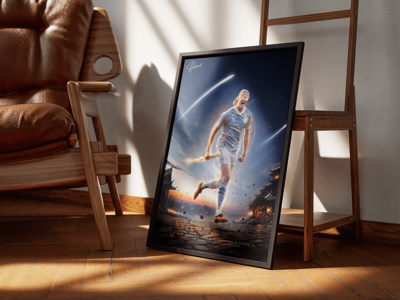


Album Cover Artwork for client

Tad blurry here, but nice job 🙂

i intentionally blurred it since it's closer to the camera. Isn't it right?
it has lower contrast compared to other chains visible. also looks like it's behind the texture?
nevertheless, I really like the idea and the outcome
love this bro

Hello @everyone! 😇
It would be great get your feedbacks 🙏🏽

Lise is more than a lingerie and beachwear store, it's a cozy place where feminine curves are valued. Each piece on display is chosen in such a way that it is always possible to find the perfect piece for any occasion. Whether for a delicious sunny day at…
How's this?

I like it. Nice colour palette.
I feel that the person doesn't pop as much as the rest. Perhaps raise the highlights on the person?
Perhaps make everyone black and white and possibly tint with a colour. This would help unify them.
You have a sharp horizontal cut off line for the woman on the left. Perhaps fade that with a feathered mask.
is there anyway to improve this picture?

It’s a great shot.
Perhaps a little vignette to draw more attention to the middle.
If you pull down the highlights is there any detail in that white portion of the sky in the middle top?

i love $b, I made this for them

Good point, thanks
No worries. Thank you.
Gave +1 Creative Carma to @wooden whale (current: #118 - 12)
Your thoughts are welcome

What should i add to his banner for a saint patricks day competition

consider these
a date?
a leprechaun?
details (what will be happening)
to add more depth to it try maybe make one of the leafs large, place it in front and apply blur on it
ive done some changes to my banner

i think theres too much happening in the background, i personally preferred the background in the other one it was more balanced, but its your design and your choices :)
hey guys!
could you help me?


i don't know how to improve this
the text on this sky background looks... weird


i have this too
do you have a referance image?

reference image? nope
have you tried with other sky backgrounds?
nope..
does it have to be sky?
What is the name of the font? I love it^^
hah! i love it aswell,it's called kiligrew
here if u want
@stray flint do you like somthing like thi?

i dont mind that, does the yellow colour of "flip" dont work with this now?
whats triggering me here its the 2 words and the gap in between,
THAT'S WHAT I TRIED TO FIXX
but idk how to make that spacing less

Is there anything that I can do make this poster better ?

how about a white outline around those guys
Still looking for feedback!

im a fan, I see that you tried adding some scribbles, how about making them white and adding some more
Ty! I mainly just wanted to do scribbles over her eyes so I didn't do too much, I also feel like white would look a bit out of place
Ahh i get it, well in that case well achieved outcome

hey i made a map for a game, how can i make it better and make it look more polished with some effects?

Whats the theme of the game? Perhaps introduce more elements like that?
Didnt really mean like that. I mean how to give it a game aesthetic using effects? Like some lighting trick or sum
maybe try to draw some lines where the objects are. Right now it has some aesthetic, but the clear form and shape should also be recognizable IMHO.
the clouds are scuffed
use some blurry clouds for foreground
also maybe less spacing before the 2 words
maybe fill in some areas beetwean the text
Any ideas to make it seem more realistic?

The shading, stacking and resolution of the images factor a ton, for example Kim Jung Un is not going to be head level with Adolf, Kims face is also like 3x bigger than adolfs in that photo, etc etc
The heads of the characters in the front shouldn’t be smaller than those in the back.
Try and match the shading. For example, put shadow on the right side of everyones face.
How did you made the orange spots? Looks so nice
Thank you! It's done with a gradient map
Gave +1 Creative Carma to @rotund nexus (current: #320 - 4)
Thanks, ill keep it mind
Gave +1 Creative Carma to @abstract oxide (current: #21 - 91)
No worries. Thank you.
Gave +1 Creative Carma to @mild iris (current: #850 - 1)
i guess add drop shadow
check dm
i guess i am getting deja vu
is that good or bad? 🙂
haha i told you earlier too it is pretty good
kim's head looks massive
I'm working on a Breaking Bad poster. It's not finished, but wanted to share it :)


This is the sketch 💀

Nice work! Looks like it's coming along well.
I would say right now there's a lot of focus on the washing machine with the text fading into the background. If you look at posters for any show in this genre, such as Better Call Saul, Narcos, and Ozark, you'll see a big focus on the characters as they are always the center point. I can find this one example of an Ozark poster where there isn't a character, but it still summarizes the show well. There's a vulture, which is a bird known to feed off corpses, money, and a gun. While a washing machine has some connection to Breaking bad, it's hard to see a good reason for that to be the identifying thing about the show.
You did a good job with the editing of all the elements together, but I would focus more on creating a theme that relates to the show more. I think you could improve it by rethinking what really makes Breaking Bad, Breaking Bad. By adding more elements that relate to the show, this poster could be really good 😄
PS. The colors in this could be closer to those in the show to make it fit better with the show

does my art simply suck? i just don't get any other engagement except for friends. and it has been like this for months. i have tried advertising, engaging with other artists, submitting to art magazines, and other stuff, but nothing seems to work. what do you think of this? it is my latest artwork.

dayum love it
As a fan of breaking bad, I like where this is going, however, as Denas | Community Expert said "washing machine has some connection to Breaking bad, it's hard to see a good reason for that to be the identifying thing about the show" since I watched it I understand the concept. I really like it, and Id love to see the outcome ;D
the cover is for an italian rap song

How does this look+any feedback?


whatever you did to the background it looks DOPE!!
It's Good but set background properly it looks so uneven
sorry, what do you mean with that?
Means in all corner and mid part of the image set the green bird like thing in proper order
Like see at same time the two bird like structure neck on same location and even their wings on same location just keep it random or set in a proper order
You can improve this alot try using firefly
It's Good but not for professional use learn photoshop more from view tutorials option in app
It's not eye catching try to improve fonts for that try Adobe Fonts
alright, thanks
For what?
Does anyone know how firefly could improve this lol, I’ve never used it
I was about ready to post I thought it looked good
hey guys i am trying to create a funny cover depicting school fights, do you think i did it well? if not what can i improve?

🥺🙏
it looks great bro
I love it
Could someone help me fix the necks in this photo?

Does anyone else have feedback on this? Only recommendation I got was to use firefly but they didn’t elaborate on that at all lol
I’ve changed the composition a little so I can send an updated one later, but any stylistic changes or recommendations?
I think it looks great. Maybe try to play with the colors and contrast
Thanks 🙏
Gave +1 Creative Carma to @rotund nexus (current: #258 - 5)
I know a shadow is obv needed but what else can I do to enhance this more


That's not bad at all.
I tried asking Gen Fill to do it, and interestingly:

it got the arms a bit messed up, but what it did show was that the shadow isn't 'perfect' all the way around...
it's more blurry at the very bottom/head area
and it warps a bit by the legs due to any uneven ground.
Is there anything I can do to make it more realistic, i think I should probably redo the shadow
I'd probably do it like this...
obviously skip the first step and just dupicate your own layer in your case...
I actually tried doing that but I used this option not sure what its called but this will be very useful thanks a lot! also 1 other question what does converting to smart object do?

Gave +1 Creative Carma to @novel comet (current: #7 - 804)
Converting to a smart object allows you to later 'undo' or 'edit' extra effects like the blur filter.
*"Smart objects in Photoshop are like having a dynamic link to your content. When you convert a layer or group into a smart object, Photoshop creates a container that preserves the original content. This means you can apply transformations, filters, adjustments, and other edits non-destructively.
Smart objects retain the original quality and can be edited independently from other elements in your design. They act as a protective wrapper around your content, allowing you to make changes without permanently altering the source. It's a powerful tool for maintaining flexibility and efficiency in your workflow, especially when working with complex designs or multiple iterations."*
at the thirty second mark how were you able to move it like that I can only move it up and own not like you did
I was holding CNTRL on my keyboard.
ty


yeah.
how so?

Well the easiest by an insane longshot is by simply using generative fill.
Or manually
@tall skiff
can you send me that?
I'm sorry, I just closed it all without bothering to save it. - You'll have to unfortunately do your own homework 🙂
bet
after hours, this is the 'best' pattern i end up with for my map subdivisions? 🤔 id rather a better looking universal pattern to fill all lines at once rather than having to make many painful independent lines and angle a pattern per one causing confusion at the intersections. currently this was an unsuccessful attempt at a universal pattern

So what's your end goal?
You may have done this already, but you can draw a bunch of lines and then apply their pattern later?
I dont understand how you do everything so effortlessly
when on the selection tool what do i hold to de-select
Like this?

Quickest is by pressing Cntrl+D on your keyboard


Oh I see. 🙂
There is set of about 4 buttons at the top. Pick the 'deselect' one. - alternatively hold something like cntrl or ALT to 'switch'
@novel comet I have been trying for like 10 mins to figure out how to remove the white on the tree to the lake

Didn't I make a seperate mini-clip above 🙂 specifically for that bit?
@tall skiff
Yeah. Ignore the 2nd half of my longer video. I made a real meal of it
yeah ive been following it but in this part when you chose black it erased the other stuff but mine just actually adds black
the 2nd video was easier
if you're picking black and it's literally painting BLACK instead of masking, it's just because you have the wrong layer selected

click the MASK thumbnail on the right and not the image thumbnail on the left

yo rate this, sorry i dont have clipping tool installed

(im a lil loose on the screws )
10/10
THANK YOU, THANK YOU SO MUCH!
Im coming to get ur house
i lost my medicine sorry

i got many screws loose
you wanna know why
im
im

ur
ur himothy
WE'VE FOUND HIM


A few things, since you asked for feedback:
- You don't need the word 'Website' and www.
- I'm not a fan of the different 'styles' in the same graphic (photo and illustratopm like that)
- Is /member necessary?
- It's a shame it's only black and white and... green?
- address is a bit low/squashed down.
First 3 Projects any advice?


all roads lead to tome
for the firstone mabye change the blending mode? or get some of the black in the image behind coming through
give it some more fun
not a complaint this is gorgeous

not a fan of this one at all


appreciate it will take the advice 💯
Thank you
Gave +1 Creative Carma to @novel comet (current: #7 - 816)

any suggestions please

its really cool visual the only thing i see is a little proble the information hierachy i think the date, hour, location shoul be bigger the learne more. Because the aim is to get people the writer fair more then to clic on the link
I think it would be interesting to give to "ELOCIT" the same iigh and shadow work that you did on the V and the Y so you' ll get an overall look of mouvment and fast
these are great bro!
try adding some more variety when it comes to colors
here's some of mine as a reference


those are unreal bro
will do thanks for the help
Gave +1 Creative Carma to @lean kayak (current: #194 - 7)
ty man
they're the only 2 I've made so far
Gave +1 Creative Carma to @warm loom (current: #851 - 1)
i have made these as part of my college course and i have been asked to collect feedback and ways i can improve, please do the following to these fashion adverts i have made


OK, Thanks
Gave +1 Creative Carma to @soft kestrel (current: #851 - 1)

the pictures look very out of place, like the lighting and that
the one on the left especially
dark background and bright person
i would improve that, cool concept though
I think the layouts look pretty good. If this were my project, I might use Harmonization (to equalize the color values) and a Camera Raw filter on a merged copy of the person and the background to "bind them together" a bit better in overall highlight, shadow and contrast.
Since the environment has cool tones (blues, purples), I might embrace that for the model and push it in a more "cool" direction (Cool in color and tonal quality.)

But this is just my opinion. If you want it to be warmer, you could bump it in the other direction towards the yellow end of the spectrum.
"midnight in a perfect world" thoughts? what could make the scene more believable (if that is possible for a fantasy scene like this one)...

blend the shiba head with the chicken
could you give me suggestions as to how better to do that? the dog has fur but the chicken has feathers... how would you blend them?
copy and paste some of the feathers over the fur
i added some sutures implying that the head and the body are two different structures that have been swen together.

I made a youtube channel and the initials of the name are UN and ive been in photoshop for a while trying to figure out an idea but im having trouble, this is what Ive come up with so far but I dont if It looks fine

I think some shadow on this side of the boat, like the waves, will help sell the composition.
Okayy got it
I'd take it even further since it's the product you're focusing on:

FIrst amazon product ad images for the store. Could I get some feedback how to improve the text and overall composition of the images?


They all look good/fine 🙂
I agree with James that the images all look great.
In terms of text, there’s not much at the moment.
I would add some, for example, on the first image of the plate, to explain the safety aspect of the ridges, where the disk sits on the gas hob.
In the image of the coffee pot, perhaps add some text to say that it’s stabilises the narrow pot.
In the image of the frying pan, explain that the diffuser stops hotspots that burn food.
this is my design proposal (its for an event), u guys have any feedback, im kinda lazy when workin on this (oh, n sorry its in bahasa, i hope u guys dont mind it)
Did you save out the document in CMYK colours? Some colours look quite washed out.
Personally, I'd switch to have some more white background pages. Every pages with a purple abstract background is a bit exausting to look at.
These are a little hard to see. I think you went a little overkill on the bevelled effect

Maybe a little less outerglow effect:

Try and keep to a consistent text size and centralise the text in these columns better

I'd also suggest that you try and be a little more consistent with headings. Not every page presumably has to look like a stand-alone poster?
this looks a little bit too tight and small, squashed up:

Maybe try lining these up better, they're all over the place:

This looks like a prime page where you could use a WHITE background for the box and darker text. Also check the alignment of section 9 bullet

Also the numbers don't align with the bullets. 1 for example aligns with bottom and 12 aligns centrally.
This text it insanely important, but you've made it TINY!

Left alignment is poor here too:

Like you said, it feels like you know what you're generally doing, but the implementation needs a little more consideration.
P.S. - All of that was constructive feedback, please don't take offence to any comments!
mmkayy, thank u so much, i need it
oh n btw its gonna be printed so yeah...
You added tickmarks and extra bleed to the pages?
I don't get it 😞
https://www.theprintinghouseltd.co.uk/blog/understanding-and-learning-to-love-ticks-and-bleeds#:~:text=Well simply put%2C Ticks (sometimes,the%20edge%20of%20the%20page.

The Printing House Ltd
If you’re new to design it won’t be long before you start to hear about ticks and bleeds but what do they mean?. Well simply put, Ticks (sometimes called Crop Marks) are the little lines on your document showing where the print needs to be trimmed and the Bleed is a little bit of wiggle room to make
Depending on where, and how you're planning to print the document, any decent professional printer in the UK would ask for it.
Concept Animation.
Software : Blender 4.0.2
Render Engine : Cycles
© 2024 DHK Productions
~ All rights reserved
#conceptdesign #prototype #beverage #beveragecan #graphicdesigner #graphicdesign #graphics #blender #blender3d #3danimation #blenderrender #bennyreview #dhkproductions #dhkgraphic
