
#📝project-feedback
1 messages · Page 7 of 1
tried my best to make this, Pless tell how to make this more horrifing or make this better


also please tell any remarks for this
I would first delete that Sign on the left or put some rotten wood at it or so. Then make it dark. So the sky should be in night time. Then put some dim light in the house by lighting the windows, but only a little and only in one window there could be a candle light or a shadow of a person be seen.
also put some ground fog in front of the house and some crows or so in the sky.
good idea i will make it
I made everything you told and i love how it turns out. Thanks for giving me some suggetions. If you want me to improve something in this please tell i will try to improve


Gave +1 Creative Carma to @normal spoke
Guys please give your feed back on this. See from this
you are welcome. Have fun with it.


Hey, ive done some fine tuning with a image I took on a video game. I change the temperature of the colour a bit and gave the light a bit more life. Should I make the blur look a lil faster or is it fine as it is?


Left is the edit and right is the original
Im still adjusting the levels on the photo though
Looks good, I'd not change much more
A little more motion blur could be good.
Perhaps a little more mist with light rays and glows from the lights.


Final of a project I'm working on, any feedback?


The rope and the white shorts on the player in red looks too bright to me. I recommend adding some shading to better match the lighting.
Cool design. A large area of wall has an orange glow around the LFT text compared to the larger horizontal orange lines.
Generally a great piece.
Should the skull be slightly smaller? I'm not sure?
Looking at the shading on the arms, should the shadows wrap around the sides of the skull a little more?
Thanks for your feedback! Other than that it’s good?
Gave +1 Creative Carma to @abstract oxide
I think overall the design and colour is strong. If your aim is to simulate a neon sign I would recommend rounding the ends of the rectangles.
How did you get the filter effect it looks so badass 🔥🔥
tried myself inspired from a youtube video, please give your feedback tell me what can be improved to make it look realistic. learning about highlights


Taht looks pretty good so far. Try to ad some more light where it can bounce maybe from the floor or other things. Also the Cristal on the left side would illuminate the foot of the robot more then the top (e.g. the leg). Also the green and orange light would bound a bit more in the florr and illuminates the feet of the robot a bit. That are all minor details, but they are essential.
thanks i will improve of what you said
Gave +1 Creative Carma to @normal spoke
anyfeedback to improve and make more realistice please??


Really nice job. The subtle particles are a nice touch.
Perhaps try darkening the grass in the distance and brightening the grass close by.
I turned this left photo into night or evening vibe in right
any feedback to improve to make it more night mood


can u send me da PSD? :>
yeah i will dm u
hi

Behance
The App aims to provide a seamless and effortless solution for safeguarding & controlling personal information. It eliminates the hassle of managing scattered documents and fragmented digital footprints.

fonts arent great, colors dont realy match up and that iceberg looks really weird. the red line on thne iceberg isn't lined up and the stroke looks weird just fix up the fonts
and the eye on thne bottom
is kinda wild
Thoughts?

My poor thumbnail got demolished...
The Iron Lung font is the font of the game, the other one is my brand font. The colours look complementary enough I wanted the title to stand out and the blood red ocean is part of the games original scenery. The red line on the Iceberg doesn't really matter and isn't noticeable by most people on a thumbnail. The stroke is there because without it the words look muddy. The eye needs to be there to attract viewers and remind them which game this is
Thanks for the feedback tho
can u show me the game am interested now
its not that bad just the fonts are weird
and u know every detail matters in gfx design so the line would still make a decent difference even if u wont instantly notice
Here's the video, it covers almost everything bout the game
https://youtu.be/ELNCifnXM_I

This is an in-depth look at the horror game Iron Lung which addresses its gameplay, lore, easter eggs and a myriad of other stuff. I hope you enjoy.
Instagram: https://www.instagram.com/saadtheglad
Videos used in order of appearance:
- SaadTheGlad: https://youtu.be/9CUvfysHD6M
- LOCAL58TV: https://youtu.be/ZPdgWYB9fdw
- sapphireHESUS: https:/...
The thing is, my dumbass thought that was normal
bro your game is so miuch better than the thumbnail
And like it could pop up behind the thumbnail
Wait, which game?
You mean the video?
It's not my game btw
i like ur mic quality
Thank you, I made sure of that haha
alright, but why?
jus curiouus how u did it
alrighty
worked out for long time, Please give any feed back to improve and make it more realistice.


Yo. I'm struggling making this floating head poster 💀
I looks off too me, but i don't know what it is. i would really appreciate your feedback :)


to me wat i see is the lighting on the people everything looks ok
overall good job!
made this guy all by myself  (please help me I dont know what im doing)( THE DEMON IS FROM ANIME ITS NOT SATANIC IM SORRY)

I think its a good start. You can ad maybe some shadows to the horns and wings and also get rid of the white around the horns and the eyes. Then it will get better.
It looks very much Ok. You can try to lighten up the Details and faces that they are not look so blueish and get a little (but only a little) blue over the Text that it would not lock THAT detached from the rest. Nice work.
Any feedback please to improve this composite ?? give your opinion


Thanks for the feedback. I'll try to fix it :)
Thanks! :)
I really like your lighting etc, the only thing that throws me off is the moon and the stars. they kinda take the focus away from the statue I feel
Honestly I just clicked a lot of things in Camera raw and it worked haha
Is there anything I need to change? Been confused a bit!.

ohh then in need to blur that down
hope i fixed the issue

Finished result :)

What do you think?
Resources:
Background: https://pixabay.com/de/photos/kosmos-himmel-universum-raum-star-3819483/
Lunar landscape: https://www.pexels.com/de-de/foto/landschaftsfotografie-des-berges-757158/
Earth: https://pixabay.com/de/illustrations/erde-planet-welt-globus-weltkarte-1617121/
Desiccated edge on earth: https://pixabay.com/de/photos/planet-mars-krater-victoria-krater-11613/
The glass area was created purely with the fill options as well as a few minor Photoshop filters

What’s up yo
I was wondering if anybody could do me a favor
And photo shop me something 🐶🥲
I like the color tone. selection should be more good to make is real. Left side brightness good I guess. But in right side try making is darker.


you can simply use spot healing brush tool to get rid of that. then you can put your logo
Oh nice thanks for the information
So for 5 dollars no one would be able to do it? I’m at work and I need it done in line 30 minutes 🫠
Would if I needed it done in like 30 minutes but I was at work??
I didn’t realize this was the project feedback groupchat
lmao looks dope bro


2nd one looks good. but why all of your photo have so much noise?
Does the shadows look realistic. I was trying to make an African spiderman

This was the rough edit

hello everyone ✌️ i’m sharing my work, hope you like it 👍


kindly check my NR logo based on Batman logo
what people think on this project; https://www.behance.net/gallery/177899165/Rochelles-Aesthetics-Logo-Brand-Identity-Beauty

Behance
Rochelle's Aesthetics - Logo & Brand Identity - Beauty
This server is all about helping people to make their own edits.
Hi, I made this composite from my imagination. Please give feedback, Thank you!


does the face go with it? or is it too brown?? or is the photo poorly edited?
be completely honest

thats very good!
Not bad. Please fix the perspective of the 🚀. and do some color corrections. And your good to go. ( for me Imagination is the most important part of manipulation )
I am not sure but adding white stock (man) can make your thumbnail more attractive.
this is my first banner, any feedback for this?

Wonderful work! 
🥰 thank you Do much. I really thought because I didn't get any feedback that it wouldn't be good. That's why I really appreciate your feedback!
Gave +1 Creative Carma to @thorny obsidian
No worries and you're welcome! It's very great, I love the stars, focus, and concept

Which one looks better and what can I do to improve the photo?


🥹 thank you!
Gave +1 Creative Carma to @thorny obsidian
Strong colour. Solid design. Nice work.
I would try increasing the size of the guy.
Nice design mate. The name is centre aligned while the text blocks are left aligned. Have you tried making them all the same?
The yellow line is not an equal distance from the green edge.
Thank you
Gave +1 Creative Carma to @abstract oxide
Any time. Thank you.
Gave +1 Creative Carma to @lavish ruin
4th project I added a whale replaced the sky. Added land on the left and right. And Added a little crab on the beach. Looking for tips and feedback to help me improve

Final result from my live tutorial today on Twitch 🙂 what do you think?

🤯 Thats amazing, way better then anything I could do
Everyone can! My tutorial is on German, its very simple: https://www.twitch.tv/videos/1903721672 (just sorry, my mic was broken. so I had to use my very old headset)
The Ressources are here: https://aerofly.design/tutorial-vorbereitung/photoshop-session-20-08-2023/
The most tricky part is to make an Selection from the tree. I think needed around 1 1/2 hours for that.

Hello guys, I designed an Architecture project, what do you think? Do you like the outcome? If you can, please give it a like and leave a comment, I would greatly appreciate it. I really enjoyed doing it. I love working and designing manually on a sheet of paper and then digitizing it. Greetings from Argentina!

Behance
Explorando la esencia de la arquitectura a través del concepto 'Percepción y Forma', el estudio OAS redefine cómo experimentamos el entorno construido. La interacción entre luces, sombras y la tridimensionalidad de los espacios se refleja en nuestro diseñ…
What do you guys think? I'm really happy with the outcome. But I don't have much recognition, so sometimes I get discouraged.😔

What could I improve? this is going to go onto a coke can professionally printed for a DIY project, any feedback would be very helpful!
Will you be printing on a generic pop/soda/soft-drink can or will you be printing on an actual Coke can? How specific do your colours have to be? If an actual Coke can then a red version (instead of pink) could work well.
Solid design by the way
Well it will be on a coke can most likely, but the can itself doesn't matter. This image is for a streamer that I watch and the stream currency he has is "Z-fuel" knockoff G-fuel. So this is basically fan mail for him. Hopefully that answers your question. If not lmk
Sounds like a fun project. Best of luck with it.
?

Thank you 🫡
Gave +1 Creative Carma to @abstract oxide
Before I send this to my friend is there any changes you would make? also @heady arch what do you think 😁

das dope
Cheers mate
feedback on my magazine cover pls?

🅰️ Thumbnail CONCEPT 1

OR
🅱️ Thumbnail CONCEPT 2

The Mistake That Almost KILLED Ferrari…
*For the record these are really quick drafts I made on my phone in the middle of class


Excellent work, perhaps you can use white color for your Venice title, which helps to understand that you are talking about Venice. Also, the price, edition and date, put it below the name of your magazine.
Amazing !! 💜💜💜

Thank you so much :3
Gave +1 Creative Carma to @silent hedge
Amazing lighting and perspective!
Thank you su much! Best part: both images, the Kids and the tree, had the Same angle! So i Just needed a soft brush for masking. It Was like winning the lottery after i saw it xD
Gave +1 Creative Carma to @thorny obsidian
Definitely hard to find the right image, but then when you do... It's Golden!
You're welcome!
Right? Right??? Its so Hard to find good free Ressources. At all. So, i was for this tutorial very lucky xD
Very hesitant to showcase any WIP/rough draft photo manipulation. Does anyone have any critique?

Hate the blurry overshade. Wish it was clearer on where it's meant to be. Barely learning fundamentals. Third WIP, I think.
Oh, I love how the little cyperpunk / videopunk feel in this image ❤️ One thing - but where I can't describe what it is either - is that it comes across to me as if bright areas or highlights are darkened. Quasi, almost pure white are forced to go down to gray. I think you can see that very well on the light roof strut, where there are small gray areas. Otherwise, I would have only so small comments: On the model right on the jacket, there is still a slightly gray mask edge. The green glow goes through the leg, but since it looks like the leg is lying down, the green glow could not continue - not without a shadow of the leg itself at the same angle. The left area on the model confuses me a bit because I don't know what it is, but I think that will become clear in the WIP. Its a very great idea!
Thank you so much! I am glad you are just as confused as I am and are able to point out my concerns. I'll try implementing what you've mentioned
Gave +1 Creative Carma to @heady arch
You're also very good at English. Lol
My True English ist very very bad. I use for long texts like this a Translator xD. I can communicate. But for someone, who 'just learned Barely the fundermentals' it is very impressive. Keep going!
Haaa?? Really? Thank! Will do 😊
Yes, Really. My first Images in Photoshop was not that detailed.
I Simply cannot be Simple 🥺 It is Pain for me as well.
There's always this vast incomplete emptiness when I go for simple, unless it's very much what I desire
You Don't have to be Simple, as long you keep going and enjoy the Progress and values the process
Oh 🤔 🤔 Never thought it that way before actually! Thank you!
Photoshop is simply a very powerful collection of tools. But only in connection with other techniques they unfold their full potential. And how you use and combine them for yourself, you will only find out in practice. And it doesn't matter how you do it - whether you redo the image 3 times and use different methods and click around until you get the result you want, or whether you follow tutorials and learn it piece by piece. The constant process is what makes the difference. At least that's how I feel about it. (and I feel over 10 Years about it, and I see progress.)
Hey guys what do you think of this ? What can I improve to make it look more realistic ?

@ruby drift Guy3 For realism it is important to see the shadows in detail, as well as to consider the light source. For example: Your light comes from the top center (if it should not be a reflection now). This means that the shadows are to be evaluated differently. Photoshop has unfortunately not yet the possibility to determine the depths of an image as in a 3D object. but it helps immensely to put such a figure times under such a light 🙂 there you see very nice what shaded and should be made. also what is important: the angle, how the fogures stand. On the right, the sigut has a completely different angle than on the left. In other words, the position would have to be completely different.

Lovely !! 🩵✨️🩷
Thank you su much, I really tryed :3
Gave +1 Creative Carma to @silent hedge
Thumbnail I made for my video, thoughts?

Made this for a new football player signing.. Looking for some feedback on how to improve

Thanks for the feedback
Gave +1 Creative Carma to @heady arch
I hope, it helps
Nice work. I think it’s really important not to obstruct the eyes when creating graphics around people. Perhaps lower the text or shuffle things around slightly so that vertical line doesn’t pass through the eye.
Got it, Thanks @abstract oxide !
Gave +1 Creative Carma to @abstract oxide
No worries. Thank you.
Gave +1 Creative Carma to @daring bluff
Just random project that created out of boredom

Please check and provide your feedback


You've got some good design elements there. One thing you could work on is the lighting and how inconsistent it is. For example, the...
- Bats are in total silhouette
- Skulls are well lit
- Guy is lit from top right
thankyou appreciated most def will fix

Hey nice work. It’s definitely looking more unified. Nice job on getting rid of the rim lighting around the bats.
Given the topic and the elements you've chosen, I think darkening everything more might be the move. Your light source is top right and behind. So you could darken things like the front of the guy and the skulls but just leave their upper right edges lit.
bet
I think we should be more honest in our praise like they are at design/architecture school.
If somebody's design is bad, the do it and hurt their feelings. They'll sure learn from it, and thank you in the long run.
Plus there's the cry wolf effect when somebody really does post something awesome.
I think it looks pretty horrible like some desperate attempt at promoting a new season of Buffy.
But I have some suggestions.
Find a similar area and rig up to shoot things after dark. But make sure it's that small time window just as the moon's setting and its early reflections are bouncing over all the surfaces.
I did this once by accident, it was beautiful. No photo effect can really repplicate this.
And what about you hold a bad b- i1at .ch whose back is towards the camera, with your fangs in her neck or shoulder.
You're assuming that the person reading your criticism respects your opinion. If you want your opinion to be respected, you should begin by being respectful and positive. Beginning with a statement like "it looks pretty horrible" and describing the post as "a desperate attempt (at something)" is not positive or helpful. If you know anything about mentoring, the correct process/method for critique is: praise, correct, praise. Not bash and then tell the person what they should do. People in this server start from different places and have vastly different skill levels and resources at their disposal. Thus, what they are capable of producing will vary based on those things. I suggest you pay attention to your tone because this sort of "advice" ends up sounding mean. There are already enough trolls on Discord. Lastly, if you can't be respectful of other people while providing feedback then I suggest that you don't post anything at all.
Yeah you're right mate thanks
what could I add to be original and fill the empty spaces ?

The design elements are consistent and those elements match well so that looks good. If a requirement for the design is that you use this layout size/aspect ratio, perhaps push the headline and the watch image up into the middle of the canvas to make better use of the space. If this is an advertisement, perhaps include some call to action toward the bottom of the layout. It is somewhat difficult to suggest other things without understanding the project brief and/or what your goals are for this design. I would also probably remove the "tiles" or lines in the background. I think they might distract from the main elements.
Nice thank you 👍
Gave +1 Creative Carma to @wooden oak


what should I add to it? any idea

Overall, tonal matching looks pretty good. I might work on the shadows underneath the bike as it doesn't really look like its sitting on the ground. Appears to be "floating" a bit. Good work thus far. Keep going!
Welcome back! So ! Your thumbnail is pretty good but you need somthing more impacting. Your thumbnail is what it makes people come to you, you need to improve it by a Coloring theme (Palette), Fonts theme, and specially you need to have a good placement of your selections. Actually on your thumbnail, there are too much information and we don't get the main information. Think simple first, and then go on your details.
If these Characters are made officially by the creators, then you can keep it, if not, think about the artist.
oh ok i understand and thank you my dear friend
Gave +1 Creative Carma to @silent hedge
Lovely ! ✨
" What are the 7 laws of design?
*Emphasis, balance and alignment, contrast, repetition, proportion, movement, and white space are the cornerstones of the principle of design. *"
There are some rules in Design to "respect", maybe this can help you ! https://www.turing.com/kb/what-are-the-7-principles-of-design-detailed-breakdown
Principles of Design are a set of rules that work together, allowing designers to compelling and appealing composition & functional designs.

Social Media Today
Ensure your visuals look their best with this collection of graphic design tips and pointers.
oh ok i learn a lot of things from you let me watch the video for more information
yeah yeah i just now noticed about shadows thanks man
Gave +1 Creative Carma to @wooden oak
I am glad I could help you ! If you have any questions please, do not hesitate !!
ok Xayanah i appreciate your help
Yayyyy, it’s Weekend movie time🍿🎬🎥
It’s a time to unwind and enjoy some cinematic magic with these trending movie picks
Check the slides using the link below and enjoy!!
https://www.instagram.com/p/CwXmMajsDa8/?igshid=MzRlODBiNWFlZA==
Yayyyy, it’s Weekend movie time🍿🎬🎥
It’s a time to unwind and enjoy some cinematic magic with these trending movie picks
Enjoy!!!!!
.
.
.
Follow @shokss_graphics for more creative design content
.
.
.
.
#shokss_graphics #designinspiration #designprocess #graphicdesign #graphicsdesigner #graphicscontent #adobeillustrator #adobephotoshop #capcut...

Hello, does this image appear authentic? I introduced a subject, yet I still perceive it as having undergone Photoshop alterations. I'm seeking the viewpoints of others. Thank you.

which one do yall prefer??


2
context
That depends on the Project that would be used for. The Colors in the second one are stronger.
colors are a bit weird after exporting

Why Ferrari HATES Italian Drivers...
any feedback appreciated. I feel like something is missing, so if anyone can help me out I would hugely appreciate it 🙏🏼
Hello all, I did an edit in lightroom this morning and I was wondering if I could get some feedback. Any and all advice (positive or negative) is welcomed, thanks in advance.


(not sure how I can share the file without it being compressed beyond hell)
Maybe a before pic would help
Thats the cr2
Gimme a sec, I will export the original

Is it possible to share on here without the extreme compression?
I believe you need discord nitro
Yeah that sounds about right :/


hey can someone gave me a feedback on the Color of this picture pls ? https://assets.adobe.com/id/urn:aaid:sc:EU:b1ecba0d-6fce-4d39-8cde-5331dbf1071b?view=published
Do you want the answer here in Discord or on the Asset itself?
On the asset if you can 🙂
done.
The dog (legs) look like foating. I think a bit shadows unter the paws would help. Also there is no light from the violet light on the girl (no reflections) but the Composition overall looks nice so far!
Ty.
I did tried picking ground color and apply to paws, but it still is not very convincing.
tried doing sketch glow for the first time anything i should do to make it look better?

today's result of my livestream tutorial. What do you think? What can i improve to get better?

Thanks !
Gave +1 Creative Carma to @normal spoke
I love it
Thank you very much :3
Gave +1 Creative Carma to @exotic coral
Im doing some colorimetric experimentation on this picture wich one you prefer ?


tell me my mistakes. i tried to make a logo icon
2nd one looks good
Now I am become Death, the destroyer of worlds.

@sand rain - if you want comments and suggestions on your work, please post your image(s) here. And please don't post the same thing multiple times in multiple channels.
so cool ! it was such a movie tho !!
feedback pls

The white space doesn't really balance the image too well for me
ummm make the main img big

This is still under development, I'm not sure about the colors, shadows, or even just the elements/decorations on it, but here is what I've been working on for a few days ^^', don't hesitate to give me some feedback 🙂


The Deadliest Formula 1 Rivalry…
*This is a draft thumbnail, I did it on canva really quickly on my phone during the middle of class
I think it's a nice idea. I think if you unify the white balance of the individual elements, as well as light and shadow, that you could still produce a more coherent image. Keep going :3
A strong design. Nice work.
The left and right people are nicely cut out but the edges of the middle person needs some work.
In regard to the spacing between the second and third letters, I would experiment with slightly increasing it or removing it altogether.
Ui button

Yeah I will 100% improve it, this was just a canva draft but in Photoshop I will make it much better 👍🏼
Awesome. Keen to see the final result.
💯🔥
someone want to give me some feedback on this? 😁 good or bad, everything is welcome. 👍

Updated Thumbnail @abstract oxide

The Deadliest Formula 1 Rivalry...
Any feedback and comments is appreciated! 🙏🏼
Lot’s of great additions there mate. The texture on the text. The increase in contrast. All very nice. I do have some suggestions for improvement...
- I’m liking the idea of a shadow to separate the middle person from the others. However, what you’ve created looks more like a black glow.
- The 3 stokes over the faces are clearly identical. Can you find different versions or at the very least manipulate the one that you have?
hey everyone i've been working on this thumbnail and I wanted to ask, what would you do to add/improve the thumbnail (besides adding the faces/emotions). My goal is to make this Image, really easy, and simple to understand. It's supposed to be a teacher and student running down the hallway, while the Teacher chasing after a student reaching out their hand towards the student.
Thank you 💚 💚 💚

The perspective of the lockers adds great depth. The bodies are extremely square and don't suggest any kind of dynamic movement to me. I would also shrink the body of the teacher and place it much closer to the centre to suggest that they are behind, not next to, the student.
Hi guys! 🖐️ 😆
So, I'm trying to transform this picture to Boa Hancock from One Piece using photo manipulation.
Let me know what do you guys think? 🤔


That is sick !! 😍😍
hey everyone! what do you prefer, with or without the pink clouds in the corners?


Without 
Thanks! In regards to your suggestions:
- Yeah I see that, I’ll fix it, thanks for letting me know 👍🏼
- I did that, but it still looks similar I can admit. I’ll also fix that, thanks for the feedback 🙏🏼
Gave +1 Creative Carma to @abstract oxide
Thanks mate. Hope it helps and best of luck with the project.
Gave +1 Creative Carma to @flat axle
Without. Perhaps you could nudge up some of the clouds from the middle to help fill (not completely) the empty sky at the top.
the first 1, looks, to me it looks like a face, but idk whats the vibe??


Hello everybody
I made this signature on illustrator but i wanted more feedback. I am going to embroid it on the wrist of my brand's garments to add a unique though subtle detail to them. It represents the name Felix JAVET (the big zip if F). Idk why though this signature seems a little off, idk what bothers me but something is. does it give you the same impression. some people may say that it is too clean and not rough enough, usually people scribble. I know and i made it on purpose so that it was more of a design than an actual signature. (+ take in in account that it's going to be emboided, it has to be the clearest possible... So please give me feedback on what you think abt , if it's weird for you too and how you think I might possibly make i tbetter
Thank you for your feedback

It looks cool to me. One thing you might want to try is making the line a bit thicker. When its embroidered, the line will probably be “heavier” than this. Thus, you should do a bit of visualization on the design to see if it still works for you at different line weights. Just something to think about.
very true, do you think it looks rough enough to be a signature you could find on a official document i kind of trying to find something similar to this :


so i came up with this :

su i'm asking for feedback
what nooo not you
There was a user who apparently spammed porn, and I said 'What was that all about"
I mean whats the point on rading a Discord server for Photoshop 😂
Hi guys I am a beginner and I am making a book cover for wattpad for a friend. the title is 'Ashes to Roses'
I want to keep to different from Ashes and Roses. Do you have any ideas for that
Moreover how can I make this even better

I like the symmetry, the font and and the background. I like the contrast of the red to black but I don't like the font of 'to'.
Nice work!
yh the font of TO put's it of but aside that the work is nice
You might want to consider using a nice image from Midjouney?


is there a way for me to make this better
this is very good GG
The actual text/icons/box look fine, but the purple background looks a bit boring perhaps?

In the example here, I just grabbed an image of some smoke online, added a black colour cast to darken it, added a white overlay for the text and then added a light blue outer glow?
That said... design is very subjective 🙂

Download this photo by Damon Lam on Unsplash
The picture is great. But I would like to add that you still have to resort to other AIs to scale. If these are printed, you need at least 300dpi and also other sizes must be considered.
Okay everyone, I've created the 2nd update to this thumbnail, adding speed lines and making the shapes more dynamic, what else would you do to add/improve the thumbnail (besides adding the faces/emotions).
I'm trying to make this image as simple and clear to understand, A teacher and student running down the hallway, while the Teacher chasing after the student reaching out is reaching their hand towards the student.
Thank you 💚

First School Project, never used photoshop before than the last 2 days but I feel it's going great. How can I improve.

keep up the good work, it can be very overwhelming when you first get into photoshop because of how many tools there are and the incredible talent out there. as for the pringle’s design, the first thing that stands out to me is the red bottom circle clipping through the under part of the pringles box. I also noticed that there is a light source being reflected off both the right and left peppers, I would recommend trying to recreate that light source above the pringles box and then add light reflections on the box itself to make it seem like the light is being reflected onto it. it will make everything seem like it came from one photo and will match better with the peppers. for the text, I enjoy the font a lot, stands out and goes well with the pringle’s box, the only noticeable thing for me is the placement of the text in relation to the circle, it’s off centered. with it being off centered I think the top half of the circle needs more, you could add drop shadow to the pringles box and peppers to make it seem as tho they are above the circle. Be careful with this idea because we want to keep in mind the x,y and z planes to make sure everything is matching. what i mean by this is for example if you where to make the circle ontop of a table, we must consider our placement with respect to the perspective of the table, along with the shadows and everything else. overall, very good start keep it up
You've been using Photoshop for 2 days!? That's amazing. Congrats.
Your design feels a little flat. My example is very rough but it shows how some variation in lighting can bring a little more life into the composition.
Best of luck and keep up the great work.

I'm not the OP/author - it's not my book, I was just showing possible other design routes and fonts.
In case it helps, this is how I quickly altered the lighting on your design. I added multiple Curves adjustment layers and then drew on their masks using a soft brush.
This is not necessarily the most economical way of doing this. However, spreading changes across multiple layers can give you more flexibility.

Appreciate it
No worries. Hope it helps.
Hello, could anyone help me choose a good photo?


Please help me choose a good photo.
will do 👍
i like how the darkness makes light around that rectangular building look like a portal.
i think those twin towers are the the most beautiful skyscrapers in the world 🤔
Do it as fast as possible thank you.
just wait...
I finished making most of the big stuff, what else should I add/edit? maybe particles or effects or something? (I'm going to add a character right in the middle of it)

Hi! Nice work. You've got a good composition with the reflection on the ground. I am hesitant to give any feedback as adding a character will change the balance, and thus, the piece significantly. I will give some pointers, though keep in mind that I don't know how this will look with the added character.
I like the light/dark contrast, it's very clear what is going on in the picture. Something that bothers me slightly is that the lanterns are lighter than the moon, and also in the same horizontal line. This makes the composition less clear, with these three big elements, plus the textured background. If possible, I suggest moving the moon up a big to make sure it sticks out more as a compositional piece. Upping its value and lowering the lanterns' should make it stand out even more.
which feature placement is better?


With the hand being slightly behind the ball cap, it gives the comp a greater sense of depth / dimensionality.
thank you so much!
Gave +1 Creative Carma to @wooden oak
Anything else?

The background blends into the Pringles can. What I would probably do is click on FX and increase the outer glow. This would help with the contrast.
Should I create Outerglow on the Pringles can?
Thats, what I was thinking of. You may also need to change the outer glow color to black.
So is your objective to build the image FROM SCRATCH?
I only ask, since you could try utilising mockup files?
https://goodmockups.com/free-cylinder-tube-chips-packaging-mockup-psd/

Free high quality packaging mockups are rare to find, either they are photoshop generated or photo based they are a great time saver for packaging designers. We have been finding good mockups from all around the web and making them available on our website by so our audience choose any one from our collection and […]
So basically it was to make a Advertisement Poster I took this picture and this is the can in the picture with some and adjustments.
I replaced the text and logo, but it is the same

So is it important to use your own photo then?
Yea
I like the photo itself 🙂 - Lifestyle, outdoors, etc
Honestly, I agree as well.

(I couldn't bring myself to type in the cliche "Once you pop.... tagline! :)" @formal pebble
(I'm less of a fan of using RED as the Background, since it's can reference danger/threat/etc

Lmao, that looks awesome. Thanks for the ideéa I will tro to recreate that shoudn't be too hard
Gave +1 Creative Carma to @novel comet
(I asked ChatGPT to help with taglines)
Please propose some advert taglines for Pringles
"Once you pop, you can't stop!"
"Pringles: Poppable Pleasure in Every Bite!"
"Unleash the Flavor with Pringles!"
"More Than a Chip: Pringles Delight!"
"Pringles: The Crunch that Packs a Punch!"
"Elevate Your Snacking Game with Pringles!"
"Stack, Snack, Smile: It's Pringles Time!"
"Snack Smart, Snack Pringles!"
"Experience Flavor Stacking with Pringles!"
"Pringles: Where Taste and Fun Collide!"
"Savor Every Stack of Pringles!"
"Bold Flavors, Infinite Stacks: Pringles Love!"
"Pringles - One Pop, Endless Possibilities!"
"Taste the Difference with Pringles!"
"Make Every Moment Poppable with Pringles!"
"Join the Pringles Party of Flavors!"
"When Cravings Call, Pringles Answers!"
"Snack Satisfaction: Pringles, No Compromise!"
"Pringles: Your Crave-Worthy Companion!"
"Elevate Snack Time with Pringles Stacks!"
Remember that taglines should align with Pringles' branding and messaging while capturing the essence of their product.
Can you add a bit about the fact that they can be taken with you when travelling
ChatGPT
Of course! Here are some taglines that highlight the portability of Pringles for travel:
"Pringles: Flavor On-the-Go, Wherever You Roam!"
"Taste the World with Pringles by Your Side!"
"Adventure-Tested, Pringles Approved: Travel Snacking Perfected!"
"From Takeoff to Takeout: Pringles for Your Journey!"
"Jetsetter's Choice: Pringles - Your Ultimate Travel Companion!"
"Wanderlust? Don't Forget Your Pringles Stash!"
"Stack Your Snacks, Pack Your Passion: Pringles Travel-Ready!"
"Globetrotter's Delight: Pringles, the Passport to Flavor!"
"Explore. Savor. Repeat. With Pringles on Your Travels!"
"Unveil Flavors Around the World with Pringles in Your Bag!"
These taglines emphasize how Pringles can be a convenient and delicious snack to take along on your travels, ensuring you have a tasty treat wherever you go.
Working on an advert for a sleep gummy..

Nice.
But the shadow is pointing the wrong direction
I was wondering about that.. so the item on the left is naturally there so I just followed that shadow. Do you think I should point it the other direction?

def right
Also, I think you would be able to theoretically see more of the 'inside' of the can
@mortal pond

great call out.. @novel comet !
- i dont know what to do with the end of the light beam up at the top.. kind of just ends.. weird?
- overall light beam.. not sure if it needs anything else
- overall lighting, i was trying to use render > lighting effects to make it all feel as one.. but got stuck on it not sure again
thank you for everything already!
Gave +1 Creative Carma to @novel comet
The light beam should 'fade out' way more granually...
like steam from a hot drink would

very true, working on that tin opening up more now. thanks a ton! @novel comet
Gave +1 Creative Carma to @novel comet
I messed it up a bit, but you get the idea...

(regarding the top of the swirl)
@mortal pond
Also, see what happens if you change the blending mode of the lightbeam/swirl to either 'overlay' or 'soft light'.

(may look awful) - hard to guess)
soft light was so faint, this is interesting but a bit too far off of the dreamy look i think. with a bit of work though it could turn into something i think

how the hell did you disspipate the smoke like that
Because I only have a flat image to work with... I just fudged it with the clone tool
and made use of the clone tool 'opacity'
What if you duplicated the swirl layer a few times?
With the overlay blend mode still enabled...
Also.... since I'm being pickly... normal shadows aren't CONSISTENT throughout. especially when that close to the lightsource - look at the other items on the desk, they're darker, the closer you get to the object
maybe duplicate the shadow layer and then mask it with a gradient
So once we start using the blend modes, you start to lose the effect of the items being behind the swirl in different places. Attached is blend mode duplicated a few times, blend mode + origina layer reduced opacity, original


yeah cool. - they were just ideas anyway. - Looking good though. Good Luck 🙂
thanks thanks thanks!
what should I put in the middle?

As it is, the focal point of the comp is the moon. If you're wanting something different, perhaps put a character in and blur the background a bit to give it a depth of field effect.
yea that's what I want to do, I just don't know what character to put in XD
Well, it's your design. Think of something. Imagine a character that would be appropriate for this scene. A vampire, some other creature. Private detective. Something mysterious to match the vibe you've got going.
alr
give grave yard vibes
what do you think of the facial expression I used for the teacher in my thumbnail showcasing a teacher chasing a student down a hallway?

It's very clear. No face on the student puts the focus on the teacher, and the composition works well.
Thank you!


Been working on this one all week. Which one do you think is the best and what else do you think I can do to improve your preferred thumbnail?
It's supposed to be on Sneaking out of School


honestly somehow incorporate the text into the actual thumbnail instead of seperating it
today's result of my livestream tutorial. What do you think? What can i improve to get better?

Is there any feedback you would like to share ?

which looks better? i was trying to experiment with speedlines.


2nd
im not sure what this is missing

its supposed to be a portal being veiwed from the side but it doesnt liik quite right
Mh, sorry, that doesn't look like a portal to me. When I think of a portal, like Dr. Strange, I think of an immediate tangible place that I can go to. If you want a 'dash', that is a sideways variation, maybe it helps if you distort the surroundings a bit, and if a person comes out that is cut off?
I was thinking about having someone come out of the cutoff but then i thought having two people coming out of both sides would look nicer
also what do you mean by dash?
The lines
oh that makes a little more sense
Looks a bit washed out. - Did you slide the saturation filter too far to the left?
I would probably just do one person / one side. And make it dynamic action, e.g. running/jumping out of the thing. Also, the use of various blurs will be necessary; one for the background to blur out the distant objects. Its too clear. And one for the character. A motion blur to impart that fast-moving run or jump out of the portal. This is just a quick example...

I agree with James. It looks a bit washed out. Perhaps a Camera Raw Filter adjustment at the end of the workflow. Levels, brightness, contrast, etc can make a huge difference.


Now?
This is gorgeous but you know what? I think if you went in with the dodge tool and lightened up some of the highlights, it would really pop.
Im trying to recreate the Kaboom sports card style, but it’s very cartoony while still seeming like it’s just a real photo. I went in and burned some contrast into josh here but I’m wondering how I can get more of a cartoony look. Maybe a blur? Some smudging?


feels kind of boring

Thanks for your feedback! sure
Gave +1 Creative Carma to @tired kelp
Duplicate the layer and Use Cutout From Filter Gallery(Number of levels =2 ,Edge Simplicity =0,Fidelity=2) on upper layer then set it to overlay adjust opacity according to satisfaction (30).
@tired kelp

@novel comet @wooden oak Thanks for your feedback and that you have reported ❤️ yes, the image as a whole was occupied with a style, which goes a little bit in the direction of nostalgia. The words for the composing were nostalgia, pale, butterfly.
These are the images i used
https://pixabay.com/de/photos/frau-chinesisches-hanfu-hanfu-5450043/
https://pixabay.com/de/photos/weg-bäume-wisterie-blumen-garten-4284677/
https://www.pexels.com/de-de/foto/insekt-schmetterling-gehockt-hockend-8404034/

Lade diese kostenlosen photo zum Thema Frau Chinesisches Hanfu herunter, die du in der großen Bibliothek von Pixabay mit lizenzfreien Stockbildern, -videos sowie lizenzfreier Stockmusik findest.

Lade diese kostenlosen photo zum Thema Weg Bäume Wisterie herunter, die du in der großen Bibliothek von Pixabay mit lizenzfreien Stockbildern, -videos sowie lizenzfreier Stockmusik findest.


By Dennis. IG: Dennidudu or NoProductionstudio. – Laden Sie dieses Foto von Paul Volkmer auf Unsplash herunter
Gave +1 Creative Carma to @novel comet

I am recreating a discord server icon, before it was a drawn skull but I like to overcomplicate things so this is my design of the logo. Prompt is a skull with black and purple color scheme, and the word "TXTO" is the name of the server. Please give feedback on how to improve this!
Seems fine, but perhaps a little hard to read when it's a tiny icon

(I tried just searching for existing black and purple skull images on midjouney)
@wraith elbow

Good point

This isn't much bigger but it has a little white outline to it and a bit bigger
I don't really want to use AI to make this project beacuse I already spent time on it, but its not a bad idea for future projects..
As far as everything else do you think it looks decent? should I make the text even bigger or easier to read somehow
If I zoom out of the image so it's the size of a Discord server icon, the text is a bit hard to read. This may be due to it being similar in contrast to the skull and its details. What you can try is turning the text purple with a black outline, this may make it easier to read. Otherwise, I think making it slightly bigger will help with legibility. Another thing to try is adding some drop shadow to push it more forward, adding contrast.

Not really sure how I feel about that, kinda blends in with the fire/smoke and doesn't really match the vibe as much, probably easier to read but not sure it's what I want.
I agree that it's very similar to the smoke. Did you try adding a bigger stroke on there? Either with purple text with black stroke or vice versa, perhaps with the black drop shadow. If you're willing to experiment you could make the skull a bit smaller and have the text be above it, instead of on top. Here is the logo of an Adobe Creative Career partnered server, you can see how the bunny is smaller and the text is above and they're both visible. This may be easier to read 🤔 💭

Trying this out now, thank so much for the feedback!
Gave +1 Creative Carma to @warm delta
@warm delta I tried a few different things, this is the one that came out the best imo. What do you think?

This makes it very clear! I like it, huge improvement from the original 😄

The Tragic Tale of Wolfgang von Trips
I am so pissed, this video has so much potential yet my I am not happy with the thumbnail... please any help is appreciated 🙏🏼🙏🏼
Thank you so much for helping once again, you helped me make this look alot better 😄
Gave +1 Creative Carma to @warm delta
do you guys think its missing something? i think it's looking pretty good but think it lacks something, the idea is to recreate the materazzi and rui costa picture from the derby della madonina

Is this good or ?
Still I'm trying to do it little better,before that I want some
Feedback>>

Thanks in any case for your idea, but I personally for me, do not like the version. The vignetting and the colors are much too aggressive for my taste. The light areas are darkened so harshly, which also leads to the fact that the incidence of light is disturbed. But thats only my own opinion
Gave +1 Creative Carma to @jaunty wadi
Negative space is more try to increase size of middle elements little and balance it and align background text with subject . Design Looks good
My first photo manipulation :'>

I like it, the contrast between the airplane appears to stick out a little. I would see if you could blur it a little to represent the airplane in motion.
thanks for your feedback sure I'll apply those changes
Gave +1 Creative Carma to @drowsy lintel
Plane feels a litle large perhaps?
Im going to add some blurs as someone suggested but the white is really sticking out, im not too sure how to fix it

this is a project someone wanted me to help them start and they left me to this😭


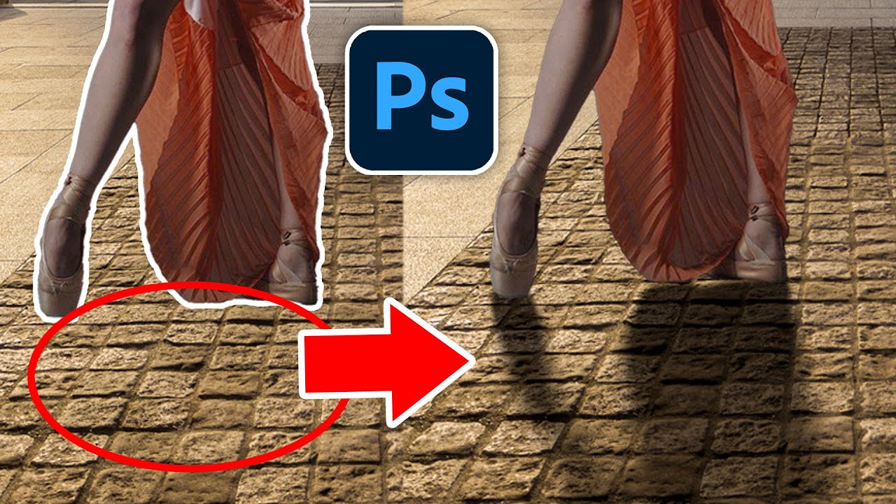
POWERFUL techniques to match a subject into any background in Photoshop!
In this Photoshop compositing tutorial, you will learn professional techniques to create realistic composites.
We will cover everything from masking, matching perspective, matching color, and everything you need to match a person into any background.
📘 INDEX - Composi...
right now i have really basic understanding of color balance and curves

Your life will be a LOT easier once you realise you can view Tranform controls
I don't think you need to blur it)
What did you have in mind?
i recently learned that but forgot to turn on xd
It probably looks a bit too well lit perhaps? - see this example? It's a lot darker.

Hm, I see what you mean. So if I’m understanding this correctly, you’re suggesting the plane to be darker?
this how it looks without curves


I'd just go way smaller - big plane looks like it's coming in to crash
(and completely central just from a comp/aesthetic point of view?).... which is entirely subjective of course
lmao
yes okay thanks :>
Gave +1 Creative Carma to @novel comet
yea, you wouldn't usually see its light like that, in a hot day in the desert, at 30,000ft
Fair point 😂
🤣
should i add highlights to the people because off the streetlights? or will it look off?

first, blend them in before adding highlights
sorry im kinda new to photoshop, wdym by blend?
So now there is no "portal"? Its just two people walking across the street? The people look composited. They are not "grounded"; there needs to be shadow underneath each person. Also, they both seem to be walking on the same path in different directions. Occupying the same space. One of the people needs to be either pulled forward slightly or pushed slightly back into perspective.
i removed the portal for the time being so i can focous on the people more
This helps a lot though!
If you're still doing the portal, then the second part of my comment probably isn't valid.
Hello
I have to make the first picture, better. But also keep it realistic. And not too yellow


I sharpened the picture, got rid of some haze? I have to make it realistic again, but that is so subjective to me
The only issue I see is that the sky on both looks "blotchy"
did you use the clone stamp tool @potent wharf ?


No I used nothing on the sky
Shoulda elaborated
This is a DNG panorama made in RAW
Weird assignment
Like can I edit stuff in it? Yes. Do I have 30 people+ who would say i do it well? Yes
Can I make a photo "better" and still realistic? Depends what your idea of that is
But yeah I can make it to that.
But for an assignment gee it's hard
We have to work in Raw btw.
Second attempt, a little less intense on the blues, found a different setting

Yeah this is better

Im tryna add the orange highlights to the red jumper like ive done on the right side
but its like coming out in a weird brown colour, how do i work around this
can you guys please tell me what you think. I made it myself

It looks pretty good. I think perhaps you would want the drop shadow on each object to be in the same direction. The shadow on the G looks to be at the wrong orientation. It seems like it should be like the other letters. You could Group all of the objects together and use a Drop Shadow Layer Style on the Group.
actually you're very right
Do you guys know how i should fill the empty spaces below the boissons and below the poulet roti ?

YOU MADE THAT?
no
oh
its from a template...
i was planning to change things here and there
oh that's okay
but i like the style it has, and i haven't been able to make something that match

Do you have a goal for what the project is for? Is it a logo?
It's simple and clean for sure; if that's what your aim is, then yes! Great job.
a logo for a server
I made this but I will stick with the other one

The shadows are still "misaligned" The shadow under the T is down (as if the light is from above). The G, the shadow is going up (as if the light is from below).
I think for the purposes of a server, if your goal was something with a less professional, more lively feel, this is pretty solid.
I agree that the shadows are not being cast at the same angle as each other; though, that could just as easily be a creative design choice if, as I mentioned earlier, your goal is for something less professional and maybe even a little intentionally sloppy as someone might infer from the messy font choice. It definitely in my opinion adds some charm.


are The Shadows on the same angle like the others?
They appear to be.
finally☠️
It just looks "odd" when the shadows are cast in different directions (for no apparent reason).
oh ok.
I'll start training a little
and also thank you so much guys
^
thx
Gave +1 Creative Carma to @mellow hare
here's a new one (big thanks to my friend for giving me tips)

guys if the shadows are little messed up please tell me
Why would you want to fill the empty space? Let it breathe!
if you think so :)
In all honesty, I'd maybe try spinning the image of the chips around 90 degrees. OR put the drinks NEXT to the tacos, instead of beneath it
helps keep the menu more balanced?
great suggestion thanks !
Gave +1 Creative Carma to @novel comet
Headings could be shrunk down a tiny bit more to provide the extra space you'll need
@queen otter - I'd honestly just keep the bottom third clear...

woow thanks
it's true that it looks neat
(but try and align the columns)

yeah right
what do you think ? Personally i think that it's great, but i'm a bit worried that i'll not find stock images matching this quality for the verso

verso?
the menu is recto version (there is also a 4 screen version i need to do but not now)
ah you'll be fine! 🙂
really ? do you know where i can get high quality food photo ?
i always struggle with this ._.
thanks ! i'll look into each one (you're a lifesaver i swear  )
)
Download the perfect fries isolated pictures. Find over 100+ of the best free fries isolated images. Free for commercial use ✓ No attribution required ✓ Copyright-free ✓
i really think i'll use it
thanks you for your help @novel comet ! i'll experiment with everything you sent tomorrow, good night 👍
Gave +1 Creative Carma to @novel comet
Hi everyone, I am trying to get some feedback on a work I am creating. The text coloring , stroke and position is where I am concerned. Not sure if changes are needed. I want it to be readable with still fitting into the aesthetics.

The main concern I think is probably trying to avoid too much visual noise.
High contrast will almost by its very nature introduce this noise by accentuating hard edges and sharp details that might not otherwise stand out.
You might benefit with increasing font size and dimming some of the contrast from the underlying artwork. It could also be worth trying to play with stroke width and see how that modifies the aesthetic.
You could also try introducing an underlay to the card text with varying opacity in order to help segregate it from Joker's head which could assist with readability quite a bit, though possibly at the cost of visual appeal, depending on how you implement it.
my life has been a lot easier since I literally have to go in edit and click free transform again and again can't thank you enough tho
Gave +1 Creative Carma to @novel comet
That border is insanely busy, which forces you to squash everything into to middle of the image.
I presume that they're meant to be playing cards?
The text it too hard to read over the jokers head.
I think you need to keep the text, and image entirely seperate. - Look at any card from a cardgame and you'd see it works like that
Have you checked out 'Card game mockups'/designs? - there are some AMAZING templates you could use as the basis.
(Try going into the midjourney discord and searching for what people have generated from the words "card game template")
Hello, guys, I am new here, I just started a course on Udemy about graphic design, which I am very excited about, and this is my first work project following this course of Lindsey Marsh, a poster for social media.

no, it's not you. - That is crazy confusing.
Also, using different fonts in the same heading like that is a big no-no, since the reader isn't sure whether they're two different headings/titles.
thanks for the feedback, it was meant to be confusing in the end, as people nowdays are used to get everything on a tray, without any brain exercise. Also the mix of fonts is intended to make the contrast between important and unimportant, red used to capture attention, and handwriting because it is a poster and make it familiar, as anyone could have written that.THANKS GUYSXX
Another shot for social media:) hoping better this one, is just understanding how layers work and using typography, still baby steps, guys, have mercy on me:)


interesting i would say

It looks cool. I'm not sure I'm getting the vibe that the people are exiting a portal though.
hm
i can see why
Ill use a motion blur then
Also im not sure how my highlighting came out as this😭

what do you think of this adjustment then?

Not sure its just the blur. I understand your intent because I've been following along since the beginning of this project. However, someone looking at it for the first time, do you think they will get that the characters are exiting an interdimensional portal?
thinkin about it now
probaly not?
what are you suggesting? I would love to hear it
I suggested a few things the other day when I first saw the image and heard the initial comments. Perhaps making the portal more "flat" facing the viewer and mask off portions of the characters where the portal exterior overlaps them. This might give the impression that they are coming from one dimension into another... #📝project-feedback message
(I don't think my message link is working correctly. Not pushing all the way up to my reply.)
The character is masked off a bit. Like he is coming out of the thing.

It's just a suggestion. Something to try and see if it works.
though i might just do it with one character instead of both for personal prefrencess
Yeah ill try it now
thanks

not a good job so ill clean it up soon but i like this
Cool. Keep going!
im almost done with this artpeice all i need to do is fix the highlights on the red jumper, thanks for follwing!

Make the faces more clear to bring life to the image, its soo dark.
just my opinion good job anyway.
I think the rim lighting you’re creating looks great. The shadows on the people, particularly the faces, is inconsistent.
add a shadow that match the proportions for the umbrella, also i agree with the comment above 👆🏾 make the faces pop more, and the proportions for the shadows need to match. ex, if there is a light from above, keep in mind how the shadows would look realistically being reflected off the objects. (in this case the people). you do a good job with rim lighting along the edges just keep in mind the lower shadows just to keep everything proportional and nothing will look out of place
keep in mind 3 point lighting techniques when it comes to rim lighting and the primary perspective of the photo

nice start, not sure about the guy's head between the 'o' and the 'n' personally. Looks a bit disruptive and best to keep faces intact
Thank you for the advice. I am taking the advice and reworking the frame. As much as I like it, it is taking to much space. I still will go with something vintage but try like you said to keep the image and text separate.
Gave +1 Creative Carma to @novel comet
Thank you for the advice. I agree there is too much going on and I am reducing it by choosing a different frame. I will try increasing the font size also for the rules text. I am trying to keep with the color for type indication and the use of Joker purple to keep with aesthetics though.
Yeah If I put it behind, his name would be a little hard to guess, so just erased parts of it with a soft brush, any improvements would be highly appreciated


The Tragic Tale of Bruce McLaren
This is a proven thumbnail concept that has worked for me in the past, so any feedback appreciated! 👍🏼
Anyone know how I can make the text more defined?

School Group Projects, thumbnail I'm working on, what you think?

i finished! Thoughts?

Thoughts?

i need help with this

its a poster, 30x40cm
i need to this looks better
with hierarchy and contrast
i can't make less text
What does it say? Knowing the context would help.
its for music production
White outer stroke may help?

My first response would of course be "remove some text", but you've already said that it all needs to remain
yep
What does it generally say? - - It would help if you had some kind of image?
yep
Also where is it for? Are you planning to print it and put it on a wall?
like make you person to an artist
yes
in high schools
what do you think about "text"?

sizes and colors?
gratis mean free in spanish

i should make it all white??
(I've just translated it to see what it says)
yeah, but it's given me a good idea at least 🙂
I think if we start by finding a decent image to use as the main body/background, it would help dramatically.

nice. - I've just gone onto midjouney discord and searched for 'microphone' for inspiration


I like the idea of using soundwaves in some way.
yep
You don't want to put a literal image of a singer, keyboard, microphone etc, since music production is far more than literally voice or playing an instrument,
maybe
like a piano in the background
maybe that background helps a lot

what do you think?

:0
thanks
Gave +1 Creative Carma to @novel comet
Finished project so far, thanks to helps from moderators, are there any space to improve ? Thanks in advance

well done man, looks nieat
Another step with gradient maps

hello guys
can i get an opinion?
its for a poster, 30x40cm about free music production

Hi! Nice work, it looks like you have all the information on there. This is something I would call practical design, where the focus is on the graphic performing a task, which is informing the reader. I don't see a place or a time on the poster, so I would make sure to add that as well. But as it is right now, it is a design that works.
Where you can go from here is to work on the composition and structure of the poster. Here is a poster I found, that does a very good job of explaining everything while setting up a hierarchy. The most important thing is to let the reader know why they are reading the poster. Therefore, the biggest thing on it is text explaining what to expect from reading, it's a kids' music workshop. Then the next important thing is the date and time, the when. And immediately underneath the big title, it tells people where it is. And after that you would probably read the text highlighted in blue, it informs people what is happening. 2 music and science workshops, for kids 6-10 (and parents). After that, you will probably read the little music note keywords where you learn what to expect from the event; piano exploration, pitch games, music theory.
You don't have to change your design completely, but this is a suggestion on where you could take it. You could set up a hierarchy where the biggest element immediately tells the viewer what is happening. Your title sort of does that, but will everyone who reads it understand quickly enough before they look away? The designer's job is to make people care!

thanks!

I think it could benefit from increasing the contrast on the character. The shadows are very bright on the character in comparison to the rocks.
Nice grid design. Personally I would bring the text in more from the edges to give it a little more breathing room.
there’s a lot of open space
Anyone Got some feedback or what else i can add just started doing this type of stuff Cheers.

I think the stroke and the bevel on the text makes it hard to read. Perhaps experiment with removing or reducing these effects. Or perhaps thicken the text.
He kind of looks like he is floating/flying. A little shadow under the foot could help ground the character and make it look more like he is running.
thanks
No worries
Hy I am Sharing My personal Project. Please Give me feedback

Hi! Nice design, it totally explains the message clearly. I have some thoughts on the design, which you are free to implement or ignore completely. I see what you are doing with the chocolate, and it's good that you are avoiding tangents, which is a common issue where an element's just barely touches something else. You've clearly cut off the chocolate pieces intentionally and that's great. What I would like to see is a complete piece of chocolate in the canvas to really send the message across.
I like the added white lines, it adds flavor to the design. The typefaces you have chosen are readable. Could you tell me where this is to be shared? Is this an Instagram post, or is it meant to be printed out and hung on a wall? I'm asking because on the bottom it looks like there is a button that says shop now, and I'm wondering if that is supposed to be a button that you can press. If it's not an actual button, instead you can add an address or url where readers will be able to purchase these cookies. And to be more specific, you can add a date and time for when they will be available. For example, if you post this now, and someone reads it in 3 weeks, they might think that these cookies are still available, and will be sad when they find out they were 3 weeks too late! Adding a date would avoid this issue altogether.
Moreover, you can add some more details. If I see this and I'm not familiar with who is posting, I might be confused. Is this a store that ships out factory made cookies, or is it a small bakery that sells freshly made cookies? Adding some text saying "homemade" or "baked in-house" could avoid this. Great work, though, these are just some suggestions!
I am Not posting it anywhere this is only for practice and thanks for giving me feedback @warm delta
Gave +1 Creative Carma to @warm delta
Can I share you my process? how I created and tell me this is good way to create!
Yeah, please do!
I Took 5 or 6 creatives, and I created their collage then I took 1,1 elements from all the creatives and create the result. Nothing is created by myself only I took each and every element to give result. Is this right way to create a poster? @warm delta ?
Hi, I like the overall Design. As some ides/suggestions I would have sharpen and not blurred Chocolate pieces and more of them around the plate in the middle. Also the "tiny stars" make for me no sence. The plate with the cookies is very good. From the Font perspective I would try to have only ONE Font for the whole project. Also give the Text and decorative Elements some 3D effect or some shadows to get a bit more depth. The overall Design i find appealing. Good work.
I am sending 1 more but text same as last but


I follow this process(I Took 5 or 6 creatives, and I created their collage then I took 1,1 elements from all the creatives and create the result. Nothing is created by myself only I took each and every element to give result. Is this right way to create a poster?) Please tell me is this good or not !
Updated


you making a thumbnail? or transition?
Okay, now I'm hungry. This is so great !!
hey fellas mind helping me in ask a question
Shoot your question and let's see ! Someone will always be able to help you !
just did my brother
how? o.o
free transform, resize
change the size of the text?
what could i do better

typography
Yeah, green text on a geen background doesn't work.
also, I think adding noise/speckles to the flames wasn't required
Also, you wrote GAURD
makes me think of....

Spelling is GUARD

today's result of my livestream tutorial. What do you think? What can i improve to get better?

Looks like you're following the jojo art style. Nice work!
give more feedback

I would unblurr the Lava the gets directly out of the vulcano and add more sparks. The "Dragon" I would do a little bigger so that is a bit more present in the Image. Also the light from the Lava would reflect from the Dragonbody so maybe some light shadows under the Dragon. Have fun.
If I make the dragon bigger, then somehow it no longer fits the ground :/. About the light, shadow and shade to the dragon: they are inside - maybe you can't see it so well. But here would be the original resource: https://pixabay.com/de/illustrations/drachen-fantasie-photoshop-1512457/
But more sparks and possibly unblurr could be an idea 🙂 thanks you very much for your hints!

Lade diese kostenlosen illustration zum Thema Drachen Fantasie herunter, die du in der großen Bibliothek von Pixabay mit lizenzfreien Stockbildern, -videos sowie lizenzfreier Stockmusik findest.
Gave +1 Creative Carma to @normal spoke

I Took 5 or 6 creatives, and I created their collage then I took 1,1 elements from all the creatives and create the result. Nothing is created by myself only I took each and every element to give result. Is this right way to create a poster for any brand ?
Hey! As long as you're using copyright-free or licensed elements, you can definitely do that. Usually it's not worth it to create everything from scratch unless you're working with a big studio. But most of the time designers find assets to use instead of making them.
So am I doing right or wrong ? I am beginner in this field so...!
If it's all licensed or copyright-free, you're good to go! 😄
Ok Thanks @warm delta
Gave +1 Creative Carma to @warm delta
Made this video, lol
Better?

Hi @bitter stone I found a video that explains how to build shadows in an image with similar angle as yours. But keep in mind the light direction, a great point of reference is the shadow cast on the neck 😉 https://www.youtube.com/watch?v=5TuhBcN9k8w
How to make a shadow in Photoshop to make a person look like they belongs in a picture. Colin Smith shows you his 3 step formula for super realistic shadows in Photoshop.
► Free Photoshop add ons: https://photoshopcafe.com/vault
► THE GEAR I USE: https://www.amazon.com/shop/photoshopcafe
► THE MUSIC I USE: http://share.epidemicsound.com/phot...
For a client, their product is called "In Da Couch" (iykyk) - i should add some berries to the lid of the tin on the bottom but it keeps looking weird.. what else looks off? any changes?
Thanks in advance!

i think you should match the lighting of the objects with the room
@queen otter thanks for this, I kind of tried.. but didn't really get anywhere good clearly. how do you suggest I approach that?
Gave +1 Creative Carma to @queen otter
try to watch this, i didn't watch it but the end result is great
https://www.youtube.com/watch?v=BPHnbC6HxTI&ab_channel=OKprod-Tutoriel

⏬ Clique sur "PLUS" pour en savoir plus⏬
__
🔔 Active la cloche pour être informer des nouveautés en temps réel ( enfin je crois)
🤞 Un abonnement ça mange pas de pain et ça me soutient :)
► http://bit.ly/30QNE0C
__
Vous cherchez à incruster un personnage dans une scène de façon réaliste dans Photoshop CC 2020? Découvrez la puissance des ca...
it's french but i think it will still help
Is there any way for me to improve this avi(I just started with photoshop today and this was the first thing i made)


@north sundial here to say that the font is AWESOME. On the small "nokia' underneath, I feel like it could use a bit of a shadow/stroke to it has an edge to it. right now it kind of just bleeds into the background. super minor, but anyways just wanted to say seriously impressed by the font on this.
Hey yall I need some input.
So Im new to designing magazine covers since I enjoyed doing them quite a bit. But i want to try something new. I want my magazine cover to be something unique that will catch peoples eye.
This is the base image that I will be putting.
Im wondering what should I do with this, should the image disperse or liquify and things like that.

Here are the other covers I have gone over so far as a reference to my work


finishing up on a design, any feedback would be greatly appreciated

hi
Hy can Someone Give me feeback for this design. Topic of design was ( May Ganesh Chaturthi launch your journey to greatness, guided by Lord Ganesha's blessings and wisdom.
Ganesh Chaturthi post
CM Autosales - Maruti car dealership)

do you guys think i should add more to this?

Hi! Could you tell us more about what this project is for and what you are going for with this concept, so we can give you more personalized feedback?
This is really cool! Personally, I would love to see more grain and texture added to this piece. It looks like something that would benefit a lot from having some additional texture. This could be in the planets (I see you have some), or in the black background. Or across the whole canvas to really connect everything together.
Other than that, I think the composition is nice, with both maximalist and minimalist characteristics. The choice of typography is good, I love the type. One thing I notice is how most of the design uses sharp edges, but the stars in the top part have short diffraction spikes. You could try out having longer, spikier stars around the text if you haven't, it may look nice with this design.
Hi! Do you have any references of the types of magazine covers you are referencing? Vogue tends to play a lot with both layout and colors of their covers. Have you played around with the background? Sometimes Vogue uses plain gradient backgrounds like you have, but usually they will then have a more saturated and busy foreground image which catches the attention.
I would say try deconstructing how magazine covers are designed, focusing on the layout of the elements, colors, movement of the images. See what you can learn from it and how you can apply it to this project.
improve qual
thanks so much, ill try implementing your feedback and see how it looks
Gave +1 Creative Carma to @warm delta
pretty bored, any feedback to make it look more realistic?

I dont really ever focus on realism so its really different for me
Bros using gen fill
Try evening up your contrast. The front of the heads are in shadow while the tentacles on the same plane are quite bright.
I think a little difference between the colour inside and outside the bottom of the frame would help create some separation and focus.

My example is rushed but it demonstrates what I mean

hey everyone, so I'm trying to achieve the ghibli artstyle
does anyone have any critiques on the overall shapes?
Oooo ok
whats that


Good afternoon. I am posting an update on the card token I am working on. So I reduced the visual noise of the rules text by removing that. I enlarged the card name for visibility and centered more the art. Changed the font to plaza. Any feedback would be welcomed.

If 'wicked role' is the only text required on the card - then yeah. Looks nice!
Font feels like it matches the frame.
Yeah, sometimes you have to pivot on things to streamline things. I plan on using this template for the rest of the series. Had to use the Batman the Animated Adventures font with this series.
I feel like the skull are a bit on the right side
Its look good already, just don’t understand the idea of A devil riding a skull horse in middle of the ocean with kraken’s tentacles 🦑
Anyone know how to add frame , edge or border in pts , also i need recommend for frame design for shirt

This one was meant for t shirt

This looks great. It's now far more dramatic and mysterious. Great update.
Wow! Just wow. Slight difference 😉
LMAO, I was just doing random stuff to practice 😭
Thanks!
Gave +1 Creative Carma to @abstract oxide


No worries
Its really cool imo
hi i dont even have photoshop but i thought i would come here for suggestions, this is my first thing i made and im looking for any feedback, thanks

original photo if that helps


I made this and I think it's really simple tbh. can anyone give me some feedback?

Its look complicated for me , good job
it was really easy tbh
could i get some feedback for this? please and thank you 🙏
How could I improve this like if I add another logo somewhere or smth to make it look better or I change something about it ignore the shadow on the feet I fix it later


How did u do that
The floating man?
I googled it and nicked it from a stock image site - It was just a reference to the footballer image above.
Could I get some feedback on this Please. 🙏
Hello, could i get some feedback please ? Just finished it 😄 Thank you ! 😄

this is good! I do wish I could read the text behind the subject better. But I always find type more interesting 🙂
ok i got a lot, the first one was my first kind of photoshop esque thing so looking for any feedback on that and the second is for what would be a tshirt or something and then other images are references. thank you!!!!


i noticed sides on vhs one and fixed them
My Design is here


it took me 2 minutes and a half to make💀

canva made it so easy
Hey I'm a new photoshop designer and was wondering if anyone had tips for my project!

We can't see the blue text
Looks like you're getting familiar with the practice of using Layers to build your comps. Great! A couple quick things: "Minecraft Content" is difficult to read. You might want to use a lighter color so it stands out a bit more from the background. Same goes for the other text as well.
the swords are too small
the pixelate cube plus the background with lot of details doesnt match
i think you can work the size of all your elements plus find a composition matching more
In Addition to what D.Human wrote also maybe try different and more bold Fonts. Try instead of dark shadows on the dark Background maybe white or lighter colors so that the contrast is more visible. Text can also be much bigger. Rest will come with practice, practice, practice. Have fun!
some text of the switches would be a bit to bright and also distracting to much. But the idea and composing is very good. Like the old Graphiti style.
Nice work. I think there could be going on a bit more in the Background. some more "magic" gadgets floating around, 1-2 characters or creatures, etc. But overall a good design.
I've got some great ideas.
Thankuuuuu so much
I've screenshot your words
To understand it better can you tell us what it was made for? When I assume that it could be a Album Cover of some kind then the Design itself is very good. The only thing that bothers me is that I could not read the words.
Great to read that! Appreciate it.
Cool idea. I would do maybe some kind of motion blur to the side on the lines that there would be a bit more dynamic in the Picture. Overall a good design.
That is sick !!!
me use canva 
Please don't post the same thing multiple times.

does that background sky match the overall scene or should i manually change color through color balance "im bad at color balance"

I think maybe without the dog/wolf. Unless its integral to your story. :)
It looks decent to me!
ty but naw it's someone else story just wanted to see what looks better
Gave +1 Creative Carma to @wooden oak
ok i got a lot, the first one was my first kind of photoshop esque thing so looking for any feedback on that and the second is for what would be a tshirt or something and then other images are references. thank you


The comp itself looks good. But I had a hard time to spot those minor differences. Because the dog in the left is more prominent and the comp is feeling a bit better I would go there. That black crow on the street-sign I did not spot there, so it would not be relevant for the Image itself overall. Have fun.
I think the sky matched pretty good. Depending on the story and the light on the figures it looks like it would be sundown time. If that's the case, then it might be better to have a little more sunset in the sky and to have a little more sunlight or brighter in the front/back right of the sky and then about a less light in the back left.
oh thanks
Gave +1 Creative Carma to @wild trail
thanks you to
Just a creation I made for a poster design ! Yes I know, especially because I worked on the type too, but I wanted to enhance he portrait 🤗
Thank you !!
Gave +1 Creative Carma to @silent hedge
Lovely ! ❤️
can someone tell me what layer style should i apply to the text im generally confused

thanks & yea I'm still working on lighting
Gave +1 Creative Carma to @normal spoke
This is my third time modifying the poster, is anything missing, I think it's not perfect yet do more🤔 ! >>FEEDBACK>> please

Could you tell us what this is for before we give you any specific feedback? Looks like you're setting up a general scene in 3D and adding text on top, is this a video thumbnail?
yes its a video thumbnail
maybe tell me how can i improve the text
I like the idea and the Composition. Very well done. maybe try to get some evenly sharp Images of the person and try to match the brightness of the Light a little. The "Mystical" do not seem to be centered, but that are all minor details. Good work so far.
Hey any pointers? I'm pretty bad at PS and was wondering if anyone had any pointers to fill in black space/make it look better.

Im pretty bad
Did you mean to say "blank" space when you wrote "black" space?
Perhaps center and enlarge the text “MYSTICAL”.
Try adding some contrast to the faces of the left and right characters to better match those in the center.
/info
If this is a thumbnail and the point is to grab attention, you are missing contrast for the text. It sticks out, but if you're comparing it to thumnails, it's fairly low contrast and flat. What you can do to improve its ability to grab attention, is add a stroke. This is pretty much the number one thing used in this type of design that will immediately add a big punch. From there, you can add a border around the whole text, rotate it, add more colors or a gradient, resize it.


Looks like an unsharp Image of a photo of a Painting, but weird Brushstrukes (way to even painted). The Art itself is very Abstract. I think some could say to all kind of facts about that piece a thing or two depending on what Feedback you wish for.
I would try to put the Text withinthe Picture itself als as a bottom Banner. Also try blend the edged between the two persons maybe a bit bette with not so much blurr in the brush. The Image itsels is good.
I like tha Rap Style. But I had a really hard time to read the Text and could not read it well. That could be improved. Also the two Goat Heads have almost the same white as the T-Shirt so its hard to see when its all white where the Person in front ends and the Goatead begins. maybe try a little shadow or more neckline.
Hello everyone!
I'm studying UX/UI Design and decided to make my first Design Dystem.
I would like to hear your feedback)
https://www.behance.net/gallery/180223539/Design-System-From-Dartus-Design

Please Give me feedback about this?


I'm back, I've taken a break from making things for a few weeks, but I suddenly had some inspiration to make something again,
Would love to hear some feedback and critiques, thanks!!


yea the text color was hard to choose and make it pop
i likee the use of what looks to be a vinyl to add some texture. idont know what a guy hiding his face and the word "stay" is supposed to evoke out of me but i think its a cool idea for sure.
no clue what you're asking here.
They look all the same! ask 20 People and you get 21 different answers 😉 If you can be more speciffic we maybe can help you better.


Good start. But maybe you can try to focus what would be the important part in the Image? Why are there red lights? It seems that they do not add anything specific to the Image. Then what would be the main "Character" of the Image? The Person in the Car, the "Death", the moon (very prominent) or the Gravestones. Such an Image should tell some kind of storry, but I do not see it here. IF the Person would have ben behind the wheel of his car texting while driving THAT would be a message/story that would have been selfexplained. If you can be more concrete with the "Story" The Image itself would be getting much better. Have fun.
Nice Compositions. For the knight pictures: Also try to mach the Color of the Lights. Yellow sun and brown or gren hills do not match so much. Also try to put some kind of castle on the Mountain. It looks like the Mountain is a bit empty. For the "Night" Image: Look wher ethe Lights and shadows come from. The earth on the right hast Light from above AND below, but the lake and Person in the forground are totally dark that would not match so much. Also the Light on the boat dock would light up the Person more and it would pop out better. To bring a bit more dynamic a little boat or something else on the lake could be nice. Have fun.
I'm an illustrator/graphic designer, and I have a passion for making my clients' ideas become a reality.
I've been working in the graphic design industry for over 2 years now, and I've designed everything from logos and websites to posters, flyers, book covers, characters and more. I'm also skilled in vector-illustration programs like Adobe Illustrator and blender. I'm looking for new clients who want to work with me on their next project. If you have an idea that needs to be brought to life in a visually stunning way, please contact me today!.
wanna have look on some dope designs....
Working on a logo for my brother upcoming podcast. He wants it simple yet conveys what it's all about, any feedback is greatly appreciated.
can i get some feedback on my twitch banner?

I like this layout, the perfectionist in me would change the corners on the P's to have the same inscribed angle as your circular "play" button tho 
whatever the arc of a circle is called i forget the name 
this part
Looks great. Nice work. If we are getting pedantic, the spacing between the letters within the title seems slightly inconsistent.
 i feel the same way, adobe says that its 4pt distance but i agree it
I will often manually adjust the spacing between pairs of letters, particularly within large titles. I'm no typographer but sometimes the spacing just feels wrong.
im in a typography course atm, i might just ask my instructor because its irking at me too
i was honestly suprised you noticed because my friends said it looks fine
To quickly adjust kerning (spacing between adjacent characters), place the cursor between the two characters, hold down Alt/Option and tap the left or right arrow keys.

Typography is definitely both an art and a science.
i dont really like this course it feels very redundant to me if i can be honest
im mostly just learning the term names to stuff that generally i already knew
but its required so maybe ill pick up on some things later on 
Sounds like you already know your stuff. Hopefully you can pick up a few tricks.
the other graphic design courses are where its at tbh
ive learned so much in my illustrator class
Excellent. Best of luck with your studies.
Really appreciate the feedback 👍🏿👍🏿👍🏿

Looks good, excited for the final outcome
what do we think of the typography/ layout? i think it could be better

does this look good?

is the logo on bottom left well aligned?
or if there's any other critiques?
@clear coral Sorry for ping, wanted to ask you your opinion on the overall thing since you saw me work on the logo earlier. Thank you in advance.
Gave +1 Creative Carma to @clear coral
I've been working on creating testimonial graphics for my company, but thinking about changing the design a bit for next year's iteration. I'm thinking of updating the accent line and possibly the background, but keeping the color scheme. would love feedback!


i would definitely try experimenting with different backgrounds , i like the overall composition w the accent line and the names on the bottom tho

would also try playing around with different fonts / font sizes for the question text on top and maybe even the names, also something like a - in between the name and job position, the gap in between tina and architecture just feels a bit off ( to me at least ) good work tho!
Are my highlights getting any better?
(Fictional light source is coming from a particular side.)


It is visible that car image is cropped from night or darker photo.
You will have to match that colors better.
I would suggest right aligning all the text, not just individual blocks of text.
I think the logo is well positioned
I think you’ve got a pretty solid design. Nice work.
A few things you could experiment with…
- Lower the opacity of the text in the title a little so you get a little blending
- Rotate the dark rectangle a little
- Put the text in two columns with text wrap on the right edge so that it wraps around the person
@abstract oxide thank you, I actually ended up scratching it and making a cover
Gave +1 Creative Carma to @abstract oxide

@mighty dragon dms
That Layout seem pretty Ok. But maybe you look at the Text that they are all in line with each other. Also the Cross Lines/Folding Lines are a bit weird. The rest is very minimalistic.
The Design looks good. I would miss the Lions Club Logo/Icon, but its Ok.
There are some Reflexions in the Windows and there is missing some light under the car. Other then that its a nice Comp.
Is this your own design? - I'm a bit confused what its supposed to be.