#📝project-feedback
1 messages · Page 2 of 1
I'd maybe work on the background image a bit. Perhaps darken it to push the title forward. You could make the image a Smart Object and then add a Camera Raw filter to it.
You could probably do the same to the text/title layer to adjust its contrast, highlight and shadows, etc.
I think the drop shadow on the title is a bit distracting. I'm not sure it adds a lot to the design. I'd maybe turn down the opacity on it (or even remove it altogether). I'd try a couple different versions of it and look at them side by side.
awesome, thanks dude!
I did a quick Camera Raw adjustment of the flattened image. Perhaps it demonstrates a bit what I mean... See the difference?

Bump the contrast, tweak the white and black levels to pull a bit more out of the image(s).
It would be easier to control as separate layers.
Hope this helps.
which color grading would you say for this one?


something like this?

title tweaked

Yeah. It stands out a bit more against the background. Don't you think?
The blue-ish one has a nicer quality to it. I think its visually more appealing.
yep, way better imo
its for a 6 part live action series i hope to make in the future
(i plan to be a director/filmmaker for my career)
my goal in the series would be to give that same open world experience and the feeling you get from botw, except in film form
the majestic landscapes, the survival aspect of it, etc
Sounds cool. Good luck with it!
it probably won't be in a long while, but cheers! :D
No better time than the present to start learning the craft.

If that text is a font, you'd probably have to Rasterize the layer, make a selection of the "ELDA" and cut it, move it to a different layer. Then you can position it where you want.
If you're trying to keep it editable, you'd probably want two different TEXT layers. One for the Z and another for the other letters.
alright! thanks mate :)
new for ps just a try any feedback

just convert it to a shape, no need to rasterize it and lose its vectorization
are you trying to make a banner and if yes what platform is it for?
Not for platform just a try to make a banner
mmm confused about my whole composition and ideas. I'm trying to imagine a collab between monster and coco for the promotion of their mango loco juice

Cool
You can do that as well. It just depends on the person's goals and skill level; if a user isn't experienced with editing vector shapes, it might be problematic for them.
Well I'd say the composition is a bit too simple. For me a banner should feel like it has a proper direction to it. The text is covering too much of the banner and there aren't enough elements to make a proper composition and showcase your subject. If you're mainly trying to do Luffy banner then it should somewhat give more hints on the character's universe. For example I've made a banner yesterday for a streamer how it helps you with seeing what I mean. I do think I could improve a lot of stuff on it but yeah that's the general idea

Arigathoo broo
any tips for me @wooden oak? I always value your feedback haha
welcome don't hesitate to tag me if you've got a question
Okiee
I'm not sure because maybe I don't understand how the brands go together (or the "overall goal" of the project). Visually, I'd say that the can and the background are similar colors so they are kind of blending together. Perhaps there should be more contrast between them. Complimentary colors, maybe?
I'd try different color backgrounds and see how they look. (Something other than blue.)
yeah tbh I just though they were very similar (prolly because they both tackle topics like the Dia de los muertos, marigolds, memories of the deads, mysticism)
aight lemme try that
I just mean, since the Monster can is blue you probably don't want to change that. Its easier to try different backgrounds to see if a complimentary color, like a rust color, dark red-orange would set off the blue can and make it more visible. It's worth a try.
The Monster Can itself is kind of a guide for you. They likely use blue and orange because they're complimentary colors.


Maybe is you make shadows its look realistic
I think the black text is a bit hard to read, I'd maybe try and invert the text to see how it looks in WHITE
Maybe a subtle drop shadow will make the can 'pop-out' the page a bit more?

thoughts on this?

I see thanks Imma try that I'm pretty bad at dealing with shadows so that's something I still gotta improve on
Gave +1 Creative Carma to @novel comet
I'd do what James suggested. However, I'd make shadows for the Monster Can, the zombie guy, the mango chunks and make all of those cast a shadow on the backdrop. :)
Not sure what to suggest. I guess I don't understand the intent of it. Is this an album cover? What are "Cleared Samples?"
its promotional material for a brand
So the Cleared Samples text on the shirt, is that the logo?
yeah
You might think about zooming in on that (or making the whole thing larger). Its a bit tough to read.
mm ok, that makes sense
When its small, that is. If you look at a huge image, you can see it.
How could I make it look better? I feel that a lot of things are wrong, but I can't exactly see it

Maybe you can add shadows on te ground where he is standing?
This is always the best solution with font situations.

I really like the halftone effect, how did you create it?
the text on the left is literally a wall, noone's ever gonna read it. consider shortening it or applying some sort of a reading aid like bullet points or bolding keywords to help eyes catch and scan the content
found this article, hope it helps https://www.brandglowup.com/make-content-easy-to-read/
never thought of that actually
filter>pixelate>colour haltone
I am new to photoshopping I want an honest opinion about this work for a rookie (I don't use adope PS)


my subscribes
This is my entry forchallenge. The unspiration from a Dream I had and the New movie.
If you like the overall content, then like the post and follow me if you are interested.😊


nice JoJo reference
That’s good in my opinion but the explosions kinda look fake
Not sure if it’s suppose to be like that but yeah
Kinda made it look more like a realistic game thumbnail, It's kinda hard to aim for IRL graphics
Hey yall! Im new to here, Im trying to get some advice on where to potentially go next-steps wise on editing a headshot/portrait. The original was super super warm toned and I had to cool it down, but in doing so it's exposure is pretty high and it gives it that "edited" effect. Any feedback for how to potentially bring this into the realm of looking more normal? Ive given two drafts of different tones and didn't know which is going to be the easier to work off of in making it look the most normal?


Should I move the gradient background for the mountains closer so they are connecting?
Looks like you've tried to just darken an over-exposed image...
maybe try...

(However, I'm not very good at this stuff, my retouches are usually not people and skin-tones)
Oh you totally read me. This was the raw. Three biggest issues was overexposure, the color was too warm to be skin tone, as well as the background was Krinkly.

We didn’t need the full photo because it’s supposed to be an 8x10 portrait so I just did some cropping and such which is why I don’t need most of it. I made a second layer with a high something or other to get a clear object to separate from the background, erased the background and did a circle gradient of two slightly different shades of off-black and then manually blurred the edges of the person with the eraser bc I couldn’t figure out the “proper” tool for it, but the one thing I had real big trouble with was the color correction and fixing the exposure
Deadpool 3 fake poster, any thoughts? I really love feedbacks to correct something that I can't see

Try covering the foreground behind the text and in front of the Deadpool figure with a bit more smoke to add depth
@analog condor
Hello, here is a before and after of a photo I took of my car. Let me know what you think!


I'm new at photoshop and made lovecraft inspired art- anything I could add/fix?

Good✌️

it looks really good
thanks
Gave +1 Creative Carma to @analog condor


Hello! I'm working on some merch, these are frames from videos I have published, and I want to put them in a grid. As you can see, they are placed roughly there they need to be, but I want them to fit perfectly down to the pixel. I can continue to adjust them manually, but I assume there must be a smarter way to do this as it's time consuming! Also, as I move one at a time, I keep having to go back and adjust some, which reveals others aren't aligned properly. I'm trying to use guides, but it's still tedious. suggestions? thanks.

Maybe using an automation helper... File > Automate > Contact Sheet II. It will probably require a bit of experimentation.
I can try that, I haven't used the contact sheet before as I haven't needed it.
There may be other plugins or scripts to do this sort of thing. However, I don't know of any offhand. You'd have to search for it.
ok, thanks. I figured it was worth a try. I figured it was a very specific need.

Anyone know how I could duplicate the red rings around the head ?
I want there to be multiple expanding in size
Use the Ellipse Tool.
Do you have Adobe Indesign?
I do not. I also don't know how to use it.
I have the Photoshop bundle as it's the only Adobe app I use.
oh I see - I was going to show you this:
#❓ask-a-question message
I'll have a think...
Have you tried using the 'image placeholder' tool? @hazy wadi

and the proper 'grid' to line them all up?
I'm not familiar with it, but I'll try that, thanks.
It's quick and easy to make the the big grid of placeholder images, but I was hoping to just select all the images in one go and then quickly just click on each box one after another to 'drop' them in... but when I try to drag in multiple at once it doesn't place them in properly...
I'll just drag them individually, but it looks like it will also crop them so I don't have to worry about the images being larger than they should be. nice!
@novel comet I should have provided the dimensions needed 🙂 Thanks for the videos! I don't have them as separate files, only layers, but I assume it's a similar process.
Attack On Titan Cosplay Photo Manipulation

Starfire Cosplay Photo Manipulation

Sandman Cosplay Photo Manipulation

Pop smoke banner


Honestly, the lighting setup for this portrait was so inadequate that I would reshoot it. The blast of light on the face has blown out some areas of skin, and there's a harsh shadow under the chin. Reducing the shadows makes the hair and shirt just blend into the dark background. Having the subject stand as far as possible away from the background will make it fall into soft focus, though you'd need a hair light to differentiate the dark hair from the dark background. The yellowish hue indicates that you might have been using incandescent light or warm lighting. It's easy enough to slide the white balance over to the blue side a bit until you get a more natural hue. Consider investing in a very inexpensive gray card to help you correct the WB during editing.
I'm doing a typography experiment and am looking for some ways to elevate this further. I think this still looks a bit simplistic. Any ideas/suggestions?

yeah, it's not a great layout. I can barely read the word 'Steal'.
It's also an awful message! - but I guess that's not the point 🙂
Maybe use something like this as inspiration:
https://www.etsy.com/uk/market/typography_poster
Etsy
Check out our typography poster selection for the very best in unique or custom, handmade pieces from our digital prints shops.

@toxic dome
great thank you so much!
as for the message I think it's supposed to be taken more in a tongue and cheek way but I agree 😂

😁 that looks so much better thank you so much!
Gave +1 Creative Carma to @novel comet
ooh i love that design
I like the torn paper concept. However, the tear should probably be lower, i.e. done so that the viewer can infer the word "steal." Although that quote is famous, some people may not be familiar with it. Thus, the message may be lost. Just my two cents.
Cheers. To be honest, I was trying to appeal to an audience of one.... I was also tempted to drop the bottom bit of paper into some random chat later. - just to confuse people.
Show a hand in the act of tearing. Now that would be awesome! :D
A hand with paint on it and leaving paint stains on part of the poster.
I already deleted the PSD above...

Ok so I just started learning how to use Photoshop like an hour ago and I'm so happy with my progress loll
This is me meeting a celebrity called Peyton List

And this is me after removing my double chin and whitening my teeth 🙂


Looking cool, but the resolution of the fur looks different from Benny, also I would make the colors like his hair
keep with the hard work

You posted the same image and I thought you were asking the same question here.
hey guys, trying to create this fake poster here

is there something that is hurting your eyes? lmk
doesnt blend in
the colors?
How??

is this eye catching? is there any way I can make it better

Honestly, I don't think it makes sense.
Is this a joke or something? Switzerland is landlocked. What navy? heh

ik
vid is about invading italy and francr so we can get naval power
its a thumbnail for a video
And the image implies that [somehow] Switzerland could overcome larger countries like France and Italy with a non-existent navy?
military
the game is hoi4
you can ally with other countries
but since france and italy are world powers will be hard but not impossible
OK. I don't know what hoi4 is so... Sorry. To me though, the thumbnail makes no sense.
ok
I understand france and italy have a lot of power and Switzerland doesnt.
as Switzerland you can get other countries land then make more infrastructure.
you can also ally with italy so they help you and at the end you betray them
the thumbnail is a before and after
anyways
anything i should change?
@wooden oak
Please don't ping me. People reply when they have time.
Also, I don't know.
If you think it makes sense for your situation, then I'm not going to try and persuade you otherwise. To me, it doesn't make sense.
Perhaps with a title under the thumbnail on YouTube people will understand its a for game and thus it will make more sense.
I mean its targetted to hoi4 audience so
I'm just not sure what the map and the arrows have to do with "Swiss Naval Power" and I'm not sure by adding the boat anchor it really helps at all.
The message seems a bit muddled.
its a before and after comparsion. the arrows mean the countries iy will invsde
its straight forward
Yes. You've explained that. I'm saying: someone looking at that image on YouTube and have no idea of the game or the intent of the video, will they understand it? I wonder if they will.
I mean
its not something everyone wikl understand
its basic geography after all
not everyone knows geography
specially americans
It makes sense to you because you made it. What about to other people looking at it. You have to try and see it from the perspective of other viewers who may not understand it at all.
ye but I would have to find Geography viewers
since Im trying to target specific audience not every
like cooking videos. people that dont know bout cooking wont understand but if you know you will
You wanted feedback. That's my feedback. If you think it makes sense, then go with it.
yup
thanks
I just wanted to know how would you make it better and more understanding
And maybe try not to insult people. You're assuming Americans don't know geography?
I mean
If you take that as an insult you are probably really sensitive
not my problem. a lot of people say stereotypes but I don't mind
I just laugh
I'm not insulted. I know geography. I'm saying, you're making a broad generalization about people you don't know.
Good luck with your video or whatever. Hope it works out for you.
The education system doesnt teach geography that well
thank you
Gave +1 Creative Carma to @wooden oak
I take that more as a hobby
Guys, what do you think of the chapter I wrote?
what do u guys think?

I think it's better now

looks good.
Hello people ?
this is one of the poster I made for last month, that is the night of worship with the theme "My Identity is Love" what do you think about this?

This looks great. Love the color and typeface you chose adding a bright glow effect to help it stand out. One way to help improve the impact of your images is adding more light to images and feeling of depth.
You're aware that this is a photoshop server right??, so most, not to say all, have more knowledge in manipulating pictures than writting, sl don't be surprised if people here don't give you feedback about that article, but you have an option, here on discord there's thousands of servers, and with some search you can find the rught place to get feedback, evwn better, find people better prepared on the subject than us
Went and tried phonk style work, this is my first attempt of it and took 1 hour!'


I am 100% aware of that. Still, I think it is rude that people just ignore your work just like its nothin. But you have a point, since people aren't interested in reading.
Also, I have been on this server long enough to know who is interested in reading or who isn't
I read it. I'm fluent in English and write fairly well. If you would like my feedback, I'll provide it. However, fair warning: I don't have a lot of positive things to say about it. Also, the other person is correct. There probably aren't a lot of folks in here who can provide feedback and constructive criticism on this sort of thing.
I see, well give it to me straight. we don't success without failing a couple of times
I don't really understand what the intent is here. You start with "Chapter 1" as if its a story but then you write in script form with [Character Name]: followed by lines of dialogue. Is this a story or a script? Then you move from this script form back to a narrative paragraph structure which seems like the main character's internal monologue...(?) I think you need to figure out what you're writing. It's either script or narrative. Pick one and stick with it throughout.
It is supposed to be a story.
That wasn't really my intent😅
If its as story, then you wouldn't do Eliza: [Eliza's dialogue]. It would be something like... Eliza turns to her mother and after a brief pause says, "Yes, mother. I remember everything you've taught me. I will do my best to make you proud." (or some such thing).
You're telling this story from a narrator's point of view. Looking at and describing what is happening.
So to summarize what your saying: The reader should imagine the events while reading the sentences, and also the dialogue part should be written within the paragraph, not as an obvious looking transcript.
That's one point. Yes. Structurally, choose story or script and write appropriately for the format.
Ah ok, understood.
In that same vain, you should really try to use language that is more appropriate for the time period. Example: you write "Ok?" and "OK, dear?" Nobody said "OK" in 1789.
Well, it is set in an alternate timeline, but yeah, I need to stick to to an appropriate language.
You are right.
This is tangential but pretty important to the overall narrative; you really have to think about how people would behave in that time period and in that particular culture.
Ok thanks man. That helped me a lot
Gave +1 Creative Carma to @wooden oak
If it's an alternate timeline then you have to emphasize it more. Initially, I thought the story literally takes place in year 1789 and didn't really think of 'imperial calendar' being that much different from the regular one so it felt more like historical fantasy to me at first. The next thing is you're not clear with the tense you use. You start with 'It was' but quickly change it into 'is hosting' then 'prepares'... Pick one and keep with it.
I can speak fluent English, but it seems I am rather swamped with using different tenses. You are right and thanks for the advice.
You should try to find a course on writing stories or "crafting the narrative." It will help. It doesn't matter how fluent you are in any language. Writing is an art form and it takes skill to not only write well (as in correct grammar) and with style but also writing a compelling story.
There are structural rules to learn. How to create tension and then release. Honestly, it's really very difficult. heh
asking in a writing-oriented discord server might be a better idea too, we here are all just graphic designers 😛
It wouldn't hurt most artists to learn how to write more effectively. Not just for the ability to communicate better. Writing better and more descriptive prompts can help you become a better artist. :D
Absolutely! It's definitely a valuable hard skill in any creative job
I am always up for a challenge, especially in this profession.
first selfmade photoshop project, tried to give it a mystic and mysterieus feel. Would like to get honest feedback since I just started my journey 🙂

Its a great start. The photo was taken at a cool angle/perspective. (Views from above/below always seem to be more interesting.) The dithering is a little distracting. I'm assuming this is in the image because you saved in Indexed Color, as an 8 bit PNG. You can see the pixels/dithering if you look closely...

Because there is so much blue in the pants and jacket, I might try to hit the background with a complimentary color, like an orange or rust. Maybe even do like a dual rim light, where you have blue on one side and orange on the other. This might help to break the monotony of all blues and purples. Just an idea...

he seems a little bit squint also for me
Sorry. I don't know what this means.
Wow, i haven't even thought of that it makes it look so much more professional, thanks for taking the time to provide feedback! Also about the pixels/dithering I had to reduce my file by a converter to be able to post it so that is why I will use secondary colors more often now thanks!
Gave +1 Creative Carma to @wooden oak
Yeah i may have missplaced the fire in the eyes a little bit so it looks like that thanks tho didn't see it
No prob. You can try saving as JPEG. That should reduce the file size down some. Even at max quality, the file should be small enough to post on Discord. Try: File > Export > Save for Web... and you can choose file format, scale the image down, all in one shot without changing the source PSD.
Unless you're saying that you made the doc in Indexed Color. If that's the case, it won't matter.
Either way, good job. Keep going!
Do you guys think that everything is right with the lights in this artwork? Or something is wrong?


Thanks, i exported it as png and can upload it normally now!

Gave +1 Creative Carma to @wooden oak
There is far too much grain/noise and the blacks are completely washed out. Jack Sparrow is getting lost against the shapes in the background.
Do you mean that Jack Sparrow is getting lost because of the dark shadows?
The image is too dark overall. So dark that all of the shadows are almost the same value. Thus, it's difficult to tell where Jack ends and the background begins.

Generally, you'd add grain when compositing to try and match grain in another image. I'm not sure all of the grain/noise really adds to the image.
Also, there needs to be shadows added under each character to "ground" them to the deck. Currently, they look like they're floating.
There was nothing wrong with the glowing eyes. Probably just a few little edits to make it better.
Like a hint of color on the skin to give the impression that the eyes are giving off a tiny bit of light...

Most edits should be subtle at first. Then you turn up the volume slowly and stop before something looks "over-done."
Damn that is a good showcase of how it could look
I have this now

done it like this because i thought in the bigger picture you won't really notice

-> end product

the starting image 😄

Does anyone have the font called "degular" ? If the answer is yes, could you kindly share it with me?
looks really good
Thanks!
Gave +1 Creative Carma to @analog condor
oh thats rly cool
what do you guys think?


Its much too dark. So much of the image is getting lost. You might want to consider adjusting the lighting, highlight and shadow on individual layers.

Then when the editing is complete, some overall adjustments on the image as a whole...

If its a night/moonlight scene, it might have a slight blue-ish tint to it...

With portraits (and similar images), the face is generally the main focal point. Thus, my preference is to make the face just a tiny bit brighter than the rest of the image. You can use Masking in an ACR filter to target and adjust only those portions of the image...

Blur the background a bit. Bump up the saturation of the "reds" and arrive at something like this...


Here's my before and after, what do you think? I need feedbacks haha


here's with orange highlights, idk

maybe it can look good if I adjust them better


what do u guys think? also where should i put the text?

Hey, I just finished these 2 photos for a school project. I'd love to get some opinions on where to improve/ what to add.


looks okay but i think you could of had a better pose
that would of made the picture better
color grading is solid nontheless
thx so much
Gave +1 Creative Carma to @wooden oak
Little study on colours (gradient maps precisely) and manga colouring. Besides the obvious little weird parts on the edge I'm looking forward to hearing any sort of criticism

pink text is a bit hard to read and the pink on pink stamp seems a bit much. Looks dope tho!
I'd probably try to dial back some of the grain/noise in the image and make the person a stronger focal point. Perhaps by using a Camera Raw Filter to make some adjustments.

Maybe even try a Filter > Blur Gallery > Tilt Shift... to give it some phony depth-of-field...

I'd convert the image to a Smart Object first. Then do the adjustments.
There are probably a dozen different directions you could go.
This is cool. Did you make this model?
hey guys 😄
I'm new to photoshop how's it?

Yes I did
Looks great
Thanks
Gave +1 Creative Carma to @wooden oak
simple but effective, maybe you could add a light or colour adjustment to clear up the similar shades of colour in the character + bg, aside from that it's pretty nice! I like it
thank you for feedback
Gave +1 Creative Carma to @cedar tapir
no problem fella
Hello, I'm new to Photoshop and this is my first photo-manipulation based on one tutorial(i didn't watch the tutorial at all, I wanted to recreate the image). So just want to get some feedback on color grade, lightning, etc...


Good job but I think you need to include some dark edge strokes around the character. To help seperate them from the background.
True true I didn’t think of that haha dunno how I forgot it thanks
Gave +1 Creative Carma to @novel comet
Also if you have the character on a top layer... maybe add an 'inner glow' of a few pixels to help hide the dodgy pink edges around his boots.


Colouring practice again I tried to get better overnight by watching a couple videos, critiques please ( @novel comet and @red fable for the previous feedback)


Nice. Loving the gradient in the text, Outer glow, shadow on the arms - Nice choice of skin tone too. - It's like a burned red.
yup yup he's supposedly burning his blood and using it as a fuel I'd say in this panel, I didn't exactly know what to do with the background though
This might go away from the solid colour style you're going for, but you might want to try making the fire a bit more 'dynamic/textured?'

@toxic dome

Oh I see for this one idk exactly if that'll fit manga idea but I have another one I'm currently working on which will benefit a lot from it thanks for the idea I was wondering how to achieve a textured look
how did you get your mask like that though? did you just lasso tool all of it?
bugger no!
xD


hit OK, to make a selection...
then whilst the selection is still active, then I go to my fire background and hit the MASK button..

@toxic dome
I did it let's gooooo thanks for the tip

Gave +1 Creative Carma to @novel comet
That looks really good. - Nice work.
I think this feedback not for me
Yeah, just realised. Ah well!
lmao thanks
Gave +1 Creative Carma to @red fable

Hey! im making the second floor of my cabin and tried to make some wood railing arround it, wanted to know your thoughts on it and how to improve it!

Looks like the perspective is off on one or both of the railings.
Yeah on the right one but I can't seem to get it on par with the other one without it looking super streched
Shadows
it is a flyer for a concert in progress any guideings


@novel comet @red fable last time I'm pinging you. I just feel like I'm beginning to understand some more things


Wow. - those colours look good!
Are you using a multiply blend effect on the black and white layer?
@toxic dome
yup yup

I don't think I'd change a single thing.
I thought maybe adding a tiny bit of colour/red to the lips, but to be honest, I don't think it's necessary.
Looks really good!
yeah, the perspective is off. - to be honest though, given what it looks like you're doing, you shouldn't try to make the 'perspective' real anyway.
If you look at these room tiles here, the artists draws in such a way that it's a sort of 'fishbowl' 'straight down' view above every single room...

Out of interest, why are you trying to photoshop this top-down floorplan/map? (I'm just being cheeky/nosey)
I'm making a map for my horror/thriller rpg, this is a old ladies cabin that makes wine and also my first map, this is the first floor and the second one so far, i had to remake the 2 floor today because the file was corrupted


that perspective is really awkward to replicate isn't it? how does mansions of madness do their tiles?
That outside/exterior wall really looks odd. Just my opinion.

To be fair, they too have the perspective approach, BUT....

in the centre of the room, they keep the walls more 'top down'.
I'm obviously not telling you how to design your own game, but if it were me.... I'd do something like this:

No perspective to worry about 🙂
This is the type of perspective Im aiming for, you might find the exterior weird but its just because when the players are outside they'll see it that way

also im not making a game lol, a rpg like dnd
I've seen, bought, made a LOT of RPG maps over the years, and I've never seen a perspective/style like that before! It makes my eyes sting and my brain hurt.
This is another example

Its all preference in the end of the day, i find normal top down perspective is kind of boring and limits the amount of detail
Yeah, totally get that. I mean look at all those amazing pics on the wall! - You'd loose all that on a 'normal' topdown map.
these examples are all from a famous investigation ttrpg called "O segredo na ilha"
The perspective is always based on this

you sure?
doesn't look like that here:
Those walls are in the middle, but you see the 'south facing' side on both,

its Because of the rooms
by the way these maps are always zoomed in while actually playing


ok, looking at how the characters are placed, I think I'm going to give up on arguing over any logic regarding perspective, angles etc. - It's... um definitely a ***unique ***way of visualising maps.
I was about to say, since your corridor seemed important, you probably want to change the angle of the wall to something like this.... but I doubt that's relevant now...

That corridor is actually just heading to the bathroom which is the empty room i haven't done yet on the right, the rooms on the interior is much more important, i apreciate the feedback though
Also if anyone curious on how to set this up to play a rpg or ttrpg in this style, there's a game/app called tabletop simulator, you put the maps, tokens etc and use it during your sessions, doubt there's many fans of the genre here though. This type of rpg actually makes maps important since its all about ambience/investigation
Yeah its definitely a unique way, this series of rpg created it

Thanks for the advice but i think your seeing it generally and not actually how its going to be viewed, this type of design makes sense looking at but during a session, with the tokens this type of perspective doesn't make much sense
Gave +1 Creative Carma to @novel comet


I am just looking for some KEYWORDS to look up for different things to improve this. I will work on some Masking tutorials as that seems extremely powerful but any other advice is welcome. Thanks!

Context: Me and another person are 0-5 in Fantasy Football
i'm a beginner😊

I like it a lot I'd assume you played with the gradient map and threshold to get this result right?

More adventures in creating art without drawing! In this tutorial, I’ll run through an approach to create a vector or vexel style treatment using a few key tools in Adobe Photoshop. This look will draw some inspiration from the portraits of Shepard Fairey, but this approach can be adapted to create all kind of other vector-ish styles... thanks f...
thanks
Gave +1 Creative Carma to @wooden oak
Yes from this video i learned @toxic dome
@toxic dome but be careful not all images can be the same result, you need to change the settings of gradients map and color for a perfect result
something feels extremely wrong (and I think it the fact that the shading was already drawn on the clouds make it even weirder)

what do u guys think about this artwork?

Really like the direction and execution but I just feel like the netflix is just akward and bring too much imbalance. Dunno but you could try just the netflix (N) symbol or play around with other variations of the placement but the tagline feels like too much
did an amateur photoshoot today should i post here?
You can if you want feedback. If not, post in #🎨share-your-work-archive
Hello guys, This is a poster that I've created for a meeting with the theme "United in Love". What do you guys think about this?

the image of the hands together is important but the word love is slightly too obscured
I would say to bring the letters forward but ofc it's your choice on how to adjust it


the second image with the partial outline looks quite appealing
also it lets the viewer see more of what's actually being presented to them in the middle of the image
(the boxer)
True
Undead Japanese WW2 pilot for my Halloween Edit

the bottom one is dope
Hi any tips something looks off idk what it is, maybe its the blur maybe too much green but idk

i think the lighting might be a little off too
yeah, you're a bit too green there. Maybe Hulk - mid-transformation.
lol
Kinda hot in the rain forest with a fleece-lined jacket on. Maybe use a northeastern, fall foliage background. :D
haha you're right. the jacket doesn't fit the theme
Hey, if anyone has any tips or critiques on these steampunk inspired characters that would be great! - working on a project for art school


remade the windows xp bliss screensaver but added rain

Check this out: https://www.adobe.com/products/photoshop/sky-replacement.html
Learn the basics of the Sky Replacement feature in Photoshop to give your images the wow factor.
@umbral canyon Here is another page as well: https://helpx.adobe.com/photoshop/using/replace-sky.html
thank you

looks pretty unreal but ig thats the nature of this kind of thing
cant rly pinpoint what abt it isnt right
Yeah. It doesn't really look that real or "believable"
Too much of the image is being obscured. I'd try replacing the sky with a dark, cloudy image. Then also adding a subtle rain effect. Perhaps like shown in this example: https://www.photoshopessentials.com/photo-effects/photoshop-weather-effects-rain/

Learn step-by-step how to create a realistic rain effect in Photoshop! Check it our in our latest tutorial at Photoshop Essentials!
Hello folks! I’m playing around with a book cover design for a friend, and I’m not quite sure what’s missing/off. The title font might be a bit thin for the smoke behind it, but I think I’ve been staring at it too long now and I’m not sure. Thanks for looking!

@umbral canyon you did good but i added some stuff. the small things that count. Before:

After:

what did you add?
@umbral canyon @heady bramble -- Too much of the original image is being washed out by the effects. It would be a more interesting image if you changed the sky to something a bit more "moody" and dial back the rain effect. Do the effect to show that its raining but try not to overload the image. This is a quick example. The sky I used is one of the Photoshop Sky Replacement samples. If I were doing this for a project, I'd probably try to find a darker/cloudier image to use but it works to demo.

I agree with your assessment here. I'd try a few different heavier fonts and see how they look. That decorative font is ok but I think some of those swishes and curls are getting lost in the smoke. :)


Looking good.
Im still learning photoshop. I use free license images to learn and I need feedback from other people. What can I improve in my work?

Discord compressed image 😅


not that much i don't have much expiriance lol. just made the grass a bit darker
also the clouds
Trying to make my own mockups. Having trouble with this one, what makes it look off and what to do about it?


It's nice. - But look how the sun is hitting the top of Half Dome. - Your feet should be in shade compared to the bright orange of the sunshine.
Any feedback for this thumbnail guys?

The translation of the big text is "They wanted to STEAL from me"

Well... it kinda looks like the person holding an invisible d**k. - but maybe that's just me 🙂
LMAOO
it do look a lil sus
Thank you. By the way, how can I better paste it.I mean look at him, and sky behind him, it looks weird but i dont have any idea.
Gave +1 Creative Carma to @novel comet

I'm not sure what I can do to make it blend with the background more
cannot rotate or move the bowl btw
2 month amateur, dont really know alot
any other USEFUL feedback?
Why is the bowl black and white? I'm sure we can help you improve the whole thing 🙂


Hi!
It's been a while since my last post 😄
I've done a daily planner themed inspired by Harry Potter novels. What do you think?
Its in Polish:
Planer Dzienny - Daily Planner
Poniedziałek - Monday
Wtorek - Tuesday
Środa - Wednesday
Czwartek - Thursday
Piątek - Friday
Sobota - Saturday
Niedziela - Sunday

put it in color, and touched it up a bit more
looks alot better but ill have to export it as a png and send it here later


Linktree
View 2023straightup’s Linktree. Listen to their music on YouTube, Spotify, Apple Music here.
Hello, I made a poster for a music show in VietNam, we have the theme is "Sing between Nature"

anyfeecback for this
I felt difficult when I put the color of gross and oceans, sky together in the poster
Make it less blurry
The tex is hard to read, and the spacing between the circled text is off
Hello! Im working on material studies, so far I did wood and stone! Let me know what you think


These look great!
pretty good for a first timer?

i like it! it looks powerfull to me, maybe the lens flare a bit to much tho

that JoJo reference is very peak
i think the colour palette could be adjusted on Kira

these types of Yellow and Purple would work well once put on top of the suit and hair
ok bro🤝

Hi everyone! 👋 I hope you all had a great MAX! Yesterday I uploaded my new project with abstract experiments… https://www.behance.net/gallery/155141025/colorful-3D-lines

I like it, like ribbon candy
that looks really dope


really cool 👍
Iconic scene in Brand New Cherry Flavor of Netflix reimagined with AI. Multiple renderings composited in Photoshop. I hope you enjoy and thanks for looking!

I know art is subjective, how does the direction of this flower look? Also I know I am destructing the background, need to work on that with layers and masks.
If I clear the background maybe at this point I can just work with the bird and the flower and start building out from there in the composition? start bringing in branches and leaves and perhaps flower variations? Any feedback appreciated.

Hi everyone! Just wanted to show you my last picture 🙂 If you would like to see the before/after as a reel you can find it on my instagram (same name).


Behance
Indigenous People in the Philippines Infographic
I made another infigraphic for skool
but i was wondering if its an actual infographic, because most examples that i see dont have any pictures, instead they have illustrations n vectors and stuff
I'd suggest working on the text contrast, it's difficult to read especially in the green and blue parts and the halftone effect isn't helping either. try heavier font weight
This is a game background I made, don’t care about below letters (they are sample)

I need some constructive feedback
Two versions of my latest artwork


love the second one. Not a big fan of the filter used on the first one. Great atmosphere
Thank you
Gave +1 Creative Carma to @wind raven
This is really cool I wish I could read it! I'm Filipino too and it's beeb hard to find academic texts in English to learn about Filipino history and culture. If you make an English one i'd like to see it 👀
it looks more like an editorial article, because most of the visual information is read and not represented by pictures, graphs, and illustrations. The percentages at the bottom should be a wider and bolder font to read more easily from a distance. Instead of using numerical percentages these would be good places to utilize a 2D pie chart
You could also improve legibility and unity by using only one font or font family in the document, using a darker or more recognizable font type like Helvetica, maybe Roboto, or if you want to look more old school I've always appreciated Caslon and Georgia.

Looks pretty nice, but there are some obvious things in which can be worked on, allow me to elaborate.
Your image looks to be showing two points of light, the center of the clouds and the stellar object,
This is shown by the shadows of the samurai and the building,
Your shadows can also be worked upon ,
I believe they aren’t correctly set to the stellar objects level of brightness
You could also make the magnitude of the stellar object lower and add more dramatic effect towards it,
Try applying to a new layer a radial gradient with orange to red to black colours, let it cover the screen and put the blend option “screen” on top.
Same can be done with the eyes of the samurai.
I’d also fix the lighting on the samurai’s arms and such to make it look a bit more realistic.
And I would play around with full gradients and colour adjustments to get the correct tone and colour tension,
I would also try and dim the lighting on the mountains, I feel as if the lighting could be a little overkill.
And for the planet itself which the samurai it’s on, try instead of making a dust effect than rather of a glow.
*note, these a my preferences that I would do, not everyone would like my style but most of these points I have made are there to make the art feel more realistic and believable aswell as appealing to ones eyes.
Apart from the current information I had said, you piece of art is beautiful and your a natural gfx artist if this is your second piece, try enhancing knowledge with lighting and how it works to get more accurate and more appealing images though, but if I had to say to give you a score, 7/10!
❤️
Thank youu @analog shuttle you are awesome
Gave +1 Creative Carma to @analog shuttle
Looks nice, but still needs some spots and details to fix. Interesting idea non-the less.

We can't wait, it looks good so far
what do you think, if something is missing, let me know🙂


i would maybe add a boat or something ^^

I already put galleon ship
sorry didnt see that in the preview nice xD
crazy creative idea!!, ropes for the balloons?
Any tips on how to make the mushroom cloud blend in more?

will doo
Looking at the width of the lanes, I think the car is just a bit too large. I'd maybe scale it down slightly.
In the cloud image, the viewer is looking up at it. But in your composite, the soldiers are looking down at it. The two perspectives don't match.
Didnt think about that.
But any tips to make it blend in more in terms of color?
Color correct it
It's too green for enviourment
Specially the lower parts
flying with the car. I love it.
It's very dark and the image that you composited it on is very light. One or the other will have to be adjusted. But, as I said above, I don't think that image really fits because the perspectives of the images don't match. You could color-correct it perfectly and that issue will still persist. I'd maybe try to find a different image to use.


Hey all, I have been working on studies for materials and textures. I looked at some references online but would appreciate any feedback:) thankssss


Very cool, @sweet marlin! I like the chocolate dripping down and the translucent ones especially with the colorcast on the ground. :)
That looks so good! Especially that green glowing orb and the lava one!
wao! it’s so cool
I like them however the watermelon feels out of place.
New art in https://www.instagram.com/p/CkGkOhCMQcJ/
"Island Tower"
LONG TIME NO SEE!!
Today, we Take a trip to the unknown, where three mysterious towers can be found on three different islands.
A new concept art presented in this new manipulation project. I hope you like it 💓.


Lovely 😍


So, a while ago I was working on a mini fantasy story on Wattpad and the previous book cover wasn't really appealing, and this cover right here is the new one.

I think it's eye is too far back on its head isn't it? @upbeat sandal

Nah, I think you're good actually! 🙂
Thank you❤️
Gave +1 Creative Carma to @novel comet
Na man, it is where it is supposed to be😌
Aww thanks 🙏 ☺️
Gave +1 Creative Carma to @wooden oak
Did you create these texture and/or materials? Also - did they remove the lighting effects completely?
To clarify: Did you use Substance to create the textures for use in photoshop?
I painted them on adobe fresco from photo references
Well - your talent is compulsive.
Hello friends! Cabinet Of Curiosities Fan Art With PlayGround AI Dall-E2 Model + Photoshop. I hope you enjoy and thanks for looking 😊 https://www.behance.net/gallery/155869685/Cabinet-Of-Curiosities-cabinetofcuriosities

Behance
Fan Art With PlayGround AI Dall-E2 Model + Photoshop. I hope you enjoy and thanks for looking; please visit the rest of my portfolio for more of my work. Comments and likes are welcome! My NFTs on ethical and environment friendly Curate Style: https://web…

The words aren't centralised properly are they? @opal pewter
Didn't notice that one, will fix.
This is a Facebook post about cosmetic post, its purpose is share some information about lotion and the benefit of it. What do you guys think about this?

Looks pretty good, it is simple but manages to deliver the products effects. 👍
thank you
Gave +1 Creative Carma to @upbeat sandal
Hi any help/tips for creating highlights on the rhino as well as maybe the background? Also how to match the colors of the background, sky, and rhino together. Thanks


Behance
Proyek tiap bulan yang berasal dari keresahan hidup sang creator dan visualisasikan melalui karya. simply.btw, thanks for watching yaa gaes.don't forget like and comment hihi :)
The highlights can be added through multiple ways, most famously the Hue Saturation adjustment or the Solid color adjustment.
I'm not a huge fan to be honest. I don't think the images are big enough. - try googling "canva social media templates" for some inspiration/designs.


Which basic adjustments is better? The stark contrast or the softer warmer version?


I think the softer ones look more "natural" ...if that helps. :)
Thanks, I think so too....
Gave +1 Creative Carma to @wooden oak

how is this logo, its not the orginal pic but a screenshot of it, i got the bg online and the rest is my work, is it good, or u guys have other reccomendations
its photoshopped
man is canva like good for design?
tried to attempt making album covers if u guys have any criticism id appreciate it
the grandma one is kinda goofy ik lol


it looks cool if anything I think It's a little complicated looking people usually try to go for simple but unique logos 🤷♂️ but it's not necessary to go simple if u don't feel like it
I like it for ideas/inspiration, but I don't build within it.
ah alr makes sense
I think the top line text should be a bit bigger so the P and the F line up with each other.
It's fine, bit I'd maybe go for a slight darker hint of blue? - but it is just subjective.

Id edit the line to match the futuristic style and make project and futurism the same size
any feedback on this photo?

Nothing is straight....

...
...
...
I'd have suggested keeping the horizon line horizonal, changing the focal length and avoided getting he tree in the shot too... - I think the boat in the desert is already a nice bit of subject matter 🙂
I know the question was about the logo, but for the background... I always think Hex/Behive textures look nice...

Hey all, I would appreciate some feedback on this design I made for a church pop up/roller banner. Heck I'd appreciate criticisms, because to be honest, to me at least it feels like it's missing something, and I just don't know what final touch it needs and its seriously bothering me.
PS: Don't worry about the empty bottom where the glowing light is, I put the social media associated to the Church there but removed due to this being an example.

Ok, I'm only being critical since you asked for it!
I personally think the opposite Woomir. It's not missing something - I think there is too much going on. Gradients, outlines, glows, colour cast over backgrounds. I don't think you need to pick a 'condensed' font. The most important text is in the bottom 3rd of the pull-up, by the viewers knees, not in their eyeline. It also looks like it says, from a glance, - "You are invited to worship us".
Also, I don't visit church myself, so ignore the following comment... but I thought the benefit of "worshipping with us" is the idea of joining a community, having people to see and talk to? Share discussions and thoughts with..... - however your main image looks like one single person sitting quietly on their own? - Pretty much the opposite of "Community/Us"
@shrewd marsh
From the background, it looks like it's a church with a lot of atmosphere and fun, with people shouting and celebrating? (Way different to the very boring CoE church I attended as a child). I If you feel that this is the main reason that people attend the venue, I'd maybe suggest you focus more on that and drop the image of book and hands.
(and move the headline to the top half of the Pull-Up).
greaat
My opinion is you can use pentool

rate?

it looks very good, although it seems everything is in focus
If you could create a bit of depth it would be one of my favourite artworks
im still fairly new so im not sure how to do that quite yet 😅
I think what he means is if everything is emphasized nothing is emphasized meaning makes less important features dim down abit. Atleast that’s what I got out of it
So if your character is the main focus don’t let the pink Neon lights flood it out
Still have color in the back just pull back abit
hmm alright ill try to fix that sometime today thanks for the feed back im still new so any help or tips help
Gave +1 Creative Carma to @rugged pond
Yeah, something like this
You're good at this!
Yea it looks really good
my stage mockup design ... the designs are also designed by me .

the font i have chosen that cuz our brand is following that font only
for every product
its my first ever irl project fully done by me
rest i was doing social media
I am a beginner with photoshop and do not know how to best practice

I guess tutorials and trying to photoshop with reference for inspiration
👍
beginner ? that is not a beginner level if i say so
❤️
im having a hard time trying to blend the 2 images together anything i can do to get them to be seemless?

'technically' it looks fine, but visually (which is the critical factor), that red glow is causing so much RED on the guys face, the coke bottle should be lit up like a bright red LED light. I think you need to tone down the red glow cast on the guys face....
Take a look at this video, feel free to skip to timestamp suggested:
https://youtu.be/Qkyg0iOqi-k?t=455

Skillshare - Get your 2 months for FREE here: https://skl.sh/nemanjasekulic9
In this fun tutorial I will show you how you can easily add a glow effect to your images and make them even more interesting and awesome.
Have fun!
_
➤PATREON: https://www.patreon.com/nemanjasekulic
➤My Photoshop brushes: https://nemanjasekulic.com/product/cloud-dus...
Have you used the neural colour correction filter to help the person match the tone of the background image?
Hey, have you ever tried using proper mock-up files and smart objects? - You could drastically improve the look of your final 'visual' quickly and easily...
https://unblast.com/free-trade-exhibition-stand-mockup-psd/
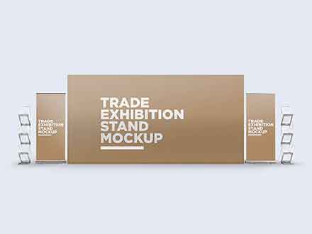
Trade exhibition stand mockup featuring a huge backdrop and two roll-up banners, and two literature racks, one on each side. Free to download.
Yes i will be doing that cuz right now my designs still waiting on approval
With minor changes
Thanks for the keyword search as well, i didn't know what to call it so it can fit all frames
Gave +1 Creative Carma to @novel comet
i modified the stuff on stage

yep thanks for this !
Gave +1 Creative Carma to @novel comet
Looks really beautiful. May I build a house there?👏
Where would you guys recommend I'd be able to put the faces of the speakers of this program?

I apologise for the late reply but thank you so much for the advice, you are right with the fact that there are a lot of things going on so I'm reworking that picture now. Thank you!
Gave +1 Creative Carma to @novel comet
I think these are the best spots


https://www.behance.net/gallery/156384699/City-Flea-Market-Design-Collateral/modules/882301863
my latest project i worked on

my first ever irl freelance project
it will be for irl art community event
all done in photoshop and illustrator
Gave +1 Creative Carma to @upbeat sandal
Newest poster design I have done. welcome to any feedback


Almost done, what color would fit the word ИЛИ?
The idea is that the green symbolizes good and red the bad, what color can be the neutral?
Hey guys, just posted my first UX case study on behance. Please check it out and tell me what you think and follow/like. https://www.behance.net/gallery/155265981/The-Cake-House-Craft-Bakery

how many different fonts are used in this? I am just curious
Hey guys, i want some feedback on this book cover

It's for a beginner photoshop class, nothing serious
I'm iffy about the font, if you have suggestions please tell me
And the dark path in the head i think it looks a little off, but idk how to make it look like an actual tunnel
Also tried this

Heavily inspired by this blackmirror episode cover

B4 and after


There is not enough contrast between the dark font and grayish/purple background.
I love the animals I come up in the streets the most: https://www.behance.net/gallery/156430215/Streets-Of-Today
Behance
I hope you enjoy and thanks for looking; have visit the rest of my portfolio for more of my work. Comments and likes are welcome! If you like my art and want to support my work please consider buying me a coffee: https://www.buymeacoffee.com/keremgo3d
you have two light sources added actually. the floor not really represents it, aswell as the characters itself. Going from the shine on the left, they all must be more lot up.
add bloom or glow to the rain
or make it less sharp
just experiment with adding several processed layers of the rain on top of each other because if you pur blur on them the might be hard to see after all
make the text more centered (too far on the top of the screen), remove signatur and replace with a more "logo type element" make text bigger, remove the "In-" it's a bit unnecessary imo
please give opinions on youtube thumbnails and tips for the future


may I please get feedback on why you guys are voting B as well?
There is more visual interest and dimensionality with the text/objects overlapping.
It makes for a more interesting image. The other one seems "flat" in comparison.
That's my opinion, anyways.


Honestly, I would never cover the product (even that slightly) that is being sold, so I vote for A. Overlapping gives for an interesting for visuals, but not when the product needs to be the hero. Think about what is more important here, what are you trying to highlight, the mouse or "of gaming mice" text?
I partly agree with the comments above. If you're the company, then they probably don't want any part of the product covered (even by their own logo). However, if you're just some person doing an unpaid/unsolicited review of the product, you probably don't care if a corner of the product is covered by the title. (When people are paying for the review, they can provide art direction.) That said, the size of the title is better in B than in A; it takes up more of that empty space. You could slide that text over 25 or 30 pixels and only cover a tiny sliver of the mouse and it would still probably work the same way. Honestly, I'd be more concerned with the title itself. "The Elon Musk of Mice?" What does that even mean? Uber-expensive, extremely pretentious? Solar powered? :)
Haha yes to your final questions! Although I didn't actually discuss or claim it that much in the video. I am working on structuring my videos better and will start implementing scripts or scripted segments so that I can stay more on topic and have more thought out videos overall.
Thank you to you as well and others who voted
Gave +1 Creative Carma to @viral sluice
I made this cover for one of my Spotify playlists named “Technical Difficulties” and I am not a huge fan of where the title is, but I feel like it also works? Any input is welcome!

is the text actually readable when it's displayed in the app?
I’d say so

still, I'd try placing the two words one over another so you can make it bigger
I will try that out and see how it looks. Thank you!
Gave +1 Creative Carma to @whole night
Hi i am literally a beginner on photoshop can anyone suggest me any videos to watch or anything, cuz idek how to use it. I have had some experience editing but its mostly on pixlr e on google 💀 pls send help
Answered in: #❓ask-a-question
Hi!! Recently I made a project whose main objective was to showcase how confident each women are irrespective of their styles and personality. I was mainly inspired by different types of street fashion. Please feel free to check it out and let me know what you all think about it. https://www.behance.net/gallery/156461327/STREET-STYLE-Poster-Design-Character-Illustration

Behance
STREET STYLE - Poster Design & Character Illustration
kinda interesting that you picked the droste effect for a fibonacci book
"mouse"
Opinion on centipika

Hello,
I had to create this "Flyer" for a school project. Any advices on how to improve it?

It's a good looking flyer! I think it may be a nice touch if you add a little background design to each item. It may help "ground" them a little bit so it doesn't seem like they are floating.
Thanks a lot for your feedback, but I dont really understand what you mean. I am not so experienced with photoshop so could you explain what you mean?
Gave +1 Creative Carma to @tawny bobcat
Great work
I love sci-fi; especially cyberpunk in general: https://www.behance.net/gallery/156877275/CrossFire-EdgeRunner-Rebecca-CyberPunk-EdgeRunners

Behance
Rebecca - to me the EdgeRunner Rebecca - is absolute best character I've ever seen along with Battle Angel Alita and Jinx. I'd wish they add her to the game too as a playable character; I'm NOT a gamer but even I'd play CyberPunk 2077 just for her. I hope…
Hey! This is my very first photoshop project! It is for school, the subject is "a scene that could be find in a scary movie". It is due for tuesday so I still have time to modify it, what do you think about it?


trying to think of what to use as a thumbnail
looking back at that one small I think this one would be better with thicker outline


you could make it look more eerie by putting a filter on it, shifting the warm to a cooler hue
also maybe consider making the snow more sparse, for instance in the darkest shadows so that the image is overall is a little darker
made this in Photoshop for my design class. i want feedback on my font choices/colors and the placement of the text. i'm not sure if its readable enough either

The text on the photo is hard to read because there's like colors right behind it. Try adding a gradient overlay and a stroke in another color around them to make them stand out. The "Heart" is also pretty close in color to its background. The fonts on everything but "Heart" are pretty plain. I'd use that Heart font on "Give Thanks", too, and something with a bit more flair on the rest.
Gave +1 Creative Carma to @tidal fern
ok thanks for the feedback! the overlay and stroke is a good idea lol.
Gave +1 Creative Carma to @undone merlin
Thoughts?

hey there! I'm a beginner with photoshop, but for the past few months have learned by experimenting with whatever could get me the output I needed as quickly as possible. Ended up having a lot of fun with it and am slowly figuring out how to approach visual art similar to how I do music.
Currently working on this Mindchatter remix cover art but feeling like the background is stale/uninteresting/isolating and having trouble figuring out what steps to take next (besides just switching it out with different ones). The hands are from the original art (including below) so I'm essentially trying to appropriate my waves aesthetic (see The Daisy below for reference) to the original's cartoon style, which is a new challenge for me. Any feedback appreciated!


@sharp hedge i'm early on so take whatever I say w a grain of salt. i think the concept is solid, but the font itself is a bit robotic for me with its mechanical sharpness + disjointed insides. think you could reference something like this for the font + maybe inverting the color of STORY for contrast

to do the color inversion you might have to fade the color for the big S
Thank You!!!
Gave +1 Creative Carma to @quaint timber
Looking cool! I would suggest some way to further separate the primary red text from the background, but what that may be I'm unsure. Maybe a subtle blur on the background, vignette, and/or drop shadow on the text and on the assets above. I'm not too experienced in Photoshop so if anyone else has feedback that'd be great. Wishing for the best!
I prefer the first.
In my opinion 2nd one, because the first image is very bright, doesn't really match with plane
Ah that's a good point. I prefer the first for the color, but darkening it would help it more for sure.
I am gradually trying to improve with image design, would anyone like to provide any feedback on this? (I don't have Nitro, linking here): https://drive.google.com/file/d/1cGGPgfPse99jvIADNY9pRk9TEG3gAzh1/view?usp=sharing

Google Docs

You should not be trying to rush through anything. Take your time and go for quality. Not speed.
Speed comes after doing a lot of projects.
They're both really good composites. I like that Shuttle version although we don't fly the shuttle anymore. Its been retired. Also, it's not "Disney Park." I suppose the proper name is: "The Walt Disney World Resort" but Disney World is the shortened version and how people refer to it.
There many different font styles and I'm not sure they all 'fit well' with each other. Also, I'm not a big fan of that "Star Wars" font. Just my opinion but I'd probably choose something else.
Hi, trying to improve this piece? Any suggestions?

That looks so amazing! Great stuff!
The only thing I can think of would be making the "funky delic" yellow blocks at the top stand out a touch more, but again I'm not too knowledgable with this so it may be perfect as is. Looks awesome
Thank you, I give it a go
Gave +1 Creative Carma to @midnight bridge
Gave +1 Creative Carma to @wooden oak
Unfinished but wanted feedback on the shadows, first time really doing shadows


Just wondering how I could make this logo better - it’s meant to be a fashion brand but I know it doesn’t give that vibe at all. I am all up for changing pretty much anything - even the main concept.

I would simplify the whole thing. Just the word "Denali" and some sort of slick mountain pictogram. And also make the mountain graphic very simple. Perhaps so it could be used by itself as an icon (app icon, fave icon, symbol patch, etc).
I thought that but then the mountain doesn’t speak clothes to me if you know what I mean, but yeah I know what you mean by simplifying it
And yet you included the mountain. It would be a worthwhile icon and helps to define or make an association to the "Denali" name. People might not know.
Also, there is already Denali Clothing and Denali Performance Appeal so you might want to consider that before you get too far along.
I'm not a branding expert or marketing person; these are just my observations.
how do you think I did according to the brief


I think it looks pretty good.
thanks
Gave +1 Creative Carma to @wooden oak
I could see it on some rugged outdoors gear or something. I think the white background looks plain, like something you'd put on a piece of paper and not on a jacket. If the white is actually supposed to be transparent, then I don't think all those thin black lines would read too well on clothes. Maybe some color behind all that stuff, as part of the logo, would look better. Maybe it could look more like a patch or something. That's what it makes me think of.
It might help if you spelled out what you did. I'm guessing you composited the subject over a background and made a glowing flower? Your mask around the subject looks a bit rough. Could use some tweaking. The edge of the light shafts looks too sharp to me , too. Maybe it should spread out more and more gradually fade out.
alright, i'ma fix some stuff and see how it turns out! Thanks
Gave +1 Creative Carma to @undone merlin

Thumbnail design for a finance youtube channel... tips?

First time adding rainf

My friends and I want to start a business and I made these two logos for it. They're both a bit off-centre because I rushed them in 5 minutes but other than that, anything I can improve?
Thanks 👍
Gave +1 Creative Carma to @undone merlin
Yeah thanks for letting me know, it’s a school project so nothing too serious but I’ll change it anyways

Best discord i ever joined omg
Here is something little I started on yesterday and just finished. There are a couple of my own photos and a couple of free stock photos. I'd like to hear what you think about it.

looks good
I would fix the raven a bit, especially the claws, they need some shadow/lighting adjusting
Hello guys, do you got any tips for this one ? would you change/improve anything ? C:

if the couple is the main subject, then it needs to be more visible
Perhaps cutting a bit from the left and the bottom?

yeah i get that idea. I will try that 🙂
Thank you @toxic dome for the feedback. I realised it after the upload. I'll work more on it.
Gave +1 Creative Carma to @shut violet

@toxic dome Here is an update on my raven project. Thank you for your input!

Gave +1 Creative Carma to @shut violet
Does anyone have any ideas on why this happens when im trying to open an image from bridge to ps? Never had it before

Bread?


Im bored

🤣 Im bored too
Hello EveryOne, I made this poster for an event, with the theme is transforming love, I use color to emphasize on the main value. What do you think about this?

These bits are a bit tough to read. - Maybe pick a slightly heavier weight font?

Yo guy what do you think about my design I made it using photoshop 🙂

any suggestions?

pretty cool, very realistic.
although I had a hard time trying to understand what the text says

Hello everyone, I made a sample design for a feminism project about injustices against women, if you want the files, just write to me.
https://www.behance.net/gallery/157570875/POWER-OF-WOMAN

This hard. 75th ?
hi guys, im trying to figure out how to blend a product into an enivronment, this is the best i can do but I still know its nowhere near perfect... any tips?

To me also agreeing with D’s thoughts, but the pink color just doesn’t work
Could someone help me a little (I'm kind of out of creativity.
And a simple art to pin on my twitter tab in my new store;
maybe I get tired of the secondary shadows

I think you did a great job, but the different perspective (and focal length) of the product and the environment images are the only thing that sticks out to me. Like the candle was shot from above (top is visible) while the bottle shows it was shot head-on
I have no clue how you could go about that, so honestly I think it's pretty great!

Thanks man, yeah you’re right about the perspective!
Gave +1 Creative Carma to @pallid vessel
Bored stars
Oh thank you, the text it's just the signature of drake
Gave +1 Creative Carma to @shut violet
I think the contact shadow is a little too big or too dark. It makes it look like it's slightly raised off the table. The edge of the mask also looks jagged, especially on the left and top. Maybe play around with the feathering on the properties of that mask to get rid of that.
Great points! Yeah i noticed the jagged edge, will try again and see how it turns out
Thanks man
Gave +1 Creative Carma to @undone merlin

I really like it. I don't have any special suggestions but my personal feedback is
The shadows on face of subject are a bit high. I know it's mean to be Depth but assuming he's main, it seems kinda off.
Something just feels off about face shadows seeing it for the first time.
what can i improve in this photograph\

Ok I found it, in my opinion it looks better if you remove/turn down this one highlight.

I'm designing a poster for a university project. From looking at the poster, what audience is it most likely to going to be attracted to it? These were made of royalty free images.

What reasons would they be attracted to it?
I looked at this image and I was attracted to Iron man. Even if spider man is clearly there but no matter how many times I look at it, my attention always go to Iron man in background.
The reason my eyes naturally focus there is because
- Iron man has more brightness than spider man.
- Spider man is just sitting sitting there and Iron man is action ready like he's about to do something to clearly I have more expectations from that part of image.
- It's in the corner. Naturally while watching any TV or cinema, our eyes are least focused on center of image. This is why if you look at movies, the subjects are either on left or right side of image. The are at middle ONLY when they want to emphasize the Power of character or they want to say something that is very important, like a order.
- Spider man has text on it, which makes us feel look somewhere else since we read text so many times that sometimes our brain feel like to look somewhere else and not read any other long word. It frequently happens with movie posters since they have useless text written on it. So I did not pay attention there.
This are the reasons I could notice at first look. I hope it helps in your project.
Another question before I improve the poster, would this poster attract an older audience, or a younger audience (typically around 13-17)?
This will attract people who are less than 30 year old the most.
Okay! 👍
Hi, Since you're starting out with Ps, I think you should definately try the Camera Raw Filter. It'll help you to change a few things.
Also, everything about such pictures depend what suits you the best and what kind of mood do you want to generate with it.
There are no perfect settings but you sure can find a lot of good styles for such photos.
begun doing something like this, and got stuck 😄

I'm unable to read what it's about.
You might need to provide a description of it.
Design depends on what kind of event it is.
I like the poster.
Yeah.
lets talk about how bad quality this image are
i can count the pixels lol
The main text Nihilism should be red sincle it's youtube thumbnail.
It looked better with eyes.
Maybe Make eyes + Text red
Gave +1 Creative Carma to @knotty pendant
Any suggestions, and what things should I put on the signs?

You can put whatever that suits you for what you are trying to achieve.
It's upto you since we don't know what this image is about.
If these don't have huge role, just put gibberish lines like you see in book page's image. Nothing written ,just strokes to represent something is written.
Glowing eyes would make it pop up.
critique plz


actually looks quite good


What do u think

I can't read it...
The point is the pic not the letters xd
Personally I think the chrome effect is probably a bit overboard, I can barely tell what it's supposed to be?
(I'm not intentionally being negative - just constructive)

Given what you stared with, I think you did a good job. - I think it's really difficult to show all the required detail when it's a photo/render like yours...
Starting with more of a vector/illustration can result in a bit of a clearer final image.... perhaps?

I actually preciate you invested a little of your time to help me, ill try to make the image cleaner since is my first time making a chroma image like that
It's a hell of a lot better than my 10-second attempt 🙂

Some tips how to add this person into this background and make it look realistic with lights , shadows and stuff?


?
You have shot this pretty well as it is nearlu perfect perspective ( you can say Angle if you're not familiar with the term),
So you won't face that much problem.
Here are a few tips that might help-
-
After you cut, Resize it wisely. The size of person has to do it with image's perspective. Also make sure you put it at right position.
-
Later positioning, you need to match 'Contrast' and Brightness of both images.
3)Match the 'Color' of both images. Luckily you have orange-ish color already in original photo which itself matches with floor of second picture. So color won't be that much problem.
- Match Highlights & Shadow.
Highlights = Bright parts of image.
Shadows = Dark parts of image.
So for this, Lets take a look at original image. Look at the shadows kf other objects. See that pole's shadow.
You'll need to create a shadow for the human there.
Now, after you create it,
Make sure to create 'Contact shadow'. The foot will touch the ground, so there must be some shadow at ground which is dark.
Now, since you figure out where the light coming from, you need to know that which parts will be dark and which'll be bright. For this photo, the front side,which we can't see will have more light and back of human will be comparitely dark.
But the edges will have some area bright due to sun. So you'll have to match this as well.
- Now when you click this with camera, Assuming human will be at focus, the background, the things which are far in picture, won't be that clear. So you'll need to add blurr to background.
If you're beginner at this, you might want to follow a youtube tutorial.
Here is one I could find well categorised.
https://youtu.be/g3qe4rDw1XU
I hope it helps :)

Learn how to create composite images and explore photo manipulation in Photoshop by using these 10 steps that will get you on track creating great composites of your own! We will cover lighting, color, shadows, perspective, and much, much more in this Photoshop tutorial.
Astronaut: https://stock.adobe.com/images/astronaut-on-white-mixed-media/...
It's too hard isn't?
This like my goal in this server to succeed in that
It depends.In your case, It's not hard. It's actually very easy because you've many factors already in your favour. But yes, if you're beginner it might take you time to perform.
Can you help me a little with this? I know how to cut a person out of the picture, I know how to put him in the picture. And let's say I managed to adjust it to the right size. I don't really know how to do the rest
I can not help you at the moment, but you can post in #💬chat-general as request. Other community members may help.
Also just saying, the photo actually is having back of human and there are plenty of such images of web which are ready to use and looks really good. But if the person is someone you know, and you want it to be edited, I think that is not much good idea.
Someone will edit it to make it fit there ,but no one knows who is the person. Since no one can see face itself.
So spending that much time to make a image look good and not having face in it does not really worth friend. As it will look just like any other stock image and no one really knows it you or some unique person there. You might want to reconsider it before posting req in #💬chat-general .
my work in SFM and Photoshop

here's what i've been working on in design, i'd appreciate any feedback. i started with this image:
squeege painting

then eventually it turned into this (see below). just the graphic with embedded line art that i made

it's for my studio design class and i'm happy with it but feedback would be useful
Hi, this looks really nice.
You should provide more info to us about what the project is about and what are you trying to achieve.
i have a powerpoint, should i send that?
it has all of that info and my process
You can send it. No problem.

Unfortunately, It will not look realistic until you paint light on person. (highlights and shadow).
Later you can do further process.

The Complete Guide to Creating Shadows and Matching the Lighting in Compositing with Photoshop! Learn how to manually paint and create shadows and discover several techniques to add realism to it. In this video, we will learn the concepts of layering, coloring, and determining the gradual blur in a shadow in utmost detail.
We will also learn ho...
Do you can help me in my file photoshop today or tomorrow?
I tried its not gonna working
actually can't find the file but i'll make a project map on photoshop later todat and send that
You'll have to give it more time.
As for me, I can not guarantee you if I can. Because my offwork hours are random. And most times I don't keep laptop with me when I'm not working.
Also, afterall you'll have to learn it by yourself. That's the whole point of learning afterall :)
Today you can man?
Someone can help me during today with realistic manipulation?;

I'd add in some more shadow underneath the guy in front
But it's look realistic?
Some comments?
The horizon is off, you should make the person bigger
Wdym ?
The person should be bigger unless they are 110 cm tall
But it's not gonna look realistic . If I gonna do that
it will not realistic if you put full body in this specific picture at that postion, you'll need to crop it as well.
can you have your pc now man?
yes, i got it
but currently working on a project
can you might help me with edit picture nake it look realistic man?
you can tell me when you can?
I will msg you when I'm done
Maybe 4 hours later I believe
Unless I finish it early.
and please dont forget msg me
i'm a rookie to phoshop but how to remove or crop the transparant background? so the image will only be that rock image

Choose quick selection tool and hit, Select Subject

then hit ctrl+ T on keyboard to resize it.
Also please ask in #❓ask-a-question next time :)
huh i thought i clicked on that channel, mb
but i dont want to resize the rock, i want resize the transparant background to the size of the rock
oh nvm I found it.
thank you! i'm working on a project map in illustrator soon that i'll send
Gave +1 Creative Carma to @zinc lintel
stumbled across this picture - wanted to make it more "christmasy"
i added the scarf which i'm somewhat happy with - and quickly put the cold breath in there which i'll probably lower the opacity for in a sec
any ideas to make it seem more like winter?


What if you played with the neural filters and winterized it ❄️
oooh i could try!