
#❓ask-a-question
1 messages · Page 72 of 1

and photosho

the blur is NOT the real image
Please help the arrow tool is completely broken and it's driving me crazy. I've tried resetting it multiple times but it literally just doesn't wanna function.

LOL, never seen that before, ill look into it
hmm, so what can I do to avoid losing quality within Photoshop, I have tried with other images but they remain the same
What you can do is open the image in Photoshop, and run a reduce noise

And then, when saving, you can upscale the image a little

that will add some blur
Reduce noise in Photoshop:

Can you show me the layer stack with the arrows?
I did it, it improved a little, how can I open an image without losing quality within Photoshop? I saw a video where a person added an image and it did not lose quality
The image is NOT losing quality, Windows Photo Viewer is blurring the image.
Do you mean this? I just threw the scene together quickly so nothing is organised.

Try turning off the dashed line?
I want this one, so when I open it in Photoshop it looks ugly?

I guess that does fix it but I don't know how a simple feature can be this broken in "professional software".
so

I don't think it's broken, you're not supposed to use them that wa.
Not supposed to make a dashed arrow? Wow.
Make it only filled line, not filled and stroked
Do I do that by just setting stroke to 0px? Because if so, I've already tried.
Can you try this?https://ar.pinterest.com/pin/281543720588795/ and tell me if the same thing happens to you as me.

Pinterest
Discover (and save!) your own Pins on Pinterest.
Again, open the image in PS and do a noise on it
redraw the line
but I don't want to edit it, I just want to upload it as I downloaded it
without blur
Your files are exactly what they look like in PS
Line becomes 1px thin. No setting to change width in 'fill'.
you're right, sorry, looking into it now

the green guy is only 564px wide
it's a small image. Windows Photo viewer is blurring the image when you zoom in.
That's not what it really looks like on the web/etc.

Yah, so, looks like the only way to make it work is to adjust the line so that both arrowheads show up, and then turn it into a shape layer
or smart object
Ok, so where could I download images? There are people who download and when they open it in Photoshop it looks just as good
Get higher resolution images?
Look for bigger files?
You can also use a upscaler to increase the image size
Isn't it a shape layer the moment it created though? Smart object might work, but I doubt it. Anyway in the end I went with the non dashed one. Thanks for your help, screw Adobe.
Gave +1 Creative Carma to @still verge (current: #130 - 12)
You'll probably want to use Illustrator for what you're doing anyway.
I downloaded this from devianart, it looks good right?

this was after ps

this was in ps

it is not the same quality in ps
@still verge
I tried it with another program and it loads correctly
🤔
Just out of curiosity:
Why do you necessarily want to do this in Photoshop? Such vector work is much easier and more flexible to create/edit in vector programmes. The transfer to a vector output format is also much less complicated.

i want to fit an image inside this png
but when i use frame tool it just deletes the outside of the frame
or when i select it fully it replaces the whole thing with the image
how do i add my png in it
pls help
So i wanna add spectrum components to my uxp plugin but the doc only shows limited items can’t i manually add more ?
you want to put image in this Square so I recommend select this Square ctrl + j to copy it and make a clipping mask with photo to copied Square and ctrl + t to scale it
and make a folder to be able to move it like 1 object
It's difficult to see here but is the polaroid frame on transparent background?
If you don't know, just post a creenshot with the white background hidden, we'll see it
The method will depend on seeing if it's transparent or not
(The frame tool is not the answer for this one, whatever the result of your screenshot shows BTW)
im coloring this image, i've been able to colorize other parts of the photo, but i'm having trouble coloring these flags (sovjet flag + netherlands flag)

i'm a beginner, so not sure how to say this but i've ut a clipping mask on top of the layer and stuff
idk if it is that im not finding colors that look good with the other colors or if im doing something wrong
anyone help?
You might have to tweak the blending mode, for example (you can try that but also other blending modes), hard light, instead of the normal you have here

You can also try "colour" but you would need to increase the saturation
What I would do is try which one works best with a solid colour adjustment layer with a mask the shape of the coloured area, instead of painting on top
It's easier to tweak the colour on an adjustment layer than to erase a brush stroke

see how the layer stack looks

for example I found that the "vivid light" blending mode looked better. in my case. You need to test them all and see the one where the texture behind looks good, then you can tweak the colour by double clicking on the colour layer
I also lowered the fill/opacity to add some realism

No problem!
The thing is to test different colour/blending mode/opacity combos!
i tried playing around a little with the different color modes, although i dont really feel like any colors fits the "vintage" vibe for the rest of the photo since its from the 50's

You didn't use a solid colour then?
Colours tend to be more saturated with a solid colour than with a standard fill
im not sure what that is 😭 i'm looking at it rn but i dont really know what im doing since im new to this lol
Take it easy, it's not necessarily basic stuff. You can't learn photoshop in a day
who's the guy facing Botvinik?
euwe, if i remember it right
It's merely impossible to open photoshop and do this, you need to learn a bit first
yeahh i believe so too
I've been doing this for over a decade and I'm still learning 😂
yeah you can always learn new things, espescially with adobe things since theres so many options 😜
I didn't read the letters right and I also forgot that Dutch is a nightmare to pronounce, so I'm just assuming they just tried to transcribe it phonetically into Russian
BTW, you did a superb job on colourising.
You can also just have a look and try an automatic method, not necssarily to follow it, but maybe to give you some hints about colours
On a copy of the original, open it in Photoshop and go to "filter" > "neural Filters"

yes, i assume so
in the right panel activate colourise

you may need to wait a bit for the filter to load
And play with the settings
For example you can play with profiles and choose a retro feel

it will give you an indication of colours
Currently messing with lightning effects, how might i remove these 'blobs' of brightness, ive messed with brightness and contrast but it remains there and reduces the lightnight to too dark


oh okay, thanks!
Gave +1 Creative Carma to @vapid flume (current: #8 - 703)

How to manipulate an image ?
Depends what you want to achieve
Hello, I'd like to make a gradient at the bottom of the podium, not from yellow to transparent but from yellow to black like a shadow may you help me please ?

Change gradient color to black

In the screenshot the gradient color is black
how might i remove these 'blobs' of brightness

Greetings. I'm a new photoshop user and I'm having an issue. So I put a lions face into some letters, but now when I moved the letters, the lions face doesn't move. Would someone tell me what I'm doing wrong please
A shot in the dark:
Linking/chain both layers.
When I'm hover over the link or right click, thr option is grayed out or has the 🚫
i prefer moving when i click ctrl + t remember to select a layer before iit
Unfortunately, I can't see your layer structure. Just to be sure: are both layers active?

Shift click on 2220336 layer and then select link from Hamburger menu.
(Both layers that are to be linked must be highlighted in light grey in the layers panel.)
could some tell me how to do the effects on the blue box? like the outline etc
Move a diagonal gradient (transparent to white to transparent) step by step over your blue box.
Thank you, what about the outline?
The same.
Move the line step by step along the frame of the box (on a separate layer)
How can I change one color to another, taking into account the color gradient? For example, I have a texture file (for a game) where I need to change red to brown, but the standard Fill and Hue/Saturation can't do it properly at the point of the color gradient

Plus, I need an exact color, which is difficult to do with a slider of "Hue/Saturation"


hue/saturation in adjustments and change mode to reds

Illustrator is a much more suitable tool for this task. It makes it much easier.

guys
im following a guide but

there is no option for layer > group with previous
and this guide was written for like a really old version of photoshop
oh flip nevermind, i actually got it lol
how to put the cats picture behind the two guys standing in game?

i think you might have to use a layer mask but ask someone else with more knowledge... for now i can just point u in the right direction
Is there a way to have multiple glow effects on the same Text layer?
I've tried grouping the text layer and adding a glow effect to the group, but that applies the glow effect to the other glow effect, rather than just the text..
I'd just like to be able to edit a single text layer and have the applied effects follow suit
Anyone able to help me with fixing the exposure that my camera messed up on a few of pictures??
I don't see what would've been so hard about just.. being able to add more Outer Glows.. you can add multiple gradient overlays, but not glows? ..stupid

Please.. if anyone knows-
All I want to be able to do is edit text once and have two outer glow effects change with it
Is it normal for the colors on Behance to be different from the project com Photoshop?
you can make it manually
just use brush set on a linear dodge (add) and start painting
honestly you will get better results than outer glow
and you can make outer glow twice
just duplicate the layer
and add another outer glow
but remember to
filling to 0%
I can make the effect.
But I'd like to create a text layer where I can simply alter the text without having to really do much else.
Right now I can achieve this with 2 text layers. The first text layer has the bulk of the effects, but the second layer has that subtle bloom.
My goal is to have just 1 text layer so that I don't have to edit 2 text layers

oh honestly i ve never had this problem but ctrl + a can help
but its not a solution
I can't edit two text layers at once, even if they're both selected
maybe try using drop shadow as an outer glow
It doesn't work with black backgrounds
The only thing I can actually think of..
is to somehow use the source text of this layer as a mask for another layer, and to give the positive values of that layer a glow effect.. but I don't know if that's possible in quite the fashion I'm after..
If it were; it would allow me to only have to alter 1 text layer for the rest of the effects to follow suit.
Creating the effect is no problem, I just like creating efficient work environments, and needing to alter two text layers.. when it's the same damn text, jsut feels needless.
Honestly, I have no idea why photoshop allows you to have multiple gradient overlays, but not multiple outer glows!? Why, photoshop.. why!?
Is it possible to remove similar watermarks

It's possible; how much time are you willing to put into it?
would like decent results with minimum time
this is a document supplied to us from KERUI the company we are partnering with, however they mentioned they dont have a document without watermarks, and we need to remove it because of the competition, and this is approved in case someone wnats to know
How's that?

😮 that is clean!
XD I literally just used the spot healing brush tool
will your method work with more complex page like this one?

🙏 all I can do is Pray
;w;
Without a higher quality image of the logo, this is about as best as I could do

In a short amount of time
wow, this is impressive, may I ask what method did you use?
Sure, I took the logo from the first image, basically just upped the contrast until only it was visible and extracted it.
Then I used it as a mask on top of a Levels layer

And I just adjusted the levels until the darkening effect was cancelled out

But only over the top of the watermark
Fortunately watermarks usually have a very uniform effect, so once you find the right balance, it will perfectly counteract it; but it works better if you have a high quality watermark as a reference
is this quality good enough?
That might be perfect, one sec
Getting it perfect would take a lot of manual work, but it's about as close as I could get

is it possible to share the psd file with me?
Sure

thanks a lot, the results are really decent!!
All good!
Glad I could help :)
Sorry it's imperfect
check DM if possible
hey, ive closed this menu, how do i open it back?

thanks!
Hey, who was that person who deleted their post about their text effect query?
I think I can help-
does anyone know how to do the glow effect.

Sorry, which glow effect? Do you mean the pink in the background?
And just to further clarify, you're not also talking about the glitch effect over the top?
that too yeah
can you pls help ? :3
here is mine

Ooooh, sorry, I haven't done many effects like that, I would be the wrong person to help.
Any method I could come up with would be slow and very manual
ok thanks , do you have any recommondations to add to mine
Gave +1 Creative Carma to @wary rivet (current: #591 - 2)
I'd probably increase the midtones of dream there, he looks pretty dark
ok thanks
Look, I'll give the glitch effect a go, but I do not promise anything
thx so much
did you do it :>?
It's not great, but I cheated and was able to come up with this

thanks , is it ok to change the color from pink to green pls (:
Gave +1 Creative Carma to @wary rivet (current: #438 - 3)
Did you want the PSD file?
yes (:


is there an easy way to remove a reflection through a glass window like this?

Before making that shortcut
After
its literally hue/saturation adjustment and then shortcut to brush so i can freely add that specific hue/saturation adjustment with my BRUSH
anyone help?
there are two ways (broadly)
1- You have the Raw file, and this raw file is detailled enough for you to reduce the highlights in this area (either masking it and lower the exposure in that part, or create another version just for that highlight and stack the two versions and mask in Photoshop)
2- You don't have the Raw file/or it's not detailled enough, and you will need to retouch that highlight the traditional way with the stamp tool, or the healing brush (Remove tool can also work)
In those highlights, on a JPEG images, there litterally no details to retrieve, just white so a standard level/curves adjustment will do nothing but turn the area into grey.
What is your question exactly?
Some ffects can be stacked and some can't. Since "outer glow" doesn't have the + next to its section like the others, you can't
You can do that in Illustrator though, just not photoshop
You could duplicate your text and apply your outer glow on the second layer with the fill at 0 (leaving the opacity at 100), also check the blending options there


where you can control how the effect works (knockout etc)
If you do that on a text, the best way would be to type your text, turn it into a smart layer, duplicate that smart layer and apply the different effects from there. If you open the smart object to change the text, then all layers duplicated from the same one wiill update accordingly with their layer styles intact

or simply CTRL/OPT +J

In this Photoshop tutorial, you will learn how to use "Blend If" like a pro.
This Photoshop tutorial will demystify this scary command to help you create fast and easy blends.
With the techniques that you will learn in this tutorial, you will be able to make fast and easy sky replacements, apply textures to text, create cool special effects, ...

Photoshop's Knockout Deep & Shallow settings allow you to make one layer knock a hole in underlying layers. The most basic use for it is to have text knock a hole through something. We'll take it much further than that and show you how to use it when converting to black and white and how to gain more control over adjustment layers.
***Guys how should I add tht black area in box and add text pls help me ***

These are done with vector shapes

see my screenshot. I used rectangular vector shapes with rounded corners
For this one I just duplicated the primary big shape, added a fill, selected the bottom points with the direct slection tool (white arrow) and resized it to create the label. You can do the same thing for the bottom label in yours
then all you have to do is add some text on top

Learn the important difference between vector shapes and pixel shapes! Now fully updated for Photoshop CC (Creative Cloud).
I c
Can u make it in form of a video 🎥
Just follow the help files and it will be OK
I can try to make a short video but be sure to read what I shared also
Ok ry
Ty
@vapid flume thanks a lot for helping me 🥰
Gave +1 Creative Carma to @vapid flume (current: #8 - 704)
https://www.youtube.com/watch?v=ZJnka575yq4
That might help too!
Thes tutorials are hard to find apparently, feel free to do your own research in another language.
Also you got tutorials within photoshop (check Help>hand-on tutorials and then type "vector shapes" in the box
You're welcome!
@vapid flume my image is not blending weel with background
And weapons abd echoes section
I want to create weapon and echoes section box gradient like in second image


You would probably need to add a gradient to each box as a layer style or add a low opacity gradient on top of each shape in a duplicated box.
It would be quite extreme to explain everything that is going on in these boxes, you need to test either adding gradients as a fill, at low opacity, or add gradients to a layer style and play with the fill (and not touch the opacity)
Play with the options and see what works best for you


have you got your foreground colour as white? If yes, make it black (Press D to go back to defaults) and add the filter again
You're NOT stupid 🙂
Aww means a lot!
I mean EVERYBODY litterally made that mistake at least once 🙂
ur right!
When i open camera raw filter page, in the options i dont see the "Geometry" option.
Sry for ping but you mind helping me?
Please don't ping people. You can ask questions and wait until some one is available to answer.
I don't know what version of Photoshop/Camera Raw you have but the "Geometry" options are here...

bruh, ok ill make sure
@vapid flume tried to play with those options
Tried as gradient overlay
First problem u can't put border with overlay I tried playing with fill
The higher the border opacitt in overlay the darker the gradient overlay get even thou the fill of box is 0
How does the image/adjustment/equalise work?
What determines what it does, also is there a way to have it do the exact same thing all the time? Because its giving different results sometimes
Do u have to have account for generate image tool to work
where do i find quality photoshoppers for social media posts? i looked on fiverr and its ridiculous to filter through all the junk
Yes, it will be the same account you created when you downloaded Photoshop, you can check that with the CC app. The gen AI features won't work without an active account (obviously) and with an internect connection active.
That might be because "overlay" isn't the right blending mode. You may try Colour or hue instead, but it really depends on the exact case. You need to test things with other blending mode and also individual effects own blending mode. Maybe you need the overlay blending mode on the gradient effect, not the layer itself
How do i traffic
Also wht is hue
Test
Not traffi
@lofty topaz We recommend Behnace here
https://www.behance.net/hire
Hire the world’s best design talent on Behance. Discover, connect with, and hire the perfect creative freelancer to bring your ideas to life.
thank you
Gave +1 Creative Carma to @vapid flume (current: #8 - 705)
Hue is another blending mode, at the bottom of the list


Wht does hue do?
Check that to understand
https://photoshoptrainingchannel.com/blending-modes-explained/
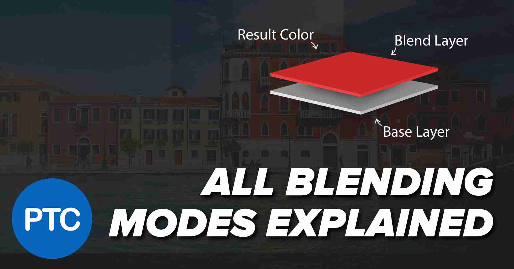
In-depth explanation of how Blending Moes work. No more scrolling through all of them to find the right one!
what blending modes do depends on what's in the layer, and what's in the layers underneath...
Hmm i c
Ty
Gave +1 Creative Carma to @vapid flume (current: #8 - 706)
Please how do I make a roblox thumbnail animation?
Every single time I've used blending modes I've honestly wished that I had some sort of explanation to build some kind of foundation of thought other than "this one looks better." I'm totally watching this, thanks for posting it!
Gave +1 Creative Carma to @vapid flume (current: #8 - 707)
i have some problems with lightroom while developing can someome help me please?
anyone got some good fonts? Something that suits with everything, similar the ones most big companes use, apple, google, instagram etc
Brothers I need to learn Photoshop skills any one can help me pls to learn it with YouTube channels or something I need your advises guys
Thank you ❤️
Just clicking random stuff and creating things by accident is the most fun you can have as a beginner! 🙂
Poppins, Helvetica Nueue are always solid choices.
Hey, is there anyone who knows of an application or page that can be used to separate (not remove) the watermark from this photo? so you can save just the watermark... it would be very helpful, thank you!

I like the watermark, for including it into a proyect
is that, i cant really replicate that
You can just draw a bunch of vector lines and group them. Turn down the Opacity on the Group.

You could convert the group of lines to a Smart Object. Then clip a gradient to the Smart Object.

Oh my god, thanks but, i dont know how to do that, can you send me a png pls 🙏

How about you drop whatever gradient over it that you like.
There is that one anyways... Its not the same as the example.

thank youuuuu
what are some good ways to remove eyelashes that are covering the eyes? ive tried spot healing brush, healing brush and patch tool but to no avail

When I use generative fill on the edges of the image, it creates a distorted texture like this. I will select that part and have to apply a blur or similar filter. Is this because the large size of the image conflicts with the generative fill?

Does anyone know a practical way for the first photo to have similar lighting to the second? (make it darker and yellow)


I'm sorry for bothering, but I've been trying for an hour to get the effect the same, and for the waves to look as similar as possible. If you could help me replicate it in a very similar way I WOULD APPRECIATE YOU VERY MUCH! What I need most is for it to go from yellow to purple in a very subtle way, and for it to be horizontal. PLS🙏
use brigtness/contrast or curves or levels (I usually use levels but for that purpose firstly i would check brightness) next step is color balance make it a bit yellow
maybe you will need to duplicate person because color balance cause yellow background
Can somebody make a edit on a card for me. I need a name change. I will pay
Check dm. Let me see what you want
i'm trying to paint with the brush and this happens. that's the 50% grey layer i have above everything. when i turn it off and on it goes away but it's annoying

it happens when i type too
Would you be looking for something like this?

Question, am I just looking in the wrong spot, or is the rotation anchor function for transforming like.. the most barebones feature in Photoshop?
The anchor doesn't snap to smart grids and you can't make a persistent anchor that stays in the same spot when you transform other layers..
thx!!
Okay.. I'm hoping the answer is as simple as the question.. but how to I perfectly mirror a vector shape to the other side of the canvas?
What does autotone does exactly? I can't seem to reproduce its effect with curves. I'm trying to get an adjustment layer to function as autotone in order to programmatically apply it to frames of a video. if i autotone each frame it will be a mess.
by 'autotune' you mean...?
transform mode works on vectors too. you can select your shape, ctrl+t and right click>flip
it snaps to corners and center points of the transformed layer. other than that, you can manually specify the position of the reference point in the options bar while transforming
so the grey should stay within the selection, right? and it gets fixed when you toggle the layer's visibility?
I keep having this kind of thing come up when I use the remove tool

first couple times I use it per project it's normal
then it starts doing this
anyone know what I'm doing wrong or how I can fix it?
Autotone and autocolor...
sorry misread that haha 😅 these commands are literally auto adjustments - they look at the selected photo and try to guess what it should look like. https://www.photoshopessentials.com/photo-editing/auto-tone-auto-contrast-and-auto-color-in-photoshop/

Learn how Photoshop's Auto Contrast, Auto Tone and Auto Color commands can instantly fix contrast and color cast problems in your images!
looks like latent noise? are you on the latest version of Ps? Does restarting Ps help? does it happen to all the photos or only this one?
This is why I mourn the days of proper books/printed help (Don't get me wrong they still exist, but they don't have the same appeal with newer users)
When you had PS in the old days it came with a full book (It was also much more expensive as a software than it is now, adapted for inflation)
it later became a PDF, which have now been replaced by the HelpX articles.
All this: the blending modes in-depth explanations, the tools, all the very minute functions were there for all to see.
There were even exercises. Now that everyone relies on YouTube tutorials (and some are really great!) we are just given the choice of what the tutorial creator decided to teach. Some subjects are obviously more popular than others. And I'm not even talking about those tutorial that teach absolute BS.
For those who still like to read, then the HelpX articles are still an invaluable source of information.
https://helpx.adobe.com/uk/photoshop/using/blending-modes.html
All photos
and yeah I think I'm on the latest PS
like it starts out fine then after a few uses it starts doing stuff like that
but they dont leave an adjustment layer behind, what if i want to apply the same adjustment to other images? auto'ing them seperately will result in contrast and color drifts, catastrophic for frames of a video.
any way to mimic autocolor with an adjustment laayer? couldnt find anything.
curves  have the auto button. and if you enter options you can pick one of 4 options
i tried that, auto curves or levels seems to produce entirely different results
is there some way to get the application to tell you what it did with autocolor/autotone?
then duplicate the layer, set it to difference blending mode and fiddle around with adjustments until you find this. auto options you are trying to use are destructive and very rarely used overall. I'm not sure why you need the exact copy of auto settings. or use auto in camera raw
The grey shouldn't even show up. It's a grain layer
But yes it gets fixed
i need some help
i have a picture of a hand and one picture of a watch. how do i blend them into one pic.
please help.
sounds like you can use layer masks to achieve this. have you tried it?
I am a begineer without much knowledge. ( Idk most of thing)
So, idk.
Need some guidance.
the watch pic has a different backrgound
Oh, Okay. Thanks a lot. 🫡
does anyone know how to remove eyelashes covering eyes while keeping details of eyes.
remove tool and clone stamp and spot healing brush arent working that great
Ok, I had a look at the image you posted earlier. Two thoughts: in the full image, could you copy from the other eye?
You could copy the existing iris, pop it into a layer above, rotate 180 degrees and blend it into the area that has the eyelashes 🙂
Seems strange that you'd want to... aren't they natural? Who doesn't have eyelashes? 🙂
everyone does it on youtube i seem to notice
i just want the eyelashes removed from the eye pupil and sclera itself like shown here

the eyelashes would still be there though?
The bottom part of the iris has no eyelashes over it. Copy, revolve 180, blend over the eyelashes at the top 🙂
ohhh i see what you mean, ok ill give it a try once im back on the computer. Thank You @lucid crane
Gave +1 Creative Carma to @lucid crane (current: #29 - 71)
Sort of: yoo-an
The E is mainly silent
ohh ok i see
can someone help me replicate the lines on this pic?

Do you want to remove them ? Dm me for more details
you literally were helped with this earlier
Um, I couldn't understand.
Can anyone help me 🙏🏻
i need some help
i have a picture of a hand and one picture of a watch. how do i blend them into one pic.
please help.
You need to learn about masks as Wertos pointed out
Without understanding layer masks you won’t be able to blend hand and watch together
I showed you how to do this yesterday.
uhh
hi all 🙂 what would be the most efficient way of removing the stand "lens cap" from this pic?

Just select it with lasso or other tool you prefer and mask it
can u help me with the hand thing
And replace it with what?
exactly, i can mask it, but when i just fill it in with black it doesnt blend to the background
i have a picture of the background without the figure, but it doesnt quite match either

Just use gen fill shoul fix it
gen fil isnt reliable to produce the same results every time, i have like 100 of these to do
Then replace the bottom and the entire background with a new gradient.
^
i was trying to avoid cutting out every figure, auto select subject never gets it right
Then you'll have to do the best you can and refine the masks.
I cant learn about layer masks for you , you should look into beginner tutorials suited with photoshop

thanks
I used the Object Selection Tool. Layer Mask. Then added a Gradient Layer below it. You could probably refine the mask a bit to make it cleaner.
How do I strech/resize the hand image in that?

Ctrl+t
Okay, Thanks a lot.
But by the looks of size it will look bad
drag around the edge after CTrl+t
Or catch dot in corner
It is getting enlarged then
It will show new cursor

try the belnding drop down in the layers panel
but i think youre gonna have to cut them out idk

yeah I know, but i really need the exact same thing
if some can help me i will be very thankful!
Easiet way would be to just mask that hand
Please stop posting the same thing multiple times.
How
im sorry, im just very hurried..
Also, if you want someone to make it for you, you'll need to post the request along with a description of what you want created to the #💬chat-general channel and wait to see if someone is interested in working on it.
oki thanks!
Gave +1 Creative Carma to @ripe quest (current: #3 - 2286)
i tried it and it doesnt work, the eyelashes are still covering the eyes, i cant make a mask of just the eyes with the eyelashes covering it


Discover what Layer Masks are and jump straight into real-world examples to learn the best ways to use them in Photoshop! Starting from basic concepts to fundamental techniques and best practices, this lesson covers every aspect of Layer Masking for beginners. I hope you enjoy this tutorial. Thank you so much for watching :)
► TIMESTAMPS:
00:00...
trying to get the image to have no eyelashes covering the eye itself.
You're likely going to have to use some combination of Clone Tool, Remove Tool, and digital painting to do this.
i tried clone stamp and remove tool but it leaves like a weird residue behind
unnatural look left behind
Welcome to the wonderful world of image editing. Part of being effective is learning different techniques and how to execute them to get the effect that you want.
yeee ik lol, i just wish i knew how people are able to do it. Its a very time consuming thing to learn these small little details.
Its wonderful when you figure it out and your plan comes together. heh
Or maybe its wonderful when they write you a check for the work. Maybe both. :)
would you happen to know any videos or anything at all that would help and i could give it a try
I think you're going to have to learn about digital painting and retouching. Probably start there.
i couldnt find any videos what so ever showing "how to remove eyelashes from pupils", retouching is the only thing ive been doing so far. Guess ill keep searching. Thanks anyways 😄
What is this thing going to look like without eyelashes?
i found 2 sites that sort of show it but the person had very short eyelashes so using remove tool was easy for them and natural looking
Just ask that person to shave their eyelashes and redo shot 😏
im just wanting to keep the eye details behind it while having the eyelashes be removed BUT only from pupils and sclera.
It seems like that would be entirely hideous and unrealistic, but ok.
simplified, remove eyelashes covering the sclera and pupils while keeping eye details
Does it have to be this photo of the eye? What about finding a different image?
these are pictures that have done it. It looks amazing to me


i mean its a retouching of someones face that i am doing so it kinda has to be their eye.
I guess I don't understand the goal because you cannot show a close-up shot of the eyes without seeing eyelashes.
goal is to remove eyelashes that are only covering the eyes itself
And this is an EXTREME close-up.
not the whole actual eyelashes itself
you are confusing me
im confused
im talking about eyelashes not eyebrows
In your image, the eye is 3-4 times larger than the later image/example you shared?
Ok, rough attempt by the method I mentioned

I want to ask a question, that so basically, there is a pic and I selected the subject and now I want the background to be masked. Can this happen.
these are just example pics of what i want them to look like
how were you able to do that? It also looks slightly unnatural but thats way better than i can do
Anyone help
Copy iris to new layer, turn 180 - mask in to suit
Seems like a strange challenge you've set yourself here.... - I think Gen fill is enough to help 'tidy them up', without it looking wierd.

Can anyone tell me how do I make this little realistic.

i tried gen fill like you did but it doesnt entirely remove it
Add some shadows under it.
ill try this again
how
You can mask whatever you want
yeah, a little shadow 🙂 - just add a layer between, paint in some black and lower the opacity down.
Paint Brush.
Ye, i did see this
ookie
uh okei
Uh. Cool.
It looks unrealistic because there is no light or shadow on the thing and no shadow under it against the skin.
Uh

pls guide 🙏🏻 😭
I would like to ask a little question. I have a question. I pressed clear 3-4 times, but it came up like in the picture. What caused it?

No problem.... bro 🙂
You could also consider making it a tiny bit darker on the side facing 'away' from the lightsource. - however I imagine a well balanced studio shot of a product, probably would have even lighting throughout.
Uhhh

What the heck happened. 💀
My laptop is heating up so much 😭
CMD is using 2GB rn 💀
More layers in ps it will take more resources
Going by the shadows on the hand those are too dark
How do I delete these from recents?

The shadow is better in brighness but its too far away from the bracelet especially if its hanging on the wrist of a vertical hand
What is SSE 4.2
Ooh
Move them to a new location or delete them from your PC. Then try to click on them. When they won't load up, Photoshop should remove them automatically.
Ohkay
Damn, that's annoying.. so there's no relative position flip; I have to create a margin beforehand
There is, just specify the anchor point before flipping
That does require manually moving it to the centre though, right?
Cause anchor points, for some reason, don't snap to smart grids..
why is panning the canvas (via scrolling or ctrl + scrolling) is so slow?
i have seletec the part i dont want, how do i mask it

Depends on your system scrolling speed settings. But I usually use the hand tool  (hold space bar and drag with your mouse)
oh thx
help !!
helpp
Hold alt and press the mask button  at the bottom of the layer panel
the fact that the discord emojis are actual tool buttons are the most genius help I ever seen
Anchor point will snap to the center, corners and centers of sides. It won't snap to smart guides but that's a good idea! I think you should describe it in #1093156942647660615
Thanks 🔥
Hm, okay, I will-
Also, is there a way to hide/unhide the anchor point? Cause mine seems to be invisible when I use it
While in transform mode, make sure it is checked in the options bar at the top, on the very left
Ah, thank you
Ooh, of the actual image itself, not the canvas
Yep
Hehe hand.jpg
lmao
how can i make the red blocks yellow to mimic the Marlboro Gold variant

can someone refer me to a slicing guide for images in photoshop everything i need to know
Do you have a specific color in mi-nd? I don't know what "Marlboro Gold" is.
RGB: 220, 177, 24
Do the red areas also have such extreme JPEG artefacts in the 100% view?
😵💫
In my opinion, it would certainly make more sense to recreate the surfaces as separate vector surfaces. You only need to draw straight surfaces. That should be quite easy and the result will be much better.
You could just do Color Range Selection. Add a Solid Color. It will get masked. Then refine the mask a bit. It might be close enough for you. I don't know.
OMG THANK YOU SO MUCH
Gave +1 Creative Carma to @ripe quest (current: #3 - 2288)
something like that

yap
That's not the color they stated above but it doesn't matter. With a Color Fill layer, it can be assigned to whatever color.
@opal locust
That would be more of a
190, 166, 105
And for a really good result, I would redraw the areas as vectors. Then there will be no artefacts at the edges and your image will look much sharper.

Thanks will try it right now
Gave +1 Creative Carma to @tame cape (current: #92 - 18)
Here is the area (in the centre) as a vector for comparison.
Depending on your level of knowledge, you may also be able to recreate the other surfaces for an even better result.

Hi Im combing 2 images together and they both have like foggy skys. Whats the best way of matching the colors of the skies? they are both grey but one is darker then the other. Thanks
Place them one next to another and use curves (Ctrl+m) to match the brightness
perfect thanks!
Gave +1 Creative Carma to @serene coral (current: #6 - 889)
What method are you exactly using to distort this?
is there a like more automatic way then just doing it by eye tho?
a more exact way to match the colors?
There's this "secret" adjustment called match color, have a look https://helpx.adobe.com/photoshop/using/matching-replacing-mixing-colors.html
looks interesting, ill check it out, Thanks again
Gave +1 Creative Carma to @serene coral (current: #6 - 890)
yes worked perfectly, just had to play around with the 3 settings under match color.
Glad it worked, have fun!
hi everyone, I’m a beginner to photoshop and am trying to replicate the text of the following image in my product. I cannot quite get the warping to mimic the sort of “squished” expression of the text. does anyone have any advice? Anything is appreciated

Yeah, there is a text warp feature. - have you found that?

thank u man u are saving my highschool
You beat me to it 🙂
but u did that out of the kindness of your heart
may whatever higher being you choose to follow bless you for your benevolence
Cool. - You can create the same 'arch' for the subheading in the same way
Do you know how to make the double strokes?

Almost, but the text really needs to stay 'upwards;
yes i just noticed that
hmm
so an arch warp is better here then
i used pen tool for that

my god i hope u wake up every day and feel happy
the world is so mean sometimes but people like you make it less
check it out

You could try it in Adobe Firefly. :)

You can create multiple 'strokes' around text if needed.
Just make them progressively larger...
Yes.
Neat!
Adobe Firefly (https://firefly.adobe.com) Then use the "Knights" image as a Composition Reference.

Convert to a smart object if you wish, but you don't need to.
Whoa thats cool too
Just another idea, if you're so inclined to play around with that.
So once I complete my design, I can import into firefly and get what is basically a render?
It renders a flattened image, yes. There are no layers.
Makes sense, the day AI can produce layered images I feel we will all be in trouble lol
That's where Photoshop comes in. You can still do all of the image compositing that people have always done with Photoshop.
Now you can just render custom image assets.
Anyways, its good to know both tools.
And I can tell you right now, no AI will ever explain like you two did
well, maybe i shouldnt say that
Hello, looking for some help. I have 2 images (cropped for example) which contain screens, one image they are turned off, one they are turned on. The angle/height the photos were taken at are ever so slightly different, I need to take the content from the turned on screen and edit it onto the turned off screen image. The turned on screen has the deeper black to it which I obviously want to keep in the edit. is there an easy tool for this/any of the ai features?


Maybe polygonal selection tool? then once you have the image perspective warp onto the original
You should be able to distort that into the correct perspective.
Ty, wasn't a tool I was aware of so will have a read 🙂
So correct me if im wrong, but a smart object is kind of like a photoshop document in a photoshop document?
Like a composite shot?
Its just the Transform Operation.
So should I cut out the screen I want, bring it in as a layer then transform it?
This sort of setup as it pertains to the Layers...

I suppose you could cut that out of the original image. I found a version of that logo and brought it in.
Well... my version was done in like 5 mins to show you how I might set up the layers.
yeah understandable
It might work...

Damn that's good, what was the exact order of doing things for that?
Give me a min.
I have a screen on the other side i need to do but my face is blocking the bottom right corner like the head on this image so cropped it for obvious reasons 
It might be something like this...
Wtf I did not expect that level of help, you are awesome dude!
Rock-n-roll. :)
How come I dont get the generative fill option when right clicking a selection?
Does Generative Fill work at all?
I don't even have the ability to use it
Window > Contextual Task Bar....
You need to be signed in to an Adobe Account to use cloud-based services.
You sure about about that? Open the Creative Cloud app and make sure you're signed in to an active Adobe Account.
I am signed in yes
Still no generative fill option
What sort of subscription do you have?
Pretty sure it's all apps
Its 2024 adobe
photoshop
dont know why it wouldn't be there
I would first try, opening the Creative Cloud app. Signing out. Reboot the computer. Open the CC app. Sign in and try it again.
Still nothing
Then you'll have to contact Adobe Customer Care and ask them what's up with your account.
i want to resize this but only the length and when i try to it does it with both length and width what can i do

just want to make it fit with the box on the top
nvm just clicked on the little lock on the top left
how could i imitate the vhs-like quality of this photo?

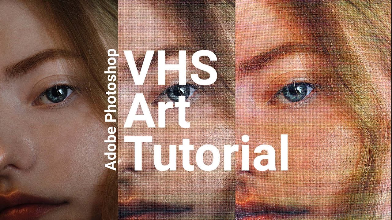
A quick tutorial on how I make my VHS style video effects in Adobe Photoshop.
Resources:
IMAGES
https://www.pexels.com/photo/person-face-in-close-up-photo-4079215/
https://unsplash.com/photos/wmyE5IBiOmo
https://unsplash.com/photos/0W4XLGITrHg
https://i0.wp.com/texturefabrik.com/wp-content/uploads/2020/09/texturefabrik_dust-08.jpg
INITIAL TU...
Thanks!
There are a number of actions available usually best aren’t free
***why my first image
Is not blending well with the background unlike 2nd and third image I m need need for help ***


***I m trying two different border just to ask her which one suits better ***
***How is second n third image background so well blurred ***
someone pls help em
This one?

You've just forgotten to lower the opacity.

what happens if you lower it to 0?
@sly hawk also buddy how is second so better so so much better than mine
It's looks good
Transperent just background
How is background in other two so blur
2nd image? - You mean the one on the right?
Ya second one and third one both looks better and thier background is totally or 70 blur I tried every blur didn't work tho
can you please screenshot your layers panel? we have no idea what's inside...
Ol
Ok
The reason yours looks dodgy is probably because of you having too many background gradient colours. - These 'info panels' or whatever they are, are already PACKED with so much colour, information etc. -
Hello,
How could I reproduce an aura around my belt like in my other image?
But instead of the aura being golden, I'd like it to be pink.


EFFECTS > Outerglow
Means background image or just rectangle s
Rectangles
U suggest color then
Gradient or no gradient
@sly hawk @serene coral Look guys my layers in video plus it has every deatails
Hi, I don't really know if this channel is the right one for my request but here I am.
I'm trying to extend some of my favorite album covers as a wallpaper size with the ai. And I am wondering if there is an easy way to improve the flow of the transition between the original cover and the extended part.


you can try using the remove tool or spot healing brush on those
so the problem is the gradient inside the rounded rectangles being too bright?
I'll try, thank you
Gave +1 Creative Carma to @serene coral (current: #6 - 891)
Look these two images
Their rectangles blend soo well with background
It looks gorgeous while mine is 💀☠️


They're probably just 40-50% dark grey, or black...

Okie just tell me ur color code hex and tell me opacity
Also urs look good
How did u get acheron ine thou
And you know what would be the easiest way to make my belt gradually disappear like this?
in Photoshop?
yes
Gradually dissapear? as in an animation?
yes as I showed you
I would say layer mask but if you're using the video timeline you can't animate the mask like you could in Premiere Pro or After Effects. So if you need to use Photoshop, I would try frame animation and just create multiple frames with different layer masks
How to make a brush so that it is like in 1 photo, in 2 I have it blurred


Use a PENCIL.

👆 this or make sure your brush hardness it at 100% same with its opacity and flow
@sly hawk wow wht a guide
Ty for help
***How is this background so blur to be real
Last help
Help me with this ***

Gave +1 Creative Carma to @sly hawk (current: #5 - 976)
Sorry I dont understand the question:
How is this background so blur to be real
Are you saying that you want to make your current background image MORE blurry, or LESS blurry?
More blurry
The image above has the background on two different layers.
They have a blurry background, and then the character version seperately.
Ok, one moment.
@sly hawk also one last thing how to give color gradient like the image I tried color pucker didn't work
Does this help?
Ya I get it
It helped me
Ty buddy @sly hawk
Gave +1 Creative Carma to @sly hawk (current: #5 - 977)
One last thing how do I make these gradient color @sly hawk

They're just white, with perhaps 20% opacity.
Oh I c
the 'gradients' you're seeing is just the blurry background coming through
e,g, clouds etc
@sly hawk also the other color is black right
?
With how much opacity
dunno - just play around and see what works for you. - Guessing maybe 35%
Okie
@sly hawk last help can u tell me font name pls
@sly hawk also how to make this
Mine still looks off and weird

I don't know the font. - But perhaps try these:

Guys quick question
i have this water drop icon and i wanted to create "falling" effect so i've put 3 same drops with lowered oppacity but idk it doesnt look right ...
how can i achieve this effect so it looks good?
motion blur perhaps?
I see.
Isn't the fact that it's a droplet, by it's very nature, enough to show it's 'in freefall'?
Otherwise it wouldn't be droplet. It would be a puddle.
i also tried putting them into one, each one a little bit smaller but then it look like a blue fire...
well.. yeah but i wanted to put some depth to it so it doesnt look so "classic"
Have you looked online for much inspiration already?

yeah

see i was thinking something like this
but when i put more it looked like a blue flame and when i put it above it it doesnt look good
Can someone help me figure this out please! So I cut this design out of a white background and the blue background is how it looks on photoshop, clean edges. When I save it, it has a white border around it and it looks messy. I export > save for web > png-8


Use PNG-24; it has per pixel variable transparency. With PNG8, the transparency is either on or off like GIF.
It worked! Thank you so much
Gave +1 Creative Carma to @ripe quest (current: #3 - 2290)
How could I reproduce the little stars that are on the outfits please?


Create one star. Duplicate and scale it a few times. Use that to define a pattern. Then you can fill areas with the new pattern.
It's that I don't really know how to create the same star shape, I'm not very good at drawing
One moment
You could do something like this...

just the 4 main sides are enough for me
Well, you can draw it with the Pen Tool.
I was able to duplicate this a few times, scale it, move it around and define a Photoshop Pattern (.pat) file. At that point, all you have to do is drag and drop it into an open document. It creates a new Pattern Layer...
You could use a Clipping Mask or a Layer Mask on a Pattern Layer so that it only appears over certain shapes or areas.
I realize that is probably not the design you want but here is the pattern if you want to play with it. Drag and drop it into the Patterns Panel.

guys how can i improve my experience in photoshop i wanna get better as a pro
And how did you remove the background in black?
I don't know your current skill level but do as many projects as you can. They should be varied and employ all of the different techniques.
There is no black background. Its transparent.
my skill is beginner i make my pic colours look better thats it
I would do all of the tutorials that Adobe provides with the app.
Yeah, once the pattern is made, you can apply it wherever you need 🙂
Because I just found star shapes but it seems complicated to me to remove the background in black without it impacting the stars

dude the thing is i did but at what to apply u know
i want something to apply on
Then try to focus on building a portfolio with the types of work that you want to do. Do the tutorials and try to apply the techniques to the projects.
When i paint with the brush tool there comes a big delay does anybody know why?
Lower the value for Smoothing...

Thank you bro
Gave +1 Creative Carma to @ripe quest (current: #3 - 2291)
Use CTRL ALT 2, then
A) make a new layer and fill with white using ALT DELETE
B) use CTRL J to make a copy of the stars.
I believe that for this image A will be the best option.
Hi, need help with replacing an image if anyone could assist.
I have the image of a work book which currently is at an angle which means the logo on the book is subsequently at this angle, but we have changed the logo and I need to replace the old one with the new png file.
Please don't ping people. You can ask questions here and if someone knows the answer (and is available to answer), they might reply. Also, it helps if you provide images; ideally, screenshots of the Photoshop GUI with the Layers Panel open so that people can see what's going on.
Sorry for ping

It is a sort of confidential image so can't really show it but let me show a mock.

Logo is an image in the centre of that book.
It seems like you could just drag/drop the image in and distort the image into place.
Is it easier for you to explain or should I watch a tutorial on image distortion?
I mean, what's your experience level with Photoshop? It seems pretty straight-forward....
Newbie, just using it on a roommates pc for a one time task.
Thank you.
Hopefully, whatever image you're bringing in is the same proportion/aspect ratio as the book image.
Otherwise, its going to look squashed/stretched.
Worked, thank you.
Gave +1 Creative Carma to @ripe quest (current: #3 - 2292)
Glad you got it sorted out!
Hoping someone can help me. For context, I am currently working on a commission when I suddenly could no longer accurately color pick colors I have place down. The bright blue is what I was triyng to color pick and the duller color is what I got. My mode is RGB color and I see that gamut warning but I can't figure out how to fix this and why it happened suddenly

View > Proof Colors... or View > Gamut Warning... are those turned on?
@ripe quest Nope, they aren't. Gamut Warning is also even greyed out

Is there a specific Color Profile assigned to the document?
Also, are you sure that document is RGB and not CMYK?
Yes, I am sure. And by color profile, do you mean this page?


Also, thank you for helping me out! 🙂
OK. Good. Next, are you using the Brush Tool and you painted there and you're seeing a different color? If so, did you check the Brush Blend Mode, Opacity, Flow, etc?

Or perhaps the Blend Mode for the Layer itself (if these are separate layers).
Both the opacity and flow were 100% and the mode was normal, same for the layer itself
Are you using a tablet and pressure sensitivity turned on for the brush? I'm running out of ideas.
Or something in the Brush settings.
Can you please share a bit more of your screen? Including control bar, title bar, layers panel etc.
I am using a tablet but I do not have sensitivity turned on for the brush
Not sure if this helps at all
It all happened suddenly too, I'm wondering if maybe I did a weird command accidentally?
Do you have an adjusment layer above the one you're 'painting on'?
If you get desperate, feel free to PM me the PSD file
Just a normal clipping mask layer, full opacity, etc.
I'm gonna try to do some more research to see why this happening here but if I still can't get it working, thank you for offering and I'll send it 🙂
Gave +1 Creative Carma to @sly hawk (current: #5 - 978)
I thought your colour profile was going to be wrong, but it's the same as mine:

Hey....
Have you checked here?

I noticed your 'TEXTURE' brush setting was ticked
Was ticked the entire time I've been working with this file. Un-ticking it changed nothing
Also this is standard photoshop settings I'm pretty sure as well

What happens if you draw on a new top layer with a pen instead of a brush?
can someone here teach me how to photoshop words onto a piece of paper like hand written words, but make it look super realistic!! Im trying to learn ty
Can any one offer any opinions on this any critiques anything off or anything they like about this picture

can anyone identify what technique/method was used here to turn a, say, 3d render object into these small white/black dots?


sorry to askin this latte time
but please tell me how to replace color for white.. without the dots on the web ..

this is original
this happends

Just go from green screen to white? Perhaps just dump all of the color and adjust the Levels...
thank you man 😄 u saved my day and how do i change the picture? to white color pleasee
Gave +1 Creative Carma to @ripe quest (current: #3 - 2293)

What are you talking about? Watch the video.
You could also change the background color by adding a Color Fill layer and using Advanced Blending on the web layer...
i was trying to remove some text on this red/pink image but this happened when i used spot healing brush.... why? and how to fix this ?

i hope people like u deserve more thank you i got what i want .. plus is there a way to remove white collor from backround because i need that png i forgot
Gave +1 Creative Carma to @ripe quest (current: #3 - 2294)

Hello does anyone know why my project looks different when zooming in, flattening layers, or exporting? its something to do with my adjustment layers i think. Thank you
not sure what happened , but just make the selection around the text and mask it . If you wanna remove the text from that image
Hello,
And what is possible to generate a brush shape by artificial intelligence?
I answered in the forum post you created
this is because of how Ps handles antialiasing. For a sure preview, view your project at 100% zoom or flatten your layers (ctrl+alt+shift+E)
yes, just follow regular brush creating workflow https://helpx.adobe.com/photoshop/using/creating-modifying-brushes.html
hello I have a problem with replace color in adjustments I cant use it and idk why?
is your layer rasterized?
yes
anything else unusual about your project? bit depth, specific image mode? can you screenshot the whole screen?
why does my brush strokes look like this when it was different before


how can i fix this
low brush opacity? layer opacity?
Your text is on "Layer 4". Hide your motif layer "Layer 3". Then you can simply delete the text in layer 4.
You would hand write them first, then scan/photograph it, then layer one over the top and then, if you're lucky, just whack a multiply blend mode over the top one and play with the skewing and opacity a bit
Your brush opacity shows only 71% (in the Control Bar)
how would I change the transparency of the grey gradient across the boxes only? I want to maintain the opacity for the stroke

It depends how did you create those boxes... Can you show the layers panel?
its a single image, the stroke and the gradient have both been rasterised

Where are the strokes, directly on the boxes layer? You could have separated the two by using layer styles. Otherwise if you want to have a different opacity on the same image you can either
- cut out the stroke and place it on another layer, or
- mask the stroke, invert the mask, and lower the opacity of the mask in the properties panel
It would make more sense to create a box (or series of), apply a stroke in the layer styles, as well as a gradient there as well, and control the opacity of each in the layer style panel
okay great thanks!

Can anyone remove the paw and get me the backround please
hey sorry to bother you do youknow how toremove something from an image to get backroun
for requests, please ask in #💬chat-general ... Thanks!
Gave +1 Creative Carma to @cold trout (current: #925 - 1)
what exactly do you want to remove? can you show your image and layers panel?
no worries!
i just want the backround like the yellow and white and black
but i dont think its possible with the big paw in the way
There would be two methods:
1 super simple, too simple it hurts in fact 🙂
Select the whole bit on the leftwhere there is no paw

then go to the move tool and hit CTRL+T, it will show you this
holding shift you can extend the background to the whole image
what like tool you use to get a perfect retangle sorry my english not good
Don't be impatient 🙂
Watch the little video!
Otherwise what you can do is loosely select the paw and go to edit>fill> and choose content aware fill in the drop down list of the fill menu
The easy method is best though 🙂
Which one did you do?
im still watcing the video on hwo you draged it across
the reason iwant the backround is because meovv is a new girl kpop group so i want to make images for a fan page
ok i made the rectangle with the rentagle select tool
when you do CTRL+T, you enter the transform mode. while you drag on the right anchor like I did, it will likely enlarge proportionnally the whole thing. By holding SHIFT, it will only drag in the direction you decided
yeah i entered transform mode
- with the rectangle selection tool, slect the whole bit without the paw
- with the move tool, hit CTRL+T and while holding SHIFT drag the handle on the right
- hit enter to commit to the transformation
I'm not a sir 🙂
No big deal, don't worry
Lunch time!
ohh what you having for lunch
A tomato and goat cheese sandwich, with homemade yogurt with Pekmez, and lots of coffee afterwards!
you too!
how to remove a background easy without doing all the circling

You could use "blend if" and remove the balck bits
https://www.photoshopessentials.com/photo-effects/blend-if/
Or use the colour slection menu select>color range, and choose shadows in the dropdown menu.
It may need some manual twek so I suggest turning the selection into a mask, and paint back the missed areas on the mask instead of deleting the selection on the original.


In this Photoshop tutorial, learn how to use the Blend If sliders to make text appear to have been written on a brick wall.
Bear in mind that your purple is quite dark (not enough contrast) so you may need some manual tweaking
Thank you for the help @vapid flume
Gave +1 Creative Carma to @vapid flume (current: #8 - 708)
you can also try the magic wand with the lowest settings (see screenhot) , so it only picks pure black

What would be the way to extract shadows (for photoshop mockup) from an image with a texture on it such as this?

since it's a 3d render I believe you could use the shadow pass? it would give you the most precise result
how do i remove the top right seven and pick the number 5 and replace it?

please do not ask for help in forgery
the frick is this?

what does it say?
im using genuine adobe
i translated it and it says something about how photoshop will be disabled etc
but i am using genuine adobe from creative cloud
that's not your native/your current location language?
it is
it's just i don't speak it very well
ok, just wanted to make sure haha
try restarting Ps and see if it apprears again?
ok
opening app
so far it looks normal

?
ok, try to use it for a bit and see if this error comes back, that's really weird

do you have Creative Cloud installed? are you logged in? try logging out and in

can anyone identify what technique/method was used here to turn a, say, 3d render object into these small white/black dots?


could be pixel art
@serene coral thoughts?
these are dots, not squares
could just be a specific type of camera
well, could this be your problem? a program magically disappearing from your pc? haha
these are definitely halftones but the technique here is top notch. where did you find this? are you sure this was made with Ps and not with the real halftone print?
Could be just grain (either "film grain" or just "grain" in the filter gallery or just standard noise, but colored instead of mono and desaturated slightly)

Looking really closely, it looks even more like " halftone dot pattern" . But we would need larger images to check that
Something like that
https://www.youtube.com/watch?v=HSbHEWOLgSc

Download Photoshop
https://bit.ly/3DFo3Mp
Colour halftone is a method for printing which separates an image into the infamous Cyan Magenta Yellow and Black combination and recombines them in a dotted pattern which is easy for printers to reproduce.
This ever popular technique is demonstrated in this video with an eye to making the most of the ...
in your first example

it's definitely PS and not mixed media
you can clearly see the halftone pattern here. I'd love to meet the guy
IMHO it can be a "real halftone" done with the bitmap mode than a filter
More like if you did a sepapartion in Photoshop and re-stacked it afterward. I may have an example of mine, need to dig it out
I know Spenceless does something similar but his technique is still a mystery to me https://www.instagram.com/spenceless_designz/

48K Followers, 1,469 Following, 1,183 Posts - See Instagram photos and videos from Spencer Nelson - Graphic Design (@spenceless_designz)
you can see this colored halftone in the part above but the white/black part to me it seems like it doesn't contain the halftone from above

although it's white and black so I guess you couldn't see the halftone?
can kind of see it here I think

Color halftone overlay. A high resolution original texture by Texturelabs. Free for commercial use.
That's not the same thing/result, because there are lots of bright colours there, but this is a file made from 3 separations for use in screenprinting. What you see is the "result" when all the files are stacked as channels in Photoshop. In real life you would hand over 4 different files to the printer. Still 100% photoshop made

I think sandrine might be right saying it might be grain/noise

chatgpt actually suggested that too but to get it to look like in my ref is the main challenge
in that case, if you can turn this halftone into black/white it might be one way to get it to look close to the reference

well, the whole point is in it not being b&w. halftone printing actually uses cmyk to get all the possible colors
I zoomed in further and you can see that some of the dots are colored
can you share the source?
That would be that
when you change mode from greyscale to bitmap. The bitmap conversion needs a "method", that method being a halftone pattern.

I did try some of the halftone plugins I have but I'll have to find more and try them too
It's the equivalent of a halftone screen used before the advent of computers in the printing industry.
they were physical screens put on top of the image and the result photographed or xeroxed over.

anyone here has and uses after effect?
Yes, but for help you should go to the Adobe video discord or the main community: https://community.adobe.com/t5/after-effects/ct-p/ct-after-effects?page=1&sort=latest_replies&lang=all&tabid=all
