#✂challenges-feedback
1 messages · Page 128 of 1
I do like that "model." I've made several versions of him. Technically, my final design for Wade's Frosted Glass challenge was the "x-ray device." I started the iris scan idea during the same time but never finished it. I'm not a "one and done" type of artist. Thus, I like to tweak and improve on my ideas when I can. Val's previous challenge offered me an opportunity to revisit that design. Cheers!


I admire your tendency to do that. I often tell myself I will go back and tweak a design, but rarely follow up on my thought. I need to be better at that. Its a great habit to have.
It's a journey. Not a destination. :)
seascape

I learned that a number of years ago. A little late in life to save me from so many harsh self judgements, but in time to make the rest of my life a lot more relaxed and enjoyable.
@lucid plover So great to see you back with us. And posting up great designs right in the afterglow of the stream. What a beautiful application of the Distort technique VDV demo'ed. The moon coloration fits a moon rise perfectly. The little boat gives such great perspective to the design. Super work by you.
Thank you very much @eternal mica !
Gave +1 Creative Carma to @eternal mica
I've been very crazy since taking a rest from design for so long
Self care is the most important thing of all. If I cant take care of myself and my health (physical & mental) then I cant take care of anything or anyone else.
100%! @eternal mica but when I say crazy, it is about my ideas, my ideas are getting crazier and crazier
but cool at the same time, at least for me
If you care to, share them with me in DM.
I will show you what I'm working on
you can see it right now in your DM @eternal mica
Challenge #3 - Dynamic Hovering Tile Effects - Here's what I created with this challenge.

I remember this one as it's a great effect @sterile berry Great job Daniel!
Thanks, Anki! :D
Gave +1 Creative Carma to @halcyon current
I'm sure I can improve this but one is too tired today, quick turnover Reflection task with VoodooVal.

Quick Question, are those challenges daily based or can i reach them in like a day after with ofc marking them as Challenge X?
Busy week so I did a quick one... No stock used: Only shapes and gradients + displacement map made with Render/clouds filter...

Im still stuck on how to toggle between color and black and white i change custom setting in view,can get black and white but control y does nothing.I have to go back to view and hit proof to see color again. does that make sense?
Ps DCC 2022-6 Challenge#3 Dynamic Hovering Tile Effects 5-25-2022

This is awesome, @wary swan! I love the color combos, and the tether really fits-in nicely with the rest of the image. I think your employee badge looks like a legit, real badge!
They are always saved after the challenge airs. You can go way back, too. Just scroll down past the current challenges and you'll see them
CTRL/CMD-Y should toggle between color & b&w. can you list the steps you used to create the check layer?
Is your Mode RGB or CMYK (in Image/Mode)?
What is your "Proof Setup" ?
Love this! Subject adds a great sense of scale. Great Dreamcape!🤩
Thanks for the feedback Hugh
Gave +1 Creative Carma to @compact pecan
Well done Daniel!
@hollow yarrow I was successful at setting custom to black and white 20% gray .I just can not toggle back and forth with contol or command y i have to go up to view in tool bar to change
@hollow yarrow my mode is rgb 8 bit
Hmmm. Have you tried restarting photoshop after you made the change?
I seem to remember that happening to me once
@jolly quest I havent tried turning off. Is it possible I may have changed short cut command? When I followed Colin Smith lesson on color
I would go through and look at your short cuts yeah! Search through and see if you have already set Ctrl Y as something
In my Keyboard shortcuts, when I look in the VIEW tab "Proof Colors" is set to Ctrl Y. See if its the same for you and if not, try setting it that way and see if it fixes it
@jolly quest Forgot where to go change short cuts
Under Edit, scroll all the way down to "Keyboard Shortcuts"
Gave +1 Creative Carma to @jolly quest
@jolly quest using command y for convert to smart object
ahhh I see. Well, you can always set "Proof Colors" to something else!
@jolly quest sweet i added in option command y it worked😃
YAYY
Thank you so much!
Gave +1 Creative Carma to @eternal mica
Ps DCC 2022-6 Challenge#4 Create A Reflected Landscape 5-26-2022, image 2 result with a flood2 filter


Day 4. Went for a simple one here, i wanted some texture in the background so I added noise for the top part, on the bottom part where the reflection is I just used the Dissolve Blend mode on the brush to add some lightness to it

Challenge 5: Reflected landscape with fishermen. Fishermen are downloaded from Adobe stock free. Of course there should be stars.

Pd DCC 22-06 04 Reflected Landscape


@onyx current 💯
Challenge #4. I really had hard time with the wave and displacement. But still on my moodboard!

Challenge #4

Did you submit it? Then it counts!!!
Modified as you suggested @eternal mica I think it is much better. Thanks!!

Gave +1 Creative Carma to @eternal mica
@elfin remnant The challenges can be completed at your own speed on your own time schedule. The only general rule is that in order to post in this tab and have your works critiqued, you submit the challenge during the 4 week time window the challenge is initially posted. The current series began on Monday. It will be "current" through June 24. Feel free to post works as you complete them. If you post works, please identify which challenge the submission relates to. Any questions, just give a shout.
I love it. How did you manage this?? I had such a hard time with displacement 😄
😀

Challenge #4 - Reflected Landscape 🪟 😅

So pretty!!
That's so good! How did you do that so well it looks amazing
@turbid fern @bright yew Thank you, and it's also because of your incredible artwork, guys.. and our mentor Voodoo Val, who inspired me. And there are also many references to animated films, such as the cat on the moon, which was inspired by the DreamWorks logo, and the door, which was inspired by the film Monsters, Inc. (sometimes I imagine what would happen if the monsters appeared in the middle of the sea hhe)
Gave +1 Creative Carma to @turbid fern
Day 4 Revised. So I changed it up a bit, I made the top part straight black, and where the bottom part starts it's not super obvious so they're not blended together almost. Just minor touches and it looks better in my opinon

Hello friends, alas work had to happen so, I'm behind. 😂 Here is my attempt at Day 3. Thank you.

Hovering Tiles. Challenge 3 with VooDoo Val. My idea here is to show our children in Light, no darkness. I eventually would like to make this into a gif where the words in the hearts change and the big heart changes colors. Thank you to Val for the inspiration and Kyle T. Webster for his unswerving compassion for mankind. Hats off to you!! Thanks to all who continue to support, critique and challenge me! You Rock!!

Please feel free to assist me with the eloquence of the words. I went through several phrases but kept coming back to my original.
Love the message! It looks great!

Thanks @jolly quest figured out the value ,wasnt sure best way to save for Discord.

Gave +1 Creative Carma to @jolly quest
added a tree to this version and a bit more to relection.


Submit where?
Thank you very much Franck!
Gave +1 Creative Carma to @hollow yarrow
Right here. By posting your design you "submit" it.
Oh
Great one! Your color palette is really nice. Reflection of your aurora borealis looks so realistic! Did you use a real water surface as displacement map? Love the bright window added, it gives a strong focal point and the cat laying on the moon adds a fun touch. Impressive work!👍
😀

I use a Normal Map like this for the displacement map. I've also created a video on my YouTube channel, However, I apologize if the language used is not understood because I speak Indonesian 🙏

That's ok I watched your video about displacement maps (with subtitles on😉 )... Your video tutorials are great👍
Happy you joined the DCC community! Thanks for sharing!
Gave +1 Creative Carma to @tidal fjord
Thank you very much 😇
PS DCC 05.26.22: Create A Reflected Landscape - "Moonshine v1.0" - I didn't intended for this to have as much graphic stylization at the outset but here we are. :)

...or approached another way, maybe its a sunrise. Who knows... :)

Day 4 Displacement map

thanks !
Gave +1 Creative Carma to @hollow yarrow
Thanks !
@trail cradle Welcome to the Ps DCC and the Discord chat. We're happy you found us. Youre in for a fun educational exciting ride. If you have any questions, give a shout. We're here to help. Nice work with your mood board, even if you didnt know what one was !!! The colors are cohesive and the design has good balance. The swatches have a nice range of colors for you to build off of as you move forward, if you choose to use them. The main text is an interesting font, and goes well with the subsidiary fonts. The transparency lock effect in the hexagons looks great. The elements you added all work nicely together.
@halcyon current Very cool hovering tile design. The concept works great for this effect. The pop out looks awesome with the frame. Extra credit for you to mock up the announcement onto the phone screen!!
Beware the goddess who is displaced!

@hollow yarrow You worked the distort perfectly. (After a couple of tries, I wasnt able to distort mine as well to get the base distortion I wanted.) Awesome color palette. Nice work adding the clouds as texture to the ellipse. Adding "waves" to the "water" is a great touch.
I love both versions! Did you try giving the 'reflection' just a hint of blur? Could be fun!
Thanks! A hint of blur? There are two [2] blurs, Motion Blur and Gaussian Blur. haha The shapes are too sharp and graphic to blow them out and destroy them with a heavy blur. :)
Gave +1 Creative Carma to @arctic rover
@wary swan Nice work Robert on the Hovering Tile. I like the color palette and gradient map you created. The title rectangle has nice brush strokes. the line you drew has almost a smiley face vibe to it. As I suggested to Anki, how about extra credit and mock up the tile onto the small name tag??
Agree! The sharpness is what makes it pop.
Actually, now that I see this, I would re-do it all in Adobe Illustrator as completely sharp vector shapes and no blur, grain or glow. It would be much better.
@wary swan Your second reflected landscape is terrific. The motion of the waves you created with the distort is super. The BG adds to the vibe. Very well done.
So many toys in the tool box! Can make you crazy, eh?
I love it! :D (The good sort of crazy.)
@bright yew Interesting effort on the Reflected Landscape. I might give more color separation between the BG and the "water" layer to better sell the idea of a reflection.
@copper moss Beautiful monochromatic landscape reflection design. I might have lowered the distortion a bit, and I would add a reflection of your moon. But thats just personal taste
@onyx current Welcome to the Ps DCC Discord chat. Thanks for joining us. If you have any questions, give a shout. Really well done landscape reflection design. Adding the icon in the door is a cool touch. Your sky BG looks great. The distortion you created looks spot on. Even though its a fantasy design, one might wonder where the reflected colors on the water come from. Maybe add some colored planets in the sky to be the source of the reflection?
Gave +1 Creative Carma to @onyx current
@lost helm Im still sticking with my mood board also. The distort effect is tricky. I dont know how the distort I create at the beginning will look at the end until I complete all the steps. (setting at 10 or 100 or something in between???) So it does require a bit of trial and error to get the effect exactly as I want. I guess youre experiencing the same thing. You have the concept down. Its just a matter of playing with the distort filter until you get the "motion" vibe youre satisfied with.
@turbid fern Lovely landscape reflection design. The red stands out so strongly against the rest of the color palette. Your distort effect looks good. I might also push the idea a bit and add a reflection from the moon onto the water.
Super tweaks!!!
@digital pike This was a perfect challenge to use your little guy, and you left him out???? I was sure youd add him to your ID badge!!! 🤣 Really well done hovering tile design. The badge you created looks great and really pops out of the design. The shading of the BG makes the focal point strong and emphatic. The top rectangle and the shading look solid. I suggested extra credit to a few other folks to mock up the badge onto the smaller badge. Give it a try??
Oh, that's a really good idea! It will definitely makes more sense. Ty!
@tidal fjord This landscape reflection is stunning. The color palette is lovely. The elements you added in the sky are awesome. The bright little shot of color added by the door is great. Your distortion of the water is incredibly realistic. Beautiful work all around. 💯
Last year Paul T led a session where I created a design very similar to your beautiful design here. I thought you might like to check out his session. https://www.behance.net/live/videos/10781/Photoshop-Daily-Creative-Challenge-Shapes-Text

Join us right now to get inspired by leading creatives. Get your questions answered and share your work with the community.
Wow that's cool. Thank you for providing a link to learn 😁
Gave +1 Creative Carma to @eternal mica
@simple idol Beautiful creation for your hovering tile design. The artwork is lovely, the colors are cohesive, and the depth you created is terrific. I think you can push a stronger drop shadow behind your tile to create more of the "hovering" vibe.
Ah! Great idea @eternal mica . I’ll do that! Thank you so much.
Gave +1 Creative Carma to @eternal mica
@tropic knoll Awesome creation for the hovering tile. Your heart text is terrific. I might push the drop shadow on the 5 hearts a bit more to enhance the "hovering" vibe. I know when you say you'd like to try something, somewhere down the road, we're going to see an incredible post from you!!! I cant wait to see your GIF.
@tropic knoll as to the text, I think the word "solidity" is awkward. Im going to work on some phraseology later today and DM you my thoughts.
@digital quest Beautiful landscape reflection design. The color palette is awesome. The mountain shapes and lines are so powerful. The door and the textures look great. My one tweak would be to play with the blue shapes you have breaking up the reflection. They look a bit too pasted on and uniform, a bit too distracting. Id suggest varying them a lot more so theyre not as dominant in the reflection.
@potent mesa The best way to save your designs for posting here in Discord is as a jpg. Your second landscape reflection is awesome. It looks much brighter than V1. The tree and leaves are cool additions. Since the light source is coming from behind the tree, perhaps add its reflection on the water as well? Your distortion is very well done. The perspective you gave the reflection is especially well done. Good work by you.
The movie poster idea development for the reflection task was too much fun.

Thanks! I will improve it by adding stars and making reflection of the moon. 🐟
Gave +1 Creative Carma to @eternal mica
Day 5 - Simple patterns

Lips and Scissors

I think, this is beautiful.
he is the most valuable player, challenge 2 with gradients ^^

Challenge 6: Flower pattern in the Sky. Flowers I have done in Ai. Actually there should be only one big flower in the second version. I did also VooDoo´s version of pattern. In fact the task was not simple pattern making. Thanks, I have learned a lot this week.

It is only image 1 how is displacement map, image 2 is a filter plugin Flood2
Day 5 - Patterns. I'm sticking with my skull and flowers theme

Challenge 5: Custom pattern with two of my favorite things (penguins and music)

Here is my Challenge 4 ~ Displacement Filters... I actually have 3 subtle filters in this one... I got a little carried away with my full moon landscape.... No death star!!!!

@gentle pasture The reflected landscape is great on both versions. The scene you created has beautiful depth and visuals. The man on the door is a great touch. Your distort looks awesome. (I could not get mine to look that consistent.) Your distorted water and brush strokes are so impactful. I would make one tiny tiny nit pick. Why not add the shadow of the man to the distorted water area? It all comes together beautifully as a movie poster. Its great that you had so much fun with this design.
PS DCC 05.27.22: Custom Patterns - "Wavelets v1.0" (PS... the Discord compression algo really munched the colors on my thumbnail. Yikes!)

@digital pike Your marbleized water in the reflected landscape looks great. It has a real vibe of a turbulent sea. The fading of the intensity of the sun as the eye moves away from the horizon looks great. The ships you added give real perspective to the vastness of your design. The sky looks incredibly realistic. Real solid effort by you.
@sterile berry Daniel, Im amazed at how precise your manipulation of the distort is in your reflected landscape. That is not an easy look to get. The entire design is a beautiful interpretation of the challenge. I like the color palette on the blue interpretation more. But I admit, if you had only posted the reddish version, I would like that one as much.
@compact pecan Solid effort on the reflected landscape. The colors look great. The distort of the door is very well done. I would make one suggestion. I would add a distort to a greater area of the water. Its a bit odd to see only water around the door distorted and the rest so perfectly calm, especially around the tree.
@arctic rover OOOH this is spooky. The scene you created is great. The vibe is so ethereal. The red goddess as the only splash non-blue color is powerful. The distort looks like there's a river flowing right out of the goddess. Your manipulation of the distort effect is awesome. Very well done by you.
Thank's for the feedback Ted the 2nd image is made with help of a plugin filter named Flood2 a special filter for water effects, you can adjust where you will have your horizontal all above the horizontal will be reflected under horizontal that is water level and you can adjust wave length, height and complexity. This is a destructive filter you have to work with a copy of the layer
😀

making thumbnails-logos-banners... for a good price dm me! :3
Pattern 1. This is the first pattern Val taught us. My triangles look like candy to me.

Pattern 2. This is the pattern inside a shape! Who knew! Thanks for the fun afternoon!

Pattern 3. Wild and vibrant pattern using the Fill. Believe it or not, I used purple hues for my design. Lots of fun! Thank you for this lovely opportunity!

challenge 3 and 4, had to rush em a little bit ^^ the distortion thing is cool, i wish i knew how to make it look realistic tho but i guess the best option is that flood filter which someone used earlier


Because I hadn't submitted the artwork for Challenge #3 (Hovering Tile), I combined it with Challenge #5. (Patterns Panel) 🐝 😅

@eternal mica Hi. I appreciate your words on my hovering tiles. Adding the drop shadow on the tiles makes a difference. Thank you! I'm excited to see what kind of word(s) you come up with. Yes, the word solidity is awkward. I tried clarity. I like 'the innocence of our children', too. But I kept going back to mental solidity. That seems to ground the phrase. I look forward to your attempts. Thank you, Ted!
Gave +1 Creative Carma to @eternal mica
challenge #04

Cheers Ted, yes, it seems better. The iterative process works.

Challenge #03

Challenge #4 - Create A Reflected Landscape - This is what I created for this challenge What a neat effect.

Very elegant and beautiful @hollow yarrow
Thank you @eternal mica I can't leave a blank space where it's supposed to be something. I now realize that I forgot something in this challenge post... hmm will add that to my behance post edition.
Gave +1 Creative Carma to @eternal mica
Hi anki - I also for this challenge was trying to do the same effect, but somewhat unsuccessful. any points would be greatly helpful if possible.
Hi @dusky wave I searched for your post of this challenge and from what I can see it seems that you didn't split the reflected moon/planet into pieces just like VooDoo Val did in the video even if she created the parts from scratch. I believe that your result will look better if you split it and then apply the displace filter. Let me know if you don't understand what I try to explain.
Thanks!
Gave +1 Creative Carma to @halcyon current
😀 @eternal mica

Ps DCC 22-06 05 Custom Patterns


I decided to try adding my favorite neural filter.

Day 5. Went with something simple, I learned the basics of patterns so that's nice learning it. Also it looks clean lol

Scaling these patterns is very hit and miss any advice guys?


@hollow yarrow Smooth crisp clean interpretation of the custom patterns challenge. The shading of the shapes and the BG each creat an interesting look. The color palette is spot on. Good effort by you.
@lucid plover LOL, I know where this came from !!!! Very interesting basic pattern design. The starkness of the colors all work to create a bold statement image. Very well done
@trail cradle Nice work on the Gradient portrait. The color palette you chose is interesting. I would suggest you add a bit more saturation to the gradient to allow the mapping to pick up more of the detail in your blacked out areas. Nice work with the pen strokes and the BG shape. Good work.
@copper moss Very nice flower drawing for your basic pattern. I love the color palette. The mountain shapes create awesome contrast in color and in concept with the delicate flowers. The shading is interesting throughout. well done.
thank you very much Ted! of course you do
Gave +1 Creative Carma to @eternal mica
@compact pecan Paul T would be so proud of you!!! Well done skulls and flowers pattern. The colors are great together. The spots of bright magenta really give the design pop. The multiple skulls are also interesting.
@turbid fern Adorable basic patterns design. It seems you selected one of the other options for your display, which is fine. It would make a lovely wrapping paper for a child's gift. The pastels look great. Good work.
@marble umbra Youve created a cool abstract art design out of the distort exercise. the trees have a painted look thats really cool. The design has nice depth and a lovely color palette. Good work.
Thank you!
Challenge #05 - produced the graphic in illustrator & imported as layers into photoshop.


challenge 3 PS foundations

@sterile berry Daniel, another lovely composition by you for the Custom Pattern design. Did you draw those lines and shapes? The lighting you created creates lovely variations within the design. The color palette is strong. Very nice job by you.
@digital pike Powerful beautiful Custom Pattern design. The monochromatic effect in the random patterns looks great. You manipulated the basic design you created into a patchwork of interesting shapes. And the red shading looks terrific. Really well done.
@tropic knoll Awesome display of the triad of Custom Patterns. Each design hits on one of the techniques VDV demo'ed. Good to see how you approached each aspect of the challenge. And in purple no less. I cant imagine what inspired your color choice. 😜 😜 The added touches to each design give each a different vibe. The random fill is especially bold and colorful.
@trail cradle Very well done Hovering Tile and Reflected Landscape designs. Cool that youre keeping within the story of earlier submissions. The lighting on the Hovering Tile keeps the pop out as the focal point of the design. The design you created is well done. It would be cool to see a mini mock up of the design on the face of the phone. I get what youre saying about the displacement filter. The trick is to think ahead and know what the distort effect you want to create should look like before you save the displacement map image. It takes a bit of trial and error. Your design is cool. I might suggest adding the bright star in the sky to the distort reflection on the water.
@tidal fjord Hey, where do the rules say you can combine challenges into a single image???😜 😜 😜 Just kidding. Very cool idea to combine them. Your beehive looks terrific. The splash of green for contrast works great. The perspectives and depth you created is awesome. I think the perspective on the right is curved a bit too much, and the bee might be blurred to heavily, but those are very minor nit picks. The Hovering Tile is super cool. It could use a bit more of drop shadow to really sell the effect. Great work all around by you.
@dusky wave Very well done Reflected Landscape design. The coloration looks great and realistic. The compositing is well done. The texture in the water is a great touch. The distort looks great. During a challenge sometime last year, someone pointed out something to me I had never realized. When there is a reflection on the water, the reflection always starts at the horizon line. You can see what I mean in the attached photo. One tiny tweak is your reflection should start at the horizon line.

@dusky wave I love your Hovering Tile. It looks like you almost went for the frosted glass effect that Wade demo'ed a couple of series back in your tile. The original asset is an awesome fit for this challenge. I would make two tiny tweaks. The white dotted line seems out of place with the color vibe of the rest of the design. Perhaps using the color of the tile stroke would work better. And I would add a bit of drop shadow to enhance the vibe of the tile "hovering" above the design rather than being a part of it. Very strong effort.
@halcyon current Really strong Reflected Landscape design. The sky images look great. The texture of the water is well done. The outer glow on the moon's reflection is a realistic touch. The distort is applied well, creating a great look. The blur to the dolphin is a nice touch. One tweak Id make to add realism is to add more of a ripple filter effect under the dolphin to show where it leapt out of the water. Solid work by you.
Great tweak.
@bright yew Simple is good. Cool monochromatic interpretation to the Custom Pattern design. It looks like it could be an album cover for the Rock band Infinite Skips.
@gentle pasture I was also flustered on that point. VDV didnt touch on it in her stream. I'll send her a text and ask her to cover it on Monday or Tuesday. By trial and error, I used this slide bar to alter the scale of my Fill>Pattern>Random Fill. The higher the number, the smaller the scale of the pattern. It seems to have worked.

@gentle pasture Cool effort at a Custom Pattern. The pipes on the black BG look cool. The perspective on the 3 blue pipes could be enhanced if the ellipses on the ends were more oval rather than round. The shading you created looks consistent.
@eternal mica Thanks 😄
Gave +1 Creative Carma to @eternal mica
@dusky wave Interesting shape for the Custom Pattern design. Nice color palette. Always nice to see the integration of different apps in the Adobe family.
@worn venture Nice collection of designs. Your mood board is well done. The vibe is consistent and cohesive, with a nice range of shades in the color swatches. The transparency lock work in the rectangles and the shapes inside the rectangles looks good. The colors are carried over nicely into the Gradient portrait. You might have used the white somewhere on the gradient line to give some of the highlight details a better chance to stand out and add pop. the Hovering Tile is well done. The gradient looks solid. The shaded title bar and icon are well done. Ive challenged folks to go the extra mile for "extra credit" by mocking up the tile onto the face of the ID badge.
Thanks! They're vector shapes cropped in a specific way so that they create that infinite loop. Then there are layer styles added to give that layer a raised, 3d look. The background is just a linear gradient.
Gave +1 Creative Carma to @eternal mica
Hihi.. Thank you in advance for your time and feedback. I actually made a story in the picture, which was shown on the ID Card (Hovering Tiles) and showed that the address where the bee lived was in the "C" region, but he strayed into the "B" region because the place was covered in honey.
I used perspective warp to create the dimensions, but sorry it doesn't look good 😅. Later, I'll experiment with Transform - Perspective.
On the Hexagon (Patterns Panel), I used the Polygon Tool with 6 sides + Bevel/Emboss and Clover Plant. Thank you! I'll do my best 👍

Gave +1 Creative Carma to @eternal mica
Glad! Thanks, Ted!  😀
😀
Gave +1 Creative Carma to @eternal mica
Do you have an EPS file of this challenge, i'd like to make it.
Ps DCC 2022-6 Challenge#5 Custom Patterns For Beginners 5/27/2022

What is an EPS file?
EPS is a vector file format.
EPS (Encapsulated PostScript)... and it can contain vector shapes, bitmaps, text/font data, color information, etc.
Learn more about it here: https://www.adobe.com/creativecloud/file-types/image/vector/eps-file.html
Thank you
This was very stressful..lol looks simple when VDV does it! A quick turnover and could be much improved but I'm just glad it's not a total disaster.

I think yours turned out great! I like the addition of the orange juice droplet. Nice touch
Arrgh cheers Hugh👍
For these, you were using the Fill Layer with a random script, yes? Unfortunately, that is very trial-and-error with a lot of CMD/CTRL-Zs until you get the scaling right. (Unless you are using the same pattern often enough that you kind of remember). Jesus did a DCC waaay back when on this technique and he prefaced the whole thing by saying it takes a lot of trial-and-error. And if Jesus has to do it by trial and error, that’s the only way it can be done! 😬
Challenge 6: Geometric Pattern. Excellent session on how to create fruits of the future.

my take on DCC 6

Day 6 Geometric Designs

@eternal mica thanks Ted! I'll look at these when i get home and see if i can apply what you're are talking about. I did three challenges in a row so i might have gotten a little tired toward the end.
Gave +1 Creative Carma to @eternal mica
Ps DCC Challeng#6 Creating Trendy Geometric Designs 5/30/2022

This one was a struggle for me, but it was cool learning more about what the transform and liquify tools can do!

😀

Did we miss comments/critiques for you? 🤔
Haha, no worries.. Just making sure!
Nice designs! Really love your square sunflower (watermelon is nice too).
@wary swan Interesting design for the Custom Pattern design. The textures you added work well. The color BG supports the main design. One tweak Id suggest is to be consistent with the placement of the tree pattern. In most of the design, you have it clipped to the shape. But in other areas, you dont.
@gentle pasture It is frustrating to watch how easily the stream leaders display these techniques. Then when I try them, I stumble along step by step with so many Ctrl Zs. But Ive experienced it enough times to know the learning curve is short and if I stick with it, after not too many tries, I can work it a good clip. Your square orange looks yummy. The distorted areas look incredibly natural. A couple of tweaks Id make is to move the juice drop to the front layer so it looks like its coming out of the orange, not from behind it, and Id check the coloration of the drop to make sure it matches the orange.
@copper moss Very well done Geometric orange. Your liquify and distorts looks great. The shadow you added gives solid realism to the square orange. Good work by you.
@coarse portal Very cool work on the geometric pomegranate. The neon vibe you gave the inside of the fruit and the rind is a creative look. Your BG texture and coloration, and the shadows you added, both add interest to the design. Very well done.
@compact pecan Your watermelon looks delicious. The distorts and liquify are applied beautifully. The rind looks natural all around. Trying the effect out with flower is a great idea, and it works!!! The entire flower looks incredibly real. Great work by you on both designs.
@wary swan Your geometric fruits are terrific. I especially like the orange. The distorts and liquify look very believable. The orange rind is consistent all around. The grapefruit is also well done. Very nice work.
@turbid fern Im not sure what you struggled with, but the end result is really well done. The fruit looks believable. The distorts and liquify are applied well throughout. One tiny nit pick Id make is to play with the coloration of the rind of the fruit. It looks a bit off both in the original and in the new version.
@digital pike Really solid effort with your geometric orange. The entire fruit looks believable. The liquify and distort are applied nicely. I especially like the liquify you created to add white inside the orange. Well done.
Thank you! With the warp tool, I wasn’t able to make my own control points like in the video, even though I did cntrl click, so all of my warping was done with the puppet warp tool
Gave +1 Creative Carma to @eternal mica


Here's my Behance Projecthttps://www.behance.net/gallery/111431431/PS-Daily-Creative-Challenge

Challenge #6 - Geometric 🐱 😅

I love it! 🐱
Thank you 💚
Gave +1 Creative Carma to @eternal mica
Ted, thanks a lot for your credit. 😀
Gave +1 Creative Carma to @eternal mica
Edited

I love this. I believe we chose the same asset. I was trying to get something like this but could not get it to work. Your design looks great. Also, I love the reflection and the backdrop.
@eternal mica Thanks 😄
Gave +1 Creative Carma to @eternal mica
Yes Gez I thought the same for the stock. Thanks for your comment! Your designs are great too. Dripping juice is a great idea!👍
Gave +1 Creative Carma to @gentle pasture
Wow! Great interpretation of the challenge! You did a great job adding corners and straight contours without loosing the details and the realism of the subject.
Really impressive and...funny!💯
Challenge #06

Day 3, joining back after a travel break.

Thanks for the feedback Ted , that isn't a grapefruit it's a blood orange.
Gave +1 Creative Carma to @eternal mica
My apologies. Ruby red grapefruits are a favorite of mine
@naive mulch I like the colors that you chose. If I may make one critique the gold text for your bio is difficult for me to read. I would go with the darker one for the smaller font so it stands out better.

Many thanks for the feedback I just updated now

Gave +1 Creative Carma to @queen geode
did you mean like this?

Yes but scale up the pop out to make a distinction in the size of the two cards.
yeah I was thinking that after I sent it. lol.
Ps DCC 22-06 07 Grids and Guides

Great minds think alike, (or maybe, in my case, not such a great mind, 😜 😜 )
Another early entry I know I can use this technique for loads of stuff.

Day 7 Grids and Guides. This was fun to play around with

Thank you so much @eternal mica I tried to do that as I do have some water splash brushes but it didn't look right. I however see why you give me that suggestion. It would certainly add to the image. I will look to it again to see if I get something that gets better.
Gave +1 Creative Carma to @eternal mica
here it is

Challenge #5 - Custom Patterns For Beginners - Oh this was yet another fun challenge from @jolly quest Thank you so much! Here are my creations. This is the first pattern suggestion. End result and main figure. I added a gradient to the background to give the illusion that the pattern changes from left to right but it's an optical illusion.


Gave +1 Creative Carma to @jolly quest
Challenge #5 - Custom Patterns For Beginners - The second pattern - The look of an alienlike figure is pure accidental 🙂 End result and main figure.


Challenge #5 - Custom Patterns For Beginners - The third pattern - In this one is the alien look a like intentional. I rotated the end result 90° clockwise as I thinks it looks better that way. End result and main figure.


Challenge 7: Grids and Guides. Far away man. VooDoo has shown another cool effect how to create split geometric texture out an image. I liked it very much.

With Neural Filter

@eternal mica That texture though!! You know I love it!!
Youre just saying that 'cause I used purple!!!!! 😜 😜
And orange. and pink. and that nural filter texture is to die for!
NICE
*neural
Thanks, VooDoo! ☄️ 🔥
Gave +1 Creative Carma to @jolly quest
Ps DCC 2022-6 Challenge#7 Understanding Grids & Guides 5-31-2022

No need to apologies, I like all types of oranges🥰
After eating a ton of fruit this last weekend I ended up with a Kiwi as my subject for Challenge #6!!! A lot of fun!!! I am so far behind on these challenges... @bleak fossil I still want to get SLIMED!!!! Ha Ha Ha

A great job!!! really like your color pallet!
Day 7. I like it

Challenge 7: Used a pic of myself for this one

challenge 4 reflected landscape

😀

challenge 5 patterns


Day 6. Really struggled with warp and puppet wrap -the shapes went haywire the center got too stretched. Found it very difficult to control.

thanks !
Gave +1 Creative Carma to @jolly quest
Thanks, the gradient is 3 diffrent layers linear with diffrent direction blended together have use same technic on the grid that I had lock gradient and add blended gradient layer. I also add a touch of layer style bevel.
Gave +1 Creative Carma to @marble umbra
Day 7. Turned out looking kinda strange I guess the photo wasn't suited for this. Tried to salvage with a lot of dissolve brush colouring .😕

💯 amazing
Hey Everyone, My first time, so go easy. I'm late to the party so challenge 7 is my first.

Challenge 4. Distorted Waves. Thanks for the opportunity!

@hollow yarrow Your Gradient Portrait is very well done. The colors along your gradient line cover both the highlights and the shadows in the asset. The details in both are clear and distinct. The contrast is solid. I especially like the the way the edges are highlighted creating almost a drawn in outline. Solid work adding interest with the textures for the dress and the BG. Your geometric fruit is so natural for such an unnatural design. The liquify and warps make the fruit and the rind look very natural. The BG work and reflection bring the fruit to life. Very well done.
@tidal fjord Cool Square Cat!!! Squaring off all the elements in the design is such a cool concept. The masking looks great. The shadow and BG give good realism to the design. Good work.
@gentle pasture Solid tweaks on your orange. The dripping juice looks much better.
@dusky wave Good work on the Geometric fruit. The liquify and distort are well done. The fruit and the rind look great. I think the coloration of the peel might be a bit off, but that coud just be me. Good work with a BG that adds interest.
@bold frigate Welcome back. Nice effort with the Hovering Tile. The gradient on the model looks great. The title bar looks solid. The ID tag you created looks realistic. I would suggest you mock up a smaller version of the ID tag onto the white space to add more meaning to the design.
@gentle pasture You got a great look out of the Grids and Guides concept. It looks like you moved the circles off center to create an interesting off balance shape. The way the harlequin text was effected is especially interesting. Very well done.
😀

@compact pecan Theres real excitement and tension in your grids and guides design. The multiple shapes create a lot of interesting visuals with your asset picture. The color palette is well done. Very nice work by you.
@halcyon current Your work on all three custom patterns is super. I love the varying color palettes in each one. The V1 base shape is interesting and the optical illusion is excellent. The vivid colors and shapes in V3 are super. By having the various highlighted areas, the random fill created all sorts of interesting variations in the fill. Awesome job.
@copper moss Beautiful work with the Grids & Guides. Your color palette really is spot on for the effect. The offset circles create an interesting pattern between the visible images. The BG supports the design. What does the text say?
@wary swan The pattern you created in your Grids & Guides design is terrific. I keep looking at it and discovering new shapes to see in it. The one tweak I'd suggest is to scale up the pattern to see if the design looks better with larger shapes, allowing more of the image to show through. Just a thought. Very well done.
@marble umbra Your Geometric Kiwi is terrific. The liquify and distort are well done. The fruit and rind look very realistic. Nice work with the text and BG too. Solid work all around.
@bright yew Very good effort on the Grids & Guides. The pattern you created has interesting offset results, a lot of half moon shapes. Cool. The BG color palette adds interest. Im not sure you intended it, but the pattern of the model's shirt adds a lot of interest to the design. Good work all around.
@turbid fern Interesting Grids & Guides. The offset shapes are interesting. I would suggest two tweaks. Move the asset image so some portion of the eyes are visible. And I might suggest you add contrast / saturation to the base image so more of the shapes and the design stand out.
@worn venture OOOHH I really like your Reflected Landscape. The colors are great. The distort and displacement look super. The stormy vibe and water texture look awesome. One tiny tiny nit pick is I think the coloration of the tower could be enhanced by being more in sync with the blue tone of the overall design.
Thanks. I had a door and the castle and the door was blue because of the hue filter. I really like the purple of the castle so I made the sky and water match close enough to the blue in the reflection without losing the purple pop of the castle. 🙂
Gave +1 Creative Carma to @eternal mica
@digital pike I know this image!!! Cool that youre finding another way to apply it in the exercises. Your Grids & Guides is so subtle. It almost looks like confetti on the image. But on closer examination, the diamond shapes take form. Very intriguing design!!
@worn venture Solid work on the Custom Patterns. The color palettes are right up Val's alley. The shapes all have nice texture and depth. The application of the dissolve in V2 is especially well done. Good work by you.
thanks! I accidently made the last pattern and thought yeahhhh that looks neat too lol
Gave +1 Creative Carma to @eternal mica
@gentle pasture Your Graphique Grids & Guides is excellent. It looks like you layered the underlying images with different opacity to create even more layers in the design than was demo'ed. The offset shapes have such fluidity and motion. Great creativity. The V2 is also very well done. The asset ahs so many lines a nd shapes in and of itself, that adding on your layer makes it a wonderful wild ride.
@bold frigate The way to control the puppet warp is to add more pin points. The puppet warp only moves the image between the point youre dragging, and the nearest pin points. If you need further explanation, give a shout. Your lemon looks great, despite the troubles you said you had. The liquify and distort effects look realistic. The fruit and rind look solid. The one tweak Id make is to increase the contrast of the BG against the fruit.
@bold frigate If your Grids & Guides design didnt come a bit strange, you would have missed the point!!! 🤣 😜 I think it looks great. The color palette of the asset and the BG look great together. The offset shapes are interesting. You kept one eye visible which define s the image. The one tweak I might consider is to move the text to the lower third where the legibility would have a better BG to read off of.
@stray dagger Welcome to the party. We're happy you decided to join us. You can go back and watch the first 6 streams over the course of the next 2 weeks and submit your designs here. if you have any questions, give a shout. We're here to help. Awesome first effort. Your Grids & Guides is well done. The asset image is a great choice for this. Your offset shapes created cool V shapes. Placing them under the eyes is awesome. The BG and additional shapes all add interest. Very well done. We look forward to more posts.
Thank you, great to be here😁
Gave +1 Creative Carma to @eternal mica
Thanks a lot! It says "far away man" in Russian. So I can understand many Slavic nations. I use 4 languages and want to experiment with different fonts. I hope Adobe is not against it. There are thousands of languages on the planet. 😀
Gave +1 Creative Carma to @eternal mica
Thanks Ted B, having some fun...
Gave +1 Creative Carma to @eternal mica
Challenge 8 here we come... I had to add a starship for you @crystal aurora & some purple!!!! Ha Ha Ha

@eternal mica 😄
Love this @proud prawn! The Queen of Hearts sticks in my mind...
Great job @worn venture... The tower feels like it is rising out of the lake with a great reflection... King Arthur eat your heart out! Ha
Thanks!
Gave +1 Creative Carma to @marble umbra
Love this @eternal mica A great & intricate design! The Neural filters are amazing!!! Great work!!!
Love your image @halcyon current great work & the reflection with the ghost lighting around the edges is beautiful... I like your Porpoise is a nice touch!!! Maybe add a hint of highlight reflection off of her/him along the dorsal fin & maybe the head area... Nice touch with the ripple under where he came out of the water...
I would be very surprised if Adobe was against using any language... they are a global company full of crazy creatives!!! Ha Ha Ha
Thank Man, I'm trying 😁
Gave +1 Creative Carma to @marble umbra
I was asking out of curiosity, not any rule that is being broken. I believe Adobe asks that English be used so the mods can know what's going on. (Whenever I use Hebrew text I try to add an English translation.)
How should I export challenge to post at a good size on Discord ?

Oh my goodness been puttering around with this for at least 3 hours🤪I’m so slow and start going off on different rabbit holes in Adobe color or trying to figure out libraries🤪🤪🤪🤪
Thanks, tloomis47! 👏
Gave +1 Creative Carma to @marble umbra
Yes, you are right Ted! There are nastiest in the world that can write even bad words. That is why translation is needed. 👍
Making Round Objects Square. I really enjoyed this learning curve. Glad I had my seatbelt on. Thank you for this opportunity!

Thank you @marble umbra I like your idea of some highlights. I'll see to it before upload to my Behance project for this series of challenges.
Gave +1 Creative Carma to @marble umbra
Challenge #6 - Creating Trendy Geometric Designs - I first thought I was kind of smart when choosing a red onion but it was kind of the oposite... There were quite some work on this. I used Liquify in addition to Warp & Puppet Warp to get the final touches.


Challenge 2

Challenge #3 Dynamic Hovering Tile Effects challenge. This was a lot of fun I was even able to use the challenge for some things I needed to do. Thank you @jolly quest
Gave +1 Creative Carma to @jolly quest

Challenge number #4 creating a reflected landscape challenge

Challenge #5 Custom Patterns for Beginners. This was a fun rabbit hole. I dived into this one. It took me out of my wheelhouse and I had a lot of fun with this! Thank you @jolly quest for this challenge!
Gave +1 Creative Carma to @jolly quest

@marble umbra Very cool! I really like how you handled the natural looking border of kiwi skin around the corners of the triangle, it gives it a very organic look. The design contrasts very nicely against the dark, blurred background as well. Nice work! You'll have to tag me if you do the slimey text challenge.
@hollow yarrow Great job on the Day 6 fruit design! I really like the way you included a bit of the top and bottom as well as the cross section, that along with the shadow gives it some really great depth and sense of believability. The gradient background and reflection are a very nice touch too.
@plain sable Late reply but your Behance project for the DCCs I ran look great! Really cool take on the "slimey text" challenge with the melting flower design, I didn't see that before but it looks really good. Very cool take on the Alien Eye challenge as well, very creative. These all came out really well, great job with the different techniques, I really like your Burning Text and Underwater challenges too!
@halcyon current Your Behance project for the previous challenges looks great! I don't think I saw your Burning Text Effects designs before, excellent job! I especially love the second design with the 3 different graphics, they came out so well and you really nailed the blue sheen effect. Great variety with Challenge 9, I love how creative you got with these. And I'm still a big fan of the Day 4 Underwater design you created, very well done!
@blissful wolf Great job with the Day 5 and 6 challenges from the previous DCC! The bevel/emboss looks great on the Day 6 challenge, and I really like the gradient on the body so the face is the lightest area. The purple color scheme on the slimey text design is a really cool idea too. Looks good!
@compact pecan Great job with all the challenges from the previous DCC, Hugh! Always great to see all your work together in these projects. Really nice presentation. The lighting in the Day 9 challenge came out really well, and I like how you included the assets you used in all of these. This is a little late in terms of suggestions since you're finished, but I think giving the underwater part of the fish in the Day 4 challenge a slight blur, and/or maybe something so it doesn't have a dark edge around the outside could help push the effect even more. Really nice work!
@tropic knoll Very nice work on the Reflected Landscape. The distort displacement looks really good. Showing the ballerina in the reflection adds realism. You achieved a very nice sense of motion in the reflected area. The sky BG looks cool too. Good work by you.
@digital pike Very nice shapes and colors for the vibrating colors design. The color palette works. Your dissolve brush strokes look exceptionally cool. Strong effort by you.
@marble umbra VDV will surely appreciate the purple vibe of this design. The overall color palette works well. You created a really interesting shape as the focal point of the design. The wave shapes also look good. The dissolve brush stroke add good shadows and contrast. Nice work.
@potent mesa Im not sure I get your question. You can post an image up to 8MB in size. You posted this image and it looks fine. If you still have a question, give me a shout back. Orange and blue always create a very strong color palette. The shapes you created are smooth and have good motion vibe. The dissolve brush strokes add good texture to the design.
@tropic knoll Im not sure this pizza qualifies for a geometric design. I eat square pizzas all the time!!! 🤣 🤣 You did a solid job with the liquify and distorts. The middle section of the pizza looks realistic. The crust you created fits the shape beautifully. You did a really good job working the corners.
@halcyon current Your geometric onion is awesome. To move all those lines and keep them realistic is no easy trick. Super job by you. The BG texture is also well done. 💯
@turbid fern Lovely Vibrant Colors design. The color palette is cohesive and vibrant. The shadows and text add just enough contrast. Nice work by you.
Thank you!!
@compact pecan Good use of the Adobe color theme. It gives you a great jumping off point, and you integrated all the swatches nicely. Cool shapes. Good application of the dissolve brush strokes. The light stroke and drop shadow enhance the legibility of your text. Good work.
@queen geode Nice dump of images. Your gradient is very well done. The colors along your gradient line are applied nicely. You might try a touch of white or some other saturated color to capture more of the highlights in your asset image. The little drawings you added are cool. Both Hovering tiles are well done. The mock up really works and the GIF is awesome. The title bars on both images look great. The Reflected Landscape is super. The displacement has a realistic watery vibe. The cats reflections work great. The additional elements in the design all look great. You really outdid yourself with your Custom Pattern design. The concept, the design, the mock up, the speed blur, each element is so well done. They all combine to create an awesome project. Great work all around.
@eternal mica thank you so much sir! Your comments mean a great deal to me. Lol. I got so caught up in the pattern challenge I completely lost track of time and missed todays live broadcast. Thank you again!
Gave +1 Creative Carma to @eternal mica
All your time and effort really show. LOL, thats what replays are for.
Thank you very much Sam!!!
Gave +1 Creative Carma to @bleak fossil
Challenge #8 - Color Theory 💛🧡 😅

Hi friends, very behind. Here is my Challenge 4 attempt

#challenge - MoodBoard Challenge 1

Understanding Grids. Challenge 7. This technique is quite enjoyable. Thank you for this opportunity! I really appreciate it!

Ps DCC 22-06 08 Vibrating Colors

Thank you for your valuable feedback , it's most helpful and I really look forward to reading them !
Gave +1 Creative Carma to @eternal mica
Thank you will try the warp again.
Thanks for the feedback !
Gave +1 Creative Carma to @eternal mica
@eternal mica Thanks 😄
Gave +1 Creative Carma to @eternal mica
Challenge 8: Design with vibrating colors. I just mix colors, blurred, used color dodge and burn and so on. Then made the second shape, scaled it and clipped into ellipse form and rotated, and added drop shadow. Then I lowered the hue on the bg. I used skills I have learned here but I mixed sort of in some imaginary way here like somet was moving in my head. Thanks to VooDoo for professionalism and inspiration!

Day 8. Was a fun challenge but mixed feelings on how its turned out !

Hi, finally I finished the last challenges from Wade's DCC, so here challenge 2 ("Custom Brushes"), this was challenging I followed Wade steps for the brushes and @sterile berry for the island's strokes (your demo was very useful thank you).

challenge 4 ("Creating Concept Art") I don't know if it is right so .... (I am not very good in drawing)

challenge 6 ("Designing A Custom Icon")
and challenge 8 ("Pixel Art Emote") This was difficult to follow but I made it.
So this is my mood...... board. I'm a bit late but did not want to miss out on a VooDoo Val party!🎉

what

idek how to use photoshop :( my 3rd artwork i think idk
i wouldnt consider it to be an artwork
cuz its a test neon thing using blending stuff
@young karma Thank you for your post. This chat stream is dedicated to posts connected to the Ps DCC. If you'd like to participate, you can watch todays stream at noon EDT. You can read more about it and find the link in the Announcements>Creative Challenge tab on the left. You can also see the links to the previous challenges in this series there. If you have posts for other Ps related topics, please post them in one of the other more appropriate tabs on the left. Thank you.
Gave +1 Creative Carma to @zenith cargo
My Challenge 2, Just trying to catch up. Hope you like. I think its a little dark in some places but I'm happy with it for now.

Challenge 3 - Hovering tile effect. This was the first challenge I did as it was the first recorded challenge I watched. I thought I would change it a little after learning a little more and post.😁

Thanks @bleak fossil your dcc was great fun.
Gave +1 Creative Carma to @bleak fossil
Thank you @eternal mica It's a nice technique and I had fun.
Gave +1 Creative Carma to @eternal mica
Thank you so much for your kind words @bleak fossil It was a very special group of challenges.
Day 4 . Learnt something completely new, had no concept of displacement maps and took me a while to grasp where Vodooval was going with all the distorting !! 😁 Was fun to follow along.

Challenge #8 vibrating colors.

#challenge PS DCC Ch 2 😉

Challenge 4: Using Displacement Maps.I had to use the displacement more than once, I think it turned out okay. A few things I could of worked on, one being the displacement of the water through the door.

Neon Glow. The painting of Light and Shadows has a tendency to escape me. This is an area where I need to practice, practice, practice. Thanks for this opportunity!

Wow this quick, it only finished 24 minutes ago I had it on while i was doing my challenge 4
Ps DCC 22-06 09 Neon Glow This is the first series of challenges where I used a tablet in most of the designs. This design is almost exclusively via tablet. Im getting the hang of it. And Im enjoying it. A great addition to my Ps quiver of tools.

Challenge 9: Glow effect. I have cooked plum breads. SLight glow effect is on the edges of the bred. Have some, please. All is done in Ps.

😀

#challenge - #3 Hovering Tiles

#challenge 4 - Reflected Landscape 😉

I really like that you used the gradient and opacity on your triangle! Looks good.
@worn venture I love that too! What a great idea!
DCC 9


2023? That would be the longest set of Photoshop Challenges ever. :D
Challenge #7 - Understanding Grids & Guides - I'm feeling a bit crazy tonight so this is the result of my challenge 7.

@sterile berry OMGoodness. Thank you for pointing that out. That is the second typo I've missed today.
Gave +1 Creative Carma to @sterile berry
No problem. Also, I think the challenges end today so June 02, 2022, yeah?
Ok Thank you @sterile berry for letting me know of my typo. Here is the corrected slide.

Gave +1 Creative Carma to @sterile berry
June 17th? The last one is today. :)
@sterile berry hmmmm but it is listed with the dates on the challenge page? Do you think I should change it?
Oh. Maybe because they replay them... That must be it. :)
Ps DCC 2022-6 Challenge#8 Design With Vibrating Colors 6-1-2022

@sterile berry I really appreciate you pointing out my typo. I would have posted it on Bedance like that. You saved me some embarrassment.
Day 9 Neon Glow. My PS crashed like VDV's during the stream. Maybe it's too much dissolve brush??

#challenge - Custom Patterns - BY FAH the best challenge yet!!! 😉 @jolly quest - you are a rock stah!!!


Hello friends. Adjusted Day 4. Trying to catch up. Apologies for posting past challenge. .

The dates on the Behance page list the full two weeks plus the "encore" two weeks, so June 2 and 17, 2022 are both correct, depending on how you look at it. I'd say just be consistent on your Behance projects by either keeping the 14-days or the 28-days. I always use the full 28-day range for Ai because it always takes me the whole time to finish one 😂
@compact pecan It takes me about the whole time too.
Challenge 9: used my initials for this one

@gentle pasture Nice job on the planetary colony from the last DCC! The light bubbles contrast nicely against the dark background and the masking is looking good. I also like how you added some foreground and background elements with the planet and bubble which gives the design some nice added depth. Good job!
@vague swift The Slimey Text challenge from the previous DCC is looking good! The drop shadow does a really nice job of separating the text from the background. This is a late reply, but I feel like a bit of a vignette on this image could be a nice touch to focus the attention on the text even more. Nice work!
@dull lava Cool to see you using this technique in a different context for the Bozeman Excavation image from the previous DCC! You did a really nice job with the bevel/emboss effect to give it a really nice sense of depth with that strong shadow. Nicely done 👍
@dreamy pumice Love what you did with the freezing effect from the previous DCC! You really took those magic effects and ran with them, very cool. I really like the variety between thick and thin swirling shapes as well as the particles. The text effect is a really nice addition as well. Also excellent job with the paper cut challenge, the detail you got with those shapes looks great, and the contrast between the values of the layers gives it such a strong sense of depth. Well done!
@hearty gale Really great job of the Freezing Photo Effect from the previous DCC! The addition of the snowflake patterns is a really clever idea and really strengthens that cold magic feel. The gradient within the magic beams and the glow are working really well. My only suggestion might be to give a little glow to the eyes to balance out the bright magic of the rest of the image and draw a little more attention into the face. Looks great!
Thanks Sam, ill give it a try! 🙂
Gave +1 Creative Carma to @bleak fossil
Day 5!

#challenge - Custom Patterns - another one that’s too much fun!!! 😁😎


Colour Vibes

Ps DCC 2022-6 Challenge#9 How To Create A Neon Glow Effect 6/2/2022


Thanks for the feedback Sam👍🏻
Gave +1 Creative Carma to @bleak fossil
Day 9.

Challenge #09 - my neon glow effect

Neon Glow task.

@tidal fjord Well done Vibrating colors. You chose an interesting color theme. The textured look you added throughout adds real depth to the design. It has a real movie poster vibe, maybe from The Mummy??? The compositing is very well done. Good effort by you.
@simple idol You'll catch up. Take your time. Your Reflected Landscape is so interesting. The design has a lovely sunset vibe to it. The colors are great. Your work on the displacement is well controlled. Id add the birds to the displacement layer. And I would change the color fill in the doorway to be the yellow of the sun, since that is the light source, and that is what your reflecting on the water.
@quiet fern Solid effort on the mood board. The color swatches allow for some interesting combinations should you choose to stick with them for your challenges. The rectangles with the Transparency Lock look great. The fonts look good together. All around good effort.
@tropic knoll Your micro design for the Grids & Guides is lovely. Im still trying to figure out how you made it. The micro shapes work so well to create the delicate flower petal design. The BG also enhances the design. Wonderful effort.
My project is up on Behance if you care to take a gander. https://www.behance.net/gallery/145216409/Photoshop-Daily-Creative-Challenge-May-June-2022

Behance
Photoshop Daily Creative Challenge with host VooDoo Val. Challenge aired from May 23 - June 3, 2022 on Adobe Live
@copper moss Your pastel Vibrating Colors is beautiful. The soft edges you created for the shapes goes so well with the vibes created by the color palette. The soft drop shadow adds interest as well.
@bold frigate Good work on the Vibrant Color challenge. I think you created an interesting design. The shapes are interesting and the dissolve brush strokes give depth and motion to the design. The color palette works well.
@near knot Better late than never. Your Mood Board has more the feel of a cover design for your Behance than a simple mood board. But thats fine. Your design. Your creation. Using the birds as color swatches is a creative approach. The wavy stripes can also be seen as color swatch samples. i might suggest a couple more text samples for variation in that area.
@stray dagger Very interesting Gradient Portrait exercise. It definitely looks like a poster for a gig at a club. One suggestion Id make is to add a few more colors to your gradient line so the the lighter highlights can show up better. It may just be personal taste, but you can add a lot more interest by retrieving a lot more texture on the hair and clothing.
I notice you didn't list the end date as "June 17th" - haha - is that because you finished before the replay started? :D
@stray dagger Your Hovering Tile is cool. The gradient is applied nicely and has a good color range. The title bar looks good. I would add a tweak of creating a mock up of the ID card you created scaled down to fit the smaller badge, and have it as part of the gradient map overlay.
@bold frigate Your Displacement is well done. You created a smooth controlled displacement for your reflection. The one tweak Id make is to widen out the displacement to better match the width of the source door.
Thank you @eternal mica - I got a bit carried away with the birds and the waves. I can see the wisdom in adding more text.
Gave +1 Creative Carma to @eternal mica
@queen geode What interesting shapes you created in your Vibrating Colors design. The little blue ball makes the large blue shape give off a vibe of a creature coming out of the ocean. So cool. The colors you selected look great. The brush stroke textures add so much depth and character to the design. Very well done.
@eternal mica thank you.
Gave +1 Creative Carma to @eternal mica
@quiet fern Your Gradient looks awesome. I love the color palette. The way you applied the gradient gives life to all the highlights and shadows in the asset. The highlights on the skin and the hair are exceptionally well done. Super effort by you.
@stray dagger Good effort on the Reflected Landscape. The displacement you created works well. A general comment on the design. The image in the door seems out of place. The two different lines conflict. The design might work better if the you raised the moon and then had the door in line with the moon, creating a single line of light through the design. Just a thought.
@tropic knoll Nice neon design. The different glowing effects look good. Nice work with the dissolve brush strokes. I might add a bit of overflow glow to the green ellipse.
LOL, yes! I was on-time with this one, so I wanted to "take credit" for completing it without having to do the "encore series".
@copper moss Very subtle neon effect indeed. I might go with a more saturated shade for the neon effect to create more contrast and more than just a drop shadow vibe. But thats just personal taste.
@digital pike Nice neon design. The light source is bright and has a nice glow. I might add a few brush strokes in yellow to the other shapes to enhance the vibe of there being an overflow glow to the sun.
@quiet fern Very well done Hovering Tile design. The pop out looks great. The gradient map works well. I would suggest you mock up the ID card and scale it down onto the blue blank space.
@quiet fern Cool concept for the Reflected Landscape design. You created a good displacement layer. Because your displacement has such a wavy texture, I would suggest adding some texture to the rest of the "water". And, since its so bright in the sky, I might try to add a displacement for the moon as well.
@coarse portal Nice work on the Neon design. Because your BG is so dark, I might push the overflow glow on the surrounding objects a bit more. Two of the orbs have nice glow, but the others seem like they could handle some more dissolve brush. I would add a rim light to the small circle sitting on the neon light source.
@queen geode Your Neon design could definitely serve as a cover design. Nice work creating the overflow glow and dissolve brush strokes. The two large blue ellipses could use a bit of red neon overflow glow. I might tweak the shading on the right blue ellipse, as the lighted area seems a bit out of line with the light source in the design. And I noticed @sterile berry pointed out the date typo.
@eternal mica thank you for the advice. I will definitely be working on that. And yes I am so happy that the typo was noticed. Lol. That was a definite oops. Thank you for the help.
Gave +1 Creative Carma to @eternal mica
@halcyon current Your Grids & Guides is wonderful. Your offset layer created some interesting shapes on the face. And the circles on the clothing look terrific, as if its the shirt design!! One tweak Id make is to use a darker shade for the BG to create a bit more contrast to the coloration of the model and the clothing.
@wary swan Bright explosive design for the Vibrant Color design. I love the textures you created. You and I have discussed this before. I love using text on a path. But one caveat that needs to be paid attention to is that the text tends to get jumbled. Especially when you add layer styles to that text. You might want to review the spacing of your text along the path, and the levels of each layer style applied to the text. I would give the text more space to breathe.
@compact pecan Your Neon design is electric!! (Did I just say that????) I love the color palette. I love the font. I love the neon overflow glow. The one thing Id pay attention to is the lighting on the ellipses. Using the neon text as the light source, I would rotate the shapes to make sure all the highlights and shadows on the various shapes are consistent with that.
@quiet fern Super shapes for your Custom Patterns. I especially like the random fill. That has really great shading and coloration. The elephant as a fill layer is also a cool idea. Just curious.... Why the first two blue and the third red?
@turbid fern Strong effort on the neon design. I like the bold bright font you created for your neon source. The font looks great. I might add some more overflow glow to the right red circle , and I might add some white overflow glow to the bottom circles to receive the overflow glow from the bottom of your initials.
Thanks for the feedback Ted, I forget you wise suggestion about the text I'm getting older and memory shorter 😁
Gave +1 Creative Carma to @eternal mica
Us older guys need to stick together. Did I suggest that??? I forgot already !!!!🤣 😜 😜 🤣
@simple idol Such a subtle creation for your Custom Patterns. The shapes are so interesting. The tiny sizes on a black BG is intriguing in a way. Very cool effort.
@quiet fern I knew when I commented on your Custom Patterns, there would be more. I asked myself, should I wait or comment on the first pass. The new Random Fills are so cool. Im still waiting to see the Blue version.
I drinking coffee with pigeon milk at Brewster's café and Isabella sitting beside me so it will be shooting stars in the evening. 🎉
@gentle pasture Such a terrific design. Is this made with the symmetry tool? I love the color palette. I love the dissolve brush strokes. Excellent effort.
@wary swan Nice Neon designs. The two variations look good. I think the yellow needs to have saturation of the overflow glow scaled up as the color is not as bold as the magenta in the V2.
@bold frigate Nice work on the neon design. The BG is interesting with the shapes you created and the shadings on the shapes. I might increase the saturation of the red on the central shape to enhance the glow. And I would change the overflow glow on the right two bottom circles to jive more with the white neon light than the red light, which is on the other side of the shape.
I’ll have to try a blue version too! 😁😎
#challenge - Geometric Produce 😉 This was so fun - it made me laugh like a 5 year old 😉 The square version looks like there is a “tree” in the middle now…

@dusky wave The shapes and design of your Neon challenge are so well done. I love the shading of the shapes. I would push the outer glow on the center design a bit more, and then Id see if I wanted more overflow glow to reflect onto the surrounding shapes.
Thanks for the feedback Ted, I used a diffrent technic in V2, I see what I will do next week for this weekend is it Rally.
Gave +1 Creative Carma to @eternal mica
I did have a blue-ish one, but I guess I forget to save it & post it 😉

@gentle pasture Really interesting collection of shapes and center design for the Neon challenge. The shading is awesome. I would go with a more saturated color for the design, to push the neon vibe. And I would go for more contrast between the coloration of the design and two lower circles.
@compact pecan Solid Behance portfolio. The cohesion running through most of the designs is really great. The presentation style is direct crisp and clean. One typo on your cover design. Check the date.
#challenge - Custom Pattern - I will stop now (maybe)... for some reason this one reminds me of Teflon Frying Pans? LOL

@quiet fern Your geometric fruit is great. The liquify and puppet warps are applied so evenly. The one tweak Id make is to match up the color of the tomato skin more to the real tomato. Yours is a bit too saturated.
Cosplay Friday!!! My younger version with my older version!!!

Thanks !
Gave +1 Creative Carma to @eternal mica
Gotcha… there actually was not any tomato skin so the darker red is the square behind it 😁😎
Thanks , noted!
I agree! Thank youuuuuuu for all your feedback! PS - FREE DONUT at Dunks today 😁🍩
Gave +1 Creative Carma to @eternal mica
Hi Ted. Thank you for your lovely comments. I made a gif for you. I hope this helps!

Challenge 7

My bad. I didnt realize that.
No no no - you are right… I did save out a few other fruits/veggies to try too… 😁😎
Thanks -advised changes updated below

cant wait.
@eternal mica 😀 Thanks for your support!

Gave +1 Creative Carma to @eternal mica
Day 6! Thanks friends!

#challenge - Grids & Guides 😉

So kewl!!! I was going to do this one too!!! 😁😎
Thank you @quiet fern Your challenges have been so cool.
Gave +1 Creative Carma to @quiet fern
Thank youuuuuuu! I actually do most of them while waiting for clients to reply to emails and texts 😁😎
Gave +1 Creative Carma to @simple idol
Your Challenges are equally cool - we sure have some talented people in here! 😁☕️
im late for the challenges, when is a new challenge series coming up again guys?
this is mine for the last challenge, used pretty much the same shapes. i focused more on getting a great noise and glow effect

Challenge 7! Onward!

I haven't seen that challenge, it is possible to turn the fruit in a location figure? For delivery designs would be nice
Challenge # 6 of the current series… not sure I understand location figure 🤔😎
i mean this, sorry for my english haha

Oh I’m sure you can… she explains everything in great detail how to manipulate the fruit or vegetables 🥗
thank you, im going to watch it 😁
I missed the first challenge because I found out about these challenges on May 24th. Since there wasn't a new challenge today, I decided to go back and try out the mood board.

it kinda worked out

@mighty folio Register now so you'll receive the announcements. Tune in Monday for updates on the schedule
i registered already thanks 😀
Gave +1 Creative Carma to @eternal mica
@eternal mica Hi Ted. I wanted to take a moment and say "Thank you" for all you do for me. Your suggestions, ideas, humor are truly appreciated.
That's very kind of you to say that. "Thank you" is free but goes a long way. I enjoy interacting with you. So I owe you a Thank You as well.
Gave +1 Creative Carma to @tropic knoll
Challenge 4 Reflections of Poinsettia Fairy

Hey,,
One here who can remove short thing for me.?

Please remove everywhere where it says "text". As marked 😄
Thanks in advance

Challenge #07

Challenge#9

Please don't post this in multiple channels. Post in #💬chat-general - If someone wants to do this, they'll reach out to you.
I like how the cut outs look like birds on this! 🥰🥰🥰
Thank you @quiet fern I think I’ll make the cuts stronger 😀
Gave +1 Creative Carma to @quiet fern
Day 5 Pattern. Just couldn't make the random fill work, tried various combinations with the value sliders but there's a difference between the preview and the actual pattern that loads .

This lives in my nightmares, like its really good but my god its creepy haha
Challenge 8 in honor of Pride month!

You are absolutely correct - the Preview window does not match the final output at all 🤷🏻♀️
Challenge 9!

#challenge 8 - Colors Colors, who got the Colors? 😉

Challenge #08

Thanks very much, Ted! This was not the original challenge stuff what I did here. I will do some real close to VooDoo version. 👍 🦄
Gave +1 Creative Carma to @eternal mica
Thanks, Ted! You have sharp eyes to notice every hints of colors, shadows and light ups! Nice observation is from you as usually.
Gave +1 Creative Carma to @eternal mica
My Challenge 9, I enjoyed this one very much, so much so I did multiple copies😁 I also added my goto glow spot i use in AE all the time along with one of my lights I use for rays. Hope you like...


#challenge 9 - Neon Glow - soooooooooo kewl!!! 😉

Challenge 7

Challenge #8 - Desing With Vibrating Colors - Here's my result of this challenge. I started choosing my own colors but ended up with almost the same as @jolly quest in the video. Well these colors are very nice together.

Very “Melon-y” 🥰👍🏼
Challenge 9

I love your Behance projects. However, I wish they would do a workshop on creating these folios.
Thank you @quiet fern 🥰
Gave +1 Creative Carma to @quiet fern
Thank you @gentle pasture ! T here have been a couple folks who have done streams on building Behance projects. The very basics are on the Behance page https://help.behance.net/hc/en-us/articles/204483684-Guide-Create-Publish-A-Project - but some folks are really good at making them. I typically use artboards in Ai to make the project bc it’s easier to make an interesting background and layout.
Behance Helpcenter
Create A Project
To create a Project:
Login to your Behance profile
Click the Share Your Work button on the top of the Behance page and select Project
Begin adding content. When you're done upl...
Here's my Pride Poster for today's challenge!
Happy Pride Month! 🏳️🌈

Is there anybody how get the color font to work I can't
Hello friends. I'm about to post my work so updating designs. Thank you for your feedback in advance

Patterns Challenge

Happy Pride 🏳️🌈

Thanks Ted, will keep that in mind 😁
Link to 372 free grunge and git brushes for Photoshop can't find them no link in Hoch description's
Cheers Hugh. I will investigate as your layouts enhance the overall feel of your work so well.
There was a link in the Behance live chat iirc
Challenge #9 - How To Create A Neon Glow Effect - The last of @jolly quest s challenges for this time around. Thank you so much Val for all the challenges you create for us. I learn so much!

Gave +1 Creative Carma to @jolly quest
I really like your color combination in this one @quiet fern!
This pattern challenge of yours is soo cute @simple idol !
So cool @quiet fern
Thank You! I had jotted down a few combinations, then this combo jumped out… I’ll definitely try some more! 😎😁
Gave +1 Creative Carma to @halcyon current
Awesome avocado @simple idol
Thank you so much @halcyon current 🥰
Gave +1 Creative Carma to @halcyon current
If you are looking how to make Behance projects like that, I streamed how I made one of mine. Check it out if you have time.https://www.behance.net/videos/af6304a5-bafe-4f15-94f7-bc295ea49c5b/Live-Stream-Behance-Project

Shawn will be making a Behance project in Adobe Photoshop. Join Shawn's Discord: https://discord.gg/rvdQkjumwR
@ruby panther 👍 💯
That will not I had to look at the replay and there is no chat.
Access Adobe Creative Cloud apps, services, file management, and more. Sign in to start creating.
Thanks Samy 🥰
Gave +1 Creative Carma to @muted robin
No problem :)
#challenge - Pride Poster 😉

PrideChallenge2022-7 Pride Design Challenge 6/6/2022

@queen geode Good work with your Grids & Guides. The offset circles created some interesting patterns. They add to the vibe motion in the design. Since your model is a relatively small space in your design, I would amplify the effect by making the circles smaller.
Good idea thank you @eternal mica
Gave +1 Creative Carma to @eternal mica
Nice tweaks.
Tweaks look solid.
@simple idol Your Geometric Avocado looks awesome. The liquify and puppet warp are barley noticeable. They geometric fruit looks amazingly real. The pit and rind are very well done. One tiny tiny nit pick would be to play with the BG gradient to get more contrast on the bottom third of both fruits. Super job by you.
@quiet fern Beautiful work with the gradient on the Grids & Guides design. You achieved a wonderful balance between highlights and shadows with the gradient. The text color fill works beautifully. In creating the offset shape, the gap is a bit distracting. I might have made all the diagonal lines overlap to create a solid zig zag line, and I would suggest making the line thicker so the offset effect is more pronounced.
That is sooooo true!!!
@mighty folio Cool effort on your first submission, the Neon design. You did good work creating the noise effect in the locked transparency BG shapes. The core shape has a nice glow to it. Where the design overlaps the shape on the large round sphere at the top, I would suggest adding more overflow red glow. And I would also add more glow to the small blue sphere on the left, similar to what you did with the small red ball on the top right.
@simple idol You created a very interesting interpretation of the Grids & Guides by phasing down the offset from bottom to top. It created a vibe of a flock of birds flying across the bottom of the design. And it left the top of the design to be dominated by the fading rows of colored circles. Really cool.
thank you for the feedback 😃
Gave +1 Creative Carma to @eternal mica
@turbid fern Thats what replays are for, to go back and revisit the streams at one's pace and leisure, and for future reference. Nice work with the mood board. Your color palette is balanced and interesting. I might suggest adding a different font or two to allow for some variation within whatever project the mood board were to be applied to. It would have been interesting to see you push the idea of a "20-20 hindsight" mood board to use the predominant colors/fonts of your submitted designs in this mood board.
@mighty folio Your geometric pizza has a sad clown vibe to it!!! 🤣 You did a great job with the liquify and puppet warp on the crust of the pizza. And the altered image definitely has a sad drooping vibe to it. Good work.
i wanted to make it look like a gps point, it would be a creative way to make a delivery design for a pizza restaurant maybe but it didn't work as i wanted 😂
@dense ocean Welcome to the Ps DCC chat. You arrived just as the latest party was drawing to a close. You can participate in the current challenges, or go back and fill in the gaps from the last series by watching the recorded video streams. Your reflected landscape is very interesting. As a general comment, I would use a curves adjustment or levels adjustment layer to raise the brightness and contrast of the design. Having said that, it looks like the distortion you created with the displacement map is solid. I might also create a slight difference between the original image BG and the reflected image BG.
@dusky wave Very good work on the Grids & Guides design. The offset shape works to create interesting attention to the design. The color palette looks solid. Your icon is a cool touch. (In the icon, Id scale up the type for enhanced legibility.)
@gloomy patio Nice job on the Neon design. The shapes are interesting. The monochromatic color palette works. The highlights look good. I might scale up the intensity of the Ps text and rectangle, to better sell the overflow glow aspect of the design.
@bold frigate I agree that VDV did not address how to adjust the scale of the Random Fill clearly. If you play with the density and scale sliders in the Random Fill drop down, you will be able to adjust the view in the preview window and the scale of the actual pattern in your random fill window. Give it a try and see if it helps achieve the look youre trying to create.
@simple idol Nice concept on the Vibrating Colors. Its almost as if you had a crystal ball and knew what this week's challenge theme would be. The textures and gradients across the whole design work very nicely. The yellow text fill contrasts with all of the colors. Good work.
Thank youuuuuuu!!! I’ll have to try another one… I already merged those layers 🤦🏻♀️😎
Gave +1 Creative Carma to @eternal mica
Don’t give up on this - I had to try several times to get something I liked… the preview window is really not even close to what actually gets applied
Challenge #9 once again - I got an idea once I finished my first submission for this challenge and I had to follow it and that idea gave me another idea that I had to animate it too so there are two sends in one here... I call this creation and the following animation "HOPE". I saw a family together in a big hug around the candle and felt hopefulness.


BG more purple 🥰

😜 😜 😜 , thats what smart objects and layers are for!!!
I knowwwwwwwww, but I’m usually a one & done and rarely go back to make edits, unless the Boss tells me to 🍩😎
@simple idol Powerful design for exercise 9. It almost looks like you started it as exercise 4 and switched horses midstream!! The dissolve texture for the neon overflow glow looks great. The sky and mountain shapes add good depth to the design. The shading of the moon works really nicely, with the light burst adding special impact. Beautiful work.
In that case, have another donut and call it a day!!!
Dunk’s Cornbread Donuts 🍩🤤
@quiet fern Terrific color palette choices for the Vibrating Color design. I looked back, and one could make the case that these colors came out of the Hovering Tile design. The dissolve looks great throughout. I think you have a lot of different areas of highlight in the design, coming from different directions, but I think in this type design, that can work. The wavy shapes and their fades look good too. Nice work.
@dusky wave Good effort on the Vibrating Color design. It would add interest to use brush strokes and layers to create variations in the textures and depth of the shapes. Unless, of course, you intended to create this flat op art sort of vibe.
@stray dagger Nice work on the Neon design. The way you handled the light burst is well done. Theres nice rim light around the left text and less around the right text. Nice rim light around the rectangle too.
@quiet fern I love the color palette for the Neon design. You did a good job working the overflow glow. The only area I might add is some on the large back purple circle. There are a couple of areas I might add glow to. The dissolves on the circles all look solid.
@candid cape The Grids & Guides design is so good. The shapes you created with the offset are very interesting. The merging of the blurred BG color palette, the textured blouse color palette, and the sharp coloration of the butterfly create a nice movement of the eye across the design. Well done.
@halcyon current The colors are definitely Vibrant. The design literally bursts off the screen. Your dissolves and textures create tons of depth and perspective in the design. The black text is a sharp contrast to all the bright neon colors. Good job.
@digital quest It looks like you incorporated one of the portal exercises we've done over the past few series into this neon design. The light of your design fits really well with the solitary light source of the center shape. I might scale that center shape up to make it more of the focal point of the design, and to create more overflow glow. But thats just me.
Great Minds… 😁😎
I keep looking at this one, and thinking that darker blue circle at the top if I just flip that vertical it might look better 😁😎
I think Shawn did one today. I havent watched it, but you might want to check it out. I just texted him to ask for the link.
I like the coloration of the door much better in this updated version.
@halcyon current Good effort on the Neon design. I like the shapes and the dissolve. You created nice overflow glow. I might blur the central shape a bit less, to emphasize the "glow" more.

I think I figured it out… we have to repeat the random pattern fill process a few times on separate layers to get it to all fill in solid-like 👍🏼😎
Thank you so much @eternal mica
Gave +1 Creative Carma to @eternal mica
@turbid fern Really liking the design variations between these stickers! I love that classic metallic/shiny sticker you got to these designs, that's a really cool look, especially noticeable in the bottom design. I think the contrast between the text and background color works really well in the middle design too. I like the first design, but I think the top "Happy" text doesn't have quite the strong read as the other words, perhaps because the values of the colors in Happy are close to the value and/or color of the background. Very nice work!
@quiet fern You really nailed this text style and look! The overlapping shapes and colors are working really well and texture (especially at the bottom design) adds a lot of interest. There's a nice balance between the text and rainbow at the bottom. Well done!
@halcyon current Very nice, I like the concept behind your design! You did a really nice job of painting the lighting to really look like the candle is affecting all those shapes. The overlapping shapes create some nice depth too. The animation is a really nice touch, great work!
@wary swan I really like your inclusion of the paper texture in the Pride Poster challenge, it fits nicely in with the texture of the text to give it that poster painted look and feel. The bright colors work really well on the clean white background too, nice work!
@turbid fern Loving the contrast of the rainbow text and shapes against the softer, more subdued texture of the background in the Pride Poster challenge. The rainbow elements look great and the texture came out really well. I like how tactile this whole design feels. This is really just personal preference but the whole design seems a touch dark, perhaps a subtle brightness boost might be nice? Looks great!
@simple idol Super cool, these looks great! The pattern design looks really nice, I like the colors and they have a nice contrast against the dark background. I love the displacement effect for Day 4 design, it works really nicely to look like it's falling on water. The only minor suggestion I have is that the light on the water looks brighter than the doorway that is creating it. Perhaps using a soft brush to paint in a little bit lighter yellow around the top of the inside of the doorway might give it a more realistic look. Nice job with these techniques!
@muted robin Very nice work on the Poster design! I really like the way the background and text colors interact within all the shapes you created. The effect with the shapes blurring around the edges makes for an interesting look and pushes a bit more of the focus in towards the center which is neat. Nicely done!
@digital quest Very cool shape and effect in the Challenge 9 design! I like the texture of the ring and the galaxy in the center makes for a nice look. Nice job with the glow and lighting all the shapes around in, the texture on all the spheres adds some nice interest too!
@halcyon current All your shapes and colors in the Challenge 8 design have a really nice balance and harmony to them. Great job with all these shapes and gradients! I'd be curious to to see the text as a really dark orange tone rather than fully 100% black to see how it harmonizes with the rest of the design, but that's just a random thought. Very nice work 👍
@candid cape Loving the colors in this design! The background has an interesting look to it with the blurred subtle texture and fits in nicely with the portrait, but still has a nice contrast against the portrait to give it a clear read. Nice work with this technique!
@quiet fern The neon glow design looks great! Really liking that complementary color scheme and you got an excellent sense of form with the painted spheres, really nice job on those. I feel like you could even darken down the yellow spheres a touch (and/or even brighten the yellow rings even a little closer to white) to further separate the values of the rings to give them an even clearer read of overlapping. Looks good!
@stray dagger Very cool, the Challenge 9 design turned out really well! I like the backlighting effect on the whole design and you indicated that really well with the lighting on the spheres. I like how much contrast the text design has, and the overlapping shapes create some great depth. This is personal preference, but I think the design has a cool aged (80s or 90s) look to it due to the lighter contrast. If that's not what you're going for then boosting the darks with a Levels adjustment would change that. Well done!
Thank you for your kind words I will surely take your advice into consideration and work on it as you said
Again thanks for your feedback
Gave +1 Creative Carma to @eternal mica
Thanks for the feedback Sam
Gave +1 Creative Carma to @bleak fossil
Cheers Sam appreciate that, to be honest I am still new to photoshop, and I wasn't actually going for any look but now you mentioned it, I kind of agree. I will also load it back up just to see what changing the levels adjustment will do. On another note: I did your Sci-fi Hud and Alien eye yesterday which I will post later today, loved doing those 2. I am first tho going to cut out the alien eye on its own send it over to AE duplicate it, track my eyes and superimpose them on😁
#challenge - Grids & Guides Revisited 😉

Thank you @eternal mica I like vibrant colors and the dissolve technique is great. Also thank you for your comment on my neon design. I agree with you that the blur on the central shape might be a bit too much. Will see to it before uploading to Behance.
Gave +1 Creative Carma to @eternal mica
Thank you @bleak fossil for your feedback on my challenges 8 & 9. It means a lot to me. The text on challenge 8 isn't 100% black but very close to. The hex-code is #1a0c30 so it's a dark dark purple. But I understand your suggestion and I will test it to see how it looks like. Once again thank you for any suggestions you give me.
Gave +1 Creative Carma to @bleak fossil
Pride Posters


#challenge - Gradient Maps Ch 2 Revisited


@stray dagger I know you are new here, and we're excited to have you join us. There are very few rules for posting images in this chat. There is one , however, regarding posting images for past challenges. Since there are so many posts for current challenges, in order to make it easy to see what everyone is posting on the current challenge, and to be able to review them, there is a separate tab on the left for past challenges. Please feel free to stream as many past challenges as you'd like and work on as many projects as you'd like. But post the designs to the past challenge tab. Thank you.
Gave +1 Creative Carma to @stray dagger
Apologies, I have deleted them and will re-post them in that tab.
@stray dagger No need to have done that. Its a common misunderstanding with new comers. I was merely pointing it out for the future.
its okay no problem, like you said there are many more posts that are in here and are the current challenges
#challenge - Custom Patterns Revisited - We figured out the problem why it was not filling with the patterns on a New Transparent Layer... you have to UNCHECK the "Preserve Transparency" option after you go to Edit, Fill... THANK YOU to @sterile berry for helping me!!! 😉


Gave +1 Creative Carma to @sterile berry
#challenge - Custom Patterns Revisited 😉


Glad you got it figured out. :)
Totally non-intuitive, but it works 😁🤷🏻♀️
Yeah, it would seem so. Counterintuitive. heh
One more 😁😎

pride challenge day 1: poster

Pop Art portraits of me 😄

pride challenge day 2: sticker

@old glen Excellent job, really clean design for the sticker challenge! The wavy text looks great, and the colors have a nice clear contrast against the background. The white border around the text and drop shadow make for a very convincing sticker look with the depth they add. Nicely done!
@turbid fern Looks good! The graphic shapes in the Pop Art design came out well and the colors all have a nice bold contrast to each other.
@old glen Really liking how you pushed the texture for this Pride Poster design! The text looks great and the rainbow shape came out well. The background texture works well with this too. Nice work!
Thank you!
Gave +1 Creative Carma to @bleak fossil
@quiet fern Ooh, liking the anchor pattern! The color shifts between them work really well. There's a nice variety that the color creates, but they still all harmonize together very well due to the similar color range and saturation. Great design!
@near knot Very cool graphic look to these gradient portrait designs! The colors look great and the displacement effect came out really well to look like a reflection on water. I also really like the pop art look to the top parrot design, great color contrast 👍
@quiet fern Nice work with the Gradient Map Revisited Challenge! The graphic elements and lines give it a cool illustrated look. The simple blue/purple color scheme works well, nice job with this technique!
@gentle pasture You nailed this design, well done! The whole design has some really great textures and feels like it could be some kind of street art. Very tactile look to it. I like how the gray text balances out the rest of the colorful elements. Really nice composition to this design too!
Thank youuuuuuu!!! Finally figured out how to make it work! 😁😎
Gave +1 Creative Carma to @bleak fossil
Pride challenge #3 Pop Art. ai v ps. In order to see my eyes in ai, I had to push the threshold much higher. Having the multiple threshold layers in ps helped address that.


Thanks, Sam. Watching you and the rest of the guys & gals has opened my mind to a brave new world of designs.
Gave +1 Creative Carma to @bleak fossil


how do you make the colour in the circle ? ty
Gave +1 Creative Carma to @quiet fern
The circle in the very center, or the circles all around the outside? VDV explains everything in very great detail in her tutorial challenge… do you need the link to it? 😁😎
thank you so much ! I would like to know how to make round round, and if possible have the link
Gave +1 Creative Carma to @quiet fern
Are we meant to be sharing on both feeds? Or am I being greedy?😇
#challenge - Pop Art Portraits - PS Style 😉 Elaine Benes hair waiting at the airport 😎 I look ticked off, but I wasn’t…


Join us right now to get inspired by leading creatives. Get your questions answered and share your work with the community.
tyyyyy
pop art DCC

😀

Love it!!!

@gentle pasture You’re welcome to share these designs on more than one Discord if that’s what you mean!
@turbid fern This style is looking great, really loving the illustrated flamingos! The color scheme works great and has a nice harmony to it. Great texture on the “Camp” text too!
@digital pike Really nice job repeating the portrait image with a seamless blend on the bottom. I really like your choice of the simple blue background, it works well with the pink and yellow of the costume. Looks good!
@coarse portal Very cool, the graphic shapes came out really nicely in this image! I really like the complimentary color contrast with each image, definitely helps push that bold look. Very nice work with this technique!
Thank you!
@quiet fern Really liking the gradient color treatment in this Pop Art design! The dark shapes of the hair and glasses have a nice compositional balance to them. Nicely done!
@gentle pasture All these designs are looking really solid, great work with the different techniques! I really like the solid shapes of the sticker design, and that drop shadow gives it some great depth. The graphic style of the Pop Art design came out well, and I really like the colors and halftone style of the portrait image you posted. The sort of blue/orange yellow color scheme works well. Nice job!
@old glen Nice job with the Pop Art design and figuring out the threshold issue! Getting those bold graphic shapes around the eyes and mouth really help the face read. The bold colors are looking good too!
Thanks @quiet fern 😄
Gave +1 Creative Carma to @quiet fern

thank you
Gave +1 Creative Carma to @bleak fossil
My good Friend DJ MisWhite and her fantastic crew share some after after-party vibes.🤩

Pride Challenge 2022-7 Challenge#3 Pop Art Portraits 6/8/2022
I did only one version I did make a Pride rake brush I think I got most of the color in the rake brush. to the beard.

#challenge - Camp! 😉

#challenge - ну нарисуйте типа хз

😀 Barking Dogs


#challenge - Digital Grafitti 😉


Just catching up... fooling around with the slicing technique in Val's Grids & Guides. What a fun technique, I can play with this for hours!


This is really kewl!!! 😎😁
Hey I got a challenge
Pride Challenge 2022-7 Challenge#4 Create A ‘Camp’ Inspired Composite 6-9-2022

Pride Challenge 2022-7 Challenge#5 Digital Graffiti 6-10-2022

My Pride pop art entry for Day 3 🙂

Hi! I did this GIF animation like Kladi did. I also did digital graffiti like Andrew did. I do not know why it is running without any stop? I will improve stars rotation movement and frame size as well. There is no play sign. Shall I resize it?

#📣creative-challenges - Camp Composite 😊 . I tried making such a composite/design for the first time and it was wayy too much fun! Looking forward to more such creative challenges in the future 🙂

Hi, Kajrov! A question. Who and when this camp composite hosted? In Adobe live?
https://www.behance.net/live/videos/16767/Create-A-Camp-Inspired-Composite-Pride-Design-Challenge
and the other in this Pride Challenge will you finde hear
https://www.behance.net/challenge/design

Join us right now to get inspired by leading creatives. Get your questions answered and share your work with the community.

Daily Creative Challenge
Thanks!
Gave +1 Creative Carma to @wary swan

@copper moss Really cool animation! I really like the spiral design you made and the sparkle shapes are a really nice whimsical touch. When you export the GIF you can select if you want it to loop forever or just loop once, though I think looping typically works best, especially for this kind of animation. Nice job!

@toxic locust Very cool! I like the variety of treatments between these animal silhouettes. I think glow effects are often most apparent with really dark backgrounds, it really helps them pop. That along with smooth outer glow gradients can go a long way. Nice work 👍
@fresh mica Glad to hear you had fun with this Camp Composite! The upside down flamingos and eyes have a nice compositional balance to them and feel that "camp" feel well. Nice job with the texture on the text and the masking of the flamingo heads, looks good!
@deep mango Really cool design for the Pop Art challenge! The purple/green kind of reminds me of the Joker a bit, hah. The solid blue background works nicely to push that pop art feel, nice job with the dark graphic shapes on this image!
@wary swan Cool design and application to the background image! The only thing that looks a bit off to me is the brightness and saturation of the pink color in this scene, since the scene is so dark. I wonder if using a Multiply layer might darken it down a bit while also showing a bit more of the texture from the wall underneath it. Just a thought. Nice work, the brush stroke texture looks good!
@wary swan Ooh, liking that really bold color palette for the Camp design. The spiral flamingos make for a cool pattern and graphic shape. Nice job with all these elements!
@gentle pasture These graffiti designs are great! I like how many different graphics you created and the texture is looking really good. The dripping paint is a really nice touch and the image of them applied to the brick wall works really well with all the texture showing though. Well done!
@arctic rover Oooh, great job with this technique! The slices have a really nice sense of depth with that added dimension you added to each piece. Excellent color palette too, that warm cool contrast is working really nicely. The overlapping pieces help really push that feeling of depth too, nicely done!
@quiet fern Really nice variation between these designs for the graffiti challenge! I especially love the version applied to the subway wall and the texture you got in the design. Kind of looks like it's been sprayed or splattered with something that corroded/cleaned it a bit which is a really interesting look. The drips are a really nice touch too. Looks good!
@turbid fern The spotted texture within the graffiti design and the drips are working well on this design! The blending mode you used has a realistic look to it with the texture that's showing through from the tiles. Nice job!
Thank you!!
@digital pike Great texture on the barking dog design on the subway wall! It has a convincing look to it. I like how it's darker in the spaces between the tiles, kind of makes it look like the paint pooled up a little more heavily in those cracks. Looks good!
@quiet fern Very nice work on the Camp design! I really like the color palette, the blue/pink/white gives it a really unified feel, and I like the way the clean graphic illustrations contrast with the more textured photo of the water. Very nice work with the masking too, it adds some very nice depth!
@wary swan The graphic shadows of the Pop Art challenge came out really well in this image! It draws some nice attention to the face. I also like the manual coloring you did with the glasses/eyes and the beard. Nice job!
@gentle pasture Very cool design for the Camp image! I love the colors in this, the blue/purple contrast really well and the simple color palette makes for a really unified design. Very nice job making the photo fit with the color grading of the rest of the design. The photo and bubbles overlapping the text add some nice depth and further give it a strong sense of cohesiveness. Well done!
@tropic bane Nice job with the techniques in the Challenge 3 design! I like that color scheme/gradient map you used, it gives it a strong stylized look and reminds me a little of a thermal vision display. Nice job with the different graphics in this one 👍

Thanks for the feedback Sam, I will see what I can do with the bright color and if I can get more texture
Gave +1 Creative Carma to @bleak fossil
Thanks Sam
Thanks for the feedback Sam, I nearly gave up with this challenge but I successes to the end.
Gave +1 Creative Carma to @bleak fossil
Hi, here the first 5 sam's challenges from April , so here challenge 1 ("Burned Text Effects")

challenge 2 ("Papercut Effects")

challenge 5 ("Slimy Text")

challenge 7 ("Sci-Fi Display")

challenge 8 ("Alien Eye") here 2 versions : alien and humain


Pride Challenge 2022-7 Challenge#5 Digital Graffiti 6-10-2022 version 2


Challenge Two

I have now posted my Ps DCC 2022-6 project on Behance https://www.behance.net/gallery/146168061/Ps-DCC-2022-6-May-23-June-17-host-Voo-Doo-Val
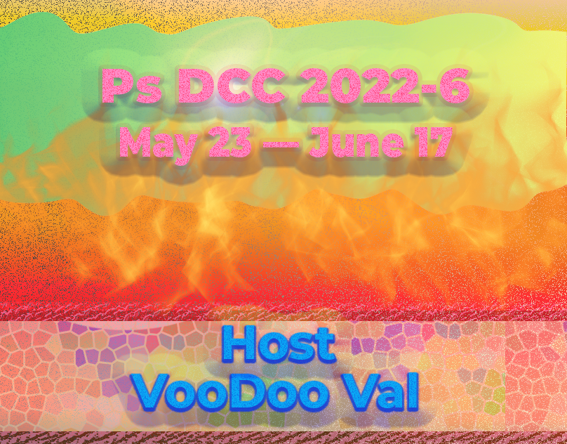
Behance
Ps DCC 2022-6 May 23 — June 17 host Voo-Doo Val
Sam, thanks! I will improve the stars movement and frames size went bit different in some frames. I actually opened the Ai doc (rectangle with strokes), which I saved in .psd in Ai and then manipulated in the frame animation. 😀
Gave +1 Creative Carma to @bleak fossil
#challenge - Moodboard Ch 1 Revisit

Moodboard inspired by Amblin Entertainment logo 😁😎

I'm have posted Pride Challenge 2022-7 project to Behance
https://www.behance.net/gallery/146273741/Pride-Challenge-2022-7-66-610-Host-Andrew-Hochradel

Behance
Pride Challenge 2022-7 6/6-6/10 Host Andrew Hochradel
Hi, here the last 4 sam's challenges from April , so here challenge 3 ("Freezing Photo Effects")

challenge 4 ("Underwater Photo Effects")

challenge 6 ("Galaxy Portrait Composite")

and challenge 9 ("Space Colony Composite")

Where is the photo gallery for #createwaves? I tried looking it up on stock.adobe, but it just made a search with those words. Thanks!
Access Adobe Creative Cloud apps, services, file management, and more. Sign in to start creating.
You can find the link to the photo library here. Im having trouble opening it. I think its an issue with my computer not the link.
Thanks, Ted! It's giving me a 404 Not Found when I click through to the assets. I can find some on stock.adobe. There already are some pretty cool ones.
Gave +1 Creative Carma to @eternal mica
Yes, I'm getting the same error. I'll report it and see what we can do to correct the link.
Yeah. This link is 404. Perhaps someone at Adobe can look into that. :)

Thanks for the heads up everyone! I'll let the team know and see if they can get that fixed.
😀

Day 1 #createwaves

#challenge - CreateWaves

Ps DCC 06.20.22 - #CreateWaves Double Exposure Effects - "Breaker" - Just playing with the wave-portrait idea. Might revisit again later. Might try a whole different comp. Who knows?

Thanks Wade for a great & fun project!!!!

Challenge #1 - #CreateWaves Double Exposure Effects - Here's what I created with todays challenge. All of the images are from Adobe Stock Free section.

This one is kind of related to this Selfportrait Double Exposure Effect even if it's "just" a photo. I used the on camera flash and shot through glas into an aquarium with several octopuses. I didn't realize what I did until I uploaded the photos to my computer. One heck of a lucky shot! It IS a self portrait and it IS water/sea related 😉 😁

My first pass at Challenge #1

My first ever at Daily Challenge. I'm very happy with the results, and because i'm passing through a problem with my creativity. Thanks a lot to Daily Challenge. Hope post much more. #CreateWaves #DailyChallenge #01

Ps DCC 22-07 01 Double Exposure

I just love the colors and the entire image @noble dragon
Thanks, a made some variations too, love them too.
Gave +1 Creative Carma to @halcyon current
Hey! Great work so far everyone! Here's my contribution to the challenge. Don't forget to post on your socials w/ #createwaves! 🌊

Ooh, nice and dark. Digging the color combos! Also, welcome to the PS challenges!
My Challenge 1 Finished. Great work @slender juniper. Awesome images everyone.👌


Couldn't help noodling around with challenge#1 a bit more...

Same. Still noodling...Think I'm getting close though. :D
Ps DCC 06.20.22 - #CreateWaves Double Exposure Effects - Breakers v1.1

The curse of working at 5000 pixels tall... Gauging the size of things when you have to reduce it for the web. heh

@digital pike I love the warm tone of this design.The various natural elements all go well together. the Double exposure looks great.
@last mica Very lovely watercolor like design. The design gives good contrast to the distinct fronting turtle. The entire design comes together very nicely. Well Done.
So about that content aware fill. 🤣
Here's a quick update and definitely looking into it.
@quiet fern Nice composite image. The masking of the model and the turtle looks great together. You might want to push the double exposure concept a little more, but that just personal taste.
Definitely going to try a Round 2 on this one! 🍩😎
@sterile berry Daniel, lovely double exposure. The merging of the waves and the hair of the model is a great look. The color palette is beautiful and simple. Im sure you'll give us more of your creativity, but his is one is pretty good!!!
@marble umbra Hey Tim, nice work compositing these images. Definitely has an underwater vibe. You might get more of the double exposure effect if you lower the opacity of the face and/or use a BM like overlay.
Grazie, signore! Thank you!
Gave +1 Creative Carma to @eternal mica
@halcyon current Lovely double exposure effort. The contrast between the turtle and the rest of the design is a great look. You might want to try a BM on the model to add more transparency and "double exposure" vibe to her. The compositing of the water layers is very well done.
@halcyon current Your second double exposure is flat out awesome!!!
@plain sable Really well done effort. I like the contrast between the sky and the underwater. One tweak I'd think about is lowering the saturation of the skin tone. Perhaps a color lookup over that layer, like Wade demonstrated at the end, would help the face blend with underwater vibe better.
Thanks @eternal mica I'll play with the saturation on the portrait layer...
Gave +1 Creative Carma to @eternal mica
@eternal mica Thanks😀
Underwater Selfie Challenge! AfterI finished this I realised this would have been a cold one, as Penguins are just in the Antarctic. And poor Nemo!

@noble dragon Welcome to the Ps DCC Discord chat. Youre joining at a great time, right at the outset of our latest series. If you have any questions or need help, give a shout. We're here to help. Your design is so delicate and, at the same time, powerful. Awesome. The double exposure effect is spot on. The green tones give a strong under water floating vibe, while the highlighting of the various jelly fish in the neon red adds real tension to the design. The floating red shapes are a great touch. Very well done.
DAY 1 Double Exposure

@eternal mica thanks, a great suggestion… I forgot about the double exposer effect! Ha Ha Ha
Gave +1 Creative Carma to @eternal mica
#challenge #CreateWaves Round 2 - My head exploded....

FYI - CAF worked fine for me the first time around no problems… iMac OS Monterey 12.4 with PS 23.4.1 - I was wondering if you were maybe having trouble because you had inverted your selection just previous but I kept looking at your screen and it did not look like it was still inverted…
Okay @eternal mica, thanks for your feedback…here is a new version…
Gave +1 Creative Carma to @eternal mica

Thank you so much @eternal mica The model had in fact already a blend mode (overlay) but I worked a bit more on masking in some transparency on that layer and think it looks better now.

Gave +1 Creative Carma to @eternal mica
Ps DCC 2022-7CW Double Exposure Effects 6-20-2022

Ps DCC 2022-7CW Double Exposure Effects 6-20-2022 version 2
with a blue gradient fill on the background

This is my contribution. First time doing any challenge! It's been a great learning experience so far..

@slender juniper Wow, your final image is awesome. The positioning of the waterline on your hat looks great. The double exposure on your shirt is spot on. And the turtle looks 3D!!! Beautiful!!!
@stray dagger Really well done. The coloration of the waves is eye catching. The double exposure is well done. The underwater elements you added all add interest. Just a thought, but how would your image look if you brought the octopus above all the layers and made it stand out vs the rest of the image?
@dawn umbra Beautiful design. The color palette has a wonderful underwater vibe. The double exposure looks good. The underwater elements add nice pop to the design. Two tweaks I might suggest. I would try masking out the model 100% at the water line, and I would soften the hard edges of the model's body. Good work by you.
@plain sable V2 is cool
Why am I not surprised!!!😜 😜
@turbid fern Solid work by you. The contrast between the sky and the underwater is really cool. The water line looks great. The double exposure is well done, with nice soft edges to fade the model into the underwater scene. One tweak I might suggest is to bring the turtle above the underwater layers. It will add a 3D element to the design. But thats really just me. Your design. Your decision.
@dense slate Hey Steve, great to see you here. Its a fantasy. This penguin is lost in the tropics!!! Really well done double exposure. The motion created by the underwater swimming objects is so cool. I like the penguin and Nemo swimming "out" of the design. One small nit pick Id make is Id mask out the hair more along the top edge of the design. But thats just me.
@compact pecan Super interpretation of the challenge. Your double exposure looks great. Adding a B&W element to the design is a really interesting idea. Your logo with the turtle swimming out of the circle is great. Solid work by you.
Little late to the challenge, but loved the theme. My beautiful wife definitely steals the show on this one! 🤩
Thank you, @slender juniper !

Gave +1 Creative Carma to @slender juniper
@quiet fern V2 is great. Try feathering the edge of the orb above the waterline and masking the hand on the left at the bottom of the waterline. Im just curious how it would look.
I agree. Great tweak.
@wary swan OOOHH, I like this a lot!!! The contrast in the two scenes is great. The double exposure is very well done. The underwater elements add interest. I would make one small suggestion. I would mask out the model completely from the bottom of the waterline and above. Great job by you.
@tough seal Welcome. We're happy to have you join the party. If you have any questions or need help finding your way around, give a shout. We're all here to help. Very cool first design. The double exposure is well done. I might make a few suggestions. I would try feathering the edge of the model above the water line. And Im not sure what the area on the right of the model's head is. But thats distracting to me. I would work on that to soften it away. But thats just me being me.

Challenge 1: Double exposure effect. I devote it to reincarnation of warriors to win opponents or switch over to win sea hardships. I think it helped them to survive. I will improve it and add to my Viking collection.

@glossy bane Welcome to the Ps DCC Discord chat. Its never late here. We welcome people who start anywhere along the way, and you joined on Day 1 of the current series. So youre right on time. Your double exposure design is lovely. It has a beautiful watercolor painting vibe. The double exposure effects are very well done. The color palette is great. The textures you added really work. If I had one tiny nit pick it would be to perhaps darken the white over your wife's face to add a touch more contrast there. But that may just be my personal preference. Well done by you.
Thank you, glad to be here. Been wanting to do these for a while & finally have a bit of time now 😅. And Thank you for the tip. I’m always open to comments. I will admit, I wanted to do this in 30 minutes like Wade did in the video. I like your suggestion, and will work with it a bit more as I have my own “nit picks” too 😁 Cheers, friend!
Gave +1 Creative Carma to @eternal mica
@eternal mica I will load it up and see when no one is looking at work, hehe, it is actually one of the top layers I just introduced A Bokeh texture on top of everything and then blended it through. Thank you Ted.
Gave +1 Creative Carma to @eternal mica
@copper moss I love this. The double exposure effect is spot on. The below water elements are excellent. The compositing of the shark and Wade's face is so well done. Matching their eyes is a an awesome touch. The 3d shark is terrific. One tiny nit pick I would make is to increase the contrast between the sky and the water. I think it would add some more interest to the design.
I always joke with all the creatives here, Adobe is very benevolent in this chat. They only start charging us to post with the third post for any design. The first two are free!!! Go for it!!! 🤣 🤣 🤣
I will add contrast to the sky and the water. Thanks for the great hints how to improve it. I did some designs on the Vikings as well, which I will display in Behance profile.
Gave +1 Creative Carma to @eternal mica
Ps DCC 06.20.22 - #CreateWaves Double Exposure Effects - Breakers v1.2 - I think this is my final comp (at least for today). hah :D

Challenge #1 - Double Exposure 👒 😅
#CreateWaves

first challenge attempt idk if this even counts but there ya go

Day 1. Turned out a bit weird .

I think I like 1.1 best. The surfers are in a better position on the face (less obtrusive). The color looks a little richer. But I do like the additional text in 1.2.
Challenge #1 - DoubleExposure
#CreateWaves

Challenge #1 - DoubleExposure w/ stock images
I'm a working commercial designer so it was instinct to make this look like an advertisement. Fun and simple 🙂

Now with watery hand-lettered Penguin of Destiny text!

No link to the Starter File for today? 😉

Hey @quiet fern cuz! 🙂
It was a straigt up blank canvas to make hand-drawn text. I just used my first image to put the text on
It's really just the prompt, so no need for it really. But here it is: https://assets.adobe.com/public/bbfb9212-f39f-4701-5631-357e8c95699f
Force of Habit 😎😁
Force of Habit 😎😁
Yep I do that too!
Challenge 2: Hand lettering with mixer brushes. Thank you for great tips. I used 3 different brushes with bit different brush presets and layer style. I copied colors from the image.

Green Sea Turtle and Friends. There are 7 different images here. I used the Content Aware Fill multiple times, in different ways and didn't have an issue. Whew! This was enjoyable! Thank you for this opportunity! The images on the createwaves site are fantastic! My applause to the photographers!

Definitely WILD! That "s" looks nice and fuzzy! Very cool use of the mixer brush there.
Wet & Wild type w/ few bad puns. It's been a good day.

@eternal mica Challenge 1 again making tho Octo Stand out, I thought I would make Nemo and his m8 pop to.

#challenge

😀


Can Anyone help, when I use the mixer brush it is just copying the pattern and not mixing the colours like it did for Wade??
Sorry Colors, Keep forgetting to switch
Thanks, Wade! 🦄
Gave +1 Creative Carma to @slender juniper
Tried to make this as good as possible. Hope it's ok 🙂

In the brushes settings panel, what is spacing set to? Perhaps lower the spacing. Mine is 9%. When you adjust the spacing, it gives you different results. Good Luck!
mine is at 6, I think I have it now, Thank you👌
yw. good!


Double Exposure Effects #CreateWaves | Photoshop Photo Editing Challenge

Wet & Wild done 😎

Okay so I keep noodling around with challenge #1, I think I'm done...

PS DCC 2022-7 Challenge#2 Hand Lettering For Beginners

Thanks for your feedback Ted, I will see what I do later.
Gave +1 Creative Carma to @eternal mica
Double Exposure Effects #CreateWaves | Photoshop Photo Editing Challenge

Ps DCC 06.21.22 - "Wet & Wild" - Staying with the surfer theme by doing a 'Wet & Wild' board design (v1.0). :D

Day 2 Typography

Day 2

@limber thistle These are all looking great, very nice clear reads and contrast on each design. I especially like the frost design and the particle effects you made around the ice beam. Great job with all these techniques!
@wary swan Very nice work with the challenges for the Pride week! These came out nicely. Did you create all those flag graphics for the cover image too? Well done 👍
@quiet fern The color scheme and gradients on the Moodboard design have a nice clean look to them, and I really like the depth they add. Really nice color variety between the two designs also!
@wary swan Very nice work for the Behance project designs from Val's DCC too! I really like the Reflected Landscape image with the rippled water reflection. And I love the patterns and textures you created for the cover image, very cool!
@tropic garnet Really nice color scheme on the Challenge Two design for Val's DCC! It has a very neon 80s look to it which is really neat, nice job with this technique!
@coarse portal These designs for DCC 7 and the Pop Art challenges came out really nice! I love the graphic style of the cat image, and the DCC 7 image has a really neat retro look to it. I like how you kept the color focused on the image in the TV to really make it a strong focal point.
@limber thistle Great to see all these challenges from the previous DCC I ran! You got some excellent depth with the shadows in the Papercut Effect and I really like that sort of edge glow you got on the Slimey Text design. Really cool texture and design for the Alien Eye images too, nice work!
@tropic bane The displacement effect in the water of the design from Val's DCC turned out really well. I really like how dramatic that red is against the dark blue background of the rest of the design.
@compact pecan Super cool application of the Day 2 challenge to this design! The color, "bevel" depth and shadow, and the texture within the text all give this design a really clear and interesting read that fits in really well with the rest of the photo. The wavy effect to fit in with the water adds a lot to the effect as well. Very nicely done 👍
@sterile berry Really liking that white highlight around the edge of the text, that along with the darker blue color gives it a nice clear read. I like the added depth of the #CreateWaves text behind the girl. Looks good!
@naive mulch Nice job with the double exposure effect! I like the white text over the water texture, it gives it a nice clear read. I wonder how it might look if you vertically flipped the water texture, so that her face is a bit more clear, which might strengthen it as the focal point. Or even giving the bottom half a bit of a blue tint to appear like everything is under water to unify it a bit. Just a couple ideas of course, nice work!
@wary swan Really cool texture on the Wet and Wild design! I like the contrast between the blue and turquoise colors. I wonder if making the blue backing shape of the text a bit of a darker blue might help the whole thing read a bit more clearly at a glance. Hard to say without seeing it of course. Nice job!
@plain sable Hah, it's hard to pull away from a design sometimes, I know how that is. I really like the bold color contrast of the blue against the orange and how you fit the text and portrait into that. The reflection in that glasses really helps integrate the portrait with the rest of the scene. I wonder if giving the text an outer glow with a similar color of the sun might give it the effect of being backlit by the sunset, kind of like a rim light. Very nice work on this!
@young karma Very cool variety between the two words in this Wet and Wild design! I really like how "Wild" has almost a foamy type look which feels kind of like sea foam in this image. Nice job with these techniques!
@pine wraith Ooh, really loving the texture in this design! I really like how you played with the brush strokes to give it a bit of a painterly look and some interesting dynamic brush strokes. My only suggestion might be to brighten it up a bit, the whole design looks a little dark. Or even brightening up the text to give it some additional contrast against the darker background. Nicely done!
Thanks, @bleak fossil - I appreciate your feedback. I thought that layout might be a cool concept to try but I think it still needs some work. :D
Gave +1 Creative Carma to @bleak fossil
Ps DCC 06.21.22 - "Wet & Wild" (Alt Layout). This is another concept I had for the 'Wet & Wild' design.


@sterile berry The only critical thing I could see was that the #CreateWaves almost felt like a watermark at a glance, but I think the way it's masked behind the person solves that for the most part. However, I think your integration of the hashtag into the environment on this second design works much better! Placing it in perspective with the texture of the wall really makes it feel like an intentional part of the design. I really like the focus of the lighting on the boards and the way the text looks like a graphic on the board with the vertical stripe. If I was going to get ultra nitpicky, I'd maybe say that the bright outline in the Wet and Wild text almost seems a touch too bright to look like it's part of the board. It almost gives the impression that it's brighter than the environment it's in, though that's just my guess. Great work on these!
thanks @bleak fossil I'll try that, thanks again
Gave +1 Creative Carma to @bleak fossil
Many thanks for the feedback here's my 1st revision

Gave +1 Creative Carma to @bleak fossil


@bleak fossil thank you for your feedback , so i will light it up a
Gave +1 Creative Carma to @bleak fossil
#2 . . . a bit brighter

Thanks for the feedback Sam, the flags is svg files is from https://www.prideflags.org/ Licensed under GNU General Public License v3.0 the list last updated 2021/01/17
Gave +1 Creative Carma to @bleak fossil
Thanks Sam, the water is a filter Flood2 one of my favorite filter from www.flamingpear.com they work great with all version of Photoshop Tutorial: https://youtu.be/ciGgHOUATbo
her is how to do the same without the filter https://youtu.be/0MvjWH8opK0

Quick tutorial showing you how to use a flood plugin in photoshop.

Photoshop Tutorial : in this video i will show you how to make water reflections from scratch, with realistic reflections and ripples.
Download PSD file : http://photoshopdesire.com/how-to-create-add-realistic-water-reflections-with-ripples-waves-in-photoshop-tutorial-psd/
check out all tutorial here : https://www.youtube.com/photoshopdesiretv/v...
Gave +1 Creative Carma to @bleak fossil
Thanks for the feedback Sam, I will look at your suggestion

