#✂challenges-feedback
1 messages · Page 125 of 1
Gave +1 Creative Carma to @eternal mica
Here is updated version of the map. I've tried to include more folks from the Challenge community chat. Added new locations such as, Kajrov Bay, Satlen Sea, the towns of Meagan, Italicoil, Nathalie, Teta Vata etc. If I missed anyone, I apologize. I'm doing my best to be as inclusive as I can. 🙂

NICE I own property!!! I promise to be a wise and caring Mayor of Meagan Town!
This is an awesome map @sterile berry I'm very honoured to get a place on your map 🥰
I just love your pirate island @quiet fern 🥰
Ha! This is legit! I will always strive to be a just and benevolent king. 🤣 👑
You win on this one - it’s simply fabulous!!! 👍🏼😎
Thanks! I'm glad you like it. It seems to have given everyone a laugh so we ALL win. 🙂
Gave +1 Creative Carma to @quiet fern
Really nice color combos too!!! 👍🏼😎
A little behind, here Paul's challenges here challenge 1 (Bending Type to Your Will)

challenge 2 (Fire, Water, and Earth Type)


challenge 3 (3D and 4D Text!)
challenge 4 (Wild Typography)

and challenge 5 (Handy Lettering)


Day 3

Some quick examples using the methods taught in the 3D type challenge.
Ok, so I think coolio could actually work? Hear me out. Coolio! The Complete Hydration Solution! Ehh? But I also like the idea of woolio now.

#challenge - Perspective Typography 😉

3: 3D extrude easy. i have learned new stuffs from you. Pressing on ctrl+alt+"page down" then "end". I liked your brush. What kind of brush is this?

PS DCC #3 3D Made Easy. March 30, 2022

PS DCC 03.30.22 - 3D Made Easy. Introducing: Woolio. Complete Warmth Solution. Synthetic wool that is as soft as a cloud. 🙂

#challenge - 3-D Type - FUN!!! 😉

Ps DCC 22-04 03 3D Type Wow, this stream is called 3D made easy. This was NOT easy!! So many cool techniques incorporated into this. It took a lot of rewind. But it was worth it. Very coolio @slender juniper

Thank you! yes, this looks better with the page full.

Gave +1 Creative Carma to @eternal mica
Challenge #2 - Custom Brushes (Map) - and I also added challenge #1 in this one. Such a great way to use the fill command. Thank you @slender juniper for your efforts to teach us some new stuff. This sure was new to me!

Gave +1 Creative Carma to @slender juniper
Today's challenge

your awesome!
Thank you Frank 😇
Gave +1 Creative Carma to @hollow yarrow
Day 3, so easy and cool for those not using illustrator.... I loved it!

Catching up before I tackle todays video.... Here is Day 1 Perspective, Day 1 Weathering and Day 2 Treasure Map. Pushing the boundaries of fonts and things!


@copper moss Your turtle map is hardly a map but, who cares, its so neat. One thing you might consider, vectorizing the butterflies to have them better fit the theme of the design. Just a thought. Very well done.
@last mica You did a fine job with the 3D design. You covered everyone of the numerous steps in the process. The lighted one is really spot on. Just for sake of contrast I would change the color of one of the BG layers.
"Coolio"??? "Woolio"??? Im not sure marketing is your strong suit. I think keep your day job in design!!🤣 🤣 🤣 Today's stream was really so packed with stuff, I had to rewind more times than I could count.
@quiet fern The Morocco design is great. Perfect color balance, matching the text fill to the mosaic. The color range and BM look spot on, showing so much texture through the text. Very well done.
@copper moss Two very nice variations of the 3D design. I think Im going to be seeing variations of Wade's "oolio" in my sleep tonight!!! The B&W depth layers look terrific. For me, the color scheme in the second one is a bit off, but the technique and text effects you added are very well done.
@hearty gale This looks great. The Gradient fill is a super touch. You also did a fine job with the backlighting. I like the shadow being cast by the top design onto the lower one. Well done.
@sterile berry Nicely done. The warm color palette really send the message youre trying to send. The white stroke on the letters adds so much pop. I know you thought this through but I was wondering why you went with the grey for the cloud's depth layers rather than a different shade of blue?
@quiet fern Good work on the 3D design. The coloration, depth, highlighting all look solid. One comment, it seems like the overall opacity / highlight of the design is sort of muted. Was that intentional?
Yes - I leaned to the Teal Pastely colors today ☕️🥰
Thanks! Warm color palette? I think you mean cool palette, eh? I chose grey because my cloud is almost white. Not blue. Also, I didn't want everything to be blue. Just a simple blue and grey/white motif for this.
Gave +1 Creative Carma to @eternal mica
@halcyon current Very well done Brush design. The colors look great. The BG texture is so good. You added so many detailed brush elements, all of which individually look great, and as a complete design, look wonderful. I think I might increase the opacity of the title a bit. The map is so vibrant, having the text so faded is a bit out of synch.
My mistake. Going a bit too quickly and didnt catch that. Thank you.
Gave +1 Creative Carma to @sterile berry
@coarse portal Thats a very challenging design to turn into 3D. Very well done. The perspective on the lines, added to the triple 3D of your text/shapes is really a challenge. The gradient text fill is also a cool touch. They all look very realistic. Good work by you.
@dusky swallow Is your design based off Ai? The 3D effect is spot on. The contrast between the BG, the rectangle, and your text really makes your design pop. The backlighting looks solid. Well done all around.
@tired turret I was wondering when you would show up!!! Your two compositing text photos are great for the exercise. The Parking design is spot on. The color range and BM work to really let the textures show through. And your varied opacity/ brightness picks up the lighting so smoothly. The grey wall is also well done, though I think a lot of the text is too faded to make out. But thats fine, if thats the look you were going for. You might want to try a version with a bit lower saturation on the wall and a bit more on the text just to see how it plays out. The map design is cool. Very interesting asset selection. You might want to fade the edges of the maps to better synch them into the BG. The sharp contrast you have looks a bit too strong for the vibe of the worn faded BG sheet.
@eternal mica The weathering wall was on purpose. I liked the idea it’s been there for decades. 😂 as for the map… I should have thought about it. Fading! I didn’t even think about fading out the edges. I also thought about changing the color to something closer to the parchment.
So your thoughts on the tweaks?


@tired turret IMHO both dramatically more powerful. Your opinion?
Day 2. Pretty basic, but it was fun creating a brush again.

💯 agree! Your eye never lies my friend ever. 😊
PSDCC 3D Made Easy Day 3

Flattery will get you nowhere, but keep trying!!! I sincerely appreciate your support and encouragement. It motivates me.
@compact pecan "Basic" works. The brush work looks solid. The design is straightforward. I might have added some color to the tree brush, just for a little more pop than the blue and red are giving.
@visual pelican Good work on the 3D. The colors work so well to tell your story. You did a nice job on all the techniques that were required to create the effect. The transparency of the rectangle is a very interesting eye catching touch. Even though the ice is an important part of the message, I know Sam would suggest how about blurring the BG or lowering the opacity to get the focus on your focal point.
Thank you. This one was fun once I decided to go with Coolio (lol). I tried blurring and lowering the opacity on the BG and thought it looked bad. I also tried lowering the opacity w/an off white behind it, but once again I thought it looked bad. Maybe a different BG would work hmmm?
Gave +1 Creative Carma to @eternal mica
That's up to you. Lots of times I fall in love with a BG and end up forcing the issue. A good way to avoid that is to work on a transparent or mid gray BG until the design is done, then finding a BG that supports rather than competes with the design.
Day3- 3D Made Easy
Early enough @eternal mica

@hollow yarrow Maybe, but not if we were on Indonesia Time!!!🕐
@hollow yarrow Beautiful vibe from the design. The bright white light source creates an underwater feeling; the texture adds a flowing sense of watery movement. You added a real neat effect by having soft round edges to your text, with multiple shades for the depth layers. Very interesting. The split wavy tint also adds to that underwater vibe. One tiny nit pick. It looks like the shadow layer on the BG has the texture showing in the shadow. Maybe a bit more blur will conceal it.
BTW, how did you like having your own province in @sterile berry 's design? With your own capital city???
Haha. He saw it and was pleased with the territory.
Wow, you even did the caustics! Nice one!
Dang. I forgot to add @graceful arch into the map. He doesn't usually chat in here though. heh
CC2: custom Brushes... a little hidden map on a necklace...

Haha no worries, you're right, I feel safer in #❓ask-a-question 😜
I had to fix a couple spelling errors and add a few more people/locations so I added the Wertos Island chain in the south. heh

Day -3 DCC - 3D Type.

It's lovely, thank you so much! I wish we had more 'social' projects like this one
Gave +1 Creative Carma to @sterile berry
Ps DCC2022-4 Challenge #2 Custom Brushes 3-29-2022

I will do real map! Have a look on the map Andri did in Ai challenges. I will do something like that. Thanks! 😀
Gave +1 Creative Carma to @eternal mica
Thanks! 😀
Ps DCC 2022-4 Challenge #3 3D Made Easy 3-30-2022

Can you explain how have you done this map? Have you generated the shapes from a map or just draw by hand? I´d like to learn how to make such. It will be useful for others also. You did shapes, then offseted, then some diamonds inside shapes to decorate. I like how you glorify your friends as well. Thank you for Satlen sea!
I was really honored @sterile berry named a province with my name and even better he choose to place me in the south🏝️ I blurred texture in shadow though... Not enough?🤔 You get a good point Ted, I will take a look later. Thanks!
Gave +1 Creative Carma to @eternal mica
Thanks!
Gave +1 Creative Carma to @graceful arch
That map is so coolio, dhuman! I love the idea of using PSDCC people for your names. The Catan hexes make a nice subtle texture. I was surprised and touched to see Meade! Thanks!
Gave +1 Creative Carma to @sterile berry
I added the bg after because like you said I sometimes try to force the issue. Thank you for feedback, I feel that it has helped me improve.
Gave +1 Creative Carma to @eternal mica
@gaunt veldt Im happy you described what you did. I thought your mouse flipped over on its back!! 😜 Very creative approach to the brush exercise. Creating such a micro map is a cool concept. Even in monochromatic, the brush strokes look well done. Im not sure the text is supposed to be legible or not.
You do phenomenal work in #ask-a-question.
If Adobe ever decides to create a logo or thumbnail for the Ps DCC chat, this should most definitely be the image used. You've done an amazing job with it. 💯
@normal gale Good work with the 3D design. Using the technique on the icon looks really good. I like the varying degrees of depth you applied to the different items. It makes the focal point very clear. One tiny tweak, the coloration of the depth layers on NS is really close to the BG color. You might have created a bit more contrast there, especially since you used a gradient, and still kept the right side light source.
Yes I agree. I was looking at it again this morning and it's light to the point of being confusing. I will fix!
@wary swan Very well done Brush design. All the elements work really well together. The textured gradient BG is very well done. The trees and mountains are spot on. Solid work by you.
It always amazes me how, after a good nights sleep, I see things in a design I didnt see the night before!!!
@wary swan I really like the 3D badge. The depth you created fits the design. The text fill is cool. Using the fill and the 3D moving in the opposite direction created an almost psychedelic vibe. I might have gone with your name scaled up to be a bit more prominent, but thats totally personal taste. Very well done by you.
😆 mouses are gonna flip. The text is coordinates... i think they would be useful for a cryptic map. I do wish that "land ends" were less smooth and more jagged... what brush was i suppose to use?
I dont understand your question. What lands end?
Im curious. What are the properties of this file? How did you save it? What specs when you saved it?
So the edges of the land... how they are not smooth but mine are... i wish for them to be more jagged. I am curious what brush was used as I used a hard round brush. I saved this file as you suggested a bigger canvas but at medium quality.
You're welcome. I'm glad you like it! The shapes for all the continents, peninsulas and islands are painted from my imagination. (I did look at some photo-reference for inspiration.) A bit later I will make a quick video that shows exactly what I did so that you can recreate the effect(s) on your own map image.
Of course, Beaume Province is well-known throughout the realms for producing high-quality, hand-crafted pixels. 🙂
Thanks! I'm glad you like it. Yes. The hexagon overlay was inspired by the maps in all of those old tabletop role-playing games so I used them in my image.
Gave +1 Creative Carma to @hushed spade
and Im sure it never snows in Beaume Province and the temperature is always a steady 75º, right @hollow yarrow
Thanks again, Ted. I keep hearing/reading the word "community" on these servers and I wanted to work on a project that reinforced that idea. When @slender juniper presented the "map project" and then stated that he wanted to see some names of places and features, the opportunity I was looking for [literally] presented itself. Seeing everyone's work inspires me to really push my creativity. In fact, I think that is what these challenges are all about. Take the lessons, learn something new and use creativity to make something cool. Hopefully, we can create images that inspire others to be creative. That continues to be my hope.
Gave +1 Creative Carma to @eternal mica
😀

I couldnt agree more with your sentiments. You've been a wonderful addition to the community. Not only for regularly sharing your creativity, but for the active role youve taken in being involved, involving others, and being so willing to go the extra mile in participating. Im sure I speak for many in saying Thank You.
Gave +1 Creative Carma to @sterile berry
This is the ionk Wade presented this morning https://www.youtube.com/watch?v=_KZx5YqsdqY

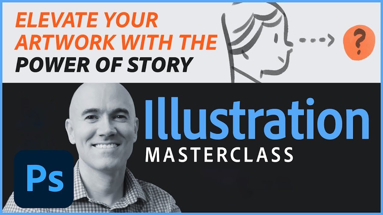
Join Sr. Design Evangelist Kyle T. Webster for an Illustration Masterclass on the topic of composition. Learn to play with, and improve your compositional ideas in your illustration work and your art will tell a more compelling story and engage the viewer. Subscribe: https://www.youtube.com/user/adobecreativecloud?sub_confirmation=1
LET’S CONN...
#illustration #digitalart #photoshop
You have the skills to create an illustration with great color, composition, shapes and all the rest, but why does it feel a bit 'meh' in the end? Maybe you need an element of storytelling to elevate it to the next level. Kyle T. Webster will show some examples of this and do a live demo on today's Illustrati...
Day One - Compositing Type
While looking for some nice cabin stock photos, I kept being directed to outhouses. So I rolled with it.

@wary swan Robert's spreadsheet link https://discordapp.com/channels/547473772727238676/553669724244934656/956314504025735238
Thanks that you have responded! An imaginary map... Waiting for your short video. Sure, many others will enjoy to watch it. I liked Andri´s isometric map made in Ai challenge.
Gave +1 Creative Carma to @sterile berry
Thanks for the feedback Ted
Gave +1 Creative Carma to @eternal mica
Thanks for the feedback Ted and the tip
A couple of quick thumbnails from the composition/concept art challenge. The challenge is really just about thinking about designing with intent while using the Rule of Thirds or Iconic composition. The subject of your compositions can be anything you want. Have fun with it! Remember this can apply to all of the visual arts, not just concept art/illustration. Also if you have any questions, feel free to ask. I'm also live twice a week on Behance, so pop in with any questions there as well. https://www.behance.net/wadeacuff

@slender juniper Your drawings are awesome.
Thanks @eternal mica ! You're too kind! I also want to say thanks for all the work you're putting into commenting on these challenges. I'm blocking out some time to dive deeper into these challenges and give some feedback as well. Can't wait to share all these on the community day next Friday!
Gave +1 Creative Carma to @eternal mica
@slender juniper Im so poor at drawing, but I'm going to give the exercise a shot.
Im enjoying supporting you. Suggestion in advance for next Friday's Community Day: As we go through the 9 day process, you may want to make note of the really good posts from early on so you can refer to them easily next week. By the end of the series there are so many top notch works, its hard to remember and reference the ones from the first week. If you'd like my assistance, just give a shout.
Created a thumbnail from some of my library pieces! 😀

@hollow yarrow I like the texture in the shadow. Makes the"block" seem transparent.
@digital pike I want to know the story.
Challenge #4 - Creating Concept Art - Thank you @slender juniper for this challenge. At first I didn't think that I would manage to create something at all but after a little while with many tests of different brushes I happen to create a shape that reminded me of a small witch who crouches on an invisible broom and that got me started. She's flying on her broom and will soon meet a huge sea monster while the rain pours down...

Gave +1 Creative Carma to @slender juniper
Concept made with simple shapes. I'd like to convey the idea that there are millions of these little pink beings rising up from the city. How would you do that without overwhelming the viewer?

Well, they're pink on my monitor in photoshop. Not so much now that I've posted it.
I've posted a quick video in #🔥tips-and-tricks if you'd like to see a basic overview of my recent "cartography" project. Hopefully it gives you some ideas!
Day 3

Ps DCC 22-04 04 Creating Concept Art Every time we do a drawing exercise, I get so nervous. I have no confidence in this area. But here goes anyway.

And yes, I drew in all the grid lines to demonstrate what I was doing.
The process video is awesome. 💯 💯 Thank you so much for sharing with the group.
Gave +1 Creative Carma to @sterile berry
Thanks a lot! Do not delete it. I will tell other friends to look at. It gave me a lot of ideas! You are such a kind human.
Gave +1 Creative Carma to @sterile berry
I think you did a great job @eternal mica and I'm with you when it comes to drawing exercises.
#CustomBrushes challenge - Super fun and a great way to learn different aspects of PS. thanks @slender juniper

Gave +1 Creative Carma to @slender juniper
THanks!
Gave +1 Creative Carma to @frigid barn
Sorry - no Daily Challenge from me today… way over my pay grade 😎😢
Day 4 DCC - "concepting" a composition.

Day4 - in the video you mentioned an atmospheric setting? where is that accessible?

Challenge #3 - 3D made easy - This was another fun challenge

I feel you on this. But I said "what the heck, give it a try".
Tomorrow is another day… I might try again 😁😎
Give it a try. I won't charge you the penalty fee for posting a design worse than mine.
PSDCC _Creating Concept Art Day 4. I created this using just the lasso tool, custom brushes, and the ellipses tool.

PS DCC 03.31.22 - Creating Concept Art. Two ideas: Fantasy and Sci-Fi.

I do not believe there is an atmospheric setting. I believe Wade was mentioning atmospheric perspective, (15:45 in the stream) which is a way to create depth in a design by making objects in the front look closer, and objects in the rear look further away. Here is a tutorial by Jesus Ramirez you may want to watch. https://photoshoptrainingchannel.com/atmospheric-perspective-photoshop/ There are many others you can google.

Photoshop video tutorial showing you how to use atmospheric perspective to create more believable composites.

Day Three 3-D Catching up... my favorite charity event on the planet. Thought I'd Gish it up a bit.

not entirely sure what i made, to be honest

4: Concept Art. I do not know if I have done them right. I did rouphly. I used 2 brushes by making different sizes something like charcoal by guessing and smear with colors. The right is "seeing nature" and the second is "jumping out choas". I used characters I have seen somewhere.


There is a girl's vietnamese in my picture, she wear a Palm-leaf conical hat. you see it?

Oh yes I see her very clear. You did great @golden walrus 👏
thanks
Gave +1 Creative Carma to @eternal mica
This is master map, fun idea to named the diffrent parts of the map, and the usa a hexagon texture to line the map
Challenge - Day 1

Thanks! I'm glad you like it.
Gave +1 Creative Carma to @wary swan
TYPE COMPOSITE CHALLENGE. catch-up!


Brainstorming how I'm going to approach this one. Ideas are flowin' 🙂
😀

@gentle pasture Very interesting composite, especially considering your asset. So cool you added speed blur from recent challenge. Good idea. The front texts are very well done. You did good work with the color range and BM and the perspectives on both texts. The brick textures show through nicely. Personal tatse, I might have given the text a bit more saturation for better contrast. But thats just me. The text on the glass building is well done, though I think there a few spots that are inconsistent as to whether the text shows above the greyed out glass or not. Good work by you.
@silent portal Nice work on the composite text. The color range and BM work well. The brick textures show through nicely. The text perspective looks good. EXTRA CREDIT: To add impact of the technique, try another text entry further along on the wall.
@digital pike Very well done 3D text. I like the color selections. All of the shapes look great. The depth layers have good textures. The back light works. Small nit pick, why not scale up the image to fill more of your canvas?
Day 5

@slow estuary Really?? Maybe you better check your Google algorithms!!! LOL. Good work on the composite text. The text fits the asset image. The color range and BM worked well, though I might push the color range a bit to get some more of the broken washed out look to the text. The half moon is a cool touch.
The wood texture shows through nicely.
@digital pike Fun piece. It has a childrens book vibe, like we did in the last series. Good work compositing all the elements.
@halcyon current Youre a trooper to make the effort, especially since its an area youre not confident in. I get the same feeling. The design is well done. The brush strokes are interesting. You definitely created a clearly communicated story. Good for you. Keep it up, friend.
@hushed spade Very creative interpretation. I think if you showed some of the pink beings half hidden arising out of the building, the story youre shooting for would be clearer. In any case, nice effort.
@last mica Very powerful concept art piece. It seems to me to be a person bracing against a storm, walking over an icy plain towards a distant mountain range. Lots of interesting brush work. Good work.
Thanks, Ted. 🙂 It felt good doing it. Making it helped me attend Sam's live stream. I was up and fueled till Sam's stream ended. But then, I missed Wade's. 😦
Gave +1 Creative Carma to @eternal mica
@cloud lily What a cool brush design. Creating such an informative map is super. The layout works really well. Your brush strokes for trees and waves look great. I really like the double X look. It gives a unique vibe to the map. Good work by you.
@eternal mica 😀

@normal gale Wow, two really lovely well done concept art pieces. They each have a clear message. The bottom one has an almost E.T. & Elliot vibe to it. The perspectives and depth you created in each are very well done, especially for the glass windows on the bottom one. I envy your skill with this.
Oh, my, so much better, right???
@cloud lily I like your concept art piece. I live by the beach so this definitely has a beautiful "wave" vibe to me. The brush work and colors tell a clear story. Did you see the post I gave you answering your question about atmospheric perspective?
@halcyon current Fun 3D design. You did fine work integrating all the elements Wade used during the stream. The road and BG are good personal touches that add interest. I like the bottom one. The bevel on the top text is a bit too much for me. But thats just personal taste. Both are well done. The one nit pick Id make is the cut out wheels on the black road are a bit confusing but, honestly, I couldnt think of a fix.
Where should I go to ask if someone can help me with something?
Best bet is # ?ask-a-question tab
@visual pelican I really like this. Theres a clear story being told. The color palette works. The brush strokes are interesting. Good work.
@eternal mica 😄
5: Frosen Glass Effect. Thank you, Wade. I have learned new things today. Fine.

@sterile berry Danny, youve got to be kidding. These are AMAZING!!! Did you draw these with a tablet? Each one is rendered beautifully, with so much detail and so many variations. I really like the top one. Super work. 💯
Thanks, Ted. Yeah. I use a Wacom to draw/paint. I'm glad you like them.
Gave +1 Creative Carma to @eternal mica
Theyre really super. Ive been researching buying a Wacom. I stink at drawing, so I blame the mouse. If I get the Wacom, I'll have to admit its me that stinks, not my tools. So it keeps me from committing. 😜 🤣 😜
The only way to improve is to practice. Regular practice is the key.
@frigid barn Two beautiful concept art pieces. they each tell a lovely landscape story. The various B&W tonation you created in the designs really works well. The brushes you used in the top design are super interesting, and create solid depth and perspective. Very well done.
There is also this notion of working smarter, not harder. Learning various techniques to let Photoshop do more of the work. Creating brushes that make painting easier. Storing various vector shapes as Library objects that you can drop in, mask and paint over. But again, those things also require practice.
There is a lot of digtal trickery in most of the images being produced today. heh
@tired turret Interesting complex 3D design. I think you nailed all the elements of the stream. One general comment I'd make is that the depth layers could be better coordinated with the top color layers. The gray doesnt seem cohesive with the globe top layer, and the same comment about the GISH depth layer. I think a different color for each of these would add cohesion and pop to your design.
EXPLORE. I hope this looks real. This one is the best of all my attempts. Thank you for this opportunity!

Thats good advice. When I started my Ps journey in earnest, I had no idea how graphically oriented the journey would be. Now that Ive experienced it, I realize how important drawing can be to the process. Hence, the thoughts on getting the Wacom and ratcheting up my drawing skills. Im inching closer.
Drawing is important. It's definitely very helpful. But to draw, you first have to be able to "see" - People who can see/visualize/mimick reality make better images. How to visualize and then "realize" or stylize reality, to give the impression of something, those are more difficult to teach.
@dusky parcel I know how you feel. I had the same sense when I was done with my exercise. Your design has cool color gradations, and interesting shapes. Theres no question the object directs the eyes upward towards the top left. It might work if you added some shape there to be the object the eye is directed towards. Just a thought.
that would've been cool, yeah
Explore the World Compass. This image compilation was inspired by DCC1. However, I learned the bricks are too far apart to give the lettering the proper effect, hence the image above with the red bricks. The compass is a design on our back patio. I wanted to try the bent perspective. It has taken me all week to get this. There are 8+ images compiled here. Thanks for the fun and opportunity!

I think thats called "creativity". Ive been Googling it to see where I can buy some, but havent found the source yet.
Here are my thoughts about creativity and inspiration (in a nutshell). [adds "Theoretical Physicist" to résumé]

@copper moss Both Concept Art designs work well. They each tell a story. You created interesting color palettes and brush strokes. The left one has nice depth. The right has good motion. Good work by you.
@golden walrus Beautiful Concept Art. It has a lovely serene jungle waterfall vibe. Yes, the character is identifiable. The depth and perspective you created with all the shadings is very well done. All the brush strokes are very impressive.
Glad! Thanks! 🦄
Gave +1 Creative Carma to @eternal mica
Thanks for the challenge @slender juniper ! Don't worry, it's not my place! Do you think the drop shadow works here, or is there something else that would be better? Do the fonts work well enough?

Gave +1 Creative Carma to @slender juniper
Thank you. Drawing with the Lasso tool takes some getting use to but it makes some interesting things.
Gave +1 Creative Carma to @eternal mica
Thank you @eternal mica for your kind words. I was actually surprised that I found something that made me happy and I love challenges even if they might be a bit frightening at the beginning. That's often those you learn most from.
Gave +1 Creative Carma to @eternal mica
Thank you once again @eternal mica for all the good advices. I agree with you about the cut out wheels but I think I have found out something that at least makes the cut out on the left side to look a tiny bit more visible. It at least looks better to my eyes. I added a small radial gradient (white to transparent) with the gradient tool blend mode set on overlay directly on the layer that colors the depth layer. I took a screenshot of the layerpanel and added to the image as well as the before-look.

Gave +1 Creative Carma to @eternal mica
Really interesting technique with using shapes, mask and painting over. That's something I've never would have thought of. Thankyou @sterile berry for the tip 👏
Ps DCC 22-04 05 Frosted Glass. This is such a cool technique. I know Im going to use this often. Thank you @slender juniper

Gave +1 Creative Carma to @slender juniper
#challenge - Frosted Glass & Lens 😉


frosted!

So as always I take your advise and BOOM just better.... I also played with text inserted into the world...


Had a good time with this frosted glass effect. Here are the results from this challenge. Love seeing what everyone is doing with all of these challenges so far!

Super tips. I also decided to improve my skills. I just don't understand how to post here. Don't scold too hard.


PS DCC #5 April 1, 2022; Frosted Glass Effects

3-Tier Cake. Mixer Brush and 3D Depth DCCs. I have never used the mixer brush this way before. Very cool. The designs are with the mixer brush. The star is using the 3D depth method. Fun! Thank you for this opportunity! Lots of learning going on!

THANK YOU for your lessons this week!!! 😎👍🏼
Gave +1 Creative Carma to @slender juniper
my results for Challenge #04 - Frosted Glass - great effect & very useful - Thanks Wade.

PSDCC_Frosted Glass Effects Day 5


Day 4 Concept Art

I think the tweaks made a dramatic difference in the pop and cohesion of the design. You agree? BTW, what is Gish?
PS DCC 04.01.22: Frosted Glass Effects. I went with the second technique @slender juniper demo'd (with the 'focus' lens over-top of the blurred background).

Gish is the Greatest International Scavenger Hunt created by Misha Collins to do fun and kind tasks while doing good charity. We just finished one last weekend. We raised $60k for Ukrainian disabled for medical equipment. $80k for literacy and our registration fees are going to World Central Kitchen. Check out Gish.com or Gish on Twitter, Gish on IG etc. lots of fun to see! BTW yes it looks much better 😊
I don't play Animal Crossing, but I found Woolio. @slender juniper #whereswoolio

My country ❤️ Have you ever been to Vietnam?


Day 5 DCC - Frosted glass effect.

Frosted Glass

Thanks for your comments and suggestion. I tried different BMs, but didn't find one to bring out the brick texture.
Gave +1 Creative Carma to @eternal mica
PS DCC March 31, 2022 Creating Concept Art: this was a complex challenge ...

Ps DCC 2022-4 Challenge #4 Creating Concept Art 3-31-2022
top drawing have I use a photo as a reference, from Brenner Pass a mountain pass through the Alps which forms the border between Italy and Austria. With a old style Minolta camera from a moving bus. Altitudes about 1500 m /4900 feet

Ps DCC 2022-4 Challenge #5 Frosted Glass Effects 4-1-2022

Ps DCC 2022-4 Challenge #4 Creating Concept Art - used my library assets - since I cannot draw at all.

Thank you Ted. No Ai, that exactly what I found so good about this 3D challenge, great tips!
Gave +1 Creative Carma to @eternal mica
More play with the Frosted Glass Effect/Blurred BG/Lens technique from Friday's Challenge. I've combined that with a "knockout" to get a zoom/magnification thing happening.


@devout kite Welcome to the PsDCC Discord chat. If you need help with abutting at all, please just give a shout. Posting is very simple. Click the + icon to the left of the chat box or just click and drag your photo to the chat area. JPG PNG GIF MOV4 files are all acceptable. PSD files will not load. There is an 8MB file size limitation. If you have any other questions, just ask.
Challenge 2 - custom brushes

I like the globe in the background idea!


Thanks umr
Challenge 3 3d type

3D Type


Looks cool

@digital pike Very good use of the Frosted Glass effect. The image works well with the shape. The blur and stroke look spot on. The text fills make the text legible. I might scale up the text to make it more legible, but that might just be my old man eyesight!!!
@last mica Nice to see both techniques applied to the same image. The Frosted Glass is s well done. I would suggest scaling the shape and text a bit to make them more prominent, but thats just personal taste. On the reverse effect, I would definitely scale up the ellipse shape.
@copper moss Beautiful asset image for your Frosted Glass design. The text fits the mage nicely. It looks like you took a slightly different approach, and it works well. Something you might consider: I would like to see how a longer narrower text box, fitting over the left wall, would impact the image.
@tropic knoll Where you been??? Your Composite Text is well done. The left text has good perspective/color range/BM. The right icon could use a bit more perspective. Great that youre trying out new techniques and stretching your comfort zone. Im not sure if you participated in the stream we had with @bleak fossil last year on how to work with perspectives. If not and you'd like me to repost, just shout. Interesting concept for the mixer brush. The strokes are well done. Your 3D star looks solid. Small nitpick, I place the stick behind the star, or have the edge fade into the star to enhance the realism.
@hushed spade Very well done Frosted Glass. The concept is excellent. It works great as a real estate promo. Very interesting text, fits the scene beautifully. Good work by you.
@quiet fern I really like your asset for the Frosted Glass, and your placement of the shape. It creates a vibe that the sunlight is shining through the frosted glass. The coloration is great. The reverse effect is also well done. I might widen out the circle just a bit to give the archway just a drop more breathing room, but that could be personal taste. Good work all around.
@cloud lily Nice concept for the Frosted Glass. The unique shape you created adds interest. (I love that font. Use it all the time.) I would widen out the shape a bit more, especially in the center, to give the text a bit more room to breathe. Good work by you.
@tired turret Thanks for explaining GISH. Im going to look into it.
Gave +1 Creative Carma to @tired turret
@devout kite Nice work on both these Composite Text designs. The color range/BM on the top one are well done. The texture of the concrete shows through nicely. Your color selection for the text fits the design. The text in the second design is also well done. I might mask a bit more of the text, especially the top few letters, as their saturation seems a bit too strong for the rest of the design.
@hearty gale Stunning image for your Frosted Glass. Is it your own photo? Very well placed rectangle. Perfect font choice for the main text. I might play with the fill of the script font to get better contrast, as its sitting over a dark spot in the blurred image. Very well done!!
@dusky wave Great application of the Frosted Glass. The placement and shape of the rectangle work so well with the image, leaving the impact of the red canoes untouched. I would suggest you increase the line spacing and font size of the text so as to make it more legible, and maybe use a more contrasty font fill to enhance the contrast. By doing that you can also fill in the big blank space in the bottom of the rectangle which looks a bit lonely.
@visual pelican Beautiful asset for your Frosted Glass designs. On the top one, I think you can blur the BG quite a bit and lower the opacity to enhance the effect. The solid color fill seems to be too strong. The reverse design is spot on. I would suggest widening out the shape to include all of the white stallion. You needn't stick with a circle shape. How would an ellipse look over that one horse? Just a thought.
@tired turret You nailed the Concept Art. Beautiful design. Excellent brush strokes and brush variations. One tiny tweak. How about blurring the leaf shapes to create a sense of motion, and to better synch with the vibe of the rest of the design? Very well done Frosted Glass, for both designs. The image is a great asset to work with. The styles you added to the rectangle are beautiful enhancements. Because of the extensive text in the box, I would extend the rectangle shape further down so as to allow for a larger more spaced out font. I might even play with a double rectangle across the top. A big rectangle across the top left and longer extended rectangle across the rest of the top. The reverse image is well done. A thicker strke would look awesome. Wonderful work by you.

@sterile berry Excellent work with the Frosted Glass design. Great concept great execution. The images are super. The MP4 is awesome. Your attention to detail is incredible. Super effort by you. 💯
@normal gale I dont think @slender juniper is going to be happy. He just lost all the royalties that were dancing in his brain for the great WOOLIO marketing campaign he was dreaming up!!! 😜 😜 😜
Thanks, Ted. I appreciate your kind words.
Gave +1 Creative Carma to @eternal mica
Uh-oh. I hope my 'Woolio' design isn't infringing on a trademark! haha.
@golden walrus Did you draw the map of your country.? It looks like you combined a couple of exercises into this one design. Good work by you if you did. Nice work in creating the two Frosted Glass designs. On the map, I would suggest you move the rectangle a bit higher and a bit to the left, off of the map, as the contrast of the white text is getting washed out over the map. Your reverse ellipse is well done. You might even try to expand the size of the ellipse, and of the stroke. Good work.
Well deserved.
@normal gale Beautiful asset with a beautifully applied Frosted Glass effect. One of the things I love about the chat is how much I learn about the world, the cultures, mankind, from all the creatives from around the world. Such an interesting post. Thank you. The rectangle is well placed, and has a perfect vibe for the image. The text is legible and well spaced. Really well done by you.
Gave +1 Creative Carma to @normal gale
@candid cape Very lovely Frosted Glass design. The rectangle looks great. Well paced. The text is crisp clear and legible. Very good work.
@hearty gale Two lovely Concept Art designs. I love both of them. I switched my vote back and forth too many times as to which i liked better. So I settled on BOTH!!! The story in each is clear and strong. The images have wonderful depth, especially the top one, and motion, especially the bottom one. I envy your drawing skill.
Thank you. I think these changes are what you were suggesting. I moved the BG on the text on the top one so it's not a solid color, and I changed the shape of the lens on the second one. You're right they do look a lot better. Thank you for the suggestions and all the encouraging words!


Gave +1 Creative Carma to @eternal mica
Great tweaks. IMHO they had a dramatic effect on your designs. One last thing: Try a stronger stroke on the ellipse and go with a color from one of the brown horses.
Thank you. Here is what the ellipse looks like with the color from one of the bay horses. Is this what you were thinking of?

Compositing Typography | Photoshop Typography Challenge

Create dimensional typography using layers and shadows.

I agree about the text box. I played with it over and over. Never even thought about two boxes. 🤪 Simplistic options apparently escape my brain. Thanks sir! 😉
Gave +1 Creative Carma to @eternal mica
Challenging

@eternal mica Thanks Man😄
Gave +1 Creative Carma to @eternal mica
Taking another shot at the technique from the 'Frosted Glass' Challenge. Samsung Realtime X-Ray device? :)

Challenge #5 - Frosted Glass - Here's my result of this great challenge.

This one is soo cool @sterile berry! Great idea!
Another great idea from you @sterile berry !
Thanks, @halcyon current. I like to try out different ideas. :)
Gave +1 Creative Carma to @halcyon current

I actually got this idea from a challenge that Jesús Ramirez did a while back.
@sterile berry I might have seen something like this before but not this one from Jesús Ramirez even if I'm following him. It's fun to view others creations to get inspiration from. That's why I really love this community as there are so many cool creations and you get real feedback. I've learned so much during this 6 months I've been here.
This is great. The perspective really draws your eye into the image. Also, the angle of the woman gives the illusion that she is reading the text. Great job!
I only have free Adobe stock to thank for the image 😊
Gave +1 Creative Carma to @eternal mica
Thank you. I admit I can't claim to having 'really' drawn them. The top one is three Adobe stock images I put together with my new Photoshop skills (thank you - PS DCC), then redrawing using brushes. Sort of like tracing I think. Though over the weekend I learned about the mixer brush and sample all layers which is more like moving pixels around than tracing. The second one is of an artist I admire but a similar process. Both these have provided a lot of additional learning about brushes which has been really good.
Gave +1 Creative Carma to @eternal mica
Thank you @sterile berry! I try to find "the" photo to use for each challenge using a photo. I now have a lot of images downloaded as I love to collect things 😁 Textures, Backgrounds, Brushes etc... 🤣
Gave +1 Creative Carma to @sterile berry
Another one for Challenge #5 - Frosted Glass - This time the other way around - the frosted glass on the outside.

Hi hi, getting a second to catch up from this past week! It's been a wild one. Loving all of the entries and the unique direction some of these have been taken. I'm going to go through some of them by challenge.
Challenge 01
@last mica Approach and placement is looking solid! A couple of things to look out for though, the type is a little too sharp for the image. Because the image is slightly low res/blurry, you could try slightly blurring the type to match. I know that wasn't in the challenge but just a thought.
@eternal mica Looking good as well. Similar to PR's though, the type seems a little crisp, but works from a distance. This is a tricky image to make a composite with too. Because of the heavy source light, maybe playing around with a layer blend modes, opacity, and maybe use blend if on the dark and light areas? I like the color matching of the signage. Nice touch!
@sterile berry Great work as always! The type behind the post really helps sell the composite too.
@digital pike Like Ted was said, perspective is looking good, especially towards the top. I'm guessing this was most done using blend if? Texture looks nice as well. For flavor, I'm might would have removed some more of the paint in the mortar joints. Overall great job!
@coarse portal I'm really digging this one! Really nice choice of photo here. Solid perspective and texture. The type also looks washed out by the sunlight, which is really nice too. Great work!
@hushed spade Whoa, you really accepted the challenge on this one! Great job! I can see what you mean by the perspective, and per @eternal mica 's comments, the "nook" does look slightly off. Good eye Ted! The composite looks good though and good on you for going for it. Well done!
Thank you @eternal mica
Gave +1 Creative Carma to @eternal mica
Only have time for one version, but a very relaxing process.

Reason: Mass mention
Welp, I've been warned for giving feedback. I promise it wasn't all bad. 🤣
This is really cool! Can see the Rule of Thirds at work of course, but also like that the outer edges start to blur out a little. That little bit of leading the eye is a nice touch. Well done!
Digging these frosted glass images. Looks like you have that technique down! Well done!
Ha, all of these are so good!
Thanks, Wade. It was inspired by your excellent direction and creativity p,s I think it's the coolest thing I've done in a while.
Gave +1 Creative Carma to @slender juniper
Wow, liking the mix of textures and colors in this one. Coolio does start to become unreadable because of the color contrast, but fun exploration! Well done!
Keep it up! And you're right, it is a lot of fun/relaxing when you get in the groove. 😃
AGh! This is great! Love the little buildings in your map! Texture is nice too! Could maybe have a little bit more contrast, but overall well done!
I must learn restraint. I still need to develop the curator's eye.
haha. Hi @eternal mica! I've been studying some of the AE and AI streams. I just watched Sam's perspective stream that you posted earlier. I didn't understand it when he did it back then, but now I believe I do. I also watched the stream by Jesus Rameriz that is posted above. My notes are extensive! Thank you for your keen eye, advise and kind comments, Ted!
Gave +1 Creative Carma to @eternal mica
Nice! Took me a second to find it. Was looking at the brick walls. 👀 Well done. For the 3D type challenge, it looks like you're missing the depth layer, but shadow does give it some dimensionality.
Many thanks for the feedback, I'll make sure to go back and re do Until I come right Now I have a clear picture.
Gave +1 Creative Carma to @slender juniper
Thanks, @slender juniper. Just playing with different ideas!
Gave +1 Creative Carma to @slender juniper
Only God knows why I decided to do the horse thing, but at the time, it felt like that portion of the picture needed something?
I like the adjustments you made on these with the reposts! Nicely done overall. I think maybe the lighter stroke works better imho, BUT maybe push the stroke to an even darker brown to see if that works. Right now it blends in too closely to the existing values. Add more contrast one way or the other and it made read better. But yeah, well done!
Thank you. Your feed back will help me improve and I now have a new skill to use on other projects.
Gave +1 Creative Carma to @slender juniper
Well, I'm a sucker for bad pun. But seriously, these are great! Very clean and solid image choices.
Thank youuuuuuu!!! You were a great, fun Teacher this past week too! 😎👍🏼
Gave +1 Creative Carma to @slender juniper
Ok, this is cool with the custom shape. I'm into it. I'm might would give the type a little more room to breathe, but fun exploration!
Happy to hear it! Be sure to thank Howard Pinsky and the mystery chatter that inspired it! Well done btw!
Gave +1 Creative Carma to @eternal mica
The contrast between the figure and the environment is a really nice touch! Well done!
This challenge is definitely a little different than the others and can be quite a challenge conceptually. Less of a tutorial for sure. But you did a great job with these.
Thank you @slender juniper for your feedback!
Gave +1 Creative Carma to @slender juniper
Ps DCC 22-04 05 Frosted Glass Part II - Reverse Effect - Animated
@eternal mica Ok... so here they are... I like em...

Did you delete the Lighthouse?
I did. Oh and here is this...

I think this works better. I darkened the color and thickened the border.

I love the two tweaks. The renewed atmospheric perspective on the Concept piece is solid. The double box layout on the lighthouse is much better. I hate nitpicking, but I will anyway. 😜 😜 Personal preferences on both points: Maybe move the lighthouse a bit over to the left so the peak is in the visual center of the space you created. And I hate when I see hyphenated words in a beautiful text space.
I hate them too and I did move it a bit but I didn't want to cut off the island. 🤪
What BM did you apply to the Stroke?
I switched it back to "Normal" I didn't like the look of "multiply" or any of the others. Why is it bad looking?
Following up on Wade's comment, it probably would add contrast and depth to the stroke.
Ok You and @slender juniper are right like always (lol) I added a linear burn BM to the stroke and it does add contrast & depth especially with the increase in the size of the stroke. I didn't change the BM after adjusting the stroke size. My bad! 😅

ProTip: Put a big PostIt note on the top corner of your monitor with the letters BM in big bold black sharpie, as a perpetual reminder. Take the time to scroll through them. You have no idea how they can change the visuals on almost anything you apply them to.
Thanks Ted. This was from a bunch of photos I tool when I was on holiday in Iceland in 2015. I was very literal with the "frosted" glass lol.
Gave +1 Creative Carma to @eternal mica
Thank you for all of your help and advice. I hope I'm improving. I know these challenges are well challenging me. LOL I think I'm going to have to get a 3rd monitor just for the Postit notes.
Gave +1 Creative Carma to @eternal mica
Custom Brushes | Photoshop Skills Challenge

That is working much better!
Thank you for all of your help and advice. I look forward to what you will be teaching us this week!
Gave +1 Creative Carma to @slender juniper
Here is my updated challenges I just played with some blending modes. I tried to add stroke But unfortunately It doesn't appear on my design!


Huh, I wonder why your outline isn't showing up? Same color as your island maybe? Interesting with the bold color choice. It does make the interior of the shapes harder to read, with those elements being lower in contrast. I am liking the almost puzzle piece shaped island though. 👍
I tried to change the color of stroke but still not working

Were you able to select the island shape? You should see a marching ants selection around the selection before you add a stroke.
lemme try right now!
Yes I was able to select the Island shape!

Nice! That should work, but you do have fairly rough edges to your island. If the outline doesn't look right, or you're not getting clean edges on your outline, go back and watch how I used the paths panel to make a clean selection. Oh, and you might want to make your stroke width 3 pixels or more too. Depending on your file size, 1 pixel stroke might not show up well.
I'll re-watch the video change stroke size and use the paths panel to make a clean selection!
Creating Concept Art | Photoshop Foundations Challenge

Thank you very much for your feedback.
Gave +1 Creative Carma to @eternal mica
I consider this a work in progress still - Challenge One

I woke up this morning and decided to create a 2nd edition for the concept art as I had a good idea of what I wanted to do. The result seems to be less muted.

i dig it man
what is the challenge ??
Welcome. Have you participated in the DCC before? If not, please join in. Thr challenge streams and asset files are available at the Behance Ps DCC landing page. A new challenge will be presented each weekday this week. You can watch the prior streams of this series and then submit your designs here. If you have any questions or need help, just give a shout. https://www.behance.net/challenge/photoshop

Daily Creative Challenge
Day 5 or the last challenge - I'm way behind! Handy Lettering. Very cool project.

here is the original image I "borrowed" from Twitter

Frosted Glass 1st attempt.

DCC5. Robot in Crate. Thanks for the fun weekend! And thank you! for this opportunity!

Day 5 - Frosted Glass. I love this font, however it never looks good when it's scaled down and I couldn't find a different font that felt right so I used it anyway.

Day 1 done 😊


😀
Frosted Glass Effects | Photoshop Skills Challenge.


Challenge #6 - Designing A Custom Icon - Here's my play with the potion bottle. I might not be much into icons itself but I always do love to create and I thought that this potion bottle needed some mystic air in the background 😀
Cool creation @tropic knoll 👏
Such a complex task. I couldn't seem to nail 30 per cent of the actions and adapted them to a facsimile.

Day 6. Not so good at drawing so I took the bottle although I may try the dice bag later...
#challenge - Custom Icon - I am not a painter, and I have not slept for 48 hours, so it is what it is, Chickadees 😉

epic!
Yours is a million percent better than mine 👍🏼😎
Yeah I found the time to do one of the challenges
Here's my potion icon from today's challenge. Looks like we've got some nice ones coming in! Glad to see some of you trying your own designs out too.
Looking great sleep or no sleep! I like the texture as well. Is that from using a dissolve layer blend mode?
I like the texture, the floor, the shadow. Trying out a few things beyond the challenge is always a great way to stretch your knowledge. Plus, bonus points for the cat 🤣 .
Solid shape w/ nice clean edges. I really like the organic wobble on the cork too. Well done.
Soft Round Brush set to Dissolve 😎
Thank you, Anki!
Gave +1 Creative Carma to @halcyon current
Designing A Custom Icon | Photoshop Branding Challenge

Challenge of the day. It's not clean ... pfff - I'll try to improve it!
PS DCC - 04.04.22 - Custom Icon/Magic Potion.

Nice!
Digging this combo! Nice work!
I quit 😎😁
Hah. Come on. Its a lot easier than you think. :)
Its more about making selections and filling with gradients than painting.
(The cork texture I stole from an actual cork. haha)
First time in my whole life I did a digital painting... Watching Wade's and Sam's streams gave me enough courage to jump in (at least one time in my life).
OMG using only brushes was quite a challenge for me.😓
Please don't judge my sketching skills😂
Day 6 Challenge - Creating Custom Icons
LOVE IT!!! 🥰
I know, I’m teasing… I might look at yours as inspiration and try again 😁😎
Hello Folk, DCC with Wade...
PHENOMENAL work by EVERYONE on the POTION BOTTLES and SCROLL and DICE BAGS today!!! 👍🏼🥰
I've been staring at my image wishing I had added some things. Maybe post another version. :)
challenge 5-Frosted Glass Effects

Thanks, Wade. That makes my day! I'm having fun with your streams!
Gave +1 Creative Carma to @slender juniper
omgosh! are you kidding me? this is amazing! congrats! you have a natural gift. thanks for sharing your work! I always enjoy your designs.
Thanks umr
Gave +1 Creative Carma to @gentle pasture
@hollow yarrow You are way too humble! This is just amazing. I really love what you did here 😍
being as I didn't put a boat in my bottle I decided to put my bottle in a boat lol 🤣
6: Designing A custom Logo: Caricature logo.

Would surely like your input on this.
Ps DCC 2022-4 Challenge #6 Designing A Custom Icon 4-4-2022

Thanks a lot! I appreciate!
Gave +1 Creative Carma to @tropic knoll
Thanks for your good words! Very very encouraging!
Thanks! Happy you loved it!
It is a very cool painting... the style as a well as the subject matter. Also, thanks for reminding me that there should be some cork visible inside the neck of the bottle. I had to go back and add it to my image. :)
Gave +1 Creative Carma to @hollow yarrow
PS DCC - 04.04.22 - Custom Icon/Magic Potion v2.0...

@naive mulch Very cool concept on the Composite Text design. Creating the space in that image was a great idea. The placement of the text adds interest. It would have been nice to add a texture to the wall so that it could impact the look of the text, but thats just extra credit.
@naive mulch On your 3D type exercise, I would push the depth layers a lot more to create more sense of the 3D effect.
@gentle pasture Good effort on the Brush exercise. The color palette works well, the textured BG adds interest. The brush strokes you added to the map are well done, adding variety and depth to the design. Nice work.
@sterile berry Your designs built off the frosted glass concept are awesome, both in conception and execution.
@halcyon current Very well done Frosted Glass exercise. I would make two tweaks. I would scale the sign to better fir the environment of the asset image and I would put the sign on a post rather than have it float in mid air.
@gentle pasture Fun concept for the 3D effect design. The addition of the BG and the OpArt text fill really keeps the eyeballs moving. One tweak you might consider is to add a color to the depth layers to replace the grey. I would be careful to select something that blends in with all thats already going on so as not to add too much more to the design.
Wow this one is just perfect @sterile berry! It almost looks like a photo! 👏
You were talented enough to source them and reimagine them into what you presented. You deserve credit for that.
Thanks, Ted. Much appreciated. They were fun to make. :)
Gave +1 Creative Carma to @eternal mica
@gentle pasture Very interesting Concept Art piece. The design clearly tells a story, though what that story is is so open to interpretation that it draws the viewer in. Very good depth and perspective to the design. Well done.
Thanks, Anki! I appreciate it. I try to make most of my images a sort of hybrid; something between photo and illustration. I hope to perfect the techniques some day.
Thank you @eternal mica I agree with you. I saw that too after upload. Will get too it before I upload to Behance!
Gave +1 Creative Carma to @eternal mica
@naive mulch On your final version of the map Brush stroke I would make one general tweak. I would add to the brightness and saturation of at least the central shape so as to add more contrast and pop to the design. That will also help the viewer see all the brush stroke elements you added.
@tropic garnet On your Day 1, youve created a serious challenge for yourself. I think the concept might work if you eliminated the reflections from the areas covered by the tinted logo. Im curious to see how you work this.
I like both of them.
@gentle pasture On your frosted Glass, just so Im forewarned, how many attempts will there be? 😜 😜 This is well done. The placement of the window, the font selection, the legibility, all work cohesively. Solid job by you. Maybe one attempt does the trick???
@tropic knoll Your Frosted Glass gif is super. The way you matched the inner robot to the design on the outside of the crate is a great touch. Very well done.
@slow estuary What an absolutely lovely design. The image and the frosted glass go so well together. The font is spot on perfect. What is it called. The little spot of gold text adds a splash of pop that enhances the design. Very well done.
This was fun! Here's another potion bottle for yesterdays challenge...

@young karma Very solid effort by you on the Composite Text design. The color range and BM are applied beautifully. The texture of the wall showing through the text looks great. Nice job by you.
Thanks, Ted. That means alot!
Gave +1 Creative Carma to @eternal mica
@dusky wave Good work on the 3D text. Before I comment, I'd love to see you post a version scaled up by a lot. You put a lot of effort into the design. Its hard to appreciate in such a small version. Your Custom Icon is very cool. I love the colors. Good work with the bubbles and the highlight. You might want to look into the clipping masks you created for the cork (right edge) and the neck of the bottle (upper left edge). You left a couple of blank spots.
@digital pike YES, the Custom Icon is spot on!! Very well done. the coloration has real pop. The highlights you add give realism to the drawing.Very well done.
@naive mulch Good job with both of your Frosted Glass designs. On both, I would suggest you blur out the the rest of the layer that has you, leaving only the circle/rectangle unblurred. And you might widen the circle to include your whole face. Good work.
@halcyon current Your Custom Icon looks great. Very realistic. I love the coloration. I love the concept of the BG, though Im not sure the color selection works with the bottle. I might go into Adobe Color and see what the color wheel would suggest.
Does it look better like this @eternal mica ?

Thanks Ted. The font is called Origin.
Gave +1 Creative Carma to @eternal mica
@eternal mica Thanks
Gave +1 Creative Carma to @eternal mica
@gentle pasture Good work on your Custom icon. vey realistic vibe. I especially like the rim light on the lower left. It looks great. The mottled green color is also very well done. Im not sure what you mean by not being able to get the actions.
@dusky swallow Great coloration to your Custom Icon. You did a solid job with all the highlights, adding realism. Your texture in the green and on the cork are very well done. Very neat touch with the BG and floor. The shadow is such a good touch. Make sure the cat doesnt drink it!!!
@quiet fern Get some sleep!!! Very well done Custom icon. the colors are awesome. The shadows add good sense of realism. The number could be placed more centrally on the bottle , as the bottle is tilted, and warped around more to create a better sense of being painted on the bottle. Good effort by you.
@quiet ridge Your Custom Icon looks like you combined two challenges, the Concept Art and the Custom Icon. Cool job by you. i moght try a different BG color to create more contrast to the main design.
@naive mulch The colors all come together to create areal fun, childlike interpretation to the Custom Icon. Good ork adding al the different textures. Good work by you.
@vagrant rapids Great effort on the Custom Icon. You better check your mailbox for letters from Chanel about using their logo, LOL. You did great work with the coloration of the liquid, and the shadows to create realistic vibe. Did you draw the bottle from scratch? Very well done.
@sterile berry The lighting, highlights, shadows on your Custom Icon are terrific. The sense of realism is excellent. The overall lighting, vignette, coloration are also great. Super effort.
Challenge #07 - Gradient Maps

@hollow yarrow Well, if this is your first, I guess you've discovered a new talent!! The bottle drawing is awesome. The lighting and shadows are spot on. There's one thing I'm having trouble with conceptually. The blob you have floating around has sort of a "bottom". Would that be visible if it were floating on a liquid? Even in your pencil drawing, this "side" of the blob is not visible. Im not sure Im explaining it properly. Anyway, awesome effort.
Thanks for your feedback @eternal mica - I used a reference for the bottle drawing but it should be rectangular instead of round. I didn't make it correctly ... Lot's of things need to be improved (like the glass) before I can post it in NFT with the Chanel logo lololololololol 🤣
Gave +1 Creative Carma to @eternal mica
@normal gale Great concept with your Custom Icon. The colors look great. The bottle highlights are well done. The BG squiggles is a neat touch. One tiny tweak. Id darken out the bottle collar over the neck a bit more to create some depth and separation.
@crisp arrow Very good work on the Custom Icon. The coloration, shading, textures all look great. The small blue touches add a lot to the design. One tweak I'd suggest is adding some shadows to give the design more realistic vibe.
Thanks Ted!
Gave +1 Creative Carma to @eternal mica
I have no idea how to do what you are asking - to scale up the version.
@hearty quiver Great image for your Frosted Glass design. It has real power and intensity. I'd tweak the text in the glass. The size and fill color can be enhanced to improve legibility. If you need to scale up the rectangle size to accommodate larger text, there's plenty of room to do that. A darker fill color might work better.
@quiet ridge This definitely has a Noah's Ark Vibe!!!!
@copper moss Wow, this looks like you took a bunch of challenges and brought them all together to create this design. Good for you. Solid work with the brush strokes, the coloration, the Concept Art vibe, the icon shape. Awesome work.
@last mica Very well done Custom icon. The colors look great. The shading and highlights are well done. Did you intentionally blur a lot of the design? It seems a lot is, but a lot is not.
@wary swan Robert, did you draw the lightbulbs? Very creative concept for the challenge. Solid effort in coloring the bulbs, adding highlights. The yellow rim light is a good touch.
@sterile berry Following up in @hollow yarrow footsteps is never a bad thing. Great catch by you, and super tweak.
@halcyon current I like the BG on this one a lot more than the first one. Its more subtle and more contrasty with the bottle.
😀

Thank you @eternal mica
Gave +1 Creative Carma to @eternal mica
@eternal mica thank you my friend 😎
Gave +1 Creative Carma to @eternal mica
Hi Ted, thanks, i will work on it. I am having trouble with text. when i type in lower case it is still upper case letters but smaller size. i do not know how to convert it back to regular text. please help me understand what to do.
Gave +1 Creative Carma to @eternal mica
Challenge 6 custom icon
Check a number of things. 1. Make sure the selected font has lower case letters. Some fonts do not. 2. Make sure neither of the buttons circled here on your Text properties panel are checked. Either one will force the text to capital letters.

Ps DCC 2022-4 Challenge #7 How To Color Your Illustration 4-5-2022

Thanks for the feedback Ted, the lightbulb is free asset Pixelbay
Gave +1 Creative Carma to @eternal mica
Challenge #7 - How To Color Your Illustration - Wasn't too happy at the beginning but after a little while I started to enjoy the challenge. Thank you @slender juniper for changing my mind 😁

Gave +1 Creative Carma to @slender juniper
I love this stuff Wades is a dude. If only I could create the illustration! Hahaha🤪

Jeje... Thank you Ted, great illustration experience this challenge with @slender juniper
Gave +1 Creative Carma to @eternal mica


Ps DCC 22-04 07 Color Illustration

Happy to help you😉 ... And thanks for your kind comment!
Gave +1 Creative Carma to @sterile berry
lol these are bubbles floating at the surface of the potion... My drawing technique definitively needs to be sharpen...Drawing something recognizable was already quite a challenge for me.😂
Im so happy we're in the same boat!! I break out in cold sweat when we do drawing exercises. To hear that you have difficulty with it gives me great comfort. (even if you're "with difficulty" surpasses my most "expert" attempts.) In this drawing, it seemed to me the way you depicted the layer in the pencil drawing was perfect. You added an extra "layer' to the colored drawing which got me confused. Any way, its always my pleasure to chat about your efforts.
Hey, glad you got into it! It can be a tough one to figure out at first for sure. Gradient maps and color layers are no joke. Love this blue to purple color! Turned out great! However, my illustration could use some work. 🤣 Should have added more hands... and collars.
Ps DCC 22-04 07 Color Illustration V2

You and @bleak fossil are "Monsters in Crime" together.
Here are my little aliens from today's challenge! I also included the photo colorization, but I see people are jumping all over that. So good to see!


PSDCC_Designing A Custom Icon Day 6


Day 6 Icon. I think I should have just stopped with the sketch...
DCC6. Potion Bottle. The bottle was easy enough to paint but the potion was tricky. I tried. Thanks for the enjoyment and opportunity!

Whoa! Very nice Franck! Truly above and beyond!


@dusky wave Very interesting application of the Gradient Map technique to a photo rather than a drawing. The colors you applied look great together. The design has a retro vibe to it, created by the stark washed out light areas and the deep dark coloration in the darker tones. Solid effort.
@digital pike I see the Frosted Glass bird makes a return. You created a vibrant gradient map coloration that is really brought to life by the blue spot of the eye of the bird. Very interesting interpretation. Good work.
@hearty quiver Nice effort with the Custom Icon. The colors look great together. The highlights and shadows are applied realistically. The coloration of the cork looks really solid. The extra shadowing on the neck of the bottle is a good touch. Extra Credit: try enhancing the realism by applying cast shadows to the bottle.
@wary swan Robert, your monster looks great. The brush strokes you added to the design give it a nice personal touch. One tweak, (not that monsters have any rules), I would keep all four hands the same color.
@halcyon current Your monster is awesome. The color palette rocks. The grey gradient you applied has a rich vibe, and enhances the contrast of the whole design. The BG is well done. Just for the fun of it, I wonder if you applied a blur to the BG, would that dramatize the focal point of the design even more.
@gentle pasture Did you watch the special added stream @bleak fossil did with us in his last series, showing us how he created his monster from scratch? After it, a few of us tried creating our own monsters from a blank palette and they came out pretty cool. You should try it. Your design is so well done. The color palette give the monster a friendly vibe. The gradients you created are awesome. Your red BG, even though there is barely any red in the design, really works well.
@dusky swallow Awesome monster. Great enhancements to the design to add personality and interest. The gradients you created are terrific. The way you mixed the orange and blue is excellent. The shadow is a great touch. One tiny tiny nit pick. I would change the color of the pencils and pocket protector to have them stand out from the orange shirt. The photo design is very cool. The contrast between the light and dark areas looks great. Two really solid pieces by you.
PS DCC - 04.05.22 - Coloring Illustrations. I desaturated and recolored an old digital painting. I didn't 'cut and paste' the sections like Wade did. I used Layer Masks to separate the areas but it is essentially the same. Not the greatest bit of painting I've ever done but the "gradient map method" was an interesting exercise. :)

@visual pelican Solid effort with your Custom Icon. The colors look great. The shadows and highlights you added work well. The texture you added to the liquid is a good touch. I might go for a bit more contrast against the BG at the top of the bottle. You could do that by just stretching out the application of the gradient just a drop.
@naive mulch Your approach to the challenge is so different. You turned the designs into brush stroke paintings. Good for you. What technique did you use to change the overall color vibe from version 1 to version 2? Did you actually go back and recolor the whole design?
@compact pecan The sketch is terrific. And the colored in design is also. The colors and textures look great. The one tweak I'd suggest is to give the bottle glass itself more depth from the sketch phase so you can use that to create more realism in the colored stage.
Thank you. Once again your feedback makes me look at things to fix instead of settling for just good enough. I appreciate the push. lol
Gave +1 Creative Carma to @eternal mica
@tropic knoll Really beautiful Custom Icon. The design has a luminescent vibe. The highlights and shadows you created are very effective. The deep dark BG works so well to create contrast in your design. Nice work by you.
PSDCC_How To Color Your Illustration Day 7

@quiet ridge This is terrific. The top monster is one of the best designs you've done. It has so much character and punch. The gradients you created are great. Excellent color palette cohesion. The brush strokes you used to add individuality to the design are excellent. The way you added depth to the shirt is spot on. Really solid work by you. Extra Credit: Without messing up the base design, how about creating a complimentary BG that boosts the design even more, without distracting from the focal point of the design?
@sterile berry Just so I understand what you did, you created layers with layer masks for the different areas of the drawing, and then applied gradient layer clipping masks to the different layers to obtain the coloration of the B&W?
@visual pelican Beautiful work on the Colored Illustration. You created some really nice deep color tones for the design. Good job.
@eternal mica Thank you & challenge excepted lol
Gave +1 Creative Carma to @eternal mica
I did everything that Wade did, except for the cut and pasting the pieces to different layers. I just masked out everything from each layer except for the portions that I wanted to recolor. (If that makes sense.)
Thank you. This one was fun and has opened up my eyes to the possibilities for other drawings I have.
Gave +1 Creative Carma to @eternal mica
I figured you only posted 2 versions, there were surely more to come, so I might as well add my 2¢ before you spent the time and energy. 😜
Time has been in short supply around here, so it's not a given i will get it done lol
Is this better? I think I see what you were suggestion. By lightening the color behind the top of the bottle it does bring it out more.
Got it. The drawing looks terrific. Its hard to believe you got that skin tone and realism from using gradients. Very well done.
Thanks!. I didn't say it was easy! haha
Gave +1 Creative Carma to @eternal mica
Thank you, Ted! I really appreciate your kindness and input. I stumbled on this but am glad I kept going.
Gave +1 Creative Carma to @eternal mica
Dont ask me if its better. (I think it is.) Put the two versions side by side on your screen and tell me which YOU like better. Now throw a cast shadow onto the bright bottom of the gradient and you'll be rocking out of sight.
I dont think anything you create is easy. Youre way past "easy". Your innate creativity pushes you to stretch your own boundaries.
Appreciate it! This was def. challenging.
roflmao! I like the second on better. I'll work on the cast shadow tomorrow. Thank you for the challenge. lol
Gave +1 Creative Carma to @eternal mica
Thanks Wade!🤩
Gave +1 Creative Carma to @slender juniper
Great digital painting and gradient map colorization turned out great! Impressive work👍
Thanks, Franck!
Gave +1 Creative Carma to @hollow yarrow
Day 7 Challenge - BW one of my own sketches to a few different gradient map options

ThanksTed, I do want that extra credit ,thanks for the tip ,I will work on it.thanks umr
Many thanks for the feedback and Indeed I went back and use the ad an adjustment layer and use brush!

Gave +1 Creative Carma to @eternal mica
Haha @slender juniper You're too funny 🤣 I love this illustration as it is but on the other hand I'm not used to alien monsters and their preferred looks 😆 Thank you so much for your kind words. I've discovered that, if I persist and do the challenge I'm not too thrilled over, I often learn a lot both about making art but most of all about myself and life. You evolve both as an artist and a human if you work through the different challenges of life and art.
Gave +1 Creative Carma to @slender juniper
Hey Ted. The blurring is because of the radial gradient.
Thank you @eternal mica for your feedback! You know I appreciate it very much! I tested a couple of different blurred backgrounds and found out that I like a mix between my original one and a zoom blurred one. I really like the details in my original so I couldn't let it go totally 😁

Gave +1 Creative Carma to @eternal mica
@eternal mica Thanks 😊
Gave +1 Creative Carma to @eternal mica
Thanks for the feedback Ted, I think that is monsters feet you mean, what I can see are he sitting with x-ed legs, it was the same but somthing had change it have to look that up.
Gave +1 Creative Carma to @eternal mica
Challenge PS- 04/05/22 - How To Color Your Illustration.


Thanks! 🦄
Gave +1 Creative Carma to @eternal mica
Great Tip! Thank you Ted, I hope you like the final, I find it has much more personality 🤩
Gave +1 Creative Carma to @eternal mica

Day 7

Thanks, Wade. Actually, it didn't escape me, the blurred surrounding. But instead of blur, I added noise. Was it a bad choice?
Gave +1 Creative Carma to @slender juniper
It's a beautiful sketch. Yours?
Yeah. It's a pretty old image. It was made during a digital painting course. Thanks!
Gave +1 Creative Carma to @last mica
LOL, you like to tell me how hard it was for you, yet you keep coming up with awesome work. "The lady doth protest too much, methinks" William Shakespeare 🤣 🤣 Keep it up!!!
The neck's done really beautifully. 🌟

Awesome tweak. This is super.
@normal gale Wonderfully creative interpretation of the Gradient challenge. Both designs look great. The highlights shadows and coloration of both versions is spot on. I really like the tones and variations you achieved in the white version. In the dark version, some of that variation does not show through as well. maybe soften the saturation just a bit. Lovely effort.
@golden walrus WOW, Awesome!!! Your Gradient monster is excellent. You did a great job applying the techniques, and achieved a terrific result. Your blending of the base colors is vibrant yet cohesive. The red "bloody" brush strokes is a super addition. The BG gives terrific contrast to the main design. Great work by you. 💯
@wary swan great tweaks to your monster designs. Really well done.
@dusky swallow Great tweak. Now you have a "nerdy" alien monster with lots of "personality" 🤣 🤣
@last mica Your monster looks terrific. The colors you achieved with your gradients are wonderful together. The shadow you created on the neck as well as the coloration of the eye are especially impressive. One tiny tweak Id suggest (and Ive suggested it to a number of folks), Id separate the pens and the pocket protector from the shirt. It could add a lot of pop to that big yellow space.
Thanks Ted! Yes I agree, I was having issues with the face on the purple horse.
Gave +1 Creative Carma to @eternal mica
Challenge 7 gradient maps

What can I say, caught acting lazy😅 Thanks, Ted

Gave +1 Creative Carma to @eternal mica
Adorable!!!!
So much anger, so much smol! Here's the angry lil' emote we made in today's pixel art challenge. Remember just to have fun with it!... actually looks like it could be laughing, after a second look. See, anything goes, have fun!


@slender juniper an evil laugh for his dastardly deeds 🤣
HISSSS-terical.
Ted reminded me about this side project with SamPetersonArt !! My textur and skin shading need help! but not bad for a 1st run.

7: Color Illustration. Hungry rhino. Here I colored by an ordinary soft brush. I used the same bit different from this scatch in Ai challenge, where I color by blob brush.

Thanks. It’s like version 50. Haha, I’m still thinking about how to improve it
Gave +1 Creative Carma to @eternal mica
Challenge #8 - Pixel Art Emote - I had no clue to what an emote was but it was quite clear after the stream. I had no idea what to do so I choose one of my favourite pokémons (well at least my kids favourite) Pikachu as happy and in love. Sending both png and jpg files in sizes 64x64 and 1500x1500 px.
Version 3 @eternal mica made me do it lol

🤣 🤣 I take full responsibility!!! Very cool design. Better check the BM on the head over the window.
Day 8 - Not all went as planned. But, it was fun. 💜

PSDCC_Pixel Art Emote Day 8
@eternal mica Thank you for pointing out the window showing through the head lol

Gave +1 Creative Carma to @eternal mica
If Im responsible, we have to do this right!!!😎
😇 Thank you Ted
Gave +1 Creative Carma to @eternal mica
Day 8, not so angry but not happy wolf either.... I am thinking of a rose in the mouth to give a softer look
I had trouble with masking, as usual, and the two color steps at the end. I think ,y computer was getting tired. I went with a pink alien because i he seemed like he was a scientist or engineer. So brainy.

I played with gradients on a photo of mine that i had converted to black and white.


#challenge - Color

Ps DCC 2204-08 Pixel Art

#challenge - Pixels

I'm not a painter...any advice?

CC3...3D text easy. Boy am I late but better than never

😀
omg @digital pike you used the doggo! love it!
@quartz bear 😄


That's my Chilli girl
dog???

CC4. creating concept art.

Pixel art. I am not sure I am doing the larger version correct, it is not looking sharp.
Thanks @eternal mica for your feedback
Gave +1 Creative Carma to @eternal mica
8: Pixel Art Emote: I did my unicorn soldger in comuflage from my scetch and traced all by pencil tool size 1 px. It was like embroidery sewing I remember my mom did by hands when I was a child. I did highlights and small shadow. Thanks to Wade for showing full rudimental scills he did. I enjoyed and learned a lot.


Thanks Ted
Gave +1 Creative Carma to @eternal mica
Great work Ted
I can't get my head around this test.

So playing catch up. Designing my own Icon. Figured this fit me better. The entire crystal ball and stand are paint and fill. Little darker then I normally like but it works.

I figured out how to get the larger size correct. I wend back to Wads's video and realized he explained it at the end. UMR
Thank you Ted 😊
Gave +1 Creative Carma to @eternal mica
PS DCC - 04.04.22 - Custom Icon/Magic Potion (Version 2.0 Variations). Playing with some different color variations for the potion.

Alphonse Maria Mucha - The complete works, large resolution images, ecard, rating, slideshow and more! One of the largest Alphonse Maria Mucha resource on the web!
Day 8 - Pixel Art. Decided to pull up a pic from a "few" years ago as reference for my emote. The look when one finds the electric blue lemonade which conviently matched my dress.
A couple of designs from today's challenge. Again, use the skateboard canvas provided in the source file or just make a fun design with the symmetry options. Anything goes really. Love to see what everyone comes up with!

Friends make life fun! I drew out the flowers, bunny and eggs. Could not get the grass drawn right so I took pictures of ours out front and substituted it in. Hope you feel it works. Then I placed an Oil filter over the image. That's a ruby ring on Mr. Alien's finger. This was loads of fun! So much learning going on! Thank you for this opportunity!

😀

What can I do to make it look more like the design belongs on the plate? Just used my mouse for this one. Too lazy to go get my stylus.

This is looking good as it is, BUT but you could lasso the blank plate, make a new layer from the selection, put it on a new layer above your design, then use blend modes to adjust (maybe a multiply with low opacity). Something like that might work. But I'm really liking this!
Nice! Like that you made a character with the symmetry tools! That can be tough to pull off. Well done.
HA! Well, you certainly captured the excitement in this emote! The eyes really sell the energy here!
I dig it! I feel like you and this challenge have some real CHEMISTRY! 🤦♂️
Ah, yes well done! Glad you got the scaling sorted out. It reads well at a small size too!
I can't tell if you're making a joke here or not? 👀 It's looking good to me. I might would extend the line that indicates the bottom jaw further into the neck. BUT it has a certain charm without it too? Just an option to try.
Looking good on the small version. The larger one looks like the image might have been resized with the Bicubic (smooth gradients) option. Be sure to use Nearst Neighbor (hard edges) in the drop down menu before resizing. That will keep the image nice and crisp.
This great! I could see foreshortened images being tricky, but this really reads well both big and small.
Is this from one of your sketches?!? 👀
@slender juniper Thank you for the kind word my friend.
Gave +1 Creative Carma to @slender juniper
Thanks, all your projects have been great and inspiring - umr
Gave +1 Creative Carma to @slender juniper
@slender juniper I tried your suggestion, along with a linear burn one, for fun. What do you think?

sorry it's so small!
Thanks, Wade! I will do. 🦄
Gave +1 Creative Carma to @slender juniper
Yep, one of the dogs in the starter file, ai/ps challenge crossover @slender juniper
I changed the size to the Nearst Neighbor (hard edges). It went by accident to like Bicubic (smooth gradients) by accident. Thanks a lot!

Day 2 challenge done 😊

Yes, nice and crispy!
Thanks-thanks a lot, Wade! 👏
9: Scate board. I did it my way. I did shapes in Ai and girl´s shape is adopted from Trani session in Ai. But I am not sure if wrapping by this plastic OK? I was thinking the surface of the scate board is sort laminated by some tough plastic. I liked this session, because it was quite easy and distinct and the mock up is super useful that we can use in future.

Day 9 - 😅 Random strokes using symmetry.

Challenge #9 - Create A Custom Skateboard Deck - using the symmetry tool. I also created a mandala pattern.


My second entry. Thanks @slender juniper 🎁 for the awesome challenges.

I've worked on another one for challenge #6 for a couple of days between the newest challenges. I used one of the sketches but not all the techniques and created this one. I created a lot of paths for it.
I would buy this board and I dont even skateboard
PS DCC - 04.07.22 - Custom Deck Design. "The Santa Cruz Neutrino."

PS. I'm very into fractal geometry and symmetries. Thus, I have my own way of doing them. Hope that is acceptable. :)
Thank you @gaunt veldt I could have it hanging on my wall as a modern piece of art 🙂
Gave +1 Creative Carma to @gaunt veldt
Sick!
Thank you!
Gave +1 Creative Carma to @bright pebble
This is soo cool @sterile berry!
Thanks, Anki!
Oof. Must be a cool-down period for Creative Carma. haha
Oh i love this idea!
@slender juniper Thanks😀
Ps DCC 22-04 09 Skateboard Design. Im pretty sure I'll be creating a few more of these designs. To quote @slender juniper "We're not there yet"!!! Thanks Wade for a really creative two weeks. So many of the concepts and applications you demonstrated are things I have not seen before. Great job by you.

Gave +1 Creative Carma to @slender juniper
#challenge - Skateboard - Not bad with MY shaky Essential Tremor hands and a wired mouse - TOO FUN!!!! 😉

PS DCC - 04.07.22 - Custom Deck Design (02). "The Santa Cruz Aztlán."

Whoa baby!!! Too kewl!!! 😎🥰
Thank you! :)
Gave +1 Creative Carma to @quiet fern
Create A Custom Skateboard Deck | Photoshop Illustration Challenge

Still catching up... gradient maps and illustrations. I should have done the alien but I had this and well it was a frustration waiting to happen 🤪

PSDCC_Create A Custom Skateboard Deck Day 9

i was first thinking of a yawning animal because i am always tired. But then a lot of them looked like they were also yelling which i sometimes would like to do.

@hearty quiver Awesome work with your monster. The highlights and shadows you created with the gradients are terrific. The BG works great with the drawing. One thing you might think about is the light source. You added a rim light on the left but you also have light highlights on the shoulders on the right. A tiny nit pick Ive pointed out to others: I'd give the pens and pocket protector a color to separate them from the shirt. Great work by you.
@gentle pasture Good for you for going back and retrieving this drawing. Good effort with the pixel art. Especially as a first run.
@halcyon current Your pixel drawing is adorable. Super job by you.
@last mica Your pixel art went fine!! This is really well done. You were able to get lots of variations into the tone of the design. Good for you.
@dusky swallow Good effort on the pixel art, without and with the rose. Good effort highlighting the shadows and coloration of the dog.
@stone steppe Very well done gradient monster. The color palettes you created all work so well together. You added really good highlights to the monster. The shadow on the neck is very well done. Nice work. The palm leaves design is super. Very creative application of the technique.
@quiet fern I love your gradient monster. The gradient effects are super throughout. The color palette you created is awesome, and really works well with the BG. The shadows on the neck and head are great. The eye looks awesome.
@coarse portal OOOH very well done pixel art. Did you make the sketch also? The color gradations you added to the design look awesome. You really captured the vibe of the sketch into this design.
@quiet fern Interesting application of the pixel art design. It looks super cool. I really dont know how an emote is supposed to be used, but it looks to me like this image could be used as a logo, or symbol. Good work.
@hushed spade Your monster is awesome. You did a terrific job working the gradients to create highlights and shadows. I especially like the blue shadows on the neck and the face. the setting you created is a great touch. Very well done.
@gaunt veldt Nice work on the 3D text. Your depth layers look good with the coloration you added. The stroke on the top layer is also a neat touch.
@digital pike Your pixel art is super cool. The colors and the design have a cool childlike vibe. The color gradations you created are very well done.
@eternal mica Thanks 😀
Gave +1 Creative Carma to @eternal mica
@gaunt veldt On your concept art, I think you meant ASSETS?? Im not sure this was intended to be a composite, but if thats what you want, thats fine. I think I saw this movie about 30 years ago!!! Good work.
@hearty quiver How did you try to scale up your pixel art?
@copper moss Very cool design for the pixel art. How did you scale it up? It seems to have gotten quite blurred in the process.
@gentle pasture You got the pixel art fine. The wolf you drew is fine. The color gradations you created look solid. Your design is fine for the first time trying a new concept.
Todays challenge

@tired turret Awesome effort with the Custom Icon. Very creative application of the technique. The crystal ball looks terrific, especially with the opaque interior and highlights on the outside of the globe. Solid effort by you.
@hearty quiver There you go. Now your doggie looks great. Your design is super. The color variations you added to the dog throughout are really well done. Your persistence paid off!!!
@slow estuary Terrific pixel art!!! You captured every bit of the asset image. Excellent effort by you.
@tropic knoll WOW, I love how you created a whole story for your gradient monster design. Merging the monster in with the other images works so well. The coloration of the monster fits the rest of the color palette. Did you try one of Kyle's grass brushes? Excellent job by you.💯
@digital pike I had to do a double take. I thought you did pixel art on your skateboard!!! Awesome concept. Very well done mandala drawing. That is not easy!!. The sharp bright colors are very realistic for a skateboard. Very well done.
@young karma Good effort with your brush map. The icons you created look solid. The signposts are a cool touch. The rest of the strokes you created all look good. Very nice effort by you.
@eternal mica Thanks again😄
Gave +1 Creative Carma to @eternal mica
@copper moss Beautiful skateboard design. You always figure out a way to make your designs. Good for you. Your design is very well done. A real OpArt vibe to it.
Ted. I did it wrong the first time. I checked on Wades's video and corrected the mistake. i had to make changes in the resample size.
Ive learned one thing over all my time in DCC. If I dont get the result Im expecting, I need to rewatch the stream. Im missing something. There usually is the one little click I messed up on, and once I redo, following the steps exactly, BINGO, it works.
thanks for your input on the Doggie. It took time but fortunately i worked on 64x 64 pixels . umr
Gave +1 Creative Carma to @eternal mica
@last mica Oh man, it looks like a finger paint skateboard!!! Awesome!! The color palette is terrific. All those white smears make the design really pop. Vey creative approach by you.
Ted. thanks for pointing outr the light souce. I will correct it and be more careful from next time umr
challenge 9 -Custom Skateboard Deck


@halcyon current Your skateboard has a Hawaiian Islands vibe, with the rainbow gradient and the Tiki type shapes. And with the tourquoise BG, its almost more a surfboard. Your mandala pattern is also cool. Very good work by you.
@last mica Which one do you like better. I think I like the chaotic feel of the first one, though the shapes on the second are lovely. I hate when designs are so good I cant pick which one I like better. GRRRR.😠 😠
😝 yes assets haha i completely messed up that spelling. What was the movie called? Arachnophobia? That was one of the first horrors i ever saw and i am still terrified of spiders
@sterile berry Turning you loose with the mandala tool is a dangerous proposition. You must love working with it. Just give me a hint. How many board designs are you going to create? That way I can look at all them at once!!! The two youve posted so far are awesome.

CLICK TO SUBSCRIBE: http://bit.ly/1reuGJV
Follow us on TWITTER: https://twitter.com/scream_factory
Follow us on FACEBOOK: http://on.fb.me/1ojljJS
"One of the best giant-insect films, with fast pacing, convincing special effects, and interesting subplot ... " – Leonard Maltin's Movie Guide
Biochemist Gerald Deemer (Leo G. Carroll, North by N...
@gaunt veldt Im way older than you think!!!!
Oh i have to watch this!
Tell me sir did you have paper in school 😆 teasing!
@quiet fern Doesnt everybody have a shaking hand and a mouse???? 🤣 Really nice straightforward design. Isnt the mandala fun? I wish there was a 200% setting for smoothing!!!

Thanks! I've been making fractal-based symmetrical designs for a while so I had a leg-up on this challenge. I will probably make one more design.
Gave +1 Creative Carma to @eternal mica
@naive mulch Really nice skateboard design. The lines and shapes are interesting. One point. Some of the lines extend beyond the skateboard. Did you use a clipping mask to attach your mandala layer to the skateboard image?
What are fractal based symmetrical designs?
@tired turret Beautiful work on your gradient design. You did a great job carving out the layers and getting the colors to blend. I have no idea how you handled the black and white arc. Very cool job by you.
A fractal design (an image made with fractal math). Then make it symmetrical / equal on all sides.
@visual pelican Awesome skateboard design. Its is really tough to create an image like that with the mandala. Did you use a stylus? One tweak Id' make, solely on personal preference, I would brighten up the image a lot and make it a lot more neon looking. Like I said thats just me.
I really need to look into that. You gave me some homework for next week during replays. Thank you for always being open to sharing.
Gave +1 Creative Carma to @sterile berry
@stone steppe You really nailed your yawning/shouting animal. It looks great. You did a great job with the details, like the whiskers.
@quiet ridge Wow cork, you stepped out of your comfort zone with the skateboard. Your color palette is really a fresh look for you. And the direct simple design looks awesome. Very well done.
Thank you. I traced the wolf using the mouse. Then painted it. I should have used the stylus it probably would have been easier. I'm still trying to get the hang of the stylus. HMM neon huh? I may play around and see how it looks. Thanks for the idea! I'm not sure how I got the other I was just playing around with the mandala and ended up with that design.
Gave +1 Creative Carma to @eternal mica
@hearty quiver I love the skateboard. It has clean crisp oriental look. Did you use the horizontal or vertical to create your design? Did you draw the coral/fish or are they brush strokes?
I never know what Im going to end up with when I use the mandala. I get frustrated when I try to go back and recreate something and dont know what I did to get from point A to point B.
@eternal mica Thank you I keep it as simple as I could
Gave +1 Creative Carma to @eternal mica
A fractal is a never-ending pattern. Fractals are infinitely complex patterns that are self-similar across different scales. They are created by repeating a simple process over and over in an ongoing feedback loop. Driven by recursion, fractals are images of dynamic systems – the pictures of Chaos.

Yep. That is it in a nutshell.
And now you all get this from me lol

LOL so glad I'm not the only one. I plan on practicing so I can create so nice designs in the future.
I think I have found a new toy
Cork, I just wrote how simple clean direct your design was, you turning over a new leaf, and in two seconds you blow me right out of the water with this!!!! 😜 😜 😜 I love you, man!!.
🥳
Thanks Ted! 😊
Gave +1 Creative Carma to @eternal mica
Thank you again! 😊 the most frustrating part was the sections 😂 now to make a teeny tiny picture 😳

Took a previous design and rotated it, but the center got too dark. Tried a few things but couldn't figure out how to lighten just that part. Ideas?

Did you try setting the layer with the design to a different Blending Mode? Like Overlay or Soft Light?
Probably try out different Blending Modes and then maybe a "Levels" Adjustment Layer.
Hi Ted. I tried Kyle's grass brushes, but my skill level needs improvement. I need more practice. Thanks for your complimentary words! Your skateboard is amazing!
Gave +1 Creative Carma to @eternal mica
I absolutely love this tool!!! I made my own brush with some legacy shapes. Applied the new brush here. There is an endless amount of fun here.

Ted, I used horizontal to make my skate board design. The coral and fish are brush strokes I made in an earlier ocean project. I decided to go with the clean crisp look, so I made a semicircle brush and a s shaped brush. I used the brushes to make the design. I do not know how to get a tapered look with pencil or brush . Umr
Try leaving some space in between. Then paint on a different layer. Then try different Blending Modes to see what sorts of shapes show through. You can get some interesting results.
Paint in grey scale, set the blending mode to screen or multiply and put a multi-colored radial gradient underneath. heh
@slender juniper not joking Wade it just seems too complex and the pixelation version seem hard to read
Thank have loved your challenges 🔥 👍
Gave +1 Creative Carma to @slender juniper


Many thanks for the feedback I didn't use the clipping I'll revisit it and correct that!
Gave +1 Creative Carma to @eternal mica
Day 8 PS Challenge - Pixel Art Emote


CC5: the frosted glass effect

Thank you ❤️, yes i did the sketch myself.
Gave +1 Creative Carma to @eternal mica
Thanks, Ted! 🛹
Gave +1 Creative Carma to @eternal mica
I scaled into 1020X1020 and forgot to use nearest neigbour (presure hard edges). In a hurry I used bicubic be in time to discord. I have corrected after Wade promt.

I had a number of layers, but not really enough to take your idea to full extent. Given what I had, I played with BMs and got some cool effects.

Thank you Ted
Gave +1 Creative Carma to @eternal mica
PS DCC - 04.07.22 - Custom Deck Designs (Final Comp).

There you go, @eternal mica. Those are my final designs in one comp. You asked so I'm re-posting them all together.
Really!! I am already feeling better. 🙂 A little doubtful of the star at the bottom of the first. Similarly, still unsure if the symmetrical star belongs in the design (Second one). What's your view about these shapes?


The star is simple enough of a shape to blend in with the randomness of #1. The brown strokes are a good offset to the light strokes on the top.
The white of #2 gets a bit lost against the white BG. I didn't notice it until you pointed it out.
Ps DCC 2022-4 Challenge #8 Pixel Art Emote 4-6-2022
Ps Dcc 2022-4 Chjallenge #9 Create A Custom Skateboard Deck 4-7-2022

I'm apologizing in advance for posting all of my challenges pieces at once. lol This is my firstt ime completing a Ps DCC and I'm stoked. Makes me want to finish more that I wanted to do but just didn't and the one that I started last year and didn't finish. 😬


Days 2 - 4


Days 5 -7


And Days 8 & 9

09 Skateboard deck

@visual adder Welcome. We're happy to have you join, one at time, or all at once. I'll get to reviewing your work later today. I wanted to let you know today is a great stream to watch live. Its Community Day. Wade will be doing a live review of selected submissions from the past 9 challenges. Tune in.
One more

@eternal mica Have you counted the amount of triangles in this one 😉
Nope. That is not my design. I just posted it as an example of what Danny meant by fractal design. But it is awesome, isnt it?
So, I'm an adult. My name is Daniel (or Dan if you prefer a shorter version). Mr. Humann is also acceptable (although that sounds a little weird to me). Thanks in advance.
Gave +1 Creative Carma to @eternal mica
@halcyon current I count 365 triangles lol 🧐
@sterile berry Danny I kind of like the sound of Mr. Humann
😎
Whatever you say Corky. haha
Thank you @eternal mica! The fun here is that I just swirled with my pen (I do have a wacom tablet) and it happen to become these fun shapes. When you mention Hawaii and Tiki type shapes that was the feeling I kind of had without knowing it.
Gave +1 Creative Carma to @eternal mica
@sterile berry I get called Mr. Wright pretty often & that too can sound weird, but after 65 years I have gotten use to it lol
That's a lot better than "Mr. Wrong." heh
Thanks everyone for a fun and challenging 2 weeks!!! I know we couldn't get to all of these during the review, and I really wanted to. I will be peeking in on these over the next few days with more 👍 🤩 and comments. Truly, thanks for all the hard work and effort!
Attempting to comp my deck design into an image. (Just for fun.)

Here's my Skateboard Design, I didn't want to paint so i just freestyled :)

This was a pixel pain in the emote.... 🤪


It sure is awesome @eternal mica It's a classic quiz as there are so many triangles that it's very easy to miss some of them 😆
One for each day of a year... Are you sure @quiet ridge 😉 It's so easy to miss some of them 😆
Anki — Today at 12:45 PM
One for each day of a year... Are you sure @quiet ridge 😉 It's so easy to miss some of them 😆
@halcyon current I wouldn't pit any money on it but that the number I came up with 😅
the final challenge


Last one I promise 🙃

@eternal mica I thought you might want to see what I was doing with the lady in the ring.... I'm designing these for my daughter for Mother's day. It worked out perfectly.... I can't thank this group and the DCC enough for all the skills I've developed in order to do this type of thing for my family and friends. So extra thanks to all!

Gave +1 Creative Carma to @eternal mica
Awesome work
Before Ps DCC, I couldnt draw a straight line with the help of a ruler. Now, every birthday and holiday, my family and friends look forward to the ecards I develop and share. Here is the birthday card I made up for my son's birthday this week and the Passover holiday card Im going to be sending out in the next few days.


I have so much gratitude for Adobe for the enjoyment and pleasure Ive gotten from, the people Ive met, the world its opened for me.
Those are awesome!
Thanks. Im learning. Besides the techniques, I didnt have a clue what a "design" was. Now, I at least understand what "looks" good. I cant say I always know how to implement things in the best presentation, but I try.
just a random thing I made out of boredom

Thank you. I was worried when i started since i am a terrible drawer and using a mouse and touch pad makes it worse.
Gave +1 Creative Carma to @eternal mica
Day 9 - I had fun messing with the symmetry tool.

Day 1 Typography. Growing up, I remember seeing tobacco ads painted on the sides of barns near the highways. It's rare nowadays, but there are still some with fading and chipping paint.

Thanks WadeAcuff , for your inspiring projects. The challenge now is to remember everything I learned these two weeks and use those techniques again. Umr
Gave +1 Creative Carma to @slender juniper
Day 9 Challenge - Create A Custom Skateboard Deck


Challenge PS - Create A Custom Skateboard Deck - 04/09/2022

Pixel Art Emote | Photoshop Branding Challenge


Challenge #09 - Custom Skateboard.

Cool bunny icon. I was thinking... perhaps if you tried a darker value for the outline color, it would help to define the overall shape a bit more. In the example image, I used a darker value of the purple shadow color.

Thanks for the feedback so I must change the daker value using Hue and saturation?
Gave +1 Creative Carma to @sterile berry
You could use Select > Color Range to select that color. Click on that yellow/orange with the Eyedropper in that tool. Make the selection, then on a new layer fill it with a new color. Any color. It doesn't matter. Then you could use a Layer Style > Color Overlay to try out different colors... or different shades of that purple hue.
Do you know what I mean @naive mulch?
Yes let me do it right now!
Thanks for the feedback I managed to change the color and make in darker using the Edit, fill and color!

Nice! Great job.
Ha! Busy at work! Nice environment, fun composite.
This one is for you @eternal mica Thanks to your thought it almost looked like a surfboard I decided to make one. Had to lighten the black board-background a bit to make the shapes visible and I added a white inner stroke on overlay BM to make the shapes even more visible.

Gave +1 Creative Carma to @eternal mica
Day 3 - 3D made easy. I'm a classic rock fan, not rap, so instead of "Coolio" I made "The Wholio"

You should've made "The HUGH-LIO" :)
I'll show myself out.
LOL! That’s a good one! But I think you own the copyrights to the Hughlio now. 😬
I release it to you. :)
Gradient map sections. This is a huge help with this project!

My last one for Challenge #6 - Create Custom Icon - The Scroll - I had so much fun with this one. Now I think I'm finished with it.
Meade, once you have your design pattern set, duplicate the layer and create a smart object. Then use that layer as you would any other design and apply effects to any portion of the design you'd like. So if, e.g., you wanted to brighten up the center, you could select it onto a new layer and then incresase HSL, curves adjustment layer, etc. I hope that helps you out.
@hollow yarrow Your skateboard design is intriguing. Did you draw your design with a tablet? The swirls are so delicate and intricate. Not what one would think of as a skateboard. But seeing your mock ups, the coloration you added makes them all work. Cool work by you.
@normal gale Terrific pixel art design. It looks great in the micro size. Did you copy a design or draw this up from scratch?
@gaunt veldt Well done Frosted Glass. Good concept. The two flowers give a cohesive look to the design with the text fill. The frosted rectangle is well done. Good work.
@gentle pasture Your skateboard design is awesome. Did you draw that with a mouse or tablet? The mandala drawing is super and the coloration you added afterwards adds so much pop to the design. One tweak I'd suggest is a different BG to create more contrast with your design.
@sterile berry Your skateboard collection is great. So may intricate shapes and lines in each design. Focusing in on any one reveals so many levels to the design. Out of curiosity, how many levels did you use to create the magenta design?
@wary swan Two wonderful cat works, Robert. Your pixel art is super. You got so many colors and shades into the micro design. One tweak Id suggest is a BG coloration that is more cohesive with the cat. Your skateboard design is very well done. And the cat composite is adorable. You might want to work on the masking of the wheels to get them to be a bit more exact. To really rock the design, give the skateboard a color overlay to get it more in synch with the orange coloration of the cat and the BG, as Sam showed us a few weeks ago.
@visual adder Ok, (as I take a deep breath), here we go: 1A. Very cool asset and execution on the Composite Text. The color range and BM work very well on the design. You got the stone texture to show through nicely. I love the font choice. It definitely adds to the ancient ruins vibe. 1B. Also done well. Nice text choice. Personal preference, I might like to see the color range applied a bit more to wash out more of the text. It looks a bit to "fresh" for the BG. 2. Very solid color palette to convey the map concept. The grey brushed edges add realism. The tree brushes you created are very well done. The island shapes are realistic. Good going. 3. I like the work you did on the 3D elements. The cut out shapes are very well done. The coloration of the top one seems better to me. The bottom one could use some more HSL on the text to add pop. I would blur the BG quite a bit. It is too busy and dominant, distracting from the focal point of the design. 4. Very nice brush strokes and coloration to convey a story. The reflection in the lake adds perspective.
@visual adder 5. Good work with the rectangle and the text. Having the dog on a bit of an angle is a good touch. 6. Very well done. The blending of the colors is wonderful. The highlights and shadows are very consistent throughout. For extra credit, add some cast shadows, maybe a more supportive BG, and the design will really rock. 7. Super effort. The coloration is awesome. The detail created with the gradients is excellent. The BG and "desk" enhance the design. The pink eye adds so much pop. The text is a great touch. I love it. 8. Very well done. The details and colors you were able to create are very well done. I love the shadow you added. 9. Beautiful skateboard. Each of the designs/shapes is very well done, and the composite of all of them is awesome. The gradient color works to sell the vibe of the designs.
Great job by you. Its great that you decided to finally post your designs. Hopefully, you'll join us and post regularly. We'd love to see your work.
Hi Ted, I've worked with a mixture of mouse and stylus. Here are my original elements/ sketches, and as per your observations regarding the background contrast, they are on point as always. Thanks.


I apologize. Daniel it is. I took a liberty I shoud not have.
That is a difficult question. It began its life as a fractal design so the initial layers isn't a direct correlation with layers in Photoshop. Inside Photoshop, there were maybe 20-25 layers before I merged them. Then various duplication, mirroring etc.
@dusky swallow Somehow your skull looks its smiling. I would expect a "happy skull" from you!! And that fits the beautiful design of your skateboard. As usual, your coloration is lovely, the designs smooth and delicate. Good work.
Your work is always fascinating. Without burdening you in any way, if you wouldnt mind using the time over the two week "replay" to create some process videos, I think others would love to see how you create some of your designs. I know I would be interested.
@muted robin Welcome to the Ps DCC Discord chat. We're happy to have you join the fun. The mandala @slender juniper demonstrated is a suggestion. You can use any technique you'd like in your design. Your skateboard is great. You created a mirror effect with your composite. Its a great look. I would suggest one tweak. Theres a bit of the car's tire showing on the left side that is a bit distracting. I might bring the water up a little higher.
@tired turret Super emote. You got great color and texture into your design.
@coarse portal Very interesting presentation of the skateboard blended into the BG. Very well done.
@compact pecan Very beautiful mandala design. The hands and shapes create a very interesting mix. The color palette is very cohesive. You text on the barn is great. The techniques you applied allow the wood to show through and create a very realistic vibe.
@normal gale Very interesting patterns for you skateboards. And awesome color palettes for each. Both look like they could be real skateboards, especially the top one.
I dont have to remember the details. I just try remember the concepts. I use @wary swan spreadsheet to quickly find any lesson I want to review. Then I go back to the replay and do a quick refresher to re-learn the details.
@golden walrus Oh WOW, this is stunning. Excellent concept. Excellent design. Excellent coloration. Beautifully simple and complex at the same time. Awesome job by you. 💯
@naive mulch Nice work with the pixel art. The design you selected fits the concept. Good job creating the depth in the design with the coloration you applied.
@gentle pasture Oh man, did you nail the gradient design!! This is super. Besides your excellent application of the technique to the monster, your embellishments of the design are terrific. The perspective you created adds so much realism. The tinges of red throughout add so much pop. You create so many terrific designs, but this is one of your best. 💯
Hello my name is Liam, I'm a beginner on photoshop and I would like to to some challenge to get better at photoshop, how the challenges work ?
@dusky wave Very fun skateboard design. The shapes gradient and drawing all work well to create that vibe. Very well done.
Thanks for the feedback and tips Ted, I agree with the wheels they not look so great, I have take them from the skateboard travel on from the beginning, and put them on Howards template skateboard, so the cat get a new skateboard, it took little tweaking to get the angle right. The transform tool do it rather esay to do.
Gave +1 Creative Carma to @eternal mica
Welcome. We're happy to have you join us in the Ps DCC Discord chat. We just completed a series of challenges. Tomorrow you can begin to watch them in replay mode with live chat starting at 9:00 AM PDT. You can register to receive the challenge announcements on the Behance landing page. Also, if you'd like to move ahead at your own speed, you can watch the replay's on the Behance PS Challenge home page. As you complete each challenge, post your work here for review and feedback. if you have any questions, please dont hesitate to ask. https://www.behance.net/challenge/photoshop

Daily Creative Challenge
Ohhhhh thanks
Thanks fir the shoutout. I live by the beach. I could definitley see this a surfboard. 👏🏻 👏🏻
Gave +1 Creative Carma to @halcyon current
@compact pecan Good work on the 3D text. The depth layers came out really well. I like the way you colored the depth layers on the target shape. I think you might ease up just a drop on the gradient in the main text, as it gets pretty dark on the right side, and a bit hard to read.
@tired turret Youre loving this gradient technique!!! Did you draw that or only color it? Either way, its great.
@brittle charm Hello, are you submitting your design for one of the challenges? Which one?
Ohh my bad I think this is wrong channel
Sorry about that ( true one is #📝project-feedback )💜
@halcyon current Really well done. This looks terrific. One tiny tiny nit pick. I would make the seal darker to give it more of a substantial realistic vibe.
Wow, the tweak makes such a difference. I put the Before/After up on my screen. The colors are so much more vibrant, they jump off the design. The white is almost flourescent. The red is vibrant. I hadnt even noticed how textured the skateboard is. All that shows up in this version. Great tweak.
That's going to be pretty difficult on this topic. Unlike the map video I made, this requires some proprietary scripts that won't be available as well as coding knowledge that can't be easily taught. Some folks won't have the apptitude or the desire to delve that deeply into the coding side of computer graphics. I will try to think of a way that someone could get started doing these things using different, more accessible methods.
There are some apps out there that can expedite the design/construction of "fire fractals" that can be used for the base image. They could be mirrored and used on a radial repeat. Unfortunately, they aren't free or very easy to use. They tend to be pretty "math heavy" and require a lot of patience.
Daniel, as I said, please dont feel any obligation. I realize you put so much into your works. Just seeing the final products is enough. It was just a thought. Forget I asked.
I'll think of another way to do some designs using Photoshop that don't require a lot of math and frustration. lol
Here's another one for Challenge #8 - Pixel Art Emote - I used a picture of myself where I was about two years old and created an emote. I'm sending one 64x64, one 1500x1500 and the original 🙂

Thank you @eternal mica I was struggling to make the stamp have a look like it was folding around the scroll like I've done with the rest. I've changed that now and think it looks better.
Gave +1 Creative Carma to @eternal mica
Thank you @eternal mica
I copied a design I found. It took me a few tries to simplify it enough that it made sense as pixel art.
Thanks Ted!
Gave +1 Creative Carma to @eternal mica
This is a really simple example. It uses some basic items, e.g. a 4-stop linear gradient in conjunction with the Wave and Polar Coordinate filters to create a fairly complex effect. It shows how Ps can be used to "generate" complex imagery using mathematical functions to transform pixels in interesting ways.
For this one, I added a Twist Filter as well. When you duplicate layers, mirror them and try out various Blending Modes, things can really get interesting.

Now apply it to our skateboard project... et viola!

Daniel, That is AWESOME. You make it so simple and the result its so impressive. When you say "mirror them", do you mean flip them horizontally and even vertically? Spectacular!!!
Yep. Flip Horz/Vertical. Either, both. I just try things out and see what looks good.
You made my day!!! Im smiling from ear to ear!!!
That's great! Happy to help. Experimenting with these things can really be fun. :)
I get addicted to playing with these ideas.
Yeah. Its easy to get lost for hours in this stuff. haha
This looks so cool. I’ll have to give it a try @sterile berry 🤩
Way too easy 🤣
Day 5 Frosted Glass. The government warning lable is required...

Does that apply to cows on the farm as well????? 🤣 🤣 🤣
Thanks @sterile berry

Gave +1 Creative Carma to @sterile berry
Keep going! There is a lot you can do by exploring the filters and using layers/blending modes.
I gotta stop. I'll end up doing this all day!!! I'll play more tomorrow.
Last one for today!!! I promise!!! 😜

Thanks for your feedback Ted 👍
Gave +1 Creative Carma to @eternal mica
Thank you Ted 😊
Gave +1 Creative Carma to @eternal mica
I had to test your technique @sterile berry and it was very fun. I tested some different gradients and settings and here are the best four of them. Thank you for sharing how you do things 🤗

Gave +1 Creative Carma to @sterile berry
These look great! You're really getting the hang of it. If you keep experimenting with this, be sure to share them. :)
Thank you! Absolutely! I also made an action so I don't have to remember every step even if it was very easy. It's fun to play! 🤩
Actions. That's awesome!
Have to share a last one for tonight @sterile berry 😎 as I love how it turned out. I only applied the waves-filter once here.

Day 5 challenge 😊


Thats great!
Practicing with the Symmetry .


Sure Ted I say that all the time too 🥳 on
I wish I had that type of talent but you are right I love that gradient technique!
Day 7 challenge - amazing colouring lesson from @slender juniper!

cc6: this was a interesting challenge

A BIG "Thank You" to @sterile berry for the idea to turn "Coolio" into "Hughlio."
