@somber kestrel I like it! Nice work with fitting all the different shapes together. It could even be cool to see a stylized surfboard shape, with fins and details being different colors, but I like how the current designs already have that sort of overall shape. The drop shadow on the text gives it some nice extra contrast too. Nicely done!
#✂challenges-feedback
1 messages · Page 119 of 1
@distant needle Excellent job with this Day 7 design! I really like the cohesive style this whole design has. The graphic shapes all work really well together and the sharp text works really well against the gradient background. Nice job with the color palette too, everything harmonizes really well. 👍
Thank you, @hushed spade for your feedback. The font is 'hobbiton_brush_hand' from dafont.com
Gave +1 Creative Carma to @hushed spade
Thanks, @bleak fossil. BTW, the pattern of the roads are those that I made in your challenge set - where we had to make a seamless pattern with drown stones
Thanks for the feedback Sam! In this work I used my 15 deg isometric pattern at 75% , you can download it at #🔥tips-and-tricks https://discordapp.com/channels/547473772727238676/553669724244934656/926422388143452190 and I did a test on a blank document
3kpx × 3kpx 150ppi it take this space in my Scratch:= 9,0Gb/32,0Gb this image tock 16Gb/32Gb that was before I merged my layers, so it saved as a bigg file psb format.
Gave +1 Creative Carma to @bleak fossil
Thanks for your feedback @bleak fossil!
Gave +1 Creative Carma to @bleak fossil
Thank you, Sam! From me, a Happy new year to you!
Gave +1 Creative Carma to @bleak fossil
PSDCC 2022-1 Challenge 8 Floating Archway 1-13-2022

Day 8

@bleak fossil Thanks 😀

Gave +1 Creative Carma to @bleak fossil

Day 7 - Isometric Post

nicely done
Day 5 - Distressed & Vintage. The muse was quiet today. meh.

Thanks! I really appreciate!
Gave +1 Creative Carma to @spark saddle
@bleak fossil Thank you for your input
Gave +1 Creative Carma to @bleak fossil
@hollow yarrow Decisions, Decisions, which path does the suit guy take!
DAY 8

PS DCC Challemge 8 Floating Window

Result for PS DCC #09 - retro wave lockup

😀

I love this, it’s hypnotizing
Challenge #5 - distressed and vintage.

Todays challenge


@quiet ridge@cinder sandal do both of these seem squished or is it just me
Day 9, great finale @jolly quest, you looked fantastic in your costume.


I would really appreciate you give me some pieces of advice to improve my photoshop skills...
#challenge - Fantasy Landsape - "Rocky Mountain High" I used one of my own sky images and Landscape Mixer in Neural Filters 😉


Challenge #9 I have learned so much the past two weeks! Thank You VooDoo Val! and Thank you Sam Peterson for all your encouraging words! These are images from my hometown, Traverse City MI. Top image is actual view from my kitchen at sunset - I used to create the gradient.

#challenge - Chunky Colors

Photoshop Daily Creative Challenge - Chunky Colors

Thanks! That was the goal 😉 !
Gave +1 Creative Carma to @bold junco


🤘
Here's my moodboard. Not exactly vaporwave.... The bedroom and fire pictures didn't match. I tried to make them bluer and greener to fit in better. What do you think? Does it sell? I'm not sure.

that looks so pretty and tranquil. Is this an assignment for something or you just put it together?
I'm just working on this last assignment now ... well if 'work' is getting distracted all the time and coming back to it. My first impression of yours is that there is a distinct feeling of perspective that can be honed in .. the two long sides have differing VPs, as they all do; with the bottom middle pair not so much, but their golden colour stands out, so i'd immediately try them on the top. Would also experiment with greener borders and the background on the lettering. The lesson reminded me of one of Sam's, or Jesus's; where they created presets i think but just watching the video again so will know more in hour or two .. to me yours 'invites' the viewer in through the different perspectives
@hollow yarrow my brain has yet to wrap around how you did the Isometric Post. Wow! All of the shading you did. So perfect! Thanks for sharing your post and keeping the bar high! I'm going to study this and try to imitate your design. 🙂
Gave +1 Creative Carma to @hollow yarrow
WOW! This came out fantastic!. would you mind telling me how you did the shading so I can learn from you? if you don't mind that is
It’s my take on today’s challenge: vaporwave moodboard post.
Thanks, Stroofy. I get your point.
Gave +1 Creative Carma to @onyx field
Thanks for your kind comments!
Gave +1 Creative Carma to @tropic knoll
Nothing secret here: each colored surface is a seperate shape. All shapes of a same color were grouped in a group then I added a clipped blank layer over each group.
I paint shade with a Home made brush (Grain texture - Flow +/- 20%) - The tip is to use a dark shade of the shape color + put blending mode on "Multiply" . Each stroke will add a soft "grainy" shade. Here is the Brush I made for this challenge (You can use it as you want)
whats the original source?
No, just the brush I made and used to paint shadding.
Nice I haven't watched it yet. But yours is really good
I tried it but didn't come out as good as yours.

I'd stay there !

what is that?
isometric grid, add to your art and put on low opacity and you will have good isometrics everytime
sorry new to this what is isometrics? i added it but don't see the point

Challenge 9. Thanks @jolly quest

@hushed spade Really liking the presentation and color palette with this! I also like how you took it and ran with it in your own direction. I think it reads really nicely and the colors and contrast work really well with the calming subject matter. Nicely done!
@plain sable Very cool! I really like the style of both of these. Very nice job with the shapes and colors of the Day 8 design, I really like the sense of perspective you got with the bottom horizontal lines. Loving the sort of retro video game look of the Day 7 design, and that optical illusion is a really neat idea for it. One small suggestion, it could be nice to give the vertical pillars a slight shadow on the right side. I think this could work with a clipping mask with with a soft gradient, or with a hard edged darker shape for that sort of graphic shading look. Very nice work!
@naive mulch Very nice work with all the graphics in this chunky colors challenge! I think this is looking really solid, though I think darkening the main text and graphics a touch might help give them a stronger read and separation from the background graphics. As it is now they're close enough that they compete a little. Looks good!
@quiet fern Nicely done! I like the balance between the black and gold elements. The black drop shadow shape on text helps give it some nice added contrast to compete with the black elements. Nice work!
@frail ice That's great to hear! Happy to help any time. That's really cool you were able to use your own image for this, great view! Nice work with the gradient maps, everything has a nice uniform feel to it. Very minor suggestion, but since the Traverse City Michigan text is fairly thin and small in the lower case letters, it could help to bump up the contrast and readability of it a bit by making sure "Traverse" gets a bit more of the lighter color from the gradient in the small letters, and/or even scaling them all up a touch. Just a thought. Nice job!
@quiet fern Loving the coloration of these fantasy landscape designs! Nice call on the blue drop shadow in the icy design to give it some strong contrast. This is really just personal opinion, but in the first design it could be nice to see the "challenge 3" text colored with some of that warmer orange from the bottom right. Would contrast nicely against the sky and add a nice color balance in the image by bringing a touch of it into the top. Looks good!
@dusky swallow Really cool design! Always fun to see how much a gradient map can transform an image. All the colors and elements in this design fit together really well. Nice job!
@cinder sandal This is looking solid, loving the colors! It could be nice to see that blue repeated somewhere else in the design for the sake of cohesiveness, but I'm not sure where. A thin stroke around the image could maybe work? Though it works without it too. My other suggestion would be to give the blue text a subtle drop shadow so it's easier to read on the bright areas of the background where we lose it a little at the moment. Nice work!
@quiet ridge Very nice job with the color palette in this design, everything has a nice unity to it. The purple and yellow have a nice contrast and I like how you brought that into the text elements too. Looks good!
@mystic topaz Very nice! The texture and faded look definitely do a great job of pushing that vintage look. I think you could even fade the text a bit by brightening it up ever so slightly to give it a softer, more aged look too. Well done 👍
@jolly quest What hapen with your videos on Behance for PSDCC 2022-1 they is not available.

Haha. Thanks!
Gave +1 Creative Carma to @onyx field
Thanks, Sam. Do you have any suggestions for improving it?
PS DCC 2022-1 Challenge #9 Retrowave Lockoup 1-14-2022
All photos taken by my self special edit for this challenge.

Thanks for sharing. I just doodled with it in Fresco and look fwd to using it in Photoshop soon. Your challenge us beautiful!
Gave +1 Creative Carma to @hollow yarrow
I could not get on with this project, so I just made a poster from the starter file.


@bleak fossil Thank you for your input & all the help you and the Adobe team have given me on learning Photoshop
Gave +1 Creative Carma to @bleak fossil
Challenge #7 - Isometric Post - I had so much problems to find the "right" color combination until I by accident, sort of, found the one I used here. Now I'm pretty happy with the result.

I really like the colors here! Good job!
Really good job on this one @hollow yarrow
I like the colors here @gentle pasture
Thanks @bleak fossil I made some tweak's to challenge #8 per your suggestion 🙂

Gave +1 Creative Carma to @bleak fossil
Challenge #9 is a walk down memory lane, had some photo fun in San Francisco...

Very cool creation @plain sable!
I believe that is all projects so far?

There is still one outstanding, and I would love to see how to make this set or any set into a Behance presentation?
Day 8 -- This one threw me. I knew what I wanted to do in my head, but couldn't make it happen "on the page". This isn't what I was picturing, but I like it.

DCC Retrowave Lockup


thank you for sharing the brush Frank, the labyrinth looks great, good job!
Gave +1 Creative Carma to @hollow yarrow
thank you Sam
Gave +1 Creative Carma to @bleak fossil
#challenge - Distressed & Vintage


BEAUTIFUL !!!!! I love how this came out and I had to let you know 🙂
👍
Thanks!
Gave +1 Creative Carma to @halcyon current
always a pleasure to share! Thanks for your comment!
Made a change to challenge #9

Challenge 7 done 😊

Catching up on Challenge #6~

This looks really good all around, except for the sunlight at the top honestly - it's a bit distracting and covering up your fun textures. I might also make sure to put the font below the texture layers so it's not sitting "on top" of the image
If you want to get a smoother background behind the "CHUNKY COLOR POST" words, I found the easiest way is actually to draw a rectangle and then Puppet Warp it!
Hello community... Here is my isometric post attempt. Not sure I made it work but alas...

That's why I suggested a way that she did not use which has better results.👍
If you look at other peoples' examples, you might find that your light leak should be blended differently 😌
keep getting an error when trying to export layers to files in PNG format...need help
they suggest reset preferences, in adobe support.. i often just screenshot it

I have deleted the preferences folder on the C: drive and re-booted PS but when doing the export ( layers to files in PNG format) I keep getting the same error regardless
I also went as far as taking the saved project from one computer via thumb drive to another and installed photoshop from scratch but still got the same error
check in the ask-a-question tab under Advice in here.. also in the Adobe Support community .. hope they can help ..
thanks, I put it in support community forum and also in ask a question. no luck yet
Gave +1 Creative Carma to @onyx field
DCC9

Day 9. Not gonna lie...it was a bit of a thrill when my gradient worked on the first try. I understood @jolly quest's excitement! Thanks for all the cool challenges this week. They definitely stretched the bounds of my knowledge and taught me a lot of new cool tricks!

Gave +1 Creative Carma to @jolly quest
Sa-weeet. I love your blues ... well blues in general 😉 Flipping the images is a nifty effect. To me it shows spatial movement through time. And the lighting streaks matching up ... again, neato.
Thanks @signal grove! Blue is my favorite color so anytime I can include use it, I will. As for flipping the pictures, I didn't actually do the flip myself. As I was scanning Adobe Stock for images, I grabbed similar appearing pictures. When I looked in my library they actually lined up this way and I loved the movement and the lines. I was glad to get them aligned well.
Gave +1 Creative Carma to @signal grove
I like this one and it will help me create an image I dreamt about many years ago... It was an island floating in the sky like this one... Now I have the tools to create it. Thanks for the inspiration. I don't know if I will be able to make it but I will certainly try 😊
Gave +1 Creative Carma to @vagrant rapids
Haha... I think that the original image is hilarious and the challenge result looks good 🤗
So happy to read that @halcyon current! Me too, I love this greenish fantasy style ... Can't wait to see your artwork! I'm sure you are going to succeed 🙂
Thanks Anki
Gave +1 Creative Carma to @halcyon current

The Font Matcherator will help you identify what the font is in any image. Just upload any jpg, gif or png.
Seen a font in use and want to know what it is? Upload an image to WhatTheFont to find the closest matches in our database.
#challenge - Distressed & Vintage - added one more version... 🤷♀️


#challenge - Minimalist Shapes with Puppet Warp

Absolutely Fabulous!!! 😉
Thank u @hushed spade for your feedback 🙂 !
Gave +1 Creative Carma to @hushed spade


#challenge - Floating Archway - I had fun making the fronds with the Pen Tool 👍🏼😎😁

@hushed spade I added the line as you suggested 🙂

Try choosing the text layer, selecting blend modes, then select stroke, and then explore the options. That’ll apply the effect to the whole word instead of just one letter. 🙂
Does anyone know if Voodoo Val has done Challenge #02 - Ascending Type (it is the one she was sick for)
nice work
i think it's premiered in the repeats this coming week, ie going live .. that's what it says on youtube

DCC4

thanks!
Gave +1 Creative Carma to @spark saddle
<@&548221840750018590>
DCC5

Thank you 🙂 🙂
Gave +1 Creative Carma to @spark saddle
Love this one! Vintage look is on the point with scratches and light leak. Great job!👍
Thanks a lot!😉
Gave +1 Creative Carma to @quiet fern
Wow! Blobs with gradient give a nice touch. Great color theme and text elements are well balanced...I really love the "Spotify" look of your Post! Well done!👍
Amazing image! I particularly love how your sun turned out with his gradient and glowing edge. Add of depth with rocks and clouds coming out the archway is really cool! Nicely done!👍
See my reply right under your last blog image. I forgot to ping you. Sorry. Maybe try a one or two point stroke. I really like the contrast ing weights in the original font. Just wanted to address readability. Play around with it if you want and see what you think. Love your archway post! Great colors, gradients, composition! 🙂
Day 6: Minimalist Shape

Day 8

Challenge 8 Floating Archway

nice work
@spark saddle Thank you.
Gave +1 Creative Carma to @spark saddle

Here is Challenge 9. Woo hoo. Enjoyed the challenges. Thanks.

Here's another one inspired by Challenge 7 - Isometric post and a post by @vagrant rapids. I had a dream several years ago about an island floating in the air with a waterfall down onto the island and a waterfall down from the island as well. I haven't been able to create that image earlier but this challenge and Christelles post made me think I could do it. Well this isn't the way the island looked like in my dream but it's pretty close. The preview looks bad - I suggest you open the original to get a better look at it.

Loovvvveee this. Great work
@simple idol Thank you!
Gave +1 Creative Carma to @simple idol
Wow @halcyon current! I love how you stylized the strata, the river and the trees - your color palette choice adds a lot. Oh amazing, I'm sure you're super satisfied to do what you dreamt of! 🦋
I can feel a Lego inspiration and it is amazing 👏
I can't make my eye focus so that the water is flowing down from back to front. It looks like it is going up stairsteps from the back. Ugh.
Oh I'm sorry that you can't focus the water to the direction I see it but I'm pretty sure you're not alone. It happens quite often that some people are having troubles to focus on 3-dimensionel images. I hope I didn't gave you headache 🤗
Oh thank you @vagrant rapids for your feedback. I had fun even though it was pretty challenging. I'm sure it would be a lot easier to do it in Illustrator and I really am very satisfied with the result. I thought more on Minecraft than on Lego but you're right it has a lot of Lego-feeling too 🤗
Gave +1 Creative Carma to @vagrant rapids
No headaches!! 🙂 I always enjoy you're works.
Thank you @hollow yarrow 🙂
Gave +1 Creative Carma to @hollow yarrow
yeah I will 😊 , thanks!
Day 9 challenge


I came up with two versions, which one do u like ? 🙂
Awesome!!!
I like the bottom one best!
Challenge 8 Floating Archway. I did this one completely on PS for ipad which is a challenge in itself.

@compact pecan I really like that. Ha ha outdoors where I live looks a lot like that today.
Hi, happy new year everyone, and before beginning the new set of challenges, here the last 5 challenges of 2021 with Kathleen Martin, so here challenge 1 (Text, Shapes & Colors)

challenge 2 (Digital Collage)

challenge 5 (Seamless Pattern)

challenge 4 (Paint With Brush) big version and small version


really nice
Thank you
Gave +1 Creative Carma to @pulsar oracle
what
Challenge #9: Retrowave Lockup

These are magical!
Oh WOW! This could be a book illustration!
Congrats they all turned out great! Happy new creative year for you too!
@near knot Thank you!
Gave +1 Creative Carma to @near knot
Is there any word as to when the Ascending Type will be available?
This is A Maze Ing https://tenor.com/view/yawnface-gif-4425271

@signal grove Thank you!
Gave +1 Creative Carma to @signal grove
Hi! im trying to work in the challenges but there is an error on the dropbox docs 😟

Which challenge? Are you trying to do challenge 2?
The first one, but I tried with the other ones and I have the same problem...]
The social bio from January 4th?
Yes
Try this link for the video:
https://www.behance.net/live/videos/14461/Photoshop-Daily-Creative-Challenge-Social-Bio

CHALLENGE: Create an attractive social bio or introduction graphic using shapes and alignment tools.Get your starter files here: https://adobe.ly/3eNgIQcJoin your host VooDoo Val each morning at 9:00am PT to learn how to approach each challenge using Photoshop. Complete 9 challenges by Friday, January 14th, and you’ll be on your way to sharpenin...
Yes, now I got it!! Thank you so much!!!
Be sure to post your bio when you're done!! 🙂
Yes 😄
and the last one, challenge 3 (Colorize a photo). Feedback, advices and reviews are welcomed for all 5 challenges. Thank you.

#challenge - Retrowave Lockup - Totally kewl kewl kewl!!! 😉

@jolly quest - YOU ARE THE BEST!!! Thank you for your PS Challenges! And your CosPlay Friday was on fleek - talk about a perfect lace front hairline! 😉
Gave +1 Creative Carma to @jolly quest
PS DCC Challenge 9

Good to hear and thank you for your kind words 😊
Gave +1 Creative Carma to @signal grove
Thank you soo much for your feedback! It means a lot to me 😊
Wow! Your challenge 3 (colorize a photo) turned out great! If I had to nitpick : maybe a refine ege on masking of branches to remove the light white fringe. You might consider adding a light drop shadow under the bottom of the wreath to add depth... Just 2 ideas 'cause you asked for advices 😉 ... Anyway you made a great great job!👍
Thank you for the advice I will look it. By the way, I wanted to know your nationality (where are from?)
Gave +1 Creative Carma to @hollow yarrow
Hi! Here is my first challenge 😄


lol (message in english to respect chat language): I'm French but I live in Canada (Montreal area) since 2001.😉
From MTL? Same here! How do you like MTL?
I'm 15 minutes away from MTL (Laval)
I am french too, I live in the middle of France so feel free to give me any advices or reviews in french. Of course, I understand that the chat space is in english.
I LOVE THAT! What a great concept!
how can i see the challenges?
for the delayed challenge #02 - I know the layers beneath do not have enough contrast. With the colors that I used what would make it stand out more (better contrast)

Is the video posted yet for this one?
challenge - Retrowave Lockup #2

Yes - I watched it on the Creative encore.
Can you point me to the link? I can’t find it anywhere
Here is the link to Behance: https://www.behance.net/challenge/photoshop

Daily Creative Challenge
Challenge 2 Ascending Type


Where did you see the video for this please?
@quiet fern I watched the video on YouTube here: https://www.youtube.com/watch?v=x3iDk-BMhmw

Tune in to Adobe Live for a Creative Encore of the Photoshop Daily Creative Challenge, hosted by VooDoo Val! Complete 9 challenges by Friday, January 28th and you’ll be on your way to sharpening your skills.
CHALLENGE: Create a social media post with levitating type using Adobe Fonts, transform tools and the Character Panel.
Get your starter ...
Gave +1 Creative Carma to @halcyon current
Ahhhhhh - YOUTUBE - nobody has even mentioned YOUTUBE - Thank Youuuuu 🤦🏻♀️
@quiet fern Yes that is it. I found it by going to livestreams and seeing what aired today. For some reason the link from the Behance page didn't work for me.
Challenge #2 - Ascending Type - Here's what I created with this fun challenge. It was worth waiting for 🤩

You win the GOLD MEDAL for today - why it’s such a big secret and no one but you could tell me where it is 🤦🏻♀️🥰
@quiet fern If I had seen that you were looking for it earlier I would have been let you know. I didn't see you. Sorry.
I often watch the videos on YouTube unless I'm watching it when it's live 😄
I only watch the videos from Behance and every time I’m watching them they tell people to not watch them on YouTube and to come watch them on Behance - it doesn’t make any sense 🤦🏻♀️
During the live shows, they only monitor the Behance chatroom so any comments on youtube aren't seen by the host. After that, either platform works.
The thing with watching on Behance is that you can ask questions and have fun in the chat while watching the video. You can see them live on YT too. If you don't watch live you then you could as well watch on YT unless you would like to read all messages without having the possibility to reply...
Day 8 challenge - done 🙂

#PSChallenge9Retrowave lockup

Challenge #5 - Distressed & Vintage - From one of my favorite old movies.

#challenge - Isometric Post - I almost gave up on this one, but watched VV’s transform settings very close and I think I got it 👍🏼😎😁

#challenge - Ascendingggggggg Type 😎

amazing so inspiring. Love the art style. Did you do it all on photoshop as well!?
Thank you @queen geode 🙂
Gave +1 Creative Carma to @queen geode
Me too! Way to hang in there! Great job.
Challenge #3 Fantasy Landscape

Day 2 Challenge

Challenge #2:

Ps Dcc 2022-1 Challenge #2 Ascending Type 1-19-2022


Challenge #8 - Floating Archway - I had troubles to find inspiration for this one at first but sitting down and do some work and play with stuff I like, like silhouettes, time flew away and this is the result of which I'm very happy.

Thank you @balmy edge for your kind words. Yes everything is created in Photoshop 🙂
Gave +1 Creative Carma to @balmy edge
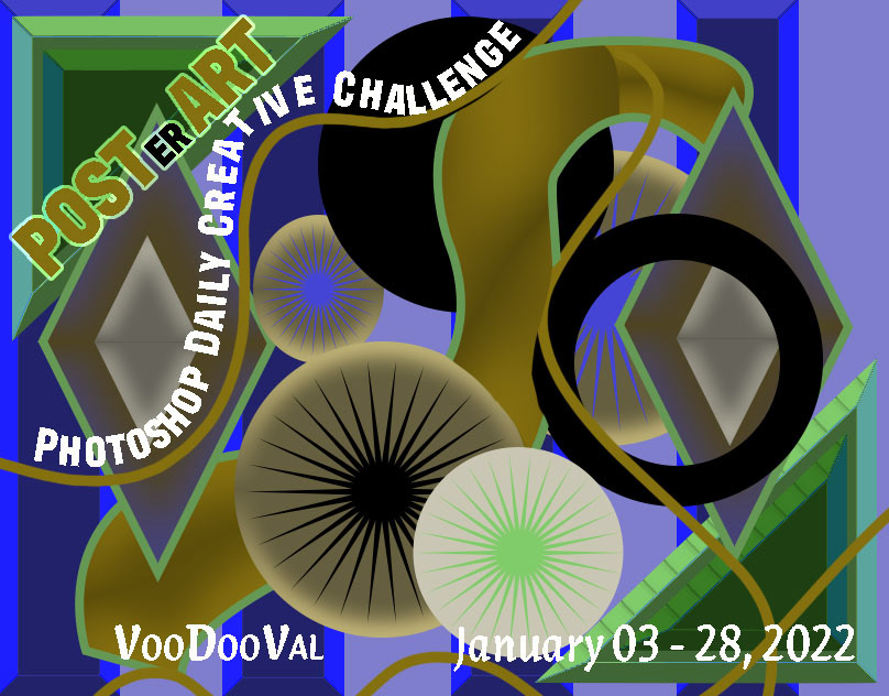
PS DCC2022-1 Post(er) a Day is now publish on Bêhance
https://www.behance.net/gallery/135222615/Post(er)-a-day-PS-DCC-host-Voodoo-Val-January-3-28-2022

Behance
Post(er) a day PS DCC host Voodoo Val January 3-28 2022
Day 9 - done! thank you so much @crystal aurora for the amazing challenges. AND looooved the costume 🤩

Gave +1 Creative Carma to @crystal aurora
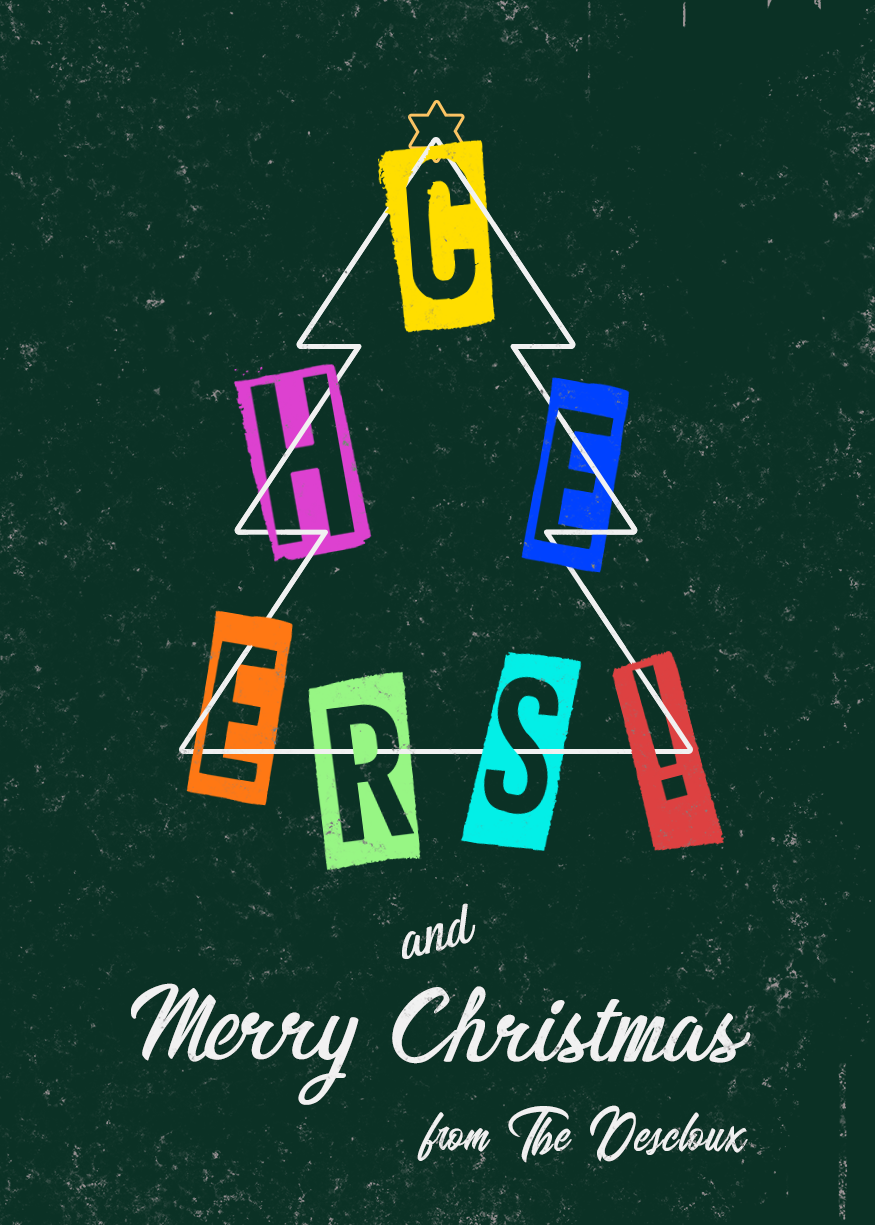
Here my Behance project from last month (Dec 2021) with Kathleen Martin, thank you for this interesting project and thank you to the people give me review and feedback https://www.behance.net/gallery/135405409/PSDCC-DEC-2021-THE-HOLIDAY-CARDS
Challenge 2. Tribute to one of my favorites. Thank you

Missing Challenge.

Challenge #2 - Ascending Type. My new mantra. This is my tribute to Voodoo Val. I am so grateful to you! Such an inspiration and excellent instructor. Every time I watch I learn something new. Every time!

Challenge #9 - Retrowave Lockup - Here's my last result of VooDoo Vals challenges.

Here's my Behance-project for this Challenge series: https://www.behance.net/gallery/134682911/Photoshop-Daily-Creative-Challenge-3-jan-28-jan-2022

Behance
Photoshop Daily Creative Challenge 3 jan - 28 jan 2022
CC5 distressed and vintage

Ascending Type challenge 😄

Quick and dirty because I'm trying to get these done before the end of the month. Challenge Three

brother, you spelled Depth incorrectly
That’s what I get for being all fast with it. I always forget to run Photoshop’s spellcheck. I’m going to fix that when I get home. Lol
i read it in a lisp "dpeth"
CHALLENGE: Design a social media post with chunky colorful elements. Try using Color Replacement to quickly create multiple iterations.


Dasy 3

This is my attempt for the ascending type challenge. I used a liquify effect and 2 copies in lower opacity to give this smoky effect.

so can driving
and sky diving
the ascending type challenge reminded me of one of Sam's ( 210927 ) but w o w did I get into trouble trying out all the 'actions!'

Distressed and Vintage, thought simple looked best and kept original background. Brings back memories of developing One-Hour Photos, lol

CyberCity

my two tries at challenge 9


DCC_D3_C2

challenge 1 social bio. what are your thoughts?

Hello. So glad I found the time to complete this project. Here is the completed project. Thanks. https://www.behance.net/gallery/135814279/Photoshop-Creative-Challenge-with-Voodoo-Val

SPAM ALERT!!!!!
Thanks!
Gave +1 Creative Carma to @ruby panther
You ARE Welcome!
You're photo evokes such warmth and compassion. The color palate you chose continues the feeling your picture is showing. I would like to see your bio text larger to make it more readable, perhaps with a finer type rather than bold.
Thank k you for the feedback! I will update
Gave +1 Creative Carma to @signal grove
CHALLENGE: Make an isometric scene using 3D shapes. Try adding new colors and customizing strokes with the Shapes panel.

Here is my attempt for Challenge #8 - I enjoyed so much doing this winter landscape with the new brushes of Kyle! I used the lasso tool to do the shapes.

I was away for a while on PTO for a bit of a personal matter. I missed all of you and seeing all your creativity. Im back and ready to go. Here are my designs for the last 2/3 of the DCC.


i've redone this with my face. it doesn't look quite the right angle. I can't figure out how to blend my neck with the stock photo. challenge 1 social bio

I'll leave blending techniques to my betters on here. Something I did notice though: I had your pic up on my monitor and walked away. When I walked back to it, the proportion of your face seems to be a bit too small for the body of the stock photo.
I like the borders and the consistency of the colors throughout.
ok. i'll try to increase my head size a little. it was kind of difficult because my head is leaning to the left in my pic and her head was leaning right but she's looking left. thanks!
Gave +1 Creative Carma to @signal grove
@eternal mica welcome back!
@worn venture Yes. With the increased size you look proportionate to the body and your head fills the space better.. Probably about the only time people see that having a big head works better. LOL 🤣
this one i think i'm happy with. I just need to get the blending down. thanks for your help. 😀

Gave +1 Creative Carma to @signal grove
We missed you too @eternal mica Nice job on the challenges. I really like the distressed one.
I've just published the Challenges on Behance. The 9th challenge is not really what was requested, I did my best to handle the retro wave style but it didn't work.
Thanks VooDoo Val for all the tips you taught us during the challenge!
Thanks Ted B and Sam Peterson for your feedbacks!
https://www.behance.net/gallery/134545751/POST(ER)-A-DAY-Ps-DCC-with-VooDooVal
Happy to be back
On my computer, your face looks discolored. I'm not sure if it's on my end or yours. What method did you use to try to composite yourself into the picture?
@eternal micaThis is the latest. Yes they were both lit differently. I think this is a little better but i still need to work on the neck

@worn venture Very nice! This design is looking good. I was wondering if the portrait is made up of different images? The deepness of the dark tones in the headphones and jacked don't seem to match the contrast of the face and upper hair area. I think perhaps a masked levels adjustment to boost the contrast in the facial features might help them all fit together a bit more. The bottom also feels a bit visually light compared to the top in your latest iteration. Perhaps leaving the border on the bottom could balance out the design and unify it a bit more? Just some thoughts. Here's a quick mockup of both suggestions. Nice work!
(Discord compresses GIFs a lot so click the image then click "Open Original" at the bottom for best quality)

Also worth mentioning I added some shadow onto the neck with a multiply layer (the last frame) and a light desaturated purple tone to better get the neck to match the body. It might help to soften the transition between those two parts a bit more.
Here's a still frame too. If you want to push the realism even more it could help to cool down the colors around the face with another masked layer. I'm now noticing the face lighting is warmer than the body, but these are very subtle nitpicks.

@vagrant rapids Great job with all these challenges! The presentation is looking really nice and I like how you matched the Behance project to the color palette of all your designs. I especially like the styles of the Day 5 and 8 challenges, well done!
@eternal mica Welcome back! Hope everything is going well. Great to see all these designs from you, I especially like the style of the second to last design with all the flat shapes, really neat cartoon look to it and the layering creates some nice depth. Nicely done!
@naive mulch Nicely done! I like the bold shapes in this and strong color contrast between the redish tones and the yellow. It makes for a nice strong graphic read to everything. Nice job!
@simple idol Woo, very nice Biola! The presentation is looking really solid, I like how there's a bit of space between each design to give each design a little breathing room. Great cover image design too. Great colors in these designs, I love the depth and abstract look of the Isometric image, very nicely done!
Thank you Sam. I'm very happy to be back. Thanks for the comment. I had fun with that one.
Gave +1 Creative Carma to @bleak fossil
Thanks for your feedback @bleak fossil!
Gave +1 Creative Carma to @bleak fossil
Thanks! I'll look at the suggestions you made. Yours does look better. I tried harmonization but it only helped so much.
Gave +1 Creative Carma to @bleak fossil
Challenge 1

@quiet ridge Very nice, I like the consistent color palette across this design! Really cool trailing effect with the top text too. Though I think the top "Glenn Wright" text could be a touch bigger for a cleaner read, and maybe moved down slightly to give the text a bit more breathing room. Looks good!
@lusty shell This looks great! Really nice visual balance to this design. I love how well the colors of the photo and design work together with the clean blue and white color palette, everything has a great unity to it. Well done!
@bleak fossil Thank you for your input
Gave +1 Creative Carma to @bleak fossil
Thanks @bleak fossil
Gave +1 Creative Carma to @bleak fossil
@stone steppe I really like the variety between the two Day 9 challenges! Both of them have a nice unified color palette, and I especially like how the first one has a banner image for the title that fades into a simplified background as it moves downward. I like how you played with different shapes and stylized between these two designs, nicely done!
@left abyss Very nice! The texture on the left and the general worn/scratched texture makes for a really nice aged look. One major thing I notice about aged photos compared to modern ones is there's often quite a bit less contrast, specifically in the dark tones. If you wanted to push the vintage look even more it might help using a levels (or curves) adjustment to lighten the darks just a touch. Just a thought of course. Nice work 👍
@onyx field Hah, bringing back memories! Actions are definitely an interesting thing. I like the layered text here, and the cast shadow on the text adds a nice element of depth. On the 2nd text from the top (the green text) it might help to add a subtle drop shadow, as I feel like that text could have a bit of a stronger read since the value of the green is so close to the value of the gray background. Nice job!
Day2 - Ascending Type
... Not only ascending I tried something a bit different 😉

@hollow yarrow Hey Franck, remember that shadow box technique you taught me a while back? I just used it again in my Behance portfolio. I used it with a color this time. I think it came out really well. Thank you again for teaching it to me.
Gave +1 Creative Carma to @hollow yarrow
Happy to know I taught something to someone... Maybe the beginning of a new career for me 😂 .
My pleasure to help and share... When I can!
Thank you to @jolly quest for a really well thought out series of challenges.. A lot of new applications, new techniques, and cool ideas for designs. Thanks as always to @bleak fossil for his insightful comments and for being the glue that holds the chat together. I had to take some time off during the last series, but I was able to catch up and get all the exercises done. I just posted my Behance portfolio. Please stop by and take a look. I'd love to hear your comments. https://www.behance.net/gallery/135935255/Ps-DCC-22-01-Ja-03-28-2022-VooDooVal
Gave +1 Creative Carma to @jolly quest
Youve always been there for me. Im sure Im not the only one youve helped. Youre a mainstay in this group.
yes the different lighting is definitely what's causing the blending issue. I don't have very many shots of myself and this one was an outside shot. thanks for all the suggestions. I'll try them out.
Gave +1 Creative Carma to @bleak fossil
Thanks for your kind comment!
Gave +1 Creative Carma to @eternal mica
Challenge #2

@tame jacinth Interesting design for Ascending Type exercise. There's a nice sense of motion in the design created by the waves at the bottom. The Ascending Type looks good. To give the ascending type more consistency, you might want to make sure the layers are each lined up properly. The third layer down looks a bit off the mark. Good work.
I tried and tried to fix that layer but it wouldn’t cooperate! Thanks for the input.
Creative Encore: Photoshop Daily Creative Challenge - Minimalist Shape

LOL, it is frustrating when computers have a mind of their own.
@naive mulch Nice effort on the Minimalist Shapes exercise. I like your color palette . I like the little shapes and text you added along the borders. I might suggest two tweaks: increase the contrast between the color fill of the two main shapes and at least center your main text from left to right, if you intentionally did not center the whole design, which I think would work well.
@tame jacinth Did you try holding down the shift key & using the arrow keys to move the text layer? This gives you better control of the movement
With the move tool selected, if you activate the layer, and use the arrow keys, I dont think you need the shift key.
@eternal mica cool I will try that next time
Good tips, thanks.
@naive mulch Very cool! Nice job with the shapes, they have a nice contrast against the background. It might help to balance out the space a bit more, for example, there's a lot of used room at the top of the design, but the text is basically touching the right edge of the frame which feels a bit cramped. Just a thought. Nice work!
@tame jacinth Nice job with the layered text effect! I really like how you matched the background image to match the style and color of the title text. The pop of color on the right side is a nice touch, but it could look good to repeat that color somewhere else to make it look more consistent. Maybe the "La Onda de" text could be the same blue as the 5G? Though that's really just up to your personal preference. Looks good!
@hollow yarrow Loving this design! You really nailed that isometric look and it has some really great depth. Was this mostly just using free transform to get the elements in different orientations? Really liking the almost blueprint looking style of this too. Excellent work.
@eternal mica Thanks for the kind words Ted! Nice work on all these designs, I think I missed the landscape mixer/Jersey Shore design before, but really loving the color palette on that one. Nicely done.
Gave +1 Creative Carma to @eternal mica
Thanks for the pop of color balance ideas.
Gave +1 Creative Carma to @bleak fossil


Sam, you deserve them. Thanks for that follow up comment. Im sorry I dumped all those designs in one shot. But Im happy I was able to complete the challenges and build my Behance portfolio. It was a well done group of exercises by VDV.
Gave +1 Creative Carma to @bleak fossil
Creative Encore: Photoshop Daily Creative Challenge - Minimalist Shape

Challenge 2

Nice! I like the icing dripping down the sides effect. Quite clever.
Thanks
Gave +1 Creative Carma to @signal grove
Hi! This is my day 4

I cheated a bit and used Illustrator for isometric distrotion of text and multiple copies alignement. Then I used Photoshop layer styles for appereance of each copy, final colors and textures...
🤔 I could play with distortion value to find values to use in Photoshop...
But it's so easy with illustrator to get isometric distortion than I couldn't resist use it 😉
Day 5

Challenge Four

Challenge Five

Day 7 Isometric Post

@naive mulch lekker to see a fellow South African here!
<@&548221840750018590>
Thanks! Got it
Gave +1 Creative Carma to @graceful arch
thanks! could you also remove links from other channels?
Gave +1 Creative Carma to @teal badge
Day 6

Hi, here challenge 1

challenge 3 (left : before and right : after)

challenge 4 first the original version

challenge 4 with other colors

here challenge 6

@lusty shell Nice work on the Ascending Type. Using Liquify is a cool touch. The color palette you used works well to create a unified cohesive design. The shape at the bottom looks like it could be cotton candy, a nice touch.
Thanks for the comment @eternal mica
Gave +1 Creative Carma to @eternal mica
@blissful wolf Good batch of posts. Your Chunky Colors is solid. The color palette is strong and exciting. Your work on the text layers is spot on. The light outer glow brings attention to the icon. Good Work. Your D&V image is well done. I like the textures you added. I might suggest you blur the original image and maybe add a color overlay to it to add to the effect thats its old. The image is a bit to sharp and crisp right now. Lovely Minimalist Shape design. Beautiful color palette. The shapes definitely have the feel of an abstract drawing of sea creatures. I would suggest you bring the word "Unthinkable" down to the second line of text. It looks a bit weird at the end of the first line. (also, check your spelling.)
Using Ai isnt cheating. Its a great idea.
@limber thistle Lovely Social Bio work. The color palette jumps off the page! The cohesion with the photo is terrific. Good work spacing the icons and the text. One small teak you might try to add a bit of interest is to move your name to either the left or the right of the text line above it. Your Fantasy Landscape is well done. The Sky Replacement changed the temperature of the entire design, and it looks great. What would you think about picking up one the image colors for text fill, rather than white? Maybe even a gradient?
@limber thistle Your Chunky Colors looks super. You handled the wavy lines perfectly. I love the text you added. The soft blue in the lower right is my favorite. And finally, the Minimalist Shape design is cool. Again, a cohesive color palette, especially as you used it on the text lines. I might scale up the small top line of text a bit to enhance legibility.
Thank you for your feedback Ted! I will try those changes and check the spelling
Gave +1 Creative Carma to @eternal mica
Thank you for the feedback I will make the teak that you suggested. You are totally right for the text on top of "wicked" I might change the color for a better legibility.
Gave +1 Creative Carma to @eternal mica
@tropic garnet Powerful colors in your Chunky Colors design. Id be interested to see how it would look if you applied the Color Replacement to it creating a few iterations. I think you'll be surprised by the result. Your D&V has a very OpArt look to it. I like how the sunglasses stand out and become a focal point of the image.
@near knot Nice work!!! Very interesting application of the concept. You did an awesome job creating perspective with the shapes. We had an exercise in our October series with Sam where we worked on this idea. If you didnt see it then, you might want to take a look at it. https://www.behance.net/live/videos/13303/Photoshop-Daily-Creative-Challenge-Perspective-Match . I like the text you added. The font fits the design. Good work all around.
CHALLENGE: Add graphics to a photo using Free Transform and Perspective Warp to match perspective.Get the starter file here: https://bit.ly/psdcc9-20-1You are watching a replay of a recent live stream. Adobe is live every weekday with content just like this. To find more, join us at behance.net/adobeliveFor more challenges like this, check out h...
Thanks Ted.
Gave +1 Creative Carma to @eternal mica
@eternal mica Thank you very, very much for the feedback! I tried to go for a Bauhaus look, hence the font. And thank you for the link to the perspective match tutorial. I will check it out.
Gave +1 Creative Carma to @eternal mica
hi
#1, kinda late but eh

Hello. Can we help you?
Nice effort with the Social Bio exercise. The color palette you used has a cohesive look with the photo. You did a nice job with spacing the icons. The shapes you added add interest. Good effort. A heads up. We will be staring a new DCC series on Monday. If you're interested in completing more exercises from this series, submit your work before Monday.
DCC meaning daily something challenge or smth?
Daily Creative Challenge
Ah k, thx
Creative Encore: Photoshop Daily Creative Challenge - Ascending Type

@naive mulch Good job with this design. I like the gradations you applied to the top few layers of the text. It would be cool to see you continue that effect on the other layers. You might want to move the text off of the photo to enhance the legibility. You can crop the photo and move it up without losing the effect you're looking for.

@late wolf Thank you for your post, but please respect the rules of this chat. The posts here are dedicated to the Ps DCC. If you have posts for other purposes, please use one of the appropriate tabs on the left.
Gave +1 Creative Carma to @late wolf
Challenge Six

Hey all... Man I've been down with COVID and ugg... I am so behind. So here is cover and day one challenge... I might do the others too... maybe I'll just start again tomorrow 🙃


Day 2 Ascending Type One of my most fav quotes

Day 3 Landscape

Creative Encore: Photoshop Daily Creative Challenge - Retrowave Lockup

#2

Challenge 3
^ scam links
<@&548221840750018590>
lol its written discorde
Thanks @quartz bear 😊
Gave +1 Creative Carma to @quartz bear
Day 4 Chunky colors


Day 5

@tropic garnet Really nice job with the Minimalist Shapes. I like the inconsistent text. It adds interest. The varying opacities of the shapes, also add interest. Good work
@tired turret Oh my, so sorry youve been struggling with Covid. But Im happy to hear youre back on track. Your cover design is very interesting. The wavy lines across the middle give a nice sense of motion. The color palette is sharp. I have to tell you, we've had chats before, but I never thought I was chatting with the person described in your Social Bio. So interesting to learn all that about you. Oh, and the design is cool too!! The Ascending Type looks good. You captured the essence of the exercise.
@tired turret Good job with the Sky Replacement. I might suggest you add more of the sunset sky effect to the flowers and the path, as they have a clearer brighter lighting effect. The Chunky Colors design is creative, the variations are interesting. On your D&V, it looks like you applied the textures to the right side of the photo, but not to the area on the left of the backyard. Also, you might want to blur the image a bit to make it look less digitally modern.
@naive mulch Nice collection of photos for the Retro design. To enhance the "retro" look, you might want to play with the gradient tool, as VDV did at the 13:00 minute mark of the stream, and apply that to the photos. Give it a try. See how you like it.
@dull fox Very well done Ascending Type design. I like the gradations you created in the levels of the type. The B&W has a stark contrast with your BG. I like the gradient you put at the bottom. I might want to extend the fade higher up into the design. But thats just my preference.
@lusty shell Nice work on the Sky Replacement. It fits well with your image. I might like to see more of the pinkish tint of the sky on the flowers and especially on the girl, as her dress is pure white (unless you intentionally wanted that). And I believe you wanted the text to read Forever Love, but maybe not.
Thanks! Ya there’s tons of tweaks. Odd getting back into the groove after Covid. My family is still sick with it 🤦🏻♀️ never ending. Looking forward to the new stuff coming.
I’m having a Devil of a time with the neural filters. They error out after a couple uses. I did see the need for more but the orange error said no. I’m try again to see if it’s back up.
D&V… blurring!!! Yes! Can you believe I forgot on the second round 🤦🏻♀️ long story short PS crashed. The filter thing maybe… anyway the attachment is all across and blended to the whole layer…. I’m thinking it’s because of the too white right side. If I use to harsh as blend on it for the yard the white looks bad…. Suggestions?
Gave +1 Creative Carma to @eternal mica
Sorry to hear about you've had Covid and good to hear you seems to be back on track although you think you're behind. The thing that matters is you feeling well again.
Thank you!
Gave +1 Creative Carma to @halcyon current
So I applied the blur and a could blends... here's the original pic and the update.... thoughts? Thanks Ted for the feedback I appreciate it


Gave +1 Creative Carma to @eternal mica
Challenge Seven

I think youve got it in this version
Challenge 3 correction. Thanks for the comment and mistake correction @eternal mica

Gave +1 Creative Carma to @eternal mica
@tropic garnet Interesting take on Isometric Post. I would lessen the difference between the perspective of the smaller shapes. The addition of some shadows would also enhance the effect.
@lusty shell Awesome tweaks. Looks great.
Thanks, @eternal mica
Gave +1 Creative Carma to @eternal mica
@frosty current Thank you
Gave +1 Creative Carma to @frosty current
@frosty current their back @radiant sparrow
here my challenge 3 first on the left before feedback and second on the right after feedback ? which one is better ?


here challenge 5

here challenge 9

here challenge 8 with 2 versions, which one is better ?


Day 6 Minimalist Shape Puppet Warp and Shapes
the project and the artboard to show what was used for inspiration and colors. Gradient creator on adobe is awesome! So using that again.


I still do! Love the coast
Haven’t been there in years
Bottom one
@lusty shell Very cool! I like the dripping effect you got with the layered text. That effect along with the color palette helps everything fit together really nicely. It could even look good to match the color fill of the main text to the brighter/more saturated color of the candy to give it a bolder look, but that's really just personal preference. Nicely done!
Thanks @bleak fossil
Gave +1 Creative Carma to @bleak fossil
@limber thistle Nice effort on the D&V design. The light blur along the edges looks good. The texture definitely adds the aged look. And blurring the image worked well. The Floating Archway design #2 is really cool. The shadows you added give a sense of realism to a fantasy image. The Retro design is very well done. Your color p[alette works well. The varying text is well done. Good work all around.
@tired turret Awesome effort on the Minimalist Shapes exercise. You picked up the vibe of the photo beautifully. Your shapes are interesting. Color palette is perfect. The gradient text fill is a good touch. Well done.
Thanks! Who knew you could make a seal from a triangle 😂 that puppet warp is my new favorite tool!
Gave +1 Creative Carma to @eternal mica

Adobe Stock
Download Ink black blot set. Abstract stain. Isolate on a white background Stock Vector and explore similar vectors at Adobe Stock.
If you'd like to rewatch the Welcome stream, Ive posted the link and pinned it to the ribbon bar. Also, here is the link to Sam's ink blots.
Thanks Ted!
@bleak fossil Youre welcome. Great start. Lots of good vibes.
My Behance Project cover image, and a version cropped to the 808x632px ratio that Behance uses for the project thumbnail.
Some slight Nickelodeon vibes on mine, hah. In that 90s mood I guess.


Check out my behance gallery from January session with VooDoo Val. https://www.behance.net/gallery/135739637/Photoshop-Creative-Challenge-January-3-28-2022

Behance
Photoshop Creative Challenge January 3 - 28, 2022
This rather looks like a death threat or the cover of a B-horror film LOL
Join your host Sam Peterson each morning at 9:00am PT to learn how to approach each challenge using Photoshop. Complete 9 challenges by Friday, February 11th, and you’ll be on your way to sharpening your skills. Get your questions answered, see what the community is creating and get feedback on your work!Starting off with creating a Behance proj...
FYI Adobe Stock Fonts has Falcon Script. I think it is the font @bleak fossil used today

@digital pike Very cool, the color palette is working really well! Great job on the splatter effect too. Did you use Kyle Webster's special effects brush for that too? They work great. Looks good!
@bleak fossil Thanks and yes I did use Kyle’s Brush. 😄
Gave +1 Creative Carma to @bleak fossil
Cover Graphic. Ugh, the PNG looks better but the file size is too big

My CoverImage for the Challenge.

Welcome page. Magic eraser tool usage is wonderful. I used for highlights triangle shape and lowered opacity and for the bg spatter shape Ps legacy custom shape starburst. Maybe I should use some other color for the background.

@tropic garnet Ooh, very cool, I like the background graphic. That along with the perspective on the text gives the image a nice dynamic feel. The color scheme and gradients are working well too!
Thanks @bleak fossil
Gave +1 Creative Carma to @bleak fossil
@rigid wolf Nice, really pushing that graffiti look! Very nice work with the text highlights and the different strokes. It could even be cool to see a version where you group all the text layers and groups together and try a blending mode on the group that shows a bit of the wall texture through it so that the text looks like it's painted on the wall too. Nice job!
@copper moss Cool effect! I really like the font style and that texture works well with it. I also really like the indented effect you got on the bottom text with the interior shadow, really nice sense of depth. It might help to add a subtle drop shadow to the bottom text to help it read a bit more clearly against the background star at a glance. Nicely done!
Excellent idea. Thanks for it.
Gave +1 Creative Carma to @bleak fossil
@frail ice These came out great! Nice job with the presentation and all the different design styles and techniques. I think my favorite is your Floating Archway design, really nice clean design and composition. Very cool!
Sam, thanks very much! I have learned a lot of new things here. Drop shadow I will add.
Gave +1 Creative Carma to @bleak fossil
My work for todays Cover page on Ps_DCC


@quiet ridge Cool shapes! Nice job with the strokes and the gradient effects. The background graphic adds a lot of energy. This is just up to personal preference, but it's often good practice to repeat a few choice colors in the design rather than having everything be a different color. This can help establish a color scheme. Less colors, especially when repeated throughout the design often give a nice feeling of a unified look. For example, rather than green, if you repeated a color from another area of the design (maybe yellow?) in the fill of the top and bottom text that might be a nice look. Just an option of course. Well done!
@bleak fossil Thank you for the input . I played around with a few colors but wasn't happy with the readability so I went with the green. I do agree and will play around with it a bit more in fact I had just re-opened the file when I saw you had made a comment lol 🥂
Gave +1 Creative Carma to @bleak fossil
@bleak fossil A fun start to the series. Ps DCC 22-02 01 Behance Cover (for now)

@bleak fossil The strokes you added give a real jump tp your text. And the orange fill works great. Most definitely a Nickelodeon vibe to the design.
@frail ice I wanted to commend you a super first Behance portfolio. The portfolio reflects the time energy and inspiration you put into the designs. I might make one suggestion. The dark blue font on the black bg is a bit hard to read lacking contrast. I might play with the fill color and settle on a softer brighter blue like the one you used for the cover design . Very well done. Keep it up.
Thank You!
Gave +1 Creative Carma to @eternal mica
@digital pike No wonder @bleak fossil liked your design. Yours looks as good as his, and thats a compliment!! Well done. I especially like the highlights. Theyre consistent and realistic.
Did these tweaks help?


@tropic garnet Did you use the 808X632 canvas size? very cool concept. I love that filter. Its one of my favorites. Interesting font . To get a bit more cohesion with the BG perspective filter, I might push the perspective on the text just a bit more.
Second Try 😉

@eternal mica Thanks 😄
Gave +1 Creative Carma to @eternal mica
@quiet ridge I wanted to follow up on what @bleak fossil pointed out. I found a great tool to learn how to control my urge to add colors was to pick a theme set from Adobe Colors and stick within the 5 colors of any particular set, sometimes even using less than all 5. It really taught me to reign in my "splash" impulse.
@rigid wolf Super tweak. You'll learn ALL Sam's ideas are excellent ideas.!!!
@quiet ridge The second tweak looks a lot better.
@eternal mica So you noticed I like a lot of color lol 🥳
@quiet ridge DUH, YEAH!!!!!
Jepp. He´s great 😂
@eternal mica At least I didn't give everything a drop shadow with an outer glow as well as a stroke with an inner glow and shadow lol
I had never heard of the Magic Eraser tool before the stream today. Its awesome. Learning that tip alone made watching the stream worthwhile. I love your font. It creates so much interest. I think you could use a lot more contrast on the second row of text. The blue/white blends right into the starburst blue.
Here's my result of todays Welcome "challenge". I know it's pretty dark but I like it. I had to take a break halfway through the making of this one - I had just added a random gradient but when I got back I realised that I liked the effect. I had to add a curves layer to mask in more light in the bottom two rows to make it somewhat visible. One fun fact is that I didn't like the combination of blue and orange when I was younger. I like it now even if I don't think I would wear clothes in this color combination 😆

@halcyon current There are no "right" answers to the challenges. Its whatever feels right for you at this particular moment. If you like "dark" today, then go with "dark". Who knows. Maybe tomorrow you like "light". BTW, Blue and Orange is one of the most popular color combinations for sports teams in America.
@eternal mica That's true - I'm pretty spontaneous and my taste varies from day to day or I should say from creation to creation. I go where the creativity takes me. I can understand the popularity for that combination as there is a good contrast between those two colors.
Here's my cover for the challenges 🙂

Behance Cover for February's Challenges. Looking forward to a month of inspiration by Sam!

I'm probably way over my head here, I used to be a photographer and fairly fluent in Photoshop for editing and simple creativity, but have been out of the loop for about 6 years.😬 Hoping a challenge would refresh old skilz or ignite new ones, but I cant even find the video for the first day of the latest challenge. Is there anyone who would be willing to handhold until I get my footing in here? I would be extremely grateful!☺

Cover for new challenges:

update my Behance project header

Really great shot! Love the idea of painted wall. If I could suggest you something: maybe you could play with the type of contour settings for your typo.
If you adjust settings in the red circle (capture linked) you can reduce the harsh look of the black outline... Your choice. Anyway you done an amazing cover!👍

The link for today's Welcome stream is just a bit above, you can scroll up and click on it. The actual challenge begins tomorrow. Today's steam is a perfect refresher for you. The challenges are for any skill level. If you have any questions, we're here to help
Late watching the video today, but here's what I came up with.

#✂challenges-feedback This is my welcome page for my first photoshop challenge. This is the month of February and I just love everything about valentine's day.

Day 0 My Behance Cover.

I did not. I was testing out new brushes on a larger canvas and just kept that file open. It's the same ratio (iirc) but quite a bit larger.
Welcome DCC! I look forward to the challenges! Thank you!

@quiet ridge I like it! Definitely an improvement in the cohesiveness of the design in my opinion. The yellow contrast against the pinks and purples really make the title text pop too. Very nice!
@bleak fossil Thank you
Gave +1 Creative Carma to @bleak fossil
@compact pecan Always quality fun, colorful, and psychedelic color palettes coming from you. I really like the depth of the wall behind the colorful background, and the shadow effect sells it well. The text contrasts really well against the background even with all the color and texture, nicely done!
@toxic patio Very nice! I like the theme you went with. I really like the way you kept the background design really light in contrast so that the title text has a strong read to it. Well done!
@tropic knoll Glad you're excited! This is looking really nice, I like what you did with the textures in the text and background, it adds a really cool look to it. Really nice contrast between the text and background, great colors too!
@crystal saffron Very nice, I'm digging that font style! Really cool bubble-like letters. It works really nicely with the highlights you added. Great clear contrast between the background and text, and I like the added dimension of the shadow on the background splash. This came out really well!
@dusky wave Very nice work, I like the brush stroke texture in the background. All these elements have a nice clear read to them, and the color palette is working well. Looks good!
Thank you!
Gave +1 Creative Carma to @bleak fossil
@queen aspen Ooh, great textures and colors in this! I really like the consistent style between the text and background. There's also a great contrast and subtle color palette going on in this design that works really well. Nice job!
@median horizon I really love the way the "Photoshop Challenge" text interacts with the background texture, almost has a sort of glass look to it with the bright edges catching light. Really cool background texture as well. I feel like maybe the red is a little overpowering with how strong it contrasts against all the blue in the design, perhaps toning down the saturation or brightness could help that? But that really is up to your personal preference. Looks good!
@frail ice Great style! I really like the blue and gold color scheme, and the way the blending mode of the "Photoshop Challenge" text interacts with the background works really well. Nice job with the composition of the text 👍
@deep mango Nice job on the cover image, there's a great contrast between the text and background in both color and texture. The background texture adds a lot of nice interest. Looking good!
@halcyon current Ooh, I love the style of your text. The blue and yellow/orange with that font works really well together. It also contrasts really nicely against the darker background design. I definitely use the orange and blue color combination a lot, hah, probably my favorite complementary contrast. Nice work on the background graphics too!

@eternal mica Cool use of the splatter graphics on this cover design! Nice job with the gradients on the graphics and text as well. If I had any suggestion I'd say that the design starts to get a bit visually busy with all the different colors and shapes, especially the bold contrast between the background shapes. It might be interesting to keep everything as is, but try a simple gradient for the background color instead of the boxes and see how that changes the feel of it, but of course it really just depends on what you're going for. Nice work 👍
@rocky kite I really like the softness of your background design here. Nice work with the repeating brush texture (I assume this was done with a brush?) as well, it kind of has a floral feel to it at a glance. The softness of it contrasts nicely with the bold title text. Nice work with all the stroke effects too!
@tired turret Nice job with all the different shapes you created on the Day 6 challenge! I like the soft contrast between all these colors, and the warm-cool color palette you have going. The text gradient has a nice feel to it, looks good.
I had to play just a bit more


Extremely rusty in Photoshop! Didn't realize I should have dated and put the instructors name on it! :/ Of course my original file is gone...YIKES

@quiet ridge Very cool! Always fun to see people exploring different styles and designs, this is a neat take on this cover image. The frame and the background pattern are looking nice!
@slate dust I love it, even more of that nostalgic Nickelodeon vibe, hah. The colors work really nicely together. And you're totally welcome to add whatever you want on the cover image, but it doesn't need the date or instructor name. Though if you wanted to date it or anything you could always just open up the Jpeg in Photoshop and add in a quick text layer. Looks good, really liking that text gradient!
@bleak fossil Thank you I owe it all to the DCC I have learned so much taking them. Also the help and input I get from everyone here on Discord I just can't say thank you enough
Gave +1 Creative Carma to @bleak fossil
Day 0 - Welcome stream cover.

@hollow yarrow You nailed it! Love the style and design to this one. The half tone and background texture looks great, and the faded contrast gives it a slightly aged look which is really neat. The whole design has a great cohesive look to it, impressive work!
Thank you, @bleak fossil!
Gave +1 Creative Carma to @bleak fossil
Gave +1 Creative Carma to @bleak fossil
Thanks Sam I really appreciate !
Gave +1 Creative Carma to @bleak fossil
Thank you Sam. I got carried away. Here's something more restrained.

Looks great!
This would then look more realistic. You're right about that.
Looking forward to the challenge!

Hello peeps! You may know me from the illustrator discord but posting here for the first time 🙃 time to tackle with photoshop

always start from 0 🤣
Thank you, @bleak fossil
Gave +1 Creative Carma to @bleak fossil
Thanks Sam .. have a 'scratch disc full' situation to solve; 4am our time is a bit early for me lol
Gave +1 Creative Carma to @bleak fossil
Version 2. Yes, Ted, I used this tool for the first time and I will experiment it further in other cases.

Version 3 for those who like pink. I added cloud effect to the bg. I shoud use for date black fill, I will correct it later.


Hey I really like the colors in this one and the background style is cool too. Well done!
Thanks!
Gave +1 Creative Carma to @halcyon current
Welcome in Katarina!
Thank you @bleak fossil for your feedback. I appreciate it very much. I never thought that blue/orange-yellow are complimentary colors. Now the popularity makes a lot of sense.
Gave +1 Creative Carma to @bleak fossil
I love the style of this one. Red-blue-white works very well together in my eyes.
imposter syndrome activated 😄 🦸♀️
I love the style of this one. Great thought to make a wall painting out of it.
Welcome Katarina! It's always good to expand the knowledge - it can for sure make the creativity thrive even more 🙂
@deep mango I really like your brush strokes. The color palette works very nicely. One small tweak. It appears the P and D are capitalized but the c is not. If this is going to be your cover, you might want to fix that.
@frail ice I love the concept and the execution. Following up on Sam's comment, I think the smaller text in the upper right might work better with the gold fill rather than the BM. What do you think?
@median horizon Additional to Sam's comment: how about spacing out the text more to give the different lines more room to breathe, especially the "daily creative" line above and below?
@queen aspen I love this. It looks like the text is tiles lying under a small pool of water. Great look. Beautiful gradient. Your text layer styles and strokes are subtle and cohesive. Awesome job by you.
@dusky wave Nice crisp clean design. Colors work well. Even though I love Sam, I might scale up the top of line of text a bit to give it more prominence over the second line.
@toxic patio Lovely effort. I love the font. I might suggest you reverse your gradient text fill so the lighter color fills in the Photoshop where the BG is dark, and the darker color fills in Challenge, where the BG is lighter. I think it will enhance the legibility. Also, I think Photoshop should be one word.
@compact pecan You win the prize for this series. The first design to still be in 2021 instead of 2022!!! 🤣 🤣 Powerful colorful design with tons of elements, as always. The depth on the shapes is really great touch, and well done. Even with all the colors, there is a cohesiveness to the color palette. Good job by you.
@tropic knoll Lovely concept. Solid execution. I wonder what this would look like if the candle was more part of the BG (i.e. blurred a bit, lower opacity, less dominating), unless, of course, you want it to have this prominent an effect. The colors on the text and stroke look great together.
@rocky kite Beautiful pastel color theme. Well done. I might suggest you enhance the cohesiveness of the design by using one (or maybe even two) of the pastel colors in your BG for the main text fill. TYPO: This is the February challenge, not January.
@quiet ridge I think we need to find you a full time job!!! Where do you find the time to create all these?? You have too much fun creating new designs in these challenges!!! Your latest has a very February/Valentines Day vibe to it. Perfect color palette, very cohesive, fits the message. I really like the proportion of the second one, and that frame.
@slate dust Following up on Sam's comment, a few tips to help you out. 1. Save. Save. Save. (but you know that already.) 2. I often make the same (terrible) joke to newbies, The second post is free. Adobe only charges for posts starting with the third one!! Feel free to tweak your design and repost it to your heart's content. That's what the chat is for. 3. There are no rules for what needs to be in any particular design. Thats up to you. Many folks have prior experience and know they want to create and post a Behance portfolio for this series. Having a fully descriptive cover design is a good attention grabber. 4. If you have any questions or need help finding your way around, please feel free to give a shout.
@hollow yarrow You have such a knack for bringing together so many techniques and elements in a cohesive natural subtle way. You make it all look so effortless, which it most definitely is not!!! This is a wonderful example of that. Your control of the color palette is amazing. Awesome work.
@white cedar Welcome to the DCC chat. We're happy to have you join in, especially from the beginning of this series. If you have any questions or need any help, give a shout. Great first effort. Your cover design is crisp clean and effective. The color palette looks awesome. Just for the fun of it, how about trying a subtle layer style or two on your text to give it more pop.
@lean harbor Welcome to the right side of the Adobe world!!! 😜 🤣 😜 We're happy to have you join us. Beautiful design. Awesome color palette. I love the main font. It creates real interest. Good job on the fill. The border is a good touch. The BG textures are super. One tiny tiny tweak. I'd change the fill of the word "with". The white is too stark for a word of little significance. Maybe try the same color as the other text in that font.
@onyx field You cant let go of Sam's 3D action can you!!! Its a great technique. Solid effort. The "challenge" has a retro "3D without the glasses" vibe. Nice work with the shadow. On your "Photoshop", the effect might work better if you scaled down the text a bit, increased the kerning, and gave more room for the layers to show themselves. But that may just be me.
@gentle pasture Really interesting presentation. I like the way you kept the text from overwhelming the strong image BG. I might suggest one tweak. Perhaps using one of the colors from the BG for the main text fill would add to the cohesion of the image. Im not sure. What do you think?
Thank you, @eternal mica
Gave +1 Creative Carma to @eternal mica
Thanks @spark saddle
Gave +1 Creative Carma to @spark saddle
Yeah, I’ll be writing 2021 on every date I write until about October. I’ll scratch it out and write “22” above it like I do with all my hand-written dates.
<@&548221840750018590>
@eternal mica Thank you for your kind words and well as your input. This old blind man has nothing but time on his hands being as they wont let me drive , so I am stuck at home with my computer & Adobe. lol
Gave +1 Creative Carma to @eternal mica
Well, keep it up. You're an inspiration to us all!!!

RE-DO Welcome DCC. The candle is blurred and the opacity has been taken down. The text colors are a struggle for me, which ones to use. Hope the overall effect is more flattering. Thank you for this opportunity! I really appreciate the input!

I know I'm late on this one but here is mine

@eternal mica, Hi! Thank you for your inspiration and feedback. I really appreciate it. I would have never thought to blur and lower the opacity of the candle. Sure appreciate the insight!
Gave +1 Creative Carma to @eternal mica
@modest talon Welcome. We're happy you joined our DCC Discord chat. You'll find this to be an excellent place to enhance your Ps skills, no matter what skill level you start at, meet some awesome people from around the world, and have fun, all at the same time. If you have any questions, or need help with something, give a shout. Wonderful initial design. The cover looks great. The soft pastel vibe is cohesive and consistent. The multi textured BG is well done. If I had to make one tweak, I might add one more stroke to the text and use a darker shade to give a bit more contrast and pop to the text. If you decide to add another stroke, I'd also suggest increasing the kerning to let the text breathe, with the additional stroke.
Welcome @modest talon
Awesome tweaks. The new text fill added real pop. The colors are just right. The candle looks IMHO so much better. You made a really terrific initial design even better. Good for you!!.
@somber harness Youre not late at all. The Party hasnt even really started. Our first challenge will air in just a few minutes. Welcome to the Ps DCC chat. You can complete the challenges on your schedule, any time from now until 02/25/2022. If you have any questions or need help, give a shout. We're here to help. Nice work on your cover design. The textured type looks cool. Having two fonts is a good idea. Because you have only text, I might scale up the main text to fill more of the canvas. You'll learn I'm a pain in the neck about spelling. (sorry, its in my DNA, 😜 ) Check your spelling on "Challenge". I look forward to your future posts.
Lol all good on the spelling, I illustrate for a living not much of a writer. Was never good in English courses in high school. I really should get in the practice of typing in word first to check for errors. I did have the text bigger, I know lots of empty space, but then the grunge effect didn't look so good. I could try again. Thanks for the 2 fonts comment I know Sam was doing what he could in 30 min but that's a good design tip to use 2 fonts on a text only file. Otherwise I feel it mushes together too much.
Gave +1 Creative Carma to @eternal mica
Also I'm excited for this challenge I normally work in Illustrator and feel my Photoshop skills have gotten rusty looking forward to getting some more knowledge and skills back
There are a few Ai crossovers in the group. Many of us Ps folks dabble in AI. You can use both apps as you develop your exercises. Sam is an excellent leader. He usually has innovative creative interesting projects lined up for us. And he has a very smooth measured well paced delivery. I think you're going to enjoy the experience.
Awesome! Sadly i'm gonnna miss the live looking forward to the encore
@eternal mica Thank you!! (big smile)
Gave +1 Creative Carma to @eternal mica
watch it on your schedule.
I just watched today's live stream. It's my first time on Discord but I'm a long-time Photoshop user, needing to brush up on the newer tools. Thanks!
Welcome in! @proper umbra
Thanks, I will make another version according to your advice
Gave +1 Creative Carma to @eternal mica
Welcome in. We're happy you joined the group. We look forward to your posts. If you have any questions, just give a shout.
Day 1 challenge: Super Speed Blur! Gotta go fast.

Ps Dcc 2022-2 Challenge #1 Super Speed Blur 2-1-2022

HA! Yes, I normally know that with my photos, I have no idea why I didn't save this first workable file. I'm quite rusty, haven't been in the thick of Photoshop for about 7 years, and trust me, at my age, if you don't use it, you lose it! Thank you for your encouraging words!! 🙂
Gave +1 Creative Carma to @eternal mica
Thank you for y our kind words and the recommendation! 🙂
Challenge #01 - super speed blur. Ran into an issue as to make it appear that the arm is also coming forward tried using puppet warp. Anyone suggestions would help.

Dont bring up age with me!!! I believe Im the seniorest of the seniors in here!!!😜 😜 😜 We need to stick together.
Did you apply the puppet warp before the blur and the additional layers?
This challenges is a great work out for old brain 🤩
@wary swan Good work on this. You got this one!!! I might blur the top image in the areas away from the face just a bit more.
Thanks for the feedback Ted, great tip have not use motion blur so often.
Gave +1 Creative Carma to @eternal mica
NO, I copied the original layer - did a smart filter then used the motion blur & then puppet warp.
😀

Ive not tried it before, but I would think applying the puppet warp before the blur filters will get a better result.
@digital pike YES!!! Good job!!! One tiny tweak. Id mask out the blur only on the rightmost face topmost layer to match the faces on the other two images, leaving the blur for the rest of the body. Well done.
Motion blur was so much fun

@quiet ridge Oh man, thats good. The blurs are spot on. Really well done. Im starting to think there are going to be a slew of exciting submissions for this challenge.
That was fun! We just watched the Matrix (the first one) again with the family. I love that movie!

here is my creation, what do you think?

Day 1

My opening for Ps DCC 🙂

@eternal mica

My son overcame the sound barrier))

Hello all! Josie here. Unfortunately missed the welcome yesterday. didn't see a spot for a replay? First time on pretty much all of this! discord, Behance, challenges... but familiar with PS 😂 just a wee rusty. Excited to jump in to all this
A little more diifcult than I originally thought it would be.

@vital iris Go up to the pinned files on the ribbon bar. I posted the link to yesterdays' Welcome stream.
her is the link https://www.behance.net/live/videos/14869/Photoshop-Daily-Creative-Challenge-Welcome?tracking_source=to_replay&from_row=What's_New
Join your host Sam Peterson each morning at 9:00am PT to learn how to approach each challenge using Photoshop. Complete 9 challenges by Friday, February 11th, and you’ll be on your way to sharpening your skills. Get your questions answered, see what the community is creating and get feedback on your work!Starting off with creating a Behance proj...
@lost helm We keep getting asked for the Welcome stream. Rather than reposting the link here every time, I posted the link in the pinned files. I think thats easier
Sure, that is a perfect way 🙂
@eternal mica Thank you for your kind words & I agree I am seeing tons of great version of todays challenge
Gave +1 Creative Carma to @eternal mica
So good to have a new challenge Sam, I made a breakdancer version too to keep trying the speed blur


Yeah i guess we 'click' with some tutors way of working. I was experimenting with using blend modes on the photoshop word and with the daily work; warp and kerning. the lesson is in the middl,e of the night here and the day took over. My main concern was the challenge font's 'G' ! VDVal recently has also used the 3D trick. I am finally getting the hang of the app differences so am 'letting go' of that hehe !
hi, here the last 2 challenges from last month, so here challenge 2 (ascending type) (is it pretty legible ?)

and challenge 7 (isometric post)

Challenge #1 - Super Speed Blur - I found a perfect image (in my own eyes) for this challenge and had a lot of fun with it! Photo from Adobe Stock Free. Original is attatched too.


Challenge 1 - Super Speed Blur

#challenge - Super Speed Blur - Gradient Map added 😉

Daily challenge #1.

Challange 1

Fighter girl. I used filter to age the image.

Girl´s fly above the city. My hands are my wings to soar. Her boy friend has taken this picture from the plane. Tried to use colors in blurs. Images are from Adobe stock free.

Day 1: Motion blur

Not the greatest result this time but the technique will be very useful in the future I'm sure.

@young karma Your boxer is right on. The multiple blurs look great. I think you created a good amount of space between the right and center image. I think the break dancer could use a more distinct central image. The Blurs are well done.
#PSChallenge-MotionBlur

@halcyon current Oh yeah, that's a terrific image. And I love what you've done with it. The two sides are balanced nicely. The central image for all 3 images are clear, which makes the blur really work.
Hi! here my photo challenge

@modest talon Nice job!! The blurs look solid. I might suggest you mask out the blur on the two side face images to make them a bit more crisp, which will enhance the blur even more.
PreChallenge-Banner

Challenge 1 with some different background options.


@quiet fern Very interesting interpretation. The punch has really good blur effect. The image on the right might look better with a few more iterations of the blur.
@livid bough Good work. The blurs look solid. The way they fade out on the right is cool. I like that the face is nice and clear.
@coarse portal Well done. The blurs and fades look solid. One small tweak I'd make is to have the faces on both side images be sharper to sell the effect even more.
@copper moss The grainy filter is a great touch. It takes a modern effect and throws it back in time. Your blurs look solid. The falling girl is an interesting interpretation and use of the blur. Good for you for creating outside the box.
@queen aspen Spot on with this design.The left blur looks great. I think showing the right face a bit more clearly would really sell the image even more.
@gentle pasture I think you have a good start. If you extend the effect some more, I believe it could work on this image.
@paper shadow It looks like you took a different path. Good for you. You created some interesting blur. I think you could use more of the blur to the left face to match the blur on the gloves.
@tall maple Well done. Theres a real sense of the skateboarder coming in for a landing. It would be cool to see some blur attached to the skateboard.
@topaz vine Interesting interpretation. Neat concept to go with various BG styles. I think you could increase the opacity of the layers closest to the subject to add a bit more strength to those layers and sell the image a bit more.
Well, I thought I would try to find one of my own photos to use for this challenge, but I wasn't quite motivated enough. Maybe one of these days...LOL! I really enjoyed the process video, and it is a great feeling to get back in the Photoshop saddle again, so to speak! I haven't gotten quite this detailed with editing before. Thank you Sam! 😊

Hi! They were done spontaneously. I will improve manipulations on bluring in flying girl concept later. Thanks a lot for you feedback. 🌼
Gave +1 Creative Carma to @eternal mica
@slate dust Great to have you. The leaders pick out assets that allow us to really work the technique. Many times it's hard to find an alternate that works as well. I think this is one of those times. You did a nice job working the blurs. The image on the left is very good. The one on the right could use a bit more definition of the face to make it as strong as the one on the left.
I didn't get too creative, differing from the example, but it was a good lesson on a couple things. And I thought of a time-saver to copy a whole group to move to create the right/duck series.

Challenge #1 Motion Blur


@last mica Very nice! Nice job with the masking and the gradient background. It could help the effect to slightly lower the opacity of the trailing figures and bring the most focus to the top one. Looks good 👍
@steel slate Looks good, it's somewhat subtle, but the motion blur definitely gives it a feeling of movement while still being clear. Nice job!
@proper umbra Hah, perfect timing then. This looks great, the blurred figures on both sides definitely gives her that sense of bobbing and weaving with a nice focus in the center figure. Well done!
@quiet ridge It's a fun effect for sure, this is looking good. Definitely has that Matrix-like sense of movement with all the different figures. My only minor nitpick would be that softening the mask for the left hand edge of the figure on the right so there's less of a visible "seam" between the center and right figure might give the figure more of an effect of being in movement. Hopefully that makes sense. Very nice work!
@digital pike Very nice, this is looking solid. Really nice sense of movement with all the figures, and I like the variety in levels of opacity/fading too. Nice work!
@dusky wave Nice work. Were you trying to have the blur effect on everything but the arm? Nice job with the blur, though there seems to be some areas around the legs and center of the torso with an abrupt hard edge that looks a bit out of place. Perhaps softening those areas, and trying to keep a bit more focus in a key area like the face could give it a natural look. Nice job with this design 👍
@raven ginkgo Ooh, this looks great! I really like how you got the blur trailing off the front figure to make them all seem like a part of each other. The direction of the blur and gradual fading of opacity is working very well. Nice job!
@bleak fossil Thank you . I agree & tried but it can use more work in that mask
Gave +1 Creative Carma to @bleak fossil
PS DCC

@lost helm I like it! Really nice background graphic, and I like the texture and soft fade around the edges. The strokes and sense of depth on the text are working really well too, nicely done!
@hearty hatch I think it's definitely easiest to keep it simple with one figure/blur at first, but can certainly get a bit more involved the more you add. This is looking good! Nice job with the blurs and opacity of the multiple figures. The main thing that catches my eye is the figure directly to the left of the center image. I see the left side of her hair is still in focus and doesn't appear to have any blur to it which makes it compete a little with the focus of the center image. But that's a minor detail for the most part. Nice job with this technique!
@compact pecan Ooh, cool take on this challenge! I was excited to see any different uses for this effect people might find. The effect is looking good and definitely has a nice sense of motion. The composition also works well for this image, nicely done!
@crystal saffron Very nice! That's a really good idea if you find you'll be duplicating a lot of the steps with the second group for sure. The blurred effects are looking great, I really like the level of opacity you set them at for that ghosted movement look. Nice work!
@slate dust This looks great! Really nice job with the gradual faded opacity of the trailing blur effect. It really allows a nice focus on the center image. It's always fun to use your own photos too, but I can relate, always more work, hah. Good if you really want to get specific with the images you need though. Nicely done!
First time doing the Photoshop challenges but using it as an opportunity to utilise multiple effects at once.
I do recognise the other effects hide the blur to a degree but I feel it has helped to add a new dimension to the image and create a sharper focus overall.
Thank you for challenge 1, I look forward to trying out more!

@topaz vine Very cool, I really like the color effect in this image to really focus the attention on the hiker. I think it works especially well on the sepia version in my opinion. Really nice job with the masking and blur effect on this!
@paper shadow Nice job with the strokes on the text and the gradient effect too! My only suggestion might be to choose a background color that isn't so close to the value of the splatter graphic so they contrast a bit more clearly. Maybe even a white background might work better? Nice work on this design 👍
@tall maple Great photo for this challenge! Really nice job with the multiple, gradually faded images. If you wanted to push it even further you could give the main figure a slight blur (maybe mask out the torso and head to be unaffected) and the skateboard too. But of course that's all personal preference. Very nice work!
@gentle pasture Very nice, the direction of the blur is working really well in this image. I like how the blurred images give the sense of movement but the head and face areas are more in focus. Nice job with the faded layers!
@queen aspen The layering and blur effect is looking good here. Nice job keeping the focus in the center for a clear focal point, this effect looks solid!
Sorry a bit slow on the uptake... any comments are welcome 😊

did the tweak Sam was talking about. To be honest it was the back copy of the right image I forgot to mask out her right hand

@bleak fossilSam, thank you for your feedback🙌🏻
Hey Cork. I think you did a great job of the bob and weave. I see where you're talking about missing the right hand mask, but looking at it from the perspective of the "guy on the outside", it looks flawless. On the inside critique, I would say a softer opacity on the right side. My eyes is drawn to that rather than seeing the center image.
First time at blurring.... it's a cool effect.. will practice more...

Hi There! first time on discord and first time doing an Adobe Challenge week. It's been a while since I have played around in photoshop, so this has been a nice way to wade back in. Thanks for a great tutorial @bleak fossil

Gave +1 Creative Carma to @bleak fossil
I tried something different... Path blur and motion blur + warp tool... Not as good as expected 😢

@signal grove I agree and thank you
Gave +1 Creative Carma to @signal grove
Challenge 1: Super Speed Blur

Ive never used motion blur with one of my sports edits before but wow it is powerful! i need to start using it more often

challenge 1 btw
PS challenge - Motion blur

@copper moss Ooh, the aged photo effect gives it a whole different feel. Kind of like superhuman movement caught on camera many years ago, hah. Also really neat effect with the girl above the city design. It could be neat to give the color layers even stronger of an up/down motion blur to really push that sense of movement/following. Nice work with these!
@coarse portal Very nice, this came out really well! Very nice job with the blur effect and the faded opacity of the other layers. The masking and focus on the face of the center figure is also looking solid.
@livid bough Nice sense of movement in this design! Kind of looks like a quick slide to the left followed by a bob/weave to the left. Looks good, nice job with all these techniques 👍
@quiet fern Really cool stylized look to the super speed challenge in this design! The gradient map adds a really nice look, and the blur effect is doing a nice job of adding that sense of motion. Great design.
@halcyon current Cool idea for this challenge! I like the way the faded images keep the contrast in the center figure, and the way they all kind of blend together works really well too. Nice job!
@modest talon Great take on this challenge, this is a good picture for it. Did you add the blur in the slack line too? That's a nice touch. The blur effect is looking really solid, though I think it might help to lower the opacity of the figures on either side even more for that ghosted type of effect since some seem a bit too opaque to read as a faded blur. Just an idea of course. Really nice work with the masking too!
@covert loom Nice cohesive color palette to this cover image design. The black stroke on the text looks great and adds some nice contrast, but I also like the subtlety of the orange and white strokes too, it gives the whole image a nice clean read. Looks good!
Thank you, Sam!
Gave +1 Creative Carma to @bleak fossil
2nd one is just random expriments on the layer style page


@bleak fossil Thanks 😀
Cover for this months PS DCC

OK, give to blurred colors more stronger, but I made them with lower opacity but in vain. I really like your way of giving new techniques, which inspires and gives reins to imagination. Thanks!
Thanks
#pscreativechallenge Motion Blur
…plus neural filters

Thank you, @bleak fossil
Thank you, @eternal mica
Challenge 1

Challenge 1 - Motion Blur. I found this fun to do but tricky to follow. I had to watch the presentation about 4-5 times as it was going too quick and some of my icons weren't in the same place as the demonstrator. But the content was excellent.

I did this one kind of quickly. If I had more time I'd make some more adjustments.

Challenge 1 Motion


sigh .. had to screen shot where i got to (18.15) cos no matter how much i took off onto a disc the scratch disc filled up ! had fun though lol

My version 🦋

Thanks! your too kind.
How yeah! Yours is really well done! Blur effect gives a solid dynamic result. Impressive work!👍
Wow! Speed blur is well done and I love the background replacement. Painted look effect adds a really nice touch. Nicely done!🤩
Welcome in! Great shot, I can't wait to see your next pieces!
It's great, love the movement and vibrance.
Thank you so much! I loved your work a lot too, Franch! ✨
Cover and Challenge 1


Thanks!
Thanks!
Day 1 - Super Speed Blur (2nd Design)
When Motion Blur meets Pixel Stretching.

Thank you so much @eternal mica I knew what kind of image I wanted and was happy to find one.
@hollow yarrow whatever pixel stretching is, it looks great. How does it work?
Thank you so much @bleak fossil for your feedback. I knew what image I wanted so I was happy when I found one 🙂
Thanks for the feedback! I'll experiment with the opacity on those layers!
Thank you! I appreciate the feedback.
Thank you for the feedback, @bleak fossil !!!!
Man I wanted to use this effect too but couldn’t remember the name so unintentionally thank you
Motion Blur. Am I close? Sam made this look easy! Thank you for this opportunity!

#challenge 1 v2, Collage from four consecutive photos 😀

My Cat

Thank you @bleak fossil for teaching us some cool stuff today

Thanks for the feedback @eternal mica, I fixed the "c" 🙂


Ps DCC 2022-2 Challenge #2 Portrait Lighting Effects 2-2-2022 image 1

I love the apocalyptic vibes on this edit
This was a cool demo! I was going to re-watch the video right now and try it out, but it's not showing. Is this typical? How long do I need to wait to review it?
Pro Tip from Shawn everyone, set your Hue/Saturation layers to the Color blending mode for a more realistic color spill look. (This is in reference to the Day 2 challenge)
Hmm strange... I did the same yesterday and it worked. There might be some glitch somewhere... Check if the YouTube version is up
hey sam I gave it a try.

yeah, it worked for me yesterday on this challenge and on the Illustrator one, but right now the video feed is black.
I'll check if the YouTube version is up
Here's todays stream on YouTube until it's back up on Behance:
https://www.youtube.com/watch?v=TXJNKHwCTGA
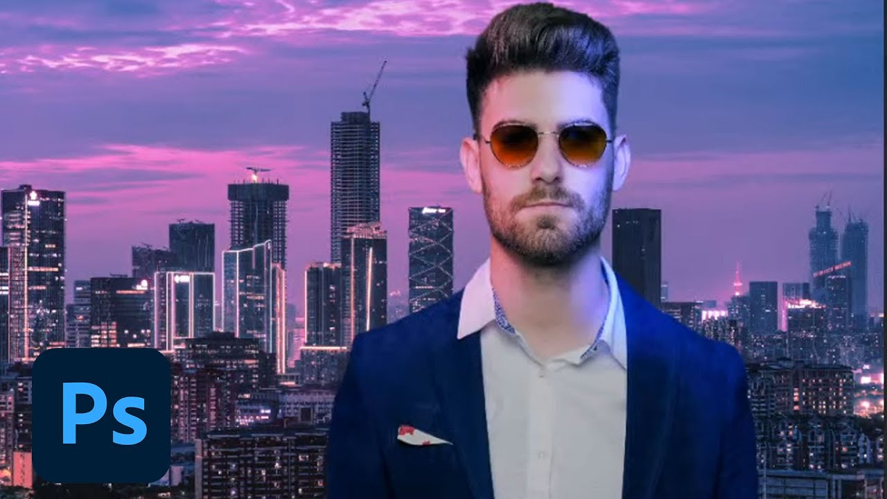
CHALLENGE: Use adjustment layers, color dodge, and multiply to create unique lighting effects for portraits.
Get your starter files here: https://adobe.ly/3Fojsyf
Join your host Sam Peterson each morning at 9:00am PT to learn how to approach each challenge using Photoshop. Complete 9 challenges by Friday, February 11th, and you’ll be on your w...
Result for today's Challenge

Today's Day 3 challenge: Portrait Lighting Effects

Ps DCC 2022-2 Challenge #2 Portrait Lighting Effects 2-2-2022 image 1+2+3
The News Man

Challenge #1: Super Speed Blur

😀


I messed up the bottom part. How can I fix this?

catching up with challenge #1 This is such a neat technique!

that is about what Sam was talking, you have to clip mask and refine it or by painting with black or by selection mask
I painted it black, then this happened. It should blend but it looks like solid.
You sure you were painting with black on the clipping mask not on the photo?
@lean harbor yes i did

I don’t know. Haha, I grabbed it from a Free Stock Pro search
I have to start form the beginning 😮💨
Like you motion blur of the dog with the water going everywhere. Looks very realistic.
oh! am not sure post in #❓ask-a-question somebody would know better
really? non intentional
thank you ^^ so glad you like it
If you'd like, I will give you a method to save this project, but it is absolutely not recommended for regular use. DM me if youre interested.
Here's my entry for Day 1 🙂


Day 1 Challenge - 2nd Attempt to upload 😫

Is it me or can no one else see the Day 2 video?
There is something wrong with the link on the landing page. Try this. https://www.behance.net/live/videos/14873/Photoshop-Daily-Creative-Challenge-Portrait-Lighting-Effects?tracking_source=to_replay&from_row=What's_New
CHALLENGE: Use adjustment layers, color dodge, and multiply to create unique lighting effects for portraits.Get your starter files here: https://adobe.ly/3FojsyfJoin your host Sam Peterson each morning at 9:00am PT to learn how to approach each challenge using Photoshop. Complete 9 challenges by Friday, February 11th, and you’ll be on your way t...
😂Sorry, I couldn't resist🙈

Hi everyone! Not sure why the link wasn't working, but I re-added it to the landing page and it seems to be working now! Apologies!
Thank you! Now everything works!
Tried several approaches for challenge 2


learned so much from todays challenge!
My version of the 2nd Challenge 🦋

I got carried away 😄


Challenge 2: portrait lighting effects- Its amazing how a picture like this can have SOOOOO many layers! It is hard to keep track and seeing which are useful to the image. Can someone advise where the airbrush paintbrush is as I can't find it in my folder of brushes. I had to use a normal brush and reduce the flow.

#challenge - Portrait Lighting Effects - Before & After 😉


Challenge 01

Version 2 for the portrait lighting effects

OK, I took a few swings at the Pinata on this one. Let me know what you guys think.


Challenge #2 - Portrait Lightning Effect - Here's my result of this challenge. It was fun to play with lightning and colors. Thank you @bleak fossil for another great tutorial 🙂 I'm also attaching the assets I used - both downloaded from Adobe Stock Free.


hi al, heres my take on challenge 1. i also tried to do challenge 2 but for some reason my computer nor my ipad would play that video. is it a problem on adobe's end maybe?
anyway the first image is my take on the starter file that was provided for the challenge. but only after i did that did i remember i wanted to do the same thing with my OC that i use as my profile pic so i figured might as well post that here too (second image)


DCC 2.

Lovely result. It looks like she’s caught in a dreamworld!
Took me a couple days but here's my blur effect Aston Martin

Well I guess a day and a half
#challenge 2

When I get free time tonight I look forward to taking as better look at everyone stuff! Awesome work everyone!
#challenge - Photoshop Daily Creative Challenge - Welcome Day

Challenge day 2

#challenge - Portrait Lighting Effects

@quiet fern love the color choice
Thank you! Your looks stunning 😍
Neat pan motion effect!
thanks! i wasn't liking the effect i was getting with the motion blur so i tried using the path blur from the blur gallery
@lean harbor very cool effect, very whimsical.
lol i just realized i forgot to mirror my image back, the license plate is backwards
#challenge - Portrait Lighting Effects - Just wanted to try Masking on her beautiful hair!

Thank you! It’s actually a gradient made from Teamster colors! 🥰
i use the triadic color scheme often in my illustrations
I guess my Portrait Lighting Effects are fairly subtle instead of as bold as you did, @bleak fossil .

Thanks
The link has now been repaired. You can watch the stream.
@jade imp I believe it will just be called "soft round" in the default Photoshop General Brushes. As long as it has a soft edge it should do the trick, that'll give you that smooth gradient effect. Nice job with the colors in this!

@modest talon Very cool! These are matching really nicely, and I like how the light on the left side of the face matches the color of the lights on that side. The colors and values on the portrait fit in really nicely with the scene as well. Nice work!
@quiet fern Really liking that style of text and the colored strokes you added to it! Kind of a Willy Wonka vibe with that font style. The text gradient is looking really good too, nicely done.
@tall maple Looking good! The lighting and color between the portrait and background fit together really nicely. I feel like you could go a bit darker in the dark tones of the background to match it a little more closely to the portrait, but it's looking solid overall. Nice job.
@somber harness Ah, I was waiting to see a speeding car design! Great image for this challenge. Nice work with the motion blur, I really like the focus of the car, but it could maybe even add more of a sense of motion if you blurred the car but masked it out so the effect was only on the trailing back end of the car. Though that's really just personal preference. Nice work!
Day 2

@crystal saffron That's totally fine! It all depends on what you're going for, my goal is just to show some tools that you can use in whatever way you need. The figure seems to be fitting in with the lighting of the scene really nicely here. And while the lighting/color is subtle, it definitely has an effect. Nice job!
@quiet fern Excellent job with the masking on the hair! Complex selections like that can definitely be tricky and you nailed it. Loving the colors too, definitely fits in with the coloration of the beach background. Looks good!
Ps DCC 22-02 02 Portrait Lighting Effects

Ps DCC 22-02 02 Portrait Lighting Effects Assets

@livid bough Nice job, the color tinting is subtle but works well. I like how the more subdued colors of the background really let the figure pop. 👍
@winter root Nice job, it's cool to see this technique applied to multiple images, both a photo and illustration. I really like the way you positioned the blur of the boxer down low on the right side to give her the effect of ducking/bobbing up and down, that works really well. Nice job applying it to the drawing as well!
@halcyon current Thanks for showing the base photos too, this came out really well. The portrait fits in nicely with the background and the color tinting has a really cool look to it. Very neat style!
@eternal mica I like how you tried the Day 1 challenge out on multiple images, and the addition of the color effects makes for a really interesting look. My only minor nitpick on the boxer image is the head of blurred image directly to the right of her seems to have a hard edge on the right side and the texture of the hair showing, which kind of takes away from the ghosted/blurred effect a little.
Also, for the dancer it might help to use masking to try and keep the blur mainly concentrated to the areas of his body that would be in motion more, such as the legs, whereas I imagine the hand planted on the ground and the area around the hand would be less in motion since that's where he's pivoting. As is, it almost gives the impression that his whole body is sliding from right to left. Just some thoughts of course, nice job with these and I'm liking the stylization with that color effect!
@dusky wave Nice to see you trying this effect on multiple images! I especially like the contrast between the portrait and background on Version 2, while the portrait still seems to have a warm tint that makes sense with the background image. Nice job with the color grading on these.
@quick compass Really great work on the Day 1 blur effect! The various levels of opacity are working really well to give her that dodging effect. The masking is looking solid as well.
@quiet fern Really liking the color shift on the Portrait Lighting Effects on the image with the girl and the city! Those cool tones on the left side of her face fit really nicely with the lighting of the background, and the turquoise lighting around the jaw and neck is a nice touch.
@lean harbor I love it when people get carried away in these challenges, haha. These are great images for this challenge, really cool concept! Excellent job taking the lighting of the original portrait and pushing it in such a dramatic way. The warm glow looks great, and I really like the cool tones on the left side of the face in the forehead and cheek. Super cool!
I'll look into the boxer image to see if I can correct what youve pointed out.
Good point on the dancer image. I did in fact mask most of the torso but its hard to see because its white. But I'll rework the mask to take into account your point.
@bleak fossil is this the area you're pointing out?

@eternal mica Correct!
Thank you, Sam!
@bleak fossil Great eye Sam. I forgot to apply the blur filter to the bottom most layer in my stack for the center image!! On The Breakdancer, I eliminated most of the blur on the hand, but I believe there still should be some, as even the that hand is swapped in and out as they breakdance.


My first attempt. Something doesn't feel right so I will have to keep playing around with it

@bleak fossil After i posted the picture i thought the same thing lol. i got some blur to mask and unmask
Tried it with Color Dodge

@young karma Very nice! The reddish glow on his face fits in nicely with the red signs in the background image. The lighting on his shoulders is a really nice touch to sell that effect as well.
@quiet ridge Looking good, I like that you tried two different passes at it. There's certainly a lot of variables that can affect each image so experimenting with the techniques really is the best way to get a good feel for them. I kind of like the deeper contrast of the portrait in the first version. Nice work 👍
@last mica I like the bold colors and stylistic look of this image! The colors on the portrait fit in really well with the background and look like they belong together. Nice job with the color and lighting effects.
@coarse portal Very nice, that's the best way to get a feel for the tools and techniques. This is looking good, I like the semi-stylized look to the colors, I think the second version reads a bit more like a light source compared to the darker blue of the first one, though that could still be a dim reflected light of something blue nearby. Nice work!
It's a little more pink in tone than I intended 😂 I still feel like the man "pops' too much out from the background.

Thank you @bleak fossil for Day 2 challenge tutorial 😀


Thanks for your feedback @bleak fossil it was a bit hard for me. But did it.
Thank you so much, @bleak fossil 😍
Yes, as always your advice is spot on, and I feel it would pull the design together..I may give it a go if I can squeeze in the time👌
Hi Ted, thanks once again thats something I did not consider at the time and may have really helped the image along.
Thank you Sam loving your Challenges.
wow that was a lot of information ! have to stop somewhere but heh ta heaps


Challenge 2- Portrait Lighting, Tried this effect in a dreamy fairy tale style.

Thanks, I learned a lot from this challenge (#2), excited for the next challenges
where do you all get these challange
Here @young karma https://www.behance.net/challenge/photoshop

Daily Creative Challenge
thanks mariah
You are very welcome ✨

Cover


Thank you for your feedback!
Here is another one for Challenge #1

Here's my lighting effect for Day 2 🙂

Hi, here is my challenge 1

Day 2 Challenge

Challenge 2: Portrait Lighting Effects. Very cool playing with all the adjustment layers to see how each one can play a part in achieving that look you're going for. Will certainly keep playing around with this stuff.

I've enjoyed this one.. last post for this challenge, I promise, imaginary CD cover.

@young karma If you'd like to join the DCC start by watching the Welcome stream. The link is pinned in the pin files above. Then you can watch the live stream of todays challenge by clicking the link in the ANNOUNCEMENTS>CREATIVE CHALLENGE tab on the left. The landing page for the Ps DCC is https://www.behance.net/challenge/photoshop

Daily Creative Challenge
@young karma If you have any questions, give a shout. We're here to help you along.
@compact pecan such an interesting take on the Speed Blur. Solid work on the composite. I might tweak the top layer to give one layer a bit more clarity as the leading edge of the animal.
@covert loom Good work with the style layers on your cover design. The colors look great together, and work well with the gradient.
@silent perch Good effort with the Speed Blur. I'd suggest two tweaks. Move the clear image to the front and the blurred images behind it. And lower the opacity in stages on the blurred images to increase the effect that they are fading away.
@civic kettle Welcome to the group. The whole purpose of the DCC is to elevate your skill level, no matter where you start from. So youre in the right place. As well, there are very few rules. You can create whatever designs you feel like as a response to the streamed challenge. Your speed blur design is very creative. I think the blur works well on the man. I'd suggest for consistency the pig needs the same treatment.
@vague zephyr Welcome to the group. If you have any questions, give a shout. You can do the DCC on your own schedule. This series will be running through 02/25. If youre going to post designs not from that particular day's stream, it will help if you designate which challenge your post relates to. Your Cover design looks solid. The color palette works. The layer styles you used add good interest to an interesting font selection. Your Speed Blur looks good. I would make one tweak by lowering the opacity a bit more on the blurred images in stages to increase the fade effect.
@west viper Welcome to the group. We're happy you decided to join us. If you stick with us, you'll learn some amazing techniques while interacting with some wonderful people. You did a solid job on the Speed Blur. I might like to see a clearer version of the right face to mimic the clarity of the left face, but that could just be personal preference. Good work on your Portrait Lighting, I think the man still looks a bit too "pasted on". You might want to add more of the lighting effects to his clothes to get them to blend more with the BG lighting.
@velvet lintel Welcome to the group. Give a shout if you have any questions, or need help. Solid effort on your Speed Blur. All 3 images look right on. Very well done Lighting Effect. The tint on the skin tones and the clothes looks good. I think I might have the blue tint cover more of the right side of the face, but thats personal preference.
just WOW! This is gorgeous!
Day 2


@rich vapor Really cool application of the Speed Blur. You did a good job with the blur layers. I might suggest you increase the difference in the opacity levels of the blur layers to sell the concept even more.
Thanks for the great feedback! I'm excited to be here with fellow creatives.
Thank you @lean harbor
If anyone wants to add the gradient "flame" effect @bleak fossil showed at the end of the stream, check this video from one of his earlier streams. https://www.behance.net/live/videos/11689/Photoshop-Daily-Creative-Challenge-Magical-Gradients

Challenge: Create magical swirling and glowing effects using Gradient Maps.Get the starter file here: https://bit.ly/psdcc5-24-9Join your host each morning at 9:00am PT to learn how to approach each challenge using Photoshop. Complete 9 challenges by Friday, June 4th and you’ll be on your way to sharpening your skills. Get your questions answere...
Its the same Sam, just without the mustache!!!
Day #3 challenge: Smoking Text Effects!

finished challenge 2 just now. will upload challenge 3 later today

What was the font @bleak fossil used in todays challenge? The "Aileron" found on AdobeFonts doesn't look like the one Sam used?
Download Ailerons Regular For Free. View Sample Text, Character Map, User rating and review for Ailerons Regular
Ailerons. I might have gotten it off DaFont. I don't quite recall. @halcyon current
Adobe has a font called Aileron, but its not exactly the same.
I searched and found it on befonts.com
Challenge 2

Challenge 3: Smoke. I used smoke with a pipe. Image is from Adobe stock. I adjust light via hue/sat and curves, that smoke is seen better. I have done on type as well. Thanks, that was a valuable session on how to use smoke. There should also a trace of the bullet that has flown out, ha-ha.

I must say what a fabulous set of challenges so far, REALLY loving the exercises. TY Sam! It's literally 'learn something new every day' with this set!
Thank you!!
Just finished my lighting effect

I love this image, the guys expression is just awesome
day 2 lighting effect

Challenge day 2

😀

Thanks, it is in Adobe stock for free 8435113, you can download. 😀
Looks good, another tip to help you try and make the subject blend into the background is to apply a black and white adjustment layer to the top layer and then using Levels, Color Balance, Brightness/Contrast, and Selective color adjustment layers to try and match the same saturation black and white tones. The whitest part of the subject should be as white as the whitest part in the background. Same with the midtone gray and blackest parts of the image
Ps Dcc 2022-2 Challenge #3 Smoking Text Effects 2-4-2022

Oh also make sure all the other adjustments you make are clipped to your subjects layer so you're not effecting your background
There was smoke coming from the pipe. Now I added a trace of the bullet that has flown out. In my own way. Ha-ha.

My result for PS DCC #03 Smoking Text Effect

Day 3 smoky-spooky

My version of Smoking Text Effects 🦋

DCC 3. This was a lot of fun!

@rocky kite Interesting Speed Blur design. Using a different BG is a cool touch. Fine job on creating the alternate blur images. I think you can sell the effect even more if you increased the fade on the images as you move away from your core image, with the ones furthest away barely being visible. Give it a try, see how it looks.
@dull fox Very well done cover design. I really like the color palette. You did a great job creating the white highlights. The textures and styles added in V2 make the design even better. BTW check spelling of Challenge. (Edit>Check spelling)
@tired turret Very interesting cover design. The wintry BG you created looks great. The soft stroke looks good. I think I'd go with a different color for the main text fill. The black seems off with the rest of your color palette. But that may just be me. You decide.
@rigid wolf WOW, I really like the way you used the neural filter. I would not have thought it would combine well with the Speed Blur, but it does. The filter you selected looks great with the colors in this design. Your fading of the alternate images is well done. I might blur the top left image just a bit more. Very well done.
@autumn pasture Cool interpretation of the Speed Blur. I may be mistaken but it looks like you used blur filters rather than multiple layers to create your effect. Thats fine. I think you could sell the effect more if you pushed the opacity of the blur higher. It looks too subtle to me.
@jade imp Welcome to the Ps Discord chat. Yes, at first, the streams seem to move too quickly. Watching the video multiple times is normal. Especially for an exercise with as many steps as this one had. After a while, you'll get the rhythm down pat and things will be easier for you to follow. Stick with it. But you seem to have gotten it down. Your speed blur is cool. I would make a few tweaks. I would have the left image fade off to the left rather than to the center. I would have the left and right top images in synch. One (R) seems very blurred and the other (L) very clear.
@tropic garnet Hahah, fun design for the Speed Blur. It took me a second/third look to see what you did. It looks like you used the blur but not the multiple images. If so, I would add the effect to the head and legs of the bird as well.
Challenge 2: Light effects


