#✂challenges-feedback
1 messages · Page 117 of 1
Aciu Aciu (thanks in Lithuanian) 😄
Nice photo and I really like how heard face (head) is filling the art-boeard. Nice Job!! as always.
Thanks @lost helm!
Gave +1 Creative Carma to @lost helm
My take at Challenge #2. I'm really having fun and feeling creative 🤗

It's so cute @dusky swallow ! The eyes of your mother are full of joy on this picture. I love the red flowers you added!
@sterile bane Thanks 😀
Gave +1 Creative Carma to @sterile bane
DCC_D3_C3 Image of my parents and their first born

Dear Kathleen, thanks a lot for your feedback. I really like your works very much. I watched the previous videos with you. 🌼
Gave +1 Creative Carma to @sterile bane
PS DCC Day 2 Challenge🎄

Day 3

Hope you all like it 🙂

Here's a fun one!

DCC 2. Cottage Card. The cottage is a holiday decoration in my window. I hope you feel the gif tells a story. Thank you for this opportunity! I really appreciate it! Holiday wishes come your way!

Day 3 using colorize Neural Filter

This is an image of my grandmother & her brother who was killed on the 1st World War!
This photo turned out great! Plus your wreath looks really good. I think it’s pretty special to have a color phot of your grandmother and great uncle!
Day 3. Just the basics. Trying to feel comfortable using program. My beautiful grandma. Happy Heavenly Holiday!

Ps DCC 1-12 01 Text Shapes & Colors

Pa DCC 21-12 02 Digital Collage

Ps DCC 21-12 03 Colorize a Photo
Ps DCC 21-12 03 Colorize a Photo

This is my grandma, three great-aunts, a great-uncle, a cousin, and my uncle. Only one person is still alive.


My original file.

Love the composition. I really draws my eyes in.
Nice job! I really love the green texture in the background.
I love how you added mountains and snow. I also like how you made the background snow less vivid/ opaque. lt all really gives a Sense of depth
Here's my version of the challenge, had so much fun doing it!

Here is my Daily Challenge #3 project.

I'm a day behind but this one took me a little while. Brand new to photoshop so still learning! Any feedback?

Thank you @uneven osprey for your feedback! It means a lot to me!
Gave +1 Creative Carma to @uneven osprey
@compact pecan Uncle Joe always has the most festive cards. Nice work! The colorization in the photo, especially in the skin tones has a very believable look to it. Great work with the wreath and all the decorative card elements. The mockup is a nice touch too!
@tropic knoll Really cool animation! I like the story behind this one. The color gradients in the sky give this a really whimsical feel. If I had any nitpicks it might be that it could look good if the speed of the animation was adjusted so the sleigh is a bit faster as it comes in, but slows slightly as it gets closer to the house. Just a thought. Nice work!
@marble umbra Nice job with the colorization effect! It has a really natural look and the skin tones have a nice saturated feel to them. Very nice job with the wreath and the pinecones and flowers. The text styles are looking good as well. Nicely done!
@young karma Really nice mockup in this Day 3 design! The presentation looks really good, and the wreath came out really well. The colorization is really subtle and has a cool look to it, though I think it could be manually adjusted around their arms and the top part of her face where it still looks quite desaturated. Nice work!
@velvet yacht Cool design for this Day 3 challenge! The wreath looks good and I like the paper texture underneath. It appears as though the background trees in the middle/right took on the saturated blue green color of the clothes instead of the background trees on the left. Perhaps manually adjusting the trees would help separate the background from the figure a bit more. Looks good!
@lusty relic Really nice design, I like all the background design elements and the shapes you created to frame the cabin. Since the green text at the bottom is so thin, and such a similar value to the background color it kind of gets lost a bit. It might have a stronger read to it if you brightened the text up a touch. Nice job!
@quiet ridge Super cool to see you using your own photo for this challenge! The wreath looks great, and the colorization came out well. My only suggestion would be to manually change the color of the child's face, since it looks like it took on the color of the shirt. It could also be nice to make the bottom text red to repeat that red color throughout the design and unify it all a bit more. Just some thoughts. Well done!
@peak python Great to see people using their own family photos for this challenge! This looks really good, the colors have a clear contrast and vibrant look to them. Very nice work with the wreath as well, nicely done!
@eternal mica These are all looking solid Ted! I really like how much you seem to be considering clean and simple color palettes for all of these. There's some nice stylistic variety between, but all have a solid unified look. I especially like the more vintage style and colors of the first greeting card design. Really nice job with the masking and composition with the various design assets in these images. Well done!
@quiet moon Very nice! Welcome on in, glad you're joining us. These challenges are definitely a good way to gradually pick up new techniques and get more familiar with Photoshop. This is looking good, I personally might like to see the design scaled up on the blue background a bit, and then the whole design plus blue background scale up slightly on the white background for a bit more focus on the design, but that's a minor suggestion. Really nice job with all the shapes you created!
@prisma horizon Nice work, I like the clear contrast and read of the shapes in the Day 3 challenge! Nice job masking and creating the elements for the wreath too. 👍
@ivory rock Glad to hear it, it's looking good! I like the background paper texture and the holly leaf pattern you made. If you wanted to push it further it could be nice to mask the area in between the two figures to be the same shade of blue we see on both sides of them, just to separate the figures from the background a bit more. Nice work!
@grave moss Nice job putting this design together. Did you use neural filters in addition to manual coloring, or just one or the other? The main thing I would suggest would be trying to fill in the areas of skin tones so there's no remaining patches of grey. Nice work with the border and background!
wow, looks amazing!
This really made me smile. really cool!
Thank you @uneven osprey 🙂
Gave +1 Creative Carma to @uneven osprey
Hi Sam, thank you for your feedback. I will check again 😊
Gave +1 Creative Carma to @bleak fossil


Challenge day 3

I really like the wood sign with the snow on top. That’s a great touch! I also like how you broke the frame with the Santa hat at the top. Nicely done!
Thanks for the feedback
Gave +1 Creative Carma to @sterile bane
I really like the color palette on this one and the repeating pattern of Holly really adds to the wreath! Nice use of the diagonal line from the horse through the whip (is that what it’s called?”

Challenge day 3...

@peak python Please dont give up. At the outset, pausing the video and redoing steps over and over to get the clicks exactly right is perfectly normal. When I started, it took me hours to follow one half hour session. But the learning curve is steep. I'm sure you'll get the knack of the basics pretty quickly. And as Sam said, please do not hesitate to reach out to any of us directly or through ask-a-question if youre really stumped on a step. We're here to help. Youre doing great!!!!
Thank you
Gave +1 Creative Carma to @bleak fossil
@bleak fossil Thanks for the comment and thanks for taking the time to make all your great comments on lots of people’s efforts! Can’t wait for challenge 4
Gave +1 Creative Carma to @bleak fossil
@bleak fossil Thank you Sam. As always, I value your critiques.
Gave +1 Creative Carma to @bleak fossil
This is my mom and dad, circa 1955


This is my brother and sister Christmas circa 1955

Thank you @bleak fossil I like your suggestion and will make those changes. I will try to remember to post it for all to see when I get it done
Gave +1 Creative Carma to @bleak fossil
Thank you @bleak fossil! I'm so appreciative of your nitpicks. I'lI switch the speeds of Santa coming in and leaving! Thank you for your ongoing support and inspiration!
Gave +1 Creative Carma to @bleak fossil
Day 3: I used an old picture of me and my friends that were taken in 199? - I can't remember


you can see the words "adobe stock" in the photo
@queen aspen Cool effort. The card is well done as is the mock up. The color palettes on both work well. I would make one tweak. Center the faces in the middle of the wreath so theyre not cut off. (If necessary, eliminate that branch that is hanging down.) Make the faces more definitively the focal point of your image.
@spark saddle @ivory rock Having the Adobe imprint on images is something we all accept here as we know we sometimes use Stock photos for which we have no license. Sometimes we're able to disguise it, sometimes not. Dont sweat it.
Thanks, @eternal mica but it is no way to center the faces - the picture doesn't allow to do this.
Gave +1 Creative Carma to @eternal mica
im not....
For sure there is. Work backwards. Use the center person as your reference point. Center that. Then work to size the Wreath accordingly, showing all three faces. Then fill in any area of the inner circle with filler/vignette/blur/etc.
Real quick example

Maybe... I'm not sure
Shark atacking persons
Day # 3 Completed

PS DCC Day 3 Challenge

great idea!
Used an old family photo, I wasn't born when this was taken, only 6 people are left alive in this image now. Even the church behind it has been demolished, ah well.... the neural filter kinda worked.

My final Aurora Borealis for the day! Can't wait to see yours 🙂

Hi! First time here... I use this pic and did- did i complete challenge №3?) 🙃


My Challenge result for today


My DCC_D4_C4

Challenge 3 #DCC

😀

thank you for the feedback
Gave +1 Creative Carma to @vagrant rapids
DCC Day 4 Challenge

Thank you Kathleen, to tell the truth the colorize filter just turned it sepia... not much really seemed to happened, actually what you see is IT,
Gave +1 Creative Carma to @sterile bane
Day 4 challenge - I switched up the photo and tried a couple different brushes. Need to practice more with the brush-swirling, but it was fun!


@timber dagger Welcome to Ps DCC Discord. Great to have you join us. Cool take on the Colorize a Photo challenge. Good consistency in the color palette, picking off the Ps colors. The texture you added to the card looks good. One tweak Id suggest is finding a space on your card to make the text a bit larger and more prominent. Good work.
@dusky wave Nice job getting the brush stroke to have texture throughout the band. Your text has good contrast against the brush stroke, even though the color is so similar. Cool job.
@gentle pasture Lovely triptych type presentation for your exercises. Theres a good consistency in the designs. I might suggest you give the text, especially the thinner fonts, more of a contrast against the dark backgrounds, so they dont get swallowed up.
@quiet ridge Very nice subtle effects added to the design. And the text arrangement works well to sell the whimsical feel of the design. Good job.
@short plank Nice work on the Colorize Photo exercise. (It would be cool to see the original photo you worked off of.) The color palette of the image, the card, the text, look very solid together. Good work.
@digital pike Lovely result with your brush strokes. The colors you chose to give the design that ephemeral design work really nicely. I like that you chose to zoom in on the BG to make it more prominent part of the design. Good job.
@lusty relic Very nice work on the Brush design. The band across the sky is nicely done. Creating the flow of sparkles is a solid enhancement. Tying it to the text for cohesion works very well. I might tweak one thing. There are parts of the red text that are getting lost against the BG. Perhaps give them a layer style that enhances their contrast to the BG.
Day 4 , the northern lights 💫

@pine venture Lovely work. I think you nailed it. The sky has a very realistic look to it. Picking up the green from the sky as your text fill adds good cohesion to the design. Very well done.
@gentle pasture Wow, very powerful interpretation. Good job by you. The colors you added to the sky look terrific. My one tweak would be to select a more subtle BG for your card. I think the added image detracts from the power of your central image. But that could just be me. Your image. Your decision.
Thank you @eternal mica
Gave +1 Creative Carma to @eternal mica
@dusky swallow Super job by you. Your brush work is awesome. Was this done with a tablet or mouse? Did you select many different brushes to create the different strokes, or the same brush with different settings? The color combinations look great. If I received that card from you, knowing you created it, I would be very impressed!!.
Day 4. I was hung up for a bit because the brush spacing was set to a value that made dots across the page. I tried the up/down brush strokes, but ended up nixing. Nice and simple end result 👍

I took this picture of the Greek Orthodox Church in Traverse City MI in October while out chasing the northern lights - No lights that night but so happy to add them via photoshop - great idea - thank you for the inspiration and lesson on mixer brushes!

Challenge #4 with one of my own pictures of a real aurora borealis from the only time I've been lucky to see one at all in real life. I thought it would be perfect to apply a "fake" one to the real one.

... and here is the before picture.

#challenge Text Shapes & Colors

Is this better?

🙏
Version 2 of todays challenge

I think it enhances the text quite a bit. What do you think?

Not sure which side's style I like better, but I like how the reflections on the water turned out.

I did use both neural filters and manual. I had to use manual, their skin did not come out well when colorized (didn't think about the zombie factor if using family). I need to keep working on that skill. I got a little emotional working on it and had to stop for a while.
Awesome tweak. What do you think?
Yes, it's is definitely
stronger, all your advice has been impeccable and much appreciated.
Challenge #3 - Colorize a photo - This is my parents wedding photo. It was pretty bad colored by age so I added an adjustment layer of b/w in photoshop then colorized in in Neural filter and then added Neural filter once again but this time a Color Transfer. I changed the opacity of both the filter result layers to my liking, found a heart shape for the frame and two valentines brushes for the decorations in the background.

Great. Because its not whether I like it that's important. Its whether you think its an enhancement. "impeccable" .... far from it, 😊 😊 but I greatly appreciate your kind words.
@velvet yacht "Nice and simple"=beautiful result. Your color palette works really well to create ephemeral atmospheric effect. The brush strokes float nicely across the design.
@frail ice Its always exciting to use personal photography in a challenge and create something magical. Good work by you. The color bands look great. Strong brush work. Very cohesive design. The stroke on the yellow text is such a strong decision by you.
@halcyon current Good work with your photo!!!. Your design looks like a meteor shower. Very solid color palette and cohesion. Its challenging to improve on Mother Nature. You did a great job (BTW, youre missing a "t" at the end of your top text.)
@quiet fern Nice work with all the different colors and font styles. They are each interesting. They all stand out nicely from the rich burgundy BG. (Question: I guess your natural language is not English, but are the letters supposed to spell something?)
@quiet ridge I like the text in this version. Did you use brushes or liquify to create your strokes?
@grave moss Beautiful asset photo. Awesome use of the brushes to create the atmospheric light bands. Theres definitely a vibe that the light is floating over the mountains. Well done.
@halcyon current Wonderful interpretation of the exercise. Solid cohesion to the design concept and execution. Very well done by you.
I thought to make it a bit more b&w to get a more vintage look?

Challenge 04: Paint With Brush. I draw Christmas trees and stars in Ai and did Aurora Borealis in my way.

Instead of HOLIDAY - ALLIDAY - all, like in everyone 👍🏼😁😎
im down for this new name lol
thank you @eternal mica I used brushes, just remembered to clean the brush lol.
Gave +1 Creative Carma to @eternal mica
Yep! I totally agree. Thank you for the feedback and suggestion! 🙏🏼
Gave +1 Creative Carma to @eternal mica
This is my challenge #4 - I have to progress but I enjoyed doing it. I never used a mixer brush like that!

Day 4 Challenge - This was a hard on. I have to learn more about the brushes.

Could someone tell me how to see the chat when watching the live challenge? I'm watching on Behance. Thank you!
DAY 4.

all of the lights...challenge day 4!

Challenge Three plus a short process gif. I didn't have any old photos so I made one. I think it kind of messed with the colorizing because of it. I had to do some manual color layer adjustments. But, it turned out ok (besides being a little washed out, lol)


@vagrant rapids Lovely design. Im guessing you brushed in the white clouds. The coloration is very well done. Excellent winter vibe. It would be cool to see your asset image.
@prisma horizon Very well done. I get your feeling. For me, it has taken a long time until I finally have what I believe is a basic faith in using brushes. And there are so many to choose from. But they are an incredibly valuable tool. Your design has a realitic feel to it. The brush strokes work well. The reflections sell the design. Good work by you.
@peak python OOOHHH we recently did an exercise with VDV creating mixer brushes designs like this? Did you participate in that one? Interesting interpretation to todays challenge. Very neon electric look to your strokes. Good job by you.
@distant needle Good work with the brush strokes. Having the overlaps creates some interesting looks. I really like the strong contrast between the dark blue of the objects and the pastels of the sky. Your text looks great. One tiny tiny tweak. Your tag line looks lost at the bottom. Why not add a little contrast with a layer style?
@tropic garnet Good effort, especially with the process GIF. I think the issue starts with the photo itself. The skin tones are a bit washed out. I think you might want to try to reverse your path; go to LR on the skin tones first and then go to the neural filters in Ps. Just a suggestion. Also, why not give your picture more room to breathe in your design. Its so bunched up in the corner.
Thanks Ted. Yeah, I thought about doing a Lightroom edit first. But I did not feel well at all yesterday and had a number of other things to do today.
Honestly, I’m really not sure that is the best photo in general though. I had kept it smaller because there is weird hard edge on the right side. I’d considered using a vector mask, but time constraints had me moving kind of fast through this one and I totally forgot about the vector mask. I definitely plan on doing some more work on it before I post the project to behance (if I include this one at all).
I hope youre feeling better today. I love your approach, your willingness to try different approaches. We're all learning with the neural filters, what works what doesnt. Keep on trying until it works. Or maybe it doesnt. Thats what DELETE is for. (My design for today is sitting on my screen. I just cant get it to where I want. So I'll sleep on it and look at it with fresh eyes in the morning.)
For sure! I am feeling a lot better today. When I’m stuck on something I usually find that taking a night to sleep on it helps. 🙂
Gave +1 Creative Carma to @eternal mica
Thanks for the encouragement.
PSDCC 2021-13 Challenge #1 Text, Shapes & Colors 12-13-2021 Version 2

@peak python Nice job! I like how both the brush shapes and the text have a sort of chalky look to them which makes the design fit together nicely. Also really nice clear contrast of the colorful designs against the dark blue background, looks good!
@prisma horizon Great colors and effects in this Day 4 challenge! I like the variety between the more faded and wispy areas and the more prominent areas in the middle. The addition of the reflections in the water is a very nice touch. Nice work!
@vagrant rapids I like the simple monochromatic color palette of this Day 4 design! The mixer brush effect came out really well and has a nice softness to it. The text choice works well too, nice job!
@copper moss Cool aurora borealis effect! I like the colors and smudge effect in this. My only suggestion would be that the values of the trees and background are very similar and could be separated more for a clearer read. Maybe a darker blue ground background could do it. Nice work!
@young karma Cool stylization look in this design! It might be interesting to lower the opacity or try a different blending mode to give the effect in the sky a bit more of a transparent look. Also, adding a little bit of texture to the text might help push that vintage look even more. Very cool!
@halcyon current Very nice work on the Day 3 challenge! I really like what you did with the color palette of the entire design, everything fits together nicely and has a vintage look to it. The subtle background pattern is a nice touch as well. 👍
@grave moss Really interesting! The reflection in the water is neat, and I think I personally like the sky effect on the right side. But the left side has an interesting sort of paper cut-out effect which is an interesting style if that's what you're going for. Nice work!
@gentle pasture Very cool! I really like the colors and surreal look of the landscape and sky. The more toned down saturation and texture of the background really helps the text pop. Looks good!
@quiet ridge I like the magical wispy look of the Day 4 challenge! The colors have a nice contrast and unified look in this design. Looks good 👍
@lusty relic Cool texture and colors in the Day 4 challenge effect! I like the sort of magical trail that goes down to the cabin. These effects have a nice contrast against the darker blue background too. Parts of the red text seem to be faded out more than the bold part, I'm not sure what caused that but if the red text could be a bit brighter overall it might help give it a more even read with the yellow text. Nice work!
@quiet fern Nice job with the text shapes and colors design! I especially like the added sparkle effect around the top of the letters/tree. Not sure if I'm missing something, but the text confuses me a bit because it appears to say "alljday", thought not sure if I'm missing something. Looks good!
@tropic garnet Nice job, I like the overall design in this colorized greeting card challenge. The background gradient with the bokeh effect makes for a really cool look, and the design behind the top text fits in nicely with that style too. The colorization of the portraits is looking good, and has a cool sort of graphic look to it. Nicely done!
@distant needle Really cool style to this Day 4 design. I like the sort of soft, textured edges you got in the sky effect, and the text color and styling works well for this design too. Nice job!
@wary swan Nice job with the letters in this Day 1 (version 2) challenge, I like the different styles and colors in the text. The illustrated tree in the background came out well too. I like the little Santa/elf figure, but the head doesn't quite seem to match the contrast of the body. I think boosting the dark tones in the head would help them fit together a bit more. Nice work!
Thanks. The background and design are definitely my favorite parts of the whole thing. I drew the three main pieces in Fresco before arranging them around the type.
Gave +1 Creative Carma to @bleak fossil
@halcyon current Super cool! It's awesome that you got to see one and can use your own photo for this challenge. I love the purple/gold contrast in this image, and the golden line effects in the sky create a really nice contrast. Nice job with the framing and design elements too.
@frail ice Great colors and effect on this challenge! I like the textured edges you got with your brush strokes. The way the colors pop out the silhouette of the building works really well too. The pop of light within the building also makes for a really nice effect. Looks good!
@velvet yacht Ah yeah, the brush settings can often make a difference. Did you end up lowering the spacing for a smoother look? I really like how the mixing between the colors turned out. The color palette fits this image really well, but still has a nice pop against the darker blue background. Well done!
@dusky swallow Ooh, this looks great, I love the shape and color variation of this effect. All the different ribbons of color and the variation between hard and soft edges works really well. The way it blends into the bright sky of the background photo looks really nice too, nice job!
Thank you Sam.
Gave +1 Creative Carma to @bleak fossil
@pine venture Very cool, I like the composition of this effect and how it fits in with the rest of the image. There's definitely some getting used to the mixer brush, with all the sort of different brushes and approaches you can use. I also like how the color in the sky effect is reflected in the text. Looks good!
@digital pike Nice job Gerard! The colors in the sky are looking good and have a subtle, but interesting look to them. I like the way the colors are blended together. And the yellow text has a nice strong, clear read against the background. 👍
Gave +1 Creative Carma to @eternal mica
Thank you TED, I have a Wacom and the brush, I don’t remember which one right as I tried many before deciding, I could check and say later but definitely a photoshop brush but different layers. I sometimes miss that I cannot highlight somehow the brushes that I like. Or I least I don’t know how to do that. Maybe @bleak fossil does. It would be great to have them selected as a personal selection or something to be able to go back to them@easier
Please help. I tried posting to the "ask a question port", but no one has responded. Can anyone explain why these bounding lines are visible and what I should do in the future to avoid them appearing in my composites? I would be very grateful for any advice, thanks.

I replied in #❓ask-a-question
cool thank you
@bleak fossil Thanks 😄
Gave +1 Creative Carma to @bleak fossil
Thanks for the feedback Sam , the Santa is a brush so it not easy to do that.
Gave +1 Creative Carma to @bleak fossil
PS DCC 2021-13 Challenge #3 Colorize a Photo


Hi Sam! Thank you for this. I also tried to add some colour stripes but for some reason it wouldn't appear even though I used a different layer so I can have a colour effect on the b&w. Any advice on this will be really helpful. Will try to play around and implement your suggestions 😊
Gave +1 Creative Carma to @bleak fossil
@eternal mica thanks for your feedback - I took the "Snowy tree" picture of the Anna McNaught' assets (Photo Holidays /AdobeliveHolidays). I darken this picture, I did what Kathleen showed us, the mixer brush in 3 colors * and a white in the middle - but I didn't like how all those colors were interacting - so I always do that, unfortunately - I added an adjustment layer Horror Blue + a solid Turquoise color adjustment.
*I tried the wind effect Blast (R&L) and then I added a motion blur - I transformed with Warp to not be as linear - it slightly worked - it is rather linear.

Gave +1 Creative Carma to @eternal mica
Without ajdjustment layers ...

Thanks for your feedback @bleak fossil!
Gave +1 Creative Carma to @bleak fossil

@bleak fossil played around a bit and this is the new result. What do you think? Also adjusted opacity and also used the eraser tool to add more texture

PS DCC 2021-13 Challenge #4 Paint with Brushes 12-15-2021
I use an Aurora brush made by Linda Rae https://www.deviantart.com/midnightstouch


Check out midnightstouch's art on DeviantArt. Browse the user profile and get inspired.
I will improve the color of my trees into bit different color shade. Thanks! 😀
Gave +1 Creative Carma to @bleak fossil
PS DCC 2021-13 Challenge #4 Paint with Brushes 12-15-2021 version2 with a color lookup

PS DCC 2021-13 Challenge #3 Colorize a Photo 12-14-2021 version 2 I have increase the contrast in the image

I think it’s safe to say I watched a totally different Challenge Four video. 😉 Hahahahaha, but I had fun with this one.

I think we need to check whats in your coffee!!!!! 😜 🤣 😜 🤣 I actually love it. This is what I describe as a "Kitchen Sink" design. You throw everything but the kitchen sink at it and see what happens. You should definitely make a process video. It would be fascinating to see all the steps involved.
love it
you just need a crazed santa flying across the sky haha

Thanks Ted. I was thinking the same thing on the process video. There are basically a ton of mixer brush layers. I started with a regular brush, locked the setting then I would hit crtl + shift + F to clear them, but keep them locked. Grab another brush and look at where the brush tip was located. Go back to the mixer brush, then use that brush tip and repeat. Once I was done with that I used a few spatter and impressionist brushes on some layers masks, adusted the density of them, used a few vector masks on some, then grouped them and did a layer mask with a spatter again, added an outer glow to the whole group and I think that’s it. Besides putting each layer and the group on a blending mode. Lol, my favorite challenge so far this month for sure.
Gave +1 Creative Carma to @eternal mica
Thanks. Such a great idea! I can’t stop laughing
Day 3 challenge. What I used and what I created.


Ps DCC 21-12 04 Paint With Brushes

Thanks, Sam!
Gave +1 Creative Carma to @bleak fossil
I made the font bigger, added a bevel to the greeting as well as adding bevel and stroke to my name.

@lethal prism Cool work with the Colorize a Photo exercise. I like the dark gradient BG. It adds nice cohesion to the design. If I wanted the focal point of my design to be the center picture, I might try masking out a bit of the inner part of the wreath to allow more of the picture to show through. Nice job with the Mixer Brush. The colors you blended work well together. Is there a significance to the red D?
wow @vagrant rapids the dept is good, so real !! I see those almost every week.


Thank you for your feedback Ted! It means a lot to me. I've added that ending T now .
Gave +1 Creative Carma to @eternal mica
@wary swan Robert thank you for that link. I checked it out. Looks like a solid resource. Your Brushes design is lovely. The colors are so peaceful. I would suggest enhanced contrast for the text to allow it to stand out more. The colorized photo V2 is awesome. The photo has such a warm feel to it (can someone skiing have a "warm feel"), its perfect for a holiday greeting. the tweaks you made in V2 all work. Good job.
Gave +1 Creative Carma to @wary swan
Hard to make them real northern lights. I gave it a shot 🙂

original needed the to removal of clouds

Thank you Ted!
Gave +1 Creative Carma to @eternal mica
Thanks @lost helm - so happy to read that 🥳 - because honestly, I never saw any in real life!
Gave +1 Creative Carma to @lost helm
@vagrant rapids you need to visit 🙂 it is magical !!
@tired turret Beautiful composition. I love the font you selected, the colors, the enhancements. The colorized photo is so interesting. I would make one tweak. I would dodge the image a bit just off center to eliminate that dark shadow, unless of course you want it there to enhance the idea its an old picture. Solid job.
Thank you Sam! I wasn't sure of the colors but it worked out fine. I tried to get a subtle colorization.
Gave +1 Creative Carma to @bleak fossil
Beautiful colors @lost helm - I love the brush you built and its move. 👏 You're lucky to live in a country where you can see that all nights!
Sure, one day I'll do it - it's in my future holidays plans 🙂
@timber dagger Wow, awesome. Thank you for showing the assets. Great work by you combining them into a lovely scene. 💯
Gave +1 Creative Carma to @timber dagger
Thank you Sam! It really was an exciting night. I know I have two "aurora borealis" stamp brushes but couldn't find them when I made this image. I however doubt I would have used any of them for this challenge as we actually should paint it 😁 but it reminded me that I have them and a ton of other brushes.
Gave +1 Creative Carma to @bleak fossil
Very nice result Andri!
@lost helm Good work. Its hard to compete with Mother Nature. Your subtle color approach works very well. The bright text is a good contrast, and the layer styles are well done.
@lost helm How many months of the year can you The Lights? What times during the day are they visible? Most intense?
Thank you @halcyon current 😄
Gave +1 Creative Carma to @halcyon current
Thanks @eternal mica yes, nothing beats Mother nature,
We actually can see them as soon as we get dark nights again mid September. But most intense normally in January
Thanks for the feedback Ted, great tip see if I will change it then I post it to Behance
Gave +1 Creative Carma to @eternal mica
Fascinating!!!
Very nice Kajrov! I just love all kind of brushes (and fonts, and vectors and so on 😆 ) so the link is very welcome 😁
Day 4: I used 2 different ways and then combined them:


NPR.org
An article suggests the natural light show starts when disturbances on the sun pull on Earth's magnetic field, creating cosmic waves that launch electrons into the atmosphere to form the aurora.
This work is flawless. They look stunning!! @queen aspen The middle one is most realistc
@queen aspen Wow, your design looks so much like the actual picture I just posted!!!! Awesome work by you. You captured the coloration, the spread, the ephemeral feel. Each of the two designs works so well, the two together are really great. Excellent. 💯
Completed Day # 4

Thanks, @eternal mica and @lost helm. Mixer brush was more difficult for me.
Gave +1 Creative Carma to @eternal mica
Challenge 4

That was a font type I found and thought it would be cool to throw it in there. Although making a font like that is possible.

The final challenge has arrived! What kind of pattern will you make?

I couldn't quite figure out how to get the pattern to be larger, but I think it looks ok!

Working on it... 

Hey Kathleen, sorry I missed today’s session and I really love the pattern tool it is great and makes kind of a long time project is very short time! Thank you very much for a wonderful week, great fun! I’m still working on the Aurora Borealis. That is definitely a good challenge! Have a great weekend!
PS DCC 2021-13 Challenge #5 Seamless Patterns 12-17-2021

Thanks Ted. As always such amazing feedback!
Gave +1 Creative Carma to @eternal mica
😀

You welcome, one more link https://www.brusheezy.com/free/christmas


Day 5: Pattern

Challenge #5 - Seamless patterns - I really had fun while creating this. I added big stroke on the outside of the text with the same color as the main background color. Thank you @sterile bane for this weeks challenges. I had so much fun and they gave me inspiration!

Gave +1 Creative Carma to @sterile bane
Here is the pattern I created.

Ps DCC 21-12 05 Seamless Pattern I made the seamless pattern of snowflakes and then turned it into wrapping paper by adding the text.


Here is my Day 5 challenge image. Simple look

The project for this challenge set: https://www.behance.net/gallery/133157787/Holiday-cards

Day 5. It has been greatT thank you @sterile bane Happy holiday and new year 2022


Gave +1 Creative Carma to @sterile bane
You can visit the behance post here:
https://www.behance.net/gallery/133426289/December-2021-DCC

i guess we are rocking the censorship route
@spark saddle Please watch your texts. We have very few rules. But we do ask you observe them. Thank you.
Gave +1 Creative Carma to @spark saddle
excuse you, i broke no rules TED
This is not a debate. If you have an issue interpreting the rules, DM me and we can review them.
nah dude, why you trying to hide the conversation, i didnt break any rules. deal with it
In your layers panel double click on the pattern icon. The Pattern drop down should appear. There is a scale slider in the dropdown. If you need help give a shout.
@tropic fern Nice Mixer Brush strokes for your design. And the vertical offshoots look good as well. Good job by you.


The Auroris was quite the challenge... still having trouble with it & I wanted to get something up...

Looks good. Were the sleigh and reindeer already backlit or did you do that?
I did that
Pattern. It is kind of stamp repeat. This need a practise to get hold on. Thanks @sterile bane for the Challenges. Happy holidays to you all! 🤼♀️

Gave +1 Creative Carma to @sterile bane
Challenge #05 - Seamless Christmas Pattern

Challenge 05: Seamless Holiday Pattern. Maybe I did none conventional holiday card. But I did brushes myself in Ai and did this texture for this card. I think this symbolize beauty, food and joy with friends. Many thanks to Kathleen, Sam and also to my challenge mates for every support.

What better gift than my cats?

I am always asked about the "red D" and that is the point... to get people to notice it. To get people to ask about it. It gets recognition to the name.
i made this horrible wrapping paper

Day 5!


@velvet yacht this is 100% on point

Pine trees are gorgeous and deserve a beautiful quote 😊

as an animist, i love this quote
thank you! really glad you do x
Gave +1 Creative Carma to @spark saddle
PS DCC Pattern challenge.

Don't know why there are grid lines, and could't figure out how to get rid of them. 🤷♀️
Just wanted to say thank you to Kathleen for being an awesome instructor, and everyone here in Discord that gave their time and feedback! Happy Holidays to everyone!
Gave +1 Creative Carma to @sterile bane
Day 5! I've really enjoyed each challenge. I've learned so much this week! Thank you @sterile bane! Merry Christmas and a Happy New Year, everyone!🎅 🥂


Gave +1 Creative Carma to @sterile bane
Day 5. I'm just happy to complete this week's challenge and find some awesome people.

you should upload the .png
“Then he got an idea! An awful idea! The Grinch got a wonderful, awful idea!”
If you’re having trouble, it doesn’t show. I think your image looks great! I really like the Milky Way addition and the backlight on Santa and the reindeer really adds to the believability of the composite.
There’s a reason that an entire forest is named after John Muir! I like your pattern of pine cones/needles. The quote is great and the orange color really helps it stand out from the blue background. Nicely done.
Its hard to tell why the bounding box is showing without seeing your layers panel and workflow. I would check layer masks first - often it’s when the mask misses the outer-most pixels when I’ve seen similar things show up on the final image. If you can, post a screen shot of your layers panel to #❓ask-a-question and I’m sure someone can help you figure it out.
Great pattern including your cats! There are some other “cat lovers” in the Adobe Discord community that I know would really appreciate this! It might just be the colors in the snowflakes, but on my screen it looks like you might be able to fine-tune your masking of the cats. I’d recommend using “select and mask” - the “refine hair” option might be a quick one-click solution to making the mask much cleaner. (Or it could just be the background color of the snowflake - I’m not sure since I’m not viewing on a desktop monitor).
I like it! DCCs are about creating - there are no hard rules you have to follow, just that you learn from the lesson. I think your pattern looks good - the ornament stands out as the main subject, and your pattern provides the viewer with context. I might suggest using a different font, though for your message - maybe one that has curves similar to your pattern? Just an idea….
I like the directional pattern of Santa and the reindeer. And the trees on the top and bottom add balance. There’s not much I can think of that I would do differently or I could suggest for improvement. Nice job!
Nice! I dig it a lot
I like it! The subtle differences in the star shapes are a great addition to the overall pattern. Have you considered lowering the opacity of the pattern layer or using a blend mode that would make the star pattern a little muted? I wonder if that might make the pattern blend-in more like a night sky? Just an idea…
25% opacity on this one the first one I uploaded was at 72% Opacity

@compact pecan thank you for you input
Gave +1 Creative Carma to @compact pecan
Text, shape and color challenge


Well...I kind of abandoned the holiday theme for the last one and ended in a similar, yet extremely different (lol), place from where I started the challenges. I may still do a holiday themed one, but I had too much fun with this one to stop and holiday-ize it. I suppose I could claim the color palette is holiday adjacent, but I would immediately fold if challenge on that.

🤪
best Christmas cartoon ever made
you have a really cool abstract style my dude
I updated the type and some color shades on them. One fresh the other is peaceful. Thanks for your feedback!


Thanks. I think it's borne out of my tastes in art that's not mine, my general personality, and a whole lot of experimentation. I've basically taught myself (with the help of the CC tutorials and the DCCs) and have spent the last year learning and experimenting daily with what I've learned.
Gave +1 Creative Carma to @spark saddle
Gave +1 Creative Carma to @compact pecan
I really like how these turned out!
Hi Hugh! Thank you for your feedback and this info for the forest. I didn't know that 😊
Gave +1 Creative Carma to @compact pecan


@halcyon current Hi! I really like your Aurora Borealis image. Congrats! I was wondering - Is the text suppose to say "A magic night with magic light?" on the top? Where were you lucky enough to get this image? The stars are incredible, too! I've yet to see one of these beautiful phenomenon. The sprites you placed look so natural. What brush did you use? Thanks, Anki! I wish you the best in your endeavors!
Gave +1 Creative Carma to @halcyon current
PS DCC 2021-13 Coverimage Merry Christmas, Happy Ending 2021, Happy Holidays, Happy New PS DCC 2022

PS DCC 2021-13 Is now posted on Bêhance https://www.behance.net/gallery/133468395/PS-DCC-2021-13-Back-to-Basic-with-Kathleen-Dec-13-17

I made some changes to my Challenge #1 result as I first of all missed to add my star and I wasn't too happy with the style of the greetings at the bottom. Here it is once again with the star this time @sterile bane 😁

Here is the link to my Behance project with this weeks results. I hope you like it 🤗
https://www.behance.net/gallery/133465495/Photoshop-Daily-Creative-Challenge-Dec-13-to-17

Behance
Photoshop Daily Creative Challenge Dec 13 to 17
Thanks, Hugh! ☺️
Gave +1 Creative Carma to @compact pecan
Thank you CK for your kind words. Yes that’s what top text is saying. It sure was a magic night. It’s shot on the Swedish west coast not far from where I live. We’re not very privileged to view aurora borealis that often here in the southern parts of Sweden but it happens. I don’t remember exactly what brush I used but it was a thin and spiky one. It might have been a rain-brush. I first created a painting of the effect and then added a mask and used the same brush to mask away some of it.
Gave +1 Creative Carma to @tropic knoll
Day 5 challenge a bit late🙃

Playing catchup... found a bw pic of my mom when she was a kid


#challenge - Digital Collage

#challenge - Colorize a Photo - OMG this has to be my FAVORITE Daily Challenge yet!!! My sister is going to kill me!!! LOLOLOL 😉

That is a great photo! I think the colors look very realistic and natural. I like your added touch of the ornament hanging down from the wreath. Nicely done! 👏🏼
What a really nice scene - it really gives me the feelings of comfort and peace. And I think your background is nicely done to be simple, yet the stars are nice shapes and the seem to guide my eye around the subject.
Boy, that really turned out nice! I would have a hard time telling that was colorized if I didn’t know it beforehand. I think your sister will really like it!
LOL... I think it's a very nice image of you two although I know the feeling. Good result on this one and on the Digital Collage challenge as well!
Digital Collage Challenge

Day 2: Digital Collage

Love how you created a mountain behind the cabin centering it. Also really dig the teal color with the navy background. My only suggestion would be moving the entire graphic up a little bit so there is a little more room between the text and the graphic portion. Great card.


A little behind....day 1. I made it for mail and facebook, so I didn't use the left side with folding line... thanks for Kathleen for the template

In the 1980th I talked with a guy in USA on 144 Mhz ssb 100 W wia aurora borealis for 1.5 min, I was new HAM radio operator then it was so exciting. If you heard Donald Duck speak you know how it sound, like speak after inhaled helium gas, and both talk on the same time ,even HAM radio on way on the time.
Wow that sounds very cool!
I'm combining challenge 1, 2 and 4 in this card together with Anna McNaughts Adobe Holiday Special challenge. The snow on the ground, the cabin, the footprints and the moon are images. The Santa sleigh was a shape and the rest are made by brushes. I had soo much fun creating this.

Day 1

Day 4 - A Matisse inspiration for the pattern + a message following the discovery of a fantastic text about the pre-Christian origins of Christmas in Europe. It was all about socializing (when the harvest work of the year was finished) and not about gift giving + The 24th night was called ‘Modraniht’ in the Pagan culture and was totally dedicated to the women celebration + Evergreen trees brought at home symbolized life and fertility as they remained green and healthy throughout the long winters.

@quiet ridge Really nice job on the snowflake pattern. The shapes you drew work so nicely into the pattern mock up you created. iIt makes a wonderful holiday message. Thank you for the Aurora Borealis link. Enjoy your holiday.
Gave +1 Creative Carma to @quiet ridge
Thank you @eternal mica. I stumbled across that like a couple weeks ago & after the challenge I thought some others on here might enjoy it to, & am so glad to hear you did
Gave +1 Creative Carma to @eternal mica
@marble umbra Your Brush design seems like youre having no trouble at all with the exercise. This is wonderful. The ephemeral holiday vibe is very strong. Using the text fill for some cohesion with the brush strokes is a good touch. The layer styles you added to the Santa and to the text each work well in their own way. If I wanted to make one tiny nit pick, it would be that the light sources in the image are all over the place. You may want to create one color overlay and try to get all the shadows working in one direction. Have a happy holiday.
@lost helm Cool idea to use the last design as a BG for your pattern. Adding the snow looks good. I might suggest lowering the opacity on the snowflake just a bit to help them blend into the BG. And maybe add a slight blur too. But that may just be my preference. Great job by you. Have a happy holiday.
@dusky wave I love the color palette for your pattern design. The blue/green/red is awesome. Your pattern is right on target. It has a great holiday vibe to it. The overlapping of your text is a great look for that script font. One tweak Id be curious to see is the text in the baby blue fill of those snowflakes. Im thinking it would look electric against the deep blue BG. What do you think? Have a very happy holiday.
@copper moss Youve been posting beautiful creative unique designs since the first post in the chat a few short months ago. Your last post for the year fits right in with the trend. Its a lovely design with beautiful artwork, beautiful conception, beautiful execution, beautiful coloration. My only tweak is that the text could probably stand to be quite a bit larger without impacting the vibe of the design. Thank you for posts. Have a happy holiday.
Gave +1 Creative Carma to @copper moss
@grave moss Good work on the pattern design. The snowflakes look great. The gradient is beautiful. I might want to give all the cats a color overlay to allow them to blend in more with the design and lose some of that digital pasted on look. But that may be just my preference. Good work.
Well, it definitely got my attention.
@spark saddle Cool cute pattern. It looks great. I might try to tone down the saturation of the red as its a bit hard on the eyes. But for a wrapping paper or something like that, maybe it works. Good job. Have a happy holiday.
@velvet yacht Your design is lovely and looks great on the deep blue BG. Your text stands out beautifully, especially with the bold white stroke. I might increase the font size and the kerning of the text just a bit to give the letters and stroke a bit more room to breathe, without losing the script effect. The canvas can definitely support it.
Day 4 challenge, almost caught up...

@gentle pasture Really neat crisp cool design. The simple blue white color palette looks great. The pattern objects create a happy holiday vibe. Nice work. Have a happy holiday
@gentle pasture I didnt realize you posted a brush stroke card also. Looks lovely. It has a peaceful "Hallmark" look. Good work.
@wary swan Your cover image reminds me of a swirl lollipop!! And your Behance looks great. I want to thank you for all you do for the chat all year round, and for the support you give me personally. It is greatly appreciated. Have an awesome holiday.
Gave +1 Creative Carma to @wary swan
@halcyon current Awesome Behance. I love the personalized description of each design. It adds so much interest to learn how you created each. Your work for each challenge and comments for others has added so much to the chat. Keep it up. Have a happy holiday.
@short plank Nice work on the pattern challenge. The snowflakes look cool, and the color palette looks lovely. The offset for the text against the dark shape is a neat touch. Youre not late!! Youve got two weeks to submit designs. Have a happy holiday.
@plain sable Beautiful asset applied beautifully. You captured the vibe that Kathleen created in the stream. Your compositing of the picture inside the wreath is well done. The brush stroke BG adds a lot of interest. Good work. Have a happy holiday.
@quiet fern Two lovely designs. The collage has a such a warm peaceful vibe. It makes a terrific holiday card. Your colorized photo is adorable. (your sister is going to love it!!) I would make one tiny tweak. Id move the insert down just a drop so the wreath doesnt cover your head. Or maybe mask out the wreath at that point. Have a happy holiday.
@chilly hawk Nice work with your collage challenge. I might suggest you add a mask to the image and take a soft brush to the edges to add a little more whimsy to the asset. The text looks great. Have a happy holiday.
@uneven osprey Awesome collage. Great depth to the design with the size variations and blur on the candy canes. Beautiful cool color palette. Good work. Enjoy the holiday
@tired turret Very well done composite. Beautiful holiday vibe. Lovely work by you. Have a lovely holiday.
Thanks Ted! You as well.
Gave +1 Creative Carma to @eternal mica
@young karma Nice work with the Day 1 challenge. Nice color variations for the text fill. Have a happy holiday.
@buoyant nova Interesting font selections for the Day 1 challenge. I like your handling of the text line. Id make it two lines and scale up the text and play with the kerning to give that part of the design more breathing room. Thanks for all your posts all year round. Your support is greatly appreciated. Have a happy holiday.
Gave +1 Creative Carma to @buoyant nova
@vagrant rapids Awesome pattern and message in your design. Color palette is so unusual for a Christmas design. Brush strokes in the pattern are great combination technique. Have a happy holiday
This is absolutely gorgeous!!! 👍🏼😎🥰
Thanks for your feedback @eternal mica! Have a happy holiday too 🙂
Gave +1 Creative Carma to @eternal mica
@plain sable Nice job with the brush design. The colors and shapes you created are lovely. I would tweak the trees with an overlay to lower their highlights. They look like theyre in the daylight.
Yes I tried that but the top of the photo is very short so it was showing in the center area, but you are right on as I kept saying the same thing - I guess I could go back and edit the original so there is more headroom at the top of the photo
This is my FAVORITE one so far!!! I love how you did this!!! 🥰
Try masking that part of the head just above the wreath
yeah i was having a hard time with it, i wanted to do like a metallic sheen sort of deal, kinda failed though lol
Try using a texture and then some blend modes
ill have to do some research, im not the best with blend modes. i was using render lighting in that one
Thank you @eternal mica I wil give it a go 😀 Happy holidays to you 🎄🎄
Gave +1 Creative Carma to @eternal mica
Add a texture layer and make it a clipping mask. Then just click through the BMs and watch the effect. When you have one you like, play with opacity.
ill check it out, ive seen people use like 20 layers and effects, ive never been good at stacking all those things
i guess i have more of a painterly approach or something
3 layers deep
Don't be intimidated by others. Have fun and play around at your own speed in your own way. Try what I suggested. Blend Modes will open your eyes in a way you could not have imagined. If you want help, just ask. Thats what the chat is for.

Thanks Ted. Will give that a try. Enjoyed doing the challenges over the year. Looking forward to starting again in January. Thanks for your tips and ideas, always great!
Gave +1 Creative Carma to @eternal mica
Day 5 Pattern

@tired turret Such a fun way to use the pattern. It's always interesting to see how impactful black on white is. Great choice. You put together a fun holiday message. Solid work.
Funny you mention black and white... I was thinking something similar and changed the background to see if it made a difference without the blue hue. 🥰

I think the blue tint works well with the tint you added to the snowman graphic. Once youve removed that, the all white looks fine in V2.
I played quickly with your image to show you what a texture + blend mode would look like. I used adobe image # 360171444 for texture, then the Blend Mode Lighten and opacity at 39%.

does not look like wrapping paper, but it is interesting, thank you
Blends modes were game changing for me. I use blend modes all the time on brushes, layers, adjustment layers, filters, fx, LUTS. Lol
I think I have a blend mode addiction. HAHAHA
Thanks Ted your knowledge abut art and design is a great source for this community thanks for this year Happy Holidays and a Happy New PC and Ai DCC 2022.
Gave +1 Creative Carma to @eternal mica
it fits in with my site and my logo.

Happy Holiday's, All!

@ruby panther Thank you Shawn. Same to you and yours. Your snowman looks like its wearing a gas mask!!!!! 🤣 🤣 I love the font. What is it?
Gave +1 Creative Carma to @ruby panther
Pentz is the font. Just found it today. Also the gas mask is my goatee. Frozen.
I think Kathleen mentioned Pentz in her last stream.
Thanks! 😀
Gave +1 Creative Carma to @compact pecan
Thanks @eternal mica I darken the trees...

Gave +1 Creative Carma to @eternal mica
Here is my first stab at day 5

Wow, great tweak!!! (I'm looking at this on my phone and it looks awesome. I can't wait to see it on my computer when I get home.)
Thanks @eternal mica
Gave +1 Creative Carma to @eternal mica

i like the green color on this one here
Thanks
Gave +1 Creative Carma to @bronze bluff
PS DCC #1 Basic's but useful... photo is from yesterday's family shoot.....


Can you share which Brush and Settings you used? This is THE BEST!!! 😉
Wow beautiful!!!
Day 2 - Digital Collage


day 4

i like the star you got on top
Thank you
Gave +1 Creative Carma to @bronze bluff
My Day 3

This is absolutely gorgeous! I love what you did here. Well done!
Thank you Ted for your feedback and very kind words. They means a lot to me. Happy holidays to you too.
Gave +1 Creative Carma to @eternal mica
I love skylines and this is a great idea for an aurora borealis. The purple colors in the top image are perfect!
I really like your logo. I have one thought though and it's the colors as the red one is hard to my eyes. Maybe if it had a touch of less contrast. It can also have to do with the combination of red and blue together.
Very nice! What is the font in this one?
I really like this one. The colors and style works very well togeher.
Lovely idea and I really like the colors as the work very well together. Well done!
BlackRiver I’m pretty sure - I’ll check again tomorrow 🥰


Thank you, @halcyon current. I'm wondering about the text. Is the 't' missing from the word 'light'? I really like the font. Never been to Sweden. Thanks for sharing your image so I could be there.
Gave +1 Creative Carma to @halcyon current
Another pass at day 5

It's definitely a lot easier to look at your logo now! This time my personal "taste" says that you've got a touch of too large size and/or depth for the bevel & emboss on the logo. If you're happy with it then it's good.
You're right about the missing "t" at the end of light. I changed it in the image that I uploaded to my behance but didn't resend here. I like that font too. You're welcome. There will probably be more images from Sweden since I love photography 🙂 Thank you CK!
Gave +1 Creative Carma to @tropic knoll
Day 3 - My Parents


Love this!!! 😉
Thank you 😀
Gave +1 Creative Carma to @quiet fern
Here is my Behance portfolio for the DCC miniseries we just completed. I'd love to have you stop by and view it. Please feel free to comment. https://www.behance.net/gallery/133314371/Photoshop-DCC-21-12-Dec-13-17-2021-Kathleen-Martin

Behance
Photoshop DCC 21-12 Dec 13 - 17, 2021 Kathleen Martin
@plain sable Your day 5 pattern is a great example of your style, crisp, clean, imaginative, well executed. Your snowflakes have nice variety. The soft subtle gradient works well. My one tweak is I'd scale up your tag line text. The thin font and small size make it a bit difficult to read. I wanted to take a second to go back to your brush design. The selecting of the trees looks even better in the darker design, and the overall effect is impressive. Super job by you. 💯
Thx @eternal mica
Gave +1 Creative Carma to @eternal mica
@bronze bluff Your Day 1 holiday card looks cool. Nice work compositing the objects. I think you might want to soften the edges of some of the objects to take away the "pasted on" feel that you have (snow banks, bottom of the branches). Very nice work on the photo colorization. The text you used is adorable. (what's it called?) Your placement of the image inside the wreath is spot on. Your Brush exercise is very well done. The colors look realistic and blend nicely. Your text fits the design. I might suggest using one of the brush stroke colors for the text fill to add some more cohesion to the design. What do you think?
@silent perch Basic is good!!! Nice work coloring the text letters. The design came out cheery and bright. Adding the picture is a neat touch (as evidenced by our day 3 challenge).
@quiet fern You and I had a similar idea, only I live in NYC not Boston. I like the first design. the brush colors blend better with the BG image. Your application of the brush strokes is very well done. I really like your pattern. It looks very sophisticated and professional. Your text work is great. Very nice work by you all around.
@buoyant nova Very well done digital collage. Your compositing is well done. I would make a few tweaks. The star is in a bit of an odd spot. Its just a bit off from above the mountain top. Its hard to know if you wanted it above that point or not. I'd make sure its more off to the side, or above that point. Id scale up the size of your design. The canvas can handle it and the design deserves more attention. Lastly, its always a hard choice how to space out script fonts. Some of the letters lead directly into the adjoining letters, and some dont. You might have to space each letter individually to get them all to work. Thank you for all your posts all year round. Youve been a great member of the chat. And, personally, thank you for your support. i sincerely appreciate it.
Gave +1 Creative Carma to @buoyant nova
@scenic anchor Very nice work on the colorized photo exercise. Your design has a nice balance and feel to it. The picture is well placed in the wreath, and the colors look great. Your font selection is terrific.
@buoyant nova Very nice work with the colorized photo exercise. The picture came out great. Id suggest you place the photo insert in a position to allow both people to be fully visible. A few suggestions: scale up the wreath; move the people down to the center of the wreath; mask the tops of the peoples' heads outside the wreath. Play with it. See what works best for you. The text blends very nicely. Good work by you.
Thanks for the suggestions @eternal mica much appreciated

Gave +1 Creative Carma to @eternal mica
Thanks again @eternal mica I think it looks much better

My Parents taken I think in 1947

@buoyant nova Solid tweaks on both. IMO your parents picture looks lovely. Handsome couple. Well done by you.
Thanks @eternal mica
Gave +1 Creative Carma to @eternal mica
@eternal mica Thank you very much for the encouraging words. I had some difficulty with the colorize Neural Filter. The colors were blotchy...drastically different colors on different flesh areas. I am not sure if how I fixed it is repeatable...I just messed around with sliders until I got what I wanted. lol
Gave +1 Creative Carma to @eternal mica
I think we're all in the same boat in that respect. Its a new toy that Adobe is developing expanding and enhancing on the fly. As we all gain experience and learn more about them, we'll all become more proficient and precise.
@eternal mica That is good to hear. I enjoy the learning process and being a part of this group. I learn so much from what others are doing and the feedback. Thank you again.
Gave +1 Creative Carma to @eternal mica

Happy to have the extra time to catch up.:)

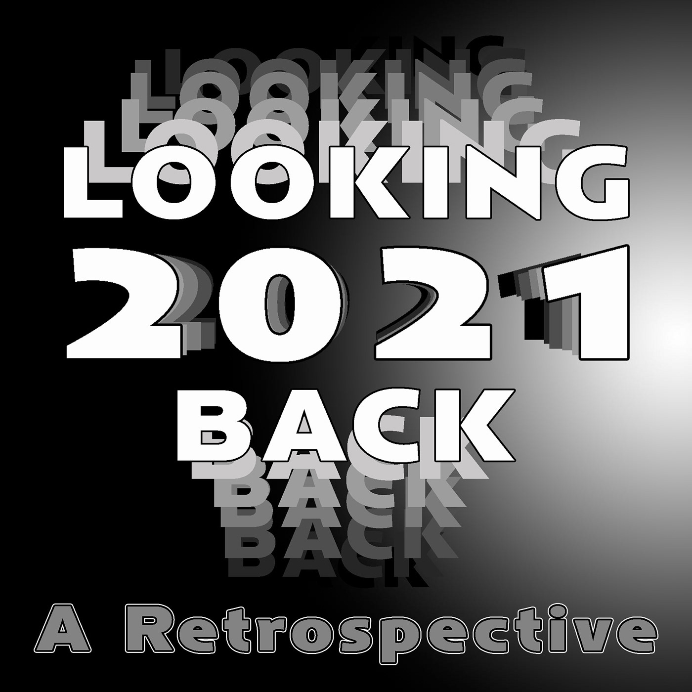
Last year I saw a Behance post by my icon @hollow yarrow that really impressed me, as his work regularly does. He posted a portfolio of some of his favorite DCC designs from the prior year. I thought I'd "borrow" Franck's idea and create a retrospective of my 2021 DCC designs. If you have the time to look, let me know what you think. (Thanks Franck!! I hope youre enjoying your vacation!!) https://www.behance.net/gallery/133132607/2021-Photoshop-DCC-Retrospective?
@quiet fern Did you remember to check the font as I couldn't find it under the name BlackRiver neither on DaFont.com or Adobe Fonts?
@scenic anchor Cool asset image for the brush design. I like the filter you applied. Your design has a real oil painting vibe. Your reflection on the water looks solid. The text fill adds good cohesion, picking up the brush strokes palette. I would tweak the area where the text is a bit, to give it more contrast against the water. Their colors are so similar. How about trying a low opacity shape behind the text? Maybe some soft random brush strokes? What do you think?
@eternal mica thank you. Great ideas for the text. I have a drop shadow but I think you are right about it needing something more to set it apart. I will work on it. 😊
Gave +1 Creative Carma to @eternal mica
I just double checked - "Blackriver" is a propriety font from Heritage Type Co. 😎👍🏼🥰
wow i haven't really had a chance to look at a lot of peoples behances yet I'm new here and I think your work is very good you are very talented. I enjoyed looking at it.
Thank you for your very kind words. Welcome to our Ps DCC Discord chat. This is a safe friendly exciting fun space for people who are interested in increasing their Ps skill levels This group is filled with creatives from around the world who amaze every day with the creativity and design skills they exhibit. Why dont you join in on the challenge? If you're interested, and have any questions about how to get started, just reach out. We're here to help.
Gave +1 Creative Carma to @sand sand
DCC 1 RE-DO. Cheers everyone! I hope you feel this has a better story. Took me some time to get. Thank you for this opportunity!! Warmest wishes for magical holidays!

I live 7 miles south of Boston- I just LOVE our skyline - I probably have THOUSANDS of photos from the same vantage point 😉


@quiet ridge Cute GIF. I would suggest eliminating the candy canes on each side and widening out the inside of the wreath so none of the people are cut off. I would assume they are more important than the candy canes. I might also move the picture up a bit so theres less of the BG in the picture and more of the people.
Sorry I wasn't On yesterday but your welcome and yes I plan on doing the challenges on Jan 3rd its already on my to do list lol but thank you so far this site has been great seeing others work and the critique they get. I think its got my creative juices flowing lol cant wait to start creating
Gave +1 Creative Carma to @eternal mica
does anyone have the behance link to the daily creative challenges? I want to try some older ones over the holiday.
@sand sand Here is the Live stream and much more: https://www.behance.net/live?tracking_source=nav20. Have fun. 🙂

Join us right now to get inspired by leading creatives. Get your questions answered and share your work with the community.
Thank you so much
Gave +1 Creative Carma to @scenic anchor
@sand sand The landing page is: https://www.behance.net/challenge/photoshop
Is scroll down to find a library of past challenges.
We also have a Google sheets that lists every stream.

Daily Creative Challenge
perfect thank you
Gave +1 Creative Carma to @eternal mica
Pattern Challenge. Wishing you all a very, merry Christmas.

I love the star brush! Is it an Adobe/one of Kyles? How can I find it? Thanks
Gave +1 Creative Carma to @tired turret
👍
sorry, I delete message, was fun?
I have participated in most of this year's creative challenges but have rarely shared. I would like to thank the following Adobe challenge presenters for inspiring me to create in a safe space, as Kladi Vergine, likes to say! Thanks to Jesús Ramirez, Kladi Vergine, Paul Trani, VooDoo Val, Kyle Webster, Kathleen Martin and Andrew Horchradel. I hope to learn from the many other talented Adobe presenters next year!

Well, one thing led to another and this looks nothing like Kathleen's first challenge, the "cheers-mas tree." I'm not sure "Believe" stands out enough. What do you think?

I'm going to use a two words: "Inspiring" and "TRUTH".
- I've been trying to come up with a Epiphany artwork for this and the next Sunday and you've given me several ideas to build on now. Thank you.
- You can never be too strong in your belief. I think the the text could be stronger to match the intensity (not necessarily the brilliance) of the star. That said, the subtlety of the trumpeter behind the text may get lost if you bump it up too much.
Gave +1 Creative Carma to @hushed spade
HOW TO WIN FRIENDS in the community.?
SO. now am I able to send messages?
Yes, want to be more prepared & involved with this community. Own a very VERY small publishing business. 
Good Ending 2021 and Happy New Year 2022. I hope that 2022 will be a very creative year with less Covid19 so we can go back to normal, with the new lessons we learned during 2020-2021 Covid 19
@hushed spade How strong the text should be is a matter of what your design message is. You have quite a lot going in the design, so its difficult to say for sure how strong the text should be. For my personal taste, I think the text should be the focal point of the design, and therefore, should be much bolder, have much more contrast with the BG. I would also make the tag line text much more prominent, as that is the secondary message of your design. The imagery is supplemental to those two. Like I said, thats all my personal preference, and you neednt agree. Its your design; you decide.
@tame jacinth If you participate in the DCC, please share your work. We'd love to see what you create. This is a safe friendly space for you to exhibit your work, get constructive, friendly critiques, and meet creatives from around the world. Our next DCC begins on Monday. Please join us.
Thanks, I certainly will join you on Monday.
@tame jacinth Great. The live Welcome stream is at Noon EST Monday. The first challenge is on Tuesday. I look forward to seeing your posts.
Love the image - its captivating. But, I think your instincts on this are correct - the font needs to be beefed up a bit.
Thanks! I have plenty of time before next Christmas to experiment😊
Gave +1 Creative Carma to @arctic rover
Thanks! I’d love to see what you come up with!
Challenge 2: Collage. Spent waaaay too much time trying to select that tree in front of the cabin. I couldn't get the object selection tool to play nice. Finally gave up, since making great selections isn't the point. Maybe Kathleen has a trick? Had fun using gradients on the lights and windows. However, I'm not sold on the texture on the mountains. What do you think? 🥳 Happy New Year, Everyone! 🥳

Covered up Kathleen's creepy broken windows. THIS cabin isn't abandoned!
This is gorgeous!
How did you make the stars?
an Epiphany message - once again you inspire me!
It’s in the winter brush pack
I can’t claim credit for the stars. They were part of the manger image.
😊
Well, "Believe" doesn't look all that different, but do you think it stands out enough now?

The angel still shows up, at least.
May the new year bring you peace, joy, and happiness. God Bless You!

Nice image! I like how you made the year look embossed.
I'm not going to be paying for photoshop. I have a business offer, someone remove the background from a few images for me and I'll pay £1, thank you! DM me
@vivid pollen Is the last of the big spenders lol
It took me too much time to do the conversion. I've already used up his 1#
it would cost more than 1 in electricity to do this
Happy Healthy New Year all...

thank you!
Gave +1 Creative Carma to @tired turret
honestly people are lucky I’m offering that
most pay to work for me

not if you’re some kid who’s parents pay for it
@vivid pollen Quick question sir, how many offers have you had on taking you up on that big money ?
69
🤣
Why don't you just post them and be done with it.
Nice to see we have a comedian
in the house
Perhaps someone who hasn't seen your arrogant, condescending comments will graciously agree to acquiesce to bow a knee for the opportunity to do your bidding.
mate
I’m not made of money
i have 3 kids with 4 different women
I have to feed them
personal choices. Your fault. Not ours
I’m joking dude
someone has taken up my offer
thank you for your help guys
“3 kids with 4 different women”
that could have meant you just haven't had a 4th with the fourth. there's still time 😉
@vivid pollen
Well you got help. And that's what you wanted. So I'll wish you well and a safe and happy new year
happy new year and have a nice Christmas!
I will, and I did. 😉
Do we get to see these oh so important images? Or are they a secret?
that information is classified sadly :(
unsurprising
@vivid pollen Please respect the rules of this chat. This chat is dedicated to the Ps DCC. If you have something to post related to other matters, please find the more appropriate tab on the left to post your inquiry. Thank you.
Gave +1 Creative Carma to @vivid pollen
Let's go! Thanks for the creative carma!
This was fun! Wish I had more time to play with it. Not sure the northern lights effect really sells. What do you think?

Does anyone know a way to make it more luminous/glowy?
Happy new year @hushed spade What is the type face you used for happy new year? I like it.
🙂

Your font.
You're missing the shines and highlights; it's solid green
Try adding a "color burn" layer over the top to play with
Download the Actions here: http://www.f64.co/colordb
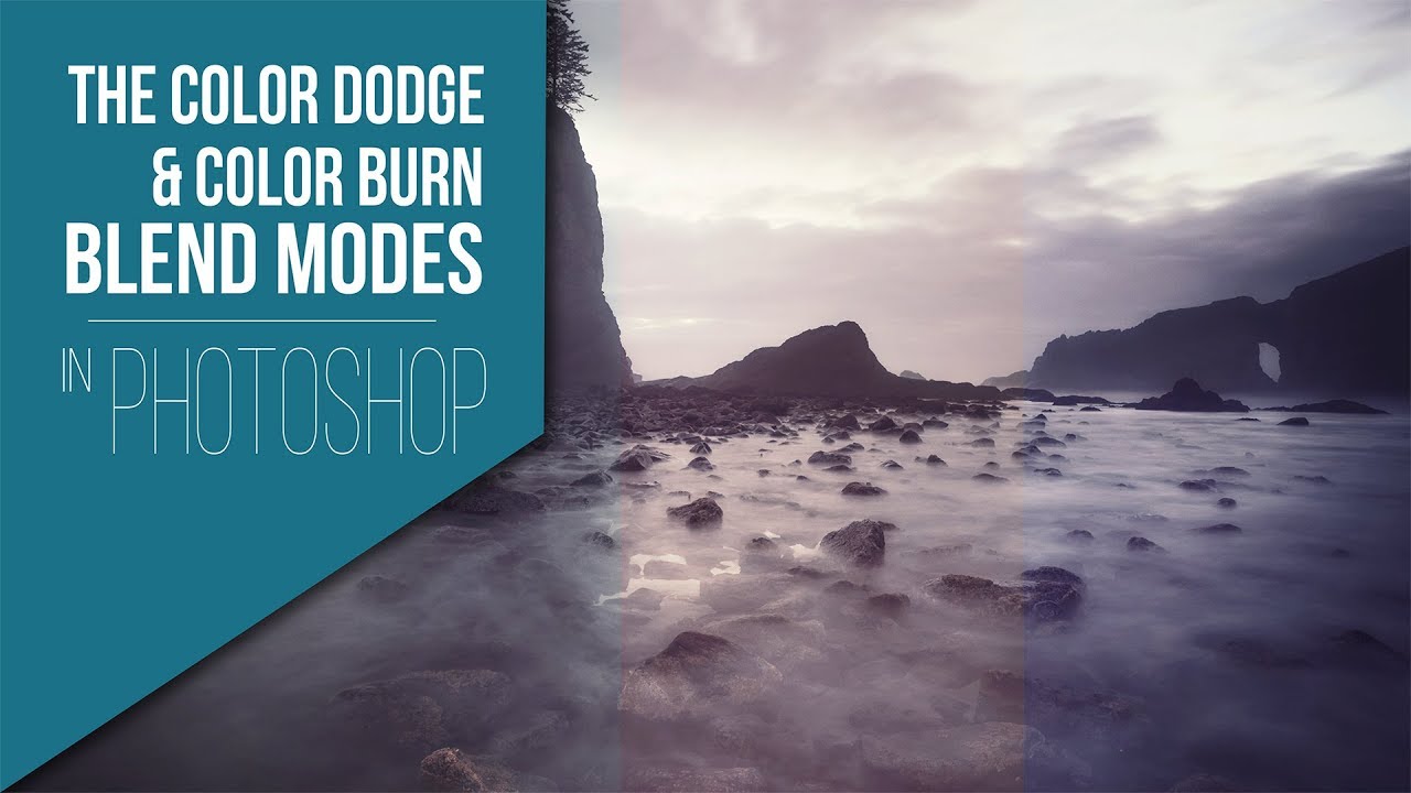
Dodging and Burning with Blend Modes and Colors
If you have spent any amount of time with me you know that I am always trying to come up with new ways of using Blend Modes. I have recently started experimenting with the Color Dodge and Color Burn Blend Modes. At first I thought they were t...
Thanks! Will take s look.
Gave +1 Creative Carma to @oak depot
Do it with brush strokes instead of the entire layer like he's doing in the video hehe
Let me see if I can find the little image I reger to
Here we go

Step V, lighting with color dodge!
What do you think? Do you like this better?

yes, also you can see the stock words on the photo
Yes. Will fix that if I decide to use this for more than just an exercise.
Ah! Much better!!!
My behance header for the current PS DCC w/ Kathleen Martin

Click on the stream in the Livestreams to continue watching Val. No chat though.
Thanks, Shawn
She's gone.
I see. Oh well, until tomorrow
See ya!
Not unusual for VDV to run out of time, but not usually on Welcome Day, 😂
1 for 1. Batting 1000%. Hall of fame numbers.
Was your goal to make the colors vibrate violently, because you achieved it

NICELY done @oak depot Great choice of blend modes. Great linework!
PS DCC 2022-1 Cover Image for Behance theme Post(er) a Day host VooDoo Val

Cover Image for Behance theme- Day 1

Ps DCC 22-01 Behance Title I'll probably change this over the course of the next two weeks, but I never know.

For the cover, I used my work from another project where I had to create double exposure effect

Behance Cover

I love playing with type and saw a current design trend that mixes fonts within a single word. It looked so fun I had to try. I also wanted to use a mixer brush to create cool waves and swirls with candy colors to use as a clipping mask, but I couldn't get the mixer brush to cooperate. I need to watch Kathleen's on the northern lights again already. What do you think? Do the fonts work together well in "Poster a Day"?

Does anyone know if this next two weeks of challenges has a theme?
@hushed spade Check out VDV on mixer brushes
@vague shuttle Based on what I understood from today's Welcome steam. VDV is going to have the theme of Posters. She didnt really get into how that is going to play out. But that just adds to the fun as she exposes each days's challenge.
In case anyone needs the link to day's Welcome stream, I'm posting it here and I'll add it to the pinned files above. https://www.behance.net/live/videos/14459/Photoshop-Daily-Creative-Challenge-Welcome?tracking_source=to_replay&from_row=What's_New

Join your host VooDoo Val each morning at 9:00am PT to learn how to approach each challenge using Photoshop. Complete 9 challenges by Friday, January 14th, and you’ll be on your way to sharpening your skills. Get your questions answered, see what the community is creating and get feedback on your work!To sign up and get started, go to: https://w...

Having fun with color...

@hushed spade I thought I gave you the link. My mistake. Here it is. https://www.behance.net/live/videos/13701/Photoshop-Daily-Creative-Challenge-Mixer-Brush
CHALLENGE: Learn how to use the mixer brush to create unique (and spooky) design elements!Get the starter file here: https://bit.ly/psdcc10-18-1You are watching a replay of a recent live stream. Adobe is live every weekday with content just like this. To find more, join us at behance.net/adobeliveFor more challenges like this, check out https://...
Thanks, Ted!
Gave +1 Creative Carma to @eternal mica
I think it looks fun, funky and playful. Going to go so far as to say, "Groovy! Yeah, baby!"

It was a really good session on the concepts and details of mixer brush. IMHO, It might help a bit more than Kathleen's session.
Hahaha 🤣
SuPerB, Cheers @eternal mica!
Hello again to all of the regulars in the DCC chat and welcome to all the newcomers.
@digital pike Crisp clean design. I might change the color of the text to create more contrast with the black lines from the balloon.
@wary swan You went to town with your use of colors and shapes in this design. There are many cool elements. I like the sense of motion you created in the text.
@sly sparrow Is this your first DCC? Welcome! we're happy you joined our chat. Nice start with your cover design. The subtle BG design works very well to highlight your text message. One tweak Id make is to add cohesion to the design by coordinating the text color with the Ps logo.
This is my first DCC. I will pay more attention to that. It would have been cool to make the PS logo the same color as the font.
@queen aspen Beautiful design. Lovely color palette to the design. I love the double exposure and the reflection. One tweak Id make is make the text in the lower right a bit more prominent. It seems a bit difficult to read.
You can do that if you choose, but then you lose some of the effect of the logo, as the colors are part of the Ps logo. I suggest consider changing the text fill to something complimentary to one of the logo colors.
Okay
@cerulean creek Welcome to our DCC chat. Nice effort with the cover design. I like the "ink blot" shape you created and the gradient you used. Good job.
@hushed spade I love what you did with the fonts. What is the name of the main font? The addition of the green dots adds a really cool sense of motion to the design. Very well done.
catching up on the holiday challenges!

@subtle breach Very cool design. The textured look adds a lot of interest. The simple white text works great against the blue BG. One really tiny tweak. The bubbles seem not to have the textured effect. It seems they should.
Thanks, Ted! P, S, T, and 2022 are HWT Arabesque. E, R, D, Y and VooDoo Val are DrSugiyama Pro. O, A, and January are P22 FLW Exhibition.
Gave +1 Creative Carma to @eternal mica
@plain sable I love this "fireworks" display. The shapes you created are terrific. I especially like how you changed the colors within the text fill to contrast with the shape colors. The one tweak Id make is the text fill in the bottom text. Its probably difficult to find a color that works.
You gave me a lot to write down!!!
thank you!
Gave +1 Creative Carma to @eternal mica
That’s what screenshots are for. 🙂
Hi, I'm new here! Just learning my way around photoshop

Ps DCC 22-01 Behance Title V2. I added some more layer styles to the shapes. Ive learned to love layer styles/blend modes. Its amazing how powerful they can be.

Can you be my mentor?
I know you are typing
But you are typing for to long
Cmon stop typing already and press enter
@swift lake Welcome in Kim. We're happy you decided to join our Ps DCC Discord chat. You'll find this a great place to enhance your Ps skills, have fun, and meet awesome creatives from around the world. Nice tropical vibe to your design. I love the color palette. Having the palm images overshoot the boundary is a cool touch. Nice brush strokes for the BG.
Finally your typing over
🤣 🤣 🤣
DM me
Thank you for the warm welcome and feedback!
Gave +1 Creative Carma to @eternal mica
DCC_D1_C0

very nice its simple and colorful!@cerulean creek
@plain sable Very cool! The color burst and texture add a lot of energy to this image. Even with all the colors the title text still reads nice and clearly. Nice job!
@subtle breach I really like the bold color contrast of the goldfish in this design! The texture adds a lot of interest and gives it a nice bit of dimension. The text has a nice playful look to it too which fits the design nicely. Looks good!
@hushed spade I really like the style of this design! Really cool, sort of retro feel to that font. I think it might work better to stick to a couple fonts instead of 3, for example, if the "Voodoo Val" text was the same as the "January" text it might unify it a bit more. But it's really up to personal preference. Nice job!
@cerulean creek Nice job with the Behance cover image! The graphic elements are a nice touch and the gradient adds some nice interest as well. 👍
@queen aspen Great design, I really like the use of texture in this one! The subtle warm and cool tones work really well. Nice job with the textured brush effect too. The text fits in really well with the rest of the design with how you repeated the color and texture. Nicely done!
@eternal mica Cool design Ted! I like all the geometric shapes and patterns you have going here. Kind of a retro feel to it which is neat. I wonder if the white/yellow color of the text at the top would work better than the black text at the bottom? But it's hard to say without seeing it. Looks good!
@sly sparrow I really like the layout and structure of your text in this design! It has a nice readability to it. The texture in the background adds some nice interest while the faded look to it helps it not compete with the text too much. Nice work!
@wary swan I really like the playful look of this design. The variety of shapes and the wavy text effect is looking good. I also really like the backing/drop shadow each shape has which gives it some nice contrast. Looks good!
@quiet ridge Nice job with the warping text effect. The subtle contrast of the background designs works nicely to balance the image as well. 👍
@swift lake Awesome, welcome in! Glad to have you here. This design is looking really solid! I like the soft contrast of this, and the simple color scheme works really well to give everything a nice unity. The composition is looking really nice too, good balance. Well done!
@amber peak This came out really well! Great job with the graphic shapes, and the lights on the cabin are looking really good. Nice texture to the whole design too. Nice work!
Thanks for the feedback Ted, and have a continued good year 2022. I like your 2nd contribution better, it is better contrast betwen graphic and text compared to your first one, maybe ad a stroke on the blue text.
Gave +1 Creative Carma to @eternal mica
New to PS. This is fun!

Thanks for the feedback Sam, the only that credit for is I used just that patter from Adobe included textures, maybe I should and a shadow to the elephants to be consisted to the backgrounds shadows. I used layer style on the mask of the image to get the glowing effect.
Gave +1 Creative Carma to @bleak fossil
@tawdry sky Very cool, welcome in Abby! I really like the mix between painterly texture and the more rigid geometric shapes. The strong red/yellow color palette works really nicely too, and the dark black of the text and background adds some really nice contrast. Glad you're joining us, nice job!
@tawdry sky Welcome to the gang we have fun here like you post.
Is this good?

PS DCC 2022-1 Cover Image for Behance theme Post(er) a Day host VooDoo Val version 2

Post (er) A Day Cover

Thanks, @bleak fossil
Gave +1 Creative Carma to @bleak fossil
Thanks, @eternal mica. The text in the lower right is like this with a purpose - doesn't need to be more readable - it is not important at all - as a small note.
Gave +1 Creative Carma to @eternal mica
@bleak fossil Thank you for the suggestion Sam. Appreciated as always.

Gave +1 Creative Carma to @bleak fossil
@fair valley What is the purpose of the design? It has interesting color palette and shapes, but I have no reference point as to what the message youre sending is. This chat is dedicated solely to Ps DCC and the designs posted here are connected to those exercises. If you'd like to post designs for other reasons, I suggest you post them in one of the other more appropriate tabs on the left. Thank you.
Gave +1 Creative Carma to @fair valley
@chilly hawk Lovely design. Beautiful color palette and fantasy vibe to the design. Interesting how you composited the girl. You might want to work on adding some shadows and blur to the butterfly wings to add more depth and realism to them, get them to blend in more with the lighting of the BG image.
I got up to the shapes and then VDV ran out of time so I'm wasn't sure what was going to come after so I hope this is on line with her idea. LOVE her! I am glad that I was able to free up some time to join this challenge.

@queen geode OOOH, you hit my soft spot. I love neon designs. Nice work here. The color palette works well. The text is clear and legible. I might make two tweaks. I think you might use a brush to create more reflective glow from some of the neon elements, especially the PS, and Im not sure the vertical line on the right adds to the symmetry of the image. Very well done. (BTW, VooDooVal has 4 "O"s in total.)
@eternal mica thank you for your feedback. Oooo she put four O's? Awesome lol. Can you explain in more detail what you mean by painting in more reflective elements on the PS? Are you talking about highlights like in buring and dodging?
Gave +1 Creative Carma to @eternal mica
@eternal mica was this what you meant? Painting the reflection on the bacground?

This is my Go To video on neon lighting. Starting at the 11:00 minute mark, Nemanja spends most of the rest of the video on different techniques to really sell the realism of the neon reflective glow. Let me know what you think. https://www.youtube.com/watch?v=l9S_4swRM1A&t=812s

Hey guys, in this fun tutorial I will show you how to create this NEON lights effect in Photoshop. You can use this same technique to create lightsaber or anything that looks like a neon light.
Have fun!
➤Photo Manipulation Essentials COURSE: https://nemanjasekulic.com/photo-manipulation-essentials
➤Unlimited Photoshop loot with Envato Elemen...
nemanja the best guy for photoshop tutorials, he is the reason why I started photoshop, he made the tutorials cool and he just attracted me and i dont regret it.

the glow on PS is wayyy too much, reduce it or lower the opacity yk..
this one I made

I dont know if he's the best. But he is expert in explaining things, showing clearly every click and step. As I said, I have watched this neon tutorial numerous times.
definitely 1 of the best, piximperfect and nemanja really helped me alot
If I may: Now that you've added that glow to the wall for the PS, might the "daily creative Challenge" be casting a wee bit more of glow on the wall too? A simple thought.
#✂challenges-feedback Since our instructor is Voo-Doo Val I tried to put her color in since4 she likes Orange. I'm not a fan of orange and it's my first photoshop design. I always get stuck in photoshop so this is different and uncharted territory for me.

@eternal mica @late kelp @signal grove Thank you for your imput. All help is appreciated. Here is the tweaked version following your advice. I reduced my outerglow some and then painted the colors on a layer behind them and then put it in color dodge and reduced the fill. Is that better?

Gave +1 Creative Carma to @eternal mica
@eternal mica @late kelp @signal grove i would love to know how you did the neon colors. Nice work guys!!!!
It definitely looks smoother and well balanced. Yep. (still need the last 'O' in voodoo though)
@queen geode What you just did is the essence of the Discord chat. Look at your original design and how, with the input of others, you tweaked it. Which do you like better? IMHO, the new version is dramatically better than the first version. Great tweaks by you.
i just duplicated the layers with the color and added gaussian blur
@signal grove Lol. This is the first time I got four oooo's so I am happy!
Here's the tutorial video that @eternal mica gave to @queen geode : https://www.youtube.com/watch?v=l9S_4swRM1A&t=812s
Hey guys, in this fun tutorial I will show you how to create this NEON lights effect in Photoshop. You can use this same technique to create lightsaber or anything that looks like a neon light.
Have fun!
➤Photo Manipulation Essentials COURSE: https://nemanjasekulic.com/photo-manipulation-essentials
➤Unlimited Photoshop loot with Envato Elemen...
thanks
@eternal mica I am happier with the tweaks everyone helped me with. This is why I love these challenges so much. My new years resolution is to be able to make time for more of them not that we have longer to complete the challenges I am optimistic that I will be able to do so.
I love that! If I was to tweak anything on this image I would probably reduce the color gradient on the Instructor text and the date. But mostly the instructor text. It is harder to read.
@queen geode ok thanks
Gave +1 Creative Carma to @queen geode
@toxic patio Welcome to the Ps DCC Discord chat. This is a great place to ratchet up your Ps skill level, while having fun, and meeting a great group of friendly creative people. If you need help with anything, just give a shout. If thats your first design, you did a fine job. Overall, the design has a nice color palette. You created some nice interest with all the different rectangle shapes. I'll just make few quick basic points. The cohesion of the design would be enhanced if you repeated some of the colors and styles rather than had so many different ones. It seems you moved your canvas off to the right, exposing some of the transparent BG on the left side. (Thats easily fixed by nudging over your bottom-most layer.) Im not sure why, but the text and some of your elements seem very pixelated. Did you use the transform tool to scale up the image? All in all, good job by you. Stick with it. We look forward to your future posts.
@eternal mica thank you for your time and letting me know how i can improve it.
Gave +1 Creative Carma to @eternal mica

@bleak fossil Thank you
Gave +1 Creative Carma to @bleak fossil
not really minimalist design

PS challenge 3 jan poster a day

Hello friends. Here is my cover. I reserve the right to completely change this! Thanks

Hello! PS Challenge Cover..Yikes, I really needed this challenge...Looking for input...Thanks in advance!

here is the first one of my day 2. I am going to do another one.

Thank you!
Gave +1 Creative Carma to @bleak fossil
I really loved the colors in the starter file and was happy to find a pic of my that kind of worked .

#challenge - Social Bio - I even followed along with no sound on the video (conference calls going on all day in the next desk) 😉

Beautiful!!! 😉
I like your "Murphy" text! 😉
thanks a bunch
Gave +1 Creative Carma to @quiet fern


PS DCC - Social Bio - actual photography bio (not my photo)

PS Daily Challenge - Social Bio.

Challenge #1 - Social Bio
First of all - Happy New Creative Year to all of everyone. It's good to be back on a creative track again 😄
Photo from Adobe Stock and the text is made up.

@gentle pasture WHOA, what have we here??? Minimalist, I should say not!!!. Thats a super bold design, but, I think it works to send the message youre trying to send. The Poster A Day text almost disappears as text and becomes just part of the BG design. If I can suggest one tweak. I would scale up the white central text to fill that whole area so that it becomes a lot more legible. Really awesome creativity by you.


@rocky kite Lovely pastel themed cover design. The shadow text in a different font is a cool touch. All the shapes give a nice sense of motion to the design. I might tweak the text on the bottom as the size and the white fill make it difficult to read.
@simple idol You win the prize. I was waiting to see who would be the first person to use 2021 as a date instead of 2022!!! Excellent design. Really powerful image. The monochromatic color palette goes very well with all the fonts, shapes, and patterns to create a solid sense of motion in the design. Maybe you wont need to change it!!! Very well done.
LOL @eternal mica YOU Always catch me! Thank you and I really said it too that I needed to remember that it's 2022! 😂 Thanks again for the feedback!
Gave +1 Creative Carma to @eternal mica
@warm hamlet Nice cohesive color palette exhibited very well. The shapes and shade variations create good interest. I like the drop shadow on the large rectangular shapes. That is a cool touch. If I made any suggestion it would be to bring the POST and ER closer together to give the sense that they should be read together, even though theyre separated by the line. Nice job.
@simple idol you know Im a pain in the (***) NECK about those little details. 🤣 🤣 🤣 . And Im sure you wont be the last one these two weeks.😍 😍
@sly sparrow Solid design. I love the color scheme, the layout, the signature style text, the subtle BG. You nailed it. Well done. Can we do something about the funny looking guy in the picture????
Thanks @eternal mica
Gave +1 Creative Carma to @eternal mica
Social Bio. First PS DCC chanllenge of the year🥳 .

@autumn bloom Very well done. Its good you stuck with those colors. They blend perfectly with the image. I like the strong bold font you selected for your name. It fits the design. (Just curious, is that BG in the original picture of you or did you composite it?) Your text is incredible!!! Keep up the great works towards making this world a better place for others. 👏🏻
thanks a bunch. I plan on using my signature style and font throughout. I wanna see how far I can take it. I am addicted to paisley cause of all the colors in the palette.
Gave +1 Creative Carma to @eternal mica
I really enjoy when I try to create my own unifying theme for the designs in a DCC series. Sometimes it can become pretty challenging, but I enjoy the extra challenge.
Good luck.
@quiet fern Oh wow, my son has a shiba inu. Looks exactly like yours!! The way you picked up the color scheme off the couch into your design is great. It makes it look really cohesive. Very nice work on the fonts and the spacing of the text. I like the three dots you added on top of the text. Its sort of a balance to the ones in the lower left. Good work
@dusky swallow Two really good designs. Your cover has a soft ethereal vibe. And I like the pastel color palette. The day 1 poster looks great. I think the orange tone you picked goes well with the picture you selected. The layout looks spot on. Well done.
@dusky wave Well done social bio poster. Its neat crisp concise. I like the layout you created for the social media icons. Its a bit more interesting than the norm, especially since you have different tags. Nice solution to that problem.
@wide magnet Nice job. The color scheme and picture have a nice cohesive look. The two fonts selected also jive with the design message. The spacing of the icons is great. Well done.
Thank you! I'm fairly new to Photoshop, so I'm really excited to be doing these challenges.
Gave +1 Creative Carma to @eternal mica
@halcyon current Great to see you back again. Very nice design. The layout is solid. I would make one tweak. The text of HAPPY looks a bit out of whack because the A has spread the letters out too much. You might want to correct that.
I apologize. I was remiss in not welcoming you. We're happy youre going to be joining us in the Ps DCC Discord chat. You'll find this is a great place to enhance your Ps skills, have fun, and meet an awesome group of creatives. If we can help you in any way, feel free to reach out. We're here to help.
@digital pike Nice job on the social bio. It has a neat clean professional feel. The text stroke is a nice touch. Im not sure if you intended to have the icons spaced out this way, but I would suggest they would look better evenly spaced out.
@lusty relic Cool design. Interesting use of the gradient, alternating the direction of the fade. I like the color palette you chose. The grey of the couch goes well with the golden color of the dog and the text/design. Good work.
Day 1: Social Bio - finished poster and artboard with used images


@autumn bloom I like the gliphics background
Tatiana the patchwork and yarn fonts you found are really playful. Very nice.
Gave +1 Creative Carma to @eternal mica
Thank you Ted for your valuable feedback. I've tweaked what you supposed and you're right - it looks a lot better now! I also changed a spelling error and the color & size of the small colored border behind the top border. I hope it looks better now.

Gave +1 Creative Carma to @eternal mica
Hi, This is what I have for the 1st challenge

#PSDailyChallengeintro-poster

Hello friends. Here is my version of Day 1. Thanks for allowing me to share.

Challenge #1 - I plan to do so much with this. Thanks VooDoo Val.

Social Bio Challenge)


@eternal mica Thanks for the input! 😀

Gave +1 Creative Carma to @eternal mica
Challenge #1 - personal social bio

Challenge #1 - Social Bio

I like your bio. I think the colors are a great contrast against eachother and having half of a face showing leaves something to the imagination.
Your bio matches really well. it looks very elegant.
I really like the touch of gradient you have running from left to right. I would only have maybe changed the colors of the font to match with the image. But great look.
I love how your bio looks. I especially like how your name looks like a personal signature.
Hi Everyone!

Challenge 1 Social Bio.

@lethal prism Another version😀

I really like that. I feel like the colors match a little better. That is just my personal opinion. Clearly, what ever YOU think is good... Thats what matters!
https://1drv.ms/u/s!AuyL-ykZbl8iguQsYQELXuAQw6T4-w
Ps DCC 22-01 01 Social Bio

JPG Image
@lethal prism Thank you!
Gave +1 Creative Carma to @lethal prism
Hello Everyone!!!
I am so happy to be here.
I am new here, so I would like to know regarding the Social Bio Challenge, am I still on time to participate? any deadline for the challenge?
I am not an expert, I use Photoshop mainly to remove blemishes and do little things that are easier to do here than in Lightroom.
Did I miss the “Poster A Day” challenge video? 🤔
@quiet fern click on the pin on the top of Discord & you should have a link to watch it
hi @uncut ginkgo - I have this server muted so I don't get overwhelmed with notifications, but I am subscribed to the creative-challenge announcement channel so I can get those in my own server. However, it's not working. It looks like people sending messages to announcement channels need to specifically choose to broadcast the message to all other servers that have followed the channel.
If admins could please publish the posts from the announcements server so we can get the notifications, I would really appreciate!
PS DCC January Challenge 1

Follou'
what a terrible typeface for w. poor thing
Thank you for the inspiration! I look forward to the future challenges. As always, sending everyone here creative vibes!

PS creative challenge 4Jan2022

made a few tweaks


@queen aspen I love the idea of the artboard with the social bio design. The two look great together. The colors and shapes in the design are so vibrant. Using the low opacity skeins of yarn for a BG is wonderful look. The knitted font works better in red on the design than it does in black on the artbosrd. But thats a very minor tweak. Well done.
Challenge #1 - personal social bio

@muted quail Nice crisp concise clean design. The textured BG looks good, as do the colors. The one tweak Id make is that in a few areas you created overlaps. I think the design might work better with the octagon shape settled neatly centered in the left half, without the overlaps. But thats really just personal preference.
@paper shadow Nice work on the cover design. The color palette is bright with complimentary colors. The design message is clear and concise. Always a good technique.
Something I noticed and I'm not sure if you planned it: With the white stroke on the letters and the white separation line, because the letters are sitting on the line and mostly block it, it looks like the line and the stroke are continuous from the left. Masking out the line in the negative space (the triangle shape) between the 'two v's' of the 'w' and the two negative spaces of the 'M' would complete the illusion.
@simple idol Very powerful color palette selection. And the pattern fill in the HELLO looks great. The three circles add a good sense of cohesiveness to the design. Good work by you.
@craggy fable Very well done. The product samples make a great backdrop for the design. Your font selection is very interesting and looks great with the repeating RE letters at the start of each word, especially with the pronounced serif on the R. Repeating the mauve and green colors at the bottom of the design adds a good cohesiveness to the work. Good job by you.
@young karma Welcome to our PsDCC Disord chat. We're happy youve joined our party. If you have any questions or need help finding your way around, feel free to give a shout. We're here to help. Your Social Bio design is great. The cohesiveness created by using the image BG as your color palette works beautifully. The design is well laid out. The bottom icons are spaced well. Very good work by you.
@lethal prism Welcome back Nick. Great to see you again. Im happy to see the red D in the design. Very interest grabbing image on the top of the design. Cool text layer styles. Very clear cut, crisp design. Not your normal style, but I love it.
@craggy fable Something fun for you to maybe try: Placing a drop shadow on the pronounced serif of the R portion of the letter that extends into the white rectangle might create the illusion that 'Relax Release Renew' is laying flat on the product display table and that the white rectangle and 'Salt Cave' is the front edge of the table, like a table cloth hanging over the edge. I can almost see it, but that shadow would definitely sell it. Just a silly thought.
@quiet ridge Cool that youre incorporating past DCC designs into this social bio. The image BG has a subtle interesting pattern. Your layer styles on the text came out very well. Theyre also subtle, but effective. The color palette has a cohesive together vibe. Well done.
@young karma This image is awesome. The color palette is awesome. The cohesion in the design is great. The one tiny tweak Id make is that some of the white text is fading into the beige brick wall. You might want to see how a layer style on the white text creates contrast to allow the text to stand out uniformly from the BG wall.
@frail ice Go for it. Thats how some of these zillion dollar NFTs started. Good work with the layer styles on the text. It stands out from the very busy BG of all the little thumbnail images. The signature font adds a personal effect to the design. Well done.
@eternal mica Thank you. It took several of you nice people here telling me less can be more
Gave +1 Creative Carma to @eternal mica
Thanks! I see what you mean. I intentionally tried to make the stroke seem continuous, but I didn’t consider the areas you mentioned. I cant decide whether those areas should have a stroke or not - I was concentrating on making the letters and rectangle seamless. I really appreciate your input!!
Gave +1 Creative Carma to @signal grove
@waxen seal Welcome to our Ps DCC Discord chat. Great to have you join the party. If you need help with anything, give a shout. Very solid first effort. You captured the concept of the project. Your design is neat, concise, direct to the point. Always a good idea. Your blending of the soft blue and green really looks great together. The personal photos sell the design. I look forward to seeing your future posts.
@compact pecan Awesome design. The color palette works great. The stroke on the top letters merging with the straight line adds tons of interest to the design. The gradient looks solid. If I had to nit pick something, Id say the text font is a bit too small. Id probably use a bit less text and a larger font. But thats just my personal 2 cents. Great job by you.
@lethal prism @digital pike Nice work by the two of you. Thats what makes this chat such a powerful tool. The design definitely got upgraded with each tweak. It looks solid.👏🏻
Happy New Year Everyone!
I am new here, new to PS (coming from a different program). Excited to participate in these challenges.
Day 1 Challenge: Social Bio Graphic
Photo Credit - Nappy.co, Photographer Drew Muse (@bodybendyoga).

Funny you brought that up. When I posted my design tonight, I thought the same thing to myself. I said " @bleak fossil and @coral stone will love how toned down and direct my design is. I think Im finally catching on to what theyve been trying to teach me."
@verbal crater Late??? The party just started!!! We'll be doing this series of DCC for the whole month of January. Dive right in. If youd like to watch the Welcome stream, theres a link pinned in the pin files in the top right ribbon. If you watch that, VooDooVal will explain the whole process to you. If you have any questions, just give a shout. We're here to help. Join the party!!!
Thanks!!
Gave +1 Creative Carma to @eternal mica
@silent perch WOW, thats what I call a direct message. Brief. To the Point. Very well done.
A little bit late - sorry. I've watched some of the challenges; but first time trying to participate. I was trying for one of those old-time black velvet/felt posters. 🤷♀️

@left vine Very solid design. The color palette works very well with the image. I ,like the brush strokes you used to back up the text. And the stroke also builds contrast for the text. The icons on the bottom look solid. Good work all around.
@rocky kite Nice work. The double exposure picture adds good personalization to the design. I think you can help the contrast of the text in two places, but in different ways. The white text is washed out against the BG of the face. And the text in the lower right is lost in the gradient. In both cases, some additional layer styles might help a lot.
@tranquil flume Welcome. Great to see you starting your first DCC. If you have any questions, or need any help, give a shout. I like your design. the color palette picks up the feeling of the top image. The way you handled the icons looks cool. My one tweak is I think some of the white text is a bit washed out against the image BG. You might think about an off white fill to give the text more contrast. Im looking forward to your next posts.
@obsidian sequoia Welcome in to the Ps DCC Discord chat. Great to have you. Please let us know if you need help with anything. Very well done initial project. The design image is powerful. You created a very cohesive look by picking up the tones from the image in the design elements. I might make one tweak, and its totally personal preference. I think the Hello being capitalized is a bit odd. I wouldnt think I wanted more emphasis on the hello than I wanted on, say, Anderson. Again thats just me. Your design; your decision.
@neon kayak Welcome to you as well. (I cant believe how many newcomers Ive welcomed in today. AWESOME) As Ive told all the others, we're happy youve decided to join our chat. If you need any help or have any questions, just give a shout out. Very solid social bio design. I like the subtle BG texture. The way you positioned the text is interesting. The inset image sends a strong message. If I had to tweak one thing, I think id look for a way to add some cohesiveness between the inset image color scheme and the design. I feel in spite of the image being interesting, it needs something to tie it to the rest of the design. That could be just me. What do you think?
@radiant kite Its great that youre finally taking the plunge. I think youre going to be surprised how much fun it is. If you have any questions, give a shout. Nice effort on the cover design. The design is lively and fun, as is the font. If I made one tweak I might make the center text a bit smaller so I could scale up the other border white text to enhance the legibility. I will point out that if you intend to use this for a Behance cover, the canvas proportions are off. The correct canvas size is 808x632 pxl. I think you can probably copy and paste most of this to that size canvas without too much trouble. Of course, if youre not concerned about a Behance cover page, ignore everything I just said. 😜 😜 😜
OK folks, signing off for the night. Bedtime!! See you all in the AM. 😴 😴
Thank you.
Gave +1 Creative Carma to @eternal mica
Thanks, Ted! I am still in the early learning stages, but I THINK I understand what you are saying. They do seem to look like they are just all floating in their own worlds without much interaction. I think I will try changing up the color scheme/layout tomorrow - I am done fighting with Photoshop tonight, 🤣 Thanks, again!
Gave +1 Creative Carma to @eternal mica
Challenge 1

@signal grove I think I will try your suggestion. Thanks.
Gave +1 Creative Carma to @signal grove
Happy New Year, everyone! 🥂 Here's my take on the day one challenge!

thank you very much this was my first poster 🙌🏽😉
Gave +1 Creative Carma to @eternal mica
@left vine Very nice! I like how all the colors have a sort of warm tint to them which makes everything feel like it belongs together. The graphic shapes are looking good as well, nice job!
@silent perch Looks good! Really nice, clean, and clear design. The image has a nice composition and balance to it and all the colors work well together. Nicely done.
@rocky kite Really neat effect with the face graphic and how it blends into the sky. My only nitpick is the "design" text doesn't read as strongly as it could. Perhaps a subtle darkening gradient at the very bottom of the top image could help add just enough "darkness" over the bottom of the face but under the text to allow it to pop out more? Hopefully that makes sense. Nice work, I like the monochromatic look of the image and how it fits with the rest of the design!
@eternal mica This is great! I like how the color palette of the photo matches the page design so well. I also really like the composition balance of the main title text. The only nitpick I might have is I feel like the bottom graphics could be moved down a bit to not crowd the paragraph text as much. Nice work!
@digital pike This looks good! The color palette is working well and the masking/lighting of the portrait photo works nicely on the background image. I also like the way the portrait is breaking the frame at the top, but it might be nice to make it break the frame a touch more to push the effect a little. Nicely done.
@compact pecan I like how the Follow Me text is integrated into the background gradient, very neat. Nice work with the graphic elements, though I feel like the bottom bar is crowding the paragraph text on the left a bit. Maybe scaling the bar down and to the right would help a bit? It also might help to brighten up the portrait image just a bit. Nice work!
@quiet ridge Haha, I like the flame effects you have, it's a very intimidating portrait with the flaming head. This is looking good! The title text is looking good. I personally kind of like the slightly less cluttered look of the first version, but that's just me. For that one I also think it might look good if the website info and icons were moved down a touch, and if the paragraph text box was narrowed a little to not make it crowd the edges so much, but give it a little breathing room. Just some thoughts. Looks good!
@waxen seal Hello Faith! Nice work on this design, I really like the simple color palette you have going in this one. All the shapes and elements have a nice compositional balance to them. This is kind of subtle, but it could be interesting to try giving the photo on the right a small drop shadow shape that matches the dark blue under the photo on the left. Currently the dark value of that blue along with the darker contrast of the left image overpowers the visual weight of the lighter contrast of the left image a bit. Repeating that dark blue as a thin drop shadow shape under the right image might balance that out. Nice work!
@frail ice Very nice work Cathy! I like the balance between the photo collage at the top and the less detailed, more simple design of the bottom portion. The bold white text also has a really nice contrast against the photo collage. Looks good!
This is what happens when I let both sides of my brain express their opinions.

@young karma Great design! I really love how the color scheme from the design is mirrored in the green of the photo, everything fits together really nicely and the text overlaying on the photo ties the elements together very well. Very nice work 👍
@distant needle Happy new year! Really nice use of shapes in this design, there's a nice balance between the big and small graphic elements. The colors from the photo are reflected in the overall design which is really nice. Very fun design.
@autumn pasture Challenge 1 is looking good! All the colors in this design fit together really nicely. Nice job with the different shapes in this design, the bottom wavy shape looks good. Nice work.
@radiant kite Glad you jumped in and joined us! I can definitely see that sort of felt poster look from this design, and I think the subtle texture helps that a lot. Really cool to that take on this challenge, the colorful gradients came out nicely. Very nice!
@toxic patio Really nice job with this social media design, the color scheme and shapes are all looking really good! Two small details that might be worth noting, if you brightened up the portrait image on the right it might fit the look and feel of the left image a bit more, and the paragraph text might look good with a little more breathing room if you moved it down a touch so it isn't so close to the title text. Just some thoughts, very nice work!
@neon kayak Very cool, welcome on in! Glad you're joining us. Really nice design, very clean and balanced. I like the subtle design in the background of the top. I feel like you could probably even give the top section a little more room to allow you to make the image even bigger and give it a strong read, but that's a really minor detail that comes down to personal preference. Looks great.
@obsidian sequoia This is looking really solid. I really like the bold contrast of the image and titles at the top. The orange and red tones work really well against the background color and look great with the photo. I do feel like moving the paragraph text down just a touch might balance the image a little more, but that's a minor note. Looks good!
@tranquil flume This looks great, I really like how well the bright, high key look of the photo matches with the colors in the design. Everything has a bright upbeat feel to it which works well. I like the balance that the orange bar on the right side of the bottom half adds to the design. Nicely done!
@signal grove Very cool, this is looking good! I like the textured look of this design, and the text is looking good too. I wonder if the "water the metaphors..." line might work a bit better in the light tan color of the top title text? Sometimes using too many colors and give a design a lack of unity, but it also might help it read stronger against that green background. Just an idea of course, it's really up to personal preference. Nice work with this design!
Thanks so much, Sam. Fun is definitely what I was going for. I'm glad it came through!
Gave +1 Creative Carma to @bleak fossil
I had trouble with the lighter color standing out. Tried this gradient. I think it works better to what you suggested.

Thanks, @eternal mica
Gave +1 Creative Carma to @eternal mica
My first challenge ever in the books

re-worked after advice many thanks Ted B👍

what challenge is this from?
Welcome challenge by VoodooVal
PS DCC 2022-1 Challenge #1 Social Bio 1-4-2022

Cover

tks for feedback
tks for feedback
Thank you Sam. I appreciate your kind words. Very insightful comment. I eliminated a few lines of the verbiage, increased the kerning and the line spacing, and centered the text in the lower portion of the design, all to give the text more room to breathe.

Gave +1 Creative Carma to @bleak fossil
Social Bio Project

Hahah, this is probably one of the goofiest things I've ever made. But somehow, it fits my personality. Lol

@autumn pasture Well done. This design fits the message. The color palette works well with the inset image. The fonts work with the message. The wavy shape adds to the motion vibe of the runner. The gradient feeds off the sun in the image. Nice touch. Good work by you.
@distant needle This design works wonderfully with the message. The color palette, shapes, image, fonts, brush strokes/pattern all get a unified message across. Very professional look to the design. The faint gradient on the bottom is a cool touch. 👏🏻
I need help, the files made available in the challenges are not being listed for me to download.

@sand sand Welcome. We're happy youve decided to take the plunge. If you need help figuring things out, or have any questions, feel free to reach out. Great job on your first effort. The cohesion of the design is solid. Your color palette blends well with the image. The gradient or vignette on the bottom half works well. The icons are well placed and legible. Well done. (There is a typo in line 4 "type".)
Day 1 Challenge

Is that for todays challenge? Try refreshing your Behance page.
I've already refreshed the page and cleared the cache, the same happened with yesterday's file.
Wow, super tweak. I love this one. The black makes a world of difference. The larger white text really works. Good job by you.
Were you able to solve the issue yesterday?
If not, post your issue in #ask-a-question and let some of the more technically inclined give you a hand.
@wary swan Well done Robert. Your design has a warm friendly vibe. The text fill picks up on the earth tone from the image and gives a nice cohesion to the design. The one tweak Id suggest is I might use one of the color tones from the image for the gradient at the bottom rather than introducing a new color. But thats just my taste.
@gilded flame I really like your cover design. It has a modern art vibe. The rectangle in the rectangle is a cool touch. Your layer styles on the text all look great. One little nit pick Id make is the final line of text at the lower right is a bit too small. I might like to see both of those lines of text a bit more legible. Fine job by you.
No, I did yesterday's challenge based on the video
@gentle pasture Nice job presenting three alternative designs for the social bio. I think the blue one works best for me. It is the cleanest crispest most direct of the three. In the other two, the title text is not as bold, needs more contrast. The layout, color palette, cohesion in all three is right on.
@tropic garnet Does that mean youre goofy??? 😜 Really well done design. Very creative interpretation of the challenge. The shapes, layers, color palette, all work together to create a very interesting design. The color you added in the lower right adds pop to the design. Nice work.
@gilded flame Beautiful social bio design. The image you selected is interesting. Your color palette built off the image is spot on. The design is clean crisp direct. If I had to make one nit pick, Id like to see the name text scaled up more to make it more prominent in the design. But thats a really small nit pick. Good job by you.
did you try clicking on the link Gus provided? https://adobe.ly/3eNgIQc
Hi Everyone! Here is my post for the 1st challenge.

Yeah:

Thanks for the feedback and I fixed the type. Quick Question what is this challenge i see people doing with voodoo val and posters? I've asked some people but got no responses
Gave +1 Creative Carma to @eternal mica
Challenge_1

There's a link to it in the pinned messages. Top of the window next to the profile icon. :0
Youre doing the VDV Challenge Series. You submitted your first challenge. In just a little while, Challenge #2 will be released. You may be referring to what VDV proposed in the Welcome stream, which we dont really consider part of the DCC series. She offered ideas for a Behance cover image. If you havent watched that, you can find a link to that session in the pinned files on the ribbon bar above. If you need more clarification, give a shout.
I think it's pretty cool. Comforting t know I'm not the only one. 😉
The one that is pinned I did but I keep seeing these posters made up saying they are the challenge for the week
Good Morning! Made some changes. Thanks so much for the feedback @bleak fossil and @eternal mica

Gave +1 Creative Carma to @bleak fossil
Im not sure what youre referring to. If you can direct me to one of them, I'll try to explain.

Thats what I described earlier. That will be (as of now) Nadia's Behance cover image. The idea of a Post(er) A Day was presented by Val at the 9:00 mark of the Welcome stream as the theme for these 9 challenges. Each challenge will be to create some sort of poster (I think). Yesterday, e.g. you created a social bio poster. What many of us (like Nadia) who like to create Behance portfolios at the end of the series do, is we create a temporary cover design at the start. Most times, we create a different one after we complete the 9 challenges and have a better idea as to what a representative cover for our portfolio should look like. You might get a better idea by visiting the Behance pages of some of the people in the chat and seeing their portfolios and how a cover image works. I hope that explains what youre seeing.
One last point. You said you made up a design for the cover page. I did not see it posted.
Thank you for the feedback!
Gave +1 Creative Carma to @eternal mica
I did make any cover page just the bio from yesterday

Thanks for the feedback Ted, you right I will do that to the version I post in Behance later
Gave +1 Creative Carma to @eternal mica
Thank you @eternal mica for your feedback 🙂 , here is the update, is that ok?

Gave +1 Creative Carma to @eternal mica
Thanks a lot for the feedback 🙂

Thank Sam, your positive feedback means a lot to me as a designer. I understand the text required to be shown more.. this has been my bone of contention in design so now onwards i shall ensure text is seen well 🥳
Gave +1 Creative Carma to @bleak fossil
Thank you Ted
Gave +1 Creative Carma to @eternal mica
Here's my social bio poster!

it looks nice, the only thing, in my opinion, is to select another font for text from social media, because is less to understand and less visible
thank you!
Do I need to post my work here or on the site?
Challenge1

Challenge #1

Looks beautiful, this pink. The text "GREATINGS FROM SOFIA" I would choose a thicker font and change to white. (that's my opinion)
@lusty shell I think a thicker bolder font would be good as well
THANKS FOR ADVICE @true remnant @plain sable
Gave +1 Creative Carma to @true remnant

There you go!!! Not too difficult, right??? Just to clarify, this image is not (necessarily) your Behance cover image. here is a text I sent earlier today about the difference.
Youre doing the VDV Challenge Series. You submitted your first challenge. In just a little while, Challenge #2 will be released. You may be referring to what VDV proposed in the Welcome stream, which we dont really consider part of the DCC series. She offered ideas for a Behance cover image. If you havent watched that, you can find a link to that session in the pinned files on the ribbon bar above. The idea of a Post(er) A Day was presented by Val at the 9:00 mark of the Welcome stream as the theme for these 9 challenges. Each challenge will be to create some sort of poster (I think). Yesterday, e.g. you created a social bio poster. What many of us (like Nadia) who like to create Behance portfolios at the end of the series do, is we create a temporary cover design at the start. Most times, we create a different one after we complete the 9 challenges and have a better idea as to what a representative cover for our portfolio should look like. You might get a better idea by visiting the Behance pages of some of the people in the chat and seeing their portfolios and how a cover image works.

Just wondering what happened to Voodoo Val today or maybe just technical problems.
I too would like to know
me too. Still trying to do he challenge.