#✂challenges-feedback
1 messages · Page 95 of 1
Thanks @brittle drift and @ruby panther for your comments!
Shawn: I made it quick to force people follow the link... Same strategy than movie teasers😉 .
Gave +1 Creative Carma to @brittle drift
Good work.
@warped orbit : Really great Personalised Avatar. Love how you mixed foliage and moon shapes and the idea of Polaroid frame (I love polaroid pictures look). Your dripping colors are fine too. Just an idea: It could be interesting to place dripping colors and/or the moon over the polaroid frame. It could adds depth to your image with a nice "out of bounds" effect... It's just an idea. Nice job!
@bleak fossil Thanks for the tips dont mind the rectangles its just to meet the rubric requirements
Gave +1 Creative Carma to @bleak fossil
Challenge #7-1-13-21_Case Studie
Challenge 7 - Iv carried on with the same theme as i have no more of my own images to use . Still learned loads of new stuff Text waves, pen path. Just so looking forward to the next step!
Well done Frank!
@bleak fossil , thank you for your feedback.... I´m happier with the design now. ..😀
Gave +1 Creative Carma to @bleak fossil
Hello all. I really enjoyed these western theme challenges. I'm slow as molasses learning this, but am having loads of fun! Thank you for all the teachings! You all are awesome!
oops. my sun is connected to my night time. I'll go fix that now.
Thanks @wary swan
Gave +1 Creative Carma to @wary swan
@tropic knoll : your western houses are really awesome. You did a great job but if you want feed back from illustrator mentors you should post them on AI discord channel (you are on Photoshop chanel): not a big deal we can enjoy illustrations too 😉 . Nicely done!
I love the presentation, the origami Master Yoda cool 🤩 Thank you for sharing
Gave +1 Creative Carma to @hollow yarrow
@tropic knoll These look great! I love the color variation between the night and day images, the color palettes add a lot of personality. I assume you meant to post this in the Illustrator Discord for the western DCCs? Here's the AI Discord if you don't already have it: http://bit.ly/AIdiscord
Thank you @bleak fossil! These were alot of fun! I'll go post these on Illustrator. 🙂
Gave +1 Creative Carma to @bleak fossil
@hollow yarrow, thank you! I appreciate your kind words and will post these to Illustrator. 😄
@sour comet Awesome, glad to hear it! These challenges are a great way to practice and try new techniques and methods. Really cool color effects on this one, the red around the eyes makes for a strong focal point. My only suggestion would be if you want to get a cleaner edge around the hair the Refine Edge Tool within the Quick Selection Tool or the or the "Refine Hair" button within "Select and Mask" does a great job. Nice work!
Thanks @dusky swallow . I appreciate
Gave +1 Creative Carma to @dusky swallow
@hollow yarrow thanks and yeah that's great idea to drip color from the moon.. I'll do that for sure...
Gave +1 Creative Carma to @hollow yarrow
Just to illustrate my first message... It was just an idea. In my opinion: moon out of bounds is really interesting... color drips must be a personal choice...It's up to you.
@hollow yarrow wow.. That looks much better than before.. Specially the 3rd one..
Day :2 Creating Style Guide
Day #7 Case study
These owls are so cute,, @glacial minnow! I love them
Here is my completed project for day 6. I was going for more of a minimalist design that could be used for someone's Behance. All of the photos used were stock images. I am working on improving my digital editing skills, so any feedback is greatly appreciated 😁
@bleak fossil Thanks for the feedback I really appreciate it. Here is the updated version!
Gave +1 Creative Carma to @bleak fossil
Hello everyone,
I just completed the first challenge of the year. I wanted to be more interactive and complete each challenge a day, but I was a little under the weather and could only complete it now. This project/case study is very close to heart and I would really appreciate feedback. 😄
https://www.behance.net/gallery/111417227/Photoshop-Daily-Creative-Challenge-January-4-2021

Behance
This is a fan artwork, an ode to the Peaky Blinders, I made while following and learning from the first Photoshop Daily Creative Challenge of 2021, instructed by VooDoo Val.
Here are my set of artboards and my Instagram design. I'm trying to take the challenge to heart about creating things you really love. I'm a musician, and much of what I like to create relates to that world. I enjoy doing portraits a lot, I've been doing them traditionally since I was a teenager. This one of EVH was one of my first digital portraits. Anyway, I'm not real good at social media, I feel the design maybe too busy and angular. Anyway, I need guidance and feedback.
Social media post
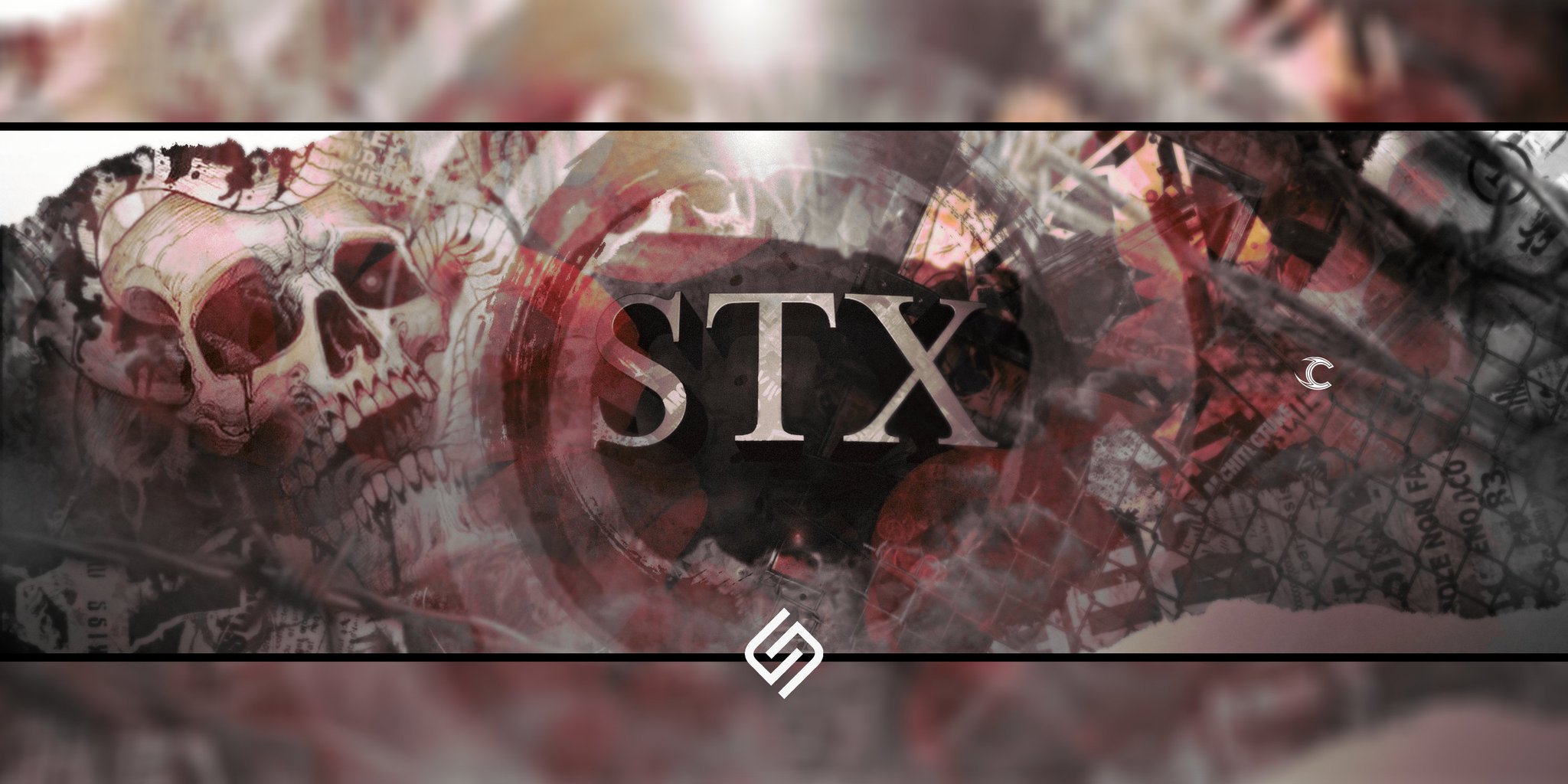
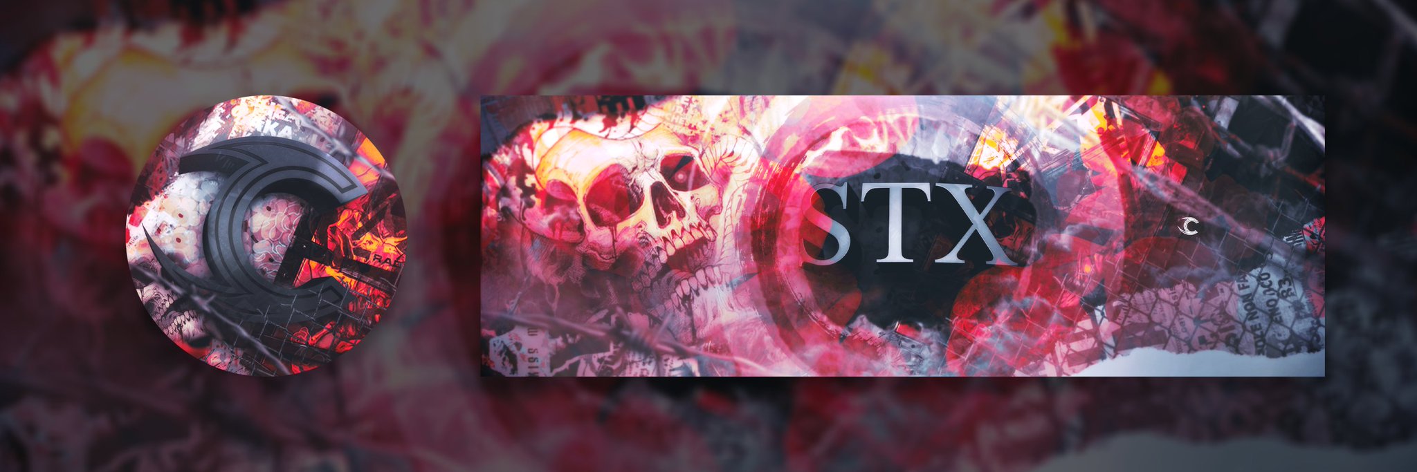
Header for @stx_rl , @teamcorruptrl || Any type of support appreciated
Animated challenge, if this upload correcty I will be staggered. Well it did and Im the first to note that its not quite right in that the apple moves around the page , that must be something to do with me not using a frame to start with. Anyway for now thats as good as it gets as Iv spent hours on it!
@outer vector : your project is simply AWESOME! I love the mood, colors, typeface...etc everything fits together... You nailed it!!!
@pseudo fog Very cool! Loving the textures on this one. The worm reminds me of that popular kids book The Very Hungry Caterpillar. Really nice job with the animation, assuming you approached this by making a frame from each layer the apple shouldn't move as long as it's in the same position in each frame. Very nicely done!
@whole tangle That's great to hear, I think incorporating interests and personal work into these challenges is a great way to go. The social media post is looking good! I think you did a nice job of breaking up the background design with the frame and I think the bigger shapes give that classic Van Halen look without being too visually busy. The blue/purple of the portrait background creates some nice contrast too. I think the designs compliment that energetic rock and roll look without being too much. Very nice!
@bleak fossil Thanks so much for your feedback, I really appreciate it! I always get real anxious when I post my art online. Thanks again! 🙂
Gave +1 Creative Carma to @bleak fossil
Thank you so so much!!! This means a lot. And I really admire your work. 😁
Gave +1 Creative Carma to @hollow yarrow
Day #8 - Animated Title. This certainly was a bit of a challenge. I am a terrible artist. I guess a lot of practice is necessary
Challenge #8 1-14-21 Animated Title full size.
Photo is little overexposed but I think it work well with the background, first try with the photos didn't work well the background jump all over.
I figured out the solution to that problem. With 2 diffrent mask one with only the bear and one with only background (first frames background), only the first frame have orignal background. With content aware fill, did I replace the hole after deleted the bear frome background.
Now I have 1 frame with original photo, and the rest of the frames only the bear, no background, now I mearge the bears in fram 2 to 6 to the new background. For this work I had to have the bear on top of the background. 😅
My Day 6 Entry!
I enjoyed how my banner looked, so I updated my Day 1 and Day 4 Challenges to reflect the same look!


@hollow yarrow Franck, your Behance post is incredible. What an amazing job. Every creation is so special in its own right. I for one will be checking out this post over and over. Thank you so much for putting it together and posting it for us to share.
Gave +1 Creative Carma to @hollow yarrow
Have now post my projekt on Behance https://www.behance.net/gallery/112051249/Mother-Natuer

@long granite the image that you re-worked and posted on 1.20.2021 is amazing! I was drawn right to it. Congrats! Have you had the opportunity to watch the 'shadows' stream by @bleak fossil? He goes into detail. I found it very helpful. Good luck in all of your endeavors!
My day 7 Case Study rough draft! Decided to make it for the latest AI Challenge!
Thanks, I really appreciate your comment. By the way I saw your message in design squad chat... I take time to reply but I will certainly give my opinion later this week.👍
Gave +1 Creative Carma to @eternal mica
😇
Hello everyone! So glad to present you my serie (I've been working on since the live) ... I'm enjoying working on these little caracters and their different personalities. I would pay a huge attention to the presentation of my Behance project. I would certainly organised it in drawings and paintings ... Not totally finished but here are the drawings. Do not hesitate to tell me anything you think I could improve ...
and here are the paintings
CHALLENGE # 1
1


@simple mason There's to much going on. My eyes don't know what to focus on. Now the models are stunning and the lighting is perfect.
@long granite You do a great work but I think you post in wrong channel, a better channel is # design-other, this channel is for daily creative challenge work.
My apologies thank you for notifyin me
Officially I started! First challenge done! Next two tomorrow, maybe three. We will see
Welcome @young karma! You’re off to a great start.
2
Brushes Episode 1. Thanks for this lesson. There are so many brushes. It was grand to see their uses. I will continue to practice.
Camera Raw Treatment for my #DesignChallenge
Challenge no. 2. I was naive thinking it will be fast done. 😖
Playing around gif animation in Photoshop...
Challenge no3, done! See you tomorow in the morning, in european time! Now lets play Tetris 🤓
i cant find neutral filter please help
Hey @quiet compass. You need to update to Photoshop 2021 to have them. Go to the Help menu and click on the Updates option.
Animated Title for my project. I almost finished it! https://www.behance.net/gallery/111511161/PS-VS-II-photo-manipulation-exercises?tracking_source=for_you_feed_user_published

Challenge 4 done!
@hollow yarrow awesome job on the gif. I'm curious, how many layers are in the animation?
Hello. Here's my GIF. Fun to do, but took me a while to figure this one out!
Challenge 4, done
@little spoke. Your Tic Tac Toe board is great! This is just a thought, would you be able to place a line through the O's at the end? I like the colors you have chosen for your X's and O's. Congrats!
This is my trial for #8 Animate ... so much fun whith ACNH characters ...
IT's sooooo beautiful! I loved it ♥
Thanks @candid chasm Actually, I can't wait to post my project ...
Gave +1 Creative Carma to @candid chasm
Thanks Ted. It's a 18 frames animation... In fact it is the same design I just animated a hue/saturation layer on top. I move the "hue" slider of 20 and take a snap shot each time+the original frame.
Gave +1 Creative Carma to @eternal mica
Your frog is lovely the animation is really great @vagrant rapids ! Love the colors and how you applied textures. 10/10 for the eyes animation👍 Nicely done!
@hollow yarrow I realized it was a static image. I couldn't tell how many variations you made. Is the multi-lined background pattern an image you created? The whole piece is really cool.
@vagrant rapids this frog and the animation are both amazing! Thanks for sharing 😍
Gave +1 Creative Carma to @vagrant rapids
Thank you so much @hollow yarrow and @simple idol!
Gave +1 Creative Carma to @hollow yarrow
challenge no.6, done
Yep! I made everything on this one
@hollow yarrow That brush is fantastic. You never cease to amaze
Challenge no.7, done! I use my old works from AI+Procerate because my super plan that I will use Ipad pro as a graphic tablet doesn't work. Ps app I don't like. So, somebody will tomorrow order good old Wacom 😩
!rank
 Tiny, that command is disabled in this channel.
Attached you have a couple DCC's in one: Challenges 1, 2, and 6 @jolly quest Took a little longer than I thought and hoped, but I definitely learned SO much in the process. I really appreciate all the time it took in creating such great projects. Also want to thank this AMAZING community for their support! #Adobe #Behance ... wouldn't be here without ya'! More projects on the way 😉 👌🏽 Any feed back is greatly appreciated.
Gave +1 Creative Carma to @jolly quest
DCC-6 Create A Banner(My Behance Banner).
Very nice work @raw coyote! The elements are very well distributed and I like the consistent colors of the background and the eye. Well done!
This turned out awesome @fluid sequoia! The color palettes can capture the essence of the images. Great font choice too. I loved the way that you combined them on your banner. Excellent works! 🙂
Thank you very much for the appreciation. This means a lot to me.
Gave +1 Creative Carma to @coral stone
Hello everyone! I'm new to the challenge this month.
Are the piece submitted from the previous one or did I miss the announcement for today's challenge?
Heya @vale gale welcome! Today is just the welcome stream. Day 1 of the challenge is tomorrow 🙂 Today, Kathleen shows how to get started and how to take the challenges.
Okay great to know! Thanks so much!
Gave +1 Creative Carma to @coral stone
Hi everyone. It's been 11 months since I last tried a dcc, and my PS skills are nowhere! Looking forward to this even though I am a newbie. I have no pretentions of being a graphic designer, - just trying to learn what some of the buttons do in PS. 🙂
Cover for Kathleen's "Vanishing" series.
Hey @thorny comet! Welcome back! Feel free to tag me if you have any questions 🙂
Great colors, @bold valley! The white stroke helps the blue text to separate itself from the background. You matched the typefaces very well too. Just make sure that when you upload it, there won't be any cropping (the recommended size for the cover is 808x632px). Well done!
my PS DCC board for the next series of daily challenges
My cover image for the PSDCC with Kathleen 1-12 Feb 21
Loved the stylized frame with Bevel & Emboss, @dusky wave! The colors are looking great as well, I like how everything has a great amount of contrast and the illustrations are very consistent among each other. Can't wait to see your next works. 🙂
Awesome textures @compact pecan! The wavy lines overlapping the stamp adds a nice visual interest for the cover. Well done!
thanks, @coral stone !
Gave +1 Creative Carma to @coral stone
ok if Damian is a newbie I'm a super-newbie++. How do I upload my file?
See I don't even have a pic
@hushed spade Just click the + Icon to the left of the chat, and find your file on your computer
@hushed spade Unless you mean open in Photoshop. Then you go to File-Open at the top and locate your file
@compact pecan Great style to this! That monochromatic look really helps sell that aged feel. The stamp patterns work really nicely too. It could be nice to use a blending mode on the brown border that shows just a touch of the paper texture underneath for a more realistic look. Very nice!
Ok nobody laugh. My skills are zero. I have a couple ideas I'd like to try with this basic setup, but haven't been able to make either of them happen. Roadblocks left and right. Thanks for any feedback.
@hushed spade No problem, that's what we're here for! If you need feedback this is the best place to post, but if you have any Photoshop or technical questions the #❓ask-a-question section is best. I'd recommend posting JPEGs here in Discord with a description of what you want feedback or help on, rather than a PSD people would have to download and open in Photoshop to view.
Gotcha! thanks
No problem!
@dusky wave Very cool! Digging that embossed border effect. It gives it some nice dimension which fits this design well. The texture and fonts work well too, though I wonder if using the top font on the "with Kathleen Martin" part at the bottom might make the design feel more cohesive? Just a minor suggestion, depending what you like. Nicely done 😄
accidentally chose psd before
All I could really do was text and color, so based on that, what do you think?
@hushed spade Looks good! I like the font choice. Did you mean to crop it in that way though? It either looks like you cropped it or made the text too big for the canvas. My only suggestion would be to give the "They Vanish" text a bit more value contrast to make it read more clearly like "Before" does. You could make the text lighter, or make the background a bit lighter and the text darker, whatever works to make it read a bit more clearly. Nice job!
hello! just joining, is there a link I can rewatch the intro....lost. Thanks
@amber thistle Welcome in! You bet, you can find all the challenges here: https://www.behance.net/challenge/photoshop (first one will be revealed tomorrow) and the intro stream can be found here: https://www.behance.net/live/videos/10037/Photoshop-Daily-Creative-Challenge-Welcome?tracking_source=to_replay&from_row=Photoshop
THANKS!
I didn't like how the yellow-ish color of the backround was playing with the colors, so I added a hue/saturation layer to make it less-yellow. Then I used the 'ole "blend-if" sliders on the text to bring out a more aged look that I got before.
Thanks, Sam! Yes, I actually did crop it on purpose. The word vanishes like the animals are. Will try to play with lightening "they vanish".
@hushed spade there are a bunch of ways you could make "vanish" disappear - the first one that comes to mind is to put a gradient layer mask on that layer so it'll gradually disappear but still be obvious what is says
Hi everyone, very new to this. Is the new challenge starting tomorrow ? 🙂
Thanks! Yep I was able to do that, but then couldn't figure how to change the colors, so backtracked.
Glad to know there's a place on here to ask questions as I go! I plan to take advantage of that.
@hushed spade don't be shy and don't be embarrassed to ask questions! Use the ask-a-question room if you want help with your projects. This forum is a very safe and encouraging place for all of us to learn Photoshop. You can always tag me if you want on your questons and I'd be more than happy to help. We've all started at the beginning. Welcome!!
@pastel spindle yes, the challenge starts tomorrow and goes for 9 challenges. The first day is a "welcome" day, and lots of people use the first day to create their "cover image" for their Behance project post. Welcome!
Thanks a lot. Cant wait 🙂
Thank you! You said I can tag you. Sorry, I don't know what that mean or how to do it. (?)
Gave +1 Creative Carma to @compact pecan
@hushed spade haha. you just did it! When you mention someone (using "@" and their username) -- I just click on their name and choose "mention" it gives a notification. In that case, your question or post goes directly to someone (and is visible to all). @coral stone is a mentor and is SUPER helpful as well.
hahaha! Ok thanks!
@compact pecan Thanks for your help! I also really appreciate the weathered look of the paper on your project. I wrestled with trying to achieve that look for hours and hours about a year ago.... I'm sure there's actually a very easy way to do it.
Gave +1 Creative Carma to @compact pecan
What's the deal with the bots?
@hushed spade The bots award points for giving feedback and such. No real purpose to it, just kind of a fun thing
👍
Before They Vanish. I tried to get the cats to appear as though they are hiding in the forest. Getting the colors right is tricky for me. I'm practicing!
Super cool neon look of the Photoshop DCC! @tropic knoll Is that a custom font? I loved how it fits great with the theme. The overlaps add a nice depth to the whole cover as well and the contras look very on point. Only a minor detail that I spotted would be to decrease the glow spread of the Before They and brighten it a touch, so it will match the luminosity values from the Vanish. Well done, CK!
Here is my first try. I have always heard, "Think globally but act locally", so I am looking at endangered American species.
My cover art for this DCC not sure I'm done with it...
PSDCC Day 0 with Kathleen Martin - Behance Cover
And I was trying to stop being so cat-centric, too.... 😉 Fell off the cat wagon. I'll try again next month!
Pa DCC 21-02 Banner
Re-Do. Before They Vanish. Thank you @coral stone for your keen eye! I lessoned the outer glow and lightened Before They. Now when I look at the image, the animals are the main focus. Thank you! The neon font is Critter Std, Regular from Adobe fonts.
Gave +1 Creative Carma to @coral stone
@compact pecan The changes look great! I like the pop of color, but the aged/vintage look is still working very nicely. The texture showing through really sells the effect.
@tropic knoll Nice work, looking good! I really like the top font, the glow gives it a nice read. The yellow hue of the other text contrasts nicely as well. I feel like a multiply layer and soft brush to darken/fade the edges more into shadow with a bit of brightness in the center of the face with something like a color dodge layer might help push the illusion of peaking out of the shadows even more. Nicely done!
@eternal mica The border and texture give this a really nice stamp look. The whole design has a nice visual balance between the text and picture too. The white text has a nice unity and the drop shadow effect is a nice touch. Looks good!
@pliant comet Hah, maybe this one was just meant to be with cats. Loving that wispy text effect against the white background! Very cool effect on the leopard too. 👍
@bleak fossil Thanks Sam. Im looking forward to this DCC. It seems like forever since I did one.
Gave +1 Creative Carma to @bleak fossil
@plain sable Very nice design, everything looks really cohesive and works together nicely. I like the faded opacity effect you did with the plant at the bottom. Well done!
Thanks @bleak fossil
Gave +1 Creative Carma to @bleak fossil
Thank you, @bleak fossil
Gave +1 Creative Carma to @bleak fossil
@sweet fern I like it! The masking is looking solid, though I think perhaps the far leg of the cougar could be cleaned up a bit. I often like to use the Refine Edge Brush tool or even the newer Refine Hair button within the Mask and Select window. The font styles and effects are looking good!
Thank you! Thank you for the advice. I'll see what I can come up with.
Gave +1 Creative Carma to @bleak fossil
Day 1 Cover
Hi has the nine day. photoshop challenge started ?I am new to discord and ia m still struggling to get. used to it
@topaz trail The actual challenges begin Tue @ 9:00 AM PST. This is @bleak fossil earlier reply to another newcomer. Just follow what he says. Welcome in! You bet, you can find all the challenges here: https://www.behance.net/challenge/photoshop (first one will be revealed tomorrow) and the intro stream can be found here: https://www.behance.net/live/videos/10037/Photoshop-Daily-Creative-Challenge-Welcome?tracking_source=to_replay&from_row=Photoshop

Daily Creative Challenge

Join your host each morning at 9:00am PT to learn how to approach each challenge using Photoshop. Complete 9 challenges by Friday, February 12th and you’ll be on your way to sharpening your skills. Get your questions answered, see what the community is creating and get feedback on your work!To sign up and get started, go to: https://www.behance....
@topaz trail I suggest you watch the intro video. Kathleen explains the two week process in detail.
Thank you so much Ted. Much appreciated.
PS DCC Cover
PS DCC Feb 1, 2021 Welcome Day: Behance project cover
This was so heavy challenge! Gif is not smooth, but, hey, it is my first one (in PS!).
Hey @winter tinsel! I loved the pattern and textures of your cover! The lines give a nice movement to the hole design, and the Help colors maintain the context of the composition. Great job with the organic edges too. 🙂
Very nice work, @lucid plover! The flowers were a great way to catch the viewers' attention to the middle, like a vignette, helping the thumbnail stand out among the Behance feed. Also, the grain for the gradient colors from the background was a nice touch as well.
Thank you @coral stone
Gave +1 Creative Carma to @coral stone
@inner plaza super cool work, Keith! I loved the slab serif with textured edges at the bottom area. Well done!
Haha how cute @young karma! It can be a stop motion animation 😉 I loved how, in a very short time, your animation was able to tell a story. Keep it up!
Hey y'all! Thanks for being here. I'm excited to get started today!
Looking forward to today's challenge 🙂
Here is my title
Cool work @mortal crescent! I loved the paper effect for the animals, it builds a strong message. My only suggestion would be to increase the spacing between the letters for the word Endangered, just to increase the legibility. This way, the shapes of the letters will be more defined. Well done. 🙂
Thank you! It took me a while to find that bottom text font for an antiquated, distressed look and I finally found a use for the Dissolve blend mode to increase the effect.
Gave +1 Creative Carma to @coral stone
@coral stone Thanks, I'll take a look at the spacing 🙂
Gave +1 Creative Carma to @coral stone
@coral stone Thanks for the comments.
Gave +1 Creative Carma to @coral stone
@bleak fossil Thanks for the comments.
Here's my cover image for the DCC 🙂
Feeling nostalgic, so I went with a different endangered species for my cover.
Here's day 1! What do you think of the added halftone texture?
looks perfect
looks incredible @sterile bane !
Looks great - love seeing where other people's brains go - I would have never thought to approach it like this. Nice 👍 😍
Love the texture n effect👌
It's really cool, and as you say gives it a really nice edge. I think tomorrow we might be saving the bees...
Day 1 Creating my own stamps. Better "cancel" it or the Postal Service wiil be looking for me. Whata u think?
Wow, how'd you get that nice flat paper feel on the butterfly? It's great!
Played around more with the background & a little liquify.
@sterile bane My butterfly had that texture when I placed it in the this file.
DCC Day 1,Gradient
Here's my day 1 submission. I wanted to use the cool halftone technique that @sterile bane mentioned but I felt it was a bit too busy/similar with the leopard's spot pattern. I'll have to bag that trick for another day. Any thoughts on the color scheme? Does it work well or would a different background color be a better choice?
I love the colors and the overall look - my only comment would be that its hard to read the Leopard part.
Thank you Jude! I agree there is some legibility issues in that area. I'll give it another go. 🙂
My day 1 submission, followed along on @sterile bane stream decided to give my turtle some friends 😄
I used one of my own images of a cheetah, and a radial color gradient
Day1 Submission. Colorful Gradient. Please give your review. Thanks.
@deep lintel : lovely job on this one! Texture looks well. I love gradient tone chosen and how you kept the skin/fur pattern of your Leopard!
@vapid venture : Great stamp! Love the contrasting colors between the leopard and the background. British post stamp adds a nice realistic touch! Nicely done!
This is my colorful endangered animal stamp. It is bird with less then 50 known adults in the world.
This is my first daily creative challenge, and using layers in this way is very new to me, let me know what you think!
@deep lintel Nice job. Im not sure the tail should be running off of the stamp in the lower left corner.
Ps DCC 21-02 01 Colorful Gradient
Hi, @deep mango! I loved the font that you chose for the Ps DCC. The textures from the background was a nice way to build the wildlife context. This is just an idea that might give the whole design even more balance. but you can position the red text a bit lower, aligning the top area of Endangered to the top area of the stamp from the bottom. This way, the middle line will be empty without any trapped space. Great job with the color combination!
Very cool idea for the challenge, @slow estuary! Awesome font choice for the cover, it matches the style nostalgic style of the electronics. Nicely done!
Hey @arctic rover! I like the high contrast that the turtle and the sea has. The liquify was a cool idea for creating water distortions. The contrast and the colors are looking very on point as well!
Nice textures in this one @rocky kite! I like how you made it consistent throughout all the areas of the stamp. The only suggestion I have would be to fade the water or make the turtle a little bit with more contrast. It can be done with a levels adjustment layer. The font that you chose for the texts is looking great!
@lucid plover super cool work, Fery! I like how the gradients gave some depth to the composition. I also like the text with a high amount of tracking, it matches the clean style of the layout. The only considerations I have would be to refine the mask of the tiger, just to remove the fringing, you can try the Shift edge from the Select & Mask workspace or even the minimum filter. Also, you can remove the original grass in the lower area with the spot healing brush and clone stamp tool.
My day 1 entry! I love the colors on this. I'm not a big fan of the stamp lines, any suggestions on improvements?
thank you @coral stone
Gave +1 Creative Carma to @coral stone
also @rocky kite I would suggest moving the text inside your colored background, and swap out "animal name" for the name of the animal in the image ... maybe "sea turtle" ??? Really nice work.
@somber token I googled images cancellation postmarks and came up with plenty of alternatives
@tranquil tendon Nice job! I like hor you applied the gradient on your image. It gives a nice glowing effect to jellyfish and water surface. I like how you framed your design playing with opacity on the borders.
DCC Day 1,Revised
@lucid plover Ooh, digging these colors! Very vaporwave type of feel to it. The background gradient shapes have a really nice balance to each other, and the composition is working really well overall. Great job on the masking too. 👍
thank you @bleak fossil
Gave +1 Creative Carma to @bleak fossil
Nice job @lucid plover ! Love how you used shapes and gradient orientations to guide our eyes and give a great focal point! Great improvement on mask refinement 👍
@jaunty tiger Very nice effect on this! The turtles almost have a sort of etched look to them. Both the turtles and background have really interesting textures but still contrast and read nicely against one another. I like the simple color scheme too, nice work!
Thank You @hollow yarrow
Save the turtles!
Thanks for noticing the subtle British touch!
Gave +1 Creative Carma to @hollow yarrow
@bleak fossil, @lucid plover did his usual awesome job. I have a question. Is there such a thing as text being too spread out to be readable? It seems to me the "before" is hard to read. Would it help to have the letters on top and bottom much closer together even if they dont fill up those spaces?
I will try it @eternal mica
Here's my Hermann's tortoise stamp for Day 1 🙂
Thank you!
Gave +1 Creative Carma to @bleak fossil
@eternal mica I think it reads fairly clearly because it's the only word at the top, I think once you start having multiple words on a line it can get tricky. It just reminds me of that really wide kerning you sometimes see on movie posters. I just usually eyeball it, and if it reads as being "off" or confusing that's usually when I think it's an issue.
@deep mango Loving that turtle image! Really liking that turtle's gradient too, it creates enough huge contrast to read well against the background. Great textures!
Thanks @bleak fossil 🙂
Gave +1 Creative Carma to @bleak fossil
Got it. I guess im old fashioned. I would have liked the one word alone on top, centered, with less spread.
@compact pecan The bold colors with the rough texture makes for a really interesting effect. Kind of vintage, but also modern looking at the same time, hah. I kind of wonder if the "Save the Turtles" text at the bottom being blue might be a nice way to repeat the blue tones in the design, and contrast the orange of that area, the way the "Forever USA" contrasts the blue background. Just a thought, nice work!
@eternal mica Type is certainly my weak point in terms of design due to my narrow focus on drawing and painting. I just kind of eyeball it most of the time and hope for the best xD
Though I suppose that's what all design is, hah
@bleak fossil Your modesty becomes you
Did an update on the font to try and make it more readable at smaller sizes, let me know what you think!
@coral stone Thanks for the suggestion,it was a good idea 🙂 Also I've notice my stamp on the bottom right is too far down so I pushed it up as it was aligned with the text
Gave +1 Creative Carma to @coral stone
@somber token Really cool style to this! Kind of that black light effect with those glowing colors. Maybe the stamp lines being a solid blue rather than just blue strokes with a black center would make it less "detailed" looking and draw more attention to the turtle? If it's too bold you could always adjust the opacity. It also might be nice to use something like the burn tool or a masked levels adjustment to boost the dark shapes in the turtle's face to make the head and eye more of a focal point. Really nicely done!
Green Sea Turtle
@eternal mica I like how you mirrored the color scheme from the bird into your text! This is kind of a subtle suggestion, but the text seems to overpower the image of the bird just a bit in terms of both value and saturation contrast, it might be nice to tone down the text slightly in those areas while boosting the value and saturation contrast of the bird to really solidify it as the focal point of the image. Looking good!
Always have focused on creating logos, first time taking the time to create on photoshop
@bleak fossil Thanks Sam. I'll definitely give that a go.
Gave +1 Creative Carma to @bleak fossil
That's a great idea and an awesome tip. I like how you always find some subtle, yet powerful changes I can make so my images really improve. I'm glad it still has a vintage twist to it - after all the postmark is 1945! ( i think)
Day 1! Up till a week ago I had to work with Photoshop CS6. With my new computer and an up to date Creative Cloud subscription I am exited to explore and discover all these new features. Still a little bit confused, but hey, it will get better with these wonderful challenges.
PSDCC Day 2 with Kathleen Martin - Gradients
I know. It's not a cat.
My Day 2 for PS DCC #02 - Gradients
nice! it's a good point that designing for stamps can be a struggle because...they're about as small as it gets. I think this type face works and feels pretty classic. One thing that is helping it stay legible is you left a good amount of space between the letters so that the words can breathe, even at a small size. great job!
Cover Image
Awesome! Thanks for posting. I like the embossed effect you achieved with that seal in the top left corner. The type on the right is starting to get a little difficult to read - I think going for a lighter color might help if you're interested in making any adjustments!
Gave +1 Creative Carma to @dusky wave
Love the letters-as-frames direction! How did you go about achieving this effect?
@sterile bane I just did clipping masks. I used the animal image 3 times
First time submitting CC Day 1
@hoary owl Great colors! I really love the blue tones in the turtle to contrast the background. I think maybe decreasing the saturation of the green in the text ever so slightly might give it a similar 80s/90s era look that the rest of the image seems to have. Nice work!
day 1
@buoyant nova Very nice work with the masking effect within the letters for the cover image! The faded background gives it some context but still allows the title text to shine. Very cool!
My image for today's challenge
sphinx
@pliant comet Gradients are looking really cool! The text fits nicely around the turtle, and the subtle faded effect towards the bottom is a really nice touch. Looks good!
Catching up : 4am live here a bit early for me lol .. the turtles etc look great wow great to be back hi all this is from intro monday .. working out diff btwn Ai and Ps headtrip going on
Thanks @bleak fossil
Gave +1 Creative Carma to @bleak fossil
thanks @bleak fossil
Gave +1 Creative Carma to @bleak fossil
Heroes never perish, don´t they? I use all techniques I have learned for half a year here in Behance.
This is lovely - nice and clean!
My Day 2 for PS DCC #02 - Gradients
Hi All, first time doing a DCC so a bit nervous! If anyone has any suggestions on how to improve then let me know 🙂
loving the half tone on this
Challenge #1 Sea Turtle 🐢 Stamp.
Here is my Day 1 stamp with Asiatic Lion.
Loved the video today! Here's what I made- I'm not sold on the gradient, I think it could be lighter. Attempted to include the postage effects like Kathleen suggested but kinda of struggled with it tbh- I havent seriously used photoshop since I was a teen even then object selection seemed to elude me. Would love some tips!
Here's my stamp with a Royal Starfish.
Day 1 Whale Shark Stamp!
Cover and Day 1: For the cover, I used some postage stamp images that I have created and purchased to use in my business.
I'm in love with this one - very nice!
I used the same background texture/image and similar edge color as the cover to be more cohesive. Yesterday when I watched the cover video, I thought that no matter what Kathleen started with, I'd start with sea turtles. Surprise!
My Day 1 DCC. The Ridley Sea Turtle is native to the Gulf of Mexico and lays eggs along the beaches of Padre Island, Texas.
PS_DCC title
Updated my fonts - I have no idea what I was thinking earlier haha
I can’t believe how much I learned in 20 minutes! Looking forward to continuing each day...
The great Jaguar from Latin America
First time I've done a challenge in over a year. Feels good to be back.
Day 1 😀
@fluid wharf super cool works! The way that you separated the elements with brightness preserved the depth from the original image, especially on the Sphinx. I can see that you applied a subtle glow to the eagle, it is a very nice touch. Well done!
@waxen ledge awesome textures for the turtle's shadow! The colors contrasts really well to the yellow/green from the turtle. Very well done!
@onyx field I like the clean look of your cover! The only suggestion I have would be to decrease the brightness of the background a touch, so it will avoid the E from Before and VA from Vanish to blend with it. Nice font choice 🙂
My first time doing this challenge, and I already feel like I've learned a lot. Thanks everyone!
Day 1 - Danube Sturgeon
Here goes several hours later and still not able to avoid the graduation mask on the outer boarder.
Day 1 -
Thank you Valdar for feedback
day 1, realy nice challenge 👍
Here's my draft 1 for Day 1 - sea turtle. Welcome feedback on how well the gradient color scheme works with the background color scheme. And any other feedback! thanks
Added the ink overlay for more authenticity and to fill in open space.
#✂challenges-feedback Seahorse
This is my first time doing the Photoshop challenge. I'm also doing the Illustrator challenge for the second time.
DAY 1 had to use workarounds , wasn't experienced enough to do it easily and correctly. But it was fun!
I really like the shade of green you used and how you matched the background with the turtle. Your change in fonts really adds to the believability for me. Very nice!
I think your image looks really great and it has some depth to it with the dark background and the trees. I'm thinking maybe you need to use a clipping mask so that your graduation only applies to the specific layer you want it to affect.
I will definitely try that again. I was unsuccessful in doing that here.
@pastel fractal I like the added touch of having the turtle break the boundary of the stamp a little bit - not overdone but enough to make it interesting. Nice work!
@west plume Well, whatever workaround you used still got you there! You can always go back to the challenge and watch it again. They are all saved on that same webpage. Lots of times I re-watch them so I can pause and rewind when things didn't go the same for me as in the video.
Thanks I am continuing to re-wind/stop back up . Maybe 20 times more will do it.
@thorn geyser Your Whale Shark stamp is really awesome! Love how you've made it pop with your color choice and the added depth with the nose over the frame. Really well done!
And I love all the options in layers under "normal" color burn seems to be my fav.
DCC #1! 😀
@old jetty : I like your stamp design. Great Texture on the background, Good idea to add gradient on wavy post stamp marks. Halftone pattern on the outlines adds a nice touch! Nicely done!
I just published my Animal Crossing Characters and Sceneries on Behance. I'm adding a huge Thanks @jolly quest for this so inspirational Challenge, for your amazing series ... Thank you!
https://www.behance.net/gallery/110836211/ACNH-Portraits-and-Sceneries-Drawings-Paintings

Behance
ACNH Portraits and Sceneries - Drawings Paintings
Gave +1 Creative Carma to @jolly quest
@vagrant rapids Great project!!! I am curious how did you made the second part of your project (scrollable coloring pages)??? Very impressive work!
First DCC! I tried to make the white lines between the turtle's "scutes" all white by various methods - a threshold layer etc... but failed. Could have done it manually but that was not a challenge, just tedium. So the Psychedelic Turtle is all color, for now.
Thank you so much @hollow yarrow - I'm happy you liked it! Concerning the second part, I simply used a Spark presentation! Spark is a fantastic tool, I greatly appreciate.
Gave +1 Creative Carma to @hollow yarrow
Thank you for the lesson. First time doing this kind of learning challenge/style. So many creative takes, I appreciate being part of this group. Thanks again! 😀
Thank you kindly😊
Gave +1 Creative Carma to @compact pecan
Beautiful! I absolutely love the background. Looks like you’ve got some advanced skill🙌🏼
My 1st DCC, this was a fun project! Can't wait to see what's next.
Thank you for the feedback 🥰
Gave +1 Creative Carma to @hollow yarrow
Day 1- so excited 🙂
🏳️🌈 Day 1 - Colorful Gradients - Betta Fish 🏳️🌈
@runic basin I like the way you balanced and accented the yellow throughout this design! Really nice contrast between the wolf and the black background too, looks good!
@stone wigeon Liking the colors here! The warm and cool contrast works really well. The text and background have a really nice hue contrast, but they're very similar in value. I wonder if a subtle shadow on the text might give it a bit more readability at a glance. Nice work with the gradient!
@worn jackal That's great to hear, welcome in! The fun part of these challenges is definitely how open it is to take the designs where you want. I really like the sort of deep sea luminescence look to the whole nice. Very nice!
@inner jacinth I like the interesting color scheme and sort of radial gradient pattern in this! The bold colors definitely create a strong focal point. Looks good!
@vagrant rapids These came out great! I really like the work you put into the project presentation to tie everything together. Very nice work!
@west plume Very cool! I love the way you integrated the background texture into the whole design to really sell that printed look. Kind of pushes that sort or aged look too. Really cool use of color within the texture of the turtle, nicely done!
The fact that you added the “plastic wrap” makes this 1000x more appealing—gives it more of a hyper realistic look/feel. This is sick!
@sonic mulch Welcome in! Glad you're joining us. The gradient is looking really nice, it gives it a nice strong contrast against the background. I like the way you also repeated the colors from the gradient into the text, looks good!
Thank you so much @bleak fossil! I'm happy you appreciated the project and its presentation!
Gave +1 Creative Carma to @bleak fossil
@spiral pine Great colors, I especially like how the gradient works within the patterning on the seahorse. I think making the background green color a bit more neutral/less saturated might help draw more focus to the inner design, though it really just depends on what you're going for. Nice work!
@blissful egret Very nice, I really like the more subdued colors in this. The fine lines of the turtle work nicely with that font style. I feel like the black lines might be a bit too thick/bold compared to the fine lines of the rest of the design. Perhaps making them thinner could create a better balance? Nicely done!
Feedback, please 😁
@zinc fjord I think the contrast is working really well between the turtle and background! The gradient creates a really interesting stylized look and pattern too. 👍
@midnight magnet Ooh, very nice, I like the high key look of the contrast in this design. It gives the whole thing a really soft feel to it. The gradient is looking good!
Gave +1 Creative Carma to @bleak fossil
Thanks, good observation with the shade! I will change it! 😃 😉
My first challenge. Let me know what you think.😀
Absolutely amazing! I love the added layer of in the back, definitely makes the turtle pop.
Played around with it a little more...Version two...
This is my first time using calques, that was not easy.
Thanks for the nice tutorial. Had to stop and replay finding the right buttons sometimes. But much appreciated. I actually used my first mask today :)
LOL😁
BLAH BLAH
Thanks for your reply... Never tried Spark... I should take time to try it!
Gave +1 Creative Carma to @vagrant rapids
@echo parrot Thank you! It feels intimidating to post my work and have people critique it, but its so good to see everyone's great talent, and get inspiration!
Gave +1 Creative Carma to @echo parrot
I like the contrast much better on the 2nd version. Less green. Good job!
Im not sure what I did, but I was unable to use the postage stamps.anyway here is my take....
@weary palm Your betta fish looks awesome! Nice contrast with Red and Blue + White frame... Fits well with your "Forever.USA". Great Halftone texture and I love how your fish shape turns like a cat face... Nicely done!
I agree...was looking rather flat. I even, accidently, gave myself a thumbs up...LOL. Thank you very much. Yours looks amazing.
Gave +1 Creative Carma to @bold spade
This is my attempt at Day 2 of PS Challenge.
@bleak fossil I adjusted the brightness of the bird and the text elements to make the focus point more distinct.
I don't know if it is too simple but I just wanna do things simple.
Wow! I see some really impressive stamps! I hope to get faster during this challenge. This one took all afternoon. So much to learn. So often I'm exploring and suddenly my screen changes and I don't know how to get back to where I was. Need to use ask-a-question tomorrow.
So my question is do you think this monochrome theme works, or would a few warm tones or maybe lightening up the turtle help?
Thank you. Good point about the lines. I’ve tried a few different variables and it’s looking better.😊
Gave +1 Creative Carma to @bleak fossil
my guess for tomorrow is some type of porpoise
nothing wrong with simple. I like what you did with the postal artifacts. And the added numbers. Gives an even more authentic look.
I like the watery background. Would like to know how you did it, as I had wondered about attempting something similar. I wonder if a larger size type for "Green Sea Turtle" would be more legible when viewed at stamp size.
Wow, Leah, I really like your stamp. Love the big turtle looking right at me, and the green shading highlighting the number. I think the font works, too. What would it be like if the text had a slight green tint to it?
😍 I think the color scheme works really well.
My work in progress so far.
Here's my attempt 🙈
Never did anything like this before. Learned a lot! Couldn't figure out the halftone part,though.....
I really like your stamp! Turtle seems to be ready to jump out of it 😄
I love your drawings, very inspiring, the blinking eyes frog... 😍 . thank you for sharing.
Gave +1 Creative Carma to @vagrant rapids
Day 1. Loved the halftone filter detail.
My first attempt at creating something like this.
Day 1 Sea turtle stamp.
Hi! My first draft, I had a hard time figuring out how to keep the text from being affected, resizing the turtle and moving it after making a mask, and changing the color behind the stamp. If anyone has tips on these, would greatly appreciate it! 😄
Just Trying First time here.
Just joined, excited to learn some new tricks! Here is my first attempt.
Just tried a silhouette with India Earth Shades... lemme know what you feel.
Love this ....
@vale sentinel Nice color contrast! The texture is looking really good too. perhaps the turtle could be scaled up a bit, maybe even brightened slightly so be a more dominant focal point? Either way, looking good!
@wispy compass Really interesting design! I like the bold colors, and the red color as an accent works nicely. The border and black stamp in the upper left corner really sell the stamp effect. Nice job!
@queen aspen Great shark image and gradient! I like how it looks like blue and pink are added to its natural color. It contrasts really nicely with the more textured background too. Very cool!
@bleak berry Welcome in, glad you're joining us! Really liking the gradient on this design. The colors add a lot of interest but still keep that icy so sort of look to it. Very cool!
@tired tree Awesome, welcome in, glad to have you joining us! Very nice work with the gradient on this, the bold colors create a really strong visual. Nicely done!
@tender temple Glad to hear it! Great colors on this, the gradient came out very nicely and contrasts well against the background. Is there any part of the halftone that got you stuck. Essentially you're just duplicating the animal layer (make sure it's rasterized so it's only affecting the shape of the cut out animal), putting it under the original animal layer, and giving it a halftone effect, then offsetting it a bit. Nice work!
First time taking the creative challenge!
Thank you, Sam @bleak fossil BTW, this isn't a shark - it's a sturgeon, but you're right, it looks like a shark
Gave +1 Creative Carma to @bleak fossil
Thanks, @blissful egret
Hello everyone, this is my stamp, I chose Oryx as a reflection of the Qatari culture. Happy to see ur comments 🤓
Hello Everyone! Sharing my Day 1 -Stamp! Would love to hear any feedback 🙂
Thanks @dusky swallow I'm glad you appreciate it!
Gave +1 Creative Carma to @dusky swallow
Here is my entry for today's challenge
Here is my work
My try ~ x)
First version on Challenge 1. I may change it up a bit...
heeeyyy there everyone, 1st time partaking in this challenge and im stoked!! it's great seeing everyones art ❤️ So here's the stamp i've created for day 1. i've got 2 other versions also.. berrrry similar just different tuna colour. that is all!
Thank you - I ended up changing the fonts to something a bit cleaner - I liked the previous font and made the error of trying to force it to work but the design turned out cleaner than I intended 😄 I tried a green tint but personally felt like it was too much green then 😦 Hopefully some coloured text on the next one!
Gave +1 Creative Carma to @hushed spade
Really loving the gradient against the bolder colours 😄 Nice
Thank you @summer sinew .
Gave +1 Creative Carma to @summer sinew
For what it's worth 😉
Thnk you
Working on my cover.
I really like the colors! Nice job
Love to hear your feedback 🙂
First DCC! Would really appreciate some feedback. 😇
Hello everyone ! Sharing my work with you ! Hope you'll like it 😃
Some changes made.
Banner challenge #0-2-1-2021
Day 1
Original
credits there is about links and licens for 20 diffrent animals that have CC BY 2.0 or 3.0 licence.
Variant with text
Awesome stamp @ruby panther ! Love the dualtone look of your Rhino and the "Obama Hope" poster style! Typeface choice fits well with the overall design. Great job!!!!
Thanks @hollow yarrow Yup, I fully stole it! 😂
Gave +1 Creative Carma to @hollow yarrow
Thank you! @bleak fossil @midnight magnet
Gave +1 Creative Carma to @bleak fossil
Great shot @idle zealot ! Your stamp is really cool. Love textures and how you added contrasting colors to your turtle (Apply Style filter I suppose). Nicely done!
@peak sentinel Love the dynamism and energy in this image. The smooth, soft gradient creates softness and a sense of calm at the same time. 👍
how would you guys rate it /10 👍
Hey! This is my first try. Is it good enough?
I hope enjoy this, i had difficult putting postmask... so i left it out xD
Hey @hexed scroll! Welcome to Ps server! I loved the colors that you used for the cheetah! The gradient turned out nice and combines very well with the background. Very well done!
Hi, @viscid ore! Your stamp came out very nicely! I like the shadow that you used to separate it from the background. The only suggestion I have would be to position the Oryx a bit up, so the horns will appear more through the bright area of the background. Great job!
This is my first time joining Adobe Creative challenge and I had so much fun doing this project! What do you think?
@idle zealot super cool work! I loved the textured background and the gradient map of the turtle. The contrast is looking very on point, and the different sizes for the texts also help the Sea Turtle to stand out. Well done!
@wet epoch great work, Jonny! The subtle dark frame that you applied to the stamp is a nice touch. I like how the black and white turtle is standing out from the background, and the water texture is looking nice as well. My only suggestion would be to darken up the green text a bit, so it can be more legible. Well done!
I loved the neon look of the turtle @sleek agate, it combines very well with the dark background. Great job!
@plain oar this turned out awesome, Gali! I loved the textures from the texts and the honeycomb in the background with the solar effect. The emblem was a great idea to enhance the stamp context for the whole composition. Excellent job!
Amazing design, @ruby panther! The texture for the rhino adds a nice personality to the stamp. I agree with Franck, the font choice fits very well with the stamp, I like that you used a bright value of the blue, keeping everything consistent. 💯
The cover looks super cool as well, especially for the overlaps. One minor nitpick I have would be the upside down texy. If you used Type on a path to create it, you can have this text on a separated path > with the path selection tool push it to the inner area, and then increase the scale to fit in the stroke. Well done!
Hi! Here is my day1 challenge. Just brushing up on my skills and learning new ways to do things here. Sorry it isnt much different than the example.
@glossy gale That's a great start, Marz! I loved the pattern texture for the fish's shadow, my only suggestion would be to darken the text's color a touch, you can even use some of the dark blue hues present on the fish, so you'll gain more consistency and contrast against the background. Keep it up!
@spare garnet loved that you used a bokeh effect to give the impression of the bubbles. If you want you to brighten the turtle just a touch more so it might appear more from the background. Great work!
I like the duotone effect in your stamp, @simple mason! The muted colors are very consistent as well. Perhaps adding a levels adjustment layer to boost the contrast of the subject, bringing the first and third slider a bit closer. Let me know if you need any help.
@coral stone Thank you for the feedback! I did not think of creating another path for the bottom text. Great eye! Thanks again! 🙃 Note: Upside down text. 😂
Gave +1 Creative Carma to @coral stone
Thanks @ruby panther! Updated it 😅
Gave +1 Creative Carma to @ruby panther
I was late XD...
After a while, I found some time to participate again ☺️ Here is my day 1
@sonic saddle I love what you did with it! It looks beautiful!
@sonic saddle Great work on your stamp! Love the colors. One question, is the texture space dust or stars? I like it but if they are stars, you may not be able to see them through the planet. Great work!😄
Here is my version of Challenge 1
@mortal crescent this is super cool
@craggy lake Thank you 🙂
Gave +1 Creative Carma to @craggy lake
@sonic saddle I love it.
Beautiful colors, Zuzana!
Reminds me of sunset colors, quite calming. As far as the 2nd owl goes (bottom) it may have been useful to use a brush with minimal hardness/opacity to blend it into the background a bit more. Let me know if that’s what what you were looking to do/what you think about that.
Thank you! @inner jacinth @craggy lake @sleek lark
Gave +1 Creative Carma to @inner jacinth
Interesting effect here! How’d you get the tiger to come out like that towards the right side?
Great job @sonic saddle ! Good idea to go different way with your space theme. Gradient and blending mode give a great result and Typeface chosen fits well with your theme. Well done!
@mortal crescent : I love the idea to use "wind filter" on your tiger! Your design turned out very cool. My only suggestion would be to try to make "ENDANGERED" more readable... Maybe use a slightly darker gradient... Just an idea. Great job!👍
To be honest, I meant it to be kind of both, dust and stars.. When I masked it out from the planet it looked plain to me so I kept it there
@sonic saddle I think you made the right chose. Great work!
very new to photoshop! I've really enjoyed this tutorial
Changed the turtle back to the original color. I think I like this better.
Hi! I would like to know where I can find the Welcoming video to Kathleen's stamp class.. I didn't find it in Youtube, neither is it on the Ps Creative Challenge website.. please help me!
Here is the link https://www.behance.net/live/videos/10037/Photoshop-Daily-Creative-Challenge-Welcome?tracking_source=to_replay&from_row=Graphic_Design
Join your host each morning at 9:00am PT to learn how to approach each challenge using Photoshop. Complete 9 challenges by Friday, February 12th and you’ll be on your way to sharpening your skills. Get your questions answered, see what the community is creating and get feedback on your work!To sign up and get started, go to: https://www.behance....
Awesome, thanks!! Where did you find it? I have same problem with other CC-s, like Xd and Ai ones. I can't locate the very first ones...
Gave +1 Creative Carma to @sonic saddle
@naive kayak You can find the past streams at https://www.behance.net/live and scroll down to Photoshop.

Join us right now to get inspired by leading creatives. Get your questions answered and share your work with the community.
Aah, I see! 👍 🙃
Comments welcome 😀
I couldn't use the original font and the source files had the Adobe watermark on. Any help would be great. I was logged into Creative Cloud at the time.
Also my first DCC, went for a psychedelic effect — was thinking about Pink Floyd’s The Piper at the Gates of Dawn album cover. Worked with various iterations of this — was limited by PS on iPad not having certain features available but invigorating nonetheless.
Loved the bright cyan tones of your stamp, @frozen forum, with the texture, it produced a very nice effect. I can also see that you gave a subtle glow and overlapped with the Oil Spill, I think it adds a cool detail to the overall design. Great job!
@craggy lake I'm a big fan of what you did with the text, combining texture and a neon color. The stamp also has a great contrast with the background and the hard edges of reminds me of those stamp inks when in contact with the paper. Well done!
First work with photoshop😄
Somehow my background wound up looking like the crushed velvet from one of my dice trays. I like happy accidents.
AMUR Leopard. Said to be rarest cat in existance. My stamp for challenge 1. Thank you for this opportunity!
Hi friends, here is my day 1 stamp!
Hi... Took this for a spin....
Great thank you! I'll tweak the art tonight
Gave +1 Creative Carma to @coral stone
I'm going to change the color palette - what kind of colors might you recommend? I'm thinking some nice warm oranges and tangerines
Nice compound eyevision....!
DCC Day 2,Compose Design
Day 2 Coming out.
I can imagine holding this in my hands as an actual stamp with a lenticular effect going on. An observation I made though was the space between the hind legs has some additional masking that can be done — seems like that was looked over but overall I’m enjoying the design, it’s trippy 🌀
@heavy nebula Thanks. I'll take a look at that masking. Glad you like it.
Gave +1 Creative Carma to @heavy nebula
Here's my draft of cover for the creative challenge project. Feedback on colors and composition are welcome!
yeah, i had really try to hide the end of the bottom (because owl's body was cut in the picture, it wouldn't be good) and, so i used the brush instinctively to smooth this part.
Still new to all this, any tips on improvment?
PS DCC #1 Colorful Gradients
Day one challenge! Having done the second one now, I kind of want to go back and make this one in the same style. We shall see!
The second day of the challenge. This is the style I think I prefer now. So happy with how it turned out!
I hope you all don't find me irreverent - I, too, am concerned about vanishing species. Then again, I haven't seen one of these things around for YEARS!
my day two entry! I don't love a lot of the warp text effects, so went with a pattern & a drop shadow instead.
My color pallet for this set of challenges is oranges & animal is the polar bear - any comments
The pangolin reminded me of the letter P, so I played off of that shape. Any comments? I need to add the postmark.
I love the texture, and the tail curled over the edge
I've added the "P" shaped postmark
Day 1 - Colourful Gradients
PSDCC Day 2 with Kathleen Martin - Compose a Design
My pitch for a new show, "I Love Layer Masks!" Much like "I Love Lucy" but the hilarity ensues because I have so many layer masks that I forget which mask is doing what. Most of the show is me clicking through until I find the right layer.
Edit: I see the two white spots on the left. I fixed them in my file, but decided not to re-upload again. Moar masking!
If you option-click on a layer's visibility, it'll "solo" that layer and turn all of the others off. That can help to figure out where you are. The pros around here will tell you they name their layers but who has time for that? 😆
Thanks for the tip. I need to write these down as I often think, "Now what was that button?" Also, that is my other pitch. "What Was That Shortcut?" It's a gameshow dedicated to, well, you know... shortcuts. 😉
Gave +1 Creative Carma to @inner jacinth
Very cool work with the out of bounds effect, @lucid plover! This adds a cool depth to the scene. I also liked the red choice for the background, it suits the anger from the tiger's expression. Great job!
This came out really cool! I like how you combined the text with the primates and the pattern fill from the background, @bold valley! The only suggestion I have would be to use the Decontaminate colors from the select & mask workspace to remove the fringing of the edges. Well done!
Nice colors, @zinc fjord! I like the contrast between the purple text and the orange, it makes the texture stand out very nicely. The gradient map also came out really well with the elephant. Nicely done!
Thank You @coral stone
Gave +1 Creative Carma to @coral stone
The subtle green texture from the background is enough to bring that jungle context to your stamp, @gleaming cobalt. If you want to play with the out of bounds effect you can extend the vines to the stamp edges, and maybe reduce the size of the circular text a touch so it won't compete with the yellow silhouettes, enhancing the hierarchy of the design. Keep it up!
Very nice colors choice, @tacit condor! I like how they are very well distributed in the stamp and how they have enough contrast to stand out from the dark background. Great job!
I like the pastel colors of the gradient, @peak sentinel The bubbles also adds that cool movement to the whale. This is just an optional step, but if you want to make the colors even more consistent, you might choose a dark tone from the whale as a fill for the text. 🙂
I like the depth created with the gradients and the shadow for the word endangered @wary swan! The overlaps add a nice touch for the cover as well. Nicely done!
Wanted to get the text interacting with the subject. Any feedback?
Ps DCC 21-02 02 Compose a Design I have never heard of this animal. I read on Wiki that it is the most trafficked animal in the world. How sad.
@broken sierra Hungry ape! 👍
@vapid venture : Love how you played with P shape on your pangolin stamp! Smart idea and diagonal placement adds a great dynamic! Great Job!!!!
@sterile jackal wow! I think you landed on something really cool for day 2. LOVE the pangolin breaking the silhouette of the square and the matte orange/purple scheme. Keep doing what you're doing! It's working 😄
wow your stamps are crazy good ! I had trouble making an adjustment layer work for challenge 1
@median crystal LOVE the liquified effect in the background to mimic water. Super graphic and nice. Unfortunately I'm not able to provide the un-watermarked version of the images I use.. but you're welcome to use your own photos! Sorry about that
@onyx field thanks for posting! i'm digging the font choice. we can try to help you figure out some of those adjustment layer issues if you'd like!
Gave +1 Creative Carma to @onyx field
Thank you, @coral stone
Gave +1 Creative Carma to @coral stone
This was fun! Here's my draft of Day 2 - orangutang. Specific things I'd like to understand and have feedback about: 1) I'd love to have the vine the one that the smaller one on the right is holding onto -- be behind the O. I can't figure out how to do that - do I need to make a duplicate of the image and somehow crop and merge 2 images together, one with the leftmost vine on top of the O and the rightmost vine behind the O? 2) I seem to have lost the edges of the postage stamp design. I've tried rearranging all the layers but that postage stamp edge is just not visible anymore. Welcome all suggestions and feedback! Thank you
Also, how to mask the Adobe stock photo watermark?
Thank you, Kathleen! For your techniques and professionalism. We can express in so beautiful ways thanks to Adobe products!
My day 2 design for the photoshop challenge. Not sure about the colors.
PS DCC #2 Compose a Design
Day 2 - Bat
PSDCC feb 2021. Compose A Design. Please give a review.
Day 2 - Compose a Design
Thanks for the feedback! It was really helpful, didn’t notice that space between the legs 😳👍🏽
Gave +1 Creative Carma to @heavy nebula
What are your recommandation overall ?
@heavy nebula the psychedelic effect was an awesome idea! I loved that when the red and blue meet, they resulted in a pink hue. The texts are working very well too, I wonder if you could increase the contrast of the Postage at the upper left just to appear a little more. Great job!
Day 2 Challenge
@median crystal To remove the watermark you'll need to license the image through Adobe Stock. I loved the colors that you used. The background turned out amazing! Did you use liquify for that? It looks great! 💯
PSDCC feb2021. Colorful Gradient. Please give your review.
Todays process did go better but , why when you add text after the previous layers then delete it you are left with a white patch of letters on the backgrounds? is it because I changed the background colour after I added the text , if so how do I stop this happening again? As for todays image Iv tried working with the colour wheel a bit working with complimentary colurs, have I got it ?
Thank you! Excited to bring it to the next few challanges!
Gave +1 Creative Carma to @sterile bane
Very nice composition - love the square and the beast stepping out of the frame!
Day 2 of the challenge. I really hate what I created! I couldn't figure out how to space the text evenly along the circle. Also, after applying the mask to the pangolin that deleted the background of the image, I noticed, too late, the small green dot behind and to the right of the pangolin. This was a part of the background that failed to delete, but I couldn't figure out how to get rid of it; do I have to delete mask and create a brand new one with the lasso?
I really love this! It's so bold - stands out in an awesome way 😄
I dig that one Daxa! I two views are very compelling
Day 1 #challenge. Stuck with the turtle and added some stamps.
Day 2 - For colours I used a gradient map so that it matched the feel from yesterday. I added the "o" into the image and masked some of it out but it was a bit meh, so I also added some larger text with a stroke set to overlay. I'm not 100% sold so if anyone has any ideas to make this better just hola 🙂
I would suggest putting the font all the way on the white or all the way on the blue. It looks great!
Definitely not meh! 👍
day 2, I learned a lot, but something doesn't feel right with my project.
It's so cute!! maybe a bit more space between the words otter in the circle. so there's a bit more seperation.
@idle yarrow hi! any ideas about what you don't like about your project? I think it's working overall. There's a bit of a struggle for hierarchy right now since the otter, text and postal texture are all dark objects against a light background. I would try using a lighter color or white for the postal texture to help it mesh with the background
I think there’s a way to control the tail of the pangolin so it fits into that bend from the stalk of the P to the D shape. Someone would have to tell you the correct feature of photoshop but I remember seeing it in Paul’s master class video where he controlled the shape of the whales. Otherwise maybe making the P a bit larger, these are just some suggestions but otherwise this is great to see. Here’s the link to Paul’s video to see what I’m talking about https://youtu.be/9a_6RGAOrOM

Surrealism is one of those terms that people associate with nonsensical imagery. But it also includes the world “real”. In this session Evangelist Paul Trani will take seemingly normal images and combine them to make something new and fantastical. Using selection tools, masks and blend modes learn how to combine images in new and unique ways.
...
@inner jacinth Thank you!
Gave +1 Creative Carma to @inner jacinth
I'm stuck. I'm following along on today's video and at 9:15 about after Kathleen explains about duplicating the layer and changing the color, she says to click on the move icon to skew the text. She talks about pressing shift or control (I run windows) but the Blue guidelines that are supposed to appear don't. I can't make any changes.When I try to do that I get nothing.I can move one of the letters, but I can't change its shape. What am I doing wrong?
I tried but I'm having a tough time changing the color of the postal texter.
Inspirations include; Madonna, 80 workout fashion, prints.
If you to the view menu, does "extras" have a tick next to it? If not click it and you should see the blue lines... let us know if this works?
How to get a shadow behind the stamp?
nope. Extras is clicked. No blue lines. But as I was checking I discovered the "Show Transform Controls". It was not checked. Now it is. Yeah!!!!!!!! Thanks @summer sinew
Awesome! have fun 🙂
Day 2 - Compose a Design
3rd draft - cleaned up the fur a bit. Ready for any feedback and to tomorrow's lesson!
Day 2: I didn't get any text manipulations that I liked. They all felt like it took away from the seriousness of the problem.
day 2 !
revised version! thanks for the feedback! it's much better now.
day2!
This is my first challenge. Here is my day 1 image, first version. I hope it is not to bad.
Very arresting image. Would get people's attention, with the orangutan eating the letters. Also the orange/green scheme helps grab the eyes.
I'm a little late with the challenge but here it is... still a work in progress.
I hope this stamp doesn't cost R$200,00 haha! Great job @severe ice, I like the way you distributed the elements and kept the text colors consistent the lobo guará image. Well done! 🙂
Day 2 Red Panda
😆 😆 😆 Thanks for the feedback!!!
Gave +1 Creative Carma to @coral stone
Second Challenge. Took me a little bit moving the layers around to get the desired affect with the lettering. Is it too crowded?
Day 2 project! Please let me know what you think 🙂
@sterile bane Kathleen, just a suggestion, ..... since it looks like we're going to be making stamps, it might be helpful for each of us to add to each post the challenge # the post relates to. Maybe suggest in tomorrow's presentation.
Thank you @hollow yarrow Very much appreciated!
Gave +1 Creative Carma to @hollow yarrow
thanks for the feedback i'll definitely give your suggestion a try
Gave +1 Creative Carma to @coral stone
Day #1 -
Thank you! @coral stone
Gave +1 Creative Carma to @coral stone
Day 2, I hope you like it 🙂
Nice work! I like the way the colors flow.
Thanks Kathleen .. I've just tried again .. finding more controls !!
Gave +1 Creative Carma to @sterile bane
2nd Day
Day 1
I was able to do my day 1 today. I make a simple composite or a sea turtle and The ocean floor then I made some subtle adjustment to make them blend together and the color to pop. I am working on improving my skills overall in Photoshop. So any feedback is greatly appreciated. 😁
So good it lights up the page! Nice job
Day Two Chanllenge...Feedback anyone?
Hey guys I just tried to do the day 2 challenge, but my stock photo doesn’t open with text layers etc... just one ‘background layer’... what am I doing wrong?
I am new at the comments so If I am repeating... Just wanted to give a shout out loved your peacock
Nice one 😁
@west plume Thank you
Gave +1 Creative Carma to @west plume
@stone wigeon I love your black widow stamp! Very creative doing the web. One thought on your shadows--different directions can be disorienting since light source would generally be from one direction
Great. Can I ask, what's the font of the "&"?
I thought the same thing. But I couldn't shade for lack of space. I'll use another technique and fix it, thanks! 😀
Gave +1 Creative Carma to @vapid venture
DCC 2! 😀 🕷️ 🕸️
Sauvez la nature, Sauvez le futur!
Just learning photoshop, there's so much to take in and remember. Here's my attempt from yesterday's challenge.
He does know how to strut his stuff.
hey @coral stone hope this looks better 🤔
@glad knot When you download and open the PSD you're only getting one layer? It should have a few different layers within the PSD, but you have to download the provided source files and import them into the PSD separately. It's also best to ask any technical questions in the #❓ask-a-question section since this chat moves quickly with all the images being posted.
@pseudo fog The design is looking good! I like the color scheme you have going, though it seems more like an analogous color scheme rather than complimentary since all the colors are in the same general area of the color wheel. Complimentary would be if you fit in some red to contrast the green, or blue/purple to contrast the orange/yellow. I'm also not completely clear on what you're referring to in regards to the white patch left over from the lettering. Nice work!
@raw coyote Really nice textures on this! The turtle contrasts the background really nicely. My only suggestion would be maybe doing something so that the text reads a bit more clearly against the blue. You could put a light colored stroke or drop shadow/shape on the text, or even brighten the blue or at least the edges. Just depends what you're going for. Looks good!
@waxen ledge I'm liking the monochromatic look of this design! The halftone drop shadow from the "P" is a nice effect as well. I feel like perhaps increasing the contrast (particularly the dark tones) on the pangolin just a bit might help it work as a stronger focal point while balancing out the deeper contrast of the black stamp in the top left. Great design!
@old jetty Very nice! Great to see a couple variations on this design, both have a really nice style and composition to them. For the second design I wonder if fading the opacity of the big "F" next to the flamingo might help balance the design a bit more. That way it'll compete less with the flamingo since they're both a very similar size, saturation, and hue at the moment. These are looking solid!
@thorn geyser Very nice! The blue and orange makes for some nice color contrast. I like the bit of masking you did with the text behind the ear, it adds some nice depth. 👍
@urban garnet I like it! Great composition between the text, cheetah, and triangle. The gradient is looking good too. I really like how the stamp in the upper left corner shows some texture from the paper underneath, it could be interesting to play with the blending mode, opacity or something to give the center design that same integrated/textured look. Nice work!
@glacial minnow Really nice texture contrast between the turtle and background! I like the color scheme too, with the most saturated colors being used on the turtle to really make it pop. Nicely done!
@sonic mulch I like the design variations! The O shape around the orangutans works well and the monochromatic color scheme is looking good. This is totally up to personal preference, but I feel like a tight drop shadow under the "Pangolin" text in the second design might help balance the contrast of the whole composition and mirror the deep shadows the pangolin image has. Nice job on these!
@vale sentinel Great image for this one! The strong color contrast between the peacock and background works really well to make the design pop. I feel like the whole image feels a touch dark, perhaps a slight boost to the brightness of the peacock might look good? Well done!
@echo parrot Very nice! I like the warping effect you have with the P, and the arched text looks good. I think perhaps removing the "pangolin" text within the P could cut down on it looking a bit too crowded? Making the pangolin and the P overlap the text might help with that too. Nicely done!
@severe ice Looks good! Nice job with the masking and halftone effect in this, it reads nicely against the background. The font color works really well to balance the contrast of the image too. 👍
@shrewd kettle Awesome, welcome in! Glad you joined us. I like what you did with the size variation of the elements to give it a good focal point and read. My only suggestion is that the masking could be cleaned up a bit around the elephants. After doing an initial selection with a tool like the Object Selection tool or using the Select Subject function I usually have some good luck cleaning up the selection with the Quick Selection tool, and even the Refine Edge Brush tool if I really need to finesse the edge of the selection on things like hair or fur. Nice work!
Day1 -Colorful Gradients
@warm hamlet Very cool, I really like what you did with the text in this Day 2 design! This is totally up to you, but since the orangutan image is a bit lower resolution, it could be interesting to try giving the text a slight blur and/or grain effect, or even playing with the blending mode to show a bit of the texture from the paper underneath. Since one element is so sharp and clean, and the other is a bit softer and more grainy it might help unify the look a bit more. Just a thought. Very nice design!
@idle yarrow I love the gradients in this design! Such great colors to give it a really light and playful look. Really great image too, hah. The soft contrast works nicely, well done!
@stone wigeon : Your black widow is really awesome! Love how you played with typeface shadows and added depth with lead overlaping B and W. Great job!
@young karma Very nice! I really like the soft contrast of this design and the warm and cool contrast of the blues and yellows works nicely. The yellow stroke/drop shadow under the elephant is a nice touch too!
@forest aspen Great image! The color gradients across the turtle add a lot of interest as well. I think this text fits nicely, looks good!
@wispy compass Hah, I like your take on this Day 2 challenge. Really nice job on the masking around the Ewok. The background texture adds some nice contrast and interest to the design as well. Nice job!
Thanks! 😃
Gave +1 Creative Carma to @hollow yarrow
No problem, I'm learning too... photoshop and discord 💪🏽
@west plume Very nice, I like the pattern you used around the outside border/background. Nice job with the text warping. The masking looks a bit rough, I'm not sure what process you used, but I often get good results with the Object Selection tool or the Select Subject function and the quick selection tool for fine tuning it. The gradients are looking good too!
@simple mason I always love a good 80s inspired design, hah. The gradient is looking really solid, and the border texture is definitely very interesting. Nice work!
@tight kelp I really like your use of the gradient on the text in this design! The whole design has a nice balance and contrast to it. Looks good 👍
Alright Folks This is my first time posting on the Ps Discord and Funny enough i did this project in college! here is my twist on Day 1! ill be back with more!
Tada! Lets Spread awaremess for Endangered Animals! 🙌
Hi there! this is my first post in here, I ❤️ Sasquatch!

wow, I really love your stamp! the colors blend together perfectly and it's so nice to look at, but I feel like the text doesn't enhance the image. If I were you I would probably choose a handwritten font style and try to make it not take any attention from the image. I say that because the image looks like a watercolor drawing.
Had some serious issues with the masking. But have doubled up on the video and have been practicing. I hear ya!
Love the feel and palette. I would like to see it with a little more contrast or brightness on the animals to highlight them?
So, my challenge was with the postage mark on the bottom right. I used the quick select tool and removed some of the background so all you'd see is the wavy black lines. Took me forever. Is there an easier way to do this?
this looks like a mess thrown together because it is one! 😂 I'm just having fun playing with colors with these challenges while learning some neat things, sort of an intermediate-beginner(?) with photoshop so I'm really inspired to learn more!
Thanks I will fix it.
Gave +1 Creative Carma to @final shore
Thanks for the appreciation and suggestion. I will fix it.
Day 2. Pangolin
Thanks for your input Sam! I will give the texture option a try and see what I can do! Thanks again!
Gave +1 Creative Carma to @bleak fossil
Day 2 Challenge....How do I remove the "adobe watermark off the stock file?
Modified my first version. Let me know your thoughts. Thanks!
Nice Color Pallete!
Changed up my design from yesterday to mess with the font.
First time doing anything other than just adding text to an existing picture so please be nice. An suggestions?
This is what I did for my day 1 challenge. Please help me to improve my work!
@coral stone 👍
Not sure about this one.
The leopard reminded me of my Lisa Frank Trapper Keeper when I was little (color-wise). I also realized I forgot to actually name the animal. Doh. I'd like the colors to blend less sharply? Or do I have too many colors?
Definitely not done. I want the words to fit into the Rhino shape better. I keep losing the "O". I'm also not sure if it's too stark. I have one where the background is a take on rhino hide texture in a dark dark gray. But I kind of like the simplicity of this? Thoughts?
gorgeous!!! the complimenting colors are stunning!
@young karma Ooh, the blur effect is a really nice touch and adds a nice sense of motion! The masking is looking really good as well, nicely done.
@stone wigeon I really like the bold use of the red for your Day 2 design! The black and red work really nicely together and the faded cast shadow from the W is very nicely done. Looking good!
@runic basin Very nice! I really like the framing within the O. The color contrast between the green and the orangutan's face works really nicely too. I think it's looking solid, but perhaps shifting the hue of the background (Maybe a bit more towards the cooler blue range?) could make it contrast a touch more against the green text. Might give the whole image a nice balance while still keeping the bold color contrast of the face. Nice job!
@arctic rover Great photo! I like how you curved the text along with the wing. The blue texture at the bottom along with the orange text and beak add some really nice color contrast to the scene. The blue kind of adds a hint of coldness to balance it out too. Looks good!
@tawdry marsh That's great to hear, glad you're joining us! It can definitely seem like a lot to remember, but once you get a feel for the layout of the UI and the common tools you'll be using it becomes a bit easier. Of course learning by doing is the best way, and these challenges are a great way to gradually pick up new methods, tools, and techniques. This design is looking really nice! This is totally personal preference, but I feel like a cool dark blueish tone for the text, or even seafoam green could create a nice color contrast to the warm color of the turtle. Nice work!
@hollow yarrow Loving the combination of the bold colors with the aged looking textures! The integration of the design into the white paper background is working really well. I really like the sort of watercolor texture of the background, the whole thing has a great inked/printed look to it.
I will try to do the text more readable. I like the black and white bears picture.
Hi... Trying out the Indian Earthen Shades .. do let me know where I could Improve !!!
Day 2. Are the colors too similar?
little late but day 2! let me know your thoughts
maybe lighten your background or turn the opacity down so your animal can be the focal point? just a thought!
me like it 🙂
I really like the striking colors and simplicity. the L with i think letters of lion? in them? confuses me a bit. i feel like it's more complicated than your powerful animal 🙂 it's gorgeous!
In honor of black history month I choose Shirley Chisholm as my inspiration.. I never know when I'm done though
hey ya'll :] so here's the final version for challenge 1. i feel like it's missing something but i also feel like there's too much going on?? thoughts are welcome please and thank youuu 🙂 ❤️
This is my first time ever doing a challenge, appreciate any feedback.
i keep coming back to look at this piece ❤️ love love love
Hey .... Final Version for Day 1. wanted to match the style of Day 2.
Hello All! Here is my Day 2!
My take on challenges 1 and 2 combined, would love some feedback, especially on alignment and placemnt of elements! 😄
Just getting the hang of this whole discord thing - forgive my faltering starts!
This parrot has been in the news as it migrates from the mainland down to this island, where the forest it normally aims for is marked for logging
that background is 'ape' !
@dim jasper It is Goudy Old Style Italic
Thank you so much!
Gave +1 Creative Carma to @bleak fossil
You guys are so creative! Here's what I could manage
Thankyou @coral stone . I really have too much going on at the moment to put much effort in the dcc's. Not knowing PS very well doesn't help. Normally takes me hours to complete a daily task, and the standard is still nowhere! It gets kinda depressing. Anyways I have a catch-up day today, so I'll see what I can get done. Off to watch the vids now 🙂
Challenge #1 - Colorful Gradients
Thanks 😌 😌
Gave +1 Creative Carma to @urban garnet
here's my draft for challenge day 2 ! i'll be arching the text that are above and below the orangutans, hopefully this will give it them some visual weight? idk if that makes sense so we shall see if i can achieve what i am imagining. feedback is welcome! 🙂 gnight ya'll! i love seeing everyones minds at work ❤️ super motivating! ❤️
No problem, feel free to tag me whenever you need help 😉
Day #2
Day 2
@craggy lake - looks really great!
@fathom moon Thank you 🙂
Gave +1 Creative Carma to @fathom moon
Here is my Day 2 Challenge. How is it?
PSDCC-1 Colorful Gradient version-1.
save the animal stamps
just one i have created using my own image just for some fun
save the animal stamp 2

Day 2: Compose a Design - I'm not sure if Flamingos are actually endangered, but I had an idea and I went with it.
@compact pecan great idea
Hi ho hum everyone - a bit behind on my Challenges. Hope no one minds me posting both my cover and stamp for your critiques which I will humbly accept.
Here is the stamp !
thanks!
Gave +1 Creative Carma to @trail field
Slight changes to my previous version.
@lapis roost @idle zealot ... Nice filigrane Ps
Like the woodcut look Jen P - suggestion - the tail and hord could be intergrated into the edge a bit crisper. 🙂
So, I think I called this one "done" a little too soon. I think the "F" ad the "L" needed to be stretched to resemble the Flamingo legs to really make sense.
Day 1_ Colordul gradient
@topaz trail very nice layout, Ayesha! I like how the pangolin is standing out from the background and how you made the word Save more subtle giving a great hierarchy to all the elements. 💯
@true seal The circular text was a great idea for bringing the attention to the middle, establishing a strong focal point. About your question, whenever you're in doubt with the similarity of the colors and you want to apply some contrast, you might play with the values, like darkening the background a touch will already help to separate the elements and still keep the consistency. 😉 Great job!
@young karma this turned out great! I loved how you played with some color values for the lion and the way that you played with the text, at first I thought it was a graphic element then I saw that you played with the word Lion. Great job with the textures too!
@idle remnant very nice duotone colors! I loved the way that you kept the details and preserved the contrast. Very well done!
Hey @versed stream, if you have the feeling that's too much going on, you can choose what you want the main focus to be and then rearrange the other elements' position, opacity, and sizes. You can rebuild the layout in a second version with the same elements, and then establish a hierarchy, it will help with the design decisions. I like what you did with the fish's shadow. I feel like bringing down the opacity of the circular element at the bottom right will help the fish to stand out a little more, and bring more balance to the stamp. The color harmony from Keep it up!
I'm digging the colors of your stamp, @copper pebble! Welcome on board, I like how you made the puffin stand out making the background subtle. Great job with the font choice as well!
@idle zealot Wow this is amazing! I loved the overlaps of the pangolin around the P, I think it adds great visual interest to the stamp, and also the way that you made the type on a path around the curvature of the animal, this makes all the elements come together really well. Nicely done!
@lapis roost super cool work, Ritu! The P stroke helps the stamp not to look busy. The colors are also looking very on point. Well done!
@old egret I like the blue tones of the background and texts, I think it creates a great environment for the stamp. Good job!
@onyx field Excellent work! The colors, the typeface, and the images came out great! I loved how you made the Endangered Species red contrasting against the yellow to bring that warning and tension mood, which also combines very well with the typeface. Awesome work!
@young karma super cool work, Carlos! I loved the pattern in the background and how the color combination gave an interesting look to the stamp. The green highlights from the zebra kind of give a metallic shine to it. Well done!
@craggy lake excellent image choice to build a strong and powerful message, Dora! The elements came out great. The only suggestion I have would be to make the "Rangutans" with the same pink hue from the O and maybe reduce the scale and position more to the right so they won't blend. So the viewers would be able to establish a connection between both as they are part of the same word. Keep it up!
@inner plaza great job with the background, it creates a great context for the turtle at the same time as it allows the animal to stand out from it. The yellow text also contrasts very nicely against the blue hues. Great job!
@glacial minnow wow! I loved your stamp! The way that the D blends to the Dolphin are amazing! Is that the overlay blend mode? Excellent work with the textures and colors as well!
@peak sentinel super cool work, Andrew! The perspective of the text is a very cool touch for the stamp. I wonder if you could increase the brightness of the lower area of the lemur, so it won't blend with the letter R. You can easily do that with curves or levels adjustment layers and the layer mask. Let me know if you need any help. 🙂
Wooow @sonic saddle this is very cool! I loved the lighting and the colors that you used to build the stamp. That makes me want to be a stamp collector hah. Awesome job!
Great use of the colors, @coral fog! The overlaps of the circular shape added a nice visual interest for your stamp. The masking is very solid, especially for the paws. My only suggestion would be to refine the layer mask at the top area of the tiger, just to look even more natural. To be more precise you can create a selection with the pen tool. Let me know if you need any help. 🙂
Thanks a lot, I was aiming for a minimal look! 😃
Gave +1 Creative Carma to @coral stone
@raw coyote super cool work! I love the subtlety of the gradient from the background and how it doesn't take all the attention out from the turtle. Well done!
Day 2, the narwhal! I feel like the 'N' could be incorporated better, but I'm all out of ideas. Any suggestions?
Thank you!
Gave +1 Creative Carma to @coral stone
Thanks @coral stone I have tried my best to keep its visibility and cleanliness so that it appeals to the eyes. I was asked to change the color of fonts. I have also uploaded it on my Behance portfolio if you like to check it there.
Gave +1 Creative Carma to @coral stone
Here's what I made for today 🙂
Hello, it's my first time joining the challenge here! I combined it with my hand drawing of Totoro 😄
your welcome
I loved the black and white versions @trail field, it creates a great effect with the texture and the graphics. Well done 🙂
@coral stone Thankyou very much I appreciate the feed back
Day 1 , my cover might have taken me an age, but I kinda got there.
Good color selection and stamp with encircled Pangoline. Gives good contrast.
Day 2. Just did my first stamp. Not sure I got all of the lesson right, but I ended up with something I like, and I had fun on the journey! 🙂 @coral stone
Super cool works @thorny comet I like your font choice for the stamp and the consistent green tones for the text. Keep it up! 🙂
Thank you so much .. feeling great !!
Gave +1 Creative Carma to @coral stone
Updated it!
Awesome improvement @coral fog 💯
Thanks!
Gave +1 Creative Carma to @coral stone
Day 1 I'm still working on cover -
Here's my marble polecat stamp for Day 2 🙂
Day 2
Thank you. More luck than judgement on my part really though. 😉😂😂🤣
Gave +1 Creative Carma to @coral stone
Day 2 Entry
Challenge #2 ...My orangutan photo was by David Gonzalas on Pexels. I had an “O” in the design but it was looking too cluttered. Is this still looking too busy for a stamp?
Version 2...I took Sam's advice and added a photo filter (cool) to the background giving it a more blue tint. I also thickened up the "O" so it looked more like text than a framing of the Orangutan face and added a little bit of drop shadow to the text to make it pop out a little more. I also learned how to spell Orangutan from this project...my entire life I have spelt and pronounced it as Orangutang...LOL.
This is so good! Are you going to do cryptids for all of the challenges?!
Day two challenge...
hey @uncut ginkgo the link that you send us in the announcements takes me to (re-work it) not kathleen
Heya! The stream starts at 9:00am PT so it isn't live yet 😄
Day 2 Challenge. The Black Footed Ferret is native to the Central US. In 1986 is was considered "extinct in the wild" but because of a captive breeding program it is now considered endangered with a little over 1,000 breeding adults in the Dakotas and Wyoming.
Hi everyone! first time posting here, this is day 1 challenge.
@coral stone thank you for your feedback. I will definately try it.
Gave +1 Creative Carma to @coral stone
Hi all! My take on the first challenge (a little late but I started it only yesterday). What do you think?
What if you centered the N (love the way it looks!) and have the narwhal swim in thru the N? I do love narwhals!
@coral stone Thanks for the comments.
Gave +1 Creative Carma to @coral stone
Oou yes I'll try a second version too!! Also bring down the opacity of the circular element. Ah thank you for the feedback! I appreciate it🤓 👍
Gave +1 Creative Carma to @coral stone
Have a question folks. I'm struggling wiht adding the postage lines and icons into the document without the white background. I used the object select tool to "erase" what I dont what, but I'm not sure if that's the most effective way to do it. I see many of you have been able to add the wavy designs and more. How are you doing this? Attached is my project so you can see what I did.
thank you! i agree 🙂
Gave +1 Creative Carma to @sterile bough
Oh, what a GREAT idea! I'm going to see if I can figure out how to split the narwhal up so that it'll look like he's swimming through the N. 😊
First timer. Looking forward to practicing each day.
Day 3 of Photoshop daily creative challenge wahoo
very quick scratch
I was playing with the stamp with one of my own image
day 2
here is an another one I am having to much fun
It's the wind effect, found under Filter, Stylize, Wind
Which direction do you like? You can reactions on this message to vote 1 or 2!
Thanks for your feedback Franck. You're right about the text, I'll take a look at that. Thanks again
Gave +1 Creative Carma to @hollow yarrow
@sterile bane I dig what you made LIVE. Thank you for the stream!
Gave +1 Creative Carma to @sterile bane
First day and first time doing these challenges. Love learning tho!
Ah thanks, won’t have the feature since I’m using PS on iPad.
💠 Day 2 - Compose a Design 💠
@sterile bane - missed the live. As for the designs it`s number 1 for me... althought wouldn't include the gradien clipping mask on the text. 🙂
@sterile bough awesome! thanks for the feedback 🙂
Gave +1 Creative Carma to @sterile bough
Well one challenge behind and a bit astray on the brief but here it is my second output. Endangered Speicies hiding from human observation. 😉
I chose a baby African Elephant
The P symbol with the maple leaf means Permanent (forever) stamp.
Good remix @vapid venture
Day 2 - Compose a Design 😄
This guy was a troublemaker, NGL, but that's all the time I have for him. 🐘
@compact pecan Great idea playing with the text haha! I loved how you kept the colors consistent too. The texture from the background suggests some damage from the time, giving a cool vintage look for the stamp. Well done!
@sterile bough The circular pattern was a very nice touch for the stamp! I like how this kind of detail, even though it's subtle, makes a huge difference. You also did a great job contrasting the font and adding that red/orange shadow behind it. 💯
Day 3 - Double Exposure
Your Day 2 Challenge (with the tiger )is so, so cool! I adore how the letters pass between its front legs. Great use of depth.
Thank you😁
Gave +1 Creative Carma to @fallow quest
@vapid venture Very cool! I really like the bold gradient within the elephant. The blue background makes for a really strong contrast too. Nicely done!
@hollow yarrow Ooh, awesome images for this double exposure, they work really well together. The deep contrast is looking really good too. That landscape makes for a really nice fade into the fur of the buffalo. Very nice!
@lucid plover Really cool, I like the sort of portal effect with the cave/archway. You did a nice job of fitting the portrait into the background too, the lighting and cloud effects really make it look like it belongs. Very nice effect!
Thanks @coral stone
Gave +1 Creative Carma to @coral stone
@lucid plover Great double exposure with the deer image! Really nice balance of colors with the neutral tones to make the background circle pop. Really great balance between the two images as well.
A day late, but here's #daytwo challenge. So many talented people here! love seeing everyone's work : )
thank you very much @bleak fossil
Gave +1 Creative Carma to @bleak fossil
@hollow yarrow Impactful the imagery is thought provoking.
I agree @sterile bough !!!
@inner jacinth Really nice colors! I love the texture of the background, it definitely adds a lot of interest. It could be neat to see the orange color/gradient from the sunset image expanding across the rest of the elephant to really integrate the two a bit more, but just depends on what you're going for. Nice job!
@smoky mural I like the uniform coloration of this design! The shapes have a nice balance between the S and the cat, and I like the balance between the black and red-pink too. Nicely done!
@RG Reminds me of game blocks.. Nice scholastic touch.
Thank you @bleak fossil 😄
Gave +1 Creative Carma to @bleak fossil
@sterile bough Very nice design! I like the textures you added throughout the image. My only suggestion is I feel like there could be a bit stronger of a focal point. Both the text and the arctic fox image at the top are a bit faded, perhaps making one of them more prominent by increasing the contrast could help? Looking good!
I agree @bleak fossil sacrificed a too much of the ledgibility for the suggestion of invisibility on the fox. Will likely rework the concept before moving on to the next. Thanks
Gave +1 Creative Carma to @bleak fossil
@weary palm Great graphic style to this Day 2 design! The bold color contrast and the drop shadow shapes really give this a bold, but clean read. I like the balance of colors too, nice work!
Not the most creative image I've created in PS, but it's a double-exposure.
@weary palm Great graphic style to this Day 2 design! The bold color contrast and the drop shadow shapes really give this a bold, but clean read. I like the balance of colors and the addition of texture too, nice work!
@young karma Oh no, that poor pangolin, hah. Really clever use of the pose of the pangolin to combine it with the ship. I really like the graphic style of everything, but I wonder if giving the ship a bit of a black stroke would make it fit that more stylized look of the rest of the image. Maybe even a subtle, soft shadow on the ship under the tail could be a nice touch. Just some ideas of course, looking good!
Very nice! How did you get the image in the letter? AND how did you remove the background in the postal marks?
@hushed relic The gradients are looking really good on the Day 2 designs! The background texture adds some nice interest and separation from the rest of the design too. I especially like the layout and shapes of the Kangaroo image, the overlapping shapes create some nice depth and a good composition. Nice work!
@trail field That's great to hear! The values between these two images blend really nicely together. This is totally personal preference, but I wonder if masking out the landscape image on the far left and right where it breaks off from the elephant's face and upper tail area might strengthen the graphic read and double exposure effect of the whole thing. Looks good!
@fluid wharf Very nice gradient on this one! I like how the purple tones from the cat are repeated in the stamp at the top left. This is a nitpick more than anything, but I feel like scaling up the circle text around the cat's head might create a better balance of space. Currently there's almost a bit of a tangent happening between the text and the cat's mouth, as well as the ears. Nice work on this design!
@sharp ivy It looks good! I like the bold color scheme. The large shapes all have a nice compositional balance and the flat colors really allow the pangolin's texture to create some nice focus. Nice job 👍
@tired turret Super cool, glad to hear it, welcome in! The colors and textures almost give me a sort of 80-90s retro vibe that I really like. The colors also contrast really well to make that turtle a nice focal point. Well done!
Thank you Sam for feedback
Great shot @old jetty! Your Moose is really cool. love how you blend the two pictures. Gradient with cold colors fits well with moose theme. Just for my personnal knowning... Is there any Moose in Brazil? I would say no but maybe I'm wrong. Anyway Nicely done!!
Here's my Challenge 2, currently a day behind
@tender temple The design is looking good! I like the color and texture, they give the image some great contrast. As for the postage lines, since the background is white most blending modes will allow you to put it over the picture and have the white disappear. Try something like Multiply. Hopefully that clears it up!
@compact pecan I like it, it kind of gives the images a blended look which makes them work together nicely. I like the sort of faded contrast look in all the colors and shapes, sort of gives it an aged/vintage look. The only thing is the red “Bald Eagle” text doesn't seem to match that, as if that ink is newer than the rest. Perhaps fading the opacity slightly might help unify them a bit more? Looks good 👍
@old jetty Ooh, really cool combination of images on this one! The gradient works really well too, the purple adds a bit more warmth but the whole image still has a cold snowy feel too in, very nicely done 😄
@vapid pumice Woo, welcome in! Glad you're joining us. The background pattern looks great, and both the texture and color really give the turtle some nice contrast. Looks good!
Thank you, I really liked to make this stamp @hollow yarrow.. No, We don't have Moose here, but I though that like "Forever USA" with elephant I could do a moose from Brazil 🤣
Gave +1 Creative Carma to @hollow yarrow
@sterile bough Thank you so much! Appreciate your feedback : )
Gave +1 Creative Carma to @sterile bough
Thank you @bleak fossil 🥰
@mortal crescent Ooh, I love how you made the pangolin image interact with the text. The dark gradient near the top gives a nice shadow effect under the pangolin too. Really great contrast too, it gives the whole thing a nice bold look, very nice!
@unkempt field Great designs! I really like the variety between them. I like the way the sea turtle breaks the frame of the circle to create some nice depth. Great color contrast in the alligator image, though at the moment the gator and green background are a very similar value. Boosting the brightness of the alligator a bit might help give it a bit more punch, and even scaling it up slightly so that the mouth overlaps the text just a bit could create some really nice depth too. Well done!
Day 3: Brown Bear
Day 4 Challenge. I wish I could have found a better picture for the landscape.
I decided to do the wolf for my best friend. Choosing a lighter background then i normally do for an attempt at texture contrasts.
I first post just getting started on this project
Added the postage lines to this one.
AH...but when I colorize the background won't that cover up the lines?
How'd you add the postage lines?
@tender temple Not if the lines layer is above the background layer.
I'll have to play with it. Thanks
Just make sure it's on top, set to multiply, and it'll show up on top of everything else.
I took it into Illustrator and traced the image and then only selected the parts I wanted. Then I copied it into photoshop
Day 3 Challenge. The Red Wolf was native to the eastern United States but has is now found in the wild in only eastTexas and southwest Louisiana. A captive breeding program is meeting limited success to repopulate the species in North Carolina.
This is what came from the double exposure challenge 🐏
My Day 3 image
Day 3 (double exposure) challenge.
I think I am good with day 1 now. Time to move on to the next one lol
Day 3 Double Exposure. Not sure if the text works on this one, but wanted to keep it consistent with my other stamps!
That looks wildly cool!
😄 Thanks!
Gave +1 Creative Carma to @fallow quest
I love the colours! 😄
Great shot @thorn geyser ! Love how you swaped colors! Overall design looks really Cool!👍
Hi. Not sure I understand. You took into photoshop and traced and then selected and then copied into photoshop? I'm confused. Sorry!
Sorry I meant to say I look the postage line art into illustrator.
Ah! Got it. thanks!!!
I'm sorry to ask a stupid question, but I am struggling with getting files from the area called "Your Work" to photoshop. How do you do this?
Stamp Design Challenge
This is my very first post on here. I do not understand much about Discord. It is very hard for me to see where it is the host is clicking when viewing the live streams. I have to go through recorded sessions very slowly, pause, rewind, go to full screen. I am behind on the challenges. I hope to pick it up. Thanks.
did you buy photoshop or crack it?
Day 3 - again wanted to keep the gradient map so it's part of the set. Might change the colours yet... TBC
I looked through Adobe Stock to find a couple of images that might work together. I grabbed AdobeStock_310009105 and AdobeStock_304855011 for free. Once I started mixing them, my eye took me another way. So I’m sorry that this is really not a double exposure and more of a composite. But maybe it will still fit the extinction theme. How hard would we fight if we were the ones becoming extinct? Have a great day, Rick.
That is the best part of the Livestreams, you get to watch them over and over. I do that all the time.
Thanks! 🙂
Gave +1 Creative Carma to @hollow yarrow
So here's my shot at the 3rd Challenge...Any feedback would be appreciated.
This is pretty neat!
Thanks...just not sure it's it's reading...Double Exposure.
I think I need different images to get a better effect. Maybe I went a bit too far with all the layering but without it it looked to simple.
My Day 2 any feed back?
Day 3. I wanted to show more of the polar bear's face initially, but I think I like it hidden. 😃
Day 3: I took multi-exposure to mean several images in the frame. Yes, I know, it's really a composite. I rarely find images that go well as a double exposure. Stock images from Adobe. Frame and textures created more or less from scratch. It took a while because I made a psd template first.
Yes Valdair it is the Overlay blend mode, I just duplicated it so it gave it more depth.
Thank you for the input! I created a layer with the letter “O”, underneath I placed multiple images (separate layers) of rainforests, placed them accordingly under the “O” then merged all the layers with images into one layer. With the “O” layer directly above the newly-created “images” layer, I right-clicked the “O” and selected “create clipping mask”. That should do it 😀
Gave +1 Creative Carma to @tender temple
DCC 3! 😀 🪲 🏞️
The background removal: with your magic selection tool, select all the white around the postal marks (as clean as you can) the apply a “layer mask” (hint: look in the dock under the layers)
The background removal: with your magic selection tool, select all the white around the postal marks (as clean as you can) the apply a “layer mask” (hint: look in the dock under the layers)
It has taken me way to long to do this and almost didn't want to post it. But seeing the amazing community on here. Here it goes. (that's Comet Lovejoy and the picture is from nasa.gov)
This is my day 3 challenge.
This is my Day 2 challenge.
I'm a few days behind. Wanted to make a 60th birthday card for my brother-in-law with some old photos of him I recently found. I thought a spin on this challenge would work-60 is almost extinct, right?😂 I've been messing around with gradient maps, opacity and blending modes for hours. Ready for some feedback.
that's great!!
Thanks! I'm not sure it's legible. I got a little texture happy🤪
Gave +1 Creative Carma to @idle gull
Welcome on board! Great job with the texture and colors, I think they work very well with the stamp. The only suggestion I have would be to change the texts color to white or choose a bright blue tone so it can read a bit better. Can’t wait to see your next designs 😀
Awesome font choice for day 3, @heavy ruin. I loved the orange and yellow hues that you chose for the double exposure, they make the trees and the elephant come together very nicely.
Appreciate that!
Excellent work @stone wigeon! I loved your font choice and how you chose a green color present on the trees to keep everything consistent. Trees can be very tricky to make but you did a very nice job with it. Well done
The colors of the elephant and the tree helps to unify both of them in the scene, I also like how you made the text stand out with contrast too. My only suggestion would be to bring more elements to enhance the double exposure effect or even blend the top of the tree with the top of the elephant, for that you can use the selections tricks Kathleen shows us. Just some ideas, great job 😀
Thank you! 😀