@fringe sun These are looking really good! Really nice job with the hair change image, hah, the way it connects to the head is looking really natural. Nicely done with the surreal portrait challenge too. The shapes are separated well and the backing shape and shadow really sells the effect. My only thought is that the Refine Edge Brush tool might be able to help you get a bit more of a clean edge around the outside of the hair where the edges get softer. If you haven't used this tool already this is a quick little video demonstrating it https://youtu.be/c2I7X92IVGk Nice work!
#✂challenges-feedback
1 messages · Page 86 of 1
@queen aspen Really interesting combination of effects! Very nice work on the rounded backing shapes to give that sense of dimension as well. The texture difference gives nice contrast separation and I like the concept behind it. Nice work!
@gilded flame Really nice work! Really great job on the separation between the shapes and the backing shapes with the pen tool. The effect came out very nice and clear. The masking on the hair is looking solid as well 👍
@sweet fern Looking good Ron! Nice work on the shadows to really push that sense of overlapping shapes. Though I think you could push it a bit further on the bottom of the center shape to match the other edges. Nice work with this effect!
@oak mist Hah, very nice take on the surreal portrait challenge with the Corgi image xD. I love the look on the smaller Corgi's face too. Nice job!
@tropic haven Nice job with the pen tool! The two areas of the face have a nice brightness contrast to separate them. My only suggestion would be to use a soft brush for the shadow between the layers to give it a more natural shadow look. 👍
@spark ledge Very nice! I think the lighting on the hair is matching the source photo quite well. The only thing I'd do is maybe boost the dark tones with a levels adjustment on the hair everrr so slightly so that the dark tones on the hair are a bit deeper to match the dark tones of the facial hair. Great work!
@marble bramble Nice work! The color/value separation of the two halves of the face give them a nice separation. The shadow effect is working very well too. I think you could probably ever scale up the top part of the head to offset it on the left side a bit more too, but I think the top part of the face looking like a mask or "helmet" is a really cool idea. Looks good!
@bleak fossil Thanks, Sam
Gave +1 Creative Carma to @bleak fossil
@eternal mica I know what you mean, I find it difficult not having my multiple monitors when not working on my PC, hah. The value/color separation between the different areas of the face is working really well. Nice job with the shadow effect too. Other than a little cleanup that could be used on the top of the head/glasses I think this is looking really solid. Nice job Ted!
@fresh swallow Hah, great image for this challenge I think the key to hair, especially like this is to capture some of those soft edges. This can be very tricky but the Refine Edge Brush tool is great for this if you haven’t tried it. Getting that refined mask can go a long way. Here’s a brief video on it if you’re unfamiliar. Nice work! https://youtu.be/c2I7X92IVGk
Edit: Just saw your updated version, the edges are looking much more natural! Cool style too.
@sacred field Solid work! These separate pieces are looking great, and the shadows are pushing that effect very nicely. Really great sense of dimension. If I had to suggest anything I think using a multiply layer with a soft brush (specially in the deeper area of the bottom left shape) to add some additional shadow gradient could help push the realism and contrast. Great work!
@hollow yarrow No problem! anytime. These are looking great, always looking forward to seeing what you create for these. The hair swap and surreal portrait are on point. Really nice job on the backing shape and shadows to give the surreal effect some great depth!
@potent cove This is looking really solid, I love the neon glow effect! If I had to suggest anything I think it would be for the logo in the center to have the same combination of drop shadow and glow that the text seems to have. It seems to ground it and give it a convincing neon sign look as if it's physically attached to the wall. Well done!
@winter tinsel Very cool! Great lighting and particle effects. The gradual size variation of the snowflakes gives it some really nice depth. The glow is looking very nice as well. Looks good!
@spark ledge This is looking great! I really like the soft light and color palette of the portrait. The masking on the face is looking really solid! My only suggestion is that I think masking out the flowers a little more cleanly might help. You could even find a separate image of grass that you could mask out and layer them if you want both. The quick selection tool and the Refine Edge Brush tool could mask those out quite nicely. Even Select Subject might do a nice job with the flowers. I like the little glowing rectangle graphic too. Nice work!
@compact pecan Really cool concept for this one! I love the colorful palette. I think a few things might help this effect. The skull seems to be the intended focal point for this image, so I think scaling it up a bit and making the butterflies smaller would help. I also think trying to get a pattern with the flowers that criss-crosses the section of the skull more might help rather than going parallel to the sections of the skull like it does in some areas. After that I think it's really just about adding a shadow effect under the flowers to give it a bit more depth and separate the different objects. Hopefully that makes sense. Looks good!
@untold iron Really cool, I like the shape you chose with the one section of the face peeking through. I think the shadow effect on the area overlapping the face looks really solid, but I think the black backing shape could use a little bit of a gradient with a slightly lighter color around the edges to give it a more natural lighting effect. Nicely done!
@coral cloak Really cool shape with the pen tool! The backing shape and added dimension is looking really good. Though I think you could go even darker on the shadow to really sell the depth. Oftentimes with this effect you have to go dark enough before it starts looking 3D. Maybe something like this? Nice work!
(Click the image then click "Open Original" for best quality)
Challenge #4 - Face Painting 😀
@shy bobcat Nice job, the color and lighting on the hair swap image is looking really good! Hair with curls and such can be quite tricky, not sure if you used the Refine Edge Brush tool for it, but that often helps me get some clean complex edges. The only other suggestion I would have would be to maybe try separating the background color or value a bit more from the shirt to give her more contrast and a stronger silhouette. Nice work 👍
@keen badge Really great effect! Love the colors in this. The masking around the hair is looking really solid too. My only suggestion is masking out the colors in the eyes might help sell the effect even more. Nicely done!
@bleak fossil Thanks for the feedback. Its funny you mention the shadow, I couldnt decide between lighter and darker. The darker does sell the 3d effect better. I've been consuming so much information, it seems each project is different depending on the result you are going for. Thanks again.
Gave +1 Creative Carma to @bleak fossil
@coral cloak Definitely, and lot of these things come down to personal preference and what you're trying to achieve. No problem!
Surreal Portrait: Here's one I made earlier... www.behance.net/btdt
Challenge 8. This is my third ver. Couldn't get something I liked.
@fresh swallow there is a cool trick that you can use when the hair is cropped this way which is create a new layer > with the Clone Stamp Tool pick a sample of the hair edges and paint on this new layer (to help with the blending, paint a little more for the inside area of the hair) > press Ctrl+T and rotate it to position it on the cropped area > then you just need to use a layer mask and a soft round brush to blend it, consider using a levels adjustment layer in case you need to match the light values. Also, to get rid of the seamless areas you might use the liquify tool. I made a super quick edit to show you how this technique work, you might take as much time as you need to refine it 🙂 I had to compress the video to fit on the 8MB from Discord but you get the idea 😄
@coral stone wow that was helpful- thanks alot for your effort and tips :)))
Gave +1 Creative Carma to @fresh swallow
Thank you for your feedback @bleak fossil 🙂
Gave +1 Creative Carma to @bleak fossil
Thanks @bleak fossil! That’s great advice - I’m going to mess with it some more and try your suggestions. That is extremely helpful!!
Gave +1 Creative Carma to @bleak fossil
Daily Challenge 200924 - Surreal Portrait
i've took a small hiatus from these challenges, but everyone's work looks so good!
Love this @young karma
@simple idol -- Thanks
Gave +1 Creative Carma to @simple idol
Daily Challenge 200924 - Surreal Portrait
@young karma Awesome!😲
@young karma Awesome!😲
@hollow yarrow -- Thank you..
@coral stone, thank you for your feedback, wow, you really looked at the details. Really appreciated! I’ve made my notes, hope to fix it during the weekend.
Gave +1 Creative Carma to @coral stone
@bleak fossil, thank you for your feedback, yes. I agree with you. It’s really helpful when you pointed out how to make it natural shadow look. I can’t wait to fix it!😄
Gave +1 Creative Carma to @bleak fossil
thanks I'll make the update @bleak fossil
Gave +1 Creative Carma to @bleak fossil
Thanks I'll work on those updates @coral stone
Gave +1 Creative Carma to @coral stone
This is looking amazing, @covert harbor! I loved how all the pieces fit very well with each other. You did a fantastic job with the perspective and the shadows, and I like how you created a whole atmosphere for your composition with the colors and the textures on the background. Awesome job!
@ruby panther I loved the color grading that you applied to your composition, Shawn! Especially how the low contrast is working well with the background colors and textures, this creates a nice balance to the overall work. Hair can be tricky with the cutting effect, so the areas that you chose to apply the cuts were a great decision! The subtle Bevel & Emboss also adds those thickness effects, adding a cool 3D look for the edge. Also, you did an amazing work with the shadows, I like how they emphasize the subject's position inside, not too close to the edge and not too far. Great work!
@lapis quarry great composites! I like how they have a strong visual story! My only suggestion would be to do some tweaks on the light values on the first version, especially with contrast and light direction. Since these assets have different light sources and light intensity, it could be tricky to unify them together. Here are some tips that might be helpful: Create a Solid Color 50% gray (Hex code #808080) > position the layer on top of all layers and change the blending mode to Color. It will make the image Black & White, meaning that it will remove all the color distractions of the assets, allowing you to see only the luminosity values. Then, analyze and identify the darkest and brightest areas of the whole scene to choose some direction to follow. Afte that, with a levels adjustment layer replicate the same areas to each asset according to it. If it gives you some saturated results, just change the blending mode to Luminosity. Also, you might use another Levels adjustment layer and add light sources with the same direction on all the assets, sometimes, flipping is a great starting point. PHLEARN has a cool series that covers the compositing techniques, I'll give you the link for Part 1 in case you want to take a look. https://www.youtube.com/watch?v=72_dJf6Wm7E Awesome job! 😉
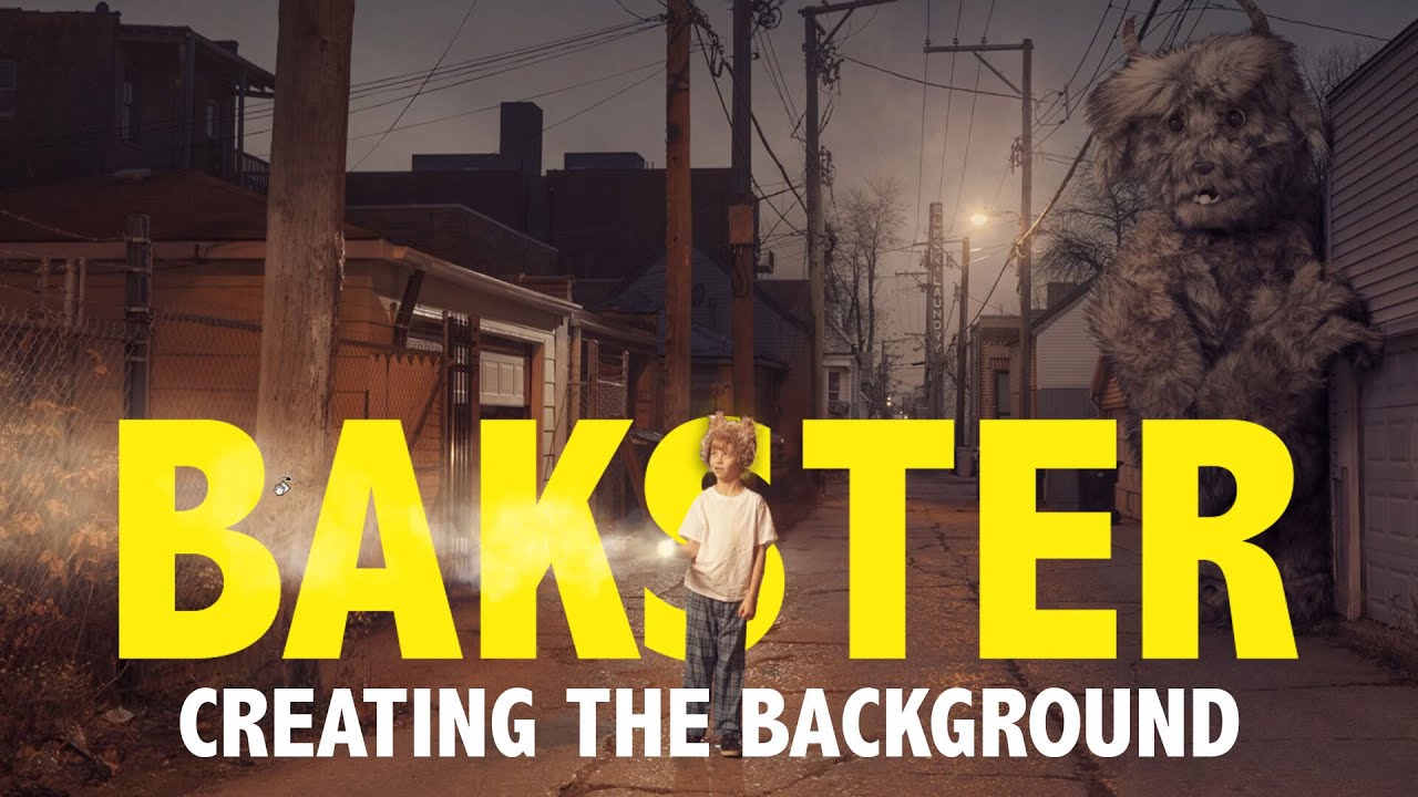
Today we kick off our fantasy compositing series as Aaron shows you how to create one his most iconic images: Bakster! In this first episode, follow along as we begin an advanced composite, blending multiple images together to create the background and environment. Learn how t...
Thank you @coral stone This was a challenge just to start with the hair. I tried every way to get this one to work. 💇♀️
Gave +1 Creative Carma to @coral stone
Very creative @fluid wharf! Loved how you placed the face to the subject's hand, the layer mask is looking solid, helping to sell the effect in a great way! Version 2 is looking very on point as well, the way you connected the shapes from the background with the face makes it feel very consistent. My only suggestion would be to try the Bevel and Emboss layer style for the shapes on the bottom area, so it might be connected to the Bevel that you created for the face, if it doesn't give you some cool results, another way is to paint them using the brush tool in a new layer and the selection tools to be more precise. Let me know if you have any questions. Nicely done
@mortal crescent This looks super cool! I like how the edits you made to the subject's lights and saturations, I think it really enhances the separation between the outside and inside. The edges of your cuts are looking great, I like how you emphasized them with the Bevel & Emboss with a high size. Well done, Key!
@young karma this turned out awesome! I loved your attention to the details. The grain was a great way to unify all the assets, I like how it works very well with the dispersion effect on the right. Also, the vignette adds a great focal point to the image, and I like that you applied some shadows and highlights to the shapes, enhancing the depth of the composition. Amazing job, Vickey!
Challenge 8
@young karma this turned out awesome! I loved your attention to the details. The grain was a great way to unify all the assets, I like how it works very well with the dispersion effect on the right. Also, the vignette adds a great focal point to the image, and I like that you applied some shadows and highlights to the shapes, enhancing the depth of the composition. Amazing job, Vickey!
@coral stone -- Thank you for the positive comments 😁
Engraved Effect
Decorations
New Hairdo-1
New Hairdo-2
SUrreal Portrait (Day-8)
@bleak fossil What do you think of this version? I also added a radial blur in an attempt to make it look like she's... coalescing. 🙂
@coral stone thanks for the tip about using the fur brush to mask hair. Here's my attempt - not perfect but definitely looks a lot more natural 😀
Gave +1 Creative Carma to @coral stone
day 8 PSdcc Surreal Portrait
Loved the update @mortal crescent! The edges are even more natural now 💯
Surreal portrait with @lethal mural . Struggling a bit with the shadows into the cutting´area
@bleak fossil thanks for the YouTube video! I really love the oil paint effect. I may do that to all my projects to some degree lol
DCC Day 9,Retro Effect
Gave +1 Creative Carma to @bleak fossil
Retro Photography Thanks @lethal mural
Gave +1 Creative Carma to @lethal mural
engraved effect 😃
PS DCC #8 Surreal Portrait
Challenge #9
and here is my behance project - https://www.behance.net/gallery/104935395/Ps-Daily-Creative-Challenge-9-14

Behance
Photoshop Daily Creative ChallengesDaily creative projects created over the course of 9 days, from September 14 - September 25
@pliant comet I love it, this creates such a strong focal point! The night effect is looking really solid too. I think the radial blur adds some really nice interest, though I think masking it off around the edges of the opening it the cat might give it a look more like it's contained within. Nice job!
@lethal mural - my ps Daily challenge #09 - Old school portrait
Day 6. Finally made something decent for this challenge that I didn't hate lol https://www.behance.net/gallery/104957767/92220-Photoshop-Daily-Creative-Challenge-Day-6

Behance
Day 6 - Decorations. Decorate an image with a seamless pattern using the Random Pattern Fill tool. Instead of a flower crown I made a bunch of leaves wrapping around a hand.
Challenge #7 New Hairdo (Photos by Thirdman and Gatot Adri on Pexels.) How’s the lighting on the hair? I was trying to match the shadow from the shirt collar but still looks a little ‘off’ to me.
Retro Photography. Thanks, Jesús! I hope everyone has a great weekend! 🙂
Couldn't stay with the flower theme for challenge #8
I'm rushing so I know it's not perfect but here is my day 7! https://www.behance.net/gallery/104959521/92320-Photoshop-Daily-Creative-Challenge-Day-7
Behance
Day 7 - New Hairdo. Give yourself or somebody else a new hair style using Layer Masks and custom brushes.
images used for my piece, btw try out match color to get a more accurate color for the hair/skin around the hair!

DCC - Day 9
@bleak fossil Hey, Sam! Added shading to lower left shape. (Inside cut).
Behind. Here is my surrealism challenge
Day9
Since I was going for 70s retro I added a cheesy 70s living room
@sacred field Looks excellent! great depth to this design. I really like how the rim of the shape on the bottom right around the jaw is catching some light.
@whole flame Very nice! The color, grain, and stark contrast between the lights and darks definitely adds to that aged feel. Really strong focal point as well with the faded background. Looks good!
@tropic haven Really cool, kind of an old faded painting look with this one. I like the grainy texture, around the left side it kind of looks like the paint has been aged and worn off slightly. The light spill on the left gives it a strong photo feel, as if this were taken in a museum or church or something. The contrast of the cat's head makes for a nice focal point, looks good!
@simple idol Great work Biola! The shape and effect with the big sunglasses makes for a really interesting look. A couple suggestions that could possibly help would be to create a saturation adjustment layer and mask it off with a small brush to tone down the blue saturation in the top of the head as it doesn't quite seem to fit the coloration of the rest of the image very well. It could also be nice to brighten up the background a bit, maybe even a bit of a gradient, just to give the portrait a little more pop since the person seems fairly dark overall in shadow. Just some thoughts. Nice job with this, the shadow and backing shape is looking good!
Thank you @bleak fossil I wasn’t quite sure how to get rid of that blue hue on top. I took the pic like that 😣. I’ll try your suggestion! Thanks!🙏🏽
Gave +1 Creative Carma to @bleak fossil
Added a filmstock_50.3 LUT
@fallow bough Hah, perfect, the background works great. The light bleed on the right side is looking really nice and the coffee stains are a nice touch. I think the colors are looking good, I just saw your LUT version and I think that helps the effect a lot. My only suggestion might be to brighten up the darkest tones with a levels adjustment since you don’t usually see super deep darks in old 60s/70s era photos. And/or even selectively doing that with the couch in the background might help too since I feel like the couch’s deep contrast is somewhat distracting from the portrait. All personal preference of course. Looks great!
@tacit condor Great texture in the Day 9 challenge! The color toning works nicely as well. The light spill from the left is looking good, kind of makes it look like a printed photo. Though I think if you wanted to push the aged look further you could maybe lower the overall darks in the image so it doesn't quite have such deep black tones. Often in older photos they have a sort of faded high key look to them.
@bleak fossil Thanks for the suggestion. Brightened the dark areas on the sofa a bit.
Gave +1 Creative Carma to @bleak fossil
@fallow bough Looks great!
PS DCC #9 Retro Photography Fix
Surreal Tom Hiddleston:
Daily Challenge 200925 - Vintage Photo
Couldn't stay with the flower theme for challenge #8
@plain sable this is cute i guess if the rose moon would shine-glow abit that would be super cool
Added some Camera Raw settings...
DCC14 09 200925 Retro Portrait
You were so right. I tend toward dark colors sometimes. But it's getting better. I'll keep working on it.
I did the pic Jesus provided and then found one of my wife at the French Market in NOLA. (My wife is on the left. The gal on the right is just a new friend.)
thanks @steep inlet I gave the glow a try
Gave +1 Creative Carma to @steep inlet
Perfume product line - 'Curious.'
Thanks @lethal mural for all the challenges was a pretty fun experience 💯 , heres my behance project with all the challenges hope you guys like it 😃 👍 https://www.behance.net/gallery/104373283/Ps-Daily-Creative-Challenge

Gave +1 Creative Carma to @lethal mural
Last challenge, retro Xispa. What do U think?
Daily Challenge 200925 - Vintage Photo
@young karma Looks great and your steampunk model fits well with Day9...👌
Challenge 9
@obtuse spruce what effects are you going for? I’d be happy to try and help
@compact pecan I was going for a surreal portrait just like in the tutorial video - then thought it would look better with a color splash
@obtuse spruce I think the color splash is a bit too harsh. It’s tough to pick out the cut-out effect in the tutorial. Maybe lower the fill or the opacity a bit - that may make your cut-out a little more prominent while keeping some color splash
@compact pecan something like this maybe?
@obtuse spruce that definitely makes your cut-out more obvious. Another part of the tutorial was to keep a layer of the original image, but transform it so it is slightly smaller, then place it under the image with the cut-out effect and maybe add a levels adjustment so that the “small” image stands out like it’s “inside” the new, larger image with the cut outs. I think if you add that, you’d be rocking this one
had to work, but catching up, decorations Day 6 PSDCC
@young karma Looks great and your steampunk model fits well with Day9...👌
@hollow yarrow - Thank you!
@compact pecan Well? I think it looks better indeed. Any other improvement that can be added, you think?
@obtuse spruce Looking good! I would just add a levels adjustment layer to the smaller/inside image, just so it stands out a little more. Really nice shadows, but pay attention to where the light is coming from - typically there wouldn’t be a shadow on both top and bottom of the cut part. I think in this case, the top cut-out would have the shadow and the left side of the bottom cut-out (down the zipper). I say add some of that color back in from the original, but not as much as before; not as bright or opaque, so that your desired effect is the main subject of the image. I think it’s looking really good!
@obtuse spruce I hope that helps! Like you, I am learning as I go thanks to the PSDCC instructors and the mentors here.
Gave +1 Creative Carma to @obtuse spruce
PSDCC Day 9 with Jesús Ramirez - Retro Photography
I tried to find a parasol and dress for her, but alas all I could find was a little straw hat.
@compact pecan How about now??
New Hairdoo PSDCC Day 7
DCC - Day 7 - Here's an update - still had a little trouble with removing the blues from the edges. How is this? @coral stone
@obtuse spruce nice!!
I made it slightly lighter is this better? @bleak fossil
Very nice @fluid wharf! I like the new stroke that you added to the cuts, it gives the impression that it has a small thickness and feels very consistent through the cuts. The bevel & emboss is looking super cool as well, my only suggestion is that you might mask it out the extra areas on the hair, the ears, and the shoulders. For that, you can right-click on the layer style from the layers panel and choose Create Layers, then add a layer mask to hide those extra areas from the hair. Of course, all of this depends on the look that you're going for. 😉 Great job!
Day 9: Retro Photography. I used two separate "scratch" patterns to make the scratches or artifacts effect. Plus, I added a stroke to the "old photo: because way back when, every photo had that white border. Hopefully I have the perspective right with the guy/skeleton and the background - do the horizons match?
I used this photo to set the preset for camera raw for the photo. It was taken by a Kodak Insta-Film camera on or about 1976. This camera was all the rage before the polaroid style. . However, Camera Raw didn't want to ingest the preset so I used Lightroom to adjust the modern photo's presets. It even has the type of glare that this lens used to get when using this camera and film. Outside of cropping this photo has not been altered digitally. That's why it made such a great reference.
I used a slashing brush over a bw photo layer just to get the right faded tape marks.
Retro Cheeto!
@compact pecan that's pretty boss, man! 😄
@fresh swallow thank you! I found that challenge to be the easiest of all of these ones for some reason. I'm STILL working on the surreal portrait and the engraved effect. 😟
Gave +1 Creative Carma to @fresh swallow
I haven't did the engraved one yet either bro
Here is my retro challenge. The pattern challenge is not working for me but I will keep trying.
Very cool work @compact pecan! I loved the colors and the textures that you applied. It really makes the image look retro. The perspective of both images is looking nice, maybe you could position the subject a little higher, or the background lower by judging by where the floor is and the lines created by the pillars. If you want to take a look at a additional content about the perspective you might check this video from Jesús Ramirez, this is definitely my go-to when I’m in doubt about perspectives. https://www.youtube.com/watch?v=OoHfZFl65fo My other suggestion would be to reduce the saturation from these bones here: point_down :, this will make it gray, which will match even more to the grey tones from the skull. Awesome work, Hugh!
It’s looking great @untold iron! I loved the edits you made on the colors of the image, it helps the hair to blend very nicely. Sorry you had trouble with the blues on the edges, but since you made those edits on the background it’s almost unnoticeable. There is a cool trick to remove the fringing that you might try which is by creating a new layer > clip it to the subject’s layer > with the clone stamp tool (make sure you have Sample All Layers enabled on the top bar), pick a sample of the hair, if possible where the hair seems to have the same direction of the lines that you'll be painting, and with a soft round brush with a low flow, paint on the edges gradually to make it blend. Here’s a video that shows a more about this technique in case you want to check https://www.youtube.com/watch?v=uIcQQbJAOF8. Day 9 turned out really cool! I like the way that you reduce the contrast from the subject and added a subtle white vignette on the corners. The light leak and the textures really enhance that retro look. 🙂

Remove Annoying Edge Fringe After Hair Masking in Photoshop! Learn how to use Clipping Masks to remove color edges or fringes to select hair better and create a cleaner composite. In this tutorial, we will use several techniques to erase or replace the fringe in Photoshop.
Us...
@safe linden super cool work! I like the saturation and brightness edits that you applied to the whole composition, it definitely makes the subject stand out. My only minor nitpick, would be to reduce the contrast of the hair a touch, just to match more with the other contrast values from the image, you might also consider brightening a bit, especially the left area where there are some lights coming from it judging by the face and the shoulders. If you want to be precise on the edits, you might create a Black & White adjustment layer so it will remove the distractions from the colors. After that, just analyze the luminosity values around and replicate it with a levels layer. The decorations challenge looks very nice as well, I like that the shadows that you added gives a nice visual presence on the scene. Great job!
@pliant comet this is awesome! I loved her pose! The hat that you added and the way that you let the ear to appear made it look very realistic! Great work with the retro look! The grain, and the warm tones turned out really good! I also like the contrast edits that you made especially how it combines really well with the textures that you applied, making the image look like it has aged as the time passed. Excellent work!
Very nice improvements @obtuse spruce! I like that the subject has more contrast now and the lights are more well defined. The splashes are a very nice touch for the composition, it reminds me of a fashion photoshoot. My suggestion would be to enhance the cuts a little bit more by adding stronger shadows cast by the cuts or playing a bit more with the scale, especially on this area here 👇 just to add more consistency between the effect, so it won't look like it was masked. 😉 Let me know if you need any help! Nicely done!
@sterile talon I loved how the engraved turned out on the photo, it looks very balanced preserving the details of the subject. The photo mosaic turned out really cool as well. The colors from the grid are looking very consistent to the ones present on the main image. This is totally optional, but if you want to add more context to the Engraved effect, you might consider adding some subtle textures on the background, maybe a paper texture would look even cooler, just an idea. Well done!
This is awesome @limpid cape! I like the look that you chose for challenge 9, preserving the depth present on the shadows and highlights from the subject. The grain also helps the image to have a nice personality it could definitely be a photo for a fashion magazine. This, of course, depends on the look that you want to achieve, but if you want to enhance the retro look, consider brightening the shadows and blacks and reduce the contrast and saturation a little bit. Great work and great challenge, Brad!
How cute @young karma! The warm tones definitely adds a cool retro style to the photo especially when combined with the with the textures. This is just a minor detail, but you might change the color of the date to a brighter one, so it will stand out a little more, maybe a bright yellow with low saturation will be good. 😉 Well done, Lori!
Amazing project @rose pendant! Loved how the edits came together very nicely. The hairdo challenge is looking very realistic. The textures that you applied to the retro are looking very on point as well, I like how it enhances the style with the warm tones. Great challenge!
Excellent work @rare bluff! Loved the frame and how the oil paint produced some great results in your composition. The subtle smudges on the word Curious add a nice personality and make it look consistent with the effect on the flowers. My only suggestion would be to center the image and the frame, right now it’s a little bit to the right, this way the blurred dark image on the background will look like it’s a secondary frame. 😉 Awesome work!
Very cool @plain sable! Loved how the shadows on the cuts are very on point allowing the two moons to be separated from each other with a great sense of depth. The glow that you added makes it look very consistent with the nebulas on the background. The retro challenge worked out very nicely! I like the warm tones and the colors that you applied to the light leak. This is totally optional, but if you want to enhance the retro style, consider lightening the blacks and the shadows a touch, just to add that faded look. This of course is just a personal preference. Great work, Susan!
Great photos, @sweet fern! Loved how all of them came together on the first version. I like how you went subtle on the edits, this helps all of them to be well-balanced. The textures and the light leak combine very nicely to the color and lighting edits you made. Version two turned out great as well! The low saturated colors really bring the retro style to your image. The grain and the subtle light leak on the right are also a nice touch! Nicely done!
@eternal mica This came out great, Ted! Loved the grain and the warm tones that you applied! The texture with a larger size really makes the image look like it has aged and damaged as the time passed. This is just a personal preference, but if you want to enhance the retro style, you might consider brightening the blacks and the shadows and maybe reduce the contrast a bit. Great challenge, Ted!
@fresh swallow oh this is looking cool! I like the vibrant colors that you chose for the composition. My only suggestion would be to crop the image on the left and on the right areas, where it has a vertical edge and the background is showing a bit. This will add a continuity effect to your subject. Well done!
Amazing job @wet thistle! I loved how you created a nice color contrast between the subjects. You did a spectacular job making your composition tell a story. It makes me think if she is hiding in a costume or if she is disguised... The colors are looking very consistent as well. I also like how you applied the cuts on some strategic areas giving them a nice shape suggested by her face, preserving the mouth and the eyes. Fantastic work!
This is super cool @young karma! Loved how the textures worked out in your composition. My only minor nitpick would be to reduce the contrast of her head and the face just a touch, you can use a levels adjustment layer and drag the black point to the right. This will help the contrast of the whole composition to look even more consistent and unified, matching her other areas. Great challenge this past two weeks!
@fallen talon very cool edits, Eric! Loved that you added some layers for the version two of the surreal portrait, the colors that are changing gradually were a great choice to emphasize this effect. Version 2 is looking very solid as well, I like it has a strong message, with an age contrast among the subjects. This is just a personal preference, but you might add some depth to the edges by using the bevel and emboss layer style just to enhance the cuts. Great work!
@neat shale Loved your edits for day 7! Especially that you added some yellow tones to the hair and the beard, this is a cool way to see the effect. My only minor detail would be to create a shadow cast by the hair over the forehead, this will help you to make the effect even more realistic. For that, you can use the brush tool with a medium amount of hardness on a multiply layer, and sample a dark color from the hair and start to paint on his forehead. Keeping the flow amount very low will help you to build slowly the effect. Awesome work!
@coral stone I kinda like the edges lol 😛 I want to go in and do some hellscape background to add more effect
but I think that might be overboard
@queen aspen super cool edits! Loved the saturation adjustments you made, especially on the eagle image. The only thought I have would be to reduce the saturation of version two, and maybe brighten the darks and reducing the contrast, I believe that this will enhance the retro style of your image, you can easily do that by making some tweaks on the Camera Raw sliders under the basic tab. Well done!
@fresh swallow that's perfectly fine 😄 Don't forget to post the update here when you add more effect!
Thanks @coral stone I'll play with the tweaks you suggested for the retro bit
Gave +1 Creative Carma to @coral stone
@coral stone. Thanks
Gave +1 Creative Carma to @coral stone
@coral stone Thank you Valdair. Your compliment means so much to me. I've been trying to up my level of creativity by going beyond the techniques displayed in any one tutorial. I've been trying to bring in other techniques I've learned so as to make my work more interesting, more creative. My confidence is growing. Thanks for guiding and motivating me.
Gave +1 Creative Carma to @coral stone
This is super cool @young karma! Loved how the textures worked out in your composition. My only minor nitpick would be to reduce the contrast of her head and the face just a touch, you can use a levels adjustment layer and drag the black point to the right. This will help the contrast of the whole composition to look even more consistent and unified, matching her other areas. Great challenge this past two weeks!
@coral stone - - Thanks , here is the quick tweak you suggested..
Are there oh photoshop a and I illustrator challenges for ipad?
@subtle briar I don't believe there are. Most of the advanced stuff (smart filters, for example) aren't available yet on mobile devices.
at least that was what my mobile version of PS told me
Yeah but I mean like I would like to do more on my iPad when I'm not at home
Thank you, @coral stone !
Gave +1 Creative Carma to @coral stone
Day 8: Surreal Portrait take_2. Hopefully this time the flowers look a little more like they are weaving through the skull.
Thanks @coral stone for the advice. How about this? I moved him down a little so that the vanishing point of the room and his nose is just about even, and I reduced the saturation of the spinal cord until I thought it matched the saturation of his bow tie.
Gave +1 Creative Carma to @coral stone
@wet thistle Love it! Great idea. The contrast between the two faces really makes for a strong visual impact. The background is a great choice and adds some really nice color contrast too. The shadows and backing shape came out very well too. Impressive work!
@young karma This is looking great! the texture and colors fit together really nicely, the deep reds of the shadows really sell that aged parchment look. Excellent work!
@eternal mica Very nice Ted, the heavy grain and color grading really gives the image a strong aged look. The light spill around the top left is a nice touch that helps push that feeling too. Nice work!
@sweet fern Hah, very nice work! These are both looking really good. The brightness and colors on the first design are working really well. I think increasing the brightness of the second one and maybe giving it a bit more color grading could push the aged effect a bit more. Nicely done!
@plain sable Cool to see this effect on this subject matter, it's a really nice take on this challenge. The shadow is looking really nice and creates some great depth. Really nice contrast against the dark background too. If I had to nitpick anything it would be that there's a bit of a dark ring visible around the top of the planet that you can see due to the lighter background. Removing that might help the composite be a bit smoother. Nice work!
@neat shale This looks excellent! Really nice masking job with the hair, solid work. Everything seems to fit really nicely together and look quite natural. If I had to try and nitpick anything I feel like maybe the forehead right under the hair on the left side could use a really subtle and soft shadow from the hair. You can kind of see it in the original hair photo. Impressive work!
@young karma This is looking great! the texture and colors fit together really nicely, the deep reds of the shadows really sell that aged parchment look. Excellent work!
@bleak fossil -- Thank you..
Thank you @coral stone !!! I noticed I need a shadow right as I posted it which is why I pointed out I rushed because I made it in like 20? 30 minutes? 😂
Gave +1 Creative Carma to @coral stone
Thank you @bleak fossil lol Valdair said the same thing about the hair 😭 I looked at the original then went "NO THE SHADOW!"
@cold oyster Very nice! These are looking really good. The first one especially sells that effect with the paper texture and heavy color grading. The way you framed it in a photo is a great touch too!
@neat shale Hah, I think it's subtle and easy to overlook but adds that extra touch of realism.
@lucid plover Nice work Fery! The high key contrast and grain effect does a nice job of pushing that aged effect. Looks good!
@bleak fossil yeah I swear if I spent a few more minutes on it I wouldn't have missed it lol I was too busy spending my time trying to get the blend of the skin justttttt right
@young karma I think this effect is looking really solid! The shadow effect seems to be working quite well to give it some nice depth. I like the additional darkness you added to the interior layers. Nice take on this challenge!
Edit: The aged effect design looks great!
@tiny bridge Very nice, I like the way you layered this image! The shadow is working really well to sell that effect and add depth. The background gradient is working really well too!
@fluid wharf Really nice job with the surreal portrait effect. The offsetting of the second image and backing shapes are looking really good. My only suggestion would be to use a soft shadow to separate the pieces instead of a hard stroke/line for a more realistic look. Looks good!
@covert loom Really cool effect for the retro photo challenge! I like the colors. Though if you're going for a more aged photo feel I think desaturating the colors and giving a more sepia-like grading might push that effect more. Of course this is a cool look and style all on its own. Nice job!
@compact pecan Looking good! I think the overlapping shapes and such gives it some nice depth like some flowers are inside the skull. My only suggestion if you want to push it more would be to use a multiply layer or levels adjustment and a soft brush to add a little shadow to the flowers inside the skull and maybe around the bottom of the big bushel at the top. Putting a little more shadow on the interior shape at the bottom might help too. Nice job with this, great colors!
@fallen talon Super cool, and great concept behind the first one. The shadow effect is looking solid and adding some great depth in both of these. Really nice job with the consistent lighting with the second design, great layering in the one. Impressive work!
Surreal Portrait PSDCC Day 8
@queen aspen The desaturation in these photos both give it a great aged look, and the texture is an excellent touch to push that even further. I like how they even seem to be from different eras with the colors and level of wear. I can picture the second design being a photo from a 90s yearbook or something. Nice job!
@winter tinsel Very nice! The lighting is looking pretty solid to me, nice work there. I think the main things that catch my eye are how the hair seems to be less sharp/lower quality than the face. The area around the face is so sharp and the hair seems noticeably fuzzier. I also think the shadow under the hair could have a bit of a softer edge as to have a more subtle effect. Lastly I think the sideburns on the right side could be darker, even with the bright lighting. I'd try and match the darkness of the facial hair on that side.
@dusky wave Nice, this is looking really good! The colors definitely add a nice sort of retro look. The texture and light spill effect add to that nicely as well 👍
@marble bramble Looking good! The color and value contrast adjustments do a really nice job of adding that aged feeling. The grain is a really nice addition as well!
@rose pendant I'm really liking the photo mosaic effect you got in the portrait image! I really like the choice of the cartoon/comic images and how they show up most clearly in the face to create a nice focal point. Nice blend between the two images. The colors add some great contrast too!
@limpid cape Really nice job, challenge 9 is looking good! The grain and light bleed effect came out very well and the added texture in the top right is a nice touch. I feel like a little bit of desaturation or using a levels adjustment to brighten up the deepest darks slightly might push the aged look even more for that high key look. Nice work!
@safe linden Looking good! Nice job with the shadows and separating the two areas of the face value wise. My only suggestion would be to sharpen up the edge of the top part of the opening. It looks a little soft to the sharper edges of the bottom part, specifically around the middle and left side. Nice job 👍
Thanks @bleak fossil
Gave +1 Creative Carma to @bleak fossil
Challenge #5 - Engraved Effect
psdcc DAY 9 RETROIZE A PHOTO
Retro-Day 9
Thank you @bleak fossil
Gave +1 Creative Carma to @bleak fossil
Thank you @coral stone and @bleak fossil
Gave +1 Creative Carma to @coral stone
I made some modifications as @coral stone said:
Challenge 9. I went old school rather then retro.
Thank you @coral stone , @bleak fossil for your feedbacks 🙂
Gave +1 Creative Carma to @coral stone
Day 8 Challenge . @coral stone I did the adjustment , is that better?
Very nice @gilded flame! The cuts are even more consistent now 👍
Thank you @coral stone 👍
Gave +1 Creative Carma to @coral stone
I just wrapped up the project for the daily creative challenge
Special thanks to @fierce valley, @bleak fossil , @coral stone and @compact pecan
for your valuable feedback and addition to this wonderful challenge.
I hope you all enjoy viewing this project as much as I did making it.
Thank you everyone.

Gave +1 Creative Carma to @fierce valley
Mixing vintage & youth. But, also want to take a moment to thank the whole DCC crew for their incredible support, generosity and depth of knowledge. @bleak fossil @coral stone - you guys are amazing & make my work better every day. Thank you.
Gave +1 Creative Carma to @bleak fossil
@fallen talon very cool edits, Eric! Loved that you added some layers for the version two of the surreal portrait, the colors that are changing gradually were a great choice to emphasize this effect. Version 2 is looking very solid as well, I like it has a strong message, with an age contrast among the subjects. This is just a personal preference, but you might add some depth to the edges by using the bevel and emboss layer style just to enhance the cuts. Great work!
@coral stone Thank you! I'll try it 👍
@fallen talon Super cool, and great concept behind the first one. The shadow effect is looking solid and adding some great depth in both of these. Really nice job with the consistent lighting with the second design, great layering in the one. Impressive work!
@bleak fossil Thank you!
day 9 PSdcc, retro vintage old school
@lethal mural thank you very much for the awesome challenges👍
Gave +1 Creative Carma to @lethal mural
A fun departure from surreal portrait challenge... what does it need?
Thanks @bleak fossil I worked on the layer mask of the moon a bit
Gave +1 Creative Carma to @bleak fossil
Thanks @bleak fossil I worked on the layer mask of the moon a bit
@plain sable perfect
Gave +1 Creative Carma to @bleak fossil

This took hours just to get uploaded because my wifi is acting up so bad today! I know there's lots I had to fix but I'm trying to finish up the week quick. Here's my day 9, I love surrealism ☁️ https://www.behance.net/gallery/105008919/92420-Photoshop-Daily-Challenge-Day-8

Behance
Day 8 - Surreal Portrait. Create a surreal portrait using Blending Modes, Masks and Layer Styles.
@neat shale Surrealism is probably my favorite art style as well 😄
great job on the photo too btw 😛
Challenge 9_Retro Photo
09 - Retro Photography
20's or 70's... I can't make a choice! 😉
Here is the link to my complete Behance project!
https://www.behance.net/gallery/104472503/Photoshop-Daily-Creative-Challenge-Sept2020
Thanks @coral stone !
Gave +1 Creative Carma to @coral stone
Thanks @bleak fossil
Gave +1 Creative Carma to @bleak fossil
@cold oyster I love the vintage photo you posted (the woman with the rose)- really nice work! What kind of techniques did you use to get that creased and cracked look?
Challenge #9 Retro Photo
Thanks @coral stone I made some tweaks to the blacks & shadows
Gave +1 Creative Carma to @coral stone
@eternal mica Very nice Ted, the heavy grain and color grading really gives the image a strong aged look. The light spill around the top left is a nice touch that helps push that feeling too. Nice work!
@bleak fossil Thank you Sam. Thanks for your advice during this DCC. You were a big help.
Here is my work from this DCC https://www.behance.net/gallery/104844367/Adobe-Photoshop-DCC-Sept-14th-25th

@eternal mica This came out great, Ted! Loved the grain and the warm tones that you applied! The texture with a larger size really makes the image look like it has aged and damaged as the time passed. This is just a personal preference, but if you want to enhance the retro style, you might consider brightening the blacks and the shadows and maybe reduce the contrast a bit. Great challenge, Ted!
@coral stone Im not sure I understood your comment on the blacks/shadows/contrast. Is this what you meant? In Raw Filter I slid blacks/shadows to the right; contrast to left.
@eternal mica I got the same suggestion I just used camera raw to move the shadows & blacks to the right on the slider
Yes @eternal mica. To brighten the black and shadows you need to drag the sliders to the right, and to reduce the contrast you'll need to drag it to the right. 🙂
Gave 1 Creative Carma to sno.e (current: #28 - 28)
Revised
Engrave Cahllenge Day #5
Finally went back and finished my Day 5: Engraved effect
@bleak fossil , thank you for your encouraging feedback. It’s been fun to learn. Thanks to mentors like you actively give feedback in this community, it makes online learning a little bit easier.🤓👍
Gave +1 Creative Carma to @bleak fossil
Here's my first time participating in the challenges!
Left is before and right is after. What a fun challenge!
Here is the link to my Behance Portfolio for DCC14. Thank you @lethal mural. As always, every day you presented new tips and techniques galore. I learned a great deal. And to my digital friends, a tremendous thank you to @bleak fossil and @coral stone for helping me through. Your tips and advice are invaluable. I appreciate all the participants for their creativity, their support. You guys are the best. https://www.behance.net/gallery/104911121/Photoshop-DCC14-Sep-14-25-2020-Jesus-Ramirez

Behance
Photoshop DCC14 Sep 14 - 25 2020 Jesus Ramirez
Gave +1 Creative Carma to @lethal mural
I made a video of my DCC14. Here is the link. Please let me know how you like it. https://1drv.ms/v/s!AuyL-ykZbl8igqIvwXZh3bR9TFECVA?e=AJOaQ1

MP4 File
@slow stirrup Really solid portfolio.
@hollow yarrow Super portfolio. Im entranced by the images, the presentation, the talent. 💯
@eternal mica, love the video!!
@slow stirrup Thank you
Gave +1 Creative Carma to @slow stirrup
Here is the link to my complete Behance project!
https://www.behance.net/gallery/104935395/Ps-Daily-Creative-Challenge-9-14
please let me know what you guys think 🙂
Behance
Photoshop Daily Creative ChallengesDaily creative projects created over the course of 9 days, from September 14 - September 25
Challenge 9 retro effect
@hollow yarrow Super portfolio. Im entranced by the images, the presentation, the talent. 💯
@eternal mica Thanks! I appreciate☺️
My finished project on Behance https://www.behance.net/gallery/105040143/PS-DCC-14-25th-Sept-2020

Can someone post the link of that page that @lethal mural mentioned before starting the last challenge? Some tutorials for Ai and Adobe Premier. He said the link was in the description, but I can't find it. Thanks!
Gave +1 Creative Carma to @lethal mural
Can someone post the link of that page that @lethal mural mentioned before starting the last challenge? Some tutorials for Ai and Adobe Premier. He said the link was in the description, but I can't find it. Thanks!
@void ermine
Wendy, this is the link
https://pages.adobe.com/creativecloud/en/ete/how-adobe-apps-work-together/
Thank you!

Design and edit more effectively by using the best app for your task. Interactive tutorials from world-renowned instructor will show you how.
Challenge #6. Decorations completed.
DCC 7 New Hairdo 💇♂️
@fallen talon This retro photo challenge is looking great, the color grading and texture in the top left really adds to the effect nicely. Looking good!
@neat shale This is looking great, really nice depth with the backing shape and clouds passing through. If I had to nitpick anything it might be to smooth out the curves in the mask around the left side of the face. They're looking really good on the right side, I think it's just a matter of pulling those pen anchor point handles just right. Great contrast in this image 👍
@fringe sun Very nice! The decorative elements seem to match the photo quite nicely. Though I think maybe if the dog bones were flipping with the lighting coming from the top side it might appear a bit more natural? Either way, very nice job!
@rocky reef Oh man, this actually made me laugh out loud. Seeing the rock with hair, specifically this hair is great. It’s looking really solid too. The lighting and coloration fits very well. If you wanted to push it further it could be interesting to see the left side of the hair lit to match the lighting on the face a bit more. I often like to use a color dodge layer with a soft brush. Though if that doesn’t look good it still looks quite natural as is. Very nice!
@shy bobcat The changes on the hair swap challenge are looking good! The contrast is reading well. Challenge 8 and 9 came out really well too. Very nice work on the shadow effect for Day 8, and the purple backing shape is a nice stylistic touch. Well done!
day9
@bleak fossil Thank you for your feedback, I found these challenges quite difficult and your help was much appreciated.
Gave +1 Creative Carma to @bleak fossil
finally got the last one done! Yay!
@bleak fossil thank you so much for the feedback! 😊
Gave +1 Creative Carma to @bleak fossil
thanks so much 🙂 I'll check out the video @coral stone
Gave +1 Creative Carma to @coral stone
PS creative challenge - retro photography
My DCC Cover for @jolly quest Daily Creative Challenge
@lucid plover YESSSSSS
I LOVE IT!
Its awesome that you even put the inside edge of the pumpkin so the Ps really looks carved in
@lucid plover Great Work!
thank you very much @jolly quest @livid ravine
Gave +1 Creative Carma to @jolly quest
thank you very much @livid ravine
Day #9 Retro Photography Challenge
@livid ravine Nice! Great use of paper textures!
@jolly quest Thank you 😄
paper is my favorite texture to use, right after noise LOL
Gave +1 Creative Carma to @jolly quest
Same here haha
@lucid plover That was my goal
I really really love it
@modern halo YES
Design Cover for Photoshop Daily Creative Challenge on Behance with VooDoo Val
dramatic version of @jolly quest DCC Cover
My cover art - it went off in a bizarre direction is all I can say!
Personally I prefer to wait to make a project cover in line with the work done. So I did another cover of the last DCC...
Modify a portrait with difeerent kind of effects.
Should I change the original cover of my project? (see below)
What do you think?
Challenge #8 Surreal Portrait (Photo by Tom Leishman on Pexels.) Finishing up the last series of challenges. I’m not sure about the lighting of the Beveled FX. I couldn’t get it just the way I was hoping.
welcome day - Cover art
😀
@bold valley, my vote goes to the second
@slow stirrup I think so too. Maybe I'll twiddle around some more later though.
and we're off on another adventure with @jolly quest ! Looking forward to some creepy fun.
YESSSS
@jolly quest I used your Noise brush from the last challenge...I love that brush!
@slow stirrup I like 2nd one. Texts look nice!!👌
Thanks, @spare badge!!
Gave +1 Creative Carma to @spare badge
new one
PSDCC Day .5 with VooDoo Val - Behance Cover
I'll take any excuse to put a cat in the work.
@slow stirrup I also like #2. The font is more...unsettling. 🙂
@pliant comet, ok, thanks
Gave +1 Creative Carma to @pliant comet
Very nice @fluid wharf! I like the texture that you applied to the corners suggesting that the image was damaged as the time has passed. If you want to enhance that retro look, you might consider decreasing the saturation and contrast sliders in Camera Raw Filter just a touch, so the colors and the shadows might look a bit more faded. All personal preference, of course. Well done!
Lovely work @naive steppe! I like how you added a subtle vignette to the image, establishing a nice focal point. The splatters and the colors are looking very nice as well. Also, the grain really gives that retro touch for the composition. Nicely done!
Very cool work @rocky kite! Loved the vignette that you applied! The brightness really enhanced that faded look present on the retro photos. My only nitpick would be to brighten those green splatters, just to match even more with the style and bring more damaged texture to the composition. Great job!
@lucid plover this is amazing! I loved the way that you applied the Ps to the pumpkin, adding distortions, thickness, and creating a light source from it. My nitpick would be to brighten the text just a bit more to add more contrast against the background, so the viewers will be able to read a bit easier. Excellent work, Fery!
@livid ravine the paper texture turned out great in your composition! My only thought would be that if you want to increase the retro effect of your image, you might decrease the contrast and brighten the shadows and blacks, just to get that faded look from the 60's photos. Just an idea, great job! 🙂
This is cool @modern halo! Loved the handmade style of your cover. Perhaps increasing the text scale might help the viewers to read more easily, especially on mobile devices 🙂 Good job! Keep it up!
This is great, @dusky wave! I like the dark atmosphere of your cover! The yellows and oranges from the pumpkins were a great way to bring contrast and add visual interest to the composition. I also like how the shadow guides the eyes to the text. Nicely done!
Which do you think is better?
@slow stirrup I like the 1st one. Not as kitschy.
Awesome job, @mortal crescent! I like how balanced your cover is, especially how you added a rectangle as a frame for the text and played with transparency allowing the background to appear a little more. The oranges tones are contrasting really well against the predominantly dark tones, and the way that you blended the cat added a cool and mysterious mood to the composition! 💯
Thanks, @arctic rover
Gave +1 Creative Carma to @arctic rover
Tough question @hollow yarrow hah I like the comic book style from the original cover, and the way that you kept it consistent on the text’s effects adding a nice fun context to it. The new version really tells more about the project and I love the way that you distributed the pictures and added a description. I would go for the new version 😄 Awesome job, as usual, Franck!
Super cool covers, @bold valley! I like the way that version two matches more the Halloween context than version one. The irregular edges of the words add a nice personality to the cover as well. This is just a personal preference, but you might darken the background just a bit with a levels/curves adjustment layer, so the lightings, the glow from the spider, and the October Fun might stand out even more, it doesn’t need to be a strong adjustment so the hair won’t blend with it. Well done, Ralph!
Thank you @coral stone
Gave +1 Creative Carma to @coral stone
@winter tinsel Great job on day 8! Really like how you matched the positions from both subjects. The bevel & emboss is looking nice as well! Sometimes it might be tricky because of the Global Light option, but one thing that you can do is to fine-tune with the angle as well as the altitude of the light (by moving the small circle closer or farther than the edge). If you don’t get any cool results, you might play with the gloss contour, choosing the preset that you see that fits. I hope this helps. Great job!
@spare badge beautiful cover, Daxa! I loved that you contrasted the background image to some drawings, the ellipse with subtle transparency helps to keep everything consistent without making the cover to look busy. The glow was a cool touch as well, I think it enhances really well the context of the composition. Nicely done!
@digital pike! Great to see you’re back! I loved the effect on the letters! The way that you blended the fire to the cat shape turned out into a very interesting effect. If you want to take a step further, you might consider playing with an overlap, putting the cat’s ears in front of the letters, you can easily do that with a layer mask and the selection tools. Let me know if you have any doubt. Great job
That’s a great effect, @arctic rover! I loved how the blood directs the eyes very nicely towards the text, especially the distorted letters. Can’t wait to see what you’re going to create in this challenge set. Well done!
This is looking super cool @ember crown! Loved the color palette that you chose for both versions. The color of the text from the first image contrasts really well against the tones on the background. The red glow on the door of the version adds a nice context to the composition. My only suggestion on this version would be to darken the background just a touch so the glow might be able to stand out and the text will have more contrast. Great job!
This is a very nice @slow stirrup! I loved how you aligned the two lines of text, it’s a great way to bring more balance to the composition. I like version 2 the most, especially how the Os has a great texture on them, matching more the dark atmosphere of the cover. Super cool work!
Excellent work @pliant comet! I loved the color grading of your cover, especially the way that you preserved the whiskers and the color that you applied to the text, allowing it to have a nice amount of contrast at the same time as it feels very consistent with the colors of the cat. The details on the eyes are looking amazing, I like how it grabbed my attention when I first looked at them, that’s a great way to control the viewer's attention and establish hierarchy. 💯
Thank you very much, @coral stone !
Gave +1 Creative Carma to @coral stone
Take 3!
Thank you!! @coral stone
Gave +1 Creative Carma to @coral stone
Here is my cover... excited for this challenge. I might even post it on my profile 😀
PS DCC with VooDoo Val. This was fun! Thank you for this opportunity! The ceiling inside is also pointy so she can wear her hat while on her broom.
@coral stone Thanks, I'll try that darkening the bkg.
Gave +1 Creative Carma to @coral stone
Cover
@dusky wave right now all I can say is spooky.
@lucid plover I see your cover photo as friendly and inviting
thank you,glad you like it @modern halo
Gave +1 Creative Carma to @modern halo
Challenge #9 Old Photo (Original photo by Edu Cavalho on Pexels.)
None
@fluid wharf Nice job with the color grading and texture, it's working well to push that retro look. I think you could probably even desaturate the image a bit more if you wanted to make it look even more aged. Nice job!
@naive steppe Very nice! At a glance I definitely get a sort of 90s era feel from this image. The colors and texture of the grain do a nice job of selling the effect. Looks good!
@balmy lake Awesome, welcome in! Glad you joined us for a challenge. Excellent work, the color grading and grain effect does a really nice job of giving it an aged look. Well done!
@rocky kite Nice job with the grain and texture effects! Though I think lowering the opacity of the splatter texture might give it a bit more natural of a look. I think you could also possibly push that yellowish/sepia color grading a little more to push that aged feel a bit more, just depending on what you're shooting for. The light spill on the sides is looking good!
@lucid plover Loving the glow effect, really nice sense of lighting! Excited to see what everyone comes up with.
thank you @bleak fossil
Gave +1 Creative Carma to @bleak fossil
@livid ravine Very cool! I like how far you pushed the paper texture and aged color grading on this one. I feel like a bit more grain might even help push the really old look and feel. Nicely done!
@modern halo Hah, going for the spooky theme with the Voodoo_Val signature purple background. Looking forward to seeing everyone's challenges!
@dusky wave Look good, I almost get a bit of an x-ray feel from the background. I think you could make the PS DCC title even darker to give it a bit more focus. Nice job!
@mortal crescent This is great! I love the pumpkin moon in the sky and the sort of ghostly floating cat eyes. Great Halloween feel to this cover!
@hollow yarrow Both are great, one just has a much more upbeat bright feel. Maybe whatever you think represents the look and feel of most of the designs more? The next one has some great depth/realism with the polaroid photo effect. Looking good!
@winter tinsel Very nice! The color grading and grain on the Day 9 challenge is looking really good. I like the worn texture and photo format you put it in as well. Nicely done!
@shy bobcat Nice job Pam! Really cool effect on the Photoshop text and I like the texture contrast in this design. It could be nice to make the Photoshop text stroke red to repeat what is happening with the bottom text. Might also give more of a Halloween type of feel. Looks good!
@tropic knoll Looking good! Nice combination of textures and layers here. I like the sort of orange-blue color contrast. The cat eyes are a nice touch!
@simple idol Looking good, I like the silhouette and glowing eyes! Excited to see what everyone creates.
@ember crown Hah, very nice! Really great lighting on this, and very nice color temperature contrast. The text shadow and glowing door give it a really dramatic feel. Great texture too!
@pliant comet The cover is looking really good! Great idea for the cat pupils, the color contrast works really well in this image to make those a focal point 👍
@slow stirrup Looking good! Kind of a ghostly feel to it which is cool. I kind of like the second one. The text seems a bit more creepy overall.
@arctic rover Hah, very creepy! Nice effect with the dripping text. The contrast with the statue looks really nice too!
@digital pike Ooh, I really like the fiery texture within the cat. Nice contrast with the background as well!
@bleak fossil thanks for the feedback, I'll do that.
Gave +1 Creative Carma to @bleak fossil
Hi, where can I watch the "welcome day" video for this challenge with VooDoo Val? I missed it yesterday...
Cover
Cover for my DCC with VooDoo Val.
@ruby panther, love the font. Almost used it myself.
@slow stirrup Thanks. Haven't used it since last Oct.
Gave +1 Creative Carma to @slow stirrup
DCC15 Cover (for now at least)
Thank you @spark ledge, for the creased look I used an old photograph texture and played with the blending modes.
Gave +1 Creative Carma to @spark ledge
Hey @queen aspen, here's the link for the replay. All of them are on the Adobe Live page on Behance 🙂 https://www.behance.net/live/videos/8541/Photoshop-Daily-Creative-Challenge-Welcome-Day?tracking_source=to_replay&from_row=Graphic_Design

Join your host each morning at 9:00am PT to learn how to approach each challenge using Photoshop. Complete 9 challenges by Friday, October 9th and you’ll be on your way to sharpening your skills. Get your questions answered, see what the community is creating and get feedback ...
Thanks, Valdiar
Cover for the new DCC 💀
Daily Challenge 200929 - Project Cover
Images Used:
Witch: provided by Weiderhold
Pumpkin patch: provided by Stambaugh
House: by Gothlyllyock of Deviant Art
Jack: by Ex Shadow of DeviantArt
Sky: by Gwendolyn1 Stock of DeviantArt
Image assests
hi
My First Ever Digital Art using Photoshop! 🤩
Thank You!
My first DCC.
I'm still struggling a little (okay a lot) with color matching.
@chilly hawk very nice, Cecilia! I loved the colors that you chose for the image, especially the way you allowed the text to have a nice amount of contrast against the background using the glow. The oranges from the pumpkin worked out very nicely as well.
@ruby panther This is super cool, Shawn! The text's positions are looking very on point, and I like the way that you managed the lights and colors from the image, allowing the text to have contrast and adding a vignette to enhance the focal point in the middle created by the railroad. Great job!
Thanks @coral stone An old photo I took a few years ago in Boston. 📷
Gave +1 Creative Carma to @coral stone
Wow, great photo, Shawn! Loved it! 💙
Thanks @coral stone
@eternal mica it's looking very good, Ted! I like that you played with some warp on the texts. My only point of feedback would be if you want the texts to stand out a little more, you might decrease the background's brightness. So the stylized font and even the spider web clipped on Photoshop will receive more attention, and then, background would be a secondary element that adds context to the cover. Well done, Ted!
New Challenge Cover. Do I need more contrast to help my hooded figure stand out or is it fine being in the shadows? (Photo credit to Sebastian Unrau and Racheal Tomas on UnSplash.)
Very impressive work, @livid ravine! Loved the font that you chose and the way that you emphasized the word creative with a subtle gradient. The contrast and the colors are looking great as well. 💯
Darkened background with curves adj. and foggynihght LUT
@young karma WOW This is amazing! I loved the way that you blended the subject to the scene, especially on the ground. The blurred background also gives a nice sense of depth to the composition and the light that you added on the house on the background helps to sell the effect. My suggestion would be to create a color balance adjustment layer and clip it to the subject's layer, then add more orange tones by increasing the reds and yellows to the midtones and highlights, since all the areas nearby him are this color, he would be reflecting these colors as well. You might also darken him a little bit more, especially on the left hand area, since the light source is placed behind him, I know this can be tricky especially because the light source on the original was on the right, but a levels adjustment layer might help you with that, if you noticed that it's saturating a lot, you might change the blend mode to luminosity. Great job, Vickey! 💯
PS Creative Challenge 25 Sept, 2020
yessss
@rocky kite great! loving the texture of the brush strokes
Hi @bleak fossil. Thank you for the feedback. Question, I am unable to open the .psd with the House that has the eyes. Says program error. I am updated. Have restarted computer three times. Not sure what happened. Even the pumpkin .psd won't open. (they are in the tree) I'm sure it's something simple. Any ideas, please?
Gave +1 Creative Carma to @bleak fossil
Had this on behance earlier and decided to make it my cover!
My day #1 of the PS DCC with @jolly quest
Thank you @spark ledge, for the creased look I used an old photograph texture and played with the blending modes.
@cold oyster Thanks for the tip!! Over the wknd I found some creased photo images and have been working with them; I need to keep experimenting.
DCC Day 1,Ghost Effect
@modern bear ha! perfect. Nice job with the composite - the little details of adding grass in front of the other images really makes the design feel cohesive and "believable" 😉
@dusky wave woah! very spectral. I imagine you could make a whole series of these ghostly figures
@lucid plover LOVING the grain texture and lighting you achieved. since the rocks at the bottom are in focus. i think sharpening the focus (just a bit) for the bottom half of the figure might help the composition feel more finished
thank you for the feedback @sterile bane
Gave +1 Creative Carma to @sterile bane
Ethereal Objects
DCC Ghost 👻
My first challenge. DCC day 1
DCC Day 1,Ghost Effect
Day1- 20minutes draft for feed back
@eternal mica it's looking very good, Ted! I like that you played with some warp on the texts. My only point of feedback would be if you want the texts to stand out a little more, you might decrease the background's brightness. So the stylized font and even the spider web clipped on Photoshop will receive more attention, and then, background would be a secondary element that adds context to the cover. Well done, Ted!
@coral stone I lowered the opacity on the gradient bg and the ghost bg and played with the text strokes.
DCC15 01 200929 Ethereal Object
"Ethereal Object" - Ghostie Girl! Trouble a-brewin' in this spooky hallway for our intrepid photographer. Which evil demon will get her first?
Spooky
@dense slate Really nice job. I have a feeling this is going to be a wild and wooley 10 days, 😜 😜 😜
@rocky kite technical note , the dates for the DCC are 09/28-10/09.
since I don't do ghost... caterpillar dreaming. Original photo from my garden of the swallowtail butterfly larva .
@wheat briar shades of Apple 1984 Macintosh commercial
Challenge #1 Completed
@hollow yarrow Youre in a time warp. It looks like youre using a photo of the same girl for an image that you used in Jesus' DCC. Are you???
Here is my attempt at the Ethereal DCC!
👍
If those stones could talk...what story would they tell?
@dusky wave Nice! I would love to see you add a little glow maybe with the soft brush and some color dodge! might be cool!
@lucid plover TERRIFYING I love it. If I were camping and I saw this accross the lake, I would call my mom and tell her to PULL THE CAR AROUND WE ARE LEAVING
@fallow bough Love it! I would also love to see it with some more blue tones in the face. This looks like a screenshot from a spooky scifi game. She's like a doctor in a lab that houses some scary monster experiments!!! SPOOKYYYY
@modern bear awesome vignette effect along with your ghost effect! my only feedback is that her reflection doesn't show any of the ghostly-ness that the center figure does :)
@livid ravine it looks like you've built multiple different wapr effects.. so cool!
@wheat briar thanks for posting! lots of emotion in this one.. besides that, i really appreciate how the statue figure fits nicely into the cloud shapes
Gave +1 Creative Carma to @modern bear
@hollow yarrow YES! Only thing worse than a ghost, is a ghost with an axe LOL
Day 1
So, I made 2 versions, with 2 different pictures. I'm not sure which one qualifies better, if at all...
version 1
This is the original photo I took at an abandoned psych center near me.
This is is the same image in black and white where you can really see the streak.
This is with the Ghost added.
@slow stirrup Ohhh1 That first one is great! Giving me serious Voldemort vibes. Its my favorite. The second one may need a little contrast! You could try replacing the background with something darker so the ghost stands out!
@slow stirrup Version 1. Soo creepy.
#✂challenges-feedback Finally joined PS creative challenge! Ethereal objects
@jolly quest, what do you think of it now?
Ghost Girl :-0 Challenge 1.
@fallow bough, I know the 1st came out creepier, but I think it's more Voldemort-like, than ghost-like. I uploaded another attempt on the 2nd version. What do you think?
Day 1 Demon Cat
@slow stirrup Maybe blend the area you darkened on the eyes to let some of the original come through.
Fixed it up a little!
day 1
Challenge #1 Ghost
ghostown
Challenge 1 Ethereal ghostly image
@hollow yarrow @fallow bough @lucid plover @wheat briar @livid ravine If any of you are interested, Anthony Jones and I did feedback for your designs during his stream today. It can be found starting at 1:32:12 https://www.behance.net/live/videos/8269/Illustrating-Horror-Characters-with-Robotpencil-2-of-2?tracking_source=to_replay&from_row=What's_New
@spare badge Really nice color and value contrast! I like how the middle doll has the most focus to act as a nice focal point, and the varying degrees of distortion give it a nice effect. The red color definitely adds a creepy feel as well. Nice work!
@feral oak Very cool Bredna! I like the repeated figures behind her that give it that sense of motion. My only thought is that the ghost effect is very hard to read. If you want her to have that glowing ghostly look then darkening down the bright areas of the background should help give the ghost a bit more contrast. I like the effect!
@strong lake Very creepy! I like the glow effect from the ghost/robe. It could be cool to see a bit of that blue glow coming off the head and hands to tie it all together. Nice work!
@modern bear Really cool effect! The blur and second image of the head definitely gives it a creepy and bizarre look. If you wanted to push it even more it could be a really cool touch to edit the reflections on the walls on both sides to show that same distortion. Looking good!
Challenge #1 Ghostly Image (Photo by Darius Bashar on UnSplash.)
I would expect to see this in New Orleans.
per ur suggestion @bleak fossil is it too bright?
@bleak fossil and Anthony, thanks for the feedback. Had added blur to background so was easy to remove. Changed background perspective to attempt matching foreground's. Lastly, added a bit of blue to face to match body.
Gave +1 Creative Carma to @bleak fossil
Top original submission. Bottom: applied feedback.
Challenge #1: ethereal stag 🤫 - loved that challenge (photo by @adrienl on unsplash 🙏 )
Day 1: ghosts
I spend WAY too much time on these. I need to make myself keep them simple. Looking at this you'd think I spent 30 minutes...more like 3 hours trying to get new & different effects instead of just doing what @jolly quest is teaching.
Gave +1 Creative Carma to @jolly quest
Day 1 challenge. Photo by cottonbro from Pexels
Hi there, Here is my ghost-like post. DAY#1.
Challenge One. Ethereal. The image is mine. Just had fun. Thank you to all for making this opportunity available! I just made song up. Hope it makes sense. 😄
@slow stirrup One mans opinion, the first is a bit more in line with the "ethereal" theme, but thats up to you
PSDCC Day 1 with VooDoo Val - Ethereal Objects
I may or may not have run off the rails with my demon cat coming through her inter-dimensional kitty door to hunt for demon mice.
@strong lake Wow, really good
@eternal mica, thanks. To be honest, I thought none of them was enogh, so I'm glad you think, it is.
Gave +1 Creative Carma to @eternal mica
@slow stirrup Maybe work with the background to add some "spookiness"
Still trying to learn but I think I got the idea
@dusty pond If I saw that in a camera, I'd scream and possibly passout. Or accidentally run into a wall trying to get out of my office and knock myself out. 😄
HA, HA, HA! thank you @tropic knoll
Gave +1 Creative Carma to @tropic knoll
I moreso altered the reflections
Thank You,Glad you like it @jolly quest
Gave +1 Creative Carma to @jolly quest
Thank you @bleak fossil
The Ghost of Physics-It's one helluva Ghost. I have a hypothesis that ghosts are people who are caught in a gravitational bubble, forcing them to relive the same bits of their life over and over. A truly frightening experience.
@short osprey This is really great, Karan! Awesome start! Loved the attention to the shadows and highlights, and how you built the details of the chaffs, this makes every element look cohesive. I like the thickness of the text as well, and how you managed the contrast against the background, keeping it very consistent with the chaff from nearby areas. Keep it up!
Hey @elfin thorn! Welcome! That’s definitely a super cool start. I like that you played with some texture on the shape, the witch flying on the word Spooky direction is a nice way to direct the viewer's attention. My only suggestion is actually an idea that you could try, it would be that since the creature has a low resolution or was blurred, you might take advantage of its hand's position and place it on the top of the shape, to look like it’s holding the shape with its hands, and reduce the scale, then you might center these elements to feel even more balanced. Nicely done!
Daily Challenge 200929 - Scary Project cover Revisions with suggestions from Valdair Leonardo
Hey @sweet fern! No problem! I like that you positioned the text in an area where doesn’t make the image look busy. The red contrasts really well with the dark from the background and those Jack o'lantern instead of the Os was a nice touch. About the color matching here are some ideas that hopefully might help you: For compositions like this you can play with a Color Lookup table adjustment layer or even a Photo Filter (this one in case you want to add some warm or cool tones), so it will help you to unify the overall colors of the scene. Also, a Color Balance layer is always my first option when I have to adjust the colors of the images, with it, you can add and subtract colors from the Midtones, Shadows, and Highlights. Let me know if you need any help. Loved the day 1 composition, especially how you made her hand to look like it’s holding the handrail. Great job, Ron!
@winter tinsel awesome cover! I like the style of the font that you chose for the cover. Personally, I like the figure being in the shadows, the silhouette really helps my imagination lead the interpretation haha. The fog that you added enhances that spooky mood of the overall cover. Great job managing the text’s contrast! 🙂
That’s super cool, @bold valley! The LUT was a great decision to add some cool tones to the background. Well done!
This is very nice @rocky kite! I like the hand drawing look of the house, my suggestion would be to place it a little higher and position the text to the very bottom of the cover, so it will have even more contrast against the background and the house will stand out a little more. If you want to take a step further, you might add some Outer Glow layer style to the moon on the top right, just an idea. 😉 Nicely done!
@eternal mica nice improvement on the cover, Ted! I like the way that you added a yellow stroke to the red text, and how the overall texts are standing out a little more. I wonder if you could decrease the size or even reduce the opacity of the glow on the dates text, right now it feels a little difficult to read, especially because it has some wavy edges. Day 1 turned out really great! I like how you build an atmosphere for the composition, allowing it to tell a story. This is just an idea that you might try to see if you like, but if you want to enhance the focal point straight to the ghost, you might add a vignette to the composition by darkening the corners. This way the ghost will receive even more attention and the cyan tones will stand out a little more as well. Nicely done!
Awesome job managing the perspective of the elements, @dense slate The way that you placed the reflections and the creature on the floor turned out really cool. The fog and the textures add a nice context to the scene as well. Great to see you here, Steve! Keep it up!
@mint chasm super cool atmosphere! I like the green tones of your cover. I wonder if brightening the subject just a bit would make it stand out and look even more cohesive to the glow. Also, if you want, you might brighten some areas around her, just to enhance that she is kind of a light source with the glow, you can easily do that with a Levels adjustment layer and using a layer mask to restrict the edit to certain areas. Let me know if you need any help. 🙂 Well done!
Challenge 1 Ghost Girl. I tried to pay homage to Nearly Headless Nick from Harry Potter.
@digital pike I like the spooky look of your Day 1, Gerard! The green tones and the motion blur really gives that Halloween style. I also like that you added some reflected glow on the left wall, you can also apply it more to her face level, so it will look like that the green tones from her face are reflecting on it as well. And, if you want the glow to stand out a little more, you might consider darkening the background a touch with a levels/curves adjustment layer. Just some ideas 😄 Great work!
@vagrant harness That’s an amazing photo! I loved that you added movement to the caterpillar! The way that you decreased the saturation and the brightness of the background really helps to establish a focal point. My only minor detail would be to increase the transition between the brightness of the caterpillar to the darkness of the edges areas, making it more gradual, just to feel even more natural. Of course, it depends on the effect you’re going for. 😉 Awesome work!
@fringe sun super cool work, Macmat! I like the results that the blur produced on your composition, creating kind of a ghosty glow on her. It might look even cooler if you added some bright spots on the railroad and on the ground. A nice trick is creating a new layer and changing the blending mode to Color Dodge or Screen, then with a soft round brush pick a sample of her tones, it could be the cyan ones from the boots, and start painting. You can be subtle and after that darken the background so the lights will stand out a bit more. 😉 Nicely done!
@oak mist very nice work! I loved the color grading, and how the image as a great contrast and some low saturated colors on the highlights. My only point of feedback would be to darken the areas around the subject just a bit, so it will be able to stand out more and the focal point will be enhanced. You can easily do that with a levels adjustment layer and then with a soft round brush paint with black, paint on the layer mask to remove the edit from the subject. Feel free to tag me if you have any questions. 🙂 Great job!
I’m pretty sure that the stones would have stories for days haha! Loved your work @arctic rover! The transparency that you added to the subjects really gives that nostalgia mood and someone remembering what happened to that place and so on. Not only the rocks but your image tells a great story, well done! 👍
@slow stirrup super cool versions! Loved how the first version really has that spooky look. The way that you added a background with no movement enhanced the motion blur that you added to the subject. Version 2 is looking nice as well, I liked that you removed his eyes adding that scariness mood to it. I think I won’t grab some water in the middle of the night. 😄
This is very cool @sacred field! I loved the way that you added contrast to the scene and replaced the word from the sign on the background. The noise adds a super cool touch for the composition as well. I can see that her eyes have a red/orange tone on them, it really makes everything look even scarier. Well done!
@thorn geyser great to see you’re back! Loved the Demon Cat! Especially the subtle distortions that you applied. The glow on the ground also helps to sell the effect, and I like the way that the image has a vignette, giving a nice focal point to the composition. Nicely done!
Loved how the colorful noise worked out in your image @loud mist! The ghost effect is looking very on point as well, the distortions on the glow from the floor also gives a nice context to the scene. Great job!
@winter tinsel I saw day 1 now 😄 I loved the night scene! The colors and the fog that you added really enhanced the dark atmosphere of the image. I also like the way that you placed the subject, creating interaction with the tree. Well done!
@zenith mulch this is looking super cool! I like the faces that you added to the ground, the colors also helps it to stand out from the background. The different reflection also adds that spooky look to it, and I like how your image has a fall atmosphere. Nicely done!
@young karma Great job combining with the glitch effect! I loved how the subtle blur allows the subject to be recognizable and at the same time, it feels very consistent. The grain was a very nice touch as well! 🙂
DCC 1: Ethereal Challenge! First time doing the photoshop challenges! Had a lot of fun with it! I did try to remove the girl from the background and had issues with it, but other than that Val was great in really teaching in the video! I felt like I learned a lot from it!
Alright, first time uploading anything. Newbie here! 🙂 Cover page exercise.
Ghost. Still figuring out the file sizes. 😦
Tried a little bit of a different approach. Let me know your guys' thoughts
Here's a before & after
Challenge #1 Ghost Image. My first one was so fun, I decided to try another. (Photo by Shakin Khalaji on UnSplash.)
@hollow yarrow YES! Only thing worse than a ghost, is a ghost with an axe LOL
@jolly quest : you are 100% right!😂
Reason: Mass mention
@bleak fossil :Thanks Sam I watched you live! Thanks again for your constructive feedbacks... You pointed out some real mistakes but it's normal I done this one in 20-25 minutes to be sure to have a feedback... Hope the next one will be more "clean" because I have spent more time on it
By the way I received a warning for "mass mention" can tell me what does it mean?
Gave +1 Creative Carma to @bleak fossil
@fallow bough Perfect, looking good Ken!
@eternal mica : Not sure but it's possible... I can use the same image for different challenge...
Day1-Ethereal Objects
Here is my day one! It's time to get spooky 👻 https://www.behance.net/gallery/105208825/92920-Photoshop-Daily-Challenge-Day-1
Behance
Day 1 - Ethereal Objects. Add a transparency effect to a person or object, making it look ghost-like and ethereal. I made her float!
the original image i used btw
@hollow yarrow Mass mentions? I’ve never seen that before. If you Direct Message me a screen shot of the warning I could look into it though.
@thorn geyser This is great! I really love the little ghost kitten layers. The way the outside has more of a glow and the sort of ghostly warp around the bottom works very well. The red eyes are a great touch too. Really nice contrast in this design. Impressive work!
Original by Miguel Marquina [unsplash] -- 👻 🐴 would be waaay cooler.
@strong lake That’s looking great! I feel like it all fits together very nicely now. And I don’t think its too bright add all, I think you have it in a great place now. Nice work!
@loud mist Very cool! Great effect to this, I really like the colors it creates. It might be night to give it a bit more glow to give it that soft ghostly feel. I sometimes like to use a darkish color on a color dodge or screen layer for a glow effect. Just a thought. Looks great, I really like the wispy shape at the bottom and the blurred edges around it!
@sacred field Really love what you did here with the figure! The ghost effect came out very well and it has a nice 1-2-3 read with the varying levels of transparency. The morgue sign is a great touch. My only nitpick is I think that the white seems to white for the image. Maybe a slightly dark color shifted a bit towards a green/blue tone like we see in the scene might look more natural. Very nice work!
@slow stirrup Very nice! The edit black void of the eyes is looking really creepy. The motion blur effect on both designs is looking really cool as well 👍
@winter tinsel I really like the ghostly look of the color of the figure. I kind of like how it's a secondary read compared to the tree too, it adds a bit of a creepy feel to it. The only thing I'd suggest would be to remove the hard dark edge around the outside. You can shrink the selection when masking by clicking Select->Modify->Contract if need be. Giving it a little of a blur or motion blur effect might give it a bit more of a ghostly appearance. Nice work!
Edit: Really loving the effect on the second design!
@sweet fern Very cool! I love the setting here. The faded effect is looking good. Though I think brightening up the top part of her a little to give her a bit more glow/contrast might be a good look, and even giving her a slightly more ghostly look by using a soft brush to fade out her bottom area a little. Just some thoughts on what might push that effect more, looking good!
@zealous iron Very nice! Really nice blend between the part of the skull in focus and the blur effect. The added red tint definitely gives it a bit more of a creepy look as well. Looks good!
@ember island Awesome, welcome on in! I really like the color grading and spirit effect for the ghost image. The cover page is looking really nice too. Only thing I’d say to keep in mind is with atmospheric perspective the contrast (especially the dark tones) fades as they get further back towards the background. So I think you could increase the dark tones of the tombstones in the foreground and maybe even lower it for the house to give it a more realistic look. Nice work!
@quick wolf That's great to hear, welcome in, I'm glad you're joining us! I really like the green tones in the ghostly figure. Nice job with the blur effects, the erratic direction of them really adds to the creepy look and feel of this image. Nice job!
Gave +1 Creative Carma to @coral stone
@eternal mica Very nice Ted! The ghostly figure challenge is looking really good and has a really interesting almost surreal feel to it. I think increasing the contrast on the figure (both darks and lights) could help it pop even more. Looks good!
@dense slate Ooh, really great effects here! I love what you did with the creepy screaming reflections on the walls. I really like all the additional effects as well. My only suggestion is I feel like the image could use a stronger focal point. Perhaps giving the center figure more contrast and a bit of a glow could help push that. Very cool!
@mint chasm Looking good! I like the blue tint to the background forest. The glow effect is looking good as well, though I think giving the figure or glow a bit more brightness might help push the contrast. Currently everything seems a bit dark. Doing this and even fading the figure a bit more at the bottom or key areas could help push that ghostly look. Nice work!
@digital pike Oh wow, super creepy! The intense green color along with the sort of motion blur gives it a really spooky feel. Really solid color contrast against the background too. Looks great!
@vagrant harness Really cool idea! Really nice sense of motion with the butterfly wings. That along with the color also creates a nice focus on the caterpillar. Looking good!
@stone wigeon This is looking great! The glowing effect, especially around the edges is giving it a really ghostly look. Very nice job on the warped and distorted figures too, they add a really nice effect while still keeping focus on the center figure. Well done!
@mortal moss Very cool! The wispy smoke-like effect around the figure really gives it a nice ghostly look.The coloration and lighter contrast of the figure really strengthens that effect too. If I had any suggestion it might be to brighten the figure up just a bit to kind of push that glowing effect. Nicely done!
@neat shale Raising the figure up in the air is a great touch. Really nice job of keeping the shadow intact, I think that ground shadow is really what sells the effect. The fade and blur effect add to that ghostly look and feel very nicely 👍
@zenith mulch Really nice job on the distorted warp effect! I really like the sort of alternate reflection type of effect on the bottom as well. My only suggestion is I feel like a bit of a glow or wispy edges along with the top warped areas of the figure might add to that more ghost-like effect. Really nice work!
@young karma Great take on this challenge! I love the color contrast on this design, and the pop of red makes for an interesting effect. Really nice job of the blurred/distorted effect, I think that’s what really sells the sort of ghostly/bizarre feel of this image. Looks great!
@silver zenithe#0126 I really like how the focal point of this image is mostly clearly the face. Though I feel like a bit more definition in the body of the figure might help separate it from the background a bit more. Though the gain is adding nicely to that creepy effect overall. Colors and contrast are looking good to push that spooky feeling too!
@bleak fossil thank you so much Sam! 🤗 lol what's funny about the ground shadow was originally when doing the content aware/spot healing I was going to get rid of it all bc i thought it looked splotchy but once i placed the ghost it ended up being the in perfect spot!
Gave +1 Creative Carma to @bleak fossil
Day 1 - Ethereal Objects
Thank you @coral stone for the detailed analysis, I will surely maintain and come up with more outputs ❤️
Gave +1 Creative Carma to @coral stone
Ethereal Objects- happy ghost dogs
D1_Ethereal Objects
Hello everyone,
Hope everybody is doing well. I know I am very, very late. I started the last Challenge week on time but couldn't keep up towards the middle. Just completed it and I know this is a new challenge week already but it would be so so great if I could get feedback from you guys on my challenge project. I updated it all today on Behance and here's the link. Again, I apologize for this. 😢
https://www.behance.net/gallery/104469147/Photoshop-Daily-Creative-Challenge-September-15

Behance
Photoshop Daily Creative Challenge September 15
Spooky Ethereal Scene. I didn’t like this image so I changed it to be spooky and not so much ethereal. I changed the sign to say ghost. Added a ghost head coming down the stairs. Put camera on floor.
@outer vector : great project! 👌
@outer vector : great project! 👌
@hollow yarrow Thank you so much!
@outer vector, your project is beautiful. Just so you know, this isn't school... you don't have to appologize for a late submission, and you definitely don't have to write it, at the top of your project. 😂
@outer vector, your project is beautiful. Just so you know, this isn't school... you don't have to appologize for a late submission, and you definitely don't have to write it, at the top of your project. 😂
@slow stirrup Haha thanks a ton! I didn't want to disrupt the stream with the previous challenge when a new one is on. So as a courtesy. 😆 😁
@outer vector, if it makes you feel better, in the future, you can upload late work to #💎past-challenge.
@sweet fern really good job
@hollow yarrow I received that warning once. I once mentioned 4 or 5 people at once. It seems if there are too many @uneven glaciers mentioned in the text, Discord automatically generates the mass mention warning.
@outer vector Nice portfolio. There is much to like in your work.
Incorporating the tips from @coral stone and @bleak fossil
@outer vector, if it makes you feel better, in the future, you can upload late work to #💎past-challenge.
@slow stirrup sounds good! I am still new here. I do find Discord a little complicated still. Getting used to it. 🙂
@outer vector Nice portfolio. There is much to like in your work.
@eternal mica Thank you! 🙂
Challenge 1 complete
day1
Daily Challenge 200929 - Ethereal Object
@coral stone Thanks, Valdair! 👍
Gave +1 Creative Carma to @coral stone
PS creative challenge - Ethereal Objects
Cover
@gusty tide the lighting was wrong on that one.
Challenge 1_Ethereal Objects
@bleak fossil hey Sam, thanks for the suggestion; I will take into account.
Gave +1 Creative Carma to @bleak fossil
This is looking very good, @shy bobcat! I like the haze that the composition has, creating a whole mysterious atmosphere for it. The crows were also a great idea. My only minor nitpick would be to recover the bottom areas of the subject a little bit more, and if you want it to match even more the scene, you might consider reducing her contrast just a touch as well (you can even play with the opacity if you want some transparent effects), it doesn't need to be strong, so you won't lose the focal point of the composition. Well done!
This turned out super cool @simple idol! I loved how the yellow tones combines very nicely with the greens from the subject. The distortions are also very cohesive to the motion blur, adding a nice sense of movement to the scene. The element that you placed on the wall and the noise textures are looking very on point as well. Great job!
yayy. Thanks @coral stone I appreciate you.
Gave +1 Creative Carma to @coral stone
@ruby panther wow it's looking very spooky, I loved it! I think that the high contrast of version 2 helps selling the terrifying mood of the composition more than version 1, especially how the vignette in combination with the lines, makes the eye to go straight to the figure. I loved the textures on the wall and the abandoned hospital makes creates a whole context for the scene as well. The distortions and the motion blur really builds the effect that some evil spirit is with her, especially the way that you mask it with the cape around her. 💯
@left abyss how cute! Loved the way that you added the motion blur, it looks very on point, especially how the dogs are very well defined. It also enhanced their movement, making they look like they're runing faster. Nicely done!
Thank you @coral stone Makes me HAPPY! 🙃
Gave +1 Creative Carma to @coral stone
Super cool work, @young karma! I loved how the blue and cyan tones are looking in your image. The dark corners also helps to establish a cool focal point for it. The way that he is looking at that object on the ceiling helps the overall composition to tell a story. Well done!
Day 1 I've got some work to do on this.
Wow @wet thistle this is amazing! I loved the way that you blended the kid to the image. Also, you managed the glow and the cyan tones very nicely, especially from the rim light on the hand. I like how you made the distortions subtle establishing a nice visual hiearchy for the composition. Great job!
No problem, @outer vector! Awesome challenges! I loved the way that you kept all the days consistent, capturing the same angle of the cat even with some different effects. Great idea with the retro challegne as well, I loved how you made the cat to appear on the TV preserving the highlights and shadows from the original picture. Can't wait to see what you're going to create for this set! 🙂
DDC #2 Magical Potion 🧙♀️
@elfin thorn blood is always a good idea for some spooky context! I like how the splatters suggest a fight scene that might have happened before the picture was taken, I wonder if playing with some blending modes would help it to preserve the original textures present on the floor, the walls, and the clothes. In this case, I believe that the Color blend mode would work out very nicely on the midtones and highlights area, but you can also try some from the contrast group as Overlay and Soft Light and if you see that it's has lost the intensity, you can always duplicate the layer in case you see it has lost some of the intensity. Also, if you want to unify all the assets with some textures, you might consider adding some noise as well. The sign replacement was a nice touch as well, loved the face that you added on the right wall. Nicely done!
@mortal crescent I loved the way that you created the ghost effect adding some transparency and glow to the subject. The motion blur worked out very nicely as well, it adds a cool sense of movement to her. Excellent work!
Super cool work @fluid wharf! I like how the distortions and the motion blur worked on your composition. The dark atmosphere really adds that creepy look to the subject. Well done!
Here's my day 1,creepy ghost effect. I followed the lesson pretty closely, but I chose to leave the faces more visible.
thank you Valdair for feedback
PS DCC Task 1: Ethereal Object
No problem, @outer vector! Awesome challenges! I loved the way that you kept all the days consistent, capturing the same angle of the cat even with some different effects. Great idea with the retro challegne as well, I loved how you made the cat to appear on the TV preserving the highlights and shadows from the original picture. Can't wait to see what you're going to create for this set! 🙂
@coral stone thank you so much for the feedback! I will try to keep up this week. 😄
Day 1 - Ethereal Object - A Great Challenge!
Gave +1 Creative Carma to @coral stone
Thanks @coral stone !
DCC Day 2,Potion
Gave +1 Creative Carma to @coral stone
Challenge #1 assets - Photo by Dwayne Paisley-Marshall on Unsplashed & Photo by David Hofmann on Unsplash
Had a little too much fun with this challenge... challenge #1 asset Photo by Justin Main on Unsplash
& Photo by Mahir Uysal on Unsplash
@plain sable your challenge 2 kinda remind the relational part of my brain of a scene from the BBC's version of Being Human. Excellent work.
PS Creative Challenge - Magical potion
Updated version per your suggestion @coral stone Also included the original and decided to float the spirt. Thanks for your input!
Gave +1 Creative Carma to @coral stone
Potion
PS DCC #1 Ethereal Objects
PS DCC #2 - Magical Potion with @jolly quest
Day 2
Day 2 - Magic Potion
Take a shot!!!
@hollow yarrow, so if I drink your potion, I immediately get all the knowledge of Photoshop?
@slow stirrup : you can try but I can't certify you'll get what you want... Not sure of my recipe 🤢 🤣
@livid ravine WOOOOOAH That is AWESOME! It looks real!
@limpid cape That wisp of light blue across the girl looks amazing! You really pushed the ghost vibe!
@flat oxide Love your painting!
@lucid plover Great job! The glowing light really makes it look otherworldly! I think you could push the contrast a bit by trying to make the background a little darker behind the neck of the bottle so the whole subject pops a little more
thank you for the feedback @jolly quest
Gave +1 Creative Carma to @jolly quest
@rocky kite Nice! I looks almost like a storm trapped in a glass. I would love to see you play with the base of the glass a little bit too. try and make it clear like the base of the cup portion of the glass to separate it from the surface of the table more.
@lucid plover My pleasure!
@kindred kernel Very spooky! I think you could make the awesome details of all the things inside the glass pop more if you tried desaturating the background a little bit. I LOVE the background too, especially the tombstones and the green color, but its just as saturated and sharp as the glass, so desaturation and maybe a little bit of gaussian blur might help to give it more depth!
@tacit condor That subtle overlay of the distorted figure over the top of your ghost girl is AWESOME! What blending options did you use there? Very nice!
@dusky wave Just retweeted you on Twitter! Thank you for sharing it there!
Gave +1 Creative Carma to @dusky wave
is it better now? @jolly quest
that is very scary,I imagine he is coming to me while in the dark,great job @whole flame
@lucid plover thank you, I can be very creepy when i want ^^
Gave +1 Creative Carma to @lucid plover
@jolly quest thanks...a screen blending mode for both layers then I brought down the opacity to one of the blends to like 50%
PS DCC #1 Ethereal Objects
PS DCC #1 Ethereal Objects
PS DCC #1 Ethereal Objects
PS DCC #1 Ethereal Objects
@jolly quest
Challenge #2 assets Photo by Annie Spratt on Unsplash & Photo by Alex Iby on Unsplash
@whole tangle Very nice! I really like the blue glowing effect this has. Really nice job on the additional distorted figures. The face being in focus makes for a nice focal point and gives the image a sort of calm ghostly look. If I had to nitpick anything it might be to fade out the feet just a touch so they're not such a high point of contrast as to distract from the face. Very nicely done!
@short osprey Looking good! The red tint over everything, especially the figure gives it a really creepy feel. I like how the figure has such a high point of contrast too. Nice job!
@limpid cape Really nice work on the wispy ghost-like effect! The blue glowing of the feet and head looks really nice as well. I'd say the sort of hard outline around the figure, and the duplicated/cut off feet almost give it more of a hologram/digital look. If you want to push that ghost-like effect more I think a bit more softness or wispyness around the edges and possibly a bit of a glow might help. Looks good!
@bleak fossil Thank you so much for the feedback ❤️
Gave +1 Creative Carma to @bleak fossil
@bleak fossil Thanks, Sam! I will do some more work on the feet! 🙂
Gave +1 Creative Carma to @bleak fossil
@flat oxide These drawings are looking really cool! I'm a big fan of drawing monster type characters too. Though just a heads up that the best place for these and any designs unrelated to the current challenge would be in the #📝project-feedback section. Nice job!
@plain sable Really nice work with the distorted blur effect in these designs! It's always great to see the original source photos too. I'd be interested to see the fist design with the ballerina with a cooler blue-green background. It would give it some great color temperature contrast to make the figure pop and also give the background a sort of creepy look. Just a thought. Looking good!
@rocky kite I really like the sort of inky/cloudy look in the glass. Really great color contrast in this design as well. Though it might be nice to fade the saturation off on the table a bit and increase it inside the glass just to make that part the strongest focal point.
Day 2 Challenge Magical Potion
Vampire Blood
ethereal
Virtual Offerings. RIP Annie A.
This one started out oddly – It's not a Daily Creative Challenge entry.
There was an Adobe contest to 'draw/sketch/paint' an image with a positive message, using new brushes from a dude called Keith Haring.
I am super new to sketching digitally, so my plan for this 3rd-try-ever sketching, was to make a "composite rough sketch" using actual photos (as shown, above), then, to sketch by looking at this composite.
Only, after I made THIS composite, with this message about "Asking for help is cool - and so, helping someone who might look dangerous is also cool", my graphic tablet went south. Like, it busted. It was hooped. Gonzo. Caught a cab to the Tablet Graveyard. And so I missed the deadline (Sept 29 2020).
So here's the composite photo. Likely MUCH more of a coherent image than my hen-scratching on a tablet would have been.
So – g'wan, ask someone to lend a hand if you're in a tight spot ... and if someone fierce-looking asks YOU for help, g'wan, help 'em.
They probably won't eat you.
T-Rex clearly has a big date ... and she needs some help! 😉
Masking was easy. Getting the glass to blend well with background was bulk of work. Still not that happy.
Here is my poison of choice! 😉
@oak mist great glow! loving the extra detail of the pink on the bottom of the glass.
Thank you! 🙂
@fallow bough it's looking good! did you apply a slight blur to the wall behind the glass?
@dense slate love the concept, steve! that's a huge bummer that your tablet took a nosedive 😦
(but i enjoyed reading about your journey haha)
Thanks @sterile bane !!
Gave +1 Creative Carma to @sterile bane
@sacred field wow! interesting composition. since the light is so bright, i think there should be some wider highlights on the wineglass, but i know that's difficult to render in a realistic way. either way, i really enjoy how you pushed perspective with the objects that are super close to the viewer. nice job!
@naive steppe nice, tasha! thanks for posting
Gave +1 Creative Carma to @naive steppe
@cold oyster 😮 that awesome product mockup! i enjoy the spooky moon in the background. i might try playing with the scale and position on it, though. right now it's a similar size to the bowl of the wine glass & is barely touching the edge.. so my eye goes directly to it! thanks for posting!
nice @sweet fern !
PSDCC Day 2 with VooDoo Val - Magic Potion
Don't worry everyone, the cat is not going to drink it! She might push it off the table, though.
@sterile bane Thanks, Kathleen! I wanted to use this grave since it's so unique but I could have found a better background!
Gave +1 Creative Carma to @sterile bane
Thank you for your feedback. Still learning the skill 😉 @jolly quest
Gave +1 Creative Carma to @jolly quest
@sterile bane Yes, I applied a blur to the wall. Decided to add more of a blur behind the actual glass. Also worked on shadows.
Day 2: Magical potion
Day 2 Magic Potion
Late post. Challenge 1
@bleak fossil Thank you for your feedback
Gave +1 Creative Carma to @bleak fossil
Challenge 2 Glowing Potion
Transparent objects: Found this difficult and tedious and not real happy with the result. Feedback appreciated.
Source photos
@loud mist, I'm so going to drink that! Beautiful color!!!
Though I won't give it a sip, looks like there's someone with a disembodied hand going for it. I wonder where the rest of the ghost is?!
Challenge #2 🧪 Potions (Photos by Jispo Kim, Valentin Salja and Michael C. on UnSplash.) Is the smoke too heavy? Wondering if I should show his fist more?
Thanks @bleak fossil I tried a blue version...
Gave +1 Creative Carma to @bleak fossil
reworked my magical potion wasn't happy with my first version
Thank you @jolly quest You are so entertaining to watch on Adobe Live. Looking forward to the rest of the challenges.
Gave +1 Creative Carma to @jolly quest
Challenge 2 - Magical Potion - Very cool challenge!
Challenge 2,
Challenge #2. Magic Potion
day one challenge. taken at Trans Allegheny Lunatic Asylum
This looks terrifying, @safe ledge! My only suggestion is that you might create a focal point to your image establishing a hierarchy. Here are some ideas on how to do that: you might choose the creature that you want the main attention to go to, then you might play with some darkness like vignettes and manage the brights and darks with a levels layer and even some haze in order to control the viewer’s eyes, and last, you might play with the other creature as a secondary element, like hiding it in the shadows and even playing with some overlaps with the door or another area. Just some ideas. Let me know if you have any questions. Well done!
Very nice work, @elfin thorn! I loved the eye blending to the potion, especially the way you masked to the surface of the liquid. If you want to blend it even more to the scene, you might mask the stick on the top edge of the glass, creating kind of an overlap from the edge that is in the front, and keeping the one from the back, behind, so the stick might look like that it’s really inside the glass. You can do that by creating a mask for the stick's layer and paint black using the brush tool to reveal the front edge. Feel free to tag me if you have any doubt. Great job!
Magic Potion - Martini skull 🍸 💀
This is looking great @winter tinsel! The whole dark atmosphere worked out very nicely on your image, especially to the color that you applied to the smoke. About your question about the smoke, I have an idea that you might try to see if you like it: You can take advantage of the fist and make it look like it’s adding some red magical dust by putting some dust falling from it straight to the liquid, creating kind of a connection between the reds inside the liquid and the fist, then you might reduce the opacity of the smoke just to make it as a secondary element on the scene. Again, this is just an idea. 😄 Awesome work!
@eternal mica really cool work combining all the assets, I like how you introduced some green tones for the composition. The frog also adds that laboratory experimentations context to the scene. I wonder if applying the same texture and color grading to the glass would unify all the elements to the scene, this is just something that you might try to see if you like. Great job!
@ember crown this turned out really cool! I like how the hand on the background helps the composition to tell a story, it makes me wonder what does the ghost wants the potion so bad hah. My only minor nitpick would be to adjust the texture of the bubbles on the liquid, some areas seem to have some hard edges creating the impression that it was duplicated, you can easily adjust that by playing with some scale or a cool trick would be duplicating, flip it horizontally and then connect both by placing side by side. Well done!
Beautiful scene @loud mist! The textures that you applied to the liquids is looking very nice and the wine bottle removal from the original image worked out great. If you want, you might sell even more the effect, by adding a second shadow (occlusion shadow) between the glasses and the table, this time a bit darker, smaller and sharper, you can use the original image of the bottle as a reference. Feel free to tag me if you need any help. Very nice job!
@waxen shard oh it’s looking very cool! The glow worked out great adding that magical look to the potion. Also, the texture is blending to the liquid in a very interesting way. This is just a personal preference, but if you want, you might decrease the brightness of the background image, so the glow might stand out a little more. Well done!
@heady jackal great job! The way that you added some cyan tones to the road and the trees makes the glow from the ghost to look very cohesive. My only suggestion would be to darken that bright area on the top left, so it could look more like a fog than a bright sky, and the attention could go straight to the subject as well. Nicely done!
Super cool work @thorn geyser! I like how the fog and the glow that you added around the glass makes all the elements combine all together very nicely. Also, the base of the glass showing the ground is looking very on point. Great job!
Awesome blending @compact pecan! The eye is looking like it really belongs to the scene, especially judging by its shading. The textures are looking very interesting as well. My only teeny tiny nitpick would be that you might use a soft round brush for the shadow and maybe opening the Brush Settings panel and reduce the Spacing slider to 1%. The soft round brush will help you to blend the shadows even more and the Spacing adjustment will avoid it having some well-defined circle shapes on the brush to appear. 👇 Awesome work, Hugh!
@coral stone actually I used a transparent background pattern on the liquid bit. I will follow your suggestion, though, and see if that made it better.
LOL, I thought exactly the same as you haha @pliant comet! The movement that you added to the liquid makes it look very cool when combining with the texture, it really has that magical style. My only suggestion would be that since the base of the wine glass is a bit opaque, you might apply an occlusion shadow, which is a shadow that happens between the base of the glass and the surface of the table. It’s very dark, small, and sharp because that’s where the light doesn’t hit. You can see that there are some between the cat and the table. Let me know if you have any questions. Great job!
This is very cool @sweet fern! I like the subtle textures you applied to the liquid. My suggestion would be that you might increase the scale of the glass a little bit more and maybe fine-tune with the refine edge brush to get some transparency on the empty areas of the glass, just to sell even more the effect. Well done!
You got some great variations of day 1 @wheat coyote! I loved the ghost from version 3 and the way that you managed the transparency. The distortions from version 1 are looking super cool as well. Also, I’m a big fan of the style of the ghosts from version 2 haha, the blending turned out really great. Awesome work!
Great creepy atmosphere on your work @whole flame! I like the high contrast of the elements and the subtle motion blur that you applied to them. The hand textures and the details of the masks add really helps on the overall context of the composition. Excellent work!
That’s a great image choice @fallen talon! Loved how the grain unifies all the elements of your composition. The vignette and the lines from the floor were a great way to establish a focal point for the subject. Also, nice colors for the distortions, I like how they combine very well together, allowing it to have a contrast, especially with the red tones. Super cool work!
@young karma amazing! Loved the neon colors that you added to the subject. The haze worked out really well with overall colors, and I like the way that it’s a nice element to enhance the creepy atmosphere. Great job!
@fluid wharf super cool work, Abudalla! Loved the colors that you chose for the images, the vignette also adds a cool focal point to the subject. Also, the subtle distortions also worked really nicely. Well done!
Loved the colors that you chose for the liquid @stone wigeon - Alejandro! It really has that mysterious feel especially when combined with the skull. The details from the smoke worked out very nicely as well, and you achieved a nice depth creating the effect that the stick is really inside the glass. Well done!
@fringe sun my mom's favorite was purple
@young karma amazing! Loved the neon colors that you added to the subject. The haze worked out really well with overall colors, and I like the way that it’s a nice element to enhance the creepy atmosphere. Great job!
@coral stone -- Thanks
Really cool work @limpid cape! I like how the black smoke creates a mysterious look for the green potion. If you want the glow to be enhanced, you might consider darken wall from the background just a touch. Awesome job with the blur, it adds a great depth to the scene. 👍
This is looking very nice @modern halo! I like the textures that you applied to the liquid. It looks like there are some rectangular edges on the glass layer, this usually happens when we scale down the layer with the layer mask, but you can remove it very easily by painting with black with the brush tool on the layer mask. Well done, Willi!
Just saw the update on day 1, @fringe sun, it looks incredible! Challenge 2 is looking very nice as well, I like the textures on the potion and the background image that you chose. Well done!
@eternal mica really cool work combining all the assets, I like how you introduced some green tones for the composition. The frog also adds that laboratory experimentations context to the scene. I wonder if applying the same texture and color grading to the glass would unify all the elements to the scene, this is just something that you might try to see if you like. Great job!
@coral stone Im not sure I understood what you were suggesting. I changed the foreground color to a shade of the purple, then used the filter gallery>halftone on the beaker layer. Is that what you were suggesting?
In black halftone
Drink Responsibly.
Exactly, @eternal mica Sorry I wasn't clear. The suggestion was to add the halftone pattern to the glass as well, just to match the effects you applied to the background image. 🙂
Day 1 - Ethereal
Day 2: Magical Potion! Thanks for the welcome @bleak fossil! I'm glad that the challenges are here to give me a refresher! Sorry for replying late too.
That aside for this challenge I tried to deviate away from using a glass cup and searched for more of a bottle. I felt like I wanted the whole feel to be darker but I feel like I didn't capture that feeling enough. Any feedback would be helpful. The images I used were:
Glass: AdobeStock_29460917
Table/BG: AdobeStock_103151906
Smoke: lucas-benjamin-wq1BodC0TS8-unsplash
Potion Texture/Abstract Texture: pawel-czerwinski-3NXZA_V3qOQ-unsplash & pawel-czerwinski-Q28mUd2RdoQ-unsplash
Gave +1 Creative Carma to @bleak fossil
@coral stone I actually tried that in my first effort. But I applied the filter to the wrong layer, and it mis-colored the whole colored image. Now I applied it underneath the layer mask and it worked much better. As always, thank you for your advice.
Gave +1 Creative Carma to @coral stone
Day 2 -magic potion
Day 1 Ethereal Challenge
need feedback on this one, i feel like i need to fix something about it but idk what 🤔
Day 2 Magic Potion. Having a hard time making the glass look like it fits in the scene. Would love suggestions and feedback.
Original Images. Desk Image by Nathan Anderson on Unsplash
Lamp and Flowers Photos by Annie Spratt on Unsplash
@jolly pond maybe having multiple layers of the cup using different blend modes and opacity like overlay/softlight for highlights and multiply for shadows might made the cup look more realistic? other than that maybe putting all the cup layers in one layer and using "color match" to match the background layer might help too. also there's a tiny shadow that looks like it's behind the cup so probably erase that out. i really like the smoke effect btw! 😄
@coral stone Thank you for your feedback, I think I have managed to make her look more ghostlike. Now to tackle the Day 2 challenge 😀
Gave +1 Creative Carma to @coral stone
POtionS. Lime Cranial. After an evening jog, Skully finds a Lime Cranial waiting for him. This was fun. Thank you!
PSDCC Day 2 with VooDoo Val - Magical Potion v2
@coral stone I took the glass a different direction... 🙂 And Color LUTs are wonderful!
Challenge #2 Magic Potion (Photos by Jispo Kim and Michael C. on UnSplash.) @coral stone I worked with the bloody fist and smoke to try to make it more cohesive. Does it look any better?
Challenge #2 POTION This was a lot of fun! I am a day late to the party, but I am so excited to see everyones amazing work and learn a thing or two! You are all so talented!
Daily Challenge 200930 - Magic Potion
DCC2 Images were from Pixabay or Pexels.
Smoke from www.deviantart.com/fmstock
IMAGE DETAILS
Daily Challenge 200930 - Magic Potion - color more saturated
Working with transparent objects is a lot more challenging than I thought
@neat shale thanks for the tips! I'll work with those suggestions and see how it works out. Thank you!
Gave +1 Creative Carma to @neat shale
PS DCC #2 Magical Potion
PS creative challenge - a second option for "Magic Potion"
catching up on creative challenges... it's a potion with bubbles! 🤩
aaaaand here's yesterday's ghost, too.
Here is another option for- Magic potion
@neat shale This is looking great! Really nice color contrast with the bold pink. I think there's a few things that could potentially help. I did a quick edit that might be useful. Instead of a reflection on the rough wooden table I think we'd see more of a general light spill with less definition. I think we might also see some of the pink reflected in the top part of the pitcher. Vignetting the table might help it match the lighting of the background a bit more (though I think I went too heavy on this). Lastly the handle doesn't seem to have nearly the same contrast, specifically the deep dark areas that the pitcher does. Hopefully this helps. Really nice job!
(Click the image and then click "Open Original" for best quality)
@fringe sun Really nice job with the motion blur effect, it gives the image a really ghostly feel. The soft edges and contrast work really well to push that effect too. Really nice contrast against the dark background too. Nice work with turning the background into a night scene 👍
@digital pike Very cool! I really like the color contrast in this image. The bold green and red make for some nice contrast and really push that spooky look. Nicely done!
@tacit condor Really nice color contrast here! The saturated blue definitely makes her stand out in the scene. If you wanted to push this image even further it could be cool to see the blue ghostly figure reflected on the walls on the sides too. Looks good!
@dusky wave Really cool effect! I love the color and texture you got in this. The sort of smokey yellow effect coming off the top is a nice touch. I think it could be a nice touch to make an ellipse that represents the top surface of the liquid in the glass and brighten it up a little bit just to give it a more realistic effect. Nice work!
@slow stirrup Very cool! I really like the swirling texture of this one. My only suggestion for the Day 2 challenge would be to brighten up the surface ellipse of the liquid, or even the whole upper area to try and match the bright light we see coming from the upper left on the cork. It might help match the lighting in a more natural way. I often like to use a color dodge layer or masked levels adjustment with a soft round brush. Nice work!
@hollow yarrow This is looking so good! Really great sense of light and shadow in this. The contrast and color gives it a really dramatic feeling. I love the background clouds as well. The water droplets and PS logo are looking really good. Impressive work!
@whole flame Ooh, very spooky. I like the sort of warped/blurred effect on this image. That along with the under lighting definitely enhance the creepy look. Nice work!
@lucid plover Really nice lighting in this! I like how the potion looks like it’s glowing slightly. The slight glow effect around it and lighting on the table are working nicely to push that effect. Really nice overall contrast!
@bleak fossil aaaaa thank you so much sam!!! i'll for sure use this as reference 😊 that handle was bugging the crap out of me because that's how it was like in the original images and i only used blend modes so i got stuck lol, but all the advice is so good i gotta do all of it now! 😱
Gave +1 Creative Carma to @bleak fossil
@wheat coyote Really nice work with all these designs! The warped/distortion effect is looking really good one the first image. I really like the transparent ghostly effect on the image of the ghost in the hallway. Really nice contrast and lighting on that image too!
@neat shale If the handle is in the original image you might just want to try selecting it and cranking up the dark tones so see if you can get them to match the dark tones we see in the rest of the pitcher.
@bleak fossil the handle is literally like this 😭
@neat shale Ahhh, hah, strange. It looks like it would shatter if you gripped it.
@bleak fossil lol yeah but that's what i get for using free stock images 😂
@neat shale If cranking up the darks with a levels adjustment doesn't work, the maybe some crafty compositing from the handle of another pitcher with deeper darks might be an option? (I just googled "pitcher" to find these.)
Challenge #2 After seeing everyone's incredible work, I was compelled to go back and add a little more. Thank you all for the inspiration! You are all so dang talented. I added a little vapor to my image! Horror themed potion. Cant wait for tomorrows challenge. Specifically all of your guys' submissions.
@bleak fossil thank you! lol maybe i can use puppet warp to help me out
Gave +1 Creative Carma to @bleak fossil
Day 2: Magical Potion! On an alter of horror, in front of a couple of ghoulish hosts, who seem have let their haunted mansion run a bit to ruin. Good thing they have that extra hand to help ... tidy up any mess that may occur.
@plain sable Very cool! I really like the cloudy look within the glass and how you made the top surface of the liquid brighter to give it a realistic look. I think the dissolve effect above the glass might look a little more realistic like wispy fumes if you gave it a bit of a blur or used the smudge tool. Assuming that’s what you were going for. Nice job!
@fallow bough Very cool! I love the wispy effect and the saturated green color. It has a really cool effect like a liquid witch’s brew turning into a sort of gas state near the top. Great effect, and really great read and contrast to the whole image. Looks good!
@sweet fern Nicely done Ron! The yellow has a really nice contrast against the dark background. I think it might help to deepen the darks for the table to the end of it is a bit darker, and maybe use a levels adjustment to brighten the dark tones of the background. Usually you don’t see deeper dark tones in the background over the foreground, but the other way around. I think if you brightened up the background slightly around the bottom where it meets the table it might help separate those shapes a bit more. Just some ideas. Nice work!
@cold oyster Very cool! Really great texture and bold red color to this image. The red creates a really strong focus and mood, and the overall contrast in the lighting really helps these pop. Looks great!
@Tasha#7488 I really like the high key look to this whole image! The soft colors and values really add a bit to that ghostly feel. I think setting the figure to a blending mode that has a bit of transparency would help push that ghostly look even more. I’m not sure which, but screen, soft light, hard light, overlay, etc might all be worth a shot. Nice job!
@jolly pond I think one of the main tricky things with compositing is finding images with matching perspective and lighting. Really interesting to see the perspective warp you got with the background photo! I think the perspective of the glass isn't overhead quite enough, and perhaps hitting it with some more light from the top would both give it more pop and make it match the lighting of the scene. You could try selecting the ellipses of the top and base of the glass and resizing them to be rounder (more of the perspective from above) but that could be somewhat tricky to get right. Really nice work on this design!
@naive steppe I really like the high key look to this whole image! The soft colors and values really add a bit to that ghostly feel. I think setting the figure to a blending mode that has a bit of transparency would help push that ghostly look even more. I’m not sure which, but screen, soft light, hard light, overlay, etc might all be worth a shot. Nice job!
@rain agate Very nice, really great lighting effects in this Day 2 challenge! The vapor effect is looking really neat and I like the condensation with the water droplets. The knife in the table is a nice touch 😄
@dense slate Oh wow, I love all these gross and creepy additions to the potion, really cool idea! I really like all the additional background elements you added and how far you went with the theming. Very nice!
@stark vault Very nice! The bubble effect is looking great here. The lighting on the liquid and the texture is looking very nice as well. My main suggestion would be to put a little color spill of the green into the stem of the glass and even the marble table below. That should give it a more realistic effect to fit it in the environment. Also a sort of glowy or wispy effect coming from the glass could be neat. Maybe something like this? Well done!
Thanks @bleak fossil z2
Gave +1 Creative Carma to @bleak fossil
thank you @bleak fossil
Gave +1 Creative Carma to @bleak fossil
Magical Potion- filling up on bug juice
Day 2 - Magical Potion
@bleak fossil, like this, or more?
Challenge 2. Not a fan of it though.
Thanks @bleak fossil and @sterile bane, does the background work better now @sterile bane ?
Gave +1 Creative Carma to @bleak fossil
Challenge 2, Magical potion
Good Afternoon. This is my first time here. I missed challenge one, so thought I'd combine The Ethereal object and the potion.
Day 2
Beautiful color, @young karma
@coral cloak : Great! You maybe could make it more realistic adding a light blue tint in shadow/reflection of the glass (on the wall). Well done! 👍
Hey guys, first time here. Day 1 - Would love your feedback, thanks anyway! (Discord limit file = low quality) 😁
@coral stone Thank you! I agree, I ran out of time to get it exact. I'll try the levels layer, how would I do the haze /fog? This is a cool place to go to - it's outside of Pittsburgh and they do tours day and night. (I'd be to scared to do the dark tour, it was scary enough in the daylight)
Gave +1 Creative Carma to @coral stone
Ghost in waiting
Day 2 - Magical Potion (updated and final version)
Water drops and light adjustment
@safe ledge for the fog, you can use the Clouds brush from the Kyle Webster Concept pack, to download them, go to the Brushes Panel > On the three lines icon on the top right corner click on Get More Brushes > Find the concept pack and then import it to Ps. Then create a curves adjustment layer and drag the first point of the curve up, this will lower the contrast of the image. Then press Ctrl+I with the layer mask selected to invert it, and with the clouds brush to paint white to reveal on the areas that you want. If you want some colors on the fog, you might skip the curves step and paint the clouds on a new layer using the color that you want as a foreground.
@coral cloak super cool work!I loved how you blended the liquid to the glass, especially how the textures combine very well with the details of the smoke, suggesting that magical potion vibe. I agree with Franck, you might add some subtle blue tones reflected on the glass shadow on the wall, just to sell even more the effect. To do that, you can use the brush tool and pick a sample for the blue liquid, on a new layer paint over the wall and then try to use some different blend modes (Hue, Color or even Soft Light might give you some cool results) to preserve the texture, shadows, and highlights from the wall. Nicely done!
This is looking great, @left abyss! The colors of the flowers reflected on the bug's juice was a great idea to add some realism to the effect. I like the texture that you used as well, especially how it has some yellows with the greens, preserving that nature context from the scene. Very well done!
@ruby panther Really great job matching the light direction on the glass, I like the low saturated yellow of the highlightsof it and the levels of conrast are looking very balanced as well. 🙂
Thanks @coral stone & thanks for stopping in my stream.
Super cool blending, @wheat coyote! The glass positioned below the lamp was a great decision for creating a focal point. If you want to create the effect that the smoke is inside the glass, you might consider position it covering the surface of the liquid as well, so it won't look like it's behind the glass. 🙂 Great job!
Gave +1 Creative Carma to @coral stone
My pleasure @ruby panther! 💯
Challenge 2_Potions
Loved how the glow turned out in your image @errant mountain! Great job combining both challenges techniques in one image. The color of the liquid feels very consistent with the ones present on the subject. Nicely done!
This is great, @young karma! The way that you preserved the original highlights from the glass creates a nice realistic look for the composition. The shadows are looking very on point as well. My only consideration would be to smooth the edges of the glass. To do that you can use the Smooth option on the select and mask and then increase the contrast very subtly. Excellent work!
@fiery gull The motion blur and the distortions worked out great in your image, I also like how the haze adds that mysterious and spooky look to the image. The teal tones also help to break that predominant greyscale tones contributing very well to the context. Well done!
Very creative @fluid wharf! I like that you blended some drawing with the image. The liquid has a nice sense of movement, and the masking of the transparent areas are looking very on point. Great job!
This is looking very cool @simple spear! I like how the grain unifies all the effect, making the effect to combine very well together with the other elements. The distortions worked out nicely as well! 👍
Challenge 2 - really enjoyed this one although I had some issues. I can't get the gradient tool to work for me to make the bottom of the potion darker - it just turns my potion completely black and sometimes in a mask, I can't get the white brush to bring anything back. Any help appreciated
Lovely Potion #✂challenges-feedback 🥰 ⚡ Challene #2
@coral stone Thanks for feedback. Worked on the occlusion shadows and also applied a color lookup to improve the color integration.
Gave +1 Creative Carma to @coral stone
Here is my day 2! Not as good as what @bleak fossil did but the reference sure helped a lot! https://www.behance.net/gallery/105310115/93020-Photoshop-Daily-Creative-Challenge-Day-2

Behance
Day 2 - Magical Potion. Use Selection tools, Blending modes and shapes to cut out a transparent object and fill it with a magical concoction.
update
@hollow yarrow thank you for the feedback, I’ll give that a try.
Gave +1 Creative Carma to @hollow yarrow
@coral stone thanks for the feedback. I’ll give shadow color a try.
Gave +1 Creative Carma to @coral stone
Catching up, ghost day 1
Potion Challenge #2
I think,you should match the luminosity and add highlights and shadow on the potions
and also make it a bit cooler or warmer with color balance @whole flame
DCC Day 3,Crystal Ball
PS DCC #03 - Crystal Ball - thank you @jolly quest
Gave +1 Creative Carma to @jolly quest
Day 1 DCC PS :Ethreal Objects
Day 2 challenge - potion 👀 😊
thank you @jolly quest
Gave +1 Creative Carma to @jolly quest
Day 3 Challenge!
Crystal Ball #3
I added my Cyrstal ball to my evolving ethereal/potion pic.
Day 3
Day 2- potion. It was fun 😀
@errant mountain I just noticed I used the same background 😯
@young karma No worries, it's a good image 👍
Photoshop Daily Creative Challenge - Crystal Ball. Challenge: Design a crystal ball that contains a mysterious scene using Transform and Warp. This image was created with modified Unsplash photos: White House photo by Tabrez Syed and night sky by Johny Goerend. I experimented with several filters and effects for the overall mood of the photo. I probably will experiment a bit more. Wondering if the mood should have more of scary vibe? Your thoughts are welcome. #wip
Crystal Ball #3 with suggested edits
@errant mountain from unsplash 😉
@mortal crescent The wispy effect and texture within the glass looks great! Really excellent lighting and contrast in the image too. I like how some of the orange glow from the background pumpkins can be seen in the stem and base of the glass. Impressive work!
Are you creating a gradient on a new layer? You should just be able to select the colors you want, and use a blending mode like Multiply if you're trying to create a bit of a shadow effect near the bottom. From there masking it out with black and bringing it back with white should work normally.
@heady bronze This is looking really nice! I like the texture within the glass, it definitely adds some nice interest. I like the sort of distorted warp effect you have in the background. Though it might be nice to see that a bit more on the left side, maybe a bit within the potted plant? In addition to it giving the background a more cohesive look it might help the wine glass stand out even more. My only other suggestion is increasing the contrast of the wine glass (specifically the dark tones) to better match the dark tones and contrast of the rest of the image could be a nice adjustment. Nice work!
@loud mist Really cool color and texture in the potion on this design! I like the idea of the mockup image as well. It could be nice to darken down the part of the potion directly below the top surface of the liquid to make the surface a little more clear and give it a stronger contrast. Kind of like we see in the dark areas of the smaller glasses to the left. Looking good!
@neat shale These adjustments are looking great! I really like the coloration within the pitcher and the fume effect is an excellent touch 👍
Gave +1 Creative Carma to @bleak fossil
@bleak fossil thank you so much for the feedback and for the help before!!!
@ember crown Really great effects in this potion design! I really like the inky/cloudy effect, and the hand is a really cool addition. My only suggestion is that I think the top area of the glass/potion could be brightened up a bit to match the hard lighting we see on the same and better fit it into the scene. I often like to use a color dodge layer or masked levels adjustment layer with a soft round brush for this kind of effect. Looks good!
@safe linden Very cool! The warped figure effect and the transparency does a nice job of giving it a ghost-like effect. The green color adds a nice creepy look to it too!
@feral oak Great effects here! I really like the spider web pattern and sparkles within the glass. Really great value and color contrast with the bright green against the dark red/black background. Very nice!
@lucid plover Really cool idea! I like how he seems to look like he knows he's being watched, hah. The crystal ball is looking good! My only suggestion is I think giving the crystal ball a bit f a glow might help it better match the intense lighting we see on the hands. Just a subtle glow might look good, I often like to use a color dodge or screen layer for this with a soft round brush. Well done!
@dusky wave Looking good! I like the strong contrast of the orange orb. I think it might help to increase the contrast (specifically the dark tones) on the eagle so they better match the intense darks we see in the environment. It might help it act as a stronger focal point. A little orange tint on the palm of the hand might help it look like the orb is casting a bit of light onto it. An overlay, screen, or other blending mode might be good for that effect. Nice work!
@hollow dune Very nice! The blur effects are doing a really nice job of giving the figures edges a ghostly feel. The red color grading and intense contrast definitely adds a sort of evil/creepy look to the whole thing. Nicely done!
@whole flame Nice job with the potion challenge! The contrast and glow of the bottle is looking good. My only suggestion is to make the glow of the bottle affect the environment. It should be casting a bit of light on the table with the amount of glow it seems to have. Here's a quick example I did using a combination of a color dodge and screen layer. Nice work!
@bleak fossil Thank you!
Gave +1 Creative Carma to @bleak fossil
Day 2 with adjustments and feedback. Used puppet warp to adjust the rims of the glass to make it look more overhead instead of straight on. Also added some reflections of light at various points around the glass. Thanks @bleak fossil for the feedback!
Gave +1 Creative Carma to @bleak fossil
thank you @bleak fossil
Gave +1 Creative Carma to @bleak fossil
Catching up - here's day one's creepy ghost
@bleak fossil Thank you for all your suggestions, and feedback its much appreciated!
Gave +1 Creative Carma to @bleak fossil
DCC#3: Crystal Ball. I used the hand image, switched the background. This one was fun to do! Though it doesn't give many spooky vibes. Not sure what I could do to add more.
Image credits:
Background - Johannes Plenio @jplenio on unsplash
Texture - Nathan Anderson @ NathanAnderson unsplash
It's time to show my work - working slowly... At first - the challenge's cover
#1: Ethereal Object
#2: Magical Potions - I don't know how it happens but the same object looks a little bit different
I used my image from Day 1 as a base, added lightning from iStock, used VooDoo Val's hands, made my own globe, and played with some color overlays.
Or something like this: it is a jar but I think it will be better with a glass...
With a glass
I did use the Liquify-bloat on the sphere - just made it way larger than the shape and then an iris blur.
@bleak fossil thank you
Gave +1 Creative Carma to @bleak fossil
Here is my crystal ball!
Challenge No1 ghosts
My brain frightens me from time to time.