

1 messages · Page 84 of 1
Hello🌼 have a nice day everyone 😇 my work in a challenge Blurring and Sharpening✨ The pictures I used https://unsplash.com/photos/LeTy1Ff4k80 https://unsplash.com/photos/z7rzbFHXym0
Download this photo by Fluxweed on Unsplash
Check out more of my photos on my Instagram - @drubui. Download this photo by Andrew Bui on Unsplash
This is looking super cool, @shy bobcat! Loved the way that you combined both images and added the shadow. My suggestion would be to smooth the edges of the subject just a bit, so they won't look very sharp, allowing it to blend even more on the scene (you can do that by increasing the feather of the mask on the properties panel, just a subtle touch is enough). Also, if you want to enhance the depth of field of the image, you might make the sand area, where she is, sharper, adding a gradual transition of the blur as it goes farther from the camera.
Cool edits @ruby panther! I like how the blur brought some dreamy mood to the composition. My only suggestion would be to reduce the opacity of the bokeh that is placed on the subject since there's no strong highlights or a light source on her. Just an idea, great job! 🙂
Nice job @queen dew! I like how the blur effect turned out in the city on the background. The way that you played with the scale of the cap added a cool depth to the composition. Nicely done!
Thanks @coral stone Good point!
Gave +1 Creative Carma to @coral stone
This is looking great, @covert loom! I loved the way that you added movement to the eagle maintaining a consistent direction of the one suggested by it. My only suggestion is just a personal preference, but if you want, you might increase the gradual transition from the sharp areas to the blurred ones on the city behind, so it might feel a little more realistic with the tilt-shift filter. Awesome work!
That's a great effect, @young karma! Loved the repetion that you created on the subject. The blurred background gives a great sense of depth as well. 👍
@thorny scaffold great job Anna! Basically, when you apply the blur it stretches the pixels of the element increasing its size, so it's natural to have more fade areas on the edges. My only suggestion would be that if you want to enhance the movement of the Snowboarder, you might not shift it farther than its source, so the blur might be able to look "connected" to the subject. Also, if you want to make the edges a little bit sharper, you can reduce the amount of blur, so the pixels won't be stretched in a high amount. Another trick is that you can duplicate the blur layer so it will intensify its effect. Just some ideas, you did a pretty good job!
Day 8 Challenge
Good advice Boss @coral stone
@bleak fossil Thanks for the advice. I lightened up the center and tried to make the tuber more in focus but I wanted to keep the strobe effect. The sharp image is in the middle of the ghost images. Is there a way to have the leading edge image be the sharp one with ghosts behind? I have tried both painting on the smart filter mask and overlaying a sharp image at 25% opacity.
Gave +1 Creative Carma to @bleak fossil
@arctic rover good thought but still not displaced to me. Instead of manipulating the text, the displace moves the text up and to the left by however much I put in the displace window. So weird.
@arctic rover good thought but still not displaced to me. Instead of manipulating the text, the displace moves the text up and to the left by however much I put in the displace window. So weird.
@primal fulcrum Oh well. It was just a thought! I know I had to do a bunch of manipulation to a displacement map to get it to do anything. Tricky little bugger.
@arctic rover good to know that I'm not the only one then. Maybe I just need to fiddle with it some more. But not today LOL
@coral stone I used some brush effects on the avalanche, but clearly not the best ones. A rolling fog type of brush effect would probably work. Will give it a shot. As always...thank you for your feedback!
DCC Day 9,The Continental
Challenge 7 - displacement maps are so useful 😀
day 6
@steep inlet Great serie! First one is my favorite... Great balance between pixelated redfish and original picture. Black background give more impact. Really awesome!👍
@steep inlet Great serie! First one is my favorite... Great balance between pixelated redfish and original picture. Black background give more impact. Really awesome!👍
@hollow yarrow thank you 🙂 !
That's a great effect, @young karma! Loved the repetition that you created on the subject. The blurred background gives a great sense of depth as well. 👍
@coral stone - Thanks
Using custom brushes with the symmetry tool.
Blurring and Sharpening using multiple blur filters 🥴
not great - but I tried
So, first i created this brush that's not even symmetrical ... it took me 1 hour.
then i understand that i wont have to use this brush anymore
i hate myself some days ...
(i took the skull on google btw)
@gilded flame Great idea for this image, hah. Really nice shift in focus here to really push the eagle as the focal point and add some nice depth. Though I feel like maybe the snowboarder could be a bit brighter to match that lighting of the eagle and scene. I'd maybe even just hit it with some color dodge just to make them look like they're being illuminated from the sun a bit more. Maybe something like this? Really cool image 👍
(Click the image and click "Open Original" for better quality)
@eternal mica Nice! I really like the text now, it keeps that same style but reads a lot more cleanly.
@young karma Loving the style of this! The vertical lines of the offset effect came out really well. And of course the contrast between the blurred background and sharpness of the face looks great. Really great colors between the saturated blue and the skin tone too!
@thorny scaffold Very nice! I think the blurs by default will be quite opaque, but the more you blur an image the more it will have a faded look around the edges. You could always have the blur on its own layer and duplicate it which would have a bit of that effect. In addition to that you could always use a levels or curves adjustment to adjust the contrast which might help as well. For this particular image I think making the second blurred image a little more transparent might actually look good, but of course it just depends on what you're going for. Nice job!
@young karma Awesome composite! Glad you shared the source files to see the effects. I really like how you pushed that yellow/purple contrast, and the focus on the foreground with the blurred background really makes for a nice focal point. The motion blur on the dancer came out well too!
@whole flame Nice job, the gradual shift in focus here looks really natural and achieves that nice tilt shift effect 👍
Gave +1 Creative Carma to @bleak fossil
Thanks you @bleak fossil
Symmetry & Custom Brushes. Faux Family Crest.
DCC - Day 9 - Symmetry
@bleak fossil Desaturated and blurred hotdog! 😉
Symmetry
Symmetry. These past two weeks went so fast. I am feeling more comfortable with what I am producing. Thanks to all who make these challenges possible!
Oh, I forgot to mention, I made a butterfly, dove and flower pattern. That's what is visible in the background.
Fun!
PS Daily Challenge_Symmetry
@coral stone Just got up and have tried to do the tweaks that you suggested. Not real sure about the feather though. Thank you so much for your help.
Gave +1 Creative Carma to @coral stone
Sam, I took the glow from the letters, fixed the palm and did an opacity of the black letters in the water. And thank you for your professional advise.
No problem @shy bobcat 🙂 Another way to smooth the edges is selecting the layer mask, and go to select > select & mask and increase the smooth value. This is a more precise way to add more smoothness to the edges if the feather didn't work as expected. 🙂 The blur edits are looking great!
After God, Country, and Family, my two greatest passions.
Who is faster? The snowboarder or the Kestrel Falcon?
Hi there! Here is my Day 9
This is looking amazing @lucid plover! I loved the golden tones that you applied to the elements, the shading creates a nice 3D look for it as well! Also, the flare and the flipped E were a super cool touch. Great challenge!
@mortal crescent well done with the displacement map, Key! I like how subtle the distortions are looking on the text on top. My only suggestion would be to reduce the distortion of the text where the shark is placed, since there’s not much movement suggested by the water, it wouldn’t have so many distortions 😉 Just a thought. Nicely done!
That’s a lovely quote @steep inlet! I like the colors that you chose as well. Though I wonder if placing the text on the bottom area, where there’s not much information on the background, and give it a brighter color might let the flowers to stand out a little more. Well done!
@young karma that looks fast hah! Loved the way that you applied the blur on the same direction that the car is going, this adds a nice realistic touch for the composition. The smoke from behind is looking very cool as well. My only suggestion would be to fine-tune this area of the sign, maybe reducing the blur will be enough, so it won’t have that ghosting effect. Great job!
That’s the spirit @dusky wave! I like the texture that you applied to the background. If you want, you can increase the spacing slider of this green brush, this will help on the distribution of the graphics, making them not to blend. Keep it up! 👍
This turned out really great, @whole flame. Don't hate yourself hah! I loved the balanced look that you achieved with the graphics. The inverted version is looking pretty nice! Awesome job! 💯
Lovely work @sacred field! I really like the colors that you chose for the composition! The A in the middle enhanced the crest style. My only suggestion would be to brighten the dark areas of the lips just a bit, so it might feel even more balanced when compared to the face brush and the other graphics.
You can easily do that with a levels adjustment layer clipped to the lips layer and then drag the black slider to the right (the black slider is part of this strip on the lower area) 👇
Oh Wow @untold iron! You did a pretty amazing job! I like how you blended the face to the background color using the brush, it added a super cool interesting look for the composition. The eyes were a great choice to enhance the focal point straight to the middle area. 💯
Excellent use of the symmetry tool @cold oyster! I loved how you added some images and blend them with the shapes. The areas where the light is shinning turned out really awesome. Great job throughout this set! 🙂
Great job @tropic knoll! Loved how you establish a very strong focal point of the composition in the middle at the same time as you added some variations around the yellow flowers circle. The warm tones of the glow around turned out amazing. Nicely done!
Thanks @coral stone
Gave +1 Creative Carma to @coral stone
You got some very cool and interesting results with the symmetry tool, @loud mist! I loved the colorful tones of the butterflies. If you want the colors to stand out a little more, you can create a levels adjustment layer and brighten all the images just a touch. Great works in these two weeks! 💯
What a beautiful color palette, @simple idol!I like how the flowers create a nice contrasty look against the background. The transparent areas of the petals are a really nice touch for the composition. Great job!
Challenge #9
@sweet fern this is looking very nice, Ron! I like how the composition really transmits the mood that you wanted to create about your passions. My only suggestion would be to even the spacing between the blue cameras since after each three of them there's a larger space, you can add a little dot or a small graphic, just to balance even more the crest. Awesome challenge, Ron!
I vote for the Falcon @unique flume! hah Really nice sense of movement on the two subjects, I like how the spread of the blur suggests a high speed on both. The blur on the snowboard suggests that it is spinning, my only thought would be to reduce it, so it might be able to look even more consistent since it would be following the same direction as the person. Well done!
@coral stone Thanks, Valdair! I wish they were all that easy to fix! Have a good one! 🙂
Gave +1 Creative Carma to @coral stone
Very nice edits, @fluid wharf! I loved how, on version two, the subject seems to be moving at a super high speed. The eagle image is looking great! I like that the background is a little blurred creating a nice depth of field to the image. 🙂
This is looking super cool @blissful wolf! I like how some tones of the flowers created a neon look when combined with the dark background. The stylized letters were a very nice touch for everything to come together. Nicely done!
@coral stone , Thank you very much!
Gave +1 Creative Carma to @coral stone
This is looking great @plain sable! Loved how the flowers have a nice glowing effect. The colors worked out amazing as well! Nicely done 🙂
Thanks @coral stone this was fun
Gave +1 Creative Carma to @coral stone
Thank you so much @coral stone !
Gave +1 Creative Carma to @coral stone
@young karma Loving the style of this! The vertical lines of the offset effect came out really well. And of course the contrast between the blurred background and sharpness of the face looks great. Really great colors between the saturated blue and the skin tone too!
@bleak fossil -- thanks
Thank you, Valdair. Your kind words mean alot.
Day 9 Symmetry with liquify
I vote for the Falcon @unique flume! hah Really nice sense of movement on the two subjects, I like how the spread of the blur suggests a high speed on both. The blur on the snowboard suggests that it is spinning, my only thought would be to reduce it, so it might be able to look even more consistent since it would be following the same direction as the person. Well done!
@coral stone
Thanks @coral stone ...I agree on reducing the spin. I painted over the central portion which was way overdone and agree, it needs a bit less still. I had tried to use the path blur to put opposing blurs on the diagonal tips of the board. It seemed the spin was apparent on one tip only though. Now that I consider my failure at that, I realize I should have done it in two steps. Spin one tip clockwise and click OK. Then spin the diagonal tip the same direction and OK. Thank you for always raising the points that cause me to think! Thinking is good.
Challenge 1 dramatic landscapes and HDR toning
Challenge 2 vector and raster
Challenge 3 paint effect
My take on the "symmetry" challenge is the King of Hearts. I thought the "diagonal" symmetry would have given me the effect you see in playing cards, but it didn't work that way. I'll definitely keep messing around with this tool.
Challenge 9 Tried not to overkill.
Thank you @coral stone , that was what I was looking for.
Gave +1 Creative Carma to @coral stone
Blur challenge
Thank you @coral stone
Gave +1 Creative Carma to @coral stone
Day 9 - Symmetry
day 9
@gilded flame Great idea for this image, hah. Really nice shift in focus here to really push the eagle as the focal point and add some nice depth. Though I feel like maybe the snowboarder could be a bit brighter to match that lighting of the eagle and scene. I'd maybe even just hit it with some color dodge just to make them look like they're being illuminated from the sun a bit more. Maybe something like this? Really cool image 👍
@primal fulcrum Loving this one! Always great to see different takes on challenges. The blur effect with the figure in focus really gives this a great look. Almost kind of looks like a screen cap from a movie with some really dramatic lighting. Really liking the looks and feel of this!
@steep inlet Really nice variety of effects in these Day 6 designs! They have a unique feel to them. I especially like the simplicity of the first one with the sort of pixelated look. Nicely done!
@lucid plover This looks great! Really interesting design, and great sense of dimension with the lighting effects. I really like how it has a convincing metallic look to it as well. Very cool!
@mortal crescent Cool idea with this Day 7 design! Displacement maps are definitely helpful in a lot of situations, I think I’ve had the most use for them with applying graphics to clothing. I like how you kept the text at the bottom a bit lighter to not compete with the top text. Looks good!
@young karma Very nice! This composite is looking good. I’d just recommend maybe masking out the front area of the car with a soft brush to keep it more in focus so it reads more as a motion blue and not as much like the car is out of focus. The smoke is a nice touch to add some motion 👍
@dusky wave Nice job with the different brush textures! I think the sort of mandala effect is all about getting clear graphic shapes in an interesting pattern. I’m not sure if you used a radial symmetry for this but I think that helps a lot, as well as not having too many shapes overlapping that they come hard to read. I really like the color variation in the leaves.
@whole flame Very cool, great job on this design! The symmetry design came out really nice as well, I think the stark black and white of the design fits really nicely with the imagery. Looks good!
Thank you @bleak fossil
Gave +1 Creative Carma to @bleak fossil
@sacred field Looking good! I like the variety of shape sizes here, it gives the whole thing a clear graphic read. The A in the center is a nice touch and adds some focus to the design. Nicely done!
@untold iron Really cool colors in this! I really like the combination of imagery here too with the face/eyes and hands along with the flowers. Really nice flow to all the shapes too. The size variation creates a nice balance. Very cool dream-Ike feel to this one!
Brush Tool from @brittle slate. May I know is there a way to set the brush to only 2 alternative colors in color dynamic in brush setting?
That’s a lovely quote @steep inlet! I like the colors that you chose as well. Though I wonder if placing the text on the bottom area, where there’s not much information on the background, and give it a brighter color might let the flowers to stand out a little more. Well done!
@coral stone thanksss okay then- ill edit it
@steep inlet Really nice variety of effects in these Day 6 designs! They have a unique feel to them. I especially like the simplicity of the first one with the sort of pixelated look. Nicely done!
@bleak fossil thankssss !
Gave +1 Creative Carma to @bleak fossil
day-8
playing with yellows day 9
I enjoyed watching these tutorials. I learned a lot. Special thanks for @brittle slate . The good advice @coral stone & @bleak fossil Thanks.
Gave +1 Creative Carma to @brittle slate
I worked on my playing card a little more this morning and decided the original one was way too busy. So, I simplified it a little and then did a composite to see how it would look. It was then that I realized I had made the suit on the wrong side of the card. DOH!
Raster Image (Challenge # 02)
Daily Challenge 200911 - Symmetry
Challenge 7
Paint Effects I am behind sorry...
Hey @gaunt knoll! Beautiful colors! I don't use the Color Dynamics option very often but you can try to check the Apply per tip option and increase the Foreground/Background Jitter and Purity all the way to 100% with the other sliders in 0%. This way Ps will give you the range between both colors as you paint with the brush. Hope this helps 🙂
#PSDCC Day 9 Symmetry Many years of using Photoshop, never knew there was a Symmetry tool. Thanks Paul.
Symmetry and Brush presets tool. Went with a Halloween theme. So much fun creating new brush presets and spending way too much time playing around with that and messing around with the blend modes too👻 🧙♀️ 🎃 💀 . Thanks @brittle slate for the lessons 💯.
Gave +1 Creative Carma to @brittle slate
Quasar
Challenge 9
Symmetry
I really had fun doing all these 9 creative challenges and had great enthusiasm to complete it.
Thank you @brittle slate Sir , for guiding us, inspiring us... and special thanks to our mentors, whom are guiding, correcting our mistakes and making us high!
Will continue working on the projects for improving our skills in psd.. 😊
Thanks a lot!💐
Gave +1 Creative Carma to @brittle slate
I don't know what this is but is sure had fun!
First symmetry. Other than using it to make a wreath, I'm not sure I would use it for much but it is fun to play with
another try to come up with something useful
last time. This one I just use one of kyles round brushes and drew it freehand. Then selected and flood filled sections then applied styles
@bleak fossil thanks. The figure was actually there from the polar coordinate filter. I just added the head and hands. 🙂 The back ground is the same filter only with the other option
Gave +1 Creative Carma to @bleak fossil
Working on my Day 8 blur challenge
Blur
any suggestions for improvements?
Challenge 4 camraw
Challenge 5 Content-Aware
Challenge 6 Pixelate, Pointilize, Mezzotint
DCC13 09 200911
still working on this
Thank you @brittle slate , @coral stone , @bleak fossil for a wonderful DCC. I enjoyed it. Some of these exercises were really hard for me, but I definitley believe they pushed me to grow my skills. You each have meant so much to my effort to learn and develop my Ps and design skills. I cannot thank you enough. Again, thank you.
Gave +1 Creative Carma to @brittle slate
I have posted my portfolio in my Behance page. Please take a moment to visit and review it. I welcome any and all comments (The Good, The Bad, The Ugly). I enjoyed sharing this past DCC with all of you. Your work inspires and motivates me. Thank you for posting it. https://www.behance.net/gallery/103694433/Photoshop-DCC-13-Aug31-Sep-11-2020-Paul-Trani

Photoshop DCC 13 Aug31-Sep 11, 2020 Paul Trani
Challenge 6 - Pixelate, Pointilize and Mezzotint
challenge 7 - Text Manipulation
Bye for now
Thank you @bleak fossil for your feedback 🙂 ( What do you think? )
Gave +1 Creative Carma to @bleak fossil
this one was fun 😂 thank u @brittle slate
Gave +1 Creative Carma to @brittle slate
Super cool work @covert loom! I really like how you positioned the badges, my only suggestion would be to darken the background image of the first version just a touch, so the badge might have a nice amount of contrast and stand out a little more, especially on the white areas 😉 Well done!
Excellent work @tiny bridge! I like that you used symmetry for the peacock's feathers, this is a very creative approach. The position and the colors worked out very nicely as well 💯
@abstract parcel this is looking beautiful. I like how the squares have a nice depth and the way that you let the subject visible but still interacting on the scene. Challenge 7 turned out really cool as well, especially how you used a city/beach contrast with the word's fill, I think it adds a nice context to the overall composition. Great job!
Loved how your work reminds me of watercolor painting, @thorny scaffold! This is totally optional but I wonder if increasing the contrast might be helpful in making the shapes stand out a little more. For that, you can create a levels adjustment layer and then drag the first slider to the right. Just a thought 😉 Super cool job!
This is looking great @chilly hawk! Especially the version with a dark background. I like how the colors have a cool neon effect, also, the hands were a super cool choice to add visual context. Awesome work!
Thanks @coral stone
Gave +1 Creative Carma to @coral stone
Revised
@coral stone thank you is this better 😋
Gave +1 Creative Carma to @coral stone

Very nice @thorny scaffold! 🙂
https://www.behance.net/gallery/104208129/Photoshop-Daily-Creative-Challenge
HERE IS THE LATEST PSD CREATIVE CHALLENGE PORTFOLIO IN MY BEHANCE PAGE. I WELCOME YOU ALL TO VISIT MY PROFILE AND DON'T FORGET TO APPRECIATE AND COMMENT!
REGARDS 🙂

Day 9 - Symmetry with Paul Trani
I made a halloween wreath with the circle option in symmetry.
And then I tried to put it on the front door...
DCC 5 Content Aware Editing
DCC 6 Stylize
Playing with brushes & symmetry.
@cold oyster Beautiful, imaginative portfolio. Thank you for posting
Gave +1 Creative Carma to @cold oyster
@rocky reef Nicely done! That’s a lot of stuff to remove and it’s all looking nice and natural. The text you added looks convincing too, the displacement effect on the “Oleg was here” text is a very nice touch. Looks good!
@pliant comet Very nice! The layering of brushes here is looking nice. The variation in opacity with the layering helps it read clearly. The mockup is a nice addition, though I think it might help to make a drop shadow for the wreath to give it a more natural look of being in the scene. Especially due to the hard light directly overhead. Nice work!
@topaz bone Really solid work with all these challenges! Congrats on keeping up with all of these. Great variety of effects and techniques on these, nice job!
@cold oyster Really nice collection of work here! I especially like the look and style of the Camera Raw Filter challenge. Nicely done!
@thorny scaffold Really cool watercolor-like look and feel to this one! The symmetry look worked really nicely here. I like the soft colors and tones in this design, though I feel like perhaps a levels adjustment to boost the light tones a bit within the design could look nice. For those lighter tones, such as the butterflies. Might give it a nice look and a bit more pop. Looking good!
DCC13 09 200911 B I just decided to do another one. Very addictive tool. Layers Layers Layers
the blur challenge
Thank you, @bleak fossil !
Gave +1 Creative Carma to @bleak fossil
challenge 9
@wet thistle I love it! It adds so much motion and gives the image a really dynamic feel. The blur and radiating lines leading into the figures in the center give the image a really strong focal point too. Well done!
@arctic rover Very nice! I like the background pattern, the soft colors work well on this image and keep the background from being too busy. I think it might help to use the Refine Edge Brush tool to clean up some of the edges, especially the areas around the hair. That tool can be great for complex edges like that. Nice work!
@peak sentinel These are both looking really good! The displacement effect on Day 7 is working really nicely and I like how you gave the text an almost wave like warping to fit the image. The focus in the Day 8 challenge creates a really clear focal point and the masking around the figures is looking really clean. Solid work!
@bronze bluff Getting ready for October with these designs, very nice! The focus/blur effect on the first design is looking really good, the effect looks really natural and focuses attention on the pumpkin nicely. I like how you shifted the colors and values for the Day 9 challenge to get a more clear separation in the different layers. Nice work!
@eternal mica Very cool, Ted! Definitely, the symmetry tool can be a lot of fun with how quickly you can create designs. I especially love the design you made on the very outer edge. Really nice combination of designs and effects here. There’s a strong focus to this image too with all the contrast around the center too. Looking good!
Thanks Very good advice @coral stone
Gave +1 Creative Carma to @coral stone
@bleak fossil Sam thank you. @brittle slate squeezed so many techniques into this DCC and even the Day 9 challenge. It's exciting to put them into practice.
Gave +1 Creative Carma to @bleak fossil
Blur Challenge
Thank you! @bleak fossil 🙂
Gave +1 Creative Carma to @bleak fossil
@bleak fossil thanks for the feedback
Gave +1 Creative Carma to @bleak fossil
Challenge 9
Gave +1 Creative Carma to @eternal mica
Thank you @eternal mica and @bleak fossil this challenge I was trying to go with Surrealism as my underlying theme.
day-9
paint effects. can i make the paint stokes go with the letters? if so how? thx
@thorny scaffold beautiful colors! Loved how the flowers contrasts really nicely against the background. You can apply the filters to the text: right click on the text layer and choose Convert To Smart Object. Then you just have to play with the filters 🙂
Challenge 8 blurs
Challenge #2, finally finished! The world turned upside down with nobody on the streets.
@oblique anvil this is lovely.
Thanks @sweet arch 😊
Gave +1 Creative Carma to @sweet arch
I'm catching up! Here is challenge 6, but also using Camera Raw Filters and Blur.
New to Photoshop - Here's a piece I just finished in college. City background, Superman, with a vintage Batman mask on. Learned a lot. Just thought I would share for feedback.
DCC Cover
Hi everyone,
Here is the link to my personnal behance project of the last PSDCC.
Thanks for watching!
https://www.behance.net/gallery/104228053/Photoshop-Daily-Creative-Challenge-Sept-2020

Here's the link to my portfolio of #PSDailyChallenge projects. Thank you to @brittle slate , @bleak fossil and @coral stone for your instruction, inspiration and enlightening feedback. Happy travels to you all! https://www.behance.net/gallery/103422797/Photoshop-Daily-Creative-Challenge-August-2020

Photoshop Daily Creative Challenge August 2020
Brushes, Mandala, etc
Challenge #9 Symmetry
Thanks @bleak fossil
Gave +1 Creative Carma to @bleak fossil
Challenge #9 Symmetry... I didn’t like how my mandala was looking so I turned it 30 degrees...better?
After some corrections...
And the eagle... Actually, I don't know how it looks like an eagle's reflection in the water but anyway
And Challenge #9: Symmetry
@hollow yarrow I love the portfolio, especially that you added the assets so a viewer like me can appreciate your work. Did you use the cut out technique that Kathleen showed us in the headers and descriptions? It looks awesome.
Super cool work @chilly hawk! I like the sense of movement that the blur created on the wings. My only suggestion would be to reduce the amount of blur on the bottom right area, this will give the image more of a natural look avoiding some distractions 🙂 Well done!
@peak sentinel really nice colors Drew! I like how you let some breathing space for the middle text. The way that you positioned the faces added a cool focal point for the composition. Great job!
@steep inlet lovely job! The way that you created a movement with the flowers as a whole made the composition look amazing. The color palette feels very balanced as well, especially with the brightness.
Also, I loved how all days came out together really nicely in your project. My only suggestion is that you can include some of the original assets, especially on the HDR and the Camera Raw days. This will help the person who is viewing your project to understand a bit more of your process and your editing decisions 😉 Excellent job!
Looking very good @mortal crescent! I like the nice sense of movement that the blur created on both subjects. My only suggestion would be to reduce the blur on the background image, just to increase the impression that it's not moving along with the subject, helping to create an even more realistic effect. 😉
Cool dark atmosphere @wet thistle! Loved how you reflected the subject on the circle in the sky creating a very unique and interesting look. Also, the shadows and highlights were a great way to establish a focal point. Great work!
@oblique anvilI loved the colors that you used, Colleen! The map on the background turned out into a great contextual element for the composition. I like how its darkness allowing the elements to stand out from it. Very nicely done! Your project came out together really great, thank you so much for the words 🙂
Gave +1 Creative Carma to @oblique anvil
@spark ledge you got this! Super cool works, Julia! I like how the distortions on version three have a consistent spiral direction. The colors and the blur worked out very nice as well. 👍
This is looking very nice @daring ridge! My only suggestion would be to position the subject a little lower so the city won't be visible on the bottom edge, creating the effect that Superman's body has continuity, another way to do that, is by using the crop tool and crop this area 😉 Well done!
Beautiful cover @lucid plover! I like that you added some bright spots on the Photoshop logo, enhancing the metallic look of it. I also like how the textures on the background are very subtle allowing the whole design to feel very comfortable to see. My only point of feedback would be to reduce the effect on the edges or even change the font of the smaller text, just to increase it's readability 😉 Great job!
Awesome presentation @hollow yarrow! I loved that you included a video describing each step of your process on the Content-Aware day. This is a great way to let the make viewers know a little more about your work. The effects on the titles and the numbers are looking amazing! 💯
Lovely work @prime temple! I like how the colors and the overall look of the image are well balanced. I wonder if overlapping the B and the fingers would add even more depth to the composition, if you want even more overlaps you might consider positioning the text a little lower, just an idea 😉 Great job!
Totally @winter tinsel! I like how the subtle change on the angle made a super cool difference, especially because it looks even more symmetrical now. The colors worked out great as well. Awesome challenge :thumsup:
Really nice work with the challenges @queen aspen! Here are a couple of suggestions that might help on the eagle’s reflection:
Thank you @coral stone
Gave +1 Creative Carma to @coral stone
Thank you for the feedback @coral stone
Gave +1 Creative Carma to @coral stone
thank you @coral stone
Gave +1 Creative Carma to @coral stone
@hollow yarrow I love the portfolio, especially that you added the assets so a viewer like me can appreciate your work. Did you use the cut out technique that Kathleen showed us in the headers and descriptions? It looks awesome.
@eternal mica Thanks for your comments☺️ ... Not sure to understand for Kathleens cut out technique? Do you remember the date she explained it? It could be interesting.
Awesome presentation @hollow yarrow! I loved that you included a video describing each step of your process on the Content-Aware day. This is a great way to let the make viewers know a little more about your work. The effects on the titles and the numbers are looking amazing! 💯
@coral stone Thanks for your good comments. I appreciate.👍
@hollow yarrow
@hollow yarrow
@eternal mica : Ok... Sorry...Now I understand... Yes it's not exactly the same technique but very close... I created a rectangle shape with a light gray gradient, Put a text layer over with numbers in white. I set the size off the numbers big enough to cover the border. I used the text layer to create a selection (ctl/cmd +click on thumbnail) then create an inverted layer mask on rectangle (alt+click on layer mask icon). To finish the effect I added a layer effect on rectangle with a subtle "inner shadow"... You can hide the text layer if you want to apply this on a colored background... Hope my english is good enough🤭
my complete project is now live

Improving my Photoshop skill through nine challenges within weeks with mentor Paul Trani from August 31st to September 11th 2020
PS DCC #3 Paint Effects
PS DCC #4 Camera Raw Filter
PS DCC #5 Content-Aware Editing
PS DCC #6 Pixelate, Pointilize, Mezzotint
PS DCC #7 Text Manipulation
PS DCC #8 Blurring and Sharpening
PS DCC #9 Symmetry
@hollow yarrow Thanks. Thats awesome. Im going to play with it to see if I can replicate it.
Gave +1 Creative Carma to @hollow yarrow
@hollow yarrow and your English is fine. I should try speaking French!!!!
@mortal crescent Nice job with the challenge 8 blur effect! I like how you used multiple figures for this one. It could be a nice effect to make the front part of them more crisp with the blur effect applied to their backend. To give the impression they're still in focus, but moving in a specific direction, might give the image a stronger focal point too. Looks good!
@wet thistle Really cool composite! I love the dramatic look and feel to this image with the colors and lighting. The mirrored circle/dome above was a nice choice for this effect. Nice job!
@oblique anvil Nicely done! Really nice variety of shapes and designs here. I especially like the blue circular shapes in the corners. These all contrast really well against the darker background, nice work!
@spark ledge Very cool, nice variety of effects on these! I like how the second one almost has a sort of heat warp look to it. Nice job on the blur effect too!
@daring ridge Very nice, glad you join us, welcome in! This is looking good, the colors and lighting seem to fit pretty well. My only minor suggestion is it might be nice to make the bottom of Superman flush with the bottom edge of the frame, either that or make the faded area at the bottom a bit more gradual. The small strip of the city at the bottom looks a bit odd without being pushed one way or the other. Nice work on this!
@lucid plover Very nice Fery, great texture on this. The subtle background texture gives it a nice feel. The metallic logo is a nice touch as well!
@hollow yarrow These are great, really nice work these past two weeks! Always great to see what you're creating. I especially like the design with the car and the astronaut helmet. Well done 👍
@steep inlet Great collection of work here! I don't think I ever saw your challenge with the motion blur effect but that came out very nicely and definitely gives the design a strong sense of motion. Very nicely done!
@prime temple Great take on this symmetry challenge! You really got a great look and feel to that background with the high key colors and floral designs. They give the ballet dancers a really strong contrast and silhouette too. Looks great!
@winter tinsel Loving the look and mood of this mandala! The lighting and glowing tones give it a really interesting sort of mystical feel. I especially like the glow of the butterflies in this. Really nice work!
@queen aspen These are looking really nice! The motion blur on the eagle image came out very well, I like how you kept the head and feet area crisp to give it a nice focal point. The reflection is looking really natural too. The symmetry deign has a great color scheme. I really like the more subdued color contrast of this design. It gives the whole image a sort of soft, gentle feel. Really great shape and size variation too, great work!
@peak sentinel Really nice collection of work here! Nice job with the various techniques and effects. I especially like the pixelation effect of challenge 6 and the focal shift of challenge 8. Nicely done!
@tacit condor These are looking great! Really nice collection of work. The color grading on the day 5 challenge adds a really interesting look to it, and the content aware fill turned out well. I especially love your Day 6 challenge, really awesome style and colors to that image. I really like how the filter effects sort of abstract the background, almost making it look like a video game environment or something, but the astronaut still stands out nicely as a focal point among all the detail. Great work!
@thorny scaffold Looking good! I really like how well the bright colors of the parrot and flowers contrast against the darker, more neutral colored background. You could always use the mixer brush to get that deliberately directional brush stroke effect if that’s something you want to do.
@chilly hawk Very nice! The blur challenge is looking good. I like the effect you got on the eagle’s wings in this one. My only thought is that the focus shift of the background looks a bit abrupt, especially around the eagle’s feet where the bush and the hillside seem to switch focus drastically very quickly. I think it might help to give the background a more gradual blue, and maybe make the center a little more blurred overall to keep the branch and eagle in the sharpest focus. That might help to separate them a bit more and give the overall focus of the image a more natural look. Really nice job on making the colors match nicely in this!
hello @bleak fossil thanks for taking out time to go through my work especially through out the past 2 weeks💯 👍
Gave +1 Creative Carma to @bleak fossil
@young karma #💬chat-general ;)
https://www.behance.net/gallery/103529817/DCC-31st-August Thank you to Paul Trani, Valdair Leonardo and SamPetersonArt for all your help and tutorage

Thank you @bleak fossil
Gave +1 Creative Carma to @bleak fossil
Challenge 9 symmetry
Revised Challenge 7 - I've reduced the number of distortions to the text around the dolphin 👍
Revised Challenge 8 - I've used an Iris blur so that the subjects are in focus with a blur on the edges and I've taken off the blur on the background 👍
@steep inlet lovely job! The way that you created a movement with the flowers as a whole made the composition look amazing. The color palette feels very balanced as well, especially with the brightness.
Also, I loved how all days came out together really nicely in your project. My only suggestion is that you can include some of the original assets, especially on the HDR and the Camera Raw days. This will help the person who is viewing your project to understand a bit more of your process and your editing decisions 😉 Excellent job! @coral stone okay ill add the original pics --THANKS alot for your feedback and tips . you helped me alot in this project !!
@steep inlet Great collection of work here! I don't think I ever saw your challenge with the motion blur effect but that came out very nicely and definitely gives the design a strong sense of motion. Very nicely done!
@bleak fossil THANKS ALOT for your feedback ... i really appreciate it!
I am receiving this error when i try to drag and drop a Photoshop shape onto the picture. How can I fix this?
@cloud void you don't drag and drop a shape. Pick your shape and then go over to the image and drag out the size that you want the shape. the shape is a vector so you have to "draw" it. Be sure to look at the top and choose what you want to happen - either a shape or a path. and whether you want it filled or stroked.
@cloud void try to go the the Paths panel and delete the path that is there. Then try to drag and drop the shape again 🙂 If it doesn't work you can try these steps here: https://community.adobe.com/t5/photoshop/could-not-transform-the-path-because-the-selected-portion-of-the-path-does-not-enclose-any-pixels/td-p/6394812?page=1&profile.language=pt
getting this error today when trying to resize photos in PSD files. "could not transform the path because the selected portion of the path does not enclose any pixels"
Thank you both!
Hey Everyone! I hope you enjoyed today's Ps Daily Creative Challenge!
Here's my final result.
You can watch the replay here:
https://www.behance.net/live/videos/8137/Photoshop-Daily-Creative-Challenge-Portrait-Pizazz

Challenge: Create a Pop Art inspired portrait using filters.Get the starter file here: https://bit.ly/psdcc9-14-1Join your host each morning at 9:00am PT to learn how to approach each challenge using Photoshop. Complete 9 challenges by Friday, September 25th and you’ll be on y...
Question, why lately, will my filter gallery not be selectable.
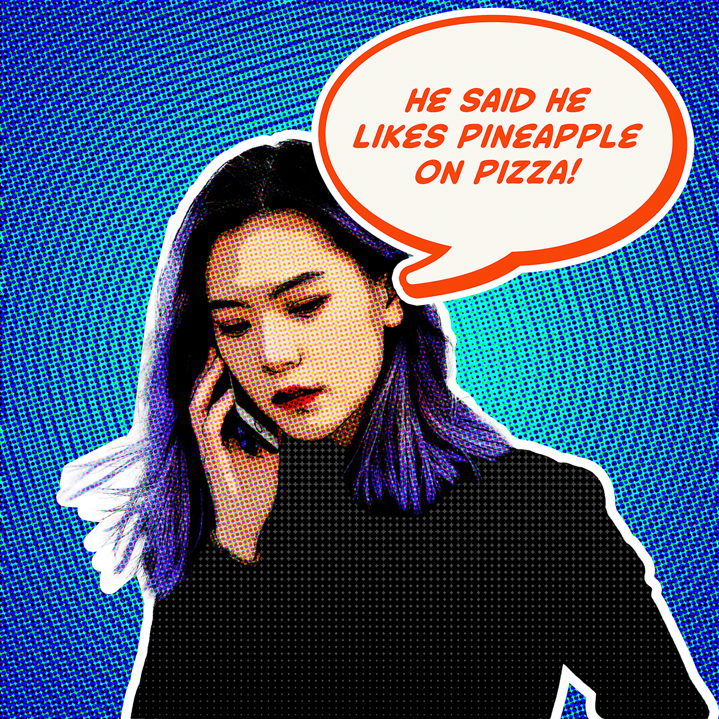
DCC Day 1,Pizzaz (Pop Art)
Question, why lately, will my filter gallery not be selectable.
@night maple Make sure that you are working with an 8-bit RGB image
ok probably have it at 16 bit
Can you guys give a link (you can in private messages) to all servers from adoba?
#✂challenges-feedback I'm still a little new here. I didn't have many pictures to choose from but it was fun trying out these effects,
Day 1
If when I use the Remove background tool, it erase too much, how can I make reappear the missing parts ?
@lethal mural Good pace! The way you verbalize each step reduces replay and makes following along easier. I didn't know about using + to stack filters from gallery dialog. That's a handy tip to simplify the workflow. Well done!!
work in progress so far. any advice on how i can get a color tone effect on the black shirt at all?
Thats really cool!
@neat shale, love the hair!!
@slow stirrup thank you!
Gave +1 Creative Carma to @slow stirrup
Day 1 PSDCC - Portrait Pizazz with Jésus Ramirez -
My cat Shasta. Cat hair is a special challenge for select and mask.
I had a problem with the gradient in the background layer - how do I go in and alter the gradient so it show 3 "stripes"?
DAY1 - Really enjoyed this one
Day 1 Got a portrait from pixels.com and placed it over the smart objects I created with the lesson and did a crop.
DCC Day 1 V2
@neat shale I'm not sure how much detail you have on the shirt, but I had the same issue with my jacket on Wilem...I reduced the opacity of the Line Art layer and it brought through some detail, but not much...hope this helps
2020-09-15 PS DCC 01 - Portrait Pizazz
@fresh swallow yeah its black with little to no detail in the original photo and i dont want it grey. probably gonna end up getting a b&w layer of color tone and invert it to create some sort of halftone effect
Sounds like a plan 🙂
Daily Challenge 1 
Day 1 Color changes
Daily Challenge 1
First try
Challenge 1 - my favourite photo of my best boy who I lost back in February 💙
Daily Creative Challenge 01
Challenge 1, Pop Art.
Challenge day 1
day 1
Day 1
Portrait Pizazz day 1
@austere stump if i got your question right, one thing that might be causing that, is the transitions of the colors on your gradient, because that's what Photoshop looks in order to apply the posterization. Also, make sure that you don't have any transparency applied on the gradient colors, if you're looking for some solid colors stripes. Fine tuning the Posterization slider on the Poster edges effect might be helpful as well. Hope this helps 🙂
is there a reason my oil paint filter would not be useable? It's grayed out when I try to select it.
@naive steppe Make sure you're working on a 8bit image (to check just go to Image > Mode > and choose 8 bits/channel). Also, the oil paint filter relies on the Graphics Processor, depending the one that you have, unfortunately it won't work. Go to Edit > Preferences > Performance and try to enable this checkbox here 👇 Last, under Advanced Settings, enable the Use OpenCL. If one of them is grayed out, unfortunately it won't work
What happens when you play with so many filters you forget what you were going for! ( @bleak fossil - still playing with hair and the Refine Edge brush - we have not bonded yet!! )
Hi ! I'm new here 🙂 this is just a try, it doesn't look a lot like a drawing but 😏
Tried a couple of things. This was the best.
Challenge #1 Portrait Pizazz
@coral stone thank you. It, unfortunately, won't work. 😦 Oh well. There are plenty of other filters from which to choose.
Gave +1 Creative Carma to @coral stone
Day 1: Portrait Pizazz
DCC 1 Portrait Pizzazz
DCC14 01 200915 Portrait Pizazz
Challenge #1 Portrait Pizazz (Original photo by Charles Chen on UnSplash.)
Challenge 1. Portrait Pizazz. I have always enjoyed how Disney did the Rose stain glass window in Beauty and the Beast. I hope you feel I have captured that essence in the After image. The original image of the stain glass is mine. The lighting was horrible. Thank for this opportunity! It was fun to experience the difference in the filters.
here's mine for day one! i don't use filters very often so it was fun playing with them!
updated Wilem a little...
PCC 1 yikes
Very good work @little root! Loved the graphic that you added for the background. I wonder if decreasing the Edge Intensity and the Edges Thickness sliders on the Poster Edges effect might reduce the lines from the face a little bit helping the tones to have more smooth transitions 😉 Good job!
@limpid cape loved the atmosphere you created, Brad! The high contrast subject combines really well with the background. The halftone pattern turned out really cool as well. 💯
@bold valley this turned out really great! You achieved a nice consistency by bringing some background colors to the subject. I like how the effects preserved the details on her hair too. Awesome work!
Great, rich colour contrasts @limpid cape
Oh, thanks @coral stone It was definitely a fun project. Looking forward to tomorrows. 😀
Gave +1 Creative Carma to @coral stone
Can't wait to see your next works @limpid cape 🙂
I like how the poster edges produced kind of a painting style for your image, @robust belfry. My only minor detail would be to reduce the stroke of the hair or apply it to the shoulders as well, just to have more of a consistent look throughout the edges. 😉 Nicely done!
Awesome job @lucid plover
Thank you @vague shuttle
Gave +1 Creative Carma to @vague shuttle
Super cool @cold oyster
Good to see you’re back @blissful geyser! Loved the colors that you chose for the background, especially how the gradient added a nice glow effect. I like that all the areas of the subject are looking very consistent. Well done!
Loved it. @queen aspen! The way that you added the textures and preserved the details turned out into two amazing compositions. Which one is your favorite? Awesome work!
What a beautiful photo @mortal crescent! Really like the results of the effects on the subjects, my only suggestion would be to darken or even choose a different color for the background, so some areas, like the hair, won’t blend with it, since there would be more contrast. 😉 Well done!
@humble vessel very nice work! I like how you preserved the details of the edges in a subtle way. My only suggestion would be that since the subject has some hard edges, I believe that’s because the resolution of the image, you might decrease the stroke layer style or even remove it, so the edges might feel even more natural, especially on the hair area. The textures on the background are looking very impressive! 🙂
This is very cool @sacred field! Loved the subtle transitions of the colors on the gradient from the background. The subject’s contrast is looking great as well, I like how the details from the eyes and the shirt don’t blend with the nearby areas, allowing it to have more depth. Great job!
Thanks
@lone cliff very nice, Michael! I like how the halftone pattern feels very balanced between the background and the subject. The colors and the details are looking very on point. Well done! 👍
You got some awesome textures in this one @fluid wharf! Loved the way that you preserved the light values of the subject, especially on his shoulders. The colors are looking very cohesive, especially the way that the saturated blue circle in the middle added a nice focal point. Nicely done! 🙂
@humble vessel very nice work! I like how you preserved the details of the edges in a subtle way. My only suggestion would be that since the subject has some hard edges, I believe that’s because the resolution of the image, you might decrease the stroke layer style or even remove it, so the edges might feel even more natural, especially on the hair area. The textures on the background are looking very impressive! 🙂
@coral stone Thanks. I appreciate the suggestion, I would try it out
Hey @hot thicket! Really great job with the effect, I like the levels of details that her clothes has. Also, the edges of her hair are looking great as well. Keep it up 🙂
Gave +1 Creative Carma to @coral stone
@coral stone Thanks, Valdair! 👍
@azure flint super cool work! The colors that you used for the background turned out very nicely. I like how the filters produced a cool texture throughout the areas of the statue. Well done!
@hexed lark Great job with the effect! I like how the white stroke on his edges adds a great contrast against the background. My only suggestion would be to enhance the contrast of the subject by brightening it just a touch. If his layer is a smart object, you can go to Image > Adjustments > Levels and drag the third slider to the left, if not, you can create a Levels adjustment layer by clicking on the fourth icon on the bottom of the layer's panel 🙂 Let me know if you have any questions.
@fallow loom great effects, Candice! Loved how the high contrast look of the second version made his details stand out. The effects are looking very smooth on the first version, I like how the shadows and highlights were preserved adding a nice sense of depth. Nicely done!
Haha @arctic rover! Really cool work! I like that you played with some different colors. Loved the effect on the background, I can see a mixture of the wind and mosaic?? haha. Great job! 💯
No problem @craggy anchor! 😄 I loved how the colors are consistent unifying the whole composition. The circles and textures on the background added a nice visual interest for the overall design. Excellent work!
I couldn't get the radial color bands that you had in your background. Watched your video repeatedly, must be something simple that I'm missing. I see someone else had this problem too.
Very nice work @sweet fern! I like the subtle circles that you added to the background, they have kind of a glow effect, which is super cool. The filters turned out great on the subject, especially on the details fro the eyes, the beard, and the shirt. Well done! 🙂
Hey @young karma can you send a screenshot of you Photoshop canvas and also one for the filter gallery workspace for me to take a look? 🙂
@coral stone Thank you for feedback Valdair
Gave +1 Creative Carma to @coral stone
@young karma this is very creative! Loved how you played with the brightness of the circles, When I first look, I immediately thought that the text would be That’s All Folks 😄 You did a great job positioning the text in the same angle as the circle. 💯
@slender wing this turned out really cool! I like that you added a new background for the image. The thin stroke was a very nice subtle touch for the subject. The filters worked out great, all the areas are looking very clear and consistent. Nicely done!
Oh wow great job @rocky reef! This could be a super cool album cover hah. Loved that you added some lines on the graphics of the background. The textures are looking very interesting too. 💯
@ember crown I loved how the filters produced a noise texture for the subject! Great color choice as well, I like how they and the graphics added a nice context to the scene. Very nice job!
Implementing suggestion @coral stone 👍 👍 👍
Hey @eternal mica! Loved the effects that you achieved on the background. It has a cool metallic look with the gradients. My only suggestion would be to darken the subject just a bit more, so it might have a little bit more contrast, enhancing all the filters edits that you applied 😉 Great work!
Very nice @humble vessel
@winter tinsel woooow this is awesome! Loved the high contrast that you applied to the subject, and how you added a great context with the background and the flowers. Amazing job! 💯
Oh wow great image, @tropic knoll! I like how the filters preserved the number of details from the original. The colors seem to be a little bit more vibrant, which is a great way to make the composition to stand out in a subtle way. Loved how you adjusted its perspective as well. Keep it up!
Hey @feral locust! Glad you had fun! The filters turned out very nice in your image. My only suggestion would be to darken the background just a touch, so the shoulders and the forehead won’t be blending with it, helping the subject to be even more separated from the background. Well done!
@tropic haven great job, Jessie! Loved the graphic on the background. The subject colors and the noise textures especially on the edges are looking nice as well! 🙂
@coral stone Thank you Valdair. Greatly appreciated. Do you mean to darken the original image to which all the filters/effects are being applied? Or darken the filtered effects?
Gave +1 Creative Carma to @coral stone
@fresh swallow really cool comic book style! The lines and the cyan frame added a cool personality to the composition as well. I like that you changed the background color, the tones helped the composition to have even more depth. Nicely done!
Here are my Layers
@eternal mica oh sorry. I mean darken the image with the filters already applied 🙂 Like this:
@coral stone Got it. Thank you
Gave +1 Creative Carma to @coral stone
@young karma I believe I found what might be causing that. YOu have the radial gradient from black to transparent. Jesús had it from black to white. You can easily fix this with the gradient tool selected and click on the colors from the top bar 👇
After that, click on this preset which is black to white
Then just fill the new layer and apply the effects again 🙂 Let me know if it worked
Your did it, thanks for finding my error, was driving me crazy😀
@coral stone Thanks! I wasn't happy with my first attempt so I went back in and touched it up.
Gave +1 Creative Carma to @coral stone
I had a weird thing happening with my halftone that I'll show you in ask questions so my photo is missing it. I will try again with a different photo another day.
day-01
Day 1: Portrait Pizza ... errr... Pizzaz. I don't think my photo had enough contrast with lights and darks for this to work the same way Jesus's did. But, it was fun and I learned a couple new filters!
Boy, that was really looking dark, so I added a levels adjustment to the entire image.
@vague swift I love that background!
@coral stone I lowered the brightness and increased the contrast
@sullen shard that reminds me of a Warhol art piece lol
exactly my inspiration 🙂
@unique flume @ocean isle @magic forge @untold iron @neat shale @pliant comet @austere stump @zinc elbow @cold oyster @bold valley @primal fulcrum @whole flame
If any of you are interested Codibear and I gave feedback on your designs today during her stream. You can find it here https://www.behance.net/live/videos/8139/Fun-Bear-Illustrations-with-Codi-Bear-2-of-2?tracking_source=to_replay&from_row=Illustration starting at the 1:31:15 mark
@magic forge Not sure if someone answered you already, but when you do select subject it creates a selection that you can add to or subtract from. If it creates a mask you are also able to select the mask afterwards and paint with black or white to reveal or conceal the mask. This allows you to edit the mask whenever you’d like non-destructively. Also just a heads up that the #❓ask-a-question section might be best for these types of questions since they can get lost quickly in this section among all the designs being submitted.
@fresh swallow Very cool, you got a very strong outline effect with this one. Kind of reminds me of the show Archer a little, hah. The background does a nice job of pushing that sort of pop art feel. Looks good!
@bleak fossil Thank you! I freaking love Archer lol.
Gave +1 Creative Carma to @bleak fossil
Thank you @coral stone!!
Gave +1 Creative Carma to @coral stone
@lucid plover Very nice! The halftone texture is looking really good on this, and the warm background separates very nicely from the cool colors of the figure too. I feel like it could look nice to brighten the figure just a bit to give them a little more pop to match the style. Nice work!
@cloud void Glad to have you! Nice work with this, that filter definitely gave it a sort of pop art feel with the heavy outlines. I feel like a halftone texture could look really good in the background of this image to match the style of the figures. Nice job!
Thank You @bleak fossil
Gave +1 Creative Carma to @bleak fossil
@slow stirrup Great illustrated feel to this image! Especially with the flotation ring at the bottom. The simplified background shapes and colors does a nice job of drawing attention to the more detailed kid. I like the more muted colors in this image, it gives it an interesting look and feel. Nicely done!
@little root Cool combination of effects here! I really like the radial texture of the background. It contrasts nicely with the face in both texture and color. If you ever find the lines of the face are getting too dark and heavy with this effect you can always mask it off a little with a soft round brush to fade it a bit. Though I think the deep darks around the eyes hold attention nicely. The halftone texture is a nice touch too!
@limpid cape Really solid style going on with these effects! The halftone effect is looking really good and the colors and highlights in the face do a nice job of separating it from the background. Looking good!
@robust belfry Very cool, the bold background does a nice job to push that pop art look! The filters do a nice job of pushing that more stylized look with the separated areas of color and halftone texture. Nicely done!
@blissful geyser I really like the effect with the separated areas of color on the face, it has a great stylized look. It really makes for some great textures in the hair and shirt as well. If you wanted to push that classic pop art feel I think choosing a more bold color for the background could really give it that look, but it really just depends what you’re going for. I think your background has a really nice contrast with the subject texture wise as it is. Looking good!
Day 1 - Pop Art inspired portrait using filters.
Yum! Yum!
Challenge #1
Thank you, @bleak fossil !
Gave +1 Creative Carma to @bleak fossil
Daily Challenge 200915 – Portrait Pizazz
Credits for images
Steampunk woman: by Magikstock on DeviantArt
Circles from PngTree
I could not get the concentric circles to work in the filter gallery. I used the solid black to white gradient. I also tried a 50% grey layer but no circles.
@bleak fossil thanks so much on the feedback in the stream!!! 🤗 also my username is pronounced "diagonal - leigh" 😂 its a play on words for diagonally because my middle name is leigh lol. what i ended up doing for the shirt is masking the black color and adding a layer with a really dark gradient set all the channels in color halftone to 0 then set the layer to lighter color and fill to 25%. you'll see soon when i upload the final version 😁
Gave +1 Creative Carma to @bleak fossil
Day 1 Pop Art
I could not get the concentric circles to work in the filter gallery. I used the solid black to white gradient. I also tried a 50% grey layer but no circles.
@young karma : you should have list of choice on the right of the Halftone pattern dialog box (you can choose dot, line or circle patterns)
@hollow yarrow -- Thanks for responding. That is essentially what I resorted to using. However, in today's tutorial Jesus Ramirez did not use the circles option. All he did was open the gradient layer in the filter gallery.
Gave +1 Creative Carma to @hollow yarrow
Added halftone
Day 1 - Pop Art Portrait
@hollow yarrow -- Thanks for responding. That is essentially what I resorted to using. However, in today's tutorial Jesus Ramirez did not use the circles option. All he did was open the gradient layer in the filter gallery.
@young karma Ok...Sorry... if you want the same effect that Jesus done maybe you should play with contrast settings. I made a test on a simple grandient and halftone circles appear... Hope it will help you! Great design!👍
my first challenge, beginner✌️
Here is my completed day 1 challenge!!! 😇 threw some roy lichtenstein inspo in there lol also what jesus was talking about in the stream with pizza toppings 😂 https://www.behance.net/gallery/104371745/91520-Photoshop-Daily-Creative-Challenge-Day-1
Day 1 - Portrait Pizazz. Create a Pop Art inspired portrait using filters.
@hollow yarrow Thanks, I'll give it a try.
Gave +1 Creative Carma to @hollow yarrow
Day 1 - Portrait Pizazz
@coral stone Thanks for the nice comments.
Gave +1 Creative Carma to @coral stone
@eternal mica Very cool Ted! The increased contrast is a great improvement. Really interesting effect on the background in this design. This is really just personal preference depending on what you want, but currently there’s a lot of texture in both the background and on the face. I think easing off on the sort of spotty/hatchy texture on the skin and replacing it with a soft half tone texture could both contrast the background nicely as well as push that pop art feel. But again, really just comes down to personal preference. Nicely done!
@compact pecan The levels adjustment made a big difference! It really made all the graphic shapes in the face pop, and pushed those red tones in the shadow area which looks really cool. Really nice stylized look!
@vague swift Great textures in the background! It really creates some nice color and value contrast for the main figure to read. The filter stylization on the face is looking really good too with the different blocks of color. Nice work!
@safe flint Looking good! I like the cool tones and lighting to this whole thing. Even with the cooler tones the warmer colors of a face do a nice job of standing out. The gradient and texture of the background came out well!
@fleet pecan Hah, getting carried away always makes for the most fun. The bold colors and contrast definitely have a pop art feel to this with this design. Nice job!
@young karma These are looking good! I especially like the version with the bold green color behind the portrait. Really nice use of the halftone textures on both designs, it really pushes that pop art look. Very cool!
@humble vessel Nice job! I like the clean graphic read of the figure against the clean background. Nice job on the stylization effect of the portrait. It could be cool to see a halftone texture in the background to push that pop art feel, but that’s really just personal preference. Nice work!
@obtuse spruce Great take on this challenge! I really like the addition of the graphic square, the way you mask it adds some nice depth. The bold colors and halftone texture really push that pop art look. The bold colors and shadows of the figure make her a strong focal point too. Looks good 👍
@vague shuttle Great style to this image! Even though the background and portrait are a really similar color and value the outline around the head does a nice job of separating them. I really like the halftone texture in the face as well. Looks good!
@coral cloak Really cool color contrast in this design! The bold blue and halftone texture really pushes that pop art look, and the more reddish tones of the skin give the whole image a really nice warm/cool contrast. The lighting on the portrait makes for a really cool look as well. Really great stylization of the portrait with the blocked sections of color and dark outline!
@shy bobcat Looks good Pam, I'm really liking that bold yellow/purple gradient in the background! The graphic blocks of color and halftone texture on the portrait are looking nice as well. Good job!
@verbal anvil Awesome, welcome on in, glad to have you! There's a nice contrast between the background and portrait here with the color and texture. The filter effect on the face is looking very nice as well. I think a bit more brightness either in the face or in the background to make one of them pop a bit more might be a nice look. Nicely done!
@rose pendant Very cool! I like the bold contrast in here, and the emphasis of the reds creates a really strong mood. The lighting effect in the eye and the rim light on the hat are both looking good. Nice work on the halftone texture as well!
@fallow bough Hah, loving it! The bold outline with some of these elements pushes that pop art feel nicely. This is just personal preference, but it could be a cool look to make the blue star burst shape the portrait is in be a contrasting color to the blue background. Maybe even repeat the purple color from the glasses for a bold look? Just a thought, great style to this image!
@young karma Looking good! Hopefully that suggestion that Franck gave works for what you're going for. Really great stylization of the figure in this one! The outlined effect turned out well and gives it a strong illustrated look. It could be interesting to se the saturation increased slightly to push that bold pop art feel against the black and white background, but it just depends on the look you want. Nice work!
@unkempt field Very interesting effect with the colorful areas throughout this image. The separation of texture and detail between the girls and background helps the image read very clearly. Really liking the bold colors of everything too!
@hollow yarrow Niiice, great take on this challenge! That's a classic look for sure. Great control with the filter on this one, it really does a great job of pushing that outlined illustrated effect. The color shifts all look solid, and the off white thought bubble along with all the texture really helps push that classic pop art feel. Very cool!
I have some issues to select the subject
https://unsplash.com/ (the bank i use) 😉
@bleak fossil Thank you for the feedback
Gave +1 Creative Carma to @bleak fossil
Portrait Pizazz
Tjank you @coral stone
Here is my completed day 1 challenge!!! 😇 threw some roy lichtenstein inspo in there lol also what jesus was talking about in the stream with pizza toppings 😂 https://www.behance.net/gallery/104371745/91520-Photoshop-Daily-Creative-Challenge-Day-1
@neat shale
LOL that's great! Awesome image and great quote!
Day 1 - Portrait Pizazz. Create a Pop Art inspired portrait using filters.
Challenge 1.
Loved it. @queen aspen! The way that you added the textures and preserved the details turned out into two amazing compositions. Which one is your favorite? Awesome work!
@coral stone: Thank you very much for your feedback! I don't know which one is better. I like both of them!
@fallow bough Great job! I like how groovy it looks!
@young karma Looking good! Hopefully that suggestion that Franck gave works for what you're going for. Really great stylization of the figure in this one! The outlined effect turned out well and gives it a strong illustrated look. It could be interesting to se the saturation increased slightly to push that bold pop art feel against the black and white background, but it just depends on the look you want. Nice work!
@bleak fossil - - Thanks Sam .. Still unable to get the same effect as Jesus Ramirez. I played with the contrast as Franck suggested and I reduced the resolution and turned off the dither to force more banding and there was a hint of the circles but no real effect.
Daily Challenge 200915 – Portrait Pizazz - Pop Art Version 2
Credits for images
Steampunk woman: by Magikstock on DeviantArt
Original from Unsplash - jassir-jonis-xwz84heqHxE. Do you think the background is too dark?
Challenge 1
Portrait Pizazz
suggestions and corrections to be made are welcome! 🙂
This is my first time doing pop art, I hope I've done a good job.
@bleak fossil I tried. Im not sure I got what you are looking for. But this is the best I could do.
I like how the poster edges produced kind of a painting style for your image, @robust belfry. My only minor detail would be to reduce the stroke of the hair or apply it to the shoulders as well, just to have more of a consistent look throughout the edges. 😉 Nicely done!
@coral stone Thanks for the feedback. How do I get the halftone to be black instead of blue? The blue dots on skin tone looks green, yuck. I tried several times to add a hafltone smart filter, but the preview is always blue.
@robust belfry Make sure that your colors are set to black and white. (Default colors) I had the same problem.
Revised Challenge 1 - I've changed the background colour but have also had a second attempt which has more detail on it. Not sure which one I prefer
Day 1 _ Portrait-Pizazz
Improvement from the first version.
@bleak fossil - - Thanks Sam .. Still unable to get the same effect as Jesus Ramirez. I played with the contrast as Franck suggested and I reduced the resolution and turned off the dither to force more banding and there was a hint of the circles but no real effect.
@young karma : very odd🤔 ... Great improvement anyway!👍
Gave +1 Creative Carma to @bleak fossil
@hollow yarrow -- Thank you!
Gave +1 Creative Carma to @hollow yarrow
Thanks @bleak fossil! I really enjoyed the challenge. Looking forward to todays challenge! It's amazing how much I learn during these challenges! 👍 😃
Gave +1 Creative Carma to @bleak fossil
Hey I am working on challenge 1 and having some kind of issue with halftone filter, that it shows white output after applying it on any layer don't know why? Please help me on this!
Hey @restive otter can you send a screenshot on #❓ask-a-question for me to take a look?
day-01
@coral stone Thank you very much for your feedback! I'm really happy 😄
Gave +1 Creative Carma to @coral stone
@hollow yarrow and @bleak fossil -- I decided to shutdown and reboot my PC to totally refresh Photoshop and the concentric circles are working properly now. Perhaps all the filters I used for the pop art effect caused some sort of problem with the GPU or memory. Thanks helping...
Gave +1 Creative Carma to @hollow yarrow
day-01
Hi 🌼 my work in challenge Portrait Pizazz✨
@whole flame super cool work! Loved how you kept the shadows and highlights of the subject consistent, preserving the original depth of the image. The details on her hair enhance the comic book style as well. Nicely done!
PS Daily Challenge Day 1
PS daily challenge
Nice job @left abyss! I like the stylized stroke that you applied. I think it adds a cool touch to the composition. Also, the details on her skin are looking very interesting, especially with the textures applied to the shadows. 🙂
This turned out great, @ruby panther! Loved how you positioned the background enhancing the focal point to the subject. I like that the halftone pattern is looking well balanced, avoiding any distraction. The textures and the details are very on point as well. 🙂
@lethal mural thank you so much!
Gave +1 Creative Carma to @lethal mural
@coral stone Thanks. Had a few problems but figured it out! 😖
Gave +1 Creative Carma to @coral stone
01 - Portrait Pizazz
Glad it worked, let me know if I can help you 🙂 @ruby panther
I will! Thanks again. @coral stone
@glacial minnow wow very nice, Sue! I like the results that the filter produced, especially on the skin tones. You might consider brightening the whole composition so the details can stand out a little more, especially on the bottom areas. 😉
@whole flame super cool work! Loved how you kept the shadows and highlights of the subject consistent, preserving the original depth of the image. The details on her hair enhance the comic book style as well. Nicely done!
@coral stone thank you 😉
@bleak fossil Thanks. You always catch that little tweak that makes a big difference and gets me thinking how to go further. Added contrasting color to burst background. At same time added circles and repeated on glasses. Removed dot pattern from face as it obscured the paint effect.
Gave +1 Creative Carma to @bleak fossil
Super cool work @topaz bone! I like how the yellow/orange choice for the background, it adds a nice comic book context to the composition. My only suggestion would be to decrease the edge instensity slider just a touch, so the skin tones might look even smoother, especially on the shadows from the right 🙂 Well done, Devika!
You did a great job, @young karma! Loved how you achieved a nice depth among the light values, especially on the skin tones. The halftone pattern worked out amazing too! 💯
@bleak fossil @teal badge Thanks for looking at my submission and the compliments and suggestions. Cool!
Gave +1 Creative Carma to @bleak fossil
@bold valley Of course! 🥰
PS DCC #1 Portrait Pizazz
This is my final result for today's Daily Creative Challenge.
Make sure to submit your animated gifs!
If you missed the stream you can watch here:
https://www.behance.net/live/videos/8151/Photoshop-Daily-Creative-Challenge-Parallax-Portrait

Challenge: Use 3D and animation features to create a portrait with an animated parallax effect.Get the starter file here: https://bit.ly/psdcc9-14-2Join your host each morning at 9:00am PT to learn how to approach each challenge using Photoshop. Complete 9 challenges by Friday...
Very good work @little root! Loved the graphic that you added for the background. I wonder if decreasing the Edge Intensity and the Edges Thickness sliders on the Poster Edges effect might reduce the lines from the face a little bit helping the tones to have more smooth transitions 😉 Good job!
@coral stone Thank you for your feedback ... will give it a try. I found this challenge very easy since I started. ☺️
Update to my day 1. I didn't love the first colors.
@little root Cool combination of effects here! I really like the radial texture of the background. It contrasts nicely with the face in both texture and color. If you ever find the lines of the face are getting too dark and heavy with this effect you can always mask it off a little with a soft round brush to fade it a bit. Though I think the deep darks around the eyes hold attention nicely. The halftone texture is a nice touch too!
@bleak fossil Thank you for your feedback.... My first easy challenge... I must say... ☺️
Here is my first Photoshop Challenge! #✂challenges-feedback
PS DCC #2 Parallax Portrait
Is anyone else having trouble with the live videos loading on Behance? I am trying to catch up with Paul's last two and they will not load.
I can view the current live going on now, but none of the past videos will load. Well I found them on youtube for the time being..
Parallax Portrait GIF. Challenge 2.
DCC-Day 2 - Parallax Portrait
DCC Day 2,Parallax Motion
PSdcc Day 1, Selfportrait Pop Art style, thanks @lethal mural
Gave +1 Creative Carma to @lethal mural
Day 2 Challenge!
Is there a way to copy a transformation on one layer to a second layer so it transforms in the identical way?
#2 Parallax Shot
gotta go to work now but made this real quick might make more or tons of changes just need some feedback first!
@young karma This is great! The combination of the bold colors with the halftone pattern really give it that pop art look and feel. I even get a bit of an 80s/90s vibe with this style. Solid work!
@simple idol The blocked out color effect on this is looking really cool! The graphic shapes it makes with the colors gives it a really clean stylized look. It could even be cool to see this one with a bit of a bold outline which could push that stylized look, but that's totally up to preference. Really nice colors with the background gradient and texture too 👍
(The update looks nice as well. Two pretty different moods with each background, very nice)
@rocky kite Really liking the colors on this one! The color is the face especially make for a really interesting style. Nice job with the texture in both the portrait and the background. Looks good!
@umbral frigate The bold outline and halftone effect are looking really good to push the stylized look of this image. The hard edged shadows in the face are looking really good too. The bold green in that background pushes that pop art feel nicely. It could be nice to see this whole design brightened up a bit by boosting the light tones with a levels or curves adjustment to push that pop art look even further, but that's a minor note. Nice work!
Thank you @bleak fossil Did you mean a bold outline on the image?
Gave +1 Creative Carma to @bleak fossil
@simple idol Around the figure specifically. Kind of that pop art/comic look feel. It could look nice with the simplified colors, but that just depends on the style/look you're shooting for.
Thank you! I'll give it a shot
@wet thistle This is great! The colors and bold outline give the portrait a nice stylized feel and the graphic shapes and bold colors of the background compliment that nicely. Great color scheme, and I like how the yellow of the shirt seems to be repeated in the sun in the background. This came out really nicely!
@tacit condor Looking good! The simplified sections of color along with the deep ink like shadows and halftone texture of the background give this whole design a nice stylized look. Really great contrast against the dark background. The animated version is looking really good too!
@mortal sinew Nice job with the stylized look here, the halftone texture is looking good. I think a little more contrast around the portrait could look nice. Maybe increase both the lights and darks with a levels adjustment, and/or adding a sort of bold outline filter around the portrait. Just some thoughts. Nicely done!
@calm stratus It's cool to see a take on this challenge with more muted colors. There's still a really interesting stylized look with the halftone texture but it's interesting to see a less saturated approach. Both of these contrast really nicely with the clean background gradients as well. Very cool look and feel to these 👍
@sacred field Nicely done Marc, this is looking good! The blurred background really gives the portrait a strong focus and realistic camera look. Nice job!
@untold iron This is great! Really strong motion graphic feel to this with all the different shapes in the background passing through the design. I really like the addition of the color changes on the portrait throughout the animation. Impressive work!
@obtuse spruce Very nice addition of the spinning mandala animation in the background! The animation is looking really smooth and solid, nice work!
Thanks 🙂 @bleak fossil
Gave +1 Creative Carma to @bleak fossil
@lucid plover Very nice! Good sense of depth and the animation is looking solid. The slightly blurred background helps sell the effect too. Nicely done!
Thank you very much @bleak fossil
Gave +1 Creative Carma to @bleak fossil
@hollow yarrow Awesome job! The blurred background looks great and the lighting and colors have a nice cohesive look here. The particle effects in the foreground are a really nice touch as well. Great sense of depth!
@queen dew Nice job on the stylized effect of this Day 1 challenge! The outlined texture and simplified colors work nicely together, the bold background color really adds to that stylized look too. Nice job!
@ashen cliff Nice work on the Day 2 challenge, I like the soft fade in of the figure! The parallax effect is looking good and the blurred background creates some nice focus with the portrait. 👍
Day 2: Where is the pizza?
my interpretation of day 2
♑
#PSDCC Day 1 Portrait Pizazz
Thank you @bleak fossil, I was still not happy about the background though, the background was too flat, so I added a patchwork filter. Does it look better this way?
Gave +1 Creative Carma to @bleak fossil
@coral stone I have made some changes as per your suggestions, kindly share your views on this image, thanks ☺️
Gave +1 Creative Carma to @coral stone
Here is my revised Challenge 1. I think it looks much better after I added more contrast via levels and adding a border around the profile. I don't like how my border is so choppy. Is there a way to fix that so it appears more rounded and smooth? #✂challenges-feedback
PS DCC # 2 - Parallex Portrait
first shot at the challenge:
second attempt
@coral stone thanks for you feedback. I used levels to lighten, do you think this looks better? I think it makes him pop more from the background.
Gave +1 Creative Carma to @coral stone
@bleak fossil 👍
Daily Challenge 200916 - Parallax effect
Hi there,
is there any other link to the Ps Challenges? I just cannot access to the right videos through the behance link.
Daily Challenge 200916 - Parallax effect
@young karma awesome!👍
Hi @void ermine Which link are you trying? Here's the link for the challenge landing page where you can access them 🙂 https://www.behance.net/challenge/photoshop

Daily Creative Challenge
Hi @void ermine Which link are you trying? Here's the link for the challenge landing page where you can access them 🙂 https://www.behance.net/challenge/photoshop
@coral stone exactly this one. I cannot access the video!
Daily Creative Challenge
Odd, I made a test here and everything is working fine. Does it appear any message or the videos just don't load?
@young karma awesome!👍
@hollow yarrow -- thank you..
Odd, I made a test here and everything is working fine. Does it appear any message or the videos just don't load?
@coral stone the video doesn't load.
Sorry for that @void ermine, try to access using a different browser. The replays are available on the Adobe YouTube channel as well 🙂 https://www.youtube.com/channel/UCL0iAkpqV5YaIVG7xkDtS4Q

Adobe® Creative Cloud™ brings together everything you need to create your greatest work. One simple membership gives you and your team access to the very lat...
Sorry for that @void ermine, try to access using a different browser. The replays are available on the Adobe YouTube channel as well 🙂 https://www.youtube.com/channel/UCL0iAkpqV5YaIVG7xkDtS4Q
@coral stone Great thanks! this works!! 🙏
Adobe® Creative Cloud™ brings together everything you need to create your greatest work. One simple membership gives you and your team access to the very lat...
hello @untold iron that parallax effect is so mesmerizing that, i can't stop looking at it 😅
I think I have more questions than answers with this technique...but that's ok! @coral stone - good eye! Yes, mosaic and wind filters.
@arctic rover feel free to tag me if you need any help 🙂
I was using the warp tool to try and move the shark's tail back and forth so it looks like he's swimming naturally (well, as naturally as possible), but the end result didn't quite live up to my expectations. It's much choppier than I had hoped. Fun challenge, though!!
@bleak fossil Thanks, Sam! 👍🙂
Gave +1 Creative Carma to @bleak fossil
day2
DCC Day 2 - Parallax Motion
Paralax frame
Is there a way to copy a transformation on one layer to a second layer so it transforms in the identical way?
@austere stump yes. I made a quick video showing how to do that 🙂
@slender wing great approach to the challenge. I like the way that the animation tells a story, making me want to find out what happens, if there will be a shot or something like that. The subjects looking still were a nice touch as well.
First attempt.
@neat shale great job! Loved how the parallax effect looks like a promotional video, especially by the mood that the image has with those vibrant colors. 💯
Hah really cool work @Pankreatt! The pizza looks delicious 😄 The parallax effect turned out great! I like the smooth movement that both the subject and the pizza have. Great job with the color overlay as well!
Loved that you played with more than one subject, @dusky wave, the way that the colors change at the same time as the other subject appears made it look very cool. Nicely done!
This came out great, @zinc elbow! The airplane flying behind him and moving in the opposite direction created a nice and interesting parallax effect. This is only an optional step, but if you want, you might animate the scale of the airplane, just to create the effect that as it moves, it gets a bit bigger. Great job, Angie!
Oh wow, @merry stream! You got some great colors in your work! I like that the animation has a very nice amount of time and how the logo appears when all comes together. If you want, you might enhance the parallax effect by adding some slow animation on the background, maybe with the gradient sliding up, or some subtle movements, just some ideas. 😄 Awesome work!
Excellent use of the effect, @safe linden! The texture that you applied to the subject is looking very interesting, especially the way that it is subtle when it goes to the highlights. The background with the textures and the graphics turned out very cool! Spectacular work on day 2 as well, the colors and the light values are looking very well balanced in contrast. 👍
Nice work combining the effects @tropic haven! I like how the movement of the subject makes him look like it’s coming closer to the viewer. The posterized background adds a nice painting look to the composition. Well done!
Hey @sweet fern, that looks pretty cool! The way that the background becomes brighter when the sunglasses appear adds a nice context to the story, even though the animation lasts a few seconds, it was already capable to tell a story. Excellent work!
@little root great improvements, Aisha! I loved the way that the clothes areas now have more details, especially that you brought back the light blues from it. I can see that the stroke enhanced some areas around her edges 👇 I wonder if you could mask them, so there won’t be any distractions on the composition. To do that, just enter on the Smart Object, select the subject’s layer mask, and with the brush tool paint with black on the areas in order to hide them 🙂 Feel free to tag me if you need any help. Really cool parallax effect loved the way that you hid the flag behind the subject. Very nice job!
Very nice improvement @mortal sinew! There is a way to do that, which is selecting the subject’s layer mask, go to the select menu, and choose Select & Mask. Under the workspace, increase the smooth value and then very subtly the contrast slicer. This way you’ll make the edge smoother and with the contrast slider, it will prevent some areas from the original background to show. Hope this helps 🙂 Feel free to tag me if you need help.
Nice one, @fresh swallow! 🙂 Loved that you simulated depth with the background distortion. I’m wondering if you might add a smooth transition on the color overlay of the second version, making the dark tones to appear gradually as the subject goes farther. Just a thought, well done!
@coral stone that was exactly what I was attempting with the second attempt. I am not sure how to accomplish that though
@oak mist Amazing jobs, Mykala! Loved how you preserved the details of the fur. The colors for the background were a very good choice, I like how it keeps everything cohesive and interesting. The parallax effect is looking great as well, the way that you played with the speed of the dog and the background, and how the brightness gradually changes, turned out amazing! 💯
@coral stone ,thank you for your feedback, I really appreciate!
@fresh swallow if you used the Color Overlay layer style you can create a keyframe for the Style on the timeline and then move the time indicator, after that you just need to enter on the layer style and play with the opacity slider 🙂 Jesús did that under 17:21 on today's video. If you used an additional layer for the effect, you can just animate its opacity.
I agree with you, @glacial minnow! I can see very clearly the details on the background and subtle circle that you placed behind the subject. Also, the colors are appearing even more now. 🙂 Great job!
@austere stump Haha very nice! I can see that you combined the effects on day 2. This is just a personal preference, but I wonder if you could recover the vibrant colors of the subject just a bit, this will help to enhance the summer mood. Well done!
No problem @fresh swallow 🙂
Awesome take on this one, @young karma! The combinations of the effects turned out really cool, and I loved the movement of the circles on the background, I feel very hypnotized 😂 Amazing job!
Great parallax effect, @arctic rover. I like that you played with different speeds for the subject and the background, adding some depth to the composition. Nicely done!
Very nice edits @steep inlet! Loved the colors changing throughout the words, and how you flipped the directions of the fading on both words. The second one is looking very well balanced in contrast, I like how you blended the halftone pattern making it subtle but still noticeable. The overlaps between the pineapple and the Hawaii word are looking very on point as well!
Busy Little Bee. I certainly learned alot today. Thank you! It's not the best but I guess it's the learning behind it. Will keep going!
Challenge 2. I did this just to see if I could. Was lots of fun. Thank you for this opportunity!
@fluid wharf great job playing with the scale, Abudalla! The subject coming closer to the viewer and the background moving farther is a really cool effect. Very well done!
Awesome take on this one, @young karma! The combinations of the effects turned out really cool, and I loved the movement of the circles on the background, I feel very hypnotized 😂 Amazing job!
@coral stone -- Thank you
Wow @compact pecan! Loved the distortions of the text blending to the ground and how you took care of the details like the shark’s shadow and his movement, by going a little slow and then fast. Awesome job!
@limpid cape another super cool work, Brad! Loved the gradients revealing the background image. The colors and the lights are looking amazing, especially how it gradually changes as the subject moves. 💯
@fleet pecan very interesting approach, Ricardo! Loved that you masked the image on the frame, creating kind of a contrast of realities. I wonder if you could add a subtle movement to the background image, just to see how it turns out 😄 this is just an optional step, of course, the edits already look great!
@coral stone that image was from last PSDCC so I had already done the hard work of blending the lettering on the ocean floor. (Is that considered cheating??) 😁
thank you very much Valdair for feedback
@coral stone that image was from last PSDCC so I had already done the hard work of blending the lettering on the ocean floor. (Is that considered cheating??) 😁
@compact pecan of course not haha! That's just a creative way of combining the works 😉
Smiling Man
Fixed the parallax
I listened to live cast during lunch during lunch but had too much work to do today. so after work i rushed home to do this. But honestly i have don animation before. what i am completely tickled with is the content aware and the remove backgound tools. Ith makes stuff like this much more fun than work. I originally had him photographed sitting on stairs and it did not lend it's self to a good animation so i used adobe stock for the background. still fun all the same.
PSDCC Day 2 with Jésus Ramirez - Parallax Portrait
I thought this cat couldn't get any more cool, but now she wears sunglasses. 😻
@coral stone thank you for the feedback!!!
Gave +1 Creative Carma to @coral stone
Day 2 animated
DCC14 02 200916 Birthday greeting to me
@coral stone Thank you for your feedback!
Gave +1 Creative Carma to @coral stone
@queen aspen Haha, nicely done. I like how it wafts perfectly under his nose. It could even be cool to see the steam warped to the left a bit as if it's blowing as it flies by. Nice job with the animated elements here!
@dusky wave Interesting effect with the gradual opacity fade! Kind of gives it a more solemn feel, like it's an animation about remembering them. The color shift is an interesting effect too, nice job!
@zinc elbow Nice work with the parallax effect! The little plane graphic between the portrait and background adds some nice additional depth. Nice job with the various elements of animation here!
@shy bobcat Nice work on the animation, Pam! The color shift in the background makes for an interesting look as well. I’d be really curious to see what this animation would look like if the background shift was more subtle. For example, if the background started at the 80% mark (where it’s already fairly zoomed in) and went from there. I wonder if it might look more like she’s sitting at a table in the courtyard at that level. Just a thought. Nice job with this technique!
Thanks to @bleak fossil for feedback!
Gave +1 Creative Carma to @bleak fossil
@vague swift Animation is looking good! I think the slightly more subtle shift of the background is a nice effect. Looks good 👍
@pliant comet Hah very nice. The thing Photoshop was intended for from the very beginning: Animating sunglasses on cats. The different rates of animation in this design give it a really nice look. Well done 😄
@night maple The animation is looking good! The lighting and colors on these images seem to match nicely. The zoom on the portrait is looking good, though I think a subtle zoom out on the background might really help push that parallax effect. Nice job!
@young karma The parallax effect is looking good! Really cool to see you going the extra mile with all the other animated elements. The different speeds involved, such as the bee makes for some nice variety. I like the rotation to the bee you added. Nice work!
@coral cloak Cool effect! I like the direction you went with this one. The spiraling of the background kind of makes it look like this could be used for some sort of mystery show or something. Kind of a vertigo effect. Looks good!
@tropic knoll Very cool! great to see how far you took this challenge. Really nice contrast on the Bee animation, and the zooming/parallax effect is looking good. Really cool to see you animating every letter of the Thank You animation too. Definitely a more complex animation but it turned out nicely and has some great motion to it. Very nicely done!
Gave +1 Creative Carma to @tropic knoll
@eternal mica Really nice effects with the text! Great to see you playing with different elements of animation. The animated background is looking very nice too. My only suggestion would be to slow the text down at the end and give it a couple more seconds to make it clearly readable. I had to watch it a few times to catch what it said at the very end for the second it slowed a bit. Just a thought. Looking good!
@safe linden Very impressive work! Great to see all these techniques coming together in this piece. The coloring looks great, and very natural. The parallax effect came out very well too. I like the somewhat painted quality this piece seems to have. Well done!
Challenge #2 Parallax GIF (Photo credit goes to Nanfe on Deviant Art and Runnyred on UnSplash.) I wonder if I don't have too much movement?...I'm not sure, I've been sitting here staring at it for too long. Ha.
@bleak fossil thanks for your comments, appreciated
Gave +1 Creative Carma to @bleak fossil
Day 2
Parallax Portrait, fading into sunset. Tried using puppet warp to animate head tilts, it did not go as I envisioned. Oh well, sometimes simple is better!
Day 2
Day 2
Day 2
A little late to the party, but would love to get some feedback on my Day 1
#PSDCC Day 1 Portrait Pizazz
PSDCC Day 1 Portrait Pizza suggestions for improvement are welcome...
@bleak fossil Thank you for your feedback, I tried to try out your suggestions, but I'm not too sure if I accomplished them.
Gave +1 Creative Carma to @bleak fossil
@bleak fossil Thanks 😊
Gave +1 Creative Carma to @bleak fossil
My Challenge 2 gif 😀
@coral stone colors and dither fixed it. Thanks.
@bleak fossil I adjusted the motion on the text and I added an additional element.
Im on #day1 #✂challenges-feedback try to catch up with you guys😀 🤯 #portraitpizazz
Just messing around a bit!
Final version
Day 3
Great job, @winter tinsel! The movement of the elements looks very on point. Also, the edits have a nice sense of depth, and the way that the lines from the floor are guiding the eyes, as it goes farther, turned out into a great effect. Well done!
You did a very nice job masking the elements @fallow bough! My only suggestion would be to adjust this area of the background, 👇 I believe that's from the original image. For that, you can use the clone stamp tool or even the content-aware to fill it with the nearby areas 😉 Nice job, Ken!
Challenge 1
Loved the animations @left abyss! The way that the sky is simulating kind of a sunset with the changing colors resulted in a great effect. The masking is looking great as well. 🙂
Very cool work @slow stirrup! Loved the way that you added a diagonal movement increasing the subject's scale. I can see that this was a very tricky image to apply the content-aware, you did a pretty good job. This is just an optional step, but if you want the lines from the fence to be a little more straight, you can use the clone stamp tool to sample the other areas and apply them to the distortions. 😉 Well done!
@coral stone, thank you. The fence was like this on the original picture. I didn't think it needed fixing..
Gave +1 Creative Carma to @coral stone
I loved the subtle movement on your composition @young karma, especially with the circles on the background! The masking of the subject worked out great as well. 💯
Don't worry @slow stirrup 🙂 It already looks great!
DCC 2 Parallax
@little root great improvements, Aisha! I loved the way that the clothes areas now have more details, especially that you brought back the light blues from it. I can see that the stroke enhanced some areas around her edges 👇 I wonder if you could mask them, so there won’t be any distractions on the composition. To do that, just enter on the Smart Object, select the subject’s layer mask, and with the brush tool paint with black on the areas in order to hide them 🙂 Feel free to tag me if you need any help. Really cool parallax effect loved the way that you hid the flag behind the subject. Very nice job!
@coral stone I tried to mask the distraction, please see if it is ok..... thank you for your feedback... means a lot
Challenge 2: Parallax Portrait
okay the change of image size for sending it on discord really ruined the parallax

Build your Photoshop skills in just 9 challenges! | Sep 14 - Sep 25, 2020
@glacial minnow Loved that you played with some bokeh overlays. The subject becoming visible as the lights move farther turned out great!
Awesome impromevent @little root! It's looking great! 🙂
Everybody Dance Now!
I struggled with this. No matter what it wouldn't show the scale change. I changed the layer to smart object and the controls changed from position to transform and then it worked. then had to play with the settings to get it small enough to post here
i made a better one!
and my behance post with everything in it https://www.behance.net/gallery/104472027/91620-Photoshop-Daily-Creative-Challenge-Day-2

Day 2 - Parallax Portrait. Use 3D and animation features to create a portrait with an animated parallax effect. I ended up making two for this challenge, I wanted to make more but didn't have the time so I might do this again in the future.
If you don't understand this reference, this mean that you' re not watching the DDC live on behance, so here is the link 😉 : https://www.behance.net/live
I had to reduce the size and change the color panel to upload here on discord
@lethal mural, hope you won't mind me if i put this on my behance page ?
Thanks, @bleak fossil !
Gave +1 Creative Carma to @bleak fossil
Thank you, @bleak fossil
Gave +1 Creative Carma to @bleak fossil
@little root Cool combination of effects here! I really like the radial texture of the background. It contrasts nicely with the face in both texture and color. If you ever find the lines of the face are getting too dark and heavy with this effect you can always mask it off a little with a soft round brush to fade it a bit. Though I think the deep darks around the eyes hold attention nicely. The halftone texture is a nice touch too!
@bleak fossil thank you so much for your feedback... means a lot....
Spent more time getting it down to 8 MB than I did creating animation. Resizing and blurring the background worked best.
Followed along to create this Photo Mosaic for Day 3: Photo Mosaic. Please let me know what you think, mentors 🙂 Thanks 🙂
quick question: we can use our own photos for the challenges, yes? 🙈
@analog atlas Absolutely
A bit late...Pizazz
Day 3
@slow stirrup I love your Day 3!
Challenge 3, Mozaic portrait.
Thank you, @analog atlas!!
Gave +1 Creative Carma to @analog atlas
@neat shale These are looking great! Really strong feeling of a focal shift in the first one with the simultaneous zoom of both the background and foreground. Very cool to see you play with some particle effects as well on the second design. The slower parallax effect and animation of the particles really suits the mood of the second design as well. Well done!
@whole flame Hah, perfect, I love the dramatic slow motion movement of this. For some reason I picture this song being played in the background with it. https://www.youtube.com/watch?v=BNWpZ-Y_KvU
I like the focus variation of the different pineapple pieces, nice job on all the animated elements!
@fallow bough Picky ol' Discord with it's 8mb limit. This is looking really good! Great job matching the lighting and colors on this. The blurred background gives it a nice strong focal point and depth of field effect. Nice job with the parallax effect!
@marble bramble Very nice! There's a cool stylized effect going on to this image. I like the sort of hand illustrated look of the background. I think you could potentially increase the opacity or visibility of the overlay of the photos on the portrait to make the effect a bit more obvious, but it really just depends how much of the photo pattern you want visible vs how much of the portrait you want to be clear. Either way it makes for an interesting effect. Nice work!
@bleak fossil thank you so much! i wanna do more with the parallax and particle effects but with fire next time 👀
Gave +1 Creative Carma to @bleak fossil
@lime meadow I like it! Really nice color palette in this. The contrast in textures between the background and figure make the figure pop out nicely. I feel like a bit of an increase in contrast might look good in this image, but that's a minor suggestion. Nice job!
@neat shale For sure, animation can be a really fun way to breathe life into a 2D image. I've wanted to play around with that more myself with my drawings and paintings. Fire would be cool to see!
@slow stirrup Looking good! Really nice blend between the photo collage and the original portrait. Both seem to read quite clearly. It could look nice to make the photos smaller to give more of that classic photo collage effect, but this is a cool look in and of itself depending on what you're shooting for. Great colors in this design too!
@bleak fossil omg yes! your art would look even better with animated particles!
DCC Day 3,Photo Mosaic
@sacred field Really interesting effect with how small these photos are. Kind of creates its own textures and pattern. Both elements are reading really nicely together. Looking good!
@wind jolt Very nice designs! I like the bold background colored gradient of the first design. The parallax effect in the second design is looking really solid. Though I think starting the background a little less zoomed in might give it a bit more of a realistic feel size wise. Nice job!
Thank you, @bleak fossil. How much smaller, would you say? like 50%, or like 10%?
Gave +1 Creative Carma to @bleak fossil
My Mosaic creative challenge for day #3
@slow stirrup Hmm, good question. I think it really just comes down to personal taste and what you think looks best, but I was thinking it could be interesting to see them like a quarter of that size.
@bleak fossil thankyou so much😊
@cold oyster have you used displacement map filter or the liquify filter?
@primal fulcrum Yeah, when it comes to animations/videos it can be hard to fit it into 8MB. Luckily Behance allows bigger files. The parallax effect is looking good! I think seeing a bit more of a noticeable zoom out with the background could help push the effect even further potentially. I like the blur of the background too 👍
@cold oyster These are great! I really love your take on this with the warped effects and sort of glitch effect of the first one. The color of the photo collage is also adding a lot of visual interest. Both of these create a really strong focal point of the face/eyes of the portrait too. Impressive work!
day3
Challenge 3 Jesus makes it look so easy.
@bleak fossil, this is 6%. But you can't see the little pics, it just looks like a random texture.
This one, is 25%
2020-09-17 PS DCC 03 - Photo Mosaic☺️
@slow stirrup Yeah, I think it's nice to keep it big enough to see the photos, the 25% one is looking solid to me!
@marble bramble Very nice! There's a cool stylized effect going on to this image. I like the sort of hand illustrated look of the background. I think you could potentially increase the opacity or visibility of the overlay of the photos on the portrait to make the effect a bit more obvious, but it really just depends how much of the photo pattern you want visible vs how much of the portrait you want to be clear. Either way it makes for an interesting effect. Nice work!
@bleak fossil Awesome, thank you for your feedback 🙂 I actually made the line art in the background as a separate illustration so decided to use it here. I will try and implement the changes and send in my updated work soon 🙂 Thank you again 🙂
Day 3 PSDCC with Jésus Ramirez - Mosaic
This is my cat Luma, so named because she is black and white. (I'm in video and lighting for live events. Or I used to be-before the industry was decimated.)
DAY3 - Photo Mosaic
Day 3 Mosaic Challenge
Day 3 Decided to use some of my DCC pieces for pattern and background, Same pattern size and blend didn't work over entire image so varied for face, hair and body.
@wet thistle Both are great in heir own way.
I had only one album loaded in Lr of cars. I might try again using Mac Photos.
Here is my mosaic made from a composite. The background image is from Kouji Tsuru on Unsplash (Thank you) and the photo is mine. Thanks
Challenge 2
DCC-Day3-PhotoMosaic
Mosaic Time!
DCC 3 Photo Mosaic
Hi everyone! this is my challenge n2 😄
Second shot at Day 3 challenge...pattern is DC villains 😄
Variation on a theme
Day 1 Photo Pizazz
Challenge 4. This hawk stares at my one-eyed lens staring at her. I couldn't help but smile. Liquify shifts the pattern over her. Hopefully, the pattern and adjustment isn't too strong. I have also applied an oil painting effect. Thanks to all for this opportunity!
Ok this is my fina answer!! 😊 😊 😊
Challenge #3 Photo Mosaic (Photo credit goes to David Guliciuc on UnSplash.)
@lone cliff very nice, Michael! I like how the halftone pattern feels very balanced between the background and the subject. The colors and the details are looking very on point. Well done! 👍
@coral stone Thank you for your valuable feedback! 🙂
Thanks @bleak fossil @wind jolt I used a displacement map on both of the images.
Gave +1 Creative Carma to @bleak fossil
@bleak fossil thanks for the feedback!
Gave +1 Creative Carma to @bleak fossil
Mosaic of junkyard cars
Here is GIF! Such a fun project! I edited the layer mask to get the smooth borders and I am so much happier with them now #✂challenges-feedback
@bleak fossil Thanks, Sam! I had a problem with the border thickness in Lightroom and Bridge. I couldn't make a thin line between pics. That's why they're so small ... I wonder if it's because I use Dark Mode?!
Gave +1 Creative Carma to @bleak fossil
DCC Challenge 3 - Photo Mosaic 😬
Challenge 3 -Photo Mosaic
Great overlays @safe linden! I like how you made the pattern subtle but still visible, adding a nice visual interest, especially on the close-up. 💯
@zinc elbow nice edits, Angie! The diagonal pattern added a nice movement feel to your day 3, I also like how it’s subtle on the highlights, making the overall composition to look balanced. Well done!
@wet thistle I can’t decide either haha I like the warm tones and how the details are showing a little more on the first version, and the dark atmosphere of the second turned out great, I think you can keep both :D. Great job!
@fallow bough that’s very creative Ken! Really like that you brought the previous DCC images on day 3. I can remember some of them 😄 The masking and the overlays worked out very nice.
@queen aspen that’s awesome, Pankratt! You achieved great texture results on your image! I like how it added a nice sense of depth to the image as if it was printed on a special paper. Excellent work!
@safe flint I like the photos that you used for the pattern! You got some very interesting effects on the image, I’m a big fan of the texture that the subject’s shirt has. Nicely done!
Oh very nice @simple idol! Loved how the pattern created a nice texture on your image, I like how it’s subtle on the highlights avoiding the overall composition to look busy. Great job with the colors as well!
fun one, I'm enjoying the multiple filter options!
@sullen shard, it’s always nice to see different approaches to the challenges. The movement on the eyes are looking very cool, I’m wondering if you might refine the layer mask to remove the white edges on the face, especially on the lower part. You can use the pen tool to create accurate selections. Another alternative technique would be to use the minimum filter, here’s a video that explains how it works: https://www.youtube.com/watch?v=60GysIWun2s Let me know if you need any help 🙂
In this tutorial, you will learn how to remove white edges or fringes from cut-outs in Photoshop!
Fringing, the white edges, or halos, around your selections, could be very distracting and could ruin a good composite.
I'm going to show you two filters designed to specificall...
@untold iron very cool work, Jae! Loved how the pictures created a nice pattern overlay. If you want, you might decrease the pattern’s opacity just a touch so the subject might be able to stand out a little more, especially on the highlights and midtones areas 😉 Nicely done!
oh thanks a lot @coral stone I will
Gave +1 Creative Carma to @coral stone
@rocky reef this turned out really cool! Loved the neon colors that you applied to the composition. I wonder if brightening the subject just a bit, it would make it stand out a little more from the photos overlays. This is just a minor detail, you did an amazing job!
Hi, @azure flint! Wow this looks amazing! I absolutely loved the movement of the mountains. The way that you pushed the contrast up as the animation goes, tied everything perfectly. Very impressive job!
@fresh swallow loved the way that the diagonal pattern added a cool movement feel on your first version! The color palette is looking very on point as well, and I really like the use of blue and orange on your second version, complementary colors are always a great choice to make the design to look balanced and contrasting. My only suggestion would be to reduce the amount of grain just a touch, so the elements on the pattern might be able to be even more visible. Of course, it depends on the effect you’re going for. 😉 Well done!
The blending worked out very nicely in your image, @arctic rover! I also like how the small pictures created a cool texture, especially in the background. Loved the colorful outline on version one. 😍 Great job!
This is great @modern bear! Loved the way that you played with the thickness of the lines, how did you do that? It looks amazing. The comic book style is looking great as well. 👍
@coral stone Thank you! The one thing that stuck out today in the video with Jesus was the joking about Grain at the end lol. SO, I figured go big or go home...apparently should've chose the latter 😛
Gave +1 Creative Carma to @coral stone
I was not happy with the first one at all once I finished it
I felt that it was too...off?
Suuuper cool work @unkempt field! Loved the way that you preserved the colors of the photos, it is a great effect on the composition, especially because of their small size. Nicely done!
No problem @fresh swallow. I like both versions 😉 The grain gives a nice personality to the design, I'm a big fan of it. It's just some tweak that you can do to see if you like it 🙂
I'll give it a shot and post it here then we can compare notes 😄
Very nice work @analog atlas! Loved how the frames are blending to the image without making it lose the original dark atmosphere. I like how the dark corners establish a nice focal point to the composition, and the way that the pictures aren’t visible there makes it feel more balanced. Great job 😀
Amazing combinations among the filters, @tropic knoll. I loved how the liquify added a wavy look to the pictures. I wonder if you might brighten the dark areas on the left of the bird since the blend mode added more contrast, it made this area to lose some of the details. Well done, CK!
Really great design @eternal mica! Loved how you played with some overlays in the background. The lines among the photos created a nice geometric look for the composition as well. Very nice job!
@winter tinsel you’ve got some great blending on your image. Loved how the effect turned out on the background and on the subject’s shirt. Did you add a halftone pattern to the background? I think that’s a very nice touch for the image! Well done!
This turned out amazing @west zealot! I loved the color grading and the grain of the image. Really cool way to bring the effect just on the building, it adds a nice visual interest for the overall composition. Awesome work!
Loved how the edges are looking now @mortal sinew! Very nice improvement! 💯
@limpid cape wow this is looking very impressive! I like how you blended the pattern to the image. The way that the original colors were preserved kept everything cohesive and consistent. Nicely done!
This is looking very nice, @shy bobcat! Loved the colors on the background and how the blend modes worked out great on the original image. Nicely done!
@calm jay Loved the results of the halftone pattern on the background! The subject and the colors are looking great as well! Well done!
I'm late to posting this - sorry if this isn't the right place/time to post.
Thanks guys - it was a rainy day so I'm working to get caught up!
@coral stone Thank you Valdair. It was a simple exercise, with a lot of possibilities, a lot of variations.
Gave +1 Creative Carma to @coral stone
It looks very good, @true spoke! I loved the effect on the glasses 🙂
@true spoke You're totally good, you're welcome to post any of the challenges for this 2 week DCC throughout the 2 week period. There's #💎past-challenge for anything beyond that. This is looking good BTW! The bold background pushes that stylized pop art look nicely. I think brightening up the face a bit with a levels adjustment could give this image a nice pop and push that style even further. Nice job!
@lucid plover Nicely done! This is a great photo for this challenge. There's a really nice blend of the two elements in this one, both read very well. Looks great!
@dusky wave Very nice, really cool to see how this photo mosaic works with this image. It gives the background a nice effect and contrast. This is totally just personal preference, but the grayscale background kind of gives me a crime show vibe, or like a documentary talking about something that happened to a couple long ago with black and white photos. Maybe that's just me, hah. I wonder if a solid color in the background might give it a more up beat look depending on what you're going for. Really nice job, there's a nice blend between the two different photo elements!
thank you @bleak fossil
Gave +1 Creative Carma to @bleak fossil
@bleak fossil I totally agree with you! My initial intent was to go for more muted colors since it was a photo I took post-bike ride on a rainy day. But since there's hardly any context shown in the photo, I think you're absolutely right about brightening up the face a bit more to give it a nice pop.
@fluid wharf Day 3 is looking good! I like the vibrant colors in this design. There's a nice blend between the portrait and the photo mosaic, both read really nicely together. It also creates a really interesting texture in a small view. Nicely done!
@sturdy vault Really interesting effect with the Day 3 challenge! I really like how the colors from the portrait photo affect the mosaic collage. There's a nice mix between the two photo elements, I like how the portrait is still clearly visible but almost starts to become abstracted. Very cool!
Thank you Sam for feedback
@bleak fossil thank you. I value your critiques.
Gave +1 Creative Carma to @bleak fossil
Challenge 2
@fallen talon Now that's cool! I love the little touch with the wink.
@tropic haven Very cool! It could be interesting to see a higher resolution image to see more of the photo mosaic, but it's looking good. It could be nice to see a little more of the photo mosaic since some of it seems to be lost with this blending more, but it makes for an interesting sort of texture. Really cool colors in this design too 👍
@calm jay Looking good! The stylized filter on the portrait and the halftone texture is working nicely in this image. It has a nice cohesive look and style to it!
@fallen talon Hah, this is great, very cool idea for this challenge! I love the zoom in on the wink. Really solid work with the various animated elements!
@young karma Really cool idea for the pattern! It makes for an interesting texture on these designs. I especially like how it looks in the astronaut photo. Kind of an interesting digital/hologram type of look. Also gives it some interesting pop of color. Nicely done!
@little root Nice job, this creates a really interesting texture on this image for the mosaic challenge! It might be nice to use a collage of photos without the space in between them to get more of that classic mosaic look. Looks good 👍
@pliant comet Very cool! Interesting to see how this effect appears on the different areas of dark and light. I have a little black and white kitty on my lap as I write this, hah. Nice work!
Daily Challenge 200917 - Photo Mosaic
Gave +1 Creative Carma to @bleak fossil
@bleak fossil,yes. You’re right! Thank you for your feedback 🙂
@safe linden Very interesting to see the sort of structured texture these photos create in mosaic form. I also like how the cool colors of the photo match that theme. Nice job!
@fresh swallow This makes for a really cool pattern with the different areas of color. Really nice blend between the portrait and mosaic elements too. Very nice effect!
Thank you, @bleak fossil
Gave +1 Creative Carma to @bleak fossil
@wet thistle Very cool! I like the colored one because the different colors emphasize that it's made up of different photo elements, but the monotone image kind of creates a cool abstract texture and the whole thing has a bit more of a dramatic look. Just depending on what you're going for. Nice job!
@fallow bough Great idea! I really like how you did it for both the background and portrait but with different sizes. It makes them contrast nicely. It could be nice to see the entire area of the portrait increased in contrast a bit (specifically the dark tones) so it's not overpowered by the contrast of the background. Really nice effect!
@young karma Loving the sort of aged look to the colors in here! Really gives it a strong thematic feel. I like how you varied the mosaic size between the subjects and background, it gives them a nice contrast. Really nice take on this challenge!
Gave +1 Creative Carma to @coral stone
@coral stone Thank you for your kind feedback
@young karma Loving the sort of aged look to the colors in here! Really gives it a strong thematic feel. I like how you varied the mosaic size between the subjects and background, it gives them a nice contrast. Really nice take on this challenge!
@bleak fossil -- Thanks
Thanks, @bleak fossil !
Gave +1 Creative Carma to @bleak fossil
@fallen talon Now that's cool! I love the little touch with the wink.
@true spoke Thanks!
@young karma Really cool idea for the pattern! It makes for an interesting texture on these designs. I especially like how it looks in the astronaut photo. Kind of an interesting digital/hologram type of look. Also gives it some interesting pop of color. Nicely done!
@bleak fossil Thank you!
Gave +1 Creative Carma to @round estuary
Hell! Portrait Pizazz challenge
Daily Challenge 200917 - Photo Mosaic
@young karma Great take! Love the idea to use diferent pattern sizes and angle.👍
Day 3 - Photo Mosaic
Hi everyone! this is my challenge n2 😄
@azure flint GReat take! Love the animation...Especially the light effect!👍
I decided to make this mosaic a bit weather worn
@young karma Great take! Love the idea to use diferent pattern sizes and angle.👍
@hollow yarrow -- Thank you!
Photoshop Daily Creative Challenge - Parallax Portrait
okay so im being really picky with this mosaic challenge bc im not liking how anything im doing is coming out. i ended up making two patterns - one light and one dark and used color range to separate the dark just to idk make a more accurate mosaic i guess? idk how i feel about it i need some feedback 🤔
@neat shale FWIW, I like the image. 😀 I like how I know what I’m looking at (a building with balconies and lots of glass, right?) and yet, I’m not completely sure of what I’m looking at (this is meant to be a compliment even if it doesn’t sound like it, I love images like this.) I think it may help if you could find a way to make a more varied pattern for the overlays?
@pliant comet thank you for the feedback! I think I gotta play around more with patterns
Gave +1 Creative Carma to @pliant comet
Day 3 - Photo Mosaic
Challenge 3, ver 2. Looking at the 1st one I posted, I needed to flip it.
@marble bramble Very nice! There's a cool stylized effect going on to this image. I like the sort of hand illustrated look of the background. I think you could potentially increase the opacity or visibility of the overlay of the photos on the portrait to make the effect a bit more obvious, but it really just depends how much of the photo pattern you want visible vs how much of the portrait you want to be clear. Either way it makes for an interesting effect. Nice work!
@bleak fossil Hey Sam! I took your advice and changed the blending mode of the photos from the mosaic and I really do see a difference. I can see all the little paintings in the mosaic! Here is my updated version for Challenge 3. Please let me know what you think 🙂 Thanks
Thank you @bleak fossil !
Gave +1 Creative Carma to @bleak fossil
Sorry for the low quality photo, couldn't find anything better 😛
Mosaic Challenge
@hollow yarrow Thank you!
Gave +1 Creative Carma to @hollow yarrow
Parallax Portrait
Challenge 3 mosaic made up of all photos of my boy
@neat shale Its an interesting photo, though Im not sure what its a photo of. I think the black and grey worked well. I cannot see any effect on the white. If there is an effect there, you might want to change the method youre applying.
@coral stone Thank you for the feedback! Greatly appreciated.
Gave +1 Creative Carma to @coral stone
Parallax Portrait challenge
The assets played very well together, @young karma! I like how the pattern is looking, especially on the background acting as a cool wallpaper. The subtle shadow on the subject adds a nice sense of depth, creating a separation between her and the background. Great job!
@sterile talon very nice portrait, Marym! I like how the filters are looking throughout your subject, especially in the brighter areas. Even though the original looks a bit overexposed you were still able to accomplish the comic book style. The parallax portrait is looking super cool as well, my only thought would be to adjust the subject's position on the bottom, it kind of loses the continuity effect since it's moving away from the bottom edge. 🙂
Very cool work, @chilly hawk! I like the different posterization levels of your composition, allowing the tonal values to have a nice presence on the scene. I would consider brightening the subject just a touch with a levels adjustment layer, so the details of his shirt might be able to pop a little more and match the brightness values from the background. Well done!
@hollow yarrow this is looking great, Franck! The way that the vignette establishes a strong focal point to the subject allows her to be seen first and then the other elements as the pattern and the cake. Keep it up!
@ember crown the grain adds the weather-worn style you are going for! This is totally optional, but if you want, you might introduce some yellow tones to enhance this style. For that, you'll just need to create a Solid Color adjustment layer and choose a yellow-orangeish tone, then just change the blend mode to color and adjust the opacity. Also, combining some old papers textures images and some blending mode might enhance even more the style. Just some ideas. Great job! 😉
This is looking pretty cool @neat shale! I like the pattern separations that you applied among the dark and light areas and the geometric look of it. About your doubt, try playing with some textures, colors, and other patterns, not only on the windows but the outlines and even on the sky, just some ideas hah 😄 Great job!
