#✂challenges-feedback
1 messages · Page 78 of 1
Not a big artist, but...
day 8 challenge, dutch landscape
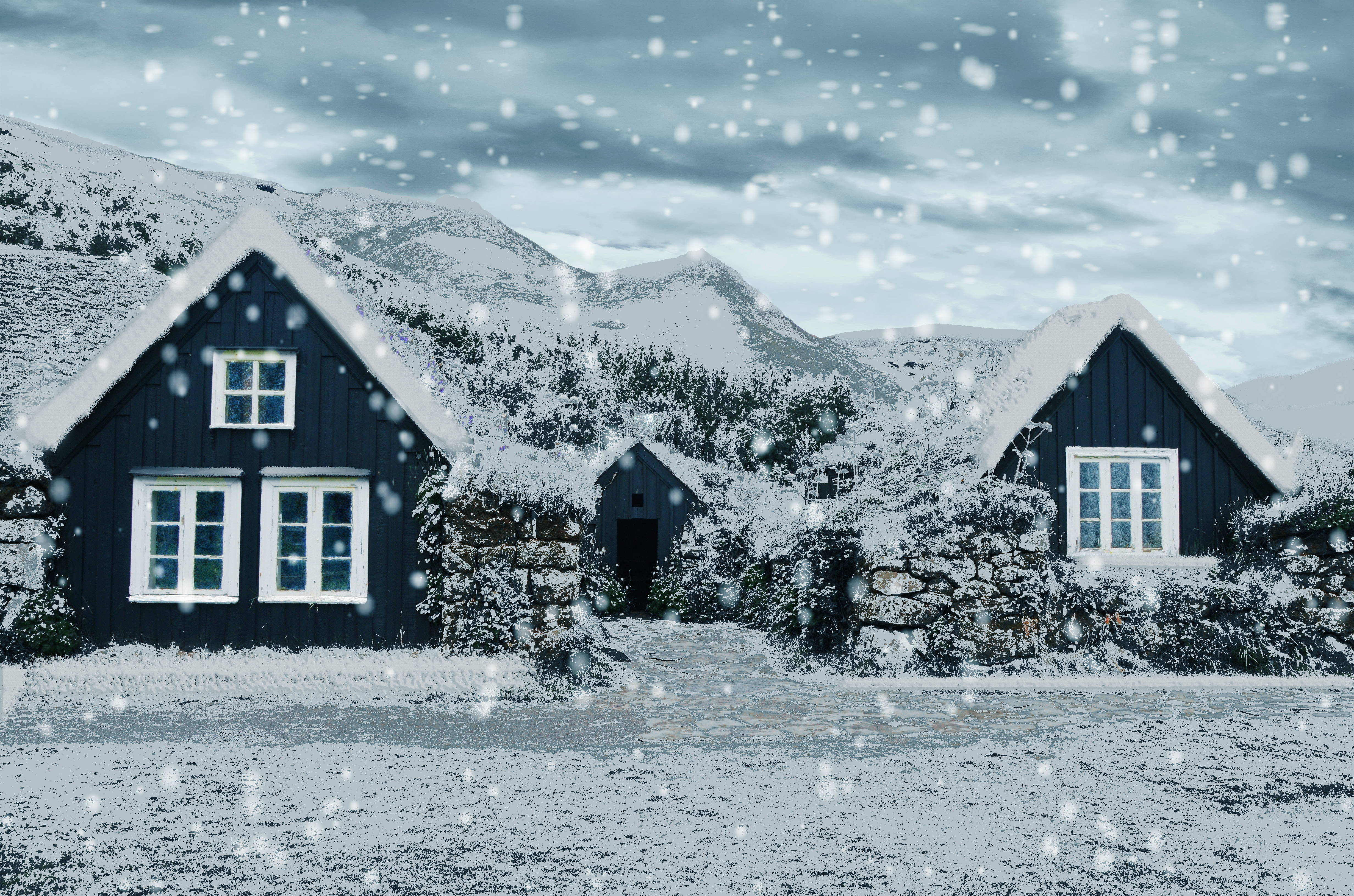
Light snow
Challenge #8 Knockout Text Effect (My postcard image is by Ishan Seefromthesky on UnSplash.)
Challenge #8 Knockout Text Effect
Day 8: Polar Night
I hope this works
I added the last technique Jesus exhibited of a knockout animation layered on a B&W of my original image.
Challenge #8. Knockout Effect.
Challenge 8. Knockout Effect. This technique is quite fun. I can see lots of possibilites where I can use this effect. Thank you!
@bleak fossil thanks for the feedback and enthusiasm 🙂 Nice to hear first thing in the morning. Cheers!
Gave +1 Creative Carma to @bleak fossil
@young karma very nice job! Loved how you made the frame and the text consistent by using the colors present on the image. My only nitpick would be to lighten the dark tones on the bottom area of the text, just to make it appear more, especially on the A where it seems to be blending to the background, making the readability a bit difficult. 😉
@gilded flame You did an amazing job with the snow effect, especially how you achieved depth with the falling flakes and how all the areas of the image seem to be covered by the snow, creating an impression that it is really cold (and making me want to have a hot chocolate ☕ haha). Awesome work!
@neat sparrow this is looking really nice, but the letters are very unclear. Maybe try to move them to the sky area, so that it would show.
@indigo monolith this makes me want to travel haha. You did a pretty good job with the effect. My only suggestion would be to decrease the brightness of the background a bit. It doesn't need to be strong, you can keep it subtle. This way the text and the frame will be able to pop a little more from it. 😉 Very nice work!
Daily Challenge 200730 - Knockout postcard // Credits for images used:
Bridge background: Adobe Stock
Woman: Adobe Stock
Luggage: Pixabay
@indigo monolith this makes me want to travel haha. You did a pretty good job with the effect. My only suggestion would be to decrease the brightness of the background a bit. It doesn't need to be strong, you can keep it subtle. This way the text and the frame will be able to pop a little more from it. 😉 Very nice work!
@coral stone makes sense. I’ll try that
This is looking beautiful @sweet fern Really like the diagonal direction of the texts, it makes it feel very consistent with the towers of the church. The knockout effect is very cool, my only suggestion would be to apply some brighter tones on the middle colors of the frame, so the O and R areas will be able to appear a little more from the background. Good job! 🙂
@untold iron lovely color adjustments on the image, Jane! I liked how you played with the knockout effect by placing the text on the bottom part of the frame and making it look like it was on the water. Awesome work 💯
thanks 🙂 @coral stone
Gave +1 Creative Carma to @coral stone
@queen aspen haha the crayon effect turned out super cool in your work! I like the vibrant colors of the sky and the grass as well. Day 8 is wonderful! Loved your font choice and how it matches the context of the image very nicely, giving a magical mood. Great job
Cool job playing with overlaps, @queen dew! The shades on the text match the high contrast present on the image very nicely! Well done 👍
Loved how you kept the adjustments subtle @gritty violet! The saturation edits are on point, especially in the sky and the way that the trees and grass have a very dark shade of green. Nicely done!
@slow stirrup loved the realism that the crayon effect produced on the balloons. Great textures as well. The cyan tones for the text on day 8 are looking super nice, especially that it allows the text to have enough contrast creating a minimalistic look, at the same time as it brings even more consistency to the composition.
@fluid wharf great work! Loved the font and image choice. The bevel and emboss was a great touch to make it look even more interesting. Well done!
@winter tinsel I absolutely loved how your image has some adventure look. The coordinates were a very creative approach. My only suggestion would be to give the number so bit more of space among them, it doesn't need to be a lot, you can keep it subtle, so the areas like the 123 will be able to be read easily. Awesome work!
This is lovely @young karma! Loved how the bevel and emboss produced a subtle 3D look to the image. This could be a super cool postcard. Nicely done!
@raw oak Great job keeping the colors consistent! My only suggestion would be to reduce the size of the Bevel & Emboss juuuust a bit. This will increase the readability of the text since the letters are close to each other
@eternal mica oh this is cool! Loved the animation, Ted. It reminds me of the 3D rendering in Photoshop haha Great job!
@neat sparrow Great job creating some contrast with the colors on the images! My only suggestion would be to fine-tune the contrast of the text a little more, especially on the left side. In addition to @slow stirrup's feedback, if you position the text higher, you can play with some overlaps between it and the buildings, another thing that you might try is to add a white stoke on it or some colors that might be able to make it stand out a little more, if that’s the effect you’re going for, of course 😉 Well done!
Gave 1 Creative Carma to BlackBeccy (current: #42 - 19)
@safe ledge This turned out super cool! Loved the snow on the surfaces. My point of feedback would be to smooth this edge 👇 so the snow will blend even more to the surface, for that, you can use a layer mask with a soft round brush. You can also increase the distance between the Blend If sliders a little bit more, so these areas will look smoother 🙂 Nicely done!
@tropic knoll wow this is very creative, CK! Loved the color grading and how you played with the knockout effect showing the interior of the house. Amazing job!
@tropic haven very nice job, Jessie! Really like how the knockout effect worked very well with the transparent areas of the car. 👍
@peak sentinel super cool lighting adjustments, Drew! Loved how the adjustments made the colors and the subject pop. Also, the edits made the details like her phone and the window in the background get more attention, which is great! Day #2 colors are looking nice as well!
@young karma you did an amazing job blending the images! Loved the knockout effect and how you positioned the text in a strategic place, where it doesn’t make the image look busy, giving even more balance to it. This would turn into a great postcard 😉
Thank you @coral stone! Somehow today everything just fell into place.
Gave +1 Creative Carma to @coral stone
Day 8 -Knockout Effect. I can't wait for hockey to get going again - one more day!!!
Very nice work @compact pecan! Loved that you played with additional graphics on the frame for the knockout effect. My only suggestion is an optional one, you might position the elements more to the bottom of the image, so the river and the bridge will appear more, at the same time as the frame and the text will occupy an area where they will make it be able to have more contrast. (You might consider brightening their yellow tones if you see you don't have enough contrast). 😉
Not really what I was going for, so I had to settle. I think if I started with what I wanted for my Background layer and could have used the Deep knockout, it would have worked ...
Played with challenge #8 a bit more...
challenge 8
@peak sentinel super cool lighting adjustments, Drew! Loved how the adjustments made the colors and the subject pop. Also, the edits made the details like her phone and the window in the background get more attention, which is great! Day #2 colors are looking nice as well!
@coral stone thank you for the feedback
@coral stone - I took your suggestion, but I was a bit limited bc I had to use my iPad & couldn’t mess with the stroke of the logo so I think it looks a little too dark.
@compact pecan in this case, on the iPad, you can add a clipped adjustment to the graphics, layer like Levels or Curves and then try to brighten it to see if it helps. 🙂
Challenge 5. Rock Text. Making a letter out of a rock is difficult. Sure was a fun adventure. Thank you!
DCC #8 I thought the best part of the challenge today was the ability to modify the text, as oppose to just using a normal Masking Layer, so there two where the text is editable.
Center green lightened to make it more visible. Thanks @coral stone for the tip, it looks a lot more readable.
@young karma you did an amazing job blending the images! Loved the knockout effect and how you positioned the text in a strategic place, where it doesn’t make the image look busy, giving even more balance to it. This would turn into a great postcard 😉
@coral stone - Thx
@south adder Great texture in the crayon effect challenge! Not sure if it was all the same brush but I think the crayon effect reads a bit more on the marks with more texture, such as the brown border. The texture on the house is a bit smoother and has a bit of a different overall look. Nice job with all the different elements in this one 👍
@arctic rover Cool combination of images here! The gradient across the portrait makes for an interesting effect. The brush texture is looking good!
@queen dew I like how you split the Day 6 challenge down the middle to show both seasons! One thing I’ve noticed is it seems like keeping certain bits of color intact helps the rest of it read as snow more. Otherwise it can almost appear as a B&W photo. Maybe a bit of blue still showing through in the sky, or even an overall cool bluish tint to the scene, or maybe a little coloration of the brown in the fence? Just some ideas. Nice work with the falling snow/blizzard effect!
@young karma Really nice textures and design effects for the Day 7 challenge! Kind of an interesting variety of textures too, with the hard edges dome shape, the outline of the car, and the clean black fill. Really liking those swirly designs and spikes texture coming from the dome!
@midge#4065 This turned out great! You got a really convincing snow effect, and I think the color in the sky, and the cabin help the rest of it read as snow. There seems to be a bit of cooler blues in the shadow of the snow on the roof and on the ground which really helps too. Great job on the snow falling effect as well, nicely done!
@naive mural I love it! The designs for the Day 8 challenge are looking great. As someone who grew up with the show these look great. I feel like I could see these being an actual promo image for the show, hah, really great style, and I like the design variations too!
@young karma Super cool! Really loving the whimsical feel of this design! The text is a cool tie in to the city. Really nice compositing as well, the colors and lighting all feel really good together. This looks like it could be a real ad for a show or movie or something. Really nice work!
@tropic knoll Ooh, great idea for this one! I really like how you combined it with your previous challenge too. That particular image also adds a really nice pop of warm color to contrast the cold of the rest of the image. Makes for a really nice focal point!
@safe ledge Very nice, I really like the snow effect on the tops of the trees and bushes in the foreground! I think maybe getting a bit of a blue in the sky and darkening it down enough for the white roof to contrast against it might help strengthen that snowy look. It seems like certain key pops of color such as the sky help the rest of it to read as snow rather than a B&W image. Looks good!
@vale sandal Really nice, I like how you used a shade of purple from the photo for the graphic shape at the top, and the punch out technique also helps make the colors of the whole design look really unified and natural. Nice work!
@lucid plover Nice job Fery, this looks good! It definitely has a bold look against the background. Really nice job with the sense of dimension and lighting on the string of the tag. Good job!
@hollow yarrow Great photo and formatting for this image! The square composition works well for this photo. I really like the texture and lighting of the white shape too, gives it some nice added dimension. Well done!
@hot thicket Nice job John, the texture is looking good 👍 Also really interesting effect with the gradient graphic surrounded by the stroke with the brush texture. Nice work!
@blazing quail Cool effect! Nice photo too. It could be interesting to see a version with the knock out effect within a shape. Maybe a shape with the same color as the brick of the house could be a cool effect, it might give the color a nice balance throughout the whole image. Just a thought. The dimension on the text is looking good!
@safe linden Really cool take on the Day 8 challenge! I really like the dramatic ominous look of the red coloration, kind of looks like it would be a shot from some movie like Blade or something, hah. The black box of the text fits in nicely with the black graphic of the city and buildings. Nice work!
@primal fulcrum That definitely sounds like a fun way to do it, especially with a tablet. Always cool to see the effect appear as you paint it in. Really great texture, and the bevel adds a really solid sense of dimension. Nicely done!
@pure wigeon This turned out great! You got a really convincing snow effect, and I think the color in the sky, and the cabin help the rest of it read as snow. There seems to be a bit of cooler blues in the shadow of the snow on the roof and on the ground which really helps too. Great job on the snow falling effect as well, nicely done!
@tropic knoll Nice work on challenge 8!
Thank you very much @bleak fossil
Gave +1 Creative Carma to @bleak fossil
@bleak fossil thank you for your comments.
Gave +1 Creative Carma to @bleak fossil
@young karma very nice job! Loved how you made the frame and the text consistent by using the colors present on the image. My only nitpick would be to lighten the dark tones on the bottom area of the text, just to make it appear more, especially on the A where it seems to be blending to the background, making the readability a bit difficult. 😉
@coral stone thank you for the comment and i'll make sure to keep that in mind for later entries 😅
Day-8_Knockout Effect https://www.behance.net/gallery/101426055/PSDC
Postcard knockout technique...,
Day 8 Knockout Effect
slow down
Hello!!
This is de challenge #6 changing seasons. Hope you like it!!
https://dribbble.com/shots/13937769-Challenge-6-Changing-Seasons-Photoshop-Daily-Challenge

Dribbble
Challenge #6 Changing Seasons - Photoshop Daily Challenge. Transform a summer photograph into a winter scene using Adjustment Layers and Blending Modes.
@young karma Super cool! Really loving the whimsical feel of this design! The text is a cool tie in to the city. Really nice compositing as well, the colors and lighting all feel really good together. This looks like it could be a real ad for a show or movie or something. Really nice work!
@bleak fossil - - Thx so much for the kind review..
@fluid wharf it's creepy and cool at the same time...
Thank you
Knockout
Great colors choice @unborn prism! The alignment of the subject and the skull really helps to sell the effect. Also, the knockout on the word X-RAY was a great way to bring consistency. Awesome work!
@fluid wharf this is super cool! Loved the green color on the skull image. Nicely done!
thank you Valdair for feedback
Loved the combination of blue and yellow, @split pier! Did you use a filter for the effect on the image? Great job on the font matching as well.
@shy bobcat very nice job, Pam! I really like the 3D effect of the text and how the background is showing through it. Well done!
Thanks @coral stone
Gave +1 Creative Carma to @coral stone
That's awesome @ruby panther! Loved the shape that you added, it looks like the heat made it look like it is melting. The smooth movement and alignment between the images worked out great as well!
Thanks @coral stone This was a fun one!
Gave +1 Creative Carma to @coral stone
@cold oyster this is super cool! I like how the stars match the concert image very nicely! Also, the 3D effect worked out really great with the knockout.
Closer. I see the limitations of using a Background image for the Deep Knockout effect, but at least it worked.
Challenge #8. Postcard from the Great Northwest!
I really like how easy it is to go back and edit w/e you want by using this Knockout Effect.
A postcard of my hometown for Day 8 🙂
oooh challenge today is Vector Drawing....oh yeah!!!!
Knockout Effect Challenge
I thought I'll have some fun with the X-ray effect so I also incorporated a shape of a magnifying glass 🙂
Knockout text effect challenge
PS JR DCC 8 30072020 - Knockout Text Effect
PS DCC #8 Knockout Effect
Here's an animated GIF of the X-ray effect 🙂
Thank you, @bleak fossil! Challenge 8 was fun! And thanks again for the shadow streams! They're so helpful.
Gave +1 Creative Carma to @bleak fossil
Thank you, @ruby panther!!
Day 8 - Knockout Effect
@coral stone Hi thank you for the feedback on my China picture. I didn't know how to smooth out the area. I'll try again. that did bother me.
Gave +1 Creative Carma to @coral stone
@bleak fossil on my china photo how would I change the sky color? In the original it was very light.
I'm sorry if I post this on wrong location. This is for Photoshop Daily Creative Challenge - Vector Drawing.
@void yarrow cool! looks like you used the "make a logo" tutorial as reference - i love that lil' owl. I like the "hand drawn" nature of the moon shape
@coral stone thanks for the feedback on #8
Gave +1 Creative Carma to @coral stone
@bleak fossil thanks for the feedback on #6 , have some work to do with the coloring 👍
Gave +1 Creative Carma to @bleak fossil
@sterile bane , Thanks for the feedback. Yes, i used ''Make a logo'' tutorial. I make this in Illustrator and today I tried to make this in Photoshop.
Gave +1 Creative Carma to @sterile bane
Anyone have any suggestion/advice/tips for what to make for the vector drawing challenge?
@naive mural I'll be using an old drawing of mine, if you have any old sketches, you can use some of them 🙂
@naive mural lol, now that's a real challenge 😄 Well I guess whichever you pick, it will turn out great
@naive mural if you can't think of something to draw, using a photo as a template might be fun! flowers, buildings, a selfie...
the last vector illustration i made was in AI, and it was way more complicated than it was worth
for my buddies son's t-ball team
for my buddies son's t-ball team
@naive mural But it looks great!
Here's an animated GIF of the X-ray effect 🙂
@deep mango great job!!!
Closer. I see the limitations of using a Background image for the Deep Knockout effect, but at least it worked.
@sacred field Yeah, it is limited. Using groups is the way to go. Your graphic looks amazing!
DCC #8 I thought the best part of the challenge today was the ability to modify the text, as oppose to just using a normal Masking Layer, so there two where the text is editable.
@naive mural They both look great! I'd go witht he second one. Which state is Springfield in? 😉
made a shapes banner, and im really really new to photoshop
Day 9 - Vector Drawing
@bleak fossil more colours , thanks again for the feedback
Gave +1 Creative Carma to @bleak fossil
I sure am sorry These past two weeks are over. I learned an awful lot!
Hey @prime temple, I like your image of New York City, I think the overall composition is coming along nicely. The photography in the background of the city feels a little green to me though, I would suggest maybe playing with the color balance for that image. The typography is nice as well, but the dropshadow on the script typeface really catches my attention. I think that shadow might be a little too intense right now.
Hey @pale topaz, yeah this banner is looking really great! I love the colors you're using in the swirl on the outer sides of this image. The center character is really cool as well. It begins to remind me of Kirby mixed with a ghost. Behind that character you have some blue/green speckles. I really like that addition because it begins to make the character in the center feel like it's in motion.
DCC10 09 200731. Wow was this DCC fun!!! I loved almost every one of the challenges. And @lethal mural is so chock full of energy and info that its hard not to love every second he's on the screen. Thank you so much for leading us. @bleak fossil @coral stone As always, your critiques were so helpful. You make the journey so much fun. Youre the best.
Gave +1 Creative Carma to @lethal mural
Hey @pseudo current, yeah I love this! Thanks for sharing the original and the crayon effect version. The crayon image came out really great! If I didn't know about this techinique then I would have totally assumed that this was a physical image.
Gave +1 Creative Carma to @pseudo current
baby spiderman to end up #psdcc #9
daily challenge day 9 vector art 😁

Behance
Photoshop DCC X July 20-31, 2020 Jesus Ramirez
😊 😊😊 Thank u @coral stone . 😀
Gave +1 Creative Carma to @coral stone
Day 9: Little Spiderman
Decided to do a vector drawing of my crayon drawing. Definitely prefer working in Illustrator when it comes to Vector drawing but in a pinch... (added a Legacy texture layer to give him the feeling of fur)
This is a very nice start @pale topaz ! I like how the shapes have a neon look because of the gradients. If you want, you might add more details to the subject in the middle, like darkening the eyes and adding more strokes, maybe a nose, mouth, ears... The key is always to keep practicing. You're doing great! Don't hesitate in @ me if you need any help 😉
@pseudo current wooow this turned out really great, Adem! Loved the textures that the effect produced on the walls. You did an amazing job maintaining the essence of the image. Excellent work!
@hollow yarrow , I was going to say that you did an impressive job, but I said that yesterday 😂. Great job with the drawing, loved the way that you created shadows and highlights, especially on the character. The subtle blurred stars on the background were a great way to add depth to the composition. Awesome work! 💯
@fluid wharf nice job with the illustration! I liked how you added a contrast of realities combining image and vector. My suggestion would be to place the right hand in front of the subject, just to add more depth and enhance the impression that it is ready to shoot. Well done 👍🏻
That’s great to hear @sweet fern! Thank you so much for participating, hope to see your works on the next set, pretty sure it will be awesome!
Loved the strokes on the background, especially how the windows are not perfectly aligned, giving an organic drawing impression. Spider man is looking awesome as well!
Gave +1 Creative Carma to @sweet fern
Yaay @eternal mica! Thank you so much for participating!
Loved that you took day 9 to the next level, adding a baby crib, the way that you overlapped Spider Baby was pretty awesome, it added so much depth to the composition. Nice job creating consistency with the background colors as well, the blur makes it look like the crib is moving with him. 💯
Gave +1 Creative Carma to @eternal mica
Still channeling Paul Trani's book covers. Great session...vector illustration, knockout, brush fun. So many new crayons in the box to play with!
@safe linden this turned out really well! Loved the creative way that you added the fill to the subject! I also like the fill and especially the stroke that you applied to the shapes from the background as well! Nicely done!
PS DCC #9 Vector Drawing
Hi everyone. I'm jumping in at the very end, so apologies if I break any rules?!?
@hollow yarrow , I was going to say that you did an impressive job, but I said that yesterday 😂. Great job with the drawing, loved the way that you created shadows and highlights, especially on the character. The subtle blurred stars on the background were a great way to add depth to the composition. Awesome work! 💯
@coral stone THanks for your good comments (as everyday 😂 ...), I will probably let you more time next weeks on this page because I'll challenge myself to make a poster every day from 1st of August to... as long as possible... Don't worry I'll follow the DCC and probably use some topics for my posters... Thanks again for your good comments👍
Challenge #9 vector drawing of Doraemon
Can't way to see them @hollow yarrow! 🙂
Day 8 Challenge
@burnt marten You can jump in anytime 🙂
@young karma how cute! Lovely vector art, Deepu! I like how you faded the bottom areas of the tree. Here's an optional thing that you might try:
You can position the bigger trees more to the front and the smaller ones to the background, behind them, and play with opacity, as they move away, more faded they will look. This will give your image more depth since you'll be creating a perspective view on it.
Great job!
@untold iron super cool job, Jae! I like that you played with different tones for the Spider Baby :D. The balance of the saturation tones made it look very cohesive. Nicely done!
Super cool job @queen aspen! Really like how you added some lights on the buildings' window behind! The circular shapes through the web add a powerful look to them. Well done!
@fringe sun Super cute work! The texture and colors worked out great on the illustration! If you want, you might play with more textures for the trees and the background, just to see how it looks. Awesome job!
That's a very nice cover @arctic rover! Loved the picture of the background. My only suggestion would be to straighten the horizon line (where the sky meets the ground) on it. To do that you can select the crop tool > from the top bar you'll see a leveler icon > select it and then click and drag to create a line following the direction of the horizon line 👇 . Ps will straighten the image for you 🙂 Let me know if you have any question. :)
Well done!
Great colors @tacit condor! Loved the dotted pattern on the background! and how the subject seems to pop from it. Nicely done!
Hey @burnt marten! Welcome to the community, glad to have you here with us! Loved the way that you played with the bridge lines! Well done!
cool - quick and easy tool 🙂 thanks Jesus
@plain sable this turned out really cool! Loved how you positioned all the elements without making the image look like there's too much going on! My only suggestion would be to apply a dark tone to the white areas of the buildings, this will enhance the night atmosphere of your composition and make the lights on the window stand out a little more. Great job!
Like this???
@gilded flame woow this is awesome! Loved how the serif font choice, when combined to the color of the background, they create a great premium/fancy look to the image. The white from the text matches really well the rectangle one on the edges. This is just a personal preference, but you might remove those vertical bright areas on the very left and right of the image, making everything with the same light value, just like the middle area 😉 Awesome job!
@plain sable you can try an even darker tone, kind of making it appear just the silhouette of the buildings.
like mostly black
Yes. Just to see how it looks 🙂
Knockout effect challenge. Created a gif animation to show how I created it.
I like it better black
Beautiful work @vague swift! Loved the knockout effect as well as the color grading of the image. Nicely done!
@queen geode

wooow this is amazing! Thanks for sharing the GIF showing the process! @queen geode You did a fantastic job!
Gave +1 Creative Carma to @queen geode
@coral stone Thank you for the return GIF I hope they are allowed.
Gave +1 Creative Carma to @coral stone
#tomuchtimeonmyhands! Here is another challenge #9
Challenge 9. Vector Drawing. Spiderman! Thanks to all for a great past two weeks!
thanks @coral stone
Gave +1 Creative Carma to @coral stone
@coral stone thanks 🙂
Gave +1 Creative Carma to @coral stone
crayon
Over 178 layers. Day 9, Vector Drawing. My spidey senses are tingling or it's carpel tunnel syndrome from using my mouse!

@naive mural Thanks, man!
Gave +1 Creative Carma to @naive mural
@naive mural
I love that version of spiderman, aww that tv-show being on disney + is why i got it lol
Day 9: Baby Sister Night! Still working on Day 8, but this was too cute to stop. Added a slight texture to the background, good? bad? needed?
DCC 9: May I introduce Pool Party Peter Porker!
Here my original Sketch for those wanting to do a little coloring 😄
Day 9 Vector Drawing
@young karma how cute! Lovely vector art, Deepu! I like how you faded the bottom areas of the tree. Here's an optional thing that you might try:
You can position the bigger trees more to the front and the smaller ones to the background, behind them, and play with opacity, as they move away, more faded they will look. This will give your image more depth since you'll be creating a perspective view on it.
Great job!
@coral stone i'll keep that in mind And thanks for your advise 😺
@safe ledge It would just be a fairly standard sky replacement technique. You could do it a couple different ways. One would be to just make a clean selection of the sky with something like the quick selection tool and mask it out. Or you could use channels. Here's an example from a stream with Anna McNaught from some time back where she shows how she does it at 15:45 https://www.behance.net/live/videos/4671/Adobe-Live-Photography-1-of-3?tracking_source=to_replay
Then you could put an alternate sky image or make your own gradient behind the image to replace the masked out sky. Alternatively you could just use adjustment layers like levels and/or hue and saturation and mask it so it only affects the sky to adjust the brightness and color. Hopefully that makes sense.
@fringe sun Nice job with the knock out effect, the white shape gives the text a lot of nice contrast! The color grading gives it a nice unified look too. Looks good!
@deep mango Looks good! I like the gradient on the shape with the text. It fits nicely with the colors in the photo. The text effect turned out well, nice job!
The x-ray effect looks really good too, I like the sort of x-ray colored tint to it. Loving the animation!
@simple idol Very nice! The color of the heart fits in nicely with the rest of the photo. The red adds a nice pop of color too. Nice job with the text effect!
@queen geode This looks great! I really like the collage of animals, there’s a really nice arrangement to them. I think it might be a nice effect to mask out some key areas where the animals are behind the “wall” but still showing through slightly transparently, like the back of the thing and zebra. Might give the whole thing a more solid feel. Really liking the colors and textures!
@naive mural This is awesome, you did the line drawing as well? Loving the background along with the colored character, they work together very nicely. The shading and lens for the goggles both look great. Makes me think of something from Tiny Tunes, hah. Impressive work!
@tacit condor Very cool! I really like the color scheme on this portrait, it gives him a really cool look. He looks like he would make a great villain character. Also great to see you coloring your own drawing for this challenge. The background texture and gradient works nicely too, gives the character some good contrast!
The knock out text is looking great too, I like the irregular edges of the shape used for the text.
@queen aspen Really cool ideas for both these images! I really like the double ring effect of the first one with the fish. The colors match really nicely as well 👍
@iron flicker Really great style with the text! The coloration looks really nice and cohesive with how you used the color of the car for the text backing graphic. It could be cool to also see a version where the text it completely knocked out to show the warehouse background behind it. Looks good!
@young karma Really cool texture! The bold color and stroke of the text almost gives it a sort of comic book feel. I like the effect that blending mode has on the lightning too. Nice work!
@arctic rover Hah, these are great. I really like the cat one, very fun idea. The texture and crayon effect turned out nicely! Text effect is looking good too, the beveled effect gives it some nice contrast!
@void yarrow This is the right section. Nice job, the vector shapes are looking really good! I like the little character you made, looks good 😄
@untold iron Really cool! Nice job lining the two images up in a believable way. It almost looks a little like there's a disc with a skull on it in front of her face. I think you could put a little shadow within the skull (I like to use a multiply layer for this) to make it look like it's within the face, or giving the disc a border might give it that sort of x-ray effect. Just a couple ideas. Maybe something like this? Nice work!
@shy bobcat Nicely done Pam! The added background is a really nice touch, and the simplified colors really help the character pop and stand out the most. Looks good!
@young karma Ooh, this is a really cool idea! This looks great, really nice job reproducing everything. Really nice job matching the proportions and getting all the details in there!
Challenge#9: Vector Drawing - Sticker Spiderman? 😅
Thank you @coral stone for nice comments!
Gave +1 Creative Carma to @coral stone
Postcard using knockout effect for The Drovers Inn, Loch Lomond Scotland.
Challenge 9. Vectors.
I miss you guy so much! Came back for a dose of inspo and within seconds of watching @brittle slate's video I was charged up and ready to go. I'm so glad I have this place to wander to.
@young karma Ooh, this is a really cool idea! This looks great, really nice job reproducing everything. Really nice job matching the proportions and getting all the details in there!
@bleak fossil Thx
day 7 challenge, playing with one of my woodcuts, paint and blendmodes
day7 original woodcut
Beautiful work @queen dew! Loved both versions especially how effect produced great textures!
Day 9 - Vector Drawing. SpiderBoy
my crayon drawing. Might be useful for a kids book or card. Fun anyway. Worked so much better with the tablet than with the mouse.
@coral stone thanks, PS features give a total new dimension
Gave +1 Creative Carma to @coral stone
Daily Challenge 200731 - Close-up -Vectorized Drawing
Daily Challenge 200731 - before and after -Vectorized Drawing
@bleak fossil thanks I will watch that tutorial. There are some tree branches with leaves in the background so I need to either get rid of them or use that feather tool (not sure if thats the correct name...) to try to keep them in.
Gave +1 Creative Carma to @bleak fossil
@sacred field Marc, that's an incredible piece. Thank you for posting it. 💯
Gave +1 Creative Carma to @sacred field
Lovely drawing @young karma! I loved how you increased the saturation of the colors bringing more life to the drawing. The details are looking awesome as well. Very impressive work!
Knockout effect Day 8
@eternal mica Thanks, Ted! I appreciate it! 🙂
Gave +1 Creative Carma to @eternal mica
@naive mural I love "Pool Party Peter Porker"!
Day 8: Knockout Hometown Postcard.
PS JR DCC 8 30072020 - Knockout Text Effect #1
Thanks for your feedback @bleak fossil. Here's tweaked versions of that challenge.
Gave +1 Creative Carma to @bleak fossil
PS JR DCC 8 30072020 - Knockout Text Effect #2
My cover image for the DCC 🙂
Day 9

day7-crayon, drawing with the crayon brush
Day 9 Challenge
Day 8 Challenge after modification. Thanks @coral stone
Gave +1 Creative Carma to @coral stone
day8 knockout
My complete project on Behance.
Thank you, @lethal mural.
Thank you, @coral stone and @bleak fossil.
https://www.behance.net/gallery/101757665/Photoshop-Creative-Challenge

Gave +1 Creative Carma to @lethal mural
@slow stirrup Thanks for posting your Behance project. Solid portfolio.
Gave +1 Creative Carma to @slow stirrup
@eternal mica Thank you, for pushing me forward and for teaching me an important lesson!
Gave +1 Creative Carma to @eternal mica
@slow stirrup Youre welcome. To me thats what DCC and Discord are all about. Being open and WILLING to learn, to grow, to experiment, to fail, to ask, to accept less than 100% result but never less than 100% effort.
@eternal mica I totally agree
First Photoshop Challenge with @lethal mural completed and presented on Behance. Thanks for all of the support and input. I can't wait to start the next one! https://www.behance.net/gallery/101223433/Photoshop-Daily-Challenge

Gave +1 Creative Carma to @lethal mural
@fringe sun that's slick

DCC #3
challenge 9 vector drawing
PSdcc #9 pentool, shapes, filters and blendmode for my hat @lethal mural thanks for all the new things i've learned about PS👍
Gave +1 Creative Carma to @lethal mural
Day 7 Challenge
PS JR DCC 9 31072020 - Vector Drawing
Behance Project for July 20-31 is posted .. Thanks everyone for support and feedback . https://www.behance.net/gallery/101737869/PS-DCC-July-20-31-2020
Beautiful work, @iron flicker!!
Awesome work, @young karma 🙂 I love how you've designed the entire project and especially love the cover image 🙂
@deep mango Thx..
@slow stirrup thank you 😊 what do you think about the background? isn't this too dark?
Gave +1 Creative Carma to @slow stirrup
@young karma very nice! Now I want mine to look like yours 😄
@iron flicker not to me...
ok, thanks 🙂
DCC 1 Polishing Portraits
Vector Drawing Day 9
@hot thicket I LOVE IT!!!
@iron flicker Thx - I think the keys to Photoshop are practice and learning everyday.
Gave +1 Creative Carma to @iron flicker
day9
DCC 2 Color Grading
My project on Behance. Thank you @lethal mural for the tutorial, I learned a lot and had a lot of fun. Thank you @coral stone for advice and help. I will implement corrections later. I had time problems, because the winter scene took me 3 days 😃 https://www.behance.net/gallery/101550487/PS-DCC

Gave +1 Creative Carma to @lethal mural
Good learning and good fun! Thanks @lethal mural https://www.behance.net/gallery/101023251/Photoshop-DCC

Gave +1 Creative Carma to @lethal mural
Thanks @coral stone for your input for this session
Thanks @bleak fossil for your input for this session
@topaz stirrup Boneva#0324 I love it, really cool design! Kind of an alien looking monster. Really cool to see both the original sketch and how it turned out in vector form. The shaded portion gives it a lot of nice contrast and dimension. The texture is really interesting too, the interior lines almost give it a sort of drippy/melting look. The background and cast shadow on the ground are a nice touch. Well done :D
@soft arch Ooh, this turned out great. You really sold that snowy feel. I like how you kept some nice contrast between the snowy roof and the sky, it really helps that roof look like its covered in snow. The snow texture on the ground and falling snow are both looking really solid!
@vernal ice Oooh, super cool! Same hometown, hah. I didn’t recognize this image from the previous challenge, but this island is very recognizable now. The text is looking good, kind of a subtle embossed look to it. Very nice!
thank you @bleak fossil 😃
Gave +1 Creative Carma to @bleak fossil
Very nice illustration @lucid plover! Loved how you managed the perspective of the car! The colors are looking great as well!

My complete challenge project on Behance.
Thank you, @lethal mural and everyone who helped with a feedback

Gave +1 Creative Carma to @lethal mural
Updated my project's cover image 🙂

This is my day 5 - Last one I post here, next will be posted in past challenges, of course....
@blissful wolf I think it would be way cooler if your background was of the same theme' a jungle, or a green side of a mountain
@obtuse spruce , thank you. I will try that
Gave +1 Creative Carma to @obtuse spruce
This is super cool @blissful wolf! Loved the edges and the cracks on the letters. You did a great job overlapping the flowers as well!
@coral stone , thank you very much!
Gave +1 Creative Carma to @coral stone

@blissful wolf both are nice.
@slow stirrup , Thank you!
Gave +1 Creative Carma to @slow stirrup
thank you @coral stone
Gave +1 Creative Carma to @coral stone
That's a very nice cover @arctic rover! Loved the picture of the background. My only suggestion would be to straighten the horizon line (where the sky meets the ground) on it. To do that you can select the crop tool > from the top bar you'll see a leveler icon > select it and then click and drag to create a line following the direction of the horizon line 👇 . Ps will straighten the image for you 🙂 Let me know if you have any question. :)
Well done!
@coral stone As always, great suggestion! Although straightening the image created a raft of other problems. All of the other items: title, author, the cocktail glass all skewed as well. If I tried to use the crop>straighten tool on the title it reskewed the background. Then I wound up straightening by hand/eye those items (title, author, cocktail glass). How do I avoid that? Many thanks!!
@arctic rover One thing that you can do is to convert just the background image into a smart object > double click on the layer thumbnail access it and then apply the staighten adjustments. Let me know if that worked. 🙂
What is better, with leaves or without?
@blissful wolf With leaves! Looks fabulous!
@arctic rover , thank you very much!
Gave +1 Creative Carma to @arctic rover
@arctic rover One thing that you can do is to convert just the background image into a smart object > double click on the layer thumbnail access it and then apply the staighten adjustments. Let me know if that worked. 🙂
@coral stone That straightened the background layer perfectly, but the other layers are still off center. I'd have to convert the other items with merge group>convert to smart object. Will give a try later today. Thx!
No problem. Let me know if you need any help 🙂
@bleak fossil LBC ❤️! Thanks for all your advice, always makes a huge difference!
Gave +1 Creative Carma to @bleak fossil
@deep mango Love this skeleton! Dali meets animation, and then somehow adorable all at once!
Thank you @vernal ice 🙂
Gave +1 Creative Carma to @vernal ice
Hey y'all! If you want to get started with the template for the Zine, here you go: https://bit.ly/psdcc8-3-0
@young karma Looks great Vickey 😃
So anyone come up with their zine theme?
Hi all, I am thinking for my Zine theme - simpler times
My Behance project for the last two weeks with Jesus Ramirez https://www.behance.net/gallery/101824553/DCC-Challenge-Jesus-Ramirez-21st-31st-July-2020

Behance
DCC Challenge - Jesus Ramirez - 21st - 31st July 2020
Hello everyone, I just publish last weeks challenge on my behance account> http://www.behance.net/schultz2013. Please check it out thanks.
@uncut island nice! my theme is along the same lines..
@buoyant nova Thx
Gave +1 Creative Carma to @buoyant nova
Not sure which way I want to go here, serious or
fluffy, so much going on...
maybe both
Nice work @buoyant nova on the 21st-31st-July-2020 challenge
Cover Art. Not sure if this has anything to do with the template? If not, at least I got in a little more practice with the Vanishing Point filter.
@sacred field here is the link to the template https://bit.ly/psdcc8-3-0
Thanks, @plain sable ! 🙂
Gave +1 Creative Carma to @plain sable
Knockout effects challenge
Finishing up Challenge #9 Vector Drawing. My daughter provided me with a character she wanted me to work on. 😊 Still finishing this but how are the prospectives in this? Looks off to me but I’ve been looking at it too long...
@plain sable Thanks Susan, very much appreciated 😀
Gave +1 Creative Carma to @plain sable
@chilly hawk The color shift within the text gives it some nice pop of color and added interest. Really cool texture on the text block as well. Looks good!
@plain sable There's some really nice contrast on the Right To Vote zine cover! I think the more simplified color palette is working really well. The "generic" cover looks good too, though giving the image some temperature contrast by either making the text or background warmer could look good and add some interest. Cool text style on these!
@winter tinsel Very cool, collaborative drawing, hah! Great personality and proportions of that cat, love it. I really like that soft edge/hard edge you got in the brown fur around the chest. The only thought I have on the perspective is based off the parallel lines on the right it looks like they recede to a horizon line that is basically lines up with the bottom edge of the house. But the horizon line would more likely be around the height of the cat's collar based off the perspective of everything else in the scene. Really great shapes, loving all the elements you added!
@sacred field Nice job Marc, the mock up and perspective is looking really good!
@hot thicket Excellent work John! Really great to see these all together in one place, looks like I missed a few of these. Nice job with all these techniques, cool to see how much you pushed the Rugby image with the puppet warp. I really like the background blur in the last Spiderman challenge you did, it really helps separate the character and adds some nice depth!
@bleak fossil Thanks, Sam! I really appreciate it! 😀
Gave +1 Creative Carma to @bleak fossil
DCC 5 Text Effect -- A for Adobe
Thanks @bleak fossil the text on my cover is a blast form my mechanical drafting past when we worked on a drafting board 🙂
Gave +1 Creative Carma to @bleak fossil
That's super cool @rocky reef! Loved how the middle part reminds the Adobe Logo. Well done!
Cover
Warmed up the text, thanks again @bleak fossil
Gave +1 Creative Carma to @bleak fossil
Here's my design for the front and back cover! Now that I think about it, the title/description text might be a little too small for the actual size of the zine.. i'll have to print a preview and make sure it's legible 🙂
Day 1,Zine Cover for personal portfolio
Let me know thoughts how I could approve, love the adobe challenges really helping through the lockdown 🙂
Ps Daily Challenge #9 #psdailychallenge
Used Auto Blend Layers with desaturated flag and Lady Liberty. Not sure if will be final cover. It depends on how the week goes.
Sketch Challenge
It's all about fun in the Sun!
Figured I'd marry the two softwares I've been messing with the most!
Left side is the back cover, right side is the front cover... Photos from Ducati website. Any thoughts would be appreciated!
Used Auto Blend Layers with desaturated flag and Lady Liberty. Not sure if will be final cover. It depends on how the week goes.
@fallow bough I like the desaturation very much -- now how about making the type font fit the image? To me, it needs to decay effect applied - make it look battered and worn, to go hand in hand with the theme of the piece... This for example was just a rusted metal fill, bevel, emboss, plant/tree overlay and then warped to shape. Concrete would likely be better for your piece though....
@pliant geyser Nice suggestion. May play with it later.
Day one. Front and Back
Photoshop Creative Daily CHallenge #1 ! So far the zine aesthetic is this/////I've been taking picture at this reservoir for over a year -- excited to finally put them to use --- kind of my own version of On Walden Pond 🙂 we'll see where this goes....thoughts?
Day 1 - Front & Back
Day 1 Challenge
@cold oyster love the theme idea and the decaying effect of the textures. keep in mind that the right side of this spread will be the front page (if your zine reads left to right)
@gilded flame very nice palette and the type fits so well into the negative space of the green. i really enjoy the symmetry of the wings and how one wing will be on the cover & one on the back ❤️
Here is my Day One challenge. Should I keep the old time look of this photo with all the scratches and artifacts, or retouch them out?
Thank you @sterile bane for your feedback 😀
Gave +1 Creative Carma to @sterile bane
Day 1 challenge. Not sure about the colors.
@sturdy vault I love the grey with the pop of red! I might tone down the brightness of the words to make it a little easier to read.
@shadow mural i personally LOVE the texture.
Hi everyone, here is my challenge #1 - Next week I take the TOEIC exam, so English language is my challenge topic ...
Working at actual size ... this is it, this is all I've got! 😭
@sacred field why the tears?
@slow stirrup I miss her
Oh, @sacred field, I'm so sorry!!!
@slow stirrup Thanks, Beccy!
Gave +1 Creative Carma to @slow stirrup
not a lot of manipulation on the text...but i will use the block text eventually...
Day 1 challenge. Not sure about the colors.
@bleak turtle I like the colors! Very playful.
day 1 challenge
Day 1, go zines !
With a nod to @tawny skiff for the CuiZine inspiration. (Not sure I have the right Noor! )
Did I over-simplify? Did I misunderstand that the image was supposed to fit into the "gray area"? Today feels like a Monday. 😩
Cover
@cold oyster I really like this one here.
I'm Scared 😟
Day 1: Zine covers . Videos for the two projects shown here (paper box and finger puppet) are really on my web site under the videos button. You'll have to scroll down a bit to find the box, but puppets are in the first row. Title in Chantal light; rest in Buckley regular. Both are from the Casual Lettering Looks font pack. Background is an Adobe template. The photos are mine.
Day 1 Zine cover
PS DCC #1 Transform Text
Loved the bounding box @lucid plover! The shadows are looking on point as well. I like how they separate the elements from the background. Perhaps increasing the scale of the title juuust a bit would make it even more visible (considering the size that you are going to print, of course 😉) Great job!
Ps Daily Challenge #1 Zines
That's great to hear @short kestrel! Glad to have you here with us! If this is the cover and the back sides, consider that the right side will be the front area, so the text on the left won't be visible, making the phrases be split in the middle. You might place the texts on the right side and even create a connection between them and the illustration, the one from the middle might be the perfect candidate for that. Nicely done!
@simple idol that's super cool! Loved how the illustration on the back doesn't compete with the spider baby in the front. The details like the birds are looking great!
The fonts of the zine cover are looking amazing as well. The mask on the "A" turned out cool!
Thank you for the feedback @coral stone. I wasn't sure about the mask
Gave +1 Creative Carma to @coral stone
Really like how you managed the text's contrast @fallow bough! Since this is the cover for the zine, you might position the text on the right side, which will be the front part of the cover. Loved the desaturated look, it adds a nice mood for the cover when combined with the Statue of Liberty wearing the mask!
ooh great job @chilly hawk! Loved the dark atmosphere in the background. It makes the little spiderman pop even more from it. The spiderwebs are looking awesome!
That will be fun @fringe sun! Great job positioning the elements! The warped text was a great choice to match the context of the cover as well. Super cool work!
This is looking delicious @fathom holly! Loved how you sampled the colors from the donut and applied to the long shadows of the text. It makes the whole design look very cohesive. 👍
Great theme @pliant geyser! The neon of the word emotion is looking on point, also it matches really well the dark background. Well done!
@sturdy vault Awesome cover Pam! Loved the illustrations and the texture on the background. My only suggestion would be to fine-tune the text's contrast. Maybe reducing the saturation of the red or even sample some bright areas of the cup will increase its contrast, if it isn’t still enough you can apply a very subtle drop shadow to it. Great work!
Amazing cover @onyx fable! Loved all the elements that you applied and how you achieved a nice balance on it! The texture of the font is looking nice as well! Can’t wait to see the other pages. 💯
Beautiful colors @bleak turtle I like the summer vibes that your cover has. Great job playing with the fonts and the letters as well!
@vagrant rapids wow this turned out great! Loved the blending effect on the letters! I also like how the image on the background does not compete with the other elements giving a nice balanced look to the cover!
Sorry for that @sacred field! These photos are beautiful! Their placement are looking great! Nice job playing with the texts as well.
Very clever way to play with the text @rugged iris! I like the colors that you chose and how the font matches really well the cover’s context. Nicely done!
Thanks for your feedback @coral stone!
Gave +1 Creative Carma to @coral stone
Daily Creative - Zine
This is looking pretty nice @young karma! My only suggestion would be that since The Fight For Life looks like it is the title of the zine, you might place it to the right side because it's the one that will be the front when printed. 😉 Well done!
@coral stone Thanks, Valdair! I’m kind of like, Mr. Bojangles (after 20 years he still grieves). It'll be okay!
Gave +1 Creative Carma to @coral stone
Beautiful colors @small swift! Loved the monochromatic look of your cover. My only point of feedback would be to place the “DE” from Designer more to the right, so it will be visible on the front part of the cover when printed. If that’s the effect you’re going for, of course! Great job on the arrow of the background!
@arctic rover make sure to send me a copy of your zine when finished 😄 Loved how you played with the text. Also, the images were a great way to enhance the context of the cover. Awesome work!
Not at all @compact pecan! Loved how you played with the text and the effects on the cover. You can fill all the areas according to the guides on the template, just like Kathleen did on the live stream. Keep creating, you’re doing awesome!
Very nice job @untold iron! My thought would be to invert the placement of your elements, putting the text on the right side since when printing this side will be the front cover, so you might want the viewers to see it first 😉 Awesome job playing with the letters 💯
Cool effects @gritty violet! I like that you played with continuity in the illustration on the background. Well done!
@forest aspen great to see you’re back! Loved the torn paper effect, it matches really well the theme of your zine. Awesome work!
@safe linden this turned out amazing! The car and the map are looking very nice! I like how they match the travel theme of your zine as well! 💯
@tacit condor wow great font choice! Loved the 80’s vibes from it. Nice job with the colors as well!
Thank you for your feedback @coral stone
Gave +1 Creative Carma to @coral stone
@coral stone thanks so much for the feedback! 🙂
Gave +1 Creative Carma to @coral stone
Hi everyone! I made this xray effect, i'm still shocked, it's super fun to do!
Thankss
https://dribbble.com/shots/13964281-Challenge-8-X-ray-effect-Photoshop-Daily-Challenge

Dribbble
Challenge #8 - X-ray effect - Photoshop Daily Challenge
I used a photo of my face and a xray photo of a skull, and made this incredible effect!!! <3
very fancy, good job
@coral stone thanks so much for the feedback. I was definitely going for a summer vibe.
Gave +1 Creative Carma to @coral stone
@arctic rover thanks for the feedback!
Technical stuff is where my comfort level is. Not sure about this creative stuff. Usually, my wife is the artist.
Updates were made.
I added a stroke to the fonts. I like the way it turned out.
@coral stone Thanks for the critique. I like the font with the stroke added to it better than changing the color. It now co-ordinates with the cup.
Gave +1 Creative Carma to @coral stone
@bleak turtle Thanks for the compl;iment and critique. I wanted something a little different from what I normally do. I added a stroke to make the font pop.
I usualy just edit photos. Text and stuff... not my thing, and now.. this isn't even my photo! where is my comfort zone?
Daily Challenge 200804 - Transforming Text
@coral stone Thanks for the feedback. To make it work on the right, I had to use another Liberty image and Puppet Warp a mask onto it. Went with @pliant geyser idea of adding texture to the text.
Gave +1 Creative Carma to @coral stone
Not sure if the Layer Blend works with this version. Here;'s one without it.
Day 1 - Transform Text
@fallow bough I prefer the one without blend 👍
@young karma wow :-) this is dreamy
Beautiful colors @small swift! Loved the monochromatic look of your cover. My only point of feedback would be to place the “DE” from Designer more to the right, so it will be visible on the front part of the cover when printed. If that’s the effect you’re going for, of course! Great job on the arrow of the background!
@coral stone
Thank you, I'll adjust that and we'll see.
When I look at it now I'm not a fan of the upper right corner symbol, it doesn't sound with the rest of it imo, will have to replace it with sth else.
@slow stirrup beautiful, feels sofisticated 🍴 🍷
Imo the " wine and dine " is a bit to close to the border of the zine.
@small swift Thanks. So scale it down?
Gave +1 Creative Carma to @small swift
Probably a good idea if you don't want it to go over the glass
Challenge 1. Dreaming of traveling again.
@small swift, better?
Actually I think I like the previous better
PS JR DCC 6 28072020 - Changing Seasons
how you do it?
me?
@granite plover Jesus taught us how to do that https://www.behance.net/live/videos/7233/Photoshop-Daily-Creative-Challenge-Changing-Seasons

Challenge: Transform a summer photograph into a winter scene using Adjustment Layers and Blending Modes.Get the starter file here: https://bit.ly/psdcc7-20-6Join your host each morning at 9:00am PT to learn how to approach each challenge using Photoshop. Complete 9 challenges ...
zine...
@slow stirrup what brush did you use to create that BG?
@iron flicker ooops.... it came as a background of the picture...🤭
got you 😄 love everything about that cover image 😉
@iron flicker thanks
Gave +1 Creative Carma to @iron flicker
@iron flicker I guess you could search for 'chalk' brushes. It might give you this effect..
How come the whole project fits on an 8.5 x 11 sheet but the first day's challenge by itself is 8.5 x 11? Shouldn't we make it to fit the 0 day template?
@primal fulcrum you don't send to print a full size document. It will be too heavy.
@sturdy vault I love this so much. It’s definitely easier to read. Can’t wait to see the rest of your zine
@bleak turtle Thanks.
Gave +1 Creative Carma to @bleak turtle
@sweet arch I feel your pain. I have to think for this one. I feel like I am in school and have to write an essay. Oh where do I begin.
@primal fulcrum it's the ratio of a quarter page as well, which I am assuming we will drop into the final document.
Not sure if the Layer Blend works with this version. Here;'s one without it.
@fallow bough I like it with the blend layer -- I was thinking about what you must have done to achieve the effect in the dress and not the head/arm etc... and then saw the unblended one. Gives a feeling that liberty and justice are fading under the weight of what's happening in the USA
@sweet arch @slow stirrup Yeah I guessing we would shrink but designing 4x the size could make details disappear when shrunk that much. Maybe she will talk about it later.
My cover. I haven't been very good at getting DCCs up on Behance lately. I'll try to get this one up there.
@primal fulcrum yea. Higher resolution.
@lyric laurel There's quite a bit to proper pagination and page layout for a multi-page layout on a single sheet. I come from a graphic design / print field and have seen many things go sideways when customers try to help without understanding the process.
@primal fulcrum @sweet arch @slow stirrup I just Placed Day 1 Challenge onto the Challenge 0 Template and it scaled down perfectly into its designated location. 🙂 Details on mine didn't vanish too bad 😉 but should be considered. Its going to be a tiny book. 😂
Nice work, @fringe sun!!
Nice work, @fringe sun!!
@slow stirrup Thanks! I love your Classy Sophisticated approach for this project!
Gave +1 Creative Carma to @coral stone
Daily Challenge 200804 - Transforming Text Version2 - Decided it might be better to move more to the front panel side.. not sure?
@young karma I really loved your first version. It felt dreamier and the lettering was more spacious and readable.
Thanks @coral stone I made the updates based on your suggestions.
Gave +1 Creative Carma to @coral stone
Cover Image
@ruby panther Count me in on the journey hah. Great job with the textures, Shawn! I also like the font that you chose. My only suggestion would be to adjust the contrast of the yellow text just a little more, so it won't blend to the background, increasing the readability of it. Awesome job!
@iron flicker loved the snow effect, especially on the river and the rocks. I also like how you changed the whole atmosphere of the image, giving kind of a black & white mood! Great job!
@ruby panther Can't wait to start travelling again
Thank you @coral stone ! You're more then welcome to join my travels! Been to 30+ countries, can't wait to start again.
Gave +1 Creative Carma to @coral stone
@buoyant nova Me too!
@young karma I really loved your first version. It felt dreamier and the lettering was more spacious and readable.
@simple idol - I like the first one better also, but questioned how much would be lost on the back panel..
Loved the font choice @glacial minnow! The way that the texts blend to the illustration turned out into a super cool effect. Nicely done!
Great style @slow stirrup! Loved the way that the font matches the premium look of the dark background and the wine. Awesome job!
@sweet arch i'm proud of you for stepping into unknown territory! keep it up!
here's my day 1! im going to try out a different style than what i usually do for graphic design! ive always wanted to make a zine but i never knew where to start before so this week should be fun 😊 https://www.behance.net/gallery/101938239/8420-Photoshop-Daily-Creative-Challenge-Day-1

Behance
Photoshop Daily Creative Challenge - Transform Text. Zine Front and Back Cover.
Challenge 1
Day 1 - Transform Text
I really love maps so here's my zine concept!
Day 1 front back cover of zine
Cover Image
@buoyant nova if that is for Behance, I think your ratio is a little off. It needs to be 808 by 632 for the cover. If it is the cover for the zine - never mind LOL
@primal fulcrum Doh, thanks 🙂
Gave +1 Creative Carma to @primal fulcrum
Here's my graphic for day 2! I think I want to add more texture to the gradients to better match the brush strokes
Here's the Haiku generator from stream: https://www.poem-generator.org.uk/haiku
Poem Generator
Automatic haiku generator tool. Choose some keywords and we will automatically create a poem in seconds.
challenge number 2 done
Does anyone know where I can get the layout file for the zine?
vector style gradients day 2
@naive mural here you go!
thank you
Day 1 Entry
day 1 challenge about Stamps as printing tools
@queen dew sweet! can't wait to see how the spreads turn out
@sterile bane Thanks, really enjoying the challenges👍
Gave +1 Creative Carma to @sterile bane
Wanted to bring out the RAGE in TRAGEDY
Day 2 Challenge Gradient
@untold iron oooo love the subtle gradient in the cloud shape (rocks?)
thanks @sterile bane yes they're rocks 🙂
Gave +1 Creative Carma to @sterile bane
Day 2 - Page 1 of folding paper zine. This is just a screen shot, so it's pretty small.
Challenge #1 Zine Cover/Back image.
Challenge #2
Challenge #2 on the grid. I created smart objects for each day on the grid and for the up side down day two I created my first action to copy and rotate my artwork... I can make changes on up right version and rotate it easily when I finished work on it
I decided to make a color update to the letters
!!! ahhh day 2 of challenge! woke up late today, but will be back to the live tomorrow --- idk, its getting kinda of wild, i have a feeling once I add other pages I will want to declutter this some, but for nowwww.......
Hello everyone, here is my Day 1 challenge, any feedback is welcome.
Transform text Day 1
#PSDCC #2 Gradient basics
Continuing with American Tragedy theme. Most of the gradient work is within the various masks.
day2 challenge, theme is stamps, not sure about the size is right?
DCC11 01 200804 For centuries, Naturalized Citizens and Immigrants found America to be a welcoming home for people from all over the world. Id like to honor a few of them (Im running behind. Hurricane Isaias knocked out power for 24 hours. Im just getting back on line.)
Day 2 Challenge
Hi everyone!
This is my Challenge #2 -
I did the haiku by myself. It is poorly written, but I hope it works.
Mockup of Day 1 and 2. Will work Day 3 into flag on right page.
Sorry to be indecisive but after today's challenge, I decided to change my look completely and create a different composite. Thoughts?
Pages 2 and potentially, 3 - depending on the challenge tomorrow of course! Thoughts, anyone?
Page 2 of the Zine... page 3 has "spread" elements but since we haven't had the class yet I'm hiding it until I can incorporate the assignment from that days project... 😉
@pliant geyser I love the texture to this, my only comment would be maybe make the text on the top right a bit more legible? Looks great!!
@plain sable that is a genius use of smart objects!!!
Thanks @sterile bane I love time savers and I didn't want to work on it upside down 🙃
Gave +1 Creative Carma to @sterile bane
@pliant geyser I love the texture to this, my only comment would be maybe make the text on the top right a bit more legible? Looks great!!
@simple idol Thanks so much for the comment. I will be sure to make the text you mentioned more opaque. The right side isn't complete, as we're waiting on the instructions from tomorrow... Thanks again!
Thanks @coral stone the font felt a little cheeky and fun
Gave +1 Creative Carma to @coral stone
Thanks Sam, finally got here!
DCC11 02 200805
anyone pretty good at illustration that could help me with something for this project?
@naive mural I think I could help. DM me, describe what you need help with and I'll reply when I wake up ; )
DCC11 01 200804 I had to tweak the opacity on one of the boxes I forgot to adjust in my first post
@naive mural try the ask-a-question tab on the left. You'll get all the help you need from the mentors
sorry i just figured since it had to do with this project i'd ask here thanks
@naive mural No need to apologize. Im just trying to be helpful.
@slow stirrup beautiful work on the day 1 spread. Incredibly classy
Wanted to bring out the RAGE in TRAGEDY
@fallow bough Go bolder! I had to do a triple look before I saw the RAGE...which BTW is brilliant!
Thanks, @eternal mica!!
Gave +1 Creative Carma to @eternal mica
Page 2...which is only half of the spread! And I got to work in that diamond layout for the gradient! If you keep it super subtle it just adds a 'glow' to the wine glass.
Ps Daily Challenge Day 2 Zine
Sorry for some bloody mood)
Loved the color palette @trail field! The blending of the images is looking very nice as well and I like how you added subtle tones to fill the white areas and achieve consistency. 💯
Great job with the night scene @lucid plover! Loved the overlap with the mountain and planet.
@potent spoke awesome font choice for the title! My only point of feedback is that since this is the cover, it will be split in half, so the left side will be the back cover and the right side will be the cover (front), this way your text will be split as well. You might position them to the right side so the viewers will be able to read the whole texts without having to flip the zine 😉
Great improvements @fallow bough! Loved the texture you added to the title and its overlap with the statue. Day 2 is looking very good! I like how you managed the opacity giving great focal points for the page. Nicely done!
@untold iron nice job playing with the shapes of the rocks. It makes the viewer’s recall the cover of your zine, which is a great strategy for achieving consistency in graphic design. The textures are looking great as well!
Loved the new colors for the cover as well!
@forest aspen nice job! I like the subtle gradient colors from the image. My only suggestion would be to place the text on the solid areas of the background image, without it being on the torn ones. This will make it more readable because the background image will act as a frame for the text, allowing your design to have more balance through it 😉 Well done, Marie!
@winter tinsel this cover is beautiful! What’s the name of the font that you used for Coffee House? I like how it has some nice shapes making the cover look even more interesting. Great job!
@plain sable great to see the template getting filled. You did an amazing job choosing the font according to the theme of your zine, I love how it has a historical look through the shapes, especially with the old style on the numbers. Awesome work!
Nice color choice for the gradient @sweet fern! I like that you sampled the colors from the shapes of the cover. The masking of the nail is looking very good, especially how the edges have kind of organic shapes which match the rust of it very well. 👍
No problem @onyx fable, hope to see you in the live stream tomorrow 🙂 Loved the colorful look of your day 2, the shapes and the textures are looking really great. Nicely done!
@urban berry good to see you’re back, Cindy! Loved the muted tones of the illustrations of your cover. The saturated tones from the text were a clever way to make them stand out from it. Can’t wait to see the next pages. Great work!
Beautiful work @hot thicket! Really like how you played with the state name and the map. My only point of feedback would be to place the IDAHO more to the right side, because, since this spread is the front and the back when you print and fold it, the left side will become the back cover, making only the H and O visible in the front side (the ones that are on the right side). 😉
@safe linden You’re doing an incredible job with your zine! Loved how day 2 is very consistent with Day 1. The Swedish colors and the maps are a great touch for the theme as well, did you use an effect for the reindeer? Just a suggestion, if you’re using the template to print it later, you might make day 2 portrait mode, unless this you’re going to divide it and make a full spread, of course. Great job!
@eternal mica I loved the look of your cover and the way that you place the elements and played with the font. Also, day 2 is looking very consistent to the cover as well, I really like how it has a nice hierarchy among the texts (the name, data, and overall information). Super cool job!
@gilded flame this is getting very nice, Nadia! Loved how you placed the text on the shape and how the colors are looking super cool.
@coral stone Thank you Valdair. Very encouraging critique. Im not sure I understand yet where @sterile bane is leading us, but Im sure she does. I guess I'll figure it out when we get there.
Gave +1 Creative Carma to @coral stone
@coral stone Thank you for your feedback. The font I used for the “Coffee House” title is called, Milka. Also, I think the challenge is to manipulate the text so I still need to do that to really complete the challenge. 😊
Gave +1 Creative Carma to @coral stone
Ohh day 2 is looking great, @vagrant rapids! Loved the monochromatic colors of your work and the texture that you applied to the flag in the background. 💙
I'm pretty sure it's going to be great @eternal mica 😉
Feel free to share the final results here @winter tinsel 😍
@simple idol no problem at all! Loved the colors and how you managed the contrast perfectly, the subtle plants on the background makes the cover look even more interesting. Awesome work!
@eternal mica are you alright otherwise?
Thank you @coral stone! Your feedback is much appreciated.
Gave +1 Creative Carma to @coral stone
@vagrant rapids looks nice but white of lavendar is very hard to read. You need a bit more contrast. Go darker with the text or maybe add a stroke or outline to make it stand out more.
@primal fulcrum Thank you so much for asking. Yes, the storm was very windy but blew through very quickly. Mostly trees down all over the place. No other damage locally that I know about.
Gave +1 Creative Carma to @primal fulcrum
Pages 2 and potentially, 3 - depending on the challenge tomorrow of course! Thoughts, anyone?
@pliant geyser page 2 and 3 aren't next to each other though. I think it is 2 and 4. She suggested printing out the layout of the welcome day and putting it together. It helps to see how it goes together.
@primal fulcrum Get it! Thanks for your feedback.
Gave +1 Creative Carma to @primal fulcrum
@coral stone Thanks for your feedback! Today, I enjoyed learning how to do this texture ...
Day 2. I had so much fun I forgot the gradient and had to go back and add in 2. They are very subtle but there
thanks 🙂 @coral stone
Gave +1 Creative Carma to @coral stone
Who knows what the future will bring
Day 2 Gradients
DCC11 01 200804 For centuries, Naturalized Citizens and Immigrants found America to be a welcoming home for people from all over the world. Id like to honor a few of them (Im running behind. Hurricane Isaias knocked out power for 24 hours. Im just getting back on line.)
@eternal mica Well done! Hope you're OK
Thank you @hollow yarrow. Im so happy you took the time to notice my post and to inquire about me. Im fine. Not having electricity for 24 hours is a good way to make me thankful for all the luxuries in my day to day life.
Gave +1 Creative Carma to @hollow yarrow
Thanks @coral stone
Gave +1 Creative Carma to @coral stone
thank you @coral stone
Gave +1 Creative Carma to @coral stone
Day 2...
Impossible Echoes
Wheat • A Haiku by Water Falls People • Snowfall wintertime • A red, champion wheat flies • At the perfect heart • Haiku Generator. I may erase everything and fill my zine with random Haiku poetry. It would probably make more sense and be a whole lot easier!
Daily Challenge 200805 - Gradients
@young karma you've been hard at work. this is very cool. congrats.
@tropic knoll Thx
Gave +1 Creative Carma to @tropic knoll
PS DCC #2 Gradient Basics
my day 2, mixing my usual aesthetic with this style im trying out 😇 i wanna get really good at the noise gradients someday but i just kept it simple for right now https://www.behance.net/gallery/101968291/8520-Photoshop-Daily-Creative-Challenge-Day-2

Behance
8/5/20 Photoshop Daily Creative Challenge Day 2
Day 1 challenge
@neat shale Great texture on this Day 1 challenge! I really like the more subdued colors and tones in this design. It fits very nicely with the sort of elegant style of the text. Nicely done!
@plain sable The color scheme is working really nicely on Challenge 1! The more subdued colors fit the sort of sepia look of the design while still adding a nice pop of color. Looks good!
@deep lintel The blue-orange color scheme is looking good! I really like the texture of those brush strokes. They have a really realistic brush texture, and the blending mode that allows the orange lines to show through gives it a nice balance. Nice work!
@buoyant nova Ooh I love the background image and texture on this Day 1 challenge! The typewriter style font works really well with the blend mode too. The way the text gets darker as it overlaps the flowers kind of makes it look like the typewriter ink is mixing with the paint a bit. The way you used colors from the flowers in the text gives the design a nice cohesive look too!
@flint lintel Very nice! I really love the topographical line texture in the background! It adds some nice interest while not pulling too much contrast. I think the title text might look a bit better if it was something a bit more simple so it doesn’t compete with the texture and complexity of the background. But it really just depends on the look you’re going for. Nicely done!
@primal fulcrum Great style to this Day 1 challenge Sig! I love the texture of the background, and the clean hard edged virus shape contrasts nicely against it in terms of both texture and color. The title text balances the composition nicely too. Looks good!
@trail field Really great effect on this Day 2 design! There’s a nice blends between the two images, and the stronger contrast on the darker image gives it a nice visual balance. The colored gradient gives the whole design a nice cohesiveness too!
@lucid plover Very cool! Nice balance of shapes in the Day 2 design. The color/value and gradient on the sphere makes it a really strong focal point, and the hill in front of it adds some nice depth!
thank you @bleak fossil
Gave +1 Creative Carma to @bleak fossil
@potent spoke The Day 1 entry is looking really nice! Great contrast between the solid text and rainy textured background. I really like the font here, though I wonder if a more simple font for the bottom text might read a little easier. I really like the subtle pop of color with the yellow and blue lights too, really nice design!
@queen dew Nice, I love the color scheme and texture variation for the Day 1 challenge! The bold colors and shapes have a nice balance in this design, and the texture really gives a strong sense of that traditional printing feel. Very cool!
@fallow bough Very nice Ken, the Rage is really subtle, but just enough to kind of act as a second or subconscious read which I think is effective in this image. Not sure if you saw the stream with Anna Daviscourt and I on Tuesday where we talked about this design, but to reiterate I really like what you did with the more subdued colors. It seems to fit the theme of this image very well.
@silver zenithe#0126 I love the color and texture of the background for the Day 2 design! It really gives a nice contrast to the more smooth look of the photo and gives the design a more tangible feel which fits nicely with the zine theme. The colors work well together too!
@winter tinsel Nice mix of text styles for this challenge! The curvature of “Culture” works really nicely with that image. The front and back designs seem to have a nice balance too, nice work!
@chilly hawk Great mix of graphic and photo elements in this Day 1 design! The realistic photos contrast really well against the smooth graphic shapes and low contrast of the background designs. The designs look really great too, and fit the theme well. Really nice balance of colors too, the title text has a great feel to it. 👍
@neat shale Great feel to the Day 2 challenge! There’s a really nice balance of the subdued tones and colors here. I like the blending mode of the pink rectangle that highlights the top of the flower. Really nice work with the noise gradient and brush stroke textures. Really nice balance to this composition!
@tacit condor You really nailed down that colorful sort of retro arcade look with this one! The gradient texture works really well, it kind of mimics that pixelated feel and gives the design some nice texture too. Nice job balancing the contrast of this design with all the different elements in it. The blue of the arcade machine acts as a nice focal point. Well done 😄
@young karma I love this! Such a cool design. The colored gradients and textures are working so well in this design. Really great color scheme and balance of shapes and contrast in this design! This turned out great, it would be cool to see all the original elements you used to see how this was created. Loving the textures and colors!
@urban berry Nice work on the Day 2 challenge! I like the contrast of the graphic shapes with the photo. I feel like allowing a bit more of the photo to show through at the bottom, and maybe even the top might look good. Currently the large grey rectangular space at the bottom seems like it could be better filled with some more colorful imagery, the cool blue tones in the image might do well to contrast the orange? Or even maybe a bit of a gradient in those areas could give it a nice balance. Just some thoughts. Nice job!
@sacred field Very nice Marc! I like the way you blended the photos of the dog together, they have a nice visual hierarchy to them and read well. My only thought is it might be nice to have a little bit more of a visual break in the text. I'm definitely no expert in this kind of design, but I imagine the formatting of magazines might be a good reference for how to visually balance a lot of text. Just to avoid it from becoming a wall of text, and to add a bit of visual interest and areas for the eye to rest in the design. Of course this is really just an idea depending on what you're going for. Nice work!
@hollow yarrow Really great balance of shapes and colors in this Day 2 design! The texture adds a really nice feel too, almost gives the design a bit of a tangible feel and hint of dimension. I like the sort of elegant feel of the thing text, but I wonder if something slightly thicker might be an easier read at that size. Great design!
@sturdy vault Very nice! Really cool use of the collage of text here. The bold red gradient definitely acts a strong focal point. I like the size variation throughout all the different words too. My only thought is that a more structured floral design on the right might work a bit better. I think the value contrast works really well, but everything else in the image has a really solid sharp edged feel. The more hand drawn design almost seems a little out of place. But I think a similar graphic floral pattern up the side could look really nice. Maybe something you find and mask as a shape for that would fit more than the hand illustrated look. Of course this is just a minor suggestion, just an idea. Nice work on this design!
Thank you @bleak fossil, much appreciated
Gave +1 Creative Carma to @bleak fossil
@bleak fossil Thanks. Watched stream live and heard feedback. Feels good to do something creative after sheltering in place without a usable PC for 5 months.
Did day1&2 on the same proj? 😅 pancake🥞
Day 2 - Gradient Basics
@bleak fossil thanks for your feedback Sam
Gave +1 Creative Carma to @bleak fossil
@young karma wow really supercool illustrations, good combination with the background and colours!
@bleak fossil Thanks, Sam! I see what you're saying and agree with you! My idea for a back story may not be feasible! I still have that much more text to add before I try to tie it in with my story. When we get closer to the end I may skip all that narrative in lieu of more design elements and some random Haiku poetry!
Thanks for the advice! ~ Marc ✌️
Gave +1 Creative Carma to @bleak fossil
Day 2
This my 1day challenge...
When you keep playing your not sure if you make it better or worse.
No following the rules of the challenge. Doing my own this. Day 2...
@ruby panther it's lovely!
@lean badger but you'll be missing a page
yep i think i will do something different @slow stirrup
@lean badger no one said you can't have gradient on both..
it will be gradient but different photo 🙂
Thanks @slow stirrup
Gave +1 Creative Carma to @slow stirrup
#2 Stamps Zine, from sketch to print
Day 2 - Gradient Basics
Day 2 revisited
Thanks for you feedback @bleak fossil
Gave +1 Creative Carma to @bleak fossil
@bleak fossil Thanks, I appreciate the feedback. I followed your advice and went with leaves because "tea leaves". I was trying for the same as was on the cover but you were correct this is much better, more pulled together and blends with the window.
Gave +1 Creative Carma to @bleak fossil
@hollow yarrow Wow, how in Heavens name do you do that!!!! Beautiful 💯
@slow stirrup youre really good at creating lighting effects on bottles and rounded objects. Another top effort.
Thanks @coral stone
Gave +1 Creative Carma to @coral stone
Day 2 revisited again. I added color to the side panel. Is color better or black and white?
Just finished challenge #1 I might add some more detail to it later on. Any feedback would be much appreciated
Day 2 Gradients
@kindred trellis now you made me hungry haha! Great job playing with the overlap, it adds a strong depth to the image. My only suggestion would be to give some space between the headline text and the left and right edges. This will bring a little more breathing room for the design at the same time as it will avoid inconsistencies in the text when printed. 😉 Well done!
@shy bobcat lovely use of the gradients and the textures on the background. Well done!
Beautiful colors @fair berry! I like the way that the fonts correspond well with the background textures, giving a nice feel on it. This is just a personal preference that you might try to see if you like it: Day 1 seems to have less contrast and saturation than day 2. To even the values, you can use adjustment layers like levels and hue/saturation. Feel free to tag me if you need any help. Excellent job!
@young karma I love this! Such a cool design. The colored gradients and textures are working so well in this design. Really great color scheme and balance of shapes and contrast in this design! This turned out great, it would be cool to see all the original elements you used to see how this was created. Loving the textures and colors!
@bleak fossil Thx -- and here are the Images used for Daily Challenge 200805
Original print from Flickr Commons in digital book “Mother Goose by Boyd Smith”
Man in the Moon: from Pixabay
Sky: merged from StockSnap and Pexels
Grass pattern
Rocks from Pixabay
@queen dew -- Thx
Gave +1 Creative Carma to @queen dew
@slow stirrup, @kindred trellis made me hungry and now you made me thirsty 🍷 haha! Great job maintaining the consistency of the zine. This page is very cohesive with the cover. Also, I like the white space (the empty area on the top right) that you added, it makes the whole page feel more balanced at the same time as the reading is comfortable. Nicely done!
@tacit oracle very creative job playing with the opacity blending the shapes! I loved the way you played with the title on the left! Great job on the font choice as well, the geometric contrasts really well with the serif from the title. Awesome job!
Added a few more details
Thank you @bleak fossil on the feedback!!! 🤗 really glad day 2 came out to be a good balance because honestly i was worried i was starting to make it a little messy 😅
Gave +1 Creative Carma to @bleak fossil
Day 2 gradients.
@coral stone Thank you! :) I should have made a space there not sure why that went woossh over my head.😆
Gave +1 Creative Carma to @coral stone
Thank you @bronze bluff I figured I'd use some of pictures I've taken at abandoned places and use them for this challenge.
Gave +1 Creative Carma to @bronze bluff
@coral stone cheers!! Any notes for me?
Thank You @sterile bane I revised the day 1 so the text is all on the front side of that section.
Day 2
@slow stirrup, Day 2 has a strong look and feel on the overall page, I don't see any point that is distracting on it. Maybe just a personal preference, I'd align the texts to the left, this will bring the title and the last line closer to the bottle at the same time as the viewers would create kind of an imaginary line (Blue line 👇) which will match the edge of the bottle. 🙂
@glacial minnow I really like your heart image with the poem. The colors are very peaceful kind of the way a good friend can make you feel. The cut out works great in this.
@slow stirrup yes, you can also align the body copy to the left instead of justified.
@coral stone, here. (sorry, I've deleted the previous one, by mistake...)
No problem 🙂 It's looking great. It's very subtle but right now it's easier for the viewers establish a relationship between the bottle and the text. (If you want to take a look at some design concepts, you might search the Proximity Principle of Graphic Design) @slow stirrup 😉
@coral stone Thanks. This is why I'm the student, and you are the master!!
Gave +1 Creative Carma to @coral stone
@young karma I reached out to Gus but have heard anything back
@sterile bane Hey the folder is empty for today's starter file
@plain sable @young karma thanks y'all! we'll get it fixed in a jiffy
Gave +1 Creative Carma to @plain sable
@pliant geyser page 2 and 3 aren't next to each other though. I think it is 2 and 4.
@primal fulcrum I just looked at the template - it makes sense for a lay person, but print industry knowledge makes it seem really wonky. It's an 8 page document. Where Back/Front are shown, those are actually pages 8/1. This makes a big difference in understanding how things fold and page sequence.
@young karma @plain sable the files are there now 🙂
@sterile bane @young karma The files are there now
@primal fulcrum I just looked at the template - it makes sense for a lay person, but print industry knowledge makes it seem really wonky. It's an 8 page document. Where Back/Front are shown, those are actually pages 8/1. This makes a big difference in understanding how things fold and page sequence.
@pliant geyser in print they are together, you are right. But as to which day we do what, 2 and 4 are together for some reason only Kathleen knows LOL
Day 2 ...Quick one...Just playing with shapes and gradients... Lot fo fun
Here is my Day 2 challenge (fixed)
All spreads template!!!!
black and white/color combo!
^one thing I do want to do is mesh that hard blue edge at the top with the background a little more! it's distracting at the moment
Ooh yeah, a bit of a blend could give it a nice feel.
@sterile bane Top looks like clouds or chimney smoke.😋
DCC day 2,Grayscale and Color
blended!
day 1
@cold oyster oh wow you take picture of that. Now that is cool right there.
@safe linden You’re doing an incredible job with your zine! Loved how day 2 is very consistent with Day 1. The Swedish colors and the maps are a great touch for the theme as well, did you use an effect for the reindeer? Just a suggestion, if you’re using the template to print it later, you might make day 2 portrait mode, unless this you’re going to divide it and make a full spread, of course. Great job!
@coral stone Actually the same effect for the Reindeer and the Volvo on day 1. Took a photo, desaturate it, duplicate it, invert and make the layer style color burn, then Gaussian blur, and add a gradient, and maybe a levels adjustment page.
challenge one
Page 5 Black & White Color Challenge.
Day 3, Page 5. It was fun making the Haiku.
The image is upside down. The airplane is also upside down, so it looks upright. Haiku and Phantoms, what a kick! I am really enjoying this DCC. Is this a correct size for the Zine?
Here's my front & back for Day 1, I hope I got it right 🙂
Here's my front & back for Day 1, I hope I got it right 🙂
@deep mango Simple design I like it though very good.
@bronze bluff thank you 🙂 That's my first attempt in designing a magazine
Gave +1 Creative Carma to @bronze bluff
@deep mango the title is brilliant 💎
Day 3 Challenge
Thanks @slow stirrup 🙂
Gave +1 Creative Carma to @slow stirrup
Zine day2
Day 1 - 3 Mockup
All spreads template!!!!
@sterile bane I cannot download your file. HELP!
@wraith sierra hey there, what trouble are you having? do you get an error message? what does it say?
@sterile bane Hi ! It is inactive. I click on the download icon, and nothing happens...
@coral stone "I like the subtle gradient colors from the image. My only suggestion would be to place the text on the solid areas of the background image, without it being on the torn ones. " I'll have to think on that one -- maybe confine my text to a shape or shapes??? I've got the same problem today. Too wordy I guess. 😉
Minor updates were made on the text
Day 3: Grayscale to color on page 5. The photo of the braiding technique is from AdobeStock. The other two images are my photos. Too bad I don't have a source for real straw. Back when I first learned this technique (late 70's), straws were pretty wimpy -- designed to be disposable -- but soon disappeared when plastic straws became endemic. These new paper straws are really tough, which makes them more difficult to work with. Sigh . . .
@wraith sierra try this one out:
@wraith sierra it's compressed (because it's a large file) so you'll need to unzip it
@wraith sierra I got mine yesterday from the pinned message area. Get the one from August 3rd
@wraith sierra hey there, what trouble are you having? do you get an error message? what does it say?
@sterile bane It is solved, on day zero you have posted a link, that works. Thank you! This challenge is real fun!
@wraith sierra yay! glad you found the solution. thanks 😄
Gave +1 Creative Carma to @wraith sierra
Day 2 Challenge
Loved playing with the color - black/white technique!
@arctic rover fun!
@safe linden looking great so far! feels super cohesive with the color palette and repeating map motif
Day2 Entry
@sweet fern ooo love the simple backgrounds behind the photos! are you using Select & Mask to get those really intricate selections around the petals?
@sterile bane Yes. I started with select subject and had to refine a lot. The only problem is the B&W show through is very subdued.
@potent spoke very nice! did you write the poem first or make the graphic? i like the subtle fantasy element with the ship in the clouds
@sterile bane Thanks ! I think the poem took upper hand ..
Gave +1 Creative Carma to @sterile bane
challenge number 2
challenge 1
im new in photoshop please suggest me , is it good idea for transform text
Day 3 - Greyscale and Colour
Day 3 - Grayscale and Color
DCC11 03 200806 Grayscale and color. Gave Baryshnikov an inner glow and an outer glow. He deserves it.
Day 3
So I followed the challenge more carefully. How do you like the texture of this one?
Hi, @forest aspen. One technique that you might try is to increase the scale of the background image and adjust its position to fit the text area.
You can also take advantage of the text features like the leading to decrease the space between the lines. Select the text > under the properties panel, reduce the value from this icon. 👇 Be careful not overlap the lines making the reading uncomfortable 😉 Let me know if you need any help
I think I'll stick to this theme and stop fussing. 😄
Day 3 Challenge
Thanks @sturdy vault for the comment.🥰
Gave +1 Creative Carma to @sturdy vault
Way behind - here is Day 1
Not sure I love this but I'm very excited that I am caught up and learning so many new things! Any feedback is welcome
day 2
Hi everyone, this my challenge #3.
I didn't know there have been all these available brushes 🥳
Very nice use of the effect @safe linden! You did a great job masking the subject to remove the black & white layer from it. The contrast of the overall image is looking on point as well. Nicely done!
Beautiful color palette @chilly hawk! Loved how the flowers in the background aren’t distracting allowing the texts and the illustration to pop from it without losing contrast. The soft edges of the illustration was a very clever way to make it blend in the page. Great job!
@sterile bane how do u put all the psd in the big file? are they jpgs?
@void ermine You can do it a couple ways. 1 would be to export your designs as jpgs and go to File > Place and place your jpg. You can do the same with a PSD, but your file will end up larger
@arctic rover this is getting so tasty! The custom fill for the title is looking very nice, I like this feels like a texture. My only point of feedback would be to fine-tune the contrast in this area here 👇 You can do that by resizing the text just a touch, so there won’t be any text overlapping the food and the readability will be preserved. Super cool job! 👍
@sweet fern very interesting use of the grayscale, Ron! The zine is getting very cohesive with the color palette that you are using. I’m loving the theme that you chose as well, can't wait to find out the next images.
Nice use of the blend modes @bronze bluff! I like the square shapes that you added to the picture and the little squares in the middle turn into a very interesting effect.
Hey, @quiet compass that was an amazing start! I like how the text feels very consistent with the glitch effect from the image. Well done!
Beautiful job @buoyant nova! Loved the way that you preserved the colors of the flowers, how did you apply the grayscale? Did you use a selection for that? Looks great!
Lovely image @simple idol! The masking of the ground is looking very nice! I like how the subject leads the eye to the text in the mountains. This is a super cool way to achieve hierarchy and balance on a composition. Excellent work!
@arctic rover this is getting so tasty! The custom fill for the title is looking very nice, I like this feels like a texture. My only point of feedback would be to fine-tune the contrast in this area here 👇 You can do that by resizing the text just a touch, so there won’t be any text overlapping the food and the readability will be preserved. Super cool job! 👍
@coral stone As always, greatly appreciate your feedback. Still not loving the title, that may not be the final version (is there ever a final, final version??). Agree the text shouldn't overlap! The actual recipes will be coming shortly!
Great job with the images, @eternal mica! My only suggestion would be to adjust the gradient fill on the texts. Since the rectangle is gray, some areas that go from black to white will be the same value as this gray. You can use a solid color like black for it or adjust the gradient in a way that the text will be more comfortable to read 😉
@coral stone Thanks Valdair for your comments. I applied the grayscale to all of it and then painted the flowers back in
Gave +1 Creative Carma to @coral stone
@coral stone Got it. I'll play with it and see what I come up with. Thanks for the critique.
Gave +1 Creative Carma to @coral stone
Great image @cold oyster! The font that you chose reminds me of those super cool documentaries where people are exploring abandoned places, which means that it worked out great 😄 I like that you introduced a dark green tone behind the text as well. Awesome work!
I like how your zine is coming together @sturdy vault! The grayscale areas of the background blend really well with the colorful ones. Well done!
Thank you so much @coral stone! Very encouraging!
Gave +1 Creative Carma to @coral stone
@shadow mural personally I like how the texture came out in your image. When combined with the colors, it feels very cohesive with the theme. The way that you managed the contrast of the text is very pleasant to the eye. Well done!
Great job with the images, @eternal mica! My only suggestion would be to adjust the gradient fill on the texts. Since the rectangle is gray, some areas that go from black to white will be the same value as this gray. You can use a solid color like black for it or adjust the gradient in a way that the text will be more comfortable to read 😉
@coral stone Better?? I adjusted the opacity of the rectangle fill to 65%, changed the fill color to pick up the yellow of the stroke around his body, and added a 3pxl black stroke to the text.
Nice improvement @eternal mica. The stroke adds shape to the letters making it more readable. You can also brighten the black areas of the gradient text just a bit, giving it a dark shade of gray, so the black stroke won't blend with it 😉
Lovely work @gilded flame! I like the color that you added to the area behind the text allowing it to pop a little more without causing any distractions. Well done!
Lovely work @loud mist! I like the color palette that you chose for the cover. My only suggestion would be to increase the space between the lines just a bit more, so the text can have a better reading flow 😉 Nicely done!
Day 3 - Grayscale and Color
Gave +1 Creative Carma to @coral stone
@coral stone - Thanks. I tried and failed to space the lines more. will try that again.
Feel free to tag me if you need any help @loud mist! 😉
Gave +1 Creative Carma to @coral stone
@coral stone Thanks for the compliment. It's amazing what one little tea cup can do.
You did a cool job preserving the colors of the car in day 2 @warm terrace! Did you use the warp feature to achieve the effect on the text? It looks very nice!
The textures turned out great @fluid wharf! I really like the colors of the window on the left. Nice job!
Day 2 grayscale to color Day After Day by Badfinger. purchased clipart.
@vagrant rapids Nice job with the cohesiveness of the pages! Loved the textures and the colors. The contrast of the image makes it pop from the background in a great way. Well done!
@coral stone
@eternal mica Great job, Ted! The text definitely reads better now 🙂
@coral stone For sure. I was too caught up in the grayscale mindset. This is much livelier. Thank you for your guidance and attention.
Gave +1 Creative Carma to @coral stone
No problem, Ted 😉
@plain sable Question: youre putting a ton of text into each day's project. If I understand where we're headed, each day will print on a space about 2"x3". Will your work be legible?
Thats what I'm working out now
I've been working to two of them and have one finished just printed it out
@plain sable Maybe print a hard copy and see what it looks like before you get all the way to the end and find out it doesnt work
Just did just that with the one I finished, I'm tweaking that one to get the text right
@plain sable 😊 😊 😊
Day 3. Found error in mask. Fixed here.
@eternal mica It has to be 12pt text to be readable...
alright alright day 3 challenge, feeling a little lost in direction, but think it will turn around.....
Here's day 3! I put a color fill layer with soft light blend mode above my black&white adjustment layer and did so much color grading and correction on the photo i chose just to match the color scheme 😂 kept the design more simple for this day 🤗 https://www.behance.net/gallery/102030797/8620-Photoshop-Daily-Creative-Challenge-Day-3
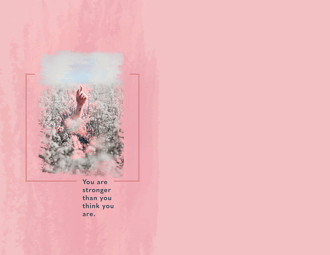
Behance
Photoshop Daily Creative Challenge - Grayscale and Color.
the original photo i used btw
A bit delayed for a zine is in progress...
Challenge #2: haven't wrapped my mind around the 'Zine yet, but I used a gradient mask to turn the painted ladies into a rainbow. I'll admit I could have had finer details. But I thought I got the idea across!
@lucid plover Very cool! I really like the dramatic brush strokes in the color transition. The sharp edges and angles seem to fit with the sports car theme nicely. Maybe the logo at the bottom being a bit more visible could help? I like how you're keeping the contrast of the logo more subdued to keep focus on the car, but I think a bit more could help. Nice job!
@trail field I like the gradual fade in your Day 3 challenge! There's a nice balance in the transitions. Though in the third one it's almost a little harder to tell. I think the transition might need to be more abrupt since the figure is thinner from a side view. Looks good!
@fluid wharf Ooh, really liking the graphic effects in this one! The sunset image adds a really nice pop of color to the design as well. I like how you used the text on the back cover as a sort of abstract graphic element. Very nice!
@bronze bluff Looking good! I like the subdued color with the pop of blue with the text, really nice contrast. The front and back are both looking good, and have a nice balance as a full design too. Really cool textured font style!
@fringe sun Nice use of the textured brushes for the black and white color challenge! The water splash adds a really nice and energetic background for this image. I like the effect of the water in the text too!
@shadow mural Very nice! I like the simplicity of your design for Day 3. There’s a nice visual balance between the photo and text as well 👍
@deep mango Nice balance to this Day 1 design! I like the name of the zine too, hah. There’s a nice stylistic consistency between the text and graphic elements. Both the front and back are looking solid, nice work!
@fallow bough I really like the way you used color in this design! The way the focus and saturation draws the eye to the mural makes for a really powerful effect. The color and contrast at the bottom also helps balance the image out. Nicely done!
@untold iron Interesting color and texture on the Day 3 challenge! The color of the graphic shape and text seem to fit the image well. It’s just a tiny nitpick, but it looks like you forgot a space after the comma before the word “ideal”. I like the sort of hand drawn addition on her head, though it looks a little out of place on it’s own. If you wanted to blend the photo style with the yawn drawn elements it might help to add a couple more to make it more of a solid theme. Just an idea. Nice work 😄
@uncut island Really cool way to frame the design for Day 2! The image in the middle also acts as a nice focal point with the color contrast. Really nice work on the masking around the window!
Heheh, thanks @bleak fossil 🙂
Gave +1 Creative Carma to @bleak fossil
@onyx fable Really interesting style to this Day 3 design! All the elements contrast nicely against the dark background. I'm not sure if you wanted that hard edge style with the flowers at the bottom and the area at the top, though your mask on the palm trees is really clean so I assume that was intentional. It does give it a bit of a cut out collaged feel which I think is cool if that's what you were going for. Nice job balancing the shapes and composition on this one 👍
@rocky kite Nice work, these are looking good! I really like the spread of the ocean scene across the front and back of the cover. Though I wonder if giving the back view a small graphical element, even a little text, if that would help tie the two sides together a bit more. Just a thought. Looking good!
@neat shale The colors from the background tie nicely into the skin tone, it gives it a nice cohesive feel! I also like how the pink area of the flowers almost look like pink clouds. There's a nice mix between the soft cloudy shapes and the more textured brush strokes. Nice work!
I forgot to size my images to fit the zine pages. I'll go back and redo if I have time.
Day 2 Gradient Basics
Day 3 Grayscale
@plain sable Very cool Sno! I really like the cohesive look and style between the different pages so far. It will be really great to see these all come together in a finished product. My only thought is challenge 3 is bordering on being a bit too busy. I feel like it might help to give the eye a place to rest. For example, if you got rid of the "stop racism" image, and moved the "impractical movements..." to the left it might balance it out a touch since there's already a similar image with the raised hands. Just an example. Liking how you're handling the colors!
@eternal mica Nice job ted, I like how you kept the color and design of the text and image simple. The background is so intense in texture and color that the only real way to make it work is with the subdued colors and textures of all the graphical elements. I think the stroke around the dancer helps too. Looks good!
@burnt marten Great effect! It looks so natural and convincing. The gradient has a really nice look to it, and the transition across the houses came out really well. Very nice job on the masking!
@gaunt wagon Looking good! I like the style of this, they all seem to have fairly bold colors which ties them together nicely. Though I feel like the first one could make use a bit more color contrast, maybe a warm gradient instead of the light blue in the background? Maybe something that shifts from blue to yellow or orange to mimic the sunset scheme of the other photos? Just an idea, of course it really just depends what you're going for. Nice work!
Kinda running a bit late on the challenges. Here is my Day 1 submission.
The theme is to show my gratitude towards things I had and also didn't with a combination of pictures and words in a very subtle way. Aiming for a very calm and peaceful vibe with this.
Daily Challenge 200806 - Greyscale and Color
@bleak fossil Sooo funny you said that. I had only sunset colors on the cover and then changed it.😀
@bleak fossil thanks peterson I always appreciate your advice 🙏
Gave +1 Creative Carma to @bleak fossil
Day #3
Thanks @bleak fossil I think it's too much as well, lots to say in a little space, I'm rethinking some of the quotes and graphics
Gave +1 Creative Carma to @bleak fossil
thank you for your feedback @bleak fossil
Gave +1 Creative Carma to @bleak fossil
Challenge so far
Challenge 3. Travel Journal.
PSdcc #3 basic stamps, the grey/colour version
... but I like the dark one a little bit more😀
This is #📣creative-challenges #✂challenges-feedback . challenge no. : 03
@pallid creek Very good drawing/scribbling! Nice with all the different colours, cool. Perhaps without the circle on the right side the design will look stronger. Or make it less pop up.
I made a new version of this one. #📣creative-challenges #✂challenges-feedback
@coral stone Thanks for the feedback 😀 I'll give that a try.
Gave +1 Creative Carma to @coral stone
Day 3 Challenge Grayscale & Color