@eternal mica awesome variations Ted! I like how version 2 and 3 preserved the details on the subject. I also like how they seem to be standing out from the background without losing balance.
About the thumbnail, I absolutely loved the effects, especially that the font is readable without too much going on. Nice job with the consistency of the colors as well 💯
#✂challenges-feedback
1 messages · Page 77 of 1
Very nice @wanton badge! I like the details of the text’s frame. This is totally optional, but if you want, you might lower it and create an overlap on the subject’s head using a layer mask. So the text will be able to appear more on the Instagram Feed. Again, this is totally optional, it already looks great!
Awesome image @tropic knoll! Loved how the font style matches the context of the photo as well. Great job! 💯
@coral stone Thank you, I really appreciate your critique. I didnt realize I lost detail in some of the versions. Which color faces do you think I need to improve? Thanks for the comment on the Thumbnail. That image has been one of my favorites of all the projects I created in DCC.
Gave +1 Creative Carma to @coral stone
thanks @coral stone I really appreciate the feedback
Gave +1 Creative Carma to @coral stone
@eternal mica you're welcome 🙂 You might fine tune the red tones from number 4, so it will bring more details, especially on the midtones 😉
Got it. I definitely see it now.
Thank you, @coral stone!
Gave +1 Creative Carma to @coral stone
IGTV THUMBNAIL--Photoshop daily challenge
DCC: IGTV Image Cover
Day 03 challenge
Day 03 challenge
@supple ledge Great abstract work. I love the shapes and colors👍
Another very impressive work, @hollow yarrow! I loved how you blended the books and how the letters follow the lines created by the them. Amaaaazing work! 💯
@coral stone THanks I appreciate!
Valdair, Thank you for the comment.
I only use two colors on the background, gradient effect. A light color and dark.
Cecilia
@coral stone I took your advice with the extrusion, but I went with a more grey tone with the text...
you were right...white is better for the text 😛
 IGTV
IGTV
Thanks @sterile bane for the feedback!
Gave +1 Creative Carma to @sterile bane
Day 3: IGTV Thumbnail...as if getting lost in fonts wasn't enough, now there's styles?! Scrolling through Styles on the logo, interesting to see how differently each Style effected it.
@tropic haven Nice, the color grading kind of gives it a cold look which is really interesting. My only suggestion is that it might be nice to separate the figure from the background a bit more, either in terms of brightness/value or color/hue. It might give the figure a bit more pop. Nice work!
@sudden hawk I like how you made the background colors fit the color scheme from the photo for the video thumbnail, looks good! I wonder if changing the text to be closer to the hue of the stripe on her hat might be a nice way to give the design a bit more unity. A subtle drop shadow might also be nice to help the text read a bit more. Looking good!
Edit: I saw your update, the yellow text is a nice change!
@runic wing Very cool! The bold colors really give it some strong contrast and kind of gives it a black light/neon lighting effect. Really nice contrast between the colors in the background and the dinosaur too 👍
@fringe sun Really cool illustrated style on this image! I'm often thinking about how to format my content a bit different for Instagram, definitely good to know! I feel like maybe lowering the text a few notches could balance the space at the bottom a bit. Nice work and cool texture 😄
@mild wasp Looking good! I really like the boldness of this image with the complimentary colors. Very nice stylized effect, well done.
@queen dew The duotones are looking good! Really nice contrast between the figure and the background. I like how light the shadows are on the figure, really gives it a bright high key look. Great contrast in this design 👍
@untold iron This looks great! The style and color of the text compliments the photo really well. The bold purple splatter texture at the bottom works well with the yellow text and the gradient transition into the photo works really well!
Challenge 3.
@mossy hazel Looks good! Nice work on the shadow effects and compositing all these together. Though this design might be more suited towards the #📝project-feedback section if it's not for the current series of DCC challenges. Nice work!
@young karma Very nice, I like how it fades into black around the edges to fit that Instagram formatting in a natural way! Really cool work with the rainbow coloring too, hah. Really gives the image an interesting bold pop of color!
@vale sandal This is looking great! With that said this might be more suited to the #💎past-challenge section if this was from a previous set of DCCs. Really great style though, really love how you used that illustrated look to give it a natural blend with all the splatter effects. I especially like what you did with the splatter texture around the ends of the hair. Really cool look to this!
@ruby panther Nice work Shawn, this one works really well with the Instagram style format! The text has some really nice contrast as well. I wonder if it could look good to take the more purple hue of the fireworks and shift the text closer to that away from the more sky blue color. Just a thought, might give the design a nice cohesive feel. Nice work 👍
@bleak fossil Thanks! Great idea, I will give that a go!
Gave +1 Creative Carma to @bleak fossil
Challenge 3. Ver 2. Good idea, Sam!
Such a small change but makes all the difference! It unifies it nicely. @ruby panther
Thank you! @bleak fossil
Gave +1 Creative Carma to @bleak fossil
@vernal ice Hah, so many rabbit holes to go down. This look great! Really nice contrast and sense of dimension. The color scheme has a really cool feel to it as well!
@young karma Nice job, this looks good, also great to see the photos you used with it! This is really just personal preference, but I wonder if giving the background a slight blur might help focus the eye on the inner design a bit. There seems to be a lot of texture in the images overall and I wonder if that might balance it a bit. Just an idea. Nice job making the color scheme cohesive with the whole design 😄
@sharp hedge This image works really well for this kind of format! I wonder if moving the text towards the upper part of the image might balance out this design a bit more and give the figure a bit more focus? Cool styling on this photo 👍
@supple ledge Super cool! Really great to see both formats here and how it was adapted to the IGTV format. This works really well for both formats, and the design itself is awesome. Great colors and shapes. Really nice blend between the photo and graphic elements here. Impressive work!
@brisk spear Formatting looks good! The double exposure effect between the animal and background is a nice effect too. And the orange lettering makes for a really nice pop of color, nicely done!
@bronze bluff Very cool! Really great bold color contrast here. That along with the out of focus background really make her a strong focal point. Though I wonder if boosting her dark tones (while leaving the background alone) with a levels adjustment might add some nice additional contrast and pop to the image. Nice job!
@low garnet Looking good! Always nice to see color variations of these options. The color shift in the original design is looking great too, really natural color change!
@tropic knoll Awesome to see you using your own photo! Really nice cohesive look between the sand dollar and text colors. Really great contrast to this image as well. This works really nicely in this format. 👍
@eternal mica Very nice! It's always good practice to see how you can make the same design fit various formats. Looks good, I like the extended background!
@wanton badge I really like what you did with the colors in this one! The way the graphic box at the top matches her shirt looks great. This whole design works really well for the vertical style IGTV format. Nicely done!
Day 3 - Video Thumbnail
I took the black off. Doesn't really lend it'self to the vertical format of the Instagram banner.
@vale sandal this is beautiful!!
@bronze bluff Very cool! Really great bold color contrast here. That along with the out of focus background really make her a strong focal point. Though I wonder if boosting her dark tones (while leaving the background alone) with a levels adjustment might add some nice additional contrast and pop to the image. Nice job!
@bleak fossil
Thank mr sam Peterson sir I will look back to it and see what I can come up with.👍
Did a tn for my new Insta-account
Nice, @young karma !!
Catching up with the challenge for Day 1, here's my original portrait
And the polished version for the challenge
Challenge 3
@bleak fossil Thank you very much for the feedback, I appreciate it!
Gave +1 Creative Carma to @bleak fossil
Thanks @coral stone 🙂
Gave +1 Creative Carma to @coral stone
Day-03_Video Thumbnail
These colors are great @shy bobcat! Really like how the pink splashes interact with the background and the subject. Well done!
@bleak fossil Thank you Sam. I appreciate your advice
Gave +1 Creative Carma to @bleak fossil
Challenge 2. I got caught up at work and missed it.
Photo Compositing (Challenge # 9) Date July 17, 2020
challenge 3 - igtv thumbnail
Day 03 IGTV Cover
Not done a challenge in a while, it's good to be back 😃 . Here's my day 1
My day 2 using gradient maps
@young karma this turned out great! The font matches the context of the thumbnail very nicely, especially the Analog Photo! Also, I like the black & white tone and and how the red text breaks this mood in a great way without losing its cohesiveness; 💯
Very nice @deep mango! I like how you reduced the yellow tones of the image without losing its atmosphere! Well done!
@obtuse spruce great job adding the gradient in background on the IGTV thumbnail! It really helps to keep the consistency of the image . Awesome job! 😉
@sterile bane youngest was walking the runway as a model 🙂
You did an amazing job playing with the text position @lean badger! I also like how the shapes creates those lines that makes the thumbnail to have a nice reading flow. Great job!
Thanks @coral stone 🙂🙏
Gave +1 Creative Carma to @coral stone
@supple ledge Super cool! Really great to see both formats here and how it was adapted to the IGTV format. This works really well for both formats, and the design itself is awesome. Great colors and shapes. Really nice blend between the photo and graphic elements here. Impressive work!
@bleak fossil Thank you so much! 😁
PS DCC #3 Video Thumbnail
Thanks @bleak fossil for your feedback, much appreciated👍
Gave +1 Creative Carma to @bleak fossil
Tried making a gif for a video.
Gave +1 Creative Carma to @bleak fossil
Daily Challenge 200723 - REDO with blurred Bkg - IGTV thumbnail -- @bleak fossil - Thx for the suggestion.
Gave +1 Creative Carma to @bleak fossil
Thanks 😀 @coral stone
Gave +1 Creative Carma to @coral stone
Thank you, @bleak fossil!
Gave +1 Creative Carma to @bleak fossil
@little root Glad you liked, thank you so much for sharing your work! Very nice colors, Aisha! I really like how they contrast really well. My only suggestion, and that’s just a personal preference, is that you might add a bit more of contrast to the subject’s layer. For that, you can use a levels or a brightness and contrast adjustment layer. Let me know if you need any help 😉 Can’t wait to see more of your works!
@coral stone Thank you for feedback...means a lot. I have a lot to learn... Don't know how to use levels or a brightness and contrast adjustment layer.... i need to learn to try
Gave +1 Creative Carma to @little root
@nimble shard Thank you... but what did you give.... Creative Carma... i am new here ...so don't have much idea
Feel free to ask me when you try @little root
C is a bot that gives point whenever you thank someone 🙂
day3 challenge , need to find the right sizes for Insta
C is a bot that gives point whenever you thank someone 🙂
@coral stone oh ok ...thanks for your quick response... i am just figuring out how does Discord work... will surely get back to you... i am very happy to join here.... i can see that i will be able to learn a lot here with so many mentors here .... thank you once again
Gave +1 Creative Carma to @coral stone
Daily Challenge 200723 - REDO with blurred Bkg - IGTV thumbnail -- @bleak fossil - Thx for the suggestion.
@young karma Excellent Job! I love how you basically created two posts in one!
Gave +1 Creative Carma to @bleak fossil
PS Creative Daily Challenger Day 3
@queen geode Love the animation! Excellent Job!
My Ps CS6 was not saving as a JPEG...so I took a screenshot, cropped and copied, and now its here. Hope you like it. Challenge 3- IGTV thumbnail. Feedback is appreciated and sorry for being late!😣
Thumbnail for a Science video that is
@lethal mural Thank you! for your feedback I didn't realize at the time that videos needed to be at least 1 minute long for IGTV but now I know and will design accordingly. Thank you for the challenge!
Gave +1 Creative Carma to @lethal mural
@young karma ooo the texture here is great! i think the outlined text for "analog photo" is a good choice! since there's so much going on in the background, i think you could get away with simple text for "fotostudio-eindhoven presents" i.e i don't think you need the duplicate of the text behind. it makes it a liiiittttle difficult to read. i think the duplicate text works for analog photo because it's outlined and set apart from the background
@deep mango nice edit! I like how you lowered the saturation a bit. the background is much less distracting now
@obtuse spruce simple and clean design! nice job
@lean badger i like your bold design choice here - diagonals are a great way to make a composition more dynamic. however, i think the fact that the title covers most of the photo is a little distracting - i want to be able to see the photo so i know what the video is going to be about. maybe you could shrink the text a bit and have it running diagonally across the top 1/3 of the design? just so we can also see the photo, too 🙂
@unborn prism this design has great hierarchy! it's clear where i should look first (the scary virus!) and then second (the yellow text in the top left corner). i think the "stay at home" icon could be just a liiiiitttttle bit smaller to keep it from competing with the text in the top left
@covert loom cool composite! to finish out, i would work on cleaning up the blue color around the right side of the island. also, i would add a little more room on the left side of the composition - right now the island edge is a bit too close to the edge of the frame
@slim niche cool! the text stands off of the background pretty well because of the drop shadow. the bottom edge of "WASTE" hits a little too close to the edge of the box IMO
@sand lichen cute! is that your pup? since it's a cover image, i might increase the size of the "agility training" text so the viewer quickly knows what they're about to watch. the "challenge your dog" text is a cool tagline, but it's a little difficult to read without some sort of drop shadow or stroke
@magic rampart nice submissions! keep up the great work 🙂
@tacit condor cool! the text reads pretty well on top of the BG. i might even lighten the color juuuust a bit more - but that's a nit pick
@gilded flame love the text coming out of the window! I personally don't think you need the shadow at the top - the design and text is clear without it
@queen geode very cool!!!!! turning the lights on and off as an animation would be sweeeeet
@queen dew cool template! the text at the bottom is just a tad difficult to read - i think it's because it's overlapping both light and dark areas
@fringe harness no worries about being late! we're not grading you 🙂 i like this color palette and design idea. just be careful that all of the important design details fall within the "safe space" (a 1:1 square)
Always learning. igtv-3.
@young karma nice job making the text legible on top of the photo. I might try playing with the scale of the portrait a little bit and finding an intentional location for the text - right now it feels like the text is sitting right on his beard 😆 I know it's a silly thought, but this is the kind of stuff that viewers think when they see designs
@sterile bane Thanks for your comment and the text on the beard really looks a little comical.
Gave +1 Creative Carma to @sterile bane
@sterile bane thanks for the feedback i will keep that in mind next time
Gave +1 Creative Carma to @sterile bane
@sterile bane that is a brilliant idea thank you so much for the advice!
Gave +1 Creative Carma to @sterile bane
@sterile bane thanks for the feedback, I will change the text at the bottom👍
Gave +1 Creative Carma to @sterile bane
Day 1 - Polishing Portraits
Fui, covid. Abraço. #psdailychallenge #📣creative-challenges
Day 4 - Custom Posture
Before
After
I definitely have to play around with this tool more, as her legs look a little warped
Day 2 - Color Grading.... I like the solid color adjustment layer much better. It seems to keep the sharpness of the image better than the gradient map does.
This one I used the same base colors but still ended up with pretty different results.
Photoshop Daily Creative Challenge # 3 - IGTV Video Thumbnail (23-Jul-2020). Happy to improve my learning curve. Very interesting session. Your feedback is highly appreciated.
Day 4
PS DCC #4 Custom Postures (added a little extra from an old PSDCC)
Challenge 3, IGTV cover
When we are given files to work on are we allowed to post those in any site that we choose such as flickr for example to showcase the work that we did on them? I'm not sure what the rules are for that
Repost after using some levels to brighten the artwork. The image appears darker once I post it. I'm checking to see if this is an optical illusion....? Possibly my monitor is set to show things lighter...? Excuse my experimentation. 😅
The original statue. Relocated her arm & rearranged her face. Was going for facepalm, but the original photo just didn't have enough detail.
Day 4 - custom postures. In this case, mostly her wings. Her arms got distorted trying to move her head and the bird cage got all warped trying to move her right arm. When one looked good, the other looked terrible. (original is on the right)
Day 4 - Custom Postures. Thought I would try something a little different. I really did not like the blinds So I edited that also.
Challenge 2
Challenge 4
@buoyant nova Very nice job boosting the cool tones, Susan! The saturation values are looking even, bringing even more consistency for the subject and the background. Nicely done!
@hallow sedge Well done, Pedro! I like how you added more assets to give an ambient to the scene. If you can, please upload the original image of the subject, that would be easier to see your adjustments 🙂 You might increase the realism of it by creating a color balance adjustment layer for the subject and add more blue and cyan tones for its shadows, midtones, and highlights, since he is placed on an atmosphere that these colors are predominant, naturally he would start to reflect the same tones. You can also use the same technique for the rocks near him. Let me know if you need any help 🙂 Abraço!
Thanks @coral stone, appreciated 😀
Gave +1 Creative Carma to @coral stone
@untold iron Nice edits, Jae! I like how you played with the puppet warp without creating an unnatural posture, the liquify adjustments are on point as well. 👍
Thanks 🙂 @coral stone
Gave +1 Creative Carma to @coral stone
Not easy to make it believable😅
This turned out great @young karma ! Loved how the edits made the subject look like its moving faster. The masking is looking very good as well! I wonder if rotating him clockwise just a little bit would make like his foot is really on the ground, since he is a bit smaller than the one from the left. Nicely done!
@young karma that is extremely impressive! Great job!
Thanks @fresh swallow!
Gave +1 Creative Carma to @fresh swallow
Photoshop Daily Creative Challenge # 4 - Puppet Warp (24-Jul-2020). This was really challenging. I am so glad that I learned something NEW.
That’s very Olympic @indigo monolith ! I hope that this photo wasn’t taken by someone on a train 😄. I loved the way that you were able to mask her, especially that she seems to be a little blurred. You did a great job on the subject removal as well. About the warp, you might fine-tune the pins to see what looks more natural. Well done!
#psdcc Day 4 Posturing
This is great @eternal mica! Loved the edits that you made, especially how it looks like it was a combination of multiple images. I also like that you added some shadows. One thing that you can do is set their blend modes to Multiply. if they are already in Multiply, you can try to darken the gray areas just a bit more, so they will look darker but won’t lose its transitions. I'll give you a link to a video from Jesús, where he teaches how to use the 3D features to create realistic shadows (I know that you like to use the 3D in Photoshop, so I thought you might enjoy it).https://www.youtube.com/watch?v=EJ7UAzFv17c Awesome job!
In this tutorial, you will learn how to make realistic shadows in Photoshop.
Getting shadows right is extremely important in compositing.
Realistic natural shadows will make your subject fit better within the scene make the whole composite more cohesive.
One of the most di...
@north ridge very cool edits! I also like the solid color version, it seems like it has kept the shadows and highlights better. If you want the same effect on the Gradient Map, you can fine-tune the sliders and the colors for the shadows, midtones, and highlights, playing with the bigthness of them. It takes more work but gives you more control. Excellent job! 💯
Lovely work @little root! Loved the tones on the background of your thumbnail! My only suggestion would be to reduce the white glow behind text just a bit, so the viewers won’t be distracted by it. You don’t need to remove it, just reduce the opacity or position it closer to the text, this way you won’t lose contrast.
Great job playing with the posture with the puppet warp too as well! He looks like he is jumping from one area to another.
@coral stone WOW, the Multiply BM made a huge difference. It brought the shadows to life and made the whole image pop. I had to re-do some erasing to increase the fade effect. Thank you for that advice. That tutorial by Jesus is one of my favorites. I think Ive watched it 3 times already. I think Im ready for #4. Its a lot like what he's doing in the current DCC, where he explains the technicalities behind the processes, so that we can understand what we're doing.
Gave +1 Creative Carma to @coral stone
This is super cool @queen dew! Did you use a gradient map for the background? I loved the blue tones of it. Perhaps you might add a shadow to the subject, just the enhance the realistic look of it. You can use the original image as a reference. 👇 😉
Loved that you used the pixel stretch effect @tacit condor! I like that although this is an effect it has created a nice sense of movement for the image. Awesome work!
This is looking very nice @sacred field! I like that you added a snake creating a story for the scene. I also like the color adjustments you made to the image giving warmer tones to it. Well done!
Very nice @split pier! Don’t worry, it was looking a bit darker ;)
Loved the thumbnail, my only suggestion is a personal one: If you are promoting a brand, you might make the product labels more visible. For that, you can position the image a little higher and the text lower (be careful about the Instagram feed cropping the text). Well done!
Super cool work @tropic haven! I loved how you played with the puppet warp, the dog seems to be climbing some stairs. I like that you cared about his head position to enhance this impression. Great job!
Nice photo @deep mango! I like the subtle adjustments that you made. This would turn into a great gif 😉
Loved the new background @arctic rover. The new posture makes me think that the statue just woke up hah. Great job as always!
Nice results @compact pecan! If you want to move just the wings without moving the arm, you can create some extra pins on the arm so it will prevent that this area to move when you apply the distortion with the puppet warp. Well done!
cover
@sweet fern this turned out awesome! Loved how you changed the background, it really helps the focus to be on the element from the front. Great job with the puppet warp as well. Fantastic!
@fickle garden beautiful work! Loved how you played with the contrast, making the background as a secondary element for the composition. Well done!
Hi @queen geode one thing that you can do is to create a project on Behance using the challenge works. Here's the link for the curated gallery in case you want to get inspired: https://www.behance.net/galleries/challenges

Browse curated community projects and get inspired to take the daily creative challenge
@coral stone thank you for the help!
Gave +1 Creative Carma to @coral stone
@uneven grove wooow this is great! Loved how you blended the subject to the new scene. If you want, you might reduce his contrast, since the people around him don't have much contrast. For that, you can use a levels adjustment layer or even a brightness and contrast. This will enhance the realism of your work. Awesome job!
@uneven grove wooow this is great! Loved how you blended the subject to the new scene. If you want, you might reduce his contrast, since the people around him don't have much contrast. For that, you can use a levels adjustment layer or even a brightness and contrast. This will enhance the realism of your work. Awesome job!
@coral stone Thanks so much for the insight. I'll try adjusting the contrast.
@young karma This is amazing, Hella! Loved that you replaced the sky, especially the way that you kept the details like the tree and the pole. You did an excellent work with the puppet warp as well 💯
Challenge 3 I used the blend mode (soft light) to create this devious looking double exposure effect.
Day 4: Custom Postures Any advice at all, does anything look off?
Here is another one. I refined the exposure. I feel like this version looks much better. What do you guys think?
Day 3 - IGTV Post
Day 04 challenge
@coral stone Thanks, Valdair! 😀
Gave +1 Creative Carma to @coral stone
Day 3 Challenge
Thanks for your advice @sterile bane
Gave +1 Creative Carma to @sterile bane
Day 4 - Custom Posture
Heheh, thanks @coral stone 🙂
Gave +1 Creative Carma to @coral stone
Thanks for the feedback @lean wind , I will do this.
Gave +1 Creative Carma to @lean wind
Daily Challenge 200724 - Custom Postures
Model from AdobeStock and used in Jesus Ramirez’s PTC Puppet Warp Tutorial
Day-1 Portraits
@buoyant nova Nice work Susan, this adds some really nice contrast and vibrancy and still looks really natural. It definitely gives the image a bit more pop. Nicely done 👍
@hallow sedge Really nice! I love how far you pushed this image with the background and compositing different items on him. Also very cool to see how far you pushed the pose with the leg all the way back. The back leg does look like it got a little distorted, I feel like using the Liquify tool to push the lower shin area a touch towards the right of the image might straighten out that shin bone and look more natural. Really nice work with this one!
@untold iron Very cool! The posing change is looking solid. The only thing I notice is the warping seems to have either shortened the thigh or elongated the lower part of the leg on the right side. I feel like if you selected the whole leg and moved the knee slightly down and to the right it would even out the proportions a bit. Looking good!
@young karma Nice work, I really like how far you pushed this pose! Kind of make it looks like he’s running through the finish line at the very end of a race, really leaning into it. The only suggestion I would have would be to use the Liquify too to push the top of his thigh on the right up a bit to round it out. Currently it's sinking inward a bit, and the top of muscular thighs should be rounded outward a bit as you can see in the original image. Might make it look a bit more natural. Nice work!
@indigo monolith Cool photo for this one! I like the idea of really pushing the curve of the spine like you did. I think her legs look a little warped because the lower part of the calf right above the ankle is bowed where it should be more straight. If you used the Liquify tool to push that area down a bit it might look more natural. It also looks like her legs and feet area got a bit distorted. Not sure if this happened during the masking or warping process? Either way the effect is looking good, nice job 😄
@eternal mica Nice ted, cool to see you combining these images! Also very cool to see how far you pushed these poses. I think the Liquify tool could do a lot of good to fine tune some of the distorted areas. Such as the thigh on the left side of the very left figure, making the top of her thigh rounded out instead of sinking inward, and pushing down the back of her arm on the right side a bit. You could probably also use it to get rid of that pinch point at the elbow in the center figures arm on the right side. But overall it’s looking really solid, nicely done!
@north ridge Really cool to see these different variations of the Day 2 challenge! Always great to explore different approaches like this. I think gradient maps have a lot of potential and power, but they can also drastically change the values of an image so they can be a bit tricky. I definitely like the contrast that is maintained in the solid color image, though the soft contrast of the gradient map image with the green background has a really cool stylized look in its own right. It seems fitting for something that drastically stylized. Nice job!
@little root Looks good! My only suggestion is I think with all the vertical room available it might look to separate the dog and the text a bit more. I also think content aware fill could fix the background seam on the left pretty nicely, and any touch ups could be done with the clone stamp or even a soft round brush. Nice work!
@queen dew Very nice, good work with the puppet warp and posing! The two different backgrounds are cool to see, it could be interesting to tweak the color grading of the runner in the first one to make the lighting on his front side cool instead of warm. The only real suggestion I have with the runner is the dip in his stomach looks a bit unnatural. Maybe using the Liquify tool to push it outward slightly would give it a more natural shape. Just some thoughts. Good job 😄
@cold oyster Really interesting take on this challenge! I like the trippy sort of repetition of the image, the alternate color really helps it contrast and stay readable. The only thing I might suggest would be that you could clean up the mask on his forearm a bit. Really cool style to this design!
@young karma Impressive work! You did a great job with the puppet warp here. I think the big difficulty is keeping the posing looking natural and these all look really solid! Really nice use of the ball placement to mix it up too, nicely done!
@covert loom The day 1 challenge is looking good, nice work on boosting up the vibrancy of the whole image! It has some really nice contrast and pop against the background. I kind of feel like the pants could probably be a bit toned down, the saturation is bordering on unnatural looking, and toning it down might also help keep the focus on the face. Looks good!
@fluid wharf Challenge 3 and 4 are looking really good! I Challenge 4 is looking really solid, I'm impressed how far you pushed the bottom pose and still kept it believable and natural looking. I assume the blurred stroke around the image on the right was a stylistic choice, and if so it might help if it was a bit more apparent around the whole figure to make it look more consistent. It could also be nice to see a little more of the face gradually blend into the forest scene in the double exposure image. Kind of a more gradual transition that shows a bit more of the portrait. Just some general thoughts, great work!
@north ridge Really loving that motion blurred effect for Day 4, really nice idea! The adjustment of the back leg and dipping of the head between each frame really gives it a great sense of motion. Very nice!
@plain sable Very nice, is this challenge 4 for a previous DCC? Either way it's really cool to see how you turned this into a poster style design. The contrast of the dark figure against the light background has a really strong silhouette that works well. It might be cool to give the text a little outer glow to match the flame in her hands, and maybe even boost the flames on the text up a bit with something like a color dodge layer to give it more of a glowing look. Nice work!
@bleak fossil Thanks for the feedback, really appreciate it 😀
Gave +1 Creative Carma to @bleak fossil
nice challenge!
challenge number 4 done
Day-04_Custom Postures
@bleak fossil thanks for the feedback, will try and change the colour grading of the runner👍
Gave +1 Creative Carma to @bleak fossil
Day 4 - Custom Posture
@north ridge nice movement, a few more steps and it's like an animation👍
Lovely work @little root! Loved the tones on the background of your thumbnail! My only suggestion would be to reduce the white glow behind text just a bit, so the viewers won’t be distracted by it. You don’t need to remove it, just reduce the opacity or position it closer to the text, this way you won’t lose contrast.
Great job playing with the posture with the puppet warp too as well! He looks like he is jumping from one area to another.
@coral stone Appreciate your feedback.... will try to work on your feedback.
@little root Looks good! My only suggestion is I think with all the vertical room available it might look to separate the dog and the text a bit more. I also think content aware fill could fix the background seam on the left pretty nicely, and any touch ups could be done with the clone stamp or even a soft round brush. Nice work!
@bleak fossil Appreciate your feedback.... will try to work on your feedback.
This is super cool @queen dew! Did you use a gradient map for the background? I loved the blue tones of it. Perhaps you might add a shadow to the subject, just the enhance the realistic look of it. You can use the original image as a reference. 👇 😉
@coral stone I used blending mode with a solid blue layer beneath it, gonna make some shadows👍 thanks for your feedback @coral stone
@coral stone thanks for your feedback about the shadows.
Gave +1 Creative Carma to @coral stone
Custom Posture, comments welcome..
@indigo monolith Cool photo for this one! I like the idea of really pushing the curve of the spine like you did. I think her legs look a little warped because the lower part of the calf right above the ankle is bowed where it should be more straight. If you used the Liquify tool to push that area down a bit it might look more natural. It also looks like her legs and feet area got a bit distorted. Not sure if this happened during the masking or warping process? Either way the effect is looking good, nice job 😄
@bleak fossil thank you Sam. I agree that the lower leg got distorted in the warping phase. I couldn’t seem to get it back to normal, but I can definitely try using the liquify tool.
day 4 challenge, with changes in colour and shadows
@young karma Impressive work! You did a great job with the puppet warp here. I think the big difficulty is keeping the posing looking natural and these all look really solid! Really nice use of the ball placement to mix it up too, nicely done!
@bleak fossil -- Thx, I had to tweak things a bit with clone stamp and liquify to get the model versions more believable. (fyi, its a hat rather than a ball but its small and hard to see at 2am)
Thanks @bleak fossil for the suggestions and this is for this DCC #4 video thumbnail 🙂 Just used a technique from a previous challenge.
Gave +1 Creative Carma to @bleak fossil
Another pass at challenge #4, whoops I mean #3
I haven't been keeping up with this week but when I saw the last challenge was puppet warp I had to try it! I've learned how to use the perspective warp by watching @lethal mural yt channel before but I never tried out the puppet warp on a person before so this is the first time I've done this! Was kinda aiming for super powers type of vibe for this one 😁 https://www.behance.net/gallery/101333161/72520-Photoshop-Daily-Creative-Challenge-Day-4

Behance
Photoshop Daily Creative Challenge - Puppet Warp. This is my first time using the puppet warp on a person too.
Challenge #4 Custom Postures
Custom Postures Day 4
The hand looks awkward
took a little while for me to get the hang of the pins and how they manipulate the mesh, but I finally got it 😄
original image is on the right...Mr. Owl finds interesting trash
I learned something new as always! It is comforting to not know everything...
Decided to try Day 1 (Polishing Portraits) again. What do you think? This is the original
Edited
Challenge #4. Apparently running on the sand is a "struggle"!!! 🤪
Challenge 4
@fickle garden Title of this artwork should be: 'One of Us is Not Like the Other' 😄
LOL @fresh swallow
I like that coloring on the purplish sheep 😛
Yes, everyone is welcome to make fun of it. I am sure, it has no emotions. LOL😂
lol Being different is better than being part of the 'herd' 🙂
Well, you might wanna ask that sheep how it feels about it.😂
Challenge 4. Custom Posture. Meet Gorilla, guardian of a fabulous pumpkin patch. This image is mine. Doing the puppet warp was easy and fun!. Filling in all details was Whew! I tried. I do see the benefits of having a subject against a solid background. Thanks to all for this opportunity!
day2: duo-tone
@tropic knoll Very impressive how you were able to manipulate that image. It looks very believable.
very nice, small tip is that now that his arm is moved, the shadow on his leg will no longer be there
but fixing that would be tricky given the pleats
@fickle garden Thank you!! 🙂
Gave +1 Creative Carma to @fickle garden
@eternal mica Nice ted, cool to see you combining these images! Also very cool to see how far you pushed these poses. I think the Liquify tool could do a lot of good to fine tune some of the distorted areas. Such as the thigh on the left side of the very left figure, making the top of her thigh rounded out instead of sinking inward, and pushing down the back of her arm on the right side a bit. You could probably also use it to get rid of that pinch point at the elbow in the center figures arm on the right side. But overall it’s looking really solid, nicely done!
@bleak fossil Sam, thanks for that critique. Its going to sound strange but, Im happy to get that from you. To me, receiving that level of critique means Im making real progress. I "liquified" the areas you pointed out, and a couple of other small tweaks I thought could use it. How do you like it now?
For some reason (idk what it is) the back leg keeps coming out longer.
@gaunt wagon I love that blur effect!
@fresh swallow Thanks
Gave +1 Creative Carma to @fresh swallow
Day 4
very nice
hello
day3
hi. may i know what's the ongoing challenge
DAY4
day 2 colour grade 😄
Thanks, @eternal mica!!
Gave +1 Creative Carma to @eternal mica
#day4 puppet warp challenge 😅 with a lot more than just puppet warp
Thank you @sterile bane for your feedback 🙂
Gave +1 Creative Carma to @sterile bane
Day 4 Challenge
I didn't know how to edit the mask to make the background less harsh . and how do you undo a bad puppet pin, I ended up with stub legs
this was original
I didn't know how to edit the mask to make the background less harsh . and how do you undo a bad puppet pin, I ended up with stub legs
@safe ledge - - You can only undo a few times, to delete an individual pin you can select it and press delete or hold alt and click the pin. However, sometimes this may change adjustments made to nearby pins.
@soft arch loved your cover! Red and White colors turned out into a great combination. I also like the cyan style of the text which helps to match the dark blue frame and the Photoshop logo. Well done!
Very nice @young karma! Loved how the blur enhances the movement of the subject. Here's one thing that you might try for the lightings on the one from the left: You can use the puppet warp tool to warp it around the subject kind of enhancing the energetic movement that it already has. Just an idea, of course 😉
Great colors @buoyant nova! I loved how the subject has some gold tones with high contrast, preserving the shadows and highlights. The blue tones on the background were a great choice to make the subject stand out from it as well.
Day 3 is looking very consistent! The organic lines from the text match the blue muted tones of the thumbnail really well. Nicely done!
@gilded flame this is super cool, Nadia! I like how the subject on the left seems to be crossing the finish line. My only nitpick would be to refine the layer mask on this area of the hand 👇 (you can use a very small brush with black as your foreground color). It will make the edges look even more consistent throughout the subject. Well done! 👍
Day 04
@compact pecan Really liking the sort of dark psychedelic look of the cover image! Also really cool to see you really pushing the colors so drastically in the first day’s challenge. My only thoughts are that I think the colors almost seem a little separated from each other. I wonder if a subtle cooling photo filter or some kind of cool color lookup could give everything a slightly cool tint to make it fit the scene and unify the colors a bit more. Maybe even darkening him down to fit the lighting of the scene a touch (even if it’s just around the lower half) could help too. Just some thoughts, nice work!
@bleak fossil I tried LUTs but they were a bit drastic, so I applied a cooling filter and darkened it a little, and then applied a levels adjustment with a vector mask with gradient to darken the pants but not the top. Do you think this looks more realistic or the colors less separated from each other? Thanks again for the advice!
Day 3 - video thumbnail. (I'm running a little behind on my challenges this time around).
Thank you very much @coral stone really appreciate your comments 😀
Gave +1 Creative Carma to @coral stone
Missed the first video. So I did the Behance page (and made a challenge page) today.
thank you @coral stone 😃
Gave +1 Creative Carma to @coral stone
Day 4
Challenge 04- Custom Postures. Feedback is appreciated as usual. Hope I've done it correct. Used Puppet Warp and Content-Aware Scale to just resize him without overstretching as he got a little too short😏
@blissful wolf Looks good! Really natural adjustment on this Day 4 challenge. The color shift adds an interesting feel too. I think there's a super slight white halo around the figure on the right, but that's super subtle. Nice work!
@cerulean beacon Looking good jane! I like the different color variations on Day 2, the first two have a really interesting stylized look. My only suggestion is I think the saturation on the Day one design could be tweaked down just a bit. The colors are bordering on unnaturally saturated. Though the overall boldness and added contrast is looking good 👍
@fringe harness Very nice! The posing changes for Challenge 4 are looking good! Nice job with the color shift as well. The only thing I notice is the foot on the left side looks like it was lost a bit in the masking process. The quality of the edited image also seems noticeably more fuzzy, but not sure exactly what would have caused that unless it was scaled down. Nice work 😄
@blissful wolf Day 2 and 3 are looking good! Nice color contrast going on in both of them. Gives both images a really strong focus. I like the more subtle yellow/orange tint in the Day 2, gives him a fairly natural look while still having strong contrast. Nice work!
@safe ledge Very nice! It gives the image an interesting, slightly stylized look which seems to work well with this image. The sort of red/green tones create a lot of nice contrast too. Looks good!
@young karma Nice work! I really like how you warped the logo to fit the sphere of the moon. It could be nice to make the "Creative Challenge" text the same shade of red to give the whole image a nice unity and balance to the color on both sides of the image.
@compact pecan Yeah, that's looking good! Definitely seems to fit more into that scene with the adjusted lighting.
The Day 3 effect is looking really solid too! I really like how you added the glitch effect to the title text as well as the text. The tv and text color create a nice unity too, really has some nice contrast against the white background. 👍
@bleak fossil Thanks for the advice 😀
Gave +1 Creative Carma to @bleak fossil
day 1,2,3 skin retouch color grade and double exposure all in one 😂
@@bleak fossil , thank you for your feedbak
Gave +1 Creative Carma to @bleak fossil
Thank you @bleak fossil ! Actually I'm on CS6, the dang old version. No Select Subject or any modern Ps tool. And my quick selection tool was too big. So I used the one of the most un-zippiest ways-the Magnetic Lasso Tool. But I had scaled it up, not down. So dunno what happened. Anyway, thanks for the feedback.
Gave +1 Creative Carma to @bleak fossil
Day-04_Custom posture_2
Fui, covid. Abraço. #psdailychallenge #📣creative-challenges
@hallow sedge Excellent Job! I love the background and the space helment you added!
DCC10 04 200724 Assets and Puppet Warp
@eternal mica Great job on the Warping. I would consider working on the shadow a bit. If you look at the original image there are hardly any shadows. I would use the original image as a guide and place the shadows in a similar way.
Day 4
@cold oyster Great job! I love the colors and the idea of using the same image twice
Challenge 1
@fickle garden No worries! It looks great! Thanks for sharing!
Gave +1 Creative Carma to @fickle garden
Day-04_Custom posture_2
@unborn prism Great work! I love the colors you used!
Thank you so much @lethal mural
Gave +1 Creative Carma to @lethal mural
Thanks @bleak fossil My file was corrupted so I started over from scratch here is my new work.
Gave +1 Creative Carma to @bleak fossil
Thank u @coral stone 👍 , should be better now 🙂
Gave +1 Creative Carma to @coral stone
Hello everyone 😃
Hi all! Looking forward to seeing your challenges for today 😄
Challenge 5 rock effect
day5 , perhaps the rock surface a little bit too flat to get a good depth?
I'm a bit behind but here is my Challenge 1 😄
@queen dew maybe if you remove the background, and play with the shadows some more, it would pop out.
@slow stirrup thanks for the feedback, will play with bg and shadows👍
Gave +1 Creative Carma to @slow stirrup
Rocks!
Still catching up. Here is my Challenge 2 (hope the quality is okay now):
My Pendant
Text effects day 5
Challenge #5
Here's my today's DCC. Any feedback appreciated.
Day 5. Rock Text Effect. R as in Rawk n Roe! 🤟


Thank uu @slow stirrup
Gave +1 Creative Carma to @slow stirrup
Custom Posture Challenge
Nice colors @fallen trail! I like how you played with the colors and the high saturated look of them. The yellow and green tones from the background don’t let the overall image look busy. Well done!
This is cool @blazing quail! Loved the organic edge from the letter. The bevel and emboss combined to the drop shadow, gave you great results separating the letter from the background. Nicely done!
Photoshop Daily Creative Challenge # 5 – Text Effects (27-Jul-2020). This was fun to do. Once again loved the session. Your feedback is highly appreciated. These challenges are helping to learn Photoshop, Thank you @lethal mural
Awesome improvements @queen dew! The PM are looking great, especially the way that you played with some missing parts and gave the edges a “broken” style. The M is definitely more readable now and I like how it has contrast. Maybe you might reduce the opacity of the drop shadow just a touch so it can be more subtle but still able separate the M from the background. Just a thought 😉 great job!
Really nice work @lean badger
@untold iron thank you 🙂 😃
Super cool edits @slender moat! I like how the background is a bit darker, making the subject stand out from it a little more. The saturation adjustments are looking very well balanced. Nice work!
A little more difficult and troublesome than it appeared. For some reason, the Flintstones theme keeps going through my head.
@little root Glad you liked, thank you so much for sharing your work! Very nice colors, Aisha! I really like how they contrast really well. My only suggestion, and that’s just a personal preference, is that you might add a bit more of contrast to the subject’s layer. For that, you can use a levels or a brightness and contrast adjustment layer. Let me know if you need any help 😉 Can’t wait to see more of your works!
@coral stone Could you please help me understand how to make the suggested change, thanks
Just saw your day 2 😃 @slender moat it’s looking pretty nice. Maybe you could recover the contrast on the background, especially the highlights, for that, you might fine tune the white point color (if you used a gradient map adjustment layer).
Hi @little root of course! Just a sec 😀
DCC10 05 200727. When I tried to save the psd file, i kept getting a message the file is locked. So I dont think I'll be able to edit this.
Here's my text effect for Day 5 🙂
This challenge was fun to do. Still a lot of work to do but very educational
👍
@fringe sun very cool and creative. Love it!
@slow stirrup Suggestion, different color BG to help the image stand out more.
@coral stone Could you please help me understand how to make the suggested change, thanks
@little root Check the #❓ask-a-question channel 🙂
This is very creative @bold valley! Really like how you played with the letter edges especially the top left part of the R. Perhaps you might add a drop shadow on the chain as well, just to sell even more the effect. Well done! 👍
Great work @tacit condor! The pieces are looking very consistent. The subtle diagonal lines add a great context to the composition. Nicely done!
Nice approach @hot thicket! If you want to take a step further, you can play with displacement maps to enhance the effect that the words are wrapping the rock. Also, if you want a engraved style you can play with bevel & emboss. This is totally a personal suggestion, of course 🙂 Good job!
Day 4
Great job @plain sable! Loved the organic edges of the letters, especially on the S and N where it seems that they have a transition on the lines, from thick to thin. The color on the background is looking super cool as well! i like how it is very consistent to the tones of the rocks.
This is amazing @iron flicker. Loved the circular shape and the splatters on the sides, how did you add them? The text is looking great as well. My only suggestion would be to fine tune the contrast of it just a bit, maybe a drop shadow on the text or some lighting adjustments on the background would be great. This will make the word stand out a little more 😀. Fantastic job!
Challenge 5. Text Effects. Image credit: NASA/JPL-Caltech/SwRI/MSSS. I was inspired to try to write a word across a planet. After several tries, I feel I may be onto something. This challenge isn't as easy as it looks! Thank you for this opportunity!
Challenge 5
@coral stone thanks for your feedback! I'll make those tweaks for sure 😉
...Loved the circular shape and the splatters on the sides, how did you add them?...
@coral stone I put rock texture layer under the sphere layer, masked it out and used dispersion brush to make that splash effect 😉
Gave +1 Creative Carma to @coral stone
That's awesome @iron flicker! These details make a huge difference! Thanks for sharing 🙂
Gave +1 Creative Carma to @iron flicker
@sacred field great job with the edges, Marc! I loved the organic look of them especially the sharp ones. 💯
Loved the contrast between rocks and water @young karma! The textures on the letters are awesome. I also like how the circular ripples on the water make the D and B receive total attention in the composition. Well done! 👍
@coral stone Thanks, Valdair! It's a great technique, but I’d hate to write a whole letter that way! 😜
Gave +1 Creative Carma to @coral stone
Beautiful composite @lean badger! I really like the color grading of your image! Just a few points of feedback:
- You might boost the contrast of the wolf, so the shadows and highlights will look more consistent with the one of the subject and the background. If you need help, you can create a 50% Gray (#505050) Solid Color adjustment layer on the Color blend mode. This will make your image black & white, allowing you to see just the luminosity values removing the distraction of the colors. Then you can analyze the darkest and lightest points of the background and with a Levels (it can be Curves) adjustment layer clipped to the wolf's layer establish the same values on it adjusting the sliders.
- You can use a brush to create an occlusion shadow on the paws from the back so it will help you to sell even more the realism of your image. There is a link on #🔨resources for a stream that Sam did a few weeks ago, where he shows how to create shadows (You might check the basketball ball example).
Keep creating, Yazan, you're doing great!
Loved the black and white composition @slow stirrup! The edges are looking very nice and I like how the high contrast of the image matches really well the overall composition. Well done!
Nice job @chilly hawk! I like the gradual movement that you made with the puppet warp 🙂
@untold iron woow this turned out great! I loved how you created a 3D style on the words. The edges are looking awesome as well. My only nitpick would be to align the texts to the center, right now they look a bit more to the right 😄 Excellent work!
@little root you're doing great, Aisha! I loved the effect on the edges of the letter. I also like how the shadows seem to have a darker tone from the fill of the letter. Super cool job!
This is looking pretty nice @sweet fern. I like how you played with the effect on the edges in the same time as you preserved the readability of the letters. The hard shadow enhances the high contrast against the background, adding even more depth to the image. Great job!
@little root you're doing great, Aisha! I loved the effect on the edges of the letter. I also like how the shadows seem to have a darker tone from the fill of the letter. Super cool job!
@coral stone Thank you so much .... Your comments really inspire me
@tropic knoll I think it's off to a great start! Good job 😄
@eternal mica this is looking great, Ted! Really like your font choice, it has some blackletter style, especially the B! My only suggestion would be to reduce the spread of the drop shadow just a bit, and maybe its opacity, so it will be more subtle allowing the letters to stand out a little more. Well done!
Great job @deep mango! Loved the 3D look of the letters. The background solid color is looking nice as well and I like how the word Solid is a brighter tone of it, keeping it even more consistent. Nicely done!
Thank you, @fresh swallow!!
Gave +1 Creative Carma to @fresh swallow
Thanks @coral stone
Gave +1 Creative Carma to @coral stone
That's a beautiful approach to the challenge @queen aspen! Loved how the irregular edges make the illustration look consistent when compared to the shape's fill and the background. Awesome work!
@coral stone thanks Valdair. I'll try to recover the file to make the adjustments you suggest. My psd file was locked and I couldn't save it. I have the jpegs. Let me see what I can do.
Gave +1 Creative Carma to @coral stone
Having fun not sure what road got me here 🙂
Day 5 Text Effects
Awesome work @compact pecan !
@eternal mica this is looking great, Ted! Really like your font choice, it has some blackletter style, especially the B! My only suggestion would be to reduce the spread of the drop shadow just a bit, and maybe its opacity, so it will be more subtle allowing the letters to stand out a little more. Well done!
@coral stone I had to recreate the image, so its not exactly what I posted the frst time. I did tone down the Drop Shadows, making them much more subtle.
Day 5: Using David Clode's Snake skin from Unsplash.
Daily Challenge 200727 - Stone Text Effect
Challenge #4. (The original image is by Jasmin Chew on UnSplash.)
I used puppet warp and liquify on this but I'm not finished yet. Should I show more movement in the hair?
@young karma I love how the shadows create depth . The vignette and spot light gives the composition a great ambiance. Also, the texture on the letters look very nice.
Glad you like it, and thanks. @fickle garden
Gave +1 Creative Carma to @fickle garden
@coral stone Thanks so much. I will make that update 😀
Gave +1 Creative Carma to @coral stone
Updated
Daily Challenge 200727 - Stone Text Effect
@young karma wow this looks so good
@gilded flame The longer stride of the legs and the lean of the figure are looking good! Looks really natural. The only suggestion I’d have is that because the front leg is lower down than the back leg it makes it appear as though it must be closer to the camera. Which would mean it’s crossing over in front of their body to the other side. If that makes sense. To fix it you’d just want to make the area directly below the feet where they would connect the ground to be lined up horizontally like in the original. Also nice work with the shadows as well!
@uneven grove Really interesting stylized colors in this! It’s an interesting mix of realistic and bold/neon colors. I like the effect in the hair, nice work!
@blazing quail Very nice! The irregular shape of the edges of the stone is looking good. It could be cool to make the drop shadow from the text match the lighting of the rock a bit more. Maybe have the shadow a little lower to the right and maybe give it a harder edge to mimic the shadows that direct sunlight would have. Just a thought. Good job with this design!
@queen dew I think the angular shadows in Jesus’ image work well, but it would be interesting to see this design with more of a soft edge transition instead of the small sharp edges, I think that might fit this rounded rock surface a bit more. The PM looks really cool too, Kind of liked broken letter tiles.These are interesting images to try it with, nice work!
@slender moat Very cool, better late than never, we still have a whole week to go. This is looking good, the Day 1 design definitely gives the image a bit more boldness and contrast. I like the stylized look to the Day 2 design as well. Looks good 👍
@bold valley Really interesting, is this a gold texture of some kind? It’s a bit hard to identify the texture, I think because it seems so zoomed in. Maybe if it wasn’t so close up the texture would read a bit more clearly. Either way it’s a really cool effect, nice work!
@tacit condor Really cool idea for the Day 5 challenge! The bevel works really well to complete the tiled rock effect along the outside edge. Looks really convincing, nice job cutting out the shape of the stones!
@plain sable This turned out really well! I love the texture and color of this rock. The soft bevel edge works really well with the particular texture too since it seems a bit smoother. Well done!
@iron flicker Really cool idea! Loving all the texture on here. Great job with the shadows to give this a convincing spherical effect. I wonder if it could look good to add more of a fisheye perspective on the text by making the top and bottom bow outwards a bit. Could be a cool effect along with the perspective of the sphere. Great work!
@sacred field The Day 5 rock effect is looking really good! Very nice sense of dimension with the bevel, and the jagged part of the rock add an interesting organic look to it. Nicely done!
@young karma Nice work, challenge #5 is looking very nice! I like how the sheen on the letters almost makes them look wet. Kind of gives it an interesting metallic look too. I really like the water background and how you made the ripples match the letters. Kind of like it’s part of some fancy fountain. Very nice job!
@lean badger Nice composite with this image! The color grading does a nice job of making them match. I think you could have probably composited the rock in front of the back foot of the wolf too just to keep that element that’s hiding it in a natural way. It almost might help to blur the cast shadows just a touch, and lower the opacity slightly. The light coming into that forest would be a bit more distilled due to the trees which would create softer shadows. Those are more the kind of shadows you would see in direct bright sunlight. Nice work!
@slow stirrup This texture for Day 5 is looking really good! There seems to be a bit of a bevel effect on the top edge a little, but I think it would add a lot of dimension if there was a noticeable bevel effect on the rest of the edges, especially the lower right hand area where the shadows would be. It might also help to change the background to something not so similar to the color and values of the text, maybe a cooler bluer tones rather than the warm grey. Just some thoughts, nice job!
@chilly hawk Oh wow, I’m surprised how far you were able to push this and still keep a natural look to it! Nice job getting a convincing curve in the back and stomach area. Looks good!
@untold iron Day 5 is looking solid! Really great texture and edge to this letter. The bevel and hard edges cast shadow really fit this nicely as well. Kind of makes me think of some Land of The Lost or dinosaur related title to a show or something. This turned out well!
@naive mural Nice, the shadow of the bevel effect seems to match the rest of the rock well. The natural edge turned out well too. Nice work 😄
@young karma I love how you handled the lighting in this design! Really cool idea to take a photo of a rock in the sun and turn it into a spot light effect in a dark room. The cast shadows, background, and ground plane really sell it. Very nicely done!
@winter tinsel Great idea! This is looking really cool, I especially like how you animated the water as well. It could be interesting to try pushing the hair further to sort of mimic the strong with on the cloth, but you'd just have to see how far you can push it while still keeping it natural. Really cool!
@vernal ice Ooh, great effect how you made the edges fit with the individual scales. It really makes for a natural and convincing looking shape. Really great sense of dimension on this with the lighting on the texture too. Nice work!
@eternal mica Really interesting graphic style to this lettering with the hard edges and angles. Really liking the color and texture! I think the cast shadows look cool as a graphic element, but to really make them read as a shadow it could help to soften them slightly with a blur, and maybe even adjust the color to be more towards a cooler blue-grey tint rather than a more warm sort of tan. Either way the design is looking cool!
Daily Challenge 2020-07-27 Text Effect
Redo on Day 1 Polishing portraits, cause I took the first one in an unintended direction and wanted to get the workflow down correctly. My curves adjustment layer in impacting the background more than the example in the video. Is this solely because I'm adjusting the curves more or did I miss a step isolating this adjustment to the person?
@sullen oasis Love your P!
Day 5 - Text Effects
Just saw your day 2 😃 @slender moat it’s looking pretty nice. Maybe you could recover the contrast on the background, especially the highlights, for that, you might fine tune the white point color (if you used a gradient map adjustment layer).
@coral stone Thanks for the tip tried that and it's looking much nicer
Challenge 5.
@young karma Nice work, challenge #5 is looking very nice! I like how the sheen on the letters almost makes them look wet. Kind of gives it an interesting metallic look too. I really like the water background and how you made the ripples match the letters. Kind of like it’s part of some fancy fountain. Very nice job!
@bleak fossil thank you 😁
Day 5 - Rock Text Effect
using custom stone textures and elements
Day-05_Text Effects
@unborn prism Looks great 🙂
Thanks @buoyant nova
Gave +1 Creative Carma to @buoyant nova
Loved the contrast between rocks and water @young karma! The textures on the letters are awesome. I also like how the circular ripples on the water make the D and B receive total attention in the composition. Well done! 👍
@coral stone thank you 😁
DCC Text Effect
Thanks @fierce valley and @bleak fossil . I also cleaned up the mask for his arm.
Gave +1 Creative Carma to @fierce valley
@young karma I love how you handled the lighting in this design! Really cool idea to take a photo of a rock in the sun and turn it into a spot light effect in a dark room. The cast shadows, background, and ground plane really sell it. Very nicely done!
@bleak fossil - - Thx
@bleak fossil do any of these look better?
@eternal mica what do you think of the color?
@bleak fossil Thank you for your reiew. You bring up a point Ive often wondered about. How should I "color" shadows? You seem to say use a complimentary color. I used Jesus' suggetion of the darkest color in the image. Would you be able to comment further?
Gave +1 Creative Carma to @bleak fossil
@slow stirrup First is too dark. I like the second. I would even go with solid color fill using the blue fom the top of that one. Im not sure if this is the effect youre trying for, but parts of the rock image are a bit too dark. (top of R, top of O). See if you might like it brightening them up just a bit.
Day 5
@eternal mica I think that solid color looks too flat. The dark patches that you mentioned are the natural rock.
@eternal mica what do you think?
@slow stirrup I like it, the rock ends up with a softer bluer brighter look. But, like Sam always says, thats just me.
@queen aspen I tried looking up the fonts you mentioned, without any luck. Can you tell us more about them.
@eternal mica Thank you for your insites!!
Gave +1 Creative Carma to @eternal mica
Here is a better challenge that I created this morning, I think it is better than my first one, had to do some more practice
Day 5 - Text Effects
@bleak fossil Thanks, Sam! 😀
Gave +1 Creative Carma to @bleak fossil
@coral stone thanks for the feedback
Gave +1 Creative Carma to @coral stone
@bleak fossil thanks for the feedback, will change the edges👍
challenge 5 😇
@coral stone Thanks for the comments. I got in a hurry with the chain.
Gave +1 Creative Carma to @coral stone
Day 5 - Rock Text Effects
Challenge #5 (Grassy background image is by Karol D. on Pexels.)
Thanks Sam I've made some tweaks which you guys suggested @bleak fossil @coral stone and now it looks like this. What do you think?
Gave +1 Creative Carma to @bleak fossil
Daily Challenge 2020-07-27 Text Effect
@sullen oasis Excellent job!!!!
Hi. From UK
made some adjustments to the coloring of the rocks...
@bleak fossil Thanks Sam. It is Gold I got from a financial news article.
Gave +1 Creative Carma to @bleak fossil
day 5, some changes in colour and shadows, @bleak fossil thanks for the feedback
challenge number 6 done
a literal copy of what jesus did 😂
challenge 5
Winter Cabin. It quit snowing for now. Can you find the girl?
Day-04_Puppet Warp
both summer and winter Challenge 6
Day-05_Text Effects
@unborn prism FANTASTIC job! I love how you added the base!
Thanks @lethal mural 🙂
Gave +1 Creative Carma to @lethal mural
@eternal mica For sure! I don't think I mentioned complimentary colors, but if I did I might have misspoke. I just use a cooler color than the surface the shadow will be on. The easy way I achieve this is typically by using a multiply layer with a desaturated purple tone. That will essentially cool down any color you put it on. So the shadow of an orange ball (in warm light) will be slightly closer to red, a green ball might be slightly more towards the blue hues, etc. But using a multiply layer with a purple/blue tone will achieve this more or less on any color. As long as the light source is warm, if it's a cool light source then the shadows will be warmer. Warm light=cool shadow, Cool light=warm shadow.
If you're curious about any more I did a mentor lesson on Discord about how I use shadows about a month ago which can be found here. https://www.behance.net/videos/48e9e392-eadc-4c68-aaa6-712852ccae32/Photoshop-Mentor-Session-Shadows

This was a recording from a Discord live stream I did in the Photoshop Discord on June 30th 2020 on the subject of shadows. I discuss how I use drop shadows, cast shadows, and generally how I use multiply layers to achieve shadow effects in photo compositing as well as paintin...
@slow stirrup Very nice, I personally like the second one as well. It seems to read a bit better against the background. Looks good!
@ruby panther Really interesting texture for Challenge 5 here! I like the coloration. The texture and sharp edges almost kind of reminds me of coral a bit. The bevel effect gives it some nice dimension and the edge gives it a really organic look. Nice job!
@glacial minnow Very nice Sue! The texture on this P turned out really nice. The bevel effect turned out well too. I like the added texture to the background and how you kept a lot of contrast on the letter, nicely done!
Thank you, @bleak fossil!! (the second one, you mean, the solid color?)
Gave +1 Creative Carma to @bleak fossil
@slow stirrup Oh, whoops, I missed that third post. I meant the second one of the 2 gradient images you posted. Honestly I like the 2nd gradient image and the flat color about the same. Either one works quite well. Maybe even something between them with a subtle gradient? I always like gradients as they seem to add a nice sense of dimension. Both read quite well so I think it just comes down to personal preference. 👍
@young karma Really great job on this whole design and arrangement! Really cool presentation. Both the stone texture and dimension in the beveled effect turned out great. There seems to be a bit of a cast shadow from the text onto the grass which is a great touch. Great work!
@unborn prism This turned out so well! Really great edge on the letter, it has a really nice sense of 3D form. The way you composited it into the base at the bottom looks great too. Really nice work with the cast shadow on the ground and the ambient occlusion shadow under the base. Overall really nice read and contrast against the background. Impressive work!
@shy bobcat Looking good Pam! I like the bright sort of orange-blue color scheme this Day 5 challenge has. The letters contrast nicely against the background. That's also a really cool texture for the letters, kind of a smoother more marble-like surface. My only thought is I feel like the shadow area of the bevels could be a bit darker, but that's really just personal preference. Well done 😄
@unkempt field The texture and natural edge came out really well on this Day 5 rock challenge! The beveled edge looks good and adds some nice dimension to it. 👍
@cold oyster Really cool texture effect on this text! The gritty broken up areas seem to work well thematically. It could be cool to see how it looks with the bevel effect increased a bit more, just to see if the added dimension works well with this style. The colored text contrasts really nicely against the greyscale background too!
OK, @bleak fossil. Thank you!
Gave +1 Creative Carma to @bleak fossil
Thanks @bleak fossil
Gave +1 Creative Carma to @bleak fossil
Day 6
@bleak fossil I watched your tutorial live. It was excellent. And thanks for the info as to blend modes. I'm still hunting and pecking, trying to learn when best to use them. I still dont fully realize how valuable and talented a tool they are
Gave +1 Creative Carma to @bleak fossil
Day 6
@slow stirrup looks very well there. I like it alot
Thanks, @bronze bluff!!
Gave +1 Creative Carma to @bronze bluff
I am not a fan of snow and do NOT like cold but this was an interesting and more complex exercise than I thought it would be.
Day 6 - Changing Seasons
Day 5 PSDCC Rockface
Day 6. Changing Seasons.
@hot thicket this looks cool, John! I like the edges on the letter K, especially how some of them look sharper than the others. The textures and the bevel and emboss worked out great as well!
Beautiful work @buoyant nova! Loved the shadows and the look of the letter S. Also, the edges are very consistent with the image fill.
Day 6 is looking super cool as well. I like the smooth look of the snow on the roof, and how the falling snow isn’t making the image look busy. Great job!
Thanks @coral stone, it is very much appreciated 😀
Gave +1 Creative Carma to @coral stone
Nice job @young karma! Loved how you created a composition for the letter. It. If you want to blend the elements even more, you can use some splatter brushes from Kyle’s set with a very small size, and then paint with black on the layer mask to make the bottom area of the elements look like they are covered by sand. Also, you might apply the same technique to Wall-E and add a shadow to it as well as you did to the letter. Feel free to tag me if you need any help 🙂
New to this server but just wanted to post my try at the day 6 challenge - Changing Seasons
@bold valley I see a stuffed teddy bear laying across the tops of the fence but no girl. Your image is beautiful. thanks for sharing.
Gave +1 Creative Carma to @bold valley
Wow @south adder! Awesome work! Loved how you blended the N to the water, the reflection makes it look even more cohesive especially that you applied some blur to it! My only suggestion is just a personal preference, you might reduce the flare’s opacity just a bit so the letter and the astronaut will be able to be even more visible. Very impressive job, Neil! 💯
@young karma. This turned out great, Artur! Loved how you added a stroke offsetting the edges of the A. The textures and the 3D look of the letter are creating a nice sense of depth to the overall composition. Well done!
#psdcc #6 Change season.
This is looking amazing @winter tinsel! Loved how you blended the word to the lawn and the way that you added depth putting some grass in the front of the letters. The gray color was a great choice to make it stand out without looking busy and inconsistent. Fantastic work!
@young karma just saw your day 6. Loved the color grading of the image! The cyan/blue tones really enhances the winter mood of it. Great job!
DCC10 06 200728 Its 95 degrees on the beach!!! @lethal mural is a genius for having us do a Winterscape on one of the hottest days of the year!!!
@fickle garden this is awesome! Loved the image fill of the words, it reminds me of a planet surface which makes it matches the spacial background image context really nicely. My only nitpick on it is that it looks a bit blurred, if the image was already like this, you might try to add a sharpening on it with an unsharp mask (Filter > Sharpen > Unsharpen Mask). Be careful not to add some halo to the image, the sliders are very sensitive 😉 Just a suggestion, of course 🙂 Great job!
Great improvements @iron flicker! The text is definitely more readable now! 💯
Edit: Loved the colors that you chose for day 2 as well! The RGB girls are looking great! I also like the yellow tone that you applied to the background preserving the shadows contrast really well!
First time doing one of the challenges!
I guess I found the girl in the window, am I right? 😅 @bold valley
Awesome work, Ralph I loved the effect that you applied to the scene, is that the oil paint filter? You did a very impressive job with it! 💯
@bold valley yup I found her (I think)
@coral stone Thats what I found. But I dont think @bold valley wanted us to tell everyone, 🤣 🤣 🤣

@eternal mica I haven't thought about it 😱
@bold valley I promise that the next time I find, I'll make tag my comment as a spoiler. 😉
Very nice job @fresh swallow! I like that you played with some depth on the rocks, making some areas look like they are above the surface and others aren't. Well done!
Thanks, @coral stone !
Gave +1 Creative Carma to @coral stone
Beautiful work @trail field! I like the night from day adjustments you made. The snow indicates that it just started falling. My only suggestion would be to play with the spread of the lights a little more, you can increase the spread of them according to the way that they are moving away from the source (window). If you want, you can also add a gradual blur on it 😉 Great job!
@unreal vessel very nice job! I like how you played with the opacity gradually increasing, this enhances the movement feel of the subject. I also like the color adjustments you made, turning the warm scene into a cold one. Well done!
This is beautiful @slow stirrup! Loved your image choice, the snow version seems to match the context of it more than the original one 😄 It would result into great postcards. I also like how the trees and the ground look with the effect on them, it feels very realistic. Well done!
Thanks, @coral stone 😊
Gave +1 Creative Carma to @coral stone
Super cool work @untold iron! Really like the results that the snow effect gave to the image, especially on the trees and the roof. If you want, you can add a movement feel to the falling snow using a subtle motion blur to them, this is totally optional, of course. 😉 Well done!
@bronze bluff good job, Diaz! Really like how some edges seem to match the areas of the image clipped, where there are rocks, the edge is irregular. The blue background also adds a nice context to the composition as well. 👍
Haha I feel you @sweet fern! It’s winter here :D
I like that you kept some cyan tones on the sky making it look like it’s snowing but it’s still in the middle of the day. The trees and the fence are looking very realistic. Also, the way that you preserved the details on the roof helps to sell the effect even more. Awesome work!
Great job on day 5 @safe linden! Loved the edges of the P and how the bevel and emboss added a 3D look to it. The background color was a great choice for the letter and the image to stand out more.
Loved day 6, the way that you didn’t cover all the areas with snow made it look very interesting, especially on the trees on the background. Awesome work!
@indigo monolith The snow effect gave you great results on your image. I also like the gray/dark blue tone that you added as well. Nicely done!
@indigo monolith The snow effect gave you great results on your image. I also like the gray/dark blue tone that you added as well. Nicely done!
@coral stone thank you @Valdair
@sacred field very nice work, Marc! I like the motion blur that you added to the snow, I also like that you made some of them thicker and others thinner. This is totally optional, but if you want to enhance the cold feeling of the image, you can apply some cyan/blue tones to it, you can use Camera Raw as Jesús did or some adjustment layers like color balance or curves. Super cool job!
Welcome @shrewd merlin! You did an amazing job! Really like how you kept the light rays. Also, the way that you made the color tones look cooler enhances the snow effect. Well done!
This would turn into a great Christmas postcard @eternal mica! Loved the sepia tone of your composition and the elements that you added to create even more context to the scene. Awesome job!
Welcome to the community @robust escarp! I loved that you added light on the windows! You did a great job transforming the day into night. 💯
Lovely work @plain sable! I like how you kept the tones of the cabin and the trees but still added snow to them. Great job!
@coral stone thank you!
Gave +1 Creative Carma to @coral stone
@fresh swallow thanks for the kind words!
Gave +1 Creative Carma to @fresh swallow
@coral stone Thanks, Valdair! I actually used the LUT for the overall tint, but I turned the opacity down. I thought about putting a wood burning stove in there with a stove pipe belching out some smoke. Then I came to my senses and decided to leave it alone before I messed it up! I did try the blues in the LUT and didn't like them, so I went with a soft, but subtle green...???
Gave +1 Creative Carma to @coral stone
Thanks @coral stone
Gave +1 Creative Carma to @coral stone
@tropic knoll Thanks No Teddy Bear from me.
Gave +1 Creative Carma to @tropic knoll
@coral stone Thanks. Yes, oil paint.
@eternal mica In the window. Thanks for looking.
This is looking great, @sacred field! Actually there's no right or wrong with these adjustments, it's a lot of personal preferences and fine-tuning to see what you like and what you don't ;)
I loved the adjustments, it really adds more cold feeling to it. 👍
@coral stone 👍
Thanks. I did use the motion blur on it 😯 should I make changes to it? 🤔 @coral stone
Gave +1 Creative Carma to @coral stone
No worries, @untold iron 😄 The motion blur is just if you want to enhance the movement of the snow, if you like it subtle, there's absolutely no problem with that 😉
Day 6: I'd like to make the snow pop more, maybe ease up on the haze and increase the vibrance a little Would adding a very slight shadow be strange?
@robust escarp Loving the finished look of your snow.
DCC #6, I really enjoy these challenges. I am curious as someone with mild Deuteranopia (red-green colorblindness) is it apparent in any of my DCC for this week

Behance
@bleak fossil From a complete novice at chatting and photoshop I thank you for your suggestion and comments. I needed this advice as I'm really unsure about all the settings. Is this effort better or have I gone too far? Oops I posted the wrong image, will post proper one below
Gave +1 Creative Carma to @bleak fossil
@bleak fossil
Challenge 6. Changing Seasons. I added a chimney and a golden retriever. The snow is starting to fall, again. What a beautiful setting. Thank you for this opportunity to create a winter wonderland!
Rock Text Challenge
@shy bobcat Ooh, looks good! I’m liking the added contrast! I don’t think it went too far, I think it gives the rock a nice solid look to it.
Thank you @coral stone
Gave +1 Creative Carma to @coral stone
Daily Challenge 200728 - Changing Seasons - Summer to Winter
Original
@young karma just saw your day 6. Loved the color grading of the image! The cyan/blue tones really enhances the winter mood of it. Great job!
@coral stone thank you 😃
Thanks for your feedback! @bleak fossil
Gave +1 Creative Carma to @bleak fossil
@buoyant nova The texture with the S is looking good! Really nice contrast against the background too. Not sure if you added the bevel effect but I think it could add a bit more dimension to give the rock a more solid blocky feel. Looks good!
@young karma Really great solid 3D effect to this letter for challenge 5! I think to help that buried in sand effect it might be better to have a more solid edge where the sand meets the objects instead of the softer airbrushed looking edge. If you find reference images of things buried in sand there's a pretty clear seam, and adding a little shadow on the sand below if needed might help too. Just an idea. I like the presentation of this challenge in an environment, nice job!
@south adder Very cool! I like how far you took this challenge with the environment and all the elements. I just have a couple suggestions. 1) would be to make a harder and more clear edge where the letter meets the water instead of the softer fade. If you look up reference of an object like a boat in water there's a pretty clear separation between the water and boat and the reflection starts right where they meet. 2) it might help to unify the contrast a bit. The dark tones on the N are much lighter than the astronaut, even though the two elements look close to each other and therefore should have similar contrast. The mountains in the back on the right side have deeper contrast than the N even though they are further back and would be more affected by atmospheric perspective. Unifying that contrast might help it fit together a bit more naturally. Just some thoughts, really nice work putting all this together!
@chilly hawk This is looking good! The edges of the PS text turned out nicely. Really nice sense of dimension to this, and the rock texture fits the environment well. My only suggestion is that some cast shadows underneath the letters might help set it in the scene a bit more. Looks good!
@tropic knoll Looking good! I like the horizontal lines in the roof to show the shingles a bit. I kind of wonder if a cooling photo filter to give everything a slightly cooler tone might unify the colors and give it more of a cold feel. Nice work on this!
@naive mural Nice work, the snow effects on the roof and ground are looking good! I like the sort of cool color tint the image seems to have. The falling snow is a nice addition as well!
@vernal ice I think a soft diffused shadow under the lifeguard tower could look good. Especially if it’s a fairly cool blueish shadow like you often see in the snow. I think you could try and get some pop in the foreground by giving the image a sort of subtle cool blue tint and maybe masking out the lifeguard tower and foreground if you want to get a little color contrast from the background. Really great effects with the snow on the ground and falling in the sky, it really transforms the image in a dramatic way!
@tropic haven Really nice job, the snow on the roof is looking really good! I like how far you pushed the snow effects in the rest of the scene too. My only suggestion would be to maybe lower the opacity of the effect on the background a little, or even try another blending mode, just so you can retain some of that value and form in the trees and everything. Without the shadows and highlight information of the environment everything kind of turns into a uniform texture. It could also help to blur/soften the snow texture in the background just a touch too to give a sense of depth. Just some ideas. Really nice job!
@vague swift Nice job Janet! If you wanted to push the effect even further I think darkening down the sky so we can see the snow on the roof a bit more clearly would help. It might also look good to add some patches of snow on the ground, and I think giving the whole image a cool blueish tint via a photo filter layer or something like that could help. Just some ideas to really sell that winter/snowy effect. Nicely done!
@young karma Great image for this challenge! I really love the light textured snow you did for the cabin’s roof. The way you separated the color of the river from the rest of the scene a bit looks good too. I wonder if giving the sky back a bit more of its blue and giving the overall design a slightly cool tint (via something like a photo filter) might add to that cool winter feeling. Very nice work 😄
@bleak fossil Thanks Sam, will re-visit the bevel 😀
Gave +1 Creative Carma to @bleak fossil
@bleak fossil Thank you! Giving these a try!
Gave +1 Creative Carma to @bleak fossil
@bleak fossil, thank you for your feedback, good suggestions, I really appreciate it.
Gave +1 Creative Carma to @bleak fossil
My Challenge 5, text effects
Day-06_Changing Seasons
Day 6 Changing Seasons
I have never seen snow fall so this is how I imagine snow to be
Wonderful, @unborn prism. Just wonderful!!
Thanks 😊 @slow stirrup
Gave +1 Creative Carma to @slow stirrup
@ruby panther this is beautiful! The saturation adjustments made a huge difference to the cabin. I also like the way that the snow seems to be in every branch of the trees enhancing the impression that it is really cold outside. ❄️ Great job!
Super cool job @split pier! Loved that you added a base to the letters. Also, the edges are looking very nice, especially the top of the T. If you want, you can enhance the effect that the letters are really on the ground by adding some occlusion (contact) shadows. You can create them with a small brush and a darker tone and then paint where the letters are touching the ground. You can use the shadows on the letter S as a reference. Nicely done!
This turned out great @young karma! Loved the color grading and how you added the wolfs to the scene. I wonder if you could create a cast shadow below the one near the cabin. It doesn't need to be strong, just a subtle one will help you sell more the effect. Great job!
Amazing work @unborn prism! Loved the animation and the color grading, especially the dark green on the trees. 💯
This turned out great @young karma! Loved the color grading and how you added the wolfs to the scene. I wonder if you could create a cast shadow below the one near the cabin. It doesn't need to be strong, just a subtle one will help you sell more the effect. Great job!
@coral stone Thanks for the advice Valdair ☺️
@unborn prism A beautiful winter wonderland, looks great!
@bleak fossil I increased the Bevel but not sure it looks quite right at the bottom on the image?
Thanks @buoyant nova
Gave +1 Creative Carma to @buoyant nova
Thank you so much @coral stone ! 🙂
Gave +1 Creative Carma to @coral stone
@young karma as always, your work is awesome. Beautiful presentation
@unborn prism really nice job with the gif
Thanks @eternal mica
Gave +1 Creative Carma to @eternal mica
Thanks, again! @coral stone
Daily Challenge 200728 - Changing Seasons - Summer to Winter Version 2 with a little blue tint and falling snow. Thanks @bleak fossil for the review and suggestions.
Daily Challenge 200728 - Changing Seasons - Summer to Winter Version 2 with a little blue tint and falling snow.
Well done @young karma
Gave +1 Creative Carma to @eternal mica
Thanks -- @hollow yarrow
@unborn prism what software did you use to animate the snow?
Great improvements. The text is definitely more readable now! 💯
Edit: Loved the colors that you chose for day 2 as well! The RGB girls are looking great! I also like the yellow tone that you applied to the background preserving the shadows contrast really well!
@coral stone thank you 🙂✌️
Gave +1 Creative Carma to @coral stone
I'm a bit late with everything xD but i show you the challenge of the day 4.
https://dribbble.com/shots/13928605-Challenge-4-Custom-Posture-Photoshop-Daily-Creative-Challenge
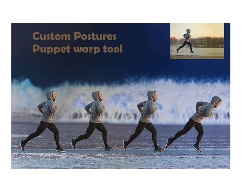
Dribbble
Challenge #4 Custom Postures with Puppet warp tool - Photoshop Daily Creative Challenge
Premier pro @iron flicker
@unborn prism thanks ✌️
You are welcome @iron flicker
@fluid wharf, nice work on the rock effect. Maybe you can add some "Bevel & Emboss" to give it dimention, and make it look like the letters are actually made of rock.
Your snow is also looking good. I like that you kept the flowers with color. I would say, just to try and remove the gray 'noise' on the house. I think it would look better.
Day-05_Text Effects
@unborn prism may I know what was the process to achieve this ?
Took the jpg file and downloaded a snow fall video clip with black background from google, both taken in file premier Pro. snow clip layer upper side with screen opacity. That it. Export gif. @young karma
no i mean the stone effect with letter S
Took the jpg file and downloaded a snow fall video clip with black background from google, both taken in file premier Pro. snow clip layer upper side with screen opacity. That it. Export gif. @young karma
@unborn prism
Used some dodge and burn tool for tint and shades, make first S letter structure with stone with proportion. Used some gradients and got more help from our host's video. @young karma
@bold valley Very nice. I found the girl in the window. Now that you have mentioned it, all I wanna do is find a girl in every cabin. LOL
PS DCC #6 Changing Seasons
Stone Image source- Freepik. Challenge 04- Text Effects. Feedback welcome
Challenge-05- Changing Seasons. Loved this challenge! Pretty dense (lots of topics covered, packaged and delivered in 30 mins)😂 🤣. Feedback welcome
Challenge 6 Re-Do. Thank you @bleak fossil. You have a keen eye. I found this cooling filter. Seems to makes the setting more believable, chilly. I decided to take the time to close the windows and add some Purple Crocus, winter flowers. Thanks again!
Gave +1 Creative Carma to @bleak fossil
@fringe harness why have your text so small?
@deep mango Wow, you made an all out blizzard!!! Just a thought, but all the work you put into creating all the other effects is blocked out by the snow. Maybe go a little lighter on the snow so the rest of your image can show through.
@pseudo current nice job. It has a nice gauzy look. I wonder how it would look if the image was a bit more contrasty, to show the elements a bit more.
Day 6 - Changing Seasons
@young karma Emoji much?
@young karma Emoji much?
@ruby panther Thanks
Change of seasons Day 6
Day 4 - custom postures. In this case, mostly her wings. Her arms got distorted trying to move her head and the bird cage got all warped trying to move her right arm. When one looked good, the other looked terrible. (original is on the right)
@compact pecan add more pins then. Put pins in the area you want to stay put. then they will stay when you move the other pins.
@eternal mica I reduced the snowfall and put more focus on the big stone jars 🙂
@south adder very nice stormy winter look to this. Good job
@deep mango I like that much better. What do you think??
@eternal mica I do like it this way better too, thanks for the advise 🙂
Gave +1 Creative Carma to @eternal mica
@deep mango 😊 😊 😊
Thank you Ted
I draw my school logo with the crayon custom brush from livestream
@unborn prism Your animation of Challenge 6 is wonderful. Brings back many fond memories. I look forward to the day when my skill level can create something so magical. Thanks for sharing.
Gave +1 Creative Carma to @unborn prism
Rock Text Effect Challenge
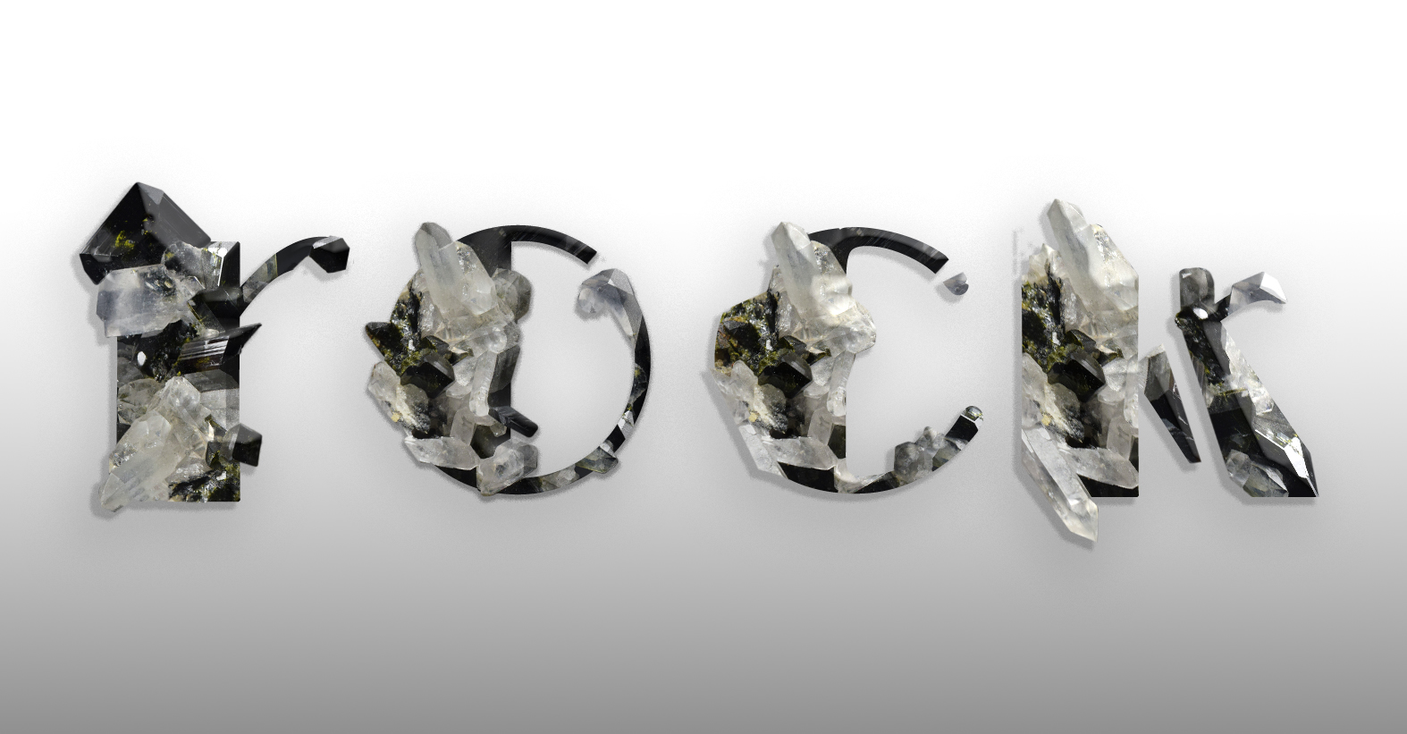
challenge number 7 done
I had put these in the past challenge by mistake Pam
I'm slowly working my way through the challenges.
👍 @tropic knoll
I was drawing high school logo where I'm in
@untold iron awesome! this color palette works really well for the hand-crafted aesthetic
Thanks 🙂 @sterile bane
Gave +1 Creative Carma to @sterile bane
AYH
@tropic knoll Oooh, I like it! Really selling that winter feeling now I think. Very nicely done! It could be really easy to turn this one into a night scene too by darkening the overall image and adding some warm orange/yellow glows in the windows. Looks good!
@chilly hawk Really cool job with the rock text challenge! I like that dramatic spotlight sort of look. The red and blue of the background gives it a really interesting stylized feel too. My only suggestion is that a slightly more gradual fade on the ground plane between the light and shadow might give a more convincing sort of spotlight effect. Really great contrast in this design!
@lean badger I love what you did with the text on this rock design! Really awesome way to combine the look of the original text with the blocky organic look of the rock/crystal. Really great style overall, and nice balance to the shapes. The way you cut out the edges of the rock works really well and gives the rock formations a really natural look. Impressive work!
@trail field Really cool effect! Almost kind of looks like a thick paint effect. Really liking the textures and bold color gradients in this one, the jigsaw puzzle idea is a nice touch too!
@sweet bluff These are looking good! I really love the texture you got with the letter P image. It almost kind of looks like old wood/paint on the side of a house, or thin tree bark or something. It has a really nice contrast with the color and texture of the background. The drop shadow adds some nice depth too. Also really liking the bold graphic look of the blue-orange image. Great stuff!
@lucid plover Nice job Fery! It's cool to see how brush size can change the look too. The smaller size of the orange circle has a strong crayon feel to it, but the larger red spots in the middle almost start to look more like spray paint or something. Really nice textures and effects 👍
@fluid wharf Really interesting effects going on in the snow scene design! The hard edged black-grey-white look kind of gives it a sort of inked look which is neat. I think if you wanted more of a realistic/natural look softening some of the speckled texture with a very slight blur might do the trick, and maybe using a blending mode that shows some of the shadow/lighting and dimension of the objects underneath would help. But as is the hard edges give it an interesting ink/painted feel. Nice work 😄
Thank you @bleak fossil
Gave +1 Creative Carma to @bleak fossil
@untold iron Nice job, the texture looks good! Kind of interesting how the bigger the brush gets the more it almost looks like a sponge painting or something, like with the tree. Nice work with the lines and designs on this!
@south adder This turned out great! I like how you kept some color in the sky, it seems to give it a more natural look. Really nice job with the falling snow and texture. My only thought is that the snow on the left side of the image on the grass and hill looks really hard edged. Almost kind of like paint or chalk on a stucco wall. I wonder if softening it, maybe with a subtle blur, might give it a more snow like feel. I think the texture works, it just might be a bit hard edged. Snow usually has a fairly soft look and feel to it. Just an idea. Nicely done!
Day 5 Challenge
@hot thicket Looks good John! The snow texture is working really well. I wonder if getting a bit more of the blue back in the sky might give it a more natural look and balance out the bit of color we see in the cabin, but that's really just personal preference. Nice work!
@young karma Nice work! Kind of an aged B&W photograph feel with this too with the desaturation and overall texture. If you wanted to push the snowy look of it I think leaving some color in key areas (a bit in the wood of the cabin, sky, and maybe fence or some in the closer trees) would make it look more wintery and a little less like a B&W photo. Even giving it a slightly cool blue tint could help push that even more. Just depends what you're going for. Good job 👍
@gilded flame Cool take on this challenge with the flowers! Nice work breaking up the edge of the letter with the flowers while still keeping it easily readable. Really nice color scheme to this too, the warm tones add a nice balance!
Thank u @bleak fossil 🙂
Gave +1 Creative Carma to @bleak fossil
my first attempt
PS DCC #7 Crayon Effect
Challenge #7 Crayon 🖍 Effect
amazing
I wasn't much good at this when I was a kid. Some things never change.
Day 7 - Crayon Effect
Starting point - Original Logo
Day 7 - Crayon Effect
Logo turned into blueprint technical drawing
DCC10 07 200729 As you can see, I failed kindergarten!!! This was so much fun.
Changing Season Challenge
Challenge #7
Here's my crayons creature peaking out for Day 7 🙂
stone text
Challenge #7 played with some gradient overlays...
I'm not sure where to ask this, but when I try to following along in todays challenge my splatter #14 doesn't behave anything like his when I decrease the spacing. I can't even see it
stupid me, textures was on by default got it
Winter has FINALLY set in.
@plain sable those crayon lillies are super pretty - i could imagine them being used on stationary or even as a cross-stitch mockup
Thanks @sterile bane
Gave +1 Creative Carma to @sterile bane
#psdcc #7 Crayon Effect
Challenge 7. Crayon Effects. This challenge was quite fun. I experimented with the different textures. I have four applied here with blending modes. What a joy it was to play with crayons in Photoshop! Thanks to all!
Color Grading Challenge #2
@fluid wharf very cool work! I like the variations of the brush size you applied to the grass and the overall image. Loved your attention to the details, especially the bricks showing on the houses and the small birds in the sky. The water is looking like the crayon was tilted when painted. Good job!
@dusky wave you did a great job changing the season of the image! The falling snow is looking very cool as well. If you want to take a step further you can create some small flakes to add more depth to the image, as Jesús did on the stream. This will help you sell the impression the flakes get smaller as they move away from the viewer. 😉
This looks awesome @chilly hawk! Loved both images! My only suggestion would be to fine-tune the blue channel in the blend if, so this blue fringes will disappear. You can also adjust that in an easier way, which is creating a hue/saturation adjustment layer > choose blue on the drop-down menu > drag the saturation slider to the left to reduce it. If you see that you lost some blue tones on the other elements, you can take advantage of the layer mask and paint black using a brush to recover them 😉 I loved the snowman on the version 2 ☃️
Nice color palette @tacit condor! I like the details of the fill on the Fish word. If you want to enhance the effect that the fish is jumping from the water, you can create some drops near it, it will enhance its movement impression. This is totally personal preference, of course 😉 Great job!
@winter tinsel awesome work! Loved the night scene. The way that you combined and blended the colors resulted in a great effect, especially on the ground and with the highlights of the trees. Fantastic job!
@queen aspen Great job with the effect! I loved the movement that the falling snow has. The trees on the background are looking very realistic as well. The train version is looking pretty cool! I like how the snow effect reduced the contrast of the trees in the foreground. My only nitpick would be to reduce the saturation of the magentas a little bit more, so this area 👇 will blend even more to the snow scene. Nicely done!
Hi @sullen fractal! Loved how you changed the image from day to night. I like that you added a light pole to it as well, creating a light source for the composition. My suggestion would be that since you have a cyan light coming from the pole, the areas that its light is affecting would be reflecting this color as well. To understand some concepts I’ll give you the link for two tutorials similars to the effect that you want to achieve that might help you 🙂 Let me know if you need any help

In this Photoshop tutorial / mini Masterclass, Commercial artist, Colin Smith shows you how to turn a day photo into a night photo. Learn the 3 steps to create a convincing day for night photo manipulation.
Step by step reference guide to this tutorial: http://bit.ly/2G5ps13
...

In this video (#63) I show you how to quickly turn a day time scene into night time scene or Day for Night PLUS adding in lights.
Download the file used in this video and practice:
http://adobe.ly/1s70R2D
Each week I also produce a Photography, Photoshop and Lightroom Video ...
@coral stone thank you so much sure for your opinion i thought that was just nonsense
Gave +1 Creative Carma to @coral stone
@sacred field super cool approach to the challenge, Marc! I like the drawing effect that the subject has. The hand-drawn sun and the text gives an organic feel to the overall image. Loved the textures on the clothes as well. Nicely done!
@hollow yarrow another very impressive work, Franck! I loved how you created a technological impression using blue tones and some subtle glow on it. The textures on the symbol and the text were great complementary elements to the composition. Excellent job! 💙
Haha loved it @eternal mica! Make sure you put the drawing on fridge 😄. Loved all the details of your drawing Ted, it represents really well the kindergarten message you wanted to show. Very nice job!
@simple idol wooow this turned out great! Loved how you used a present tone from the image to the text, this brings more consistency to your work. I also like the frame that you added, it creates a very nice visual interest to the image. Challenge #2 is looking very nice as well, really like your colors choice and how you made the background red and the subject with a dark tone of green, helping it to stand out more from the image. Well done!
It’s looking beautiful @plain sable! Loved how the crayon strokes follow the same direction on the elements, this makes it look way more balanced. The colors are working really nice as well! 💯
adding castle cows plane and some shadows that dont look realistic
@deep mango lovely colors, Dorina! Really like how you filled the clouds of the bottom part, perhaps you might apply the same style to the ones from the top, it will bring even more consistency to your drawing. Super cool job! 🙂
This is looking amazing, @soft arch! Loved how the edges match the rocks in a great way. This is totally optional, but if you want to enhance that they are really on the scene, you can remove or reduce the drop shadow, placing it just in the bottom areas, and try to preserve the contrast by adding a blur to the background. In case you see that it’s still losing contrast, you can also try to darken the background. You did an amazing job! 💯
@fringe sun great job! Loved how you handled the contrast of the image, especially with the mountains from the background, the way that you kept it low without blending it to the sky, enhanced the depth of the composition. Well done! 👍
Loved the textures on this one @safe linden! I also like that you changed the background color and chose a geometric font for the text. Nicely done!
Lovely work @tropic knoll! Loved the details you added to the boy. The text is looking very consistent with the drawing at the same time as it helps the image tell a story. Great job!
This is very nice, @tropic haven! Loved the grass that you added. If you want, you can replace the gradient from the dog and the cat by a solid color like the other elements, like the butterflies. This will bring more consistency to your composition. Just an idea, of course 😉 Well done!
@bleak fossil thank you for the feedback Sam - Appreciated!
Gave +1 Creative Carma to @bleak fossil
@coral stone Hahaha. Maybe I'll give it to one of my grandkids and ask them to put it on their fridge!!! They've completely covered mine. Thanks for your review. I had fun doing this challenge. And I learned several new things. Awesome
Gave +1 Creative Carma to @coral stone
Thank you so much for the feedback @coral stone! It is so appreciated. Trying to own my skills. Thank you!
Gave +1 Creative Carma to @coral stone
Thanks @coral stone. I appreciate your thoughts. This was a fun challenge!
Gave +1 Creative Carma to @coral stone
fun quick work on crayon effect challenge
Hi @bleak fossil. Thank you for your comments! I applied a Levels Adjustment to make the image darker. And added an orange warm glow in the windows. I also added some shadowing to the dog. My thinking is I don't quite know how to create darkness successfully. I'll keep at it. Thanks again!
Gave +1 Creative Carma to @bleak fossil
@tropic knoll The orange warm glow to the windows is brilliant. So lovely!
Crayon Effect Challenge
@coral stone, thank you for your feedback. Yes! I agree with you. I forgot about the consistency as I tried different fills. ☺️
Gave +1 Creative Carma to @coral stone
Day 7: Coloring!!! This was so much fun! Flyer for my fictional seltzer brand's (Voodoo Val's last DCC...still not done yet) fictional arts foundation. Cause isn't that what we'd all do, if we had crazy successful companies?
@young karma Ahhh! Love it!
Day 6 (and a day behind) - changing seasons
@coral stone. I was very surprised to see my photo of the old gas tanks used by @sullen fractal . the night image is lovely.
That's a great photo @sturdy vault! Loved it!
@sullen fractal make sure to give @sturdy vault the credits for the wonderful photo she took 🙂
@coral stone. Thanks
Gave +1 Creative Carma to @coral stone
Thank you, @simple idol. That was Sam Peterson's idea! It does look nice, doesn't it?
Gave +1 Creative Carma to @simple idol
Wow! I gotta put down the wine, man.
thank you valdair
DCC #7 Crayon Effect
Do not ask... I have NO idea where this came from... An Illustrator, I am not! 🐰
@tropic knoll Ooh, very cool! Loving that color contrast. The lantern glows look great, but the windows don’t quite have the same effect. I often like to use a color dodge layer with a soft round brush for that effect. Here’s a quick example for both the darkening and the glow ideas
As far as creating darkness I used a levels adjustment to darken it all down (the lower slider), a multiply layer to darken a little more in key areas, and a color dodge layer to add the warm window light and some cool blue moon light on the roof and front yard. Though you probably don't need to go as dark as I did. We may have done a DCC challenge on the topic before, but I remember a live stream with Anna McNaught where she did the day to night technique. You can find it at this link around the 35:30 mark. She does the glows around 1:13:00
https://www.behance.net/live/videos/4671/Adobe-Live-Photography-1-of-3?tracking_source=to_replay
Side note: Scrolling up a bit, I noticed Valdair also posted some "Day to Night"" videos which could be useful.
@young karma Great idea to do this challenge in a sort of coloring book type of approach! Really nice job on the coloring, and the texture is looking good too!
@naive mural Very nice! Day 7 is looking good! Did you do the line drawing for this too? Looks great. You have a good sense of values going on with the coloring, and the texture adds a lot of interest. Nice work!
@bold valley Super cool, really interesting design! Both the shapes and textures are looking great. There’s a nice visual balance to the whole thing, and a sort of surreal look to it too. Looks good!
@compact pecan Day 6 is looking great! The colored areas of the fence, barn, and sky really help make the rest of it read as snow. I think you could even push that look a bit further if you put some of the warm colored glow from the sun back in the image which also might give the rest of the image a cool look by comparison which could push that winder feel. Nicely done!
@vernal ice This looks great! Nice work with the Day 7 flyer. The crayon style texture with the clean lines and fonts makes for a nice balance of styles. The background fits this nicely too. Nice job with the design!
@young karma Hah, great idea for this challenge! The lined paper and desk texture work great. The coloring and texture definitely has that crayon look to it, I feel like I could see this actually be in a Deadpool comic or movie with something you see him doodling on. Looks great!
@sweet cedar Hah, perfect! Great idea for the crayon effect challenge! It might help to brighten the white on the eyes, and use the same darker color you used for the mouth to add a bit more pop and contrast to the pupils. The texture came out really nicely, definitely has that crayon look!
@fringe sun Hah, this looks great! I'd say it's a pretty impressive illustration, the rabbit looks great xD Really nice job on the texture too, it definitely has that hand drawn crayon look to it. Nice work with the text as well 👍
@vague swift Oh man, that looks great! I feel like the sky really adds the color contrast that sells the rest as white snow. That really helps the roof read too, nicely done!
Crayon Effect challenge
@sullen fractal Some really cool effects! The masking of the text gives it a really interesting sense of scale and some nice depth. My only suggestion is switching the cow's shadows to something like a multiply layer so we can still see the grass beneath it, just darker. I usually like using a very saturated purple/blue tone that isn't too dark, just enough to look convincing. Nice work!
@chilly hawk Texture is looking great on the crayon design! Really nice job with all the designs and smooth lines/paths. The gradients on the flowers are a nice touch too!
Challenge #6 Changing Seasons
Crayon effect
I'm so bummed, I really wanted to do the PS Creative Challenge - Crayon Effect but can't complete because PS crashes on me every time I change my brush settings.🤬 😠 I even had a vision of what I was going to create.
Challenge 7. Kind of fun,
challenge 7
@coral stone thanks for the feedback, I worked on the bottom clouds a bit more so they are more consistent with the others 🙂
Gave +1 Creative Carma to @coral stone
Day-7_Crayon Effect
Thanks @bleak fossil I did try to increase the bevel but it made it look too bubbly.
Gave +1 Creative Carma to @bleak fossil
This is looking amazing @unborn prism! Loved your color choice and the textures worked out great on the whole image. Fantastic job!
Thanks @coral stone
Gave +1 Creative Carma to @coral stone
Very cool job @shy bobcat! Loved the flowers and the trees that you added. My only suggestion would be to brighten the top part of the gradient on the background just a bit more, so the sun will be able to appear more with contrast, at the same time as there will be more brightness near the it. Nicely done! 😀
Nice work @young karma! Loved that you added the stars giving the impression that the balloons took the astronaut really far from the ground. My only suggestion would be to adjust the stars on the right, they seem streched, you can try to balance by reducing their vertical scale using the free transform. Well done!
Lovely work @ruby panther! The fog that you added to the mountains resulting in a great effect! I also like the shapes of the trees and the geometric look of the house. Super cool job!
Crayon Effect
PS JR DCC 7 29072020 - Crayon Effect
@sturdy vault thank you
Gave +1 Creative Carma to @sturdy vault
@bleak fossil thank you is there anyway to fix that i mean the shadows ?
@coral stone Thank you!
Gave +1 Creative Carma to @coral stone
@coral stone Thank you for your suggestion. Not real happy with this one but I suppose it fits the childish brief, nearly didn't submit it.
Gave +1 Creative Carma to @coral stone
Day-7_Crayon Effect
@unborn prism I wonder how did you make this piece of art 🤔
You did a wonderful job @chilly hawk! Loved the horse that you added and the other elements like the fence and the branch to create a scene for the composition. The textures are looking amazing as well! 💯
I love drawing and I am an art student also @iron flicker 🙂
Day 6
@unborn prism so you painted it from scratch?
@chilly hawk You did such a great job on that piece. It is dreamy.
I think I figured out how you made that one 😉 very well done an thanks for the answer SUNIL
Challenge #6
@unborn prism Brilliant
Thanks 😊 @simple idol
Gave +1 Creative Carma to @simple idol
I'm really behind. I've been doing an old school HTML project for a client. Never have a committee for a client! This was a fun one. Day 3? IG TV template
I painted green on the eye and used color mode to give it more oommph. Then played with the layer blend mode on green to make it fade in more naturally. Added a copy of the tiger and set fill to 0 and added a layer style to give it that floating look
Day 7 - Crayon Effect

@naive mural Thanks 😂
Gave +1 Creative Carma to @naive mural
Day 07 Crayon Effect-Not sure if this looks cool or not. Let me know. As I'm in CS6, it doesn't have other custom shapes or Path editing thing. Or they may be. Dunno. Let me know what you think about it.😞 (disappointed)
But for a 3-year old kid its pretty cool I guess
Crayon effect, comments welcome.
So good...mine's not though @south adder ...
day 6 challenge snowy weather, 2 seasons in one pic
original pic , it never snows overthere 😀
@bleak fossil Thank you! I'm watching Anna' McNaughten's video now with Paul Trani. Very informative. Gosh, I sure appreciate this. I'll check out the ones Valdair posted as well.
Gave +1 Creative Carma to @bleak fossil
Day 7 - Crayon Effect
hello @coral stone thank you for you advice and appreciation 😃
Gave +1 Creative Carma to @coral stone
Finally managed to complete the season change challenge. Really struggled getting the image cropped to use the camera raw filters but eventually managed it.
Nice work @young karma! Loved that you added the stars giving the impression that the balloons took the astronaut really far from the ground. My only suggestion would be to adjust the stars on the right, they seem streched, you can try to balance by reducing their vertical scale using the free transform. Well done!
@coral stone thank you for the advice i'll keep that in mind next time 😃
@fickle garden Thanks. Glad you found her. Every cabin shoulf have a girl, IMO.
Gave +1 Creative Carma to @fickle garden
@bleak fossil Thanks. I just let things flow.
Hi everyone ?
Knockout
Knockout Challenge
Day 8 - Knockout text
Crayon Effect Day 7
My Day 8 Challenge, I also changed the blending mode of the white box!
#psdcc #8 Knockout
Day 8 - Knockout Effect - Manchester, my home town 😊
playing with the crayon challenge. when i saw the scream was taken by the fact it was crayon on cardboard. So decided to use that as my inspiration. I know its not anything like the original but was fun to play with.
Crayon Drawing
Challenge 8 knock out effect 😅
@young karma interesting.
@young karma interesting.
@naive mural thank you 😁
DCC10 08 200730
Challenge #8
I found it easier to jump the text selection, set fill to 0 and add the FX. Then go back to the mask and paint and it is like you are really carving!
Crayon effect.
@vale sandal I know that spot! nice edit
challenge 8
Day 6 Challenge