#✂challenges-feedback
1 messages · Page 72 of 1
Gave +1 Creative Carma to @bleak fossil
Day 6 _ Double exposure
#📣creative-challenges 2,3,4,5,6
Sorry for late submission 😅
I have made two version of challenge 3,6
Let me know in the comment which one is better
And open for feedback and critism😊
Thank you so much @coral stone for the feedback
Gave +1 Creative Carma to @coral stone
A second bite of the cherry - the author and actor who create the great Hieronymus
@young karma Loving the textures and colors in this one! Some really great contrast with the clouds against the dark background too. This is really just personal preference, but it might be a nice balance to the image to lower the text a bit, move to more towards the right and make it a bit bigger to give it a more clear read at a glance. Might give the image a nice flow. Really nice work!
@bleak fossil thanks a lot for your feedback, I was wonderung where to put my text, then I found that composition better without it. I will take your advice and see if i like, but I think it would see nice without the text too
Should I write something else ??
To lighten the face I had to go back to Lr to tweak the silhouette so then just changed more stuff... as ya do.
I am a little bit late, but what do you think ? 🙂
wow amazing @idle tundra
I also made this for day 6 !!!☺️ What do you think??
@sage verge - I updated my astro collage. Thanks for your helpful advice!
Gave +1 Creative Carma to @sage verge
@normal sapphire - You've done an excellent job on your Day 6 Double exposure challenge. Here's mine.
@young karma amazingly done loved it
@idle tundra - I like the dotted circles around your planet and the telescope. It ties them together. I also like the glowing stars and yellow planet. Can you reduce the opacity of the smaller planets and all the stars so the main yellow planet stands out more?
@young karma I love yours as well !!! It has a a beautiful leopard- watercolor effect which looks really nice!! 👍
PSDCC Day 4
#6 feels like painting again, loads of fun with double exposure, first attempt..
I made some fun things with this😱 😃
@soft arch Nice! Not sure what the zebra thinks of it tho! I like the sepia tone to the final piece, actually looks like an old photo.
@soft arch lol that is an interesting choice butt it makes a very cool pattern on the fabric! [Pun totally intended 😂 ]
@hollow yarrow These are killer! Really cool to see you taking this in the movie poster direction! Really loving the colors of the Fly Away image, the clean simplicity of the style works really well. Great variety between the two posters as well. I kind of wonder if the Streets of the City might work better on a different background. Maybe some kind of gradient? The color/value could vary quite a bit depending on the mood you’re going for. Just a thought. Fantastic work on these!
Thanks for your comment@bleak fossil. Bright Background was a choice. I went for a large contrast between Silhouette and Background but you have a point I could try with a gradient. Unfortunately, I kept the original image of the man (no mask... I know it's bad😞 ) and I don't have time to do this now. But maybe I'll try later. Thanks again for your good comments👍
thank you @sage verge and @young karma 😇 🤣
Gave +1 Creative Carma to @sage verge
@hollow yarrow Those look great. I would just adjust some of the text (very minor) Like in the second one, "of" creates a weird gap in the middle, try just right aligning it. The first one, this may be nitpicky, move the "a film by..." under the title of "Fly Away"...just to see how it reads. But overall awesome job! 💯
@sage verge Thank for your comments. I'll try if I have time but the "of" offset was my choice to balance with the Y shape of the "City"... You have definitivly a point : I need to find a way to fill the gap... maybe a graphic element.
Thanks again I appreciate!👍
@hollow yarrow Really like how you've used the technique for a poster - obvious when you see it but then... you saw it! The paper folds are a nice touch. Both work really well. I'll go and see the second one when its out!
Thanks@young karma
Thank you @bleak fossil for your encouragement
Gave +1 Creative Carma to @bleak fossil
@bleak fossil thank you very much. I can play around with that and see how it looks
Gave +1 Creative Carma to @bleak fossil
What do you think? Too simple? What could have I added to the background colour?
@small ibex Simplicity is not a problem... When it works, it works! I love your image. Did you trace the shape from a Lion picture? Background image is a composite or a stock picture? The two go well together! Well done👌
@young karma love this!!
Daily Challenge 200616 - Double Exposure #2
@young karma Awesome job! All elements fit well together.👌
I struggled trying to get the fold of the corner to have the right amount of depth, but this is also only my 5th creation ever so im pretty happy with it in that regard. It could still use a lot of work and time was becoming and issue, but Im starting to understand the clipping and the overlays and triming and masking! Thank you
Day 6
@plain sable Good job! Maybe you could try a slightly lighter color for your background (or maybe a gradient) just to better see the dragonfly contour. 👌
Double Exposure_Day6 - https://www.behance.net/gallery/98694437/Daily-Creative-Challenge-June-09
@unborn prism Well done and nice Behance project!👍
@young karma Your multi-exposure is beautiful, great job! If I had to give any feedback maybe have some more of the edges of her falling off so it's as formed to the body. Hard to explain but to see even less of the line of her body where it is falling into leaves.
Thanks @sage verge, will try to add to the dispersion effect in the future.
@young karma This is looking awesome! Really great blending of the images here. The whole design has a really nice balance to it with a nice focal point contrast wise within the portrait. Really loving how you faded out the background too. Loving the guitar double exposure design as well. Great work!
@bleak fossil Thanks
@young karma Awesome job! All elements fit well together.👌
@hollow yarrow Thank You..
@hearty quest woow Susan, this is very creative, I loved the fold of the corner. My only suggestion would be to refine the mask a little bit more on the left arm edges. For that you can use the pen tool and even the polygonal lasso tool to create a selection and then fill it with black on the layer mask. If you need any help for that, feel free to tag me 🙂
Double Exposure 💯
@bleak fossil Hey Sam, is this anything like you had in mind?
@soft arch haha super cool! Loved how you perfectly managed the zebra's position on the hair. Well done!
thank you @coral stone
Gave +1 Creative Carma to @coral stone
@queen dew that's nice, Paul! Really like the style that you used. My suggestion would be to place the right tree a little lower, so it won't have this cut on the bottom part 😉
@safe linden Loved the color palette! The green of the pin and the Kensington gives a nice balance and consistency to your composition. Especially that the Kensington word is placed on a lighter area, allowing it to have a great contrast as well!
catching up, day 5 collage
Double Exposure
PSDCC #5
My Day 5 and 6. Not sure why I wanted the sailboats, they just felt right. The Turtle has sea squirts, fish and a bryozoan as the double exposure layers.
Problems with internet now fixed, I'm slowly catching up with the past challenges
challenge 4
challenge 5
@bleak fossil thanks
Gave +1 Creative Carma to @bleak fossil
Glad you're back @young karma. Great job on both of them! Just an optional step, in challenge 4 you might apply shadow where the pin is fixed, just like Kathleen did on the live stream. This will add even more depth to your composition. Nicely done!
@safe linden Loved the color palette! The green of the pin and the Kensington gives a nice balance and consistrncy to your composition. Especially that the Kensington word is placed on a lighter area, allowing it to have a great contrast as well!
@coral stone working a lot on color palettes, and complimentary colors this week, trying to make it cohesive and natural feeling.
@bleak fossil I flipped the gradient and changed the scale a little as well. Thoughts from previous version?
@barren ice very nice, Sally! I loved the different images you appliced on the double exposure. If you want, you might reduce their opacity juuust a bit so the turtle might be able to appear a little more, just to enhance the double exposure effect. I loved the sailboats on day 5, my only suggestion in this would be to smooth the edges of the telescope, if you used a layer mask, the feather option on the properties panel might work for you. 🙂
@buoyant nova loved the color palette, Susan! The orange tones contrast really well against the cyan on the background. Loved the typeface as well, if you want, you might pick a sample of the subject's colors and apply to the rectangles behind the text, this is just personal preference 🙂
No starter file today? it is after 8. Yesterday I couldn't find it until after the livestream started
No starter file today? it is after 8. Yesterday I couldn't find it until after the livestream started
Hi@primal fulcrum... No livestream today because of 99u conferences.
Hi @primal fulcrum. It's already available on the challenge page: https://www.behance.net/challenge/photoshop

Daily Creative Challenge
thanks @coral stone . Do you know when the video will be available?😎
(No livestream because of 99u conferences)
Gave +1 Creative Carma to @coral stone
@hollow yarrow I'm not sure yet. But on Adobe Youtube page it's showing that Kathleen will be live https://www.youtube.com/watch?v=1ourBgUjYeA

Challenge: Liquify color for a custom marble texture.
Get the starter file here: https://bit.ly/psdcc6-8-7
Join your host each morning at 9:00am PT to learn how to approach each challenge using Photoshop. Complete 9 challenges by Friday, June 19th and you’ll be on your way to...
Thanks @coral stone it does look better
Gave +1 Creative Carma to @coral stone
@coral stone , @primal fulcrum Thanks a lot
maybe livestream only via Youtube chanel...
@hollow yarrow I'm not sure yet. But on Adobe Youtube page it's showing that Kathleen will be live https://www.youtube.com/watch?v=1ourBgUjYeA
@coral stone
Challenge: Liquify color for a custom marble texture.
Get the starter file here: https://bit.ly/psdcc6-8-7
Join your host each morning at 9:00am PT to learn how to approach each challenge using Photoshop. Complete 9 challenges by Friday, June 19th and you’ll be on your way to...
Thanks @hollow yarrow I've been having trouble with the background when I export it, it export darker than I expected, trying to find a good background...
Gave +1 Creative Carma to @hollow yarrow
@hollow yarrow I think so. Last year in one of Kladi's challenge we moved to YouTube as well. I don't remember what was being streamed on Adobe Live
@coral stone : thanks for the link... 👍 We'll see...Maybe a post in creative-challenge section will follow?
Gave +1 Creative Carma to @coral stone
@hollow yarrow I believe it will be posted very soon. I'm checking here 😉
@hearty quest woow Susan, this is very creative, I loved the fold of the corner. My only suggestion would be to refine the mask a little bit more on the left arm edges. For that you can use the pen tool and even the polygonal lasso tool to create a selection and then fill it with black on the layer mask. If you need any help for that, feel free to tag me 🙂
@coral stone thank you I seem to be struggling with masking and creating fine detail masks if yo can point me towards any good past tutorials or challenges. Thank you
@hollow yarrow yes the DCC will still be on
@coral stone thanks @celest nebula didn't put it here in Discord. Normally it is here at 8am
Gave +1 Creative Carma to @coral stone
@hollow yarrow yes the DCC will still be on
@primal fulcrum Yes but on youtube chanel... Did you see the Valdair link?
speed round as Im getting being on tasks have been needing to spend a bit less time on creations unfortunately...masking is hard for me, but getting there... Clipping I understand, but if anyone can point me towards good masking tutorials and how to define these finer edges it would be much appreciated!
Of course @hearty quest, it will be my pleasure.
Jesús Ramirez was live last week on Adobe Live showing how to get started with Layer Masks. Here's the link: https://www.youtube.com/watch?v=sYt23sAPP50
Also this tutorial might be very useful as well: https://youtu.be/pLVQecX4bkQ
from one of my own photos, but is a low quality photo photo
@sterile bane said it would be live on Youtube. 99U is live on Behance
Of course @hearty quest, it will be my pleasure.
Jesús Ramirez was live last week on Adobe Live showing how to get started with Layer Masks. Here's the link: https://www.youtube.com/watch?v=sYt23sAPP50
Also this tutorial might be very useful as well: https://youtu.be/pLVQecX4bkQ
@coral stone fantastic thank you, lets see if it helps me improve, but its 2am here, so thats all for me today, have a great day everyone, thanks again @coral stone
No problem 🙂 @hearty quest
If 99U gets interesting, I may catch Kathleen on the replay.
Second attempt at these, with some changes suggested by @coral stone. Thank you. I think they look better now.
Gave +1 Creative Carma to @coral stone
@young karma Welcome back! Loving this dot pattern fade over the map.
Another swag at Day 6
@bleak fossil These are the picks I’m here for!! Perspective is my constant challenge. Thank you so much!!
Gave +1 Creative Carma to @bleak fossil
new version of day 5
I don't have a YouTube account so not on chat but watching this morning 🙂
@bleak fossil Thank you for your feedback. 🙂
Gave +1 Creative Carma to @bleak fossil
not happy with final, couldn't get it to just cover my Granddaughter and her art
some of the challenges and some previous photoshop work. Challenge #2 Moodboard
never used this filter before, it was quite fun
@halcyon trail Tbh this looks sick,very easy to process,im gonna make something similar,great work
PSDCC #6 Double Exposure
I am seeing what appears to be a HUGE bug in the new version of PS. Even if I turn off layers, if you have changed opacity or blend modes you ALWAYS see them! I have to go in and delete layers not just turn them off to get it to stop. Not cool. Makes it almost impossible to use. Anyone else seeing this?
Double Exposure in B&W🤓
I finally catch up on current challenge. It's been so fun so far! 🇦🇷
Day 7 - Marbling
I will finally be able to use my bad photographs!!! 😜
Three photos, the recorded liquidise effect applied and finally an image that uses them all. What do you think?
I joined way too late, but here's my day 1! I'm new to PS, still finding my way around. What do you think?
I joined way too late, but here's my day 1! I'm new to PS, still finding my way around. What do you think?
Great start and welcome in@stoic spoke
😩Marbling Liquify
I wouldn't drink the coffee ... 👀
thank you for the tip @coral stone, that is a great idea, will give it a go.
Gave +1 Creative Carma to @coral stone
Challenge 3
liquified, not marbled😋
PSDCC #7 Marbling
i'm loving the greyscale - can't wait to play more with additional colors
@sterile bane Very nice, like it!
Day 7 - Marbling Liquify
DAY 7 - 'Lets' Marbling Postcard
DAY 7 - 'Lets' Marbling Postcard
@zinc elbow Nice
marble challenge
@young karma Thanks
Gave +1 Creative Carma to @winged schooner
Thank you! This challenge was fun
So... source image included, as is a revisit to a silly idea from one of Paul T's challenges...
My mother said I couldn't take anything seriously. This is a serious challenge for serious people! 😛
Day 7, Thanks Kathleen for showing us tips on the liquify tool.
Day 7: Marbling with Liquify. Original - Art illustration from AdobeStock
After liquify, texture and gradients
@wet thistle I love the mood of your double exposure piece. Did you intend the dog's eye to be as dominant in the image?
#PSDCC Day 6 Double exposure
Thank you @young karma, you are right. I am going to see how I can make the eye a little bit less dominant.
Gave +1 Creative Carma to @tame gorge
I just discovered the challenge set and this discord and just finished up the Day 1 cover image, looking forward to going through the rest! I used the text layer to create the background.
Day 6 Liquify final
Challenge Day 7- For some reason I feel really bad liquefying people and animals...anyway, this is a great way to make backgrounds. Kathleen said you could use a photo or a brush to do this, curious how the brush works?
@hot thicket I love what you did with the liquefy. That is a great practical application for this tool.
Some Cottoncandy and Popcorn? 🥳 🤩
Challenge Day 7- For some reason I feel really bad liquefying people and animals...anyway, this is a great way to make backgrounds. Kathleen said you could use a photo or a brush to do this, curious how the brush works?
@hasty oracle Like how you create an gradient on the sailboat,
Day 7
DCC 07 200617 Marbling Liquify Text
thanks ioan
@young karma 😊 😊 That is the point
@eternal mica I thought I saw a previous version without the pattern was much nicer but using the way you have the girl and sunset. It had great color and contrast when I saw it on white. 🤔
@sage verge Thank you for noticing my project. Yes, I had the profile on a white background. I wasnt happy with it. It was too stark. @coral stone made some suggestions to me. I took his advice and reworked it. I like this one better, even though some of the sunset colors are more subdued.
@sage verge Thank you for noticing my project. Yes, I had the profile on a white background. I wasnt happy with it. It was too stark. @coral stone made some suggestions to me. I took his advice and reworked it. I like this one better, even though some of the sunset colors are more subdued.
@eternal mica maybe a more subtle pattern?🤔 or take the opacity down some. It just feels a bit busier now when before the focus and lighting was what made it stand out.
@sage verge ok, i'll play with it and send it to you in DM. I appreciate your time and attention
Ah no worries, I really like helping people is all. I am getting my own practice in giving and receiving feedback. I also like helping people grow.
Some father's day double exposure.
#challenge 7 (anger) . open for feedback😊
Had a go at the double exposure daily challenge. Trying to balance the background and foreground images was quite a challenge.
What do you think about this double exposure?
Not happy with the design of challenge 6 so tried to update it by playing with the size of object. what do you think about it ? open for feedback
Day 7 😀
@astral hedge I like the double exposure image, the blending looks nicely done. How would it be if you got rid of that door frame? I feel as if that would focus us even more on the face. The liquified background is cool, kind of metallic looking. I think the text needs to be clearer. Maybe play around with that a bit more? Only my thoughts.
Here is my marble effect for Day7. I noticed that it seemed to take PS a while to catch up to what I was doing. Not sure if I made the file too large or what.
@peak creek I think you have a good start! Try making the figure larger, almost the height of your canvas. Then you can allow for more space to where you want us to focus on the photo of the street. Try playing with the size relationship of each image and what do you want the viewer to see. Hope this helps.
From beach chairs to melted bumpers #PSDCC 7
Day 7
@plain sable I like what you've done here!
@tacit condor I loved the tropical look of the background hah The rectangles and the white text were a super cool choice to match the saturated colors from the background. Nicely done!
Nice job @young karma! Loved the stroke on the text and how the gradient gives kind of a metallic look to it. I also like the consistent fill that you added to the text. Well done!
@zinc elbow great job combining the liquify with some textures. I also loved the distorted text. It matches really well the background effect.
@cold snow wow Shelly this looks great. Loved the color palette and how the orange/yellow tones add a great context that matches really well the Fire word. Did you use blend modes for that? Awesome job!
@wet thistle wow very nice double exposure effect. I like how the colors and the overexposed images resulted in a cool composition. Well done!
@turbid wedge very nice contrast edits, Danny! I loved how the white text contrasts really well against the background. If you want you might use a font from Adobe Fonts website the decorative and hand filters might be a good choice for getting started, just for fun 😉
@young karma haha awesome effect, Ioan! How did you create this effect? On the number 👇 Loved the little submarine as well.
@hot thicket very creative John. I like how you preserved the area where she is climbing and didn't distort her as well. Nicely done!
@hasty oracle hah no problem! Loved your work the blue and the green tones are always an interesting combination. My only suggestion would be to give the sail 100% of opacity, so the background doesn't show through and enhance the effect that it is really on the water. Great job!
@blissful geyser super cool effect! Loved the distortion, looks like you have a little bit of the edges showing, you can easily adjust that by opening liquify from the smart object and with the forward warp tool click and drag to fill those edges. Well done!
@merry parcel yaaay welcome! Great job with the colors, Loved how the yellow from the text contrasts really well against the background color. The subtle "glitch effect" on the background shapes is a nice subtle touch. Looking forward to see your next works!
You are doing a great job with the colors @safe linden! Loved the burst on the background and how the colors have that summer feel that the text suggests. Well done!
@forest aspen super cool, Marie! The black strokes created an interesting effect on the liquify. I also like your font choice and how you achieved consistency with the fill color and the black stroke. Great job!
this was a fun challenge. masking my frizzy hair was a bit of a pain tho
@young karma haha awesome effect, Ioan! How did you create this effect? On the number 👇 Loved the little submarine as well.
Thanks @coral stone I don't think I can take credit for that effect - It is a bubble witing font, I've had it lying around since the days of Pagemeker! It is emphasized when you add a stroke to it and then B&E of course (goes on absoloutely everything). The sub I borrowed off a task I did for @brittle slate 's challenge on smudging through layers .
Now that's a dramatic effect @blissful moon! Loved the blue/yellow tones, it reminds me of a comic book style Here's one thing that you might try 😄: You can make your text white and give it a little bit of a drop shadow just to enhance the contrast from the background if you still don't get enough contrast you can try to darken the background a bit. I believe this will help to increase the readability of the text. Just a personal preference to see how it looks 😉
@young karma woow loved the colors and the effect that you applied to the type. I wonder if darkening the background just a bit will help the text contrasting even more from it, just an idea 😉 . Awesome work!
@thorn geyser woow another super cool work! Loved the lines on the Creative word!
@zinc river very nice, Alfred. My only suggestion would be to increase the text size just a bit. It will help with the readability and make it fill more space 😉
@fluid wharf, super cool variations! Loved how the dark strokes on the second version make it look like it has that paper cut effect. I also loved the color palette on the version 3! Great job!
@peak creek cool work Nehal! I loved the dark mood of the background and how the melting effect is a great complementary touch for it. Just an idea that you might try. Some fonts might enhance the tension/dark mood of it. Maybe a serif one or even a condensed sans serif could be a nice choice. You can get inspired by some horror/action movie posters from the 70s/80s Just an idea, it already looks great! 🙂
@deep rampart very nice, Kari! My only suggestion would be to soften the edges just a bit, so they can look even more consistent, especially on the beard area. Good job!
@cerulean steppe nice contrast on this one, Hawwa! My points of feedback would be to crop the background on the bottom edge or just position the subject a little lower, so both can have the same cut line. Also, you might try to reduce the flowers' opacity juuust a touch, so some of her details might be able to appear more. Great job!
Photoshop kept crashing over and over!
@tame jacinth Thats what you get for turning to the dark side!
Ha Ha!
@slim plume lovely work, Michaela! Loved the color palette and the textures you applied. Nicely done!
Double Exposure_Day6 - https://www.behance.net/gallery/98694437/Daily-Creative-Challenge-June-09
@unborn prism gorgeous work! i really love the masking at the bottom of the image (your double exposure - not the cover image here, tho that is great as well 😉 )

ketchup! challenge No. ?
challenge no 6. I'm almost caught up
Thanks @young karma
Gave +1 Creative Carma to @tame gorge
Challenge Day 6- Double exposure re-worked. Some funny stuff going on with my gradient when I try to do an export as, but "quick export as JPG" worked OK. Not sure what I was doing wrong.
wow @tame jacinth Lore I think what you have done here is Amazing
@hasty oracle nice! your placement of the different botanical shapes is really working
@plain sable Oooh, really liking this design! The flowy texture of the background contrasts nicely against the more rigid texture of the flamingo shape. I like the pop of red color too. I feel like the whole design might look good with a bit of a levels adjustment to boost the brightness a bit, but that's just personal preference. Looks good!
@safe linden The smooth area in this center is looking great! Really creates great contrast for the text and the gradient across it works well to add some depth. The liquid texture turned out really nice!
@autumn granite Really interesting texture here! I think liquify can definitely be a pretty resource intensive tool if you're using a big brush or large document size, so that's not too unusual. Nice design!
@kindred kernel This has a really cool rock/geological feel to it! I really like the mix between that rocky texture look and a liquified texture, looks great. I like the stroke on the text, but I wonder if a different color than black might look nice? Maybe a dark blue to contrast the background could look good. Either way this came out really nice!
@slim plume Ahh, I love the liquify effect along with the cement looking texture, gives it a really cool feel! Kind of makes it look like really intricate sidewalk chalk designs, hah. Great effect and I like how you handled the text effects in these.
@astral hedge These are great! Really nice job with the liquify effect! I wonder if it might look good to scale the text up a bit on this one? The double exposure effect came out really nice too, I like the colors on that one, nice job with these!
@peak creek Cool colors in this! I think it really just depends on what you're going for with the double exposure effect. I think it can often be a nice effect to have a textured image contained within a smaller shape, for example a person's face or figure. And then revealing a little bit of the portrait in key areas to get a nice blend between the images. I think this works as an interesting graphic shape within the scene, but it could be a nice effect to reveal some of the person's face to blend the two images a bit more and act as a focal point. Just a thought. I like the swirl effect in the background!
@prime temple Great colors in this image! Really love the gradient from purple to red to orange. Gives the whole design a great style and mood to it. The text is looking really solid too!
@cerulean steppe Very nice, I like the color contrast between the portrait and background! Some really cool texture too. It could even be a nice effect to mask out a few different flowers that break the frame of the portrait around the back or something to give it a bit more of a natural look to the edges. Just a thought Design is looking good 👍
@deep rampart Really cool, almost sort of looks like an invisibility cloak effect, hah. It might be nice to reverse the contrast in this so the portrait has the most contrast and the background is a bit more faded. Either way, cool effect, nice work!
@coral stone Tried your suggestions, I think I do like this better.
4!!
@coral stone yes I was playing around with the blend modes and that looked cool.
@safe linden love the colors! Looks like paint being swirled together.And the embossed lettering is perfect.
what do you think ? I’m not sure about text color !!
Challenge 7. Marbling. Photoshop kept crashing while in Blending Options/Patterns. Oddest thing. Took a few tries entwined with patience and magic happened! Thank you for the fun challenge!
Thanks @bleak fossil I brightened it a bit
Gave +1 Creative Carma to @bleak fossil
I do not like it too much, but I had to show you, because I had two icecreams while creating 😅
Do you think it is too busy?
Big move forward for me to do this today. Could not import Custom Shapes though.
@charred imp I really like it!
Challenge 4
Getting the text right was the hardest part
Day 6 for a friend, thoughts? Feel like it could be punched up a bit.
Daily Challenge 200617 - Liquify color for a custom marble texture
Day 7 - Marbling
Day 7, Trying again!
Just getting a little silly today 😋
@charred imp I really like it!
@grave apex thank you!! @grave apex
Liquify
ok I'm a few days late but here is my space collage from a few days ago. Is it too busy?
hi there. this isnt really a final submission for the marbling - but i'm getting this artifacting on my liquified smart object. i've seen it on a few other smart filters i've used... but this is the worst artifacting i've seen in a while. any idea why this is happening?? thanks in advance!
Challenge #5
Double exposure challenge
Day 6~Double exposure. I have to admit that I love playing in Photoshop. What do you think...too fishy?
stock
Day 7 - Marbling - along with liquify also threw in a couple of filters 'Chrome' 'Ocean Ripple' and 'Sponge' + Gradient Map + Color lookup... basically threw the kitchen sink at it... Please let me know what you think. Have also loaded stock images above thanks to: Boys on boat Photo by Gokul Barman and tiger photo by Richard Verbeek from Pexels.
does the falling stars backdrop work?
@storm falcon yes it does and I really like it also loving the texture in your shapes 👍
Day 7 - Marbling - along with liquify also threw in a couple of filters 'Chrome' 'Ocean Ripple' and 'Sponge' + Gradient Map + Color lookup... basically threw the kitchen sink at it... Please let me know what you think. Have also loaded stock images above thanks to: Boys on boat Photo by Gokul Barman and tiger photo by Richard Verbeek from Pexels.
@bronze thorn so 'life of pi' -- nice work!
@charred imp got it in one - Thank You 😀
Gave +1 Creative Carma to @bronze thorn
My Entry For The #✂challenges-feedback [A U R A] named after the track I was listening to while I was creating this piece. any feedback would be appreciated.
Mixed Liquify with blending of original image
Marbling challenge. Mixed liquify and filter gallery.
@soft arch To quote the Hulk, "I see this as an absolute win."
@chilly hawk I like the club vibe it has going on.
Here is a Pride inspired one, this was a lot of fun to do.
Collage Illustration (day5)
@v> My Entry For The #✂challenges-feedback [A U R A] named after the track I was listening to while I was creating this piece. any feedback would be appreciated.
Mixed Liquify with blending of original image
@desert lantern this is a really nice piece. I love how you can see some of the flower shapes and the color is very fitting to the title. 😍
@sage verge thank you 😊 really appreciate it
Gave +1 Creative Carma to @sage verge
@storm falcon well done I love it!
@desert lantern thanks🙂
Day 7: Fluidity
Photo I took a few years ago. And now it's melting. 🤣
@peak creek I like the sort of neon look to the red against the black, really dramatic look to it. Cool dripping effect to the text as well!
@cold snow Aww, this is great. Really loving the lighting and colors in this design! These images are all working very nicely together, there's a nice visual balance to the image. Well done!
@blissful geyser Were you just trying to get the painting to be on the portrait only? You'd just have to select the portrait and create a mask based off that shape to use a clipping mask. Unless I'm misunderstanding. Really cool idea behind this one, the colors have a really interesting feel to them on this portrait!
@cold snow Nice use of the frame challenge! This is a cool way to show off different designs and challenges. Nice use of the portrait frame too, looks good!
@halcyon trail Very nice! Really nice balance between the blue and pink, great texture too! The text style and color work really well against that background, nice job 😄
@hasty oracle The shapes for this design are looking great! Really love how you handled the hair effect with the palm branches and the faded look they have. Very effective placement of the palm shapes throughout this design 👍
@young karma Really nice use of textures with this design! Both in the portrait and in the background. The colors have a nice cohesive look to them too 👍
day7-Marbling
@coral stone thank you for your feedback, appreciated.
Gave +1 Creative Carma to @coral stone
Frankfurt/Main main station a willow and my friend 😃
@soft arch that is super clever with the willow as her hair
my marbled album cover
Day6 Double Exposure
Thx @coral stone for the suggestion, first will try to enlarge the photo with the tree or use a brush to undo the hard edge 👍
Gave +1 Creative Carma to @coral stone
Double Exposure (Thanks @brittle slate )
@covert loom Thats a nice piece of work. I would be tempted to crop in a bit for balance but that is just my personal taste. The blending and the pose and colours I like very much.
@covert loom i love the double exposures you did. lovely colours and composition. the blue one is so amazing. it really works for me. thank you for sharing with us
Gave +1 Creative Carma to @covert loom
@desert lantern i really love the atmosphere and the colours. it creates a sense of calm. 👍
@bleak fossil thank you for the feedback
Gave +1 Creative Carma to @bleak fossil
Thanks @young karma
Gave +1 Creative Carma to @tame gorge
day 5 with Kathleen 🙂
and I made it for fun a couple days ago. What you guys think?
What do you think about this one? This is two images of flowers from my garden. The underneath one is the one I used to record an action, and the other is the action applied to a different photo. I then reduced the opacity of the top photo. If that makes sense.
@barren ice very cool effect
@velvet kelp Love your 'Quiet Mind'
Liquify with wave effect
@velvet kelp Love your 'Quiet Mind'
@barren ice Thank You
Gave +1 Creative Carma to @zinc kindle
Did this Double Exposure back in January with Paul Trani
Marbleized one of my photographs of a hot air balloon. Perhaps a bit more chaos for my personal taste, but it is bright and cheerful.
Marbling (day7)
What do you think of the tree overhang on the elephant's ear?
I like this better than the first one I posted. I think that it is much less chaotic, and, perhaps, even soothing.
I like this better than the first one I posted. I think that it is much less chaotic, and, perhaps, even soothing.
@night shale yes it looks better👍
Day 7: Marbling - I did three, but only uploaded this one as it ties in with the astro theme and title card for the challenge.
My first daily challenge 🙂 Hope you guys like this!
@night shale I LOOOVE love love how the first one came out! love the color blocking you got from your photo. I also like your second one but that first one has me!
@bleak fossil Thank you for the words of encouragement 😀
Gave +1 Creative Carma to @bleak fossil
@storm falcon cool effect with wave filter 👍
#7 Go with the flow 😉 still have to find out how to make an action in CS6
Here's my marbled image postcard. I was hoping to add some type of drop shadow to the text but couldn't figure it out, does it show up enough or should I do some research and add it so it pops more?
@young karma love the text you chose for this, It adds to the whimsy you have with both the colors and the sentiment!
@chilly hawk very strong piece. well done
@young karma woow loved the colors and the effect that you applied to the type. I wonder if darkening the background just a bit will help the text contrasting even more from it, just an idea 😉 . Awesome work!
@coral stone thanks!! always open for feedback and new ideas!!
Day 7 - Marbling. Love blue and orange
@young karma I like how the colors for both of your submissions work well together. I bet in your behance profile they would look great together. I love the background for your monogram, but I think it overshadows your type. I'm not a typography master by any means, and I do like your font...I think it just needs to pop out a bit more. Also, it should say "Let the sun brighten your day." Beautiful work!
@verbal dirge thanks a lot for your feedback!! and of course I will correct the grammar!! I will try another possibilities to make it pop out!! 💯
@young karma I love your psychedellic designs! Those colors are poptastic.
@mint vigil thanks a lot!! have a nice psychedellic day!! 😜
@icy heart I agree the drop shadow might help tho with the black text then maybe a different colour for the shadow? It is sometimesa fiddly tweak to get it just right. I like the coloured shapes against the grey.
Marbling dandelions
added a drop shadow- lol way easier than i thought. What do you guys think? Easier to read?
@icy heart It wasn't bad to begin with and the slight hint of shadow is enough. Nice!
thanks, @young karma !
Gave +1 Creative Carma to @tame gorge
@icy heart try making the Hello larger in white. You can find the little "fx" button at the bottlm of the layers panel. Drop shadow is in there. You can play with the setting but drop shadows should be subtle as they can get out of hand at times. Alternatively, you could try duplicating the hello, making it black and behind the the white. Adjust the size just a little or just moving it to be offset from the white, creating a sort of shadow. It will be interesting to see because i really like the CMYK print vibe you have here! Good luck!😁 👍
Thank you, @sage verge ! I made the text bigger and you were absolutely right! I think
it helped a lot!
Gave +1 Creative Carma to @sage verge
made from the action I made. Took all day because the new version was a mess. Uninstalled and installed, tried renaming the preferences, nothing worked. Finally uninstalled and installed the older version.
@primal fulcrum that would be an interesting clock 😆
Sorry you had a rough time updating though 😕
@tropic knoll was that the latest version? It was SO buggy for me, I had to uninstall it and go back to the previous version. PS was unusable with the newest version.
@gritty violet yeah marble is a hard one to use as a background for text, I think. I gave up on mine LOL
@primal fulcrum - Sometimes updates have minor conflicts with plug-ins or extensions. You might want to make sure your graphics card driver is recent.
@night shale it has a real illustration feel to it. Nice
Sorry im late, here is my Liquefied Project🙃
@vocal drift nice entry would suggest adding some contrast to the image and maybe try some fonts variations
@young karma loved this one!
@young karma I know that is a big part of my problem. I don't have a graphics card. Graphics are onboard. I so need a better computer. But when I got the money and went to buy the parts, everyone seems out of stock and the prices have skyrocketed because so many are working at home on computers now. So I'll still looking for bargins - either parts to build my own or prebuilt.
@chilly hawk amazing entry! Well done loved the spectrum dark vibes
From a poppy flower
#7 with a new gradient fill
Without Gradient
@storm falcon great combination of the effects. I loved how this turned out, cool job!
@glacial minnow I think the tree looks really nice. I don't know if this is the effect you are going for, but you can try to play with some blending between the tree and the elephant. I found this reference tutorial that can illustrate what I mean. Of course, this is totally optional, it's just an idea that you can try 😉
https://www.youtube.com/watch?v=-19z_ldzPes
Nice mood in this one @slow estuary! Loved the dandelions' color combining to the tones from the background. Also, the subtle drop shadow on the text was a great idea for the contrast. Great job!
@cold oyster super cool composite! Thanks for sharing the original images. I loved the combination of the images and the colors, well done!
Gave +1 Creative Carma to @cold oyster
Great color palette @primal fulcrum! Sorry you had issues with Ps. I like the foreground and background separations. One thing that you might try ,is to soften the rough edges just a bit, so the they will be able to look even more consitent and the lights and shadows near it will look soft as well. Great job, Sig!
@primal fulcrum Yes. I updated Creative Cloud the day prior. Never had a problem before. Now Photoshop seems to run super slow. Takes forever to load.
My Work
Super cool background @queen dew! My only suggestion would be to play a little bit more with the text or even the font, maybe a lighter tone or adjusting the background lighting, and some different ways to increase the contrast against the background to improve its readability. Well done, Paul!
@vocal drift in addition to @desert lantern's feedback, one thing that you might try is to apply a very subtle drop shadow on the text to make it pop a little more from the background. Loved the colors that you used! 😉
@coral stone Thank you for the feedback, didn't save the font layers and have to find another solution
Gave +1 Creative Carma to @coral stone
@young karma wow well done
new dress 😅
@soft arch that is super clever with the willow as her hair
@mint vigil thank you 😃
Thank you, @coral stone for your feedback! 👍
Gave +1 Creative Carma to @coral stone
Day5
Ragatta - Day 7
Wazzup my peeps
My day 4 Postcard.
Marbling .Hope you like it!
my map! i'd like to make a whole series of different words or names. what should i do next?
😉
My take on the psychodellic liquify lesson. 🙂 Just a quicky.
@soft arch woah clever!! I think u should earn bonus points for this!
Had to mix things up and not use baseball or bricks this time. Going for a vintage look.
@soft arch woah clever!! I think u should earn bonus points for this!
@desert lantern thank you 😃 🌞
a rework of my first entry [AURA] called it THIS TIME tried the wave effect credit to @storm falcon for this one thanks for inspiration. Let me know what do u think #✂challenges-feedback
Gave +1 Creative Carma to @storm falcon
DAY 8 - Displaced Text. I never get tired of using Photoshop & Type.
Here's my day 6, double exposure take. I had an idea, I think, and wanted to try something. Not sure what to think yet, any ideas?
Gave +1 Creative Carma to @random hamlet
Day 8 I did this before the challenge I designed it on May the 17th #✂challenges-feedback looking for some feedback
Gave +1 Creative Carma to @sterile bane
Gave +1 Creative Carma to @sterile bane
Here is another one with the cool deck in my back yard and the copper color from the AZ state flag.
@tacit summit I love the little splashes of green and yellow in here, it keeps the mood fun instead of imposing. What blend mode did you use for the flower?
@whole tangle I get a super fun active vibe from this, like a Women's Only HIIT Gym. Makes me want to go lift!
This image was in my moodboard at the beginning of this series. The whole situation had me really down and I wanted to get out all the feelings and I was craving creating something. I probably would not have done these challenges if not for the current cultural situation of the world outside. This photo was from Unsplash Artist: Oladimeji Odunsi.
@desert lantern Ooooo spooky. "This Time" certainly is taking on ominous tones with this marble. Very well done.
I only added the text
Monogram (day3)
Can i have some feedbacks ?
Halloween in June. What do you think?
I tried making my own displacement map, what do you think of the result?
@brisk flower that's a very cool shattering effect that resulted from your displacement map. i like it!
Day 8 I did this before the challenge I designed it on May the 17th #✂challenges-feedback looking for some feedback
@desert lantern i really like it! that warping effect is super cool. i feel like maybe the text for high (both regular and warped) could be moved higher... you know... like an added visual pun on your words?
Day2 Starter File
@covert loom nice! it seems like you have the hang of the frame tool 🙂
@young karma this ripple-y water is the perfect option for a displacement map! now that you've done one, i recommend that you play with the placement of the type. maybe try centering it and enlarging it so it provides a nice focal point for the composition?
@short mica cool! what was your original image?
@sterile bane ⏬⏬⏬⏬
Gave +1 Creative Carma to @sterile bane
thank you @young karma 😃
Gave +1 Creative Carma to @vivid moth
@soft arch woah clever!! I think u should earn bonus points for this!
@desert lantern TYVM, @soft arch! Truthfully, I'm not a very imaginative person. But for some reason, I thought the liquify swirls would make a cool soda can of some kind! So I just went with it! 🙂
Hey, I am having a problem with the displacement map. I've tried with two separate images and have gotten the same response. The response: "Could not continue. Displacement maps must be 8 bit/pixels." Anyone have a solution?
Wazzup?
Hopefully better?
Something with my PS is not working well, I cannot see the effect (displace), need some help, please thanks
Day-8---Warp-Text
Day 8, PS Daily Challenge. Warping text with a displacement map.
Hello I'm Lilian from Nigeria I'm glad i found Adobe live
catching up with the marbling effect and double exposure. not sure about the text placement
Day 5 Collage. Feeling like someone is pulling my strings. I hate that. Used DAZ Studio to generate the 3D arm element and used a wireframe render to play with the contour line theme from Day 4. Does the zodiac background seem strong enough in the composition?
I used the silhouette of my cat🐱 💜
@tardy heart greaaat texture in the fur! works well with the botanical overlay
Day 8
@tardy heart greaaat texture in the fur! works well with the botanical overlay
@sterile bane hi, sorry I have a question, I´m doing the last challenge the way you do it, but it doesn´t work. The typo doesn´t take the effect, can you please help me? thanks
This is for Dail Chalnege
@young karma hi there! it's difficult for me to diagnose the issue without seeing your .PSD. feel free to share it with me!
@young karma hi there! it's difficult for me to diagnose the issue without seeing your .PSD. feel free to share it with me!
@sterile bane thanks I don´t know what happen... I don´t know if this a problem with my graphic card....😭
@heady stirrup haha! Thanks, that sounds great!
Gave +1 Creative Carma to @heady stirrup
Day8
Day 5 Collage. Feeling like someone is pulling my strings. I hate that. Used DAZ Studio to generate the 3D arm element and used a wireframe render to play with the contour line theme from Day 4. Does the zodiac background seem strong enough in the composition?
@civic yew That is an awesome concept. I wonder what it would look like with the calendar straight on or larger, going off the page a bit more?
Had a lot of fun with this one!
Love the colors, would be great for the challenge to create the warping effect to the flow of the hair/fibers(?)
Day8
@astral hedge
@fair wagon super succesful!
thanks 🙂
@young karma that’s awesome
@sacred field displacement maps are so fun! Hope you enjoyed creating that!
@sage verge. Check this out and see if it helps composition-wise. Thank you for the feedback.
Gave +1 Creative Carma to @sage verge
@civic yew Yeah! It takes away some of the white shapes from the top to really bring focus to the cool puppetmastering of the planets!
So I love liquify!!!
@sage verge. good call on your part. I like it better as well.
@heady stirrup @charred imp thanks a lot for the feedback much appreciated
Gave +1 Creative Carma to @heady stirrup
Day 8 challenge: warping text with displacement filter. Grumpy donkey is from pngimg.com; font is Bely Display, sunburst is Toon Artist Rays pattern (link in 6/17/20 Adobe Create Magazine), roof tiles 23730171 from Bittbox (for warping text) and overlay is textured metals 07 from Graphic Authority, a division of Photo Solutions Market.
Day 8 Warped Text. I used a marbled effect photo that I created yesterday, and warped the text based on that photo.
Here is my Day 8 My texture was a reed basket.
hope this one looks better
Yes @sage verge having fun with it would be great to see that
#psDCC day 8, works trying different maps
Challenge #7 Marbling Effect! How’s the typography? Is it legible?
warp text - what do you think?
Hi everyone! I started late, this is what I've been doing so far. Love the challenge!
There's a lot I would change. Had a hard time figuring out how to isolate the images to change the colour (I wouldve made the face a little lighter and added more contrast to the "hair") 🙂
Just catching up on a couple of the recent challenges, here's my take on the double exposures, and yes I used to do this in the camera before the days of photoshop
here is my marbling challenge - done along with the warp text challenge (warp text was done a bit subtly - i may resubmit in a while with the warping a bit stronger)
A bit of marbling
@tidal bloom Yes, displacement maps are a lot of fun! 👍
I couldn't not do a collage challenge, so I am catching up on that one first today. I have had this idea for a modern take on a cameo. I got the subject picture from https://www.piqsels.com/en/public-domain-photo-zkwor First my Monochromatic version
And I did an oil paint version too because you gotta 😆
#Day5 DCC Collage Illustration
Day 8 v2! Made the colours brighter and the text bigger
Day 6 double exposure. Added back a little bit of the underlying image to come through a bit clearer. Is it too much detail?
Daily Challenge 200618 - add movement to text using a Displacement Map
Yes @sage verge having fun with it would be great to see that
@astral hedge
The latest one looks great!!
Only Good Vibes ☮️
Day 6 double exposure. Added back a little bit of the underlying image to come through a bit clearer. Is it too much detail?
@civic yew Not too much detail for me! Its a strong image.
PSDCC #8 Warp Text
Warp Text...this can be quite a powerful technique. Thanks @sterile bane !
Gave +1 Creative Carma to @sterile bane
I was just super happy about this today so
@young karma That's just beautiful. The text looks a bit newer(?), but I can see why you left it that dark.
@tacit condor I love the texture you used, and the way you did the shadow and the light is really well done. I could see this at the beginning of a western movie.
@tardy heart Groovy 😆 I would punch up the size of that font though, it has good contrast, its a fun font, and its sassy. It should be seen!
@young karma That's just beautiful. The text looks a bit newer(?), but I can see why you left it that dark.
@heady stirrup Thanks, I did try other fonts and less dark colors but wanted the text to be legible and not get lost. So I settled on an in-between.
@sacred field cool colors, Marc! I loved the contrast that the red text has against the white background! Well done!
@young karma very nice effect, Lori. One thing that you might try with the text is to position it on the bottom left and break it into 2 or even 3 lines and align it to the left, just to see how it looks. Make sure it will have nice readability and, if you lose some contrast you might fine-tune the colors and the shadow behind it. Nicely done, Lori!
@coral stone Thank you, sir! I appreciate it!
Gave +1 Creative Carma to @coral stone
Loved your collage @civic yew! The elements are well placed and balanced as well, I loved the way that everything seems to be connected. Also, day 6 is looking great, it could definitely be a movie poster. Fantastic work!
Very nice colors on this @hot thicket. My only point of feedback would be to darken the second text just a bit, allowing it to have more contrast against the background! Well done!
@timid plinth very creative! I like the subtle effect on the water and how the displace effect created kind of a wave on the text. Nice job!
@fair wagon super cool blending! Loved the black and white composition, well done!
Very nice colors @grave apex! I loved how the background looks like a painting. I also like how the rectangle and the frame colors are consistent compared to the background ones. Cool job!
Hi Guys, I took a lace map for Challenge #8 !
hahah @forest aspen loved the wavy effect that the displace created on the text. The colors are looking awesome just like the placement of the text. Awesome work, Marie!
Thanks Valdair for your feedback
Very nice challenges combination @thorn geyser. Loved the improvements, the text is definitely more readable. Also, I’m a big fan of the effect that the displacement map created on the text, it looks like it started blending with the background giving a movement impression. Great job!
@scenic anchor very nice, Bobbie! Loved the font choice. My only suggestion would be to lighten the text a bit so it can stand out from the dark background a little more. Nicely done!
Very nice @astral hedge! Loved the color that you chose for the text! My only suggestion is just an optional step: you might fine-tune the displacement values just to smooth a little bit the I and V area. If it doesn't work, you can adjust manually using liquify. Or you can paint black on the Smart Filters layer mask with a black soft round brush with low flow or opacity to recover this area gradually (I suggest that you try this technique first). Just a personal thought, it looks super cool already! 😉
@safe linden wow! I loved the texture and how the effect on the edges made it look awesome. My only suggestion would be to refine the pillow's layer mask just for the edges to be more natural, especially on the top left side. I believe the pen tool will give you a precise result on the selection. Well done!
Very nice colors @winter tinsel the quote has nice legibility, I believe that if you position the I miss you text to the left, it will contrast more against the background. Just a thought. 😉
@soft arch this is looking really cool. I loved the image choice and the font as well! My suggestion would be to position the text a little bit more to the bottom, so the first line will be able to be read easily, or you can brighten the background in this area. Well done
@midnight idol super cool consistency of colors in all of them Tisha! There’s no problem in starting late 😉 Can’t wait to see your next works! 💯
Wow @upper crag the work was worth the effort, this turned out great! Loved the combinations of the images and how the fishes give a movement impression to the composition. Great job!
@inland kiln Thanks for sharing, Pat! I loved your images choice and how the perspective turned out great with the double exposure. Also, the way that you preserved the subject's shadows on the marbling challenge was awesome. Great job!
Gave +1 Creative Carma to @inland kiln
@charred imp oh very nice! Loved the color palette and the subtle warp on the text. The knockout effect is a great way to unify the overall composition. Awesome job!
thank you @coral stone this is a good advice, I was wondering, how I could manage this problem
Gave +1 Creative Carma to @coral stone
@young karma I can’t choose my favorite on the three versions haha, they all look very very nice! I like the subtlety on the Agua and Holz and how you played with the shadows on the Cemento, the font blending with the surface in this absolutely amazing! Fantastic!
Warp Text
I redid challenge 6 think it's a little better
Nice job @twilit granite! I like how you played with the Away word on your day 4. The collage is looking nice as well. Just an optional step, you can choose the main element you want to be the focal point of the whole image (what you want the viewers to see first). You can do that playing with scale, position, and even the direction that elements like the airship and the telescope might be able to point, helping to guide the eyes. Just an idea
Well done!
@heady stirrup super cool job! I like how the oil paint and the colorful elements on the second version created a very interesting look. It’s always nice to see the texture that the oil paint effect creates. Lovely work!
@ocean pine loved the colors and the font in this one, Tracy! My only suggestion is that if you want you might position the mountains a little bit lower creating an overlap between them and the VW bus (I had to google its name in English 😅 ). Cool job!
@wet thistle this is very creative! Loved the overlap and the color palette. Nicely done!
Day 7 was an interesting lesson. These 4 different images are using the same Liquify action with some tweaks and blend mode adjustments. Love the smart layers/smart filters. I struggled with understanding the benefits and this helps. I do so many repetetive tasks prepping multiple files for Premiere or After Effects that the Action lesson will save me a bunch of time. Thanks!
@arctic rover awesome color choice, Jude! I like the cyan shadow you put behind the text. What image did you use for the displace effect? I loved how it created some roughen edges on the letters which combine pretty well to the mood of the colors. Great job!
Text Warp challenge. Sup?
@vagrant rapids wooow this turned out great! Loved the gradient on the background and the effect on the edges of the letters. Awesome job!
Day 8 Map
@civic yew well done 👍 loved these 4
I did my logo, first challenge for me....
Texture mapping with hand-painted liquify for lava with displacement map text. Selected steam and pasted it in but I'm not happy with it.
Challenge Day 8- Warped Text
I signed up for this set of challenges and then totally forgot about them when things got busy at work. I went through all the trouble to watch the video on marbelizing only to just now realize that was yesterday's challenge. So ... here's my file for yesterday's marblizing. Now I'm going to watch today's challenge.
my mom is currently going through breast cancer treatment and I used the symbol from the current challenge as a heart to represent the bond i feel to my mom, attached is a picture i took on christmas day last year on our annual beach walk.
@jolly quest
liquid marble
Actually got my own photos for this project!
my new towel 😃 😇
@charred imp oh very nice! Loved the color palette and the subtle warp on the text. The knockout effect is a great way to unify the overall composition. Awesome job!
@coral stone thank you so much @coral stone
my PS crashed and my first file is destroyed 😩
Day 8. I have used displacement in After Effects and subtle works great when it is in motion. Had the flag from one of those projects so tried it here. Not sure if it is creating enough displacement for this. Also considering a fine horizontal line pattern to blend with the type layer to give it more of an embroidered feel.
Here's what I came up with for day 8! What do you think?
Day 7: Two looks at marbling. Pastel with base photo by Se Nuno and Neon with base photo by Luca Bravo.
@echo mesa You really made the logo feel like it is living on the fabric. Good job.
catching up - here's day 4's challenge
Day 8 Warp Text - really fun, • Created my own background of gradient black to white stripes and then used yesterdays liquify action to create a displacement map. • The Submarine is from the custom shape tools. • Yellow Submarine lyrics are from the Beetles. • Water bubbles were supplied by Paul Trani in a previous DCC. Happy to hear any ideas for improvement. cheers R
This is a texture layer I used, created out of a photograph I had from I dont know when.
DCC7 08 200678 Version 1
DCC7 08 200618 Version 2. I hid the black bg, used the texture for a bg and ended up with this.
2nd Entry. Day 8. Displacement Maps.
here's what I came up with. I couldn't find a good texture file - but I love what my tree photo did with this technique.
@tacit condor Very unique application for the warp text. Nice job. I would make your logo larger. Now its just a distraction. If youre adding it to the project, we should be able to read it. Otherwise I would suggest removing it.
Day 6 - Double Exposure (again)
American Dream
my mom is currently going through breast cancer treatment and I used the symbol from the current challenge as a heart to represent the bond i feel to my mom, attached is a picture i took on christmas day last year on our annual beach walk.
@queen cipher My prayers are with your mom and with you. My wishes for a complete speedy recovery.
@vernal ice #2 is special. Really good job.
day 8 - warped text (type done in illustrator)
Warp Text Challenge
Thank you @coral stone I was thinking the same. I made several attempts but the effects weren't as cool. I did lighten it and put it up on Behance. I will try again another time starting over and using a different color. I appreciate your advice.
Gave +1 Creative Carma to @coral stone
texture live displace
@novel escarp Great application of this project, really cool idea! I really like how strong of a focal point the can is due to the color contrast. The liquify effect came out excellenet, really great pattern! It could be interesting to see one of the more bold colors from the can mirrored in the text instead of the white. Maybe the yellow, blue, or green? Nice job with the shadow under the can too!
@autumn granite Really cool! The image behind the text is looking good. I think perhaps the displacement effect could be pushed even further to really make the effect more intentional looking. Currently the text just looks a little rough in certain areas. Could be cool to put a star texture in the background too. Either way, nice work on this challenge Matt!
@desert lantern Ooh, I really like the mix of a sort of liquid/digital effect in the background! Almost gives a bit of Matrix vibes. Really liking the text choice! I kind of feel like a wide tracking with the text on this design could be a cool effect. Really nice work, love the texture!
@zinc elbow Really nice textured dissolve effect with this one, I like the white and red combo too! I feel like an overall boost to the brights in this image might look good to give it a bit more pop. Nice job 👍
@whole tangle Great colors and textures! Really liking that gradient. The palm shapes are working really well in this, I like how it gets less dense as it moves towards the shoulders. Nice balance of shapes here. Great effect 😄
@covert loom The second design's displacement effect is working really well. Has a nice waving flag effect to it. Looks good!
@gritty violet Cool text style on this! The second image was a good idea for this particular effect. The only thing is the text seems to break up a bit in the shadow areas of "Photoshop". If it was just darkened instead of broken that might help the effect look a touch more natural. The displacement seems to be working with this nicely, looks good!
@lunar wagon Really liking how well the text and logo is fitting the texture and painted effect of the wall. Fits in with the image nicely. Nice work!
@sage verge Really nice job! That's really great to hear, it's always nice when you can channel those types of feelings creatively. I know sometimes it can also be hard to focus on anything work related in those instances so that's good to hear. I really like the dramatic contrasting and lighting of the photo as well as the white text. It could be nice to get the black part of the text a little darker and sharper to have a consistent read across all the words. Really nice image!
@brisk flower Really digging the displacement text effect! I really like the sharp fragmented shapes it creates while still keeping a clean uniform look to the text. Very nice!
@lunar wagon This is great! It fits so well with the balloon I didn't know you didn't do both until I read your caption. Really nice job fitting it in, the added chipped paint texture to the text really helps. As well as the more faded contrast of the colors. Nice work!
@young karma This is a great idea for this effect! I think it's looking really good on a lot of the letters, but maybe you could double up the effect on some of the less effect letters, such as the "R". You could also probably fine tune it afterwards with the liquify tool if there's any adjustments you want to make. Looks good!
Edit: I saw the updated post, nice job! Maybe the “W” could be pushed a bit more?
@sage verge Really nice job! That's really great to hear, it's always nice when you can channel those types of feelings creatively. I know sometimes it can also be hard to focus on anything work related in those instances so that's good to hear. I really like the dramatic contrasting and lighting of the photo as well as the white text. It could be nice to get the black part of the text a little darker and sharper to have a consistent read across all the words. Really nice image!
@bleak fossil Thank you, it was still a work in progress but I wanted to get it posted during the reviews. I will finish it up tomorrow and post the final. I was on a call while watching the stream lol freaking out cuz Hank and @jolly quest liked it too. 😍
Can't wait to share the final!
@shadow mural Nice job! It'd be interesting to see what image you used for the displacement effect in this one. I think pushing more of a larger swaying shape to the shape to appear more ghost like could be a nice touch for this design. Liquify is always good for fine tuning as well. Good job 😄
@short mica The textured effect on the text's edges makes for an interesting look. I like the gradient you chose as well, somewhat subtle but adds some nice interest. 👍
@haughty cape The texture on this looks awesome! Really nice and clean effect. The bits of shadow on the edges of the paper letters add a ton to push that sense of dimension. Reads very nicely against the soft gradient background too. Very well done!
@young karma Very nice effect! I really like the textured edges and faded areas of the text. Really convincing effect of being written on glass. The water texture across the whole thing adds a really interesting and realistic feel too. Nicely done!
@young karma The displacement effect turned out great on this! My only suggestion is it might look a bit more natural if the areas of the text in shadows were a touch darker. Cool effect and texture!
@sacred field This came out great! Both the displacement effect and the look of the text within the shadows. It also looks quite natural. The only oddity is some of the shapes edges that were created but that's fairly minor. Well done!
@young karma Really great textures on this one! The colors are nice and bold and contrast really well too, which helps overpower all the texture so they still read well together. I think the text might look a bit better and more balanced if it were in the top left in a solid white, but that just depends what you're going for. Looking good!
@civic yew I love this! Really impressive work all around, everything is looking really solid. Really nice balance to the composition and shapes, great cohesive color scheme, great contrast and focal point to the title text, and the arm holding the shapes is a great touch that adds a lot of personality to the image. Very nice!
@grave canyon Really cool idea for this challenge! The displacement effect looks really good. I wonder if adding a bit more of a sense of perspective could look good, though it might help if the text were bolder since the thinner text can be easily lost with this effect. Nice work!
@tardy heart Really great soft colors and contrast in this cat design! Gives the whole thing a really peaceful feel. I think the silhouette looks a bit off since only the feet/tail are missing, though I assume it's because of the photo you used they were not in frame? It could be interesting to find a photo of another cat in a similar pose and add in the feet/tail to your silhouette to complete it. Just a thought, though it still looks cool as is. Nice job!
@mint vigil Really loving the texture on the text here! The way the horizontal/diagonal lines break the frame in some of the letters is an awesome effect that adds some really nice depth! The lighter contrast of the background really helps the text pop too. Nice work!
@chilly hawk The displacement effect and textures are looking really nice on the Warp Text challenge! The darker background contrasts nicely with the text too, looks good!
@fresh yarrow Really cool text effect on this one! Great texture and sense of dimension. I wonder if giving the background a slight gradient so it’s a bit darker at the bottom might help the text read a bit more clearly. Really nice design, I like the simplistic color scheme!
@hollow yarrow Another impressive challenge! The skyscrapers at the bottom are a really great way to transition between the two images, and the textures of the edges add a lot of interest. Really great lighting and texture overall in this design, very nice!
@gleaming wigeon Very nice, was this using your own photo? The image within the letters looks great and reads very well and the textured edges of the text really adds to that organic look. Nicely done!
@eternal mica I love the color gradients you added to this image! Really transforms it and adds a sort of psychedelic/molecular type look. Really interesting combination. The irregular edges of the text seems to fit that feel as well. Really nice!
@bronze thorn Ooh, this displacement effect turned out really well! Really nice technique for creating the displacement map, and the submarine looks great too! Cool to see that you created everything for this design, the submarine came out great. Really great contrast of the yellow submarine against the more subdued blue background, great design!
@charred imp Really nice balance of shapes in the Day 4 challenge! The texture adds a nice element of interest to the whole thing too, looks good!
@bleak fossil thanks Sam for the feedback😊
Gave +1 Creative Carma to @bleak fossil
Thank you @bleak fossil appreciate your feedback.
Gave +1 Creative Carma to @bleak fossil
@civic yew Thank you
Gave +1 Creative Carma to @civic yew
Day 8 Warp Text - really fun, • Created my own background of gradient black to white stripes and then used yesterdays liquify action to create a displacement map. • The Submarine is from the custom shape tools. • Yellow Submarine lyrics are from the Beetles. • Water bubbles were supplied by Paul Trani in a previous DCC. Happy to hear any ideas for improvement. cheers R
@bronze thorn cool that is a good idea to create a displacement map by drawing👍
@bleak fossil Thanks
Gave +1 Creative Carma to @bleak fossil
new version - warp text
Challenge 8.
scribble artist action set by Nuwan Paditha on Adobe Create, playing around with blending styles
@coral stone thanks for the Feedback, I was having problems with my computer but I got it!! https://tenor.com/view/carlton-dance-happy-dance-retro-gif-15393322

Thank you @sterile bane , mentors, and moderators for this great Challenge! I'm happy to be learning more and more about Photoshop ❤️
Gave +1 Creative Carma to @sterile bane
Day 8 _ Warp text
@young karma well done
@jade swift I love it!
@upper crag incredibly insane I love it!
@grave apex well done on the liquify image I would suggest to change the font
Thanks @soft arch trying to create more of my own stuff where possible 😀
Gave +1 Creative Carma to @soft arch
@mint vigil couldn’t agree more - great couple of weeks- thanks @sterile bane and mods especially @bleak fossil 👍
Gave +1 Creative Carma to @mint vigil
Oooo good suggestion, thanks so much @coral stone 👍
Gave +1 Creative Carma to @coral stone
#Day6 DCC Double Exposure - He looked like he might have a colorful personality 😋
#Day7 DCC - Marbling
#day8 DCC Warp Text
Hello everyone, some compositions using liquify + displace ...
another, (composition to present my essays on Behance, for example ... or primitive art)
My day 6. Still not very happy, but gonna work on it.
My attempt at Warping Text
@inland kiln damn it's amazing
Hi everyone! I started late, this is what I've been doing so far. Love the challenge!
@midnight idol Never too late to join us! Your photos are awesome. Little preference for the last two. So far so good... Great job👍 !
@hollow yarrow Another impressive challenge! The skyscrapers at the bottom are a really great way to transition between the two images, and the textures of the edges add a lot of interest. Really great lighting and texture overall in this design, very nice!
@bleak fossil : Thanks for your comment - I saw 10 min. of the "live from the sofa" with Gavin Campbell earlier this week. He did a much better piece than me but he inspired me😉
@haughty cape The texture on this looks awesome! Really nice and clean effect. The bits of shadow on the edges of the paper letters add a ton to push that sense of dimension. Reads very nicely against the soft gradient background too. Very well done!
@bleak fossil thank you!!
@hollow yarrow really great what you do! Chapeau ! 😉 👍
@sturdy briar yes, it's really fun what you can do with this effect. the first, if you want a little advice, give it a little more intensity ... and use other overlays, layers with other photos, it's fun. And thank you to the Adobe Creative Challenge team! 👍
Gave +1 Creative Carma to @sturdy briar
@bleak fossil Thanks so much! I’m glad to hear that you like it okay. I appreciate the feedback! Thank you! 🙂
Gave +1 Creative Carma to @bleak fossil
@sturdy briar
I allowed myself to remove the veil on your first marbling. edit with the camera raw filter ..
@bleak fossil Thank you, Sam! I noticed some the irregular edges... Probably from my displacement numbers or the shading on the DP. ✌️
Gave +1 Creative Carma to @bleak fossil
Warp Text
@young karma thank you for your feedback! Yes, your right, something happen to my colours, i didin't notice that! 🙂
Gave +1 Creative Carma to @shadow crypt
challenge #8 tried different textures, was difficult to get the right colour for the text, so far not too happy with displacement filter
which one do you like best?
I tried a bunch of images for double exposure, would love your thoughts https://www.behance.net/gallery/98642485/Photoshop-Daily-Creative-Challenge-June-8-June-19

Behance
Photoshop Daily Creative Challenge : June 8 - June 19
Day 8: Bump Map.
Since the current challenge is collage I figured I would share one that I created awhile ago. It is still my favorite out of everything I have done in the past few years. If you look closely you can see images in each triangle. When produced at 3" wide, from a distance you only see the eye. Up close you see the faces of my family. Would love to hear any feedback.
Challenge 9. @sterile bane I love these actions! Thank you.
Gave +1 Creative Carma to @sterile bane
@bleak fossil yes, this was my own photo.
My day 5 Collage
Thank you 😃
@gloomy dawn oh! welcome
Next time you get a call from an anonymous number pick it up and say...
@mint vigil woow beautiful effect! Especially on the third version, I loved how the action created a lighting effect on the flower. Great job!
Super cool @young karma! I loved the background color and the texture as well. The subtle text fill and its edges are looking very nice!
Very nice @young karma! I like the poetic style on yout first version. The subtle shadow on the text from the bottom right adds a cool contrast against the background. Also, the colors and the textures you applied on the second version, my only nitpick would be that you might apply some textures on these dark strokes or maybe reducing the opacity like the other ones, just to make it even more consistent compared to the other textured elements. 😉
@inland kiln awesome work, Pat! Loved how the text looks like it's really carved on the surface. The color palette was a great choice to keep everything consistent. Great job!
@cold oyster super cool work! The serif font combined to the fabric and the gradient created a great premium/fancy style to you composition. Well done!
Super cool variations @queen dew! The displacement filter might be a little tricky to work depending on the images. I'll give you a link for a technique that Tim posted a few months ago on the #🔨resources channel that might help #🔨resources message
@young karma bloody minion gloves?

Very creative @young karma. Loved the bloody effect that you applied on the gloves. Great job 😄
@coral stone blame the cabin fever! Is the vid for #9 out?
😂 😂
DCC 8
I dunno how i got this weird effect but i love it sooo here is my DCC 8
it was a regular photo then i did something by accident and now it got like a cartoon effect
@ruby pantherI predict that yours will be very effective and dramatic!
Thanks @young karma but the jpeg is messed up.
Gave +1 Creative Carma to @tame gorge
@young karma It's already available on the Adobe YouTube page. I believe the challenge page will be updated soon 🙂
Thankyou @coral stone
@coral stone do you know how i got this effect?
thank you very much valdair, "Also, the colors and the textures you applied on the second version ..." I agree, it's true ... I will correct that ...😉
Bot doesn't like you today @coral stone
@young karma I'll give the bot a bloody annonymous call hah
Another Challenge 9!
Woow @ruby panther that's awesome!
Thanks @coral stone !
Gave +1 Creative Carma to @coral stone
Yet another challenge 9!
Day 8 photo asset from Photo by Shapelined on Unsplash
Very nice actions @ruby panther. Did you record them? If not, is there a source you can share?
@young karma It's today's Ps DCC.
@young karma great effect on the gloves you really got it to look like its right on them! I'm not feelin' the minion in the corner, it makes it a little kitschy for me and takes me out of the design world.
@ruby panther Thanks
Gave +1 Creative Carma to @ruby panther
@coral stone thanks Valdair, I will dive into it 👍
Gave +1 Creative Carma to @coral stone
Challenge #8 Warp Text...I did 2 different ones. The brick wall was tough. I even tried increasing the contrast of the brick texture layer but it’s okay. Would this work better with a b/w version of the texture layer?
Last one for Challenge 9! 😆 Have a good weekend!
Adjusted heirarchy. Thanks for the advice @coral stone
Gave +1 Creative Carma to @coral stone
I wanna eat something sweet because of these ☝️
@arctic rover awesome color choice, Jude! I like the cyan shadow you put behind the text. What image did you use for the displace effect? I loved how it created some roughen edges on the letters which combine pretty well to the mood of the colors. Great job!
@coral stone I used a white low pile towel...built in texture! As always, appreciate your comments!!
@midnight idol Never too late to join us! Your photos are awesome. Little preference for the last two. So far so good... Great job👍 !
@hollow yarrow Thanks a lot!!
@midnight idol super cool consistency of colors in all of them Tisha! There’s no problem in starting late 😉 Can’t wait to see your next works! 💯
@coral stone Thank you!!!
Day 8, Warp Text, comments welcome.
Day9 Action
@covert loom HOW...........DID..........YOU......................DO............IT1!?!?!?!?!?!?!?!?!?!?!?!???!
Day 8, Warp Text, comments welcome.
@south adder I love the way the shark (?) is woven thru the word text! My only suggestion would be to move the words Warp & Text closer to the center. My eye gets stuck in the dead center of the image making the text peripheral. Love the colors!
@coral stone after small corrections ...
this was a feature i've never used before, it was fun
or ...
Friend @vocal drift Action Tool
No
I just want to tell you that I took this action only when I got it. And its achievement @sterile bane
Noice @covert loom
Thanks
@bleak fossil Did some messing around and made my own stars..
Kathleen - Photoshop Daily Creative Challenge - DAY 1
Day 8 - Warp Text
Kathleen - Photoshop Daily Creative Challenge - DAY 1 (COVER)
Kathleen - Photoshop Daily Creative Challenge - DAY 2
Kathleen - Photoshop Daily Creative Challenge - DAY 3
Kathleen - Photoshop Daily Creative Challenge - DAY 4
My 2nd day daily creative challenge, my mood board as off yet that I can't take off my mind nowadays. Hope you like it!
Kathleen - Photoshop Daily Creative Challenge - DAY 5
Kathleen - Photoshop Daily Creative Challenge - DAY 6
Special thanks @sterile bane
Gave +1 Creative Carma to @sterile bane
Special thanks @sterile bane
Kathleen - Photoshop Daily Creative Challenge - DAY 7 ( Immage DAY 2)
It took a while! And the number of options you have available when you've actually run the script/action is amazing! This is a friends dog, I know she will love the result but what do you think?
Call me a geek, I don't care but I was sceptical about this whole 'actions' mullarkey so I did a quick experiment. I took a photo that I had of a view that Gaugin painted in Pont-Aven, Brittany in 1848 and then rendered it in 'Painterly' and in 'Watercolour'. The location has changed a bit. Now, whilst the ghost of Gaugin does not walk amongst us I think what the maker of these actons has achieved is pretty damn good. I include all 4 here. The only part that is mine is the experiment.
Day 9 - Action
Action Painterly
Photoshop Daily Creative Challenge -
Kathleen - DAY 8
#challenge 8 !!! What do you all think about it???
Day 2
Postcard DCC
I had a little trouble with the angle of the telescope lol it was tricky to figure out how to make it look realistic so I decided to leave it alone
@charred imp Really nice balance of shapes in the Day 4 challenge! The texture adds a nice element of interest to the whole thing too, looks good!
@bleak fossil thanks so much!!
My DCC 9 was mind blowing and sooooooo amazing. I want to thank Sebastian Pena Lambarri for providing the Whale Shark Photo on Unsplash.com. I hope all of you Enjoy this Peace of art.😋
day9
Toon Artist Action with some edits
Rocky, flying by ...
I used an image of some sand that I took at the Outer Banks for my texture. It is obvious that I don't have the dynamic effect that Kathleen obtained with her image with shadows. None-the-less, I rather like this. What do you think?
Day 9 - Actions
my super hero
@brisk flower thanks for sharing your method
Gave +1 Creative Carma to @brisk flower
The 3rd Time Is A Charm! Blue, 94Lbs of Love with Teeth!
I wasn't home for a couple of days so I stayed waaaay behind. Today I was able to finish the collage illustration. What do you guys think bout the font?
@next palm this is where we share the results we got from the Daily Challenge. Isn't that the work that one of the teachers did on a livestream?
#PSDCC Final day Action!
@ruby panther Love your day 9! Especially the positive and negative space with the paint splatter.
Thanks to the team for another 2 weeks of fun an learning - much appreciated
@eternal mica Thank you so much for your kind feedback. @queen cipher Sending you and your mom all the love.
Gave +1 Creative Carma to @eternal mica
@sturdy briar I like your day 6! And I feel you, I do one of these, step away, take another pass at it... the process!
@primal fulcrum yesterday!! Yes, livestream
I had so much fun with this challenge! Thank you @sterile bane 😃
Gave +1 Creative Carma to @sterile bane
@young karma I love the font! And I like the color and how it stands out against the background. Nice job!
I decided to use "Modern artist" action from Nuwan instead of toon. It really interesting to find out that the importance of the mask layer name is crucial.
Challenge #6 Double Exposure. I just realized I was missing this one. My images are from UnSplash. The ‘Old Cowboy’ is from Jaku Arias and the ‘Horses in the Forest’ shot is by Tobias Keller. 😊
I've tried to learn Photoshop doing Linkedin learning courses but what I've learned hasn't stayed with me. This is my first daily challenge and I stumbled on it by accident. I have really enjoyed it and what I've learned seems to be staying in my head so I'm super happy and will definitely be doing another. 😍 Thanks.
Decided to run all four actions.
Day 9 using the painter effect action. Great session of awesome challenges. Cannot wait to do it again!
Toon Action
Well there goes all of my free time for the summer 😆
@autumn granite The Toon Sketch action looks so good on Wilson!
@twilit granite The green tiles was a great texture choice the text looks really believable there.
@twilit granite I like that one and the paint. The watercolor came out weird to me.
@blissful moon Very cool, did you buy that one or was it a free action? Do you have a link?
@peak creek I love your angry renaissance cat
Found a Van Gogh action online.
Challenge Day 9-Actions. Not a perfect result, but I think I am beginning to get the idea. This challenge should keep me busy for the rest of the weekend! Thanks Kathleen, this has been super fun AND educational. I actually made it through the whole 9 days. Feeling more confident about working with Photoshop, but still a long way to go. I'll probably be back for more.
Day 9 first attempt - watercolor effect with a lot of post processing
Day 9: Actions thanks to Adobe Create Magazine. Watercolor Artist
Painterly Artist
Scribble Artist
Tooned Artist
just got time to catch up day8
#PSDCC Final day Action!
@safe linden great work! I had a weimaraner, Bobby. He was the best dog in the world. I should make more art with his image to honor him, they are such beautiful doggos.
Well there goes all of my free time for the summer 😆
@heady stirrup i love what you have done here!
is eveyone install brush okay? how come I don't have brush choice. When i get to the step to install brush, I only see tool or contours in the preset type?
my photoshop is 2020 version, is there something I missed?
Can somebody tell me which one is the art history brush tool in the painterly action, which I should reset? I think this is a problem of translation, they have all the same names and some even the same number.
The colors are great @tropic haven. My only suggestion would be to reduce the shadow's opacity or even remove it, so the text can grab more attention on the composition. Nicely done, Jessie!
About your question, on the Ps 2020 version the presets were organise differently. To install the brush open the Brushes Panel (Window > Brushes) > click on the hamburger menu on the top right of the panel and choose Import Brushes > select the file and you'll be good to go 🙂
@coral stone , Yes, it worked! woohoo, thank you!
Gave +1 Creative Carma to @coral stone
@soft arch it's under the History brush group. The icons are pretty similar, but the Art history brush is the one with the longer spiral
Day 9 🦎
Thank you so much @brisk flower, glad you enjoyed! Have a great weekend 🙂
Gave +1 Creative Carma to @brisk flower
How cute is Bo, @sacred field! Loved the details on the fur that the action created. Also, I like the Rocky and Blue as well, especially the splatters on the background in the 3rd version. Great job!
@covert loom very nice, Mahedi! Loved the subtlety of the effect, the details on the bird are looking great!
@coral stone Thanks, Valdair! I appreciate it! 🙂
Gave +1 Creative Carma to @coral stone
Super cool effect @autumn granite. I like how the action created kind of a shadow where Wilson is standing, preserving the effect that he is on the ground. Great job!
Super cute @dim brook. Loved the colors on the background and the brush strokes as well! Nicely done!
thank you @coral stone I guessed one and it was this with the long spiral, my brush group looks like this. I will check if there is the same problem with the other actions
Gave +1 Creative Carma to @coral stone
This one is my favorite action. Need to get a decent pic of my dog though.
Hi @night shale 🙂 . The displace effect can be a little bit tricky depending on the images you have. It's a lot of fine-tuning the values to see what looks good and what doesn't, adjusting the displace file (maybe applying some subtle Gaussian Blur effect on it might help). I also sent a link of a tip from Tim on #🔨resources earlier, maybe it can help you. :)Here's the link: #🔨resources message
No problem @soft arch. Let me know if you need any help 🙂
This looks awesome @halcyon trail! Did he like it? Great job 💯
thank you @coral stone it seems as if painterly is the only action where I should select an reset a brush, I just checked it
Gave +1 Creative Carma to @coral stone
Lovely work @safe linden Loved the colors and the details on the bottom right area. Well done!
@soft arch If I'm not mistaken that's because it used the Stroke Path technique, that's why the brush was needed. The stroke path technique is the one that Paul used for the Smudge Tool challenge on the last DCC.
feeling pastelly today.....I have been struggling with photoshop since a while...feel like I made quite a breakthrough with this challenge series....Thank you so much @sterile bane 😊
Super cute dog @slim plume! Loved the details and how the action preserved the look in the eyes. Well done!
haha what a great connection between these two images @peak creek haha. I loved the cats' expressions!
did I use the right brush @coral stone ? now I am not sure, there are 9 brushes with the big spiral😅
catching up with earlier challenges today...Let me know what you guys think 🙂
I think so @soft arch haha. You can play with the 9 brushes to see the results they give you and choose the one that you like the most, there's no right or wrong 😉
I loved the frame that the action created and how cute the dog looks, is it yours?
@young karma the font looks great and goes really well with the theme of the postcard. Love the gradient effect too and the slight glowyness coming from the moon and stars make it look soo realistic...love it!
it is my friends dog called Marley, it is still a baby and very new in our world 😃 @coral stone how was your adobe-conference-day?
Sorry you had issues @astral hedge :(
The Oil Paint filter relies on the Ps performance settings. You might try to use the steps from this videos to see if it works https://www.youtube.com/watch?v=kKXOcEpRkyc If not, I'm afraid that the graphics card of your computer doesn't support the effect.
Super cute, I have three, the mother and two daughters haha.I'm planning to watch some 99U replays this weekend. 🙂 @soft arch
@blissful moon woow these colors are great! I loved the diagonal shapes and how the gradients added a super interesting effect combined to the subject! Awesome job!
The double exposure effect turned out great @winter tinsel! Loved the context of both images and how the colors are consistent. Super cool job!
@young karma Stunning opening day image
@heady stirrup Hey, I didn't buy this action. It's one of Nuwan Panditha's actions, but here's the links. Its pretty cool. https://create.adobe.com/2018/8/10/modern_artist_photos.html

Turn photographs into vibrantly colorful works of modern art.
@young karma I love the font! And I like the color and how it stands out against the background. Nice job!
@slim plume Thank you very much 🙂
Thanks @coral stone for all your advice. The only one I couldn't figure out was how to add a drop shadow to the text. Is that a 3D effect?
Gave +1 Creative Carma to @coral stone
@young karma the font looks great and goes really well with the theme of the postcard. Love the gradient effect too and the slight glowyness coming from the moon and stars make it look soo realistic...love it!
@coarse juniper Thank you 🙂 😊
Thanks @coral stone I already checked all of the and I need to get a new Graphics Card, this is a new computer, I never knew that Photoshop came without all the things you need, I also can't use the brushes neither, I just want to sit and cry cause really enjoying the challenges , and would like to learn more, but without the parts I need don't know what to do, it's makes me very upset
Gave +1 Creative Carma to @coral stone
Challenge 9. Actions. Toons Artist. Thank you, @sterile bane , and all! for the past two weeks. Amazing fun! In this shot, our kitty sits on a fence.
Gave +1 Creative Carma to @sterile bane
@blissful moon for the warp text challenge? You can use the drop shadow layer style under the Fx icon on the bottom of the layers panel, you have to do that with your text layer selected. Just a quick explanation of some sliders that you can play with: a low size means that the lower the number the sharper your shadow will be. The spread is the area that you want the shadow to be, the higher the number, more areas it will spread, and the distance is where you want the direction for the shadow to be (you can also click and drag from you canvas to position the shadow). You can always use the opacity slider to make it subtle or stronger 🙂
I'm really sorry you are having these issues @astral hedge.I wish I could help you more with this. I can give you the link for a guide that helps to adjust the performance. Also consider to contact the support team to see if your computer has the specifications for Ps run smoothly. Don't be upset, I'm sure you'll find a great solution for that 🙂 https://helpx.adobe.com/photoshop/kb/optimize-photoshop-cc-performance.html
Tweak your operating system, hardware, and application settings to help your computer run Photoshop stably at the optimum speed. If Photoshop is running slower than expected on your computer, or if you're experiencing system freezes, lags, or delays while using Photoshop, try ...
aww @coral stone Thank you so much, I was feeling alone when it came to all of this and now I get it, I am reading and watching Video now, and I will seek help, but also want to again say thanks to you 🙂
Gave +1 Creative Carma to @coral stone
@astral hedge Feel free to reach out to me also I will help if I can 🙂
@blissful moon Thank you! It is very cool, I am going to do a series with all my pets now 😆
Day 9
Hi everyone, on the week end I tried to do Challenges I couldn't do ... so here is my challenge double exposure.
thank you @plain sable
Gave +1 Creative Carma to @plain sable
@coral stone thanks for the feedback. Appreciate that. This was a fun one. Plan to have my graphic design class do this project next semester.
Gave +1 Creative Carma to @coral stone
My baby boy when he was 3 months 🙂
Challenge 9. Actions. Painterly. I can honestly say I don't think I could have done better. :D. This is fun! I have so much to practice on. Thank you!
The modern artist action on a photo of my daughter
"toon" action on a random headshot I took several years ago
@thorn geyser - super fun iguana. I love the effect of the action on him.
@blissful moon - I did that one too. I think it's a fantastic effect.
@twilit granite Both the double exposure challenge and the liquify challenge are looking really good! I really like the asymmetry of the second double exposure challenge with the blue and red texture. It could be nice to boost the contrast of the eyes in both of those challenges to act as a stronger focal point. Nice work!
@south adder Nice job with the text effect! The masking looks really good too. The whole design feels a touch dark, I wonder if a levels adjustment to brighten it up slightly might look good? Cool effect!
@covert loom Very cool! Really interesting look to this effect. Kind of a mix between a clean vector type look while also looking kind of painterly. What effects did you use for this one? Really nice work!
@young karma Looking good Matt! I really like the look and feel of this design. Really great texture and the colors give it an interesting, almost relaxing look to it. Nice job 👍
@halcyon trail Very nice, this came out well! The texture inside the text works really well with this edges of the text. Was this all from the displacement map or did you have to touch it up afterwards manually? Hah, the “Hot” one looks great too. Looks like it could be a hot wing ad for a restaurant. Really love the text effect on that one. Looks great!
@young karma The transition from color to grayscale is looking really good! The feathers create a really nice background texture too. Nice design!
@gleaming wigeon These are great! I think both of these turned out quite well, cool to see the difference in each style. I Really like the sort of retro look to the modern artist one. Great colors too!
@tropic knoll This one turned out really well! Great textures and the image still reads really well with the large brushstroke looking shapes. Very cool!
@upper crag The stylized look came out really nicely on this image! The simplified shading and black outlines work well, the background is really interesting too!
@vagrant rapids Really cool style to this one! I love the colors and simplified shapes. The texture adds a nice element to it too!
@kindred kernel Really cool, interesting subtle texture to this that you really nice when you zoom it. It would be interesting to see how the same effect would affect a larger image of a bit. Very nice!
@tropic haven Hah, this turned out really cool! I like the simplified colors on the dog. The detailed inked line look on the mouth area looks really nice too. The colors work really well here 👍
@bleak fossil Thanks
Gave +1 Creative Carma to @bleak fossil
thank you very much, @bleak fossil and @coral stone for help and comments . I think I will keep doing it (I found pleasure and a desire to continue creating textures ). Thank you @sterile bane , it's really nice, it was really interesting (Daily Creative Challenge), it allows you to discover techniques and a way to discover yourself. (to be continued ...)
Gave +1 Creative Carma to @bleak fossil
Day9_Actions
Day 9. Added some text!
Also tried the painterly action with a tiger! 🐯. Lots of fun, may do some more of these! They just take so long to process!
thanks for the challenge Kathleen, it was fun and i learn a lot!
My long suffering friends are challenge victims. I made Tony the banjo player disappear for Jesus and now for this TOON effect Nick is exposed as a ... what is he exactly?
here's what I made for day 7 https://www.behance.net/gallery/98642485/Photoshop-Daily-Creative-Challenge-June-8-June-19

Behance
Photoshop Daily Creative Challenge : June 8 - June 19
dog with a sketch affect
scribble-effect and drawing with my photo of a giraffe
Day 9
watercolor-effect with my composition of warped text
@buoyant nova You've been busy!! Double exp is nicely done and I like the blue.
@young karma Thanks. Its a photo of my Daughter, she asked if I could use blue, which goes with my theme luckily 🙂
Gave +1 Creative Carma to @tame gorge
@young karma it was not on purpose, that it is a man, I wanted to criticize all this being quiet, that one is confronted with in life in general 🤣 😇
@soft arch Hush now 🤣 . Wasn't what I was thinking - It is a good, strong piece, love the direct address and if it is a man or a woman is not really evident, probably on purpose. The watercolour effect is a good one for it.
@young karma aaah! I did not know this expression "hush now", yes, the watercolor-effect is better than the normal version, no not on purpose honestly 🙃
my daughter full of energy, in concert yesterday ! Super top 🤟 !
Day 8
@sturdy vault pls checkout the following video to make this blend look better
► TourBox now available on Kickstarter for 40% off! Limited time offer, only 15 days left! Check it out here: https://www.kickstarter.com/projects/470115464/tourbox-the-game-changer-for-photoshop-and-lightro?ref=7pwm8z
The Most Realistic Technique to Add a Text, Graphic, or a...
Please watch it
It is worth the time
Miles Davis is reputed to have said that someone once played a bum note and then jazz was born. Things sometimes don't go to plan and still the results are... interesting. I'm calling this one 'The command 'Filter Gallery' could not be competed' . (Scribble Artist didn't work)
Did another one! The Toon Artist action is definitely my favourite!
try again @young karma I love saxophones
Kinda like it tho.
Joking apart - I think there was insufficient contrast between the bg and the subj. I'll have to re-photograph it against a different cloth.
Here is my project https://www.behance.net/gallery/99235183/DCC-with-Kathleen-June-2020

my project with explanations on behance https://www.behance.net/gallery/98616229/PS-Daily-Creative-Challenge-with-Kathleen-Martin

Behance
PS Daily Creative Challenge with Kathleen Martin
thank you @sterile bane 😃
Here is another Action my fam😉
One day the rocks were alive in the land of Pagans ...
Can you catch the Fox?🦊
My finished Behance Project https://www.behance.net/gallery/99238749/Daily-Creative-Challenge

Behance
This is my renditions of the daily creative challenge from June 8-19.
Day 9 Challenge My Granddaughter as a Butterfly
My completed project on Behance! https://www.behance.net/gallery/98625937/Photoshop-DCC-8-June-to-19-June-2020
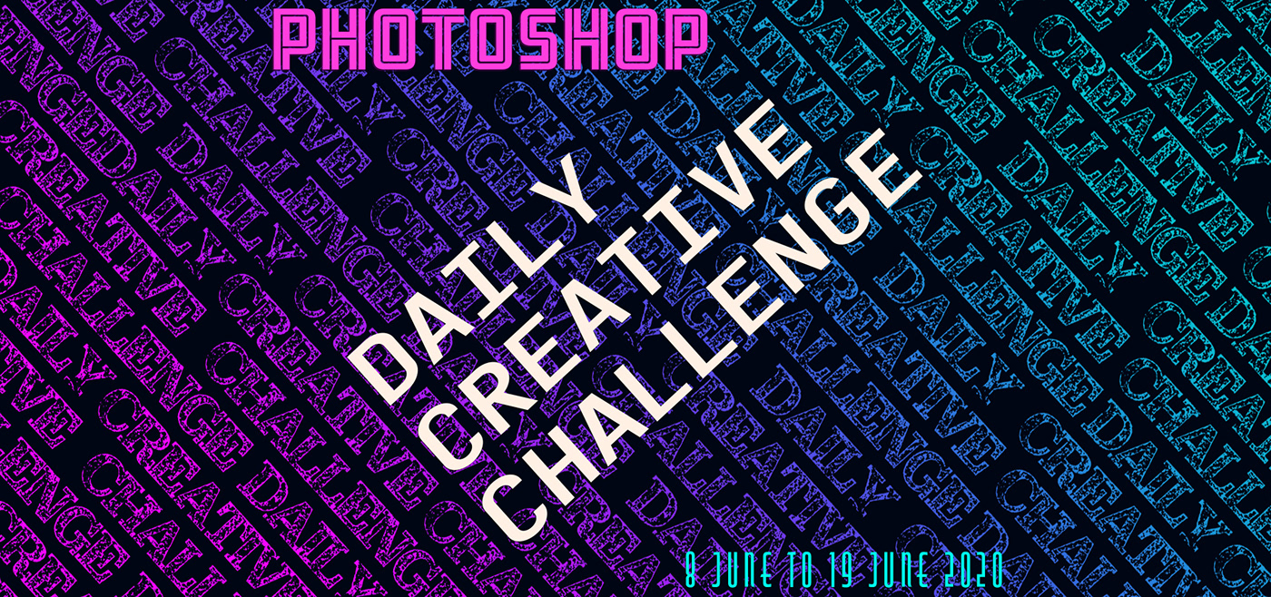
Behance
The PhotoShop Daily Creative Challenges from 8th June to 19th June 2020.
double exposure time
double exposure time
@young karma I appreciate this piece!
@indigo monolith thanks!