#✂challenges-feedback
1 messages · Page 18 of 1
Today's practice 😃
The after photo. Comments are welcome.
@young karma I like the way you got rid of all the extra hairs. The background is a little bit distracting though.
@stark kayak Your totally right with the background and her blue sweater isn't looking good either.
Make it in the purple range and should be a little better 😃
Maybe the sky is too blue
Hello everybody! This is my first challenge with adjustment with the Camera Raw 🙂 https://www.behance.net/gallery/80477563/PSChallenge-May

I changed the background and adjusted the blue color of the sweater.
@young karma good job! I love the colors 😃

Original
Edited with Raw Filter. Masking for Adjustment Brush a bit tedious in RAW, especially at building-sky edge.
day 5 😉
day 5 callenge
@young karma the background is looking a little bit better, but it's still a big contrast with your subject. Perhaps cropping the photo really tight so there is less background. Maybe line up her eyes with the top line in the grid? Maybe adjusting the temperature of the image will help too? I'm still a beginner myself!
This is so much fun! THANKS TERRY!!!
@dark lotus I don't think the sky is too blue at all! Reflects with the water hues nicely.
@young karma The buildings look much nicer here! I wonder if there's a way to bring the blue of the sky back in using Camera Raw only?
@kindred kernel Everything pops really nicely here with this edit! I would just watch the saturation in the skintones from getting too unnatural - here particularly in the middle subject's kneecap and in the faces on the left and right.
@peak zinc this edit is lovely! Only thing is it looks like it was saved a little low resolution? Wish it was as crisp as the original.
@fallow bough It sure can be tedious, but you did a good job! One thing to consider is the slight cyan cast in the water in the bottom right vs the more blue tones you now have in the sky.
@wispy compass Wow, I love what you've done to bring out the grass and those chairs in this edit. One thing I'd ensure is straightening out your horizon line.
@tawny dagger Great shadows and tones in this edit! Wonder what it would look like if you took it into Photoshop now to retouch the skin just a bit and to bring back some lightness in the eyes?
@rain parrot great fix! I'd just consider bringing the midtones/highlights down just a touch, it is reading a bit harshly bright to me in the context of that beautiful sunset sky.
@young karma Love the warm tones here, I'd just straighten out your horizon line!
@gaunt forge Great job adding some life in this photo! The blues in the sky read a tad too unnatural to me, so I'd consider toning down just a bit 😃
@uneven lark Gorgeous! I just see a small spot of white in the top right corner.
@blazing quail Great adjustments and cotton candy sky! Wish this was a wider frame to see even more of the effect.
@fallow bough Love the natural vignetting you get here in the shadows of the trees on either side of the path. Helps guide the eye to the mountain!
@wild quail I think this looks great! This is the first edit of the photo I've noticed the warm light reflecting off the rail, which is really nice to help balance out the sky!
@young karma Wow, this is great! I love the treatment of the lower half of the photo. I wonder what it would look like with the sky still a bit desaturated (but with the new darker levels you have in)?
thanks! I got it😊
❤ @thorn narwhal
@thorn narwhal thank you:)
Hello Everyone. I am little late. Here is Day 1. https://www.behance.net/gallery/80496559/Photoshop-Creative-Challenge

@thorn narwhal thank you! What do you think? it is huuuuu... frightening realistic... 😃
Camera Raw playing Day 5
@thorn narwhal ...ok...for some reason I never notice the horizon...but I see it now and will adjust....thanks so much for the feedback
@thorn narwhal Thanks for the feedback. Here's an updated version. While I was a at it, I added a little bit of the Warming Filter to the talk buildings and the hill to remove the blue cast they had.
@young karma Thank you very much for submitting your work 😃 I think the collar band could be a bit brighter, in the original image it really stands out because of the vibrant red color. I like the contrast and exposure quite a lot
Was zoomed in so missed a section on the right in the mask selection.
@brave hound nicely done! I love the bright colors in the sky, but be carful with the saturation slider because for one: it will introduce color noise and it will oversaturate already saturated colors (like the orange). So I wouldn't go too far - maybe even reduce the vibrancy of the orange tones
Here's mine 😃 Photo also by me, as always https://www.behance.net/gallery/80497789/PS-Daily-Challenge-Day-5-Photo-Adjustments

Original (straightened it too)
@brazen barn wow! the colors of the ocean and the sky really pop 😄 . I like how you went with a more stylized look - it works
@dusk crown nice one! just look out for the tree, right now it is touching the edge of the picture
@dusk crown I would give it some extra room around the leaves
Yeah, I did think it might be a bit close, but I was stuck between that and making the deer more central. I'll let it breathe a bit more. 😃
@glacial path How's that? I couldn't do any more without it exposing white edges because of the straightening.
@dusk crown you should try the content aware checkbox! it will magically add content where there would be white edges 😃
@dusk crown just make sure your layer is not a smart object though
@glacial path Ooh, fancy! Did Terry talk about that on Friday's stream? I missed it and haven't had chance to rewatch yet. I'll give the wizardry a go!
Day 2 Creative Challenge B&W conversion
@glacial path Do I have to rasterise it then, to stop it being a smart object?

Day 5 challenge; Reservoir
Day 5 challenge; before edits
@wraith surge hey cool! The image feels a lot more balanced now. but the question is: where is this light coming from? What color should it have? Should it be as warm as the sun or should it be slightly colder.
@rigid bobcat alright! well done 😃 The colors really do pop and you have saved some of the dark shadows. I think the edit in the trees on the left is a bit too much, they look rather gray, so I would tone down the adjustments. Also: the hand rail blends in with the blue water on the right - before, there was some contrast but now the luminance is very similar. maybe you can darken the hand rail again to bring back the contrast 😃
@outer lantern I like how you went with a pretty dramatic effect. It looks like an HDR image. Keep in mind, that you're losing contrast by applying this kind of editing. Images tend to look flat if everything has the same brightness
@outer lantern my advice would be to bring back some of the light/dark areas to enhance the contrast (unless you're going for that HDR look, which would also be totally legit)
Day 5! Playing with those adjustments in the Raw filter...loved the tip of using the brush setting! That was a lifesaver https://www.behance.net/gallery/80498923/Photoshop-Challenge-Day-5-Photo-Adjustments


Instagram
50 Likes, 5 Comments - Estaban (@estaban_1000) on Instagram: “Another portrait, probably one of my favorites that I’ve done.”
What should I add to that photo
@sly turtle That's a huge difference! I love it - the crop is nice and the exposure is much better. Just reduce the saturation of his red shirt a touch, and you're done! I also like how you have added a description to your Behance project. It helps a lot when looking through everyones work 😃
Day 5 Challenge; Reservoir Version 2; turned down the exposure in land section
looks good wow
@glacial path Thank you for suggestions. The light should be cooler. I will try it out.
@glacial path thanks for the tip! I’ll give that a try!
PS daily challenge day 4. its sloppy but for me it was hard. UGH
@summer mica your hard work really shows... or I guess it doesn't show, because it is pretty seamless! Maaaaybe you can take a look at this part again, but everything else is pretty good
@thorn narwhal ...OK?
@glacial path thank you for the grace and YESSSS that stupid tag...maybe we should speak to the photographer lol.
Before
After
I had trouble with Tony's hair. How can I improve on that selection? I kept getting a bright highlight at the front as if I'd selected his skintone
Original photo (from a 4 X 5 transparency), taken near Camdenton, Missouri.
And this is after some Camera Raw fiddling...
Gotta say I love that adjustment brush..
@wraith surge this makes a big diff. there is some lens distortion. making the lights lean left. Maybe the experts in ask-s-question can help.
Here is a before and after. Other than some global adjustments to adjust overall lighting I used the HSL and the Targeted Asj pointer to work on the sky then the Adj Brush to bring out the wood in the Juniper tree.
@gloomy flare Oh yea! love the reflection you poped
Day 3 Cropping Before
Day 3 Cropping After
🤘🏻
Day 5 Raw Filter Before
Day 5 Raw Filter After
I think my brush tip was WAY too big around the trees and caused that halo...I'm so embarrassed
Day 3 Cropping Before and after
@bitter plover I love it. I actually really like the original since there's so much to look at. I think all you need to do is crop out a little bit of the sky. IMO.
A couple more... Golden Hour at 290 feet with my DJI Mavic Pro. Original shot.
straightened the horizon, darkened the sky a little, and slightly brightened the foreground trees.
Used brushes to lighten the foreground and the Gradient adjuster for the sky. Not a great image but this is what it lookked like at the moment with my eye. Also used the Patch tool to remove my foot.
@wispy compass Yes! Looks great
@fallow bough Looks awesome!
@young karma I much prefer the toned down version! Super cool. Looks very ominous 😃
@glass bridge well done!
Day Five Camera Raw Filter
Photography Daily Creative Challenge #03 B&W Before
Photography Daily Creative Challenge #03 B&W After
Day 5 - Nice to use this familiar tool in PS, I'm used to lightroom. Good to know how to use the smart filter etc. Looking forward to maybe some more challenging challenges for the rest of the week?
Had difficulties removing all the noise even though I think I did everything just like in the video. Anybody else find the knack to this?
At least I searched and found the keyboard short cuts [ ] to change the brush sizes 😃
@neon palm All I did was make another brush and go back over the path with noise reduction turned right up and desaturated and then darken a little. The path isn't too noisy then.
@gloomy arch Thanks, I'll try that.
https://www.behance.net/gallery/80506757/PSdailychallange-Day-5 my submission for day 5

Behance
A picture of a statue at Bunker Hill, Boston. Used for day 5 of the PSdailychallange, using camera RAW only.
@dark lotus I like this image! Always satisfying to get a photo to look how you remember when you captured it. Definitely worth the recovery here.
@coral stone Those leaves pop really nicely on the path in this edit! Beautiful control.
@lofty saddle Looks really nice with the template image! Great job with the subtle adjustments and crop. I dig the blue tones as well. I'd consider toning down the whites in the highlights of the sky to match the feeling of the blue and not to distract from it. Good work on your original image edit as well!
@glass bridge Wish I was on that boardwalk right now! I love the colors you're getting in the grasses and sand and wood. I'd consider just toning down the blue a bit, it reads a bit too "daytime" to me and I think is a tad oversaturated which is competing with that lovely sun.
@raven hearth Nice! I would try to straighten out the horizon line a bit more for full impact!
@young karma I like the darker take on this edit, I'd just be careful of losing too much detail in the blacks on the left side of the frame! I also still see a small spot of white in the upper right hand corner!
Tnaks @thorn narwhal 😄
I think this version did come out better than the first. Used a new brush for an extra pass of the brush for decreasing noise and desaturated. Adjusted exposure down for sidewalk. Increased blues again for sky and water.
Straightened, shadows lifted, texture/clarity for clouds, water,lights, tone curve for colour warmth
@dark lotus I like your image— particularly the sun and it's reflection.
@brave hound I had to do the ghost too because this is wonderfully eerie like a black and whit emovie.
Thank you so much for the feedback and tip @thorn narwhal 😊
@thorn narwhal thank you for the advice will post once i get it done
@dark lotus I will see if I can correct or will ask. Thanks!
Took me a while to get to this one. Busy day. Needs work, I know. I resorted to levels for the exposure because I just couldn't seem to get it right in Camera Raw. What are your suggestions.
Hi there! Here are my photos for Day5! Camera Raw Filter is great for extra dramatic skies! 😎
https://www.behance.net/gallery/80514611/PS-Daily-Challenge-5

@cold cedar I think I like the one with only Camera Raw better, the one with levels seems a bit too light.
PS Daily Challenge 5
Before :-
'A silent tear keeps memory dear'
After:-
Arras, Normandy (January 2017)
👌
PSdailychallenge - Day 05. Original Image
PSdailychallenge - Day 05. After cropping, converting to B/W, and retouching using Camera Raw filter.
My original image
My image after using the Camera Raw filter. I use this filter in LightRoom. It's great to be able to use it in PS too. Bring on some more challenging challenges 😃
Cropping for Instagram CORRECTION: Hi all, during the Photography Daily Creative Challenge #4 I mistakenly said 5x7 for Instagram portraits. I mean 4x5 : 8x10. Sorry for the confusion.
After and before. Day 5 challenge
Hello everybody! my second challenge is ready. Thanks in advance for your comments https://www.behance.net/gallery/80526655/PS-Daily-Creative-Challenge

This is a BEFORE adjustments
And this is AFTER camera raw smart filtering etc..
My fault, its the other way round!
Sorry uploaded wrong image - this is after
I also tried it on an older image from 2008, this was shot with a consumer camera, so its quite poor quality
Before adjustments
After adjustments
I found though, the image to be really grainy as soon as I lifted the spectrum
@buoyant nova - thanks for the feedback
@high mesa looks good. I am looking forward to re-doing some old photos 😃
@young karma - cool adjustments - the image with the London Eye brings back memories; I used to work in that office block to the right of the Eye. That's Shell Centre
#PSDailyChallenge
Day 5 - Camera RAW filter - #📣creative-challenges #✂challenges-feedback
😍
@gaunt forge beautiful!
@gaunt forge Nice work on the color balancing. Did you try dehaze? If not, give it a shot.
@young karma Great retouching, especially on the second portrait of the man! I really enjoy the green in the background and its natural halo effect around the subject's head. Bet this image could be really nice in B&W as well. Your landscape/cityscape shots look nice as well. I'd just watch the blue in the sky on the countryside pic from looking too unnatural/saturated compared to the rest of the image.
@cold cedar It's a great start! In my own work flow, I usually do basic adjustments in camera raw with exposure before fine-tuning in Photoshop even more. That said, you can get pretty detailed in Camera RAW with adjustments. It's definitely worth playing around with more and always a good challenge to try to achieve the same exact outcome you got with Photoshop only with Camera RAW!
@young karma Super cool! Feels like I'm in space. I would just tone down the saturation in the sky a bit so you're not getting any residual noise or distracting from the cool building + rest of image.
@fringe thicket Great skies! In that first edit, I'd let your highlight range come through a bit more like it is in the original to make the image really pop!
@celest ermine Looks nice! A bit light to be able to read the text on the gravestone. I'd consider bringing those levels down a bit to give the image more impact.
@grave thorn This image is beautiful! I love it in monochrome.
@young karma Postcard perfect!
#psdailychallenge 4 retouching - getting rid of those wrinkles!
#psdailychallenge 4 retouch pre
@thorn narwhal Thank you for your feedback, I will try this way
Looks good
@thorn narwhal Thanks for your kind words!
Thank you @fringe thicket. I will take another look at it.
Thank you @thorn narwhal. Camera Raw rocks. I do need to explore it more. Fortunately, I have a LOT of images to work. on.
@ionic gulch They look great overall. I'm not a fan of the placement of the social links on the bird LP. Vertical text is distracting in my opinion. Also the third column is a little hard to see under the "watch video". The photography one could use a different font color. It blends too much into the background and is hard to read
@quaint latch love the colors you brought out! Did you try leveling with the mountains as the horizon line to see how that looks?
Thank you for the feedback @wet kettle i will note that on the next one
@wet thistle I like the colors, but my eyes keep going to the bright towels on the ground. Maybe use the spot healing brush to get rid of some of them?
Here we removed the boat on the side
@sly turtle Thanks! And I hadn't thought of levelling the mountains - I'll give that a try now.
@vital fjord Thank you! like this?
@light nebula Looks good with the warm tones!
This was my attempt for today's challenge. Got rid of everything but the boat and dock. Decluttered the dock as well, all the excess ropes and safety equipment.
Catching up from yesterday's challenge.
Yesterday's challenge with my own photo - the After
original.
@wet thistle that’s good, I would maybe remove the dark area in the water too, but that’s just me maybe
@north arrow I really like your photo. The edit brings life to it. Good job!
Thank you @wet kettle
If you could @quaint latch it would be nice if you could get rid of the reigns or at least the red one, of you want to play with it some more.
@vital fjord Gulp - that feels a little beyond my capabilities, but I'm going to give it a go!
It’s something to try. It should be fairly easy with the spot healing brush for the most part. Have fun
@vital fjord Thanks again, I only do not know the best way to remove the dark area in the water. I'm afraid it is going to look unnatural. Can you give me an advise?
It’s just a little area @wet thistle, maybe a rock or person? I would use the clone stamp or healing brush tool. I don’t think it will look unnatural
@thorn narwhal Thanks! I’ll take a look at it and post it later 🙂
I really like to try - and struggle with - these challenges before the Live show. That way all the cool tips & tricks that are shown - in just half an hour - really stick :). Thanks for that @gloomy flare !
@vital fjord Would this be enough?😀
@quaint latch wow I love your result! the after image really stands out imo!
Day 6: I'm sure Terry will show us much more than I did. After straightening and cropping to retain as much as possible, used combination of spot healing, patch tool and clone brush to clean up. Used Camera RAW filter. Sky had JPG banding artifacts so used sharpness filter at -100 in that area to help blend.
@eternal marsh thank you!
Hi...just curious if there is a filter that would help sharpen stars that are oblong in this photo.
Day 5 - Photo adjustments with camera raw filter. I regret I didn't use this filter earlier!! 🙂
I meant this @wet thistle
Ohhhh....is that all 😂 @vital fjord
yeah 😃
I was taking care of the whole sea....😂
I'm sorry!
Hello! I send you my link for to see my challenges 3 and 4. Thanks in advance for your comments https://www.behance.net/gallery/80526655/PS-Daily-Creative-Challenge
Another photo for Day 2 b&w, it's not that great of quality. Shot with a p&s camera, but I love taking pics of the moon!
Nice work @wet thistle
After. Mostly camera raw with a bit of unsharp mask
@young karma Nice adjustments on the final.
@quaint latch Nice work with bringing out the details in the clouds and creating a focal point.
Very nice @vital fjord, I loved it!
Thanks!
Day 5 challenge

Awesome @wet thistle
@fast moth there’s a bit of glow around the rail that is catching my eye, but great job!
What's going on with my camera raw filter?
Ouch
Not the look I'm going for
@mellow quail IDK maybe gpu issue
@mellow quail Has it done that before?
It was fine yesterday. I'll try to updated drivers for GPU.
Weird, maybe just restart PS
Alright... after the video. Love the "Content Aware Fill"
@light nebula Cool
Thank you @tender mantle

I would like y'all's opinions on this. I did today's challenge with a pretty basic shot. Took out a few things that were distracting and used camera raw to touch it up a bit. I also recomposed it by cropping it a bit. I prefer centered subjects generally, but I would be interested to hear thoughts on the off center compostion.
my result for day 6 with the template 😃
Take off the distraction for add other distraction!
#✂challenges-feedback @gloomy flare
hi ,where can i see my photos?
Such a huge difference @grave hound !
Hi everyone this is the original:
And now they are ghosts 😂 I'm still working on the lines but what do you think?
Day 6 Removing things
Distractions removed https://www.behance.net/gallery/80549375/Day-6-remove-distractions

Any suggestions?
Here comes Day06!
@rich sequoia While I like more experimental editing, I think you've gone slightly too far 😅 - look at the sky around the mountains and the sharp edges around the bridge
@rich sequoia by dialing it back a touch, you could make it feel less artificial 😃
@rich sequoia maybe slightly desaturate the bottom part, bring down the highlights, bring up clarity a tad, looks nice though 👍
@young karma yes! I like the sky and the saturated bridge 😃 also good job removing the ship 😃
@coral stone yeah! they look like somebody pasted them in because of the missing shadows 😮
Yes @glacial path 😂 I think I’ll remove them from the scene too
@woven bane Thanks Tim, was hard work... 😅
Removing van. Basically Just removed the distraction and no other editing.
Day 6 of the PS Daily Challenge, removing objects. This one was pretty fun. I like doing clean up and or touch ups in both people and landscapes like this.
@coral stone I really like that, it's a cool concept, I think it would also be interesting to see just the steps and take out the two people? It would just be cool to see both I guess, but I really like it good job!
thank you*
Thanks @gentle elk 😃, great tip! I’ll try that
👍 sounds good, look forward to seeing how it turns out!
DC #6 - Add'l touches: Removed duplicate bowline from boat, added stern line to boat, replaced water line where buildings were deleted, worked on some color (I may have gotten to saturated). Need suggestion on how to remove the vignetting in the sky.
@coral stone but I like the footprints!
@dark lotus I’ll make different versions 😉
@wispy compass Really heplps me see the bird. Nice!
@dark lotus ....thank you!
@maiden flax very simple and seamless. nicely done!
@stray totem that's actually a very difficult edit! Even some of the pros will have difficulties removing such an object. props to you!
@fierce zinc I think the off-center one, especially with the tighter crop, is strong.
Playing catch up with the Photoshop daily challenge, so I've got my contributions to day one and two.
Here's the original image
Now, with some lifting of the shadows in the foreground to help expose some of the detail on his coat and face.

Behance
Photoshop daily challenge May 13 - May 24, 2019 focusing on improving lighting in an image.
And for the day two challenge...
Here's the original. Potential, with the shapes, but way too flat.
The use of black and white to crisp up the contrast and focus on the geometric shapes helps to declutter the image.

Removing objects - before
Removing objects - After. Also did a little cropping and punched up the color a bit.
a day late but here is my challenge for 5 photo adjustments
@kindred kernel So you did a sky replacement, right?
@kindred kernel that's the first thing my eye is drawn to
the edit on the grass is veeeery difficult, I would actually start with a more simple image. It is pretty much impossible to get a clean edit here without replacing the grass completely
but I think you did a pretty good job removing the fence, post and hut
@glacial path Thank you so much Tim! It means a lot!
Day 1 Original
Here is my Day6 after the video. I did not like the strong dark shadow on the mountains so..... now it is a cartoon 😂 🙃 😂
Day 1 Camera RAW
Day 1 Challenge - Original
Day 2 Original
Day 1 Challenge- Edit
Day 2 BW
@young karma I love this effect! You almost made it look like a marble statue! Love it!
@mystic rain nice one! just be careful when you're increasing the saturation. you can easily oversaturate colors
but I'm no food expert, gotta consult Hungryboy for that 😛
@young karma yes, cropping this image is a good idea, but don't go too tight or you will lose the beautiful scenery. I would go for a slightly wider shot like this
Colors looks good to me @mystic rain @glacial path Would maybe considering cooling the tones in the highlights just a tad so you really get the full effect of all of the different colored produce. It is reading a bit warm to me if we're being picky 😉
@wet sentinel Really nice edits for days one + two! I particularly love that first edit and how you've managed to make it more dynamic with adjusting the exposure. Great example of what might seem like a throwaway shot until you've revisited it to make it match what you have in your head.
@fierce zinc I don't mind the off-center! I think the shadow is dramatic enough to nicely balance out the space.
Day 6 - Remove Distractions (+ adjustments) - I really enjoy the exercise! 🙂 I didn't remove all the buildings - the boat seemed to me quite lonely without any....
@glacial path thank you. i was concerned i reached the limit
@mystic rain I think you're still good, but I wouldn't push it more
unless you're going for that look. which is also ok
is there a way to add multiple photos to a post on here?
Removing unsightly cables and smaller boats:-
Before
and after
and after
and after
sailing into the sunset
@glacial path, @young karma So agree with you, Tim. That is a wonderful image, Thomas so a wide crop keeps the beauty of it.
Day 6 Before and After: https://mir-s3-cdn-cf.behance.net/project_modules/1400_opt_1/271fb080552551.5ce474e789378.jpeg
https://mir-s3-cdn-cf.behance.net/project_modules/1400_opt_1/e9169b80552551.5ce474e789707.jpg


Day 6 Removing Distractions Before and After https://mir-s3-cdn-cf.behance.net/project_modules/max_1200/0b30cf80553781.5ce47e3468558.jpg
https://mir-s3-cdn-cf.behance.net/project_modules/max_1200/7b0f5180553781.5ce47e34681aa.jpg


Here is another one of my photos for the day5 challenge - after
belore
Day 6 challenge after
PSDailyChallenge 5
Before & After for day 6 of the #📣creative-challenges
Before & After for day 6 of the #📣creative-challenges
#psdailychallenge 5 camera raw filter adjustments. Managed to enhance the color of the crystals. thanks for a fabulous class!
no adjustment
!rank
 Hafsteinn, this command is disabled in this channel
@young karma the command works only in the #💬chat-general channel 😄
Yea I have already figured that out 😂
@vapid niche Ty Kat! I didn't try a mask but I might go back and try and see how it looks. 😃
PS DCC Photo-Adjustments Before & After
Before
PS Daily Challenge Day 6 - I liked the big boat
@young karma I don't mind the buildings! It offsets the boat nicely.
@celest ermine Looks great! I wonder if you can achieve the same effect removing the cables with the uncropped image?
@rustic tree Nice rich colors in the sunset challenge! I'd be careful leaving the bottom left too "light." A lot of noise is showing through and I don't think it would be too bad if it was generally darker. Also in the water around the rail, I'd try to even out the blues if you can between the gaps so it blends with the rest of the water more evenly. And great job with the retouching on today's challenge.
@north arrow Great job bringing the sky details back into the frame and making all the colors in the trees pop. I'd just be careful of darkening the tips of the trees when darkening that area of the sky so they don't blend together too much.
@coral stone So cool to see these final edits! I think it's fun without the people but with the footprints. I can imagine removing their footprints was a fun challenge though and the result looks pretty clean!
Thanks @thorn narwhal It was really a challenge trying to match the lines 😂 I'll give my brain some rest to try to enhance them later 😄
@thorn narwhal Thanks for the feedback.
@sudden mesa I dig the cyan - looks like a sleek ad. Would be really nice in B&W too I bet since that car is so bright and clean!
@wispy sand Looks nice! I bet they would pop even more if you evened out the tones in the highlights to read a tiny less "yellow."
@trail turret Nice bringing some detail back into those highlights on the rose!
@gloomy arch I like the big boat too! Good job with the retouching. I'd beware of overexposing your highlights a bit, especially in the sky.
@thin jetty Awesome job bringing some shadows and clarity back into those stones! I wonder what it'd be like if you toned down all the highlights in general so it read more "foggy" than a bit overexposed? Might also be nice to play with in B&W!
@thorn narwhal - Thanks for the feedback. 😃
@thorn narwhal thank you!! I leave the B&W version 🌗
@thorn narwhal I lowered the highlights, the exposure, and the saturation.
@thorn narwhal I lightened it a little so the fog doesn't seem so dark
@thin jetty looks good!

Remove distractions: Had a little fun, did a lot of work. The mountain holds a secret.
@high mesa Wow, what a place to work! London is my favorite stopover from Asia to the US. We have lot's of family memories there.
@thorn narwhal Thanks for the feedback on the portrait retouching and the landscapes. I agree, the blue is a little over done, but after living in India for a decade and then going to England, the sky felt that blue to me!
@cold cedar Broken hearts
@light nebula 😅
@thin jetty Very nice. I would crop it a little so the horizon sits about or below one of the rules of third, which would give it more impact.
@cold cedar this better?
@thin jetty I was thinking less sky but that sky is so dramatic. And the concrete at the bottom leads the eye. I wish it could have both. I just don't know how to bring the drama of the sky to the bridge. I tried it, actually, but I used some hack manipulations.
@cold cedar I tried taking some off the sky, it threw off the balance of the picture. Same with completely removing the grassy bit at the bottom
gahhh took me all day and I'm still not thrilled with it. practice makes perfect ...they say
@thin jetty I understand that. It is a good image, though.
@young karma lol the Tony photo 😂
Photography Daily Creative Challenge #05 psdailychallange
@urban berry Your beach scene is amazing! Did you take this photo? Both the original and the adjusted are very nice images.
Edited image of Terry's
Original image of Seven Sisters in South Downs, England
Edited image with a few items removed and adjustements
@thin jetty The image of the bridge is nicely cropped now. I can imagine some bold headline in the sky as part of some social post or magazine ad. Nice work.
@young karma The beach scene is the stock photo I found in Pixabay.com
Just noticed I left the reflections of the buildings...here it is again with that fixed.
Ps Daily Challenge day 6 Remove distracting objects from a photo
my day 5 😃
ive wanted these people out of the photo for a while, but question.. what is the policy about including photos that contain alcoholic beverages?
Removing distractions #2. This photo was shot from the passenger side of a vehicle. Tried to make the line created by the windshield's sunshield tint less obvious. Couldn't get the sun right so left it alone. Suggestions?
Original image.
After retouching, cropping, conversion to B/W, and removing the pole coming out of her head.
👌
@young karma great work on the removal of distracting elements, but I think that now there's no foreground interest. Maybe leave a couple of people in?
Sorry to ask, would it be possible to get some feedback from the moderators/mentors? I know there are alot of folks on here, I appreciate time is short, but I would appreciate it, thanks. 🙂
@grave thorn yes, you're right, this is another attempt, thanks for your feedback

@young karma yes! That is much better. Well done!🏅
@grave thorn thank you ! Indeed, the photo tells another story 😀
@mystic rain I'm not sure of the rules but it's a pretty clean edit! I'd just watch on keeping that horizon line super seamless and even, I see a slight dark discoloration where the person sitting was edited out.
@cold cedar If something is overexposed in an image (like the sun here, for example) it's hard to bring back detail in it. I think you did the right thing but making things generally warmer toned to give off a more impactful effect, though!
@young karma Nice and clean on the grass/water image! I would just watched in the lower left evening out the darker patches of grass into the lighter area. Really love what you've done with the biker image to make the image even stronger (bet it'd be great in B&W as well!).
@young karma Looks lovely! I'd just consider brightening up the area where the solo boat is a little so it's more noticeable. I'd also tone down the yellows in the mountain so it comes across as a tad less "artificial"!
@high mesa re: your images from yesterday: Good job recovering the blues in the sky on the water shot! It is always frustrating shooting directly into the sun and losing the rich saturation of the surrounding scene. I'd consider extending the blue down into more of a vignette and less linear, or slightly desaturating it so it doesn't look so "painted" across the edge of the frame. I like the new subtle pop in the grass on the lefthand side as well. With the orange sunset, I'd just watch messing with that patch of sea on the middle right too much and exposing too much noise/grain. I kind of like how that bit looks in the original. The noise in the foreground bothers me less, because I think the texture works ok in the sand!
@thorn narwhal ty 😃
Yesterday's assignment. I chose to remove the rowboat, and leave the bigger one. That was harder than it looked. I chose to alter the lit (brown) mountains with curves, not Raw. Masked first. Did similar to the boat on the left.
Oh, also, When I altered the sky, it started to band. I got rid of that by using a blur. Is there a better way to remove banding in the sky?
@glacial path Thanks for the suggestions. I was just trying to make it unnatural using Scott's HDR tone from the adjustment. Still experimenting. I would have never looked at the finer details that you pointed out. Appreciate it.
Here's my one for yesterday 😃 Photo also by me, as always https://www.behance.net/gallery/80586649/Ps-Daily-Challenge-Day-6-Remove-Object

@gentle elk Thanks for the suggestion! Let me dial it down..by a lot.
Original
Removing objects (day 6) challenge. After retouching
and before

Behance
Adobe Photoshop photography challenge 2019 - day 6. Use Photoshop to remove unwanted objects from a composition
@novel bronze wrong discord server?
@dusk crown Wow. That was impressive. Although, composition wise, I like the cave framing except the lower right. I have a weakness for framing devices, for example curtains in Dutch Golden Age paintings.
@dusk crown great crop and removal of those rocks! I would suggest maybe leveling out where the water meets the far rocks, but otherwise it's a great capture and edit!
Oah, sorry
@peak warren Thanks! Haha noted, but I think because this challenge is removing stuff, I’ll keep it as drastic as I can. I might do some stuff with framing in the future though. I agree it can look cool.
@desert leaf Thank you! 😄 Far as in which side? Right?
@dusk crown Agree.
@thorn narwhal Thank you for your feedback, you're right, the grass can be improved, I'm pretty beginner in retouching photos, but I love that 😊 , thanks for the photo of the biker, i'll try it in B&W 👍 🙏
Thanks @thorn narwhal.
today was faster because I re-did yesterday like 100 times. I like a darker ambience., but still need to take my time time. it is really a beautiful picture after we work on it. Thanks Terry White.
@desert leaf I had a go out smoothing out the far right, and making it less repetitive/more random.
More distraction removal. Couldn't quite get the color right on the tree. Suggestions?
I just meant more level the whole thing out. The image was kind of angled up to the left, so personally, to me, this looks better. Just my opinion.
@dusk crown ^
Day 7 after, used the skull with a different layer blending mode and healed out the parts of her hand that were showing through. CC welcome
PS DCC Crop Before
Converted photo to black and white but left colour on reflections
After
@young karma normally I'm not a fan of the selective color type look, but I really like that picture!
Day 6 (removing distracting elements) - Boy, once you start taking stuff out, it's hard to stop! https://www.behance.net/gallery/80591339/Photoshop-Challenge-Day-6-Removing-Distractions

Behance
Ladies enjoying Bunco at our Women's Ministry night. I removed distracting elements from the photo for use on our church's website.
Day 5 - Photo Adjustments (AFTER)
Day 5 - Photo Adjustments (BEFORE)
I'm open to feedback on how to improve on my photo editing skills 😃
Ps Daily Challenge: Day 6 - Removed Objects / Enhanced in Camera Raw (Before & After)
day 7 - after: who else thinks this is weird??😇
@young karma that's hilarious! Very creative 😃
kymera, this command is disabled in this channel
My Day 6 Challenge: Remove Distracting Objects from a Photo.
@young karma I knew this was coming. LOL
@gloomy flare come on, there is always more than meets the eye!!! 😉
@thorn narwhal thank you for checking it out. i'm going to endeavor to remove the book next and will revisit the horizon.
here's the day 5 adjustments image that I did.
!rank
porchpirate, this command is disabled in this channel
Messing round with the images for todays challenge. Not sure on the challenge specifics yet. Tried to make it so the head is emitting blue light so would love some feedback on how I have done with that. Many thanks. @fast belfry wondered if you could give me your opinion, the women feels a little washed out now but don't know what I done wrong 😃
Camden Lock in London, removed railway wires and posts etc...
The lettering was awkward and the high street is messy, but happy with the result
@young karma I tried but my very little knowledge made a real mess and I discarded. but really funny. good job.
@high mesa good job. Like how vivid the yellow is 😃
@jovial moss - thanks, raw adjustment just beefs everything up
@true storm thanks appreciate it
@summer mica thanks, practice makes perfect and I have lot of that to do as well!
@true storm thank you, i think i might have over did it with the yellow. i have a thing for really vibrant yellows.
@young karma so much fun. I forget the clock while I'm fiddling with these images. Inspired to pull a CV ouple of favorites and try to "fix".
@dusk crown - blimey, have you removed that big rock? Where is the TNT tool in photoshop?
#📣creative-challenges @gloomy flare
@high mesa I did! Haha, that’d be useful, wouldn’t it? 😆🧨
Fantastic job on reoving that rock @dusk crown
@jovial moss Thank you! 😄
@dusk crown freakin' awesome - talk about remove the needle in your eye! Huge props to undertake major civil engineering in PShop
@high mesa Thank you! I’d actually messed around with this photo before; removed the dark cave edges, but I was curious to see if I could go the whole way from scratch.
Quick one!
like that @mellow quail
🙂
day 7 🤔
Yeah I did it in real time with Terry @gloomy flare Thanks Terry for the tutorial.
@cold cedar On the tree, it looks like your shadows are too warm. I'd suggest playing around in Image > Adjustments > Color Balance and select the "Shadows" in the Tone Balance menu. It won't be perfect, but I'd add back in some cyan and potentially blues.
Day 7 - Compositing: Background photo taken in downtown Kansas City, Mo.
Acacia and Alyssa - 3D figures rendered in Poser Pro 2014
Final composite with a bit of fiddling in Camera Raw, etc.
My patch tool is acting up... it makes a pattern. How do I deactivate that? I tried resetting the workspace to photography. I have probably checked or unchecked something super obvious. #❓ask-a-question #✂challenges-feedback
@crimson niche Really nice shot! I'd consider selectively vignetting on the right side of the frame only, or just in the sky even. Would be cool to bring out the details of the man and the stroller in the lower left column. I'd also try to rotate the frame so those vertical lines on the houses are a bit more straight up and down.
@fast moth this is no easy feat! I would just be careful about darkening the water too much and making it too splotchy. All of your edits in the sand/foreground look solid, though.
@grizzled goblet Great job retouching out the subtle distractions but really awesome job with the colors and levels! The sun spots pop really beautifully behind the figure. Super strong image.
Compositing Day 7
@young karma I'm a bit terrified but it's a really fun edit! I would just be careful of that white bit you can see around the hair on the left head, as well as the lower left edge of the hair on both.
@jovial moss I don't think the woman looks washed out given the desired effect of the blue! I would just watch the bottom edge of the head in the hand so it doesn't look like it's blending in too much.
@high mesa A great practice in typography!
@tawny dagger Awesome job matching up the tones in the new background! Really seamless.
@queen surge Solid! Would consider moving the head in the hand up just a tad so it looks like it's sitting in her hand a bit more instead of the edge of her pinky.
@timid pasture Great job pushing the red tones from that neon sign into the figures.
@thorn narwhal thanks for the feedback, much appreciated
❤ @thorn narwhal
@mystic rain Yellows can be very very dangerous in photos. Sometimes too much yellows can give an aged look to the shot, but if that's what you're looking for by all means, add yellow. Personally, I like to add a bit of saturation into my shots and balance out the shadows and midtones. I'll also resort to black and white, which is most of my Instagram feed now.
Challenge 7 . Before
😃
After. Blending mode substract
This is my day 7... thank's to Terry and adobe so much!! I'm watching Amber and all this is so intersting!!!!
This is my remove object image from yesterday.
This is an image I practiced some retouching with.
And I decided to combine the two for today's image!
I tried to cool the temperature of the portrait picture so it would better match the background image, but I still feel like she doesn't quite "fit".
@thorn narwhal - I thought my piece was about removing things not type? Can you elaborate what you mean please?
@young karma - it looks like a projection screen and the lady is stood in front of it, cool
DAY 7
Day 7 , images combined. https://www.behance.net/gallery/80600647/Day-7-Combine-Images

@fast moth Good job on Day 5. One critique point... Be careful with the blotchy look on the photo seen in the water. It's a dead giveaway to retouching a shot. This is something you'll learn to avoid with more with practice. Repeats and patterns are also a good thing to avoid in your final artwork.
My Day 7 challenge entry. Used one of my own photos to liven up the background.
I need you guys' opinions. I can't decide whether to do a slight gaussian blur on the background or not.
On the one hand, it might give the effect of a camera's depth-of-field and so be more realistic.
On the flip side it might draw attention to the person too much and make it obvious they're placed in.
Thoughts? 🤔
@dusk crown i think person should be a little bit more contrast
@tawny dagger Thanks for the feedback, I'll bump that up a little 😃
@tawny dagger How's that? 😃
👍 👍 👍
Following the herd on DC #7
check pm @dusk crown
@tawny dagger Thanks! 😄 Do you like the blur or no blur best? I did, thanks for the vid, it seems useful. 😃
on my pic i use Lens blur and make some blur on the person's corners, but without any blur i think ur pic is nice @dusk crown
I played with the masking to make it look like the skull is nestled in her hand. Now on to something of my own.
@thorn narwhal Thanks, good sir.. Got a couple more coming... 😁
@tawny dagger Yeah, I sometimes use the blur tool for a similar effect. I feathered the image before I copied it in so that it wasn't too sharp too. And thanks, both pics are taken by me (the guy is my brother). 😃
I didn't realize this model with to Iceland with Terry, too 😜
Original photo from Unsplash
G4 Rendered in Poser Pro 2014
Final composite.. Added reddish light, and blurred the BG a bit. Also added shadow under the bike, and a few speculars here and there.
Down the rabbit hole I go! Day7 combine two images
@fast moth Aw, I miss the yellow boat.😉
changed the colours a bit
wow you all are so creative!
@uneven spoke Awesome concept! I think if you removed more of the white background on the skull image it would blend better with the background image
@thorn narwhal Thanks! I will try that tonight when I have more time.
This is my final one for today's challenge 😃 https://www.behance.net/gallery/80601949/PS-Daily-Challenge-Day-7-Combine-Images

Original images
@timid pasture dig it. Really nice job on the subject matter
This one took me a minute, but here's my retouch from Day 4
Love what you have done with the skull @uneven spoke
Day 7! https://www.behance.net/gallery/80602585/Photoshop-Challenge-Day-7-Combine-Images Before photos:

Behance
A combined image of a backyard patio and a young woman
holy moly that's good! @scarlet lily
just move the font a bit down so it is more in the center and you're done!
about the same level as her eyes

This is the adjusted image for the day 6 challenge followed by the original.
😋
Day 7 - Composition - Combined 3 photos....not sure how to fix the shoulder
@wispy compass thank you for submitting your work! It certainly is a very dramatic photo and so are the colors in the backgroun. I would darken the exposure of the person and dog slightly. The red of the shirt should probably match the red of the helicopter. And unfortunately the arm is cut off - I understand that you probably can't retake the image, maybe you can mirror the person and the dog, so the dog looks to the right, but still is on the left of the image
@scarlet lily perfect! I love the warm colors and the palm leaves are a great touch
@young karma what a beautiful scene! I love the more saturated colors and the removed shadow! Thew edit is pretty seamless apart from a mini spot on the very left. Great job 😄
@glacial path ...unfortunately when I took the picture, both dog and person were cut off....but I will darken the shirt ...that's a great idea...thanks!
alright! that's what I thought 😃
@wispy compass if this was for a real client, and they absolutely need the image, somebody would probably have to hand paint the rest of the shoulder or dog in. Of course we don't expect that for the challenge because it could take days
@peak zinc I think you're about 90% there. Just make sure to take your time cutting out the glass. towards the back of the head you've missed some white spots. I think you could also increase the brightness of the skull slightly. The black parts are too dark, given the ambient lighting in the scene.
@peak zinc Maybe you could even add a shadow on the hand. Such a big glass head will probably block some of the light and therefore create a shadow on her hand. Let me know if you need any help with that. It could be as simple as drawing a black blob using the brush
Hi everyone, I'm not sure about the perspective, any tips? 😄
@sly turtle Lovely shot and (lovely garden too)! The light and exposure is very natural. However, I think the background light is slightly warmer than the light hitting her shirt. You can solve that issue by either going to Camera Raw or by using the Photo Filter effect
@wispy compass looks like a battlefield. I like the shoulder this way because it really adds to the gravity of the situation. Tile is off essence. It oozes urgency. Love it again Babs !
@mystic rain very subtle and seamless! I like it. Just keep in mind that some clients want to keep any beauty marks. Personally, I only remove temporary blemishes, but that's of course entirely up to you 😃
@young karma ...thanks! It was a battlefield. Pictures are from a fire in California last year.
Thank You @glacial path I am doing another pass and messing around with color. Going to shelve it for a bit because I think I've been looking at it for too long. Also took a massive detour to watch a Burn & Dodge clinic on youtube.... it's getting weird over here.
@wispy compass Composites with a message - can’t go wrong. Powerful image!
PS Daily Creative Challenge Day 7
@uneven lark lol! that's a good one 😄
I would sliiiightly increase the brightness of his legs, but that's about it
well done!
@wet kettle oof it looked fine on my laptop but then I checked it out on my phone screen and it looks horrible any idea why?
@glacial path 🙂 Thank you for suggestion
@dusk crown Nice! I think going b/w was the right move. it also solves the color matching issues ^^
@wet thistle Fantastic composite, the flowers look very natural in her purse! Just increase the brightness a bit to match the ambient light 😃
@glacial path Thanks! 😄 Yeah, I also wanted to give it a slightly old timey / dramatic feel.
@coral stone hmmm. I think she is a bit too red. Since the sky is pretty blue, you would expect to see some neutral white light on her.
@coral stone as far as cutting out her hair and the object, you did a fantastic job 😃
I also like the shadow below the stone on her hand
OK - one last one for today... Original photo from Unsplash
@coral stone THe perspective looks about right. maybe she's a bit too big but she could just be close to the camera
@timid pasture I think she is a bit too big for the perspective. try actually putting her on the cobblestone, that will help putting her in the scene.
@timid pasture it also looks like the shadows in the background have a blue-ish color wash
using a curves adjustment layer
Thank you so much for the feedback @glacial path 😄
@glacial path Interesting... I'm gonna do a little playing with that... Thanks for the feedback, Tim! 👍
@glacial path hey I made this a while back and it looked fine on my laptop screen but then I saw it on my phone screen and realised it looks really bad with the white background still visible do you know why this happened and what changes I need to make?
@uneven spoke looks like your laptop screen needs some adjusting. the background is not pure white, but the foreground is
I'm not a professional, @uneven spoke, but you would need to use the proper blending style, and then you could probably merge the layers and heal/paint/clone around the head and the stuff coming up from it to make it blend with the background better
combination day 7 #📣creative-challenges !
@uneven spoke therefore you can see an edge. one easy way to fix that, is to change the blending mode to multiply or darken
@glacial path it looks fine on my laptop screen (sorry for the bad picture) what adjustments do I need to make to my screen?
@uneven spoke http://www.lagom.nl/lcd-test/contrast.php
@uneven spoke also http://www.lagom.nl/lcd-test/white.php
@glacial path Thank you ill check it out 😃
@glacial path I've reduced her size, and fiddled with the curves a but (blue and red) to get rid of the bluish cast in the shadows. Also added a bit of shadow to her to anchor her to the ground.
@high mesa In the removal of objects, you constructed and finalized the letters of the sign, which is really skilled to match the look and feel of the rest of the letters! It's still very much about removing things, but I was just pointing out the extra challenge you presented yourself with in that image.
Photoshop Daily Challenge Day 6 before and after
Photoshop Daily Challenge Day 6 Final
After
@gloomy flare
Day 7 Birth of Crowthulu
@gritty mortar Icy! Do you mind sharing the images you composited just so everyone can see? If you don't mind giving away your tricks ;)
@timid pasture The figure is still reading a bit tall to me maybe, but otherwise the coloring looks great!
@past canopy Love the flip! The dock draws the eye from the left of the screen to the boat on the right very nicely.
@vestal tendon I dig it! Would just watch that pink line looking like it's going through his hand like he's holding a light saber or something.. :)
@ornate saffron really lovely! I'd play around with softening the focus on that big second butterfly and the top one to match the focus on the original flower image?
@mystic rain Lovely! Skin retouching is so hard to keep looking natural but it looks pretty solid here. Only thing that sticks out to me really is the small patch below the mouth on the left side, and maybe a few more darker spots on the neck. I think these spots were probably accentuated in your edit of tones and levels (which are lovely), which always makes it trickier.
@young karma gorgeous! I Love the contrast in the cooler tones of the shadows vs the warmer tones of the sky and water. One thing I'd watch is the slight halo effect around the lighthouse and a bit around that hill/mountain.
This feedback chat is amazing. Thank you everyone who is so active. It is really helping to motivate and push me. I often get caught up thinking "nobody else will notice that" or "will it really make a difference" and it's so great to know that people do that and the nuance of fine design is appreciated
@thorn narwhal Thank you. I tried to give the Lighthouse a little shine on the top, like a fire is burning.
My Day 7 Challenge: Combine two or more images together with layers
I reduced her size a little (she was a pretty tall model LOL), and moved her to the right. There were too many BG elements on the right that looked like they were growing out of her head.. 🤔
@fallow bough I'd just watch the scale of the tricyclist in comparison to the runner! Unless it is intentional of course :)
@limber birch Nice work! I'd just center the head in her hand a bit more so it looks like it's resting on her palm instead of on her fingers.
@glacial path @thorn narwhal Thanks for the feedback good sirs!
@dusk crown I think the slight background blur looks good, and your 3rd image with more contrast really pops. 👍 I do a lot of compositing with 3D-CG figures placed into a photo background. One thing I've found helpful is to run the blur tool lightly around the edge of the figure you're compositing into the photo. It helps blend the sharp edges and reduces that 'pasted in' look.
@timid pasture Thanks, I’ll go back an add the slight blur. Yeah, I feathered the selection before I brought it in, and I sometimes take the blue tool around the edges too. Might do that in this case too. Thanks for the feedback. 😊
@timid pasture I re-added the blur and went round with the blur tool. 😃
@thorn narwhal thank you for your feedback! Will definitely work to improve on it ☺️
@dusk crown Great job on this - it's very convincing! 👍
@past canopy LOL - that's awesome with Terry's head in her hand! 😆

PS Daily Challenge, Day 7 Combining Images
I combined the images, per the instructions, then I went about cleaning up the model to get some touch-up practice. I worked on her hair, makeup, skin tone (blemishes, discoloration), etc.
Alright, Here's my Day 7 and I'm finally caught up! 😃
having difficulty with a 1px halo around the buildings.. any suggestions?
Sorry Tony... Day 7
@mystic rain I don't think it would be visible on most screens, probably not much of an issue. I had to open it up in my browser and zoom in to see it on my laptop here. It looks like a great composite anyways! If you don't have the layers merged I would maybe suggest trying and messing around with that (make sure you save a separate copy!) to maybe clone stamp or heal the background around the buildings to make it less visible if it's an issue for you.
Day 7 - Combine Images
For Day 5 Challenge I chose this picture of my son I took on our last flight. I liked how bringing out the shadows using the brush tool in camera raw filter really complimented the photo.
Day 7
@mystic rain What kind of filter did you use for the colors in the sky?
Thought I would climb up out of that rabbit hole and do something more in line with reality — sort of. Tried to use some of the techniques we've been challenged with over the last two weeks. The sunset and flower are my images. Feel free to share your thoughts and suggestions.
Day 6 Remove Objects (AFTER)
Day 6 Remove Objects (BEFORE)
I manually patched the pavement areas and extended the lamp post to make the removal of the objects more seamless. It was quite a challenge 😅
@gloomy arch lol.
@crimson niche Looks good 👌
@glacial path Color Replacement brush - exactly what I needed but couldn't remember. Thanks.
@gloomy arch - what is she saying to us, "Look no hands?" And those blue headed guys are off the chart! Cool idea
@thorn narwhal - thanks for the added comments, I thought you were suggesting that I turned it into a type exercise. Thank you for clarifying, and yes, I when I began I thought, "you have just dug yourself a huge hole!" Cheers 😄
@vestal tendon - that has a proper 80s/90s feel to it, cool design.
@timid pasture - like the biker girl, do u composite in 3d?
@cold cedar - you have set the trend now, who is going to take her extra terrestial? Moon or Mars?😀
All - have to say its so good looking through everyone's work - lot of talented folks getting up to speed with PS
@high mesa Maybe you will put her into outer space? Yes, I agree. Seeing all this amazing work and people really putting in the effort.
Day 5 Daily Challenge
Day 7, not sure how to blend the legs better into the picture, any tips?
@young karma wow, thats pretty cool!
@eternal marsh Maybe clone a few leafs? 🤔
How can I clone them between layers? 🙈
@eternal marsh thank you ! 😊 like your composition too 👌
I tried changing a little the colors...
Pretty awesome 👌
thank you 😀

ahah love it ! 😂
@young karma thanks! I like the color change, looks even better now imo! 👍
thank you 😊
Discovered DailyCreativeChallenge yesterday, not sure i'm on the right place...https://www.behance.net/gallery/80625147/Day-1-to-4-photography-daily-challenge

Behance
Discovered PSDailychallenge yesterday... Here's my start.
@young karma welcome and nice work 😃
hi please help me how to participate on daily challenge !
@stable flame check out https://www.behance.net/dailycreativechallenge/photo

Daily Creative Challenge
hey thank you for sharing !
I'm a little (or a lot) behind, so sorry for posting them all at once, here's day 1
Day 2
Heads Up
@echo gulch oh no, poor Tony! but nice work 😂 👍
Day 5
Day 6 before
Day 6 after
Day 7
Day 7 when i noticed one of the blending modes turned the inside of the skull into fire 😃
Inline with the daily challenge (day 6) exercise, as a newbie I'd love to hear your feedback on this photo manipulation done for a client in order to promote is business. https://www.behance.net/gallery/80627533/Photo-Manipulation

combine images challenge
PSdailychallenge - Day 07 - Composite Images - original
PSdailychallenge - Day 07 - Composite Images - after (How did I get here? trapped)
Fruit House after Compositing
@dusky raven the skin retouching looks particularly good here, as well as the clean up on the hair! For the composite, I'd just watch the bottom edge of the head in her hand from being too "choppy" and defined.
@ionic gulch Great job! If you can, I would just smooth out that "line" in the water where you removed the objects directly above the center of the boat. I dig the Rubix cube composite and how the glowing figure works with the background. I'd just make sure that the cube reflects that glow as well, and that it was more centered in her palm.
@vital fjord So cute! I'd consider retouching the dock and boat out of the background so there's no distractions or confusion on scale.
@blazing quail I dig the duck theme. I'd warm up the tones of the model + duck to blend a bit more with the background. I'd also retouch out the sun flare in the background if you can!
@crimson niche Pretty tricky with the reflection of the lamp post in the wet sidewalk but this looks good to me!
Fruit House before Compositing
@grave thorn Solid! I'd try to add some texture to the human to blend in more with the texture of the tree.
@maiden flax I dig your consideration of adding the clouds to help draw focus into the figure here!
@vagrant frost Looks pretty good! I would just watch where the water lines are meeting the tile from getting too "oversaturated" or looking too cut out. I would also play around with adding some warmer tones to the overall image to make it seem like a slightly more summer-y day :)
@magic rampart Cheers to you for catching up!
This is not an entry. I just worked my butt off on this and I wanted to share @uncut ginkgo @jolly quest @sterile bane @glacial path And here it is... I finished after like 3 weeks of searching for pictures and compositing. What do you guys think?
@eternal marsh I would blend some of the ground in with the legs by subtly cloning! You can change the sample area depending on what makes the most sense to include all layers, only the current, or current and below.
Thanks for the feedback @thorn narwhal. Here is the revised version with warmed up girl and duck and one with an attempt to better define her hair. Can't do much about the sun flare
These were the base images used to composite
This is the completed composite - added the text and blended
Thanks @thorn narwhal I’ll see what I can do.
Before - PS Daily Challenge 7
https://www.behance.net/gallery/80225887/PS-Daily-Challenge-1 #PSDailyChallenge

After - PS Daily Challenge 7
https://www.behance.net/gallery/80273031/Day-2-Adobe-Photoshop-Challenge #PSDailyChallenge

Ken Cawley, this command is disabled in this channel
https://www.behance.net/gallery/80636763/Day-3-Challenge-Crop #PSDailyChallenge

@glacial path , does this color balance look better?
@sly turtle I think so, yes 😃
@thorn narwhal I see, thank you! I ended up just using some pictures of leaves, that I already had, but I'll try this option too, thanks!
#PSDailyChallenge
#✂challenges-feedback @gloomy flare
@young karma ha!
For Day 7 I combined two photos of my children into one. I really enjoyed this challenge!
After
@vagrant frost I think the image was best without the reflection in the pool. the overall image is cleaner without it. If you're bent on keeping it I would lighten it and bring up the blues in the sky.
@dusk crown - is that hand drawn text? There is a slight grain in the shot which makes it look jazzy!
the 8th challenge
Been MIA with adulting issues. Here is Day 7
@high mesa It's not actually, it's a font. Yeah, the photo itself is one I took and edited a few years ago, and I did put a grain on it back then, good eye! 😃
@desert leaf thank you for the feedback. i have been very annoyed about it since last night.
Quick go at todays challenge before I head out. Any feedback much appreciated.
Day 7 Combine Images
@vital fjord I masked three sections of the same image (each a different layer) and for the sky dehazed and turned the temperate all the way to the left because i thought the image would be more interesting at night. I'm really obsessed with dehaze.
@young karma I'm having flashbacks to @jolly quest meme challenge 😄
Getting caught up today https://www.behance.net/gallery/80641421/Day-04-Retouching #PSDailyChallenges

Borring text 😃
PSDailyChallenge
Not actual a photo, but cover for music album \ day8

@tawny dagger I like what you did with the color. It's almost more muted and vibrant at the same time. Interesting. You could add a drop shadow to the text so the parts in Yellow don't get so lost to the background. and I would consider keeping the buildings a true black silhouette for drama.
❤ @mystic rain
Hi guys, i'm a little behind just had a go at day 5's challenge on one of my own photo's and would love some feedback @gloomy flare or anyone else who would be able to help ... not sure how to fix the top of the sky and would love to know if i managed the rest ok and got rid of all the other people alright.... thanks 😀
daily challenge day 🎱
https://www.behance.net/gallery/80645293/Day-6-Photoshop-Challenge #✂challenges-feedback PSDAILYCHALLENGE

@light nebula love how you have curved the text
Hi everyone! I'm late to the party, but this was my attempt at the first creative challenge. I used some photos from a recent trip to the Grand Canyon which I thought were overexposed and useless and tired to breathe some life into them!
This is the original. Note the smudge on the lens, which I think I did a pretty good job of removing...
HHughes03, this command is disabled in this channel
@humble ridge lobe what you have done bringing out the details and the rich colour 😃
@jovial moss Thank you! I'm new to photography, so I was a little nervous about posting anything I've done!
@humble ridge I was terrified the first time I posted but you get some great feedback on here. You have done a great job in my opinion 😃
Day 8 - Adding Text to Photos... Whee! I'm going to Mars! Well, my name is anyway... BG photo - Badlands National Park, S. Dakota.
PSdailyChallenge #Day 7
Here's my attempt at the Add-Text Challenge. This picture reminded me of those cheesy inspirational quote posters from elementary school!
Day #6 Challenge - Back road of Maui

Here's my Day 3 attempt
#✂challenges-feedback @gloomy flare
Day 7 two images together

Day 4 retouching
Day 8 in the books. https://www.behance.net/gallery/80649609/Day-8-Add-Text
@timid pasture That is really good. The font is a great choice and the ticket, cool. I like how the gulley leads your eye straight to the text.
hated the sign and composition of this photo so i changed it. 😃
any suggestions on how to make this look more painted than text dropped on a photo?
Day 8 - Text
@wispy compass Nice Image. You could play with the green color that is being muted by applying the Dehaze Camera Raw filter and if it was me, I would switch word order. I think Flight demonstration might fit better below the script.
@mystic rain ...OK...I will try that! Thanks!
Hello, I have an issue, I didn't find serif and Beckham script fonts in my Adobe Photoshop 2019 . Please help me!
@uneven lark You might have to download them or sync your Adobe TypeKit Account. You can also download them from the internet and add them to your computers font book
@mystic rain okay thanks, let me try
@mystic rain ...is this better?
@humble ridge I too am a GC fan. This is nicely recovered!
Daily Challenge #8
@wispy compass yes! the color really pops the bird. i'd give the bird some more space by bringing down the styling on the b (i forget what the correct word @gloomy flare used in the video).
😃
Here is my design for day 8.
I activated but I still didn't find Bickham script in PS
My Day 4 of the Creative Challenge attempt. Turns out, you can give yourself more hair in pictures!
daily challenge #7
PSDCC8 Adding Text. Found this while picking through my images for the challenges and knew I had to use it for something. Got a LOT of practice with my graphics tablet.
Trying to catch up with the challenges. I practically grew up on this beach and was disappointed when they built the condominium up in the mountain. Took this picture on a recent visit and Im glad I can remove the eye sore 😀 BEFORE
AFTER
day 08 - no spoilers 🕶
Hello everyone , I have started the Photoshop challenges a tad bit late but I'm determined to catch up. Here is the first photoshop challenge that deals with lighting. Could anyone give me feedback?
@mystic rain ...I agree...thanks again for the feedback!
@frank basin don't forget to straighten the horizon 😃
text challenge
PS Daily creative challenge Day 8
@random pawn Gorgeous! I bet this image would look especially nice in B&W. The highlights are reading a touch too yellow/green to me.
@blazing quail Looks better! You could try using the patch tool, spot healing brush, or clone stamp to remove those two sun flares.
@frank basin the combination of your children looks so cute! I think the scale is technically a bit off with your daughter in the background (she seems small), but I'm sure you don't want to crop her head out of the frame if you made her bigger. I wonder if there's a different background you could combine both of them on to fit better?
@young karma I dig the desaturated touch on the head!
@dusk crown I dig the second version
@night isle If an image is too overexposed in parts, it loses the detail that you can recover as you can see here in the sky. Sometimes, you can make it work more for your benefit by making the rest of the image super bright. Alternatively, you could try Photoshopping in a new sky. On the flip side, darker parts of the image keep detail that can be recovered as you can see here with the people. I would just watch from getting too oversaturated with the reds in the skin so it doesn't look unnatural!
@vagrant sorrel Good use of adding texture to the background to balance out the illustrative quality of the head in her hand!
@mystic rain I would play around with the blending mode of the text!
@proper egret Great edit! Glad you're jumping in. I would just lessen the saturation of the sky a bit or slightly change the hue -- wouldn't want it to compete with that beautiful cyan water! I would also consider editing out one or two of those new palm trees so they don't look too redundant and fake across the background 😃
@maiden flax i really like this one. maybe try adding patterns or textures to the words and i'm always a fan of Drop Shadows for depth
@fiery trail Looks pretty great! I would consider slightly darkening your highlights and ever so slightly lightening your shadows, just so we are not losing any detail in the bottom right corners and so that the eye isn't too distracted from the center of the image being too bright. Might just be a personal preference though! Lovely subtle cool tones and cropping and horizon line look solid.
@mystic rain thank you for the feedback
@maiden flax Nice one! Perhaps a slight shadow on the rocks would make it look more integrated.
@cold cedar thank you for the feedback
@cold cedar good job cleaning up the base image to ensure your text clearly comes through!
@young karma I dig the frame around the text
@maiden flax I'm into the flat letters and how it's masked into the image. One thing I'd consider is making the length of each text line the same ("justified") so it would read even more boldly.
@thorn narwhal thanks, appreciate the feedback so much! Sometimes I miss little details like the palm trees until someone else mentions it lol 🎉 cheers!
@thorn narwhal ahh that makes sense. thank you
@thorn narwhal Thank you. It took half the day but I really love that image of crows on the beach as though they came out for the day so it was worth the effort.
@cold cedar Definitely not the birds I'd want to see on a beach!
@thorn narwhal That's what makes this image so much fun! Plus, crows are fabulously intelligent, like their cousins, ravens.
Before and After pictues PS Challenge 08 https://mir-s3-cdn-cf.behance.net/project_modules/max_1200/429f5b80652517.5ce70a1016afc.jpeg
https://mir-s3-cdn-cf.behance.net/project_modules/max_1200/0cfb4e80652517.5ce70a10166aa.jpg


OK - Just to challenge myself a bit more, I went back to Day 4 - Retouching. I took this photo from on top of a mountain in S. Dakota. Nice view - except for the fact that some clown stuck a bunch of poles, wires, guy-wires and other stuff right where I wanted to shoot. These guys ought to have to consult with a photographer before they do stuff like this. Seriously... I mean, just because we have Photoshop... 😆
Terry said to do this kind of stuff in small chunks, so... Got rid of all the wires, mostly. Now for the poles....
Hey @timid pasture that's a great first step! After you've removed the poles, you could also work on the colors in the sky
Poles gone.. I used a combination of spot healing tool, patch tool. content aware fill, and clone stamp tool. I also punched up the color and contrast just a bit in Camera Raw..
@glacial path Ask and ye shall receive... 😁
@lunar mango love the crop and post processing! I think you can print that on a postcard right away 😃
Love it!
@timid pasture ^
@rustic tree The sky is beautiful! But I think there is also a lot of color noise in there. some of the clouds are slightly pink. You could remove that using Camera Raw 😃
@uneven lark cool photo and nice text 😃 - I think you could remove the two birds in the sky - they don't really add a lot. If they were bigger or if there were more birds up there, I could see why you would keep them 👍
Thank you, let me try☺️
@maiden flax lovely text! I like the bold font! The V looks like a Y at first glance though. just something to keep in mind
@glacial path thank you, i appreciate the feedback

@young karma I think I know what you're going for. Unfortunately, going with diversity is not the best option when picking fonts. you should go with one font and one thickness 😃
@young karma I think you should also work on the gray frame with the cutout corners. the gray diminishes the contrast of the colors underneath
Work Halloween Party
@wraith surge hey bijan, it looks like your files don't work
@glacial path not sure what happened, will try again. Thanks.
@glacial path Thhanks for the feedback.
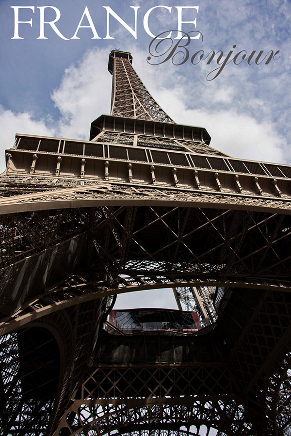
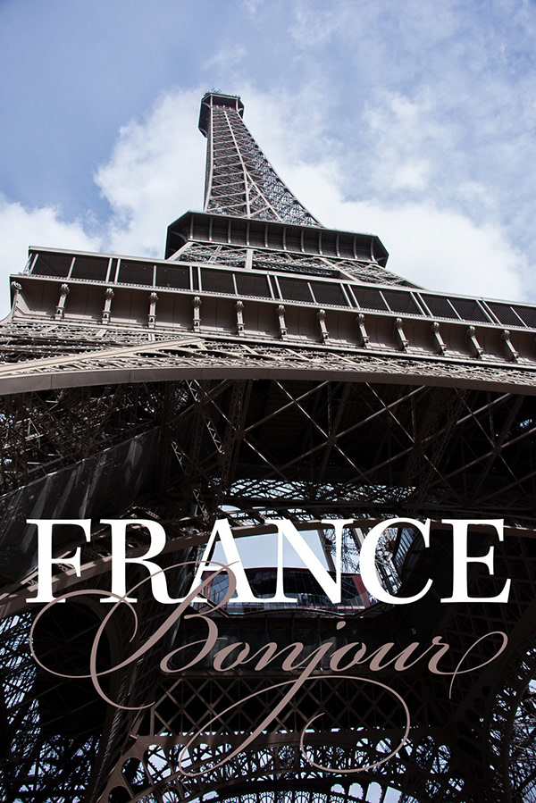
A different France image. "Bonjour" didn't seem appropriate, since it wasn't French people greeting the Americans on that morning. The blue/white/red are the official French tricolor shades.
@proper egret Well done on the colro matching 😃 but something's not right... hm. I think the perspective is slightly off there. She wouldn't be as tall if she were standing there. also the background is shot from a low perspective, but the woman is shot from a medium height.
@dusk crown I know relatively little about music. What are the little discs at the edges of the keys? Are they significant? I like the image and the alignment of the text against the black keys, around the "N" in Notes. One suggestion, is there an alternate glyph for the lowercase t, or a ligature for "tt?" That way it would look more handwritten. The other letters don't noticeably repeat, but the two t's next to each other stand out as identical.
it helps beginners to remember the key names
@peak warren @glacial path's got it. It's my family's grand piano, and my brother and I used it when we were learning growing up, hence the stickers.
Also, I don't think there's another glyph, but I'll check.
@dusk crown @glacial path Thanks! Then it would be obvious to people who know more than me.
Which is most everyone. I only play the radio. 😃
@peak warren I used a t from another font, how about that?
And no shame in that, everyone likes different things in different intensities. 😃 My mum might've actually done the stickers for herself now that I think about it. I know it's her handwriting, anyway. 🤔
@glacial path Are you a musical person too then? 😃
maaaaaaaaaaaaaaaaaaaaaaaaaaaybe
Haha, it's ok Tim, we're all friends here, no one's going to judge you 😉
@dusk crown What font is that? Does it have ligatures?
@peak warren The main font is Dicey Slices, the one I took the other t from is Youth Touch. Both free fonts. No, not that I can make out.
Day 8 Challenge - Add Text
@unkempt field Nice font choice! The text color is too similar to the background IMO. I would go for something brighter 😃
Photo #1
Photo #2
Combined image. Need to work on hair or make background sky lighter?
@wraith surge Ha this is a fun edit! Agreed on the hair/sky -- tricky since he's a bit backlit, we're seeing a bigger highlight around the edge of his hair. I'd suggest trying to darken those highlights and evening that out first. If that doesn't work, might not hurt to "overexpose" the sky a bit to match that highlight intensity, at least around where he is.
@fallow bough Love the selective text masking and color choices!
update on feedback https://mir-s3-cdn-cf.behance.net/project_modules/max_1200/954f3e80652517.5ce73d2b81fe2.jpg

Looks solid @rustic tree
@thorn narwhal Thanks for feedback.
Just having some fun. Daily challenge 8.
day 8
Text ...
Adding Text Day 8