#✂challenges-feedback
1 messages · Page 16 of 1
Thanks again for the feedback & tips @bleak fossil and @glacial path ! Here is an updated version and an extra. I can't stop creating 😂
I used this poster to place my husband's face into.
I couldn't get him to open his eyes while trying to act like the Hulk. It was a fun challenge and took me a couple of goes to get it somewhat right.
@dark quiver Thank you. 😃
The original has darker shadows have you tried to darken them? Could make it blend in even better.
No @dark quiver, I didn't. I will have a go at that later. I need to also try and adjust the colour a little to try and remove the red. Thanks for the suggestion.
Yeah my pleasure. I had to adjust the color in mine. Making an adjustment layer and masking out everything but the specific area you're working on is a great way to adjust a specific part non-destructively.
Apologies if I'm telling you something you already know.
Tips are always useful and really appreciate them. No apologies necessary
Adjustment to colour and darkening of eyes and shadow on neck. Thanks for the tip @dark quiver
@unreal hornet very baroque interpretation. I understand you need a rest. So much work! Great!
Iconic Australian animal. This koala was captured close by to where I live. I thought it made a good subject for this challenge. Not sure how best to do the tree that it was climbing though.
My work now is uploaded on behance have a look !!! https://www.behance.net/gallery/80083311/Face-Swap-Techniques

Behance
Photoshop Daily Creative Challenge !Movie Scene.Place your face into a movie scene or movie poster using face swap techniques in Photoshop.
Give your comment guys!! CR7 the magnificent. #📣creative-challenges #PSdailychallenge #PSdailychallenge09
Pop out Mountain
Day 9 - Movie Title (try one) 😫 #📣creative-challenges #✂challenges-feedback @glacial path @bleak fossil
@young karma Def. bumped it up a notch! Good job 😉
It could go even darker if you wanted it to. The original poster seems to go all the way to black in its shadows. That's your choice cause it looks cool both ways.
@wind pond nicely done!
Original photography @glacial path @bleak fossil @lethal mural #📣creative-challenges #✂challenges-feedback
After! = Me and the Shadowhunters (SelfPortrait) 😍 😱 @glacial path @bleak fossil @lethal mural #📣creative-challenges #✂challenges-feedback
Did a second txt pop
@severe flame Daily Challenge 9 - Nice. Perhaps you could adjust the guy so his legs show a little better. Right now he looks cut-off at the knees. Also, a small typo - chaMpionship.
im playing catch up with al the challanges heres my Daily Challange 1
the comic book challange
Whoo! Just updated my latest project named Xtreme Travel on Behance. New pages are added. If you like, check it out! Feedback is always welcome. Please send it in a message on Discord or on Behance!
https://www.behance.net/gallery/77867489/Xtreme-Travel-Agancy

Behance
Xtreme travel is is a travel agency that organizes trips to distant destinations.From U.S.A to Indonesia and from Belgium to the arctic. With Xtreme Travel you can go to all destination around the world.
@young karma Love the type! This is just a thought: Perhaps you could mask the top part of the tree and slide the koala down so his top paw in hanging on to the "a." And maybe adjust the mask around him to reduce the fringe highlight? Can you make the tree look like the text? Don't know if it would look good but Photoshop is all about experimentation, right? Just thinking here. Mind running amok looking at all the fabulous work.
@grave hound great job! I would consider using a different color for life. It gets lost a bit. Maybe orange? Great job overall!!
@dapper basin great job! I would maybe do some retouching on the face. It looks a bit too saturated and dark. Treat it a a regular photo. Good job overall
@lethal mural there was a plan to do a darker back round the life pops like sand... but those palm leaves were killing me
@obtuse haven lol love it!
@dapper basin great job on addition the Soccer balls. I also like your positioning better than. What I did in the demonstration!
Album Cover PS Daily Challenge 02 - I decided to do my album cover a bit more subtle. Thoughts, comments, suggestions are are welcome. https://www.behance.net/gallery/80095277/Sentimental-Album-Cover

@thick arrow looks great! Fantastic job!
@lethal mural this was the first one I did
@stray totem Great job. My only suggestion would be maybe a different background. I don't think it matches the foreground. Maybe something darker? Also, why not a Juve image! 😋
@wind pond Great poster and good job! It looks great. Thanks for sharing it on Behance!!
@thick arrowthe elephants work great! Also, I was thinking, since you have a lot of depth in your image consider making the text in perspective. Just transform the text so that it looks like it's laying on a surface. I think it might make it more dynamic and interesting
@severe flame great job! I like the color palate. My only suggestion would be to get the entire boy in the image. But great job overall
@coral stone Really good work! I love the colors, the depth, and the wording and image choice. I wish I had more to say besides Great work!!!
@unreal hornet Great final result! I can tell you put a lot of work into it!!
@grave houndgreat choice of background! I think it looks good. I would consider darkening the background a bit so that the Vegas part stands out more. But great job overall
@dark quiver excellent game of thrones face swap! The smile is great! Lol
Thank you so much for our mentor. I do not know how to tag people :p I have finished my project already https://www.behance.net/gallery/79641247/Photoshop-Daily-Creative-Challenge-April-29-May10

Behance
Photoshop Daily Creative Challenge April 29-May10
This is my day 9 challenge. Still 1 behind. Pls cc thank you
Composite
Background
Eagle
What do you think ?
I modified the tones, the blur and I created a shadow for the eagle (3D + displacement)
@cold cedar, thank you for the suggestions. I will have a try later today and see what I can come up with
thanks for the feedback Jesús @lethal mural 😊
@lethal mural sure. Thanks for your advice!!
Another work with the technique of the dailychallenge.
@Ghostly Love the red wine!
Last daily challenge! I took some techniques I learned here plus my challenge from Day 5 and upped my movie title game.
Overlayed the text on top of an embossed layer and a concrete texture layer.
Using non-destructive stuff I learned here - creating a clipping mask etc.
Here's the day-4 version
just experimenting
Day 9 - Movie Title
last challenge, hehe yaa i know this different
Just dance - had fun with this one
@vale merlin Fabulous dance image.
how come i cant upload all my work from jesus ramires
i thought we had till the thirteenth
this is really sucks now that ive finished and wanted to upload all my works
So I took some feedback on board and I am pretty happy with the way my koala looks now.
PSdailychallenge #09 - JUMP
Color correction challenge. That's my 4 year-old chasing me...is that action packed enough? haha
original
Did I make myself too orange?
My first gif..hopefully it works lol
Daily Challenge day 9
Last one! I'm finally done. What do you guys think?
I am a bit late on working through the challenges. Below is Day 3 and my take on the double exposure project. Any suggestions or feedback is welcome! https://www.behance.net/gallery/80120451/Double-Exposure

Building upon Day 3, I have added the text to the double exposure image, but I can't seem to find a color overlay that I like. Any suggestions? https://www.behance.net/gallery/80123937/Movie-Poster

How do I make the eyes not so dark? Can I adjust the auto-blend? Or did I mess something up?
This is what I have come with after Jesús Ramirez suggestion.Please tell me how is it now. Everyone's feedback is welcome. @lethal mural #📣creative-challenges #PSdailychallange09 Note: I used the Real Madrid background because his jersey here is of Real Madrid's.
Got a lot done today! 3 Days work of challenges!

Behance
Adobe Photoshop Daily Challenge May 2019 - Day 7

Behance
Adobe Photoshop Daily Challenge May 2019 - Day 9
Already shared Day 8 wit hteh pikachu
@young karma I think both the photos are too bright and the colors are too much saturated. Otherwise I like the first one as the text effect is awesome and just like a movie poster text!
@stray totem thx! I try to make the colors softer and maybe a little darker.
@stray totem I lowered the brightness and the saturation and i added a subtle gradient. It is true that i have more depth in the image and the cloud looks more real. Thanks for the advice
@young karma I like the last one more. Let's see what other thinks. But I think this deep colour suits most. And you are welcome.
@stray totem thx. An external eye always helps
@young karma Yes truly helps. You are welcome 😃
Day 9 - Movie Title
Photoshop Daily Creative Challenge #09
@young karma Thanks!
@grand patio Oh MJ! That is by far my favorite movie in the whole wide world.
@loud zephyr same
Elephants pop out. Thanks for the feedback Jesús, I made changes to text and would like to hear your thoughts. @lethal mural
Updated
Instagram @_twc_daily My first double exposure in photoshop. What you think about it?
Instagram @_twc_daily My second double exposure in photoshop. What you think about it?
@velvet axle there are a lot of things going on in your second image. I think you should concentrate more on one object/person/animal because having a dog, a woman with long hair, a guy jumping around, a cabin in the woods and people in a boat on the lake all in one image can be a bit overwhelming 😃
I know what you mean @glacial path the problem is not the amount of detail (having a lot of people etc) its the composition/visual hierarchy (story). I will keep your feedback in mind for the next one 👍 — Its not that easy to find a story and the right images 😅 #lessismore
Hi Guys! Need your feedback!, i still think there's 50% of work that needs to be completed. Thanks in advance.
@hallow terrace nicely done! I like both versions 😃 The flag could be a bit brighter in the first one 👍
Movie Title Day 9 Thoughts? I tried to pick a 40's style font that I had (Gill Sans) but it may look a little "star wars" if that makes sense with the glow. Any way to make the dances pop out of the words a little more?
one of my first mockups, any feedback??
You guys did such an awesome job with this PS challenge!!! 💖💖💖 Looking forward to the next one
@brave pewter looking nice and slick. If your direction allows it, I would stretch the brand a bit further. for items like the note pad or the complimentary slip, I would make the logo larger and show only a side of it making sure both colours and key elements of the shapes are there. It will still recall the brand consistently and look part of the series. it will also add a modern feel to it! Hope this helps. If you try any variation feel free to give me a shout 😎👍
that is honestly the best feedback i ever gotten thank you so much!! will definitley keep that in mind! @agile ruin
@sour ingot yeah! you're almost there 😄 I would darken the red stain on the ground a bit. Go for a more brown-ish dark-red tone 😃
We're going to review your designs shared in #✂challenges-feedback during Adobe Live this week! Tune in tomorrow and Wednesday at 12:30pm PT!
Day 9 - Pop out text
@main talon Maybe a stroke on the word PACE
Thanks! I was trying to play with saturation also to try to make it less busy.
@main talon Maybe stay with the theme of the team colors. Also consider making the stroke a bit thicker?
Nicely done Shanny! Did you adjust the spacing between letters? It seems like there is more space between the P and A than the ACE.
PSdailychallenge Day 9
Hello, here is my Day 6 Brush challenge. https://www.behance.net/gallery/79794157/Photoshop-Daily-Creative-Challenge-April-30-May-10

Experimentations, can I please have some feedback? 😃
https://www.behance.net/gallery/79947929/Typography-Poster-Collection

Behance
Typography Poster Collection that is done out of boredom, practice, and experimentation. Trying out different styles of typographic treatment, layout, and colours.
#📣creative-challenges PS daily challenge
Hello everyone! New to Behance and these Daily Challenges. Before getting the live video training, here's my first attempt at Daily Challenge #1. Did I share this correctly? https://www.behance.net/gallery/80212907/Daily-Creative-Challenges-Photography

@glacial path What you think? — Better? 😎
@calm lance awesome job! I really love the moody vibe. After you watch Terry's stream today, you might want to go back in and revisit with any new skills you learn - but I like it!
My first day with the Photoshop challenge! I've been using photoshop/lightroom to augment my photography hobby for years, but it's great to be apart of this community and get some feedback. 😃
Very nicely done @young karma !
My first attempt 😃
@zealous bloom Nice. It is softer than the original.
I went in the other direction for something darker.
@sick dew Nice!
Trying to get a defined look. Will post an artistic one later
I am new to Behance, Discord, and the Daily Photoshop challenges. Feedback is appreciated. Thanks.
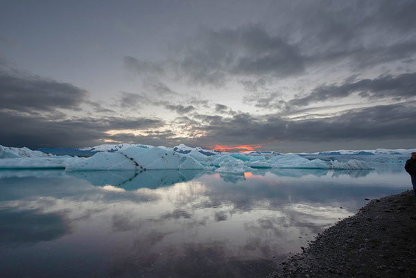
Went for a moody tone and made the icebergs pop with color
@light nebula The red and blue images above look like they are single channels of an RGB image. Maybe because they are one on top of the other.
I did gradient maps on each with custom gradients @peak warren Let me check the channel resutls
@light nebula I did not think they were actually channels. They made me think of channels. Sorry to be unclear.
@peak warren Got it... that is the vision. Monochrome 🙃
day 09 , pulling image through text
i do no know how my water got dirty. like i said...just learning
and I can't type...
or upload properly
@velvet axle I think it reads a little better.
@tawdry fossil I like it. You might consider adjusting your kerning a little so the space between each letter is more uniform.
D1-Adjust Lighting
@summer mica Apply a clipping mask on that to adjust the water
lol... I've been there too
Day 1 - Adjust Lighting
@sick dew I like the dark moody vibe! Nice job playing with the shadows and contrast. @light nebula looking good! I like the defined look a lot, it could totally be an epic instagram shot.
@glacial solstice nice job keeping it subtle, super cool car by the way!
@wet kettle awesome! Did you add some blue hues to the icebergs? looks nice!
@tawdry fossil nice job with that image/text - great movement! It would be awesome to play with the bird so some of the A overlaps it.
@summer mica good job! I actually like the warm 'dirty' water - keep going!
@viscid aurora good job lightening it up, I'd like to see a little bit more contrast or shadows!
@stone willow nice 'cool' tones - same as Breezy, it feels a little flat so I'd love to see a little more contrast.
@late sparrow very artsy! I like it 😃
Thank you @uncut ginkgo Too bad it isn't my picture. 😃
We can thank @gloomy flare for the epic shots 😄
Day 1 Challenge - Adjust Lighting
I take a photo from mine....
Own Pic
The before is what my camera saw. The after is what I saw.
Hi guys :D. I took this photo with the Lightroom CC app last month
After the techniques that @gloomy flare taught us:
Hello, I would love some feedback on these photos! This photo is the original.
Here's one I did right after getting lightroom for the first time. Took the photo in Rocky Mountain National Park 😅
Hey I would love some feedback! This second photo is how I usually edit on Photoshop.
This third photo is my first try using the Camera Raw Filter after the daily challenge video today. What do you guys think?
@gloomy tapir I like the sky in the second one better (your usual edit on Photoshop) and maybe the bottom part of the CRF because of the lighter reflection of the ice and details of the rocky beach. Maybe you can combine them?
I design beadwoven jewelry that I teach others how to make. It's important the finished product is eye-chatching. It's so difficult to capture well. Thanks for this class. Heres my post from today's lighting class challenge
this is the pre
@fast moth Tough working with fog. Great job on the color correction
@wet kettle Reminds me of the days of Fuji film. Very nice.
@fast moth Looks cool! I'd loved to see it a different sky
Heres my go at todays challenge
@candid sage Looks like a page from a magazine! Nice.
@cold cedar Thanks 😃
Mt Baker, Deming, WA
Again more cats ;).

Behance
Color Correction and Photo EditingLocation: Superstition Mountains, Superstition Arizona
@timid pasture just caught your messages. Thanks.
Tried it!
@raven meadow that looks awesome! love the clouds!
day one
@tulip fern Thanks! That would be great, I will try to mess around with it a little bit.
First try, i was testing 2 kinds of feelings and environnement
@upbeat cosmos I like how you went for a darker look! You could absolutely enhance the saturation in the sky 😃
@gusty vessel that's a pretty noisy picture! But you somehow removed the noise 😮 I like the subtle edit with the hints of purple. you could easily go for a more extreme look like in the 3rd picture. That one reminds me of the exact moment, when a lightning bolt strikes the earth.
Before and After. I took this photo on my old iPhone 5s and it's just been sitting in my photos for 4 years
@fast moth Nice work. That is more moody with the blue.
@unreal hornet great job! The colors really pop now 😃 You should absolutely try even more looks - how about a nice shade of red 😮 ?
@dark lotus great work
Original. Shot by my wife on her iPhone 5
@glacial path Thank you for your feedback :p I will do my best for better pictures ^^
@dark lotus wow! That's an awesome shot ^^ I wonder if you somehow could enhance the sun ray in the background? It absolutely is a cool feature 😃
color corrected & exposure corrected with Adobe Camera Raw filter
thanks. I was thinking of working on the "god rays" as we all them. I might give it a try. Thanks
With perspective corrected, by hand. Not the best correction, but better than original.
@dark lotus That is a gorgeous photo. The edits really make everything stand out especially the sky
daily challenge
@tropic cove I like the original, too. It has a holiday card feel. Perhaps you want to challenge yourself to remove the road sign using content-aware replacement.. Just for fun and practice.
@peak warren obviously you would crop the corrected image, right?
@glacial path Yes, I would. It displays differently in export and in PS, for some reason. Actually, I am redoing perspective in Lightroom. I am more familiar with those tools.
@peak warren Right! I think the perspective is still a bit off
@glacial path 100% agree
@young drift I see you're going for a high-contrast version 😃 But be careful with the highlights. right now they're a bit blown out (you can't see a lot of detail in the sky)
@dark lotus This is such a lovely image! Was it shot in Arizona?
pushed the colors more red like @glacial path suggested, very interesting effect
@unreal hornet thanks . Deep in the Grand Canyon after a storm
@unreal hornet wooooah! That looks like the sky is on fire 😄 I love it
one more time.
Before/after
Did some RAW manipulation along with some other flows 😃
Is it too green?
@summer mica That would look fantastic on a big poster - just reduce the saturation of the blue a bit. it is rather oversaturated right now 😃
@coral stone so... which one is the original 😛 ?
@glacial path the first one is the original 😂
@light nebula waaaait a second
How do you get your photo on here?
@coral stone you never know 😄 The first one has a pretty cool look to it. But I like the clearer version where you can really see the blue of the ocean 😃 Good job
Hello. Am I still on time to show my photo edditing?
Thanks @glacial path 😃
@proper egret good eye! a bit too green, yes. But you nailed the exposure! Much better now
@calm crane, guess you just drag it onto here
Day 1 - you only know what you know....until PSdailychallenge give you something xtra
https://www.behance.net/gallery/80226527/PS-Daily-Challenge-01?

@woven brook yes, you're still one time 😄
Thanks @woven brook
@jovial jolt looks like you did it!
@light nebula I think you're the first one who gave this image a warm look. It totally works! But the colors are getting a bit muddy at the horizon
Before... This is definitely NOT what I saw... I saw the moon partially obscured by some spooky looking clouds..
@glacial path so do I have to do anything else today? Do I need to put this image somewhere? This is my first time trying to participate in the daily creative challenge
Here is my piece. Feedback appreciated. #✂challenges-feedback #PSdailychallenge
@woven brook if you're looking for feedback, you have already shared it at the right place! You can also upload it as a Behance project. Details on how to do that are here: https://www.behance.net/dailycreativechallenge/photo

Daily Creative Challenge
After. This is more like what I saw - after some fiddling in Camera Raw and a few other tweaks..
Thx a lot @glacial path
Original Photo - Shade Sails Over a Pool
@woven brook I like the green-ish bleak look of the picture and how you got rid of the red sunset. It almost looks like a scene from a movie 😃 Nicely done
PS Daily Challenge, lighting photo
Thanks a lot @glacial path , that was exactly what I was aimming for. 😄
@light nebula and I think the guy on the right is a bit too bright. (nothing the spot healing brush couldn't fix in two clicks 😉 )
@viscid aurora going for a subtle hint of purple, nice! You should totally try out more experimental looks 😃
@calm crane you should totally show the before and after in your Behance project 😉
@high mesa wow! I'm really impressed with the level of detail you've revealed! Super cool 😃
@proper egret I see what u mean, but there is alot of green in the image
@clear rain I find it a little bit too contrasty. But yet I've been much more into low contrast sharp images. I like the sky and how you handled the water. But find the shadows in the foreground land a little bit too dark. Same applies for the ice. I think the ice could be lighter
@high mesa but I wouldn't make the sun darker. right now it just looks gray :/
@high mesa unfortunately the original image is blown out at that spot and you can't easily fix that 🤔
@high mesa yes, I have been playing with the colors and the green background is overpowering
@stray totem lovely red tones! But the sky is pretty white, do you think you could bring back some detail?
@young karma nice job on the exposure. I think it may be a little flat. I played with your image (so I could play with Camera Raw) and bumped the shadows and whites fairly high.
@timid pasture No way! That looks like a completely different image! Mad props to you!
Not sure how to show the photo--no drastic light changes
@glacial path Hey Tim, cool feedback thanks for that appreciate it
@stark kayak I like the brighter shadows and more saturated colors! The blues are very saturated, I would tone them down so they're not too overwhelming 😃
@glacial path Thanks for the feedback. Yes ,I wanted to I mean if I had the flexibility I would have but it's a jpeg image my camera can't shoot raw so, the informations were not there. That's why could not bring it out. Thanks again for te feedback .
@blazing quail the first one is the original?
@upbeat owl please post a jpg image, unfortunately discord can't display tif 😃
@storm rock so the second one is the original?
@storm rock (also make sure to publish your behance project before sharing the link 😉 )
@stray totem ah I see. If it was a real client project, you would probably have to reshoot it or replace the entire sky. (just FYI)
@cold cedar thank you. I feared so much, you are absolutely right! I didn’t wnt to overdo it so i underdid it 😊
I went for a darker mood
@glacial path Thanks Tim! I bumped the saturation down a bit, are the blues a bit better now? Is there a better way to adjust the blue besides the saturation slider? Thanks!
@glacial path yep you are totally right but even then I belive skyreplacement would have been the choice cause the day was already dull so was the weather haha. But thanks for notifying me! Appreciate it!
Perspective tweaked in Lightroom instead of PS.
using the hue/saturation adjustment layer
@stark kayak yes indeed! this is one way to do it
@glacial path Thank you for the help
I am now going back and retouching tons of photos from old vacations...
This is the Castillo De San Marcos in St. Augustine (1st Original, 2nd My Edit).
another option is the camera Raw filter @stark kayak
Hope you like it. Waiting for your feedback.
Nothing drastic--added light to rocky shore other minor light adjustments
@glacial path Thank you!
@blazing quail I like the idea! The image feels much more balanced. But you also lose the focus because of the lacking contrast. It's just something to keep in mind - maybe you can go 50% between the original and your version. that way you can still see some detail in the background but you don't lose the brightness contrast 😃
@dusty eagle is that Comic Sans 😱
Went a little extreme with this one...
@glacial path But of course!
@fierce zinc lovely contrast 😄 You could reduce the saturation of the second cannon slightly. It is almost popping out of the image right now ^^
@young karma I understand. I played with quite a few sliders and adjustments before I decided.
@dusty eagle oof...
Before & After - PS Daily Creative Challenge Day 01
@glacial path Thank you sir. I need to work on the FINER details on masking
lighting edit, focused on bringing in more pinks into the clouds
@glacial path Hmm perhaps I'll dilute it with papyrus tomorrow....
Just a quick edit
@dusty eagle why... Howard Pinsky, is that you?
decided to smoothen photo and give it a tad bit more light
bottom-before
top-after
@stark kayak I like the extreme one 😃 maybe a bit too black on the left, but I like the direction you're going!
@glacial path Something more like this? I am still getting used to how all of this works. I just used the selection tool and did a rough pull down on the contrast of that back cannon.
@young karma yup! it works, it looks good but you went the safe route 😉 Try something experimental, go for a completely new look ^^
Thanks for the feedback @glacial path , here is a adjusted version and I see what you mean
Oddly enough...the cannon was really bright in person compared to the other one. LOL
@halcyon zinc that shade of pink is lovely and works really well with the darker cyan shadows. nice 😃
@cold cedar thx i’ll give it a try
thanks @glacial path
Your template Day 1
@glacial path thanks, i'll try something new 😀
@blazing quail nice 😄
@fierce zinc yup! that works 😄
@fringe mauve nice job! I like the deep contrast and dark foreground.
@glacial path Right on man! Thanks for the advice. 😁
@uncut ginkgo Thank you so much for the feedback 😄
@storm rock wow, what a great image
sorry wrong photo lol, but like i said i smoothen the statue but a bit too much, advice to find that middle ground?
I’m trying to learn PS for an internship this summer 😬
My photo for Day Before and After
FINAL UPDATE, decided to sharpen the statue a tad bit more but some of the edges give too much white
My Day 1 edit, let me know what y'all think..

Adjusted like the live challenge:👌
@dusty eagle nice. I would keep the darker versions on the pebbles and bring up the highlighted light s on the buildings. Awesome capture
@dark lotus Thanks! That would definitely help the contrast. I sourced that picture from
Vitor Gusmão Shimabukuro on Pexels!
Original Lodi Field
Hello! That's my attempt in the challenge...
After Camera Raw filer auto plus tweaks.
From last week's trip. The clouds were a challenge 🌥
@glacial path Yep - It's amazing how much you can pull out of a RAW image! It blew me away when I was able to get that much out of what I thought was an un-salvageable shot.
@dark lotus I think it definitely helps! Though I'm hesitant to replace 100% of the darkness. Thanks again!
Cameea Raw filter Auto plus slight Blacks and Yellow adjust
@dusty eagle nice. Now just PS in a moon 😁
Today's Challenge - Before and after adjusting lighting using Adobe Camera Raw Filter
I'm not sure I was supposed to edit it at all, but wanted an otherworldly feel so played around until I liked it.
@eternal cypress That giraffe gives me hope for some of my too-dark images. Perhaps a little bit of shadow and whites in Camera Raw will bring out the giraffe more, give him a bit more definition?
Went for a more whimsical feeling to it.
@vagrant sorrel Lovely!
👌
Here's mine on Behance: 😃 https://www.behance.net/gallery/80234065/PS-Daily-Creative-Challenge-Day-1-Lighting

Behance
Day 1 of the May 2019 Adobe Photography Daily Creative Challenge
Original
My take.
PSdailychallenge Adjust Lighting
https://www.behance.net/gallery/80226021/PS-Daily-Challenge-1 Hello, here is my project for the frist daily challenge. 😀 Follow the link above to see the finished work.

Here is the final product for my Photoshop Daily Challenge for Day 1! #PSdailychallenge
oohhohho
day one challenge https://www.behance.net/gallery/80237321/PSdailychallenge


Hey y'all! Excited to dive into these first challenge images. Apologies for my slight delay in chiming in--busy day! Ok, here goes:
@gentle elk I love the “warmth” you’ve added to the water in contrast to the glaciers! It adds a nice balance with the spot of sunset as well.
@torn rock Wow, really nice adjustments in exposure without losing any detail! I love the natural effect in the new edit. Could be in a catalog!
@past canopy I actually really like both the before and after here! Two totally different vibes with the same base photo, but either are just as successful in their own right. Kudos!
@young karma Loving these purple tones! I think people shy away from using purple too much in photo and design so I love this unique tonal take especially as it applies to photography 😃 The yellow in the sun adds a perfect complimentary contrast in color as well.
@oblique bramble Funny how adjusting tones can make an image appear like it was taken in a totally different time of the year. One thing I’d consider is watching blowing out your highlights/whites too much in the sky. It loses some detail, which could be the desired effect, but could also be cool to bring the overall brightest value down a tad to see what the impact would be if a little muted.
@rustic tree Good job bringing some of the detail back with the sky in this pic! I’d consider playing around with the tones in the shadows from cooler to warmer to see if the landscape could be rendered a bit more naturally to balance out with the rest of the image.
@solar zinc Fun edit! Love the surreal colors without losing any of the details in the imagery. There’s a really great contrast between those oranges and cyans. Only thing I’d consider is playing around to prevent the spotting you’re getting vignetting in the sky around the edges of the frame a bit.
Thanks for the feed back hungryboy.😀
@glass bridge Nice subtle edits in the lighting here to really bring out all the textures going on in the boardwalk photo (especially in the sand and grass!). Great realistic control in midtones as well!
@half estuary Nice to see you bringing back some of the details in the image but keeping its overall bright feel! Love the slight warmth added back in as well.
@amber idol I want to dive into that newly blue-green water! Really pops nicely with the rest of the image in contrast. Good save in the highlights in the wood beams as well.
@ValentinePierce#6533 You may be right. I was struggling with getting more definition on the giraffe but I am super happy you can at least see that it is a giraffe.lol
thanks for the great feedback @thorn narwhal, any tips to make it better? Thank you
@gentle elk I wonder what it would look like if you added a touch more contrast in the midtones? The range you have around the edges with a slight vignette is really strong, so I would consider playing around with pushing that effect more in the glaciers. You could also play around with darkening the sunset a bit to make that warm bit even more of a focal point by having it pop more. But overall the edit is a really nice display of great control!
thank you for the tips, I appreciate it, I'll be sure to see how it looks with those changes and practice that. Thanks!
@eternal cypress I can't believe how much detail you were able to pull out of that giraffe image! In photography, it is helpful to remember that darker images are safer as they still hold detail (whereas overexposed, brighter images lose detail) that can be recovered in post, as you showed us here. I wonder if there's anything you could do now to preserve the nice tones in the sky from the original without losing the new details of the giraffe?

Before and After: https://www.behance.net/gallery/80238057/Ps-Daily-Challenge-1

Before
After and before
@hungryboy#2944 I am sure there must be a way. I would suspect it would involved a more targeted approach when making adjustments in raw camera mode. I confess I played it fast and loose with my corrections and that my obvious focus was recovering that beautiful giraffe.
that looks great @gloomy arch I really like both but I think you pulled it off well
nice man
@past canopy Postcard pretty.
@thorn narwhal, I tried out those suggestions, thanks for making them, I think it looks a lot better in my opinion. Once again, can't thank you guys enough, this is a super cool challenge!
the little guy on right was little distracting.
thanks i can't wait for next project 😄
I didnt crop the guy out or try to remove him, I think were doing that class next!
I also decided to use warmer tones, and make the icebergs more cyan. Overall soft image
oh sweet love to learn more about cleaning that up better don't like doing it blind and hoping for best 😄
Wasn't happy with my first double exposure so decided to do a new one
Thanks for the feedback @thorn narwhal!!! and yes, I tend to overuse the vignette tool, Would you mind giving me some tips on how to improve?
I did the main practice image. Then I decided to do another one. Here is my version of the daily challenge, day 1, lighting. I am very new to PS, just by the way. This is actually my first photography challenge ever.
Day 1 - Lighting

Behance
Day 1 of a Photoshop Challenge that I am taking to help improve my retouching skills.
I follow the intro with provided image, and then play with my own photos (maybe I should spend more time to find a "better" one for this practice). I've uploaded the before & after, thanks in advance for any feedback/suggestions! https://www.behance.net/gallery/80242445/PS-Daily-Creative-Challenge-1-PhotographyMay

Behance
PS Daily Creative Challenge #1 - Photography~May
nice
Here is the sample file and my own image from Komodo Islands in Indonesia.
After
Komodo Before
Komodo After
Hello Everyone! Here is my submission for Ps daily challenge. Please share your feedback 😃
After
Good job everyone!
@covert osprey I really like you after photo. It looks way better than the first. The colors pops out way better and there is so much more ambiance on the photo. It also makes it easier to see whats on the under side of the photo 👍
My first challenge.
well done keep on @young karma
thankx
Hi All,
Here's my submission for Day 1
#✂challenges-feedback , Adjust Lighting - Before
#✂challenges-feedback , adjust lighting - After
#✂challenges-feedback , Adjust lighting - Before
#✂challenges-feedback , Adjust Lighting _ After
This is the original image I took of our local Court House a couple of years ago when we had the most snow that Bathurst has seen in a lot of years. Snow is not a normal occurrence for Bathurst.
This is the same image after adjustment in PS using the Camera Raw Filter. I cropped the image to remove the cars.
PS Daily Challenge 1
@proven pewter great. I wonder why not leaving everything dark but increase the light where it is already lit. Creating more suspense. What do you think
@young karma yes , it will be better but here i tried to show more details which hidden in poor light
Daily Challengeee
Yes i know, it is a thin line and a lot has to do with personal preferences! I make mistakes on light all the time and than my image falls flat. Like the one i posted for this challenge. I have to remedy it later today

my day-01 challenge
nice
Here is mine
@young karma nice one! I’m not far, in Mudgee
Hi, I can't seem to find Terry's first tutorial on the Ps daily creative challenge. Can someone please link it here?
Thanks for all the great feedback. Just a student. I learned something. YAY
@weary mirage The after version of that picture is breathtaking. It feels like paradise does excist
Thanks!
@covert mason love the contrast between the cyans and the warmth in the rest of the image!
@solar zinc it’s a tool you can use to your own discretion! Sometimes with more extreme edits I’ll step away from my screen for 5-10 minutes and come back to it with “fresh eyes” before finalizing and exporting. I tend to pick up on things I hadn’t noticed before and if there’s anything distracting or that needs to be adjusted a bit more.
@floral viper @weary mirage love how you both managed to bring out extremely lush greens in both of your images!
@uneven lark love the consistency of the blues here! I think you’re now losing some of the contrast from the original image now, though. I’d play around in warming the midtone values up a bit to add some of that back in- I don’t think it would impact your blue palette much. I’m also missing some of that natural vignetting I see in the water, so I’d consider trying to add that back in a little more as well!
Thank you!
Thank you! @thorn narwhal
Here is my Day01 edit
Hi
This is my version of tuesday challenge - before and after
After
@cold cedar, @glacial path tried some local adjustments in CR. I hope to have gotten rid ??? of tve flatness of the picture and made it come alive again. Thx for reviewing
I went into HDR and played with the settings a bit.

Here is my day 1 challenge submission. ☀ #📣creative-challenges
@light nebula Nice! I like the depth of the blacks on your monochrome images. This one is sharp.
Thank you @peak warren
I made a couple of versions. This one is my black and white only
Here is one with a splash of color. Went with autumn hues
@marsh prairie Looks good! I think the colors are slightly oversaturated in the sky and trees, but the building pops a lot more. Maybe try using the HSL sliders to bring back the saturation on the greens and blues a little
Hello, here is my PS DCC 1 Adjust Lighting. Not sure the reflection of the hot air balloon on the right is accurate or not. I feel like it should be skewed but idk and I prob need to working on lighting a bit more too. Thanks for for looking and for any feedback! 😄
@young karma I love the contrast!
The original #📣creative-challenges
and the after - beefed up the shadows a bit and saturation to show the growths on the tree.
its beautiful
Personal pic
@gloomy flare  👍
👍
Day 2 PSdailychallenge - Black & White
My attempt at b&w. I love the depth in the clouds. what say ye?
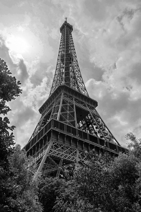
My version of Terry's Eiffel Tower image. The sky is still a bit hot in the upper left, I think.
Hello Guys!
My attempt on challeng #1. Look forward to your feedback :)
@gloomy flare @uncut ginkgo @bleak fossil
before
@rustic pumice Very well done on this one! Really nice color settings ❤
better quality image here.
After
@north arrow Very well done!!
A little late but here is my #📣creative-challenges from yesterday!
@dark lotus very well done. I just feel the cloude could be a bit more contrasted/sharpen. Its just my view. You did great!! 😃
Could not resist a B&W conversion of Tokyo Tower. Sky converted separately from the rest of the image.
Before
I utilized the Lasso Tool to select the skyline and below, minus the rocks on the lower right and then played with the Image Levels.
PSdailychallenge - Lighting
@orchid plank I like the before and the after.
😁 Done.
@tulip fern Good job!
my first go at this, what do you think? i used a gradient map
clouds are a bit washed out
:/
@orchid plank thanks. I can probably work a bit with a graduated filter but I don't want to get too grainey. J find with distant LS shots that you battle with haze.
Eiffel tower.
https://www.behance.net/gallery/80269919/PS-Creative-Daily-Challenge Here is my 2nd Challenge making a black and white picture. The link above wiill take you to the project with black and white finished photo.😀

Camera Raw with a minor Exposure Offset
Second try, using JPEG instead of TIFF
I really want to bring this sky texture, put a lot of dehaze and add a little bit of blue tone 💙 (5% actually) (add before\after version)

Instagram
15 Likes, 1 Comments - MonsteRX (@monsterx_115) on Instagram: “"Don't be afraid to build your own world" . . Simple Photoshop work Hope you like it 😊 Photo by &…”
Angel
Hey guys, the moment I wan't to apply the Camera Raw filter, Photoshop closes and I have to start all over again. It seems that I can't use that filter. How can I solve this?
@rustic tree Good stuff. You reminded me of a shot and edit I did years ago.
@young karma Make sure you save your work before going to raw camera filter, then you go to layers tab and use the saturation tool there or image tab and use the mode option to grayscale if the camera raw filter dose not work.
@lunar mango Good colors!
@light nebula Thanks for your comment.
Here it is @rustic tree
Nice work @stone mantle I would maybe brighten his face a little.
@light nebula Cool image Cadillac Ranch is a fun place to visit.
Not part of challenge but did this for fun
That it is @rustic tree
better I think
Still figuring all this out, so here is my #📣creative-challenges from Day 1 for #✂challenges-feedback!
day 2, decided to use toronto as my stock 😃
#📣creative-challenges Day01-AdjustLighting from yesterday
Day 1 complete
I made an accidental picture (I wanted to start a video, but you have to fiddle more on your phone).
I was able to make this out of it
You have to have some atmosphere in an office, to make it look human 😃
sometimes an amazing photo is just a happy accident we didnt mean to do 😄 it looks great
that's a great description of how I happened to... in fact it's exactly what my parents said...
before
after
Thank you. It's in raw and I haven't converted it..sorry working on it now
Here's my Day 2 on Behance 😃 https://www.behance.net/gallery/80275635/PS-Daily-Challenge-Day-2-Black-White

Original:
here it is.
@rustic tree @light nebula I was going to say Radiator Springs, instead of Cadillac Ranch. 😊
Someone has watched CARS too many times @peak warren
@light nebula Yes, true. But Radiator Springs is derived from Cadillac Ranch, no?
PS Daily Challenge 1 #✂challenges-feedback
why can I comment on some photos and not on others?

Knowledge bomb from @peak warren
"Cadillac Range" is a large north-to-south mountain range with many fin-backed jagged peaks, a reference to the famous Cadillac Ranch sculpture in Amarillo, Texas.
A series I did with a nice stock image of Dublin
Original photo
B&W version
B&W Color splash (I like doing these a little too much 😂 )
I'm a little late, but here's yesterday's photo. 😃 #psdailychallenge
Day 1

Behance
Portrait of @kingjayfran (IG) for PSdailychallege day 2, black and white. Before and after shown.
thank you @gentle elk
edit to my other one, I don't know why but the original showed first on the Behance link, sorry
@oak coral That's lovely. Looks vintage, like platinum or selenium (I can't remember which is which). How did you process that?
Black and white power!
Camera Filter, orange filter profile with a lot of deglaze.
Day 2 - Black and White Photo Challenge
The second one can be always better
#psdailychallenge
Quick edit 😍
Think it is alright.🌓
Original
This is the original
B&W
@peak warren yeah that is what I meant.
PS daily challenge 2 - B&W
The last one I promise.. but in honor to Wu 😉 only a little adjustment
#psdailychallenge`
Making a yellow chair into a black one.
(luv the bw adjustmentlayer, great feature with the colormasking channels).
Didn't mentioned it, but the original color of the chair is black, but converted it to yellow 😉
Day 2 Black & White Photo
Ok. Here it is. I used the same photo from challenge 1. I also did some clean up on yesterday's image — things that jumped out in b/w that I should have seen in the color.
PS Daily Challenge 2 #✂challenges-feedback
B&W Daily Challenge using the Camera Raw Filter #✂challenges-feedback
@maiden fable i love the sky! how did you get that
My entry for the day 2 challenge. #📣creative-challenges
Any feedback?
BW conversion on my own shot. Feedbacks are appreciated! #📣creative-challenges #dailychallange02
Hi, thanks @jovial jolt I wanted to give them a softer look. I use the camera raw filter and then made adjustments with the texture, dehaze and clarity sliders.
Hello.
This was my first time making a Adobe Challenge.
This is from yesterday.
https://www.behance.net/gallery/80270259/Photoshop-Adobe-Creative-Challenges
Would love your feedback 😉

Hello everyone! 🙂
B&W Daily Challenge (Compnion "After" is below
Companion "Before" is above.
@candid sage I like the conversion to monochrome. But the sky reflection that spices up the color image? It's lost in the B&W. Somehow you need to pull that out, I think.
@peak warren It helps that your model is absolutely stunning. Lol!!
B&W Daily Chlallenge with a bit of color for fun.
@fierce zinc Seen on the street in Tokyo. I don't recall any other details. 😃
thanks for the feedback @peak warren I agree it does get lost in there a bit, I tend to struggle with b&w to be fair as I feel all my images look like they're just colour images that have been changed, rather than something that was intentionally supposed to be black and white to begin with, if that makes sense
greco paris
@blazing quail The B&W is so much more dramatic!
@tropic herald awesome
@thin finch The cloud contrast is powerful.
@dark lotus I adore black & white photos! My favorite to do 😄

Here is the cleaned up version of yesterday's lighting challenge image. I know there is more to be done but these were glaring when I changed to b/w. Your comments, recommendations, suggestions welcome.
Before and after. I think I prefer the second to the last technique he showed us - the adjustment layer with the sliders for each color in the original photo. Anyone else use this method?
@sly turtle Really cool! I have a car image in my collection. I love the color of it but I might try b/w just to see.
https://www.behance.net/gallery/80280403/PSdailychallenge-WiP-more-human-that-humans-B-W a lot with masks and gradients etc....

on a sunday morning walk...
nice @young karma!
thank you!! 😃
White water
Here is my design challenge photo. 😀
Hi guys ! Here is my work for day 1 and day 2 😃 I used personal pictures of a trip in Amsterdam
i thought it would be cute😍
It is 😉
@ember cairn Nice work
How was Amsterdam?
@rain parrot Very nice work too
thanks
ya i guess
OK, let's see what happens if I link to Behance project - https://www.behance.net/gallery/80280969/PS-Challenge - OK that only showed the before 😦 https://mir-s3-cdn-cf.behance.net/project_modules/max_1200/badd7d80280969.5cdc79f12acf0.jpg - I didn't realize my notes would show with the link. Good to know and better to learn here with something innocent. I'm totally new to using Behance. The good thing is if you click on link yo ucan see more about the photo, why I picked it and how I edited it.

Behance
Using filter to convert to B&W in PSAlso learned about GradientGrayscaleDesaturation

Thanks @fast belfry ! It was cool i really enjoyed that place 😄
wow
Well not in Amsterdan but I live in the Netherlands
@cold cedar I'd love to see how yours turns out if you do one! Tag me if you post it!
@sly turtle now I must try it!
Oh really ? That's awesome ! Btw when i went to Amsterdam it was very cold so im looking forward to go back here when the weather will be better ahah
2 done with the B&W profiles in the camera raw filter. This is my favorite.
Hi everyone, here is my submission for the Ps Daily Challenge... looking forward to feedbacks!
3 was with a curves layer added to bring out her eyes, but it looks a little too flat to me..
Black and White conversion on my own photo. Feedbacks are most appreciated! #📣creative-challenges #✂challenges-feedback #PSdailychallange #Day2
Finally good 😛 @uneven lark
@uncut lagoon stunning in black and white!
Chicago Union Station. I used one of the profiles in camera raw to make the initial conversion
@clear mason Good job fellow Chitown
my quick try for todays challenge !
@sly turtle thank you 😃 I kinda thought this pic looked better in black and white too.. more dramatic
Here's my work on Day02
https://www.behance.net/gallery/80281835/PS-Daily-Creative-Challenge-2-PhotographyMay

Behance
PS Daily Creative Challenge #2 - Photography~May
Good shot
Color original
B&W #1 - Adjustment layer.
B&W #2 - Camera raw B&W profile 6. My favorite!
B&W #3 - Gradient map just for fun.

Hey! I'm a day behind but here's the lighting adjustment I did using Brightness/Contrast and Curves --- conveniently I just learned about Curves in my Filmmaking class for Premiere! Nice that there's some transfer of skills!
Think I still need to mess around with it
It doesn't look good lol
Black&White
PS Daily Challenge Day 2; Shanghai Can Opener building
@vital fjord Great work! The details are still very clear and the exposure is also good! Unfortunately we lose the color contrast of the magenta colored blossoms. Maybe you can increase the luminance of the magenta tones?
@outer lantern ah classic! I love this architecture shot with the grain in the background. You should totally go for more contrast. You could also try out the Clarity and Texture slider in Camera Raw Filter 😃
thanks!
Hi Guys a bit behind the schedule as only starting the challange today but here is my before and after for the first lighting challange. (I also used selective colour tool as I find sometimes it adds a little bit extra to the shot )
@true pewter lovely! Did you apply a two-strip color lookup table? It almost looks like those old film stocks 😃 I think you could brighten up the sky even more!
@dense wind great work! you went from a neutral image to a more stylized version with the purple color wash. Is this one of your shots, of so: is it for a project or client?
@young karma I love this one! I wonder if you could apply a gradient to the sky, so it is slightly darker at the top. this could add to the dramatic perspective. Just something to try out 😃
A personal photo for daily challenge #2
@glacial path thank you and yes one of my shots from doing a bit of street photography with friends. Was just in a right place at a right time
@gentle elk thank you!!!
@vestal tendon nice one! Since you've nailed the black and white conversion, you could add a gradient map with one of these gradients. I think it could bring some fun color to the composition 😃
@oblique bramble that's a cool shot! I think it would be even more dramatic if you crop in on the two birds! Well done 😃
i'll play around with it ^^
@oblique bramble OMG THATS SOO NICE!!! and definitelly works better as black and white photo 😃 really nice shot!!!!
@gaunt forge those clouds combined with the sun rays is an EPIC composition 😮 🎉 ! I think you should add some clarity or Texture (via Camera Raw filter) to enhance the ... uhm.... epicness 😄
@young karma another epic shot 😄 You could add even more light to the clouds to balance the image. Or you could crop in on the bright spot 😃
@silver ore ha, yes! if you know how to use Lumetri, Camera Raw becomes super easy to use 😃
@silver ore but I think you have slightly overexposed sky. there is a lot of white in there
Cropped version 😀
@sly turtle here it is.
OK I will try Lumetri! @glacial path I'll show you my results when I'm done
@silver ore the equivalent to Lumetri in Premiere, is Camera Raw in Photoshop (Filter -> Camera Raw Filter)
Oh that makes sense, thank you @glacial path 😄
i love the touch of purple
nice
@young karma wow! that's such a cool look - the magenta really pops! I love how you kept the sky nice and bright. Just a itty bitty hint of clarity and you're ready to print that image 😄
ok
@young karma *kept the sky nice and bright. sorry for the typo 😛
Hey @rustic tree can you post the original please 😃 ?
PS Daily Challenge Convert an Image to Black and White Before and After
This is the before image
@timid pasture I agree with you, #2 works best.
@young karma I think you did the right thing. While you could fix the cold color temperature, making it black & white fixes the whole issue. Given the motive, it also makes total sense 😃
https://mir-s3-cdn-cf.behance.net/project_modules/1400/4eab5c80269919.5cdc8d017c3bf.jpg Cleanup photo from earlier today and used the method that Terry White showed us in Camera raw filter. I really like this method.

@glacial path Thanks! I applied split toning and played with the color saturation and hue. I hope to learn more about using gradients so I can adjust the sky separate from the ocean.
Day 1 here we go!
after
Solid tips by the way I love all the different ways you showed us to do this. You obviously know your stuff!
Original:
Here's my Day 1 photos before and after 😃
After playing around with Camera Raw:
Before
After
@deep mango wow! That's a huge improvement on the photo. It went from grey to vibrant! I like the higher contrast on the "after" photo too. Props.
PS Daily Challenge #02 - before and after B&W
The original was taken at nightfall on the beach sheltering from a rain storm
Thanks @dark quiver 😃
Stockholm Color/B&W. Original file/size looks better. Looks slightly degraded this way.🤔
@young karma - what a cool image in B&W, well done
What do you think?
nice
thanks!
@grizzled goblet I love your B&W! It's so crisp and clear.
Hi everyone here is the first challenge from adobe https://www.behance.net/gallery/80282425/Ps-Daily-Challenge-Day-01-Adjust-lighting #✂challenges-feedback #📣creative-challenges

thank you

Behance
We had to turn a photo into a black and white image.
@glacial path idk what you mean by "clarity" so i guessed what you meant and sharpened it
@young karma oh sorry, I should have clarified (hehe). one moment, let me start Photoshop
wow nice pun
@young karma if you open camera Raw
Original
ok
Black and White
@young karma there are three sliders:
@young karma it is an awesome part of Photoshop and great fun to play around with 😄
ok
@young karma this is how it could look. Keep in mind, you should not crank up all three sliders to the max like I did here. I just wanted to show a difference 😃 Instead, you can keep the effect quite subtle
@young karma Have some fun with the sliders, see where they take you 😄 (before applying the filter, I have selected the sky so I don't affect the foreground)
I was just lookng for the Profile option in the Camera Raw filter but it's not showing up
https://www.behance.net/gallery/80286549/PsDailyChallenge todays challenge #📣creative-challenges #✂challenges-feedback

@high mesa why the middle finger lol
Before and after! I love learning more efficient ways to do photo editing in Photoshop! Thank you for doing this!
@mellow quail Very nice use of B&W. Otherwise a fairly uninteresting image.
Alright, here's my before and after for Day 2, looking forward to your feedback 😃
Before
After
Went with two copies. One all black and white while the other one has the coster left in.
PSdailychallenge #1
@gritty mortar I like your varied tones in the range of shadows on both of these, while keeping the highlights a bit muted and less of a contrast. It's a very controlled approach which looks like a taste you've developed in processing between your two edits!
@indigo panther Funny how converting to black and white can bring the details back a bit into the highlights! I would consider playing with the less contrasty, more muted approach even more, or seeing if you can fully vignette the rose in a deeper black. You should be able to achieve this by combining with some of the techniques in lighting from yesterday, either with curves or levels!
@glacial path Hadn't updated my CameraRaw I also now have texture, thought was with PS not RAW. But alas, I used it and is smoothed the clous out.
@deep mango I love both versions of this photograph! You have seem to done a great job keeping the integrity in the levels nearly perfectly between the two. Only thing I would considering is muting your range of darker tones in the ground running in the lower bit of the image. For me it competes with the light feel I get from the rest of the photograph (the only other darker bits of the photo being the beaks/faces of the swans).
@blissful patrol Awesome edit! Curious how you achieved the black for the sky -- did you use the B&W adjustment layer, or mask out the original sky?
@glass bridge Cool to see you use the same image from Day 1 (I think? Or I'm getting super tired). Everything looks really nice here again. I would consider pushing the highlights in the wood/boardwalk to see how it plays with those little pops of white in the sky. Could balance the image out even more nicely without losing the overall tonal feel.
@tall sequoia this looks nice! Good job keeping the detail in the softness of the water flowing without blowing it out too much. Only thing I'd say is that in the B&W version I'm losing the tree and contrast in the greenery around the waterfall. I'd consider trying to darken those "green" values to see how that impacts the overall result, or selectively burning in select spots to control the focus of the image.
@grizzled goblet Much stronger in B&W! Are you using the shadows/highlights tool in your edit before converting the grayscale, or achieving these levels in directly in your B&W conversion?
@hearty prism This is nice! It might be a tad too harsh for my taste personally, but I think that might only be because of that bright light highlight where the sun is. I wonder what the image would look like if you muted that part of the photo a little?
@eternal cypress I can see what you mean in your Stockholm skyline here! For me, the depth of levels in the bridge and in its shadows look really nice. It falls a bit flat to me in B&W in the blues of the sky/water in the reflection. Since you have the extreme highlights in the clouds towards that surround the buildings, I'd play around with adding a bit of the vignetting back in that you're seeing on the edges of the color photograph (but not too much so you're not losing the overall tonal effect of the B&W version).
@high mesa funny how your B&W makes it look like daytime instead of nighttime! Super cool. For me the vignette is a bit harsh, mainly in the top left corner. I'd consider lessening it or masking it out to create such a perfected faded gradient in that area. It Works really nicely for me in the lower left + right corners in the sand!
@dark quiver Good job adjusting the levels in this photo! Two things stick out to me, which could be easily fixed with a little masking: the harsh whites in the clouds are a bit distracting from the main subject in the image, and the skin tone of the figure looks a tad too unnaturally warm/saturated to me. This might be from pushing the adjustments in the rest of the image, which I think works nicely everywhere else. Could be a fun photo to work with for the remainder of the challenges as well!
reduced highlights and lifted shadows and a few other changes
PSdailychallenge Black and White photography Day2
@thorn narwhal you have to use the black and white option and adjust the blues until you get that result. You need a blue sky to get that result.
Behance
Photography Daily Creative Challenge: Rediscovering Photography and Photoshop

Behance
Photography Daily Creative Challenge: Rediscovering Photography and Photoshop
@blissful wolf I love how light these leaves are. I wonder what it'd look like if you tried darkening the background to nearly full black?
@thorn narwhal thanks for the suggestions! I'll mask those sections off and see what I can do.
@thin jetty For day one, nice subtle changes in warmth for making the overall image pop a bit more! Day two is nice as well - I'd consider increasing your highlights and maybe even a bit of the mid levels a bit to achieve a similar feel in contrast a bit more effectively. You could even play with leaving all of the product in color and darkening/desaturating the background for a similarly cool effect in that second edit.
I'd love to be able to add more texture in the sky, but not sure it is there.
@errant talon How cool do those lines in the flower look, especially in b&w? Overall I'd consider deepening your black/dark values to make things pop a bit more overall.
@icy mirage You could play around with the shadows/highlights tool (Images > Adjustments > Shadows/Highlights) to try to recover even more of the sky information, then masking in just the bits where you want to add a bit more of the texture.
I combined day 1 and 2- Original 😊
I combined day 1 and 2- Adjusted lighting
I combined day 1 and 2- black and white
@oblique bramble Both look nice! I'd consider in both darkening your green values to give more contrast against those pure white petals. Could add a bit more of a "punch" that way!
I'm sorry. I kinda couldn't resist having some fun with face manipulation in Photoshop