#✂challenges-feedback
1 messages · Page 15 of 1
Not much available on left side so plants were tripled. Second pass fixed.
@trail rose No problem! I think you have a really cool effect going on with this one! One thing I think is that the fence/railing in the bottom right corner draws a bit too much attention without adding much, in my opinion. A lot of the other elements are a bit more abstracted because they're contained within a more complex shape that breaks them up but the fence is just large and uninterrupted. Maybe edit it out and replace it with more sand, or even some green grass/plants to mirror the green at the top. Maybe the image of the person could be moved a bit to the right too, it's kind of crowding the text on the left and top. Just some ideas, it's looking really cool, I really like the double exposure effects in the face and head!
@orchid plank You did a great job on the movie poster! I really love the subtle color palette and the way the trees read as hair at a glance. I don't really have much critique for this, I think you really nailed the look, and I like how you handled the text as well, it has a nice balance. I'm wondering if something a little less blocky for the font might fit the rest of the image better? But honestly typography is not my strong suit. Awesome work!
my personal heading ☺
Day 4 (late) submission
https://www.behance.net/gallery/79619613/Photoshop-Daily-Challenge-Day-4

@bleak fossil thank you so much for your response ! i'll try to do what you suggest ! 
@orchid plank thanks a lot for taking the time to write your feedback . i was a bit hesitant about that font. i just try to play a little with them til it gets right .😀
@weary steeple Really cool look to this one, the red color and the way you controlled the double exposure to only be across one side of his face gives him a sort of sinister look. At first glance it almost appears skull-like, very cool. I also like how you controlled the double exposure to be within his suit but not affect the cat or text, nice work, really cool feel to this!
@fallow bough Very nice! The edit looks really nice a clean, though the one thing that really stands out to me is the right side of Tyrion is a bit too fuzzy/soft. If you compare to the other characters edges you can see how it's a bit fuzzier, so tightening that edge up would help. The cow image looks solid!
@light nebula I agree with Tim, I think the second one reads less like a meme. I think changing the font to something a little less “playful” looking might help the feel of the image as well. Something more hard edged and maybe without the cast shadow effect. Nice work!
@glacial path That one was posted as a meme 😃 so the intent is there. I am also open to font suggestions @bleak fossil . Thank you both for the feedback.
@bleak fossil Thanks. I also missed removing her shadow. Didn't notice until after I uploaded the image.
@young karma Nice job on this! The edits look really seamless. The crop and values adjustment look great too, makes it look much more like a finalized image.
@dusk crown Very nice work! This is a great image to show how such a simple edit can really change the focus/impact of an image. Really put's all the emphasis on the insect in the middle.
@severe flame Nice work, this is a pretty ambitious image with all the figures! I'd just suggest keeping an eye out for the little areas that need clean up that stand out a bit otherwise. The main areas that pop out to me is the light grass patch line slightly above and to the left of the kicker that looks a bit smudged out of place, and the curved white line at the very left. It's a little thin in one area and there's a hard green edge directly to the left of is that could be softened. Really nice job!
@abstract crag such a great application for this challenge...I never thought of it but I'm sure this is how some models appear to be alone even in urban shoots. looks really nice
@junior galleon its all thanks to the magic of photoshop 😃
@storm sierra Nice! One suggestion I always give is dropping in a flat tone for the rest of the figure before painting over it. Getting a general value in place from the get go gets you most of the way there and helps your eye judge the relative value of everything. When everything is white from the get-go it can be hard to accurately judge what color/value something is.
@coral stone thank you for sharing picture in detail. I'll use that.
@coral stone Very cool, interesting to see this technique applied to something so organic and texture heavy such as a landscape! Really nice work on this. One suggestion would maybe be sharpening up the edges in some of the middle areas that appear a bit soft/blurry. I believe Jesús demonstrated a sharpening pass on the stream today.
@glacial path sure!!
What do you guys think?
Thanks @glacial path , this is how I started with it but I was afraid the bottom looked too "heavy" or cluttered. I brought the opacity down to about half which I think helps, but not sure. Maybe the top needs a quote or "coming soon" to balance it out?
@bleak fossil thanks a lot!! I try that point=green.
@young karma Ooh, the comic effects looks really interesting when applied to something like that with the dandelion. Very subtle. Almost gives it a glass-like look. Very nice!
@bleak fossil Thanks! 😃
shifted some of the bottom images around to get the credits as low as possible.
Thanks @bleak fossil. I missed the Louvre part because of the bus 😂 I'll adjust my work 😃
@fluid relic Looks great! One thing I'd suggest is maybe fading the whale into the shadows more since it's so dark in the background, and perhaps even maybe using a color dodge layer or something similar to cast more light down the center to unite the whole image a little more. Here's a general example, subtle but I think it helps a bit.
@sour ingot Really nice effect with this one, I like what you did with the background and text as well, they seem to fit together nicely. One suggestion I might have would be to perhaps increase the saturation on the main/large picture of the woman a bit more, it might make the transition between here and the other images a little more natural. Though i do like how the blue in the bottom image stands out, but maybe just increase it for the top portion of the image which is where the contrast seems most abrupt.
@limber birch Nice work Mare! I really like the dog image! I think adding a bit more of a shadow under him (especially on the left side) might be a nice effect. Also I was thinking if you could soften the transition on the horse image between the little girl's arms and woman's head the two images might fit together a little more naturally. Nice work!
PS Daily Challenge | Album Covers

Behance
This is the result of Photoshop Daily Creative Challenge #2. I used layer masks, color correction and fx to create collage, taking a different approach to the album cover creation.
Restarted 3 and 4. Calling this done unless anyone has suggestions. I'm looking to nitpick at this so if any small thing stands out to you guys, please let me know.
@mental glade love the flow of traffic lights down her front like her hair!
@urban cypress thank you 😃
@mental glade could blurring her a little into the black make her look more "ghostly"? the city scape almost looks like a hijab however that makes it more "shell" like... just thinking...
could have the same glow to the image as the letters?
@urban cypress ive been considering the same thing about the shape a lot. ive considered using the shape of some third photo with hair to help the shape, cuz i feel the same way about the hijab shape
i didnt put any glow on the image so id have to create it from scratch for the text, but thats an idea i really like
@mental glade could you add the blue color to her face instead of grey? would that help blend the two images?
good consideration 😃 ok thanks 😃
@bleak fossil I had some problems try to remove the blurriness of my image, so I decide to do the process again. This time I used a high hardness of the brush and played with the flow to help with the blending. And to refine it I used some vegetation brushes that I had installed. Please let me know if you see anything weird 😄
I will still remove those dark "stains" to give a little more balance
here is my part on Daily Challenge I did this Manually and I add a little bit of color.
here is the finish product.
This was harder than it looked. I wanted to remove the chain from the first photo. I had to rebuild a lot of the buildings in the background since they are very geometrically even and the eye notices when they are off. The place where the post meets the wall was also difficult.
@storm rock - That's cool. I am thinking of a ton of historical times I wish I knew this trick and should have taken a lot more exposures!
Left image: Client wanted the man removed. Center image: Then I had to do something about the truck. Right image: I used a part of the front to repair the back. Fortunately, that area was less important since it was going to be covered by a swoosh but I fixed it as best I could. I had never used content aware but used it in combination with the clone stamp and healing brush.
@severe flame Hi. Those lines intrigued me so I made an attempt. I copied the opposite curve, flipped it vertically, manipulated it with the warp tool, and did a little masking. That is probably the hard way since I am not an expert but I just wanted to see if I could. It came out okay so I thought I'd suggest it.
completely new method of removing unwanted content for me, thought I would give it a go. Wish I had a longer period of time to take photos, perhaps I could have gotten the cars gone as well. Fun Fun!
@cold cedar "copy opposite curve" is good idea!! I'll challenge it.
Day 1 & 2
Day 3&4 Hopefully they look ok from screenshots. I had air dropped them to my phone and I guess where to big. 🙂
Project : Use Photoshop to remove people and objects from a photograph from multiple images.
Race track building. After the horse race.
@cold cedar i saw u photo creative challenge like game looking for difference hehe
@bleak fossil thanks
it is my first try of a double exposure compositing in PS. Your feedback would be very wellcome. Thanks.
Day 5 removal. I have used content aware removal and spot healing. How can i touch up the smudges ? Thx
American Beauty without the Beauty is just American. I thought I would take an iconic movie poster and take out the most important part...lol
Day 5 - Movie Magic - Rodolfo Valentino watch (and scars) - After #📣creative-challenges #✂challenges-feedback
Original Photography - Rodolfo Valentino movie. #📣creative-challenges #✂challenges-feedback
Day 1 (I'm a bit late to the party). It's not looking "drawn" enough for my liking, but changing various settings didn't really get the look I wanted. Any ideas would be great.
This picture was taken during the "Patio Festival 2018" in Cordoba, Spain. I tried to remove a white painted branch at the right.
After
Day 5 - removing people. I dumped the "before" images a week ago (save on my SD cards). Well, I would, I guess I need to learn how to attach a photo.
Got it. That "+" character represents "upload". Not especially intuitive, but now I know.
Escher exhibit had people standing all the way around it.
Again, people were in front of the exhibit at all times. Both images are hand held at about 1/125 second f2.8 ISO 3200
@bleak fossil thank you so much for your time and feedback. Definitely will take your suggestion about font and try it 😃
An old piece from about 2 years ago where I added even more fog to a photo manipulation piece (the fog in the foreground) but I made it mostly with the cloud render then using clipping mask to shape it
https://www.behance.net/gallery/49386905/Fog

I notice some things when I use the tool. For example, the cars in the R of the image are not gone. But that is because the median algorithm sees them there > 50% of the time. My time scale was too short.
I should have thought about the math involved. I know what median means, after all.
I also played with the other statistics modes. Not clear what to with them, or how to interpret the results. For example, this is median, standard deviation and variance. ofc, variance = (std dev) ^2
median. not cleaned up. Same car problem as before.
variance. I see the highly variable pixels as white. But why are the edges highlighted also? Imperfect auto-align in PS algorithm? This was handheld.
or in the case of the leaves on the trees, because the wind is moving them? That sounds right, but it doesn't explain the edge on the pillars in the lower L.
std deviation. This has a lot more detail than the variance photo. Which is weird, because std dev is the square root of the variance, so not clear why it has more non-black pixels.
Does anyone from Adobe side understand this in more detail? @glacial path or @pastel spade ?
Well done @storm rock !
Bit behind with the challenges this month 😃
Just ordered my new computer. Can't wait to go back and do Comic project. My sad laptop crashes PS on Oil Paint filter.
@mild karma great job!
@fallow bough oh no! The new computer will help! I hope you got something with a dedicated video card!
@blazing quail awesome! Great work!!! Was this cloning or a layer stack?
@peak warren I wish I understood it more. I'm not really sure why that is. Adobe Helpx unfortunately doesn't give you much more than a brief description 😞
@lethal mural Absolutely. GTX-1060. While not the best, will definitely do the job.
@lethal mural it was the layer stack medthod, first time I tried it, very impressive AI
@loud zephyr lol awesome! Was that content aware fill? Or cloning?
@grand patio great job! It looks like a real movie poster!!
@verbal herald you did a great job! Yeah and you would need to be there for hours to get rid of the cars! 😁
I'm a little behind, so here's Day 2!
@lethal mural Computer dilemma: OS/X only runs on a platform that, when pushed, melts the solder on the graphics chip and memory is pricy. Windows is designed to be hackable for convenience sake, but I can build a commodity system with 128GB of RAM for "cheap". Linux is solid and runs great, but no Photoshop. Choosing is difficult. 😦 [current choice: 64GB Linux with virtualized windows] -- also, are my photos too far back?
@weary steeple really good work as usual, Hank!!! The Feline Cutlery movie poster looks great!
@fallow bough 😂 thanks for the spoiler alert! Great job on removing her from the scene!
Day 5 - third photo. two layer stack to erase 4 people in front of the mannequins. hand held 1/30 sec at f2.8 ISO 3200
I also painted out a leg (using cloning). I find I need two passes: 1) replacement, 2) "normal". The issue: normal bleeds too much from nearby colors in the destination.
@peak warren yeah, I don't have deep insight into the algorithm used. it's not perfect and even Jesús had to do some clean up in his demo. Sry I can't be of more help.
@lethal mural It was content aware. Cloning left a pattern effect in the roses. I'm doing a harder one now and will post soon.
@orchid plank Regarding your two album covers, I think that they are both great! I think that they both could benefit from better font choices. The first, "The fault in our stars" feels like the most complete. I would maybe increase the font size under John Green. The second album cover, Sunshine, looks great! It's such a cool photo that it definitely looks like an album cover. I would consider changing the font on the left. It's a bit difficult to read and I don't think it matches the theme of the album cover. I hope this helps!
@orchid plank Your movie postes, The Quest, looks great! Not much to say, but FANTASTIC work!
@pastel spade That’s ok. I’m not complaining about needing cleanup. Not at all. I am more interested in what the other modes are used for. For example, there is skew and kurtosis. Skew measures how symmetrical a Gaussian distribution is. I assume that’s good for removing shake, because vibration should be normal. Likewise, kurtosis is a measure of how many outliers there are. And you could filter on outlier pixels.
I think you can tell I have done a lot of statistics. 😊
@silent void Melt solder on graphics card? Like red ring of death? (Ok, that was off topic)
@lethal mural thanks also to you about the modes.
@peak warren I don't know what "red ring of death" is, but, yes, the solder between the chip and main board (no card). I'll never buy another Apple laptop. Even with annual internal cleaning!
Red Ring of Death was a similar failure on Xbox. Caused a $1B recall.
No recall from Apple. Return and repair only and then only during warranty.
PSdailychallenge Movie Magic / Spot the 5 Differences 😆
Before
after... I don't know if it's bc I've been looking at this for so long but is the blurring enough to convince as fresh eye that it's not been "photoshopped"? lol
@vale burrow That was fun! Found'em.
@urban cypress I think it looks fine! Blurring is no problem
@lethal mural thank you!
N @vale burrow I just found 4 😂
Sorry I'm behind posting my work in here . Here is my Album Cover. Not sure what else to do to make it look better. I may have too much going on? Thanks for looking and for any help.
Here is my Double Exposure movie poster. I have it named Untitled atm because I can't decide on a title yet lol. But I do like the font I found and the color. Thanks for looking and for any help to improve it .
Hi guys :). I decided to use the brush we created to add some texture for the background of my poster, I also used a blend mode and a little bit of noise
I used multiply as a blend mode for the layer
😀 Brush Added to the Background
Just a little bit of fogginess added.
@wet thistle nice! Almost looks like dust clouds 😃
Hey @kindred kernel I like the cloud texture 😄 - this would make a great album cover. Maybe you can increase the exposure of Nena slightly? Her dress looks very dark and flat. I'm sure you could bring out some detail
@coral stone nice one! I like the low contrast of the clouds. It also has a ink on paper feeling, which I like a lot 😃
Hi! These are 2 versions for the Album Cover. This will be a gift for a friend and I really apretiate your feed-back.. Thans in advance! 😊
@thick arrow so you have added the woman in the purple dress, right?
Thanks @glacial path 😄
My day 6 challenge! I think the smoke adds to the atmosphere ! Thx
Here, the movie Poster.... I have some doubst, especially with the title (font, size, design, color).... What do you think? Could you give me your feed-back? Thanks in advance!😊
Since my Movie Magic Poster already had a lot of fog and smoke I created a Butterfly Brush. Thanks @lethal mural for teaching this fun functionality!
@tulip fern looks great! I love the butterflies next to that futuristic car! Great contrast!
@trail turret Thank you for submitting your work 😃 I love the overall color palette! And I think that you have made the right choice to leave the face mostly intact. Maybe you can change the black to white gradient of the title. You could use colors from the rest of the image
@young karma yeah, I agree. The title needs work. I would make it a solid color or try the title text effect challenge. Using layer styles you will probably get better results
@young karma I like version A better. Seems more cohesive and more like a real album cover. I would maybe use a different font and maybe move it up higher. There just seems like way too much space on top. But overall great job!!
@novel flare Ramirez Thank you so much for your feedback. I'm going to work on the title
@kindred kernel great job on making that brush! I think the effect is a bit too strong. I would consider reducing the opacity and make it more transparent. Also maybe apply the same color effect.
@coral stone great idea! I like what you did. Changing blending modes was smart. Also, I think that adding noise helped. Good job overall! My only critique is the text is doesn't seem to work for me... Maybe a thicker taller font? Or maybe just moving it up a bit?
@young karma version B 100%! I like the more saturated colors, the bigger title (also how it is behind her hair) and the more natural skin tones 😃
@trail turret Fantastic work! I think that the double exposure effect came out GREAT! Also, good job on the text. The layer styles worked so good here! I could see this as a real movie poster
Thanks @lethal mural, 😃 you mean the text on the neck or the Out Of The Woods?
@light nebula I think that the fog is too strong. Maybe bring down the opacity and add blue. I think that for your image a subtle approach might work best
@coral stone I meant "Out of the woods" 😋
@fallow bough pretty good! Besides maybe reducing the opacity a bit more I think you got it!!!
@young karma regarding the movie poster, I agree with @lethal mural , you could try a more solid color 😃
@lapis quarry really good work! Great masking!!! Not much to say besides great job! 🍌
@woven bane Möbest Thank you so much for your feedback... but I have a little problem.... I have 1 vote for A and 1 vote for B.... and both feedback make me sense .... 😊
Thank you @lethal mural for your great teaching ...I used today's daily-challenge to create an image signature :)) now it's very easy to add a photocredit 😃 THANKS
Thanks @lethal mural I’ll test with more fonts 😃
@fallow bough good idea to use screen captures! But give it a go with your own images!!!
@woven bane @lethal mural @bleak fossil hey guys sheer curiosity, i have uploaded a few challenges and i am not getting any feedback. No problem i understand it is a heavy load all us participants. But am i going somewhere or should i just start from scratch with my challenges 😊. Thanks
Here is almost midnight and my brain is in mode OFF.... Good work for everyone and see you tomorrow 😴 💤
@young karma sorry, we really try to give everyone some feedback. Sometimes, we unfortunately miss submissions
No probs but i’m just curious
@young karma you're definitely going somewhere! I scrolled back up and looked at your last 2. The removing the runners is great but yeah, I see what you mean about wanting to keep pushing it and removing the smudges - try using the Clone Stamp tool or the Healing Brush tool to sample some of the gravel into those smudgy areas
for the 2nd one, yeah, the mist through the trees is nice. for the figures that are floating, I'd either move them to ground them more on the grass or push it further and use something like Liquify and play with Opacity (like on the legs) to make them more ghost-like.
Hope that's helpful
I'd also encourage everyone to give others feedback -- there are lots of ideas and perspectives here and EVERYONE's feedback can be helpful
Thanks that’s definitely helpful. And it’s true participate. Mine is ltd to the emoticon language and an occasional wow. I am aware. Thx again
@young karma sorry I missed you! Regarding your double exposure effect with the people floating on the woods, I would say that it is a bit busy. Nothing wrong with that generally speaking. But in this case I'm not sure it works. I would maybe use an image with a white background so that you have confined edged. But overall good job on this one!
Created new brush with multiple clouds. After laying down white fog layer, added another layer with a bit of black cloud brush for highlights
Or would that be lowlights?
@lethal mural thank you. It is actually a triple exposure (from a white bckgrnd) so 2 speak. Maybe i have to tone it down down a bit and remove the woods in the back again? I’ll to see what can work thx
Here's mine for today 😃 https://www.behance.net/gallery/79920689/PS-Daily-Creative-Challenge-Day-6-Brushes

I'm not so good when it comes to brushes but I tried to create a rain brush as well as the smoke one in the video to combine them to add more mood to one of my photos
Very cool @dusk crown I really like the mood you gave to the image
@lethal mural I searched for horror movie posters and I found some references that used serif fonts, thicker and "stronger". So I changed my Mrs. Eaves small caps to Benton Black, it has a nice contrast and reminds me of that old style newspapers. Please let me know what you think :D.
Lightened up the dress! 😀
@kindred kernel nice one ^^
Used the skyline from the movie poster but don't really think it works so tried a skyscraper. Suggestions and comments welcome
Skyline from the movie poster. Suggestions and comments welcome.
@coral stone Thank you! I really like gothic/moody atmospheres.
@lethal mural How's this?
Day 6 - Brushes -(smoke/clouds) In process, not finished yet. #📣creative-challenges #✂challenges-feedback 😫 🙀
I used "banana" brushes.
Today with smoke brushes and this was my theme. https://www.behance.net/gallery/79925563/Smoke

@severe flame Hah, the perfect use for custom brushes. Did you did composite together the picture of the man (I ask because of the head size difference) because it looks really seamless. Nice work Sheffen!
@dapper basin Nice work AG, looking forward to seeing what else you do with this image! Could be nice to keep some of the art areas in tact (the shirt, beard area, eyes, etc) though it depend what kind of look you're going for. Looking good!
@light nebula Very nice Beard_BG! I like the contrast in this image. One small nitpick is that it might be nice to make the brush size a bit smaller for the fog in the "background". If the fog "clumps" are smaller as they move upward it might look a little bit more like they're receding into the background.
@vagrant sorrel Nice use of the smoke effect, you got some nice dimension in with the shadows! One suggestion might be to ease off the blue color on the bright part of the smoke clouds a little, give it some more of that natural grey color, might fit in with the rest of the image a bit more that way.
@coral stone Really nice to see this coming along, great work! I know nothing about fonts, but I wonder if something a tad bit thinner might look better? Here's an example image attached.
Two other minor suggestions might be to darken the neck tattoo a bit to make it look more real as the ink tends to be darker, and to maybe move the text up a little so it's not crowding the bottom quite as much. Geat work on all these challenges Valdair!
@cold cedar I think you got some good haziness with the cityscape! One suggestion with the skyscraper might be to try giving the brush a bit of size variation in the settings, and to maybe play with varying the opacity a bit to get more of a natural soft build up with the clouds.
@abstract crag Ooh, very nice use of this challenge! I think you could push the effect even further by increasing the opacity or doing another pass over the image. Maybe increase it a bit in some key places, perhaps a bit at the top of the image or in front of the lights where some of it may be a bit more illuminated, kind of how you see it more in front of the light in this image. Nice work on this one!
Great point @bleak fossil, I wanted the text on his neck to look like it was "marked" (I don't know if this is the right word) on his skin. The tattoo idea is better, it will give a more realistic look. I'll search for another font, and make the adjustments. Thank you so much for the reference 😄
@kindred kernel The lightening adjustment you did looks great! Nice work. The clouds have a really cool effect, they almost look like flowers in a way. If you wanted to get a softer cloud-like effect you could try lowering the opacity to build up some more clouds and kind of soften the edges a bit, but I think it has a pretty cool look as is too. Looks good!
@wispy compass Nice work, it gives the background a cool looking effect! I think the cloud part on the right side of the girl is a bit distracting, it might look good to use a soft round brush to softly mask out part of the cloud covering the girl to ease the effect up a little and keep her contrast/focus in tact. Great job!
My Day 5 redone, avoiding the cars. Also, much brighter sun. One note: I had to copy/paste the green doggie-waste plastic bags in the center of the frame. They were fluttering like flags, in a very slight breeze. I noticed that error of 0.1 degree was enough to look really wrong. Would not have guessed this.
@fallow bough Very nice, that technique definitely gives the fog a bit more dimension! Nice work Ken, it’s been cool to see this image develop. One suggestion I might have to give it a bit more of a movie poster look is to maybe move the text to the bottom, I attached an image as an example. It may make the top feel a bit less crowded. If the “Alien Hunter” text doesn’t read well enough on the fog you could always darken down the fog and bottom region a bit with a multiply layer, it might read more realistically with the lighting of the image anyway. Just some thoughts!
@young karma Feel free to tag me directly if you want to make sure I see something. There's only a few mentors in total and we're often on for different sections of the day and with all the submissions it can hard to get to them all. Sorry if I missed yours! For you Earthlings poster I really love the lighting you did, and the double exposure effect looks great, has a nice glow going on. I think the text effect is really cool, but I feel like a different font and style might suit the image better. Fonts aren't my strong suit but maybe something a bit more clean and simple. It also might help to lighten the text a bit and/or darken the area behind it slightly with a multiply layer/ gradient or something so it reads a bit easier.
Edit: On the updated image I think you could try blurring the fog ever so slightly to get a more natural, softer look. You could also try playing around with building them up with low opacity to get that softer look as well. Nice work 😄
@dusk crown Nice work, good job with the masking as well! One suggestion might be to soften the edges of the clouds up a bit so they appear more natural. You could do this a few ways: blur the fog/cloud layer a bit, build up a little more of the fog/clouds with the brush on a lower opacity, or mask out the edges with a soft round brush. Cool to see the brushes used this way, looks good!
@young karma Nice work, looks clean and elegant!
@tulip fern Very cool twist to Bladerunner, hah. I really like how you got some size variation with the butterflies getting bigger as they come near the top. Could be cool to see you push that even further by making the size change a bit more dramatic, and even maybe reducing the opacity of the butterflies as they get smaller so they appear further off into the distance. Nice work!
@bleak fossil. I decided to put a lion tattoo to match the idea of the woods. I also removed some bruises and the neck text because I thought it would be too much going on. I changed the font and added a little bit of bevel and emboss because of the day 4 challenge 😄 Please let me know if you see something that is still not working 😃
@young karma Personally I like the font. It has nice solid contrast and I feel like the image fits the theme of the title. I think the double exposure on the woman could be adjusted some way so the whole thing reads better. Maybe a different blending mode, or maybe masking out part of the pathway photo around her face, or even the bottom portion so that doesn't draw so much attention. I like the light contrast effect and feel it gives the image a sort of dream like quality, but I wonder if a little more contrast around the woman's face might focus attention a bit better. Just some thoughts, looking good!
@coral stone I like the font choice! I think you could maybe blur the tattoo ever so slightly, it looks a little too crisp. If you look up images of tattoos like that you might notice that the edges aren't quite perfectly sharp just due to the nature of skin. The edges almost "bleed" eeeeever so slightly. Gotta be careful not to do it too much. Nice work 😄
Thanks @bleak fossil I'll make that 😄
@young karma For the album cover I like B! I think it has a nicer composition and contrast with the background. Nice work!
@wet thistle Nice, almost gives it a subtle dusty look. If you wanted to go crazy with this image you could probably drop a multiply layer over with with a desaturated blue/purple and a cooling photo adjustment layer and that cloud brush could really pop and look like fog. But it's cool to see how the fog/cloud brush can fit a daylight image so well too. Nice work!
@thick arrow Very cool, really nice edits with the sky and levels! I think this image has a really cool look, almost seems like a ghostly figure for some reason to me. I'm not sure if that's what you were going for, but I think it's because the figure doesn't quite seem to fit into the image, if that's what you were going for I think the contrast it has looks really cool. Otherwise I think if you added a slightly color adjustment to the figure (maybe a slight sepia photo filter to fit it in with the colors of the scene a bit more) and maybe tone down the contrast slightly since the light on her back seems more intense than the rest of the scene. Just some thoughts, nice work!
Day 6 challenge. Using Jesus' clouds. The BG is blurred and hue changed to violet. The clouds have varied color bottom (purple) to top (pale yellow), then blended as Linear Dodge. This is a great technique.
note: original from OMG Cosplay's Insta.
Behance
Adobe Photoshop Daily Challenge May 2019 - Day 4

Behance
Adobe Photoshop Daily Challenge May 2019 - Day 5
Man is the content fill approach amazing! Thank you for sharing that trick!
Lookin' good everyone! Here's my subtle, feeble attempt 😄 I went for a bit of a horror scene.
@bleak fossil Thanks, Sam. Here's another look. However, I think these clouds and I have some more talking to do before we work well together.
Day 6 of the Photoshop Daily Creative Challenge: create a custom brush in Photoshop to add smoke or clouds to an image
modified image
original image
@bleak fossil ...thanks! I thought the same thing about the cloud part on the right side of miss Emma... I will try you suggestion. Thanks!
@bleak fossil ...better?
I know I'm late to the party so it's a little rushed. Appreciate any feed back
@grave hound Looks cool, like the dramatic read. It took a second for me to be able to read the movie title text, maybe make the whole thing much brighter so it stands out better? If you want to keep the gradient maybe more of a desert sunset gradient to keep those warm colors. I'd also maybe make the barbed wire a bit thinner/zoomed out so it doesn't compete with the text so much. Nice work!
@wispy compass Very nice! looks good! If you want to push it further you could lighten up the clouds on her feather area to the right (and even left a bit) by using a soft round brush at a lower opacity to mask out them out slightly. Basically just to lighten/lower the opacity of the clouds over her feathers to make her pop out more. Nice work 😄
@young karma Very nice! Currently the smoke effect is washing out the contrast of the person, and almost looks like flat texture. You might have to increase the spacing/scattering to get a more smokey effect, but I think you might have more luck doing it lightly on the bottom of the image to maintain the contrast and have it look like a little fog is rising up. Here's a couple examples.
@agile ruin Thanks alot for your feedback. very grateful 😃 will ddefinitely try your valuable suggestions:)
Gave it a quick shot, it also helps to darken down the background @young karma
@bleak fossil Okay. I'll give it a shot.
@bleak fossil ...sure, I will try that too! Great..thanks!
Day 6 - Smoke Effect redone.
@bleak fossil thank you very much for this feedback. It is really helpful. I will try to make adaptations. As for the font i totally agree. It has a very unbalanced feel on the whole picture. I will look for something more solid. Thx again
movie poster attempt 6
@bleak fossil Thanks! I followed your advise regarding the multiply layer with some blue, but how I do the cooling photo adjustment layer? Or is this it? Also if I want to remove 1 disturbing cloud how do I have to start all over? I tried to use the black brush but that makes it no better.
Day #5, Movie Magic. Succeed in removing persons from three fotos. Unfortunately the perspectives were to different. So I had to crop the foto extremely.
ok so here is a fruit plate with THE ORIGINAL, clone tool and then content aware fill. Both attempts leave alot to be desired!! may i have feedback please on how to improve these efforts
@lethal mural
And how about this one?
@wet thistle ominous! It tells the story
Hi everyone! It's really nice to start my day enjoying so creative works! 😀
Now, I'm going to improve my Movie Poster.... I hope so! ☺
BEFORE (movie magic) This is a actual image from a movie set
AFTER 1. (movie magic) New Sidewalk added stones to bottom of the wall and crack in wall (clone stamp) added new sky and adjust image
AFTER 2. (movie magic) Add woman in door with sappier overlay added shadow
AFTER 3. (movie magic) Added advert sign boards on side walk (boards are from another image on the same movie set)
Before...
Actually ended up adding a gradient map to this as well and like it a whole lot better. 😝
(Just deleted my previous "after")
@bleak fossil thanks for the feedback!
I posted late last night, so I'd like to reshare last nights work. I did 3 of the challenges.
Behance
Adobe Photoshop Daily Challenge May 2019 - Day 4
Behance
Adobe Photoshop Daily Challenge May 2019 - Day 5
Thank you so much Sam ! @bleak fossil
Adapting the poster for the new brush
I will NEVER I repeat NEVER do this again! I thought I would challenge myself and take out Antman from the poster... I had to use the freakin' clone stamp the entire time because Adobe sensei wasn't getting it! I had to do a lot of costume guess work and there are some parts that don't look good if you look closely, but I did my best. @lethal mural I told you I would do a harder one, and here it is..... I did enjoy myself though lol.
That looks pretty good!
@obtuse haven Thanks!
guys
i am working on prezsentation of logo for the daily logo challenge
Whats best?
xd
@loud zephyr Wow. Really good. The only thing I see wrong is her arm. And not in the PS work you did. It’s the original pose. It’s really odd, as if the whole point is to point at the word Ant-Man. Maybe change the tracking on Wasp, so it stretches to cover her arm? (Note: these are quibbles)
@peak warren Not a bad idea. Maybe I can enlarge the title or maybe something to cover it?
@loud zephyr Can you redo the Wasp lettering? Although maybe enlarging is easier. I just looked, and the letters touch, or almost touch. Changing the tracking might mess up the look.
I noticed also how dark the bottom of the poster is, by having the two overlapping costumes. Not sure what to do about that.
The more I work like this, the more details I see. Not just in this poster.
@robust path I really like the album cover you created. The gradient together with the the picture gives a warm feeling. The combination is great and the font makes it complete. Good work!
Day 4 - Movie Poster
@young karma I love the rich color in the trees! The grass might be a bit too vibrant tho. Definitely a place I'd like to hang out. Nice work.
@lethal mural @glacial path Thank you both for your feedback I really appreciate it! I think I finally came up with a title and like the idea of using colors from the main images on the text. Thank you both again 😃
Day 3
Daily challenege Day 5 and 6
@peak warren @lethal mural Retouched and all clone stamp! Improved title suggestion by Marc
Original Manipulation
@robust path great job! I love the colors and the font works great! Not much to add besides keep up the good work!
@young karma I would suggest bringing the opacity down and reducing the spacing of the brush. I think that would help tremendously.
@young karma Actually I now see that you have more! 😂🤣😅 Good job on the rest of them!!!
Here is the original photo
...And here is the edited image with dust at the feet.
#✂challenges-feedback Hey guys and gals and suggestions on how I can improve the album cover? I would really like to know how to make the type face more compelling? and 2 did i make the image of the "musician" too large?
@storm sierra both you can use them alternating . really cool
hi @lethal mural I'm enjoying your challenges so much. You are teaching me new skills in Photoshop. I didn't know about the stack photos to remove unwanted objects. Excellent to know.
good evening from South Africa

Just getting started with Color Grading in Adobe Photoshop? Jesus Ramirez of The Photoshop Training Channel shares multiple techniques you can use to achieve a cinematic color grading effect.
@pastel spade thx for the link
welcome @dusk helm 🖖🏼 🙌🏼
@dapper basin thank you very much
@dusk helm Suggest you go back to first DCC episode, last week, and watch the reruns on Behance or YouTube. The files should still be available. Jesus is a great teacher and explains everything very clearly, with both Mac & Windows keyboard notations. Scrub back and rewatch if you don't catch things. Post your WIP in this channel for feedback from Adobe peeps, as well as other students.
@peak warren okay
Will do just that
@@peak warren What channel on YouTube is it?
@peak warren please ignore my many questions
Like i said
Quite new here
@bleak fossil Thanks for the feedback. I've dropped the title to the bottom as suggested. Tried a few different ways to darken the fog and wasn't happy. Found a dark dropped layer plus large diffused shadow around text helped make it pop.
PSDailyChallenge Day 7: Desert Oasis
@dusk helm No worries. The channel is "Adobe Creative Cloud." If you search for "Photoshop Daily Creative Channel YouTube" you can find a ton of them. Note the date. The first one I find is from March, with @sterile bane teaching. (Also good! But files are not around)
@peak warren really appreciate the help given
Will attempt to follow through right away
@tepid sierra Just getting back on board after being out for a few days with the flu... I do like the effects you've created here. I might suggest either removing or lightening the part of the lettering on her lip - It seems a little distracting to me. RE: "Ive posted quite a few attempts with not one feedback....am i doing something wrong?" To answer your question - no, you are not doing anything wrong. This seems to be pretty much SOP here. I've had much the same result as you. I've had a few helpful feedbacks from Sam, and a couple others, but by and large, not much action on anything I've posted either here or on Behance. Not sure what the problem is, but if they're going to encourage people to post both places it would be nice to at least get a few helpful suggestions. Just my $.02. Thank you to those who have been helpful!
@queen surge I'm glad that the challenges have been helpful!!! Thanks for watching
@queen surge I think that the problem with the type (on top) is that it does not have enough contrast with the image. I would try a similar color to the bottom text. Then make the text on the bottom a bit smaller and a different color. Try the blue. See how that works
@fallow bough Wow - You've really made some changes to this, and it looks great! Been out for a few days with the flu or whatever's going around - now I'm playing catch-up..😬
@blissful badgethe dust looks good. I would just change a few settings on the brush to improve it. Add more angle jitter and more Count. I think those two settings will help tremendously
@queen surge You might try adding a thin stroke to the text to make it stand out a little better, or possibly even add a drop shadow. Otherwise it looks pretty cool. You can also make the type layer a smart object, then use TRANSFORM>EDIT>WARP to warp the text and give it some interesting effects. I used this technique on my T.N.A. movie poster that's buried in here somewhere... LOL
Hello everyone this is my day 2 😃 https://www.behance.net/gallery/79966081/Designing-an-album-cover
Hope you'll like it 😊

Day 4
@vocal pine Looks good! Maybe use that cloud brush Jesus demonstrated to add a little subtle interest to the background.
@robust path That looks really great. Very mysterious feel.
@dark quiver Aww.... Poor Tramp! Great job on this!
Hello everyone! @lethal mural @glacial path . I worked more title. It was not easy for me to choose the font and the color Concerning the new version, what do you think?
@young karma Yep - Second version is really looking great!
@timid pasture thank you for you feedback!
I never really thought about using a really elaborate graphic brush before. This was my test.
Days 3 and 4 have been a real challenge for me, especially to excersice the work-flow and the artistic eye. It very, very important to be organized, create groups of layers and name them.... 😅
@timid pasture thanks for the feedback 😃
@upbeat laurel It looks great! How did you do it?
I created the white frame in illustrator and added a gradient to some of the larger fields to add dimension. The just used it like a stamp on several layers.
Day 7 Thought using old magazine photo would be good starting point. Used Curves, desaturated a bit and did a bit of color balancing. Struggling with blue tint on faces.
@young karma second better indeed
@kindred kernel it has an outer space feel to it !
Day 7 : original - color correction - color grading. I seem to remember having done a color grading before but with LUTS.
@young karma thank lani 😀
@young karma I like the pic with the blue tones!
@upbeat laurel Love your going fractal brush without going all mathematical on us🚇
@young karma thx
@fallow bough perfect book cover where the setting is Martha’s vineyard. 😻
Cinematic color grading. Comments and suggestions welcomed.
Cinema look
Used color correction technique although this is more exposure correction. Technique worked well, I think. Comments and suggestions?
Missed orange tones on face
Almost caught up.
Can you guys give me some advice to make the smoke look more realistic?
To me it looks too patterned right now.
Lady got snapped by Thanos 😂
@dark quiver I did mine in multiple layers with different sized brushes and then fiddled with layer opacity until I got the look I wanted.
Oh interesting idea.
@dark quiver maybe up the size jittering? @fallow bough suggestion is good!
Kept destroying what started to look good so thought it best to build up in layers
It could definitely use a bit more tweaking but I'm very proud of it! Thanks for the tip you two.
I used two cloud patterns to make a 2-brush brush conglomerate.
Upped the jitter and made several layers with different opacities.
Got a bit behind so here's my days 5-7. Original, item removal, add fog, color correct, color cast
A little hesitant, but anyway i have combined the advice and the suggestions! To me it feels more coherent, less scattered. What do you think
@young karma yes! the entire poster feels more coherent now, but you're losing some brightness there. I would raise the overall exposure to bring back the highlights 😃
Hello everyone 😄 here's my work, please let me know what you think
Original:
Color Correction:
Color Grading:
GIF:
@glacial path thank you. I may have dropped the opacity a tat too much. I will modify this. Tx again
@unreal hornet ha, I had to look for a minute to see which item you removed. It certainly a clean edit. Did you create a custom brush for the fog? It looks very smooth. I quite like the final color cast - it adds a super fresh atmosphere. Well done!
@coral stone first of all, before I even look at the images: props for including a GIF! It really helps to highlight your work 👍
@unreal hornet good for you now you have a real nice sequence😊
Day 6
@coral stone Alright now. The original image had a lot of orange and red tones in her (or his. who knows) hair but also in the background. This tied the whole image together, but it also removed any color contrast. You have done the right thing in my opinion: adding some teal to the shadows for a classic orange-teal look. Now the hair really stands out and the eye has something to focus on. I also like how there are some warm tones on the rails and grass. I don't think the image would work if the entire background was a blue-ish tone.
@coral stone I think you can remove this sign post right here. it doesn't add a lot to the overall composition. What do you think?
I upped the opacity for the necessary boost! Thx Tim
nice one, lani!
@robust path your edit totally changed the look of the image! The original feels like a warm summer day. Your edit looks like a dramatic cover photo 😄
@glacial path thx😊
this is just a personal preference, but I would go for a more green-ish blue @robust path
of course not as saturated as my example, I just wanted to get my point across 😉
Awesomeee! Thank you so much @glacial path, as soon as I made the adjustment I noticed the image got almost more blue tones than it needed, so I made some subtle adjustment with the selective color and refined with the layer mask. Actually I was a little worried because of the rough blue tone on the railroad, the original image already had that. I'm happy you liked, and I'll remove the sign post 😄
@coral stone the blue looks super cool and dramatic! You should certainly keep it 😉
Thanks @glacial path 😄
@dark quiver yeees the second version looks much more natural 😄 well done!
Thanks!
The original was a small soft focus polaroid from the early 70s.
@upbeat laurel nice one! But you should be careful with that text. Did you disable smoothing? The edges look a bit jagged.
@vale burrow this could be a cool poster! You could absolutely go for an even bigger and bolder font. maybe even use a different color than white for the first line. the color contrast is a bit low right now
@minor shale aaaah much better! the original image had a purple color cast 😃 but why go for such a cold look, You should totally go for more warm colors. It would enhance the kid's smile ^^
Hey @fallow bough ! I would just reduce the saturation of this billboard 😃
@vale merlin I like the overall idea with the color gradient, but I feel like the colors in the bottom half of the poster are getting a bit muddy. How about a more saturated color? Dark purple or something similar
Didn't like result so followed procedure in Jesus's Cinematic Color Grading blog. Skyline was too flat so also added clouds (image not brush)
@glacial path Good suggestion
@upbeat laurel i like what you did. The image is so much stronger than the original without losing the ‘70s feel. Definitively a movie still to me.

@cold cedar cool!!
@vale burrow hm. grey is certainly more legible but also rather boring. how about a cool petrol?
@vale burrow oooh I also like the second version! Usually colors should appear at least twice in a painting or photo.
@glacial path agree with you 👍🏻 , Thanks a lot for a feedback 🙏🏻✨
Finally finished Day 3 Challenge Double Exposure! I'm so behind! I really like how the title turned out. Thanks for looking and appreciate any feedback. 😃
Here's mine for today: 😃 https://www.behance.net/gallery/79974951/PS-Daily-Creative-Challenge-Day-7-Colour

For some reason it doesn't seem to show the correct cover photo in the preview, so this is the corrected one:
PSdailychallenge, color grade Day 7
@blissful wolf Nice work Bea! The color grade really brings the attention to the person's face. One thing I noticed is that one of the effects you put on this image seems to wash out the contrast of the camera which looks a bit odd. I would try masking it out from the camera and the person's top hand to keep the contrast of the the entire figure in tac which will help pop him out from the background, currently the camera almost looks faded as if it were further off in the distance if that makes sense. Looks good!
@dusk crown Very nice! It's a subtle but effective difference. The more saturated colors look really nice without being pushed too far, and the cropping definitely makes it look more cinematic, very cool!
@trail turret Ooh, really like the colors and the way you handled the double exposure, definitely evokes a strong mood. Really nice handling of the lay out of the text. I would kind of like to see the text with a little more contrast to draw a bit more attention, but I also like how it fits kind of naturally with the colors in the poster. Great job!
This is an interesting challenge. Need to have the right picture so it looks right. I've tried several pictures and the skin tone really makes the difference. I think one tip is to make sure the background is darker naturally than the subject IMO
@young karma Love the font change, looks really good! I think you could increase the brightness even a little bit more, especially in the faces to give them some more attention/focus. I added a levels adjustment layer to up the lights, and masked out the bottom with a soft brush because it didn’t really need it. I also used a little bit of color dodge on the faces to brighten them up a touch. Nice work Lani!
From a story I'm working on.. This is the original version - ungraded. It's a little dark, but it's supposed to be night. Our heroine is evading some bad guys.
And here's the graded version. Feedback welcome if the spirit moves you... Also cropped it a bit..
@vale burrow Nice edits to this one, looking good. I really like the look of the clouds, reads very nicely. I wonder if the background being a slight gradient could add a little more interest to the whole thing, unless that was the specific look you were going for. Almost gives me a Wes Anderson vibe with the flat background for some reason.
@fallow bough Looking good Ken!
@upbeat laurel Nice work! One suggestion I might have is to include the background in the color correction/grading steps to make the images fit together a bit more, but at the same time it really pops them out from the background in a stylized way that kind of works for this image. Cool photo to use for this challenge.
@robust path Nice work, really changes the mood of the image. I like your edits, really draws attention to the warms colors of the person, gives it a bit more mood too. Well done 😄
@unreal hornet It's great to see you combine all those challenges into one image, they look great. That color correction turned out really nicely as well, the colors and values really draw attention to the foreground, great work!
@dark quiver Very well done, that fog looks much more natural with your adjustments. I think the key for fog/clouds is getting the soft edges, so the softer built up really makes a difference. Looks good!
@minor shale Nice work! It's nice to be able to see the process as well so I'm glad you added that. The only thing I notice is that the edge around his head and right side of his face could use a bit of clean up, maybe play around with the size of the soft round brush to make a more gradual transition. Other than that it looks solid!
@bleak fossil Thank you! Yeah, I’m not a fan of super oversaturated photos, but sometimes just a little more colour can work wonders. 😊
comic-book effect challenge#1
@vale merlin Very nicely done, these images work well together. I think if you added some more contrast into his face it could balance out the focus of the city vs the person. Right now the birds pop out more than his face, but I think if you could match the contrast of his face a little closer to the city below, and lighten up the birds slightly that might make for a more balanced image. Nice job!
@cold cedar I use levels adjustments a huge amount of the time when editing photos or paintings. I think levels adjustments and color correction are really fundamental techniques for photo editing. Looks good!
For your first image with the person it might be worth trying to mask out the color effect with a soft round brush on the hair a bit, to keep more of that natural warm brown color. Currently her hair almost look oddly separated from the rest of her.
@vale merlin For your first image "Cinema Look" I'd say just to be careful with that left edge around his hair and ear. Might be good to clean that up with a soft round brush.
@kindred kernel Nice to see you getting ambitious with these composites! A couple tweaks that might help this image would be adding a shadow under the car with a multiply layer, and maybe even darkening down the man's pants a bit so they don't seem so bright compared to the rest of the scene. Nice job!
@bleak fossil yeah the softer, more nuanced buildup definitely made a difference.
@trail turret you really went the extra mile on your movie poster! It looks quite professional. Great job!
@upbeat laurel great effect on your polaroid! Looks like a postcard I'd get from the era. My only critique is that the contrast between the background and the subjects is a bit harsh. It's a good contrast to have, I'd just say either sharpen the background a bit or blur the foreground.
Album cover PS challenge#2
@young karma Very nice improvements on the Earthlings!
@bleak fossil with a gradient background
@vale burrow Oooo. Nice. This image gets better through all your iterations.
Color graded image. Feedback welcome.
With no color grading, but with color temp fixed.
Original.
@robust path I really like how you completely changed the feel of the image! Great job!
Getting in on some color grade action
@unreal hornet awesome work! Good job on catching up with the different challenges on this image!
@cold cedar good job on the cinematic color grading. I think that the blue looks great in this image!
My day 3 challenge. I am so behind lol. Really love these challenges and the great direction that is given!
@trail turret I really like your design! Great job!
Here was my attempt at applying the coloring concepts to a dramatic photo I took a few years back. Does it have too much blue?
@tame juniper I don't think it has too much blue. I think the colors look great. I would maybe brighten up the bottom right side of them I age though
@lethal mural I agree it is a bit dark in that corner. How about this?
@tame juniper yeah I think that's better! I would just not play with the colors and lighting. See what gives you a better result! Great job!
@mortal forge really good effect! The detail looks great!
@mortal forge great album cover! It looks great. My only suggestion would be to move the image up a bit. It looks too low to my eye
Anyone care to take a look at my images? I would love some feedback. 🤔
Daily Creative Challenge #03 - Double Exposure...... I present my work
@vagrant sorrel Nice! Professionally done, well-chosen fonts. I'm impressed.
@bleak fossil Thanks! Here is the revision on the hair.
day 1 creative challenge
@timid pasture Hi. Your color graded image is spooky, in a good way. I think I would probably mask the skin and hair, though, so she looks warmer and is more visible. Since she is in the foreground, I think her being brighter would be okay. Hope this suggestion is helpful.
@lethal mural Thanks, Jesús!
@cold cedar Thank you so much for your feedback! I was starting to become somewhat discouraged.. RE: your suggestion... I've been kind of arguing with myself (LOL) about increasing the light on her just a bit, and will most likely fiddle with this a bit more (the original PSD has about a gazillion layers). I would like to bring a bit more focus on her. I guess my original intent was somewhat successful - I wanted it to have that ominous, spooky feel. Thanks again! 👍
@timid pasture Don't be discouraged. There are so many people on here that I am sure the mentors just can't get to everyone as much as they would like. I am new to this and I hesitate to comment because I don't want to say the wrong thing. Do you know about grouping your layers? That can help you not feel overwhelmed by them.
@lethal mural in todays daily challenge video you mentioned an article you wrote on color grading. Could you provide that link here please?
@verbal herald Hi. I'm not Jesús but I saw your request and I had saved the link: https://blogs.adobe.com/creativecloud/cinematic-color-grading-in-adobe-photoshop-pt-1/
Just getting started with Color Grading in Adobe Photoshop? Jesus Ramirez of The Photoshop Training Channel shares multiple techniques you can use to achieve a cinematic color grading effect.
Thanks a lot, bro
@verbal herald @cold cedar beat me to it! Thanks for responding!
hello !
Since I already had my "color pencils" out, decided to do some more coloring using blend modes: various combinations of Multiply, Hue, Soft light, Screen, Overlay, and Subtract. Comments, thoughts, suggestions appreciated.
@lethal mural Welcome. I was reading through and saw the request.
Please I need your feedback https://www.behance.net/gallery/79959903/Photoshop-Daily-Creative-Challenge-06-Brushes
Day 6: Thought I’d call this one “Gizmo vs Pollution”
My Color Grading images for the challenge #7
@lethal mural here it is, I scale it up..
!rank
 sanramonmanuel, this command is disabled in this channel
@mortal forge the second has a very alanpalander look! I like both adaptations
PSdailychlallenge - Day 07 - Color Grading https://www.behance.net/gallery/79994285/Akrafjall-Color-Grading

Behance
Akrafjall mountain - Color Grading Challenge - Day 07 - Psdailychallenge
PS Daily Challenge - #5 before
This Design Reta:
After
Felt like just posting the link would be a bit neater in this chat since I edited 2 photos for this challenge. https://www.behance.net/gallery/79995039/Round-and-Round

Behance
Color graded photos for Behance Photoshop Daily Creative Challenge Day 7, taken in Seoul and Incheon, South Korea.
Sorry to repost, looking for feedback on the hierarchy of this poster. My goal is: 1) squirrel 2) lumberjack 3) title 4) side text. I feel maybe the title takes the #2 spot however, and possibly my lumberjack is 4th in hierarchy . I placed the side text in conjunction with the lumberjack and the edge of the page to push the eye back to the lumberjack and squirrel to help. Besides lowering the transparency on my text, what could I do to enforce my desired hierarchy? My initial thought is to go for a soft color for my title and maybe drop the opacity of the squirrel to allow the lumberjack overlay to be more prominent? Any ideas, or are my doubts unfounded?
@simple cliff I like the overall look of the design. I am no professional, but for me your text is hard to read, it could be bobo or baba. I feel like the text is close to a nice design but could use some tweaks. Have you tried playing with having ba ba split into 2 text layers and having the A sit inside the loop of the B, maybe play with the negative space? Try round edges on the text instead of the hard corners. Great design thus far!
Sorry for the late posting to challenge 1 but I just into the Daily Challenge yesterday so I'm trying to catch up. Here is my Challenge 1 comic book drawing. https://www.behance.net/gallery/79997883/Daily-Challenge-1

@covert orbit no color?
@verbal herald i like it the way it is. Plse don’t drop the opacity on the squirrel. As for the font you cn play round but this one fits the bill for me
@true storm nice, the color grade gives a completely different feel. Nicely done!
@young karma thanks!
@verbal herald Thanks! I reposted from yesterday. The before shot is included in this post.
For comparison to my Daily Challenge #1 from Jesus Ramirez here are the Color and no color comparisons https://www.behance.net/gallery/79998965/DailyChallenge1Compare
https://www.behance.net/portfolio/editor?project_id=79934155
my creative work on a double exposure of the daily challenge #3.
@young karma thank you, first time I heard his name, I just checked on his profile, cool. I'm flattered to be recognized like his works:)
Hi! I created this in Illustrator but was wondering if there was anything I could do in Photoshop to make the Circle shape (holding the flavor title) not stand out as much. Is it just me or does the brown color stand out too much?
PSdailychallenge Day #5 , removed cars from a stck of photos. Here the sorce images
PSdailychallenge day #5, cars removed from photo.
@tawdry fossil nice
Hi Guys
So here is the use of brush as a background to this painting I did long ago.
If you like it and want a print for your wall please use this link.
https://displate.com/illusdreamer4411
and shae your feedback 😃

Displate
Hand-crafted metal posters designed by Nida Zaffar
this is a kind of didgital painting.
@glacial path @bleak fossil @lethal mural
@hallow agate you could try lowering the opacity of the circle. Another option is an adjustment layer, or a layer mask. I think you could even find an option in filters that would create the desired effect. Nice work!
@verbal herald Thank you! I dont know why I didnt think of changing the opacity 😛 That helped alot as well as a blend mode
@young karma nice work, i wonder how it would look with feathered edges to soften the hard edge. Maybe a gradient mask. I think you can apply a gradient mask without messing up your current mask by highlighting your layer, cmd/ctrl G to put it in a group. Then click the group layer and apply the gradient to it. Be sure to have the correct colors selected, white shows, black hides.
@hallow agate 😁
@verbal herald that poster is amazing but however the based on true story is way too unnoticeable. That Sandy text makes the image a little bit unbalanced. I would place the Sandy text to up right and the an orphans tale to bottom left. Also you could try to add either a textured pattern on the Sandy text (not the orphans tale, because it is very small and texture would not be noticed) OR then change the whole typeface that's a bit more messy. Experiment it out!
@untold jungle thanks for the feedback. I will play around with it when I get home from work! 👌
🐷
PS Daily Challenge #6 https://mir-s3-cdn-cf.behance.net/project_modules/max_1200/c35eeb79681217.5cd44b056953e.jpg
@hallow agate Nice work! The circle shape does stand out too much, like you said. As @verbal herald suggested, blend modes or opacity will help. The graphic of the Mandrake is 👌 perfect. And I really like the fill pattern bg. Not a big fan of the multiple fonts in coffee chocolate stout on the left can (the 330 ml one). Also, there is not enough spacing between "stumbling" and "mandrake" in the bent text on this can, especially around the G.
@young karma That's great. The model and the coloration makes me think of Man Ray. Was that intentional?
Very far behind !!! Going to try and catch up - Here's my Day 1 challenge!
@night isle great action shot. Nice job!
@verbal herald Thanks 👍 😀
I want to make this stronger, but I don't know what I need to do... Any suggestions?
PSdailychallenge #6, added clouds and birds using brushes I created
second version
I prefer the first version, in the second one the fingers are disappearing into the ball.
@tawdry fossil Thanks!
I tried a silly lighting effect on the ball....This one I took it off
Started early on Day 8. Matched lighting and skin tone. My head looks small but it's actually a little bigger than the original.
very nicely done @young karma
PSdailychallenge - color
nice job @vale burrow !
What ever happened to the full version of Photoshop for tablets?
@vale burrow Nice
@cold cedar Thanks for your feedback - it's kind of hard not to get discouraged. They encourage us to join and post our work with these challenges multiple times during the excellent livestreams. Then (at least it seems to me) when you do post several images, it's like listening to crickets chirping. Not very encouraging at all - it tends to make one wonder if one's work is just not worth the time it took to create it. Oh well, c'est la vie, I guess... 😋
@vale burrow great color grade! Try adding a bit more contrast 😊
@fallow bough That's really excellent! 👍
@young karma I like the subtle effect much more than what I did on the stream. Great job!
@night islelooks great! I love the details! Excellent job!!
@tawdry fossil awesome! Great job! Looks fantastic
@lethal mural Thx so much ! I really appreciate
@verbal herald I agree that you need to do something to make the lumberjack more prominent. Overall I think that the image is a bit busy. I would keep the texture/detail in the items you want to make prominent. And reduce them in the things you don't.
Also, try coloring the image so that they use complimentary colors and that will help with the separation and you will have a visually pleasing image. For color ideas you can go to color.adobe.com
In my opinion it just seems too busy and the important things get lost.
I hope this helps
Was working on this before Jesus' session. Color match and lighting was really difficult. My beard is going to make the quick method difficult but will try on a few images.
@fast moth nice job! For practice I would go on YouTube and look at trailers for war movies and try to match their look. It's fun and I'm sure you will learn a lot 😊
@true storm it's coming. No date of release yet.
@fallow bough looks pretty good! The only problem is that the heads is a bit too yellow. Try color balancing it.
@tawdry fossil great job on both the clouds and birds! I think that you got the hang of it. You just need to fine tune the brushes a bit more and the colors a bit more.
"A million designers would kill for Photoshop on iPad." Andrea Priestly
The images I used
PS Daily Challenge #6 https://mir-s3-cdn-cf.behance.net/project_modules/max_1200/f929f579681217.5cd481cdd11ce.jpg


Daily Creative Challenge #08 A clone Dolly KinunTrump
@night isle great start!
Day 8. Had to do a little desaturation and darken my face a bit for blend to work.
Darn pesky balrogs..... Always stomping around like they're on fire or something....😆 Feedback welcome.
I feel very behind. Here's my Day 3 and 4. Recommendations are welcome.
@vagrant sorrel OMG - I just about fell out of my chair! Absolutely priceless..... (and a little scary...) 😆 😬
@fallow bough Nicely done! It matches pretty well.
@lethal mural thank you for the excellent feedback. You are right, there is too much going on. Thank you
@vagrant sorrel this is great 😂
Thanks for the feedback @bleak fossil ! Is this more what you were suggesting?
Yeah, it definitely gives off more of a sense of depth now, nice work!
The original picture that I used for challenge #7
And the "after-picture" for challenge #7
@fallow bough looks pretty good!!!
Original and then my own sepia tone version
@vagrant sorrel 😂🤣😅 OMG that looks so good and so funny!
300 color grade
@loud zephyr good job in th sepia tone. Looks great!
@tulip fern I really like how the color grade came out. The orange cat looks great against the blue.
@timid pasturelooks pretty good! Not much to say but good job!
@lethal mural Thank you good sir! I'm going to be using this technique a LOT. 👍
@young karma good job. I think this face swap would look better if you had similar lighting on the photo. Try taking a photo where there is a strong shadow on the same side of the face. O think that would make a huge difference. Great job overall!
got it, thx
@grave hound great job! And it's difficult to do with glasses! I think that you did a great job. I think that the original photo could be improved. Maybe try taking a photo with similar lighting. But in terms of Photoshop, you did great!
@grave hound 😂🤣😅 for sure.
@cold cedar I'm doing some back-tracking through here - saw your piece with the hair revision - really looks great with the cooler tone on the hair. Very nice job on this. 👍
@cold cedar Looking at your post with the 3 variations. My eye is drawn to the top image immediately - I think it might be because of the combination of the slightly cooler skin tone and the purple toned top. They are all really well done, but the top one really resonates with me. 👍
@plucky frost hahaha that's awesome 😄 I think you can improve the illusion by slightly darkening the left side of the face (our left)
@plucky frost Great job on this! Agree with Tim on slightly darkening the left.. otherwise it's perfect!
Can you please give me an advice to change the color of the sky (reworked version) so as to match it with the colors of the forest ? I think the sky is too blue.
reworked
Another Thor using Auto-Blend (previous was manual edit)
@grave hound yes, the lighting on your (?) face looks really realistic. I like how you're keeping the white shine on the right. If you look at the original, the face has even more contrast. I think you could darken the shadows slightly to emulate that look. maybe even add a subtle shine on the other side of the face too. But again: I think you're 90% there 😄
@young karma The slightly warmer version really catches my eye - really nice job.
@fallow bough Great job, good sir! You make a great Thor! 😁
Maybe Grandpa Thor. Should probably be doing Odin.
aw
LOL - Maybe Gandalf? 😆
@fallow bough oh wow! that's really good 😃 You have matched the skin tones beautifully and the lighting is on point. Well done, Sir Thor
@timid pasture Thx !
@young karma I like the warmer version! But you're right. the sky is a bit too saturated and the transition is too abrupt. I think that's why it looks unnatural 🤔 .
@young karma sometimes less can be more, you know? Here's how it could look
I am Scott Snow. Revised version
@young karma and just a thing to keep in mind: when you increase the luminance of the shadows, you will introduce noise. It's still on an acceptable level in your image, but I wouldn't go brighter than that
@plucky frost You don't have to delete the original by the way 😉 When reviewing revised versions, it can be helpful to compare it to the "before" version.
@plucky frost as far as I can tell, it looks better 😄 good job
Used what I learned in PSdailychallenge #7 to do some color correction using the curves. See before and after shots. https://www.behance.net/gallery/80019487/PSdailychalenge

@glacial path OK, got it. Thx
@glacial path New to posting on here. Thanks for the feedback.😀
@covert orbit your edits make a huge difference 😄 Well done! It's like you've removed many years from the image. To take it to the next level, you could remove all the white scratches and dust particles using the spot healing brush. But let me tell you, you need a loooooot of patience for that 😛
Recolored 300 like @lethal mural show us in the Daily Challenge #7
@loud zephyr nicely done, although your version is a bit too green to call it Sepia. When I think of Sepia, that's what I would come up with:
PS Daily Challenge #07 https://mir-s3-cdn-cf.behance.net/project_modules/fs/8dd1ad79681217.5cd494d38d029.jpg

@loud zephyr not saying your design isn't valid, just that I wouldn't call it sepia 😛
@glacial path ok. Mr. Mobest, I'll fix it
@glacial path 300 was more yellow though.....
@loud zephyr oh I didn't know you were going for a 300 look 😮
@loud zephyr well in that case, yeah - I can see that
For @glacial path More Magenta-y Sepia
@tulip fern it is really interesting how the blue makes it look like it's almost night time, right? The color contrast is also well executed
@glacial path Tim Mobest I took those photos back in 1980 with an older camera (non digital) then a few years back I scanned it but never liked the color since it faded the original colors (old camera). Now I like the changes with using the curve color correction. So easy, I think I'll do all my family old photos.
@covert orbit and you totally should! You could save even more time by making this a so called "action" in Photoshop. Then you will be able to do everything in one click
@covert orbit and using that action, Photoshop can load in multiple photos and process them all at once, without you having to manually open and save every one of them
Sooooo.. How do y'all like my cool new glove? Sometimes eBay has some good stuff...
lol! nice one @timid pasture
It was a 'snap' putting that together!
@timid pasture if you can find a way to add Thanos' skin texture over your face, the illusion would be perfect
right now your face is very smooth compared to Thanos
I just found about these daily challenges the other day so I'm playing catch up!
Here's Daily Challenge #1
Yeah, I see that... Time to play a little more.. 😀
@glacial path I'll have to look into the "action" in Photoshop. Thanks for the tip
Daily Challenge #2 - someone in another Discord server misread a book title and I had an idea....
@waxen knoll The warm skin tones and blue flames/smoke play nicely together. The only thing I'm not sure about is the font. Maybe you can find one that reflects the fluidity and soft flow of the flames/smoke ?
@rustic pumice omg! That should totally be a real book XD
Daily Challenge #3 or #4....the movie poster: this one was tough for me to find 2 photos that worked well together (that I liked) so I decided to continue with the "Hot and Burgered" theme
I am seeing so many flaws in my stuff (that's always the case, right?) but I am having SO MUCH FUN working on these challenges.
@rustic pumice hey, if you're seeing flaws, that's good! It means that you want to improve
thanks @glacial path ! I never thought about it like that 😄
PS challenge double exposure #3
of course that doesn't mean you shouldn't be allowed to be happy with your work @rustic pumice
Thanks @glacial path 😃 it indeed feels like the night time is creeping in ;). So cool to see what a difference in atmosphere you can create by changing the color.
Ooooo that's neat @calm vortex !
PS challenge movie poster #4
@tulip fern absolutely! If you actually want to create a night time scene, you'll quickly learn how difficult that is. Pulling off a convincing day-to-night transition takes a photoshop pro!
@rustic pumice No Idea where you're getting all those ideas from 😁 ! That beaver next to the skull looks hilarious!!! And the comic effect is also well executed

Thanks @glacial path ! Appreciate that feedback. I never have a shortage of ideas, only time and skills. 😄
@rustic pumice could be worse. you could have ALL the time and all the skill but no ideas
Learning Photoshop is a good thing for me: I can bring to life some of my bizarre ideas.
@fallow bough wow! that one is really good! I had to zoom in to notice what you did 😉
@glacial ice Nicely done! Just desaturate the reds sliiiightly and you're done 😄
@glacial path Here's version 2. I added a solid color layer and applied a bit of noise to try and even the skin texture a bit. I used the overlay blend mode at about 30% opacity and masked off everything but the face area. The texture seems to match a little better.. Thoughts? 😀
@fallow bough very convincing
@glacial path Is it better? https://mir-s3-cdn-cf.behance.net/project_modules/max_1200/c780ae79681217.5cd49ff2dfee2.jpg
PS Daily challenge # 6 "brushes"; "Field of Dreams"
@glacial ice yes! Her skin tones look much more natural 😄
Father and Son - Bended both characters using same face. Thor has my eyes and nose. Odin has Eye, nose, mouth and bit of beard
@kindred kernel lol that was unexpected 😄
@bleak fossil Thank you for the feedback I really appreciate it! Yes, I was worried about the text needing a little more contrast when you see it on larger image it's a little better lol or I think is 😂 ty again! 😃
@kindred kernel If you reduce the saturation just a tad, it would be perfect 😄
@fallow bough Ok. I thought you only added the glasses to Thors face. You are really good!
@fallow bough I've got nothing to say. You've nailed it
@glacial path Took a lot of work to make my white bread face blend.
I can only imagine
DAY 7 turn a photograph into a movie still using color correction, color grading and color matching.
DAY 7
@trail rose I can see you're going for a more dramatic effect. But those blues are a bit too saturated, even for such a dramatic color grading. You could dial them back a bit
OK THANKS A LOT!!!!
PS Daily challenge # 6 "brushes"; "Heaven Can Wait"
Hi @outer lantern great work! I believe if you apply gaussian blur in your brush layer you will get more of that fog look. (If you want, of course 😄 )
I know you guys have been waiting for this 😉
Original
Corrected
Background graded only
Skin tone also graded
Feel free to provide feedback! It's my first time doing this maneuver.
@kindred kernel I laughed out loud. It is like the woman is looking at what you did to her and wondering what the 😆 heck happened.
this was so much harder than it looked. I had to fake the lighting and I didn't get the exact angle so it looks a bit weird
You still did a wonderful job @unreal hornet ! If you hadn't provided the originals I would not have known it was an edit
@upbeat laurel I thought that was the movie poster you were going to manipulate and then I realized it was the manipulation.👏
@unreal hornet nice job
PS Daily challenge # 6 "brushes"; "Heaven Can Wait" with Gaussian Blur
@fallow bough Looks good! Definitely seems like this one would be a bit of a challenge, nice work! The only thing I would suggest would be if you could darken down the bottom half of your face a touch with a multiply layer or something similar. It seems a bit too light to fit the scene. Here's an example, I also used the warp tool to stretch the face downward slightly to make it fit the head a bit better.
@bleak fossil Nice. Won't be doing anything this evening. New PC came in so I'm going through the work of transferring files and installing apps. Can't wait to go back and try the comic effect. The old laptop kept crashing PS on the ink effects.
@urban berry Really nice to see you tackle a few different images with this technique, great job! They look great, was surprised how natural the street looked after you removed the car with that light grey streak that was blocked. The only thing I'd suggest is on the Game of Thrones image is to tighten up the edge of the table a bit, it looks a little too soft/blurry and seems to jut out slightly. Great work!
@vagrant sorrel Looking good, I really like how the values look a bit more balanced on the second image of the mountains and how you brightened the sky a bit. The first image has a cool almost surreal effect, but I think it might look good to tone down the saturation in the blues just a touch.
@outer lantern Very cool! Almost looks like fresh snow being blown up a bit, or even almost like stream coming off the snow, really nice use of the brushes, looks very convincing. I think blurs can often help soften the edges and make the clouds/fog look a lot more natural than when they have a sharp opaque edge, well done!
@upbeat laurel Hah, very cool! This is a fun take on the challenge. I think if you feathered the edge of the bottom of the cat face it might be a more natural blend. A really soft shadow using a multiply layer to put on the top part of the cat face might make it fit a little better as well. Here's a quick example
@unreal hornet Really nice! You did a good job with the angle and sizing of the face, fits very well! A couple suggestion I think could make the image even more seamless would be to remove the blue color for the teeth, and try to add the eyebrows in. You could probably even do some sort of clone stamping to get the eyebrows back in a bit more. Other than that I think you could increase the contrast in the mouth and right (our left) eye since the deeper darks seem to have gotten washed out. I think that would make the face swap pretty flawless, great work!
@dark quiver Subtle but effective! I like the contrasting cool blue tones you got as well as some nice value contrast in the image that makes it pop a bit more. Nice!
@timid pasture Hahah, that's perfect. One small suggestion I have would to be to increase the levels (the darks) in the facial features. This particular image has very high contrast, you can see how deep the darks are in the ears and near the next, I'd try to get that level of depth in the eyes, mouth, and nostrils, should really make it fit even better. Great work! (this example was just with some quick use of the Burn tool)
@trail rose Nice work! I agree with Tim, I think the blue in the cabin image could be desaturated a bit to look more natural. Even letting some of the blue affect the cabin might make them fit together more naturally too. I think the portrait image looks more natural, has a cool icy look. I'd just watch the saturation of the blue in the deeper shadows on the left side of the hair, that's where it starts looking a little unnaturally saturated. Looking good, really like the contrast you got with the face and background!
@kindred kernel Hah, nice work. Just be careful not to lose that deeper shadow contrast in the right (our left) eye. Might also help to warp the bottom (mouth area) of the face to the right slightly to better fit the original image. Nice work 😄
@glacial ice Looks solid! That change really helped. On your face swap image if you flipped your image that you used for the swap the lighting might fit better and look more natural. If you notice, the lighting in the original image is coming from the right, but the shadow on the nose is on the right, so it seems a bit off. Just a thought! Nice work, the colors match nicely!
@calm vortex Ooh, some really interesting effects with this double exposure, especially in the dog's eyes. One possible suggestion would be to remove the dark bar on the left top of the image. I assume it's the top of the building, but as it is now it creates a really dominant shape that doesn't really add much. Just a thought. Nice work!
ROFL this challenge!😂 I hope it's okay I did try to add a little of the shadow and lighting in to help match original some but I didn't want to over do it and I hope I didn't. Anyways thanks for looking and as always feedback is appreciated!
PS Daily challenge # 7 "color"; "Woman and Phone" with Selective Color
@rustic pumice Haha, something about the image is just really funny to me. I want to see a whole movie around this man's experiences with being hangry. Looks good! I like the colors you got in this, they work well. The only possible suggestion I might have is maybe easing up on the contrast of the cactus so it doesn’t compete with the face quite as much. Also that's the perfect mindset to be in, seeing flaws to always try and push your work to be better and keep learning, but still having fun with it along the way. Great work!
Edit: Just saw your album cover and I must say, you are a true artist. Hats off to you.
@outer lantern Nice work, gives it a really interesting stylized effect. I'd usually say you could probably tone down the saturation of the blue a bit but at the same time this looks like it could be some deliberate artistic choice in a movie or something. One suggestion is just to watch the effect line around the thumb and index finger, it could use a little clean up. Looking good!
Thank you @bleak fossil ! I really appreciate your detailed feedback, not just on the images I posted, but all of it; I'm learning from everything 😃 the subject in my photos is me. I like to poke fun at myself.
Very nice Ghosty 😄
@trail turret Wow, great job, you really matched the original quite well. I think the biggest thing I'm noticing that might look a little off is that you have a somewhat noticeable nose shadow on the right, and in the original that part is catching a lot of light with a more noticeable shadow on the left. Even so, I think it still looks really good! Well done 😄
@bleak fossil OH oopps... shoot... lol okay my bad I will try to go back and fix that! It's been a long day lol maybe I'll just say it was intentional and was trying to make it my own hahahah Again tyvm for looking and the feedback 😄
PS Daily challenge # 7 "color"; "Woman and Phone" with Selective Color; having trouble masking those fine hairs.
@verbal herald @dark quiver thank you both very much I really appreciate it . I really got into the movie poster it was a lot of fun to do but the credits where a total pain lol Thanks again 😄
Version 3 😁 @bleak fossil I did some subtle lightening with a curves layer, masked out most of it and painted on the mask where I wanted a slight lightening. You're right, it does bring out the details better. I also added a slight glow to the infinity stones - just because I can... LOL
I have tried the process from scratch multiple times, with different pictures and scene files. Im starting to think I have accidentally changed a setting or something? Anyone have any ideas?
WOW!!!
@verbal herald Did you check the tutorial? Aplicast Contract Selection 3?
Did you select the cropped face and face before merging?
Day 8 - Face Swap
@vagrant sorrel after the 2nd time I followed the video action for action. I attempted contracting 1,2,3, and 5 pixels. It worked once but it didnt blend correctly and it showed 2 overlapping marching ants selections. ☹
Must be doing something wrong, the first time I worked and went back to review the tutorial until I realized the steps. The cut face can not melt the edges to make the contours softer.
I think when i embedded my photo it converted it to a smart object. I placed it as a linked file and it worked...
Movie Scene: This turned out to be more challenging than it looked. Couldn't find one image of myself that worked so found some free ones.
Aha, well then maybe there is hope for me 😂 @glacial path I think I spent 2 months up till now learning PS.
@verbal herald I am so feeling you on this. I broke Photoshop the entire day trying to get the movie scene done. I would tell you what happened here if I could remember but I fried my brain on this challenge.
Movie Scene 2: Darkened the face on the right; lightened the face in the center.
@verbal herald You may have contracted on the face rather than the background. Contract on the background then delete. Then blend. I did that several times until I re-watched the tutorial about 50 times (kidding but several times)
Day 8 Movie Scene
PSdailychallenge #07 day 7, colour grading
@peak warren great word ‘face donor’ . Nice result 2
Day 7 colors, I'm not the best with changing massive color in an image and usually i love the regular colors but I had to give it a shot with the raven in the cold weather
Challenge #7 - Had fun adding a colour gradient to this image
This is the original image used
Daily Challenge 7 - Colour grading with a bit of fun with liquify and colour correction
Daily Challenge 8 phot merge
I could only get this far on the FaceSwap Challenge. I got an error message about not being able to edit. The choice for Auto-Blend Layers was my next step but it was not active for me. Any suggestions? Thanks.
@limber birch can you provide a screen shot of the pop-up window?
This was hard to do! Especially swapping my face into Lucy; the lighting is not the same, I wear glasses, different skin. I am not convinced yet that I did a good job. This is something I will practice from time to time. Thanks for showing this functionality 😃
@tulip fern Wow, you did it with glasses. I asked my friends to remove their glasses. This makes it easier. Especially for Scarlett Johansson, where the hair sweeps over her face.
seriously, nice job @tulip fern !
Day 7 - Color Grading
My one for yesterday. I decided to do something different and swap a movie character (Iron Man) into reality. 😃 https://www.behance.net/gallery/80052435/PS-Daily-Creative-Challenge-Day-8-Movie-Scene
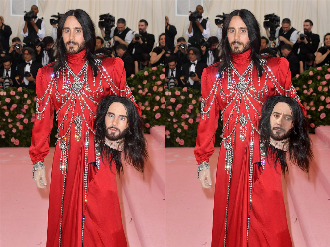
Behance
Photoshop Daily Creative Challenge Day 8 - Movie Scene; 'Place your face into a movie scene or movie poster using face swap techniques in Photoshop.' I decided to do something different and swap a movie character (Iron Man) into reality.
@orchid plank Really nice Nidz! You really nailed the lighting and blending between the two images. If I had to nitpick anything it might be to try and get a little more of the shine you see on her cheek, or to maybe warp the face so that the mouth is pushed to right eeeeever so slightly. It looks like the right corner of the mouth on the original picture is just slightly further to the right than the edit. But again, these are tiny nitpicks, fantastic job!
@bleak fossil Thanks lot. I will definitely try to improve the points you mentioned 😃
Been out of town so got behind, but here is my try at the Day 8 Challenge...put my grandson in the Little Rascals movie poster.
@bleak fossil
while making improvements I have made some mistake in layers so the bit of head is cut :D
I willl do it again meanwhile have a look at this
Jennifer Lawrence is Khaleesi
Breaking Bad with Til Schweiger
@warped saddle Ooh, I love Breaking bad. Nice work, that's a cool image to try it on. I'd try increasing the contrast of the swapped face (maybe using a levels adjustment) to get those really deep darks you see in Walter's face to the left. There's a lot of contrast in this image so that might help it fit a bit more. Nice job 😄
Edit: You also might want to try feathering the edge of the face so the facial hair doesn't have such a hard line
Greeting. I would like to say Thank you very much. I am as new as they come to photoshop shop and this past 2 weeks has be absolutely amazing. Simple explanation and to the point. @lethal mural fantastic host thank you. Will be seeing u on the streams.
I’d still like to post the work Iv done on Discord and soon to be completed all the challenges.
Just as my current work challenge and to be uploaded all here
little update on Day 8, still not perfect but much better. Thanks for the feedback @bleak fossil
@stray compass thank you so much!!! I really appreciate it 😊
🤝
Daily Challenge #5 - ORIGINAL
Daily Challenge #5 - STUFF REMOVED (sticks & cigarette butt)
Daily Challenge #6

Behance
'Create an impactful movie title by pulling an image or object through text'.
Thanks everyone, this has been really fun, this and the last XD Daily Creative Challenge have really improved my self-confidence as a designer! 😄 And the feedback has been really useful. Thanks to @glacial path @lethal mural @bleak fossil for all your time and effort. 😃 Though now I seem to have the difficult decision of whether to start the new XD or Photoshop Daily Creative Challenge on Monday, as they both look to start then, correct? 😅
Last one...
Elephant Pop-out
Today's challenge... Another shameless plug for my graphic novel..😁 It was "interesting" doing the layer mask on this one!
@wind pond Looks really good! You make a great Arrow! 😁
Hello everyone. Today, May 10th, is my grandmother's birthday. Unfortunately she passed away 4 years ago 😦 . She loved roses, so today's challenge I dedicated to her ❤
@coral stone that's beautiful! I think you could maybe add a subtle texture to the background and soften the drop shadow slightly. 😃
@warped saddle cool photo! Just one thing: the comic effect looks not too great on blurred areas. That's why your background looks funky. You could cut out the parrot and give it a new background 😉
@glacial path Sure! I was thinking about adding some leaves for the background, I'll post the result later 😉
@coral stone I'm looking forward to it!
@fallow bough you have picked a difficult image to cut out! mad props to you.
@fallow bough I think you don't need the black stroke - maybe you can achieve the contrast via a different background color
@glacial path I tried to add leaves but it didn't worked as I expected, so I desaturated a rose garden image and used in luminosity with low opacity. I finished it adding some noise. What do you think? 😄
hey @timid pasture I think you could decrease this distance a bit. the line of text looks a bit disconnected.
@timid pasture I like the fire particles in the background! I think you could make the effect even more dramatic by darkening the red a bit and using fire as a background
@timid pasture there also is a filter in Photoshop that can generate flames. you could use that too
( O - O ) don't mind me just a picture passing through
@young karma lol. your name is too funny 😛
A typical Dutch image. Have a nice weekend you all. Thanks for all the challenges @lethal mural and the feedback @bleak fossil , @glacial path
@young karma this is a nice variation on Jesús' work. I think the red in the socks and the green background clash color-wise. you could desaturate the red or go for a different hue of green. or maybe even for an image. I guess you'll just have to see what works 😃
Props go out to birgl on pixabay for providing the picture! Thanks for the feedback @glacial path I like the pop to the image as it displays the image as it's surreal. But I think a better enhancement right now would be to increase the contrast in order to make it look more intense 😉
@young karma sure! if that's the look you're going for, it works 😃
@young karma in that case you could pick an even punchier color ^^
@tulip fern ha! the orange is a nice detail 😉 I can see that you have reduced the intensity of the background by brightening it up. That would be one way to solve the fight for the viewers attention. But I think there is a better way. You could put the text somewhere, where the background is more calm. Like a sky without clouds maybe. Something like:
@tulip fern if you check this checkbox, Adobe Stock will give you exactly those images, where you could put text on the image without having to mess with the background
With this much text I found I needed to keep a bit of the background to establish what's filled.
@glacial path The green background color is to help hide masking errors
@fallow bough hmmm.
I think that works out pretty well @fallow bough I'm not gonna lie not a huge fan of the typeface. Because the WWF doesn't use that widespread lettered font anymore.
@glacial path Busy day so don't have the time to create a better mask.
It's more rounded now and looks kinda sans-serif like, rather then a pure serif font
what am I talking about this is a sans-serif font after all x-x
@fallow bough that's fine. I'm just thinking of a clever and easy way to get around this. so far without luck 😅
😃
Sky's the limit?
Is Discord mocking me, the colors are wrong. I took a bit more baby bluish color, but it's not showing it shows it in Windows photos. If my eyes don't deceive me
@coral stone If I had more time, I would work with the various brushes. Getting ready to head out the door for the evening though.
@young karma Here it is with the actual logo.
@fallow bough that's better. the stroke also looks better now 😃
@young karma colors can look different based on the surrounding colors
@kindred kernel that's a sick bevel/emboss effect!
It's defintly off though which doesn't really make sense got my color profiles setup right I'm using eciRGB_v2 also checked the box for exporting.
Monitor profile in windows should be the one precalibrated from the manufactor.
@coral stone yes! The roses look cool 😄
Thanks @glacial path 😄
@glacial path I cheated. Since I am using PNG file for logo, simply used it to mask background. Duplicated layer with an expanded selection and then used a curve to darken the text on the outside.
@fallow bough hey, if it works, it works
Results count, oh and attribution if you do tend to use it 😄
woah, okay so it's discord which shows the wrong colors if you click to view the original the colors do get shown correctly but only inside you're browser preferably chrome.
@young karma Not sure if you're having the same problem I had last week. Are your saved files more "vibrant" than the PDF? If so, look for my name in ask-a-question for how I fixed it.
@young karma woah! you're right
DailyChallenge#1 Hello I present my comic Art
My problem showed up in the actual files so not the fix.
@young karma ah yes, it looks like you are using a different color space
eciRGB v2 is probably not supported by discord
Guess I'll use Adobe RGB then in the future If I wanna upload pictures to Discord
Still better then sRGB though that's the most common arround
I would go with sRGB since most monitors can't display true Adobe RGB anyway
@glacial path “images with copy space.” I never knew. So cool. Thank you!

@glacial path I don't know their as IPS has become widespread and smartphone screens arround the world have become almost all even starting to have decent color-space support. I mean look at the S10 and especially the iPhone XR the XR is a bit to vibrant for my likings but yikes we defintly are coming to a point where we have full sRGB support.
sRGB as what I think i read was also a standard pushed by Microsoft and Epson mainly
sRGB, sure. but we're still far from having Adobe RGB screens in every device 😃 @young karma
@glacial path Man, I keep forgetting about that fire filter! 😆 time to play again!
Yeah mhm I gotta think about that in my bed with my pillow
(with my eyes shut)
good night / day everyone 😄
good night @young karma 😄
@vagrant sorrel I love that use of the oil paint effect! well done 😄
I see room to improve for sure but here's yesterday's challenge!
Movie image
My face
@wind pond wow! That effect is pretty much seamless. You even thought of adding the shadows. The only thing that could give it away is the shadow on your nose. it could wrap around the nostril a bit better but honestly, that's just nitpicking over tiny details. Well done!
Day 9-- not a movie title but a social media graphic for the page I manage. I'm a little worried that not all of the letters aren't readable
This one came out better. Does anyone have tips on how to erase the highlights on my face?
@glacial path Moved the text layer down - it does look better - also added a bit of yellow at the top of the letters. And had a play with that flame filter, and a bit of smudge tool. And added an overlay layer on top of the flames layer. I used another overly layer to give her face a bit of glow as well. This is too much fun!
@timid pasture nice one!
@dark quiver Maybe try a curves or levels adjustment layer to darken it, then paint on the layer mask to darken the highlights gradually..
I could darken the specific spots. I still need practice to make hand-darkening look natural. Let's see what happens.
@glacial path thank you, good sir! Glad I'm retired - I'll be playing with this all night!
@dark quiver Yeah, it takes a bit of fiddling with different things, but that's what makes it fun. 👍
Just watch out for the dragons..
No promises on the dragons but I'll do my best 😉
@unreal hornet hm yes, it is possible to read it but not super easy. you really have to look at it. I think you could just have them pop out of the letter less often
Did some warping magic to make my face fit better
Solid advice @timid pasture Thanks! If you have other adjustments you'd suggest I'm all ears.
@dark quiver I think your chin is still a bit too bright 🤔
Hmm yeah it is. And my right cheek needs a bit of dust too.
Thank you for your advice, I totally missed those parts... PSdailychallenge Day 7
I finally could do it - Day 8 - Movie Scene #✂challenges-feedback #📣creative-challenges @jolly quest @bleak fossil @glacial path 🖖🏼 🖖🏼 🤓
Original Photography
Original Photography
@dapper basin oh no. what have you done 😱
@glacial path 😰
run! run before @jolly quest kills you
Oh geez. Now the multiverse is going to implode.
(it is a running gag on our Slack channel. Val loves Star Wars and loves Kylo even more. We always "confuse" Star Trek with Star Wars)
so putting Kylo on a Star Wars character is pretty much a deathly sin
but to be fair, you did it well. If you add the shadow to the right (Kylo's left) cheek, it would make the effect even more convincing @dapper basin
and good luck getting away from Val
Thanks Tim @glacial path I will do it that. Thank you so much!!!
@dapper basin lol, NOW you've gone and done it. Looks good, two suggestions I might have though. 1) would to keep the shadow on the right side of his face to match the lighting more, and 2) would be maybe try using the warp tool to grab the center of the face and move it a bit to the left to try and fake the perspective a bit. You got to be careful to make sure all the features stay lines up where they need to be, but I often have good results faking a directional shift when painting by with the warp tool
Thank you @bleak fossil 👌🏼
Quick example @dapper basin
@bleak fossil I agree with your comments. But I also notice the actor’s face is not even close to symmetrical in the donor photo. I did a double take when I saw that, TBH. Hadn’t noticed it during the films because of lighting, costuming, lightsabers etc. now I want to make L/R mirrors of famous actors and see how common this is.
@blissful wolf Oooh, very nice! Those changes really have a nice impact, well done, I really like the whole look of this image.
@peak warren Yeah, for sure, I've seen a lot of those where they mirror people's faces, there's always some level of asymmetry. I was more commenting on the angle. The photo of Kylo is straight on, and Spock is slightly turned, so they look a bit odd when meshed together
@dark quiver Hah, very cool! Glad to hear it, practice with this stuff definitely helps a lot. One suggestion I have would be todarken down the mouth area a touch, currently it really pops out as if it has a light on it, it's much brighter than the surrounding area. Maybe just some subtle darkening with a multiply layer or a masked levels/curves adjustment. Quick example:
@unreal hornet Really liking the style of this, has a happy/cute vibe. The issue with the readability I think is there's a lot of busy-ness with all the shapes and textures. A good thing to keep in mind when designing is that the thumbnail (aka when zoomed out) should have a strong graphic read, and currently I think the background distracts for the main letters a b it. A few things you could try: Reduce the opacity on the background pattern, darken down the background, make the background a cooler color so the hues offer a better contrast, or any combination of those things. Ideally you'll be able to get a nice clear read when zoomed out and that just comes from trying to control the various contrasts in play.
@timid pasture Nice work! I think the motorcycle works well as an image with your text, I also like the effect like she's sitting on it even though she's in the foreground and the motorcycle is in the background, cool effect!
@bleak fossil Thank you, good sir! I had way too much fun putting that together. I've been using PS for a long time, but every time I open it, I learn something new - and these challenges add so much to that. I'm hooked! 😀 👍
That's great to hear 😄
I just realized I missed day 5 - probably when I was getting my backside kicked by the flu bug.. So here's my shot at making things disappear. Nothing irritates me quite like the lazy losers that leave their trash all over the landscape. Wish I could use content-aware to make THEM disappear.
And, it's gone thanks to the lasso tool & content aware fill.. And yes, I picked up the pop can and dropped it into the trash can that was five whole feet away... 🤔
@vagrant sorrel Ooh, interesting effect with this one. Definitely gets more of a painted/illustrated feel. If you're shooting for more comic I'd see if you could decrease the detail lines all over and get more of a flattened/simplified color effect. Either way, look really cool!
@fallow bough Very nice! Looking good Ken. If you want to get the WWF to pop out even more I'd suggest maybe changing the background to something cooler, maybe a somewhat desaturated blue, the color contrast would really bring the text forward the way the animal currently is. Nice work these past two weeks Ken!
@young karma Nice work, I like the effect the grass has with this text! I like how you added the Adobe logo to the socks! Though I'd recommend changing the blending mode on the logo to something that shows the information underneath them more so they appear to be in the same shadow as the legs. Might also be nice to add a gradient to the background rather than a flat color. Looks good!
@dapper basin I see a new ST / SW spinoff coming: The Wrath of Val..😆
@kindred kernel Well done Gerard, has been great seeing you join for all these challenges the past two weeks!
@tulip fern Love the colors on this one! And no problem, glad to help, thanks for joining us!
Also, with this image I think you could even crop a bit off the bottom, currently there's enough space down there where it feels like there should be something else, more text or something else. I think cropping it, or even have the bottom being full brightness/saturation then using a mask to have it fade to the lighter color it's at now as it moves up could look good. Just a couple ideas. Have a great weekend!
@kindred kernel Well done Gerard, has been great seeing you join for all these challenges the past two weeks!
Thanks for the advice @bleak fossil and @glacial path . I think I'm done with this... my brain is done at least
Oh, wow, well that makes a big impact readability wise at least! Haha, and yeah, I definitely know the feeling, great work Elesha!
@unreal hornet I loved your work ❤ amazing
!rank
Pyka (Sean Danby), this command is disabled in this channel
@bleak fossil @glacial path This is the original image I used for the text pop-out in today's challenge.
@grave hound the command works in the #💬chat-general 😃
Ahh, perfect, makes sense that they lines up so nicely, hah
@coral stone Oh wow, love how you implemented this effect. The concept works really well and you executed it very seamlessly. I almost like the flat background a bit more though... maybe blurring the current background to make it slightly out of focus could help? Just to make a it a touch more subtle. Been awesome seeing all the work you've been coming up with these past two weeks, really great stuff, glad you joined us!
@warped saddle Super cool, love the effect you got on the parrot! I think you could push the comic look even more if you were able to simplify the text of the grass a touch more, would really make the parrot pop out and add to that comic look. Great work!
@wind pond Wow, you naaailed this one. Really helps when you get the same angle and lighting for sure, great work! Like Tim said, it's a nitpick but if you wanted to mask out the bottom and left of your own nose to replace it with his and get that shadow that peaks underneath a bit that would match it that much more, though it still looks solid as is. Very nice 😄
@thick arrow Great work Martina! I love your use of the three elephants, very well done and gives a great sense of depth to the image! Only possible little tweak I might suggest is lightening up the background ever so slightly to make the elephants and letters pop even more, but still keeping that nice earthy tone you have.
@dusk crown Great use of breaking the frame, I like how the font emphasizes the grassy field as well. Nice work on these challenges Damian!
@bleak fossil you were absolutely right! I loved how the word popped (I don't know of this is the right word haha) and how it created a sense of depth for my work. Thank you so much for all your feedbacks, I learned a lot. Sometimes I watch you on twitch, you are a great artist and your work is incredible!
@bleak fossil Thank you! I really appreciate everyone’s feedback. I’ve always done this stuff as a hobby and not really shared it with anyone, so getting positive feedback is a real boost in self-confidence. 😁
I’m just trying to choose whether to do either the Photoshop or the XD daily challenge next, as they both start next week. 🤔
@dusk crown Terry White will be hosting the next challenge, I watch him on youtube, he is awesome, I learn a lot from him
I think he needs the infamous hair
Thank you Sam! Im happy with the results!
face swap with donald trump and thanos
@coral stone Cool, I might do the Photoshop one then. I plan to catch up on all the past Photoshop and XD challenges when there’s a break anyway. And I’m more adept at Photoshop, so those don’t take me as long as UX/UI designs do.
@dusk crown Hope to see you next week 😄
@bleak fossil I'll check it out and see what I can do. The mouth was def. bothering me.
@coral stone Thanks, you probably will! 😊
DailyChallenge#1 ......Sunset Forest
Movie Title PS Daily Challenge9 - thought I do a little something extra with this one. Thoughts, comments, suggestions.
Exploring what I've learned from the 9 challenges and the Discord group. Comments, suggestions, thoughts?
@kindred kernel Carol's got it going on!
tryed PS Daily Challenge#9 !!
Day 7
Elephant Pop-out background lighter thanks for the feedback @bleak fossil
Movie Scene, removed the lady in purple dress thanks for feedback @bleak fossil
@glacial path @bleak fossil thank you for your feedback I will fix the nose part !!!