#✂challenges-feedback
1 messages · Page 14 of 1
can you critique this design
please
It's a business card, and it will be 3" round
so, ignore the gray areas
the business card is round?
Yes
The front looks great, I would keep working on the back some more I think
I feel like there's a bit too much empty space on the back, and not sure if that font fits with the neon style of the front
i think you're right. I'm not sure where to go with it
Well, the theme will match my website
the website is a "retro/outrun/synthwave" theme, so it uses the same font
The tan circle sort of reminds me of a moon
It's all sorta space themed too
It's weird laying text out in a circle.
I didn't want to align center either
and, I didn't want to wrap the text around a circle shape
I've heard never to align center text
I think it just depends
Have you played with the idea of forgoing the circle business card and switch to a generic rectangle shape for the card?
but. Yeah. I guess I could play with the font sizes and leading to make it a block
My first idea was a square
Do you plan on printing these?
but I think round is unique.
They had rounded squares too
rounded corners.
Yeah i will print
Do you know who your printing from? What service you'll be using?
Yeah
Do they have requirements for business cards?
Yeah
Circle Business Cards by Overnightprints. Customize or upload your own design using our free online design tool.
it's 3", 3.25" with bleed
diameter
Why not try to put something in the background of the back image, something like a watermark?
they even have the sandwich cards option too! I was thinking of making something that resembled an oreo cookie
but that's totally off base from what my current theme is
hmmm... something like a watermark?
you mean on the tan circle?
Yeah
i can;t think of anything that wouldn't be too busy or distracting.
maybe like a rocketship emoji in the blank space? lmao
or just an icon
It definitely needs something there imo
maybe, only if there's a sensible reason. i do not believe in "just doing things" in terms of design. i kind of think the negative space is fine
the information i clear, legible, and succient
lmao I could replace the circle with a death star
@granite otter round design is interesting, on the front, if the font color can be lightened (bright color) then that would go great and be much visible with the background.
yeah I have to make sure of that. thanks for reminding me
also the white space, make us of it with the font or replace it with a good background in the back.
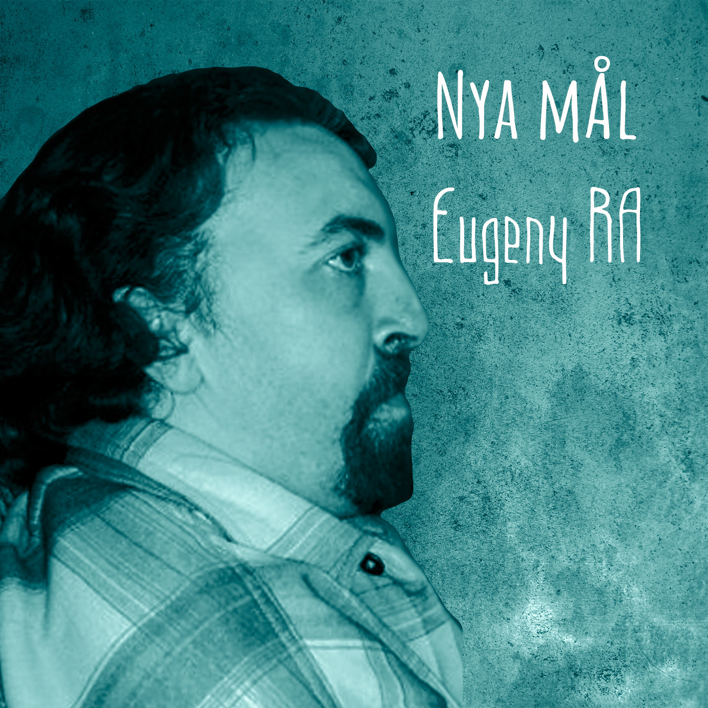
Day 2 challenge submission.
https://www.behance.net/gallery/79619613/Photoshop-Daily-Challenge

when you cant help revisiting what you learned in challenge #1 during challenge #2
PSdailychallenge Day 2
@fallow bough Cool to see you do two different versions of the album cover! Definitely two distinctly different feels. I think if you wanted to go for the crazy colors version maybe toning down the saturation slightly and overlaying a sort of psychedelic texture/pattern could be a cool variation on it. Something like this.
@turbid vapor It's always good to see people using what they learned on previous challenges! Very nice image by the way, really liking the warm cool contrast.
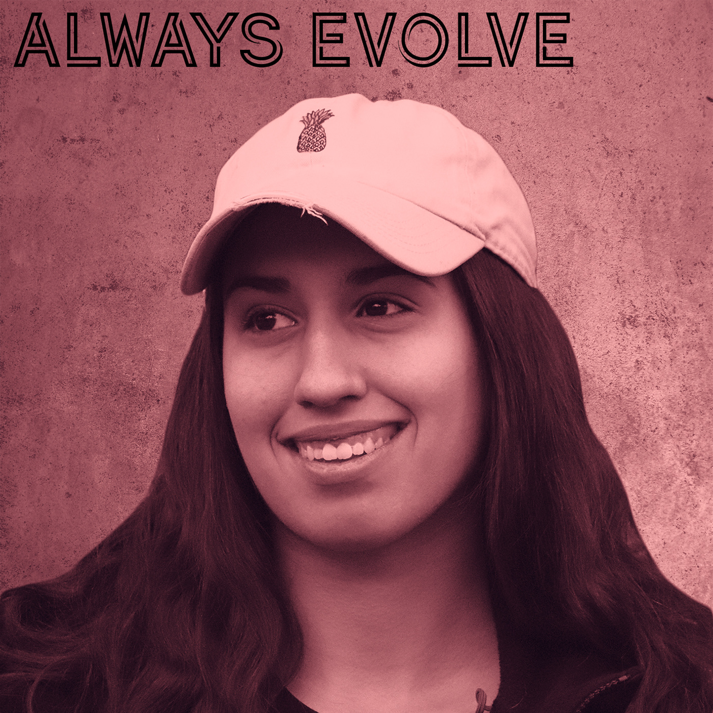
@weary steeple Nice work! I like the simple color usage and separation between the text and the background image. Works well!
@bleak fossil thank you!! i am having a blast 😃
@sour ingot Great job, definitely has a strong illustrated look! If you want to push the comic look more I think doing the line art step to get a strong outline would really help.
@abstract crag Nice work! I think the text being moved up a bit really helps. I also really like the texture feeling you have in the background image. I think toning down the bright white spots of the foreground person slightly might help fit it in with the subdued look/feel of the rest of the image without pulling focus away. Just a thought. Nice work!
@lone hare Always great to see your submissions! I definitely get an album cover vibe from this, really cool direction you went with it. Looks like you used the glitch effect from a previous challenge, very cool!
@wispy compass Very cool, I like what you did with the gradient colors!
@obtuse haven Hah, very nice! One suggestion would maybe be to move "another font" to the left slightly, seems a bit cramped against the right side as is. Nice work Jake.
@jovial moss Very nice use of the frames and half tone! And I think the reduction in saturation really helps, still bold and comic-like without being overpowering.
@mental glade Nice work Kyle, I like what you did with the black and white gradients fading to the same grey, cool effect.
@undone sapphire Nice job Maria! You have some interesting effects going on with this one, looks cool. I think his jacket currently almost looks a little too saturated and kind of looks out of place next to his face. Maybe tone down the saturation slightly and make the DJ Smooth text a bit brighter to focus the attention a little more on the album title.
@bold valley Nice work Ralph! Looks cool. I think playing around with the sizing of the shapes could help out a bit. For example making the dancers a bit bigger, or varying the sizes of the 3 "swings" , maybe making them gradually bigger and leading the eye from one to the next. For example, you could keep the top one as is, increase in the middle one a bit, and then make the bottom one the biggest. It would lead the eye around the piece nicely by using a visual hierarchy.
@buoyant fractal Looks great! I definitely could see this being an album cover. I think the simple color and texture works really well. Nicely done!
Hi @bleak fossil could you please give some feedback on mine as well 😃
@coral stone Hah, very nice Valdair. I like it. I wonder if giving the "my life begins now" some color could be a nice contrast in the image as the only little splash of color. Since the font is so thin I don't think it'd be overpowering.... maybe something cool to contrast the rest of the warm image. Just an idea, nice work!
Ah yeah, I saw yours! Here's what I wrote
@glad hamlet Very well done, love the way you worked a mock up and an ad for the album into this! They all fit together very nicely, the way the color scheme matches so well and the speed/perspective lines of the background almost look like an explosion of color. Great job!
I don't really have any critiques for you honestly, I'm not much of a graphic designer but I feel like you nailed this one
thank you soo much @bleak fossil I appreciate the nice feedback
Thanks @bleak fossil, I was waiting for your feedback 😃 . I really got stuck with the font. I'll adjust my work 😄
@storm rock Nicely done! I like the background texture and how the person's color temperature matches the background but still contrasts nicely with the value. Looks cool!
@mild karma Very cool! I like what you did with the colors, definitely gives it that album cover feel. I think the font is a nice choice as well. I think a slight darkening gradient via a multiply layer to darken down the bottom ever so slightly and draw more attention into his eyes could be a nice touch. Well done!
@bleak fossil the contrast was all it needed 😄 I also made the GRANDMA ROCKS blue so I could play with some repetition and with the noise filter it gave an old look which is awesome. Thank you so much again 😊 https://www.behance.net/gallery/79616701/Day-2-PSdailychallenge-May
I thought the image would be the "cover" of my link 😛
No problem! Glad it helped 😄
@timid pasture Hah, very nice, I could definitely see this being an album cover. Nice work!
@dull tangle The mockup added in is definitely a nice touch! Well done, I feel like this album cover fits the music type nicely!
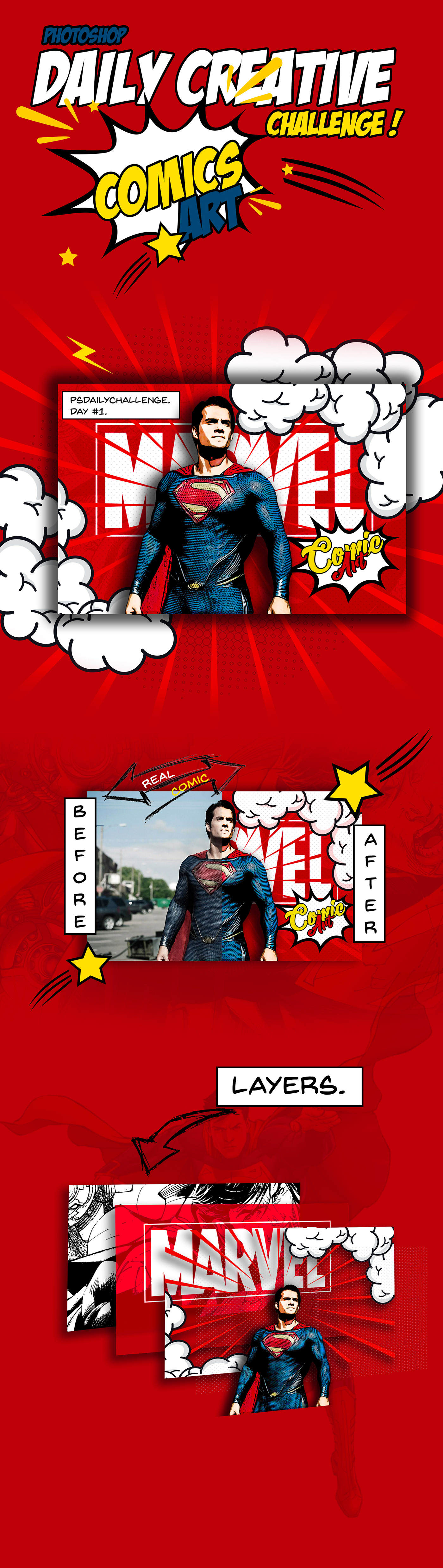
Photoshop Challenge Week 1 Comic Effect
@upbeat laurel Hah, nice to see you adding in techniques from yesterday's challenge! I feel like the small font as the bottom seems out of place, maybe something more like the deep brown/reds in the background, or perhaps a font that seems to fit with the text of the image a bit more? Maybe even having the main text be a solid tone could be a nice contrast with all the thin lines and detail of the rest of the image and make it stand out a bit more against the background. Fonts/typography aren't my strong suit though, but just some thoughts. Love the concept on this one 😄
@knotty charm Nice job Viktor! I like the way that the figure in the front is a warm tone and contrasts nicely with the cool tone in the background. I'm not sure if the cool blue shape at the bottom is adding much to it? It almost feels more of a brochure graphic than something you'd see on an album cover. Maybe just having the artists name and album name, one at the top and the other at the bottom, one being bigger than the other. Could be all you need, you could even play around with making one of the lines of text warm to get more contrast against the background if you want, though I think the white is working well. Just some thoughts, looks good!
@dusk crown Very cool! I definitely get a punk/metal vibe from this one, the bold red really makes an impact. Could be cool to try adding a stone texture over "stone angel" to make it fit the same feel of the statues in the image. Well done!
This is fun. Found a creepy picture of my brother and I ran with it 😄
PSdailychallenge #2 Album Cover
PSdailychallenge 1 Comic book drawing from photograph
PS daily challenge may 19 comic art
tried PSdailychallenge#2
Posting this for @trail rose : https://www.behance.net/gallery/79668845/ARGENTINIAN-LOVERS
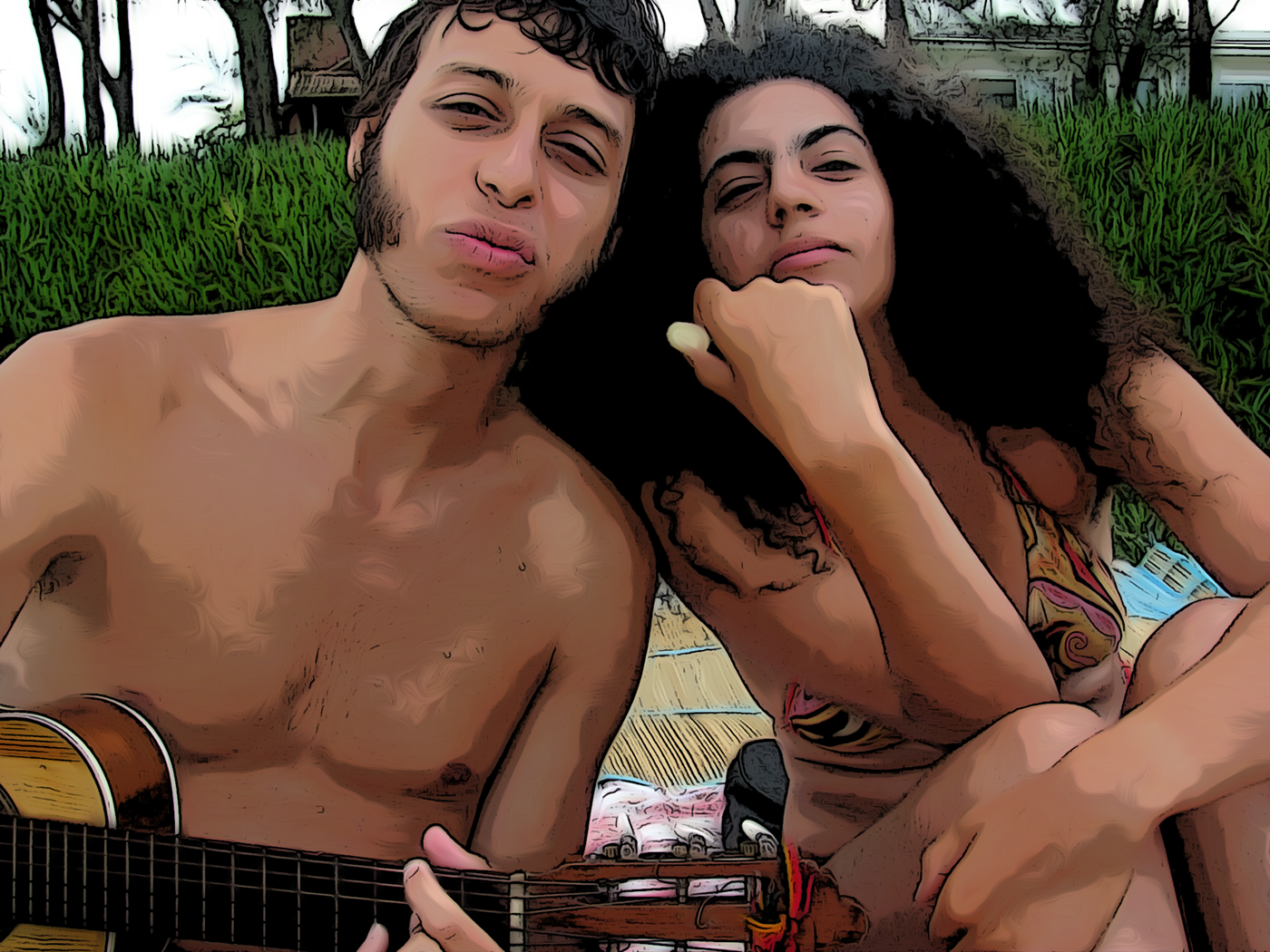
Thanks Mesh!!! much appreciated!!
And big thanks to Jesús Ramirez he is the best teacher I ever had!
Greetings people here is my first PSdailychallenge hope you like it https://www.behance.net/gallery/79188471/Daily-Cretive-Challenge-Photoshop
its 1 am and i made this for day 2 lol ill probably put it in a mockup in the morning before uploading on behance. feedback?
Day 2 - Album Cover
Comic Book Effect 2nd attempt. Ws inspired by a bird image on Discord so gave it a try.
My granddaughter is learning to play the guitar, so I thought I would make her an album cover and name her future band. Wow - had a lot of mishaps with this challenge, and started over several times!
Challenge 1 - My daughter striking a pose
Challenge 2
PS Challenge Day 2 Album Cover
PSdailychallenge #2 - Album Cover
Reprise day 1 i tried some things i saw with the others in this community and adjusted them a little! Please comment for improvement!!
@earnest inlet wonderful!
have a fun ,first challenge 😃 #✂challenges-feedback
https://www.behance.net/gallery/79678163/Album-cover For background I left descriptions for this challenge on purpose.


PS Daily Challenge #1 https://www.behance.net/gallery/79681217/Dayly-Challenge?
PS Daily Challenge #2 https://mir-s3-cdn-cf.behance.net/project_modules/fs/a7892279681217.5ccace1bdf797.jpg
@sour ingot Hi Vivix,
you can wrap the text part which is on tshirt
Hi everyone. Here is my attempt at an album cover. Love to have some feedback. Cheers Jette (It is under my daughter's name on Behance as I am using her Adobe license for this challenge)
My day 2 challenge 🌞
Amazing @devout spire. I loved and TØP is my favorite band ❤️
@coral stone thanks. I love TØP too))

@lone hare Very nice
@young karma Wow your entry looks fantastic! I love it! How did you get the fire in there? A really good job
@severe flame I love the colors in your entry! Great job on the composition as well!
@earnest inlet I love this entry. I love the font and the model you used. The only thing I wish is that his arms where closer to the saxophone or that the saxophone was lower in the frame so that it looks like he's holding it.
@stone flume Hi TaraMarie,
It looks very nice and colourful I like the over all look and feel
@carry Hi carry,
Nice Composition
@sharp niche I love your entry! It's really s.e.x.y and I really love the blue tones you used. The font choices are on point and I feel like this is something I would find on Spotify.

Hi! this is PS daily challenge 2 . album cover .
This is PS daily challenge 1 comic art. I had problems loading it , yesterday
Here is my day 2 challenge. Let me know what you think.
A retry on my post of yesterday. #PSdailychallenge day 2
....and here it is using a CD art template.
@broken crest haha, that makes it even more fun to see. Nice work! 👍
how do you tag your work on behance? #PSdailychallenge
@lone kestrel You tag it in the discoverability section of the project on behance. 1. Content 2. Cover ---> 3. Settings (in settings discoverability is there). don't uses # just type PSdailychallenge as a keyword.
A former colleague of mine is an Illustrator/Author of children's books. She shares cute little doodles Comic Art
I was thing of changing the background, not loving the shadows on the wall
https://www.behance.net/dailycreativechallenge?trackingid=DHWC1HYP&mv=in-product&mv=product&mv2=accc

Daily Creative Challenge
@warm kestrel Thanks!
@blazing junco ooooh 😃 i like how the surface shes sitting on has a similar texture to the background. This really tricks my eye into thinking the wall is really in front of her and part of her surroundings
Thank you Kyle. I'm still figuring how this site works.
which site? the discord server? behance?
discord
ok lets talk in #💬chat-general rather than here

https://www.behance.net/gallery/79691279/May-2019-Photoshop-Daily-Creative-Challenge-Day-2
also used a mockup lol

Behance
Honestly I used a word generator to come up with the title because I'm not that creative.
@bleak fossil Thanks for the comments. Here's a new version with your suggestions.
not for day 3 but honestly i love double exposures so much! haven't really done any in a while tho, this is from 2015. the watercolor image was a really old photo manipulation i did in 2014 then in college i had a class where they wanted us to do double exposures and i put an image of trees over my art to create this effect. since i've improved a lot over the past 4-5 years i cant wait to see what i can make now!!!
Daily Creative Challenge -day2
does this logo resonate with something you have already seen? I'm creating something with this "P" but I don't want to create something that already exists. thanks for any feedback you could possibly give
@elder mica this looks so pro! Great job!!
fantastic. It has style which may be why youre getting a feeling from it, but thats a good thing. I could give a hundred adjectives that describe it, but no it doesn't look copied from anything else which i think is what you're concerned about
yes, that's what I'm concerned about, thanks 😃
😃
Here's my submission for Day2....Feedback is most welcome!
Do let me know your thoughts about font pairing....
@cinder vessel I love it, but that lower font is not working
@mental glade Oops! My bad! It is Vintage...thank you for pointing it out
@cinder vessel happy to help 😃
@cunning sail I see...il try something else...thank you 😃
i agree about the lower font @cinder vessel i would try sticking with the font from the top, but keeping the smaller font size. Of if you want to have two different fonts, make them very similar. This will allow the viewers eye to connect the top and bottom text, allowing for easier flow.
Album Cover
@mental glade Fair enough but isn't it recommended to use a sans serif font with a script font for more legibility?
@cinder vessel Importance of readability will range depending on the project. If you're designing something that viewers can only view for a split second like a billboard, or the front page of a brochure thats meant to catch someones attention as fast as possible, then you want extreme legibility. but if its something like an album cover that viewers will pick up and hold for a few seconds, and consider whether or not they will purchase the CD based on the design of the front cover, you can stylize the font a little more to reflect the music. this is because the viewer has an extra second or two of attention to give, so legibility can be sacrificed just the least bit. all of this is in my humble opinion and im open to learning other philosophies on the topic 😃
Hey Malini, maybe move the lower text over or lighten the opacity on it. It might be because it is right in-line with the subject's neck-line and therefore uneasiness??
@mental glade That's a valid point 😄
@cinder vessel i actually agree with your decision to use a sans serif font – i would suggest trying a thinner weight and all caps, to compliment the varying weight of the script font. And bringing the two fonts closer together will allow them to compliment each other – maybe tucked in underneath the album title towards the upper right. I love the look of your cover, had to chime in!
i think i forgot to mention that i like the design @cinder vessel . just wanted to throw that in there so im not just critiquing lol 😃 very nice work 😃
Here's my upload for day 2 of the Photoshop daily creative challenge. I'm the guy on the left with the hat. Besides playing lead/rhythm guitar for Major Morgan, I'm an enthusiastic hobbyist photographer doing shoots for whoever needs me!
Album Cover
@thick arrow Love your album cover design!
Really enjoy the challenges!
@turbid vapor Thank you so much....il try the variations mentioned by you 😃
@mental glade Haha...no worries Kyle...thank you 😃
@proud isle that looks great, @viscid eagle love the image, @broken crest love the transition between head and hat! 😃
Made some changes...it does look better now....
@cinder vessel that does look better 😃
@proud isle I love it!
@young karma Love the font so much! Which one is it if I may ask? Overall it looks nice 😃
Day-01-Cartoon effect
@blazing junco great image!
@cinder vessel loving it... i am figuring out discord but i sent you a DM?
Thanks! You're making my day!
@turbid vapor Oh yesss....I saw it just now 😄
@bleak fossil Used your suggestion but found the JPG file (Export or Save) is much more "vibrant." than the PSD original. The image here is from screenshots of the original and exported files open in PS. I assume I have a Preference setting wrong in PS. Suggestions?
@tiny nest very interesting clipping. nice image 😃
@red jolt love the oil effect on animal fur! 😃
This is my one for today (Double exposure movie poster). Figured I'd have a crack at it before the stream: 😃 https://www.behance.net/gallery/79696039/PS-Daily-Challenge-Day-3-Double-Exposure

@fast moth Do you speak Japanese? 😃
Hi guys 😀 This is my Album cover for day2. How do you think? PSdailychallenge
@young karma fantastic
Day 2 - Album Cover
@cinder vessel Thank you, I wasn't sure about the lipstick. Because of the gradient map the color changed totally.
@wet thistle I kinda like it...:)
@wet thistle i really like the lipstick
@wet thistle say it's intentional, it looks great 😃
Hey guys here is my daily challenge #2 I really enjoyed this one! #AlbumCover
@bitter cradle this looks awesome
@mental glade Thank you!
@mental glade @cinder vessel Thanks! I had trouble with refining edges, but I think it was just because I used low quality of picture? So anyway I used much higher quality of pictures
@young karma I really like how you marked out the face on your cover it makes it fun and interesting!
@bitter cradle you did a fantastic job! Love the colors!
@lethal mural Thank you! 😃
@young karma great job! This looks like it's ready to print! 😊
@red jolt OMG!!! I love how this one came out! Great job on the details!!!
@bleak fossil Fixed my PSD vs. JPG issue so can post what I originally envisioned. To create effect below, used Color Dodge on the background and Color on foreground (Zappa in hat).
@bitter cradle Glad to hear that! She was smiling but I hied it because I wanted to make it look more mysterious.. haha😄
@bitter cradle I like the contrast in your album!
@lethal mural Thank you!!
Ps Challenge comic art
@cinder vessel Thanks!!
@loud zephyr as usally embeded file with fire, change layers to multiply or screen. CTRL+T and shape it to curve. 😃
@floral lintel Fun!
Yesterday's challenge. Feedback appreciated!
@blazing junco Nice image. The cartoon effect is good, especially around her hands and face. What aircraft is she standing in front of?
So many good entries! Thanks everyone for submitting your album covers!!! Don't forget to upload them to Behance!!!
Already had a 'movie' poster ready! 😁 This is for the upcoming Chapter 7 in my comic.. Feedback welcome. Hmmm... Not one feedback in a week. Must be garbage... 🤔
Album cover for day 2.
@lunar mango Great job on your album covers. They both look amazing. My only small suggestion might be to increase the size of the text on the "Sounds of Mind" album cover. Besides that, FANTASTIC work!
Here's the blending mode cheat-sheet
@timid pasture thanko thanko
You're welcome! Enjoy! 😀
Still trying to get accustomed to the interface. I think this is the right place for this?
Day 3 challenge Double Exposure
Photoshop Daily Creative Challenge #03
Photoshop Daily Creative Challenge #03 Version 2
@mental glade Mahalo plenty Kyle, hoped I figured out how to reply to comments crossing fingers 😊
😃
PS Daily Challenge #3 https://mir-s3-cdn-cf.behance.net/project_modules/1400/50e77179681217.5ccb49f82831b.jpg

!rank
 boomercates, this command is disabled in this channel
Day 3 challenge submission.
https://www.behance.net/gallery/79619613/Photoshop-Daily-Challenge-Day-3

Day 2 Album cover
Here is my entry for day 3. I'd appreciate some feedback on it 😃 I feel like I could improve it. Edit: I just noticed the idea was to make a movie poster 🤦 oops.
Entry for Creative Challenge #3 ☄
couldn't quite get it where I wanted to but, learned quite a bit.
Cats to the Capitol!
PSdailychallenge Album Cover @lethal mural
Entry for Day 3 #PSdailychallenge - DoubleExposure - Pineapple & Beach
Day 3 – Double Exposure
@tulip fern hey that's a really cool piece! I like how you have colored the white background to make it feel more warm :). Tell me, did you also use the comic book effect from one of the previous challenges?
me with my kids😀
Hello ! so I continue, the challenge using my cats🐱 as a theme, but this does not convince me 🤔 , please, guys, what do you think?
I have to admit I like pink
@undone sapphire welcome to math class, right? This is a great portrait and a fantastic overlay 😃 Did you cut out the hair? It looks really clean 👍
@wicked nexus awww! I like the sepia tone you've added to the picture. I would just remove the (wooden?) background. also, one of the kids is almost covered by your hair, maybe you can move the image so you can see both kids more clearly 😃
@wicked nexus The color version is very nice, it also helps the kids stand out more against the foreground 😄
although it looks a touch oversaturated 🤔
Double exposure for day 3... I actually used the galaxy image 3 different times with 3 different blending modes
@dreamy drift hm. it is certainly very dramatic. Since you've said that you're not very happy with it, let's see what we could improve. I like the sepia tone (gradient map, right?) and the color elements. However, I would say they add too much detail to the overall image. Instead, how about a gradient overlay instead? something along the lines of
@dreamy drift I also think that the cat's forehead is very bright. I wonder if you can bring back some detail 😃
😀
@unreal hornet woah! This is absolutely stunning 😲 But watch out for those color tones! The roses are getting a bit gray there. You could up the saturation slightly. Well done, I'm impressed
Double exposure with Lighten blend mode as well as masking of the eye.
Double exposure with Lighten blend mode.
Double exposure with Color Dodge blend mode.
@vale burrow Impressive job with the hair! (and great photo in general)! I'd love to see more matching colors between the mountains and the face, right now they're rather disconnected. So I would add some magenta or warm orange tones, just like the sunset in the background. Not a lot though 😃
Look forward to comments / suggestions on double exposure images. Thanks.

@coral stone LOL. I feel like this is almost a parody of those pseudo-deep instagram posts. well done! The only issue is, you do have to look at the bowl for a moment to recognize the cat food. probably because of the unusual colors
Thanks @glacial path I’ll work on that 😊
@cold cedar I like the 3rd version because of the better details. And to be honest, I don't mind the oversaturated reds and oranges 😃
Thanks, Tim. I get caught up playing around with Photoshop. I liked the 3rd version, too.
@toxic python heya! just one thing: please check if you have set the smoothing correctly. the text is very jagged
@toxic python check this setting
Hey @kindred kernel Cool portrait, but I don't think this is a classic double exposure 🤔
@lethal mural what do you think?
@cold cedar I love it that you are trying different blending modes! The one with color dodgeooks great!
@glacial path you were absolutely right. The colors were a little off, so I made and Black and White adjustment layer that @lethal mural taught and reduced the opacity a little bit. I hope it's better 😃
@coral stone yeah, now it looks more like catfood 😄
Thanks @glacial path 😃
@glacial path @kindred kernel Yeah, Tim. Not a traditional double exposure. In my opinion this effect looks better if you have confined areas. I would try to only have the effect over the man and not over the entire image.
@glacial path Thanks for noticing that. When I went in to change it I also noticed that her face was really washed out so I fixed that too
@wicked nexus so cool! I love what you did here. My only suggestion is to try a different font. In my eye, it doesn't fit the cool image you created
@unreal hornet nice! I like this version a lot 😄
@weary steeple great job Hank! Love anything with cats! Lol 😂🤣😅 Did you play around with the Black and White adjustment layer? The blend came out great!
Here's my entry for Day 2 😃
@glacial path like this 🤔
Hey @deep mango ! That's a classic album cover if I've ever seen one. You should totally also add some color to the background 😄
@vale burrow yeeeeeees! exactly like that 👍
Thanks @glacial path i like It. yes is gradient map , i Willl try with this chances . The cat is white to, so bring more detail maybe can be dificult ...
@jagged wyvern Nice! I love the metal effect and how the text is behind her arm. Now you just have to make this text right here really stand out. And be careful, those letters are touching each other. unless that's on purpose 😉
@dreamy drift ah I see. give it a try and see how it goes 😃
don't forget to @ me ^^
@lethal mural Indeed I did sir!
@glacial path but i like the dramatic look to 🤔
😀 I changed the Blend mode from multiply to lighten for the top landscape image.
I used the past couple days skills to put this one together.It's 4 different images blended in different ways, all the the animation effects from Monday. https://www.behance.net/gallery/79711249/Photoshop-Daily-Challenge-Movie-Poster
Awesome @sharp pier
@glacial path Yeah, I thought about it but it's actually inspired by the mood I'm in 😃 I might tweak the background color a little bit soon 😃
got a lil swept away experimenting with challenge #3 https://www.behance.net/gallery/79711427/ps-daily-challenge-03
Ugh.... For some reason this one isn't resonating with me.... I'm going to try a couple other things... and watch Jesus's video again... Any suggestions in the meantime?
@timid pasture I see what you mean... my eye kinda doesnt know where to go. i would suggest leaving all of her skin at 100% opacity and letting the mask clip through her suit? no clue how that would look but its the first place i would go. id leave her gun at 100% as well
OK - after a cacophony of blending modes, adjustment modes, a bit of this, a bit of that, I like this a bit better.
Hi, I wasn't happy with my cat so I decided to make another poster, any thoughts? 😄
@mental glade Yeah, I think I'll give your suggestion a try. That's what this is all about - experimenting and learning. I've been using PS for years, and every time I open it I learn something new...
Thanks @mental glade 😃
Daily Challenge Day1
Nice. My eye has an easier time starting on this one vs the first version
Version 3 - now that I have all the words spelled right... this is closer to what I'd envisioned. 😀
@mental glade Thanks, good sir! I re-uploaded it after correcting a spelling error... 😬
Just Finish the double exposure, not sure how it will become a movie poster yet but I will find a way 😃
@coral stone Very cool! I like it, has a really nice clean transition, gives off a sort of serene meditative vibe. The cat one made me laugh, hah, could be cool if you put the food more over the cat's head and found a blending mode that works well with it. Nice work!
@mental glade Very cool, interesting effects! The red earth with the night sky in the background kind of makes it feel like it's on another planet. If you want it to appear more like night you could put a cooling photo filter over the mountain and land. Looks cool!
Thanks @bleak fossil. The cat's head was the first place I put the food image, but I got some problems with its ears, the bright parts. I'll try to play with masking to see how it looks. 😃
I figured that might be the case, sometimes it can be hard to get images to work well with each other. Keep it up!
@timid pasture Looking good! I like how the double exposure is around the bottom but the face is untouched, draws the focus nicely. Though I wonder if the text could be integrated in a way that draws a little more attention
@turbid vapor Very nicely done, some really cool designs going on! One thing I noticed is the light spill at the bottom is blue but looks like it's coming from the warm sunrise/sunset. Could look nice to colorize that light spill with a more orange tone, might make a nice contrast against all the blue. Well done!
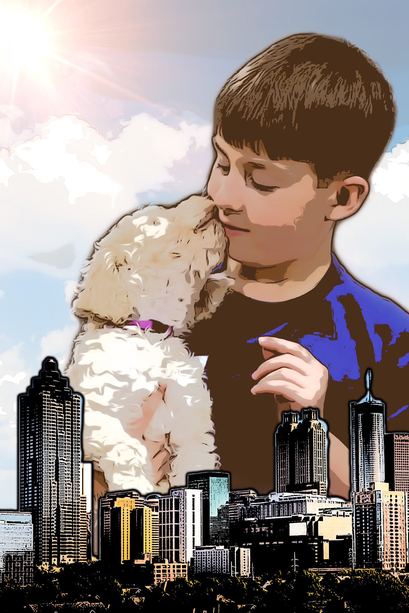
@sharp pier Nice work, cool to see you applying that stylization from day 1. It could be nice to see you integrating more of that double exposure between the top image and bottom image, or perhaps even adding in another cityscape behind the first one that blends over the bottom half of the boy/dog image. Just some ideas, good job!
@young karma Nice work Rin! You got some cool stylization effects going with that one, looks good!
@kindred kernel Nice to see you playing around with different ways of blending this! One thought is it might be nice to get more of the sky of the image over the head area, currently there's so much texture everywhere, having the sky might be a nice visual break. So much texture almost makes it look like the skin has that texture instead of seeing a scene within the image. You could even play with masking out some of the texture with a soft round brush if you want to play around with where you let that texture fall. Always great to see you doing so many of these challenges, nice work!
@heady dawn Nice work! Cool to see you doing all these challenges! The first one looks like you could get more of a comic book feel if the texture and colors were simplified a bit more, but cool effect regardless. The album cover definitely looks legit and you have a really cool effect with the values and colors in the double exposure one, very nice!
@deep mango Nice work for challenge number 2! I wonder if giving the background a slight cooling tint (maybe with a photo filter?) could help it fit with the front image even more. Might even make the yellow in the face pop more too.
@bleak fossil Thanks Sam! I tried a couple other versions, but I wasn't happy with the city showing through her face. I also added the cloud layer from one of my own photos, then went slightly nuts with the adjustment layers & blending modes.. Messing with PS is so addicting.. 😆 Yeah, I'll have to fiddle with the text a bit - maybe pick up an idea or three in Jesus's next video tomorrow.
@bleak fossil Thanks 😃 Yeah, I think you might be right about applying some photo filter to the background. I tried different color combinations about the gradient but these colors seemed to be the best combination for my idea.
@bleak fossil thank you so much! that's a great call 🙌
No problem 😄
@unreal hornet Very nice, the face really draws the attention and acts as a strong focal point. I think strengthening that color contrast was a good choice!
Yeah, that's cool, definitely gives me more of that night time feeling. Nice work!
thank you
@toxic python Nicely done! I wonder if some size or spacing variation could make the text have a bit more of a visual hierarchy in terms of focal point, though I suppose that depends on what it says so I can't say for sure. Nice work!
@cold cedar Very cool, I really like seeing the variations and the different looks they give. I like 1 and 3. #1 definitely puts the focus on the city, with a clearly recognizable human shape, and I really like how the single eye adds a bit of life to the portrait image, makes for a nice balance between the two images. #2 puts a lot more focus on the person with the city as a secondary read, which I imagine you'd likely see more often if this image was being used for something official. Very cool! I would suggest maybe toning down the saturation a touch on the 3rd image, but that might just be my personal preference.
@mental glade Yeah, that looks great, Kyle! I love the starfield over the rock formation. It has a very mystical feel.
thx @timid pasture !
@wicked nexus At first glance I thought the secondary image with the kids was at night, but then I realized it's in the day just in the shadows. Next to the top image it appears a bit dark by comparison, to maybe get more of that happy/bright feeling with it you could try a Levels adjustment just on the bottom image, might help. Nice work!
@dreamy drift I think for the double exposure challenge the images seem a little too separated. If we say more of the trees going into the top image, or vice versa it might work as a theme a bit more. Maybe try playing around with other blending modes to see if something works better? I think having more of a consistent color scheme to the whole image might tie it together a bit better as well. Nice work Mari!
@undone sapphire Hah, nice job Maria, definitely communicates a clear feeling. Looks good!
@tulip fern Very nice, really cool look to this! I like the low key contrast you have going in the image, definitely gives off a sort of retro/beach vibe. One small thought, the deepest contrast that draws my eye is the blue line halfway through the leafy part of the pineapple, and the dark blue spots above that. If you could tone those down and make the sunglasses a bit darker to draw the most contrast I think that could be a really nice effect. Well done!
@abstract crag Really cool integration of the two images, I like how you played with the orientation as well, almost gives her a robot/doll feel or looks like a crazy costume at first glance. Nice work!
@bleak fossil Thank you. When I overlaid the city, part of the eye was in a gap in the sun so I thought I'd let it show. I felt the initial one was too soft so I tried dodge. Next I will try working with saturation as you suggestion although I kind of like the hardness of the dodge. If I can figure out how to combine the eye and the hard edge, that might be interesting. Don't know yet.
took a risk and tried to blend her into the mountain
@timid pasture Really was feeling good about mine until I saw yours. It's amazing.
OK here we go... my first attempt at the album cover
@fallow bough Thank you, good sir! Hey, yours looks great, too! You should see my first attempt with this one (above). It's all a matter of putting things together, messing with layer masks, blending modes, gradients, etc. The PSD for mine looks like a battleground! 😆 If she's on a layer with the white BG, or a separate layer try varying the opacity of her layer. I'd increase the opacity gradually starting about the top of her boots, to 100% at her head just as it is now.
@timid pasture Much the same for me. I used gradiated mask to keep the double exposure look down in the mist I added.
Photoshop Day 2 Album Art.
@coral stone Really nice. Has that Jerry Uelsmann vibe. I think having a transition in the double exposure is what makes me think of his work.
Did the double exposure but masked the woman's tongue: left in color, prevented the double exposure. Also masked the eyes, but let them go monochrome. The slight pink in the eyes was distracting.
Round Two... this was a challenge with the hair!
Ok, I didn't like the gradient map effects, so I messed around with a few things, but couldn't get rid of the white background. Looking for an effect similar to what @fallow bough . I had a top layer with a rose and a book. The only way I could get it to appear across the entire poster was using one of the inverted blends. I was hoping I could then change the colors to the original, but didn't get that figured out. I chose a different top layer. I hope this makes sense. I am very new to this. I have only been using the crop tool, and Image>Adjustments>Levels for a long time.
This is the original top layer.
Day 3 - Double Exposure
played with the double exposure some more.
@peak warren - That is awesome! Here is my contribution:
@tame juniper that’s awesome
@mental glade - Thanks! I don't know where it's heading (pun intended). I played around with this for several hours tonight before I landed on this one.
Well it works really well
@tame juniper Nice! The lack of hair helps. Makes a cleaner look. I love this.
Double exposure effect. Photoshop daily challenge. Need your important feedback.
Woah that’s very cool
ok so its 2:30 am and i have tried a bit of image combinations before settling on this. i'll probably make more in the morning (also im a rly big fan of alberto seveso on behance so im def inspired by his art for this challenge) also i need feedback bc i havent tried this kind of double exposure effect in 4 years lol
Thanks for the feedback @bleak fossil . This is what I picked up from your tips. The overall double exposure blend is not that strong anymore, but I guess it should only be used when it feels balanced and not just for the effect. And yes @glacial path I indeed also used the Comic Art effect in this one.
@abstract crag Hi kavya, Very nice work
love the detail and composition
@sharp pier
Hi Nathandains,
Awesome work
@heady dawn Hi KellyMichelle,
Cool
@heady dawn Hi Kelly,
Nice work day 2 challenge
I feel like has make something like this before, i hope i didnt do any mistake
Day 3 Double exposure
Thanks @peak warren 😃
The original pic
The posterised version of this dog was blocked by Adobe as forbidden.! So, here is a link to the work in Behance: https://www.behance.net/gallery/80011099/Charles-posterised-PSdailychallenge-day-1

Day 2 Album Cover
Photo by Zachary Nelson on Unsplash
My first attempt at comic art.
PSdailychallenge #03 Blending modes, May 2019
Day 1, comic book! (just came in yesterday). Other photo I just sent is Day 2's album cover
Album Cover - mock-up! Can't beat Kanye but still tried something! share your thoughts!
Didn't like my first effort so here is mark 2
light trails in a busy road and a man but big hand double exposure
lotus flower field and a church ruin in my city Macau double exposure
@lime island I think I prefer with the gradient. The one without is very lovely as well, but the 2-tone looks more -vintage- and sophisticated. Of course depends on the mood you're aiming for!
Day 2 Album Cover
@unique skiff I like the second image, but the right edge of the cathedral (church?) looks like it is running into the edge of the frame. Is that a limitation of the original file? You could crop the canvas to make that be the edge of the overall image.
@dapper linden The double exposure with the fetus is strong. I am confused as to the effect on the woman's face, though. What is that? Also, there are weird JPEG compression artifacts on the pillow. See especially the area close to the woman's hip. Looks like a colorful mosaic.
@vernal yoke That is strong. Two thumbs up.
@lime island I like the duotone one, on top, like @junior galleon . The cloud behind the Empire State Building looks weird in monochrome. When I first scanned the image, I thought it was a windmill. 😃 And I had this whole "Audrey Hepburn was Dutch, so there is this whole Breakfast at Tiffany's meets Netherlands vibe." But I zoomed in and realized it was a cloud .
Day 3 - Double Exposure
Since today’s challenge was a Movie Poster/adding text (which I’d already done), and my one for yesterday’s wasn’t what I’d typically call a double exposure, I’ve switched the days, so this is my new double exposure for yesterday’s challenge: https://www.behance.net/gallery/79696039/PS-Daily-Creative-Challenge-Day-3-Double-Exposure

Behance
Idea for a war-based action/romance film poster.
And my one for today's (Movie Poster): 😃 https://www.behance.net/gallery/79740547/PS-Daily-Creative-Challenge-Day-4-Movie-Poster

Behance
Idea for a war-based action/romance film poster.
Okay so I fixed the one I made last night/early this morning by just removing some extra smoke outside the hair. and I also made another one rn bc I was curious if I could get the same effect using darken blending mode over a black background image. which one is better???
A good friend of mine, Andy Pivarnik, ready to be put in a movie poster. (He used to be on Fat N' Furious: Rolling Thunder, a reality TV series.)
@neat shale I like them both, but I really like the colours in the first one.
@neat shale great idea using smoke! It looks great!!!
It also feels kinda surreal and unnerving but in a good way, it looks like a hand pulling at smoke or a jellyfish or something at first glance, which is intriguing.
@dusk crown you did a fantastic job! Adding the brick wall is a great touch!
@dusk crown thank you! first one i grabbed lots of inspiration by the double exposures alberto seveso does on behance, i think i figured out how he gets the coloring in his art too
@lethal mural Thank you! The brick wall was actually in the original photo, and both photos are taken by me (the person is my brother). 😃
@lethal mural thank you!!!
@vernal yoke great image, great choice of colors. In my opinion the font is probably not the best. It does feel like a font for a CD with a parental advisory sticker. 😋
@mikeydjay#813 I think the one without the gradient is best. Maybe bring more of the model out. I think that the city is a tad bit overwhelming.
@wet thistle great idea! I love the eyes and use of color! Great job!!!
@junior galleon great use of colors! Good job!
@ionic lily I think you did a great job! The details look great!
@shy dirge To fill the white area, I selected the white background, expanded/feathered it a bit and then used the selection to mask a copy of the image I used for the double exposure.
@rigid falcon not too late! Great job on these! I love the colors on both images! But the second image with the white square looks better. Great way of applying your own style to the challenge! Not much to say besides great work!
@unborn siloyou did great! No mistakes! Your image looks amazing
@devout spire looks like a real movie poster! Good job!
@fallow bough thank you! Can’t wait to get off work and do this.
@abstract crag I'm sure that you can find a way! It looks great! Good job in flipping the image. Makes it look way more interesting!
@coral stonei think this version looks great! The hair worked perfectly for this!
@heady dawnthis one feels so much like a real album cover! Great job!!!
Thanks @lethal mural 😃
@lethal mural thanks!
Challenge day 3 movie poster, feel free to give me some feedback! 😀
Hows this ?
Hows this ? (Comic Art)
@proud osprey nice dubble exposure. I feel a lot of depth in it. The white background with the topic al colorfull, I like it! 👍
thanks @silk wigeon
@lethal mural Thank you, now come up with a nice scary movie title 😉
@wet thistle Awesome double exposure work, I really like them both 😄
@lime island Both look really good! I'd say the sepia one matches the person's style more, but equally the colours in the second one are really nice. 😃
@rigid falcon I love the colours combined with the effect in the first two! 😮 Feels very psychedelic. ☮
Day2 Star Wars themed album cover, https://www.behance.net/gallery/79743063/PSdailychallenges-2-Album-cover

@unborn silo That fox double exposure is awesome! I love that style of art, yours looks really professional too. I looked at a similar artist years ago when doing double exposure for my Art Photography course: http://earthporm.com/double-exposure-animal-portraits/

You have to see these incredible double-exposure animal portraits made by digital artist Andreas Lie.
Here is my try-out for PSdailychallenge #4. I probably will submit an updated one after watching the video tonight 😃
I just finished my album cover XD
I couldn't avoid "retouch" and enhance the pi a little bit 😛
Day 2- Album cover. https://www.behance.net/gallery/79744173/Album-Cover

#📣creative-challenges #✂challenges-feedback @lethal mural First Challenge 😅 Comic Art
PSdailychallenge Double Exposure
@bleak fossil, thank you so much for the compliments on my work! I appreciate the feedback, too. ☺️
would love any feedback on how to improve, particularly with how to achieve a less grainy quality to the overall image!
@vale burrow thats awesome looking. @magic meteor im really new to photoshop but i think the noise you're seeing in the sky might have to do with a sharpness setting. wish i could help more
challenged.https://www.behance.net/gallery/79745953/movie-poster this challenge was little difficult ,but very interesting for art tech.

Day 2 PSdailychallenge Thoughts on how to smooth him out and not look so pasted on? I applied two different filters to the mask and the background.
@urban cypress try selecting him (ctrl+click on his layer thumbnail), go into free transform (ctrl+t), right click on the selection and select feather. thats helped me in some situations
@dusk crown Amazing work!
oh sorry to select him, ctrl+click on his layer mask, not him
@cinder vessel Thank you! 😄
PSdailychallenge
Day 2 - Album Cover
@mental glade I don't seem to have the option to feather.
When I click on free transform it doesnt do anything (that I noticed anyway)
@warm kestrel I really enjoy how the text lines up so well with the image below it, it really controls the direction of how the eye moves over the image
@magic meteor Thanks!
newest
hmmmm
I was having issues with running oil paint on my computer too yesterday.
would they be connected?
try clicking select at the top, modify, feather
@mental glade I wound up playing with the opacity settings on the layer mask. I don't believe it's what you were suggesting, but it definitely began to help
@mental glade I don't have a Modify menu option
@magic meteor yeah i can definitely see a difference in the clarity of color in the sky. how do you feel about the darkening of the bottom half of the picture?
@urban cypress checking help forums
@mental glade I don't mind it, it feels to me like it gives the image some weight and an anchor point of sorts. whats your opinion though?
@magic meteor ummm, im kinda thrown off by the sharp contrast between the upper and lower halves of the picture. i think it could use a smoother transition, but id have no clue how to pull that off
@mental glade completely understand what you mean, the bottom half wasn't initially frustrating for me, I would rather have the top half not be so stark and bright as opposed to lightening the bottom half, but that's outside of my capabilities as of now as well
Thank you @dusk crown 😀
@urban cypress Click on Select in the top menu bar, then click Modify, then Feather
Forgot to upload it yesterday : Cat on the Edge
@mental glade Thanks for helping me out with that. What do we think of this?? better ? worse?
i think you solved the original challenge, but we've lost his arm and theres a discoloration on his forehead now that the image could do without. but he definitely blends into the background much better
yes I was thinking the same thing about the spot on his head! haha Just wanted to see if it bothered anyone else. Thanks so much!
happy to help 😃 😃
now... how to get his arm back lol
click on the mask thumbnail so its selected, then make sure the color selections at the bottom of the toolbar on the left are white and black, white in the foreground, black in the background, use the brush tool to paint white over the arm to reveal it
How's this OK or Not?
@wide cradle i like it 😃 id like to see more of the image thats inside the cat, maybe all over her body but not her head or ears
Is it better @mental glade ???
definitely cleaner @wide cradle 😃
GauravBarai, this command is disabled in this channel
@vale burrow the work is so beautiful! I would only improve the legibility of the title by giving more contrast. Otherwise well done 😎 👌
...still experimenting with the painterly illustrations.
Day 3 and 4
@blissful badge that looks awesome. great effect work. @lone hare that looks super professional
Photoshop daily chalange #3 - Double Exposure
PSDailyChalleng - Day #03 https://www.behance.net/gallery/79749379/Double-Exposure

@loud ferry woah, @young karma very nice 😃
Thanks! @mental glade
@mental glade Thank you !!
😆
Day 4 – Movie Poster
I've always wanted to try this effect, and I thought now would be the perfect time. I just wish I could perfect it. I don't know what I missing to make this picture pop and look better. The name of my movie is The Butterfly Effect 4. I think we're on number 4 right?
@mental glade Better? or does it need more revealed?
better in the arm 😃
Day 4
@wet thistle thats gorgeous
@mental glade Thank you, I learn so much from you all, am so happy I found you :))
@wet thistle i feel the exact same way 😃
PS Daily Challenge | Comic Art
https://www.behance.net/gallery/79750825/Comic-Art

Behance
This is the result of the the Photoshop Daily Creative Challenge #01, applying applying filters to achieve comic art style.
Can anyone suggest a font for the upper text that work well with the lower text font?
@fallow bough I need a font as well
So i decided to continue with the dramatic and mysterious effect, I made some suggested adjustments. Thanks @glacial path . Now I love the result. 😍
What do you think guys?
😀
very nice Gerard
@loud zephyr That's the name of my cat 😅 (by the way the picture is of her)🙃
@loud zephyr That's great though. Cool and funny is always fantastic
@agile ruin After improving the title 🤔
Day 2 - Challenge 2 - Cover Album #📣creative-challenges #✂challenges-feedback #psdailychallenge
Hey @dapper basin - I like your font choice and the stock photo. I think you should pick a different color than green for the 3. Also the space between the 3 and the name is slightly off. maybe you can move the text a bit more towards the center 😃
Just finished today's daily challenge;
Hi Tim , Thank you so much! @glacial path
@vale burrow woah! I'm a big fan of the red color! This is almost like a double double exposure 😄 Well done!
@kindred kernel yeees! I like the version with the clean background 😃 Well done. The font looks a bit serious though, I would either pick a color from the image or change the font. Both would help tie the image together
@dreamy drift that title rocks! I'm a big fan of the Neon type 😃
Added some text 🕵
@fallow bough thank you for sharing your poster 😃 I actually like the alien hunter font. Instead I think you should focus on the main character. Right now you can see right through her. Unless that's the effect you're going for, I would change the opacity to 100%. And you could also add some simple color corrections to her head. Let me know if you don't know how to do that 👍
Something I put together using images I've found. Played around with the blending modes in Photoshop
@feral torrent thats insane 😃
@proud osprey woah! I love everything about this. the subtle grain texture in the background, the pastell yet colorful tones and the picture itself.
@proud osprey I've noticed the subtle drop shadow behind the title. But I think this is too subtle - you could either completely remove it or increase it 😃
@proud osprey and one very minor detail: some of the wall is showing through here:
@mental glade Thanks
Nice @proud osprey
Day 3 - Challenge 3 - Double Exposure - Part A - movie poster. #✂challenges-feedback #📣creative-challenges @glacial path
original images #📣creative-challenges #📣creative-challenges #✂challenges-feedback
@glacial path Thanks for the feedback. The transparent section was left over from my first double exposure attempt. Should have dropped it when I added the face in the upper left as the double exposure element. Added a bit of the upper face hue to the main character to pull together.
Hi everyone. I didn't know where to put the text on my poster so I decided to put a phrase on his neck using Inner shadow and bevel & emboss, I also played with the fill to blend with his skin. For the movie's name I used a subtle drop shadow.
Here's a mockup 😃
@fallow bough Much better 😄 Well done 😃
Thanks @mental glade 😄
PSdailychallenge Double Exposure movie poster. Suggestions and ideas appreciated.
Great job @cold cedar . I loved it
@cold cedar I feel like this is more of a magazine cover. probably because you have text on every side. If you look at classic movie posters, this is how they do it: list the actors all in one place
@cold cedar however, it still works as a poster. just something to think about 😃 Well done!
this text color could be a bit problematic though
Stole Valdair's idea.
@coral stone Yeah, it can be difficult to know where you should put the text. but don't cram it all in the corners 😮
@coral stone how about two rows for the text instead of one. give it some room to breathe 🤔
especially the "coming soon"
@dapper basin I love this one! But if it is a movie poster, you should add a title and some actors. I also wonder what the movie is about 😉
@lethal mural super late response but thank you so much!
Thanks @glacial path , I tried to put the "coming soon" at the top of the word OUT, but I was afraid that it could compete with the title. Maybe It's not a bad idea 😉
@undone sapphire I love it! THe red text really works here 😄 Just becareful with that text up there. it is almost touching her hair
changed the size of the subject and added some planets to make a Sci-Fi Rom-Com (which definitely needs to be a thing)
@unreal hornet lovely! but right now the planet on the right is very prominent because it is rather dark compared to the background. I would brighten it up 😃
The comicy and the the double exposure give it a kind of inbetweeners effect i think. A beam us up scottie, time travelling sequence. A suspended reality maybe.
Is it credible you think?
enjoyed. I'm looking forward to design-feedback. https://www.behance.net/gallery/79755105/Movie-Poster-2

desaturated and lighten the right planet and it feels much more cohesive. Thanks @glacial path
@unreal hornet 👏 👏 👏 awesome 😄
@glacial path , I made the adjustments putting the "coming soon" at the end of the movie title and made the phrase "he knew too much" in just two rows. And to create a drama and make sure that it'll catch the viewer's attention to the phrase, I made some bruises on his neck. Let me know what you think 😃
fancy! @coral stone I like it 😄 and those bruises look... painful 😛
😂 Thanks for the feedback @glacial path
@glacial path Thanks for the feedback, Tim!
@severe flame thank you for sharing 😃 I think you can rethink the colors a bit. the blue doesn't really imply "Amazon". I would expect a more green-ish color. And the bird should be opaque too. The font is really cool and works well here and it would be even better with a brighter color 👍
@severe flame you can also use http://color.adobe.com to gather some inspiration 😃
tryed again. chaged top and bottom layer. https://www.behance.net/gallery/79755757/Movie-Poster

@glacial path thank you for remarkable feedback and sharing tool !! I try to change othor colors.
i couldn't motivate to do a movie poster...because i really only want to play with these new effects on text 🙃 here's my day4 submission: https://www.behance.net/gallery/79754853/ps-daily-challenge-04

Thanks Tim!!!!!! @glacial path
Poster Art
PHEW! Caught up, just woke up and did 3 and 4 together. I don't really care for text effects so I just chose a couple typefaces I liked and locked it up! Highly recommend this book to anyone who likes dark, surrealistic fiction. I wish it were a movie haha
Finally got days 3 & 4 completed. I guess this is my week to feel "purple."
Day 4 with the movie poster.
album cover
Day 4 Movie Poster - I didn't want to continue with my double exposure and wanted to create something that will look more like an actual movie poster hope its good 😃
@bleak fossil mentioned maybe modifying the text to grab more attention, so I did a bit of fiddling - I think I like this better... Feedback? Ideas? Suggestions? Bananas? 😋
@junior galleon I think sometimes a more simple text style suits certain designs better and I definitely think this is one of those cases, fits very well. I also really like the image you chose, the texture the brown vs yellow makes gives it a really interesting look. Nice job!
@proud isle Oooh, I like this one, I think this is a great example of really effective double exposure. The hair also plays into that theme nicely as well. Very well done
@upbeat laurel Definitely a creepy vibe from this one! I don't know if it's the text but it kind of reminds me of the 90s Nickelodeon show Are You Afraid of The Dark, hah. Nice work with the exposure!
@turbid vapor Oh wow, really cool effects with the text! Did you use the smudge or liquify tool for the final step? Glad you showed the process on your Behance, was curious how you did that. Very cool!
@severe flame Nice to see you sharing multiple designs takes on this! The last one has a cool look to it, I think if you adjusted the levels to make it overall darker, perhaps making the midtones a bit darker, it might have a stronger silhouette against the background overall. Just a thought, nice work!
@coral stone Very nice, and very convincing edits. Cool to see this image develop! Also nice job with that mock-up!
@unreal hornet Very nice! The edit you made to the planet looks really good! Once more suggestion might be to possibly make the entire text block a bit smaller so it doesn't compete with the portrait as much. That way the portrait will be a strong first read, and the text will be a secondary read. Looks good, nice seeing it develop!
just changed the right girls eyes to be clear
@bleak fossil Thank you 😄
@young karma Yeah, definitely gives it an interesting feel for sure! I think it could be nice to "focus" where the double exposure is happening a bit. For example limit the city to showing up within the figured, within the background , or even just towards the bottom or top portion of the image. Might gives the image a bit more of a focal point and natural transition. Nice work!
@fallow bough This is a great idea for a movie poster mock-up, very nice! Good job with the masking as well. One thing to make it fit in a little better could even be to add a tiny bit of blur or noise into the poster to match it closer to the photo it’s in. Currently it’s a lot more sharp/crisp than the photo so it stands out a bit. The image has come a long way, nice work!
@cold cedar I think this version of your image is definitely the best for a movie poster! Currently it looks a bit more like a magazine cover due to all the text and its placement. Usually a movie post will have minimal text, maybe just the large title, and then a short tagline in smaller text. Perhaps a list of actors at the top or bottom as well if you want to go for that effect. Looking good 👍
@dapper basin Really nice effect with these two images! One suggestion would be to fade the bottom line of the waterfall photo so it’s more of a seamless transition into the man’s face. Other than that it looks really seamless!
@feral torrent This looks great! Hard to tell what different photos you used because it all looks really seamless. Would be cool to see the original photos you used if you post this to your Behance to get an idea of the work done. Very nice! One possible suggestion I would have would be to widen the light area behind the person so that their hand doesn't make a tangent with the side of the opening in the background.
@proud osprey Wow, very well done! Love you use of space and colors with this, looks like a legitimate movie poster, definitely evokes a strong feeling and mood. Great work!
Hey everyone! First time in the chat. Looking forward to any feedback you can give! Love looking at everyone's designs, great work!
@timid badger Looks good - a classic movie poster. Nice work!
thanks @timid pasture - thanks very much!
unfinished but im def stuck here, looking up tons of text effect tutorials but nothing fancy really works :/ all i did so far was place it between the two layers but i dont feel like it's enough. does anyone have any suggestions?
@neat shale You might try moving it down below the smoke to make it stand out a little. Or possibly up a little, and add a drop shadow or a thin stroke in a slightly blue-ish tint to make it stand out a bit.
Daily challenge, Day 4
You might also try reducing the size of the "IN THE" then place it on one line and put it right on top of the "DARK"
@outer lantern Cool submission! I think if you brightened the main text it might contrast a bit better with the rest of the image as more of a focal point, could be a nice pop of contrast to balance the image. Also if you colorize the galaxy in the background to have more of the blue/purple tint you often see with space images that could provide a really nice temperature contrast to the rest of the warm yellow tones in the image. Even just a subtle blue/purple could really make the rest of the image pop.
@vale burrow Really love this image, nice work! The light contrast of the shadows in the images really allow that red to pop as a focal point and accent color to the rest of the image. Love how you blended the photos together as well, feels really natural. Great job!
@kindred kernel Nice work Gerard! I really like how that blue balances out the rest of the image, the background color really suits the image as well!
@dreamy drift Great adjustments! The toning down of the bright white, color adjustments, and gritty texture definitely give this image a nice feel. Love how you handled the text as well, nice work!
@lapis quarry Very cool, from zoomed out it gives it a really interesting high contrast effect, unique style. If you want to push it more towards a comic look I think simplifying the colors and textures (especially of the background) can make a big impact. But I think it has a really cool look as is too, nice work!
movie title will be DOUBLE EXPOSTURE MASK...this is fun fun fun!
@wet thistle Very cool image, I like it! I almost feel like the background doesn't match the mood of the rest of the image, unless that's the look you wanted. Otherwise I think darkening down the background a little bit and even cooling it down could make it a bit more dramatic. Really cool concept!
This was a fun one. I used a couple different images including the image of my grandfather from probably 1956 (ish). Fun!
@bleak fossil I know what you mean about text simplicity considerations and totally agree. There are definitely times on gig posters where I've done (appropriately) super psychedelic hand-lettered type. Thanks for the feedback and kind words! Much appreciated.
I think I figured something out!
this is boring...but ive always wanted to know how its done! oilla!! romantic poster
@bleak fossil thank you so much! yes, i used the liquify tool – something that i discovered by accident during challenge #1! It's just so much fun – I have been using photoshop for over a decade.... and the last few days have proven 100% that I've only been on the tippy-top of the iceberg the whole time. this is fantastic 😃
this was from a previous challenge but its a perfect movie poster
another try...
help please? in regards to the image above...i would have liked to place the font over her face- so that its see through to another layer behind. Would i need to trace the font and create a mask for this?
stronger with a white background.
Ive posted quite a few attempts with not one feedback....am i doing something wrong? @bleak fossil
@tepid sierra I think the chat just gets hectic and mentors are liable to miss occasionally. Doesn't seem to me like you're doing anything wrong!
RE: your double exposure question I think you just have to bring the text layer to the foreground (above all other layers) and change the blending mode. Some blending modes are more transparent than others. If you want it to be more opaque but still see-through I suggest using either "normal" with lowered opacity or one of the "lighten" blending modes. Also mess with the color of your text since different colors react differently depending on the blending mode you use. Hope that helps!
thats wonderful advice ...my thanks!
No problem, happy to be a useful peer hehe ^^
@tepid sierra Sometimes I think it depends when you post your images since Tim, myself and the other mentors are on at different times of the day. Very nice effect you have going on with this one by the way! Yeah, Cassidy gave some great advice. If you're looking to have the text be semi-transparent so that the layers underneath show through just make sure to have the text layer on top and play around with different blending modes. Blending modes in the "Lighten" or "Contrast" section of this chart might be good ones to try. You can always mask it out too if you only want it to appear on certain areas of the image. Let me know if this answers your question or if you have any more!
this is my fave...and i used the BURN tool to exaggerate areas coming through the blend
@bleak fossil thank you for nice feedback. I'll try again with your advice too.
Hello amzing people!
Here is my attempt on album cover. I am a begginer and tried to play with images. Your feed back and sugesstions are welcomed 😃
Another attempt. Wanted to make it vibrant and hip-hop style. Please share your feedback.
Movie poster
This is my movie poster from Day 3. I ended up with two posters using the same images. I like the second one the best.
Option 2
@neat shale soooo dopeee
@tepid sierra i like the other one with the text too! Could make a nice serie
Here is my final movie poster. I have to say that I am really enjoying these challenges. 😀
just a quick fun one ...of my son on a movie poster
PSdailychallenge #04, Movie Poster, May 2019
@junior galleon @dusk crown @peak warren Thanks for the feedback, I agree, having looked at them again many times I think the best one if the toned one so stuck with that one 😀 .
Day 03 Movie Poster
I am a little late to the party in sharing my images, but here is my result from the tutorial for day one of this round of daily challenges. Codder Baker Cartoonized #PSdailychallenge #PSdailycreativechallenge
Day Two, Photoshop Creative Daily Challenge: Album Art #PSdailychallenge #PSdailycreativechallenge
Here is my movie poster challenge. Please share
Beutiful work @orchid plank !!! 👌
Oh Thanks @young karma 😃
My slight deviation from the Double Exposure Tutorial, Day Three. I combined three images using various blend modes and layer masks. #PSdailychallenge #PSdailycreativechallenge
Good stuff @orchid plank
definitely! go ahead!

Behance
@storm sierra Its good! Keep practicing and rock the world! 😃 💯
@finite umbra I luv your poster Design! The way you designed it makes it look like a real movie poster. The combination of the text with the whole picture is very good. I'm really curious about how you created this. especcially the glow around the square and the persons in it. Are that loose parts or is it one item? And the background, how did you manage it? It blends nicely into each other.
I have one personal conclusion: 👍 👍 👍
I am in awe of all those who got their movie poster to "sit up and bark". I was never able to make something that I would actually use. Here is my attempt.
@silk wigeon hello There 😀
I used several city pictures, I saved the characters separately and made masks to separate them from the background. Two pictures on the top in the overlay mode screen and tinted with hue. bottom tinted rectangle and gradient from black to white
Day 4 PS Challenge Movie Poster
I was exposed to a lot of techniques that are new to me during the Day 3-4 movie poster challenge. Thanks Jesus.
BTW, that plant is a Jack-In-The-Pulpit.
thank you Sam! @bleak fossil 🤓
Photoshop Daily Creative Challenge #01 - Comic book effect


Behance
🌆Adobe XD Daily Challenge 03 - Double Exposure
Finally completed day 3 and 4. Movie poster using the double exposure effect. Am not sure on the background, does anyone have any thoughts or advice? Thanks
Here is my day 3 double exposure image. It is not obvious but the texture on the shirt comes from an underlying picture. obviously would remove adobe stock if was using properly!!
Any thoughts on it appreciated:-) #PSdailychallenge

Added the poster to an Adobe template to see it in situ for a better perspective 😃
Day 3 - Double Exposure
Challenge 04 Movie poster
I photoshopped donald trump's face on stalins mustace, eyebrows, hair and suit
Hi! I am new to the design community. I have tried my hand at the comic book image for Day 1. I know I am a bit late, but better late than never! Any feedback would be appreciated. Thanks! https://www.behance.net/gallery/79781871/Comic-Book-Stylization
guys
i know that here are profesional designers
I am learning design from almost 8 months
Here is my portfolio
Can you give me feedback?
Behance
@storm sierra these are good 😃
you mean suggestions?
PSdailychallenge #2 Album cover
sure 😃 i suppose the second to last picture with the puzzle piece cut out of the brain shape. i suggest moving the puzzle piece shape so that its centered between the tips of the brain shape lines. i will show u. one moment. ill draw an arrow on my phone to show u direction
@storm sierra
@young karma that’s awesome
hah
the web site was made for one school olympiad
from me
the back end front end and the design
Nice
Gotcha. Yea I like your work 😃
happy to help 😃
For portfolio to an 17 years old
Just started using photoshop and decided to get started by doing the daily creative challenges! feedback?
is good?
thank you!! 😃
Hi! I'm on Day 1 of the Challenge. Here's my work and I would love to get some feedback. Thank you! I'm excited to learn new stuff with you guys! <3
https://www.behance.net/gallery/79782131/PS-Comic-Challenge

Thank you to a certain Adobe mentor that gave me some great advice that lead me in the right direction to fix this and make it what I imagined in my head.
With Title
Great job @loud zephyr, I loved the blue, it suits the image 😃
Wasn't able to put a much time on the challenge today. Here is my poster. Didn't follow the video since the bevel and other style options are not new to me.
@coral stone Thank you so much! So much water had to use blue.
@bleak fossil Thank you for your feedback again :)) I fine-tuned the poster.....what do you think of it now?
I'll have to let my band know they'll be starring in their own movie! 😃
@loud zephyr Love your movie poster! Great job!
thank you so much! I worked really hard on that one
Hello! I just did Day 1 & 2 challenges, this is fun !!
Movie Poster- concept: what if god were just an average guy with a quirky sense of humor ... reloaded to uploade proper version.
Hi guys Sorry for the late !!! But I had a full week of work !!! below my Day 1 Challenge Comic Art
waiting for feedback !!!
@wind pond lukaYour day 1 entry looks fantastic! You really got the comic book tone and played it up well. The colors speak to the character and compliments the composition.
@loud zephyr thank you so much !!! 😁
@wind pond PERFECT <3, awesome job!!
@coral stone thank you 😁
NUMBER 3 : movie poster with a double exposure effect using blending modes
Can anyone give me feedback? i am learning PS . THANKS IN ADVANCE !!!
Day 4 - Movie Title
Hello everyone, here is my Day 1: Comic Book Art
Hello everyone, here is my Day 2: Album Cover
After some great comments, suggestions and Google research, I decided to take another shot at the movie poster.
@glacial path @bleak fossil Here's another poster for your thoughts and ideas. I still like the other one but I wanted to get closer to "movie" and, naturally, keep playing with Photoshop.
Greetings people here is my DailyChallenge so far https://www.behance.net/gallery/79781585/PSdailychallenge
Guys how would I get suggestions and feedback from PS experts? I have not got any comments from anyone yet.
The Ask A Question channel is probably best, what is it about?
This one is fantastic @kindred nymph I really liked it. How did you do it? Can you plz share?
Ah ok @bleak fossil I am new here so didn't know about it. Thanks
Oh, unless you mean feedback on one of your designs
Then this is the place. If you posted something I can check it out tomorrow. About to head to bed
Ah yes sure. Thanks lot @bleak fossil
No problem!
I know I am pretty late, but here is Day 1 Challenge... are we allowed to promote our insta here?
Behance
Photoshop Daily Creative Challenge!! Day#1Comic Art !Turn photographs into comic book art using filters and smart objects.

04 challenge #✂challenges-feedback
A little behind- a busy couple of days. Here's my movie poster with text:
@trail rose what emoji is that?
PSdailychallenge #3 and #4 - Movie Poster
Comic art . All my works on behance https://www.behance.net/portfolio/editor?project_id=79775283
@torn elk amazing
PSdailychallenge no 2, Album cover. Deep Purple
challenge #2
oh very cool 😃
challenge #3
thanks!!
and also good 😃
both my pets. ill use my third pet at some point for another challenge lol
and thank you!! im a total beginner so still have a lot to learn
same 😃
cool!! its nice to have ppl in the same boat 😃
ikr 🙃
hope to see some of your work!! @mental glade
my brain is having a hard time making double exposures... i keep accidentally making composites (i think thats the right word). heres the last thing i uploaded here.
that's awesome!!!!!!
thank you 😃 😃
I hope I can get half as good as that lol
thank you for the compliments 😃 😃
@tawdry fossil , great job on challenge number 2
Day 2 Album Cover
NUMBER 4 : text effects and layer styles to add titles to an image. I´d love to have feedback ! if it is possible from you @tawdry notch thanks!!!!
@mental glade i do not understand your emoji
@trail rose i mean to say your design rocks
thanks!!!!!
yw 😃
@glacial path @bleak fossil I had problems creating and editing "mask" of the eyes, I tried to eliminate the "straight line" of the waterfall (bottom) 😅 😰
hola
hellooo 🙃
Making the most of a rainy Saturday with the Movie Poster Tutorial #PSdailychallenge
@torpid wraith wow
Thanks, @mental glade
😃
PSdailychallenge , day 3, movie poster part 1
PSdailychallenge #1 - Comic Art
https://www.behance.net/gallery/79813965/Photoshop-Daily-Creative-Challenge-1-Comic-Art

Behance
Photoshop Daily Creative Challenge #1 - Comic Art
@kindred inlet very cool
PSdailychallenge #4, Movie poster part 2
Composite between one of my pics (Monument Valley at daylight) and a Milky way from someone else .

Behance
Photoshop Daily Creative Challenge!!Make an album cover using selections and layers.
@wind pond ok this is super professional! I like the triangle and the interaction with the text. The circle is also very cool. But I think the script font is dangerously close to the name
PSdailychallenge Day #2 - Album Cover
https://www.behance.net/gallery/79827923/Photoshop-Daily-Creative-Challenge-02-Album-Cover

Behance
Adobe Photoshop | Daily Creative Challenge - 02Wednesday, May 1st, 2019 | Album Cover
My movie poster for day 3+4, forgive the politics if it is against site policy
@bleak fossil thx for the feedback this is what i finally came up with! And i added the movie title for the day 4 assignment! Thx all for comments to improve or start over if need be!
PSdailychallenge Day #2 - Double Exposure
(wrong dimensions... doh! fix tomorrow ) https://www.behance.net/gallery/79828075/Photoshop-Daily-Creative-Challenge-3-Double-Exposure

Behance
Photoshop Daily Creative Challenge #3 | Double Exposure
PS Daily Challenge #4 https://mir-s3-cdn-cf.behance.net/project_modules/fs/a6020b79681217.5ccf5b3667dd0.jpg

movie poster part 1. anything I should fix/re-do before moving on??
!rank
Eugeny, this command is disabled in this channel
@torpid wraith Enjoyed reading all the info. Exactly how I was thinking of doing mine but I took the lazy way out, sort of.
Challenges 03 & 04 Completed, here it is my Movie Poster!
heres a neat album cover thing ig
PSdailychallenge Day #4 - Movie Poster
https://www.behance.net/gallery/79828681/Photoshop-Daily-Creative-Challenge-4-Movie-Poster

Behance
Photoshop Daily Creative Challenge 3 | Double Exposure
Hello everyone, my Day 3: Double Exposure challenge
Hello everyone, here is my Day 4: Movie Poster challenge
very nice @urban berry 😃
my movie poster
Thank you @mental glade
Very nice Tropical
Double exposure done. Text and title wip 🤘
Day four movie poster
Day 4. Movie Poster
@glacial path @glacial path thank you so much for your feedback I am so happy to get a feedback like that from a professional designer. For font problem I was not sure if would be better a little bit put it between of other letters or few px under it. 😁 your comment is really meaningful to me. Thanks again 🙌🏻
@lethal mural Still learning Discord so just saw your message. Thanks. I watch your YourTube tutorials and PTC several days a week.
@lethal mural Mahalo for the great comment and I too am still trying to figure out Discord. I thought I could reply to your message in the same spot you did, but does not seem that way.
it looks really cool @wind pond , could you share the procedure? Its great!
@orchid plank thank s !!! for the procedure I have to make a tutorial, once it will be ready I will put the link here !!! 😉
@wind pond sure thanks. look forward to it! 😃

hello Guys here is my challenge Day 3 -4, I hope you like it and I will wait for a lot of FEEDBACK !! see you later on live streaming for the challenge day 5 :blush https://www.behance.net/gallery/79844523/Movie-Poster

Behance
Double Exposure and Movie Poster !Daily Creative Challenge days 3-4Create a movie poster with a double exposure effect using blending modes, Use text effects and layer styles to add titles to an image. Try using your image from challenge #3..
thanks @orchid plank
@orchid plank I am a beginner, I did have any course or school I learning by my self. Design is my passion
@orchid plank do you have your bechance Profile ?/
@wind pond i saw both your instagram and behance profile
youre not loking like an begginer
i love your way to presentation
keep up the good work
@storm sierra Trust me !! I am , as I said before I am learning. thank you for follow me. I saw you on Instagram and behance !!! I hope some employe me even if I don't have experience. cos this is the job the I love to do !
good luck, you have good portfolio
@wind pond whats your behnace link?
here is mine https://www.behance.net/nidazaffar

Behance
@orchid plank I got it Thks !!!
@wind pond you really already have an impressive portfolio
@orchid plank thank you !!
Classic (Old School) double exposure
@uneven flame Great job! Really creative and effective use of the double exposure effect. The composition is well done with lots of great negative space. Glad you're not afraid to use it.
its too late challenge #3 https://www.behance.net/gallery/79851165/Photoshop-Daily-Creative-Challenge-03
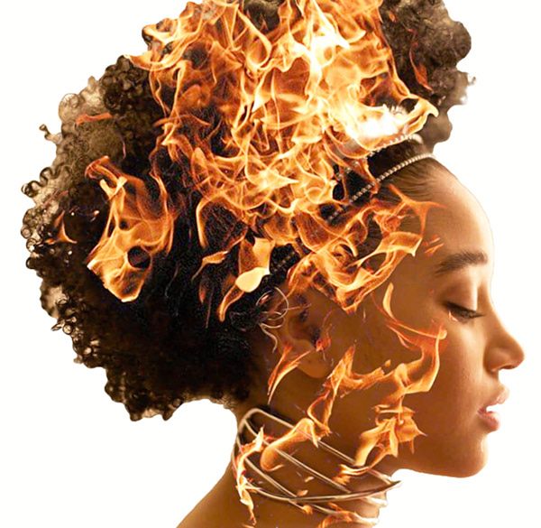
daily challenge number 2 - turned out pretty good
@frigid summit not sure what part of the challenge you're referring to. mind giving some details?
Small fix
Isn't this challenge basically the same thing as day 7 last month? Because if so might as well just share this again 😂
https://www.behance.net/gallery/78811619/April-2019-Photoshop-Daily-Creative-Challenge-Day-7
Behance
I call this "Danny Devito and Penguins"
Finally jumping on here for a little feedback. I went through three pictures before one finally worked out for the comic art look.
I get option anxiety over fonts! I never know which to choose.
My entry for #5 PSdailychallenge. I am curious to find out how I could be more efficient, so getting ready for the tips from @lethal mural 😃
Thank you for the feedback @glacial path
@loud zephyr thanks for the feedback!
@vale merlin I really like your movie poster! The colours are subtle but work and you can easily sense the theme. 😃
@wind pond Awesome work! Like people have said, looks super professional.
Quick throw together. Still needs work.
@dusk crown Thank you !
Day 3 - Double Exposure Effect!
My Day 1 Challenge: Comic Art
I don't have a title for this, but the techniques that were explained are great.
I need a better way to do all of the movie credits that I currently have at the top. thoughts? I'm using "futura condensed medium" right now but it doesn't seem condensed enough.How about the movie title?
Day 3 & 4 here #VixPS I Couldn't work much more on the images as they were screenshots and the art-board size was large! I need tips on how to work on photographs. Any tutorial link would be helpful!

Behance
Photoshop Daily Creative Challenge #01 | Thank you Jesús Ramirez :)
Did an update to give it a theme.
https://www.behance.net/gallery/79862495/Monster
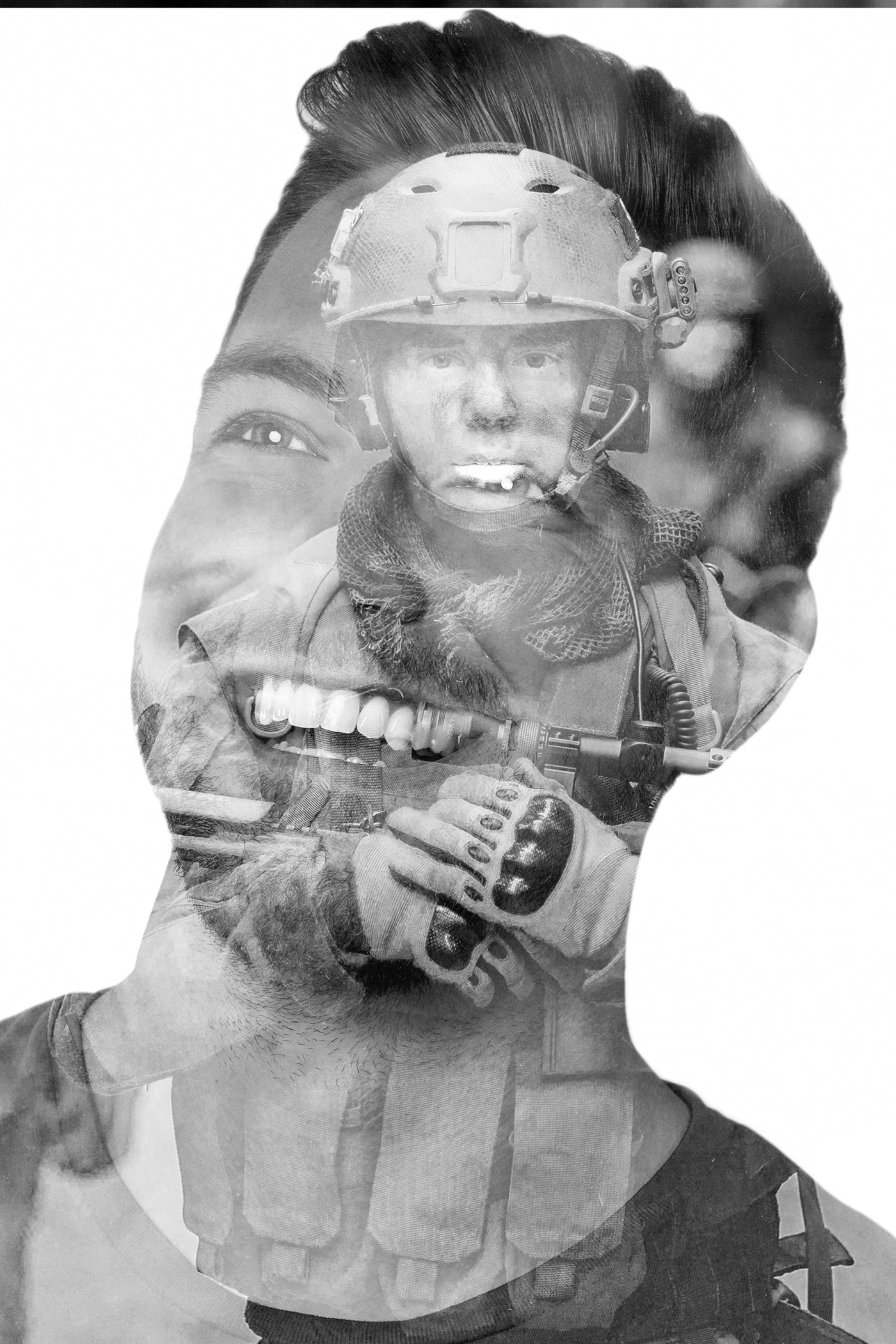
@young karma It's a really cute picture! With this day 1 effect it's look very nice! 👍
@bleak fossil YOU ASKED ME TO TAG YOU FOR FEEDBACK . I WOULD APPRECIATE IT .
i did more On the day 1 😉 Photoshop Daily Creative Challenge #01
Day 4 PSdailychallenge Catching up 😄
My submission for today: 😃 https://www.behance.net/gallery/79863669/PS-Daily-Creative-Challenge-Day-5-Movie-Magic

Behance
Photoshop Daily Creative Challenge (May 2019) Day 6: 'Movie Magic: Use Photoshop to remove people and objects from a photograph'.
@dusk crown Before and After?
@light nebula Yeah, the before and after are both there, check the link. 😃
Hi guys, here's my day 5 challenge. I used the clone stamp tool with the new content aware fill
I also made a Gif showing the before/after 😄
😀
@coral stone fantastic
Thank you @mental glade 😃
@coral stone @coral stone Fantastic work! I love that you made it into a gif!
@limber birch great album cover! I love the dog and the color you selected! Excellent work!
Thank you so much @lethal mural 😃
Didn't have multiple images so used screen captures of video on YouTube.
Frames used
Frames used and first pass of script. Script struggles with street crossing so copied/pasted cleanest bits in final version above.
guys
my first try of drawing something in photoshop with tablet
I have to finish it but
off to a great start tho
Mainly I used lasso tool.
I decided to go with a different one: https://www.behance.net/gallery/79863669/PS-Daily-Creative-Challenge-Day-5-Movie-Magic

Behance
Photoshop Daily Creative Challenge (May 2019) Day 6: 'Movie Magic: Use Photoshop to remove people and objects from a photograph'. Photo also by me.
@storm sierra That’s awesome!
@young karma Ooh, awesome! I’m guessing the photo is yours too? Great shot!
@dusk crown Thanks Damian. Yeah, I took this photo during a travel in Hokkaido (Japan)
@urban cypress usually those credits don't go at the top of the poster, only the main actors do. The dark color of the text could also be one of the reasons it looks weird
@urban cypress I would move the credits down and change the color
Ooh, I’ve always wanted to go to Japan, I did my degree in Japanese before I dropped out. 😱
@young karma nice one! I like how you have also darkened the overall image. Now the focus is really on the eagle! Well done 😃
@dusk crown Woah! First of all, that photo is really cool. And your editing is super smooth too. Did you enable the rotational feature in Content Aware fill?
@severe flame you have picked one of the more difficult images to retouch because the eye instantly notices if the lines are off by just a touch
@severe flame Apart from here, you have done a great job 😄 Well done
@severe flame but I agree, that particular spot is super difficult. I think you basically have to hand-paint this one
@fallow bough did you use the average or median stack mode?
@fallow bough by the way, you can convert videos to a sequence of images using Adobe Media Encoder (if you're a CC subscriber, you already have access to it)
@glacial path Median. Have used the convert before. Only wanted to grab handful of frames though.
@coral stone props to you! apart from maaaaaaybe this dark spot, you have no chance to know there's something missing. unless you're using tools to check
@fallow bough ah cool. It looked like the average effect, which wouldn't work for this effect. nevermind 😃
@light nebula alright, thank you for submitting 😃 I think the vertical text makes it very difficult to read it. Also, it doesn't really fit with the otherwise black and white look. I would give the guy more white space around his head. You could use it to place the text above or next to him in big, black letters
Thank you @glacial path I started with it horizontal, didn't like all the white space. I appreciate the feed back and will make corrections
@light nebula I see ☝ . Well, you could also just change the font. something more serious for such a serious topic. maybe you even use red if the font is really bold... not sure 😃
@young karma Let me tell you, you could put that design on a big poster and sell it (probably without the watermark though 😉 ). Remember to show the original when you post it to your behance project 😃
@severe flame the clone stamp tool has a panel with an amazing feature. Here you can rotate your clone source to help you fix that line issue @glacial path said 😄
good point @coral stone
@coral stone @severe flame the content aware version of the clone stamp (aka the spot healing tool) also has this option
I didn't know that, I thought it was only the clone source. This is great! Thanks @glacial path
@glacial path Thank you! 😁 I took it myself, photography is a hobby of mine. And thank again, I’ve been using Photoshop to edit my photos for years (my dad is a graphic designer, so he taught me growing up). And I just looked, and it was enabled, yeah, though I didn’t actively chose to do so.