#art-discussion-and-wip
1 messages · Page 11 of 1
 onyx breach
 fallow thicket
i wanna cry so hard

 analog oak
Hi

 lyric iron
Wip will still fix up some things

 analog oak
Hi
analog oak
analog oak
Hi
Thank u Just a Teddy for the cute little reaction
lyric iron
Finished, but im really missing my ctrl z button here

 crimson jetty
Sort of plagiarism?
 dusky trail
the artist didn't market is as his own character
he just a big fan of the character that he always draw her
crimson jetty
That’s sound like he’s more of a simp than commissioner
dusky trail
well yes, i didn't mention Kouhei because he does commission work, he is just an artist really like this type of character
crimson jetty
Gotcha
dusky trail
but because of that, people when they see Akio-san, they will think about Kouhei's work
so that is one way to make name for yourself
crimson jetty
What your saying they inspired by this artist
 left siren
Less of a people thinking you own the character and more of a "You're good at this specific character/style/genre" and if you have a big enough number of followers that knows this is what you do, they too would want you to draw more of what you do but in their terms
dusky trail
nah what i say is, it is fine to have some obsession or two as it makes you stand out more
kink and fetish may sound like a bad thing but it is a good thing for artist to have a trait they like to focus on
kinda like their brand
crimson jetty
Ok that’s makes more sense
dusky trail
and when you start commission, naturally that will be easier to market to your client
since they will chose you because of that brand of your
left siren
left siren
Less of a people thinking you own the character and more of a "You're good at th...
Like Ross Draws with his obsession on color dodge
TheBoxOfficeArtist with his western style
Sam Does Art with his semi realism style
 left siren
Yes
Most artists are famous because of their iconic art style
It's basically more distinguishable than the rest
dusky trail
Ryouma is also one of the artist i like

oop~
guess can't use that even though it isn't that sexual
oh well
left siren
Any person who's following art shit in the internet long enough does not need a mention to recognize this masterful artstyle

Also tis pretry obvious with the watermark
dusky trail
but well, not like art style can make them iconic but the kind of theme or design they like to do also make them more stand out
ya... it is hard not to see WLOP stuff for a time
specially when some music channel loves to use his art for the cover
crimson jetty
Just like how tanjiu from instragram who makes art for fun and nice storyboards
dusky trail
i prefer the mini-set than huge background style like that
 crimson jetty
 dusky trail
it is fun to see just a small set is enough to express the scene

 left siren
crimson jetty
left siren
crimson jetty
Put that in Twitter and open commissions
You'll be rich in a month
onyx breach
dusky trail
it is fun to see just a small set is enough to express the scene
that little bg is only for games
left siren
I'm not setting foot in that shithole
dusky trail
onyx breach
that little bg is only for games
it is easier to separated the sprite but~ that still the kind of thing i like to see
kinda like one of those "draw character to look like they are outside of the panel" thing
crimson jetty
It more elegant with small background to do more of her character
dusky trail
and twitter is good


found a lot of fun artist there
left siren
Twitter is bad
A lot of drama over minor shit
dusky trail
well ya but it isn't the majority of it
left siren
Oh you drew the skintone a bit off? "RACIST, WHITEWASH"
dusky trail


it all depend on what kind of content you check out
if you only look at art then eventually, they only give you art
crimson jetty
left siren
Oh you drew the skintone a bit off? "RACIST, WHITEWASH"
Yeah that is so fucked that’s my twitter account is a ghost town
 hardy yew
I'm a genius

 left siren
I'm just sticking to pixiv and like yadere or danbooru
There's that other website I forgot the name too
dusky trail
my twitter pretty much filled with speed drawing recommendation at this point
crimson jetty
Pixiv is not that bad for me unless I post something like fanart ic something

 crimson jetty
I’ve seen move of it but I honest don’t how to use speed art?
left siren
If I use Twitter
Its probably for the nsfw stuff 
dusky trail
it just people recording their draw then speed it up
crimson jetty
How did they speed it though?
onyx breach
i recommend starting an acc in pixiv and post your artworks there
left siren
dusky trail
it just people recording their draw then speed it up
Honestly at this point lets just call it a timelapse
dusky trail
just use the recording program and speed it up...?
left siren
onyx breach
i recommend starting an acc in pixiv and post your artworks there
Downside is you're surrounded with noodle talking people
crimson jetty
Wait hold on ZOOM MEETING SHOULD HAVE SPEED
onyx breach
why?
left siren
Cuz zoom
Probably what they meant
I should've probably spent time developing my ocs
crimson jetty
What your OC? Eri
dusky trail
and well, while timelapse make more sense but that is how people always call it and so~
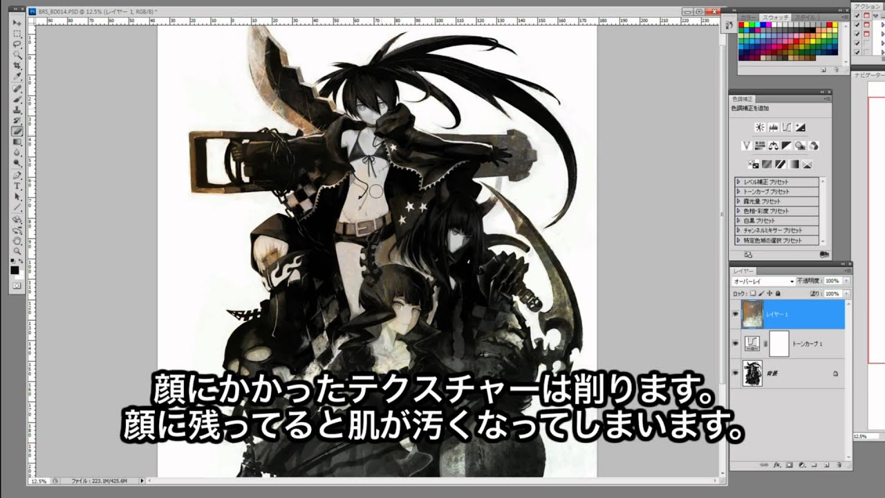
Black Rock Shooter OVA Bonus Extra. Huke Speed Drawing of the Black Rock Shooter Cast.
Black Rock Shooter
Dead Master
Black Gold Saw
Strength
left siren
crimson jetty
What your OC? Eri
I actually have a whole world building story so that I can slap my OCs in there to interact
 bleak grotto
i used to watch speedpaints all the time
dusky trail
speed painting is good, give you some motivation to try out sometime
onyx breach
i hate speedpaints just as much as i hate watching speedruns
bleak grotto
it was alot more entertaining that speedruns ill say that
left siren
If you're asking numbers, I don't know the exact numbers of OC I have but there's 5 nations and atleast 5 - 10 important characters each nation
bleak grotto
i have like at least 50 ocs or so
dusky trail
i only bother with no_dmg speed run
bleak grotto
left siren
I actually have a whole world building story so that I can slap my OCs in there ...
do you have any tips for world building
left siren
Hard to explain but the easiest way to build a world I suppose is take inspirations from myths, cultures and folk tales to create your nation/place(doesn't have to be a nation, it may aswell be a city or a couple of towns) and the myths and folktales to base your character on
onyx breach
specially fcking speedruns full of glitches
crimson jetty
Try watching avatar last air bender
dusky trail
ya, it isn't that fun to see people just breaking the game to move fast
crimson jetty
It will give you some idea
bleak grotto
crimson jetty
Try watching avatar last air bender
i watched that like 5 times
never gets old
bleak grotto
ok so? lol
left siren
I'm not really asking, I was giving suggestions
My story is far from the setting of avatar anyways
bleak grotto
i need something i can visualize but its kinda hard and itd take me hours to think it through 
crimson jetty
left siren
My story is far from the setting of avatar anyways
Oh huh

Well I’ve already thought of mine story going to be
onyx breach
its because you havent seen enough references yet thats why you can hardly visualize something
crimson jetty
bleak grotto
i need something i can visualize but its kinda hard and itd take me hours to thi...
Brush
left siren
bleak grotto
i need something i can visualize but its kinda hard and itd take me hours to thi...
First think of what your world is gonna be
bleak grotto
ive been reading lately but i think i need some more info
crimson jetty
You’re could do comedy genre with adventure
bleak grotto
i wanna do adventure i know that for sure
left siren
My story is a world of Myths and Legends with Nations inspired from different genres I like
Medieval Fantasy setting
Whatever you call GranBlue's sky island genre, basically the flying ships and sky islands
Steampunk
Egyptian fantasy
Chinese stuff (honestly still studying this)
crimson jetty
That’s sound cooool
bleak grotto
yeag
left siren
Each nation has a set of characters
And I'm treating each nation as like a different story
As in I focus on just 1 Nation on each story so I don't get confused on what to do
bleak grotto
i see
left siren
With Cameos of characters from the previous or future nations thats introduced
 small gust
What will happen in Russia after the Second Eruption,with the destruction of Muscovy?
bleak grotto
small gust
What will happen in Russia after the Second Eruption,with the destruction of Mus...
wha
wrong channel im pretty sure
small gust
I am trying to build a post Second Eruption Russia,which will become a blind zone of Otto
bleak grotto
oh
i mean, in original, russia becomes desolate and home to outliers and criminals
bronya's memory state that
russia i mean siberia to be exact
russia is big
left siren
Basically my Main premise of my story is the world was "destroyed" by the Primodial God of Chaos and when he did that, his power was split into thousands of shards and spread across the world. Overtime these tiny bits of Chaos energy (thats what im naming it) were found by the new generation of inhabitants of the world and uses them for their own needs, good or bad it doesn't matter. There are classifications for the types of chaos energy from least harmful to extremely dangerous but I'll talk about that in a separate comment. The Primodial god of Chaos went into slumber and woke up 20k years later. Weakened from his previous activity, he then set a goal to gather all the chaos energy spread across the world and try to seal it. He came across certain individuals which come to be his companion along the way
Oh yeah I call them "Primodial Gods" but they're not actually Gods, that's just what the new inhabitants refer to them now based on myths and Legends
bleak grotto
awe man so much lol
bleak grotto
thats so funny the song rasputin started playing in my playlist after talking abt russia
left siren
Cool song but it gets old after a while
crimson jetty


 pulsar veldt
left siren
Twitter is bad
A lot of drama over minor shit
pulsar veldt
left siren
Twitter is bad
A lot of drama over minor shit
twitter is a bit of mess at times and the ai stuff is so boring too but it kept popping up on the timeline, lots of drama and it's annoying
there's a lot of good artworks on it and lots of inspiration on there
the people who claims to fix artworks and stuff like that are also pretty annoying
pulsar veldt
lyric iron
Screenshot redraw to practice more water painting
the colours are quite nice
onyx breach
whats worse is they claim to fix the art by turning the character black
lyric iron
It’s tough with water painting to draw characters
pulsar veldt
onyx breach
whats worse is they claim to fix the art by turning the character black
race shouldn't matter to be honest, representation can be nice but doesn't mean you have to change the race of existing characters
onyx breach
exactly
instead of turning chars to black, why not celebrate chars who're already black and make fanart of them instead of wasting your time turning other skintones to black
its just western ppl being weird af on twitter again but somehow they always find an idea to make it worse, just amazing
pulsar veldt
the edits are harmless until you claim it's fixed
onyx breach
but thats what they always say, obviously
they dont post an alter ver without the word fixed in it
i used to post arts on twitter as well but im already sick with all the west bs i just transfered to pixiv, they may be jp ppl most of the time but its a way better site for art than twitter
lyric iron
onyx breach
instead of turning chars to black, why not celebrate chars who're already black ...
Not to mention some of the characters they’re calling white and turning black, already have a nationality that has their own culture
onyx breach
and jp ppl are very polite
lyric iron
Might’ve worded that wrong but hope it’s clear what i mean
onyx breach
thats why i hate genshin community to the bone
pulsar veldt
onyx breach
i used to post arts on twitter as well but im already sick with all the west bs ...
just mute/block the stuff
I muted the ai stuff because I don't want to hear any more dicussions about it
onyx breach
nop, better solution: i got the fck off twitter and just post my works on pixiv
pulsar veldt
I suppose
lyric iron
I post my works on a lot of platforms
pulsar veldt
I post it mainly on twitter
lyric iron
I feed off likes
pulsar veldt
I think I've seen your twitter before
pulsar veldt
lyric iron
I feed off likes<:KianaSmug:653464590792785924>
just humanity's biology, humans like attention afterall
pulsar veldt
lyric iron
Gameplay is boring, community is awful.
the lore is nice and gameplay is alright
but I left it for honkai
lyric iron
Yea the lore is nice
pulsar veldt
and preferred drawing
lyric iron
I think i joined honkai around 4.6
pulsar veldt
I really want to go back to windtrace though
lyric iron

pulsar veldt
lyric iron
I think i joined honkai around 4.6
joined around 5.9
not joined but became active around 5.9
lyric iron
Only time I’ll go back to genshin is to co op with friends but that’s all
pulsar veldt
I like playing with my friends and my sister but that's it
used to be quite interested in the lore but I took a break and can't be bothered to do the new archon quest
pulsar veldt
open world is just not fun
I speedran the whole event chapter yesterday, didn't skip it but skimmed the dialogue
lyric iron
I play on mobile so it crashes a lot and lags
lyric iron
But im glad it’s going back to the old way
Old form of chapters was way better and more fun
pulsar veldt
yes
chapter 34 is my saving grace
old art 🤮

pretty interesting to see how your own art develops over some time
 onyx breach
heres an old art of mine 👵
 pulsar veldt
onyx breach
heres an old art of mine 👵
pulsar veldt
onyx breach
heres an old art of mine 👵
looks nice
onyx breach
👌
 buoyant sky
lyric iron
Screenshot redraw to practice more water painting
buoyant sky
lyric iron
Screenshot redraw to practice more water painting
OMG I LOOKES AT YOUR DRAWING AND IMEDIATELY KNEW IT WAS REKI
I love Haibane Renmei so much 😭
Your drawing is amazing
I was thinking about painting that scene too
Except that I've wanted to do that one when she was already at the railways
 tacit delta

 lunar sonnet
Need help with sleeves
 lyric iron
buoyant sky
I love Haibane Renmei so much 😭
lyric iron
buoyant sky
I love Haibane Renmei so much 😭
YES ME TOO
left siren
This is getting more and more frustrating
 dusky trail
lunar sonnet
Need help with sleeves
dusky trail
lunar sonnet
Need help with sleeves
just make a round circle around the wrist
dusky trail
depend on the material
not all sleeve is just a piece of clothing, some have thickness to it to make it stiff
and that is specially the case with the kind of sleeve he is using there
not that gravity always matter either anyway, just like all the heavy oversize sleeve of a kimono can still somehow floating around like it has no mass

so making thing realistic or not it always depend on the artist themself
left siren
This is a case of exaggeration rather than ignoring the concept of gravity completely
onyx breach
drawing Eula's thigh high socks was more hassle than i thought
 left siren
Sus
onyx breach

hardy yew

dusky trail
not tight enough
 tender night

 left siren

 long tangle
 lyric iron
 lunar sonnet
dusky trail
just make a round circle around the wrist
lunar sonnet
dusky trail
just make a round circle around the wrist
Like this?

 lyric iron

 west bear

a little bit of a #linart did this pretty quick, a gift for her
#fanart

 Twitter
·
Twitter
·
 cosmic abyss
any tips for the folds? I am trying my best with references but I'd like some external opinion

 echo zealot
Hands are harder than they should be
cosmic abyss
tbh I actually enjoy drawing hands
sure, they are frustrating at times, but god does it feel good when you finish and they don't look like squashed noodles
bleak grotto
cosmic abyss
any tips for the folds? I am trying my best with references but I'd like some ex...
i think it looks good
im personally not good with folds
cosmic abyss
thanks for your opinion !
 verbal marten
Honestly first time doing this type of thing
 dusky trail
the glasses feel rather odd to me
crimson jetty
verbal marten
Honestly first time doing this type of thing<:TeriRip:801041888642727937>
glass is bit off to me
verbal marten
Same
crimson jetty

this is picture refrence
the lens needs to be closer to each other in between the noise.
looks like this
 dusky trail
well if it is still in separated layer, just simple move the glasses to the face
then you will see the right lend is too far off the eye
echo zealot
the legs feel off, any idea on how to fix it?
 dusky trail
echo zealot
the legs feel off, any idea on how to fix it?
dusky trail
echo zealot
the legs feel off, any idea on how to fix it?
it seem to just lack detail rather than look off
though it is a bit off center

you could use Red's pant there for detail reference
 true flower
Cabbage cuz why not
 tender night
echo zealot
Hands are harder than they should be
tender night
echo zealot
Hands are harder than they should be
wait till u learn how to draw feet
they are the worst
verbal marten
Changed it up a bit
 lunar sonnet
Perhaps the lens should be oriented such that they follow the face's contour? Since she's looking to the side, her glasses should also be off to the side.
dusky trail
meanwhile i just think about how their fingers gonna leave some finger mark on the glasses
lyric iron
Made the head a bit too big but was already too late when I realized it

Also advice is welcome ofc but this was a bit rushed
 limber flint
To balance the pattern, I would make the shoulders wider and slightly increase the length of the waist.
 scenic comet
Idk. Goku ig
 lyric iron
limber flint
To balance the pattern, I would make the shoulders wider and slightly increase t...
lyric iron
limber flint
To balance the pattern, I would make the shoulders wider and slightly increase t...
Thank you
lyric iron
scenic comet
Idk. Goku ig
Very cool
 solar bough
gogu
scenic comet
lyric iron
Very cool<:ElysiaOhayo:1055061820026667059>
Just wait till I shade it. It will be even better


 worthy junco
I'm not done yet I'm already confused about the anatomy, can anyone help me? Even just a good reference for the pose would be nice

 untold moon
worthy junco
I'm not done yet I'm already confused about the anatomy, can anyone help me? Eve...
untold moon
worthy junco
I'm not done yet I'm already confused about the anatomy, can anyone help me? Eve...
Search manga material on twitter, she had a lot of guide
worthy junco
untold moon
Search manga material on twitter, she had a lot of guide
Thank you
dusky trail
worthy junco
I'm not done yet I'm already confused about the anatomy, can anyone help me? Eve...
what are you going for in the first place?
worthy junco
dusky trail
what are you going for in the first place?
A sitting pose like this from the 3/4 angle or this if her legs weren't crossed

 dusky trail
 dusky trail
worthy junco
A sitting pose like this from the 3/4 angle or this if her legs weren't crossed
dusky trail
worthy junco
A sitting pose like this from the 3/4 angle or this if her legs weren't crossed
like so?
or even this

or even slightly lean to the side
 worthy junco
dusky trail
worthy junco
dusky trail
I think the girl on the left is closest except that her upper body could be turned to the left more
dusky trail
you don't have to use one reference, you can always stick together to get closer to what you imagine
worthy junco
Yeah thank you I think I can at least understand the legs more
 shadow nebula
if you can't find the exact reference you should use yourself, you are always your best reference
hardy yew
 scenic comet
hardy yew
scenic comet
<:HoSHmm:979832783562231878> <:FuHuaConcerned:671132101856198686>
what does this even mean
scenic comet
hardy yew
what does this even mean
Light's intensions look concerning
hardy yew
scenic comet
Light's intensions look concerning
Noo😭 i tried my hardest to make him look like a psychopath
scenic comet
hardy yew
Noo😭 i tried my hardest to make him look like a psychopath
And u succeeded. He looks sadistic.
hardy yew
Alright
 acoustic sigil
Yay
 pulsar veldt
lyric iron
Made the head a bit too big but was already too late when I realized it
pulsar veldt
lyric iron
Made the head a bit too big but was already too late when I realized it
Generally not a big fan of the purple lines although it does look nice in the hair. Are the purple lines supposed to be purple light? If so I would recommend shading and blending it slightly
lyric iron
Yea it was supposed to be lighting from behind, still expirementing
But thank you for the tip
hardy yew
pulsar veldt
Generally not a big fan of the purple lines although it does look nice in the ha...
Bro is right it looks like you did purple lineart
I drew over it hope u dont mind
Only did one side and it doesn't look so good because i made it on the phone but i bet you can catch the difference
 hardy yew
No problem
hardy yew
lyric iron
Really glad the advice is actually helpful in this channel
How did u get the texture in the background?
lyric iron
Ibispaint has material paterns and just overlayed it
hardy yew
Ok ty
 strong spire
So, im working on procreate on a piece rn. Anyone gave good videos of rendering clothing? I have shading done, but cant figure iut what to do to make it better
onyx breach
look at your shirt it has folds in it
 whole cloak
I wrap a tissue around my finger to get a general idea of the folds


 coarse pollen
Drawing morbius rn and im liking how the face is turning out
 onyx breach


 worthy junco
verbal marten
Also I wanna ask, one first glance which is better
worthy junco
verbal marten
Also I wanna ask, one first glance which is better
2
Just love the expression
dusky trail
 brave turret
What do u guys think?
brave turret
What do u guys think?
well... it is really hard to see anything like that
brave turret
Rip
hardy yew
brave turret
Griseo sketch <:griseo_hyped:1031903267904565308>
It's not hard to see :p
I can perfectly see the details in the clothing, its looking good so far
lyric iron
Yes it looks really cute
brave turret

left siren
verbal marten
Also I wanna ask, one first glance which is better
2 got more refined details and all but I like the the atmosphere of the 1st one
 past leaf
wip, jojo character but genderbent! i love this

 halcyon rune

 pulsar veldt
verbal marten
Also I wanna ask, one first glance which is better
pulsar veldt
verbal marten
Also I wanna ask, one first glance which is better
Bottom/down
lyric iron
6.4 valk spoiler
Devil works fast but artists work faster
 crimson jetty
brave turret
Griseo sketch <:griseo_hyped:1031903267904565308>
crimson jetty
brave turret
Griseo sketch <:griseo_hyped:1031903267904565308>
I barely see Griselda

 pulsar veldt
lyric iron
6.4 valk spoiler
Devil works fast but artists work faster<:TeriStonks:1009416806...
pulsar veldt
lyric iron
6.4 valk spoiler
Devil works fast but artists work faster<:TeriStonks:1009416806...
Yes
Unfortunately I don’t work fast
I don’t get how some artists are so speedy
tender night
pulsar veldt
I don’t get how some artists are so speedy

we speedrun drawing new characters asap only to be exhausted af right after


 sage canopy
 lyric iron
pulsar veldt
Burnout and art block <:TeriSad:1054294919713394698>
lyric iron
pulsar veldt
Burnout and art block <:TeriSad:1054294919713394698>
Art block sucks so bad
I had art block for maybe 8 months this year
Only recovered from it a few weeks ago
crimson jetty
I have an art block for like a week and came back two days
tender night
i got none because i draw what i want-
i had some yrs ago but only cus i was drawing popular things to get noticed in art community
but tbh drawing what u want is way more satisfying
lyric iron
6.4 spoilers
Advice is welcome, first attempt at lineart without my sketch brush
 pulsar veldt
lyric iron
6.4 spoilers
Advice is welcome, first attempt at lineart without my sketch brush...
pulsar veldt
lyric iron
6.4 spoilers
Advice is welcome, first attempt at lineart without my sketch brush...
Hand looks slightly weird although it might be because of the flower
hardy yew
Le new 6.4 elf spoiler
 lyric iron
pulsar veldt
Hand looks slightly weird although it might be because of the flower
lyric iron
pulsar veldt
Hand looks slightly weird although it might be because of the flower
Yea hands are tough
pulsar veldt
pulsar veldt
Hand looks slightly weird although it might be because of the flower
Also, maybe try experimenting with different coloured lineart although this is just probably my preferential taste
pulsar veldt
lyric iron
6.4 spoilers
Advice is welcome, first attempt at lineart without my sketch brush...
The fact there are white dots on the arm is a bit unusual too
lyric iron
It was meant to be snow/ stars but forgot to adjust it
Either way thank you for giving advice
 lethal forum
 lyric iron
6.4 spoilers
Advice is welcome, first attempt at lineart without my sketch brush...
lyric iron
lyric iron
6.4 spoilers
Advice is welcome, first attempt at lineart without my sketch brush...
Ngl i hope im improving
long tangle
 hardy yew
 hardy yew
long tangle
hardy yew
long tangle
Nice lighting
long tangle
Ty:)

 worthy junco
 craggy plank
any kronii stans i doodled the new outfit
craggy plank
any kronii stans i doodled the new outfit
I am a kronii stan
long tangle

 vocal gulch
 bleak grotto
dude i just realized i have an oc that looks like ||hofin kiana ||in color
hardy yew
guys im using crita but dont like brushes there maybe u can recommend me some good apps
onyx breach
clip studio paint
onyx breach
Photoshop
bleak grotto
also for crita you can download new brushes
though clip studio has the best brushes (even tho they are discontinuing one-time payment or whatever they planned to do as ive heard)


 bleak grotto

 dusky trail
 fresh seal
anything i could work on? ^^
fresh seal
anything i could work on? ^^
well the shard chin along with the hair really give her a more triangle shaped-face there
try to shape her cheek a bit to give her a more round face
 echo zealot
I feel like I’m doing the body wrong, any help?


Oh is it because the breasts are suppose to be lowered
Mhm okay
dusky trail
echo zealot
Oh is it because the breasts are suppose to be lowered
well arm too thin so it make her body seem more chunky there
the head likely gonna come out too small when you compare to the torso
dusky trail

you can see Dudu's arm is out of her breast there, while your seem to put her thin arm above it
echo zealot
does this look better
 dusky trail
the right side is fine but the left , you may want to increase the elbow join
it cause the upper arm looks like a club now
crimson jetty
you wanna have the boob cover arms
vocal gulch
 crimson jetty
like charater
echo zealot
dusky trail
it cause the upper arm looks like a club now
haha yes yes thank you
woowoww
 crimson jetty
echo zealot
woowoww
crimson jetty
echo zealot
woowoww
I’m gonna be brutally honest with you, the arm is not even close
echo zealot
uuuh ok
crimson jetty
 dusky trail
the hair may covered most of the face but the way you draw her chin make it extremely shard
echo zealot
dusky trail
the hair may covered most of the face but the way you draw her chin make it extr...
do I like soften it?
dusky trail
well you can see Dudu's face in the reference is more triangle there
echo zealot
oooh yes
dusky trail
but your is completely off to the side
echo zealot
crimson jetty
You might wanna check with hand 🤚
echo zealot
ok listen bro let me work on one thing at a time
dusky trail
 crimson jetty
echo zealot
ok listen bro let me work on one thing at a time
crimson jetty
echo zealot
ok listen bro let me work on one thing at a time
Yes right afterwards the head
dusky trail
try to draw this kind of shape before you draw the head next time to get the rough idea of what you need to do
echo zealot
icic

 dusky trail
well draw the mark like that gonna make her look upward
try to get the + mark line up with her body at least
crimson jetty
😕 one question did you draw a shape then detailing? To me you looks new to this? @echo zealot
echo zealot
crimson jetty
😕 one question did you draw a shape then detailing? To me you looks new to this...
wdym a shape with detailing
crimson jetty
Basic shape I mean
dusky trail
he mean for the body too

 echo zealot
oh i don’t really put shapes into my drawings even tho like I kinda should
dusky trail
well it help you to see ahead what you need to fix
so you don't have to erase too much
echo zealot
icic
dusky trail
though since you draw with a pen, try to take it easier with those shape to make it easier to erase later
echo zealot
wait so I’m getting confused, what changes should I make to the head?
echo zealot
dusky trail
though since you draw with a pen, try to take it easier with those shape to make...
im using pencil
dusky trail
oop pencil~
echo zealot
crimson jetty
dusky trail
oop pencil~
Bruh😂😂😂
dusky trail
but ya, just don't press it too hard when you draw the shape or that will come back and bite you later
echo zealot
art can be cring sometimes L
echo zealot
dusky trail
but ya, just don't press it too hard when you draw the shape or that will come b...
lol true
dusky trail
 echo zealot
dusky trail
echo zealot
dusky trail
ok thank you
dusky trail
but anyway, draw the + mark more toward the body
and try to give the cheek more round shape
echo zealot
icic
dusky trail
if you just draw straight line between the cheek and chin, it will cause the face look really shard
echo zealot
yuhhhhw
dusky trail
 echo zealot
dusky trail
echo zealot
dusky trail
LMAK
 echo zealot
okay head down time to redraw hand
dusky trail
it take time to get your wrist used to more circle movement but just keep practice
crimson jetty
It comes in handy
echo zealot
ive drawn too much men sometimes I forgor the anatomy of women /j 
crimson jetty
So be mindful and have fun with art I hope you gonna be get artist aimed
crimson jetty
echo zealot
ive drawn too much men sometimes I forgor the anatomy of women /j <:KianaBeg:585...
I’ve studying on women (by drawing) for like 2 years.
dusky trail
unless you draw this, male and female are not that different anyway
 crimson jetty
dusky trail
unless you draw this, male and female are not that different anyway
crimson jetty
dusky trail
unless you draw this, male and female are not that different anyway
God that’s traumatizing
To look at
crimson jetty
dusky trail
unless you draw this, male and female are not that different anyway
I mean for
U

 analog oak
echo zealot
struggling to draw this hand someone pls <:SeeleSweat:843946435271852103>
analog oak
echo zealot
struggling to draw this hand someone pls <:SeeleSweat:843946435271852103>
Idk why it's side ways but I hope it helps
 echo zealot
analog oak
Idk why it's side ways but I hope it helps <:SakuraWTF:588421743526281216>
echo zealot
analog oak
Idk why it's side ways but I hope it helps <:SakuraWTF:588421743526281216>
aweee I appreciate it thank you
dusky trail
echo zealot
struggling to draw this hand someone pls <:SeeleSweat:843946435271852103>

just draw a shape then start to divide it out
dusky trail
hand and feet can be a pain for people not used to draw them yes
 cursive pine
https://twitter.com/akaimoku324/status/1608955207681212417
I'm too bad at coloring, so any advice on it or line will be fine
Also critics fine, cause I'm lazy and busy butt that draw like 2-3 time in year 
Also happy new year yaay

#HonkaiImpact3rd #honkaiwinterwish
Happy new year, captains! What about some holiday atmosphere on Hyperion?
i'm too tired to make something more clearfsdfjhsdfkh
 Twitter
·
Twitter
·
 dusky trail
cursive pine
https://twitter.com/akaimoku324/status/1608955207681212417
I'm too bad at color...
dusky trail
cursive pine
https://twitter.com/akaimoku324/status/1608955207681212417
I'm too bad at color...
did you only use airbrush for the shading?
cursive pine
dusky trail
did you only use airbrush for the shading?
Pen+ airbrush mostly 
dusky trail
well then it is quite light, specially on the skin there
so even in the area that it should be darker like the elbow,, the neck, the cleavage, it is too light to feel the different

like here, you can easy see how her skin affected by the shade there
 cursive pine
 add more shade
dusky trail
well more like use a more distinct color for the shade
and use a brush would give you a better result than just airbrush it
if you not sure which color to use, you can always use color picker on those pic up there
then adjust to your liking
cursive pine
I see, thanks, will try use not only airbrush next time
dusky trail
i usually just use airbrush to add some pink blush

like on her cheek, lip and shoulder there
and jzz discord filter, blocking me from only post her face but fine with the whole body
 grave nymph
here's my current sketch that I did in 10 minutes, I want to try drawing splash art so am gonna draw one of the new outfits for experimentation

Anyone have any criticisms to the pose/silhouette/in general?
or composition tips for these kinds of things
dusky trail
slightly above angle?
grave nymph
yeahh
dusky trail
also one boob is higher than the other
grave nymph
urk
dusky trail
then you may want to wider the hip
grave nymph
?
I thought when you're viewing someone from above
the uh
the body becomes smaller the further it is from the camera
dusky trail
not the way your pose look, that seem to only be slightly above
so at most, the rib will be above the hip
grave nymph
ahh

 dusky trail
otherwise you likely suffer from big torso and too small legs later
 cursive pine
dusky trail
i usually just use airbrush to add some pink blush
cursive pine
dusky trail
i usually just use airbrush to add some pink blush
I use it cause it's easier to make something like gradient but eh I'll try next time this way, thanks 
dusky trail

even if you go for really above head, then the hip should still be visible
it just skipped the midriff kinda
grave nymph
Thank you for the red lines
😭
that's kinda the thingy I was going for
but instead of uh
her standing
her legs would look like this

I should really take a picture instead of holding the doll huh
dusky trail

then her thigh would be more visible


but ya, you can see their hip line really visible there
scenic comet
cursive pine
I use it cause it's easier to make something like gradient but eh <:KianaNotLike...
Ayo. Is it ok if I send a small clip of the new herrschr mei?.
Just thought I should ask first
cursive pine
scenic comet
Ayo. Is it ok if I send a small clip of the new herrschr mei?.
where you want to send it? cn content only for #🔮cn-gameplay-discussion but if it art, then you can put it with spoiler
scenic comet
cursive pine
where you want to send it? cn content only for <#435687797626634241> but if it ...
Honkai chat maby. It's just a 3 second clip of her ultimate
scenic comet
cursive pine
no
Ok. Just wanted to make sure
cursive pine
 don't worry, it's always better ask
scenic comet
cursive pine
<:FuHuaApprove:660878725356847105> don't worry, it's always better ask
Tho I can send it I #🔮cn-gameplay-discussion right?
cursive pine
scenic comet
Tho I can send it I <#435687797626634241> right?
sure
dusky trail
why not just send a dm...
scenic comet
dusky trail
why not just send a dm...
Fine
dusky trail
scenic comet
Fine
not to me lol, i'm not the one need it
scenic comet
dusky trail
not to me lol, i'm not the one need it
Well I sent it in CN chat.
Thought I'd send it to you too
dusky trail
=3=
pulsar veldt
As long as you have make it a spoiler I guess
 marble hemlock
Ah ok
 bleak grotto
is there supposed to be perspective? if there is, its a little off
if there isnt, id make the legs a bit longer
pulsar veldt
grave nymph
any criticisms?
Eyes are too close
grave nymph
bleak grotto
is there supposed to be perspective? if there is, its a little off
if there isnt...
yup
slight view from above
dusky trail
grave nymph
any criticisms?
it is top down view then the thing around her waist would have to curve as well
 grave nymph
demnit
I’m quite confused with the breast part
and the shoulders
cus she actually has an off-shoulder outfit
so I’m quite confused as how that would look like in that pose
dusky trail
grave nymph
cus she actually has an off-shoulder outfit
then just use the 2 reference i throw you early =3=
grave nymph
how the sleeves connect to the main clothing on the torso is my problem 

 lyric iron
Had trouble drawing today with my finger on phone
So im gonna try switching to my pen display again soon
Drawing with my finger on phone went smooth for a while but drawing with a pen feels much better
I think
 craggy smelt
 onyx breach
lyric iron
Had trouble drawing today with my finger on phone
onyx breach
lyric iron
Had trouble drawing today with my finger on phone
you just ordered a pen display?
 oblique wing
I can't seems to understand || HoFinality Design ||
 lyric iron
onyx breach
you just ordered a pen display?
lyric iron
onyx breach
you just ordered a pen display?
Nah I already have one, but dindt have the energy to try set it up again

onyx breach
its graet to have one, tho you have to get used to how slippery it can be
lyric iron
Yea, hope i can improve my art on it even further. A small phone and a finger don’t really help

onyx breach
im using a huion one, they released a felt-tip nib like 2021 i think and they make the friction noticeably more in this pen, still cant replicate a paper feel but its rough enough that your pen dont slide easily anymore
sage canopy

Hi there, me and Proud decided to release our animation presets that we use on our projects to the public and for free!
Download Link: https://drive.google.com/file/d/1ULY0UuB2EnQDrrXbbTltaQjNzWUz4xa4/view?usp=sharing
some of these presets have been used in Bleeding Death before, also yes Altya is still a WIP, but progress is being made.
 lost wagon

happy new year!
2022 was wild I had some up and down but what I really am proud of is how much I got better at making art!
I can't wait to see how much I'll grow in 2023!!!
#HappyNewYear2023 #art
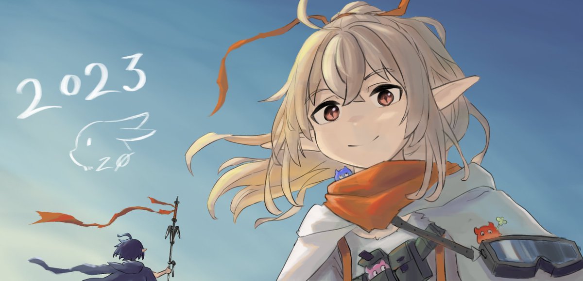 Twitter
·
Twitter
·
happy new year guys!
craggy smelt
 echo zealot

 dreamy cypress
wip

 dusky trail
craggy smelt
Feel free to give any critisism you have
dusky trail
craggy smelt
Feel free to give any critisism you have
well the upper arms seem a lot shorter than the lower arms
and the way her hair tied feel rather odd
like you can't tell if her hair being blow by the wind or she just tied it really tight
scenic comet
Finally got the courage to complete it
 lost wagon

 graceful lily
Elysia 0w0

 unique ore
graceful lily
Elysia 0w0
unique ore
graceful lily
Elysia 0w0
I don’t mean to be rude but is this traced?
graceful lily
unique ore
I don’t mean to be rude but is this traced?
I won't judge, I always get this kind of question
Fortunately, this is just the final dash for me to start contouring and coloring
unique ore
graceful lily
Fortunately, this is just the final dash for me to start contouring and coloring
I’m sorry if I said anything wrong
But normally I don’t see such clean sketches
I myself get pretty messy when sketching
graceful lily
Explain how I make my sketches
graceful lily
unique ore
I didn’t get what you’re asking
It's hard for me to write and speak English, I'm still learning
unique ore
graceful lily
It's hard for me to write and speak English, I'm still learning
Oh, I see
Never mind then
graceful lily
Okay
graceful lily
hardy yew
is there gradient brush in clip studio paint
Ahn?
 graceful lily
Ohhhh
dusky trail
hardy yew
is there gradient brush in clip studio paint
i don't think there is a brush but you can just select tool + gradient

then just adjust here and there to your liking
hardy yew
thank youuu
 ornate latch


 lyric iron
 pulsar veldt
lyric iron
pulsar veldt
lyric iron
Yes
tender night
alr, ty,,although i went with sth else but still thanks
pulsar veldt
graceful lily
Elysia 0w0
Eeeee, it’s so
pulsar veldt
tender night
alr, ty,,although i went with sth else but still thanks
Ah I see
tender night
yeah colours didnt fit with shade
bleak grotto
unique ore
I don’t mean to be rude but is this traced?
it couldve been heavily referenced or traced
people do it alot with honkai assets
if it helps them learn its fine
onyx breach
thats not traced, in order for it to be traced he needs to print the thing entirely
echo zealot
hmm can’t just be me that the body needs to be smaller right…
 hardy yew
echo zealot
hmm can’t just be me that the body needs to be smaller right…
hardy yew
echo zealot
hmm can’t just be me that the body needs to be smaller right…
The arms seem off and the chest area
maybe the body too?
echo zealot
yeye I’ve reworked it
hardy yew
alright
echo zealot
 hardy yew
echo zealot
<:HoSHmm:979832783562231878> <:HoSHmm:979832783562231878>
hardy yew
echo zealot
<:HoSHmm:979832783562231878> <:HoSHmm:979832783562231878>
One of the sides looks like a triangle
echo zealot
hardy yew
One of the sides looks like a triangle
yeah because I’m using shapes to draw the body
echo zealot
i struggle
echo zealot
maybe i could curve it a little
hardy yew
I recommend you try smooth it out for now
echo zealot
yessir
hardy yew
later on you could curve it
also, I’m gonna be honest, the cranium looks squished
try re shaping it again?
bleak grotto

 bleak grotto
echo zealot
abs 😎
bleak grotto
echo zealot
abs 😎
 compact furnace
i need to work on bgs becuase ethis is definitely not a bus stop
 dusky trail
echo zealot
hmm can’t just be me that the body needs to be smaller right…
dusky trail
echo zealot
hmm can’t just be me that the body needs to be smaller right…
it just the waist
echo zealot
haha yes thank you, dw ive made it better now 
dusky trail
you need at least 3 block for that, for chest,stomach and hip
but your seem to skip the stomach
 unkempt coral
is it just me, or scaramouche with long hair literally looked like raiden mei?
Excuse for my poor edit,


No wonder he looked familiar
onyx breach
its called similar face syndrome
dusky trail
there is only so much hair style and hair color combination, of course you will see most of them look similar
that is why character design nowaday really depend on their head accessory to make them stand out more

well and multi-color hair i guess
 unique ore
bleak grotto
it couldve been heavily referenced or traced
people do it alot with honkai asset...
unique ore
bleak grotto
it couldve been heavily referenced or traced
people do it alot with honkai asset...
I’m totally fine with that, just was curious to know wether it was traced or not
onyx breach
multi-colored hair chars are rare
 pulsar veldt
echo zealot
hmm can’t just be me that the body needs to be smaller right…
pulsar veldt
echo zealot
hmm can’t just be me that the body needs to be smaller right…
Nah, but the chest should be smaller
Not in terms of how big the breasts are
pulsar veldt
pulsar veldt
Nah, but the chest should be smaller
Although that depends on perspective
onyx breach
i personally am not fond of inner color hairs being lighter than the outer coz that makes absolute 0 sense
i think its just a lazy way of shading hair casually passing off as artstyle
pulsar veldt
onyx breach
i personally am not fond of inner color hairs being lighter than the outer coz t...
What are your opinions on seele then?
scenic comet
pulsar veldt
What are your opinions on seele then?
Also the new herrschr mei also has inner coloured hair
onyx breach
i like Seele's seiyuu nakahara mai but not the hairstyle
if its an animation im ok with it coz animators are dealing with several frames and color each frames but with static art like this, light shade on the inside isnt rly gonna work on my taste
dusky trail
Wendy who
onyx breach
ahaaha
 scenic comet
dusky trail
~~Wendy who~~
scenic comet
dusky trail
~~Wendy who~~
Wendyz nuts fit in your mouth 
 warped musk
 vocal sundial
Oof
scenic comet
I just hope the mods are chill about it

 gritty girder
it looks really nice!
oblique wing
Some render I made for some reason
 vocal gulch

 buoyant geyser
dusky trail
well color hair streak is more common
buoyant geyser
dusky trail
well color hair streak is more common
The Aesthetic...pls💀✋ it's amazing
I love the colored insides of the hair
It is something i only have seen in a few characters including Seele, not that common from my personal experience. I love the outfit aswell.
buoyant geyser
vocal gulch
Mood😤
dusky trail
well some of them may not as bright as Seele but there always a good few of two-tones hair style


where the inner hair always manage to be brighter than the outside
so you may even seen few already, you just didn't really care much about it to notice
crimson jetty
lyric iron
Ngl im proud of this
Not that bad
lunar sonnet
dusky trail
Is this from Phantom of the Kill? The artstyle looks familiar
dusky trail
Fire Emblem, the new one
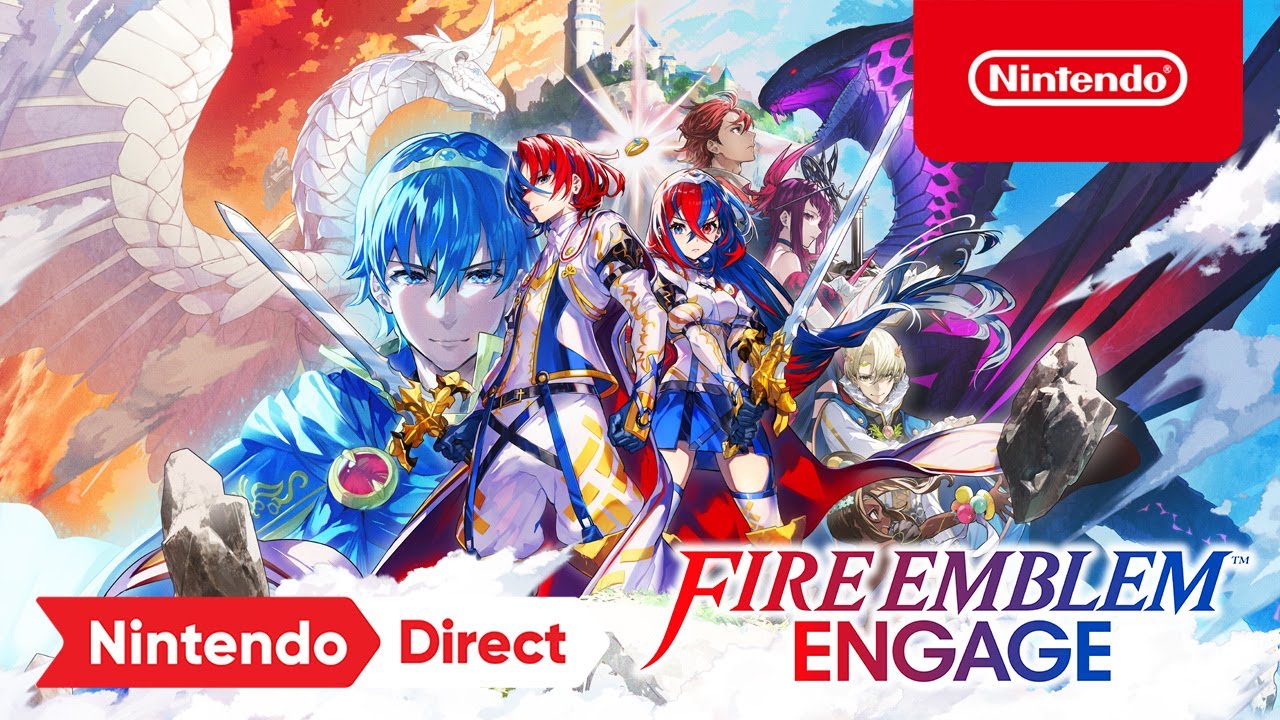
Become the Divine Dragon and save the continent of Elyos! Pre-order Today: https://www.nintendo.com/store/products/fire-emblem-engage-switch/
Use hero-summoning strategies to defeat an ancient threat in a brand-new Fire Emblem game . Summon valiant heroes like Marth & Celica alongside a new cast of characters and engage in turn-based, tactical ...
lunar sonnet
Also I forgot to get back but for the wrist cuffs, does this look right?
 dusky trail
i would say it need to be a bit longer like it enough to covered the palm but it is fine as it is
lunar sonnet
Any references?
Trying to figure out how it would cover the palm seeing its angle and its outstretched nature
 lunar sonnet
Oh yeah, iirc one of F/SN's promo art had saber like that
The palm there seems to be more withdrawn compared to my palm
dusky trail
 lunar sonnet
Also if I compared to what I see in Nasu's art for saber
dusky trail
this is close enough
dusky trail

or why not this
but ya, you can see in all of them, the sleeve... hole? is big enough to almost covered the palm there, while your feel a bit too tight
lunar sonnet
ah, I see
lunar sonnet
HOw about this then?
 dusky trail
should be fine
 lunar sonnet
I gave up on the hat, I think just going bare head is fine
dusky trail
lunar sonnet
I gave up on the hat, I think just going bare head is fine
you could always try a beret
 lunar sonnet
I tried that initially, didn't jive well with me
lost wagon

 vivid gyro
Hello, since I joined this server I'm always watching art which are posted here and it really interests me so I wanted to know if you guys have some advice for me to learn how to draw characters, or even backgrounds etc. Like youtube channels or what I need to focus on ? Considering I have a 3 years old skill at drawing
cosmic abyss
my personal favourite youtuber for this kinda thing is marc brunet
vivid gyro
cosmic abyss
my personal favourite youtuber for this kinda thing is marc brunet
Thank you !
lost wagon
cosmic abyss
my personal favourite youtuber for this kinda thing is marc brunet
haha same he's great!!
my advice is to have fun and enjoy the process in your craft. @vivid gyro
that's the best thing about creative working really
let yourself lose in it
vivid gyro
lost wagon
my advice is to have fun and enjoy the process in your craft. <@4732223535563407...
Okay I think that I'll be able to do that once I'll have the basics x) Thank you^^
dusky trail
vivid gyro
Hello, since I joined this server I'm always watching art which are posted here ...
well it would be easier to advice if we know how you draw thing
different artist has different style they prefer after all
vivid gyro
dusky trail
well it would be easier to advice if we know how you draw thing
Honestly for now I don't draw things because I'm really really bad like a 3 years old child, that is why I wanted to know where to start and then I'll be able to show my drawings x)
dusky trail
well then mostly just focus on small part first, like practice with portrait rather than try to draw the whole body
it is quite common for beginner to try draw the whole body even though they still don't know how to pose or balance the body yet
so it always good to start out with half of the body so you can get used to moving the pen
 oblique wing

Immortal Zombie logo for a bottle.
The bottle was obtained after extracting an experimented zombie essence with human consciousness within them.
 Twitter
·
lunar sonnet
Twitter
·
lunar sonnet
I am once again asking for critiques

Putting down the base colors, and about to start with lighting
dusky trail
nothing too off yet
lost wagon
vivid gyro
Honestly for now I don't draw things because I'm really really bad like a 3 year...
start with simple shapes first. the head / portrait is too difficult for any beginner.
because the head is shaped by multiple spheres, blocks etc. so to know these you have to know how to draw simple shapes and then starts with more complex structures.
vivid gyro
Okay I'll try this, thank you everyone I really appreciate^^
lunar sonnet
I like these eyes, but I might have gone overboard...
 scenic comet
lunar sonnet
I like these eyes, but I might have gone overboard...
scenic comet
lunar sonnet
I like these eyes, but I might have gone overboard...
They are completely fine. Nothing went overboard
dusky trail
lunar sonnet
I like these eyes, but I might have gone overboard...
i'm more wonder about those extra space for the white part of the eye
lunar sonnet
dusky trail
i'm more wonder about those extra space for the white part of the eye
wdym?

 dire ruin
oh!! maybe it would be helpful to ask for crits on the chibi yoimiya?
i drew this in like 2hrs last night as a "turn brain off but still art"
 dusky trail
dire ruin
oh!! maybe it would be helpful to ask for crits on the chibi yoimiya? <:SakuraLu...
dusky trail
dire ruin
oh!! maybe it would be helpful to ask for crits on the chibi yoimiya? <:SakuraLu...
just need to add her back hair for the right side to make it look more balance
with how much stuff she has on the left side there, it make the right side feel empty
dire ruin
since i used this as my reference i'm not sure what to add


 dire ruin
oh!! ty sensei
 dire ruin
ouu i see i see
lunar sonnet
dusky trail
Oh, I meant to make it to emulate this part of the eye.
 dusky trail
gahhh~~ my eyes
but you don't really need, specially the kind of eye you going for there
dusky trail
lunar sonnet
Oh, I meant to make it to emulate this part of the eye.
that part is just the gap between the eyelids

since unless you go for more low eyes like this, you don't need that part

like say Ai-chan's eyes there
 pulsar veldt
lunar sonnet
I like these eyes, but I might have gone overboard...
pulsar veldt
lunar sonnet
I like these eyes, but I might have gone overboard...
Eyes are fine
They look nice
 broken wigeon
Im asking for critique since i feel like something feels off
 pulsar veldt
broken wigeon
Im asking for critique since i feel like something feels off
pulsar veldt
broken wigeon
Im asking for critique since i feel like something feels off
Neck is too long
broken wigeon
pulsar veldt
Neck is too long
Better?
 pulsar veldt
broken wigeon
Better?
pulsar veldt
broken wigeon
Better?
Yes, also slightly asymmetrical
broken wigeon
pulsar veldt
Yes, also slightly asymmetrical
Alr thankss
 livid storm

Happy New year, I won't be able to draw as often because of my studies but I'll still try to find time to do so and keep improving.

 Instagram


 lunar sonnet
broken wigeon
Im asking for critique since i feel like something feels off
lunar sonnet
broken wigeon
Im asking for critique since i feel like something feels off
I think the nose and mouth are too high up
The eyes could stand to expand lower too
vocal gulch
 dusky trail
broken wigeon
Im asking for critique since i feel like something feels off
dusky trail
broken wigeon
Im asking for critique since i feel like something feels off
flip the pic around and you will see she is off balance
or you can draw a line between her face down to her body

so ya, you can see her neck is more on one side while one of her shoulder is higher than the other
echo zealot
 echo zealot
sad Vergil 😔
oblique wing
 broken wigeon
dusky trail
broken wigeon
dusky trail
I see tyy
 dark girder
Do you guys have any perspective advice? My perspective is super bad
 carmine geode
working on sirin
 hardy yew
dark girder
Do you guys have any perspective advice? My perspective is super bad
hardy yew
dark girder
Do you guys have any perspective advice? My perspective is super bad
Try drawing hexahedrons (cubes) in different directions. Like this

Then you could move on to other shapes!
vocal gulch

 late carbon
@plucky sphinx nice work
 plucky sphinx
late carbon
<@286130859474419712> nice work
plucky sphinx
late carbon
<@286130859474419712> nice work
||its only a simple koikatsu scene, else i could have gone on more unique scenes||
late carbon
plucky sphinx
||its only a simple koikatsu scene, else i could have gone on more unique scenes...
Still nice work
oblique wing

 main umbra
Meanwhile, in fanfic... I tried to create an illustration of Cocolia and- explicitly not Ninti. Here's Natasha.

Pretty sure they're better off here. Also Natasha has a bunch of brats attempting to play with her, like a pair of color-coded twins.
(Don't ask about the timeline.)
The picture's going to also feature Everyone(tm), as soon as I can find the time.
 fallen sparrow
main umbra
https://cdn.discordapp.com/attachments/768172256915619890/1060584614952980490/02...
fallen sparrow
main umbra
https://cdn.discordapp.com/attachments/768172256915619890/1060584614952980490/02...
SLAYED
main umbra
...?
 noble wasp
Nice ai art
main umbra
It's about 25% AI, tbh.
You can tell from the clip-art feel of some of it. I'm terrible at working in krita. XD
 rain hawk
pam pam pam! drawn on pc with 10 dollar mouse so theres an excuse for squiggly lineart tell what i should improve on or tips idk man 🙏
 hardy yew
The middle finger behind the hair looks weird, so just change that. This is my preference but the eye is kinda small.
main umbra
It looks weird because bangs like that would be transparent, I think. Not uniformly so though.
hardy yew
maybe, though it just looks cut off, I can’t really describe it though
dire ruin
i think it's more so that i get the impression that the hands are closer to the viewer yet the finger somehow goes behind the bang without bending backwards
 celest notch
daily dose of dragun but not daily becuz I spent way too much time on valorant 💀

 lone wagon
celest notch
daily dose of dragun but not daily becuz I spent way too much time on valorant �...
lone wagon
celest notch
daily dose of dragun but not daily becuz I spent way too much time on valorant �...
The details at the top of it's head looks like a sleeping fox
echo zealot
man how am I gonna colour this with colour pencils
 hardy yew
Idk, good luck tho
celest notch
lone wagon
The details at the top of it's head looks like a sleeping fox
oh lol, maybe it does a bit?
lunar sonnet
Anyone got references for shading this hand?
 dusky trail
lunar sonnet
Anyone got references for shading this hand?
dusky trail
lunar sonnet
Anyone got references for shading this hand?
well you just need to add more shade on the underside

those area would have shade as it is the underside
lunar sonnet
ayt thanks
dusky trail

but well, don't worry about it too much
just shade how you feel, along the shading feel consistent with the body
lunar sonnet
Well you see that's the thing
I don't know what feels consistent
I just go by eye and see what looks kinda good, like this here

Hair was absolutely off the seat of my pants
dusky trail
lunar sonnet
Hair was absolutely off the seat of my pants
hair aside, why are you shade the face that way?
lunar sonnet
Just experiementing to see what looks good
I noted one artwork from Yoneyama that had something like this shading
Particularly the highlight on the side of the face that the primary light is o
dusky trail
well it isn't a bad thing, it is more like that shade only work in certain situation
for that shade to work, the light source must be on the left side
lunar sonnet
Yeah, that's the idea
dusky trail
well then the left hand would be completely in the shadow as welll
while the hair on the left side will have more shadow near the edge
hmm it is hard to give a good tip on this since this depend on the way you feel object in 3D
well anime style is more flexible on that at least so you can put the light source however you like
 noble wasp
lunar sonnet
I don't know what feels consistent
noble wasp
lunar sonnet
I don't know what feels consistent
you should decide where light is coming from so the lighting will be consistent all through out
lunar sonnet
dusky trail
well then the left hand would be completely in the shadow as welll
Would it? I don't think the light source is completely obstructed from the leftt hand.
dusky trail
with how strong it suppose to be on her face, her body likely would covered it
mah~ don't over think it for now, beside set up a direction for the light source, just give it a go
 vocal meadow
Wip of the herrscher of flamescion
 lost wagon
alright... this is my 6th attempt at sketching Mia's illustration... this time I think I'm happy with the basic idea.
#drawingoftheday #art #HumanArtist #WIPs
 Twitter
·
Twitter
·
 oblique wing
took me a while to draw a dragon skull
 vocal gulch
 vocal meadow
Wip of the herrscher of flamescion
vocal meadow
vocal meadow
Wip of the herrscher of flamescion
Finished

I also drew Kokomi recently as well

I might turn it into a digital drawing
I might turn both into one
Depends on whether I at some point feel like they're good
 past sand
Ooh they're cute !
past sand
I was doing the event and the fight ended with that
I tried my best to draw it with my oc

 vocal gulch
 sage canopy
 vocal meadow
past sand
Ooh they're cute !
vocal meadow
past sand
Ooh they're cute !
Thanks
oblique wing
Kamen Rider Antidote:
Undead Dragon Form
#kamenrider #kamenriderOC #OC #Design
 Twitter
·
analog oak
Twitter
·
analog oak
 verbal marten


 smoky osprey
warm up after having not drawn for a while but not actually bc im gonna go sleep soon 

havent had that many chances to play with csp
smoky osprey
can't draw guitars and im not pulling up a ref for a sketch
 vocal gulch
 sage canopy
 lyric iron

 misty oasis

 lapis rivet
damn yall r good at that
long tangle
 vocal meadow
Found the Elysia picture from yesterday I never finished
 dire ruin
 livid storm
 Instagram
craggy smelt
Instagram
craggy smelt
 hardy yew
The Great Trial above all. (Still a WIP)

 dusky trail
verbal marten
I cant think of anything else to add lmao
dusky trail
verbal marten
I cant think of anything else to add lmao
maybe make the blue square in the back create emote shape
 vocal meadow
Venti but... Different(pyro)

Also my modern design because I wanted it to be a fast drawing
vocal gulch

 patent magnet
uhh this is just a question for people who use Krita.
When you make shadows, do you make a separate layer? Do you also blur them (the cotton swab/buds tool)?
 nocturne narwhal
patent magnet
uhh this is just a question for people who use Krita.
When you make shadows, do...
nocturne narwhal
patent magnet
uhh this is just a question for people who use Krita.
When you make shadows, do...
it depends on ur style

sometimes blurred could be better but no blur looks fine (ik im not using kirta  )
)

onyx breach
for me, i just clip the shadow layer to the layer below it
lost wagon
 celest notch
Im tired
 worthy junco
Dragoon
celest notch
That piece gives me artblock
long tangle
 solar bough
veri epix
lyric iron

 thick token


 lethal forum
I try something new

 robust mesa
thats a good heart





 lone wagon
New sketch
 onyx breach
noice
vocal meadow
Survived through changing the arm and hand, now to find bow references
 vocal meadow
Should I draw Herrscher of Reason Next?
I've decided to draw HoD(Seele) next
Could I please have some Seele HoD references-
craggy smelt
Just use pinterest 