#feedback-discussion
1 messages · Page 170 of 1
 hazy kestrel
 mighty cairn
The old UI was awful. It needed a LOT of tweaks.
hazy kestrel
Its obviously replaced to "work better", thanks to the data. But its not.
 keen wraith
mighty cairn
The old UI was awful. It needed a LOT of tweaks.
keen wraith
mighty cairn
The old UI was awful. It needed a LOT of tweaks.
wrong
mighty cairn
keen wraith
wrong
In your opinion.
 iron bloom
Streamline navigation to increase complexity imo 
keen wraith
mighty cairn
In your opinion.
in most people's opinion. Only thing was bothered me was perk & skin selection.
mighty cairn
hazy kestrel
Its obviously replaced to "work better", thanks to the data. But its not.
Right, but they didn't know until they did it, did they? So they did it, and now here you are whining like a child, without giving anything actually progressive apart from "go back to what we had before"
mighty cairn
keen wraith
in most people's opinion. Only thing was bothered me was perk & skin selection.
you don't speak for the majority.
 flat scarab
I'll just grab my popcorn, angry and furious keyboard strokes are my absolute favourite 😂
keen wraith
mighty cairn
you don't speak for the majority.
I do.
mighty cairn
keen wraith
I do.
No you don't.
keen wraith
mighty cairn
No you don't.
Yes I do 😘
hazy kestrel
mighty cairn
Right, but they didn't know until they did it, did they? So they did it, and now...
The old one was better and easier to navigate. What do you want? A 75 paper essay on this? Let me return to university and write a masterpaper, brb 5 years.
mighty cairn
You speak alongside a majority of people who dislike the new system, you don't speak on behalf of the majority of people who thought the old system was great.
keen wraith
 mighty cairn
hazy kestrel
The old one was better and easier to navigate. What do you want? A 75 paper essa...
mighty cairn
hazy kestrel
The old one was better and easier to navigate. What do you want? A 75 paper essa...
Yes, the old one was better. It's not hard to grasp, that doesn't mean it didn't need improving.
mighty cairn
They tried to improve it, they failed. Really fucking simple
hazy kestrel
I rather not improve something, if it implies it gets worse.
mighty cairn
That doesn't automatically mean throw everything out.
keen wraith
mighty cairn
They tried to improve it, they failed. Really fucking simple
They didn't try to improve shit
flat scarab
mighty cairn
You speak alongside a majority of people who dislike the new system, you don't s...
Only a Sith deals in absolutes 🤺
keen wraith
quiet obviously
mighty cairn
keen wraith
They didn't try to improve shit
Ahh yes, they tried to revamp the entire UI just to annoy children. They had no intention of improving anything.
hazy kestrel
It is very interesting how you proclaim everyone a child.
keen wraith
mighty cairn
Ahh yes, they tried to revamp the entire UI just to annoy children. They had no ...
you're brainwashed 😂
mighty cairn
hazy kestrel
It is very interesting how you proclaim everyone a child.
I said you have the reading comprehension of a child.
iron bloom
I dont feel like playing Hunt even though the gameplay is solid, I just cant get past these so called modern updates which are invariably worse
mighty cairn
keen wraith
you're brainwashed 😂
I'm brainwashed because I agree the new UI is worse?
keen wraith
crytek is completely out if touch. always have been. They didn't try to improve shit they just did whatever
hazy kestrel
They followed some data and it flunked. Cause just going by data is not going to make something functional. It makes something robotic and "Efficient", but you cannot just calculate what "works" and think Humans will love it.
mighty cairn
Yes, me agreeing that the devs fucked up, is a sign of me being brainwashed.
hazy kestrel
No, but you're still havign the caveat "It was bad before also".
keen wraith
mighty cairn
I'm brainwashed because I agree the new UI is worse?
refering to "...UI just to annoy children. They had no intention of improving anything..."
mighty cairn
hazy kestrel
They followed some data and it flunked. Cause just going by data is not going to...
Right, and I've agreed it flunked. But that doesnt mean you automatically have to go back to the beginning.
 signal mural
At everyone calling for the UI designer to get fired... Stop being a "Karen/Ken". Plenty of people are involved in the planning & execution of changes like the UI overhaul. Sure it missed it mark and we should be vocal about critiques and how to improve it but calling for someone to lose their job over your dissatisfaction is just a stupidly entitled reaction.
flat scarab
mighty cairn
I said you have the reading comprehension of a child.
Actually, you didn't say anything - unless you're also conversing orally within the discord channel. If we're being pedantic, we ought to set the standard. 🧐
mighty cairn
keen wraith
refering to "...UI just to annoy children. They had no intention of improving an...
You claimed they didn't try to improve anything.
keen wraith
mighty cairn
You claimed they didn't try to improve anything.
Wich is true they just did what everyone else is doing wich obviously doesen't work for a game like hunt. Crytek is completely out of touch w the playerbase...
hazy kestrel
mighty cairn
Right, and I've agreed it flunked. But that doesnt mean you automatically have t...
If the beginning is better and better suited, yes, I would say you should step back. If I blow out a wall to make my room bigger, but the roof collapses. I very much would try to rebuild with that wall back up.
mighty cairn
flat scarab
Actually, you didn't say anything - unless you're also conversing orally within ...
I've made a very clear position that whining on discord and not providing any constructive feedback doesnt help anyone. Did you miss that part?
hazy kestrel
And I told you ,its cluttery, messy, hard to get an oversight.
mighty cairn
hazy kestrel
If the beginning is better and better suited, yes, I would say you should step b...
That's possibly the worst analogy i've ever heard. They broke a UI meaning you have to click a few more buttons, and you're comparing that to full blown house collapse.
hazy kestrel
mighty cairn
That's possibly the worst analogy i've ever heard. They broke a UI meaning you h...
Its bad if it makes people less keen to play, lol. They need players to make money and I seen people in here say its so bad they are just not feeling like playing. I say the analogy stands well enough.
mighty cairn
keen wraith
Wich is true they just did what everyone else is doing wich obviously doesen't w...
I want to be respectful but is there maybe a language barrier? I clearly said they tried to make it better, you claimed they didn't. So I responded with sarcasm saying that they infact didn't try to improve it, they changed the UI for no reason other than to annoy people.
 carmine needle
Disagreeing is fine, but let's not be insulting each other over it.
mighty cairn
hazy kestrel
Its bad if it makes people less keen to play, lol. They need players to make mon...
So help them make it good. By giving them constructive feedback on how they can fix it.
hazy kestrel
Its irrelevant if they tried to improve or not, when it is not. Why are they not testing this? They have betas and playtests for a reason.
I told you already, do a pull back. This wont get better. Since the first version was better.
mighty cairn
hazy kestrel
I told you already, do a pull back. This wont get better. Since the first versio...
You have eventually, you started off by just crying and saying "It's badddddd" which helps nobody.
hazy kestrel
Improve the older, better version instead of working on a newer inferior version.
mighty cairn
The devs wanted to change the UI, they want to make it better. They went way too far.
hazy kestrel
They wanted. to change the Ui, does not mean they wanted to make it better.
flat scarab
Oh, I see we're deleting messages now. Lovely.
hazy kestrel
flat scarab
Oh, I see we're deleting messages now. Lovely.
Could be the censorship kicking in.
mighty cairn
hazy kestrel
They wanted. to change the Ui, does not mean they wanted to make it better.
They went into detail in the vlogs explaining how they wanted to improve it. It's very obvious they wanted to improve the experience because thats what they literally told you over and over.
Devs: "We want to improve the UI"
Random players: "They never wanted to improve the UI"
hazy kestrel
mighty cairn
They went into detail in the vlogs explaining how they wanted to improve it. It'...
Well, to bad they had no one testing it before full release then.
And you seem to trust companies that only cares about money and statistics, but okay.
mighty cairn
hazy kestrel
Well, to bad they had no one testing it before full release then.
They should have put it on a test branch.
hazy kestrel
They really should.
mighty cairn
hazy kestrel
And you seem to trust companies that only cares about money and statistics, but ...
I don't "trust" companies, and name a business that doesn't care about money and statistics.
I think the devs have shown over the years they are one of the better dev teams when it comes to community feedback. When compared to AAA devs all over the world.
hazy kestrel
I did say companies and not Crytek alone. Mate.
mighty cairn
Comparatively, Hunt has great devs.
hazy kestrel
They would been one of the best, if they didn't make it more and more like a F2P game.
mighty cairn
hazy kestrel
I did say companies and not Crytek alone. Mate.
We are talking specifically about Hunt, and you said "YOU seem to trust companies" Inferring Crytek since that's the only company we are talking about.
Don't bs me.
 distant valley
Things about UI:
- Id love to scroll sideways when hovering over sideway icon bars, instead of scrolling down the left side menu which is sometimes just 2items long (example: Hunter tab -> scrolling through hunters when hovering over them instead of scrolling a list of items (owned hunters and recruit)
- cant see teammate loadout anymore (maybe you can, but UI hid it so good, me and my friend just stopped looking for it)
- when i want 2 of the same consumables, i have to slot them in individually coz the menu takes me back when selecting one
-when in Queue i cant watch things like Last Match Details, that was possible before the patch and isnt anymore
-Saved Loadouts are confusing and have bad accessibility (for example i cant see all me saved loadouts AND i cant scroll through them)
-i think sidewayscrolling when hovering over sidewaycontainer of items is good UX in general and every sidewaycontainer with enough items that u would sccroll with Q orE should be scrollable with mousewheel too
-When choosing special ammo while equipping a hunter i see the icon for the special ammo, back on the hunter overview where i see all his equipped items, i see how the actual special bullet looks, instead of the special ammo type icon (which would be better UX IMO)
-damage report needs me to scroll and stuff more often, when the old damage report was 90% of the time showing u what u want to know immediately
-when closing the game, i need to click top right corner (1), then quit on right side menu (2) and then click exit again on a popup window (3). Im not dumb, when i click exit u dont have to make sure im sure about it by confirming it 2 times
-battle pass and store are so important tabs u put it in top bar AND left bar, but play hunt isnt?
hazy kestrel
mighty cairn
We are talking specifically about Hunt, and you said "YOU seem to trust companie...
And you started to talk about "What other companies"
iron bloom
Apart from UI though, I sincerely hope they bring back basic features and stats from old UI at the earliest.
- Roll back the ability to view Teammate KD/MMR (Pre-Lobby)
- Pull back keyboard shortcuts/custom key binds in the menu during a match
- Kill score tab post match screen
- More Servers
- Performance update/Micro stutters
mighty cairn
hazy kestrel
And you started to talk about "What other companies"
I said that after. Read the comment you specifically replied to. Please, stop bsing me. I'm not as stupid as you think I am.
Make sure to put it all in #feedback also. And encourage people to like/react to the feedback.
hazy kestrel
All I said, I dont trust companies when they say they want to "improve" something and you said" mention a company that doens't care about money and statistics". I really dont care about other companies right now.
Obviously you're passionate about Hunt and its good and all. All I say is, the UI is a mess and it should be rolled back to the old UI and that one can be worked on rather than fully changed/revamped.
 rotund obsidian
iron bloom
Apart from UI though, I sincerely hope they bring back basic features and stats ...
rotund obsidian
iron bloom
Apart from UI though, I sincerely hope they bring back basic features and stats ...
you can see teammate kda in the pre-lobby, at least.
press spacebar in the bounty hunt screen and then there should be like an 'inspect equipment' button or something like that, then press E to scroll right to the stats
mighty cairn
hazy kestrel
All I said, I dont trust companies when they say they want to "improve" somethin...
I said that AFTER you accused me of trusting those companies. Good grief man. Your reading comprehension level is atrocious. You accused me of trusting companies that ONLY care about money/stats, I never once suggested that, you accused me of something I didn't say.
AFTER you made that comment I responded saying name a company who doesnt. AFTER. Do I need to say AFTER again?
I completely agree Marcus, the UI is a mess, the old UI is better.
 tall elbow
is anyone else experiencing heavy stutters like every 10 seconds
other than that the update is pretty nice
iron bloom
tall elbow
is anyone else experiencing heavy stutters like every 10 seconds
Everyone I suppose., including me
mighty cairn
If tomorrow they reverted to the old UI whilst they work on a new one, that would be fine, but they are likely going to want to just work on the new one based on player feedback, which rolls around to my previous point.
If we are going by the assumption that the devs want to progress the game, we need to give them feedback on how to make the new UI better.
hazy kestrel
mighty cairn
I completely agree Marcus, the UI is a mess, the old UI is better.
We see what happens.
And I morely meant, do you trust companies saying they want something. I don't, not when it often turns to the worse. If you took it as an accusation, then thats my bad and im sorry.
iron bloom
 solar gust
I like the new UI lol.
solar gust
I like the new UI lol.
Xbox/PS should have known
mighty cairn
Just saying it's bad doesn't help. I very much doubt they are just going to throw away a lot of work to bring the old back. Maybe they will
 tribal wyvern
You dont see an issue with 20 screen changes just to equip ur hunter @solar gust
tribal wyvern
Im talking bour equipping them not seeing them
distant valley
solar gust
I like the new UI lol.
i get that its better for consoles in many ways, but the new UI has some straight up down grades like i cant see my teammates loadout in Play tab, i cant look into Last Match details when in Queuu etc
iron bloom
solar gust
No
You are playing on console, not on PC. Understood
solar gust
Yeah equipping stuff really is slower but that’s what loadouts are for.
tribal wyvern
Like buying consums or wepd
solar gust
I just click my loadout I made and boom I’m ready to play.
 indigo garden
I am talking about my experience with the update and I can't talk for others for different hardware. On my PC it runs well, although it is heavy on GPU. I think low settings and FSR should carry something like RX 480.
Also I am aware of bugs related to AMD GPUs and I infact think they did not test properly on AMD. From perspective of actually running it runs pretty good on my 6900XT. But as I mentioned it's quite heavy on GPU, native 1080p on max settings runs 75 - 90 fps. Quality FSR 1440p with HIGH settings mostly runs locked 160 fps ~
iron bloom
A big middle finger to us PC masterrace
mighty cairn
hazy kestrel
We see what happens.
And I morely meant, do you trust companies saying they wa...
Okay, I appreciate that and honestly I didn't need an apology I'm not offended by it at all.
What I'm saying, is as someone who has played a lot of games over the years from AAA devs, I think on the whole since 2017, Hunt devs have shown to be quite good, they've made mistakes as all of them do, but generally speaking they have delivered a really niche game and been able to grow it over time.
For me I'm willing to give them some leeway on this issue to get it right, if we are still here in a month or so and the devs have doubled down, then I'll start being critical, but right now, we need to encourage the devs to revert to the old UI or give them functional changes they should make to the new one, that can only be done with constructive discussion
distant valley
solar gust
I just click my loadout I made and boom I’m ready to play.
how many loadouts u have saved tho? u play the same 5 loadouts all the time? i play mixed loadouts and espacially now where prices and stuff changed i experiment alot with different loadouts and the new UI punishes that with keeping u in the menu for much longer
mighty cairn
@distant valley Can you copy and paste your feed back from earlier into the #feedback channel, it will get lost in this one
hazy kestrel
mighty cairn
Okay, I appreciate that and honestly I didn't need an apology I'm not offended b...
I get it, Its nice they still got the gaming going and its supported. I just dont ike when it feels like they move more towards a cashshop game with grind and, I had a friend point out, the new AI has a "console" feel to it. I really hope not.
mighty cairn
@iron bloom also
solar gust
distant valley
how many loadouts u have saved tho? u play the same 5 loadouts all the time? i p...
I just save mostly loadouts and consumables.
distant valley
mighty cairn
<@419053934108213250> Can you copy and paste your feed back from earlier into th...
will do
mighty cairn
hazy kestrel
I get it, Its nice they still got the gaming going and its supported. I just don...
I do actually agree with your friends comment, I think this update has given it a console UI feel but I couldn't work out what it was, that's a perfect analogy. I seem to remember they mentioned consoles on part of their UI video from a few months ago actually
 brazen geyser
traps on teamates cant be disarmed accurately... this reallllly is rough
they should float that interact to the top..
iron bloom
My hoont buddies just texted me to get into Delta Force until next Hoont update
mighty cairn
@distant valley Actually probably be better putting it in the #game-ideas channel so we can vote on it
iron bloom
They ditched my ass
hazy kestrel
mighty cairn
I do actually agree with your friends comment, I think this update has given it ...
Oh boy, thats pretty sad if they did all this for consoles.
mighty cairn
More Delta force drops tomorrow on twitch I think
mighty cairn
hazy kestrel
Oh boy, thats pretty sad if they did all this for consoles.
Yeah i'll have to find the video again soon I can't remember what they actually said but yeah this UI has a very strong console feel to it
hazy kestrel
mighty cairn
Yeah i'll have to find the video again soon I can't remember what they actually ...
Yeeeah, we see how it turns out! As you aid, the feedback of course need to be more than "Game sucks now"
iron bloom
Console player happy, PC gutted
mighty cairn
hazy kestrel
Yeeeah, we see how it turns out! As you aid, the feedback of course need to be m...
It does suck though lol
solar gust
So what about the UI sucks for PC players? The fact that you go through one more screen to select weapons and consumables?
hazy kestrel
mighty cairn
It does suck though lol
Yeah :/
mighty cairn
@hazy kestrel If I thought there was a chance of them reverting to the old UI as their backup plan then I'd agree and say yeah this sucks, but I'd imagine they want to keep this UI and just make changes to it
hazy kestrel
Im sure they will,. but I just feel they be working on the lesser version
indigo garden
solar gust
So what about the UI sucks for PC players? The fact that you go through one more...
How about needlessly huge boxes that you need to scroll to select something. Can't even scroll with wheel
tribal wyvern
solar gust
I just click my loadout I made and boom I’m ready to play.
So they made it from required to switch screens back and forth whenever you buy 1 item, even 1 vitality, you cant mass equip. Which you could before.
You also now need multiple screen changes just to switch skin, which you only pressed an arrow for before.
But you're just fine with this? It was made actively worse. But since you only play 1 loadout everygame and dont seem to switch on the fly it's fine.
I mean you do you. But thats very small minded.
hazy kestrel
solar gust
So what about the UI sucks for PC players? The fact that you go through one more...
Its a clunky mess. But then I understand the consoel people wont see a difference, because from my own experience. No such thing as a nice UI system on console
mighty cairn
solar gust
So what about the UI sucks for PC players? The fact that you go through one more...
I think the main feedback from what i've seen is that it's just trying to do too many things, they've cluttered it
tribal wyvern
And i generally do not accept shitty design simply because i can work around it
Whats objectively bad, is objectively bad
mighty cairn
tribal wyvern
And i generally do not accept shitty design simply because i can work around it
And we shouldn't accept it either.
tribal wyvern
Custom loadouts was added to make it quick when you knew exactly what to play. But i like to switch things up, change my consums, especially depending on if i got the trait for faster regen or not.
Sometimes i play shotgun one game, then go "hm i wanna play winnie with levering this time."
So loadouts kinda do not work for me
solar gust
tribal wyvern
So they made it from required to switch screens back and forth whenever you buy ...
Very small minded for enjoying the new UI and asking why PC players don’t enjoy it? I’m on console so I don’t know what it’s like for PC players. I also play mixed loadouts. I just don’t mind the extra stuff you have to go through to get your loadout setup lol. Feels like you’re just going after me because I stayed my opinion and asked questions to learn more.
tribal wyvern
solar gust
Very small minded for enjoying the new UI and asking why PC players don’t enjoy ...
No i just find it wild you accept worse designs & a game becoming actively worse, as you even say yourself. But since "you do not mind it" then i guess it's fine.
hazy kestrel
It is more of a mess to play now than before.
brazen geyser
so anyone else experiencing shotbolt just... not killing ever?
8 hits no kills lol wild times
tribal wyvern
Not something i play personally, im just shit with xbow 😄
Maybe the drop is alot tougher for xbow now ?
hitting legs ?
You can see what you're hitting
when you die that is
tribal wyvern
Check the dmg it does
brazen geyser
shots that normally would obliterate at 18yrds
i dont see the output anymore
found it
hazy kestrel
mighty cairn
And we shouldn't accept it either.
Anyway dude, good talk in the end! Have a good weekend!
tribal wyvern
But Cerberus if you are that interested why we hate it.
- Change hunter / Modify is the same screen. Except change hunters UI is actually better
- Modify hunter the consum/tool slot doesnt mention which is slot nr1 or 2 and so on.
- Screen switching has gone to absurd as i mentioned, 20 screen changes.
- More annoying to switch skins, skins you don't own are mixed in
- It's tougher to find weapons you already own, it's just confusing, like contrabands
- Clicking back doesnt take you to the lobby but to the home screen that serves no purpose
- It took me genuinly a few minutes to figure out the change hunter screen on hunters, because it just looks so weird. Because i have like 30 hunters that are lvled
- For some reason the menu raises my GPU heat the same as being in the fucking game playing. which i'm not sure is actually a GPU issue. Some menus in other games actually killed ppls GPUs. So i think this is a performance overlook that can be dangerous to your hardware.
@solar gust I played Hunt for 2hrs, this is the issues i found.
Some people might have more.
 sturdy rune
is something wrong with us east/west servers? i keep getting thrown into asia servers.
 sterile beacon
Ngl this new 1865 medium ammo carbine that does 145 damage makes me wanna commit an act of terrorism on crytek headquarters
 quasi saffron
sterile beacon
Ngl this new 1865 medium ammo carbine that does 145 damage makes me wanna commit...
quasi saffron
sterile beacon
Ngl this new 1865 medium ammo carbine that does 145 damage makes me wanna commit...
yikes dude
sterile beacon
It’s seriously stupid af
I don’t understand why game developers are compelled to disregard all types of balancing when making updates but it’s driving me to insanity
 pearl ridge
I don't like the new lobby song theme thingy. Where is my guy going "hmhmhm hmmmmm"? I miss him.
 rigid orbit
Whats so bad about the new medium rifle? I havent seen it in a single game
quasi saffron
I get the frustration, but let's try not to vaguely threaten people over it lol. Still just a game
indigo garden
tribal wyvern
But Cerberus if you are that interested why we hate it.
1. Change hunter / Modif...
8 - unlocked fps
Lock fps to avoid that
sterile beacon
rigid orbit
Whats so bad about the new medium rifle? I havent seen it in a single game
It’s a medium ammo rifle with an 8 round magazine that does 145 damage and has the reserve and ammo resupply of medium ammonia weapon
rigid orbit
still has medium ammo fall off at 20m
pearl ridge
I just bought 2 random things cause i am still not comfortable with the way things are selected. Helep me.
sterile beacon
Yeah but it literally does more damage than all but 3 guns
It’s only 1 less damage than the martini Henry with an additional 7 rounds in a magazine, 6 bullets back from each resupply, and has a better rate of fire than the martini as well
You’d think the trade off for high damage is running a heavy ammo weapon where you have to be more careful with your shots
 pure musk
Do you guys think the engine update was to support a mobile platform push, that's the only reason I can think they made a touchscreen/mobile swipe based UI for a PC game
Rofl
sterile beacon
It was designed for console but most people hate it on both platforms anyways
pure musk
Huge UI elements, side bars, and side scrolling are all mobile interface design points
rigid orbit
Sure but at 40m the Martini hits for 146 in the upper torso, how hard does the new medium rifle hit?
sterile beacon
Lemme test it
 raw vessel
I see a lot of outrcy about the ui and I strongly agree, but am I the only one hardcore original hunt fan who played for 4 years and love it so much and did not needed and wanted an entire graphics and engine change? I feel like its a completely different game now, doesn't give me the same feeling and vibes anymore..... can't even play cause vsync is broken but thats also my personal issue it seems like 
pure musk
raw vessel
I see a lot of outrcy about the ui and I strongly agree, but am I the only one h...
I think the game sorely needed an actual engine update/rework for things like jittering on objects etc, but this engine update didn't really address any of the engines problems just graphical fidelity stuff
pearl ridge
raw vessel
I see a lot of outrcy about the ui and I strongly agree, but am I the only one h...
Shouldn't be your personal issue tho.
raw vessel
I was perfectly happy with it.... idk
pure musk
Well they needed a big push of something to support the new Crysis game I expect
is the real reason a new engine was pushed out
rigid orbit
thats a bit cynical no?
 leaden belfry
raw vessel
I see a lot of outrcy about the ui and I strongly agree, but am I the only one h...
leaden belfry
raw vessel
I see a lot of outrcy about the ui and I strongly agree, but am I the only one h...
I disagree it still feels hunt & the engine allows more flexibility for the game & newer hardware. no one likes change but nothing stays the same forever
sterile beacon
rigid orbit
Sure but at 40m the Martini hits for 146 in the upper torso, how hard does the n...
I just tested it and at 42 meters the martini Henry hit for 140 while the new 1865 carbine hit for 132
An 8 damage difference at that range which still allows it to one shot anyone who’s already missing a health chunk
pure musk
rigid orbit
thats a bit cynical no?
Not really? They've pulled staff when it doesn't do well
 lavish pulsar
Am i the only one with a 18% GPu usage and a 80% cpu usage?
sterile beacon
Additionally the weapon seems to carry that 8 damage difference until about 100 M where the difference starts getting a little stronger in the martini’s favor
Still
rigid orbit
Ok, we'll see in a week or so once more people have it unlocked if it starts saturating the matches or not, so far ive not seen it in any match buts its only day 2
Wont stop me from Romeroing you in the face (or knowing me, 3 metres to the left of your face about 2 seconds after you were there)
sterile beacon
rigid orbit
Wont stop me from Romeroing you in the face (or knowing me, 3 metres to the left...
It will when you’ve got a 3 stack lazering through your building with 1865 carbine FMJ for 145 damage and each carrying two ammo boxes so they can just keep doing it
But I guess they needed something to distract their player base from the fact that doltch still has dum dum and FMJ
rigid orbit
I mean... how is that any different to when me and my mates did that with Marathon FMJ and boxes and just unloaded with hipfire into a building. The enemy still all died and it was hilarious!
Now you can do it with whatever this new gun is called
sterile beacon
Because marathon only does 113 damage so yeah you can do that sure but it’s not gonna literally insta kill anyone already missing a health chunk
So the balancing is there so you get more ammo but less damage
And now it just goes out the window with this new gun
solar gust
pure musk
I think the game sorely needed an actual engine update/rework for things like ji...
Dude console needed this upgrade so badly LOL
 tranquil swallow
why has the ui been so over complicated? what ever happend to keep it simple stupid?
sterile beacon
They sacrificed UI functionality for making it look pretty
solar gust
All you guys gotta do is wait for the feedback forks and use the feedback channels which I know yall been doing but I think the forms are what they’re really gonna look at when they release them.
tranquil swallow
literally a console patch
solar gust
sterile beacon
They sacrificed UI functionality for making it look pretty
Not even that. They probably could’ve kept the old UI but made it look as pretty as it is now.
sterile beacon
Exactly
solar gust
tranquil swallow
literally a console patch
Console was fine with the old UI. To me personally. I never had issues with it.
sterile beacon
Instead we’ve got this monstrosity that makes me spend more time trying to make a loadout with different hunters than actually playing the game
solar gust
I just make loadouts
Loadouts are gonna be a big time saver
Maybe not with primary and secondary weapons
sterile beacon
True but you’ve gotta spend BB to get new loadout slots
solar gust
But with tools and consumables anyway.
 radiant river
solar gust
Loadouts are gonna be a big time saver
radiant river
solar gust
Loadouts are gonna be a big time saver
Yeah but loadouts are also harder to navigate now too
You have to scroll through them 1 by 1
solar gust
You can still use loadouts but if you wanna change out just one or two items then you can and it’ll still be a lot less time than creating another one from scratch.
radiant river
And the check boxes to select each slot are way further away from each other now
rotund obsidian
horizontal scrolling is fucking whack
rigid orbit
my loadouts are bugged and dont seem to give me my consumables
sterile beacon
See and here’s another problem, I understand that they probably spent a lot of time creating this
rotund obsidian
loadouts don't let you equip 2 of the same consumable, it's bugged rn.
sterile beacon
And understandably you probably wouldn’t wanna trash something you spent months working on either
rigid orbit
thats why taco, my combo was double vit shot and double dynamite for a quick and cheap consumables option
sterile beacon
But this is exactly why the need to be more involved in their community before these massive changes so they don’t end up wasting their time and money
solar gust
rotund obsidian
loadouts don't let you equip 2 of the same consumable, it's bugged rn.
If you just go to another empty slot then you can.
rotund obsidian
solar gust
If you just go to another empty slot then you can.
...no? it automatically stacks them in the saved loadout then fails to apply, you need to equip the stacked items manually every time
solar gust
sterile beacon
But this is exactly why the need to be more involved in their community before t...
OH
Sorry forgot to not reply
solar gust
rotund obsidian
...no? it automatically stacks them in the saved loadout then fails to apply, yo...
I didn’t k ow you were talking about loadouts
sterile beacon
Np
 lost citrus
rotund obsidian
loadouts don't let you equip 2 of the same consumable, it's bugged rn.
lost citrus
rotund obsidian
loadouts don't let you equip 2 of the same consumable, it's bugged rn.
same problem for me as well
rotund obsidian
yeah you can still bring stacked stuff you just can't apply it from a saved loadout
 crystal plume
@knotty schooner Please use the correct format for posting a suggestion instead of just posting an image
 waxen merlin
rigid orbit
my loadouts are bugged and dont seem to give me my consumables
waxen merlin
rigid orbit
my loadouts are bugged and dont seem to give me my consumables
Yeah I don't get a stack of my consumables only 1.
After equipping a load out, I have to purchase the last 2 consumables individually
solar gust
sterile beacon
But this is exactly why the need to be more involved in their community before t...
Some other gentlemen mentioned they were probably not going to revert it. Just change the current UI based on feedback.
crystal plume
Expecting them to revert it is simply unrealistic
solar gust
crystal plume
Expecting them to revert it is simply unrealistic
Correct
crystal plume
Or even expecting a toggle between the old and new one like some have suggested
This is what we are stuck with and they will work on improving it, simple as that
sterile beacon
But it doesn’t change the fact that h th e majority of their player base hates the new UI right now
carmine needle
@distant valley @wary hinge @normal reef
I have removed your posts in Suggestions as they are #feedback . Feel free to DM Modmail if you need a copy to post there
It doesn't, but feedback on what would be better is more helpful than calling for a rollback.
solar gust
sterile beacon
But it doesn’t change the fact that h th e majority of their player base hates t...
If the players leave because of UI instead of gameplay issues then let them leave.
lost citrus
the running and walking system seems to be bugged as well as the game keeps walking even when i let go of th "W" button
solar gust
I’m sure they’re going to focus performance and fidelity rather than new UI that people aren’t used to yet.
 neat raven
solar gust
If the players leave because of UI instead of gameplay issues then let them leav...
neat raven
solar gust
If the players leave because of UI instead of gameplay issues then let them leav...
The ui is a gameplay issue bud
Clearly you’re on console so it isn’t as bad for you as pc…
 formal hatch
neat raven
Clearly you’re on console so it isn’t as bad for you as pc…
formal hatch
neat raven
Clearly you’re on console so it isn’t as bad for you as pc…
The UI is less user friendly for console as well i hope people realize this
1000 button presses just to adjust sensitivity
 undone grove
#feedback message
The search function still exists, but if you click the search bar again, it disables the "search filter" (the written text remains, but it's no longer actually filtering the weapons by the text). It's weird and clunky, but the function is still there...
neat raven
formal hatch
The UI is less user friendly for console as well i hope people realize this
I understand but the layout for a controller is more friendly with this ui is all I meant. It’s still pretty bad either way.
solar gust
neat raven
Clearly you’re on console so it isn’t as bad for you as pc…
Pretty sure we have the same UI. Correct?
formal hatch
Sure some key binds may be more cohesive but there are still menus on top of menus on top of menus and delay between them, selecting custom loadouts is just horrible currently
(among other things)
The new UI makes me miss the cursor on console it feels like it would have improved accesibility at this point
solar gust
formal hatch
Sure some key binds may be more cohesive but there are still menus on top of men...
What this guy said
 vague oyster
Please, I'm so tired of being taken to a new screen every time I click an item slot.
solar gust
I really don’t mind the UI cause the fights I’m having on the new map are so incredibly fun.
I just get my load out eventually and get going.
vague oyster
Yeah, in the match it's fking awesome. I love it. Fortunately not having any bugs except for a purple door or window here and there.
 floral sun
still dont understand why they removed stacking consumables
vague oyster
floral sun
still dont understand why they removed stacking consumables
wdym?
I have 2 stam stiks stacking right now
 mint star
You can stack consumables. You just can't use loadouts to do it
floral sun
^
vague oyster
oh
floral sun
thats what i meant
vague oyster
roger
mint star
I don't think it was removed though. I believe it's a bug
 odd wagon
rotund obsidian
horizontal scrolling is fucking whack
odd wagon
rotund obsidian
horizontal scrolling is fucking whack
wouldn't care that much about it if at least they made the menu navigable easily only with the mouse, you have to fuckin tapdance on the keyboard now
rotund obsidian
It's definitely a bug, you can add stacked consumables to a loadout but it just fails to apply to a hunter when you use the loadout
rotund obsidian
odd wagon
wouldn't care that much about it if at least they made the menu navigable easily...
yeah worst part is fucking backspace and enter being required for shit like confirmations
floral sun
ye i tried to set it in loadout cause
manually stacking consumables in hunter loadout is so fucking cumbersome but i guess its bugged so gg
rotund obsidian
the nested screens blow too, why is there eight different pages to customize a hunter
 hasty sinew
please, I want old lebel and sentanial crossair back:/
neat raven
It’s crazy that opening the map crashes the game this often…. Get it together.
neat raven
rotund obsidian
the nested screens blow too, why is there eight different pages to customize a h...
Not to mention you can only edit one piece of equipment at a time and can’t even see your loadout while doing it..
 dusty helm
if I want to send a large amount of feedback how can I do it :/
dusty helm
it turns it into a .txt file :v
neat raven
I open feedback and the first thing I see is someone saying “the ui is good”…… bruh
dusty helm
oof
mighty cairn
lavish pulsar
Am i the only one with a 18% GPu usage and a 80% cpu usage?
Do you have any graphics on low? Some graphics will utilise CPU when they are set to lower settings, and turning them up will set the GPU to take over to relieve the CPU, I don't know which settings do that in Hunt but it's common in modern games.
lavish pulsar
mighty cairn
Do you have any graphics on low? Some graphics will utilise CPU when they are se...
I had everything set on mid graphics when i launched the game but it managed to only get up to 27% gpu usage with 40-50 frames
so i lowered them to even get some frames in the first place, now i have 100 at lowest settings
mighty cairn
lavish pulsar
I had everything set on mid graphics when i launched the game but it managed to ...
Yeah I can't say i've looked into the graphics/fps yet so I can't make a suggestion, but I'd imagine with such a big update they will need to continue to optimise over the next few weeks/months
 spiral dust
For any complainers about shadows on AMD GPU please try to read min spec 😑
lavish pulsar
mighty cairn
Yeah I can't say i've looked into the graphics/fps yet so I can't make a suggest...
id say the same but my friends cant even get a cosistent 30 frames on a pc that could run 70-80 frames on mid settings
sterile beacon
One other thing I had noticed is that the audio in the caves/mineshafts are kinda wack at times
lavish pulsar
sterile beacon
One other thing I had noticed is that the audio in the caves/mineshafts are kind...
audio has been always fucked in hunt tbh, i remember having 5 second audio delays when i had a weaker GPU
like not even doom eternal, cyberpunk 2077 or any high hardware game fucked with me as much as Hunt
mighty cairn
lavish pulsar
id say the same but my friends cant even get a cosistent 30 frames on a pc that ...
I played this game when it was in closed testing back in 2017, my gtx 770 was getting 60fps, my friends brand new GTX Titan which had like 5x more memory was getting 50fps lol
lavish pulsar
mighty cairn
I played this game when it was in closed testing back in 2017, my gtx 770 was ge...
i have a rtx 4060 and a i5 12400 f and i literly just cant keep up with the game
like back before this update my 1050 ti had better performance then my 4060 on in terms of pure fps
mighty cairn
lavish pulsar
i have a rtx 4060 and a i5 12400 f and i literly just cant keep up with the game
Yeah that's definitely an optimisation issue then which is annoying as hell, but just keep tweaking. over the next few days people will be putting out youtube stress test videos so they should help you to tweak to try to get better performance
odd wagon
odd wagon
wouldn't care that much about it if at least they made the menu navigable easily...
i was gonna say the exact same thing lmao
lavish pulsar
also i dont know if its only me but the game looks almost the exact same even when you have max graphics
and for some reason when i mentioned this whole performance issue on a reddit post i tried to make it got taken down by "reddits filter"
 neon steppe
I'm so disappointed with the new menu screen?! it's beyond cumbersome to do any simple task?! why did they even change it??
lavish pulsar
neon steppe
I'm so disappointed with the new menu screen?! it's beyond cumbersome to do any ...
a lot of people didnt like the old Ui since it was kinda confusing too, a new ui would have been nice but instead we got a worse one
 neon steppe
lavish pulsar
a lot of people didnt like the old Ui since it was kinda confusing too, a new ui...
neon steppe
lavish pulsar
a lot of people didnt like the old Ui since it was kinda confusing too, a new ui...
how? it was so easy to navigate, took me 2 seconds to equip a new hunter, weapons, and load into the game 😂
lavish pulsar
neon steppe
how? it was so easy to navigate, took me 2 seconds to equip a new hunter, weapon...
For new players it was confusing since you only needed like 1-2 tabs out of the 7 there were
radiant river
neon steppe
how? it was so easy to navigate, took me 2 seconds to equip a new hunter, weapon...
It had lots of issues like there being 15 different pages and it asking you to confirm so many things like health bars
But they didn't solve these problems in the new ui
neon steppe
well this new ui is no better... now you have more pages .. and sub sections
radiant river
The loadouts and equipment tab was pretty good though, that's definitely the biggest downgrade right now
lavish pulsar
it lookes like they tried to group up the things into categories but that fucked up stuff even more
lavish pulsar
radiant river
The loadouts and equipment tab was pretty good though, that's definitely the big...
ye
 hoary shard
There was a middle ground between "make the complications less" and what we ended up getting, which in almost every way is more obtuse / complex
It almost feels like their testing bypasses these menus so I'm curious if they just never saw how painful they are to navigate.
If they did and shipped anyway... then maybe have some focus groups or something idk lol
neon steppe
or at the very least try it out on the test servers first .. before pushing to live
hoary shard
But then how would you have super secrets? (Kidding. Yes there's a test environment for a reason if you're not using it then just decom it and use the money for better prod equipment)
 peak rain
Recommend learning shortcut buttons on the menu. That goes a lot faster than doing any mouse tapping.
neon steppe
I shouldnt need shortcut buttons ...
if the menu is so complex I need shortcut buttons.. someone fucked up at their job
radiant river
hoary shard
It almost feels like their testing bypasses these menus so I'm curious if they j...
Honestly have no clue how it came out like this, people were predicting the problems we ended up with just from seeing the UI in their teaser videos
hoary shard
I shouldn't have to learn keyboard combos to use a menu lol every other game figured this out in the early 2000's
distant valley
i have two weak vit shots in a saved loadout and everything from that loadout works when putting it on hunter except the double small vit shot, those slot stay empty. bug?
radiant river
So surely they were aware especially if there was literally any testing at all
solar gust
I like the new ready up screen
radiant river
I assume they just didn't have time to fix it before it came out
neon steppe
hoary shard
I shouldn't have to learn keyboard combos to use a menu lol every other game fig...
if I wanted to use key binds and macros I'd go play world of warcraft 😂
hoary shard
"This UI brought to you by people who only work in terminal"
peak rain
Another thing that I dont really understand is: Why introduce rarities to skins and hunters? Does it really matter?
hoary shard
peak rain
Another thing that I dont really understand is: Why introduce rarities to skins ...
This almost feels like they're about to drop loot boxes
neon steppe
I wondered why some items had different coloured boarders
radiant river
peak rain
Another thing that I dont really understand is: Why introduce rarities to skins ...
I agree but I also don't understand why people care so much about it
hoary shard
Because why have rarity if there isn't random chance?
peak rain
Why use time implementing such things, when you clearly have other problems that needs fixing. It just makes this Ui thing even worse
dusty helm
can someone tell me why discord doesn't have word wrap on .txt files 
crystal plume
hoary shard
This almost feels like they're about to drop loot boxes
They won't
 hot vigil
neon steppe
I shouldnt need shortcut buttons ...
hot vigil
neon steppe
I shouldnt need shortcut buttons ...
This, while this UI can be learnt and navigated.
At the end of the day you just learning to navigate a bad system.
crystal plume

 hardy coral
Yeah but why? The skins are just skins.
Some regardless of their "rarity" are nicer to other people than others.
crystal plume
I agree that rarities were unnecessary apart from mythic as it is useful to tell people which skins won't be coming back
But at the same time I can just entirely ignore it
So it's whatever to me
hot vigil
hardy coral
Yeah but why? The skins are just skins.
https://discordapp.com/channels/350201607788429323/727457773205323827/1274020833479753853
Just made a feedback about where I quote their reasoning
hardy coral
Anyway still no word on AMD fixes 
hot vigil
And why that is bs
peak rain
I bet rarity will have a bad impact on the game. Using FOMO to trick people to buy skins
crystal plume
It's not a good look to those that let it affect then more than it should which is sadly the majority of people these days seemingly, imo it's a microcosm of more serious things but you know 😄
neon steppe
I feel like the devs should have had an options to either use the classic ui or the terrible new ui ...
crystal plume
I've been just focusing on the actual gameplay on the new map and such and been having a blast apart from the occasional issue that requires a game restart or such
crystal plume
neon steppe
I feel like the devs should have had an options to either use the classic ui or ...
Not happening and unrealistic to even expect it
 solar wraith
Same bullshit problems with cheaters, for sure.
peak rain
But what is not unrealistic to expect is some QA on the actual Ui before relaunching the game.
hardy coral
I've been focusing on the shadows because they don't work
solar gust
crystal plume
I've been just focusing on the actual gameplay on the new map and such and been ...
I KNOW. I love the new map and the fights I had last night were absolutely amazing. So fun!
neon steppe
crystal plume
Not happening and unrealistic to even expect it
unrealistic for me to expect devs to, I dont know, include the community on drastic game updates?
dusty helm
I had to format my feedback by hand since discord doesnt have word wrap on the preview of txt files 🫠
 crystal plume
neon steppe
unrealistic for me to expect devs to, I dont know, include the community on dras...
crystal plume
neon steppe
unrealistic for me to expect devs to, I dont know, include the community on dras...
Even if the community wanted a toggle between 2 different UIs months ago it's still an unrealistic expectation, yeah
The new UI is on an entirely different framework, probably using new backend interactions and such
You'd not only have to rework the old UI entirely to work with the new version but then also have maintain 2 UIs
neon steppe
Fair point, just came as a shock was all
hardy coral
It is incredible how awful it looks though.
hot vigil
crystal plume
Even if the community wanted a toggle between 2 different UIs months ago it's st...
Why?
hardy coral
Why on so many menus do you have to SCROLL instead of just having the icons fit and be smaller?
crystal plume
hot vigil
Why?
Read
peak rain
Use shortcuts. Faster
solar gust
I don’t hate the devs for the new UI and I never will. It was just a gamble and they didn’t win this time. Everything just needs time. They need time for everything.
hot vigil
crystal plume
Read
Yeah, doesn't sound like it is unrealistic
Just more work
like
They selling a product
and if they wanna sell a product to multiple platforms
they should support that
peak rain
crystal plume
Read
Again, some QA on the actual Ui is least to expected when relaunching a game.
hardy coral
I think what people mean to say but don't is that the bad state of the UI isn't reassuring for its (and the game's) future.
crystal plume
You know exactly what I mean by unrealistic 😄 Obviously things are rarely impossible apart from people suddenly growing wings or such but looking at each issue that they'd have to deal with by remaking old UI entirely, maintaining 2 UIs going forward etc. it is unrealistic for them to spend resources on that compared to them improving the UI we got based on feedback going forward
solar wraith
@dusty helm - what's so funny? Dude had Magpie and Packmule. 10,000% cheating. Survived and everything. I was running Berserker.
dusty helm
I finnd funny that both traded with the gunlance by hitting each other at the same time
solar wraith
Yeah, but he lived. No problem.
When is this mystical anticheat bullshit supposed to EVER work?
solar gust
crystal plume
You know exactly what I mean by unrealistic 😄 Obviously things are rarely impos...
I agree with you Diiba. I personally think they should just fix the gear and Hunter screens. The rest is okay imo. Plus the stacking issue.
solar wraith
And why the fuck is Crossplay disabled? Fuck off with that bullshit.
peak rain
solar wraith
When is this mystical anticheat bullshit supposed to EVER work?
Unfortunatly, I dont think this guy was cheating
hot vigil
crystal plume
You know exactly what I mean by unrealistic 😄 Obviously things are rarely impos...
I hard disagree, if you want to make a UI for console fair, make a console build that have that and make a UI for a pc build too.
It ain't my headache to maintain those two, I am the consumer who have brought a product, not their mother supporting their business aspirations.
You don't built a road where cars and pedestrians have to navigate too, you split it up for the best convenience of both parties.
solar wraith
peak rain
Unfortunatly, I dont think this guy was cheating
Oh yeah?
How did he survive 150 damaged of Bomblance while I had Berserker and he had Magpie and Packmule.
Explain.
 merry grotto
Do you know what necromancer is?
dusty helm
solar wraith
probably got back up with necro since they reduced the amount of time you have to wait before getting up
could be that
 solar wraith
There was not enough time for that.
peak rain
solar wraith
Explain.
Still not cheat, I heard him heal after.
solar wraith
And?
Dude pursued me and a teammate for 6 compounds and popped off impossible shots, also got headshots almost exclusively and solo put down 3 other teams.
hoary shard
Report and move on imo
crystal plume
Could be a bug with allowing people to self res faster than they should be able to, there was one like that in the past
peak rain
solar wraith
And?
From the video, it was nothing unordinary. The guy had necromancer and revived after. Happens all the time.
solar wraith
hoary shard
Report and move on imo
Yeah, but this is every other fucking game.
hoary shard
Not in my experience. Maybe different player pools then
solar wraith
I just want to play good matches. That's it. Fuck the buggy nonsense and invisible weapons and awful control re-work, WHATEVER. I just wish Crytek would get rid of the fucking bullshit. And really, seriously, the option to disable crossplay. Consoles are at a massive disadvantage.
radiant river
There is no cross play?
peak rain
solar wraith
Yeah, but this is every other fucking game.
He restores all health chunks with Necromancer, but its a burn trait now. Cant do it more than once.
hot vigil
radiant river
There is no cross play?
Console to console yes as far I'm aware, but console to pc no
solar wraith
radiant river
There is no cross play?
I've been almost exclusively playing against Xbox. I'm on PS5.
hoary shard
Enable your ping in the top right unde options. Thay is def lag though
 glad plover
solar wraith
I work in IT and know my internet isn't to blame for this awesomeness.
glad plover
solar wraith
I work in IT and know my internet isn't to blame for this awesomeness.
I don't work in IT and yet this is likely packet loss
peak rain
Yea that is lag for sure
radiant river
solar wraith
I've been almost exclusively playing against Xbox. I'm on PS5.
Oh there is cross console cross play. But the way you wrote it implies you were facing pc players
hot vigil
solar wraith
Sorry for your loss, but that was fucking funny
radiant river
How can console be at a disadvantage when you're playing other console players
solar wraith
hot vigil
Sorry for your loss, but that was fucking funny
Yeehaw. I'm glad if it wasn't bullshit, don't give a fuck. It happens.
Doesn't seem at all legit.
radiant river
Looks like you lagged
hot vigil
radiant river
How can console be at a disadvantage when you're playing other console players
Not a console player, but as far I understand for many years, Xbox players had a "easy" way to set up M&K to their console over PS users.
Dunno if that still true nowadays
peak rain
solar wraith
This update has essentially been insane bug city so far.
Also had the render bug still going on.
solar wraith
hot vigil
Not a console player, but as far I understand for many years, Xbox players had a...
Probably. PS5 instated a consoleban for C r 0 n u s somewhat and doesn't support MnK, but people still do it.
Either way, thanks for reviewing the footage everybody.
Guess I just suck.
 peak rain
I have not yet experienced a cheater on the relaunch, doesnt mean it does not happen.
solar wraith
Eh, whatever. I was outplayed by a god among men. Fuck it.
dusty helm
solar wraith
I call bullshit. He also csnt heal that fast without Physician.
since you lose necro after using it, you get up with all you bars (wich honestly is kinda bs)
peak rain
dusty helm
since you lose necro after using it, you get up with all you bars (wich honestly...
Yea necro got nerfed and buffed at the same time.
solar wraith
Doesn't explain the speed at which he healed.
Oh wait, no, he's super good and I'm baggy and bad lol
Fuck it.
peak rain
solar wraith
Short-term memory loss?
I had to review the necromancer trait first. But being salty does not help you at all
peak rain
I dont know. Cant explain it, but a cheat it was not.
solar wraith
Yep! I'm not salty, I'm just super fucking bad at the game and like to yell "Cheater" because I can't accept any accountability for my lack of skill.
Definitely just a dude with JUST Packmule and Magpie and Necro playing at 135%. I really need to suck less.
peak rain
Youre preaching to the choir at this point
 pearl adder
my game is too much dark, something i can do?
peak rain
pearl adder
my game is too much dark, something i can do?
Gamma settings possibly
pearl adder
peak rain
Gamma settings possibly
the gamma is at maximum
peak rain
Oh, hmm. Interesting. Let me launch the game and have a look
pearl adder
peak rain
Oh, hmm. Interesting. Let me launch the game and have a look
thanks
peak rain
pearl adder
thanks
PC or Console?
pearl adder
peak rain
PC or Console?
pc
peak rain
Do you have HDR? Or the possibility to do so?
pearl adder
peak rain
Do you have HDR? Or the possibility to do so?
mm i dont have i thnik
now i update my radeon
peak rain
It seems that people are experiencing bugs with Radeon GPU

Everything in the game is extremely dark on ultra or lowest settings, max gamma
solar gust
Doesn’t CoD do the same thing with their UI. It seems like I back out of ten different things when I change my loadout.
peak rain
I dont know if there are shortcuts for console players, but I highly recommend people using shortcuts. Goes way faster
solar gust
Shortcuts for what. What kind of shortcuts to PC players have?
 wanton lake
hello how can i fix bug 0:30001 ?
peak rain
Well instead of having to click every single menu there is, we have options to modify hunter, change hunter and see team details for last match at the lobby screen
 rose cedar
What to say about the "last match mission" screen? You need to scroll down to see the full teams. And the design is definitely awful.
 crisp dagger
Hello! I know that the UI is a hot button issue right now, but I would like them to keep the event exclusive tab for perks a thing in the future! Glad I can find them somewhat quicker.
pearl adder
peak rain
https://steamcommunity.com/app/594650/discussions/8/6462188749580956991/?ctp=14
and what i need to for fix?
peak rain
rose cedar
What to say about the "last match mission" screen? You need to scroll down to se...
That we can agree upon. I am just mentioning the shortcuts for faster travel
solar gust
peak rain
Well instead of having to click every single menu there is, we have options to m...
We’re able to quickly switch between the tabs and pull up the vertical lists on each tab instead of scrolling all the way down. Makes it faster for console players that way.
peak rain
pearl adder
and what i need to for fix?
Currently no fix. Go to https://discord.com/channels/350201607788429323/367784106647486466 for troubleshooting
peak rain
solar gust
We’re able to quickly switch between the tabs and pull up the vertical lists on ...
Sounds nice. Yea we just have the option to click different keys for those
solar gust
@signal mural I saw your feedback about hellborn and I just wanna add that I thought the point of wild targets was that they were smaller mini bosses. Rotjaw was just as easy.
peak rain
I feel Hellborn is too easy. Strafe to avoid his flame throws and shoot
solar gust
Strafe to avoid rotjaws lunge or whatever. Same thing. I’m fine with hellborn. He’s meant to be easy.
peak rain
Hope that we will get more bosses in the future also.
solar gust
Having hellborn be an actual boss would’ve been so cool.
peak rain
Maybe just bigger and tougher
solar gust
We need another fire boss
peak rain
Yes!
solar gust
I think the new map is so beautiful
 gentle wraith
Can we please get the option to use the Curser again? Like just make it an option please, this new menu set up is atrocious. I’m really not a fan and clearly other people agree. I don’t mind it being an option we have to enable but it Is so frustrating not being able to easily control the menu like before. Also I can’t even inspect or read what traits/perks I have below the map in game anymore. Please put this as a high priority because if the menu is a headache then it really kills my mood to play the game. Hopefully this gets seen.
solar gust
I took this right before getting shot at
 peak rain
Yea it looks perfect. I hope that the old maps gets some love too.
solar gust
Dude same
Console needed this upgrade so bad
Idk how it was on PC low settings but if you sat a compound away you could see people fighting and shit through buildings. The buildings would not render in at all.
You’d just see random floating people in the distance
peak rain
PC players still have the render bug as far as I can tell.
solar gust
Yeah console still has issues. I’ve spotted some randomly shaped shadow spots where there shouldn’t be any.
 cobalt totem
Anyone else having input delay with vsync on now? Playing without vsync and seeing all those tears is really jarring (no gsync or freesync monitor)
peak rain
Sounds like a task for https://discord.com/channels/350201607788429323/367784106647486466
solar gust
I’m pretty content with the new UI. I can navigate it pretty easily now that I went through it once or twice. The stacking issue and stacking shots and other stuff is pretty annoying. That’s my only complaint.
peak rain
The menu will grow on people. Like it did with the old. It does not justify them relaunching the game with a clunky menu system, but I am sure that people will just accept it.
 rapid jungle
@miller they will accept it only because they can't do anything about it. IMO the old menu while far from ideal was sooooo much better
peak rain
Well, I assume the relaunch of the game is to get more people to play. But relaunching with this menu was probably the worst idea they have had in a good while.
 lost steeple
can someone explain me how I get the blurry graphics fixed
 brisk bone
The game crashes for no reason when I open the map. The game freezes and closes. Thanks develop them...
 sleek steppe
I'm personally sick of the square menus that all companies are doing these days. i like menus with style not this.
that is all
 vocal merlin
-
Names being shortened (eg. Crown being renamed to AUTO-5) makes the weapons feel like fortnite guns, old name system both fits into the games theme and looks better imo, i might be biased though. They probably did it to simplify the names, but that wasnt really a complaint by new players from what ive heard and seen.
-
No names next to equipped guns unless you hover combined with the very dark background makes it hard to differentiate guns and ammo from eachother. This gets even worse with skins, and is worse for new players especially.
-
Some menus require enter, and only enter to be pressed to exit out of. (eg. health respec screen). Making ESC work too would be much better.
-
Equipping things to your hunter makes 0 noise, which feels unresponsive. For example, when trying to equip the same tool twice, you get 0 feedback even though that doesent work.
-
Keybinds in the UI are bound to the same thing by default (Filter ON and Sell for example)
-
Switching between layouts (grid view) should be a saved toggle, not a temporary change that instantly reverts once you leave that menu.
-
More interactions with the mouse, please!!! For example: Clicking the "Sort By [sort type] text should work instead of pressing N or a button on the other side of the screen.
-
Clicking the same sort option multiple times toggles it even though the button always says "on". This list should also not look like multiple choice checkboxes, and would be much better if it were a "radio button" style list, where it is clear that only one can be selected at a time.
-
"Filter toggle" / greyed out "Filter ON" in the hunter grid menu does absolutely nothing since there arent filters in that menu.
-
When going to either free or all hunters in "recruit hunters" and then going back with ESC brings you to the "chose your hunter" screen instead of "recruit hunters", the previous menu. This might be intentional, but feels very unintuitive.
i really dont want to format all that correctly to send in one of the feedback/suggestion chats
brisk bone
Oh yes and big bonus point! An interface that forces you to go back and forth between each selection of equipment items... Pure joy!
vocal merlin
this isnt that big of a deal considering the ui is pretty fast, its just the lack of feedback by the menu can make things confusing, especially for new players
its not great though
also, the "view legend" button feels like it should be a dedicated menu, not just a long list hidden in a sidebar
 obsidian sorrel
peak rain
The menu will grow on people. Like it did with the old. It does not justify them...
obsidian sorrel
peak rain
The menu will grow on people. Like it did with the old. It does not justify them...
The old menu didn't have to grow on me. It felt just like old win 7 menus. This new menu is garbage; feels like corpo/Netflix kaka. Which is to say its a bunch of useless, inconvenient sub menus i don't want.
vocal merlin
5 minute slowmode in the suggestions is absolutely diabolical
obsidian sorrel
vocal merlin
this isnt that big of a deal considering the ui is pretty fast, its just the lac...
View legend? I can't find lore, speaking of. Its a pain to get back to the lobby, stats/items aren't available on lobby and I have to run through two sub menus for it. None of it feels intuitive because its literally everywhere on the screen, every side instead of at the top; its a nightmare to navigate.
vocal merlin
obsidian sorrel
View legend? I can't find lore, speaking of. Its a pain to get back to the lobby...
For me its the opposite. the game is way too eager to throw you back to the main menu even though you just wanted to go back once to the previous submenu
also "upgrade now" button on battlepas ad in main menu just straight up doesent work
or is it just a statement? instructing me to upgrade now ? 😂
 lean estuary
lost steeple
can someone explain me how I get the blurry graphics fixed
lean estuary
lost steeple
can someone explain me how I get the blurry graphics fixed
You have to trade a shitty ape NFT
 edgy tangle
Why is every boss at the edge of the map. Everytime we load in the boss is already being banished and its always across the map on a extraction
 little fulcrum
anyone seen this "unknown player" bug?

 edgy raven
There are enough blue prints and oil in the map for ppl who prestige?
edgy raven
little fulcrum
anyone seen this "unknown player" bug?
sure
 unborn dagger
@red ibex It's not just the UI, there are also a lot of PC problems during gameplay. I'm on console and haven't had much issues other than slight FPS drops and screen tearing.
crystal plume
little fulcrum
anyone seen this "unknown player" bug?
Not a bug, enable player names in your HUD settings

 red ibex
unborn dagger
<@613690739968311338> It's not just the UI, there are also a lot of PC problems ...
red ibex
unborn dagger
<@613690739968311338> It's not just the UI, there are also a lot of PC problems ...
90% of recent negative reviews on Steam are because of the UI. I understand the problem but i don't think review bombing because of it is the right way.
Also im sure the UI will get changed / adjusted soon and we will hear from the Dev's.
 pliant ice
WHY ARE THERE SO MANY DIFFERENT WINDOWS THAT POP UP TO CHOOSE LOADOUT OR QUIT. its a little too much. great game tho
 grim saddle
Title: Gamma Hack
Description: I don't understand, why you didn't do anything about the Gamma Hacking. Why make night, dark corners and hard spots to look into, but then you just increase the Gamma settings and it looks like daytime again... It's free cheating...
little fulcrum
crystal plume
Not a bug, enable player names in your HUD settings
thx
 hollow crypt
The enter button needs to go asap, like literally today or tomorrow
replace the current spacebar with tab and make confirming stuff spacebar or any other key close to where the default position of the left hand is, on the WASD keys
i expected more from a UI update
i want LESS clicks/button presses to navigate stuff, not more
home should be on bounty hunt which is the main game mode most people play and you should change it to something else if you wanna play the other modes
 velvet grotto
Bro I love how Crytek has yet to make any statements on any of this..
hollow crypt
i dont know why they made a console UI for pc
velvet grotto
You would think with over 7,000 negative reviews in less than 2 days SOMEONE from their team would speak out
 lean estuary
obsidian sorrel
View legend? I can't find lore, speaking of. Its a pain to get back to the lobby...
lean estuary
obsidian sorrel
View legend? I can't find lore, speaking of. Its a pain to get back to the lobby...
The Lore stuff has been removed, it is supposed to return later “in some form”
hollow crypt
like what is this, this is such inefficient usage of your screen estate

i am not playing on a console
i am 1m away from my screen
lean estuary
Man that looks annoying
velvet grotto
I just "enjoy" trying to click around to see any cosmetics I purchased....
 safe blade
I am not going to lie, I don't really like the new menu.
I mean, it's okay and responds quickly, but :
-
Having the Hunters sort horizontally instead of the old Vertical style stinks.
The Pictures of the Hunters are too big, and your Loadout is way too small in comparison. -
The need to switch between every Free Hunter to see what his loadout is, is kind of annoying.
-
Pls Change back the Names of the Weapons. I mean, removing the Crown&King and King and naming it Auto-5????
No more Winfield????(ok I get it, the Numbers were confusing)
For Real pls, I want my old Weapon Names back. -
Do I need to change the Skin of a Weapon every time I want to buy a new one?
lean estuary
hollow crypt
like what is this, this is such inefficient usage of your screen estate
Why isn’t there at least some black or shadowed back panel to those tiles? It’s kinda hard to see things quickly when they’re cluttered with the visual details/competing values from the character
hollow crypt
did crytek not learn anything when people asked for a more efficient UI?
like the perfect example is the perk UI
that one is actually superb
but everything else is just ew
velvet grotto
Cryteks just here for the paycheck at this point because they clearly don't respond to feedback
hollow crypt
like such good design here, you can quickly memorize all the positions of the traits which just makes getting perks way more efficient

you dont have to search them anymore
it feels like different people designed different parts of the UI
and somehow some people have no idea how it feels to use inefficient UIs
im repeating myself here now
but if you make it so you need TWO clicks instead of ONE for something you do very often, it is effectively a bad design
at least escape still takes you to the home screen
but the home screen should be how it was before, the queue up for bounty hunt
i probably have like a 98% ratio between bounty hunt and soul survivor
make it 99%
but this stuff can be fixed
and it really should be fixed
this + also needs to go away

i can just click anywhere in that box and it takes me to the perk ui
red ibex
velvet grotto
Cryteks just here for the paycheck at this point because they clearly don't resp...
People asked for a Shooting Range - Crytek gave us a Shooting Range
People asked for Rain - Crytek gave us Rain
People complained about Cain - Crytek changed Cain
People complained about Headsman - Crytek changed Headsman
People asked for new UI - Crytek gave us new UI
What are you talkin about?
hollow crypt
and skins you own should be first

 odd oasis
Adjustments to the old UI would have been preferable
 smoky rapids
When do we get real ping limits and region locks?
hollow crypt
also i REALLY dont need this much space to see my roster of hunters
 odd oasis
Eh, still better than the old way of selecting Legendary hunters I'll give them that. Going to number 88 or so out of a hundred something to find my go to was ass
hollow crypt
thats your current hunter roster tab though
obsidian sorrel
lean estuary
The Lore stuff has been removed, it is supposed to return later “in some form”
Disgusting.
hollow crypt
the recruitment tab is actually good
odd oasis
hollow crypt
thats your current hunter roster tab though
Sorry I couldn't even tell lmao

 hardy coral
Yeah the old one was way better
odd oasis
hollow crypt
but this is really terrible
What's wrong with it?
 hollow crypt
i have to go out of my way to view the other hunters
before i could view all of their loadouts without any additional clicks
the UI has some hits and misses
whoever designed the hits, good job
whoever designed the misses, please look at some good UI design
 fossil tinsel
@red ibex ya I agree with your suggestion too bad people will always complain instead of adding real feedback
 tiny pivot
red ibex
People asked for a Shooting Range - Crytek gave us a Shooting Range
People asked...
tiny pivot
red ibex
People asked for a Shooting Range - Crytek gave us a Shooting Range
People asked...
So fucking true lol
These things are gonna take time to work out the kinks, and god, Hunt players bitch anyway
vocal merlin
hollow crypt
this + also needs to go away
+1 on this either move the "button" to the side or just make people press spacebar once
or just remove it since its all clickable like you said
odd oasis
7 button presses on old UI to equip and get into game with saved loadouts, 15 presses on new UI. New UI just has too many redundancies
vocal merlin
odd oasis
Adjustments to the old UI would have been preferable
i believe they said in one of the dev videos that the ui was made using really old, shitty technology/framework and this ui is a huge backend upgrade, so its more than just the layout they changed.
old ui*
hollow crypt
i believe that this UI has insane potential and i hope crytek does some changes asap
odd oasis
Guess it would be too big of an ask to have a check box to use the old UI
mint star
The UI has potential if they make whoever the hell on the UI team has a vendetta against list menus chill tf out
fossil tinsel
They will literally have to rebuild the old new ui in the new engine from scratch
mint star
They legit got rid of almost every single list menu in the game lol
hollow crypt
mint star
They legit got rid of almost every single list menu in the game lol
because those dont really work that well on console
mint star
I get that, but PC should be the priority
 sick parrot
what in the tarnation
 odd oasis
 mint star
sick parrot
what in the tarnation
mint star
sick parrot
what in the tarnation
my mans got thermals
hardy coral
sick parrot
what in the tarnation
Intel GPU bug be like
 winter siren
Is anyone else having the auto walk bug where if you vault over an obstacle your character starts running without using shift + w ?
hollow crypt
do you have a controller connected?
mint star
winter siren
Is anyone else having the auto walk bug where if you vault over an obstacle your...
haven't encountered that yet no
hollow crypt
i noticed weird behavior and it got fixed when i disconnected my controller
sick parrot
hardy coral
Intel GPU bug be like
nvidia 3080 lol
(im not sure if thats intel idk computers)
winter siren
No i don’t, i did try the new setting for auto walk where if you press 3x w it should auto walk for you, but i didn’t like it so i disabled it. But it turns out it fucked up my game in someway
mint star
had no idea that was a setting
winter siren
mint star
had no idea that was a setting
Don’t even try that setting, it’s probably causing the issue i’m currently having
winter siren
True 😂
I’m looking for people that got the same problem to confirm they have tried the same setting
 tardy sonnet
I'm going to assume people have already brought up this UI by now...
mint star
nah only bug i've encountered so far is slow rendering when swapping equipment. mostly my spear
mint star
tardy sonnet
I'm going to assume people have already brought up this UI by now...
its pretty rough lol
winter siren
mint star
nah only bug i've encountered so far is slow rendering when swapping equipment. ...
Yea, i noticed that one too, pretty annoying
You haven’t encountered the mouse in screen bug yet ?
sick parrot
 mint star
yeah, luckily it hasn't happened to my gun yet lol
sick parrot
i got the fuckin light of god behind me
mint star
nope, no cursor from map or anything, i've heard about it from several people though
odd oasis
sick parrot
Shoulder lamp making a comback? 
mint star
pretty sure kig had the cursor bug happen
winter siren
mint star
nope, no cursor from map or anything, i've heard about it from several people th...
Yea, there seemed no way to fix it directly in-game. I tried replugging my mouse and alt-tabbing, but that didn’t work. The only solution was getting out and rebooting the game.
What does everyone think about the UI ?
mint star
I really hate it
 wild hare
This UI is making me take a break for a while. Been playing since end of 2018 and struggling to relearn this clunky mess
if they dont fix it this game is going to die
mint star
that and performance is my only complaint about the update
sick parrot
winter siren
What does everyone think about the UI ?
id rather wear a sock full of feces than use this ai
mint star
and by extension with performance, i'm a little annoyed that they implemented such old versions of DLSS and FSR
but I don't know if it was cause of engine compatibility or something like that
sick parrot
mint star
and by extension with performance, i'm a little annoyed that they implemented su...
it makes the game look like doodoo water anyways, i hate how fuzzy it makes everything look
cant see anything
winter siren
Yea the UI is way different than what it used to be but it’s just day 1, so everyone still has to get used to it, but i do agree that some UI elements are not well thought through and made it less clear
mint star
sick parrot
it makes the game look like doodoo water anyways, i hate how fuzzy it makes ever...
yep. later versions of both really improved that which is why it sucks they implemented such old versions of it cause they're basically useless in a game like this where visiblity can already be very poor
mint star
winter siren
Yea the UI is way different than what it used to be but it’s just day 1, so ever...
I think a huge issue is there isn't going to be a lot of getting used to the UI because it's just so many damn menus to go through. everytime you die and lose a hunter, you're looking at about 19 menus minimum just to get back into another match
winter siren
Yea the navigation is a bit clunky, ngl
Having to go deep into multiple layers of the menu to get to the point where you need to be
wild hare
I could recruit a hunter and load him out in 20 seconds before
now im just baffled why it keeps taking me out of menus
and you cant even see what the weekly challenges are while youre doing your load out, have to keep backing out
winter siren
wild hare
and you cant even see what the weekly challenges are while youre doing your load...
I wasn’t even aware that this was a thing in the old UI 😂
mint star
they really took such a weird route with this UI. There is an incredible amount of inefficient usage of screen space
 tawny meteor
Imagine play testing a UI. Just imagine
wild hare
its tencent style slop
tawny meteor
Wtf
lean estuary
obsidian sorrel
Disgusting.
Yes.
winter siren
mint star
they really took such a weird route with this UI. There is an incredible amount ...
Wasn’t it because they want to make the navigation for console players easier ?
mint star
winter siren
Wasn’t it because they want to make the navigation for console players easier ?
That is what they said their goal was, and they wanted to make less redundancy
lean estuary
wild hare
its tencent style slop
Great way to describe it 👌
mint star
but that was absolutely not the end result. the UI is arguably even worse on console than it is on PC
wild hare
fuck console players, as someone who started on hunt on playstation, fuck playstation
winter siren
mint star
but that was absolutely not the end result. the UI is arguably even worse on con...
I haven’t seen the UI for console and idk how it’s been used, so it’s hard to tell.. but i do agree that they achieved the opposite and made the UI more complicated
mint star
I selfishly hope this is the last generation of consoles lol
mint star
winter siren
I haven’t seen the UI for console and idk how it’s been used, so it’s hard to te...
it's the same, but imagine you can't navigate the UI with a mouse and keyboard
all d pad or the stick
wild hare
crytek gonna get this stick if they dont give me my hunt back
someone said over the weekend "this is the last time hunt is going to be playable in the state we've been playing for half a decade"
hits hard now
winter siren
mint star
it's the same, but imagine you can't navigate the UI with a mouse and keyboard
Yea that would be hell for sure having to press d pad and only see 3 hunters on a side scroller per page while having 50 hunters
mint star
imagine how long it takes to add all 4 tools and consumables
getting kicked out of the menu every single time
and on top of that the weapons and tools menus don't default to your favorites so it makes it an even bigger pain to navigate
winter siren
Yea that would be hell, and we haven’t talked about the UI bugs yet 😂
Loadouts are broken tho
mint star
yep
winter siren
It only loads half my loadout
mint star
thats what annoys me the most, they straight up took away all kinds of QOL we had in the old UI, like defaulting to your favorites when you to to weapons or tools
vocal merlin
why do so many people complain about the amount of buttons it takes to press the quit button? who actually uses that anyways, and why do that instead of alt f4?
mint star
the only QOL they've added really is health bar respeccing, and being able to click your hunter in the bounty hunt menu to go straight to loadout
winter siren
mint star
the only QOL they've added really is health bar respeccing, and being able to cl...
Ngl, that one is really nice not having to remove my health bar on one page and add them in another page spamming the plus button
mint star
yea, im a fan of the new healthbar respec even though it's a bit sluggish, it's still better tha nwhat it used to be imo
obsidian sorrel
mint star
the only QOL they've added really is health bar respeccing, and being able to cl...
The healthbar change is nice, but I wish they'd let us actually determine what healthbars we want instead of changing them with every new hunter. They made the healthbar respec so much better but gave the problem it used to have to literally everything else.
pearl ridge
Bruv. I keep fricking dying due to bad framerates. Why in the name of the lord are the framerates so terrible. Like, medium settings and DLSS on performane - still - framedrops.
This is really starting to piss me off.
mint star
obsidian sorrel
The healthbar change is nice, but I wish they'd let us actually determine what h...
being able to save a prefered healthbar setup for every hunter you buy would be super nice
vocal merlin
#game-ideas message hey so quick question why the FUCK did they even change this? nightmare for people with certain eye conditions with the dark ass background too
pearl ridge
vocal merlin
https://discord.com/channels/350201607788429323/524577494863708180/1274018652919...
Nobody god damn knows.
pearl ridge
mint star
being able to save a prefered healthbar setup for every hunter you buy would be ...
Beeing able to navigate the menu without having to enter 3 nuclear codes would be nice.
winter siren
mint star
yea, im a fan of the new healthbar respec even though it's a bit sluggish, it's ...
True, but the overall UI still needs alot of fine tuning and probably some changes like you said the amount of layers it has is a bit too much, i do agree and fix the bugs the UI has. You can’t even inspect your random teammate their loadouts properly if they are actively changing it because the menu keeps closing it because of that
mint star
yep, it's really annoying
pearl ridge
pearl ridge
Bruv. I keep fricking dying due to bad framerates. Why in the name of the lord a...
Dying to this crap - the menu is honestly shooting me too at this point.
mint star
i imagine we will get routine optimization improvements going forward, like we did on the old engine
vocal merlin
i think the new ui has a lot of potential and a lot of issues would be gone if they just shrink some buttons and make the horizontal scrolls vertical
mint star
hunt ran kinda poopi back in 2018
but kept improving over the years, i imagine it'll be the same
pearl ridge
But why... WHY is this not checked before release?
Like- this isn't a 1 time 1 pc only issue.
vocal merlin
pearl ridge
Bruv. I keep fricking dying due to bad framerates. Why in the name of the lord a...
https://www.reddit.com/r/HuntShowdown/comments/1et8wnp/possible_memory_leak_affecting_nvidia_cards_heres/ saw this, might be worth a read

Reddit
Explore this post and more from the HuntShowdown community
sure does apply to me spot on
pearl ridge
vocal merlin
https://www.reddit.com/r/HuntShowdown/comments/1et8wnp/possible_memory_leak_affe...
Tbh. Scaling down 3440x1440 is just out right bad.
 narrow wharf
grim saddle
Title: Gamma Hack
Description: I don't understand, why you didn't do anything ab...
narrow wharf
grim saddle
Title: Gamma Hack
Description: I don't understand, why you didn't do anything ab...
In a world where many modern monitors come with gamma options anyways, this is just levelling the playing field. You can't stop people from changing their monitor gamma, or even using nvidia, to make games easier for themselves. Might as well just make it fair.
pearl ridge
Like, this shouldn't be an issue.
narrow wharf
First person i saw on my screen first game i played actually crashed my game so i feel you
vocal merlin
pearl ridge
Tbh. Scaling down 3440x1440 is just out right bad.
dude, just try 1080p on a 1440 monitor, looks like absolute garbage
mint star
you should never do 1080 on a 1440
vocal merlin
i know :(
mint star
you can do it on a 4k, but not 1440p
pearl ridge
mint star
you should never do 1080 on a 1440
 vocal merlin
its that or cinema fps ingame
mint star
it's mostly because 4k is evenly divisible by 1080 resolution
1440p is not
so the pixels simply can't line up
vocal merlin
i know :(((
pearl ridge
vocal merlin
dude, just try 1080p on a 1440 monitor, looks like absolute garbage
I won't use 16:9 on this monitor. That can't be the solution.
vocal merlin
lol
narrow wharf
#feedback message seems perfect to me
vocal merlin
what is that garbage ive never seen anything close ingame
how and why does that even happen
pearl ridge
3440 x 1440 <- I'm on that.
2560 x 1080 <- Issue still there
1720 x 720 <- Hell no i won't test this
1280 x 536 <- Are you insane? Jesus Lord no.
 remote pivot
this would be the 5th time the game has frozen when i try and look at my map. Whats going on
narrow wharf
Youve been chosen
obsidian sorrel
narrow wharf
https://discord.com/channels/350201607788429323/727457773205323827/1274087075725...
I can't read a damn thing and it just keeps overlapping shit. Poor render quality, rushed production of something that did not need changing.
grim saddle
narrow wharf
In a world where many modern monitors come with gamma options anyways, this is j...
You can. Just watch what Rust did to avoid this. You have to Build the Darkness different.
narrow wharf
obsidian sorrel
I can't read a damn thing and it just keeps overlapping shit. Poor render qualit...
Yeah no all things working as intended, you get all the buttons at once to use. Theyre saving you time really
pearl ridge
I am really sad right now. Like- i love hunt... But this is just-
narrow wharf
grim saddle
You can. Just watch what Rust did to avoid this. You have to Build the Darkness ...
Pick your battles my man, look at everything this new update has brought, think about all the issues and bugs that have come around or been around for years that they cant fix. Its like asking a toddler to solve an algebra question.
obsidian sorrel
narrow wharf
Yeah no all things working as intended, you get all the buttons at once to use. ...
I'd love to save the devs some time, its not early retirement or being fired, I'm just saving them time. I love hunt, I enjoy the game play loop. But jesus can they seriously not touch the UI?
On a side note; Why did they take away the electric lamp on the one map where it'd be useful in the mines of all places, where it'd be even more thematic?
vocal merlin
pearl ridge
3440 x 1440 <- I'm on that.
2560 x 1080 <- Issue still there
1720 x 720 <- Hell ...
guess the only solution is 105x45 🤷♂️
pearl ridge
vocal merlin
guess the only solution is 105x45 🤷♂️
Nice. Thats the solution i'm looking for. Lets check what single pixel the hunter is.
I should actually try this out for fun.
mint star
nvidia does let you make custom resolutions lol
pearl ridge
1 Pixel = 1 inch
vocal merlin
at least you should have plenty of frames to look for him with
narrow wharf
obsidian sorrel
I'd love to save the devs some time, its not early retirement or being fired, I'...
I agree 100%. I miss the final beta ui, that thing was the best version of their ui yet. This is some cod mobile meets rdr2 if it was 1997 stuff.
And yeah, thats a pretty damn good question LOL. I was looking forward to searing peoples eyes.
pearl ridge
vocal merlin
at least you should have plenty of frames to look for him with

Looks fine to me.
 obsidian sorrel
narrow wharf
I agree 100%. I miss the final beta ui, that thing was the best version of their...
obsidian sorrel
narrow wharf
I agree 100%. I miss the final beta ui, that thing was the best version of their...
Kind of makes me want to use the flashbombs. Too bad they're nerfed to shit and back.
vocal merlin
oh yeah that looks great
pearl ridge
600x800
mint star
csgo sweat moment
narrow wharf
pearl ridge
Looks fine to me.
Lookin like a professional csgo player on the main stage rn
pearl ridge
mint star
csgo sweat moment
At least the overlap went from left and right to top and bottom. xDDD
narrow wharf
Knightmare gets me
vocal merlin
pearl ridge
Looks fine to me.
some of the reshade kids probably playing like that tbf
radiant river
obsidian sorrel
I'd love to save the devs some time, its not early retirement or being fired, I'...
Probably because of how buggy it was, hopefully they bring it back fixed in the future
narrow wharf
obsidian sorrel
Kind of makes me want to use the flashbombs. Too bad they're nerfed to shit and ...
I have a solution for you: 3 man, 12 flashes, fire shotguns.
 storm pendant
@fathom pond I don’t mind a Q&A on paper but one look at general chat would tell you that it would not well well at all. It’d just be hurling abuse
pearl ridge
vocal merlin
guess the only solution is 105x45 🤷♂️
Gonna do that for you.
narrow wharf
If they took buggy things out of the game im pretty sure we'd have knuckle dusters and 2 pistols to use
 fathom pond
storm pendant
<@317773140468170763> I don’t mind a Q&A on paper but one look at general chat w...
fathom pond
storm pendant
<@317773140468170763> I don’t mind a Q&A on paper but one look at general chat w...
well yeah
mint star
storm pendant
<@317773140468170763> I don’t mind a Q&A on paper but one look at general chat w...
and if they pick reasonable questions they'd get insulted and accused of cherry picking softball questions lol
fathom pond
but after a while valid points would come to light
vocal merlin
narrow wharf
I have a solution for you: 3 man, 12 flashes, fire shotguns.
if 3 fusees and a flare can drop my fps from 120 to 28 imagine what 12 flashbangs can do to the enemies 😈
storm pendant
mint star
and if they pick reasonable questions they'd get insulted and accused of cherry ...
Exactly man. It’s just not a good idea
storm pendant
fathom pond
but after a while valid points would come to light
And then they’d get abused for not picking the abusive comments to “answer” and cherry picking
narrow wharf
vocal merlin
if 3 fusees and a flare can drop my fps from 120 to 28 imagine what 12 flashbang...
Hold on now you're cooking. Im going to go bluescreen some guys pc. The war tactics have advanced.
vocal merlin
pearl ridge
Gonna do that for you.
cheers best of luck to you
 hybrid patrol
I wish I still had wireframing software on my PC to do a mock up for how to make functional UI because the coping with "iTs nOt tHaT bAd" is annoying
vocal merlin
narrow wharf
Hold on now you're cooking. Im going to go bluescreen some guys pc. The war tact...
my theory why they removed the lamp.. too op
pearl ridge
vocal merlin
cheers best of luck to you
NVIDIA doesn't support the resolution.
 foggy acorn
this game still shity and how many years it took to make this new engine lmao
mint star
the game is fantastic
vocal merlin
damn, guess they wont let you get that big of a competitive advantage, to be fair it would basically be like downloading aimbot
mint star
ui just sucks and performance is poor rn
solar gust
I love hunt showdown!!!!!!
pearl ridge
vocal merlin
damn, guess they wont let you get that big of a competitive advantage, to be fai...
Right.
solar gust
The fights I’ve been having on the new map are so fun.
mint star
the new map slaps so hard
narrow wharf
vocal merlin
my theory why they removed the lamp.. too op
Poison weapons, flares, decoys, flashbangs, alert trippies. Taking the warfare to your GPU.
pearl ridge
mint star
the new map slaps so hard
My FPS slap me.
mint star
pearl ridge
My FPS slap me.
😭
I'm an fps snob and complaining about only getting `120-130 fps
vocal merlin
pearl ridge
Right.
i mean, you could always download CRU, wouldn't reccomend it though
lost citrus
guys 1 quick question. what was wrong with the previous UI so they felt the need for making it like this???
narrow wharf
mint star
I'm an fps snob and complaining about only getting `120-130 fps
giggles in 17 fps
pearl ridge
mint star
😭
Like, i'd like to play but there is literally nobody that wants to play out of the ppl i know cause they are all frustrated.
mint star
narrow wharf
*giggles in 17 fps*
🤮
pearl ridge
vocal merlin
i mean, you could always download CRU, wouldn't reccomend it though
I could also buy some old ass monitor from like 1986 and play hunt with 2 adapters to my graphics card.
narrow wharf
1060ti is trying her hardest
 visual forum
narrow wharf
*giggles in 17 fps*
visual forum
narrow wharf
*giggles in 17 fps*
WAIT, you can get 17?1?!
mint star
pearl ridge
Like, i'd like to play but there is literally nobody that wants to play out of t...
i end up collecting cool people in LFG like pokemon
narrow wharf
visual forum
WAIT, you can get 17?1?!
Only when there are no people on my screen otherwise my game crashes
pearl ridge
mint star
i end up collecting cool people in LFG like pokemon
Sorry, but what is "LFG"?
mint star
looking for group
pearl ridge
Ah+
mint star
the channels way at the bottom
narrow wharf
Live furry gaming
pearl ridge
narrow wharf
Only when there are no people on my screen otherwise my game crashes
I only get 17 FPS when my game is starting cause the menu doesn't allow me to see my frames.
 nova geyser
Hey everyone, did we get anything from the devs about the garbage UI yet?
visual forum
pearl ridge
I only get 17 FPS when my game is starting cause the menu doesn't allow me to se...
Yea, the menu actually seens laggier than the game itself, wtf
vocal merlin
nova geyser
Hey everyone, did we get anything from the devs about the garbage UI yet?
PR statement about them working on tweaks
narrow wharf
pearl ridge
I only get 17 FPS when my game is starting cause the menu doesn't allow me to se...
Well arent you gods favourite child
mint star
we need more than tweaks 😭
pearl ridge
visual forum
Yea, the menu actually seens laggier than the game itself, wtf
Idk, cant see the frames. Menus are too crowded.
pearl ridge
narrow wharf
Well arent you gods favourite child
Damn right i am.
narrow wharf
Nvidias frame counter is more reliable anyways
vocal merlin
mint star
we need more than tweaks 😭
they barely even said tweaks. it was pure PR.
visual forum
nova geyser
Hey everyone, did we get anything from the devs about the garbage UI yet?
The UI is the least of our problens, YBH
nova geyser
visual forum
The UI is the least of our problens, YBH
why other then the UI the game runs amazing
mint star
my buddy on a 6800 lucked out
hybrid patrol
foggy acorn
this game still shity and how many years it took to make this new engine lmao
My conspiracy theory is that Hunt Showdown is literally just a tech demo. Crytek shows it off to people wanting to lease the engine/fancy audio software, and actual development is left to their B team or interns, lmao. Look at how the overwhelming majority of changes are in the graphic design/asset department, stuff that's a lot cheaper to assign development time/effort to than programmers. The actual game mechanics are 2005 tier where player bodies don't even ragdoll, they flop over in fixed animations like Halo Combat Evolved did in 2001. All the visual/audio stuff is top notch, but the game doesn't have any actual gameplay features that couldn't have been done twenty years ago. More examples: Scopes being FOV adjustments instead of image-in-image renders. Extremely barebones environmental interactions, even the decals are barebones. Leaning has been common in games for 10ish years now but that's not been included. I'm sure other people can think of more examples but for now that's what comes to mind.
visual forum
nova geyser
why other then the UI the game runs amazing
Well, good for you, Mr. Good PC
mint star
he gets even better frames than my pc and i have a better cpu, but just a 3070
nova geyser
visual forum
Well, good for you, Mr. Good PC
i have a 5500k with a 2070 gpu and i played all day yesterday with perfect fps and zero lagging.
mint star
perfect fps is subjective tbh
visual forum
nova geyser
i have a 5500k with a 2070 gpu and i played all day yesterday with perfect fps a...
I'm gonna steal Villys words now: "Well arent you gods favourite child"
mint star
some people are totally fine at 60fps locked
visual forum
mint star
perfect fps is subjective tbh
True
mint star
i complain as soon as my fps is below 100
hybrid patrol
visual forum
I'm gonna steal Villys words now: "Well arent you gods favourite child"
God loves us all, even when we fall short.
vocal merlin
so amazing when i have computer parts twice as expensive as others yet the game goes from 120 to 30 fps in about 15 minutes ingame? :)
pearl ridge
nova geyser
i have a 5500k with a 2070 gpu and i played all day yesterday with perfect fps a...
You are the chosen one.
vocal merlin
or 3070 isnt that expensive but still
vocal merlin
nova geyser
i have a 5500k with a 2070 gpu and i played all day yesterday with perfect fps a...
you use dlss?
visual forum
I have played Hunt for a good time whit my old PC in 15 to 30 Fps, but now whit a better PC, its just unplayable
pearl ridge
vocal merlin
so amazing when i have computer parts twice as expensive as others yet the game ...
Same.
nova geyser
vocal merlin
you use dlss?
yes i put the super resolution on dlss to the middle setting
narrow wharf
 1060ti 22fps if im not moving
pearl ridge
nova geyser
yes i put the super resolution on dlss to the middle setting
Balanced?
nova geyser
vocal merlin
you use dlss?
However it seems more blurry with the dlss on then with it off
narrow wharf
Someone donate to the gpu fund
vocal merlin
nova geyser
However it seems more blurry with the dlss on then with it off
yeah it will be
hybrid patrol
Get a 1080TI, $200 and god-tier performance :^)
vocal merlin
nova geyser
However it seems more blurry with the dlss on then with it off
try turning postprocess to low, heard that helps the blurring
narrow wharf
If im buying a new gpu im not buying a 10 series do i look like i hate myself (i do)
pearl ridge
3070 TI over here. Apparently not enough for good frames on medium settings.
vocal merlin
narrow wharf
If im buying a new gpu im not buying a 10 series do i look like i hate myself (i...
you gotta get the 1060 3gb trust me
nova geyser
vocal merlin
try turning postprocess to low, heard that helps the blurring
ill check it out thanks.
hybrid patrol
pearl ridge
3070 TI over here. Apparently not enough for good frames on medium settings.
1080TI gets me 72 frames on medium settings
mint star
i'd go for an RTX gpu over a 1080ti (even though it's a god tier gpu) just so you get access to nvidias latest features
narrow wharf
vocal merlin
you gotta get the 1060 3gb trust me
LET HIM COOK
pearl ridge
vocal merlin
you gotta get the 1060 3gb trust me
I could provide you with a very clean GT 720.
vocal merlin
splendid
vocal merlin
more than enough really
hybrid patrol
mint star
i'd go for an RTX gpu over a 1080ti (even though it's a god tier gpu) just so yo...
Idk what features they could offer that are worth an extra $500 or wahtever the difference is
narrow wharf
I have a 960 for anyone in the market
mint star
hybrid patrol
Idk what features they could offer that are worth an extra $500 or wahtever the ...
DLSS
vocal merlin
dlss when implemented actually good (not hunt lol) is actually really damn good
pearl ridge
vocal merlin
more than enough really
3440 x 1440 @ 240 Hz with a total of 1 spf.
mint star
this games dlss is bad but if you play other games using later versions of DLSS its quite good now
nova geyser
My buddy is streaming on youtube and twitch at the same time and playing hunt and he has the 5500k and 2070 also with no issues. Not sure why everyone is complaining about performance over UI issues
mint star
nova geyser
My buddy is streaming on youtube and twitch at the same time and playing hunt an...
like i said, adequate performance is subjective
vocal merlin
mint star
this games dlss is bad but if you play other games using later versions of DLSS ...
yeah i dont understand why they used a years old dlss version for this update? the fsr is even worse since thats old too
mint star
personally i would have no interest playign a game if i could only get 60fps in it
hybrid patrol
mint star
DLSS
Chasing tech is a losing game, DLSS will be fun to use in 5 years when cards that run it well are 1/4 MSRP
 opaque cedar
I genuinely refuse to believe that anyone playtested this UI.
narrow wharf
nova geyser
My buddy is streaming on youtube and twitch at the same time and playing hunt an...
Well in laymans terms the ui doesnt fucking bluescreen me
mint star
hybrid patrol
Chasing tech is a losing game, DLSS will be fun to use in 5 years when cards tha...
some are. do not buy brand new. always buy used GPUs, alot of them still have warranty
nova geyser
opaque cedar
I genuinely refuse to believe that anyone playtested this UI.
I think the dev that play tested the UI got fire for calling it garbage. Haha
visual forum
To the God's chosen, suffering only from the UI, new video out about changes to it
mint star
you can get a used 3080 for about $300
vocal merlin
thats cap
hybrid patrol
opaque cedar
I genuinely refuse to believe that anyone playtested this UI.
This is the definition of "software industry" techbro slop. Some """"professional UX designer"""" used all the "modern trends" in UX development to piece this garbage together.
 shadow dagger
Good changes discussed in the Twitter Video! But any idea as to when that will be available?
nova geyser
narrow wharf
Well in laymans terms the ui doesnt fucking bluescreen me
Maybe new thermal paste sounds like a personal pc problem not hunt
narrow wharf
LOL
mint star
vocal merlin
thats cap
r/hardwareswap
hybrid patrol
mint star
some are. do not buy brand new. always buy used GPUs, alot of them still have wa...
I bought my 1080TI on ebay lmfao, but yeah 100%, I buy just about everything used
PC parts, cars, guns, you name it lmfao
vocal merlin
mint star
r/hardwareswap
you US?
mint star
yeah
vocal merlin
gotta add around 30% for me :(
mint star
US has the advantage for pc parts 100%
grim saddle
Statement from Crytek, finally:
https://www.youtube.com/watch?v=ovMwwccxMLM
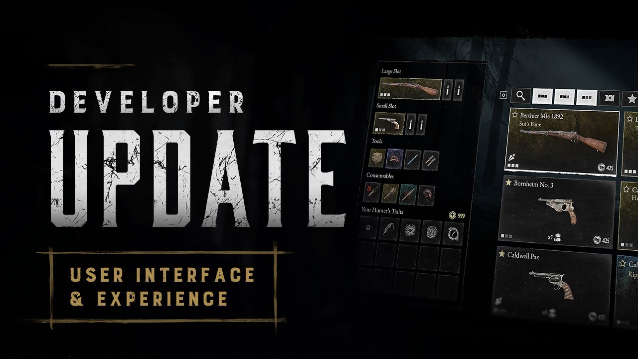
Hunters, we hear your concerns.
In our new Developer Update, we discuss changes and improvements coming to our new User Interface & Experience.
Get Hunt: Showdown 1896 on Steam: https://tinyurl.com/HuntSteamYouTube

Twitter: https://www.twitter.com/huntshowdown
Facebook: https://www.facebook.c...I'm going to stop playing the game. The framerate drop I have since the update doesn't make the game enjoyable at all.
visual forum
grim saddle
Statement from Crytek, finally:
https://www.youtube.com/watch?v=ovMwwccxMLM
"Finally" HAHAHAHAH
vocal merlin
everything is 25-30% more here even used since most people selling used have eggshells for brains
narrow wharf
If you can find an angry mom on facebook selling her kids rig you can get a hell of a steal and usually the gpu wont have any hardware bans
mint star
hybrid patrol
I bought my 1080TI on ebay lmfao, but yeah 100%, I buy just about everything use...
yeah, i refuse to dirctly give nvidia money especially after the 4090
and this is coming from a dumbass who bought a 2080ti for $900 in like 2018 or 2019
that was the last time lol
hybrid patrol
mint star
and this is coming from a dumbass who bought a 2080ti for $900 in like 2018 or 2...
You have my condolences
mint star
tbf it was an EVGA B stock
pearl ridge
Doesn't look that bad tbh.
mint star
RIP
hybrid patrol
mint star
and this is coming from a dumbass who bought a 2080ti for $900 in like 2018 or 2...
I built my wife a new PC literally one MONTH before the crash in GPU prices
shadow dagger
grim saddle
Statement from Crytek, finally:
https://www.youtube.com/watch?v=ovMwwccxMLM
Do we have a timeframe on when this is gonna be implemented. As the current state of the UI makes me wanna gouge my eyes out.
narrow wharf
Feelsgood
mint star
hybrid patrol
I built my wife a new PC literally one MONTH before the crash in GPU prices

hybrid patrol
granted she's on a 1060, so not exactly amazing specs, all she plays is the Sims 4 and Stardew lmfao
 queen jungle
Put Kda together with the other stats, no reason to have it on a separate tab
mint star
i should of scalped my 2080ti and my 6800, but i sold the 2080ti my brother for a helluva good deal, and sold my 6800 to my buddy exactly what I paid for it
and then used a 2070 for awhile then bought a 3070
shadow dagger
queen jungle
Put Kda together with the other stats, no reason to have it on a separate tab
They just need to make everything smaller by like 20% lol.
vocal merlin
grim saddle
Statement from Crytek, finally:
https://www.youtube.com/watch?v=ovMwwccxMLM
not gonna lie this looks really good
hybrid patrol
mint star
i should of scalped my 2080ti and my 6800, but i sold the 2080ti my brother for ...
There was a guy who was sort of on hard times so I donated my old 980 to him several years ago
Could have gotten $300 for it on ebay at the time but when I got it it was $90 so I couldn't do that in good conscience
grim saddle
shadow dagger
Do we have a timeframe on when this is gonna be implemented. As the current stat...
I dont't know, but in the Video it looks like they already redesigned the UI. I don't understand why they don't released it like that
shadow dagger
yeah, right!?!?
tardy sonnet
Play button at the top of the screen? I definitely don't have that.
Also, seeing my allies' loadout is an extra button to press in the game.
grim saddle
tardy sonnet
Play button at the top of the screen? I definitely don't have that.
Also, seeing...
Men it's a "coming soon" update
shadow dagger
The In-Game esc menu sucks balls too. Why is there a scroll bar for 4 ICONS?? and why does it cover my screen
mint star
facts lol
i mtelling you, someone on the UI dev team fucking hates list menus
they got rid of nearly every single one that was in the old UI
i'm surprised our options menus aren't in horizontal icons
narrow wharf
Its just so overwhelming bad i was coasting on hunters that already had loadouts last night. Also, putting server selection in settings is WILD
mint star
i am glad they finally added the ability to auto switch regions when joining a friend who is in adifferent region, although it broke last night lol
narrow wharf
mint star
they got rid of nearly every single one that was in the old UI
Its the cod-ification
shadow dagger
narrow wharf
Its the cod-ification
which is funny, because COD is moving away from that UI
narrow wharf
Was about to say, no they didnt lmao
Yeah i cant blame them
Its terrible and outdated itself quickly
There are timeless uis in the gaming industry and this style aint one of em
mint star
i miss server browsers in games like battlefield 😭
server browser > matchmaking all fuckin day
shadow dagger
There are SOME good parts of the UI, like the hunter recruit screen, and the Perk selection screen. but the rest of it needs some WORK
hybrid patrol
A buddy of mine just made a hilarious point
"The discord drama is more entertaining than the actual game at this point"
mint star
shadow dagger
There are SOME good parts of the UI, like the hunter recruit screen, and the Per...
i have to disagree
trait screen doesn't even grey out traits you can no longer afford with your available points
and also doesn't default to favorites
shadow dagger
mint star
trait screen doesn't even grey out traits you can no longer afford with your ava...
I also hate that, also that it resets.
However, for the most part, that screen is good
hybrid patrol
mint star
trait screen doesn't even grey out traits you can no longer afford with your ava...
Also the tiny gold triangle to show you when they're equipped
mint star
and everytime you restart the game you have to reset your filter options
tardy sonnet
shadow dagger
There are SOME good parts of the UI, like the hunter recruit screen, and the Per...
No, the good parts of the UI is the Quick Button Keys to access different areas.
hybrid patrol
I hate rows of Icons. Shits like Super Smash Bros Melee but a dozen times over
tiny pivot
mint star
i have to disagree
So do you want to just scroll endlessly through the traits like before ??
 modest timber
Anyone know how to tell which hunters have the daily bonus?
tiny pivot
The trait menu is one of the better changes in the UI, if not one of the best
shadow dagger
I think they need to make the top part smaller, to have them all on one screen, no scrolling
 covert yew
While I really respect the effort put in by the dev team, fsr implementation is one of the worse one I have ever seen. It should have to be useful considering the decreasing frame rate after new improvements.
mint star
tiny pivot
So do you want to just scroll endlessly through the traits like before ??
the old one actually saved the filter settings you set a single time. so yeah kinda
shadow dagger
They mentioned the filter saving in the video
Said "we're working on it" or some shit
mint star
god i hope so
tardy sonnet
The irritating part of the UI is how you select hunters. With the hunters not being displayed in a row format above and below each other, easy to access and overview your Hunters with your eyes.
shadow dagger
mint star
god i hope so
30 secs into the vid
I also wished they remembered how I want my hunters shown in the screen. Ihate the scroll, and like the Grid option, but it changes back every time i leave the screen. its awful
mint star
if they just reimplement list menus where appropriate, reduce the number of menus necessary (which some list menus will do IE weapons and tools) reduce redundancy menus (IE home page has BAttle pass and Store on the left and top of the screen). Make the home screen the bounty hunt menu, and have game mode selection on that same screen. and then implement filter memory. we'd be golden
 chrome oyster
tardy sonnet
The irritating part of the UI is how you select hunters. With the hunters not be...
chrome oyster
tardy sonnet
The irritating part of the UI is how you select hunters. With the hunters not be...
if you don't know you can press backspace and put the hunter overview into a grid. It helps a lot
hybrid patrol
I have a genuine question. Why do I need to scroll to see the entire team details page? This information should all be visible on one screen. There's no need for this.
 mint star
yea gridview is an improvmenet, but again, they dont' save the filter option so you have to do it every single time
chrome oyster
mint star
yea gridview is an improvmenet, but again, they dont' save the filter option so ...
yeah, they should change it to the default and/or remember you were using grid view
shadow dagger
hybrid patrol
I have a genuine question. Why do I need to scroll to see the entire team detail...
yeah, it looks fine, it's just too big.
mint star
oh yeat hats another improvement
reduce the size of the unimportan elements, like the hunter roster at the bottom, and increase the important info, your load out
shadow dagger
a lot of issues would be fixed if they made things like 20-40% smaller
mint star
even when you go to grid view it doesn't reduce the size of the screen that your roster takes up, even if you only have a single hunter in your roster
also add a equipment preview popup when you hover over hutners in your roster
and give us back double click item removal, right clicking, opening another menu, and clicking remove equipment is completely unnecessary
shadow dagger
mint star
and give us back double click item removal, right clicking, opening another menu...
I was legit writing the same thing just then lmao.
mint star
thats what irritates me the most man
shadow dagger
I used to right click to remove
tiny pivot
Does anyone know how spear got nerfed
shadow dagger
andnow it brings up the context menu?
mint star
nt only did they just make the UI so much mroe convoluted, they removed simple intuitive QOL features that we had for years
mint star
tiny pivot
Does anyone know how spear got nerfed
it costs $150 now
besides that, I believe the spear is exactly the same
shadow dagger
spear still feels super good to use
mint star
it's still by far the best melee option
the other melee tools either need a solid buff, or spear needs a bit of a nerf
the only true drawback of the spear is completely trivialized by conduit or stam shots
 plain yarrow
I bought the battle pass but i dont have it and it says to buy again and i know i had it
what happened
shadow dagger
plain yarrow
I bought the battle pass but i dont have it and it says to buy again and i know ...
I'd post that in here
https://discord.com/channels/350201607788429323/520548481782382602
 vestal steppe

 proven parrot
Make reconnection great again please!
 mint star
reconnection has been fucked for so long
 ruby comet
Make fixing amd shadows like a priority this is bullshit that I can't play the game b.c of this update
peak rain
I am grateful that they actually made an update about the Ui. That I did not expect
ruby comet
How did you not expect it they legit talk on it most of there videos
 next ember
@red ibex #game-ideas message
I wish just leaving feedback here would be enough. I don't know if you've only recently been checking out the feedback channels but people have been talking about very toxic issues for a while and they either took ages to fix them or never did.
Review bombing is a really shitty way of going about wanting change but it is also understandable. I won't partake it in but it does force Hunt to act much faster than they normally do. Hunt has a bad habit of releasing changes that very very few people have wanted (very simple ex: the new UI)
peak rain
ruby comet
How did you not expect it they legit talk on it most of there videos
Never been an update on Ui other than making the change.
Either way, I am happy
 potent umbra
if you arent on a card better than a 5500xt support probably isnt coming
ruby comet
They said there's a huge UI change with the new update and they have changed in the past barely but it's been touched I find It a lot more tedious then it use to be but they added a lot of futures to bad sadly some of us who use AMD can't enjoy much of the game other then look at the start up menus
red ibex
No it's not, just give constructive feedback on Discord and they will listen like they allways have
hybrid patrol
red ibex
No it's not, just give constructive feedback on Discord and they will listen lik...
"lol, lmao" said the scorpion
peak rain
Yea I wish AMD users could get their update fast enough.
next ember
red ibex
No it's not, just give constructive feedback on Discord and they will listen lik...
That doesn't work.
hybrid patrol
Like when 1.0 released and it took them the better part of four years to make the UI halfway decent-ish before then up and ruining it again?
next ember
Or the fact they haven't fixed reconnect (I'm pretty sure)
hybrid patrol
Pre-1.0 UI (and hunter grunting/melee/death noises) were excellent
ruby comet
Man I remember when this game first came out and it ran better then it does now tho and that was many year ago where you went in a line to find clue and randomly get head shot by a silence nagant pistol from 2000 m away across the maps
mint star
I remember the game not running very well way back in the day.
chrome oyster
the game runs great for the graphics it's putting out ... that's pretty much how it always goes unless a developer really screws up
1896 isn't making 4090s struggle to get 60 FPS
next ember
My PC is pretty beefy so I can't give much input here
ruby comet
Bro there servers where so bad when you started the match you randomly started firing just to see if others would to tell if people where in the game
red ibex
Almost everything a big part of the community asked for they deliverd. Rain, Shooting Range, Cain & Headman nerf etc
ruby comet
Where's my snow map
chrome oyster
red ibex
Almost everything a big part of the community asked for they deliverd. Rain, Sho...
not to mention the iteration after iteration on the weekly challenges and passes
ruby comet
Would rather had snow then fire
hybrid patrol
red ibex
Almost everything a big part of the community asked for they deliverd. Rain, Sho...
And what's the timeline on those changes? people were asking for rain in closed alpha days
next ember
red ibex
Almost everything a big part of the community asked for they deliverd. Rain, Sho...
Uh??? After how long? And what about the issues they are still yet to fix?
next ember
hybrid patrol
And what's the timeline on those changes? people were asking for rain in closed ...
exactly
chrome oyster
ruby comet
Where's my snow map
you're talking about the game not running well and you're asking for snow ... snow is really hard to render, the game would run even worse if this was a snow map ... almost guaranteed. Especially if you wanted the snow to have footprint tracking (which is extremely expensive)
hybrid patrol
"Fix the UI" was a complaint when the game released fiveish years ago FFS
ruby comet
I mean Oblivion did it fine
chrome oyster
ruby comet
I mean Oblivion did it fine
... the game from 2007?
 chrome oyster
🤦♂️
hybrid patrol
chrome oyster
... the game from 2007?
Imagine what future tech we'll get with Hunt 1896. Maybe player models that ragdoll on death! The far-future game called Halo 2 had that in 2003 lmfao