#hangar-contrib
1 messages · Page 1 of 1 (latest)
 primal cape
 noble fog
nope
 gloomy pewter
e
primal cape
it just magically appeared to me today 🪄

 lofty comet
RIP, gonna lose all my concept feedback
 cedar bramble
Hello papuzz
 outer kettle
On the upside you can gather more here 
 devout trail
Thanks discord for suggest this channel
 umbral pagoda
 lofty comet
outer kettle
On the upside you can gather more here <:fingerguns:508524663341842443>
lofty comet
outer kettle
On the upside you can gather more here <:fingerguns:508524663341842443>
That is hella true
Although technically still waiting on the "go ahead" to code the frontend xd
lofty comet
 lament rock
Wait hanger had a separate server
lament rock
Wait hanger had a separate server
For a while now
 fathom girder
this aged well  #hangar-dev message
 cloud root
A reminder that while this is a new channel, it is a contrib channel, so it's not for random conversation, shitposting, memes, etc etc etc.
 weary geyser
got it
cedar bramble
cloud root
A reminder that while this is a new channel, it *is* a contrib channel, so it's ...
Yes sir 🫡
 knotty verge
The issue with links that have a null URL (#859527399901626398 message) does not appear to be fixed. The following projects (and more) are affected:

Hangar
A place-and-break patch extension of JobsReborn - Download the Paper Plugin JobsReborn-PatchPlaceBreak by Djaytan on Hangar

Hangar
HealthHider allows you to hide the health of other entities, to prevent players from gaining an unfair advantage - Download the Paper Plugin HealthHider by Noah on Hangar

Hangar
MiniMessage Component-based Placeholders for Paper, Fabric, Sponge, Folia and Velocity platforms - Download the Paper Plugin MiniPlaceholders by MiniPlaceholders on Hangar

Hangar
Simple JumpPads plugin, optimized for the latest version of Paper, Pufferfish and Purpur - Download the Paper Plugin SimpleJumpPads by 4drian3d on Hangar
fathom girder
Is this only when using API? Or also in the frontend?
lofty comet
lofty comet
Although technically still waiting on the "go ahead" to code the frontend xd
Just resending this here for both further feedback and a potential "go ahead" of any hangar dev to turn this into actual code.


 outer kettle
I like almost everything there, just a few things:
- expanding the used horizontal space like that requires too much drastic eye movement (or at that point head movement); it can be a bit more than currently used, but in your screenshots it's too wide I think
- https://i.imgur.com/5ZS0HfI.png the release channel position looks off, I'd maybe move it to the left/right of the version (or separate that line from the text block again)... that might have been to keep it consistent with org/membership role tags (which I like better than before), but I don't think it works with the release channel. or maybe it's just that it's too round. tldr idk, just try a few things

- for pinned versions, version cards and project cards, the two "parts" shouldn't be separated by the background but more clearly connected
- the platforms look like clickable buttons https://i.imgur.com/WiL4UVc.png
- https://i.imgur.com/o4Dj2R2.png and co. might need some separation again, even if just a horizontal line


also, even without reducing width, the version list is too packed with stuff  that was for sure the hardest thing for me to do and my attempt still doesn't look good
Just thoughts (and prayers) though
fathom girder
i'd like to see the separation lines but i think it looks fine how it is.
lofty comet
outer kettle
I like almost everything there, just a few things:
- expanding the used horizont...
- Just to note, this is in a 1080p screen, depending on resolution, horizontal spacing would work similarly to how hangar currently works.
- I see what you mean and will try some other things later tomorrow.
- I might have an idea on how to fix that. Also something for tomorrow.
- The idea is kinda that they are. It would redirect to the respective page for that platform. Let me know how you feel about that.
- I am a bit confused by this one, what do you mean by co.?
lofty comet
outer kettle
also, even without reducing width, the version list is too packed with *stuff* <...
Yeah. Extremely hard to provide a bunch of info without overwhelming the user with it.
But the idea is to provide as much info as possible before the user even clicks on the project. Specially platforms
Design to code never is a 100% conversion, so I'd be curious how different it will look.
outer kettle
"respective page"? you mean the versions page with a pre-filter?
the last one was about the user and project headers
 coral violet
 knotty verge
fathom girder
Is this only when using API? Or also in the frontend?
knotty verge
fathom girder
Is this only when using API? Or also in the frontend?
According to the previous conversation I linked, the frontend filters null links but they shouldn’t exist in the first place
lofty comet
outer kettle
"respective page"? you mean the versions page with a pre-filter?
That could also be done and sounds way better but I mean linking the paper download page for ex.
lofty comet
outer kettle
the last one was about the user and project headers
Still a bit confused on what you separation you mean
outer kettle
The horizontal line below it
There’s no platform specific pages, the main page lets you see and download everything, so I don’t think they need to be buttons
lofty comet
outer kettle
The horizontal line below it
Actually so confused on what you mean, can you point it out? Aka draw
lofty comet
outer kettle
There’s no platform specific pages, the main page lets you see and download ever...
It would actually act as a display of the platform and platform versions supported when you hover it
So kinda good to be a call to action no?
If I put all that info in the card itself it's way too cluttered
 fathom girder
What if, instead of a button like we separate the platform card from the main and info card. Ie. One horizontal line above the platforms.
Just a thought tho
lofty comet
fathom girder
What if, instead of a button like we separate the platform card from the main an...
I will work on on some concepts to hopefully fix these concerns later today
lofty comet
now that I think of, what could be done is that those buttons when clicked, redirect you to the download of the respective platform for that project
 old lodge
The homepage cards seem a bit much? Is there any reason you need the separate card on the right hand side?
Some of that info could go in the line below the project, to keep the right side info cleaner
I don't really like the separate cards either, makes them look like they're not actually related to the project next to them
I feel like the supported platforms should be just icons
lofty comet
I will try to visualize all that, from there we can see
lofty comet
@old lodge @outer kettle thoughts on this?

 mental fern
I like the paper airplane logo on the right
Honestly, that's hella clean
I like it a lot
Though hwhy did you move the stars and downloads stats? I feel like stars at top and then downloads looks a bit better
Since the stars will usually be the smaller number
outer kettle
I think I like that
outer kettle
lofty comet
Actually so confused on what you mean, can you point it out? Aka draw
These two https://i.imgur.com/cWOwdyi.png https://i.imgur.com/NsHJn8B.png though they're different on the two pages current prod

 lofty comet
outer kettle
These two https://i.imgur.com/cWOwdyi.png https://i.imgur.com/NsHJn8B.png though...
lofty comet
outer kettle
These two https://i.imgur.com/cWOwdyi.png https://i.imgur.com/NsHJn8B.png though...
Okay, still confused on what the problem is... you want smt like that?
lofty comet
mental fern
Though hwhy did you move the stars and downloads stats? I feel like stars at top...
Could try changing that I guess. Also you speaking about what I initially posted or what I sent for kenny?
mental fern
lofty comet
Could try changing that I guess. Also you speaking about what I initially posted...
Only the screenshot you posted tagging kenny
I didn't pay much attention to the rest
fathom girder
i think downloads first looks better
 timid briar
lofty comet
<@145878422566993920> <@259465250716254210> thoughts on this?
timid briar
lofty comet
<@145878422566993920> <@259465250716254210> thoughts on this?
Maybe you care about my opinion as well
I like the design but the paper airplane logo looks off
You have left aligned text but centered logo
lofty comet
timid briar
Maybe you care about my opinion as well
I like the design but the paper airplan...
anyone's opinion is welcomed, I only pinged those 2 cause what I sent is a response to their feedback
regarding the alignment, I agree, but at the same time, aligned to left looks also a bit off
 wild needle
What about right aligned & move the icons for downloads / reviews / update time to the right of the text instead of left?
lofty comet
lofty comet
regarding the alignment, I agree, but at the same time, aligned to left looks al...
 lofty comet
wild needle
What about right aligned & move the icons for downloads / reviews / update time ...
lofty comet
wild needle
What about right aligned & move the icons for downloads / reviews / update time ...
good idea, will try
lofty comet
wild needle
What about right aligned & move the icons for downloads / reviews / update time ...

(ignore the weird spacing between stats and platform of the line)
fathom girder
lofty comet
imo downloads are the first thing I look for tbf
it was a response to this
 lofty comet
fathom girder
it was a response to this
lofty comet
fathom girder
it was a response to this
I know, and I was agreeing with you
fathom girder
alright
mental fern
fathom girder
it was a response to this
Darnit, I mispelled
I didn't even notice
I mean, you can keep it as downloads first, I am by no means someone you have to listen to. I just think that going from least-text to most-text makes sense. I just prefer it like that.
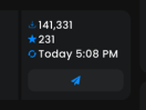
          231
      141,331
Today 5:08 PM
vs
      141,331
          231
Today 5:08 PM
It's really not a big difference, so I think it is fine
lofty comet
I personally see it as a hierachy of importance
and I find download count more important
either way, I think that is possibly the least of our problems as the main topic should be about the design, and if the latest fixes the issues mentioned by kenny mdcfe and _11
old lodge
lofty comet
<@145878422566993920> <@259465250716254210> thoughts on this?
The text on the right hand side being left aligned + the Paper logo in the middle of that space makes the whole side bit look a bit... lost? Like it's just floating somewhere
Overall looks like a pretty good improvement over the current layout still 🙂
lofty comet
old lodge
The text on the right hand side being left aligned + the Paper logo in the middl...
uh check what I sent after
old lodge
Yeah was replying to the ping, that looks better I think
I'm still not 100% sold on the platform list being there exactly but I can't really think of anything better
lofty comet
(no idea where I'd put price of a plugin with this layout, for whenever those get added but that is a problem for later)
lofty comet
old lodge
I'm still not 100% sold on the platform list being there exactly but I can't rea...
"there" being where exactly?
centered in a list format?
(which btw, not done but you can just change it to grid)
old lodge
As in the platform icons on the card
lofty comet
AH
yeah I am not sold either
problem is where would you put them
without putting too much info in a single place
old lodge
Maybe to the left of the category? Could wrap them in a pill per platform (but then that's going back towards Kenny's concern about them looking like buttons)
lofty comet
not if they are like the channel labels?

something like this?
that looks somewhat less bad
and having it written also means that those who don't recognize the logo can clearly see the platform
lofty comet
lofty comet
not sure if putting them near the category/addons is a good idea
feels a bit of an overload on info in a single line
mental fern
lofty comet
Idk, I liked the paper airplane icon more
fathom girder
Either really
lofty comet
mental fern
Idk, I liked the paper airplane icon more
What if I do both? Xd
timid briar
That part represents the platforms right?
If so I would suggest adding a folia icon as well
I like the leaf next to the category but I don't think users really know what that means
I got asked multiple times whether some of my plugins have folia support because they can't find anything on my hangar page about it
lofty comet
So ypu mean adding folia as a platform itself?
timid briar
Yes
Some plugins might have extra builds for folia
For example fawe or luckperms
Or even spark
They can't just set folia support to true in general because people will complain that it doesn't work
Adding it as a platform would solve that and enable them to publish releases specifically for it
timid briar
Yes agreed
lofty comet
I will just implement it as if it were supported on the backend
lofty comet
thoughts?
 outer kettle
Looks nice
lofty comet
outer kettle
These two https://i.imgur.com/cWOwdyi.png https://i.imgur.com/NsHJn8B.png though...
Still confused about this btw
lofty comet
r
outer kettle
oh my god
lofty comet
what's up with it?
outer kettle
It's not in your screenshots
lofty comet
well, intended
outer kettle
yes and I asked if it doesn't look too floaty atm
lofty comet
ah
imo it doesn't....
IMO
kinda the trend anyways
the divisor is kinda old school type stuff
xD
fathom girder
yeah it looks fine
outer kettle
alright that's fine then
lofty comet
guess the only thing needing fixing is the version channel label and then MAYBE I get the "go ahead"?
outer kettle
As far as I'm concerned you can start already  and that can be figured out pretty easily during/after
lofty comet
outer kettle
As far as I'm concerned you can start already <:pray:1090503570610212994> and th...
tbf was mainly looking for assurance, as I'd hate to put time into something that might not even be considered for starters
(if that makes sense)
outer kettle
just the version card needs to be figured out since it's pretty packed full for what will likely be less width
yeah makes sense, sorry it took so long
timid briar
lofty comet
thoughts?
that looks way better imo
how would it look like with velocity and waterfall as well
lofty comet
timid briar
how would it look like with velocity and waterfall as well
something like this?
 lofty comet
outer kettle
yeah makes sense, sorry it took so long
lofty comet
outer kettle
yeah makes sense, sorry it took so long
nha all good, in that case, I just need to setup the whole project in my laptop... this is where I will need docker and hope my 16gb ram is enough xD
although regarding frontend framework, rn it is using vue if I am not mistaken, is the plan to continue with vue? if so, should it be updated or what?
I have limited experience with vue, but if it's just doing the UI I most likely would have no issues
fathom girder
lofty comet
nha all good, in that case, I just need to setup the whole project in my laptop....
lofty comet
fathom girder
https://canary.discord.com/channels/289587909051416579/555469074080202765/135244...
well the statement is still correct
I don't personally use it
but apparently this new professor wants us to use it
soooo
rip
worst case I will just remote ssh into my desktop at home xD
timid briar
lofty comet
something like this?
Wow that's bad
How would it look with a line break after the second label
lofty comet
timid briar
Wow that's bad
How would it look with a line break after the second label
so expanding the existing line? fy I didn't find it that bad
fathom girder
lofty comet
but apparently this new professor wants us to use it
#general message unfortunate
lofty comet
(PS ignore the colors of the lab)
fathom girder
lofty comet
something like this?
nah i like it
lofty comet
fathom girder
https://canary.discord.com/channels/289587909051416579/555469074080202765/135244...
well funny thing is, they don't TEACH IT
they teach unix and git
fathom girder
"wow thats bad" is kinda crazy
timid briar
lofty comet
so expanding the existing line? fy I didn't find it that bad
Or make it expand?
Like adding a +x badge and make it expand when clicking
timid briar
When clicking on send I realized how bad that would be
fathom girder
i dont think thats needed
timid briar
lofty comet
that sounds a nightmare UX wise
Yes 100% ignore everything I just said xD
lofty comet
either way these things can be changed later
lofty comet
lofty comet
although regarding frontend framework, rn it is using vue if I am not mistaken, ...
since I kinda got the "go ahead", this and below is now the main concern
(we should totally not take the chance and rewrite it in svelte)
(this is totally not a biased opinion)
fathom girder
eh idk
this is generally a maintainability thing
i think @jovial lintel is in charge of hangar so he has a word in this.
lofty comet
outer kettle
I don't think there's plans to switch frameworks atm
either way, if not, then should it be updated? (I am saying this without knowing if it is already in latest)
fathom girder
i mean its going to be a complete rewrite no? So probably not a bad idea
not complete but significant
lofty comet
like 95% xD
outer kettle
I have no clue about vueuse 13, that might be a mini question
it's currently on a recent 12.x
lofty comet
I have no clue about Vue 13 in general, but I'd assume I can learn the basics and figure it out looking at existing code. Since I am only doing the frontend, it should be just fine
either way, guess I will have to wait for mini
 upbeat ibex
Vue is strange
outer kettle
ur strange
upbeat ibex
Fun but strange
upbeat ibex
outer kettle
ur strange
Just rude.
lofty comet
I guess I shall set up hangar in local (I hope mini already made it less tedious to do this) in my laptop and start working on it
timid briar
I'd be in favor of rewriting the entire Internet to not be js centered
lofty comet
I'd be in favor of using html and css purely
but yk
not the best idea
lets do it in kotlin?!!!!
upbeat ibex
lofty comet
lets do it in kotlin?!!!!
Oh god no
timid briar
Let's move to something more modern like go
And not add backwards compatibility but also force every browser to accept the new Standart while not supporting HTML and js anymore
lofty comet
write the backend in ktor
fathom girder
no?
fathom girder
this is not something to be sarcastic about
lofty comet
kotlin is cool
fathom girder
ktor xD
lofty comet
shush
fathom girder
bruh
lofty comet
tell me one thing that jetbrains made that sucks
lofty comet
true
fathom girder
dont want to make mods mad
lofty comet
anyways
lofty comet
fathom girder
dont want to make mods mad
true
I know mbax is watching us
he is the Paper police I swear
lofty comet
lofty comet
I guess I shall set up hangar in local (I hope mini already made it less tedious...
So, I guess I will do this tmr or on the weekend
wonder if I can bring the setup from my desktop to the laptop without much issues
I hated setting up hangar on local
 celest remnant
Is this cors configuration correct?
According to Spring's docs: https://docs.spring.io/spring-security/reference/servlet/integrations/cors.html
We need to provide a UrlBasedCorsConfigurationSource bean, but we're providing a CorsFilter bean. HttpSecurity#cors(AbstractHttpConfigurer::withDefaults) will use the UrlBasedCorsConfigurationSource if provided, otherwise deferring to Spring MVC's cors configuration.
I'm not sure if this cors configuration is actually being used.
I'm asking because I'm running into a cors error about a disallowed origin both from localhost and 127.0.0.1 while working on the papermc website Astro migration.
I can submit a PR to fix this, but let me know if I'm not correct about this.
Just in case it's correct: https://github.com/HangarMC/Hangar/pull/1464
If not just close the PR.
celest remnant
I'm leaning more toward this being correct and the reason it hasn't surfaced sooner is that the calls to the API from the website are happening serverside during ISR or from non-browser applications.
 jovial lintel
knotty verge
The issue with links that have a null URL (https://discord.com/channels/85512341...
jovial lintel
knotty verge
The issue with links that have a null URL (https://discord.com/channels/85512341...
urg, wtf
I cant find a way to actually create that stuff like that tho, its properly validated in the backend
maybe my cleanup just wasnt proper?
lol on staging there are 8.3k links with url null
in prod 59 projects are affected it seems
WITH rows_with_null_urls AS (
    SELECT
        created_at,
        name,
        id,
        links,
        (SELECT
             jsonb_agg(
                     jsonb_build_object(
                             'id', top_level_element->'id',
                             'type', top_level_element->'type',
                             'title', top_level_element->'title',
                             'links', (
                                 SELECT jsonb_agg(link)
                                 FROM jsonb_array_elements(top_level_element->'links') AS link
                                 WHERE link->>'url' IS NOT NULL
                             )
                     )
             )
         FROM
             jsonb_array_elements(links) AS top_level_element
        ) AS filtered_links
    FROM
        projects
    WHERE
        links @> '[{"links":[{"url":null}]}]'
)
UPDATE projects p
SET links = r.filtered_links
FROM rows_with_null_urls r
WHERE p.id = r.id;
in case I ever need to do that again
jovial lintel
outer kettle
I don't think there's plans to switch frameworks atm
yeah, no plans and no need, nuxt hasnt been an issue
jovial lintel
lofty comet
I guess I shall set up hangar in local (I hope mini already made it less tedious...
a bit I guess? docs should be updated and theres an onboarding page that allows you to create an admin account and some fake projects
also, @lofty comet, do you have a figma or something I could look over, stuff seems really nice in general, so good enough to start for sure, but the screenshots above had a few things I would comment about but idk if its still up to date
and sorry I have been so absent
lofty comet
jovial lintel
also, <@310721759110496257>, do you have a figma or something I could look over,...
pretty sure I had sent it before in hangar's discord but yes: https://www.figma.com/design/inDJlJzBn4odRfD8ym53e3/Hangar-Concept?node-id=0-1&t=uyw1GFFJop3saxd3-1
lofty comet
jovial lintel
and sorry I have been so absent
also, no worries, I have been absent myself with the uni precourse this week and getting adapted to saarbrucken
lofty comet
jovial lintel
a bit I guess? docs should be updated and theres an onboarding page that allows ...
wait.. I am gonna need to do the frontend on intellij? 💀
why can't frontend be standalone 😭
jovial lintel
it is
lofty comet
jovial lintel
it is
wait wut I can edit all frontend pages standalone?
isn't that a bit harder to test since I can't have dummy data, etc.
fathom girder
i mean webstorm is just a striped down version of intelliJ
besides you should be able to just,,,,, open the frontend folder in webstorm
and the backend one in intelliJ
jovial lintel
oh you mean without starting the backend
npm run devStaging
then it uses the staging server as backend
here my nitpicks:
- this should be aligned https://i.imgur.com/jAjDCEM.png and I think the release badge looks kinda odd there, maybe inline with the version name? like its not aligned to anything text wise, I think thats mostly tripping me
- the version list in general is super condensed and can prolly use a bit more breathing room
- on the home page keep the h1 and text, its important for seo, else google kinda considers the page empty
- this part looks a bit weird, like the platform versions look strange alignment wise to the button, the button I think would make more sense at the end maybe? icons to text margin should be a bit bigger https://i.imgur.com/MGVAY7M.png
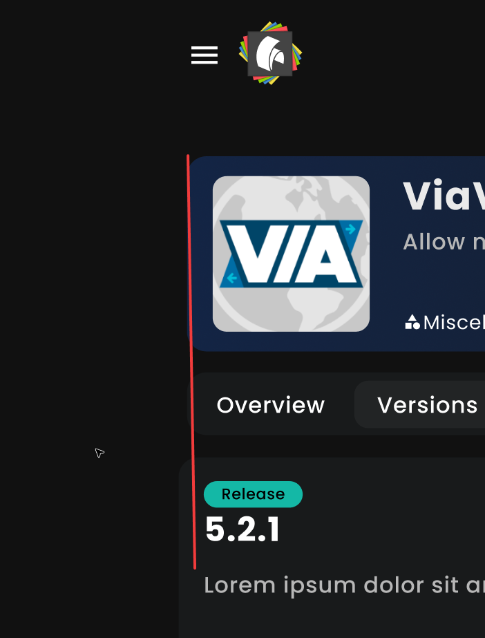
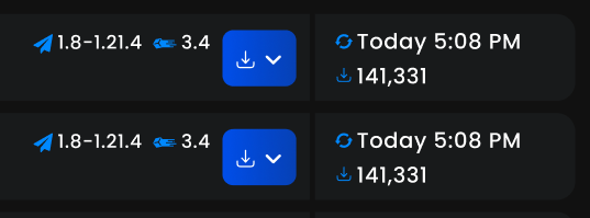
overall looks really nice
lofty comet
jovial lintel
then it uses the staging server as backend
oh wth how am I only finding this out now
lofty comet
jovial lintel
here my nitpicks:
* this should be aligned https://i.imgur.com/jAjDCEM.png and I...
- was probs a misclick lol
- yes, kenny said the same and will try to do some iterations on it.
- I agree there needs to be a header.
- I will try to make it look similar to the newer project cards I sent here.
lofty comet
jovial lintel
npm run devStaging
do I run this while in the frontend dir? does it require anything installed?
actually take that back
gotta install nuxt it appears
jovial lintel
pnpm i before of course and yes, frontend dir
jovial lintel
lol
lofty comet
so since I am using backend from staging
how would I have access/test admin pages?
I assume I need an admin account in staging? xD
jovial lintel
meh
lofty comet
lofty comet
rip my hotspot xD
4 days into the month, I have used 17gb of my mobile data lmao
jovial lintel
we can worry about that later, get familiar with stuff first
lofty comet
only getting wifi installed in saarbrucken next week
lofty comet
jovial lintel
we can worry about that later, get familiar with stuff first
yup, that's the plan, hopefully tomorrow I will be able to start working a bit on it.
Thanks for the help and THANK GOD for that command
setting up the backend is no fun
jovial lintel
its just two clicks, the run configs are commited
(also, all of this is documented in the readme)
lofty comet
jovial lintel
its just two clicks, the run configs are commited
oh so IT IS easier now
last time I set it up, I had nightmares
either way, good thing I can just run it without the backend anyways
better for the limited ram I have to not have to run docker
xd
Wait, by using the staging backend, does that mean I can't login on local?
jovial lintel
lofty comet
oh so IT IS easier now
Idk, always was. Only change is the onboarding page
jovial lintel
lofty comet
Wait, by using the staging backend, does that mean I can't login on local?
It should work with your staging account
lofty comet
jovial lintel
It should work with your staging account
uh clicking on login does nothing
even with my staging credentials
ah wait
might know why
1s
jovial lintel
Guess it's the cors thing simple ran into? Idk
jovial lintel
@lofty comet I think we can do the project search a bit nicer. I am cooking something up that will give us stats about search facets


just something to keep in mind
it will also enable a license filter
lofty comet
jovial lintel
what exactly am I looking at?
lofty comet
jovial lintel
<@310721759110496257> I think we can do the project search a bit nicer. I am coo...
also, huge W
I am kinda still trying to figure out how Vue works xD
and how the project is structured
it might be somewhat easier to just modify existing things than trying to rewrite everything....
cause rewriting everything in vue would be quite a hassle for me, since I only worked a tad bit with vue before
not at this level
jovial lintel
lofty comet
what exactly am I looking at?
The example page for meili search, lol
But I am just saying that we have those numbers now, like for hangar how many plugins in the chat category
jovial lintel
lofty comet
it might be somewhat easier to just modify existing things than trying to rewrit...
Oh yeah for sure, you don't wanna touch logic and design at once
We have a few design components factored out, maybe that's a good place to start and potentially refactor more design stuff away from the logic
lofty comet
jovial lintel
But I am just saying that we have those numbers now, like for hangar how many pl...
oh ok
lofty comet
jovial lintel
We have a few design components factored out, maybe that's a good place to start...
yeah I am starting out with main things like the project card, etc.
Also, any issues if I add poppins to the fonts?
I'd still maintain apple ones
like font-family: -apple-system, BlinkMacSystemFont, "Poppins", "Segoe UI", "Oxygen", "Ubuntu", "Cantarell", "Fira Sans", "Droid Sans", "Helvetica Neue", sans-serif;
jovial lintel
Normally you sort your custom fonts first and then fall back to system fonts
lofty comet
jovial lintel
Normally you sort your custom fonts first and then fall back to system fonts
tbh yeah but I have 0 knowledge about apple fonts so no idea if that was a priority or not
jovial lintel
Most likely just a font stack I copied from somewhere
lofty comet
ah shit platforms of projects are not provided currently
so that's something that would need to be added I guess
bunch of other stuff I can't test due to it being hidden for admins
was only able to update this today lmao this is gonna take way longer than I expected, I had no hate for vue but now I might do xD

Let me rewrite this in svelte 🥺
lofty comet
thoughts on this hover?
 timid briar
Very sexy
fathom girder
lofty comet
was only able to update this today lmao this is gonna take way longer than I ex...
is it really that bad?
mental fern
lofty comet
thoughts on this hover?
Whoah, sick
jovial lintel
lofty comet
so that's something that would need to be added I guess
That's happening rn on the meili branch
Versions too
lofty comet
Oh okok
lofty comet
fathom girder
is it really that bad?
For me, yes, since I have only messed around with vue like once or twice for very simple things, hangar is much more complex so I need to get used to a whole new framework
I am way too used to the simplicity of svelte xd
jovial lintel
vue and svelte code look basically the same, no?
just that the templating syntax is inlined to the html tags, the rest is basically the same
lofty comet
jovial lintel
just that the templating syntax is inlined to the html tags, the rest is basical...
I personally see a big difference after working with both
Or maybe the code base is simply a mess xd
Still haven't understood how props work but oh welp
I have time to learn those
jovial lintel
let { adjective }: { adjective: string } = $props(); becomes const { adjective } = defineProps<{ adjective: string }>();
jovial lintel
man, this meili refactor is getting bigger and bigger 😄
and I still have so many todos
but hopefully it will a) improve speed and b) improve quality of search
 lofty comet
doing the new filters is gonna be either exciting or a pain xD
jovial lintel
nice
lofty comet
how shall I fix this xD

tbf shouldn't there exist a filter to only accept "normal" letters?
yeah it all works perfectly fine IF these characters simply get blocked... is that a possibility @jovial lintel ?
so, only allowing ascii characters
jovial lintel
Yeah, open an issue pls
fathom girder
Ascii?
lofty comet
fathom girder
Ascii?
yes?
fathom girder
What about äöü?
lofty comet
fathom girder
What about äöü?
either an exception for those is added, or idk
although who would use those?
it's not a german website
lofty comet
fair
jovial lintel
Idk if a white or black list is easier
lofty comet
might
I am still trying to figure out how these characters specifically break the UI
they seem to have weird spacing
which somewhat allows them to override limits of the ui lol
almost there lmao but yeah these characters break consistancy a lot

fixed it, but at what cost xD

didn't know project names could be so big tbf
lol
jovial lintel
Idk if they still can
lofty comet
hm ok
welp for the filters, I might have to use buttons and handle selection, etc. myself
instead of using radio buttons for ex.
(it's way easier to design them like this)
but I will probably do the design first and only wonder about functionality after
jovial lintel
We should stick to semantic html for accessibility reasons
lofty comet
jovial lintel
We should stick to semantic html for accessibility reasons
that makes things at least 8x harder sadly xD
achieving these types of filters with semantic is a bit harder

but I will do my best
actually could use "hidden peer" classes
maybe that works
jovial lintel
If you do appearance: none on radios you can do whatever, no?
Plus an :after for the tick maybe
Don't worry too much about utility classes if writing plain scss is easier
lofty comet
jovial lintel
If you do appearance: none on radios you can do whatever, no?
technically yes, but will try around
actually, the inputradio component already disables the appearance xD
question now is, should platform be single choice or multi?
cause I am pretty sure multi choice isn't handled by the backend yet I assume
jovial lintel
Should be
lofty comet
jovial lintel
Should be
should be = ?
lofty comet
jovial lintel
Backend should support filtering for multiple platforms
so, I could in theory just switch the single choice to multi choice without touching anything else?
jovial lintel
Ye, frontend just needs to add the query param twice
lofty comet
jovial lintel
Ye, frontend just needs to add the query param twice
I... will wonder how to do that tomorrow xD
meanwhile wondering if this border is any good

it could make it look a bit less like modrinth
I actually have some other ideas in that sense
lofty comet
lofty comet
I actually have some other ideas in that sense
something like this maybe?
 jovial lintel


ok so at least platform search works
platform version will be more fun
also, I think ill include the main page content in the search, so it can be better
man why is the hangar db design so dum
why do we have a project_home_pages that has project_id and page_id as FK
and not just a boolean in project_pages....
jovial lintel
jovial lintel
platform version will be more fun
actually not much worse
 lofty comet
something like this maybe?
lofty comet
lofty comet
something like this maybe?
ended up not doing much today, probs not tmr either since going back to saarbrucken, just a fy
jovial lintel
No worries, your branch needs to wait on mine anyways
lofty comet
true
jovial lintel
jovial lintel
why do we have a project_home_pages that has project_id and page_id as FK
fixed
jovial lintel
jovial lintel
also, I think ill include the main page content in the search, so it can be bett...
done

will be interesting to see the impact of that on the prod search
smol todo list for myself
- do full updates as index switch
- remove versions from index
- get rid of version view
- figure out date format issue
- think about if we want to handle hidden projects/versions
- project members in index (for user profile page)
- automated testing
- manual testing of migrations
- deployment/config stuff
- consider exposing facet stuff (later)
- go over all todos in code
thhhaaat is more than I expected
the branch already touches 114 files :/
lofty comet
I won't even try to do a todo list lmao
Mine is just straight editing all ui files
xD
that reminds me I was editing stuff on the main branch of my fork
idk if that is a good idea
lofty comet
yeah will fix it this weekend
forgot to put the stuff in my laptop
so, do not have the files in saarbrucken xD
Can I divert changes to the main branch to a new one?
(I havent commited yet)
jovial lintel
Sure, just git switch -c dum
jovial lintel
jovial lintel
smol todo list for myself
* do full updates as index switch
* remove versions fr...
moved to pr desc https://github.com/HangarMC/Hangar/pull/1457
lofty comet
why are writing commit messages so hard
lmao
tf do I write xD

swear gonna do a commit per page at this point
jovial lintel
💤
 jovial lintel
its copilot if that wasnt obvious from the logo
lofty comet
jovial lintel
its copilot if that wasnt obvious from the logo
yeye, but that button was not showing
turns out I had to update webstorm
xd
shall I already open a PR draft?
or not worth it?
jovial lintel
sure
lofty comet
with or without border?

 outer kettle
I like with
jovial lintel
ye
lofty comet
gonna use with then
might make a more unique design due to it too
wouldn't follow the trend too much
jovial lintel
I find it helps with contrast
lofty comet
yeah
timid briar
lofty comet
with or without border?
probably just my color incompetence... buuuut what is the difference?
jovial lintel
the project card has a 1px light grey border
timid briar
ohhh i see it now
i only looked at the color gradient
i must say i like it better without the border
lofty comet
I like both personally
timid briar
yeah its not bad
lofty comet
on another note, somehow, whenever I decide I will work on hangar, something comes up and I end up changing only a color lol
redesign gonna be ready in 2029
timid briar
lofty comet
redesign gonna be ready in 2029
didn't you move to germany recently?
might be related
lofty comet
timid briar
didn't you move to germany recently?
might be related
For uni yeah xd
Although coming to luxembourg every weekend
It's 1h with the bus
It's a very weord coincidence
jovial lintel
ayyy only 3 test failures on the backend tests now that I added a meili test container
that is less than on staging branch, lmao
there 6 (different) ones fails
the 3 on the meili branch are ok too, one is just ordering and the two others are related to hidden stuff which is the last todo
 uneven vergeBOT
(6802b7591df977252a68f763) // @winged tinsel (@ruba_34539 / 1158066518911889438) has been banned by @jovial lintel (134340832093405184)
Reason: steam scam
lofty comet
jovial lintel
ayyy only 3 test failures on the backend tests now that I added a meili test con...
meanwhile, my progress:
jovial lintel
I thiiink I am feature complete
at least for what I wanted to do initially
faceted search can come later
guess ill look over the migrations one last time and then deploy to staging and see how it goes
does somebody wanna review this? lmao https://github.com/HangarMC/Hangar/pull/1457
haha lets ask copilot
lofty comet
lmao
jovial lintel
lets see how bad it breaks
jovial lintel
celest remnant
Is this cors configuration correct?
https://github.com/HangarMC/Hangar/blob/sta...
finally had a chance to take a look and you are right
this wasnt actually written for the website but for the old auth mechanism accordion to git blame, so it was never noticed that it broke (it must have worked at some point)
however, it seems like your fix doesn't work either?
will investigate more closely in a bit
ok its just the path matching that broke
also, didnt know this was a thing, lol
Access to fetch at 'http://localhost:8080/api/v1/staff?limit=25&offset=0&sort=roles' from origin 'https://papermc.io' has been blocked by CORS policy: Response to preflight request doesn't pass access control check: No 'Access-Control-Allow-Private-Network' header was present in the preflight response for this private network request targeting the
localaddress space.
jovial lintel
java.lang.IllegalArgumentException: When allowPrivateNetwork is true, allowedOrigins cannot contain the special value "*" as it is not recommended from a security perspective. To allow private network access to a set of origins, list them explicitly or consider using "allowedOriginPatterns" instead.
oh come on spring
guess we will ignore private network
jovial lintel
celest remnant
Lmk if you need me to fix the PR
fixed it myself
celest remnant
Meaning it won’t allow localhost?
jovial lintel
ye
well, no, other way around
prod website cant access localhost hangar
localhost website can access prod hangar (once deployed, idk if that will be today, need to do a bunch of testing on the new meili stuff that just landed on staging)
celest remnant
My usecase was localhost website accessing localhost hangar api
Wait jk localhost website accessing prod hangar ignore me
Brain slushy rn
jovial lintel
localhost:3000 accessing localhost:8080 will most likely be fine too
celest remnant
Yea
 celest remnant
Perfect
jovial lintel
now if only staging would actually deploy
fucking helm being lazy
Message: Helm upgrade failed for release hangar-staging/hangar with chart hangar@0.0.1+9e621ba2d2f1: template: hangar/templates/secret-hangar-backend.yaml:104:24: executing "hangar/templates/secret-hangar-backend.yaml" at <.Values.backend.config.meiliSearch.url>: nil pointer evaluating interface {}.url
ahhh
there we go

ok cool I broke flyway
for referenece, delete mentions of 05 stats und 06 from schema history
wat

why
timid briar
jovial lintel
> Message: Helm upgrade failed for release hangar-staging/hangar with cha...
The biggest war crime in the history of life itself is using Nil instead of null
lofty comet
lmao
jovial lintel
Just go things
Idk why the "cloud" world decided Google's toy language is what we all should use
 grand goblet
jovial lintel
Idk why the "cloud" world decided Google's toy language is what we all should us...
grand goblet
jovial lintel
Idk why the "cloud" world decided Google's toy language is what we all should us...
Because it is multi
 celest remnant
jovial lintel
Idk why the "cloud" world decided Google's toy language is what we all should us...
celest remnant
jovial lintel
Idk why the "cloud" world decided Google's toy language is what we all should us...
Lol. My company’s customer facing gateway is written in Go and, I’ll gladly say I barely know the language but…that code is nasty, man.
lofty comet
jovial lintel
fuck the search on the homepage is fast tho
Is it on staging?
jovial lintel
Yes
lofty comet
Holy fast search xd
Do results in the homepage already include platforms and versioning?
And whatever other info I need?
jovial lintel
Should, ye
Look at the console
Kinda sad that I can't see the improvements in the field data since something that I did makes sentry oom, lol
 flat cape
jovial lintel
fuck the search on the homepage is fast tho
flat cape
jovial lintel
fuck the search on the homepage is fast tho
meilisearch go brrr
jovial lintel
Who could have known that a proper search engine is better than my cursed postgres queries
Will see later if I can find time to migrate prod
Altho loosing sentry sucks
I did somehow manage to replicate the memory leak locally but IJ refused to take a heap dump
timid briar
jovial lintel
Who could have known that a proper search engine is better than my cursed postgr...
now the flashing just has to go and it is perfect
jovial lintel
Yeah, normally you only show a loader after X ms
But all the data fetching is so cursed rn anyways
I think I wanna migrate it to a library instead of the shit I created
Something like Pina colada or something, haven't thought too much about it
lofty comet
timid briar
now the flashing just has to go and it is perfect
tbf there is probably an animation you can do when elements change
best would be to keep elements already shown and add the "new" ones and animate that
so the list feels smooth
no idea how I'd do that in vue
I am already suffering enough with the redesign
lofty comet
I was gonna work on hangar today.... but... got assignments to do 😭
timid briar
Let's try to Fix pnpm
Yeah nvm fuck it instead
Average pnpm experience
 jovial lintel
GitHub
Hey guys, I want to be clear here. We've identified that we're using 9.0.2 to both generate the lock file and we're also using 9.0.2 in the Docker image. This is still an ongoing issue....
timid briar
Should have just reinvented the wheel and made yet another package manager
jovial lintel
lets see

{"timestamp":"2025-04-23T06:49:40.023Z","level":"INFO","thread":"main","logger":"org.flywaydb.core.internal.command.DbMigrate","message":"Successfully applied 8 migrations to schema "hangar", now at version v1.19.1 (execution time 01:20.254s)","context":"default"}
ayy
it seemed to have worked?
meili is in prod \o/
and its fast
jovial lintel
lofty comet
Do results in the homepage already include platforms and versioning?

all there
lofty comet
Big W
outer kettle
That's why I have a separate project just for that lol
jovial lintel
maybe I should build a github action for updating master
outer kettle
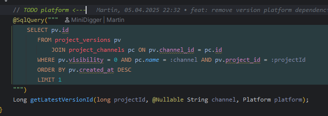
Nice todo mini https://i.imgur.com/4LGtjTq.png
 jovial lintel
Oh shit
outer kettle
are you available to fix it? because idk
download buttons are hard broken because of that
outer kettle
fixed, will push to master shortly
outer kettle
creating projects also doesn't actually let you open the new page without errors until something happens/is updated, same for versions I think
jovial lintel
Ah right I have an idea for that
Fwiw that platform param should have been an @EnumByOrdinal annotation
outer kettle
Yeah I’m too washed to remember what it was
lofty comet
Me when I get home: Gotta merge these changes before I do anything
jovial lintel
outer kettle
creating projects also doesn't actually let you open the new page without errors...
its the home projects view
quite frankly, all the materialized views suck, its ok for stats because that doesn't need to be up to date, but other stuff shouldn't use one, else we just end up refreshing it all the time, causing more load than needed
but that method is a fucking mess anyways, maybe it can be my weekend project
I did magic recursive json wizardry in postgres queries at work today, how much worse can a query for getHangarProject possibly be
lofty comet
OKAY
Today, me gonna work a bit on hangar
I hope
Otherwise tomorrow? Maybe..
I became a german way too fast
jovial lintel
Lol
jovial lintel
we actually have shields.io integration nowadays, what would be a good way to promote that on hangar? https://github.com/HangarMC/Hangar/issues/294
GitHub
I think it would be a good idea to make use of the API and make badges. Spigotmc and ore already have badges on shields.io called spiget and ore. I think this would be a nice feature to add for han...
@lofty comet fyi, I am going thru issues and whatever will hopefully/most likely be fixed by the new frontend I link to your PR, so we have a nice check list of stuff to check
lofty comet
jovial lintel
<@310721759110496257> fyi, I am going thru issues and whatever will hopefully/mo...
that sounds nice, send them over!
lofty comet
jovial lintel
we actually have shields.io integration nowadays, what would be a good way to pr...
not sure on the impact it would have
jovial lintel
well, "promote", more like convenience
as an example, github does this

I guess we could have it in the project side bar or something
maybe a badges tab in settings?
lofty comet
yeah
a way to "generate" badges easily would be nice
was gonna say resource banners
but https://mcbanners.com/ already exists
and supports Hangar
(think it even uses my api wrapper lol, which I wonder if it still works)
 hasty pecan
then people can include that on other platforms and "promote" with that
jovial lintel
lofty comet
but https://mcbanners.com/ already exists
thats a weird platform
why do they not have url params?
oh its glares thing
they have
mcbanners (+ configurable style)
https://api.mcbanners.com/banner/author/hangar/ViaVersion/banner.png
https://api.mcbanners.com/banner/resource/hangar/ViaVersion/banner.png
shields.io (+ configurable style)
https://img.shields.io/hangar/dt/ViaVersion?link=https%3A%2F%2Fhangar.papermc.io%2FViaVersion%2FViaVersion
https://img.shields.io/hangar/stars/ViaVersion?link=https%3A%2F%2Fhangar.papermc.io%2FViaVersion%2FViaVersion
https://img.shields.io/hangar/views/ViaVersion?link=https%3A%2F%2Fhangar.papermc.io%2FViaVersion%2FViaVersion
https://img.shields.io/hangar/watchers/ViaVersion?link=https%3A%2F%2Fhangar.papermc.io%2FViaVersion%2FViaVersion
anything I am missing?

 jovial lintel
soon coming to a hangar near you

 outer kettle
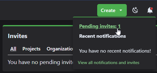 jovial lintel
Is that wrong?
outer kettle
Well there is no invite
fathom girder
I think he is lying
timid briar
did hangar just reach exactly 1000 projects?
lofty comet
jovial lintel
soon coming to a hangar near you
bro is giving me more work 😭
lofty comet
jovial lintel
soon coming to a hangar near you
wait does mcbanners have an api or how you getting those?
jovial lintel
timid briar
did hangar just reach exactly 1000 projects?
No it's more, it's on my list to fix, that message isnt total absolute project, it's the total of your search query, which is limited to 1000 (and affected by your filters)
timid briar
ahh
jovial lintel
outer kettle
Well there is no invite
mfw

time to fix the query
meh, can't concentrate, will have to wait
GitHub
Is your feature request related to a problem? In some cases, it would be nice to be able to specify a specific colour for a release channel. For example, if you have a particularly unstable channel...
do we want this?
@outer kettle do you remember what this was? https://github.com/HangarMC/Hangar/issues/1233 didnt have issues when I worked on the notification stuff earlier, seems to work fine
 lofty comet
jovial lintel
They have url params ye
lofty comet
jovial lintel
They have url params ye
me dumb xD
lofty comet
jovial lintel
Well just look at the urls I posted, lol
although shouldn't we check with glare if it's okay?
jovial lintel
@split ravine u ok with hangar integrating mcbanners like this?
 lofty comet
jovial lintel
do we want this?
lofty comet
jovial lintel
do we want this?
I personally don't see really a big advantage of it, sounds like extra work for barely any benefit
lofty comet
jovial lintel
<@104723018483318784> u ok with hangar integrating mcbanners like this?
Shouldn't Author banner be on your profile settings or smt? We could also simply do a banner section in the user settings that displays both author and project (allows you to choose which project)
Even cooler integration (would have to be in partnership with glare) was if we had custom designs that fit the new design xD
 split ravine
jovial lintel
<@104723018483318784> u ok with hangar integrating mcbanners like this?
split ravine
jovial lintel
<@104723018483318784> u ok with hangar integrating mcbanners like this?
👀
Yeah I don't have a problem with it.
jovial lintel
Meh, didn't want to duplicate stuff and it's exposed enough on the project page now so that people can find it
jovial lintel
split ravine
Yeah I don't have a problem with it.
Thanks, saves me from implementing something like this myself, lol
split ravine
That might mean I have to give it some TLC at some point 
jovial lintel
Is it being used much?
split ravine
I can you get an answer to that in a little bit.
But I think it was a few 100K requests a day
jovial lintel
Ah nice, not bad
lofty comet
Eh I guess, personally just a bit weird to have personal stuff (author) in your project. Also UX wise it sucks a bit since imagine you want a banner for each of your projects, you have to go to your project, go the settings, go to banners and copy, then repeat all those steps again for each project you want to do that, while if it were centralized, it could be done using a dropdown (switching project banners)
But that's just my opinion
jovial lintel
I am thinking about to send some hangar dev log thingy in #dev-announcements calling out banners and maybe the new search, would be interesting to see if that does anything to your stats, lol
jovial lintel
Dw hangar will be hugged to death before any other service plus I wouldn't ping
lofty comet
ah then yeah, I guess why not
split ravine
The current stack for the project is an overengineered Spring Boot project. Ideally it'd be nice to just migrate it all over to TypeScript and shove it in CF Workers or something, but I think image generation in workers is a little rough last time I checked (a year or so ago). Or at least just transform it over to TypeScript and use that as a hosted stack vs all the overhead from Spring Boot.
Trying to login to CF to see stats but it's not sending me the login email 🙃
lofty comet
relatable
lofty comet
split ravine
The current stack for the project is an overengineered Spring Boot project. Idea...
wouldn't that overwhelm CF workers too? (by this I mean, bypass free limits)
split ravine
It might if putting a CF cache in front of it doesn't stop it from incrementing the daily free requests.
Nah I could probably stay within the free tier. That original number I said was weekly, not daily 🙂
lofty comet
ah then yeah
probably
unless it gets traction with it being in hangar
on another random note, still haven't worked on hangar today 😭 been stuck on printing a 4x4 board of the 2048 game in assembly
gotta hate asm
grand goblet
split ravine
It might if putting a CF cache in front of it doesn't stop it from incrementing ...
Yeah, workers always trigger, even for cached paths :(
split ravine
Rip
split ravine
Ahh
jovial lintel
outer kettle
Well there is no invite
fixed, one join too much, we don't care about invites to orgs you own, just invites of orgs you own
lofty comet
if ya wanna blame someone for me not working on the redesign, blame this:

(god I hate assembly)
lofty comet
https://hangar.papermc.io/ShadowMare/MCPlace just noticed that table of contents is kinda weird here
unsure if it's a bug or not
timid briar
lofty comet
https://hangar.papermc.io/ShadowMare/MCPlace just noticed that table of contents...
Yeah the TOC looks really odd
 jovial lintel
lofty comet
unsure if it's a bug or not
jovial lintel
lofty comet
unsure if it's a bug or not
its not a bug, the user used a headline for text size
lofty comet
idk how I feel about the borders with this hover effect

selection is totally not fked (only paper is supposed to be selected)

god I hate vue xD
lofty comet
I actually hate it xD, can't make this work
But oh welp
Time to go watch thunderbolts
I am about to rewrite the whole thing in svelte at this point
noble fog
lofty comet
god I hate vue xD
This is why you should port hangar over to svelte
lofty comet
noble fog
~~This is why you should port hangar over to svelte~~
So instead of waiting till 2029, you wanna wait till 2039?
No but no cap, I might consider it...
Might try to port over the homepage and see how it goes
jovial lintel
Please don't
Idk why you are having such issues with Vue, it's basically the same as svelte, no?
jovial lintel
welp, looks like I am reviving the health report page
jovial lintel
good enough
 lofty comet
jovial lintel
Idk why you are having such issues with Vue, it's basically the same as svelte, ...
lofty comet
jovial lintel
Idk why you are having such issues with Vue, it's basically the same as svelte, ...
As much as it might look like it is, it quite isn't
maybe I am simply just too used to the ease of use of svelte
or simply it's the project structure
idk, I shall try to make it work
lofty comet
jovial lintel
good enough
UI side of my brain: 😵
What exactly are stale projects?
lol
jovial lintel
lofty comet
or simply it's the project structure
its def extremly messy, ye
but it would look basically exactly the same in svelte
jovial lintel
cool so something in the frontend is deadlocking the hangar backend on staging
if I shut down the frontend, it quickly recovers
Deadlock status
No deadlock
smh
lofty comet
jovial lintel
but it would look basically exactly the same in svelte
eeehh kinda disagree, svelte removes enough bloat that it would look quite a bit better, but yeah, most probably it's simply the project structure being messy xd
lofty comet
jovial lintel
cool so something in the frontend is deadlocking the hangar backend on staging
IT WASN'T ME!
yet
jovial lintel
well, if you need any pointers, lemme know
lofty comet
right now I am trying to figure out why when I select/toggle a radio, all of the buttons appear selected xD
must have fked up somewhere
jovial lintel
if you want, push your progress and I can take a look
lofty comet
hmm
seems like internalVal is shared across all inputs?
I am using it to check if it was selected or not
but guess that's the wrong way
was just doing this:
<label class="relative cursor-pointer flex items-center  peer-checked:bg-blue-600 select-none w-full  rounded-full py-1.5 border border-gray-800 transition-all duration-75"
         :class="{
      'bg-primary-500': internalVal,  // Selected state
      'border-transparent hover:bg-[rgba(255,255,255,0.05)] hover:scale-[1.0175]': !internalVal  // Default state
     }">
    <input
      v-model="internalVal"
      type="radio"
      class="peer appearance-none"
      v-bind="$attrs"
      @blur="v.$touch()"
    />

    <slot />
    <template v-if="props.label">{{ props.label }}</template>
</label>
but it appears that the val is shared across all inputradios
so when I select it, every button "gets selected" (visually)
jovial lintel
those radios work on a group
as in, internalValue will be shared, yes
and its selected if value = internalValue
but I don't think value is a prop rn
lofty comet
jovial lintel
as in, internalValue will be shared, yes
ah, thought internalVal was for the specific input itself, not for the group
jovial lintel
but you shouldn't need javascript to detect if a radio is checked, unocss has a "checked" prefix for that
i.e. the old thing had "!checked:bg-primary-500"
lofty comet
jovial lintel
but you shouldn't need javascript to detect if a radio is checked, unocss has a ...
tried that, didn't work
let me try again
jovial lintel
or is that something I wrote
lofty comet
what?
jovial lintel
nah its a uno feature
jovial lintel
well, it works in prod, lol
lofty comet
lofty comet
was just doing this:
```html
<label class="relative cursor-pointer flex items-c...
actually, I use peer-checked
maybe that's the issue lol
jovial lintel
jovial lintel
cool so something in the frontend is deadlocking the hangar backend on staging
^
jovial lintel
lofty comet
uno says it is lmao
neither the docs nor my IJ plugin say it is, lol
 jovial lintel
backend is back
that selector only works for direct peers
~
but we use an li>label>input structure
lofty comet
ah
either way checked does not seem to do anything
both if I put it in input or label
jovial lintel
need to be on the input

so basically you are not fighting vue but the dum css util framework
which I also often do
lofty comet
xD
lofty comet
yeah I was doing everything on label
jovial lintel
checked uses the :checked pseudo element on input
lofty comet
ah but I know why I did it, cause I set appearance to none
since I wanna have a fully custom radio button
not that round thingy at the start
and since I remove all appearance, I can't use the "typical" methods
lofty comet
xd
progress I guess

okay
I did some hacky stuff
but hey, it works
now the question is... with or without borders

idk how I feel about it
jovial lintel
well, the idea should be that since you touch basically all the frontend, it should be less hacky ^^
lofty comet
jovial lintel
well, the idea should be that since you touch basically all the frontend, it sho...
well, I mean, for me it doesn't look that hacky xD
<template>
  <label class="relative cursor-pointer flex items-center w-full">
    <input
      v-model="internalVal"
      type="radio"
      class="peer appearance-none"
      v-bind="$attrs"
      @blur="v.$touch()"
    />

    <div
    class="flex items-center rounded-full border w-full border-transparent py-1.5 transition-all duration-75
             peer-checked:bg-blue-600"
    >
      <slot />
      <span v-if="props.label" class="ml-1">{{ props.label }}</span>
    </div>
  </label>
</template>
the div is essentially handling it all
and I still use peer
problem was I was using peer on the parent aka label
like this, it works like a charm
xD
jovial lintel
ye that looks fine
lofty comet
lofty comet
now the question is... with or without borders
Selected, Hovering and unselected without borders
 jovial lintel
wait but a div inside a label is illegal, no?
lofty comet
jovial lintel
wait but a div inside a label is illegal, no?
define illegal
jovial lintel
ye, no block elements, only phrasing content
its not allowed by html spec and will break in fun ways in ssr
use a span
doesn't IJ yell at you?
lofty comet
interesting
lofty comet
jovial lintel
doesn't IJ yell at you?
it didn't actually
 lofty comet
idk how I feel about it

 lofty comet
jovial lintel
just checked, it properly yells for me
lofty comet
jovial lintel
just checked, it properly yells for me
shit must have accidentally added it to custom html tags
now where th do I find that list
 lofty comet
idk how I feel about it
lofty comet
lofty comet
idk how I feel about it
well, back to this, I really liked having a border but in this case... idk how I feel about it anymore
jovial lintel
kinda hard to say without bigger context

 lofty comet
I personally liked the borders more before, but now with the platform buttons, idk if it fits having borders around but inside no borders at all
I require more input
I will work on the platform tags in the project card now
gotta find out how to get them first though
but yeah
jovial lintel
just rebase on staging
lofty comet
I think I fked up something
I did rebase it
but Webstorm thinks I still have old files?
although it says I am up to date
lofty comet
okay just rebased it, and I assume this is due to changes in the backend?

seems to be some type mismatch?
Hmm what's the difference between normalized and normalizedLoaderType?
 lofty comet
I think I fked up something
lofty comet
lofty comet
I think I fked up something
yeah I def. fked something up, I partially lost the progress I had
well actually
I lost all the progress?
ah wait I am stupid
forgot to switch to my branch lmao
Mini, do you wanna keep platforms single choice or multi? Aka can choose more than one platform to filter
if done with multi, then we can actually not use radio buttons which means people can unselect things
Also, it seems like supportedPlatforms is accessible in Project but not ProjectCompact and because of that I can't access it
since the project list uses ProjectCompact
uh wait, it does work, IDE just doesn't recognize it (fixed, added it to ProjectCompact)
Got project tags working, I am not sure if I leave them like this or if I should assign a color to each platform? If someone has any recommendations for those, let me know (colors)
lofty comet
Updated: Added some colors, no idea which color I'd use for waterfall
 timid briar
available in prod when?
timid briar
isnt that too soon?
timid briar
lofty comet
German bureaucracy be like
so round about at the same time when we finally achieve the paris agreement
or the BER opens
lofty comet
timid briar
so round about at the same time when we finally achieve the paris agreement
or ...
I guess (no idea what you are speaking about)
timid briar
thats alright
offtopic anyway
lofty comet
how it's looking atm

I'd assume/bet I am gonna lose most of the time fixing compatibility with mobile... and reinventing the version thingy
plus nothing I am doing includes "staff" stuff since I am using the staging backend, and I do not have staff perms there, so I don't see staff tools, that's something I will have to deal with after
timid briar
small suggestion
make the
above the platforms as long as the max width of the entire side thingy
like if the platforms are the longest use the width of the platforms
if the upload date is the longest use that
or that weird?
lofty comet
I actually just noticed that the divisor is almost invisible
timid briar
yeah
 timid briar
it does
i like it
lofty comet
now... do I wanna implement a way to see platform versions supported on hover?
timid briar
on hover?
lofty comet
yeah
hovering the platform tags would show the supported versions
for the respective platform
timid briar
i would only show the version range
lofty comet
it's a given information, so no extra work on that s ide
lofty comet
timid briar
i would only show the version range
that's where the "problem" comes
{
  "PAPER": [
    "1.10",
    "1.10.1",
    "1.10.2",
    "1.11",
    "1.11.1",
    "1.11.2",
    .
    .
    .
    "1.9.4"
  ],
  "WATERFALL": [
    "1.20"
  ],
  "VELOCITY": [
    "3.2"
  ]
}
so, I'd need to make a function that can transform that big list, in a range
while adapting to "gaps" like 1.8-1.9, 1.19-1.21
timid briar
or just 1.8 ... 1.21.5
lofty comet
that would be misleading
as anything between 1.9 to 1.19 for ex. would not be supported
timid briar
or only show the most recent version(s) like tops 3
lofty comet
that could still be misleading
timid briar
1.19 - 1.21
lofty comet
lofty comet
that could still be misleading
.
I'd argue either you show everything or nothing
you don't wanna show bad info
timid briar
dont bother about ux
let someone else figure that out later
unless that would be you
in that case too bad
what about just using the same text as in the first pinned version?
lofty comet
side to side comparaison xD
 timid briar
and put a "and more" behind it if there are others
timid briar
lofty comet
side to side comparaison xD
me likey
lofty comet
although my concern looking at it is the fact project cards seem to be a decent chunk bigger
timid briar
altho i must say the versions table is awful in general
lofty comet
yeah, I will fully redo it lol
timid briar
lofty comet
although my concern looking at it is the fact project cards seem to be a decent...
oh i thought you are just zoomed in a little
lofty comet
lofty comet
yeah, I will fully redo it lol
 lofty comet
timid briar
oh i thought you are just zoomed in a little
lofty comet
timid briar
oh i thought you are just zoomed in a little
I was not
timid briar
little bit inconsistent with the border or what that is there
the tags have a line above but everything else doesnt
 timid briar
lofty comet
timid briar
lofty comet
okay now where are talking
thats way better
lofty comet
feel like with a 90% zoom feels way better
 timid briar
"show all versions"
as in 1.21.4, 1.21.3, 1.21.2...?
lofty comet
yes
 raven kayak
i don't really like that (clear)
lofty comet
otherwise would show only major versions
raven kayak
especially as it's only on the platform side
lofty comet
lofty comet
Mini, do you wanna keep platforms single choice or multi? Aka can choose more th...
as soon as I know this
timid briar
i think the border radius is a little bit too extreme
i feel like a value in between the current and yours would be nice
lofty comet
because that clear atm is the only thing enabling me to deselect the filter
hence why I left it for now
timid briar
why not make it a combo box or what they are called
raven kayak
is it currently single or multiple
lofty comet
lofty comet
feel like with a 90% zoom feels way better
tbf this is when on a "thight" window, since this is on split screen, on full screen it does not look too chunky
lofty comet
raven kayak
is it currently single or multiple
single
it uses radio buttons
and I need to know if it even supports multi xD
raven kayak
the clear kinda makes it seem like it's multiple
lofty comet
timid briar
i think the border radius is a little bit too extreme
i feel like a value in bet...
?
 timid briar
is there a change 😄 ?
raven kayak
the velocity color is too color-y (too aqua/blue)
lofty comet
raven kayak
the velocity color is too color-y (too aqua/blue)
took it from velocity's logo xD
timid briar
why even have a color for that
i think no color at all and only the text would be a good fit too
raven kayak
can you make all the platforms in that list have the same color as waterfall?
and send a screenshot of it?
 raven kayak
I think I like that more
lofty comet
yeah I also like it more, but my concern is the lack of color
it might become way too "mono"
raven kayak
Too much color also isn't a good thing
lofty comet
yeah
timid briar
i think too much color isnt good either
lofty comet
might add some shadow or smt, on hover it looks a bit weird

eh actually it looks okay
timid briar
is the hover gradient based on the cursor pos or always rtl
lofty comet
always there
timid briar
okay
lofty comet
timid briar
is the hover gradient based on the cursor pos or always rtl
again, do you wanna make my life hell? xD
raven kayak
..yes
timid briar
no just wanted to know
i like it that way
lofty comet
raven kayak
..yes
you shush
so yeah, gonna make the filter for platform collapsible
and then uh, idk
depends on if mini answers about the multi choice thing or not
WOULD be cool if the project list was finished today
well, if we ignore mobile 💀

mobile will have a totally different layout
timid briar
just do it like gmail
not at all
gmail on mobile in web looks straight up like pure html from 1980
lofty comet
timid briar
just do it like gmail
_not at all_
I'd love to see statistics from hangar regarding that
how much % are mobile users
timid briar
pokes rng
0.298374%
lofty comet
pretty sure umami tracks that
timid briar
it does
lofty comet
another thing to ask mini whenever he is online
timid briar
i would really like to contribute a bit to hangar but i dont want to touch the backend
i really dont want my name associated with that in any way 😄
and i suck at frontend
lofty comet
timid briar
i would really like to contribute a bit to hangar but i dont want to touch the b...
oof
yeah I am using staging's backend specially cause I don't wanna setup the backend locally
lol
timid briar
also i dont want to break stuff soooooo...
yeah
lofty comet
timid briar
also i dont want to break stuff soooooo...
yeah
I am pretty sure I already broke 1 or 2 things on the frontend 🥹