#Rec Room's UI Desperately Needs A Rework
1 messages · Page 4 of 1
 worn dove
 solemn valve
oh
 raven geyser
theyre ol dimages
 digital cipher
Yeah
worn dove
Banan 🍌
digital cipher
It’s 5:15am
 mortal bramble
that doesn't sound right 
solemn valve
mortal bramble
that doesn't sound right <:thinkat1:413825485714489364>
this might sound random but do y'all do internships?
(paid or unpaid idc)
digital cipher
That’s a good what 3 hours
mortal bramble
solemn valve
this might sound random but do y'all do internships?
I think we've done co-ops in the past for engineers, but I'm not sure about outside that
digital cipher
mortal bramble
that doesn't sound right <:thinkat1:413825485714489364>
What doesn’t
mortal bramble
the time, it's only 9:17 pm here 😄
digital cipher
mortal bramble
the time, it's only 9:17 pm here 😄
Time zone moment
solemn valve
mortal bramble
I think we've done co-ops in the past for engineers, but I'm not sure about outs...
thank you!
digital cipher
Anyways bye bye guys
solemn valve
digital cipher
Anyways bye bye guys
see ya
raven geyser
heres all of them lined up like ur in a mall and theyre all shops or somethingh idrk i just lined them up lol
 raven geyser
digital cipher
Anyways bye bye guys
bye bye
solemn valve
mortal bramble
I think we've done co-ops in the past for engineers, but I'm not sure about outs...
I have been wanting to work a rec room for a while now! But I sorta REALY suck at unity
mortal bramble
solemn valve
I have been wanting to work a rec room for a while now! But I sorta REALY suck a...
and you're looking at engineering?
worn dove
I hope it relieves the RR team to hear that I genuinely think they’re putting a lot of effort in to pull themselves out of the #SaveRecRoom AMA34 days and I’m really happy about it. No matter what rec room does i will always be there this game is so special to me 🧡 (Quothy is very much strengthening my belief)
solemn valve
mortal bramble
and you're looking at engineering?
no like game development
solemn valve
worn dove
I hope it relieves the RR team to hear that I genuinely think they’re putting a ...
2nd this
raven geyser
worn dove
I hope it relieves the RR team to hear that I genuinely think they’re putting a ...
all i do is rec room
 mortal bramble
solemn valve
no like game development
there's a lot of areas of game dev though. UI/UX design, level/gameplay design, engineering, etc
 lime panther
 mortal bramble
raven geyser
all i do is rec room
I should post my numbers tomorrow from my work PC. It counts my dev time hehe
solemn valve
mortal bramble
there's a lot of areas of game dev though. UI/UX design, level/gameplay design, ...
true I should have been more specific
worn dove
I def have 1000+ hours but I play on many different platforms. Wish rec room had global hour counting
raven geyser
mortal bramble
I should post my numbers tomorrow from my work PC. It counts my dev time hehe
do yall have to host ur own server to test stuffs,,
 dusty sluice
raven geyser
all i do is rec room
all i do is steamvr
 raven geyser
worn dove
I def have 1000+ hours but I play on many different platforms. Wish rec room had...
same
lime panther
 solemn valve
rookie numbers bc 60% of my time was on oculus
 lime panther
this is my alt steam account
worn dove
dusty sluice
all i do is steamvr
REAL, it’s all from decorating steamvr home😭
mortal bramble
raven geyser
do yall have to host ur own server to test stuffs,,
not individually, we have a test environment that everyone shares
dusty sluice
worn dove
REAL, it’s all from decorating steamvr home😭
sadly not for me
worn dove
For me
 karmic prairie
I wonder if there will ever be another progression event. The ui was only really ever used for invasion
worn dove
karmic prairie
I wonder if there will ever be another progression event. The ui was only really...
I want invasion again. I was so stupid for never doing weekly’s or invasion
raven geyser
mortal bramble
not individually, we have a test environment that everyone shares
test,,,environment
i always thought test was just for like testing updates and not like
making them
solemn valve
mortal bramble
not individually, we have a test environment that everyone shares
do you like randomly run into Gribbly or somthin?
raven geyser
thats what i thought enviroment dev or envinroment localhost was for
lime panther
 mortal bramble
solemn valve
do you like randomly run into Gribbly or somthin?
if I'm in office, yeah sometimes
raven geyser
lime panther
GRAHHHHH
solemn valve
lime panther
name server
raven geyser
im hitting myself over the head with a wooden mallot
ma
idk how to spell it
im coo coo crazy
mortal bramble
solemn valve
I ment in rec room
nah, we're all on different versions and stuff
lime panther
 solemn valve
mortal bramble
nah, we're all on different versions and stuff
oh yeah bc you all sorta make your own version or rec room
lime panther
(i found all these images looking through test squad images)
mortal bramble
solemn valve
oh yeah bc you all sorta make your own version or rec room
yup, every commit is technically different. We have some tools to override things and make it easier at least
karmic prairie
mortal bramble
nah, we're all on different versions and stuff
Does each team write their own API's or does the recnet team create them?
solemn valve
mortal bramble
yup, every commit is technically different. We have some tools to override thing...
you could make golden apples and no one would know until the projects merge
now that's a thinker
mortal bramble
karmic prairie
Does each team write their own API's or does the recnet team create them?
definitely one team, though other people contribute some times when needed. Every team doing their own would be terrible
solemn valve
mortal bramble
definitely one team, though other people contribute some times when needed. Ever...
nmv
raven geyser
mortal bramble
definitely one team, though other people contribute some times when needed. Ever...

 lime panther
 karmic prairie
mortal bramble
there's an xkcd for everything
Pretty much a universal rule of tech
raven geyser
im rec rom
raven geyser
mortal bramble
there's an xkcd for everything
nexus ideology
solemn valve
mortal bramble
there's an xkcd for everything
hmm
dusty sluice
raven geyser
im rec rom
 solemn valve
dusty sluice
https://cdn.discordapp.com/attachments/1193977491338035352/1341619414084223016/a...
high rez
lime panther
 solemn valve
 dusty sluice
https://cdn.discordapp.com/attachments/1193977491338035352/1341619414084223016/a...
(only real ones remember the april fools trailer for this lmao)
raven geyser
dusty sluice
(only real ones remember the april fools trailer for this lmao)
those who know
raven geyser
 solemn valve

raven geyser
solemn valve
why
lime panther
 solemn valve
thanks timmy
dusty sluice
lime panther
https://cdn.discordapp.com/attachments/1193977491338035352/1308142229059272734/a...
stole that from me||(this is a joke obviously)||!!!
karmic prairie
Thread is barely about the UI now
lime panther
 solemn valve
@mortal bramble what is the point/polly count in the cv2 circuit board?
I have always wondered bc why is it so LAGGY?!
mortal bramble
solemn valve
<@275771176847147009> what is the point/polly count in the cv2 circuit board?
I have never looked. There's a lot of work being done there by some really brilliant people, so I'm sure it's gonna get better
lime panther

 ruby umbra
Hey quothy can i add you, i'd like to slide you a dm about somthing
raven geyser
hi krocost
karmic prairie
ruby umbra
Hey quothy can i add you, i'd like to slide you a dm about somthing
Strange way to put it
mortal bramble
I got too many rando DMs about people getting banned for 'no reason', which is why they're turned off
ruby umbra
mortal bramble
I got too many rando DMs about people getting banned for 'no reason', which is w...
aigh well im not banned
karmic prairie
mortal bramble
I got too many rando DMs about people getting banned for 'no reason', which is w...
I think every dev has that problem in this discord
raven geyser
i used to dm star about it,,,
ruby umbra
of course
dusty sluice
ruby umbra
aigh well im not banned
bro's an alt account(possibly you are on web browser and joined like a month ago) 💀
raven geyser
maybe that was because recbot wouldnt message me
ruby umbra
makes my job way harder
raven geyser
dusty sluice
bro's an alt account(possibly you are on web browser and joined like a month ago...
hes real
lime panther
dusty sluice
bro's an alt account(possibly you are on web browser and joined like a month ago...
no
dusty sluice
raven geyser
hes real
hm alright then
dusty sluice
dusty sluice
hm alright then
just looked like it
lime panther
 solemn valve
mortal bramble
I have never looked. There's a _lot_ of work being done there by some really bri...
I hope so
ruby umbra
@mortal bramble but i am trying to invite you to a large community project, and perhaps you could share a bit of the development behind the UI and such, ive got a few of your colleagues in the project
mortal bramble
we're gonna be sharing information with the whole community soon 🙂
ruby umbra
RecRoomArchive thing
worn dove
Respect for the Rec room archive by the way
solemn valve
ruby umbra
RecRoomArchive thing
like the museum?
ruby umbra
yeah, ^RecRoomArchive largest community project that will be re-released soon
you can expect to spend 20 hours just looking
worn dove
Yooooo! Was hoping it’d be updated
solemn valve
ruby umbra
yeah, ^RecRoomArchive largest community project that will be re-released soon
Do you think I could join? I have always wanted to nerd out on rec room info!
solemn valve
mortal bramble
we're gonna be sharing information with the whole community soon 🙂
I hope a UI tut bc I am still makeing ui with objects
mortal bramble
I meant specifically info about WW
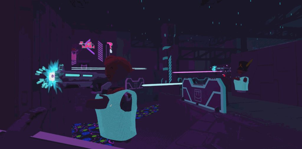 solemn valve
mortal bramble
I meant specifically info about WW
Sorry for all the questions but do you think we will ever get more of the songs on the (cv2)song chip?
raven geyser
thats a thing??
solemn valve
yes!
mortal bramble
uhhh I'm not sure tbh
solemn valve
too bad I hate playing the whole song thru voice mod
I would use RRS but im lazy and it killes my laptop
karmic prairie
solemn valve
Sorry for all the questions but do you think we will ever get more of the songs ...
more of a cv2 dev question probably
solemn valve
if I am also in vr
solemn valve
karmic prairie
more of a cv2 dev question probably
yeah but I only know GotSeb and now Quothy
raven geyser
 solemn valve
this is the chip I was refering to

sorry for the bad angle I don't ever play rec room on my pc
solemn valve
raven geyser
thats a thing??
^
mortal bramble
your circuits are so much neater than mine when I try to make things
solemn valve
thank you
mortal bramble
mine like look some kind of eldritch horror
solemn valve
this is after hours of clean up though
solemn valve
mortal bramble
mine like look some kind of eldritch horror
look at this small project about destroying amazing landscapes for money! it's ugly fish
 mortal bramble
tbh I think that being an established engineer works against me in this case
solemn valve
I clean up when I can
solemn valve
mortal bramble
tbh I think that being an established engineer works against me in this case
nah
mortal bramble
I can work so fast when I code, it's hard to have patience for visual scripting
otoh it's a really neat representation of things because I tend to think about code architecture spatially in my head
karmic prairie
mortal bramble
I can work so fast when I code, it's hard to have patience for visual scripting
I hope for a cv2 programing interface one day
solemn valve
mortal bramble
I can work so fast when I code, it's hard to have patience for visual scripting
OMG SAME and then I spend the same if not more time de bugging then if I did it slowly the first dang time
mortal bramble
I wish I could say it gets better with experience, but the real answer is that it sorta gets better but also sometimes you completely missed that you flipped a conditional and spend way too long debugging it 
solemn valve
mortal bramble
I wish I could say it gets better with experience, but the real answer is that i...
tbh I think it might be best for me to not work on ui in rec room bc I always make it for vr and compleately forget about screen mode
mortal bramble
while I admit to personal bias here, it's my belief that UI is one of the hardest areas to work in on the development side
solemn valve
mortal bramble
while I admit to personal bias here, it's my belief that UI is one of the hardes...
oh 100%
ruby umbra
solemn valve
Do you think I could join? I have always wanted to nerd out on rec room info!
Send me a dm and we can chat
solemn valve
I might be at a bias too
mortal bramble
you have to balance performance/input/player experience/development workflow/knowledge of the wider codebase and a whole bunch of other things
it's really, really challenging
and never boring haha
solemn valve
mortal bramble
you have to balance performance/input/player experience/development workflow/kno...
tbh I just usually gave up and made all my ui for vr and if it works on screan mode hurray ig
mortal bramble
making UI for both is really challenging
it can be done, but it takes some clever tricks
solemn valve
a lot of them =(
mortal bramble
alright, I'm off for the night. It was great chatting with you all!
solemn valve
mortal bramble
alright, I'm off for the night. It was great chatting with you all!
thanks for answering all my questions! have a good night!
solemn valve
ruby umbra
Send me a dm and we can chat
sent
 subtle pine
Research lab is the best imo
Quothy here is the questions for you:
-
Have you played rec room. Before getting hired, if no. Do you like playing it awhile after getting hired?
-
This is kinda a watch related but also graphical related. Will there be a option for more graphical settings? Because 1 graphic setting that just changes the games shaders to be crunchy or pixelated isn't really helping with optimizing
 signal nest
Day 415 of waiting for the UI to be improved/reworked more until RR implements/releases the changes #1192216802181255298 message
Here's a TL;DR of what I want added/fixed:
- Dark mode
- Bigger buttons
- Bigger/bolder text (possibly a different font)
- Less scroll bars/dropdown menus
- Less clutter
- Optimize the UI more
- More personality/charm
- More QoL features(?)
- Actually finish the UI instead of leaving it in a frankenstien between the old and new designs
(I forgot I had the daily message saved in my clipboard so I didn't have to scroll 3-5 business days to get to the last one I sent)
digital cipher
solemn valve
this is the chip I was refering to
Execution integer switch please

 thorny marten
Omg I'm so happy there could be ui improvements soon
I have been asking for improvement on the new ui for so long lol
 outer canyon
bruh
raven geyser
hello rec room
mortal bramble
subtle pine
Quothy here is the questions for you:
1. Have you played rec room. Before gettin...
- I actually didn't play before getting hired, but I'm also the type of person who who choose to build games over playing them. I've played a bit here and there since I joined and I like it! I don't play very much though since it helps me to take a break from Rec Room after working on it all day.
- This would be up to our rendering team. They do a ton of great work and have been a huge help with figuring out some rendering optimizations for the UI, so I trust their judgement on this one
subtle pine
mortal bramble
1. I actually didn't play before getting hired, but I'm also the type of person ...
please let rendering team know about this idea i would love it 🙏
outer canyon
mortal bramble
1. I actually didn't play before getting hired, but I'm also the type of person ...
Rendering team, server team, ui team, how many teams are there??
mortal bramble
outer canyon
Rendering team, server team, ui team, how many teams are there??
many! but they're generally small (4-6 people)
outer canyon
mortal bramble
1. I actually didn't play before getting hired, but I'm also the type of person ...
Have you tried cv2 yet or the makerpen?
raven geyser
mortal bramble
many! but they're generally small (4-6 people)
hi quothy do you know if Terrance tolman still does anything for rec room (t-money)
 fast arch
haha I got quoted by sk0l recently to which I then anxiously reviewed my message to make sure I said everything right several times 
mortal bramble
fast arch
haha I got quoted by sk0l recently to which I then anxiously reviewed my message...
I feel like this might be in my future haha
outer canyon
fast arch
haha I got quoted by sk0l recently to which I then anxiously reviewed my message...
Did you-
fast arch
Discord just
lost the reply for some reason and I don’t feel like finding the messages again
mortal bramble
raven geyser
hi quothy do you know if Terrance tolman still does anything for rec room (t-mon...
pretty sure he's still around, I had a nice chat with him a few months back
raven geyser
oh cool
mortal bramble
outer canyon
Have you tried cv2 yet or the makerpen?
yeah, I'm actually spending some time this morning building in rooms2 to get a feel for how it works. There's a lot of efforts around us feel the good & bad of the current experience firsthand so we can make better decisions about what we work on
outer canyon
mortal bramble
yeah, I'm actually spending some time this morning building in rooms2 to get a f...
What have you made currently in rooms 2 :>
raven geyser
dont know who to ask but do you know if we'll ever get more props in the maker pen over circuits and logic stuff
i need me some laser ham in the maker pen
mortal bramble
outer canyon
What have you made currently in rooms 2 :>
not much, I keep getting distracted by Slack 😂
outer canyon
mortal bramble
not much, I keep getting distracted by Slack 😂
Lol
outer canyon
mortal bramble
not much, I keep getting distracted by Slack 😂
Do you understand cv2 well?
mortal bramble
outer canyon
Do you understand cv2 well?
I consider myself a beginner with all our creation tools tbh. I've kinda purposefully kept that perspective so that I can look at the UI/UX with fresher & less experienced eyes
outer canyon
mortal bramble
I consider myself a beginner with all our creation tools tbh. I've kinda purpose...
If you ever need a challenge try to make a "game of tag" system
fast arch
outer canyon
If you ever need a challenge try to make a "game of tag" system

thanks for the flashbacks
this was quite literally the first thing I ever made with non-legacy circuits back when they were first launched and had no features
subtle pine
mortal bramble
I consider myself a beginner with all our creation tools tbh. I've kinda purpose...
you should check out the game more once you get a weekend break. i feel like it can help you report the issues to the staff team way easier and also probably have fun.
mortal bramble
fresh WW feedback from some open testing we're doing this morning: "Widget Watch is SO FAST I thought something was broken the first time I opened it"
subtle pine
mortal bramble
fresh WW feedback from some open testing we're doing this morning: "Widget Watch...
it would be funny if you guys launched it with a broken mess
solemn valve
digital cipher
Execution integer switch please
there is a reason I did it like that
lazy
also there will be only one person in that server at a time
digital cipher
solemn valve
also there will be only one person in that server at a time
using one is faster and saves on circuits
also usevalue switches
solemn valve
digital cipher
tbh it's old code from an earlyer game
digital cipher
solemn valve
tbh it's old code from an earlyer game
That’s understandable
solemn valve
I just was Frankensteing
karmic prairie
Looks like I've still got it
digital cipher
mortal bramble
fresh WW feedback from some open testing we're doing this morning: "Widget Watch...
Quothy do you think you could ask internally why they removed a bunch of items as default items when starting rec room? (Stuff like the blazer and more baseball hats)


 mortal bramble
karmic prairie
Looks like I've still got it
No one should have that flag set to true anymore 😭
I'm asking someone else who might've run into this before
 signal nest
Day 416 of waiting for the UI to be improved/reworked more until RR implements/releases the changes #1192216802181255298 message
Here's a TL;DR of what I want added/fixed:
- Dark mode
- Bigger buttons
- Bigger/bolder text (possibly a different font)
- Less scroll bars/dropdown menus
- Less clutter
- Optimize the UI more
- More personality/charm
- More QoL features(?)
- Actually finish the UI instead of leaving it in a frankenstien between the old and new designs
subtle pine
so uhh quothy, is it going to happen in march? or the release date of the new UI splittest not decided yet
mortal bramble
subtle pine
so uhh quothy, is it going to happen in march? or the release date of the new UI...
I'm pretty confident it'll be in March, but I'm less confident about when in March. We need to make sure that players can't get into stuck states where the game becomes unplayable because you can't open any UI. We have had to fix a lot of these along the way
lime panther
completely off topic but i made this a while ago in blender. does it look good?


 lime panther
 raven geyser
lime panther
https://cdn.discordapp.com/attachments/1237216970852532345/1333140569693884476/t...
applie slices
 ivory star
What's The bug was been fixed in new UI i may ask?
thorny marten
mortal bramble
I'm pretty confident it'll be in March, but I'm less confident about when in Mar...
Omg!! So excited
digital cipher
lime panther
https://cdn.discordapp.com/attachments/1237216970852532345/1333140569693884476/t...
McDonald’s?
signal nest
Day 417 of waiting for the UI to be improved/reworked more until RR implements/releases the changes #1192216802181255298 message
Here's a TL;DR of what I want added/fixed:
- Dark mode
- Bigger buttons
- Bigger/bolder text (possibly a different font)
- Less scroll bars/dropdown menus
- Less clutter
- Optimize the UI more
- More personality/charm
- More QoL features(?)
- Actually finish the UI instead of leaving it in a frankenstien between the old and new designs
thorny marten
signal nest
Day 417 of waiting for the UI to be improved/reworked more until RR implements/r...
W!!
lime panther

 upbeat juniper
wth just happened here
subtle pine
ivory star
What's The bug was been fixed in new UI i may ask?
i think they just remade the watch to look different
 viscid seal
signal nest
Day 417 of waiting for the UI to be improved/reworked more until RR implements/r...
Dedication

 still acorn
 thorny marten
Guys I wiiiiissh rec room was hiring to work on ui 💔 I would so apply
digital cipher
thorny marten
Guys I wiiiiissh rec room was hiring to work on ui 💔 I would so apply
Gabe the first style ui in rr
thorny marten
They would definitely not let me redesign the whole ui even if I got a job there lol
worn dove
lime panther
https://media.discordapp.net/attachments/1152741728063848458/1200527283585294346...
NOOOO LET HIM OUT!!!!
ivory star
Quothy, will be any plans in a near feature to add my suggestion about quality settings? https://discord.com/channels/193073071802941451/1328404550868271260
digital cipher
thorny marten
They would definitely not let me redesign the whole ui even if I got a job there...
Loll
signal nest
Day 418 of waiting for the UI to be improved/reworked more until RR implements/releases the changes #1192216802181255298 message
Here's a TL;DR of what I want added/fixed:
- Dark mode
- Bigger buttons
- Bigger/bolder text (possibly a different font)
- Less scroll bars/dropdown menus
- Less clutter
- Optimize the UI more
- More personality/charm
- More QoL features(?)
- Actually finish the UI instead of leaving it in a frankenstien between the old and new designs
 waxen cloak
I like the new widget watch UI that is going to be added but I still think they should add a toggle setting in experience so that you can either toggle between the new UI or the old UI
thorny marten
People have asked for that often but they're almost definitely not going to do that at this point
signal nest
thorny marten
People have asked for that often but they're almost definitely not going to do t...
I think they already confirmed that's not gonna be happening too
Day 419 of waiting for the UI to be improved/reworked more until RR implements/releases the changes #1192216802181255298 message
Here's a TL;DR of what I want added/fixed:
- Dark mode
- Bigger buttons
- Bigger/bolder text (possibly a different font)
- Less scroll bars/dropdown menus
- Less clutter
- Optimize the UI more
- More personality/charm
- More QoL features(?)
- Actually finish the UI instead of leaving it in a frankenstien between the old and new designs
thorny marten
signal nest
I think they already confirmed that's not gonna be happening too
They have multiple times lol
 haughty wave
I feel like adding a toggle between the ui’s would come with HUGE bugs and they’re need to redo their entire system
So I don’t think that’s happening personally
Most I want is dark mode where I can swap out the different sections
Like featured store in my home page with events next and then hot rooms
 torpid ocean
How will the ww work on VR? It seems great for screen but I dunno how it'll work on VR (or if they're even gonna have it on VR)
signal nest
torpid ocean
How will the ww work on VR? It seems great for screen but I dunno how it'll work...
It'd be cool if the buttons physically popped out of the interface like the old 3D watch did
torpid ocean
signal nest
It'd be cool if the buttons physically popped out of the interface like the old ...
Yeah
raven geyser
I just want holograms back
and 3D buttons
so I guess I just want the old watch back
😭
signal nest
Day 420 of waiting for the UI to be improved/reworked more until RR implements/releases the changes #1192216802181255298 message
Here's a TL;DR of what I want added/fixed:
- Dark mode
- Bigger buttons
- Bigger/bolder text (possibly a different font)
- Less scroll bars/dropdown menus
- Less clutter
- Optimize the UI more
- More personality/charm
- More QoL features(?)
- Actually finish the UI instead of leaving it in a frankenstien between the old and new designs
lime panther
 raven geyser

 mortal bramble
hi all! just wanted to let you know that I just turned on that optimization split test from a few weeks ago again. Hopefully we fixed all the data issues this time and we can ship it to everyone shortly 🙂
ivory star
mortal bramble
hi all! just wanted to let you know that I just turned on that optimization spli...
Amazing
signal nest
Day 421 of waiting for the UI to be improved/reworked more until RR implements/releases the changes #1192216802181255298 message
Here's a TL;DR of what I want added/fixed:
- Dark mode
- Bigger buttons
- Bigger/bolder text (possibly a different font)
- Less scroll bars/dropdown menus
- Less clutter
- Optimize the UI more
- More personality/charm
- More QoL features(?)
- Actually finish the UI instead of leaving it in a frankenstien between the old and new designs
subtle pine
signal nest
Day 421 of waiting for the UI to be improved/reworked more until RR implements/r...
how do you have motivaton of copy pasting this?
signal nest
subtle pine
how do you have motivaton of copy pasting this?
Ita kinda just become habit at this point lol
subtle pine
signal nest
Ita kinda just become habit at this point lol
do you have like a alarm to do it everyday or what lmao
signal nest
subtle pine
do you have like a alarm to do it everyday or what lmao
I just do it right after I wake up lmao
subtle pine
hi quothy is anything like this possible with the new Widget Watch UI Coming soon? or is it already done?
digital cipher
signal nest
Day 420 of waiting for the UI to be improved/reworked more until RR implements/r...
Nice
digital cipher
subtle pine
hi quothy is anything like this possible with the new Widget Watch UI Coming soo...
Like what
subtle pine
digital cipher
Like what
basically someone made a concept art apparently back in 2020 where the level 50 players has a gold thing around it to of course tell that they are level 50
digital cipher
subtle pine
basically someone made a concept art apparently back in 2020 where the level 50 ...
I don’t see the point in that
That feels like a feature for favourite friends
thorny marten
digital cipher
That feels like a feature for favourite friends
it is favorite friends lol
digital cipher
I’m being told lies
subtle pine
@signal nest you did it
Creator Forum
We’ve been working on updating our user interface (UI). UI is basically the buttons, menus, and screens you see and use in-game. It’s what helps you navigate to the rooms you want to see, customize your character, create, and more. Because we update Rec Room so frequently, our UI is under a lot of pressure to support new features but still be s...
 idle plinth
BRO YOU MADE IT
"We’re making some extra tweaks so the Widget Watch feels like it’s got that 3D magic" 3D FEATURES AGAIN?!
 sacred beacon
good shit
idle plinth
I don't know how I feel about the bland look though. It's making something already pretty bland even blander
some colour would be nice
other than that I love the new animations and such
subtle pine
its like a combination of 3D and 2D for screen.
idle plinth
subtle pine
its like a combination of 3D and 2D for screen.
I hope it's 3D for VR
subtle pine
idle plinth
I hope it's 3D for VR
VR Players will be getting different watch
idle plinth
"VR players - we want to get this in your hands too, but we’re not quite ready for that test yet. We’re making some extra tweaks so the Widget Watch feels like it’s got that 3D magic. ✨"
Seems the same but fit for VR
That's my guess
 spring swallow
as long as theres 3d and cool colors im sold
idle plinth
I just want some more colour on it, like the flag being pink or somethung
idle plinth
spring swallow
as long as theres 3d and cool colors im sold
it's rather brown. makes the game kinda look like an office sim
spring swallow
if they make it so that people can change how the watch looks, either custom or presets im so down for the new watch
signal nest
subtle pine
https://forum.rec.net/t/introducing-the-widget-watch/6225
THERE I AM GARY THERE I AM

Sorry lol
So glad this is actually happening
idle plinth
signal nest
So glad this is actually happening
Thoughts on the colours?
signal nest
idle plinth
Thoughts on the colours?
You mean like a feature to where we can change the colors of it or the color pallete it has right now?
idle plinth
the colour palette it has right now
subtle pine
signal nest
You mean like a feature to where we can change the colors of it or the color pal...
he meant the WW design
signal nest
idle plinth
the colour palette it has right now
I think it fits Rec Room's college vibe a lot better with how retro-looking the color pallete is. I also like how the orange is simply an accent color for the icons rather than overtaking the entire interface
Overall it's super pleasing to look at
subtle pine
tbh i prefer the design of the watch we have.
idle plinth
signal nest
I think it fits Rec Room's college vibe a lot better with how retro-looking the ...
i think it looks better than the overbearing orange but I dislike the bare icons
 signal nest
idle plinth
i think it looks better than the overbearing orange but I dislike the bare icons
I totally agree on the orange
idle plinth
idle plinth
i think it looks better than the overbearing orange but I dislike the bare icons
either make the button one colour and the icon be bland or make the button bland and the icon coloured
otherwise it loses the whole point of fun in RR
which 'fun' is literally in their slogan
 crimson island
idle plinth
I just want some more colour on it, like the flag being pink or somethung
Probably party colour
idle plinth
crimson island
Probably party colour
that would be really cool
 terse sand
THEY CALLED YOU OUT LMFAO
idle plinth
subtle pine
chat now think of how the christmas themed WW will look like
red and green would look nice but knowing RR its gonna be a cool blue
signal nest
idle plinth
I just want some more colour on it, like the flag being pink or somethung
Ngl I'd prefer it as it is now for the sake of consistency
But yea itd be cool if we had the option to change the color pallete of the whole interface depending on the color of the party we're in
idle plinth
signal nest
Ngl I'd prefer it as it is now for the sake of consistency
But yea itd be cool ...
that's very true but I think it lacks the colour the original original watch had
 stoic wedge
I like the look of the new ui
idle plinth
might just be me being way too nostalgic
subtle pine
i prefer the current one's design than WW's planned design tbh 😭
idle plinth
stoic wedge
I like the look of the new ui
I prefer it over the modern one
subtle pine
no offense to the graphic artists but since i saw it for the first time i instantly didnt like it
idle plinth
subtle pine
i prefer the current one's design than WW's planned design tbh 😭
I think modern is too cluttered. i like the clearing up
subtle pine
idle plinth
I think modern is too cluttered. i like the clearing up
is it tho?
stoic wedge
The ui makes me think of some sort of retro device for some reason
idle plinth
stoic wedge
The ui makes me think of some sort of retro device for some reason
RR takes place in the 80s so I like it that way
signal nest
subtle pine
no offense to the graphic artists but since i saw it for the first time i instan...
It probably just needs getting used to for some people?
Looking at the UI we have now after seeing WW, the bright orange and eye-piercing white taking up the entire interface looks hideous imo
outer canyon
"We want better watch!"
Rec Room creates a better watch
"....We want better watch!"
signal nest
outer canyon
"We want better watch!"
*Rec Room creates a better watch*
"....We want better wa...
Tbf you can't get everyone to agree on a single topic
 crimson island
Tf
stoic wedge
idle plinth
RR takes place in the 80s so I like it that way
yeah exactly
idle plinth
outer canyon
"We want better watch!"
*Rec Room creates a better watch*
"....We want better wa...
im happy with it, just some tweaking will go a long way
subtle pine
tbh since its 80s themed i kinda expected to be 8-bit style menu.
crimson island
My question is if this is a new watch home menu, or another menu. I feel the post made both seem possible
subtle pine
to pay the homage to like NES
stoic wedge
subtle pine
tbh since its 80s themed i kinda expected to be 8-bit style menu.
it feels like that but without the pixels
I think?
signal nest
 finite violet
bro made it
I wasnt expecting them to just directly say my name like that lmaoo
stoic wedge
signal nest
I wasnt expecting them to just directly say my name like that lmaoo
you're popular!
subtle pine
signal nest
I wasnt expecting them to just directly say my name like that lmaoo
it sure paid off for uhhhhhhhh 421 days of copy pasting the same stuff
finite violet
signal nest
I wasnt expecting them to just directly say my name like that lmaoo
congrats dude
subtle pine
oooh i wonder how the dark mode will look on this
signal nest
finite violet
congrats dude
Thanks :)
stoic wedge
subtle pine
oooh i wonder how the dark mode will look on this
the question is will there be one?
subtle pine
stoic wedge
the question is will there be one?
quothy said yes.
signal nest
stoic wedge
the question is will there be one?
They confirmed it, but it'll take a while
stoic wedge
hopefully doesnt take years
signal nest
Yea
subtle pine
all hail quothy
signal nest
Fr
subtle pine
🙇♂️
all hail quothy
chat someone make a room called ^AllHailQuothy
and basically start a religion out of that-
 stoic wedge
you can also find it in #announcements
signal nest
subtle pine
it sure paid off for uhhhhhhhh 421 days of copy pasting the same stuff
🗣️🗣️🗣️🔥🔥
here's hoping they'll keep this up for the rest of the interface and eventually add a dark mode
idk if i should keep this thread going after WW actually releases next week though lol
subtle pine
signal nest
idk if i should keep this thread going after WW actually releases next week thou...
Maybe start from day 1 again but waiting for WW to come out fully
signal nest
ooh maybe
subtle pine
It would've been cooler if they released the post on 420💔
signal nest
one day off 😔
signal nest
(aint no way beat saber added not like us)
 subtle pine
signal nest
(aint no way beat saber added not like us)
Cuh this is fortnite
subtle pine
Discord: I like the new watch
Reddit: THOS NEW WATCH IS DOO DOO WHOEVER MADE THIS UI SHOULD BD FIEEDDDDD!!!!
Overexxagaration? Yes.
signal nest
subtle pine
Reddit: THOS NEW WATCH IS DOO DOO WHOEVER MADE THIS UI SHOULD BD FIEEDDDDD!!!!
only on reddit
:)
worn dove
They seriously dropped ONE song from Kendrick Lamar. THey're like a year late and no one like that song anymore
signal nest
lmao
subtle pine
signal nest
only on reddit
Yeah rec room reddit is more toxic than the discord rec room💔
stoic wedge
we complain because we like the game, reddit complains because it's reddit
worn dove
I'm not sure what to think of widget watch though. I'm so split between liking and disliking
 signal nest
subtle pine
Since it's taken in the 80s
tbf i think it fits really well in an 80s college campus setting
i don't really see 8-bit fitting RR as well
subtle pine
signal nest
i don't really see 8-bit fitting RR as well
When I get on my pc tommorrow I'll go and make a mockup of it
signal nest
alright
signal nest
worn dove
honestly i agree on how it'll only make the UI more inconsistent. thats why im really hoping they'll expand this to the rest of the UI
worn dove

OMG who designed the RR creater thread

Nevermind, I think a dev deleted all those edits
mortal bramble
hi all! I was in meetings till now so I can poke around and see what you all think 🙂
totally agreed on the inconsistencies being a problem, we just don't want to promise to move everything over to this style before we see if it works for you all
I am very motivated to start moving things over
probably about as motivated as I was to make the WW actually
oh right, just wanted to point something out
that leak I shared last week?
showed off the transparency of the UI 😁
the leak

the original screenshot I took it from
 subtle pine
Huh
 pallid tartan
 worn dove
If it's small why is it transparent? I feel it takes from the readability just a little
mortal bramble
worn dove
If it's small why is it transparent? I feel it takes from the readability just a...
It takes up a bit more than half the screen width in mobile, so the transparency means you can stay aware of what's going on around you more
thorny marten
it looks soo cool 🙀
but I wonder what it's like in vr
omg but the theme/style is so awesome
okay wait though, does the menu wee see replace the home screen? or will there be a separate home page
mortal bramble
thorny marten
okay wait though, does the menu wee see replace the home screen? or will there b...
No home screen or nav bar
thorny marten
That seems like it would make it harder to navigate
like the store ui is right now
mortal bramble
thorny marten
That seems like it would make it harder to navigate
This is not feedback we've heard so far, but would love to hear from you after you get a chance to try it out. @signal nest can share his first hand experience with it
 rancid comet
I have a question? https://discord.com/channels/193073071802941451/1344412816932864000
rancid comet
Like the neon text, it won't let me change it to neon, after I save the room and go to a new instance, it disappears
mortal bramble
I can ask around and see if it's being tracked
crimson island
mortal bramble
I can ask around and see if it's being tracked
Is the whole watch being swapped to this style over time?
mortal bramble
crimson island
Is the whole watch being swapped to this style over time?
As long as the player feedback indicates that it's the right direction, then yes. We wanted to get a feel for player sentiment before committing to moving things to the new design
raven geyser
mortal bramble
As long as the player feedback indicates that it's the right direction, then yes...
so now we have 3 watch varients going around 💔
i still really like widget watch tho
mortal bramble
raven geyser
so now we have 3 watch varients going around 💔
Yeah I'm not thrilled about it either, but this is probably the least painful way to move things forward
haughty wave
yall ik its celebration time and all but
unpopular opinion, if its not more customiseable to look better, i would rather just have the current watch forever
in MY opinion
i do not like it
great ideas
and i tthink its good overall
i just dont like the comicbook style
its uglay🤢
thorny marten
I love the new style from what we saw
haughty wave
i like the layout
thats perfect
with the outfits and the players
love that
but i just dont like the harsh outlines and shadows
and the orang is really faded
thorny marten
I think no navigation bar or home page will make it harder to navigate (I might just like navigation bars though)
haughty wave
basically yellow
thorny marten
haughty wave
but i just dont like the harsh outlines and shadows
that looks soo cool though 🙀
haughty wave
thorny marten
that looks soo cool though 🙀
we can agree to dissagre! it is a time to celebrate them listening to us
and they have worked hard
raven geyser
mortal bramble
Yeah I'm not thrilled about it either, but this is probably the least painful wa...
 thorny marten
haughty wave
too big
that's a ui system I was making for a random game (it's seeming like most of the other people who were working on that game don't want to work on it though 💔 so my ui may have been for nothing)
raven geyser
thorny marten
that's a ui system I was making for a random game (it's seeming like most of the...
i told u that too 💔
thorny marten
that's easy to change 
but the ui system is so cool though (I might be only saying that because I made it)
but no I was sending that video because splooty had seen it before, not for feedback on rec room's ui lol
raven geyser
i figured
thorny marten
but navigation bars !!
 mortal bramble
thorny marten
I think no navigation bar or home page will make it harder to navigate (I might ...
We'll still have a different kind of nav bar, just not chaining almost every piece of UI together like the current one does. We'll keep it on the level of like the current top bars on play or settings that move you to a different area of that section
ivory star
can the UI be a bit thicc? It Attracts flat earthers
 fallow plover
I just want to throw my two cents in here. I love the new design for the UI, it looks way better than what we currently have (and hot take, it also looks better than the 3D UI). I just hope if this roll out goes well, we will get the rest of the UI for every (if not nearly every) UI page sooner rather than it taking 3 years. The current UI has been in development for how long now?.. and is STILL missing some UI pages...
 faint flint
I feel like there could be a little bit more color to the button icons. And yeah i know it aint the biggest deal in the world, but i feel like if the icons popped out just a tiny bit more while still fitting the feel of the UI, it would be just a bit nicer in my opinion. Also, even if it doesn't matter I think this is also a good opportunity to tweak the UI sounds. theres nothing wrong with the current ones. but i feel like some sorta mix between the old sounds and the new sounds would be very nice and maybe even add a bit more to the UI's feel. But besides that, I think this new UI looks great!
subtle pine
faint flint
I feel like there could be a little bit more color to the button icons. And yeah...
oh yeah true i was thinking of that yesterday
i dont really think the current watch menu sounds fits with the WW UI
signal nest
Day 422 of waiting for Widget Watch to release, meant to fix the stuff I pointed out in the original post #1192216802181255298 message
Here are the things I'm hoping will be added later:
- Dark mode
- Fully finish and rework the UI in this style
Hi
signal nest
 untold talon
Guess they just made a new Ui all together rather than changing anything
Yea
But that's probably the better way to go about it imo
subtle pine
i wonder what happened to the people that designed the old UI
 oak marsh
subtle pine
https://forum.rec.net/t/introducing-the-widget-watch/6225
i hope there's an option to have the buttons on the home menu be colored like how the 3d ui was, other than that i like it
 main yarrow
subtle pine
https://forum.rec.net/t/introducing-the-widget-watch/6225

Provided to YouTube by Universal Music Group
Happy Xmas (War Is Over) (Ultimate Mix) · John Lennon · Yoko Ono
Imagine
℗ 2018 Calderstone Productions Limited (a division of Universal Music Group)
Released on: 2018-10-05
Associated Performer, Vocals, Acoustic Guitar, Producer: John Lennon
Associated Performer, Vocals, Producer: Yoko Ono
As...
war is over
almost
 main yarrow
 mortal bramble
subtle pine
Oooh this is a good question, lemme get my thoughts together
mortal bramble
fallow plover
I just want to throw my two cents in here. I love the new design for the UI, it ...
We're scoping out the work that needs done to deliver the first redone page based on the positive feedback we've gotten so far, but we may not commit to them until we see the actual reception after it launches.
I'll also fess up to being part of the reason why we slowed down on conversion. We prioritized getting improved systems into place so that whatever future UI we built wouldn't have the same lag issues as the current Watch UI. The team that works on this is probably a lot smaller than you're imagining and we can only do so much at one time 😅
Okay, coming back to the question on why people can't switch between the options-
As much as I would love to be able to rely purely on community feedback, that approach runs the risk of only hearing how changes affect a small part of a large player base. I also need to understand how having the new UI affects the experience for new players who might not be hooked into the community yet.
The other part is that the changes in the groups are honestly really subtle. There's four variants and we're testing along two dimensions: widget content and widget behavior. They're split up like this:
- Group 1: Widget A and Dynamic behavior (this means we'll only show certain widgets under certain conditions when we think the widget is relevant)
- Group 2: Widget A, Static behavior
- Group 3: Widget B, Dynamic behavior
- Group 4: Widget B, Static behavior
These changes will help us understand how those small differences affect your experience and will help guide our future choices. I'm particularly interested in whether the dynamic behavior or static behavior will be better. But like I said, these are small changes rsther than drastic ones
subtle pine
here is my questions for you quothy, both related to the Watch Menu and just some random stuff:
-
do you know what happened to the people that made the original watch UI?
-
if the current watch home menu UI is accepted by everyone, what is the next menu you guys are planning to update to WW Design.
-
were there more designs of WW you or someone made but decided not to use it (ik some that were in research lab but im not talking about those)
-
favorite sandwich?
-
why the name quothy?
-
ignoring the fact that you are a staff member, how do you like the game so far?
mortal bramble
subtle pine
here is my questions for you quothy, both related to the Watch Menu and just som...
- Most of them are still at Rec Room, some still work on UI and some work on other stuff now.
- I really don't want to make any promises on what we're going to overhaul in case something changes, but I will say that the two top candidates right now are one of the most used areas of the UI and one of the ones that never got converted to RRUI.
- Our designers have had several ideas over the past few months, but nothing that was too different from the research lab stuff. The style we ended up using was one that clicked for a lot of us as having more of a Rec Room identity (though we also want to try out adding more color 😁 )
- Uhhh I'm not sure right now actually. I cycle through favorites a lot. Maybe a french dip?
- Ah yes the lovely "where did you get your internet handle from" 😂 . Honestly I went through an Edgar Allan Poe phase aaaages ago and really loved the poem "The Raven". Quoth the raven, nevermore -> quothy
- I really like the game! I'm always so impressed by what players create and I'm happy to be a small part of it of giving them the space and platform to share what they've made
also, we had to turn out the optimization split test again because we missed one piece of analytics data . The fix should hopefully ship in a couple weeks and we can finally turn it back on for good
subtle pine
mortal bramble
1. Most of them are still at Rec Room, some still work on UI and some work on ot...
you should just grind to level 50 so you can get 5 star box and showcase what you got from that box.
sorry for the ping
btw this is more of a accurate emoji
 idle plinth
Are you planning on adding a little color quothy to the WW UI? Or is that out of the question?
mortal bramble
idle plinth
Are you planning on adding a little color quothy to the WW UI? Or is that out of...
We definitely want to add color! We have a few ideas that we're planning on trying out after the initial split test
We actually have plans to add a third panel to WW, which should ship sometime in April
idle plinth
mortal bramble
We definitely want to add color! We have a few ideas that we're planning on tryi...
Fantastic! That's my only gripe currently and that would make it (dare I say) better than the OG menu!
subtle pine
crimson island
Will the home screen get a rework with the new UI?
That's the goal
mortal bramble
crimson island
Will the home screen get a rework with the new UI?
WW takes the place of the Home page. Anyone in a WW test group will not have the Home page or the bottom nav bar
mortal bramble
ah yeah that'll definitely get a pass
I'm itching to redo it honestly
the implementation is very spaghetti-fied and hard to work with
crimson island
Yay! It's not bad, but it has no charm or personality.
Well the new changes are bad.
mortal bramble
wait which new changes?
crimson island
The ones that moved the logo. Makes it feel too empty.
mortal bramble
ahhh gotcha
crimson island
The old one was fine. Just had the previously mentioned issues.
mortal bramble
tbh I see title screens as a particularly difficult piece of UI to get right (ofc I'm also not a designer lol)
like they need to be lightweight, but not bland
crimson island
Yeah
Walking Dead Saints and Sinners did a great job, but no idea how well the idea would port over, especially when considering load times and framerate.
Minecraft also has an excellent main menu.
Shows the game, but still is a main menu.
I think the old main menu (Registration) was better visually, until it came to playing the game.
digital cipher
mortal bramble
the leak
OHHH LOL
digital cipher
thorny marten
The ui is so BIG
thorny marten
Okay wait
Will we have a home button though?
Because pressing the back button a bunch of times to get out is annoying
mortal bramble
thorny marten
Will we have a home button though?
On screens or mobile? You can always click/tap outside the UI to close it
thorny marten
mortal bramble
On screens or mobile? You can always click/tap outside the UI to close it
I mean to get back to the home page
Like the main/first page
mortal bramble
The WW is that page now
ivory star
One question, will the new Widget UI will be 3D when it will came to VR? because 2D is not cool when being in VR mode you know.
thorny marten
mortal bramble
The WW is that page now
Yeah I mean like will there be a button or way to go back there? (Other than just pressing the back button until we're all the way back there)
Wait I might have accidentally left ping on for that reply, I'm sorry if I did!!
subtle pine
mortal bramble
the implementation is very spaghetti-fied and hard to work with
if you are planning to remake the log in screen idk why but i want to see something like rayman raving rabbids 2's character selection was. in VR you can walk up to your character basically point at it to select it and log in. same thing can be with the screen players too
 signal nest
Day 423 of waiting for the Widget Watch to release next week #1192216802181255298 message
Here are the things I'm hoping will be added later:
- Dark mode
- The UI is fine-tuned to be easier to use/navigate
- Fully finish and rework the UI in this style in a reasonable amount of time
- VR support that feels like it was made with VR in mind
 rotund anvil
vr support is a big thing
idk big blocky buttons just work better for vr imo
ive never used my physical hand to press buttons with any 2d ui, ive always used my cursor
3d ui just works better for a 3d system imo
ivory star
facts i want to have satisfaction of pressing those buttons without the cursor
raven geyser
subtle pine
if you are planning to remake the log in screen idk why but i want to see someth...
i love rayman raving rabbids
crimson island
I think a main menu that looks like the campus you see in the birthday stuff would be cool.
signal nest
Day 424 of waiting for the Widget Watch to release this week #1192216802181255298 message
Here are the things I'm hoping will be added later:
- Dark mode
- The UI is fine-tuned to be easier to use/navigate
- Fully finish and rework the UI in this style in a reasonable amount of time
- VR support that feels like it was made with VR in mind
oak marsh
rotund anvil
vr support is a big thing
that reminds me of how the current ui makes the makerpen a bit slower to work with compared to the 3d ui, i hope we can use the makerpen quicker with this new ui they're making
subtle pine
hope the maker pen ui with WW Theme has the same layout
ivory star
subtle pine
hope the maker pen ui with WW Theme has the same layout
its just watch menu rework. if it will be done makerpen will be done later
worn dove
signal nest
Day 424 of waiting for the Widget Watch to release this week https://discord.com...
Omg SUCH A GREAT LIST
subtle pine
ivory star
its just watch menu rework. if it will be done makerpen will be done later
i know but in the future when they focus on the maker pen
ivory star
subtle pine
i know but in the future when they focus on the maker pen
noone knows
crimson island
ivory star
noone knows
If it turns out good, it'll be ported to all UI.
signal nest
Day 425 of waiting for the Widget Watch to release this week #1192216802181255298 message
Here are the things I'm hoping will be added later:
- Dark mode
- The UI is fine-tuned to be easier to use/navigate
- Fully finish and rework the UI in this style in a reasonable amount of time
- VR support that feels like it was made with VR in mind
crimson island
Can't wait to see the blue version of this one.
I love the blue varient.
Especially the shade of blue.
Kinda wish we got more specially coloured UI based on the time.
ivory star
signal nest
Day 425 of waiting for the Widget Watch to release this week https://discord.com...
im predicting on day 442 something cool will happen
oak marsh
signal nest
Day 425 of waiting for the Widget Watch to release this week https://discord.com...
i just wanna be able to change the color scheme to how the 3d ui was, like yellow background with a red play button and blue notifications button
lime panther
 subtle pine
quothy just asking if there are any issues that has appeared making the split test to be delayed or is march 5th still the planned dated?
mortal bramble
just as a heads up, I wanted to let you all know that the UI team was not directly impacted by the layoffs today. That being said, we'll obviously need some time to process things and this may slow down some of our WW follow ups by a week or so
The current plan is still to launch the WW split test on 3/5. There's a chance we'll need to start the roll out off slower than we originally intended to make sure an analytics issue isn't having negative impacts on other parts of the game. More details to come when I'm officially back at work on Wednesday (I picked a rough time to take a few days off 😅 )
 lilac sparrow
I’m glad yall are okay!
fallow plover
Thanks for being open and letting us know, it means a lot to have actual communication with devs.
mortal bramble
fallow plover
Thanks for being open and letting us know, it means a lot to have actual communi...
I do what I can! I find it really valuable to interact with you all, so I'm going to keep doing my best to do it
stoic wedge
lime panther
https://cdn.discordapp.com/attachments/1213471301264609290/1243221442297073745/a...
HEY WAIT A MINUTE
THAT'S MY FRIEND!
Where did you get that image
because that's genuinely the roblox avatar of my friend and something that they made
ivory star
mortal bramble
just as a heads up, I wanted to let you all know that the UI team was not direct...
You are awasome dev, you should be promoted
signal nest
Day 426 of waiting for the Widget Watch to release this week #1192216802181255298 message
Here are the things I'm hoping will be added later:
- Dark mode
- The UI is fine-tuned to be easier to use/navigate
- Fully finish and rework the UI in this style in a reasonable amount of time
- VR support that feels like it was made with VR in mind
crimson island
ivory star
You are awasome dev, you should be promoted
Promoted to customer!
ivory star
crimson island
Promoted to customer!
._.
 neon folio
This is still going???
signal nest
neon folio
This is still going???
Yes lol
 nimble flower
if the widget watch UI gets applied to all of the existing watch, I'd consider this thread closed tbh
hopefully the work goes well
rec room needs a win 🥺
signal nest
Idk if I should keep going until the entire watch is complete though. That'll prolly take a really long time
idle plinth
I say you continue, you may have won the battle but you haven't won the war
ivory star
signal nest
Idk if I should keep going until the entire watch is complete though. That'll pr...
that would be really bad if your internet dies for 1 day and u'll lose the longest streak in RR server
mortal bramble
feels so good to see WW on the live build 
(only for me because my account is overridden into the split test)
I'm so excited to start rolling it out tomorrow
fallow plover
I hope I get it 🤞
My only issue is muscle memory, gonna take a minute to learn the new UI. Otherwise I LOVE it, and I really hope we get the rest of the RRUI changed to WW (without having to wait 5 years :/..)
ivory star
mortal bramble
I'm so excited to start rolling it out tomorrow
Yippee! Also, will the avatar randomier be back? I miss randomly generated avatars
thorny marten
mortal bramble
feels so good to see WW on the live build <:chefkiss:1256985815863656538>
(onl...
@karmic prairie has it too
mortal bramble
thorny marten
<@1169784328893517874> has it too <:Silly:1240021398098018304>
we changed the name of the parameter that controls whether it's turned on for the version we shipped 
thorny marten
🙀 
subtle pine
Quothy, how do you manually enable split tests? Is it going and manually enabling certain types of groups or specific players in the server room? Or what?
mortal bramble
I click a "start" button on a we page haha. I can also control what % of players it's rolled out to, which we'll probably do with WW tomorrow. Like we'll do 25 or 50% of players for a few hours to a day to make sure we aren't causing more crashes or other bad behavior, then we'll increase it to our target
crimson island
If Lucenator doesn't have it, I will be sad
subtle pine
quothy, ik you guys arent going to do store tab next but when you guys do it is it possible for it to show everything in the search tab? sure it shows everything but it limits to certain areas which sucks because people dont know what items exist or dont until they see someone wear it, or google the name.
signal nest

Day 427 of witnessing the Widget Watch releasing today #1192216802181255298 message
Here are the things I'm hoping will be added later:
- Dark mode
- The UI is fine-tuned to be easier to use/navigate
- Fully finish and rework the UI in this style in a reasonable amount of time
- VR support that feels like it was made with VR in mind
rancid comet
signal nest
https://tenor.com/view/today-today%27s-the-big-day-gary-todays-the-big-day-gary-...
The day I have exams 💀🙏🏼
signal nest
Rip lol
rancid comet
Today, tomorrow, and Friday
 ivory star
Quothy, will the photos limit be increased or just deleted? in game theres only 64 photos limit, because i want to print my old photos to my dorm for collection
outer canyon
mortal bramble
I click a "start" button on a we page haha. I can also control what % of players...
can I get it please
subtle pine
signal nest
Good luck
fire PFP luchenator
mortal bramble
outer canyon
can I get it please
you have an 40% chance of being in it today and an 80% chance of being in it tomorrow 🙂
once I turn it on ofc
we're starting it for half of the playerbase today and then the other half tomorrow as long as it looks like we haven't made things go boom
i can post once we start it so you all can check to see if you're in it
idle plinth
mortal bramble
i can post once we start it so you all can check to see if you're in it
epic!
subtle pine
subtle pine
quothy, ik you guys arent going to do store tab next but when you guys do it is ...
can you answer this quothy?
mortal bramble
oh whoops didn't see that
I can bring it up to the team that owns the Store UI. I think they have some upcoming work planned around that, but I could be wrong
subtle pine
mortal bramble
I can bring it up to the team that owns the Store UI. I think they have some upc...
hope so because since the customize tab getting a update where it doesnt show you a name PLUS not being able to buy and modify clothes from the customize tab and you are being forced to use store tab it sucks and even is a struggle for me to find clothes for my outfit
 grand dagger
If it’s possible can you make sure to have a dedicated feedback thread for the ui in #1063211834657734706
mortal bramble
it's started! give it a few minutes, then relog if you're already logged in
 simple grove
mortal bramble
it's started! give it a few minutes, then relog if you're already logged in
 mortal bramble
made a feedback thread too https://discordapp.com/channels/193073071802941451/1346912823531409528
subtle pine
please hope i get it please hope i get it 🤞
 vivid vapor
mortal bramble
it's started! give it a few minutes, then relog if you're already logged in
What devices is it on?
mortal bramble
vivid vapor
What devices is it on?
PC, console, mobile. VR is still being worked on
vivid vapor
mortal bramble
PC, console, mobile. VR is still being worked on
Does pcvr count as pc? Jk
thorny marten
I'm going to crash out 💔

 chrome forge
thorny marten
😭
 abstract field
I didn't get it :c
terse sand
abstract field
I didn't get it :c
tragic
digital cipher
goated
 outer canyon
mortal bramble
i can post once we start it so you all can check to see if you're in it
yay
vivid vapor
mortal bramble
there's still tomorrow 🤞
Was the chance of getting it random or was is something else
digital cipher
 mortal bramble
vivid vapor
Was the chance of getting it random or was is something else
it's completely random
vivid vapor
How many people got it?
subtle pine
vivid vapor
How many people got it?
50% of rec room players
digital cipher
abstract field
I didn't get it :c
use another account
mortal bramble
50% of players are checking the split test, so 40% are in a group with WW
vivid vapor
When will it be released to vr
mortal bramble
as long as nothing explodes, we'll up that to 100% tomorrow
digital cipher
mortal bramble
as long as nothing explodes, we'll up that to 100% tomorrow
how many variants of the widget watch are there
mortal bramble
vivid vapor
When will it be released to vr
after we finish that version. We've started the early bits of work, but we're at the "let's try some things and figure out how to make it a good 3D experience" stage
vivid vapor
Guys guys were bambarding him with questions
vivid vapor
mortal bramble
after we finish that version. We've started the early bits of work, but we're at...

mortal bramble
digital cipher
how many variants of the widget watch are there
rancid comet
mortal bramble
you have an 40% chance of being in it today and an 80% chance of being in it tom...
cool
ivory star
i got the new widget UI it looks so dope
 rancid comet
I don't got it 😭
ivory star
rip
its so smooth
i don't see any lag spikes anymore when opening the widget watch
Good job quothy you did amazing job
that looks interesting

quothy! on what day/month do you predict that The widget UI will be released?
fast arch
There's a Widget Watch thread now: https://discord.com/channels/193073071802941451/1346912823531409528
mortal bramble
ivory star
quothy! on what day/month do you predict that The widget UI will be released?
sometime between 4-6 weeks from now as long as the split test doesn't show that we made everything worse and we don't hear that players hate it
rancid comet
NOOO 😭😭😭😭😭
ivory star
mortal bramble
sometime between 4-6 weeks from now as long as the split test doesn't show that ...
That's awasome, im excited the widget watch will be released on VR Version. I love the widget UI already even if its not fully finished. I really doubt that people will hate it, Only people will hate that the muscle memory will change but it will be fine overtime, its like with old Watch UI, Everyone hated it after it got removed but everyone stopped and people don't hate it anymore

 mortal bramble
lime panther
<@275771176847147009> !!!
oh hey I actually know what's going on here
are you on a different internet set up than usual? If not, then I recommend restarting the app
lime panther
no im not
i tried restarting my game like 3-4 times now
ik it's something with split tests i think
but i haven't messed with anything lol
mortal bramble
yeah basically you don't have a connection to the service that runs the split tests
and we've been really, really bad at cleaning up after ourselves 😅
do you have another account you can check?
mortal bramble
Let me see if someone remembers what to do
lime panther
yeah statsig is very weird sometimes
lilac sparrow
On an entirely different topic regarding the UI: I’ve come to realize that the text on the customization menu was essential to me. I now lack customization literacy for any new items. Searching for items becomes obsolete if I don’t know what the name is for the item I am searching for. I understand that the removal of text probably reduces the lag when using this menu but it has destroyed a key component of customization.

Not sure if anyone else has this feeling tho
lime panther
i can still get to the homescreen!!!
 lime panther
mortal bramble
Let me see if someone remembers what to do
Oh also I fixed it. For some reason the statsig api was returning a 500 internal server error
mortal bramble
lime panther
Oh also I fixed it. For some reason the statsig api was returning a 500 internal...
Bleh, that would do it. This is a good reminder for us that we need to clean up old tests and update our defaults so players don't see this 
crimson island
lilac sparrow
Not sure if anyone else has this feeling tho
You are correct
lime panther
 ivory star
lime panther
and my makerpen looks off
omg you got old maker pen UI
ivory star
Is it should susposed to be like that?

 lean vessel
Tbh i miss the old menu, so if there should keep the old one, there should add a option to use the old one or the new one. and the old menu was very bright so maybe add were u can switch betewn dark mode and white
subtle pine
ivory star
Is it should susposed to be like that?
LMAO.
as of this update you can now wear as cyberjunk city
signal nest
Day 428 of waiting for the list of things below to be added to the Widget Watch sometime in the future:
- Dark mode
- The UI is fine-tuned to be easier to use/navigate
- Fully finish and rework the UI in this style in a reasonable amount of time
- VR support that feels like it was made with VR in mind
(and hopefully getting the split test for WW today)
mortal bramble
ivory star
Is it should susposed to be like that?
Lol that's our placeholder image. Wonder what happened there. I'll take a note that we should replace that with a better default
subtle pine
mortal bramble
Lol that's our placeholder image. Wonder what happened there. I'll take a note t...
reminds me of that one image where a clothing piece/weapon skin/consumable image was replaced with exactly this picture in the wishlist tab.
ivory star
mortal bramble
Lol that's our placeholder image. Wonder what happened there. I'll take a note t...
It looks funny when its just laser tag image


 crimson island
mortal bramble
Lol that's our placeholder image. Wonder what happened there. I'll take a note t...
I say keep it, as it's funny the few times it happens, and doesn't really affect gameplay.
signal nest
Day 429 of waiting for the list of things below to be added to the Widget Watch sometime in the future:
- Dark mode
- The UI is fine-tuned to be easier to use/navigate
- Fully finish and rework the UI in this style in a reasonable amount of time
- VR support that feels like it was made with VR in mind
 royal wharf
crimson island
I say keep it, as it's funny the few times it happens, and doesn't really affect...
little easter eggs to the watch would be a unique touch to give it a bit more life, id say
 stiff raven
Excuse my language but this watch is fucking ass
Like I don’t know where to go to play nor text
Can you add names of it under the buttons?
rancid comet
Bro huh
stiff raven
It’s like the watch is confusing
ivory star
stiff raven
It’s like the watch is confusing
you will get used
 left scarab
@signal nest your the reason why they added that crappy menu
stoic wedge
left scarab
<@1111030117188247684> your the reason why they added that crappy menu
buhwomp
left scarab
lol
signal nest
left scarab
<@1111030117188247684> your the reason why they added that crappy menu
You're* (:
But ngl I think it's a great improvement. It just needs some getting used to
lime panther
@mortal bramble idk if you're down to tell me but what's the name of the widget watch split test? i really wanna disable it from my account until it improves a little more. (i know how to disable split tests, all i need is the name.)
right now, i'm seeing "use_app_nav_forship" and "use_app_nav"
okay i did it

it was use_app_nav_forship
signal nest
Day 430 of waiting for the list of things below to be added to the Widget Watch sometime in the future:
- Dark mode
- The UI is fine-tuned to be easier to use/navigate
- Fully finish and rework the UI in this style in a reasonable amount of time
- VR support that feels like it was made with VR in mind
lilac sparrow
lime panther
okay i did it
ok what i never imagined that someone would go out of their way to go to the slightly older home screen of all things😭
i understand that the WW has some problems but you’re intentionally going for the ui with more issues. changing your ui now is not going to change the inevitable, i just don’t get the purpose of this.
crimson island
Only actual use are the split tests that no one likes, but even then, it probably risks a ban. Is that worth it?
Only split test I would've happily risked it for, is the one that put a red dot with a muted symbol in the middle of the screen on VR.

Look closely at the bottom of the screen in the video, and you can slightly see it.
You could temporarily disable it if you went onto an alt without it, then went back to the main
subtle pine
crimson island
tbh i like that feature for VR. especially you dont always know that your microphone is off
sure vrchat does something similar but still
crimson island
- You're wrong
- It's location was distracting
- Not toggle-able
- Too bright
- Always up
VRChat it's off to the side, toggle-able, you can chance the opacity, it's not in the way, lights up if you speak, not distracting, can just be an outline
lilac sparrow
i will agree that that needed to be toggle-able but i need that feature back. i’ve humiliated myself too many times by thinking im having a conversation with someone just to realize i’ve been muted for the past hour
crimson island
Yeah, it'd be nice, but they took the idea from VRChat, but added none of the good.
raven geyser
subtle pine
chat we found a skid 😭 🙏
i hate people who use the word skid without knowing what it means
 thorn basin
raven geyser
i hate people who use the word skid without knowing what it means
fr, that guy was not even a skid, he actualy knows what hes doing.
signal nest
Day 431 of waiting for the list of things below to be added to the Widget Watch sometime in the future:
- Dark mode
- The UI is fine-tuned to be easier to use/navigate
- Fully finish and rework the UI in this style in a reasonable amount of time
- VR support that feels like it was made with VR in mind
signal nest
Day 432 of waiting for the list of things below to be added to the Widget Watch sometime in the future:
- Dark mode
- The UI is fine-tuned to be easier to use/navigate
- Fully finish and rework the UI in this style in a reasonable amount of time
- VR support that feels like it was made with VR in mind
ivory star
im going to have a 18th birthday in 3 days!
subtle pine
ivory star
im going to have a 18th birthday in 3 days!
bro lets change the roles so i can legally use grindr-
(this is a joke)]
ivory star
i was about to call mods
subtle pine
😭
mortal bramble
that optimization split test is now started again for a third time 🤞
 tough hornet
ill tell you this
the older watch ui was simple yet colourful, user friendly and not cluttered
the new one is just so confusing
different buttons take me to the same dang page
and idk why the buttons r so small
and the ui is so inconsistent
because on some pages it had the older watch ui theme
and also
on the older watch ui
there were like so many buttons
so it was quicker to do actions
on this one i gotta press like 5 buttons to access my darn backpack 😭
while it used to be just one button
signal nest
tough hornet
on this one i gotta press like 5 buttons to access my darn backpack 😭
No you don't?
Just open the watch, go to the home menu if you're on the quick access tab, and press Backpack
I just think people need to give it a chance and get used to it. I hope they'll get to redoing the entire UI in this style; someone else mentioned that that's likely the reason why everyone isn't too fond of it atm
tough hornet
signal nest
No you don't?
Just open the watch, go to the home menu if you're on the quick a...
i would show you a video but i dont have image perms
oh nevermind i do here ._.
okay ill record a video brb
nimble flower
depends which split test bucket they were in
maybe one of them didn't have an easy to access backpack button?
tough hornet
its around 4
whereas on the old menu the button was already there on the start which took your straight to it

you just click the watch and BAM
its already there
mortal bramble
nimble flower
maybe one of them didn't have an easy to access backpack button?
The portal panel is the same in all test groups, I didn't want to mess with that
nimble flower
ah good to know
digital cipher
tough hornet
2-3*
signal nest
tough hornet
That's still like two presses
Day 433 of waiting for the list of things below to be added to the Widget Watch sometime in the future:
- Dark mode
- The UI is fine-tuned to be easier to use/navigate
- Fully finish and rework the UI in this style in a reasonable amount of time
- VR support that feels like it was made with VR in mind
- The ability to customize the widgets/panels?
outer canyon
signal nest
Day 433 of waiting for the list of things below to be added to the Widget Watch ...
Add this:
Being able to move around watch buttons to more personalize your watch
waxen cloak
made a thingy that can help rec room as a game and also help the commynity/player base in rec room (hopefuly)https://discord.com/channels/193073071802941451/1349124405078528061
signal nest
Day 434 of waiting for the list of things below to be added to the Widget Watch sometime in the future:
- Dark mode
- The UI is fine-tuned to be easier to use/navigate
- Fully finish and rework the UI in this style in a reasonable amount of time
- VR support that feels like it was made with VR in mind
Requests from other people:
- [The ability to customize the widgets/panels](#1192216802181255298 message)
- [Reorganization of the settings page](#1192216802181255298 message)
stoic wedge
Customising how the widgets are would be neat
worn dove
@signal nest can you add "not dump all new settings features or some already existing features into 'experience' and instead be put in better categories, like the larger UI feature which should be in 'controls'" to your daily list?
 tired lava
u getting the wish
tired lava
signal nest
Day 434 of waiting for the list of things below to be added to the Widget Watch ...
there making a custom vr version dont worry
rotund anvil
worn dove
<@1111030117188247684> can you add "not dump all new settings features or some a...
"reorganization of the settings page" could probably be better wording
worn dove
rotund anvil
"reorganization of the settings page" could probably be better wording
lol yes thank you😭
signal nest
Day 435 of waiting for the list of things below to be added to the Widget Watch sometime in the future:
- Dark mode
- The UI is fine-tuned to be easier to use/navigate
- Fully finish and rework the UI in this style in a reasonable amount of time
- VR support that feels like it was made with VR in mind
Requests from other people:
- [The ability to customize the widgets/panels](#1192216802181255298 message)
- [Reorganization of the settings page](#1192216802181255298 message)
- [Color customization](#1192216802181255298 message)
thorn basin
it would be cool if you could change the watch menu to any color.
mortal bramble
Oooh ty for adding requests from others, that's super helpful for us
grand dagger
I would love love love the idea of being able to place or remove buttons on the widget watch x100
signal nest
Day 436 of waiting for the list of things below to be added to the Widget Watch sometime in the future:
- Dark mode
- The UI is fine-tuned to be easier to use/navigate
- Fully finish and rework the UI in this style in a reasonable amount of time
- VR support that feels like it was made with VR in mind
Requests from other people:
- [The ability to customize the widgets/panels](#1192216802181255298 message)
- [Reorganization of the settings page](#1192216802181255298 message)
- [Color customization](#1192216802181255298 message)
 harsh tapir
Damn you’ve been doing this for a while lol
tired lava
signal nest
Day 436 of waiting for the list of things below to be added to the Widget Watch ...
Once they add dark mode will be the day gta6 releases
digital cipher
ohh yeah
signal nest
Day 437 of waiting for the list of things below to be added to the Widget Watch sometime in the future:
- Dark mode
- The UI is fine-tuned to be easier to use/navigate
- Fully finish and rework the UI in this style in a reasonable amount of time
- VR support that feels like it was made with VR in mind
Requests from other people:
- [The ability to customize the widgets/panels](#1192216802181255298 message)
- [Reorganization of the settings page](#1192216802181255298 message)
- [Color customization](#1192216802181255298 message)
- [The current system time shown on the UI](#1192216802181255298 message)
signal nest
tired lava
Hasn't even been 400 days since the announcement it was coming
Yea ik
I'm counting up from when I made this thread over a year ago
ivory star
signal nest
Yea ik
I'm counting up from when I made this thread over a year ago
Pure Dedication
terse sand
signal nest
Day 437 of waiting for the list of things below to be added to the Widget Watch ...
Add "Add a clock" to the list
Always gotta know what time it is without having to press the windows key
signal nest
terse sand
Add "Add a clock" to the list
done
terse sand
thank you
digital cipher
signal nest
Day 437 of waiting for the list of things below to be added to the Widget Watch ...
Wheee
idle plinth
terse sand
Always gotta know what time it is without having to press the windows key
well, in actuality, the clocks around RR actually do show the actual time in your location
there's too many actuals in that sentence
subtle pine
idle plinth
well, in actuality, the clocks around RR actually do show the actual time in you...
I cannot read that clock. I can only read the digital onr
idle plinth
subtle pine
I cannot read that clock. I can only read the digital onr
damn, in the UK, it's like the cornerstone of primary education
signal nest
idle plinth
damn, in the UK, it's like the cornerstone of primary education
I'm in the US and yea we were taught how to read clocks as well
Honestly I feel like reading a clock could be something you can easily Google and learn reasonably quick
But for whatever reason it still takes me a few seconds to see specifically what number the minute hand's at since I have to multiply where it's at by 5 in my head
Anyway...
Day 438 of waiting for the list of things below to be added to the Widget Watch sometime in the future:
- Dark mode
- The UI is fine-tuned to be easier to use/navigate
- Fully finish and rework the UI in this style in a reasonable amount of time
- VR support that feels like it was made with VR in mind
Requests from other people:
- [The ability to customize the widgets/panels](#1192216802181255298 message)
- [Reorganization of the settings page](#1192216802181255298 message)
- [Color customization](#1192216802181255298 message)
- [The current system time shown on the UI](#1192216802181255298 message)
subtle pine
signal nest
I'm in the US and yea we were taught how to read clocks as well
same here but my teachers couldnt teach us properly 😭
signal nest
subtle pine
same here but my teachers couldnt teach us properly 😭
ah, rip
terse sand
idle plinth
well, in actuality, the clocks around RR actually do show the actual time in you...
I cannot read the clock on my watch because my avatar items go over it lmao
 steel pier
Maybe add the current battery % on standalone headsets like the quests or pico? I've seen some beat saber mods do it
tired lava
idle plinth
well, in actuality, the clocks around RR actually do show the actual time in you...
Does it? Never knew that. Cool
tired lava
subtle pine
I cannot read that clock. I can only read the digital onr
I was never thought. My teachers hated me
tired lava
terse sand
Always gotta know what time it is without having to press the windows key
Why not just have a phone ready to check the time. Rec room ui would look bad with a clock in it
signal nest
tired lava
Why not just have a phone ready to check the time. Rec room ui would look bad wi...
It depends on where they put it on the watch and how it'll look
It's much more convenient to lookvat your wrist to look at the time in-gane
tired lava
signal nest
It depends on where they put it on the watch and how it'll look
It's much more ...
Tbh the watch should have that time system instead of going into the ui
Just put it in the watch and put a setting to make it digital or the other one i forgot the name of
No ui changes needed for that
signal nest
tired lava
Tbh the watch should have that time system instead of going into the ui
the physical watch on your wrist already shows the actual time. i think it'll be a nice feature for people who prefer reading a digital clock
tired lava
Then there doesn't need to be a change
Other then adding a digital option in the settings lol
(and a option to disable split tests from your account) that can be toggled off and on
subtle pine
signal nest
It depends on where they put it on the watch and how it'll look
It's much more ...
i feel like it can be on the side where those big buttons are at like on top or on bottom
terse sand
tired lava
Why not just have a phone ready to check the time. Rec room ui would look bad wi...
Why not have something convenient that doesnt require you to have a phone
vrchat added it to their UI and it works perfeclty fine
i can just press tab and see the current time
tired lava
terse sand
Why not have something convenient that doesnt require you to have a phone
Because its a game. Adding a time system is kinda dumb
For a game like what it is adding a time system to the ui would make it look bad
terse sand
tired lava
Because its a game. Adding a time system is kinda dumb
i dont think you have heard of unix time before
if you call it a "time system"
tired lava
Just figure out how to read the rec room watch
tired lava
terse sand
if you call it a "time system"
Literally the definition of unix
terse sand
tired lava
Just figure out how to read the rec room watch
ill show you a screenshot
of my current avatar
the gloves I use cover up the watch
terse sand
tired lava
And thats rec rooms fault
yeah im not arguing with a brick wall when I got pressure to play 
tired lava
I ain't going to argue with some stupid guy who doesn't want to read a normal watch
Its already in the game no need to make it digital
Except a digital watch. But no new ui for it
terse sand
tired lava
I ain't going to argue with some stupid guy who doesn't want to read a normal wa...
tired lava
Quick question. Are you in full body?
terse sand
tired lava
Quick question. Are you in full body?
yup
tired lava
I've always thought gloves on fba looked bad
Makes it look like scrap mechanic type hands
terse sand
tired lava
I've always thought gloves on fba looked bad
okay 👍
 subtle pine
 feral current
Gosh that's garbage
feral current
rotund anvil
why is the old ui still there
I mean parts of it never left on my game, I always get a mixture
terse sand
rotund anvil
is it **that** hard coded
yeah
the rec room code is a bunch of Jank code
rotund anvil
i heard it was all hardcoded but dang
terse sand
rotund anvil
i heard it was all hardcoded but dang
it was basically like physically enabling an disabling buttons in order to make the layout
It was actually horrid
but it felt so good because it was BUILT for VR
Fun fact though, the 2D watch Buttons actually use physical 3D buttons, put your pointer close up to a button and watch as a 3d green outline appears that acts as a button
crimson island
terse sand
Fun fact though, the 2D watch Buttons actually use physical 3D buttons, put your...
People didn't know about that?
terse sand
crimson island
People didn't know about that?
NOBODT TALKS ABOUT THAT
crimson island
It being there changes so little when using it
subtle pine
terse sand
Fun fact though, the 2D watch Buttons actually use physical 3D buttons, put your...
wait really?
signal nest
Day 439 of waiting for the list of things below to be added to the Widget Watch sometime in the future:
- Dark mode
- The UI is fine-tuned to be easier to use/navigate
- Fully finish and rework the UI in this style in a reasonable amount of time
- VR support that feels like it was made with VR in mind
Requests from other people:
- [The ability to customize the widgets/panels](#1192216802181255298 message)
- [Reorganization of the settings page](#1192216802181255298 message)
- [Color customization](#1192216802181255298 message)
- [The current system time shown on the UI](#1192216802181255298 message)
crimson island
Hello Luchenator, I am here on behalf of the Gribbster, who wishes to know how much to buy your silence and act like this game is well made. Thank you.
tired lava
feral current
if only they made it so the 2d is for screen mode and that ui was for vr. miss it so much 😢
ivory star
tired lava
if only they made it so the 2d is for screen mode and that ui was for vr. miss i...
it would be hassle to keep it working
feral current
tired lava
if only they made it so the 2d is for screen mode and that ui was for vr. miss i...
Yeah there was nothing wrong with the old ui tbh. I loved it.
subtle pine
rotund anvil
i heard it was all hardcoded but dang
.
signal nest
crimson island
Hello Luchenator, I am here on behalf of the Gribbster, who wishes to know how m...

Day 440 of waiting for the list of things below to be added to the Widget Watch sometime in the future:
- Dark mode
- The UI is fine-tuned to be easier to use/navigate
- Fully finish and rework the UI in this style in a reasonable amount of time
- VR support that feels like it was made with VR in mind
Requests from other people:
- [The ability to customize the widgets/panels](#1192216802181255298 message)
- [Reorganization of the settings page](#1192216802181255298 message)
- [Color customization](#1192216802181255298 message)
- [The current system time shown on the UI](#1192216802181255298 message)
still acorn
signal nest
Day 440 of waiting for the list of things below to be added to the Widget Watch ...
Omg bill wurtz reference
steel pier
Showing how many people are in the room next to the this room button would be cool (example: ^DormRoom 3/4)
 spark pine
They should make the widget watch buttons more colorful
digital cipher
signal nest
https://tenor.com/view/meme-gif-23433360

 eager kelp
\
grand dagger
\\
signal nest
\\\
digital cipher
\\\
digital cipher
eager kelp
\
whos the new dev on the block
signal nest
hello new dev
outer canyon
eager kelp
\
Hello new staff!
outer canyon
eager kelp
\
What part do you work for rec room?
fast arch
outer canyon
What part do you work for rec room?
/, of course
ivory star
We love /
signal nest
me when \
outer canyon
/, my beloved 🥰
still acorn
\ is better ngl.
subtle pine
eager kelp
\
what do you do mister dad?
signal nest
Day 441 of waiting for the list of things below to be added to the Widget Watch sometime in the future:
- Dark mode
- The UI is fine-tuned to be easier to use/navigate
- Fully finish and rework the UI in this style in a reasonable amount of time
- VR support that feels like it was made with VR in mind
Requests from other people:
- [The ability to customize the widgets/panels](#1192216802181255298 message)
- [Reorganization of the settings page](#1192216802181255298 message)
- [Color customization](#1192216802181255298 message)
- [The current system time shown on the UI](#1192216802181255298 message)
mortal bramble
important WW update - #1346912823531409528 message
signal nest
Day 442 of waiting for the list of things below to be added to the Widget Watch sometime in the future:
- Dark mode
- The UI is fine-tuned to be easier to use/navigate
- Fully finish and rework the UI in this style in a reasonable amount of time
- VR support that feels like it was made with VR in mind
Requests from other people:
- [The ability to customize the widgets/panels](#1192216802181255298 message)
- [Reorganization of the settings page](#1192216802181255298 message)
- [Color customization](#1192216802181255298 message)
- [The current system time shown on the UI](#1192216802181255298 message)
signal nest
Day 443 of waiting for the list of things below to be added to the Widget Watch sometime in the future:
- Dark mode
- The UI is fine-tuned to be easier to use/navigate
- Fully finish and rework the UI in this style in a reasonable amount of time
- VR support that feels like it was made with VR in mind
Requests from other people:
- [The ability to customize the widgets/panels](#1192216802181255298 message)
- [Reorganization of the settings page](#1192216802181255298 message)
- [Color customization](#1192216802181255298 message)
- [The current system time shown on the UI](#1192216802181255298 message)
crimson island
yay
terse sand
BALATRO noises
signal nest
Day 444 of waiting for the list of things below to be added to the Widget Watch sometime in the future:
- Dark mode
- The UI is fine-tuned to be easier to use/navigate
- Fully finish and rework the UI in this style in a reasonable amount of time
- VR support that feels like it was made with VR in mind
Requests from other people:
- [The ability to customize the widgets/panels](#1192216802181255298 message)
- [Reorganization of the settings page](#1192216802181255298 message)
- [Color customization](#1192216802181255298 message)
- [The current system time shown on the UI](#1192216802181255298 message)
- [Detachable interface](#1192216802181255298 message)
worn dove
System time is SUCH a good suggestion!!!
steel pier
signal nest
Day 444 of waiting for the list of things below to be added to the Widget Watch ...
A button to detach the watch like in bubble UI and rrui
digital cipher
signal nest
Day 444 of waiting for the list of things below to be added to the Widget Watch ...
444
terse sand
worn dove
System time is SUCH a good suggestion!!!
:3
signal nest
Day 445 of waiting for the list of things below to be added to the Widget Watch sometime in the future:
- Dark mode
- The UI is fine-tuned to be easier to use/navigate
- Fully finish and rework the UI in this style in a reasonable amount of time
- VR support that feels like it was made with VR in mind
Requests from other people:
- [The ability to customize the widgets/panels](#1192216802181255298 message)
- [Reorganization of the settings page](#1192216802181255298 message)
- [Color customization](#1192216802181255298 message)
- [The current system time shown on the UI](#1192216802181255298 message)
- [Detachable interface](#1192216802181255298 message)
 wet shard
445 days of this is borderline hopeless
lilac sparrow
no where near hopeless when there is active change taking place on the ui
subtle pine
chat im using this as a inspo for something trust 🙏
 silent basin
Widget watch should just entirely be redone honestly
its UGLY
being constructive, its usefull with the quick actions,
But the style with cream colors is not a good choice
silent basin
The UI is supposedly bad, and this whole thread is about asking for it to be redone
 night mauve
How does it look like
Cause i had a really bad one for 5 days and it's switched back to the old one
worn dove
Yes, widget watch’s got a lot of work to nail the aesthetic, mainly just the devs deciding on a dang style, because there are three different disorienting watch interfaces. I even ran into the old maker pen palette this morning when setting game roles.
lilac sparrow
silent basin
being constructive, its usefull with the quick actions,
But the style with cream...
i think AND TAKE THIS WITH A GRAIN OF SALT that i heard that they were working on some sorta “watch themes” so that you can customize the watch. it might be rr+ maybe
i vaguely remember this so i’m starting to doubt if it was true
i found it:
#1114546406674419864 message
#1114546406674419864 message
signal nest
Day 446 of waiting for the list of things below to be added to the Widget Watch sometime in the future:
- Dark mode
- The UI is fine-tuned to be easier to use/navigate
- Fully finish and rework the UI in this style in a reasonable amount of time
- VR support that feels like it was made with VR in mind
Requests from other people:
- [The ability to customize the widgets/panels](#1192216802181255298 message)
- [Reorganization of the settings page](#1192216802181255298 message)
- [Color customization](#1192216802181255298 message)
- [The current system time shown on the UI](#1192216802181255298 message)
- [Detachable interface](#1192216802181255298 message)
stoic wedge
terse sand
Fun fact though, the 2D watch Buttons actually use physical 3D buttons, put your...
Does nobody actually know that?
terse sand
stoic wedge
Does nobody actually know that?
I dont think so
because nobody mentions it
stoic wedge
I thought most people knew and were complaining that the ui was clunky to use
mortal bramble
everyone should have that optimization experiment I mentioned a couple weeks back. Watch Home and Play pages should load more quickly and you may see a slight increase to overall performance on some platforms 🎉
terse sand
mortal bramble
everyone should have that optimization experiment I mentioned a couple weeks bac...
More UI Improvements!
signal nest
Day 447 of waiting for the list of things below to be added to the Widget Watch sometime in the future:
- Dark mode
- The UI is fine-tuned to be easier to use/navigate
- Fully finish and rework the UI in this style in a reasonable amount of time
- VR support that feels like it was made with VR in mind
Requests from other people:
- [The ability to customize the widgets/panels](#1192216802181255298 message)
- [Reorganization of the settings page](#1192216802181255298 message)
- [Color customization](#1192216802181255298 message)
- [The current system time shown on the UI](#1192216802181255298 message)
- [Detachable interface](#1192216802181255298 message)
worn dove
(Unrelated) Speaking of UI, Discord just revamped theirs and... it's not the best. There was no reason for it, the spacing and icon size especially in the message box is extremely weird, and the profile overlaps with servers but just why???
(In general I think a better place for the profile buttons would be where everyone's profile is on the right but it's not a big deal/

Why, oh why, are these NOT level???? Maybe Rec Room's UI isn't so bad after all
 signal nest
worn dove
(Unrelated) Speaking of UI, Discord just revamped theirs and... it's not the bes...
yea, gonna have to get used to how the size of the UI elements have changed as well lol
signal nest
worn dove
Why, oh why, are these NOT level???? Maybe Rec Room's UI isn't so bad after all
Maybe Rec Room's UI isn't so bad after all
wild claim lol
one thing though, i do like the padding between the icons. i think it looks less cluttered and more pleasing to look at

this is kinda weird though. the illusion of the server icons going behind the profile card is broken by the white indicator
 worn dove
signal nest
one thing though, i do like the padding between the icons. i think it looks less...
I was 3 pixels away to agreeing with you..
 signal nest
worn dove
I was 3 pixels away to agreeing with you..
that's probably cause the mic icon is thinner than the gear icon
worn dove
I'm so nerdy bruh I shoudl NOT care
signal nest
signal nest
that's probably cause the mic icon is thinner than the gear icon
or at least it looks thinner
signal nest
signal nest
this is kinda weird though. the illusion of the server icons going behind the pr...
but i like how it's more obvious that a server is in a group when it's expanded now
worn dove
😂
signal nest
subtle pine
OMG SHUT UP
dammit i can't unsee it now
egrjiorefjioerfjioerfjioerfjioerfjiojioerfjioerfjeripf
worn dove
signal nest
dammit i can't unsee it now
Sorry 😭
If you put your cursor over the buttons the gap between the grey boxes that appear also have bad radiuses like my image 🤓
But i'm not making another visual diagram again (like anyone cares 😭)
mortal bramble
worn dove
I was 3 pixels away to agreeing with you..
I can't unsee it now 😭 😭 😭
wait are the cute little animations on hover new?
worn dove
No
mortal bramble
i don't think i've ever noticed the little mic wiggle
 signal rose
Wiggle
mortal bramble
for people not on PC who don't know what I'm talking about
 subtle pine
mortal bramble
for people not on PC who don't know what I'm talking about
wait those were a thing?
THEY TOOK MY JIGGLE PHYSICS AWAY 💔
digital cipher
mortal bramble
for people not on PC who don't know what I'm talking about
Mic wiggle? What an odd action I guess
signal nest
Day 448 of waiting for the list of things below to be added to the Widget Watch sometime in the future:
- Dark mode
- The UI is fine-tuned to be easier to use/navigate
- Fully finish and rework the UI in this style in a reasonable amount of time
- VR support that feels like it was made with VR in mind
Requests from other people:
- [The ability to customize the widgets/panels](#1192216802181255298 message)
- [Reorganization of the settings page](#1192216802181255298 message)
- [Color customization](#1192216802181255298 message)
- [The current system time shown on the UI](#1192216802181255298 message)
- [Detachable interface](#1192216802181255298 message)
ivory star
i would love to see in widget watch that you can grab the UI in VR like it was before but diffrent, or simmilar
(lunchenator add that to requests from other people please)
 stoic wedge
It would be fun to be able to grab the maker pen ui instead of having to drag it with the pointer
ivory star
yeah same
its annoying
but when touched physically its just too slow to move and unclicks
terse sand
subtle pine
THEY TOOK MY JIGGLE PHYSICS AWAY 💔
quote that
grand dagger
ivory star
i would love to see in widget watch that you can grab the UI in VR like it was b...
Oh this was peak makerpen building back in the day



For April fools day we should get the old UI
Like before the 2D one
still acorn
:(
subtle pine
grand dagger
Like before the 2D one
i think some of the code for the old UI is already removed from the game
also hope not
worn dove
subtle pine
i think some of the code for the old UI is already removed from the game
Definitely not. It's so hardcoded you can still pull up the old block/report/votekick tab, old maker palette (although broken), etc
New idea: Can the new UI show the movement of the person on their profile like the OG UI? Not a 3d holograph of their avatar but just the motion of what they're doing with their hands instead of the default screenmode animations.
subtle pine
worn dove
New idea: Can the new UI show the movement of the person on their profile like t...
oh like lets say they are in a PVP room and the motion they are doing is like fist bumps?
worn dove
Yes, any room or motion. People who have used the old UI should know what I'm talking about.
The old pink profile UI used to have a 3d hologram in the watch of the player's avatar as they are moving around. It was really cool actually
 tired lava
worn dove
The old pink profile UI used to have a 3d hologram in the watch of the player's ...
It was really cool when i first saw it when it was added
I think it was added its been to long
signal nest
Day 449 of waiting for the list of things below to be added to the Widget Watch sometime in the future:
- Dark mode
- The UI is fine-tuned to be easier to use/navigate
- Fully finish and rework the UI in this style in a reasonable amount of time
- VR support that feels like it was made with VR in mind
Requests from other people:
- [The ability to customize the widgets/panels](#1192216802181255298 message)
- [Reorganization of the settings page](#1192216802181255298 message)
- [Color customization](#1192216802181255298 message)
- [The current system time shown on the UI](#1192216802181255298 message)
- [Detachable interface](#1192216802181255298 message)
signal nest
Day 450 of waiting for the list of things below to be added to the Widget Watch sometime in the future:
- Dark mode
- The UI is fine-tuned to be easier to use/navigate
- Fully finish and rework the UI in this style in a reasonable amount of time
- VR support that feels like it was made with VR in mind
Requests from other people:
- [The ability to customize the widgets/panels](#1192216802181255298 message)
- [Reorganization of the settings page](#1192216802181255298 message)
- [Color customization](#1192216802181255298 message)
- [The current system time shown on the UI](#1192216802181255298 message)
- [Detachable interface](#1192216802181255298 message)
signal nest
Day 451 of waiting for the list of things below to be added to the Widget Watch sometime in the future:
- Dark mode
- The UI is fine-tuned to be easier to use/navigate
- Fully finish and rework the UI in this style in a reasonable amount of time
- VR support that feels like it was made with VR in mind
Requests from other people:
- [The ability to customize the widgets/panels](#1192216802181255298 message)
- [Reorganization of the settings page](#1192216802181255298 message)
- [Color customization](#1192216802181255298 message)
- [The current system time shown on the UI](#1192216802181255298 message)
- [Detachable interface](#1192216802181255298 message)
signal nest
Day 452 of waiting for the list of things below to be added to the Widget Watch sometime in the future:
- Dark mode
- The UI is fine-tuned to be easier to use/navigate
- Fully finish and rework the UI in this style in a reasonable amount of time
- VR support that feels like it was made with VR in mind
Requests from other people:
- [The ability to customize the widgets/panels](#1192216802181255298 message)
- [Reorganization of the settings page](#1192216802181255298 message)
- [Color customization](#1192216802181255298 message)
- [The current system time shown on the UI](#1192216802181255298 message)
- [Detachable interface](#1192216802181255298 message)
signal nest
Day 453 of waiting for the list of things below to be added to the Widget Watch sometime in the future:
- Dark mode
- The UI is fine-tuned to be easier to use/navigate
- Fully finish and rework the UI in this style in a reasonable amount of time
- VR support that feels like it was made with VR in mind
Requests from other people:
- [The ability to customize the widgets/panels](#1192216802181255298 message)
- [Reorganization of the settings page](#1192216802181255298 message)
- [Color customization](#1192216802181255298 message)
- [The current system time shown on the UI](#1192216802181255298 message)
- [Detachable interface](#1192216802181255298 message)
silent basin
Widget watch is ugly in general. just make it cleaner or not cream colored
its useful, and the idea is great, but oh my god its ugly
signal nest
i'd argue it looks a lot better than the current UI
 candid pebble
I still don't have the new wach menu 🙏 how do I get it ik it's as* but why do I dont have it
subtle pine
candid pebble
I still don't have the new wach menu 🙏 how do I get it ik it's as* but why do I...
you have to be one of the 20% of the people to get it in the split-test