#Widget Watch
1 messages · Page 2 of 1
 weary pollen
 simple stag
ty for mentioning it b/c I think the mock-up only has 6 in it
weary pollen
yeah im close to 10 mil
but there are others with more than that
the old ui token counter could support stupidly high numbers
someone had 3 something octillion negative tokens
 lean bronze
i would love to visually see this data
simple stag
weary pollen
yeah im close to 10 mil
our designers are apparently way ahead of me and planning for this
lean bronze
something I've always been interested in is seeing just big sets of data all visually laid out for me to analyze personally to my hearts content
simple stag
it's just a little bar with a percent next to it
lean bronze
its neat nonetheless
weary pollen
i quite hope RR+ lets us change the theme coloring of the widget watch's new style
(similiary to how you could change themes for your popit menu in LBP)
 queen oyster
.
simple stag
outfit equipped occurrence for the groups with the Appearance widget
 weary pollen
i quite hope RR+ lets us change the theme coloring of the widget watch's new sty...
having a gradient color options would be cool
simple stag
queen oyster
.
I'd have to dig in a bit deeper for some of this, but also it's only a day of data so not everything is representative yet
 keen hound
people get mad at everything and i usually do because most of the time shit sucks but i can see a future for widget watch but its kinda bad rn lol
keen hound
weary pollen
having a gradient color options would be cool
They could make themes for widget watch and sell them
keen hound
weary pollen
yeah im close to 10 mil
tryna give to the poor 😭😭😭
keen hound
lmao seems like a fire business rn
weary pollen
you betcha
keen hound
avatar studio creators rn have a laid out path to riches rn
but anyways watch theme would be awesome so add it to the spreadsheet quothy
queen oyster
is it out?
 gleaming stratus
keen hound
They could make themes for widget watch and *sell them*
I honestly wouldn't mind that too much. But have like a dark mode be free
simple stag
rollout has been increased! @gilded jasper @severe flare you can check now 🙂
(okay it might take a few minutes to propagate)
queen oyster
time to restart my rec room
simple stag
you now have an 80% chance
 warm canopy
Checking myself rn
gleaming stratus
Yay
 queen oyster
oh wow it felt FAAST
warm canopy
I don't have it :c
queen oyster
quothy explain yourself 🔫
simple stag
maybe it's still propagating 🤞
gleaming stratus
queen oyster
oh wow it felt FAAST
Fr
 devout whale
warm canopy
I don't have it :c
HAHA nerd
gleaming stratus
Oh and thank god I have that new mobile button to go to the shop without pressing a button in my watch, truly a life saver
queen oyster
yeah i really wish now that we have like star or something in the corner of the profiles that shows online friends
 spring rain
warm canopy
I don't have it :c
neither 
 queen oyster
spring rain
neither <:2what:879111744520323143>
because you are on switch
keen hound
Ayyyy i just got it
spring rain
queen oyster
because you are on switch
i went on mobile
queen oyster
spring rain
i went on mobile
then explain the ? on top right corner
keen hound
i actually love it, it’s so smooth and faster
spring rain
queen oyster
then explain the ***?*** on top right corner
i went on switch ages ago to buy the token bundle with the bee lattes and never played it again
there might be like 45 tokens left on it and now it shows that
you can also see the home bar at the bottom of the image
warm canopy
I just got it
Holy heck it really is a lot faster
devout whale
warm canopy
I just got it
Holy heck it really is a lot faster
took them what, 5 years?
keen hound
warm canopy
I just got it
Holy heck it really is a lot faster
It’s soo smooth and satisfying and clean
they just need to change up some colors and shapes and stuff
 queen oyster
i can feel that the watch is faster.
including the time it takes for the watch menu to load everything THIS is 10 times quicker
it opens less in a second
warm canopy
My notifications page opened real quick
Sadly it opened to the fact I'm no longer the owner of ^MLMAssets (A project I lead from start to finish and was really proud of  )
simple stag
queen oyster
it opens less in a second
it opens in 0.18s
queen oyster
simple stag
it opens in 0.18s
thats on PCVR but im experiencing this on Samsung Galaxy a04e, 4GB of ram with 128GB of storage
simple stag
because that's how long the hydration effect is configured to take
queen oyster
imo the X button should be moved to the same place as the watch menu button is on the screen
also i hope the hand is moved a bit to the left. because its kinda weird opening the watch, the layout is on the left side yet the hand looks like the watch is supposed to be in the middle
spring rain
i guess i wasn’t part of that 80%
 gilded jasper
The new watch is really neat. Keep working on it. 💪
 chrome talon
simple stag
because that's how long the hydration effect is configured to take
Sorry for the ping but I have a clip of the new WW breaking the multiple choice prompt. I unfortunately can’t send any media here sadly is there another way I could send it to you?
gleaming stratus
chrome talon
Sorry for the ping but I have a clip of the new WW breaking the multiple choice ...
DM it to me and I'll send here
chrome talon
gleaming stratus
DM it to me and I'll send here
I sent it to you
This error does not happen on the older UI only the new WW
gleaming stratus
chrome talon
I sent it to you
chrome talon
gleaming stratus
Thank you
gleaming stratus
chrome talon
Thank you
 simple stag
@chrome talon so wait what does selecting an option from that list do?
like in that set up
chrome talon
simple stag
<@989323309726453770> so wait what does selecting an option from that list do?
When you select an option it’s suppose to open another multiple choice with a list of things to do such as change your name color or jump high or fly but on the new watch it doesn’t open the second list
simple stag
hmmm
chrome talon
I have a delay on it set to 0.2 seconds to help it but it is still failing
simple stag
what room is this in?
simple stag
gotcha
chrome talon
simple stag
gotcha
If you would like to test it out I can log on and show you
simple stag
okay crazy idea, could you try setting the delay to 1 second?
chrome talon
simple stag
okay crazy idea, could you try setting the delay to 1 second?
Let me try that and see
simple stag
not saying it has to stay there, just trying to see if there's a workaround
I think I know what part of the code is getting angry and it's most gremlin-y part ><
chrome talon
im not on the new WW so I’ll need my friend to join and test with me because he is on it
chrome talon
simple stag
okay crazy idea, could you try setting the delay to 1 second?
Setting the delay to 1 second has the same issue
simple stag
what about something super extra ridiculous like 5 seconds?
warm canopy
I wonder if it's either a WW issue, or if it's the hidden cooldown the Prompt Multiple Choice chip has
simple stag
I think it might be that a change we made for WW exposed some gremlins
like I know which bit of code must be misbehaving
it's where my nightmares live
chrome talon
simple stag
what about something super extra ridiculous like 5 seconds?
5 second is the same. Just fails
 sly ruin
I was literally just about to make a menu with multiple choice prompts until I saw this 😞
 sleek cobalt
This ui is a pain in the butt 😭😭
 severe flare
simple stag
rollout has been increased! <@282768465121640448> <@1111030117188247684> you can...
got the split test!
im still not used to the UI running this good lol
 sly ruin
HELL YEAHH 🗣️🔥
sleek cobalt
So you can select panels to show and not show?
severe flare
the only extra feedback i have about it that i didn't already mention is that i think it would feel more satisfying if the button would click back in if you press it
 sly ruin
I didn't even notice it didn't
sly ruin
sleek cobalt
So you can select panels to show and not show?
Not yet no
sly ruin
They just increased the amount of people who have it
sleek cobalt
Oh lame
Why give it such a cool title for it to be boring af? Split test? Oh no it just gives it to more people 💀
sly ruin
They never said anything about another split test
sleek cobalt
Wa?
sly ruin
Quothy never said there's another split test, just that more people have it
chrome talon
sly ruin
I was literally just about to make a menu with multiple choice prompts until I s...
I worked so hard on mine it even has name detection on users you affect with it and now it doesn’t work with the new UI 😦
 eager oak
@silver oyster do have a screen shot of the issue you made a bug report for? #bug-reports message
simple stag
severe flare
the only extra feedback i have about it that i didn't already mention is that i ...
how did you know I'm working on a fix for this right now 😄
severe flare
simple stag
how did you know I'm working on a fix for this right now 😄
oh, sweet! :D
simple stag
something about the way I wrote the effect for doing the movement meant that we couldn't stack them  . I'm trying to figure out why now
chrome talon
simple stag
something about the way I wrote the effect for doing the movement meant that we ...
I figured out how to fix it. It’s a VERY specific delay of 0.7 😂 and you need to use 3 delays for it to work. It’s very awkward
simple stag
I'm really sorry about that one, that's super frustrating
we'll work on figuring out a fix
chrome talon
simple stag
we'll work on figuring out a fix
Thank you. Glad I could bring it up to your attention
 runic lava
simple stag
I'm really sorry about that one, that's super frustrating
I have a weird bug where I cant see ^RecRoyale2Squads for some reason on the widget watch
is there a solution yet?
simple stag
runic lava
I have a weird bug where I cant see ^RecRoyale2Squads for some reason on the wid...
what do you mean by "can't see"?
runic lava
I cant find ^RecRoyale2Squads in the widget watch, it doesnt appear
simple stag
it doesn't show up when you go into the Play menu?
runic lava
it does not, i have been trying to figure this out
simple stag
I can try to find it real quick
runic lava
thank you!
simple stag
who's the creator for that room?
runic lava
Coach I believe
simple stag
oh super weird that I don't see it then
runic lava
thats strange
simple stag
I'll do some poking around internally
eager oak
):
 warm canopy
simple stag
I'll do some poking around internally
They're being sarcastic, that room doesn't exist, but we wish it did (Rec Royale 2) :p
 queen oyster
warm canopy
They're being sarcastic, that room doesn't exist, but we wish it did (Rec Royale...
Meanwhile me wishing for rec royale 1:
severe flare
queen oyster
Meanwhile me wishing for rec royale 1:
What do you play on?
eager oak
severe flare
What do you play on?
Android
 scenic nacelle
How do you struggle to make a main outfit?
 sharp talon
eager oak
):
me rn:
keen hound
We need these improvments on the makerpen. Its gotta be the worst thing in the game. But then again theres still bubble uis in the game
 mighty spire
With the new watch ui, I just hope there will be a way to use the old one, as I knew it well, and I'd pull it up to stop my ps4 from overheating in certain maps. This new ui isn't going to help me with that, and I know I'm probably not a majority when it comes to this factor, I'm just saying :>
keen hound
mighty spire
With the new watch ui, I just hope there will be a way to use the old one, as I ...
If you look at this chat they are NOT doing toggles. it would be double work for devs and double instabality in the game.
mighty spire
Okay. Got it, I'm just not good at things changing, really stresses me out-

 wispy ibex
 woven heron
i still havent got it 😭
Same unfortunately
eager oak
What do we all have in common? We're all from the planet Earth. Lets sue for discrimination for our planet of origin!
keen hound
eager oak
What do we all have in common? We're all from the planet Earth. Lets sue for dis...
huh
eager oak
They flew my hopes high, just to crash them down like Icarus as he approached too close to the sun.
||Over exaggeration||
 wintry karma
Omg I have it!! 🔥🔥🔥

I'm not gonna stop asking for a home/all the way back button though especially now that I have it
gilded jasper
I messed with it for a good 20 minutes or so earlier today.
I don't really have any negative feedback! At least for the specific version I got out of four.
Any pain points I can bring up just have to do with the fact that no other menus are converted but that's so obvious.
On the first tab obviously the games recommended to me are bad... but that's not really a UI issue.
The Widget Watch itself is an excellent start. I can't wait to see what other menus look like when they're converted.
eager oak
My alt has it. It's so fast

 woven heron
simple stag
you now have an 80% chance
oh btw me and my friends have this thing called dynamic dorm (clubhouse that we all spawn in, and we have rooms in it) and it would really help if you made it so the dorm room button is replaced by the clubhouse in the menu since currently there is no quick access to clubhouse like there was before
for the 2 people that use clubhouse as dorm 💀
 open torrent
This is dog. Cause dogs are cool 👍
keen hound
 echo fractal
This is actually dog
as in dog this is an awesome upgrade

 green rover
chatting in here so i have this channel saved:
so far, i like the widget watch
 last reef
widget watch is cool for screen mode that interacts menus, party, and even looking up room name.
scenic nacelle
This is dog, the devourer of gods
 chilly creek
Can we be able to colour the menu of our watch to any colour?
 manic summit
chilly creek
Can we be able to colour the menu of our watch to any colour?
hoping they add that and reordering the buttons 🙏
 vocal moth
simple stag
you now have an 80% chance
I still dont have it howww
vocal moth
One of my ALT accounts finally got in and I was able to test it the only thing I don't like is how if you accidentally close it you have to redo everthing and go through the entire watch just to get back to where you were
queen oyster
scenic nacelle
How do you struggle to make a main outfit?
I want to use the isle belt for my main outfit. The laser tag shirts that I try to wear with are overused already. I also tried shirts that aren't laser tag shirts but nope. Either they are too busy or the isle belt clips through them. I tried making a outfit without the isle belt but it makes me uncomfortable.
open torrent
Not wearing a specific virtual piece of clothing makes you uncomfortable?
 oblique monolith
New watch is so ass
queen oyster
open torrent
Not wearing a specific virtual piece of clothing makes you uncomfortable?
yeah.
like if i dont have a specific item to go with the fit i dont feel like myself. does that make sense?
 velvet orchid
this new watch menu is not it. I would rather have to OG menu over this baloney watch menu it’s awfully set out
queen oyster
i think in the place of "reccomended for you" it should be rec room originals.
queen oyster
weird i got the weirdest bug.
idk how to explain this but when i changed the body scaling and then left the customization menu to the main menu my game started chugging ALOT
also for some reason when i leave the customization menu (without pressing the arrow that brings you to the store for some reason now) it opens the watch again when originally it didnt do that
scenic nacelle
queen oyster
I want to use the isle belt for my main outfit. The laser tag shirts that I try ...
Wut
keen hound
Whenever i load into a room on vr a massive widget watch is like loaded in the room for like 1 second
severe flare
You wanna know what el-
 white sage
The Widget Watch is amazing i love it! Its a nice change of pace and less laggy, i only had a little trouble finding "This Room" on the watch but i found it at the top section of your " Go to Dorm" button.
queen oyster
just got a bug where i just opened the game (or restarted in my case) and the watch doesnt appear for me anymore
oh gosh its so weird
i just went to the customization tab and now i have a current watch menu without the buttons below
sleek cobalt
EWWW if you do a multi prompt it brings up your watch afterward 🤮
Quothy PLEASE add a toggle to make it so that part of the watch needs an input for it specifically like trying to enter the watch or going back and not after everything
It takes like 10 more seconds because you can't move and have to wait for it to fully pop up to close it 😫
The fact it shows up forcibly after multi prompts and other things actually makes me hurt
I threw my controller across the room just by how annoying it is 💀
YOOOOOO MY OLD UI IS BACK BABY!!!
I LOVE THIS UI
Quothy please quothy don't get rid of rrui 😭 i will pay you to keep it just for my account idm losing out on new features 🙏🙏
I am begging you to let me keep rrui just for me name your price
If i have to i will locally store the ui on my account so it doesn't need to stay on rec room servers i just really want to keep rrui
There bio says quothy is female 😅 i never looked before sorry
wispy ibex
Can you calm tf down maybe
 frigid bloom
sleek cobalt
Quothy please quothy don't get rid of rrui 😭 i will pay you to keep it just for...
Chill the hell down dude
wispy ibex
No I just looked at the channel
frigid bloom
They are not adding a toggle, end of the story
sleek cobalt
frigid bloom
They are not adding a toggle, end of the story
Who says you depict what they do?
They might do it or the might not not they will or they wont
frigid bloom
sleek cobalt
They might do it or the might not not they will or they wont
They won't
Is too hard to support three whole different uis
sleek cobalt
I feel i should be aloud express my opinion for one is within right
sleek cobalt
frigid bloom
Is too hard to support three whole different uis
Obviously you didn't read my comment 💀
I said i want a toggle to make it so the home screen only show's when the player personally requests it like opening the watch or going back to that page and not for after doing a multiple choice prompt and stuff
frigid bloom

sleek cobalt
Me yapping about the three ui models is gone im just begging for me and me alone to keep rrui now
frigid bloom
Ye most likely
severe flare
sleek cobalt
If i have to i will locally store the ui on my account so it doesn't need to sta...

Deep Breathing exercises help reduce anxiety, stress, fatigue, restlessness, difficulty sleeping and physical discomfort. For more resources for those Living with Cancer, please visit: http://www.cityofhope.org/living-with-cancer
CONNECT WITH US
WEBSITE: http://www.cityofhope.org
FACEBOOK: http://www.facebook.com/cityofhope
TWITTER: http://www...
sleek cobalt
Bro im 16 💀
gleaming stratus
sleek cobalt
Bro im 16 💀
That's what they all say
Can you block me please
Thanks man
severe flare
gleaming stratus
Can you block me please
yea @sleek cobalt please block me
@sleek cobalt
severe flare
do you need therapy
 forest cobaltBOT

Mod Called
A moderator has been called to this channel.
via /call-mods
gleaming stratus
No I don't dw
gleaming stratus
sleek cobalt
Why am i even bickering with you two yall are blocked anyway
Why are you asking us
forest cobaltBOT
Report Reviewed
A moderator has responded to a report from this channel. We cannot share the details of any action taken (if any).
via /call-mods
sleek cobalt
Well im not banned yet so 🤷♂️
severe flare
sleek cobalt
Well im not banned yet so 🤷♂️
you're one step closer to getting muted though
if you want RR to have the slightest chance of changing the UI again, actually give constructive criticism by specifically pointing out what's wrong with it and give potential solutions instead of mindlessly raging like that #1346912823531409528 message
its also worth knowing that this isn't the final version of WW. let em cook
simple stag
while it's not the final version and has its issues, I for one am glad we shipped it early because we're getting excellent feedback that's helping shape where we're going to take things. If we had just worked on it until it was 'done', then end result would be a lot different
queen oyster
gleaming stratus
LMFAOOOOO
what did the deleted message even say?
gleaming stratus
queen oyster
what did the deleted message even say?
I'll DM
queen oyster
😭 🔫
eager oak
severe flare
you're one step closer to getting muted though
if you want RR to have the sligh...
He left and rejoined trying to get unmuted
 mellow fog
yay i still have the normal watch

 thorn iris
I think it’s not that good because on the normal watch the tabs on the bottom allow easier navigation and the widget watch doesn’t have widgets that I can customize but the widget watch would be real nice if it was on the place where the chat button is on the hands
frigid bloom
I still didn't get the WW :(
simple stag
Okay I want to get some specific feedback from all of you who have WW. I've seen the comments around it feeling too easy to lose your place because WW closes any page you have open. I have some hypotheticals solutions and I want to understand if you think each idea would fix it. I'm not promising to implement the ideas, this is more of a thought exercise for now
Scenario: You open the Play menu and navigate to the RROs page. Then you open WW, which closes the Play menu. Then you re-open the Play menu from the WW portal panel again.
Current behavior: the Play menu opens to the Highlights page and you have to navigate back to the RROs page to get back to where you were.
Hypothetical different behavior:
- The Play menu opens back to the RROs page.
- The Play menu never closes, instead it stays open/moves off to the side/whatever. It only closes if you open up some other menu (let's say the People menu)
Also happy to hear specific scenarios where you feel like you lost your place when you were doing something, it'll help us make sure that whatever we come up with accounts for each situation
scenic nacelle
Nevermind I don't have the watch
devout whale

 queen oyster
devout whale
that kind of thing happens in the current watch menu too.
hell every single game has something like this if they are millions and probably even BILLIONS away from the intentional place you were supposed to be at.
simple stag
We are gonna fix the wobbly UI issue once and for all at some point, just waiting on some help from another team because the solution is a bit gnarly
devout whale
no idea how it even happens
 cunning slate
This is unrelated to the above thing, I just wanted to share my thoughts now that I’ve actually tried it:
-I love the way it looks.
-It feels good to use. I don’t feel that I’m missing anything when pressing the UI, unlike the main UI that is not much fun at all. I find that a UI is either bad or unnoticeable, and this one is the latter. Good work.
-I like the sounds.
-I don’t like that I can’t move while it’s open. My gamer instincts tell me that I should be able to move while I have it open; I’m not sure I can elaborate, but the whole thing makes me think I can still move, but I can’t, so it feels off. I think it would be better on the other side so I could still use the joy stick—even better, leave space somewhere so I can turn, too.
-It feels like I’m not being separated from the game. The watch is a brick wall between the game and I every time I open it, but this is subtle; I feel like I’m still there, you know? Partly because it’s small, I imagine, and partly because it’s still spacious—probably dim too;
-I like the colour pallet.
I don’t have thoughts on the layout yet as I haven’t used it enough.
queen oyster
devout whale
no idea how it even happens
idk how to explain this well but it happens if you are too far away from the original location. as you are more far away the more glitchier the visuals gets. this happens with any game wether it be mario odyssey, rec room, fortnite. et cetera. someone on roblox even made a game just to show how glitchy this can become.
there was a name for this but idk what it is
simple stag
queen oyster
idk how to explain this well but it happens if you are too far away from the ori...
It's basically this. I'll just add that the wobbliness of the visuals comes from the numbers involved getting really big and less accurate. The possible error involved makes things render in slightly the wrong place, making it look wobbly
Pretty sure it's just floating point error for the name
queen oyster
hmm not really sure tbh. but im not a 3D game developer.
keen hound
simple stag
It's basically this. I'll just add that the wobbliness of the visuals comes from...
I know people who make games in unity and i think its not really a rr problem its more of a unity problem
 terse lagoon
I’m noticing after a paintball match ends the widgets watch opens
frigid bloom
queen oyster
there was a name for this but idk what it is
Floating point glitch?
keen hound
cunning slate
This is unrelated to the above thing, I just wanted to share my thoughts now tha...
I agree with everything but i think the colors could be more playful. Its better than what we have now but were kind of missing that rr orange
queen oyster
keen hound
I know people who make games in unity and i think its not really a rr problem it...
every game has this problem
queen oyster
frigid bloom
Floating point glitch?
yeah its that.
eager oak
queen oyster
every game has this problem
I will make a game without it
frigid bloom
keen hound
I agree with everything but i think the colors could be more playful. Its better...
We can't forget the iconic RR orange
keen hound
queen oyster
every game has this problem
yeah im saying its really not rr's fault
gleaming stratus
terse lagoon
I’m noticing after a paintball match ends the widgets watch opens
Is it trying to open the reward menu?
keen hound
I’m gonna hop in illustrator and mess around with some coolors
frigid bloom
When will the widget watch roll to more people?
gleaming stratus
frigid bloom
When will the widget watch roll to more people?
It did recently, I don't think it'll be 100% for a bit though
terse lagoon
gleaming stratus
Is it trying to open the reward menu?
That’s what I was thinking
 atomic crystal
mellow fog
yay i still have the normal watch
ill trade you my widget watch and 4 tokens for your old ui
simple stag
simple stag
Okay I want to get some specific feedback from all of you who have WW. I've seen...
okay follow up thought experiment to the first one-
Scenario with current behavior:
- You open WW and go to the Play menu.
- After browsing a bit, you get a notification that a friend is online.
- You open up WW, which closes the Play menu
- You use the Party widget Create Party button to open the People menu and invite them to join you
- You invite your friend.
- You open WW, which closes the People menu
- You return to the Play menu via the Portal panel.
- The Play menu open to the default page (Highlights) rather than where ever you were before
Hypothetical Scenario (with a combo of the previous 2 suggestions):
- You open WW and go to the Play menu
- After browsing a bit, you get a notification that a friend is online.
- You open WW, which slides the Play menu off to side
- You use the Party widget Create Party button to open the People menu and invite them to join you
- You invite your friend
- You open WW, which slides the People menu to the side
- You use the Portal panel to re-open the Play menu, which closes the People menu and reopens the Play menu
- The Play menu re-opens to whatever page you were on before
atomic crystal
in my opinion the widget watch is too small
layout is horrible
sucks to use on screen mode
too many clicks to go to stuff that you could have gone to in one click with the unoptimized ui
terse lagoon
Are we talking about the same ui?
gleaming stratus
atomic crystal
sucks to use on screen mode
On screen? What else are you using it on
eager oak
I just found a big oversight when messing with an alt. Since we can't currently access "this room" it is much more tedious to save the room.
simple stag
You can access this room by clicking on the room name on the top widget on the Quick Access page
eager oak
Oh
simple stag
We need to make it look more clickable
keen hound
simple stag
We need to make it look more clickable
Speaking of looking more clickable i would suggest making the profile button more apparent that its a button
simple stag
yeah the profile button would get the same treatment
keen hound
im working on my concept for what i would like the colors for widget watch to look like
lean bronze
I am having a weird time using the widget watch because when I open it I expect to be able to like get to my stuff quickly (like access the play menu and such)
But instead I have to navigate to a seperate section to do that because it starts me off in the dynamic section
queen oyster
the profile button should have the separate big button on the side. and basically show it like how facebook shows their profiles.
eager oak
I think I've noticed somewhat of a trend. People who used the 3D UI seem to like the new one more than people who've only got to use the 2D UI.
I could be wrong, but that's what I think I've noticed
 fiery ibex
i have the split test for WW on phone, and i got to say, it is fantastic on phone
all the home menu watch buttons, all in range of my left thumb
absolutely wondeful
keen hound
Does anyone here have image perms i have finished my concept
gleaming stratus
keen hound
Does anyone here have image perms i have finished my concept
Bet
 near bane
Is there an option to revert it? I personally don’t like it
keen hound
near bane
Is there an option to revert it? I personally don’t like it
No and there wont be unfortunatley. It would be way too unstable to support 2 uis at once.
near bane
Bruh…
Navigating it will be too difficult
Especially since the main menu buttons have been moved and clumped up in another section instead of it showing up instantly
gleaming stratus
 near bane
It’s difficult to navigate for me
scenic nacelle
Guys I have an idea
Let's let quothy and her team finish the ui while receiving feedback from us at the same time so then when its done we can say anything about the watch
Deal?
Navigating the watch shouldn't be difficult at all since everything is pretty much right in front you you the words are there and if you need to learn how to use it just click around buttons
All I can say is just use your context clues
Full body on the other hand
Yeah meh this is clearly a more important change and its being worked on properly with transparency
 rigid mist
near bane
It’s difficult to navigate for me
?????
 rigid marten
rigid mist
?????
basically its difficult to navigate
rigid mist
rigid marten
basically its difficult to navigate
How so?
scenic nacelle
near bane
It’s difficult to navigate for me
Because you've been playing roblox for 212 hours
 buoyant shadow
I would love if when there is Activity Box menu, when closed up it won't close to home UI it would stay as it it because i had the dude sweater in 2th time when i got it but i closed menu by accident and i didn't got it
warm canopy
My only piece of feedback: Please remember the page I was on when closing the watch and reopen to that page instead of WW
 green trench
warm canopy
My only piece of feedback: Please remember the page I was on when closing the wa...
thiss!!
lean bronze
scenic nacelle
Because you've been playing roblox for 212 hours
Nah even then it's still super hard to navigate for me
scenic nacelle
lean bronze
Nah even then it's still super hard to navigate for me
Learn it
lean bronze
I often spend 5+ seconds trying to find the button I need to press because theres no "visual separation"
Colors would help a lot
scenic nacelle
Learn it like everything else
eager oak
I was first always lost with the 2D UI. Could be because it's new, but I know that's not the only reason
lean bronze
scenic nacelle
Learn it like everything else
Completely unrelated to my feedback but okay
scenic nacelle
I don't understand its just words?
lean bronze
scenic nacelle
I don't understand its just words?
Its words with reason and a simple "just learn it lmao" isnt the thing I need to take away from it to have a workaround for a problem I am experiencing
yes I am obviously learning it still, but it doesnt mean my feedback is completely invalid because I'm learning it
scenic nacelle
Wut
lean bronze
gleaming stratus
I think this is what they should do with it. Colors help with visual separation of the different functions, and it prevents it from making it all merge into one
scenic nacelle
I just said learn it like how you learn how to get through a quest
lean bronze
scenic nacelle
I just said learn it like how you learn how to get through a quest
yeah but the way you were wording it made it sound like you were invalidating my feedback because I "have not learned it yet"
however: do keep it mind, learning (or training) to do something should be over in at most 5 minutes.
It shouldnt take a person a few hours of constantly using an interface to get used it it, it should be seamless
But yeah we should let em cook before going futher
green rover
everyone is entitled to their opinion 👍
runic lava
 sly ruin
Very helpful feedback
 tawdry marsh
think before you speak please
runic lava
nasty friends
sly ruin
Guess what, it's a work in progress
Whatever, your opinion is yours. I'm not gonna entertain the ragebait
runic lava
you tell em, buddy! proud of you for speaking your mind. how was kindergarten today?
tawdry marsh
 queen oyster
Oh wow, such a helpful suggestion
Listen here punk. Rather than saying "DELETR THIS AMD KILL ALL THE STAFF!!!111" Give a actual reason WHY you hate it. Don't be a egg head ok? If you treat someone ass, don't be suprised if you get banned from the discord server or same thing happen to you.
 placid sonnet
queen oyster
Listen here punk. Rather than saying "DELETR THIS AMD KILL ALL THE STAFF!!!111" ...
16 btw
 desert lichen
i for one don’t think death threats are cool but that’s just me👍
forest cobaltBOT
Mod Called
A moderator has been called to this channel.
via /call-mods
Report Reviewed
A moderator has responded to a report from this channel. We cannot share the details of any action taken (if any).
via /call-mods
 jovial verge
Oooooooo
 candid raven
Will there be a way to go back to the watch before this
Like the old watch because I don’t really like the new one
 normal salmon
Does anyone else have problems if u want to open something like if u use a rank system it bugges out
And I just don’t like the new watch can I have the old one back my @ is The-Real-Eddie
😃
vocal moth
sleek cobalt
They might do it or the might not not they will or they wont
They saying that because they confirmed they wont
near bane
scenic nacelle
Because you've been playing roblox for 212 hours
No I’m used to using the old UI so when everything changed it set me off
eager oak
@simple stag Have you got any plans to add tokens to the widget watch?
simple stag
eager oak
<@275771176847147009> Have you got any plans to add tokens to the widget watch?
yup! It's actually planned for the next big iteration on WW where we add a third panel
eager oak
simple stag
yup! It's actually planned for the next big iteration on WW where we add a third...
Ooh, interesting! Looking forward to see it!
 cursive vector
forgive me if this has been aswered feel free to redirect me but are there any plans at having a legacy mode or is it unable to for performace reasons?
no real issue with this new UI just seeing as i mainly use RR for moving inbetween subrooms/room creation its only a slight inconvinence to re-learn the menu
other then that personally i enjoy the layout
queen oyster
cursive vector
forgive me if this has been aswered feel free to redirect me but are there any p...
quothy said no on that.
buoyant shadow
It may be unrelated to Widget watch but i would love to see download RRstudio maps in widget watch
keen hound
Is this ui eventually going to be the rest of the uis or is it just watch
keen hound
gleaming stratus
Forgot to mention but i made this concept for a more playful vibe
it’s a little cursed but works
gleaming stratus
keen hound
Is this ui eventually going to be the rest of the uis or is it just watch
All (eventually)
keen hound
gleaming stratus
All (eventually)
Crazy seeing how there’s still the og bubble menus in the game
simple stag
keen hound
Is this ui eventually going to be the rest of the uis or is it just watch
As long as this is well-received, we'd start converting everything over to the same style
gleaming stratus
simple stag
As long as this is well-received, we'd start converting everything over to the s...
I think it'll only be well received more once there's more consistently
One of the main things people don't like at the moment is that there are 3 different UIs
simple stag
yeah, that's fair. Fwiw we are leaning in the direction of moving everything over right now
gleaming stratus
Epic
I reckon once the play and people UIs are converted, it'll be a lot better
After some time though, obviously people don't like change even though it's for the better
keen hound
And kind of related but not is the challenges menu. Either redo and upgrade daily’s, bring back weekly’s, or even just get rid of the damn thing. I’m sure yall have the stats about daily’s and i wonder if people even do them.
terse lagoon
cursive vector
i misread forgive my dislexia
COME ON GRAVITY PULSE GUY1!!!
 green sable
WE NEED THIS WATCH GONE!
 deft plank
simple stag
yeah, that's fair. Fwiw we are leaning in the direction of moving everything ove...
I dont think this is the best Ui Ive seen. Only thing I can say is really decent is optimalization. If the old Ui(current one) would be on same. There are 3 menus in the damn game so make up your mind what will be the main one. Give up this current one if you never make it a VR thing or cant figure out how to do it now.
Even that. Make it more customizable at least.
eager oak
simple stag
yeah, that's fair. Fwiw we are leaning in the direction of moving everything ove...
Are you guys ever going to translate the widget watch?
Like for different languages
simple stag
eager oak
Are you guys ever going to translate the widget watch?
Tooltips and localization support will be in the ship for the week of 3/17
simple stag
deft plank
I dont think this is the best Ui Ive seen. Only thing I can say is really decent...
We're working on VR now and we can definitely make it good, it just takes time. This is our first iteration and we're using this approach so we can quickly learn from player feedback what needs to improve. I understand change is frustrating, but I'd much rather be hearing what you all think early than waiting until it's all converted to ship and learn that we made a mistake and wasted all that work. We're only human and we're doing our best
eager oak
simple stag
Tooltips and localization support will be in the ship for the week of 3/17
Ohh. I'm in the UK. Will I still be able to use my desired language?
simple stag
eager oak
Ohh. I'm in the UK. Will I still be able to use my desired language?
Yup! It'll reflect whatever language you have set for the game. Well most of the text will, there's a few we're waiting on translations for
eager oak
simple stag
Yup! It'll reflect whatever language you have set for the game. Well most of the...
Awesome :D Thanks!!! :)
 quiet snow
I'm really loving the new widget watch right now but the pet peeves i have right now is whenever i look at my watch and then close it, it fully resets my progress making me to then redo what i just redid. And being a moderator make's my life 10x more difficult to report someone because if i close my watch and reopen it im going to have to find the user and redo all my progress instead of being able to open my watch last time where it was. If you added a toggle option where you could have it so you could reopen your watch on where you last had it would be nice and maybe add back the buttons at the bottom as I hate having to close my watch to then reopen it to go to a new menu.
queen oyster
quiet snow
I'm really loving the new widget watch right now but the pet peeves i have right...
yeah this is the issue i have too. sometimes i go and used to open leaderboard in like quests just so i can see how many points i have but now with the WW i cannot do that. hope it gets patched tho. it would be super duper lovely
simple stag
Fixing the navigation issues is going to be priority number 1 this week
simple stag
quiet snow
I'm really loving the new widget watch right now but the pet peeves i have right...
Would this be solved with a change that makes it so when you go back to the menu (like the people menu), it opens to the page you were already on?
quiet snow
simple stag
Would this be solved with a change that makes it so when you go back to the menu...
Yes exactly that
and if possible add the menu buttons that used to be on the watch so if we wanted to go to a new menu we wouldn't have to close the watch or have to go back to the widget watch to then go to a new menu.
 uncut gull
I’m really curious as to how the ww would function on vr
deft plank
simple stag
We're working on VR now and we can definitely make it good, it just takes time. ...
I understand it takes time but isn't it a waste of money and time with changing Ui so frequently?
I can tell you, this feels like a cheap shopping strategy by changing the layout of the shop so you wander around more and possibly buy more than you intended.
Please make this Ui to be the final one for next decade.
deft plank
uncut gull
I’m really curious as to how the ww would function on vr
Probably it isn't priority as we know from past :)
uncut gull
deft plank
Probably it isn't priority as we know from past :)
Thank golly gosh
I don’t wanna learn a new UI yet
weary pollen
the new watch sometimes just goes away and you gotta relaunch
queen oyster
weary pollen
the new watch sometimes just goes away and you gotta relaunch
yeah that happened to me the entire day yesterday
it fixed when i went into a different room
deft plank
uncut gull
I don’t wanna learn a new UI yet
I'm sadly part of the split test.
uncut gull
deft plank
I'm sadly part of the split test.
buy a vr to avoid it idk
deft plank
uncut gull
buy a vr to avoid it idk
I have VR but let's say it's not worth playing RR on VR anymore.
I play screen. Got matching against VR people.
I play VR. Got matchmaking against screen people.
Ain't worth playing it that way.
 supple scroll
Am have this issue with the widget watch where when i play a rro im not getting boxes or if i am its just tries to show me the 3 item options then just goes in to the new widget watch screen so then i cant pick anything then i just dont get a box in the end i thought to share his to see if anyone is having this same issue @simple stag
 neon ibex
I pray that this goes away 🙏
fiery ibex
can we have the nuclear bright green watch menu where it gives you radiation poisoning when it’s open
eager oak
neon ibex
I pray that this goes away 🙏
simple stag
supple scroll
Am have this issue with the widget watch where when i play a rro im not getting ...
I'll add this to our list as a high pri fix for this week. As long as we can figure it out, we should be able to get a fix into the ship that goes out the week of 3/17
eager oak
I feel there should be a temporary workaround in the mean time
simple stag
If we figure one out while testing, I will definitely share it
eager oak
Imagine getting the 250 tokens option, then it closes itself and gives film.
When there is something in the shop that you want, and that'd be enough tokens to get you there.
Even without the last part, it'd still be very annoying
simple stag
deft plank
I understand it takes time but isn't it a waste of money and time with changing ...
It's not a decision we made lightly. Trust me, this isn't exactly fun on our end either 😅. We decided it was necessary based on a mix of very vocal negative player feedback about the current UI, clear UX issues in the current UI, and the current UI being a constraint limiting what we can do in the future.
Once we port it all over, we're not doing this again
simple stag
deft plank
Probably it isn't priority as we know from past :)
We held back on the VR version because making it a good 3D experience is a priority. I understand the past UI changes haven't been handled with a lot of transparency and have been particularly painful for VR players, but we're doing our best to handle this one differently
deft plank
simple stag
We held back on the VR version because making it a good 3D experience *is* a pri...
Weren't handled with a transparency. I think fixing stuff with current Ui would be better. If Maker Pen gets rework Im all in.
wispy ibex
eager oak
https://cdn.discordapp.com/attachments/1162582071299031070/1348049204760809502/a...
Saving this
I'll need to use it a LOT in this server
simple stag
deft plank
Weren't handled with a transparency. I think fixing stuff with current Ui would ...
Fixing the current UI requires rebuilding it anyway, so we might as well try to find a better way to do things than what we currently have
deft plank
simple stag
Fixing the current UI requires rebuilding it anyway, so we might as well try to ...
I think people asked only for optimalization.
gleaming stratus
deft plank
I think people asked only for optimalization.
This is optimization
deft plank
And dark mode.
gleaming stratus
deft plank
And dark mode.
That is also coming
simple stag
We have received a ton of negative feedback about the current UI, not just around optimization
gleaming stratus
simple stag
We have received a *ton* of negative feedback about the current UI, not just aro...
90% of it being that they're not instantly used to the new UI 💔
deft plank
gleaming stratus
That is also coming
One for current Ui. It was an dev only feature but they gave up
simple stag
It's become a bit of a running joke that whenever we run a survey or ask players for feedback about the game, the current UI is inevitably mentioned in a bad way
(a sad joke that makes us cry a bit on the inside)
gleaming stratus
deft plank
One for current Ui. It was an dev only feature but they gave up
Dark mode is coming to widget watch
deft plank
simple stag
It's become a bit of a running joke that whenever we run a survey or ask players...
Of course it is. I even say that but it's mostly lag I got or orientation around it.
simple stag
It's also overwhelming to navigate around
deft plank
gleaming stratus
Dark mode is coming to widget watch
This one doesn't even need that. Widget watch Ui is made with darker colors and not pure orange and white.
gleaming stratus
deft plank
This one doesn't even need that. Widget watch Ui is made with darker colors and ...
There's like a little bit of brown and black
 deft plank
gleaming stratus
There's like a little bit of brown and black
Still it's not a flash bang while in a dark room.
gleaming stratus
And would not want more options to change your UI to how you want it? And who knows, we might get even more colour options in the future
deft plank
gleaming stratus
And would not want more options to change your UI to how you want it? And who kn...
That one would be cool. Better to have a background you want but as we know... RR+
gleaming stratus
deft plank
That one would be cool. Better to have a background you want but as we know... R...
I wouldn't mind, they've said they will be adding more to RR+ to make it more worth it, and if that's one of the things then fair enough
deft plank
simple stag
It's also overwhelming to navigate around
For the widget ui. Can you make the 4 dots menu as a default thab the lightning one? I don't know how to call them.
gleaming stratus
deft plank
For the widget ui. Can you make the 4 dots menu as a default thab the lightning ...
Yeah that's something I agree with, that's the UI I would use more over the current default
simple stag
So question on that - if the Portal menu (4 dots) was your default, would you ever go to the Quick Access panel (lightning bolt) for anything?
deft plank
simple stag
So question on that - if the Portal menu (4 dots) was your default, would you ev...
Yeah.
deft plank
simple stag
So question on that - if the Portal menu (4 dots) was your default, would you ev...
Quick access panel should hold This room tab for now. I use that one often so yeah.
 indigo kindle
simple stag
So question on that - if the Portal menu (4 dots) was your default, would you ev...
Id say, anything that isn't an instant click from the 4 dots page should be there. Like Recently visted rooms (please add this)
If it take 2+ clicks to get there, it should be on the quick access page. Or simply make the quick access page customizable so we can have what we want on quick access?
deft plank
indigo kindle
Id say, anything that isn't an instant click from the 4 dots page should be ther...
Recommend for you should be changed for the continue playing. Or anything you want it to be like RROs or favorites.
indigo kindle
Yeah, maybe have set things on that page. Like one being a room carousel, and you can switch it between favorites, recommend, recently visted and more
then this is also where you'd have like a people's carousel, and be able to show only favorites or everyone 🤷♂️
simple stag
It'll be interesting to see what you all think once we add a third panel to WW
 south copper
𝕴𝖘 𝖙𝖍𝖊 𝖂𝖂 𝖔𝖓 𝖛𝖗?
green rover
been debating on whether or not i should post this video in here, since it's self promo, but i figured it might be useful for the devs to see, and i also want some feedback, so here: https://www.youtube.com/watch?v=VQxOCKZqbBw
feel free to delete if it's not allowed 👍
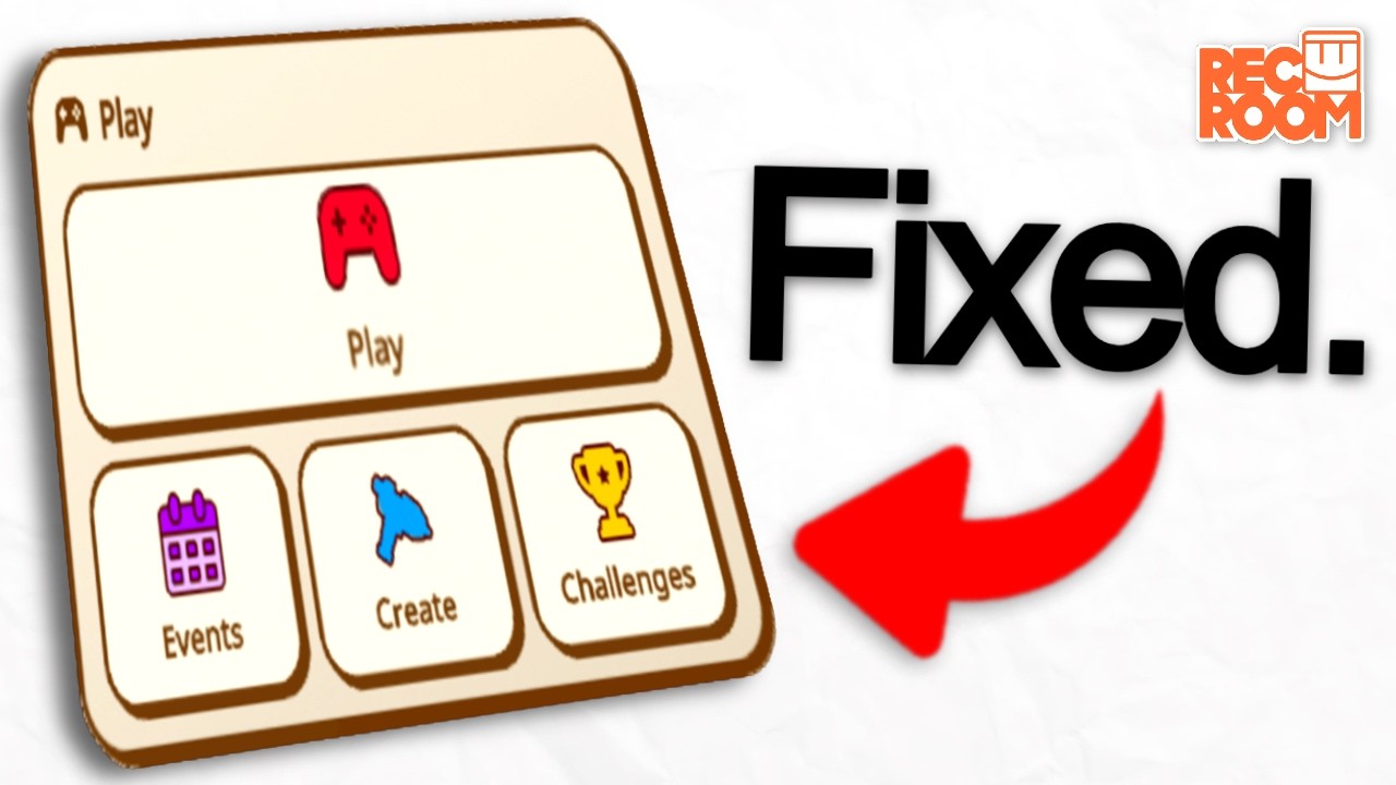
Rec Room recently released the NEW Widget Watch UI, so in this video, I managed to make 9 different concepts for the Widget Watch, ranging from SIMPLE fixes, to MAJOR additions.
More About The Widget Watch: https://forum.rec.net/t/introducing-the-widget-watch/6225
Hello, my name is Werewolf, and I make mainly YouTube shorts and TikTok videos a...
buoyant shadow
I have really frustating thing about widget watch, when opening watch in other tab like backpack and pressing TAB again it just closes it to main manu of widget watch
jovial verge
green rover
been debating on whether or not i should post this video in here, since it's sel...
I like the colored UI (the pink one), but I’m wondering if people would buy watch themes in the store.
Or kinda how Nitro works on Discord Recroom: plus users just get more themes than normal players (normal players should have the normal UI and a darker UI).
 worthy hamlet
I dont like it
simple stag
jovial verge
I like the colored UI (the pink one), but I’m wondering if people would buy watc...
Ngl we're looking at the discord nitro approach as inspiration
simple stag
Tbh it's been great hearing you all suggest things that were actively considering for features to make RR+ more valuable to players. Personally I think there's a lot we can do there that's UI related (but I'm a biased person who pays for nitro and uses a custom theme on discord haha)
gilded jasper
at least make dark mode free
if you folks chase the themes options for paywalling
(which in my opinion is completely valid)
indigo kindle
rec room is going to start selling UI colors like discord sells pfp stuff
gilded jasper
well yeah they kind of do need to sell stuff
indigo kindle
$5 per color
gilded jasper
Anything that isn't pushing low effort play menu content or lore items is fine by me
green rover
i would personally be okay with color themes being locked to RR+. which might be controversial, but like genuinely, that's okay.
that being said, i hope that a dark theme is free, like Discord.
i kind of wish that i made a dark theme UI concept for the video i made, but oh well
gleaming stratus
simple stag
Tbh it's been great hearing you all suggest things that were actively considerin...
Please don't lock basic QoL stuff behind RR+ 🙏 extra stuff like more themes past light and dark is great, but making it so non-rr+ users just have a worse experience isn't gonna help the amount of people enjoying the game
indigo kindle
do how vrchat is doing it, that works
gilded jasper
yeah like it's no longer a point of argument about Rec Room being greedy, they genuinely do need all the help they can get
however, the ball is in their court to ship features that monetize fairly and effectively, and I really hope they can get there
simple stag
gleaming stratus
Please don't lock basic QoL stuff behind RR+ 🙏 extra stuff like more themes pas...
It's important to me that basic QoL is there for everyone and I'm very loud about that internally 😁
 strong cedar
The new menu breaks a few aspects of the game.
Some being its been breaking Multiple Choice Prompt and other prompts.
It breaks the here now menu at times making scrolling not work.
Menu State Persistence is no longer a thing.
Makes you go third person and doesnt allow usage of menu until reopened which is sometimes a hassle.
The menu design in general is less efficient in most ways. Takes more clicks to do some things
gleaming stratus
simple stag
It's important to me that basic QoL is there for everyone and I'm very loud abou...
EPIC
simple stag
imo RR+ features should be 'plus'/extra
simple stag
strong cedar
The new menu breaks a few aspects of the game.
Some being its been breaking Mul...
Can you elaborate on the 'makes you go third person' bit? The others sound like issues we know we need to get fixes in for
strong cedar
When you open the menus it sometimes when changing from the Widget watch to the other menu type it'll send you into third person or your menu is farther away.
And that may be also more consistently done whilst in third person, I haven't tested a lot
gilded jasper
strong cedar
The new menu breaks a few aspects of the game.
Some being its been breaking Mul...
a lot of CV2 needs to be retrofitted to work with widget watch, unfortunately it's a pain that the old RRUI is so deeply integrated into the game (yet also not integrated enough considering how many pages still use the even older Bubble UI)
simple stag
strong cedar
When you open the menus it sometimes when changing from the Widget watch to the ...
Oh do you mean when the menu shows up in a weird position behind widget watch rather than fully opened?
gilded jasper
I'm sure if people submit bug reports or talk in this channel about what specific issues need to be fixed, they will be fixed within the next month or two
strong cedar
I guess, i don't know the best words for it, but i could see if I can replicate the things happening
simple stag
Yeah I'm going to be as clear as possible on what ships fixes will be in when we get them going
We have a small window at the beginning of this week to fix bugs found in the shipped version and get them into the following week's ship. We'll be focusing on the CV2 and rewards related bugs tomorrow for sure
strong cedar
Will there be menu persistence added as well?
simple stag
strong cedar
Will there be menu persistence added as well?
By that do you mean the menu preserving history of where you were when on it last?
green rover
kind of wish i made this for my video, but since y'all were talking about it, here's a rough concept of what a dark mode could look like

i would have done the whole menu, but the way i did it, it would have taken forever 😭
jovial verge
green rover
kind of wish i made this for my video, but since y'all were talking about it, he...
Here’s what I did where the boxes are colored instead of the logos
 green rover
jovial verge
Here’s what I did where the boxes are colored instead of the logos
ooo, yea that looks really good lol
simple stag
green rover
kind of wish i made this for my video, but since y'all were talking about it, he...
I'll add this to our pile of player-inspiration
jovial verge
I wonder what actual themes would look like… like one themed around an RRO…
I’ll try to make one for MLM bc it would probably be easy.. idk
spring rain
green rover
kind of wish i made this for my video, but since y'all were talking about it, he...
that’s peak
jovial verge
Wether some themes are locked behind Rec Room+ or sold in the store as long as we got themes I’m good
severe flare
green rover
kind of wish i made this for my video, but since y'all were talking about it, he...
how would it look if the menu was a shade/gradient of purple as the dark mode, similar to the UI that we got briefly in 2020?
that looks really good though
green rover
severe flare
how would it look if the menu was a shade/gradient of purple as the dark mode, s...
honestly not sure. that's how i was going to make it, but i couldnt figure out a way to make it look good, so i settled for this instead
spring rain
severe flare
how would it look if the menu was a shade/gradient of purple as the dark mode, s...
we never got a dark mode
severe flare
spring rain
we never got a dark mode
i know
lemme see if i can try to make a rough mockup real quick
keen hound
gleaming stratus
Speaking of colors this is my concept and it works the smoothest in my opinion
wispy ibex
green rover
honestly not sure. that's how i was going to make it, but i couldnt figure out ...
Unrelated but based silver pfp
green rover
wispy ibex
Unrelated but based silver pfp
ty lol
strong cedar
simple stag
By that do you mean the menu preserving history of where you were when on it las...
Yes it used to allow us to bring it up and it would stay on the last used menu
And got another glitch now
When using a Multiple choice prompt and using it, like a RP's Rank system, or such it may sometimes permanently break the watch until you are either forced out the room, or reset your game, meaning all me and some other players would only see the hand and no menu
severe flare
severe flare
lemme see if i can try to make a rough mockup real quick
rough mockup???
yea the black is better than purple
 frigid bloom
severe flare
rough mockup???
yea the black is better than purple
the old RRUI lol
severe flare
frigid bloom
the old RRUI lol
i hate that im already somewhat nostalgic for that purple UI
eager oak
severe flare
rough mockup???
yea the black is better than purple
I like the purple.
simple stag
alright I have another fun data fact for you all. This is actually the largest % increase I've ever seen on a value. The variant with the Appearance widget + Dynamic behavior (so you can see the Consumables widget) has increased the number of views of the Consumables section of the store by 4 million percent 😂
uncut gull
simple stag
alright I have another fun data fact for you all. This is actually the largest %...
Correct me if I’m wrong, but shouldn’t the main focus be rooms2 features? I’m not too sure why making consumables more reachable would be a good thing considering rec room has been pushing for rooms2 (hence room inventory items) like crazy
Maybe I’m just getting this all wrong, but it feels genuinely backwards to me to support that
simple stag
We picked a feature that we thought could encourage creating 'fun' moments between people and that isn't very emphasized right now. It was also us asking the question "hey do players think these are fun still?"
We do want to create a widget to emphasize room-specific items when those are available, but it's more of a follow-up
uncut gull
yeah I will say, consumables are rather in the dark so to speak in effectively all rooms, I just want to see even more love given to rooms2 is all, it’s already shaping up to be something great
eager oak
Hacking Rec Room and cancelling RoomsV2 now.
simple stag
uncut gull
yeah I will say, consumables are rather in the dark so to speak in effectively a...
tbh I haven't spoken directly with that crew about what we can specifically do for WW + R2, but I'll make sure to do that this week. Thanks for calling it out!
uncut gull
simple stag
tbh I haven't spoken directly with that crew about what we can specifically do f...
Some things I would love to see added specifically for Rooms2 are the following
- access to equipment slots via the ww
- direct access to inventory items backpack
- custom storefront buttons that directly open a storefronts item page
- custom programable buttons that allow for a user to click said button and have a cv2 output signal event of said interaction
 earnest igloo
Pay extra close attention to how you'll handle going back through and between different sections of the UI, Rec Room has always been pretty bad with this where it can end up hard to navigate from one menu to another and then back, or quickly opening up one menu resets how deep you were in a different one or doesn't remember how far you had scrolled, etc etc.
Also of the two tabs—the 4 squares and the lightning bolt—i personally think the 4 sqaures one with all the buttons should be the default to open, i more often want to check various things between my friends online to my backpack to my notifications than i want to check what room or anything to go to next.
Also also, there needs to be something more to indicate the room name in the quick menu is clickable, the "this room" button is incredibly important for navigation and i think should be more clearly shown. I think some of the buttons like this room and the dorm/rec center buttons should be included in the main 4 square tab too, it should have all of the buttons.
Also also also, you've probably heard this one plenty but the buttons/button icons really really need more colour
earnest igloo
neon ibex
I pray that this goes away 🙏
I dunno, the current one tanks performance remember? I definitely would prefer if this new one had the same colour scheme as the current one, i'm not the biggest fan of it, but i have high hopes that it will cut down on some of the lag—not having a ton of room and store thumbnails on the main page
earnest igloo
Australian
Could you tell because of the probable timezone, or because of the "ou" when i write "colour"? 😆
jovial verge
earnest igloo
Could you tell because of the probable timezone, or because of the "ou" when i w...
Colour … but Australian is still very surprising
scenic nacelle
I know its been a few days but I'm curious on what the widget watch looks like right now
 elder carbon
 alpine temple
2 bug with the WW
- WW hate the RRS HUD for some reason
- Both of my menus opened at once when just using the WW normally
https://discord.com/channels/193073071802941451/1347700519787036722
simple stag
alpine temple
2 bug with the WW
1. WW hate the RRS HUD for some reason
2. Both of my menus op...
- We have a fix being tested to make the RR Studio HUD and WW get along. I'll confirm once it makes it in, but we're targeting next week's ship
- We're doing our best to fix this one, we might have a fix, but I need to confirm
 misty wolf
simple stag
1. We have a fix being tested to make the RR Studio HUD and WW get along. I'll c...
idk how to explain this but
whenever a page is opened and i close my watch with widget watch it will close the page entirely then i'll have to go back and open the page i was on again
will we have something where your page will stay opened after closing your WW in the future?
simple stag
misty wolf
idk how to explain this but
whenever a page is opened and i close my watch with...
This is something we're working on a fix for and we consider pretty high priority to fix. We have a few ideas that we're currently working through and I'll be posting updates in this thread when we know when a fix will ship
misty wolf
simple stag
This is something we're working on a fix for and we consider pretty high priorit...
will screenmode have 3d buttons?
simple stag
misty wolf
will screenmode have 3d buttons?
buttons in screen mode will be 2D with a pseudo-3D effect like they currently are on WW. Buttons in VR are still TBD on whether they will be VR or not
TBD = to be determined
misty wolf
simple stag
buttons in screen mode will be 2D with a pseudo-3D effect like they currently ar...
so screemode wont have 3D buttons?
simple stag
misty wolf
so screemode wont have 3D buttons?
does screenmode need 3D buttons?
misty wolf
simple stag
does screenmode need 3D buttons?
well, i liked the 3D buttons more than the 2D ones and I was playing before the og ui was removed
and i dont play RR on VR i play only on screen, I haven't used a vr in my life
simple stag
gotcha. We're keeping it to the pseudo-3D effect for performance reasons, but we want to make sure they feel cool to interact with
misty wolf
nice, i didn't like it from the start but im getting used to it now because the more i look at it the more it reminds me of the og ui imo
simple stag
glad to hear it! We were definitely trying to evoke some of that old 3D button feel with the WW buttons. We're also really excited to continue updating and expanding WW, so let us know if there's anything we can do to help make it better
 tribal gate
simple stag
glad to hear it! We were definitely trying to evoke some of that old 3D button f...
is being able to keep the game scoreboards open without having to go to them back everytime going to be a thing with the WW?
cuz the old ui the game scoreboards stayed until u closed it in the menu but now u have too reopen it every time
misty wolf
tribal gate
is being able to keep the game scoreboards open without having to go to them bac...
thats basically a question i asked there will be a fix to this soon
woven heron
simple stag
glad to hear it! We were definitely trying to evoke some of that old 3D button f...
when is the next split test expansion happening?
simple stag
woven heron
when is the next split test expansion happening?
We're maxed out for the run of the test, unfortunately. We have about 3-4 more weeks before we decide whether to roll it out to everyone or not
frigid bloom
simple stag
We're maxed out for the run of the test, unfortunately. We have about 3-4 more w...
Oh an please for the love of coach. Please update all of the UI so it doesn't look inconsistent
Every. Single. One
simple stag
so far feedback is trending in the direction of going this direction
if we go that route, I will be committed
uncut gull
Free cake pops to everyone split test when
simple stag
I want to delete all the old UI from the codebase so bad
uncut gull
Wait this isn’t general, I’m not meant to shitpost here
simple stag
I don't mind some shitposting
uncut gull
 simple stag
 frigid bloom
simple stag
I want to delete all the old UI from the codebase so bad
Old code=bad performance
simple stag
more like old code == bloat
uncut gull
Rewrite old code = easier said than done
simple stag
and makes it confusing for other people trying to build UI
the new systems do work really well though
and I'm not only saying that because I wrote them
keen hound
We still have bubble menus in the game lol. Maybe just delete them because who uses the block menu anyways (joke.. kind of)
frigid bloom
Also after seeing the WW a bit, i think the style of it looks kind of good
frigid bloom
keen hound
We still have bubble menus in the game lol. Maybe just delete them because who u...
The radio menu still uses that mix between the beta an current bubble ui
uncut gull
frigid bloom
Also after seeing the WW a bit, i think the style of it looks kind of good
it’s definitely different, I’m not opposed to it, I’m just moreso a bit off put now that we have 3 different UI elements, and 1 of them can’t even function without the original backend code
keen hound
One other thing. The og MP ui appears randomly half working when using some tools. Why is it still in the game and shouldnt it be causing instability and "bloat"
But not just that other stuff in general is kind of jank like that lmao
woven heron
simple stag
I want to delete all the old UI from the codebase so bad
good luck rewriting all the 3d uis and the garbage code that probably was
like the pallete for makerpen
frigid bloom
keen hound
One other thing. The og MP ui appears randomly half working when using some tool...
Roblox an rec room always have something in common lol
woven heron
when you see inventions
frigid bloom
Theres atleast a single part of the ui that isn't updated
simple stag
i'm gonna be so excited when we start converting stuff
and we just churn out some new pages
keen hound
simple stag
i'm gonna be so excited when we start converting stuff
Me as welll
keen hound
simple stag
and we just churn out some new pages
if you ever need ideas im an unpaid unofficial intern lmao
uncut gull
keen hound
if you ever need ideas im an unpaid unofficial intern lmao
Wage theft my beloved
frigid bloom
The only thing i don't like is that the colors aren't that colorful or "rec room" like
frigid bloom
frigid bloom
The only thing i don't like is that the colors aren't that colorful or "rec room...
That could change if we get themes (please don't put em behind a paywall )
Fuck i forgot to put a word
Ignore the previous one lololl
Typotypo
simple stag
ngl we might do something like that though
it's not that different than what a lot of other apps do, like discord with nitro
and something's gotta pay the bills
frigid bloom
Maybe putting some behind RR+ could work, but please do it right an don't follow discord's steps lol
By that i mean like, make them something original an not just some gradients slapped onto the ui
I forgot another word again mb mb
uncut gull
imo, rr should go all out with rr+ features
Make it something worth buying, not just some generic subscription because hehe 6000 tokens over a month
Yeah that’s nice, but when every item is like… +6k tokens? Yeah that’s kind of pointless long term
keen hound
simple stag
ngl we might do something like that though
I had an idea for like contest winners they get a custom profile theme and shi
frigid bloom
An like i said, DON'T. FOLLOW. DISCORD'S STEPS
simple stag
from what I've seen, we're very much focused on making RR+ actually worth it
uncut gull
Profile banners RR+ (these display as a background over your avatar in the profile page)
simple stag
there's been a lot of great suggestions and talk internally
keen hound
simple stag
there's been a lot of great suggestions and talk internally
ayy so nick fajita wasnt lying
simple stag
I'm never gonna be able to unsee that
frigid bloom
frigid bloom
An like i said, DON'T. FOLLOW. DISCORD'S STEPS
Most benefits you get from Nitro are really basic that they are not justified being behind a paywall
simple stag
but all my emojis 
runic lava
make paid quality rros with them being free in a rr+ subscription
keen hound
frigid bloom
Most benefits you get from Nitro are really basic that they are not justified be...
and most servers turn off like external emojis
frigid bloom
keen hound
and most servers turn off like external emojis
Yea, paying for something that'll most likely be blocked
keen hound
simple stag
but all my emojis <a:bongo_shark:1335844402899189791> <a:bongo_shark:13358444028...
not for me 😭
frigid bloom
Thats what we call, being greedy 🤑 💵 💰
uncut gull
Make a repeat subscription bonus, if you’ve subscribed for 6+ times you get a fancy maker pen skin idk
keen hound
uncut gull
Make a repeat subscription bonus, if you’ve subscribed for 6+ times you get a fa...
NO KEEP MP SKINS FOR CONTEST ONLY
simple stag
i like my little sharky boys 


uncut gull
keen hound
NO KEEP MP SKINS FOR CONTEST ONLY
do not gatekeep something that does not require it
keen hound
we already lost contest items being special due to ugc we cant lose makerpens
frigid bloom
I wanna use animated emojis an such but because discord wants money, they say nope
keen hound
ok anyways back to widget watch
uncut gull
Contest pens should only be 3D to show off their “prestige”
Any other maker pen should default to always being 2D
Unfortunately they never went this route
and now people will fight tooth and nail over a digital item skin
frigid bloom
Also any plans for the WW to be kinda similar to how the windows 8.x-10 start menu works?
uncut gull
“Oh no what will I gatekeep now to flex over a random person who I have no clue of”
if that’s your logic behind it, you don’t deserve your contest stuff
simple stag
on a UI-but-not-WW note, if you log into RR you now have a 50% chance to be in an optimization split test (only being split test to make sure we didn't drop the ball on something an introduce bugs...again)
frigid bloom
Like with the apps being in squares that you can move to your like, that was my favorite part of windows 8
keen hound
simple stag
on a UI-but-not-WW note, if you log into RR you now have a 50% chance to be in a...
any way to tell or no>
gilded jasper
i already hit 390fps on my dorm room with RRUI but sure I'll take 400+
uncut gull
gilded jasper
i already hit 390fps on my dorm room with RRUI but sure I'll take 400+
Don’t open a UI page, worst mistake of my life
simple stag
keen hound
any way to tell or no>
the font on the top right "View More"/"Similar Content" label on room carousels on Home and Play pages will be different
quiet snow
gilded jasper
i already hit 390fps on my dorm room with RRUI but sure I'll take 400+
Me only getting 113
 simple stag
frigid bloom
Like with the apps being in squares that you can move to your like, that was my ...
windows 8 was so cursed though 😭
frigid bloom
simple stag
windows 8 was so cursed though 😭
Yea, idk why they went with the tablet thing
simple stag
I liked win8 because I had a touch screen laptop. It was great for touch screen. It was very not great for regular keyboard/mouse
keen hound
the widget watch works great on my samsung fridge!
frigid bloom
frigid bloom
Yea, idk why they went with the tablet thing
An considering the disaster that sparkled on launch...
simple stag
i remember doing a sorta-kinda UX study thing when I was doing my masters with a bunch of coworkers trying win 8 for the first time
it gave me a better appreciation for designing for multiple types of input
somehow, this was well before the point in my career when I started focusing on UI
frigid bloom
An gosh whoever made the metroUI really did a good job
Its like a combo between the modern an basic UIs
simple stag
Microsoft is full of great ideas and terrible timing for those ideas 😩
keen hound
simple stag
the font on the top right "View More"/"Similar Content" label on room carousels ...
Like different boldness?
simple stag
i experienced that first hand
 hearty path
simple stag
from what I've seen, we're very much focused on making RR+ actually worth it
Tell them to give us premium dorm rooms 🙂
simple stag
keen hound
Like different boldness?
yup! the font looks a little bolder and less thin/tall
keen hound
simple stag
yup! the font looks a little bolder and less thin/tall
Ah i got it. Vr or just screen?
frigid bloom
simple stag
Microsoft is full of great ideas and _terrible_ timing for those ideas 😩
Microsoft will remember vista:
simple stag
it matches the font for the room names if you're in the split test
simple stag
keen hound
Ah i got it. Vr or just screen?
everything 🙂
i'm excited to see how much it improves hitching on VR
eager oak
keen hound
not for me 😭
You can use any emoji here if you have member+ 
hearty path
Oh did a new version of the WW come out?
simple stag
hearty path
Oh did a new version of the WW come out?
nah, this is a Home/Play page optimization thing I just (re-)re-launched
running it for a few days as a split test to make sure I didn't break more things
keen hound
eager oak
You can use any emoji here if you have member+ <a:AkariDance:411002182201245697>
har i just made a new acc thats why
woven heron
simple stag
Microsoft is full of great ideas and _terrible_ timing for those ideas 😩
technically, you could run rr on a samsung smart fridge
(those fridges are just android phones, which means you can either sideload or normally download apps!)
or to be correct, older samsung smart fridges ran android
the modern ones unfortunately run TizenOS aka the samsung smart TV operating system
hearty path
Ah okay 👍 excited to see the next page!
simple stag
hearty path
Ah okay 👍 excited to see the next page!
I will keep you all posted (and maybe share out some spoilers here when we get closer)
woven heron
eager oak
You can use any emoji here if you have member+ <a:AkariDance:411002182201245697>
no way its referee can you fix steam deck support for rec room /j
eager oak
woven heron
no way its referee can you fix steam deck support for rec room /j
No.
#1065119973883777024 message
frigid bloom
simple stag
fun WW fact: the code that I just launched in the optimization split test is the same code that's used on the Rooms widget. Somehow, WW launched before the optimization split test finished (or even started, really)
jovial verge
i cant read but ok
woven heron
eager oak
No.
https://discord.com/channels/193073071802941451/1065119973883777024/13482050...
real
 knotty otter
the widget watch is pretty cool and i i love it so far! i love how streamlined it is, reminds me of the old ui a bit🥹 here are two minor pieces of feedback
- i wish you could customize which widgets to see on the widget menu, and customize each widget (for example being able to customize which outfits are available to pick from off the widget or being able to adjust the widget’s size)
- the events button looks quite odd being all by itself. it’s a minor nitpick but it bothers me a lil😭I’d love if the dorm room and rec center buttons were added next to it. I know they’re already on the widget page, but they’re buttons that are used quite frequently and players would benefit from it being available at all times (especially when you have to quickly leave an instance). Also, if the rec center button does get added, I’d like if you could click it even if you’re already in a rec center. Haven’t used the button while in a rec center on the widget ui yet so im not sure if this is fixed on there but I miss just pressing the button on the old ui as opposed to having to go to this room to get to a new instance
 queen oyster
I got softlocked in widget watch
Literally
I went to log into rec room next thing you know I cannot leave the dorm room because my watch softlocked me
I tried going to custom rooms, I tried placing a door that brings you a different room. I TRIED ORIENTATION GUN but I got softlocked😭
simple stag
queen oyster
I went to log into rec room next thing you know I cannot leave the dorm room bec...
Can you elaborate on softlocked here? Like was no UI showing up or was it non responsive or something?
quiet snow
I don't think this should be happening.......................
 queen oyster
simple stag
Can you elaborate on softlocked here? Like was no UI showing up or was it non re...
It was showing up but then it dissapeared again. I can send you the video in dms since I have no embed permission here
simple stag
quiet snow
I don't think this should be happening.......................
This is a known one that we keep thinking we fix and then it shows up again 😩
 harsh raven
simple stag
This is a known one that we keep thinking we fix and then it shows up again 😩
Can yall PLEASE add a button that lets me toggle the watch faces
queen oyster
quiet snow
I don't think this should be happening.......................
This is a bug? I thought it was a feature because I like it alot
simple stag
queen oyster
This is a bug? I thought it was a feature because I like it alot
We are considering trying some similar stuff to this to solve the navigation issues
quiet snow
simple stag
This is a known one that we keep thinking we fix and then it shows up again 😩
You can never get rid of RR bugs they are called advanced features.
simple stag
quiet snow
You can never get rid of RR bugs they are called advanced features.
But what if I delete them 
quiet snow
simple stag
But what if I delete them <:blobcat_smart:1335840789070086175>
Then thats a split test
queen oyster
queen oyster
thus this is the video about the bug i have
queen oyster
idk if its just me but when i went through ^SocialOrientation i got the current watch UI back?
earnest igloo
simple stag
I want to delete all the old UI from the codebase so bad
Do you have a list of everywhere it's still in use? I'm curious about where and also wanna see if i know any additional places that haven't been noticed by the team yet lol
 astral shale
I got the new Widget Watch today, and I'm a little disappointed that you can no longer quickly navigate to your recent rooms. As a creator I find myself jumping between unpublished test/work-in-progress rooms quite often, and the previous iteration of the Home menu allowed me to do this quickly, whereas with the Widget Watch you need to navigate to the Create menu first, then look up the room to join.
In addition, it looks like you can't easily navigate to your clubhouse anymore. Previously if you set a clubhouse to override your dorm spawn/Rec Center quick access, you'd be able to quickly return to your clubhouse right from the Home menu. But with the new Widget Watch, it only allows you to go from any room to your dorm, or from your dorm to the Rec Center only. I think the preference would be the ability to go from any room to either your Dorm or your Clubhouse/Rec Center, as it was with the previous iteration.
Is there any work currently planned to address these points?
simple stag
astral shale
I got the new Widget Watch today, and I'm a little disappointed that you can no ...
We are tracking that both of these are issues. I'll be honest that I'm not quite sure yet how we're going to fix the clubhouse one, but we will figure something out
The recent rooms one is something I'll be talking with people about today
queen oyster
here is a suggestion: a kinda ping thingie on the chat menu and the people. on the people tab it counts how many friend requests are sent OR how many friends are online in total. and for the chat tub of course how many chats you haven't read yet. kinda like how discord has those pings.
deft plank
simple stag
We are tracking that both of these are issues. I'll be honest that I'm not quite...
Just add one or two buttons?
woven heron
deft plank
Just add one or two buttons?
i can agree with that but remember that they need to fit a lot of other buttons people have been wanting
deft plank
Or like "Quick access" menu. Dorm, RC and Clubohouse(if any)
woven heron
deft plank
Or like "Quick access" menu. Dorm, RC and Clubohouse(if any)
wait a Rooms tab could go crazy from a UX standpoint
quick access to recent rooms, plus dorm, clubhouse/rc, some favorited rooms, access to play menu, the create party menu, and some recommendations
then again half the stuff i just said is in the existing quick access menu
and there is a decent amount of unused screen space there for additional features
deft plank
woven heron
and clubhouse/reccenter
There can be dedicated tab for all 3 of
em.
Token count can be visible in shop. You dont need to see it when you open watch
woven heron
deft plank
Token count can be visible in shop. You dont need to see it when you open watch
token count is useful and people really want it including me
woven heron
deft plank
There can be dedicated tab for all 3 of
em.
maybe, but i dont want it to be like the old watch
where there ended up being a million tabs
and that also would lead to fragmentation
which is a big problem on the old watch anyways
buoyant shadow
Make the button on back of watch(VR) that is a button for quick bug report that makes screenshot when pressed and opens report bug menu
woven heron
once im done with the projects im working on and have more time
ill draft tons of concepts for widget watch
wireframe stuff for ideas i think could work
(i design uis for games in rr!!!)
deft plank
woven heron
which is a big problem on the old watch anyways
It had few issues but putting a Clubhouse and Rec Center buttons in the Soical tab would not hurt
woven heron
deft plank
It had few issues but putting a Clubhouse and Rec Center buttons in the Soical t...
its fine if its put on the quick access menu
thats what the quick access menu is for
but making a whole seperate tab for quick access to play stuff
would lead to fragmentation
deft plank
woven heron
would lead to fragmentation
One or two extra buttons wont lead directly there.
woven heron
deft plank
One or two extra buttons wont lead directly there.
i mean yeah but either way it would be really weird to
have a quick access page
and then a DEDICATED quick access page for playing stuff
and then the rest of stuff in one tab
 simple plume
delicious
 fiery ibex
im broke enough to not have the island
severe flare
fiery ibex
im broke enough to not have the island
im broke enough to not even be able to play RR on phone
(it doesn't support my android phone)
queen oyster
severe flare
im broke enough to not even be able to play RR on phone
feel your pain
i literally had to buy a new phone just to be able to play rec room and well, become part of the community.
severe flare
queen oyster
i literally had to buy a new phone just to be able to play rec room and well, be...
wow
im already able to play on PC and VR, so not being able to play on phone wasn't that big of a deal for me
queen oyster
severe flare
wow
im already able to play on PC and VR, so not being able to play on phone wa...
i originally made my account back in 2022 with my pc, but i couldnt play it properly because all i could see was pink. few days later after my account creation i had my friend play rec room on their PC through parsec. while they played on their phone which could able to play rec room. it was fun while it lasted. (dont worry i dont do that anymore)
simple stag
jovial verge
I was just about to add a ticket to track this because someone pointed it out internally too. Can't make any promises about when it'll be addressed if there's no functionality loss, but we will get to it
 warped fable
@teal swallow
open torrent
Think I saw someone send something like this before, but I opened my watch > second page > people
It was easily fixed. Just clicking on the second watch menu closed the first. Using the back arrow worked properly
 simple stag
open torrent
Think I saw someone send something like this before, but I opened my watch > sec...
yeah this is one of the gremlin bugs running around. We kept fixing it, then making another change, then it would pop back up again ><. We should have some changes coming in a couple weeks that will hopefully help solve it
oh right, general bug update- a fix for the issue where sometimes you would load into the room and WW wouldn't be there will be fixed in next week's ship
and I forgot to share that we also got a fix in for the CV2 multiple choice prompt issues, which will also ship next week

 simple stag
I miiight be able to swing that for the ship the week of 3/24, I'll check tomorrow
We have a lot of changes we're trying to get in and only so many resources for testing them 😅
uncut gull
Let me help test them, my resume says I’m a really cool person
indigo kindle
we've been saying that they just need a public test build and allow players to test the new stuff. Boom, less QA resources required
weary pollen
indigo kindle
we've been saying that they just need a public test build and allow players to t...
Just have a public betatest server for LVL 50+ players
chrome talon
May have found a fix for the multiple choice issue with the WW. On prompt complete wire directly into execution integer switch. On your options (0, 1, 2, 3, etc) wire it into a delay, set delay to 0.2 second, wire after delay into cancel then the cancel into whatever chip you have it set for. This seems to have worked for me
Would post a screenshot but I don’t have perms for that yet
simple stag
chrome talon
May have found a fix for the multiple choice issue with the WW. On prompt comple...
We're shipping a fix for it next week as well!
chrome talon
simple stag
We're shipping a fix for it next week as well!
Awesome!
Now I don’t have to fix a bunch of CV2😅
white sage
Is anyone else having bug where, if you load into the game after logging in, you can't see or use the menu? I have found a way to help it from doing that, I just have to have some sort of button or something to take me to another room and it's back!
simple stag
white sage
Is anyone else having bug where, if you load into the game after logging in, you...
We have a fix coming for this one next week as well, no more getting stuck with no menu loaded because of some server blip
sly ruin
Sometimes when closing the WW the cursor stays on screen and you can't move
indigo kindle
I had the same issue when it first released. I tried to reproduce it but couldn't.
buoyant shadow
My widget watch doesn't work #rr-media message
queen oyster
buoyant shadow
My widget watch doesn't work https://discord.com/channels/193073071802941451/111...
you have to go to a different room to be able to use the new watch.
simple stag
that'll be fixed next ship, thankfully
simple stag
as a general thing, would it help if I keep a list of some of the top-reported issues in the main post of the thread and update it when we know we have a fix coming?
gilded jasper
just be prepared to say "look at the pins" constantly
simple stag
hmm wonder if there's a good gif I can default to
oh wow there are some weird gifs in that search
indigo kindle
make your own 
 buoyant shadow
maybe add When being in VR mode, we can have 3D items that we can acually pick up from watch lik it was on Legacy watch UI
eager oak

gilded jasper
simple stag
oh wow there are some weird gifs in that search
don't tell me you looked up rec room gifs on the discord gif search 😭
thorn iris
eager oak
<a:pocky_zzz_checkthepins:711350748507537440>
Emerald person
Ik it’s you behind the acc
eager oak
?
thorn iris
Anyway I sleep
gleaming stratus
thorn iris
Anyway I sleep
But first, rock react this thread
https://discord.com/channels/193073071802941451/1295885319471759510
 sudden bloom
there was no point changing stuff that didnt need to be changed
eager oak
Good thing the watch needed changed then.
gilded jasper
I'm going to politely peace out of this space & the discord in general.
All I have to say is this is one of the few good directions the game is undertaking lately and I can't wait to see the Widget Watch continue to iterate and expand, I just won't be involved to provide feedback. In any case, it's likely not needed if it is very solid this early on.
Cheers to anyone still working hard to improve the game, and cheers to anyone still passionate enough to offer feedback. Hopefully more improvements can be delivered to other areas of Rec Room soon as well.
gleaming stratus
gilded jasper
I'm going to politely peace out of this space & the discord in general.
All I h...
Gone but never forgotten
normal salmon
It keeps glitching out with rank system menu’s
uncut gull
“Rank system” is not an official thing, what you likely mean is the prompt multiple choice chip, that’s already known and is being fixed
This channel died ever since quothy stopped talking, I can almost hear them now, voices in the wind 
devout whale
yeah..
simple stag
Sorry all, work was super busy the last few days. But we managed to get almost a record number of changes merged in this week!
Next week's ship (week of 3/17) will include:
- tooltips
- support for languages beyond English
- WW + multiple choice prompt fix
- WW not loading in fix
- RR Studio HUD UI displaying on top of WW
The week after that (week of 3/24) will (so far) include:
- Adding in some different Rooms widget layouts for us to try out
- A bunch of various fixes and polish to make it feel better (this changeset fixed like 5-10 bugs and I don't remember them all off the top of my head)
- (Probably, will update) Fix for some RR Studio objects rendering on top of WW
- (Probably, will update) Better default appearance for This Room and profile buttons so they look clickable
Work in progress (most likely shipping the week of 3/31):
- Changes to how we maintain UI state so you don't always have to restart when you re-open the UI
- Better/smarter tooltip positioning on mobile
This weekend, I'll be responding a bit less frequently than I have been lately. I need to detach from work a bit and recharge my batteries, I've been working a bit too hard lately tbh and need to prevent burnout
eager oak
simple stag
This weekend, I'll be responding a bit less frequently than I have been lately. ...
That's fine, take your time
queen oyster
simple stag
Sorry all, work was super busy the last few days. But we managed to get almost a...
thanks for quoting the upcoming updates
jovial verge
I just reported someone so idk if that has anything to do with this bug but i got a vid on what happens
also can you stop moving my mouce all over the screen each time i move menus just keep my mouce where it last was
 patent jolt
simple stag
Sorry all, work was super busy the last few days. But we managed to get almost a...
ADD OLD AND NEW WATCH TOGGLE
IT’S NOT EVEN REALISTIC
desert lichen
patent jolt
ADD OLD AND NEW WATCH TOGGLE
desert lichen
😭
sly ruin
Bubble watch was so realistic
 final torrent
Ah yes, floating menus that open via a regular looking watch, my favorite type of realism
 queen stirrup
@simple stag There is a few posts about the Widget Watch on the Reddit, in case you missed it
queen oyster
Man I love tapping on my watch in real life and It shows a huge menu in real life.
patent jolt
severe flare
😭 😭
so it’s a “watch” but you don’t look at it
SO THEN HOW IS IT A WATCH??
queen oyster
ragebait 🙏
patent jolt
BRUH
ALSO EVEN THOUGH YOU LOOK AT IT
YOU GET A SMALL SCREEN
HOW IS THAT REALISTIC BRO
queen oyster
desert lichen
https://media.discordapp.net/attachments/1162582071299031070/1348049204760809502...
.
queen oyster
patent jolt
HOW IS THAT REALISTIC BRO
i still dont see your point with this
patent jolt
good thing it’s just the first iteration
devout whale
patent jolt
ADD OLD AND NEW WATCH TOGGLE
What would be the point of a split test then
severe flare
patent jolt
so it’s a “watch” but you don’t look at it
What.
severe flare
patent jolt
YOU GET A SMALL SCREEN
Horrible counterargument and im writing this solely because im slightly ticked off, but watches are small as well, right?
If anything WW looks more like something you see on an actual watch than the flat and cluttered RRUI
It has a simple and consistent layout, most buttons look bigger, and I dig the fake 3D effect it has on screen mode rn
(But im really hoping the VR version will actually be 3D)
sly ruin
severe flare
If anything WW looks more like something you see on an actual watch than the fla...
Exactly, if watches could project their screens then ww is more realistic than something like rrui, a more square like menu than a giant 16:9 one
devout whale
severe flare
Horrible counterargument and im writing this solely because im slightly ticked o...
I also love how I can still see people while using the widget watch, it’s being small and on the side factor is amazing
queen oyster
while the watch shut off all the memory i had of using the current one. i learnt fast. hope the other menus are easier too
sly ruin
Sometimes I feel like navigation on rrui is faster because of the nav bar, but I'm sure that'll be improved too whenever we can customize our widgets
queen oyster
i still wish the settings button was on the left side
uncut gull
Day 42… no sign of quothy, the channel has gone silent, WW is still screen only…
sly ruin
simple stag
This weekend, I'll be responding a bit less frequently than I have been lately. ...
sly ruin
Ohh mbmb I thought you were serious
vocal moth
queen oyster
i still wish the settings button was on the left side
Why??
queen oyster
vocal moth
Why?? <:RRwah:842642184671068190>
Think of a new player. The settings is small where you cannot notice it. So having it on the side big and noticeable is nice
And good.
jovial verge
Anyway… how is VR widget Watch going?
simple stag
jovial verge
Anyway… how is VR widget Watch going?
Still prototyping. It's slow going because we're prioritizing fixes and improvements for the version we've shipped first
the update that landed last night has the following WW improvements & fixes:
- Tooltips!
- Localization support
- WW should now always load after joining a room
- Multiple-choice CV2 prompts & WW now play nice together
- RR Studio HUD UI and WW now play nice together
Please let me know if you run into any issues that seem like they should have been fixed!
 autumn fiber
When getting errors loading into dorms (i.e. 'failed to load dorm') Widget watch still fails to show up when opening menu, until leaving the room
simple stag
autumn fiber
When getting errors loading into dorms (i.e. 'failed to load dorm') Widget watch...
is this in the update from last night?
autumn fiber
Yes
simple stag
hmmm okay. I'll file a bug and we'll see if we can get a fix into next week's ship
autumn fiber
👍
simple stag
I think I can see a way that failing to load could mess things up
any idea why you were failing to load into the dorm?
autumn fiber
My cell service is poor, currently out of state, so i have no choice
simple stag
that's actually really helpful context
I'll mess with our networking tools and see if I can simulate a similar delay/failure
thanks a bunch for letting me know about it!
indigo kindle
I ran into a bug where when I first loaded into my dorm after opening recroom, it pops up with the "import friends from steam" page. When I closed it, it went to the 2d ui home page instead of the ww home page.
 simple stag
indigo kindle
I ran into a bug where when I first loaded into my dorm after opening recroom, i...
does it persist as the Watch Home page when you close and re-open or does it go back to WW?
indigo kindle
simple stag
does it persist as the Watch Home page when you close and re-open or does it go ...
it goes back
queen oyster
indigo kindle
I ran into a bug where when I first loaded into my dorm after opening recroom, i...
hide your token count. QUICK
 true meadow
queen oyster
hide your token count. QUICK
That’s nothing compared to most cash grabbers
keen hound
ahh the days when i had a couple hundred k
 strange prawn
ahh the days when i had a couple hundred k
queen oyster
wtf
so uhh thats weird, i opened my watch now and now its back to the default watch???
did the new watch splittest got taken away?
simple stag
Was just about to post about that haha
We're reducing the rollout and the number of groups we're running. We have enough feedback and data to help us identify the gaps we need to close to be able to ship it to everyone.
Only 20% of the playerbase will have WW for the rest of this month. We're then planning on taking a slight break from the split test during the first week of April while we wait for some planned changes to ship, then we'll start it back up again
I'm planning on sharing out some fun facts about what we've learned in the next couple days as well 🙂
queen oyster
for april fools we should get the most unusable watch menu ever
simple stag
ngl if things went well with the test I was going to do an April Fools where I told you all we were gonna give up on WW and keep what we have
unfortunately things did not work out for me to troll you all like that (and also I didn't expect so many people to want the 2D UI)
gleaming stratus
The "so many people" is just a bunch of people who can't adjust to change, nothing wrong with WW
simple stag
if there was nothing wrong, we wouldn't have had to decrease the rollout 😅
queen oyster
i do hope some of our reccomended stuff do get added in (like showing tokens in the menu and not just in the store tab)
gleaming stratus
I mean yeah it definitely has some bugs (like it just not opening) but from what I've seen in here it's not all too bad
simple stag
however, we have built up a lot of internal confidence that we want to keep investing in it so that we can ship it
gleaming stratus
ALTHOUGH I would love it even more if the menu you open onto is the other one rather than what it is right now
Or if you could toggle between
simple stag
that is on the list of things to potentially try, but not sure if we will yet
we also have some neat ideas around improving the overall navigation flow between the different menus and WW. Some of those ideas were inspired by player suggestions 🙂
queen oyster
quothy im not sure if you can do this because of NDA but can you draw us a programmer art of what the next menu that gets WW Magic look like?
toomuch?
 raven dew
the only thing people have complained to me about Widget Watch is it opens to the party menu first ( Aka the lightning icon) when they really want the 4 square menu first (They also weren't a fan that things weren't labeled like it was just icons but I guess that is just a split test)
frigid bloom
why am i always unlucky an i don't get the good splittests but i get the bad ones instead 😭
 oak iris
simple stag
unfortunately things did not work out for me to troll you all like that (and als...
I think that a lot of people prefer the current UI because of its colourful depiction
And it's more screen-based focus
autumn fiber
I prefer WW, because it isnt a mishmash of every menu in one
I think its better than the current one, but still has a bunch of flaws with the weirdness with menus, and glitchy jank
oak iris
The issue is, you have to satisfy both sides. VR wants an interactive, simple watch that doesn't impact performance and the screenies want a more usable but still colourful UI
green trench
Hey @simple stag unsure if this is a bug but I randomly got the old watch back, like fully. I switched rooms and it stayed. Was this supposed to happen?
simple stag
simple stag
We're reducing the rollout and the number of groups we're running. We have enoug...
#1346912823531409528 message
green trench
Got it
simple stag
yeah it's intentional
but just for a little bit while we figure out some adjustments 🙂
open torrent
Crossing my fingers I get to keep it 🤞
simple stag
Disclaimer: this is purely an information-gathering exercise and not a promise of future features we're going to add.
We'd like to gather some info from those of you who create rooms about what kind of things would be convenient to have in the Quick Access panel. Some examples of what I mean are a "Save Room" button so that you don't need to open up the This Room page, a Room Settings button, and a carousel of Inventions that you can use
uncut gull
simple stag
Disclaimer: this is purely an information-gathering exercise and not a promise o...
I’ve been saying this day 1 of ww, programable cv2 buttons via events
raven dew
simple stag
Disclaimer: this is purely an information-gathering exercise and not a promise o...
I tend to use my Favorites as my "Get back to my own rooms" tab lol, I've rarely used the create tab, the only time I use it is if I'm looking for a room I don't know the name of/only know of when I made said room like a time frame so I can look through the list of rooms Also most creators that actually know how to create only use their own inventions, they never use inventions from the store lol
simple stag
uncut gull
I’ve been saying this day 1 of ww, programable cv2 buttons via events
We have this grouped in a different bucket of "features to make creation/rooms better" rather than "features to aid the creator work flow"


 simple stag
uncut gull
<:angorymadge:992302679911043142>
We do want to do that though! That was actually one of the original selling points I made for WW
"it gives us a place to surface an entry point for creator ui/creation features" was one of the OG reasons for moving in the WW direction
simple stag
raven dew
I tend to use my Favorites as my "Get back to my own rooms" tab lol, I've rarely...
Oooh I'm really curious to learn more about the invention thing. Is it because the inventions in the store don't seem useful? Or because you'd rather make your own and have full control over it?
uncut gull
simple stag
Oooh I'm really curious to learn more about the invention thing. Is it because t...
random butt in here, it’s both
uncut gull
Inventions in the store are wild and worthless, I mean that in the literal sense, as a creator, I’d much rather have my own custom carousel of my own inventions at the ready when creating
autumn fiber
Instead of fully replacing the start menu, have a 'Phone' that they can pull off their hips, that opens Widget Watch
simple stag
uncut gull
random butt in here, it’s both
Happy to hear from anyone on this to try to understand more! As an engineer, I feel like there's always a balance to strike between "go find imperfect, but existing solution so I don't have to write my own" and "okay but I want full creative control" when I'm working on projects
autumn fiber
Use only for paid inventions is my main turnoff for buying inventions
If it was possible to, id love it so buying an invention lets you edit and save it, but only you and other buyers can
uncut gull
There is no downside to letting a user choose their own style, the issue arises when said style is something forced onto them without the option to make it more impactful to the specific individual, it’s just simply not possible to create something so perfect it works for everyone, what is possible is allow even the smallest of details to be fine tuned though
raven dew
simple stag
Oooh I'm really curious to learn more about the invention thing. Is it because t...
Mixture of all of that
-Inventions tend to be locked behind a paywall and tend to be low quality Including when if an update breaks them, there is no fixing them since you cannot modify use only inventions, and to sell it needs to be use onlySo theres no point in relying on them when they probably can break and since its use only and if they are in a circuit board you are barred from modifying them
-Control, again since its use only you can't modify it, there are inventions that are edit and save and have modify controls, but at that point you can just take those circuits, re-create them, save them and boom its fully your circuits now, which kinda defeats the purpose of inventions
-You can create it but better, most of the time inventions are a product of their time, so they tend to become less useful over time because you might have developed something more powerful than what you used in the past, and since those inventions cannot and won't be updated, they become more useless
The sole reason I used inventions was transporting my stuff from room to room 9/10 stuff it was music or content from 1 subroom to the next, the only time I've gotten an invention other than my own/my teams was to support a creator usually buying a donation or a cool invention they made But would never use
Doesn't help that 90% of the invention store breaks the CoC/CCoC (aka either real rule breaking content, OR blatant copyright infringement which breaks a CCoC rule but doesn't get enforced so  )
simple stag
raven dew
Mixture of all of that
-Inventions tend to be locked behind a paywall and tend t...
Ty for the insight! I passed it along and looks like they're typing up a response in this thread 😁
 ashen glen
Curious if it helps that R2 inventions are all free and modifiable, and that the authors can update them if they go stale or get broken? We've tried to revisit the main reasons they suck to create with
They are pretty hot off the presses, so no worries if you haven't had a chance to play with them yet in R2!
queen oyster
simple stag
Oooh I'm really curious to learn more about the invention thing. Is it because t...
People don't use inventions in their rooms anymore due to the cash grab rooms popping up which of course use room templates and alot of inventions. I don't remember a single person grabbing a template just to make a room out of it since I started playing rec room.
Basically inventions are good, but were killed by the money hungry players.
gleaming stratus
I just like making stuff myself so I don't use inventions
I probably should for models because I can't model for shit but oh well
ashen glen
Soon(TM) you'll be able to get and share RRStudio content via R2 inventions as well, so hopefully they'll help for that!
devout whale
ashen glen
Soon(TM) you'll be able to get and share RRStudio content via R2 inventions as w...
Even UI???
queen oyster
ashen glen
Soon(TM) you'll be able to get and share RRStudio content via R2 inventions as w...
Not sure but I'm hoping. Inventions are a main issue when making a room. Tbh I don't blame the staff not updating invention tower (even though there is smaller room that is like invention tower but not really)
raven dew
ashen glen
Curious if it helps that R2 inventions are all free and modifiable, and that the...
how would it handle inventions being updated? Would you need to respawn them in again to get the updated version? What if said invention maker goes rouge and deletes the circuits or something, do we get access to invention revisions?
and if we are going to be able to upload straight unity content to the R2 store, what stops users from downloading content from the unity store, re-uploading it to Rec Room as an invention and then when the ability to monetize rooms 2.0 inventions slapping a price tag on content thats explicitly forbidden to resell?
ashen glen
raven dew
how would it handle inventions being updated? Would you need to respawn them in ...
- At the moment you have to delete the old one and spawn in the new one, yeah. (This is all live, so you can go play with it in R2 if you want!) If the invention maker goes rogue, you'll always have access to every version they published. You can use the Invention Details page to get at all the back catalogue versions.
- Technically I think this opens people up to a lawsuit from Unity so do it at your own risk I guess :] I don't have a comprehensive answer for you except that we'll still be responding to reports and takedown requests, and that Studio content will have to go through the same moderation Studio rooms do
ashen glen
devout whale
Even UI???
yes! UI may not work on day 1, but it's the next thing on the list. initially you'll have meshes, texture, custom audio, and studio functions
devout whale
ashen glen
yes! UI may not work on day 1, but it's the next thing on the list. initially yo...
That’s actually so cool 🔥
I can finally have like ui in my dorm
Or a probuilder cube in my dorm
raven dew
ashen glen
- At the moment you have to delete the old one and spawn in the new one, yeah. (...
Inventions version catalogue is fire, thats a much needed QOL feature a bit very late but much needed feature
ashen glen
you want a probuilder cube??
devout whale
ashen glen
you want a probuilder cube??
Yeah
I made a cherrry version of it once
Which is basically the normal probuilder material but red
And I put it in a room I had
Now imagine I could make that an invention!!!
devout whale
People gunna be jealous of my red probuilder cube
ashen glen
I'm sure it strips the scripts and everything. it's only orange scene stuff
devout whale
ashen glen
I don't actually know how probuilder works with it to be honest
I mean can’t be different since it’s just like a different type of mesh
devout whale
ashen glen
I'm sure it strips the scripts and everything. it's only orange scene stuff
Orange scene stuff?
What’s that mean
queen oyster
ashen glen
- At the moment you have to delete the old one and spawn in the new one, yeah. (...
Won't it be better for there to be a option which version should be accessed or not?
devout whale
Also probuilder works with studio so I imagine it’s classed as a component
Would be so cool in my dorm honestly

Custom video players anywhere!?!?!
devout whale
ashen glen
I'm sure it strips the scripts and everything. it's only orange scene stuff
Will video players have different rules
uncut gull
ashen glen
yes! UI may not work on day 1, but it's the next thing on the list. initially yo...
Being able to just spawn in studio UI with maker pen to start creating will seriously improve creation flow, I look forward to this I can’t lie
ashen glen
queen oyster
Won't it be better for there to be a option which version should be accessed or ...
Not sure I follow the question? But here's how it works:
As the author of an invention, let's say I save four versions. I see them as .1, .2, .3, .4
Then I publish. Version .4 becomes version 1
Then I save two more times. Those versions are 1.1, 1.2
Then I publish again. Version 1.2 becomes version 2.
Someone who downloads it sees version 1 and version 2 while the author sees .1, .2, .3, 1, 1.1, and 2
ashen glen
devout whale
Will video players have different rules
Good question! I don't know yet. Video players won't work out of the gate, we'll have to figure out the rules when we get there. There are some moderation and jr player concerns there I suspect
devout whale
ashen glen
Good question! I don't know yet. Video players won't work out of the gate, we'll...
Alrighty
sly ruin
ashen glen
Soon(TM) you'll be able to get and share RRStudio content via R2 inventions as w...
So I assume once an rrs invention is spawned the room automatically gets the #rrstudio tag? (Of course if the room isn't already a studio room)
fiery ibex
may i suggest an addition to the widget watch?
yeah so add a massive red “DESTROY REC ROOM” button on the right side of the screen
and it glows sinister red too
raven dew
fiery ibex
yeah so add a massive red “DESTROY REC ROOM” button on the right side of the scr...
tbh this would be a hilarious April fools joke and all it does is close the game
eager oak
Bans the player
lean bronze
simple stag
We're reducing the rollout and the number of groups we're running. We have enoug...
I'm apart of the 20% 
autumn fiber
I am not :<
 uneven thunder
I’m not 😄
 random mica
Personally as someone who is now back to the old watch I can confidently say I really didn't like the new one it was really confusing and not to mention buggy at times
I do have a question if I publish an outline and originally make it free how would I then change it in future to earn tokens from it?
green trench
random mica
Personally as someone who is now back to the old watch I can confidently say I r...
yeah. having the old watch back helps a lot
random mica
Is it possible to fix the mass spam invite problem btw as I'm constantly having to decline invites over and over. Maybe make it where if someone declines your invite 3 times then you can't send that person another invite for atleast an hour?
Unless obviously they then request to join
wintry karma
I still have it!! Haha

I still want a home button though because pressing back multiple times is worse than just one button/slower
simple stag
random mica
Personally as someone who is now back to the old watch I can confidently say I r...
what about it was confusing? I'd love to understand more so we can help close the gap and make WW a good replacement
autumn fiber
simple stag
what about it was confusing? I'd love to understand more so we can help close th...
Im pretty sure it was the fact it was split in half
Either the lightning and 4-square box should be combined, or the 4-square box shouldve been the default
simple stag
wintry karma
I still want a home button though because pressing back multiple times is worse ...
We are shipping a fix for this either next week or the week after. There will be a way to open the WW directly w/o going back and tapping the Watch icon/hitting Tab won't reset you back to the WW any more
wintry karma
awesome 🙀
random mica
simple stag
what about it was confusing? I'd love to understand more so we can help close th...
The whole layout was just confusing to me as I'm autistic and adhd sometimes the smallest change can throw me off
open torrent
wintry karma
I still have it!! Haha
Why is the customizable dorm still a split test?
random mica
Plus the last 2 days I had it my game was really buggy and so I had to close my game over and over
simple stag
how was it buggy?
queen oyster
open torrent
Why is the customizable dorm still a split test?
its really not a splittest anymore. anyone can access it... right?
open torrent
queen oyster
its really not a splittest anymore. anyone can access it... right?
No, I still don't have it, not even on alts
queen oyster
open torrent
No, I still don't have it, not even on alts
thats very much weird
random mica
simple stag
how was it buggy?
Basically every like half an hour things would stop working like changing outfits my friend was also completely freezing like she could open her watch and close it but wasn't able to move at all
simple stag
random mica
Basically every like half an hour things would stop working like changing out...
that's super strange. Was your friend also in the WW test group? And did it always seem to happen after 30 min of playing or could it happen sooner?
simple stag
and did it seem to matter what room you were in?
random mica
Nope it was happening no matter where I was
simple stag
okay, ty. We'll look into that today to see if there's something unanticipated going on
random mica
Thanks