#f1-hq-photos-and-videos
1 messages · Page 12 of 1
 clear adder
 cedar jewel
Me too
clear adder
Bottas spun for each Title his team mate had before the race
 rocky stone
- the number of titles schumacher has
 patent orbit
You are a Bottas fan?
clear adder
No
C'mon you gotta feel bad for him
He was supposed to challenge Lewis for the title then
No
In a way yes
He clearly wasn't lol
It went so horribly wrong
patent orbit
clear adder
C'mon you gotta feel bad for him
I felt worse for Ocon
First, he had an amazing start
Second, he is a great rain driver so he had good chances from p3
 fading stag
Didn't he get tapped by Bottas twice?
clear adder
He got redemption later in the season so it's ok
clear adder
His schoolmate bested his result by one place though
patent orbit
And then second time Bottas was impatient imo and smashed into him 😅
 patent orbit
Gasly was obviously better than Ocon in 2020, no way around that. I hope he can prove himself better in 2021 or I will have to pick a new fav f1 driver 😅
clear adder
hamiltoff

As if Ocon was dumb for getting angry when Gasly started beating him in karts
patent orbit
clear adder
hamiltoff
When did this happen? 
 patent orbit
It must be rare to see Hamilton spinning or my memory is bad. Can't remember Hamilton spinning before this 
 gilded nymph
I heard that last one coming from a kilometer away
clear adder
everyone on Wet 

 icy shadow
clear adder

 spark crow
Awesome post-2001 car
icy shadow
i miss those days-
spark crow
🌶
 icy shadow
🌶️ 🌶️
🌶️

 spark crow
rocky stone
🥵
spark crow
rocky stone
🥵
Man this red was a beautyyyy
 ivory scroll
the new merc video suggests mercedes might be back to silver arrows

 runic belfry
No it does not
They have already shown a teaser where the car was black
And Toto said they would stay black a long time ago
ivory scroll
o
😦 I like the black livery and all, but seeing the silver arrows back would be kinda sick
 stone rapids
Yeah Merc being black instead of silver feels like Ferrari being blue instead of Red
clear adder
bono my tyres

 cyan bison
I wonder how many Pirelli awards Sir Lewis has
Seeing him not taking those small tire trophies last year was crawling into me
 grave cove
 clear adder
Ooooh
fading stag
It looks more striking in the flesh and on track. I like it.
 dusk harbor
same, it looks great on track
gilded nymph
the clover really helps it
dusk harbor
that rear wing looks weird though, it looks like it's been ripped straight off the 2013-2015 Ferraris

 fervent galleon
I want the alpine car to look like this. ( this is a mod on f1 2020 )

 karmic cape
Oh yes
fervent galleon
It’s awesome
runic belfry
Just letting you know it will not
clear adder
Probably... Ech it would depend on the new engine regset honestly
 spark crow
 pulsar flint
yo i need a good wallpaper for my pc....
pulsar flint
yo i need a good wallpaper for my pc....
You being a Merc fan, these have worked perfect for me


Valtteri's is 4k, Lewis's is 5k I believe
pulsar flint
spark crow
You being a Merc fan, these have worked perfect for me
Thank u so much
spark crow
Np
They got a lotta high res quality stuff on r/f1porn as well
That’s where I got those photos
clear adder
pulsar flint
yo i need a good wallpaper for my pc....
https://www.scuderiaalphatauri.com/en/f1-wallpaper/
https://www.mercedesamgf1.com/en/wallpaper/
https://www.ferrari.com/en-EN/formula1/all-media
https://www.sauber-group.com/motorsport/formula-1/gallery/
https://www.haasf1team.com/search?search_api_fulltext=pictures
https://www.mclaren.com/racing/downloads/
Huge collection
Choose any wp


Wallpapers by Mercedes-AMG Petronas Motorsport

Discover all the videos and images from Scuderia Ferrari: races, interviews, historical moments and much more
 shut terrace
 runic belfry
clear adder
https://www.scuderiaalphatauri.com/en/f1-wallpaper/
https://www.mercedesamgf1.co...
runic belfry
clear adder
https://www.scuderiaalphatauri.com/en/f1-wallpaper/
https://www.mercedesamgf1.co...
All/most of those have some sort of post-editing done to them tho
Which is a shame in some cases
 open silo
most photos have editing done to them
runic belfry
Not if you get them straight from the content pool
 spark crow
Man Merc wallpapers are horrible ngl, like they max out the contrast
open silo
my desktop before i went to this

was an alphatauri photo
I generally find that their photos are better than their wallpapers


 shy flicker
thats fucking sexy
clear adder
Ooh it looks seskier on track
spark crow
Have a feeling it'll end up being livery of the year 👀
 placid cargo
 hidden coyote
just quick 'shop to give it softsa
hidden coyote
just quick 'shop to give it softsa
is there a ferrari pic like this
hidden coyote
placid cargo
is there a ferrari pic like this
2021 car?
hidden coyote
spark crow
Have a feeling it'll end up being livery of the year 👀
i agreeeee
clear adder

uh watch the #WeRaceAsOne not be there in Bahrain
forgot if I posted this
Ayo that slightly rumbly/unstable part doe
spark crow
Unstable nah, that’s how all F1 engines sound when accelerating from low revs
clear adder
spark crow
Unstable nah, that’s how all F1 engines sound when accelerating from low revs
Yeah but like... It really helps this boi
 shrewd hinge
clear adder
forgot if I posted this
shrewd hinge
clear adder
forgot if I posted this
Ok yeah this livery does look good on track
 patent orbit
what is this tho?
 runic belfry
what is what
 runic belfry
^^
 clear adder
Oh ok
Idk what is that

That's all I could find
that's for next year
the pic
Oh ok lol
I'm blind ig
 runic belfry
patent orbit
runic belfry
patent orbit
Just a fin for aero purposes
clear adder
https://en.wikipedia.org/wiki/Canard_(aeronautics)
It's kinda similar to this is

A canard is an aeronautical arrangement wherein a small forewing or foreplane is placed forward of the main wing of a fixed-wing aircraft. The term "canard" may be used to describe the aircraft itself, the wing configuration, or the foreplane.The term "canard" arose from the appearance of the Santos-Dumont 14-bis of 1906, which was said to be r...
Close resemblance to that

@patent orbit
patent orbit
uh okay..
hidden coyote
patent orbit
Winglet that redirects some air behind the bargeboards and under the floor
hidden coyote


 alpine wing
eighty one is an energy drink, they look kinda sketchy ngl
alpine wing
patent orbit
oh that, that redirects air flow
which helps them regain downforce
well canards are mostly used for control or lift. well its also used to modify air flow
 hardy elbow
hidden coyote
https://twitter.com/SamCarpenter_/status/1365447182573273093
hardy elbow
hidden coyote
https://twitter.com/SamCarpenter_/status/1365447182573273093
It's not better
alpine wing
honestly tho, that looks bad

like, now you actually just inverted it now
from a side view that may look good but on track thats just horrible
clear adder
No it looks better with that
shrewd hinge
I like it more
dusk harbor
the original is better imho
clear adder
clear adder
Close resemblance to that
Oh shit I forgot to say that it is inverted to create some downforce, unlike the one in the pic which creates lift.
Vind's prolly happy because it's a Canard lol...
It's a small cannard that's used to redirect air on the surface, or boundary layer, which is hot and slow into an aerodynamic help as opposed to going through the radiators
clear adder

 vast valve
pls rich
rocky stone
heh?
vast valve
nvm thought dank memer was here lol
rocky stone
why would it be in a picture channel?
patent orbit
vast valve
nvm thought dank memer was here lol
why not just go on reddit?
it just takes the top 20 or so memes from r/memes
rocky stone
popcon, i think they meant the dank memer bot
patent orbit
yeah I meant the same
it keeps looping the top 20 memes
anyways [this conversation is for #deqeneral-🤪 ]
rocky stone
 karmic cape
DEM WINGLETS
 rocky stone
they are yes, in the picture
karmic cape
Its covering the Intel logo on the engine cover


 karmic cape
Possibly the best looking Minardi

 silver panther
would have to disagree
 icy shadow
 spark crow
what a sick photo
clear adder
great colours
the Williams and McLaren cars contrast much better than a Ferrari replacing either
spark crow
back when overtaking was possible at the hairpin
icy shadow
sigh miss those days
 zinc oak
It is still possible but it's... Extremely difficult
Cars are just too big
They have been for decades now to overtake at the hairpin but anyway
karmic cape
silver panther
would have to disagree
Nah... Full yellow wouldn't do it. The only time yellow would work if it was on the 80's-early 90's MInardis

 lost nymph
silver panther
would have to disagree
lost nymph
silver panther
would have to disagree
reminds me of landos 2019 helmet
 cyan bison
dusk harbor
the original is better imho
cyan bison
dusk harbor
the original is better imho
Agree, the balance of colors with the inverted Alfa colors feels much better, also the striping on the side makes it more normal
lost nymph
clear adder
is this abu dhabi pit exit?
clear adder
Yeah it is the pit exit
spark crow
 open silo
He's not flying the plane
But otherwise, yes
It was before his first Grand Prix, in 2001 iirc
 fervent oasis
I mean Kimi served in Finnish Air Force
 lavish notch
Yeah
zinc oak
Wasn't it army?
I don't think it was air force
Iirc he just served the mandatory military service that Finland had at the time
lavish notch
He served in air force ig
open silo
zinc oak
Iirc he just served the mandatory military service that Finland had at the time
and now, afaik
lavish notch
yes finland had a mandatory service tht time
 clear adder
Wait what if the driver numbers on the car for Merc are gonna be red??
fervent oasis
?
cyan bison
Lewis had red, Valterri had cyan... Man, if only they can allow personal font designs on driver numbers as well, similar to MotoGP's personal rider numbers
 tall terrace
i think it would be alot more of a limiting factor because on an f1 car, the only way you can really tell a driver apart from their team-mate is by their helmet, top of the chassis, number and gloves. i think keeping the number a solid colour would help in f1 more, seeing that in motogp you can see the whole rider aswell as the number
like the rider will have custom helmet, boots, gloves, possibly even different suit (aswell as number)
and its alot more visible to the untrained eye
would be a good idea though
open silo
by top of the chassis, do you mean the T cam?
cyan bison
As far as number system are right now in F1, the only actual drivers that have also personal designed numbers (if you also consider the numbers in their personal logos) are Vettel, Ocon, George, Romain, Kevin, Valterri, Kimi
lavish notch
lol
shrewd hinge
halo customization would be cool
tall terrace
Mercedes did somehting like that last season didnt they
cyan bison
shrewd hinge
halo customization would be cool
I agree
open silo
tbf, Mercedes did that
lavish notch
Yeah
shrewd hinge
yes a bit
shrewd hinge
but from the front as well, would be nicer
cyan bison
Just for onboard cam guide tho... but it would be cool if they did that in the entire halo
silver panther
it doesn't help when some of these teams decide to have an annoying number design
lavish notch
yeah it was to help us recognize from t cam ig
silver panther
that can be barely seen
tall terrace
open silo
Valtteri had a blue one
george had no stripe, but if he were to have one it would have probs been red
open silo
silver panther
it doesn't help when some of these teams decide to have an annoying number desig...
Esteban Ocon #37
shrewd hinge
silver panther
it doesn't help when some of these teams decide to have an annoying number desig...
alfa romeo moment
open silo
Williams is easy tbf
cyan bison
open silo
Esteban Ocon #37
Frl... I thought Ocon had 37 when it was actually 31 
silver panther
in fairness it was more awful with the rokit livery
cyan bison
I actually kinda like the number fonts Williams had in 2020 before Rokit left
silver panther
yeah same
open silo
it was just blocky and weird
tall terrace
the 2020 one?
silver panther
white and blue is used
silver panther
way too much
open silo
it was really weird
silver panther
was nice to have some red
shrewd hinge
actually some lines made sense
but it could have been better
on this pic it looks pretty nice
 silver panther
yeah it depends on the angles
open silo
i think it's only as hyped as it is because it wasn't as shite as this
 silver panther
that is probably the best it ever looked
shrewd hinge
open silo
i think it's only as hyped as it is because it wasn't as shite as this
this one was actually really cool irl
only thing that just doesnt work is the red rokit bullshit
open silo
O_O
dusk harbor
unpopular opinion:
the 2019 Williams livery was alright
shrewd hinge
the ferrari was weird
open silo
the SF90 was perfect.
open silo
not a single line I'd change
dusk harbor
but then the SF1000 looked garbage
dusk harbor
with those weird matte spots where the black spots were on last year's car
open silo
opposite Zed
shrewd hinge
nah but the ferrari was like a very weird ass carrot red color
open silo
they were shiny under the numbers
dusk harbor
oh
open silo
The "orange" red looked better lmao
dusk harbor
either way I don't like how that looked at all
open silo
especially on TV
dusk harbor
why not make it one type of red all over the car
open silo
cuz SF1000
dusk harbor
or keep the 2019 livery, that was perfect
shrewd hinge
it had this type of color
 cyan bison
The SF90 still looked better in the matte imo than the SF1000, the SF1000 had some missing details
dusk harbor
bruh the SF90 looked and was better in every way
shrewd hinge
open silo
that is the most edited photo of carrots i've ever seen
doesnt matter it is to demonstrate the color of the car not be a realistic carrot photo
open silo
but that's not the colour lmao
cyan bison
open silo
I have no idea why they made it worse lol
Probably the black bits
open silo
it was a slightly
shrewd hinge
i dunno man it looked like that irl
shrewd hinge
bruh ive seen it with my own eyes
shrewd hinge
ok but i was?
open silo
and on TV it's a very slightly oranger red
cyan bison
SF90 had that black detail in the end of the ghetto shark fin, while the SF1000 had none

 cyan bison
Also the number fonts in the SF90 looked better
open silo
Honestly, Ferrari even kept using them elsewhere
shrewd hinge
yeah the SF1000 number fonts are terrible
shrewd hinge
ferari
 dusk harbor
cyan bison
dusk harbor
cyan bison
ok here it doesn't look that bad
open silo
 dusk harbor
at least the shiny bits aren't visible
open silo
they're visible on that tbf
dusk harbor
but yeah the 2019 car looked way better with all the black accents
open silo
look at the back
dusk harbor
I hope they return them this year
open silo
 dusk harbor
also the SF1000's number font was fine imo
open silo
it was fine, but the SF90's was better
dusk harbor
reminds me of their 1994-1995 cars
shrewd hinge
sex
 open silo
Everything about the SF1000 livery was like... fine
It was just worse than before for some reason
well I know the reason
it's Ferrari
dusk harbor
I blame the shiny red bits
dusk harbor
I thought both were the same font
 paper moth
the 5 has rough edges
open silo

yeah
i don't really mind cuz they're not really supposed to be displayed next to each other
shrewd hinge
ok so i found this on my hockenheim pictures imagine being that one guy who does not sit in the shade
 cyan bison
I just really think the Gold color in the Rich Energy livery a bit too off

 shrewd hinge
german weather ™️
 dusk harbor
still a similarish look to the 5 and 16 numbers though
but just a little bit different
paper moth
whatever the fuck this was
 shrewd hinge
what the
open silo
cyan bison
I just really think the Gold color in the Rich Energy livery a bit too off
yeah, i like that livery, but it never truly looked gold
dusk harbor
paper moth
whatever the fuck this was
Sauber number font moment
shrewd hinge
yo printing guys just print number 99 in arial bold cool
open silo
just Ferrari things
cyan bison
paper moth
whole different font for mick too
They just went "Nah... just make it Italics, no one would see the difference"
 shrewd hinge
h
silver panther
i prefer the white pm sponsoring
 cyan bison
Mission Winnow looked better in white tbh, but it kinda worked with black in the SF90 livery
cyan bison
open silo
have to say, i'm glad the model i've got is the 90th one
Wouldn't it be restricted to 18+ or something if they added MW logos to scale models as well?
I mean almost like the same to F1 games
shrewd hinge
i prefer the 2018 ferrari as well
open silo
No idea
shrewd hinge
or the 2017 one even, that one is so good
shrewd hinge
yeah MW isnt a tobacco brand its purely an alias for philip morris so they can inject a boat load of money into ferrari
open silo
I also doubt they're selling 1/18 scale models to children anyway
Children may have them, but i'm pretty sure an adult will be able to buy it for them...
I think it's more that it's the SF90, so they should put the 90th anniversary logos on it.
shrewd hinge
i didnt even know what mission winnow was until the outrage broke out that it was PMi
cyan bison
open silo
MissionWinnow isn't a tobacco brand
Well the logic behind PEGI ratings or ESRB is because PMI owns Marlboro and MW, thus saying Marlboro = MissionWinnow
open silo
They also didn't run the 90th logos in Spa

When Charles won
So I'm happy that I don't have the MW for that reason too
paper moth
cyan bison
Well the logic behind PEGI ratings or ESRB is because PMI owns Marlboro and MW, ...
no
open silo
nor at Monza
 paper moth
PMI explicitly says on their website and terms of conditions that engagement with the brand has to come from users with over 18 years of age
Thus it cant be present in videogames
cyan bison
What is MW in general anyway? All it says they're some communications platform
open silo
MissionWinnow is a way to get you to think about Marlboro
paper moth
They say it's a forum about all things science and transformation for a better future
open silo
I think technically they're supposed to promote PMI's innovation
clear adder
lol
paper moth
yesh
paper moth
yep
open silo
You're not actually meant to know what they do, because they don't really do anything except sponsor things where PMI's tobacco brands are banned
paper moth
a lot of effort for... "yeah PMI good now see"?
cyan bison
So... it's just PMI's scheme to put some encrypted code image ala Barcode/Ferrari Academy logo in a Ferrari?
paper moth
MW since its inception has sponsored:
- Scuderia Ferrari
- Ducati Corse
- Pramac MotoE team
- Formula 1 (they're a hidden sponsor)
- MotoGP (online only)
- Monaco Grand Prix
- Some seminars
- Randy Mamola
 spare dune
paper moth
MW since its inception has sponsored:
- Scuderia Ferrari
- Ducati Corse
- Pramac...
spare dune
paper moth
MW since its inception has sponsored:
- Scuderia Ferrari
- Ducati Corse
- Pramac...
dont forget mclaren
they sponsered as malboro
paper moth
spare dune
dont forget mclaren
"since its inception"
im talking about MW not marlboro
spare dune
oh
dusk harbor
a bit of a belated addition to the Minardi discussion, but my personal favorite Minardis are the 1999 M01 and the 2002 PS02

 clear adder
When did Minardi fold?
clear adder
the 1991 would be my fave

it used a Ferrari engine, unlike what could be thought with this pic and a Lambo engine in the back
dusk harbor
from that period, mine would be the M194
 dusk harbor
clear adder
it used a Ferrari engine, unlike what could be thought with this pic and a Lambo...
dusk harbor
clear adder
it used a Ferrari engine, unlike what could be thought with this pic and a Lambo...
yeah they used a Ferrari in 1991 then switched to Lambo in 92


 stone rapids
Minardi performance: 
Minardi livery: 
 near meadow
god bless
 normal hare
society if Minardi had mugen engines in 95-96
silver panther
normal hare
2000 minardi though
agree
dusk harbor
like the pale yellow myself, but prefer the silver and blue of 1998 and 1999
paper moth
yes
clear adder
it was
alpine wing
 grim garden
*2005
grim garden
*2005
yea, typo
alpine wing


 fading stag
alpine wing
fading stag
alpine wing
Colin McRae on PlayStation, oh the memories.


 rapid basin


 rocky stone
wouldnt this be more applicable to #creative ?
zinc oak
I really don't like Marlboro logos on modern cars
clear adder
It's proportion doesn't fit
clear adder
alpine wing
2006 minardi was nice
2005 minardi
clear adder
 sterile wren
Acfl it is, right?
sterile wren
sorry?
clear adder
 clear adder
I find this better than the current livery

I was about to see looks good until I saw the red on the sides
runic belfry
Yeah let us just give INEOS the brand color of Petronas and give Petronas the brand color of INEOS
That is totally how it works
paper moth
let us feast
fading stag
Have INEOS changed their color on the sponsor placement?
The red looks much brighter than last years red which was a bit dull. They might have not, maybe it's the renders making it seem that way
runic belfry
Not that I know of but it might be slightly brighter
At least that is what it looks like in the renders
But render materials will always make stuff look weird
near meadow
the red on the real car looked the same as last year
gilded nymph
the arrows looked so much better
they added a useful pattern to the car but this is just stickerbomb
clear adder
 fading stag
sexy beast
 clear adder
This render is sick!! 🔥🔥🥵🥵
clear adder
clear adder
This render is sick!! 🔥🔥🥵🥵
No it's not
 ember pulsar
It is
gilded nymph
 gilded nymph
clear adder
This render is sick!! 🔥🔥🥵🥵
gilded nymph
clear adder
This render is sick!! 🔥🔥🥵🥵
ugly
that's an f1 2020 livery template from myteam
clear adder

📸 Alpine A521
🎙 Renault E-TECH 20B
🇫🇷 @OconEsteban
🇪🇸 @alo_oficial
#A521Launch
💙 in the comments if you’re in love!

 Twitter
·
Twitter
·


 karmic spear
 clear adder

The new SF21 livery if they followed the Merc template
Likes
610
 Twitter
·
placid cargo
Twitter
·
placid cargo
any high quality wallpaper for ferrari?
would like the tuscan gp livery if possible
 mighty pollen
any high quality wallpaper for alpine?
placid cargo
prolly a lot
runic belfry
📸 Alpine A521
🎙 Renault E-TECH 20B
🇫🇷 @OconEsteban
🇪🇸 @alo_oficial
#A521Launch
💙 in the comments if you’re in love!
Twitter
·
Use those
They're like 3K
grave cove
 gilded nymph

rapid basin
I'l miss you RS20. You gave Ricciardo and Ocon a few good moments.
 clear adder
Do you reckon that this new nose philosophy is being adapted more and more as a pre-cursor for 2022?
rapid basin
Good question. There is a round nose design for 2022 so expect it more next year
 quick nimbus

 icy shadow
 fading stag

 primal solstice
this is mine


 rare fog
i also have this as my lock screen


 primal solstice
it would be amazing of one of the alpine drivers made a joke in pre season testing about cold tires lol
clear adder
primal solstice
it would be amazing of one of the alpine drivers made a joke in pre season testi...
lmaoooo
primal solstice
if nando could do something for an entrance that should be it
lavish notch
primal solstice
it would be amazing of one of the alpine drivers made a joke in pre season testi...

lavish notch
rare fog
bruh i asked for smth completely different and i did not even ask you no offense
 indigo leafBOT
 lavish notch

fading stag
lavish notch
where did you get tht photo from
This one?

Here's a link to my Imgur ultrawide collection: https://imgur.com/a/pOvHbPK
 lost nymph
fading stag
Here's a link to my Imgur ultrawide collection: https://imgur.com/a/pOvHbPK
lost nymph
fading stag
Here's a link to my Imgur ultrawide collection: https://imgur.com/a/pOvHbPK
ur a goat
fading stag
Np, photographers and editors are the real goat for capturing such cool shots.
 mossy rock
no, i'm a goat
lost nymph
fading stag
Np, photographers and editors are the real goat for capturing such cool shots.
exactly
clear adder
😳
 ripe kettle
 naive ibex
I don't like alpine card
naive ibex
I don't like alpine card
why
 crimson granite
top 3 livery for me (for now)
naive ibex
ripe kettle
why
idk i just dont
lavish notch
fading stag
This one?
thanks a lot


 rocky stone
<3
spark crow
 karmic cape
Looks better than I expected
 karmic cape
The pink is just perfect
spark crow
Yeah, could've been wayyyy worse
karmic cape
The car could have been the watermelon Aston Martin
 cloud shuttle
karmic cape
cloud shuttle
karmic cape
First Racing Point used a Mercedes, and then Aston Martin used some of Mercedes' design cues
 spark crow
The official AMR21 wallpaper from the vault thing
 fading stag
karmic cape
First Racing Point used a Mercedes, and then Aston Martin used some of Mercedes'...
fading stag
karmic cape
First Racing Point used a Mercedes, and then Aston Martin used some of Mercedes'...
ha
lavish notch
karmic cape
First Racing Point used a Mercedes, and then Aston Martin used some of Mercedes'...
 worthy moat
this is not edited, go check it out on google earth if u want

who did this
who put this on google earth
 fervent pine
lmao
worthy moat
I saw sBin which made me laugh so i clicked on it then saw it was described as a place of worship which just made me facepalm
 cyan pulsar
Bottas mowing service
worthy moat
didnt know mercedes was making lawn mowers now
gilded nymph
every track has that
monaco has stuff like kimi's boat and bono my tires: tire shop


 clear adder
YO
The BULGE MY GAMER
owo
Where has this sweatpants season bulge come from? That can't just be package tightening
clear adder
Thr AMR21 looks clean
 modest stratus
karmic cape
First Racing Point used a Mercedes, and then Aston Martin used some of Mercedes'...
modest stratus
karmic cape
First Racing Point used a Mercedes, and then Aston Martin used some of Mercedes'...
‘cause Mercedes 🐐 team

clear adder


Literally made it a Merc
With Cognizant as sponsor
Oh god
PJ's version in the replies is better

@BrandonSeaber @btwnracinglines Slight revision courtesy of Discord 😉
 Twitter
·
Twitter
·
LMAOOOOOO
alpine wing
the bump is more obvious in the amr
paper moth
of course they didnt have images to trace
 wide siren
Lol


 raven skiff
stop please
cyan bison
clear adder
"Get in the Aston Martin Lance!"
clear adder
 rocky stone
why
clear adder
Pain..

 fathom tree
clear adder
fathom tree
clear adder

ember pulsar
Silver mercedes, Black mercedes, Pink mercedes, Green mercedes, its among us!
clear adder
Mercedes is definitely the imposter lol
clear adder
clear adder
That Red looks so good
clear adder
clear adder
this blue is amazing
karmic cape
clear adder
Pain..
If The Joker had an F1 car
 ivory scroll
yeahh its an interesting livery to say the least
patent orbit
 sacred pasture
mazepins dad paid big money for dat
sacred pasture
mazepins dad paid big money for dat
Well yes... They are the title sponsors
Like almost every other title sponsor does..
Bwt even forced the team to colour the whole car pink
 ember sable
sacred pasture
mazepins dad paid big money for dat
ember sable
sacred pasture
mazepins dad paid big money for dat
for sure
 thorny pier
 American Team using a Russian Livery.... something isn't adding up
sacred pasture
American Team using a Russian Livery.... something isn't adding up
sacred pasture
big brain
ivory scroll
If mazepin paid me a couple of million I would pretend to be russian for him
mighty pollen
lol
 void hemlock


 karmic cape

clear adder


 dull hazel
.unmute @clear adder
indigo leafBOT
Successfully unmuted RecklessDude777#1118


 clear adder
Ok fine
dull hazel
.unmute @clear adder
indigo leafBOT
Successfully unmuted RecklessDude777#1118
cedar jewel
You were muted twice lmao
dull hazel
send them in 4 rather than all
clear adder
I just saw this lego model
dull hazel
np np
clear adder
It’s so good
 karmic cape
HAAS spotted
 dull hazel
i wanna be a professional lego builder now smh
fading stag
How fragile is it? The joints on this must be precise to the teeth and thick.
fading stag
cheating
clear adder
They made sure none of us can take pieces off it
raven skiff
Formula Lego w/ 2022 regulations
clear adder
There’s no halo in the model I mean
clear adder
Yeah
raven skiff
I'm the penalties guy, I accept money from shady people in turn of a driver not getting penalties
yes?

 clear adder
angle 3
 fading stag
spark crow
fading stag
spark crow
Love the color, it's elegant in the flesh.
But, I think the sponsor placements/size are a bit off. And, I think they underutilized Aston's badge on the car.
runic belfry
What is wrong with the sponsor placements
clear adder
im surprised they aren’t using the AMR logo anywhere
fading stag
Crypto(dot)com is on the bulge.
Aston Martin badge on the side is not prominent enough
Peroni would look better if it wasn't on the fin
But, this is from a fans perspective and not the team who have to consider various other factors.
And also get rid of the JCB yellow box and just have JCB in white on the wing but that would be modifying their logo so I don't think they'd want that.
hidden coyote
karmic cape
HAAS spotted
haas used to (might still) be a supplier for ferrari
karmic cape
hidden coyote
haas used to (might still) be a supplier for ferrari
Really?
Huh. Never knew their partnership had been active pre Haas debut
hidden coyote
ye
spark crow
clear adder
im surprised they aren’t using the AMR logo anywhere
There's an AMR logo on the chassic plaque thing inside the cockpit but that's all you'll get lol

 brisk mirage
clear adder
angle 3
brisk mirage
clear adder
angle 3
Seb first in green 😍
stone rapids
The Aston Martin livery might just become my fav
clear adder
no bruh
for me alfa romeo one is better
i like that chrome red
also they did the uno reverse card
with the livery
paper moth
ok
mighty pollen
can you guys create a Seb wallpaper in that AMR?
runic belfry
 zinc oak
Ah that pic that gets reposted every month or so
zinc oak

alpine wing
clear adder
lmao i thought it was big until i saw that
patent orbit
how have I never seen this before
 hardy elbow
Never saw the McLaren one either
clear adder


Everyone had it


Alfa Romeo ☝️
Looks like RP didn't have a Danke Niki
hardy elbow
Maybe on the drivers helmets
 clear adder
Oh ok
clear adder
Tbh I like Tommo's livery. (Except the pinstripe, I liked the pink one)
 gilded nymph
 stone rapids
You love to see it
 vagrant mirage
gilded nymph
if only they moved the f1 logo and fia logos further down the door
it would be 10/10
clear adder
Make it bigger
spark crow
Sick helmet


 ocean estuary
spark crow
Sick helmet
ocean estuary
spark crow
Sick helmet
that looks real nice
clear adder
Bruh what?
paper moth
crazy
clear adder
There's no gravel traps in Silverstone iirc
clear adder
Haha s🅱️in funi
shy flicker
it looks like its edited from strolls mugello crash
 fast marten
clear adder
There's no gravel traps in Silverstone iirc
fast marten
clear adder
There's no gravel traps in Silverstone iirc
what
there definitely are lol
 clear adder
 rotund oak
Pictures taken before heartbreak 😭😭😭
patent orbit
What kinda heartbreak did you get after you saw Gasly kneeling?
shy flicker
him retiring at imola
patent orbit
Ah yes mechanical failures so hurtful.
I was bawling my eyes out when Ocon's Gearbox went BRrrrrrrr
clear adder
shy flicker
him retiring at imola
That too within 4 laps 😦
clear adder
He had a stellar race so it's cool
primal solstice
why haven’t george come up in this conversation yet


 spark crow
got any higher res?
 hardy estuary
I miss this livery
 lost nymph
same
icy shadow

 wide plank
Same
Better than 2020 and 2021 for me
I wonder what the 2022 livery be
karmic cape
2019 was beautiful
rocky stone
the 2019 livery felt kinda empty ngl
lost nymph
rocky stone
the 2019 livery felt kinda empty ngl
i think the sponsors were placed nicely
rare fog
yes
clear adder
icy shadow
Why does the blue look more like the AMR Racing Green?
LOL
runic belfry
I hate you for calling it that
clear adder
Ahahahahahaha
rare fog
Aston Marting Racing Racing green
runic belfry
It’s British Racing Green
rare fog
no its Aston Martin Racing Racing Green /s
lost nymph
runic belfry
It’s British Racing Green
rocky stone

 twilit shuttle

 odd pawn
Bruh racing green

 covert acorn
twilit shuttle
covert acorn
twilit shuttle
isn't that the game.......
lost nymph
twilit shuttle
clear adder
 karmic cape
 lost nymph
clear adder
lost nymph
clear adder
the aero on f1 cars are so good that the pixels deteriorate over the car in a photo
twilit shuttle
lost nymph
<#470964143793373184>
Oup..
gilded nymph
karmic cape
👀
clear adder
 runic belfry
 rocky stone
high quality po
runic belfry
poo
cyan bison
karmic cape
How tf did Super Aguri got a 4 year old car legalized in the grid that year? /s
patent orbit
karmic cape
where are the sponsors...?
karmic cape
patent orbit
where are the sponsors...?
well it was a test mule....
hardy estuary
spark crow
Liking the red!
clear adder
 fervent oasis
I forgot about that fire
alpine wing
cyan bison
How tf did Super Aguri got a 4 year old car legalized in the grid that year? /s
it has some differences, well only difference i can find is the front wing
and rear

 patent orbit
 stone rapids
This is pretty cringe to look at tbh
raven skiff
omg so offensive having a little bit of a human body shown
clear adder
raven skiff
omg so offensive having a little bit of a human body shown <:webbah:361904880064...
he's 6
raven skiff
I'd actually be worried if it was
clear adder
 frank plinth
 alpine wing
renault were very weird in the early 2000s
clear adder
Who weren't?
clear adder
Bar the F1 cars 😤
 vestal ridge
we need that livery
 clear adder
Apart from the 1,000 sticker that has a Yellow that doesn't ma5ch any other yellow on the car
placid cargo
vestal ridge
we need that livery
yes
cyan bison
How to delete someone else's comment? /s
spark crow
 patent orbit
https://www.reddit.com/r/formula1/comments/m195j3/1920x1080_wallpapers_of_the_2021_teams_i_hope_you/
reddit
0 votes and 34 comments so far on Reddit
cyan bison
The HAAS one is actually pretty good
open silo
old aston logo
karmic cape
 icy shadow
 stone rapids
gilded nymph
ugly livery
stone rapids
gilded nymph
ugly livery
naive ibex
raven skiff
bruh moment
raven skiff
❓
raven skiff
why did u tag
raven skiff
I didn't need to see ur cringey text
naive ibex
it is the picture
raven skiff
shut_up_please_thanks
 raven skiff
I asked him politely he refuted agressively, just saying. Either way I've blocked him so imma just ignore the dude
naive ibex
o k
stone rapids
rocky stone
be nice will ya

clear adder
Them Coanda Exhaust tho
clear adder

F1 Testing, photo plan:
- Rear wing shots
- Shots of the rear wing
- Logo capture, rear wing
- More rear wing shots
Sweet 👍📸
#PoweredByHonda
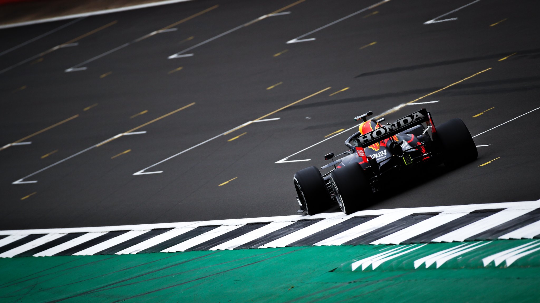 Twitter
·
Twitter
·
 patent orbit
clear adder
*Williams photobomb smh*
patent orbit
clear adder
*Williams photobomb smh*
lol
how did you find seats with no people around?
clear adder
It was 2019
This was the cheapest Grandstand we could get
Main grandstand is usually crowded
I was there at the end of the final straight
 clear adder
 clear adder
karmic cape
'post-2001 photos and images'
clear adder
karmic cape
'post-2001 photos and images'
why bruh
raven skiff
np mate
rocky stone
I really like this
 icy shadow
 rocky stone
 clear adder
That does look post 2001
raven skiff
He's talking about the Williams
raven skiff
well that's from the game
raven skiff
And maybe I'm wrong but I think the admins separated those for a reason man, It's not Post 2001 images, doesn't make sense, it's Post 2001 F1 and the classic channel pre 2001 F1 photos
Just saying
clear adder
Yeah I agree
vagrant mirage
Yeah I could tell from the tires that that Williams was from the F1 game
raven skiff
The way the sun shines gives it away as well
karmic cape
If I wanted some green on a Ferrari F1 car, I might as well have a gander at the 2016-2018 Ferraris
paper moth
 rapid basin


 clear adder
 hexed temple
 lost nymph
hexed temple
lost nymph
hexed temple
GR helmet looks just like the one lewis used in that race
 rugged crag
RIP
icy shadow
RIP Gone but not Forgotten
clear adder
I thought I was the only one who liked sf15t the most


 alpine wing
clear adder
alpine wing
clear adder
i was happy in this one
alpine wing
clear adder
i was in pain in this one
patent orbit
both are pain
patent orbit
clear adder
how did lewis's right rear get torn up so bad?
hexed temple
patent orbit
how did lewis's right rear get torn up so bad?
He was literally full throttle in the gravel
for like 20 seconds
 gilded nymph
karmic cape
The best looking hybrid era car imo
gilded nymph
karmic cape
The best looking hybrid era car imo

 karmic cape
Ngl, I think the SF71 looks beautiful, but Imma put it in P2 behind the SF15
clear adder
in terms of
shy flicker
clear adder

karmic cape
clear adder
in terms of
design and looks
clear adder
So the best designed and looking car in f1 ia the sf15t in your opinion?
gilded nymph
the s15t was meh
karmic cape
clear adder
So the best designed and looking car in f1 ia the sf15t in your opinion?
.....I meant during the hybrid era of F1
gilded nymph
the 2015 cars in general were meh
clear adder
karmic cape
.....I meant during the hybrid era of F1
Ok, that was my question :)
paper moth
what if the SF15T didnt have the SF logo
clear adder
then it would be called the 15T duh
paper moth
hey i know that car
spark crow


Haas looks great on track not even gonna lie
This is a bit oversaturated but I think the green is growing on me
 karmic cape
the green. its dumb
 neat depot
tomato
 tired quartz
it's fine tbh
karmic cape
neat depot
tomato
pasta sauce