#f1-hq-photos-and-videos
1 messages · Page 10 of 1
 clear adder
 runic belfry
smallest images eu
clear adder
The front wing on this is...??
God bless this one.....
How do the aerodynamics on this one work??
 patent orbit
clear adder
How do the aerodynamics on this one work??
patent orbit
clear adder
How do the aerodynamics on this one work??
aerodynamics in that era!?
 neat depot
ngl i kinda liked the ing renaults
 shrewd hinge
clear adder
The front wing on this is...??
shrewd hinge
clear adder
The front wing on this is...??
🅱️enis nose
 gilded nymph
cock nose
 alpine wing
suzuka is a nice track, having it in f1 is also quite iconic
alpine wing
clear adder
God bless this one.....
thats an ensign N179 i think
 cyan bison
'09 Renault R29 was 3rd in my best looking car in that year just behind the Ferrari F60 and BrawnGP BGP001
 rapid basin
 blissful grail
oooooo boi
 grave cove
 rocky stone
🅱️arlos
 spare dune
s🅱️arlos Spainz
grave cove
does anyone have pics of kimi with facial hair or is kimi invincible to growing facial hair
rocky stone
Does stubble count?
 soft beacon
Thought that was David Beckham for a second 
 ripe acorn
lol
 rare fog
grandad kimi
 cyan bison
LA N DO
N O r RiS
clear adder
gilded nymph
the good ol days when seb could actually get close to the mercs
clear adder
Does anyone want a desktop wallpaper? -Monaco 2019
I have some more high res pictures. I can upload if you guys want
rapid basin
 edgy lake
<@470279320414322698> made this and I saved it
edgy lake
<@470279320414322698> made this and I saved it
You made that?
edgy lake
rapid basin
You made that?
I saved it from u
rapid basin
Oh lol
gilded nymph
he didn't make that either but ok


 worn meadow
 spark crow
 minor musk
Erm
clear adder
Imagine dat shit LMAO
 inner galleon
clear adder
inner galleon
clear adder
i have the 1/43 scale model😃
clear adder
NICE
spark crow
miss the old ferrari number font
the 2014 style font
kinda annoyed me how they made it incosistent with charles' number though
runic belfry
Because they used their personal number design
 hidden coyote
runic belfry
Because they used their personal number design
hidden coyote
runic belfry
Because they used their personal number design
not quite
it's the same font but with the flag at the top
spark crow
isnt the same font
hidden coyote
it is
hidden coyote
yes
hidden coyote
no i meant between charles and seb
i thought that's what slendis was talking about
spark crow
charles and seb didnt use the same number font in 2019
hidden coyote
yes they did
spark crow
if they did, then it would've looked similar to how #14 looked for fernando
hidden coyote
no because the 2014 number font is different to the 2019 one
spark crow
not quite because in past ferrari years as well when fernando wore #5
it looked like seb's
for instance
hidden coyote
not the same as the 2019 font
 hidden coyote
its not
the legs going out from the 5 are longer on the 2010-2014 font
it's very similar to what they used until barcelona 2017 but its slightly modified
but not identical
hidden coyote
think of it as an evolution, similar to helvetica and helvetica neue
its considered it's own font
the 2019 ferrari font was less squished as well
spark crow
regardless, if i were to be wrong, i'd think slendis would've been correct because i'd assume a number 6 in the same font as seb's number 5 would look very similar to one another
hidden coyote
they are 😛
spark crow
the italic style as well as the shape of the 6 in charles's 16 doesnt look similar to that of seb's 5
hidden coyote
they're both italic
spark crow
yes but
my point is
the shape
seb's 5 is not as round as charles 6
think we can both distinguish that
if they were both the same typeface, the geometrical characteristics would at least been similar
but theyre not
 placid cargo
Look what I found on Reddit
placid cargo
Damn where you waiting for me, I will post there
hidden coyote
they are the same, you just cant tell easily because it looks different due to the fact that 16 and 5 is very different numbers
hidden coyote
placid cargo
Damn where you waiting for me, I will post there
nah just typing something alredy
placid cargo
Ooh
runic belfry
hidden coyote
it's the same font but with the flag at the top
Oh yeah right, sorry I got confused.
Yeah, you are right.
The font Charles uses on his helmet is quite similar hence the confusion.
hidden coyote
yep
clear adder
I like these colours tbh
Couldn't make it brighter 😦
gilded nymph
tf
clear adder
This?
Oh god I'm so bad at this lmao
clear adder
spark crow
Ugly-ass nose
 keen hedge
clear adder
This?
Oh god I'm so bad at this lmao
keen hedge
clear adder
This?
Oh god I'm so bad at this lmao
The light
clear adder
is the mercedes livery black again?
clear adder
ok thank you
inner galleon
patent orbit
they confirmed it will be black for 2021 a while ago
ies
grave cove
shrewd hinge
what i sthat
hidden coyote
wing flex monitor unit
hidden coyote

gilded nymph
this is me in the morning for no reason at all
alpine wing
when we wake up why do we have erections
rocky stone
uhh wtf did this channel turn into
 pseudo ember
 sand aurora
Checo looks cool😎
alpine wing
im just curious
 shy flicker
alpine wing
when we wake up why do we have erections
shy flicker
alpine wing
when we wake up why do we have erections
we dream about george russell
alpine wing
damn
sand aurora
George Russell in general
spark crow
cyan bison
About the font thing....
They used the 70's number design for their 2017 and 2018 season
Then reverted back to the old font design
 cursive iris
runic belfry
cursive iris
runic belfry
That was just sent^^
 dusk harbor
cyan bison
Then reverted back to the old font design
dusk harbor
cyan bison
Then reverted back to the old font design
and then they went to something of a 1996-style number design last year...
cursive iris
runic belfry
That was just sent^^
I'm sorry
runic belfry
No it's fine
dusk harbor

ngl I liked their 2020 number design
that's one nice thing I'll say about Ferrari last year
cursive iris
Valterri Mercedes F1 Team?
cyan bison
Well the 1000th GP number font fitted them well imo
dusk harbor
#creative if you want to post this kind of stuff, but it looks nice...
cursive iris
look alike
 mild epoch
runic belfry
mild epoch
runic belfry
Been there done that
spark crow
dusk harbor
ngl I liked their 2020 number design
it looks great if the number is 1
clear adder
alpine wing
when we wake up why do we have erections
That's what happens when you listen to the sound of this baby moaning down the straight
Only Michael Schumacher knows how to ride her well
spark crow
uses 300px image
 wraith lodge
boop
hidden coyote
hamilton nurburgring 2007?
alpine wing
god damn
alpine wing
damn
sand aurora
wat
wraith lodge
uh-
 spare smelt
I dont like that
alpine wing
idk
i found this in the wtf1 server
someone posted it after something funny happened
clear adder
Can we keep these to #ot|memes because this channel was intended to be high quality f1 photos
alpine wing
more grip no?
clear adder
clear adder
Bruh this concept F1 car is crazy
thatsssss wwweeiird
yh i dont like the front wing
 north karma
for what year is that concept for
 fast marten
originally 2021
iirc it was one of the first promotional images liberty/the fia used
clear adder
Red Bull Livery in Alpha Tauri colours would be beautiful imo
clear adder
fast marten
iirc it was one of the first promotional images liberty/the fia used
It's black.......
The car
I don't think it was the first ones
One of
fast marten
clear adder
It's black.......
?
that car itself has been floating around for ages

Autosport.com
Formula 1 has revealed more concept images of its proposed 2021 cars, with Ross Brawn confident of an "exciting" new look for grand prix racing
cyan bison
Bruhh... after seeing the actual final concept, the aero perspective on that first concept looks like something that would make racing more difficult with the massive wake and dirty air it could create
fast marten
it was just a weirdly stylised design
at that point, it was more of a PR exercise than a genuine engineering development
 sacred pasture
clear adder
Bruh this concept F1 car is crazy
sacred pasture
clear adder
Bruh this concept F1 car is crazy
Looks sleek and weird, IDK if I like it
 stoic glacier
clear adder
Bruh this concept F1 car is crazy
stoic glacier
clear adder
Bruh this concept F1 car is crazy
looks like a 2030 remake of the W03
from the front wing
 zinc oak
Thought I was looking at a Jordan for a bit till I saw the Renault logo
zinc oak
I don't but it's still beautiful
Put a Jordan wasp thing at the front and it would also pass as a Jordan lol
rapid basin
 stone rapids
True
zinc oak
2012 Lotus was so beautiful outside of the step nose
By far the best (modern) Lotus livery
rapid basin
^
zinc oak
The later ones just had too much red
Especially when Maldonado's PVDSA sponsor came in and also added massive blobs of red everywhere along with the Total red blobs already there
zinc oak
Wished it was lol
dusk harbor
rapid basin
I somehow like like this more than the modern Renault
[2]
the 2010 Renault livery alone makes the current Renault livery seem even more soulless
it honestly looks like a backmarker car with the amount of black on it like bruh
north karma
aint that bad of a livery
shy flicker
it has a bit too many sponsors
clear adder
i love the step nose of this Lotus
north karma
i feel weird looking at the nose now
dusk harbor
I love the 2012 and 2013 Lotuses a lot
clear adder
it was one of the most aesthetic of them
dusk harbor
alpine wing
for some reason the pic is 17mb
probably because you copied the raw image and then uploaded it directly to Discord
 hexed ice
alpine wing
hexed ice
alpine wing
kimis best years
clear adder
yeah he was so good in 2012
clear adder
haha nice one
dusk harbor
Schumi's last podium 😭
 tall terrace
OMP doesnt make suits for any driver on the grid anymore do they
dusk harbor
wait don't they still make Sauber/Alfa's suits?
tall terrace
ooo ill see
dusk harbor
pretty sure they make Williams's
tall terrace
alpinestars is williams
dusk harbor
originally they were gonna use Alpinestars as they have since 2015 but couldn't because money iirc
tall terrace
rokit being a bunch of sillies and just leaving :(
tall terrace
did they not?
cos they got quite involved in sport didnt they
with basketball, formula e etc.
alpine wing
rokit venturi
clear adder
Do y'all have any Charles, Seb or Max wallpapers?
clear adder
Damn🔥
patent orbit
that's not 1920x1080 tho so I have to use a white themed solid background and keep this at centre
pseudo ember
that looks horrible
patent orbit
stone rapids
Surely there's a 1920x1080 version
couldn't find it 🤷🏽♂️
stone rapids
lol
 sweet blaze
u can turn them into desktop ones
u need to edit them a bit
just say s🅱️ innala
and u can get them to rotate
 clear adder
Thank you @alpine wing @patent orbit
 torn plover
lol
rapid basin
 covert acorn
 plucky zealot
alpine wing
i have these wallpapers but theyre for phone
plucky zealot
alpine wing
i have these wallpapers but theyre for phone
These are very good backgrounds for Phone, I like them
alpine wing
theres also a kimi, schumi, perez, norris, ricciardo and alonso
they arent mine so props to the creator
 wary monolith
 hardy elbow
Looks so cool
 cedar jewel
Wonderful
clear adder
runic belfry
I fucked it up
$0 budget editing
pseudo ember
wot
shrewd hinge
You left a lot of white
rocky stone
Niki Tributes
grave cove
dusk harbor
ahhhh 2013 cars 🥺
 lavish mirage
🥺
dusk harbor
still wonder though what that logo was on the Force India's rear wing endplate that year
lavish mirage
Me too
clear adder
The O☑️ logo?
fast marten
i'm not actually sure if it is a company logo
runic belfry
Yeah I do not believe it is
gilded nymph
the force india livery from that year was sex
clear adder
@hidden coyote do you know?
runic belfry
There is nothing on their website about it so it was not a partner of theirs
fast marten
ugh i vaguely remember hearing something about it back in 2012
runic belfry
Nothing on their website about it in 2012 either
hidden coyote
clear adder
<@!90541813655420928> do you know?
which logo
clear adder
good find
 fervent oasis
cyan bison
grave cove
fervent oasis
cyan bison
grave cove
Mercedes and Ferrari are really missing in that pic
patent orbit
runic belfry
That must be the worst logo for something ever
from what I have heard this whole 'q shop' thing was sketchy
dusk harbor
runic belfry
That must be the worst logo for something ever
I legit thought that it was a ripoff of the O2 logo
spark crow
 magic flicker
here we have a happy seb time to make it a meme
zinc oak
....Seb in top gear already is a meme
 silver panther
yum
magic flicker
zinc oak
....Seb in top gear already is a meme
but that face tho lmao
spare dune
runic belfry
There is nothing on their website about it so it was not a partner of theirs
sahara was a partner of theirs until 2018
then canada life replaced sahara
 quick nimbus
clear adder
quick nimbus
clear adder
 jovial sphinx
This is still sad
jovial sphinx
This is still sad
what is sad on this picture?
shy flicker
ric looking at his renault for the last time i would assume
patent orbit
^
clear adder
ah it's ric, thought it was ocon
patent orbit
when Grosjean drove f1 no one gave respect
when he became gamer, much respect
hence Gaming > F1
clear adder
or just that gamers have no respect for other people
grave cove
 arctic turret
he isn't even bad as a gamer haha
alpine wing
grave cove
goddamn
pseudo ember
patent orbit
when Grosjean drove f1 no one gave respect
when he became gamer, much respect
he...
he has lost a lot of respect...
clear adder
for whom
 indigo crane
Man Reddit doesn’t lie
 elfin schooner
hey can someone give me lando noris wallpaper with the Mclaren sena
patent orbit
pseudo ember
he has lost a lot of respect...
why? 
pseudo ember
because how he treats his drivers has become more public
cyan bison
Wait, wot? You mean his eSports team?
pseudo ember
yes
indigo crane
Thank u to that one guy in aarava’ subreddit
indigo crane
Ok sorry I must have forgotten
zinc oak
grave cove
"Why did someone just post a picture of Wiener Praters Ferris wheel... OH DAMN SHIT THERES A RB THERE"
pseudo ember
lul
rare fog

shy flicker
what is circuit
pseudo ember
fiorano
shrewd hinge
pseudo ember
lul
Is this alesi
pseudo ember
no its charles
torn plover
Is sainz driving today or is it tomorrow?
gilded nymph
welp is Leclerc's drive over since he probs beached it
hardy elbow
Why
hardy elbow
I thought it was the picture angle that made it look like it was on grass
gilded nymph
that looks like gravel
patent orbit
the angle is wierd
runic belfry
Leclerc is still driving
torn plover
Can u see this live somewhere?
runic belfry
No
torn plover
shit
 slender beacon
s🅱️inalla
grave cove

who is this guy and why is he wearing an alfa romeo suit
anyone has an answer on who this guy is
 fringe bane
grave cove
fringe bane
grave cove
No
grave cove
why is the car purple
fringe bane
eurgh
grave cove
We are going to beat you to death
dusk harbor
grave cove
the gang is together
no.
alpine wing
grave cove
grave cove
 hardy ore
31 years now
gilded nymph
Checo is now boomer
but he is good boomer like kimi and seb
and sir luis jamilton
grave cove
ocon years now
patent orbit
grave cove
ocon years now
Lewis won first third title with Mercedes when he was 31
Perez is going to Redbull when he is 31
Hence proved Ocon number = best number
dusk harbor
patent orbit
Lewis won ~~first~~ third title with Mercedes when he was 31
Perez is going to R...
Lewis won his first title with Merc when he was 29 though
patent orbit
ok..
dusk harbor
just a minor correction
 reef mirage
grave cove
reef mirage
grave cove
 shrewd hinge
grave cove
https://cdn.discordapp.com/attachments/779398217322332171/803819297801502730/Scr...
shrewd hinge
grave cove
https://cdn.discordapp.com/attachments/779398217322332171/803819297801502730/Scr...
Fixed it
 dreamy willow
reef mirage
dreamy willow
reef mirage
jheeeez
 iron ridge


 shrewd hinge

 shrewd hinge
What
zinc oak
shrewd hinge
Fixed it
Oh no not Anderstorp
shrewd hinge

clear adder
hype
runic belfry
runic belfry
It is now black on the suits so I am wondering if it is going to be black on the helmet too
fervent oasis
now this is an unsmooth operation
grave cove
anderstorp = best f1 track
zinc oak
C o n s t a n t
R a d i u s
C o r n e r s
torn plover
Add Sweden to f1 calendar :)
silver panther
peng
 quick nimbus
tsunoda testing 2019 f1 machinery at imola
covert acorn
nice
clear adder
 round wadi
 quick vector
Doctor: Racing Point NASCAR isn't real and it can't hurt you.
Racing Point NASCA...
quick vector
Doctor: Racing Point NASCAR isn't real and it can't hurt you.
Racing Point NASCA...
Istg this is going to give someone epilepsy
WAYYYYY too much pink
round wadi
alpine wing
Wait where was this pic taken?
alpine wing
honestly idk
alpine wing
Photo of Alonso and Adrian Campos, Campos helped Alonso a lot to reach F1. Rest in Pace Adrian Campos.
https://twitter.com/alo_oficial/status/1354723954682961920?ref_src=twsrc^tfw|twcamp^tweetembed|twterm^1354723954682961920|twgr^|twcon^s1_&ref_url=https%3A%2F%2Fwww.formula1.com%2Fen%2Flatest%2Farticle.alonso-pays-tribute-to-adrian-campos-after-f2-team-owners-sudden-passing.6ibatqAkMg5QAFfdq6A5iZ.html, this is the link and i found it in Alonso's twitter

Uno de los días más tristes para la familia del automovilismo . Piloto y gran impulsor de este deporte. Gracias por soñar con la Fórmula 1. Gracias por creer en los jóvenes. Gracias y descansa en Paz 🙏
Retweets
919
Likes
7467

 Twitter
·
runic belfry
Twitter
·
runic belfry
Why spoiler it
runic belfry
Lol Alfa Romeo is not a lot better than Haas
cyan bison
Well results say otherwise, but in terms quali, Alfa takes the cake
zinc oak
Alfa Romeo is better then Haas but still easily bottom 3
clear adder
107 is alphatauri?
 near meadow
clear adder
107 is alphatauri?
near meadow
clear adder
107 is alphatauri?
yeah thats the gap between AT in 7th and Alfa in 8th
clear adder
pulling some G's
rapid basin
clear adder
near meadow
yeah thats the gap between AT in 7th and Alfa in 8th
Look at the gap between 1st and 2nd LMFAO smh
254 points difference
silver panther
ah my favourite
alpine wing
gilded nymph
move gio to haas and put mick at alfa
no
ferrari or alfa wont do that
you need to take gio in consideration, you cant just say oh lets move mick to alfa and drop gio. no.
fervent oasis
plus alfa/sauber has its own academy
rapid basin
rapid basin
Senna Swaggin
alpine wing
fervent oasis
plus alfa/sauber has its own academy
yea, they have pourchaire
fervent oasis
Yeah
 jade prairie
clear adder
jade prairie
clear adder
i spy 4wd
clear adder
Yes
rapid basin


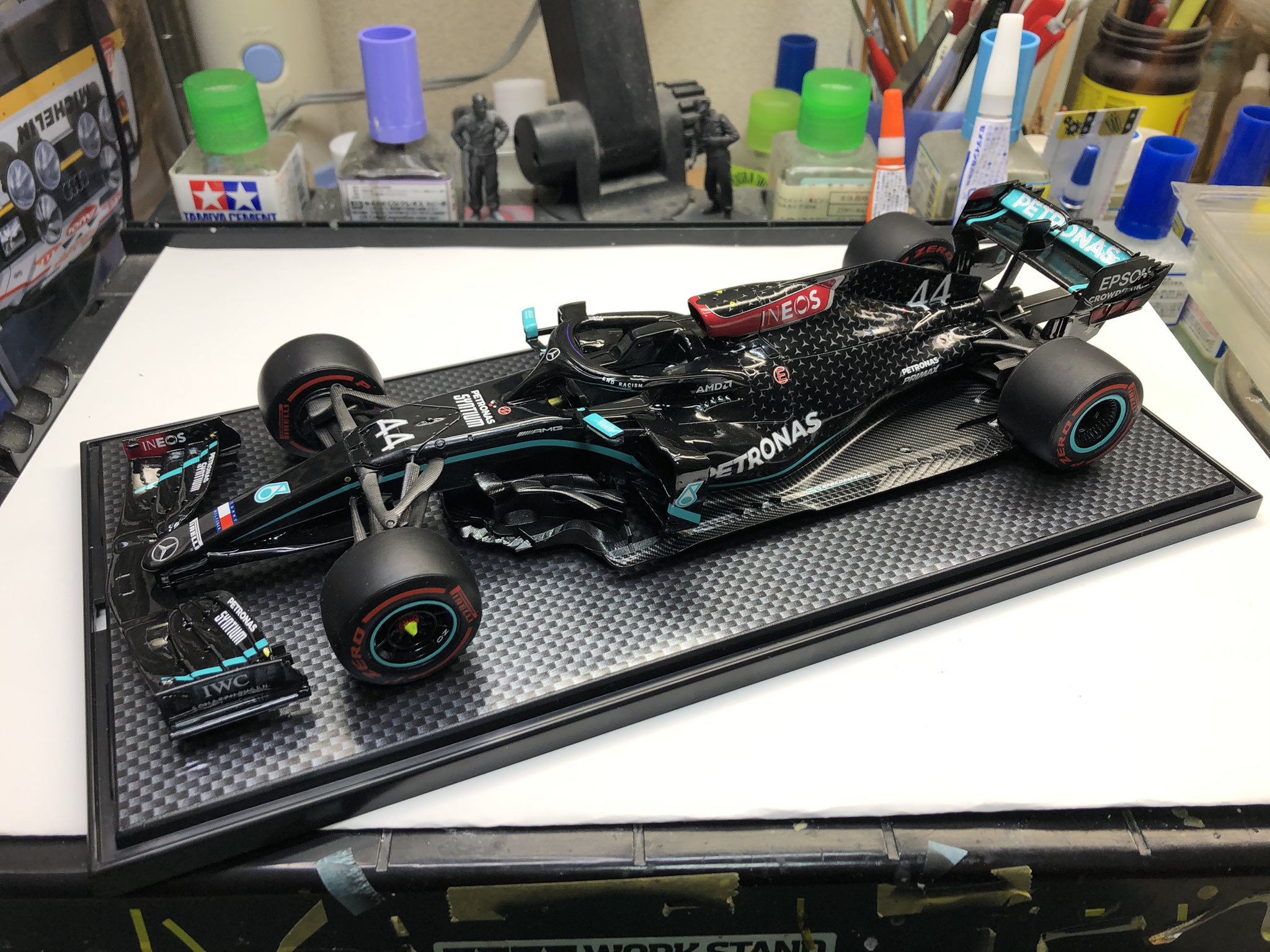
やっとここまで来ました。
まだ、細々と空力部品がつきます。
完成まで、後チョット。
(笑)
#MercedesAMG W11
Likes
124
 Twitter
·
Twitter
·


 quaint adder
rocky stone
rapid basin
https://twitter.com/makoto17502041/status/1348613689687986179
quaint adder
rocky stone
rapid basin
https://twitter.com/makoto17502041/status/1348613689687986179
oooh that looks clean
 dull hazel
 teal lava
dusk harbor
would be a better Bond than Craig tbh
teal lava
dusk harbor
would be a better Bond than Craig tbh
nah
 sweet dragon
dull hazel
sweet dragon
dull hazel
double 0 seben
 rapid basin
Idk who this guy is, but he looks like a chick magnet lol

 fleet eagle
clear adder
Look at the gap between 1st and 2nd LMFAO smh
fleet eagle
clear adder
Look at the gap between 1st and 2nd LMFAO smh
no offense but it was because of Alex
the F1 season wasn't very kind to him but it is what it is tho
he does have talent
 bitter vessel
shrewd hinge
budget max versappen
bitter vessel
shrewd hinge
budget max versappen
LMFAO
 eternal galleon
a
quick nimbus
clear adder
Uhh why is this in this channel?
stone rapids

 tardy idol
quick nimbus
tardy idol
quick nimbus
battery ded
 austere grotto
dull hazel
austere grotto
dull hazel
can someone edit him to make him bald?
shrewd hinge

tardy idol

patent orbit
austere grotto
can someone edit him to make him bald?
why u buli my bald Vettler? :sniff:
 indigo leafBOT
Vettel
austere grotto

patent orbit
Vettel isn't very active on social media so we don't really know but a lot of people say its for a hair replacement surgery
austere grotto
sbinotto sent me
tardy idol

shrewd hinge

clear adder
dull hazel
I simp for Seb
north karma
 calm torrent

neat depot
2008 f1 cars be like
quick nimbus
 summer oak

 pure apex
 little matrix
minichamps or spark
 dark granite
reminds me of grosjean in spain 2018
 clear adder
yes we know, you've posted this picture yesterday 🙂
little matrix
you know what they say
aerodynamics is somewhat addicting
ight that makes no sense

wow
aerodynamically engineered to perfection.
rocky stone
little matrix
https://media.discordapp.net/attachments/797553073257840712/805481183453511740/2...
this is not post 2001 though, is it
little matrix
nope
rocky stone
yeah then this belongs in #classic-motorsport no
little matrix
ah yes my bad
clear adder
clear adder
rapid basin
\
 dusty dome
little matrix
dusty dome
little matrix
im confused as to what im looking at
round wadi
clear adder
This looks good
 marble jasper
clear adder
marble jasper
clear adder
this looks like mountain dew f1 car and i love it
clear adder
Reminds me lf the early 90s Minardi
 ember sable
 rapid basin
clear adder
rapid basin
rapid basin
clear adder
that's not a f1 car, but whose was it, Montoya, Zanardi?
worn meadow
@clear adder is that indy
shrewd hinge
CART
reef mirage
quick nimbus
that the at02?
gilded nymph
there are too many things wrong with that
spare smelt
thats your opinion, i actually like it
gilded nymph
ew
spark crow
why the random red slash at the front
clear adder
spare smelt
spark crow
why the random red slash at the front
i dont know but i kinda like it
round wadi
reef mirage
Like the red, black and white
Everything else is shit yea, but just those three colors are decent
reef mirage
and now he's in F1
 twin shadow
dark granite
twin shadow
dark granite
spain?
clear adder
Ye
alpine wing
new T10
shrewd hinge
reef mirage
This is so bad it's worse than any of the AMR (!) livery concepts
keen hedge
clear adder
they would not use BWT, it doesn't go well at all
runic belfry
That is the problem with most concepts
They show no respect to any of the sponsors
And most focus too much on the design itself and not on the sponsors
fast marten
quick nimbus
that the at02?
technically it's the rs18
clear adder
still using this model ye
with some of the most distinguishable uhh vertical side element thingy. forgot the name.
hardy elbow
Meow
 flint grove
bargeboards
fast marten
clear adder
with some of the most distinguishable uhh vertical side element thingy. forgot t...
turning vanes
clear adder
Ye that's what i thought, but googling it showed elements ahead of the floor
fast marten
ye the forward elements can also be considered turning vanes
gilded nymph
that looks like something racing point should have done with their pink livery
but bwt stickers rule all I guess lol
clear adder
Can't believe motorsport.com did this
stone rapids
They might just pull a "this livery is cool so we just keep it for 2021 as well"
just like they did with TR
pseudo ember
i mean its almost a given imo
redbull never significantly change livery, only minor tweaks
toro rosso never really changed their livery in recent years
nothing points towards a completely new one
stone rapids
It's all about that sweet brand exposure
pseudo ember
and you won't get that if you change the visual identity only a year after it started
stone rapids
yes
 zinc oak
pseudo ember
toro rosso never really changed their livery in recent years
zinc oak
pseudo ember
toro rosso never really changed their livery in recent years
Yeah Toro Rosso only had
The phase of the ugly as fuck "realistic" bull
Then the beautiful metallic blue with the silver coloured bull
And now Alphatauri
clear adder
I loved the og realistic bull
clear adder
Tastes and all :)
 stray sinew
This one?
zinc oak
Yeah
stray sinew
I am newer to F1 so I have never seen that but blech
stray sinew
I like the navy one just a little better
clear adder
The real one you mean?

Vettel in Monza?
Bourdais at Spa
Oh ok
Busy foksmashing the black beauty
What's that tho?
What part
shrewd hinge
i am so confused what you are doing, are you just deepfrying a picture of the merc
clear adder
Looks like a negative
runic belfry
stone rapids
It's all about that sweet brand exposure
this guy gets it
But no
"reeee liveries get boring cuz always the same"
shrewd hinge
f1 fans when mclaren had a marlboro livery for the 7th time in a row

runic belfry
That is different apparently because that livery is iconic
So that can pass according to some people
But when RedBull have the same livery for five years all hell breaks loose
zinc oak
McLaren fans after McLaren only has 3 years of papaya orange and blue, but they now have grey and orange masks while they had grey masks before as well: omg guys they will add grey to the livery confirmed!
runic belfry
Did they have gray masks before though?
runic belfry
Right but the gray seems to be more official now
Well the black/titanium gray
Because they have both shirts and masks in that color with papaya
And their website has more black now than before
eternal galleon
shrewd hinge
f1 fans when mclaren had a marlboro livery for the 7th time in a row
<:sadge:757...
more like 15 times in a row lmao
1981-1996
clear adder
they started in 1974
neat depot
malbro livery overrated in my opinion.
silver panther
looked better on the roberts yamaha bikes
 tardy wind
cool
neat depot
Probably looked better on bikes because they are smaller, on cars it looks abit big empty and basic. Like it would be one of the first basic options in a game for body liveries
Also it took like no effort to design, it's literally just the company logo
alpine wing
marlboro livery was iconic
neat depot
Iconic yes, but not because of the livery itself
silver panther
i think all of the tobacco liveries probably did look better on bikes because of that
marlboro isn't the best design though it is incredibly basic
when you really think about it there has been many
quick nimbus
ford f1
sacred pasture
mod testing
rocky stone
quick nimbus
ford f1
this is more #f1-games no?
tardy idol

quick nimbus
rocky stone
this is more <#470964143793373184> no?
that was an online pic
rocky stone
quick nimbus
that was an online pic
its still an image of the game
 light portal
Don't know how the drivers will adapt to the new car changes for 2022 and 2021 specially people like Carlos, Mick Schumacher, Fernando ect cuz they have joined a new team
tardy idol
no changes in 2021
rocky stone
except for the floor
tardy idol
not a big problem is it
tardy idol
That many changes r every year, they have to adapt to the car
rocky stone
ground effect is coming for '22
tardy idol
thats 2022 smh
light portal
because the cars will be a bit slower
tardy idol
they've got an entire year to prepare
light portal
tardy idol
thats 2022 smh
thats what she said
tardy idol
light portal
thats what she said

light portal
I'm saying 2022 is going to be a major impact not only for the drivers but also for the motorsport itself
tardy idol
bruh
tardy idol
light portal
Don't know how the drivers will adapt to the new car changes for 2022 and 2021 s...
you literally said drivers here
light portal
light portal
I'm saying 2022 is going to be a major impact not only for the drivers but also ...
what am I saying here
tardy idol
lmao nvm mate
light portal
m8 what do I say now
tardy idol
nothing
tardy idol
?




 tardy idol
Lets stop right here
light portal
thats a good idea
tardy idol
#formula-1
 visual nebula
Sbinalla
quick nimbus
sBin
 spark crow
sbin
sweet dragon
S🅱️inalla
rapid basin
 viscid roost
I like the McLaren
rapid basin
Mclaren got their livery game up since 2019. Can't wait for the MCL35M.
viscid roost
I wish they would bring back the Silver and Red livery.
tardy idol
viscid roost
I wish they would bring back the Silver and Red livery.
You can watch Aarava’s videos 
rapid basin
viscid roost
I wish they would bring back the Silver and Red livery.
You could say Mclaren's sponsors has changed drastically over time. They used to have Santander before Ferrari did.
spare dune
they used to have marlboro before ferrari did
rapid basin
tardy idol
Codemasters add the VELO on the blue part of the MCL or else

spark crow
man if only they didnt pay so hard attention to the esrb rating
zinc oak
tardy idol
Codemasters add the VELO on the blue part of the MCL or else
<a:aPES_PoliceShoot...
Vaping sponsor so they dont
tardy idol
what's vaping mean?
zinc oak
Same reason Mission Winnow isn't on their or Estrella Galicia
zinc oak
tardy idol
what's vaping mean?
Essentially smoking without the entire tobacco stuff
zinc oak
Vaping brand
Again vaping isn't tobacco
But VELO is owned by British American Tobacco so
And Mission Winnow is owned by Philip Morris (Marlboro)
tardy idol
ahh I see
zinc oak
That's why Codies doesn't put them on there
Because their owners are tobacco companies
tardy idol

zinc oak
They also don't have Estrella Galicia iirc because alcohol
Same reason why they don't have Heineken advertisement boards (irl they are everywhere but in the games they are replaced by F1 2020 logos)
tardy idol
Never noticed lol
runic belfry
tardy idol
VELO is a tobacco brand?
VELO is a brand owned by BAT, advertising nicotine products - so not tobacco.
Hence why they have been able to advertise their brands, while Mission Winnow has not.
But yes, the reason why you will not see any sponsor like that in the game is because they would not pass the PEGI 3 rating.
They were going to have “WHEN YOU DRIVE NEVER DRINK” boards in F1 2020, but they did not pass the PEGI 3 rating with it so they had to get rid of them last minute.
There are still files called “heineken_never_board” and stuff, but they have the F1 2020 logos instead.
spare smelt
rapid basin
this looks so f-ing good
neat depot
I guess even anti drink driving ads count as alcohol references
clear adder
Yes
neat depot
And also it even has the brand name so its still advertising the company
I remember the old games still having things like the Marlboro logo in it but just without the logo and with like different picture in place, which now would still be seen as malbro reference and with their barcode logos and such doesnt look that out of the ordinary
dusk harbor
speaking of which, just discovered something really weird
a very early version of F1 World Grand Prix for the Nintendo 64 had tobacco and alcohol advertising, and the game was previewed with those completely uncensored
more of an #f1-games thing but posted them here for the sake of the discussion
these were most likely placeholders but yeah
neat depot
I cant remember but was bar's name allowed in games?
dusk harbor
yes
it was still allowed in games
though Jacques Villeneuve didn't allow his name to be used in games for a bit
because apparently he didn't want players to play as him? 
neat depot
Yeah because the players would do better than him
dusk harbor
lmao
zinc oak
neat depot
I cant remember but was bar's name allowed in games?
It was just known as BAR iirc
And not the full British American Racing
dusk harbor
^^
yeah that's what it was always referred to
yet it wasn't renamed in games despite it coming from British American Tobacco
anyway post-2001
neat depot
the dhl logo, and less black makes it look like a construction vehicle
clear adder
imagine JCB instead of DHL
I'm sorry I don't see any difference between the two vehicles
zinc oak
Orange Arrows as well mmmm
rapid basin
spare smelt
this looks so f-ing good
I came to realize Night race photos are my favorite. The lighting brings out all the cars.
spare smelt
rapid basin
I came to realize Night race photos are my favorite. The lighting brings out all...
for me too. i absolutely love the lighting that it gives on the cars
rapid basin
Singapore my favorite night race 😉
 glad imp
One of the best livery imo
rocky stone
I find it to be kinda the ugly duckling of the lot
 small kite
this year's mclaren also looks really nice
what do you guys think of the alpine test livery
clear adder
as a colourblind, i disagree
glad imp
small kite
what do you guys think of the alpine test livery
Not so bad but could’ve been better
neat depot
my opinion of the test livery is that it looks like a test livery
glad imp
neat depot
purple and blue dont mix in my opinion
Yeah not the best of course but strangely it works with the touches of yellow and red imo
glad imp
neat depot
my opinion of the test livery is that it looks like a test livery
I agree Understandable have a nice day
neat depot
idk maybe if the whole car was purple
i think its weird because the dark blue and dark purple are kinda close colours but different enough to kinda clash in my opinion. like a red and pink car
maybe its the darkness of the colours idk
they should have a red bull can livery because it would be funny
and by can i literally mean the can, with the ingrediants and everything
maybe as a test livery
clear adder
Now I'm new(?) here, time to come out with my whole 2009-current hate
glad imp
neat depot
idk maybe if the whole car was purple
Yeah I got your point and I would love to see a littéral redbull can on the track as well
neat depot
max takes a can out mid race and lobs it at hamilton
neat depot
i like the 2019 red bull test livery
shrewd hinge
alpha romeo had a great 2019 test livery
stone rapids
Simply simply lovely
runic belfry
 pulsar pawn
Spain 2016 I guess
clear adder
Oh sheepy's here
zinc oak
Prefer the gradient transition and the lack of a massive Red Bull on the side
@clear adder ye
shrewd hinge
pulsar pawn
Spain 2016 probably
 minor tundra
Oh god
clear adder
We going real basic now
I wanna see a full black car
Nice head protection my gamer
clear adder
clear adder
I wanna see a full black car
Oh?
dusk harbor
1998 Arrows 
clear adder
neat depot
the colour of the lungs of people who smoke lucky strike
clear adder
Guys, it's okay... The car's hot
I mean like this one
Oh just like raw carbon? Or on modern Gross cars?
Raw Carbon
Now I'm tryna find one, I'm surprised that isn't common
eternal galleon
#classic-motorsport for that one
stone rapids
Good times
shy flicker
#racing-games for non irl pictures
covert acorn
want the iceman back
shrewd hinge
spark crow
POV you wake up in heaven after being beaten to death by brocon