
#You're not missing out, you just need to delete insta
1 messages · Page 1 of 1 (latest)
alternative thumbnail (I think it's better already cause less crowded)

but title is a bit too broad
Also I feel like there is too much wasted space in there
try to make the thumbnail stand out more
I suggest using preview tools
like thumbsup, 1of10 etension & creatorml
oh and also, you don't need the instagram text cuz the logo is already recognizable faster
and its repetitive, doesn't add anything
good luck
🙂
thanks man ! 🙂
Alternative title "Just delete Instagram, see what happens".
Alternative words on the thumbnail: "5 years without"
Alternative title "I quit Instagram and it changed my life"
Alternative thumbnail with no words:
- the IG logo crossed out with a red X
- the right side of the thumbnail above becomes a full thumbnail, with (maybe) 2 additional paintings
- enlarge all the elements of the thumbnail as they are too small currently
make another thumbnail draft and post it here
I (and I'm sure that others as well) would be happy to offer more feedback 🤗
"I quit Instagram and it changed my life" is a good option
i think a side by side comparison of your face or something could be cool. Or like dark BG on IG side and light BG on no IG side
I don`t think she wants to show her face tho
fair enough then…
I like the split screen the most
but it feels a bit busy
I changed a lot of things, let me know what you think !

"I quit Instagram & it changed my life" is the best title 🙂 thank you @indigo totem
I feel that the thumbnail is still crowded, but I like a simple thumbnail.
Your audience might like it the way it is.
Here's an example of a creator with busy thumbnails:

I personally don't like this style, but this creator has an engaged audience who keeps coming back.
One change I would suggest: your head covering is white and it doesn't contrast with the background.
I would either remove it and keep only the hand with the phone (but enlarged), or I would change the color of the head covering (or draw a border around it).
Regarding the creator above: we don't know if her changing the style of thumbnail and making it simpler and clearer would increase her audience.
There is only one way to find out: by testing it. 🙂
Okay I will work on the more simple thumbnail idea more and see what results it gives. I will keep this one as backup in case I see the video flops.
I wish youtube would offer the thumbnail testing to all creators. It would make things a bit easier.


I tried again lol, this time I'm happier with it


What do you think? @indigo totem @nova glen @indigo stirrup @ivory wigeon
is the instagram logo inherently required in the thumbnail if “instagram” is in already the title?
otherwise i think its a decent thumbnail (1)
Really dont like the curved writing
and i would probably changed from yellow to something brighter so its easier to read
overall this is the best so far
I think the logo is important because otherwise people won't understand that the video talks about instagram by just looking at the image @indigo stirrup Made the text bigger and white, is it easier to read now ?

I like the last thumbnail the most. I would use a smaller font so it all fits on a line, but I would use a bigger font than it the second thumbnail.
the white words are perfect
I would keep the instagram logo on the thumbnail, even if it's in the title.
Thank you @indigo totem ! Someone told me it looked like "5 years off" when it was on one line and it was hard to understand the logo was part of the sentence so I split it into 2 lines so that it makes more sense that it's "5 years off intagram". The person also kept telling me the text was too small so that's why I made it really big... lol
I totally understand. Different people have different visions on how the thumbnail should look like. 🙂
At the end of the day, it's your thumbnail and you get to decide which ideas we suggest you like best. 💖
maybe swap “off” for “detox” then? More emotive and a more common word used in this type of vid?
white is much better. Perhaps a slight black outline on the text as well? Not super thick but enough to bring it off the floor a bit more?
Ok I tried the "detox" instead, with the slight outline, what do we think ? @indigo stirrup

I like the detox version.
yeah this >>>>>>>>
nice work!
It still really busy but sends the message easier
Because when you were on your phone it was a bit confusing "Off instagram" but you're on it
I like the detox term
good work on this only thing I have to say tho is that it might not stand out much 🤷♂️
If it is a before and after, I would be clearer on the before. And more direct on the title go for the shock: DELETE Insta (5 Years Later). And then show depressed you, with happy you. I believe the idea of the art is good. But if your art is the major benefit, maybe show sad you with a childs line drawing, and a happy you with a materpiece.
Hope that helps
yeah i agree with implementing the 50/50 format. Its a common design choice for these thumbnails and typically works tbf
I will keep the before and after version as a second option in case I see the last thumbnail I made isn't working
Hey, @indigo stirrup @nova glen @indigo totem @ivory wigeon I started the intro of the video, let me know what you think! 🙂
The Thumbnail is very crowded and I believe you should invest your 80% time in Strategy, rest design will get easily under few moments
ill check it out later! : )
@safe cobalt it says the video is private. I usually upload works in progress to my personal YouTube channel as an unlisted video
Yeah it says its private. Like @ivory wigeon said how about you upload it to YT studio as unlisted

I made an unlisted video on youtube 🙂 sorry about that
Ignore the watermark...
@indigo stirrup @ivory wigeon
Well done! this is solid. The biggest think that sticks out to me is the bad stock music for both selections. The second one the most. I dunno if the first one needs to be so cinematic too. It could be a somber ambient track. Regardless, I know the pain of trying to find decent stock music.
I would not use faces of kids that are not you. I would use b-rolls of kids from the side or back.
I would make the captions smaller.
The rest looks awesome. 🥰
yeah i think its decent…
curious to know what device you edit on cos the watermark detracts from your video A LOT. And the thing is there are other free softwares that wont have a watermark…
oops didnt read this haha
thanks! I'm gonna keep the first track but change the second one, everyone said the same thing
that's actually really smart hahah, I changed that too
yea, I ended up making the captions myself in Davinci
have you ever considered capcut? (or are you in usa where its maybe getting banned?)
Hi!
00:00 - Intro
00:25 - Happy childhood
00:52 - Getting insta
02:37 - Insta obsessed
04:55 - Body dysmorphia
07:31 - Toxic friends
11:13 - Finding peace
12:40 - Healing
Hi @silent eagle @indigo stirrup @indigo totem @ivory wigeon @untold finch @nova glen ! I posted the video, I know it's not perfect but I wanted to challenge myself to post more consistently & get the content out there. Let me know what you think!
Reason: Mass mention
I just tagged everyone who commented on this post lol
I like it.
It really shows that you spent a lot of time editing the first 30 seconds.
I loved watching you paint by using an image for inspiration.
thank you @indigo totem 🙂
I would love your feedback on the video if you have time 🙂
yeah for sure lemme take a look - just got back home lol 🙂
right i have watched and here’s my feedback:
firstly: wow - your paintings are sick thats some real talent there keep it up
secondly (i guess the is kinda contradictory to what i just said lol but): i struggled to watch the video cos what i was seeing wasnt inherently what i clicked on. 15 mins of random shots like painting, walking, toilet cleaning didnt meet what i was expecting per say. Dont get me wrong, your story is very interesting - i did an episode with someone on my pod about how tiktok influenced them negatively. But realistically ive only watched that vid to the end cos you asked me to and i wanna help. I guarantee you like 90% of people if they clicked they wouldnt stay to the end.
Future tips/ideas: i think what could be really cool is since youre so good at painting you could illustrate the story youre telling THROUGH art/drawing. Honestly would be really sick to see like a “storytime” kinda vid with real drawings to accompany it. Idk just an idea but right now i feel like the shots that go with the vid arent really reflecting the story youre telling
I like the alternate thumbnail because the first one, with the seperation of the left and right sides, looks like "5 years off" and "instagram" are two different statements, especially with them being differently colored
thank you for your feedback! I will keep everything you said in mind 🙂 and thanks for your time
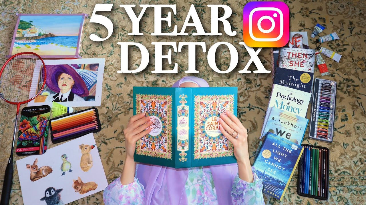
what do you think of the final thumbnail of my video?
i think its a bit cluttered, while the stuff around the thumbnail is related to the video idea, it is not immedietly apparent of what the video is about
i made a mockup of what i think could work here

just something of that sort would be my idea
or "5 years later" would convey the idea better
and you have all that free space on the right to work with so i think it could work
What app did you use, or is it just normal Photo editing?