
#Roast my "Train Your Dog to Stop Jumping: 4 Easy Steps"
1 messages · Page 1 of 1 (latest)
I think the second one is better but you should remove the block in the middle and just have a checkmark and X
Appreciate your time -- great input, thanks!!
agreed with @brave glen
the second one is better
BUT i dont like the jeans/legs on left side
just have the dog jumping
the human and being cut off distracts fromt it
also your text doesnt pop
have it a constrasting color like white from green not green on green
Haha... yeah, the jean shorts are atrocious! It was the best image I could find in Adobe. But I'm going to make them disappear. Really appreciate your input!
Good tip, thanks!
I agree with everyone here! The second thumbnail is better and removing the boxes would likely make it seem more aesthetically pleasing! To make the text more, I agree with Jon that you should use colors that contrast more! Also perhaps you could consider adding a shadow to the background
of the text box that is
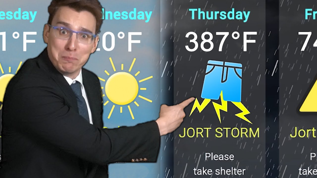
also the Jorts remind me of this video https://youtu.be/OLtT69fZIS0
STREAM JORT STORM EVERYWHERE: https://lnk.to/jorts
Editor and Father: @Zaltoman
Jort Thrower: Grace
Mother and Wine Guzzler: https://www.twitch.tv/s_e_n_e_c_a_