
#Editor GUI Updated Theme
1 messages · Page 1 of 1 (latest)

Design Studio UI/UX
Learn the best dark mode UI design practices with examples. Discover how to balance contrast, color, and accessibility for modern, eye-friendly experiences.
This seems close to how it looks currently, just woth a very different proportion of each colour:
https://www.figma.com/color-palettes/moonstone/
https://www.figma.com/color-palettes/regal-blue/

It seems for the best thing we could do is:
- Explore source and experiment with new themes
- Make a decision
- Update BlueJay (I particularly really would like to maintain Bluejay canonical to us)
- Push to
development
Yup I think so too. Editing the theme and building from source would update the O3DEWidgetGallery.exe as well and allow for evaluation.
Then it'd be about identifying which parts of the engine are not yet upgraded to using Blue Jay elements.
I'm on PC now, I'll see if I can change here and test
waiting for compile, I updated my Fedora so it'll take time...
About the colors, I don't like the "gray" of o3de, certainly we can put it more darker, but just a bit. I'll experiment once I have something I can change here
Yes, I think it's about making a tone step down. The dark background further darker, the most bright grey, one step deeper.
I actually wonder if it needs to compile to make the style changes, might be that like reflection, they just pull the file up when the app starts. Worth checking just to see if it can be avoided.
I don't know the implications of sharing other software as references, due to being a mod.
But Unity HUB, Blender, Discord and others do a good job.
IDE's are also a good study.
maybe not, but cmake should do it quickly for me anyway :p, once compiled
Actually, @digital plume, this might be a good place to interface with the RedHat design team. We are capable of doing the work, but it would be great to get a modern design palette from actual designers that meets the rigors of the O3DE brand, but also refreshes the interface for the coming years.
If they could make suble adjustment to rounded corners/not, gradient replacemens, or other things that could boost the form of the pieces, any of it would be spectacular to deploy.
RedHat works, also we can see if @lone halo has any bandwidth, since he designed a lot of the O3DE UX
tested, I can, it works 👍
Is this after a compile, and on the widget viewer?
Did you end up trying without a compile?
recompiling makes cmake "installing" the qss file again in the install folder
unfortunately it also re-links +200 C++ targets  (I'm with unity build set to on, so that's may be why)
Did you end up trying without a compile?
maybe is possible, but couldn't locate where the qss file is, if QT even uses one after build
I always have unity on, don't know the value otherwise. Good to know.
Ah yeah, so you're editing in /Code/ and the output is in Windows/profile or whatever.
unity build on is faster to build, but slower to recompile
but that's in theory, unity build off didn't helped me that much before
yep, even if it's an asset, cmake will "recompile" the modules; the same happens when you change the splash screen image, although in this case is just one target, not 200+ :v
but yeah, now the task would be realizing which CSS rule applies to what
for instance that background color at line 65 didn't changed the whole editor background, maybe other widgets do overwrites it or just doesn't uses it as a base class on CSS.
Yeah, I'm sure there are stacking layers on top of each other.
I think that's basically the two targets, identifying the full footprint of the changes needed and then identifying a change profile and colour scheme:
Full bg, other bg, body, highlight colour. That kind of thing. Then we basically need to duplicate all the type-colours to all the duplicate points. All the full bg's, all the mid bg's.
yep
I'll do give a look into that, but my focus for now is on Teal and starting the youtube tutorials (by finishing Asteroids), but nice to know that we can experiment with that.
I'm wondering now, should we wait for QT 6 first?
Yup, no pressure. There's always more to do, no need to worry about it.
We could ask. I imagine that it's just using the same tags and styles, otherwise it wouldn't look like o3de by default.
I'm away from the comp right now, but I can post there later.
You can only view, but I'm poking around with recontextualizing the colour scheme here: https://www.figma.com/design/om9kH7gqiZ9DULpcSpcl6A/Blue-Jay-Design-System--BJDS---Community-?m=auto&t=5Im3r5rdwaVFUH3T-1
I did some study on current gen UI's and have a much different plan I'll poke around with.
Key notes:
- The UI's seem very highly contrasting from the darkest to the lightest spaces, but infact the moment you pin a general area on the colour graph, you're actually only dancing up and down by a few steps of value. Them all together is what creates the feeling of contrast.
- Different saturations create very different moods, trying to match the O3DE branding colours means I need to be very gentle to the touch.

Gorgeous
https://m2.material.io/design/color/dark-theme.html#anatomy
A list of layers of depth for colour palette.
Material Design
Build beautiful, usable products faster. Material Design is an adaptable system—backed by open-source code—that helps teams build high quality digital experiences.
Not sure how far we went with picking colours. But if possible can we have options for ui that are sensitive to strained eyes.
I run almost all my themes now mimicking blue light filter. Blues feel good with bright designs, pastels hurt eyes least on dark backgrounds
Need to find more proper jnfo, but essentially the charts I use for trying to make ui experiences go beyond just looking professional, might as well accommodate to blind, one disability most of us will experience in one way or other

https://venngage.com/blog/color-blind-friendly-palette/
Mix of these especially I think would be a good start


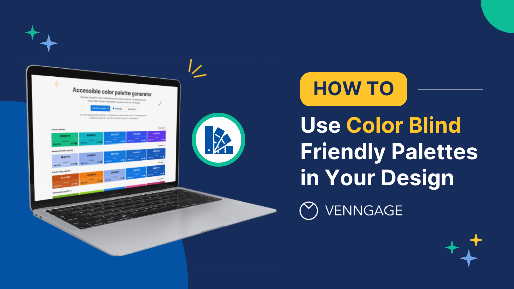
Learn to design inclusive charts using color-blind-friendly palettes and enhance accessibility effortlessly with Venngage's Accessible Design Tool.
That link I shared actually covers a lot of that stuff. Even with "contrast ratios" to explain it and stuff.
Ayy going throgih the links now, my bad for missing things.
Second I saw blue I remmebered how my desktop looks cause got very used to this particular example
https://www.image-line.com/fl-studio-learning/fl-studio-online-manual/html/envsettings_themes.htm
I was thinking about how fl solved this issue by providing modern ui. Some preset themes, and user picks rest
Yeah, it really seems like it'd be good to expose the theming, but right now it's all hard coded (as far as I can tell)
Really this is a brute force kind of upgrade to at least get it feeling more modern. From there maybe it'd provoke some contributors to make a theme settings window or something.
I think it's fair trade off for now. We can always update code later once we get a good idea what the o3de design language is as a whole.
We the only engine out there who can ship a game that doesn't have the catalog to show off engine worth trying regardless. And with how poor support is from other solutions, at this point eveey drastic change we can do now before we get a lot of users the better
it has been proven that these filters dont have a meaningful effects in some papers
Don't wanna fight men in lab coats again but autism and sensitivity to light is a very well documented phenomenon.
For me perosnallly, the more oberstimulated I get the more my vision goes. Unless I'm in daylight, I live in red lights.
Haven't found what it is yet and it's bit off topic but something to do with oberstimulation of blue cones and don't know how quantify it better.
One thing I know I use filters cus it's easier to limit display from blue light, surely can't be only one who can document this phenomenon
I mean dark mode and high contrast help a lot more for that
I agree, colour scheme secondary to me to filters, filter for all the apps that like to flash bang me 😭
i have an animation for that
I think looking at Godot’s adopting of a user theme as their default is a good lesson as well. They created a very nice theme that I quite like. Unreal Engine also has a deliciously dark but clear theme that I find quite easy to work on at night.

That is Godot, for reference now.
We’ve got a much lighter palette which I find to be more straining after some time.

Obviously the scene you’re working on makes a difference too.
I do plan to go far darker. It softens the UI, and it makes the colours pop. Pleasing all around.
And work out the colour hierarchy much more to focus the priority of windows and tools.
Same palete, just one tone down on backgrounds (background from card header, and card header from Console background)

It definitely is a step in the right direction.
Love both of these so far. Atm the saturated parts of GUI stick out most, especially highlight. For lack of better word, feels atm like diff parts of ui fighting with you for attention.
Probably for later update, but intuitively the panels that are highlighted or use colours for values (the xyz being colour with rest of GUI being pretty monochrome) make you wanna "pop" the panels out to hover over main display, I think godot reallt nailed the clean sleak look.
All the accents in Screenshots above feel like they sitting around main viewport, not fighting with it
Important related docs
Looking to build …
I finally had any time today to put into practice some of what I was learning yesterday.
https://www.figma.com/design/om9kH7gqiZ9DULpcSpcl6A/Blue-Jay-Design-System--BJDS---Community-?node-id=21-2492&t=KlQdI3kCEzFVSUR9-1
Fundamentals
Imprecise, needs value balancing, but far closer to how Dark Themes actually work. Hope ya'll like it as a first start.
Study Ref: #1450287189736034346 message

Next goals are:
- integrating O3DE Branding Blues into the mix. The site I linked has a colour generator to base off your brand colours.
- Could probably pull the Far BG even further down in value, and then even the rest out.
we are vampire's
i have a tool for testing theme colors if you are interested


It was a really rough start, but somehow i broke through and I think I put together a pretty nice Mock.
What d'yall think?

- Blue Grey Palette
- Much darker base tones.
- Blue to match Bluetone O3DE branding.
- Merged the Files Bar with Tool Launch + Playmode
- Application bar has O3DE logo, and solidblack. (The only solid black used.)
- Rounded windows/Tabs
- 4px rounded
- Slightly more generous margins.
- Margins at the bottom of the window. (Rounded corners)
- Asset Editor now has a stepping hierarchy from bright, to mid, to dark for the editor body.
- Used to be Bright, to dark, to mid. at the "Asset Location" bar.
- Bottom status bar matches the deepest BG tone that the file bar has.
- Viewport no longer has Title/Frame bar (It's not draggable, can't add tabs to it.)
- Console text field area has margins.
Looks super good. I’d love to see what it looks like with all of the light fields as pure black with white text though
I can give it a try quickly. I definitely understand the aesthetic choice.
Gimme a sec.
- Darkest BG Blue body.
- Solid Black Frame

Happy to! I definitely think it's a solid proof. I honestly was not thinking I would make anything like this when I started.
I’m super impressed with how much you’ve been able to accomplish. This change will be really impactful
I would love to bring it forward as something to actually consider, that's for sure.
I was thinking, how does our mascot fit into the colour scheme. That orange would look really good for accents and the pale tones complimented with the palette would go so well(image from the github for official art)

It's a bit complicated, because the official O3DE branding is as such: https://docs.o3de.org/docs/tools-ui/branding-guidelines/
There is no odie-refletive branching scheme.
That being said, if you look at the "Theme Colours" guidance here: https://m2.material.io/design/color/dark-theme.html#ui-application
There is the viability of creating a Primary, and Secondary scheme, where primary would be the bright blue, while the secondary could be red or yellow from odie.
Very sleak, my constant "piss" filter on my devices seems to go well with it, them colours on right still stick out to me, but it might be cause I'm used to location of cordiantes and don't need as much colour guidance.
Not sure if it's too far of scope, but if there was some option to chose between desaturated/monochrome variants to be a toggle somewhere
This is coming from pov of stating at screen for hours at a time in diff suites, reserving colour space and focus for main view and colour picker, rest of ui when placing objects when in contrast to main view makes it easier to navigate (but this is a tiny nit pick, I ussually collapse bars in tjose instances where possible)
I like that idea. Cause I went throguh the docs and was surprised by the variant (that works perfectly)
Keep blue for hyperlink like elements, use orange and red for other highlights, should look hella clean!
Yeah I can already see it, red underline, orange switches. Not sure what on the cursor, but that looks so clean
In like ease of use way not hospital if that makes sens e
looks like a modern app rather then a app from 2014
I still think some of the colors might need fine tuning(maybe few different themes even) But its such a night and day improvement you should be so proud
I agree, some are just edging on enough contrast.
But yeah, I don't even have the entire style done, like active and inactive elements and buttons.
I hope it sets a precedence though.
needed help with color picking hit my up
you know i have style😁
I'll give my notes soon, but later
In general, I really liked the inspector, but I think the asset editor is too dark.
Maybe the card background could be the editor (and thus asset editor) background?
note about this one: in the sub-pages there's a lot of details and guidelines that contextualizes better the BJDS
but in general, yeah I do liked the blue dark theme ✨
this one has, the tools-ui might be outdated compared to this one
UI Mock Source
For your more granular use.

thanks! will play with it today, just not now
Also, I think I'll take the opportunity to learn penpot xD, we can mock UX there, even creating interactive screens that will simulate the end program
also it's collaborative IIRC, like excalidraw, but I'm not sure
It looks great, but something feels off. I think the buttons look out of place with that light-ish gray color. The over abundance of white text boxes makes a huge contrast that just feels uneasy on the eyes. Maybe try an analogous harmony method for the text boxes and buttons. I would also like to see the bottom status bar be blue.
This was a change requested: #1450287189736034346 message
I haven't created buttons, those are just the old ones.
Oh in that case then it's perfect
an idea make X Y Z colors a bit more saturated and also make the green yellow-green if some one has green color blindness can see it better
Yesterday I was giving a look,
One problem is the contrast on the tabs, the inactive tab background is almost invisible
Yeah I was seeing that too, I was thinking making them more similar to the main tab but less saturated might be a way.
Also, I free handed all the values so they coud definitely use some balancing in general.
Started to port the BJDS figma to Penpot while learning it.
I didn't realized you did created a new figma document, my bad
No problem. I was barely able to use it, was going to after I did the psd mock, even to just expose the final colours chosen (they aren't 1:1 what's on the figma)
But I ran out of steam.
I see, yeah I'm porting to penpot mostly to learn penpot, but we can continue on Figma if you wish, same for Penpot.
That said, on penpot, since I'm doing from zero (but mostly matching 1 to 1), I'm also doing some changes to make it easier to change later.
All I have currently, now I'm going to UI components

(penpot and Figma is mostly the same from what I could tell, with some specific differences, like line height being a scalar on penpot, and pixels on figma)
I am fine with anything, as long as it can consolidate the current "pitch" for what we think is a valid way forward.
There's also the angle of:
Can we identify every style contact point in the source code, put it into a list, then implement references instead of hardcoded styles, and consolidate the entire styling structure to a data class and editor.
If we can make a .theme file, and an edit window, we can implement this theme as the new core, but then expose the ability to change things by preference.
#sig-ui-ux message
I think the only concern about penpot is if the O3DF wants to host the final version as the next design. I don't know if it's just a free figma, and they could do a free penpot, or if it's paid.
Same, figma is very common, certainly any UI designer who wants to contribute will know figma. The bonus for penpot is that it is open source and can be self-host.
I'm fine with both too, the penpot was my personal decision to learn ui design
That's pretty sick. Does it have user limit or other restrictions when self hosted?
This came to my mind when I was looking on design tokens:
https://help.penpot.app/user-guide/design-systems/design-tokens/
Basically, it's how themes works on Penpot, and it's standardized (it's a draft I think) on W3C. I don't think we necessarily need to use design tokens literally, but seems a very good base to work on a theme system.
Learn how to create, manage and apply Penpot Design Tokens using W3C DTCG format, with sets, themes, aliases, equations and JSON import/export.
We can break out into a new feature thread: Custom Theming System
https://penpot.app/pricing/self-host
Basically no, on self-hosting the user is 100% responsible for the service
Penpot is FOSS (MPL-2 license), there's an enterprise solution for NDA things I think (they're trying a new way of funding FOSS without "open-core" (which isn't foss), from what I could understand, it's for when the company wants to restrict the software)
I wonder if it's a CLA though.., let me check
It's DCO, as O3DE :), which AFAIK that means it cannot go like Redis did.
Here's the working Palette, with the problematic colours marked.

Love this effort. I had started working on a more streamlined theming architecture ages ago, the big issue is that a lot of our theming is hardcoded in C++ so we would want a way to abstract that to just a bunch of qss/json files and allow for true customizable themes as much as possible.
I also remember Lee created mocks for new light/dark themes that I really liked but they probably are lost somewhere on one of my hard drives lol
One thing that's worth reminding. Part of this theme concept was actually changing the structure of some of the top menu bar.
"Merged the Files Bar with Tool Launch + Playmode"
This will be far harder than just changing colours. I would definitely need help in that matter as I am usemess for software GUI and know nothing about qt.
changing the structure of some of the top menu bar.
I can help with that 🙂
https://www.docs.o3de.org/docs/user-guide/action-manager/
I wrote this system to be potentially user-customizable as well, but never got the chance to work on that part. But in a nutshell all menu items, shortcuts and other buttons are actions that are abstracted and can be called programmatically from anywhere.
Learn how to create …

This is great. Will be ready for 26.10?
Yyyeeeah baby!
Yeah I am trying very hard to get a large amount of the ongoing features into Fall release.
Yeah I'm reading lot of things here and I seeing you working in lot of stuff. Keep going!