#Pink Goober Planet
1 messages · Page 1 of 1 (latest)


Good to hear

any specific things you would like to see trial wise?
the spawn advantage should definitely be gone, and those circles are extremely rng
Then the like long falling on that wind section is meh
- checkpoint here pls


here too cuz the other one isnt reachable

just incase you somehow die

Also just generally the outskilling is kinda hard here
most of the obstacles seem really trivial and buffing them I feel like would make it hard with too many players
So shortcuts/tricks should be added
else it'll kinda be like a paradise atoll kinda situation
Alrighty are you talking about everything in your screenshot
i said gimmick i meant part
Yeah
its all not really fun sorry
I like the rest but the start isnt great
Ok👍
Just feels boring and purist, needs to be more alive and make me excited to play it
Ill try to change it
This gimmick is cool but it suffers from long falling and a way too tight timing window, and the spam dashing is just not too great aswell

I tried to mark what i meant with timing window
Gosh I need to sleep
alrightt
Since people are already providing feedback in general, I'll just point out that the use of arrows could have been more extensive, for example:

This place doesn't seem very useful, but I guess it doesn't matter.

Yeah i agree didnt even catch that ngl
I played the level like three times Tytan carrying ngl
Really !!!! most of this level is inspo from Azed up 119
Aside from the beginning of the map, the rest is pretty cool, I'd say you've innovated quite a bit.
lmao, w creator
Yes i agree this comunity has helped me sooooo much in my level building experience
i see it

tried too but couldnt do it
mhm
@tardy jay the deco is insane
This is possible

I tried
But it's not even worthy, it's a 16p and getting a shortcut like that is too RNG as Ramp_city's one
not that hard lol

I’m fixing this btw
this shortcut from here through here


Some parts in here feel very empty in terms of deco, just big open areas that need to be filled (especially in this screenshot). The level is named ‘Pink Mountain Planet’ but there seems to be a lack of mountains other than a few slopes, maybe you could make the level about climbing up a mountain by having the ending be on top of a mountain? Decoration could also be improved, the places that you have it right now are good but there are several spots you missed that look really empty. Some of the gameplay too isn’t the best, namely the part where there are bouncy blocks that send you into slopes with saws in them. I get that you can stand on top of the slopes but sometimes it feels unfair when you are pushed directly into them. If this was certified as is, that part would be horrible for multiplayer, goobers would die left and right and a lot of it wouldn’t feel like their fault, it’s too hard for a 16p rn. Other than that, the rest of the gameplay is kind of mid, and it doesn’t feel like you really thought about the multiplayer aspect of this level that much. I’d suggest filling the empty spaces and making the obstacles more 16p friendly, not super easy like a 32p, but easier and more understandable than it is right now. @tardy jay


Just fyi to people I’m working on it as much as possible I just have school work but I should be able to work on it soon
Pink Goober Planet
Once I’m free to review you’re first on my list! Been busy but I haven’t forgotten
Ok thank you!
Is their anything you could point out


oops 3rd image is my fault 
I’ll try to fix these but some are kinda but 7 and 8 what do you mean by this?
The spikes are crooked, and you've placed geometrically rectangular obstacles on a ramped terrain.
Just make it a normal spike floor without the ramp
I like the ramp ngl

I agree with Tytan, this level needs a lot more polishing. The general issue is that a lot of the platforms aren't layered consistently and the different elements in the level often tend to clip into each other in an ugly way.
Screenshot: I'm not sure if this is intentional, but it's possible to get inside of these things. In one of my test runs I got pushed into one of them by one of the gravity fields.
Additionally I'm not a huge fan of the music blocks in that part. In my opinion they contribute very little to the design and the sound they make is not very pleasant to listen to.

ye i do to imo it brings personality
also @delicate shard i changed the start and if you want me to further modify the circle part just tell me
It is intentiall just fyi
@visual quartz if your free right now could you review?
i did yesterday
i "unemptied" that part
oooo
didnt know that was a review thought was just a suggestion mb
But still anything hekps
unless its bad feedback lmao
i’ll see what it looks like rn and see if i want to review
Hmm idk what to think about this level
latter parts are pretty messy
also if you use this ugly block design please use it properly

Its a really nice level but doesn't stand out to me in the grand scheme of all levels
sorry
Yeah it reminds me too much of pirate attack
Idk just design wise it looks like every level with this theme ever
the obstacles are nice but not put into any unique design
Pic 1- design such as this with overlapping layers feels a bit sloppy in my opinion. Maybe I’m being nitpicky but the overlapping doesn’t look right to me. Pic 2- the saw here is a bit hard to see on first run, maybe a small warning? Pic 3- really enjoy these obstacles but think rechargers should be instant so as everyone can enjoy them rather than just whoever is front running. Pic 4- Great background design. This part and the other obstacle in pic 3 look very nice, but the rest of the level feels a bit bland / unpolished like others have said. You’re definitely getting much better at map making, but I feel like some of the fine details like overlapping layers throughout and barren spaces could be improved on for certification! Sorry for the long wait for review!


Thanks trow I will be adding more bg1 characters so hopefully You like that
I’ll work on it tonight
@prime wedge i fixed you review
@delicate shard also i did your review, @slim coyote could u look at this level same with @frail pecan
i could

I dont think you looked at my most recent message
its this kind of weird ascension Jtoh ahh 4-5 floor design

which i see in every level
where its like you go right in a straight line with some obstacles that were put into this straight line, then you ascend, you go left in a straight line with some obstacles, then you ascend, you go right, you ascend, you left, you ascend, you go right
and all of that in a straight line also
Do you see why I cant like your level 😭 Its so boring
I can give you the perfect terraining level as an example
Including the certified levels?
I bet itll make it clearer as to how you could make it
mk
Just in so many we get sent
and it always doesnt work
Ofc certified also
I'm sure there are some
How so?
This is super simple terraining when you catagorize how you play it (orange = ascends/descends, red arrows just as a general path)

And its honestly easy to make
steeple of pink goober???
So idk why you have to do the
Ascend, go left in a straight line, ascend again, go right in a straight line, Ascend, go left in a straight line, ascend again, go right in a straight line, Ascend, go left in a straight line, ascend again, go right in a straight line, Ascend, go left in a straight line, ascend again, go right in a straight line,
You know?
its Mollusque-Lanceur again
what is this map?
Private Kleiner map
I dont think he likes it enough
Jellyfish Cloaka
did he make it recently or is it from a long time ago
Last updated 1 year ago
Its honestly kinda a nothing burger without the theme but its fun imo
Just probably doesn't fit his standards considering the levels he makes nowadays
Yes i understand now i dont know why i did it like this it just happened]

@delicate shard are you asking me to fix this or just to know in the future

@prime wedge I finished your review just fyi
Please try😘
Great fixes! Next thing I’d work on is, particularly with the ice blocks, making them a bit more lined up/ polished if possible. I’ll go into a more in depth review once I get home tonight I promise! But polishing is the big thing here still in my opinion. All the fixes you implemented look great
Screenshot 1
I'm not sure I like this obstacle, there's only a 3 block wide area to stand on between the gravity fields, and the rechargers feel like they were placed without much thought on the ground. Visually the corners of the gravity field do stick out a little when they go down.
Screenshot 2
This feels very messily put together, you can also stand on top of the ramps to avoid death. Visually the indicators are a bit weird, the ones above the saws don't have any padding between them and it makes the entire section feel smaller or more claustrophobic than it actually is for me. This part might be fine, but it was the part that was the most awkward for me.
Screenshot 3
This applies to every other part of the level with this style, please actually use the design correctly, my first attempt I got flinged in here by the gravity fields. Sigmund already mentioned this, probably the most important visual nitpick to fix.
Screenshot 4
I think I would have enjoyed this part if there weren't ice block ramps, and maybe an actual way to die in the middle. Also, invisible dash rechargers, I don't think I need to elaborate.
This applies to the other sections, but the goobers feel placed without much thought other than so people can't say "there aren't any goobers in pink goober planet". for example the goobers arent actually standing on anything in screenshots 1 and 2
Sorry for the giant wall of text but overall i have mixed feelings about this map, still needs polishing and a few changes in the gameplay for it to stand out.


Have to agree with screenshot 1 from matrixicial here, I've been playing this level on and off for 2 days now and can't seem to find a smooth way to play this onstacle. I have constant bumps, dash misses and the dash rechargers aren't helpful either. I can't imagine how horrifying this obstacle must be for the average goober
Also generally the entire level has me feeling blind, I bump & bounce too often in random directions too
I appreciate smooth levels, this one just doesn't feel like that tho


Alr @delicate shard and @severe elk ill work on this and do a "revamp" like i did with pirate attack but it wont take as long.

Hi trow all good if your asleep right now just wondering if your still going to review


Tbh I’m not having the issue with the dash recharger obstacle everyone else is, although I can definitely see how it would be unforgiving for the average goober so I do agree that it could be made a bit more forgiving by widening it or lessening the angles somehow. I think it’s pretty easy to just straight line run across it for us though. That being said. Pic 1- the warning sides help me not get blindsided but like mat said are now kinda overshadowing the obstacles themselves. I also like the gameplay that allows you to avoid the obstacles with the jump pads, but these obstacles imo are the least consistent / smooth of the map. Pic 2- is expand this bottom section for grief avoiding purposes. Pic 3 and 4 are just areas where the map kinda looks unpolished imo.


Thank you for pinging btw feel free to keep doing so whenever I forget lmao
Sounds good, goodluck with it
Could you specify on what u mean by unpolished
like in what way?
And the ice floor at the start isn’t cleanly connected
im stumped
Yes but u guys just said problems
😭
If you have aany ideas on how to fix😘

What type of sign?
Warning Sign bruh
Left arrow frfrfrfr
you can skip this

@severe elk , @delicate shard , @slim coyote , and @prime wedge i finished your reviews hopefully i did everything u wanted if not feel free to ping me whenever and ill be happy to fix it!
Also @cloud laurel you do some of the best reviews so if you could do a review i would love that
Not tonight because I will watch the super bowl and not during the week because I’m going to ski but after ping me and I will review
superbowls on tonight?
if you somehow do that in a public it’ll probably take longer than the main path
Speed hack trust
speed hacking in public’s doesn’t work
just makes the game go to shit
it does trust
everybody else just lags for a bit except for you
no cap
matrixixiaalalalaalcslalcal
Anyways i did fix that kinda
also if u manage to do that u deserve to win
it took me like 10 mins to do that lmao
there's not much of an improvement over the previus iteration
i can see you changed the obstacle in screenshot 1 to be a bit thicker and make the gravity fields go up instead of down, but that takes away from the challenge of this obstacle and this may as well just be a flat walking simulator

natrixxixixixixicalaalalalaalalcal
mmm
you changed the design here to prevent that problem which is good but dont forget to extend the floors on the top of the moving structures and change the second screenshot as well


Could you be more specific on the first screenshot i dont really get what you mean
Someone your forgetting? hMhmhMhHMHmHMhh
Whaaaatttttttt?
I think it was faster
that’s if you do it perfectly
and that isn’t likely
howowowowowo arerererere yououououyouououuou
Gggggoooooooooodddddddddd!

Done
also done
Temp softlock smoothbanana pointed out

By the time you respawn though it will be gone
Doesn't mean you shouldn't fix it
Anyway, still have most of the same problems as before for me
You just made it look a little better and didnt really change the gameplay
@prime wedge your probably sleeping but when you wake up please review as soon as possible
It looks a lot better, but like mat said the upwards arrows kinda make the planet obstacles a bit too easy. The spikes being wider feels a lot better. I would make that one harder while making picture 1 easier to pass on top with jump zones, pic 1 seems harder than before? I’m all for hard obstacles and think in general most the course could benefit from some more challenge but this obstacle is almost too hard. I liked before that the pads above were pretty accessible if you ran perfectly. Pic 2- still not a fan of this jump zone both aesthetically and with how narrow it is, I’m thinking in a multiplayer race might be a bit too much jostling this early on to warrant a jump zone this thin. Mainly agree with Mats review but I do want to point out you fixed my recommended changes great! Just balances the difficulty of the course a bittt more throughout would probably help you most rn


Alright I will work on this tonight and for the second picture I have tried so many things to fix it except widening it lmao 🙄

Happy birthday but you must now get back to the coal mines and review 😱 😱 😱
@slim coyote gooooooooooooooooooooooooobernut i actually need a review though
67
MyDragonfly = English......MaLibellule = French.......私のトンボ = JAPANESE
@prime wedge
Also I’m pretty sure @slim coyote Your at school but if not I would love just a paragraph from you
And @frail pecan could you take another look at at this level
I'll see in a bit
okay
also trow is busy doing unc stuff
This is definitely an improvement over the last time I looked at the level. The new goober designs are cool although some of them feel a bit questionably placed. I also feel like some of them could use a bit more movement to make the level feel alive. Doesn't have to be much maybe they can just wave their hands or something.
That being said the issues I previously pointed out still persist in the level, it needs a lot more polish in the decoration as I pointed out in my first review.
Screenshot: This skip allows you to skip pretty much all of the level's gameplay without offering anything interesting in return, I can't see how that would be fun to play.

Ok i fixed the polishing stuff you said and ill work on bringing the level more livelyness
I would remove the skip
I would do as Tytan advised
I would do as Sigismund advised
i wouldn’t do as matrixical(t) advised
hmmmm then what would you advise?
review?
Yeah i fixed the skip and added a bit of deco
Please bro
Mk your probably sleeping rn but I did finish your idk really what to add now hopefully you like it
Ghost ping @tardy jay


this seems like pirate attack
It’s just my building style tbh
@prime wedge please take a look at what I’ve done

okay i will rn
can you not make me spawn in a wall please so it’s annoying when people do that
you should make 8 players come from each side

isn’t this from pirate attack? also it looks kinda weird here how it goes in the other jump feild

add arrows pointing left around this area

it’s a bit weird how the jump zones here aren’t connect just make it one big one or make it not look weird

i don’t like how you can spawn in the block

the gravity fields should be strgoner here

the v looks here here comparing to all the other letters here not being blocking

remove this gravity field

i don’t like how this circular thing goes into the checkpoint

i don’t like how the gravity field here goes into the checkpoint

anyway that’s it 

I really like it just change the jump pads they're really annoying
Which ones @woven stirrup
Goobernut pretty much stole my anticipated review (but also added a lot more stuff i didnt even notice!) I second what she said about the gravity fields, the zig zag portion being a bit too similar to your pirate map, and the main thing for me was I'm not too big of a fan of this obstacle (replied to message with it), especially because it goes through the checkpoint like Goobernut said. I like that you removed the shortcut I think that makes it more fair as a map. I also think the evil kitten text should be polished or removed as it kinda makes the map look a bit too messy. Sorry that this review took a minute, my reviews will probably be delayed for the next 2 months or so as I'm busy but looking forward to seeing what you cook up w the changes!
trow sighting
I told him about this like, 2 weeks ago, I thought it was already fixed...
No because nebula was LC at that point and she said it was good
Lmao
Bruh
Mk I’ll fix these and hopefully you guys can do smth with it
@slim coyote i fixed your review
this part still feels so choppy; how the blocks teleport down, i would probably just redo this whole section there isnt really anything special about it anyways its just jump spam
Would it be fine if I just made it stationary or just changed the beginning
Like the ones that are rotated a bit
@slim coyote Does this work?
I fixed your review btw
wow this looks pretty cool
I know 🥹
@delicate shard Could you take another look at this please!
it’s alright
Are there any ways i could improve it then?
Yo @severe elk I fixed your review a long time ago could you take another look at this because I honestly think it’s ready to be sent but you can decide that
doesn't look like you fixed anything
still dislike the obstacle in the first picture for reasons already said

s1 s2 s4 and last part all still apply for me.
still don't understand why you use tweens instead of pivots, but you also forgot to make the time 0 seconds so you can see it move at the start.

Tweens?
😢

Ok but who even calls them Tweens 😭
can you check out my new lvl it is fire
me
I did
aaahhghghauwehgauhgzhueihg :(( people dont know what tweens are
can you review plzzzzzzzzzzzzzzzzzzzzzzzzzzzzzzzzssssssssssssssssssssssssssssssssssssssssssssssssssssssssssssss!!!!!!!!!!!!!!!!!!!!!!!!!!!!!!!!!!!@@@@@@@@@!!!!!!!!!!!!!!!!!!!!@@@@@@@@@@
Tomorrow I got you!
How? i litterally changed what you asked
#1467669190218485830 message
i made it harder by making it wider but ill work on some more stuff
thx
He was talking to me im pretty sure
@prime wedge
Getting home; will review once there
- Although the "v" is fixed here the text still is really all over the place, the L being only 1 square wide insted of 2 for example. Also you've recently had a name change which would make people a bit confused by "Evil Kitten" text in the level presumably. 2. This part will be a bit of a damage to the level's flow as the squares on the top move side to side while the bottom moves up and down. When objects like this are right next to each other and look the same I'd want them to follow the same movements to avoid confusion. Alternatively, could slightly change the looks of one of the sections so it's not implied that movement is the same. 3. Minor fix but too narrow here for an early obstacle. 4. I am a big fan of the two sections of goober decor before this. Genuinely the first one looks awesome. The second one incorporates a nice shortcut in their hands. But this third section of them just seems a bit redudant to me and a bit overdone. I think the idea to have decoration here as it's pretty blank is smart but its a bit redudant. If I had to prioritize one aspect to work on it would be getting maybe some different type of decor along the lines of space/planet themed. Right now the goober figures are proportionallya bit too much of it in my opinion. You did a great job with the changes though so keep working! Points 2 and 3 are pretty nitpicky and shouldn't take longer than a minute or so to fix, points 1 and 4 imo are a bit more vital to overall level. Decor is soooo good I just think these 2 parts should be polished. Gameplay overall is solid besides being a bit wonky on the planet obstacles (easy to surpass with a run or two but hard to sight read)


Wow this is definitely a great review I’ll try to fix it tonight
Also idk if I’m going to change my name back so I’ll probably remove the text
@delicate shard could you take a look at this it would mean a lot
she might not respond hense the name
double ping so it cancels out
wdym?
i think goooooooooooooobernut is trying to get you to spam ping lol
@delicate shard Goobernut says to ping You twice
wow you guys are so smart
Seems like we’re taking the mickey now
Hi, please stop pinging me 😭
I put this name because I only want to review the levels that seem interesting to review now.
I rejected your level 2 times now:
#1467669190218485830 message
#1467669190218485830 message
Considering you didn't change anything, I won't be reviewing your level any longer. Goodluck with the other LCs 🍀
evil kitten i told you
My bad nebula 😘
I did phaser

Explain please
Oh never mind i see
@prime wedge Hopefully this works for you!
@prime wedge
@frail pecan I fixed your review does what I did look good? Same thing to you @slim coyote
These parts both feel very barren to me for a certain level. Not even just decor wise but gameplay is a bit monotonous. I don’t think every obstacle needs to be incredibly challenging but I would mitigate these two spots by either decor and/or harder gameplay. My logic is if I’m gonna be kinda doing the same movement over and over again for a few seconds the level better be nice to look at or I’m just gonna zone out/ lose interest. Decor isn’t the only fix here, could also just make these spots a bit more interactive / challenging besides just jump zones.


Should I add the gravity field parts back?
For the second picture
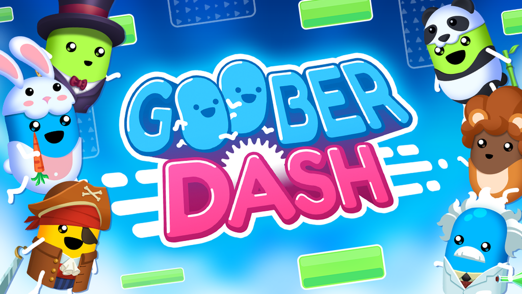
Goober Dash
Goober Dash is a free 32 Player Race Royale with user created levels and customizable characters.
re-pasting link for future reviews
Also @prime wedge or @visual quartz i am super stumped for the first pic any ideas?
also the second lmao
just having a brain fart in general rn
he suggested to make it harder or add more decoration to keep it interesting
You got space theme on your side- there’s so many options! Planet jump zones instead of a zig zag, comet obstacles to dodge, etc. you’ve got it!
I know I just mean like specific trials or blocks to use👍
it’s your level, we can’t decide everything for you.
Yeah, this looks a whole lot better than it did when I last looked at it. I do still have a few design / polishing nitpicks though.
Screenshot 1: The spinning gravity field circle here is cool but it doesn't fit with the main obstacle (zig-zag jump zone thing) at all. I'd just rework the part entirely while keeping the gravity fields and replacing the jump zone.
Screenshot 2: I feel like this whole part is kind of in conflict with itself. It'd make more sense if the movement of the gravity fields matched the background pattern. I also don't like how the gravity fields just teleport back to their starting positions after finishing their movement.
Screenshot 3: This part still looks unpolished to me. I don't like how the jump zones go inside the walls. The wall design doesn't necessarily look great here either. This is another part I feel could use a rework.
Screenshot 4: I'm not a fan of how the moving obstacles go inside of the triangles here.


For SS1 I’m just currently working on that so that’s why it’s a bit weird. And SS4 that’s the whole point of the trial so i might keep it I’ll see
after the review this has become one of my favourite lvls in gd
@frail pecan i fixed all but 4 because it is a big point in two trial (maybe) three so i was hoping you could accept it jsut telling you!
@prime wedge idk if this works for you but hopefully
@frail pecan
Let sigmund sleep
Jajaja
No
Has anything changed for you enough to send?
Or review
No yelling at me for “not changing a single thing” 😭 😭 😭 😭 😭 😭 😭
this section looks so cool extra points for using pivots, but the blocks look like they teleport instead of coming from inside also im not really sure what the intended path to get up there is supposed to be its kinda confusing


negative points for not using pivots again

rest of the level didnt really change much so i won't elaborate any more
👈 ❓


I will see later today, right now I'm doing something else
Ok
It's almost 6pm for me jajaja
Good luck with what ever your doing!

Of course
Nonono matressical is same time zone as ME
I wake up
The new part at the start is cool but I wish it were symmetrical for both sides. The area you can jump on is also probably a bit small.
Screenshot 1: This part looks visually cleaner now but it also feels kind of barren and empty to me.
Screenshot 2: One-block wall here isn't very visually appealing.


I'm not entirely sure why you don't want to change this. Surely it wouldn't affect the trial much if the triangles were moved up a few blocks to prevent them clipping into the moving obstacles below. It's your level though, entirely up to you if you wanna change it.
@frail pecan this should work!
- People starting on the right who follow this arrow are led to a dead end unless they are Breadfish level skilled at super jumps/ kaizos. Arrow going up is misleading given the top left of this screen blocks the route. 2. The charges following the path are cool but given the space between jump pads there probably needs to be a lot more of them to be sufficient enough to successfully replace the gravity fields that were formerly there. People who aren’t good with jump mechanics will probably struggle with this area as it stands now


Thanks @prime wedge will work on this
@severe elk Sence your online care to review or we could test it in multiplayer?
no

These barriers look the same, but I can only pass through one! Make sure you're consistent with this throughout the course! In picture one of this review people aren't going to be aware that they can pass through this obstacle. Then, once they see people pass through it, theyre going to try to shortcut the part seen in picture 2 which will not work. Also, I'm not sure if you adressed my second picture from my last review yet but it feels the same still. No worries if you haven't yet though, reviewing again due to your DM!


I did for the second one with gravity feilds
yeah i saw them, think you should either commit one way or the other imo, rn both gravity fields and energy kinda a bit sparse/not efficiently usable for all 8 players
Which would you say is better?


@tardy jay it’s you

I don't think you really changed much about my review
You gave a small review though
when i reviewed too you barely changed anything
I did
is the skip at the start intentional
Can you show me which one?
you can dash jump off the first ice slope and go on top of the start
Yes
I made it where it can only really happen in tieme trials
not ai right
idk
it was a joke i think it is
Sigismund I did, did i not?
9 votes 🤩 (except original poster)
One more needed!
@severe elk im pinging you because your LC and this level just reached 10 votes so its a special level can you put in the "special level list" or whatever its called please
no
as in i can't
Ok then how do you guys keep track if its special or like what does this mean for the level
its just a discord message that gets edited but the person who wrote it can't edit it anymore jajaja
priority queue just means pay more attention to this level afaik
10 upvotes community obviously loves it you should send
👀
it just means we will pay more attention to this level/put more effort into helping you i believe
otherwise ladn of smileez would be sent fr
Yeah lmao
Do you have any new troubles with this level then?
nothing new except this part sucks gameplay wise

it looks cool but like, how are you going to get up there and how will players know that
Its kind of just game play and if someone wanted to switch directions also what exactly would you want me to fix with this?
I dont need a full review actually
you do what you want lmao i got to blood hungry

i already described the problem
its very confusing for me and the only way to get up there is with the jump zone on the left, but like this level is not singleplayer
so im not really sure how the way to properly play it is
Ok thank you for your opinion!
did they actually vote on there own or did you beg them to
i think he begged for the last few
Not really begged but I asked like three of them if they could. AND they did under there free will
I simply reminded them about this level
👀
Screenshot 1: You changed nothing here.
Screenshot 2: All you did was added some gravity fields here (and removed the moving dash rechargers for some reason). In my opinion this does not change the part in any meaningful way. What I want out of this part is for it to feel more alive like it used to. Back then the problem was that the movements were janky and unpolished. Now the problem is that there is no movement at all.
Screenshot 3:


SS1: I added more gravity fields but I will still make more “stuff”. SS2: trow told me to delete the dash recharges but if you want movement I’ll make some. Ss3: is this an actual issue or is it just memes?
Review your review🤑
screenshot 3 was
Screenshot 3 the goober (and the other one to the right of it) are just randomly floating in the air
Smaller issue but it's an easy fix
@frail pecan i fixed screen shot 3 and as i cant really change screen shot1 because i love it to much . But i dont completely understand what you are saying about screen shot 2
I think what he means for SS 2 is the entirety of the gameplay for that section is just jumping in a straight line, you aren't even incentivized really to move side to side. I dont think gameplay should be this simple, and if it is, there should usually be some insane level of decor to make up for it which is not present in that section. I also agree with Mat in that the beginning, while it looks super cool, still sacrifices gameplay in the name of decoration. With 8p and those rotating squares (+ the hanging pillar that people won't know they can pass through seen in pic 1) its going to lead to quite some chaos. I also think you should make an effort to close the section that was formerly used as a shortcut as it kind of leads to nothing despite hinting at a potential shortcut (pic 2).


Overall I'd say this- don't be afraid to take some risks decor and gameplay wise- I feel like right now you're almost building obstacles that you know will work, and they do work. However, that doesn't lead to the best gameplay every time and can lead to the level feeling a bit empty gameplay wise. Don't be afraid to shoot for a more ambitious obstacle section and fail because when something like this does work out, like in your pirate course, it makes the level so much more fun! Good luck with changes!
Thank you 😊
500 messages!
Trow what is not good about the start gameplay wise?
Still not sent haha
@severe elk What do you not like about the start gameplay wise?
it just not super fun to play
did u not read what i said
I did
then u would know
No but this is for the start in general not that one part
#1467669190218485830 message
#1467669190218485830 message
i changed that part
Its not meant to be single player and there are lots of arrows?
#1467669190218485830 message
#1467669190218485830 message
exactly
its not meant to be singleplayer
but it feels like it i think
i didnt play the new verison tho
You said this level is not single player
yes
the obstacle feels like made for singleplayer, this level is not singleplayer
There we go i was confused about that part 👍
Yeah just very narrow, would not be optimal with people jumping around. Fine single player but add 3+ more and could easily fall out of jump zones
Should i keep the current trial but just expand a bit or make something new beause i do like it but if i have to...
Honestly either could work well, if you keep current just try to keep similar patterns while adding space for players
Sure!
I also said this in my original review #1467669190218485830 message
Screenshot 2 is a lot better now, it's still not my favorite part but it's better
@prime wedge and @frail pecan does this work for you guys?
Doesn't really change much in my eyes, the narrowness problem still persists
I recommend you listen to what TRow said here. Right now I feel like the part tries to do too many designs at once which makes it look confusing to me.
Ok
@frail pecan i did
Sorry but I can't tell what it is that you changed about the part
I made it bigger though idk what you want me to do I’m following you review but your saying I’m not doing much
Because I am
Doing lots
The part still looks and plays the exact same as before
you added a jump zone to the start but it doesn’t change the space to get to the next part
I just made it wider
The playability feels better, especially in the 1st picture attached which I think was biggest improvement. That being said, now that the gameplay feels a bit better I think the level is suffering from the classic "hold left hold right" phenomenon that is always talked about. There is one solid obstacle section that avoids this (pic 2) but I think at least 1 ideally 2 more sections have to toughen up in difficulty. On pic 3 I like the addition of the horizontal jump zones but the two pink squares on either side of the goober's head I could see creating some traffic jams.


@prime wedge could you specify any specific parts?
also @delicate shard has enough changed for you to review?
@frail pecan same question to you and any other LC that want to
i think its a bit jumpspammy
a lot of "obstacles" are just jump zones that are placed in different ways
man
just check my recent messages on this thread please?
If you want a detailed review again I can give you one but it won't be kind
Otherwise its just perma rejected until the layout is better
Honestly I just was asking if you liked it or not
But thanks for replying anyways!
Means a lot 🥹
yeah I do
You do like it?
yes
Wow great to hear!
Yeah sure as long as it’s constructive and not personally aimed at me.
Its constructive
Ok I write

as I said when it released, this level is really promising and had lots of potential. i believe you have now maxed out that potential, atleast on this layout. many obstacles have turned a lot more alive, refined and creative compared to earlier versions. the parts & ideas themselves are perfect now imo and you shouldn't change them.
unfortunately, i can't actually send this level: multiplayer always acts differently than singleplayer, and its important that a level is made FOR a multiplayer race setting in mind. straight lines, which 80% of this level is plagued by, are the polar opposite of that. when looking at the race-line, it is LITERALLY straight. there is no extension to the skill ceiling, it is exclusively holding a/d. additionally, falling back far enough makes it impossible to win, as you can't use good movement or map knowledge to your advantage. i'm aware you technically have some ascension parts, but the skill ceiling there consists of the small difference in jumpzone speed, which is not enough to make a level feel skillbased. we've seen this kind of layout in older uncertified levels before, and they have always been pretty random. sorry, consider this the actual final review I give you on this layout
Ok thanks Nebula I’ll take this into account for future levels and hope it can get sent by someone else
Is their anything i could do to change the layout or would you just segest making another version?
i suggest making a brand new level if you want a new layout, I don't think you should do either of those two just because I said I dislike the layout enough to not send it
Ok ill keep on taking advise from trow and hopefully it will get sent
@prime wedge can you specify the specific parts please
theres no specific parts that are horrendous, in fact theyre all solid individually, just most of them don't have obstacles. idenitfying them would be identifying a majority of the course here. all of these sections DO work individually but when combined, they lead to a lack of obstacles. any part where you feel like you're just jumping qualifies and could be changed. This gameplay is fine in and of itself but when it is a majority of the map a few obstacles could probably be added
@prime wedge can you review please
its been 2 days 😭 give the guy a rest
It’s Sunday tho
Only time in the WHOLE week
Pros: I like the new handheld gravity fields and the animations add a level of aliveness to the level that it previously didn’t have. Cons: i should’ve specified on this when I meant it’s kind of like a hold left hold right type of ordeal: yes animations you added and arrow do help. But there still needs to be at least 1-2 more ways to die right now. Theres only really one obstacle that takes avoiding saws/spikes into account still. I think you should buff at least one of your current obstacles to make it harder to pass without dying. Whether that’s something like shooting asteroids with spikes on them, making the rocket ships easier to die to, or adding some spikes throughout I’ll leave that to your judgment, but I think staying in theme with a new obstacle or two would help push this over the edge
Thank you!


eh i don’t think the map is that good or that bad
it’s not something i would send but i wouldn’t be mad if someone else were to send it
Cat GIF?

@prime wedge does this work for you?
@prime wedge today’s the day to send it!
Pic 1- These circular pathways I think are too narrow for many players and Pic 2- I still don't like this platform here, very confusing for newer players. These two are my biggest specific gripes with level right now. The new large pink obstacles (comets?) look good and are now playing better slowed down. However, one quick thing: your level is called Pink Goober Planet. I see a lot of pink. The Goober aspect is also fantastically incorporated. But with these edits I'm starting to see less and less planet. I would love more planet/decor especially with some of these newer obstacles. A lot of them have either planet theme (the circular jump pads that are too narrow) or good gameplay but are just a bit barren (the new pink obstacles you added)- I would love to see a mix of both throughout!


Thank you!
Pic 1- These obstacles in my opion (bottom left) would work a bit better if angled more towards the left. Right now they are tilted a bit to the right, which means players who fall off them / miss them will have this awkward little phase where they try to climb back on the obstacle and then fall. I think if they're mirrored with this tilt to the left instead of the right, players could survive a bit better. Pic 2- Although you added an arrow and changed the architecture I'm still just not a fan of this platform here to be honest. You did what you could to signal that it's passable but I still think many are going to be confused by it


Thanks!
Done
The starting section with the jump zones is a little better because of the extra jump zones, but they're all placed in the wrong spots It's still super confusing what the intended path is and I don't think 16 players will fit well in it. I think something that goes directly into the checkpoint rather than around it would make it much better

Ultimately I think this level still falls into the up/left/up/right pattern after the first ascension after the start. I like how the ascension areas have been buffed to try to avoid it but it really just makes it feel more claustrophobic than it should.
Matrixical review on Pink goober planet!!!!! 😘 thanks means a lot
So you would like me to put something in the red rectangle?
pretty much
Ok
Im realizing as I'm writing this I probably explained pic 1 above poorly. I think the tilt/angle should be like attached in pic 3, so that missing the square doesn't lead to falling. I also think it should be slowed down and the overall line the squares travel should be flatter. After rereading my explanation, this is completely on me for explaining rather poorly. Pics 1 and 2- Honestly there are sections of this level I really do love which I why I've reviewed it so much, but at this point certain sections are really a lot better than others. The two I've attached I really love a lot, but I'm almost wondering if you've hit a road block with other parts some of the other parts / if rebuilding the level anchoring on these two parts could help you brain storm? The rest of the level isn't bad at all it just seems like you're a bit constrained on improving it right now due to the layout, but I really would like to work with you to make this work- def would love this in game eventually even if it takes a bit more editing!


@prime wedge I’m finished!
Can give more specific feedback for this one. Pic 1 you did change well angle wise in theory but the angle still feels very weird gameplay wise here. Like if a player dashes they lose all momentum. I would try playing with angles and find one where dashing allows players to keep momentum rather than kinda come to a stop. Pic 2 imo what this level is missing- you have these two or three sections with floating jump zones and spikes. While they look nice there’s minimal gameplay, that is, the spikes done do much for anything. I think adding some moving obstacles to one or both of these sections would be extremely helpful for this level as a whole.


600th message!

@signal chasm
Goober Dash
Goober Dash is a free 32 Player Race Royale with user created levels and customizable characters.
I think this level has been slowly getting worse with each review. Not that Each review is bad, just that the parts keep devolving into parts that feel like they are each from a different level. The only consistency is the amount of jump zones and the goobers in the background. I think if you really want to give the level it’s final push to make it great, i’d try to make the parts seem cohesive, like it’s a level that was made to be a level. The individual parts are fine but looking at the level as a whole, it feels messy. The only part imo that isn’t great is the first jump zone part after the very beginning. It doesn’t flow well, it’s super confusing, and I just straight up don’t like it. I don’t think you should try to fix it, I’d just completely scrap it, maybe use the rotating jump zones again but make them easier to jump to/easier to follow. The rest of this level is great, just needs to seem like one level, not a bunch of short levels combined. I don’t really know how i would do it, but that’s up to you. Good job and Good luck . @tardy jay
Well Dan I am just going to say it
I completely disagree with you on almost everything you said
No offence to you at all, you are an amazing creator and person but I think that I have made a better level with ever review trow has given me
Again this level keeps on getting better and will hopefully be sent by an LC
Not what i was saying
at all
the parts themselves are getting better
but the level doesn’t feel cohesive as a whole
That is where we disagree
Ok, your level, your opinion.
I just dont like the first part
as with a lot of other people
it just feels weird to play imo
@signal chasm
96 days 💀
you didn't really do anything we said its mostly just adding things that only affect experienced players and don't contribute to normal playthroughs
i think it died
Like skips?
I dont really think skips are nessisary here
@signal chasm and @prime wedge could you try to find time to review this sometime soon?
thats..exactly what i said...
the planet obstacle literally has not changed a single bit since the last time i saw it and the only thing you added were jumpzones above that only pros can get to
adding the blocks in the spinning jump zones is nice obstacle but i think it will play more tedious in this situation
Maybe try something completely new for the start then?
I…have…spent….hours…..on….the….start
No but fr I think the start of this level is my favourite trial in of of Goober dash

The planet obsticle (at the end) is such a small skip IMO and is already at the end
To me it’s really just design
How so?
it’s just unfair cause it unpredictably pushes you around
I gtg to sleep Gn
Talking about the start one… most times you walk straight off the planet into the spikes, or you fall through the gap at the very beginning and now are sent back 15 seconds
Good night!
#1467669190218485830 message
I just want to remind you, the start of the level has every player in it, so it cannot have too much stuff because it can easily become chaotic fast
I dont think it is to crowded