
1 messages · Page 1 of 1 (latest)
https://gooberdash.winterpixel.io?play=9be31510-c249-4d48-aba2-c97784c7c99d
8p level, not to difficult, Feedback is appreciated 
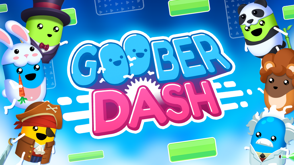
Goober Dash is a free 32 Player Race Royale with user created levels and customizable characters.
i may review this later but for now i found a softlock

if you go on the first checkpoint's leftmost tile and die you get stuck
and endlessly die
real
@shut cobalt Made an edited version of your level
https://gooberdash.winterpixel.io?play=b9f6dac2-ad60-46ae-80f1-b4bf4ba85523
Goober Dash is a free 32 Player Race Royale with user created levels and customizable characters.
Feel free to transfer over anything you like lol
Thanks!
Idk if this is just me, but I have a trend to go this way

when I realize it, its too late
its not like a big deal, but its something I want to point out
oh
and maybe add a saw or two here

lol
a secret area???

nebula added a finish line past the crane
in his version
oh lol
(first screenshot) : this ramp is placed perfectly in the way for the leftmost 2 players not to be able to dash immediately over it, but it's a decent terrain element.
(second screenshot) : nice little climb with a gravity field, no complaints here.
(third screenshot) : bit of a mess of nodes along with weird terrain, might get a lil cramped.
(fourth screenshot) : i highly recommend shortening the width of the field by 1 tile since without momentum you can't go through it.
(fifth screenshot) : this feels extremely cramped everyone's going to die if they aren't in the lead.
(sixth screenshot) : feels a bit cramped and weird with the terrain and lack of space in this area but it's still somewhat manageable.
(seventh screenshot) : nice momentum section, no complaints here.
(eighth screenshot) : boring yet nice path up, i kinda like it.
(ninth screenshot) : more simplicity and weird terrain, recurring themes in this level.
(tenth screenshot) : this section will be a chore for 8 players, but it's kinda cool and aesthetically pleasing.


(eleventh screenshot) : still a chore but still fun.
(twelfth screenshot) : such a simple ending, nothing confusing or annoying thus i like it.
Final Score :
design : 5.5/10, as much as the obstacles are cool and that there's nice decoration, the weird terrain is visible throughout the majority of the level, making it annoying to move freely in certain spots or run into some weirdly stretched ramp.
multiplayability™ : 6.5/10, some sections have space for many players while other to do not, and more critical sections like the ice block parkour and the section before the ending both have limited space to move easily.
skill req : easy, there's not a single bit of knowledge needed to beat the level a part from general map knowledge.
creativity : 5.5/10, some sections are creative but sort of unplayable with multiple people, i tested this with 2 of my irl friends and we all came to the conclusion that some sections suck for multiple people trying to brute force through at the same time.
Score : 17.5/30


@timid osprey rate my version!! :D
(first ss) Fixed The clump of nodes and removed the saw that was placed randomly.
(second ss) shortened the Width.
(third ss) Removed some obstacles so you are able to dash across if you want to.
(fourth ss) opened up the space.
(fifth ss) added some saws.
(sixth ss) removed that one big triangle.
(seventh ss) removed some gravity fields so it is easier for more ppl.
also now It feels live I have just remade cave expedition 💀 oops.


80%

very fun speedrun. but not good for multiplayer imo
sure
@timid osprey
I have fixed all of the issue you pointed out and overall fixed the level in my opinion, when you have time can u look over the level again to find any issues you have with the map. 
It's re-reviewing time !
(first screenshot) : the random nodes are gone making it less crampy and weird while keeping the basic parkour element of the original design intact.
(second screenshot) : I'd really recommend extending the platform to 4 tiles (where I'm standing in the ss) since it's currently just 2 tiles it can be very easy to jump and hug the wall on the way down and get stuck in the saws and ice.
(third screenshot) : the removal of the ramps on the ceiling of the room makes it easier for multiple players to get across, making this easier for multiple players.
(fourth screenshot) : more floors, better
(fifth screenshot) : i love hidden stuff in levels, you get some b(ias)onus points.
(sixth screenshot) : see fourth screenshot.
(seventh screenshot) : i like the addition of saws, makes it feel less bland.
(eighth screenshot) : more b(ias)onus points.
(ninth and tenth screenshots) : the removal of the gravity fields makes it less of an annoying and luck based crampzone, i love it.
Updated Final Score :
design : 8/10 (OG was 5.5/10), a couple of good changes both for the simplicity of the level and the removal of boring walking sections.
multiplayability™ : 7.5/10 (OG was 6.5/10), with a few more small improvements i believe this should be fine for 8p, but some good improvements like the removal of the weird "stalactites" and gravity fields in the crucial end section.
skill req : stays at easy due to no major changes being made to the level such as area revamps.
creativity : 7/10 (OG was 5.5), in my original review i felt it was harsh to score you low based on the fact that your obstacles are creative but hard-to-play, so i decided to add a couple of points back since the update brought some cool changes i liked
Score : 22.5/30 (OG was 17.5/30)


from B to A, congrats
also ill get to your edited version soon nebula
(first screenshot) : no changes from original, this section was already good since it was simple.
(second screenshot) : realizing you're playing on the original version of "sesquipedalian", i shared my thoughts on this in my original review.
(third screenshot) : upgraded section with no "stalactites", makes it easier to jump without consequences.
(fourth screenshot) : this section stayed the same along with more floors to the side to make it easier to progress.
(fifth screenshot) : another great way to remove blandness while being a similar aspect to a previous section. i like it.
(sixth screenshot) : weird green thing here along with a needed checkpoint, i like it.
(seventh screenshot) : you and i both know why this can't get certified lol
(eighth screenshot) : this section stayed the same, i like BOMB/dobby's updated version more


4 ratings in one thread lol
