#Show me ur editor themes pls
1 messages · Page 2 of 1
ah this is it https://github.com/protesilaos/aporetic
nah I don't use it, I use berkeley mono
I just grabbed one of the theme example pictures, the theme and the iosevka config are by the same person
Ah understand.
gleaming in everforest and fantasque sans mono

I love everforest
nice font
very cosy
i think its time i picked up a new theme/font
https://font.nina.coffee im gonna give lotion a try
Lotion is a cute programming typeface with 4
weights and italics.
it's my new obsession. i couldn't use anything but iosevka for extended periods of time before, but somehow this one scratches the itch so well
the brackets are really cute here
no pipe ligature 😔

it does still look pretty good though
a little tall though, reminds me of the victor mono 1.3 kilometre font height
the smal parenthesis is really appealing tho
ah i had zed configured with a taller line height

i can get behind this :3
everforest looks liek a nice dark theme

haskell as the example language and no (|>) ligature 😆
💀
i am a light mode enjoyer its true
everyone has flaws
me when i go (|>) = flip ($) in every single one of my haskell projects
cannot go back to haskell $ after experiencing gleam |>
(&) in Data.Function i believe!
yeah but its gross
ur right, i just like how |> looks ;-;
especially if the font is nice, i love maple mono's $
I liked the old maple font better 😔
ooooh that's really pretty
cute font, i have stolen
maybe berkeley mono and modus operandi are due a change
Change? Yall are weird
i change my stuff all the time yeah

sometimes I feel like it's the programmer equivalent to mirroring the image you're working on
regex 
:3
yes I could write a proper parser for it and it would be nicer
but I have to write python
so I don't want to
we got a comment artisan over here
what can I say, I've been taking notes from the best (namely @latent lynx)
That comment puts mine to shame idk what you mean :3
does it though :p

woah
do u just write your comments in a clean buffer then append /// before each of them and then copy them to the gleam file?
I mean I just write them inside the comment, emacs can reflow paragraphs inside a comment so that's easy to deal with
that last one is hayleigh's though and idk what she does
I'm still messing around with // comments in a ///
Funny looking Gleam
haven't you heard, she's trying out Gleam V2. It has mutation and a space sensitive syntax
Sign me up for that
oh and a hand wavey type system
and it is now waterproof!
it fucking sucks :3
in fairness I actually don't hate python as a language, but my word the tooling is bad
I've heard uv is supposed to be better
OK but it's like how the debugging facilities are meant to be the best in the world
they could be made out of Pope Francis for all I care if I'm fighting the thing all the time
uv makes dependency management a lot better, I've been pushing for a switch and it's going pretty well
and ruff is really nice for linting and formatting
but there are loads of language servers and imo none of them are fantastic
I've seen this, but don't use python. Is it any good? https://rye.astral.sh/
Oh wait there's a new disclaimer that uv is the successor lol

this is cool!
I've heard okay things about pyrefly
oooh I'll have a look, thank you
using type checkers has kinda sucked here though, I have to use a lot of libraries that aren't typed so it would take a lot of boilerplate to satisfy the checkers
indeed it can :3
:set textwidth=80<CR>
gwip
gw is better than gq since it preserves your cursor location
I meant this thing though, I think the built in neovim lsp can do the same fancy diagnostics now
they look great in gleam hehe

sure can :3


ayyy nice :3
with how i hve it set up it just looks like this when my cursor isnt on it
i had it set to always on at the start but that just got in the way a bunch 
might have to adopt this for proper splitting on newlines with tiny-diagnostic

butter dog: dog with the butter
yeah I might change it back to inline but we'll see haha
Same, and I moved even away from the current line. I need to figure out how to display them on demand with a key map like regular diagnostics.
got around to it. I can now show the current virtual lines on demand like the diagnostic float :D https://github.com/okkdev/dotnix/blob/main/home/programs/neovim/config/fnl/plugins/lsp_config.fnl#L46-L65
Gleam so heckin' pretty on hx via :theme everforest_dark 🥰

I loooove everforest dark
how do you like my font bestie? 😁
Maple Mono supremacy
We shall win the hearts and minds to the true hivemind
you'll have to pry monolisa out of my clammy clawed hands
you cant have a campfire at sunset vibe on wednesday nights or sth?
the campfire is the gateway. 😁
WOAHHHHHH MONOLISA
sorry
editor Neovim, theme Catppuccin Mocha, font 0xProto with more subtle ligatures compared to Maple Mono

ok that's super tasteful
Look at that subtle transparency on the floating window there
yes, I like too, it is subtle
vim.opt.winblend = 10
I think many others share the setup...
Editor: nvim
Theme: nightfox/duskfox
Font: FiraCode Nerd Font Mono
I do like large line spacing, tho

gosh that is so pretty
Do you not have any bar with your desktop environment? So the whole screen is a window?
it's so clean
Its just MacOS with everything removed... and Yabai as tiling window manager
whoa
Big fan of linux myself (arch + i3 + etc on my personal laptop), but they sent me a macbook from work.. I linuxized it as much as I could without breaking anything 🤷♂️
recently switched to zenbones

have you had to disable SIP to do that?
I did. But it's only needed for some features..
Space focusing (moving through workspaces) being one of them. The most important one, pretty much 
I use yabai without disabling SIP.
only thing I miss is being able to remove the space switch animation
Uff.. instant space switching is crucial... 😅
I find the animation helpful, but I've essentially abandoned tiling managers on mac these days, a little too hacky
https://www.thelasso.app i use this and am happy with it

Lasso is a window manager for macOS that allows you to move and resize windows across multiple monitors.
I had to get my Starship prompt in there cause I like it very much.
Editor: Neovim
Theme: Nord
Font: Iosevka


I have a friend who writes Python entirely in Comic Sans (non-mono)
i prefer the look of comic code over comic mono personally, it's a shame its a paid font though
i ended up splitting the cost with a few friends who also wanted it to get all the variants of it a few years back
theres a lot of variants lol

It's really not a spendy font to be fair
https://fonts.ilovetypography.com/fonts/tabular-type-foundry/comic-code#collections > that's 30$ for the package you need in an editor
yeah but if i'm getting a font I want all the variants, not just half lol
even if I probably dont need all of them
the only thing that lets it down a bit is the hinting imo. it probably wouldnt be an issue on a 4k screen, but on 1080p and 1440p it doesnt look great at smaller font sizes. it needs to be like 12pt+ to look good
I only have retina displays so it's not really an issue for me
maple mono definitely does a better job at staying legible at small font sizes


maybe when I replace my 1440p ultrawides with 4k ultrawides ill switch back from maple mono to comic code
I desperately want a 4k ultrawide but they're so expensive
yeah
I spent $450aud on each of my ultrawides, so i'm waiting until 4k ultrawides come down to under ~$750aud before I consider one
yeah, and it's 45" which kinda defeats half the point of stepping up from 1440p to 4k
i'd want something similar size as my current ones (34"), so maybe up to 40" maximum
berkeley mono has really good hinting too, it's amazing how well it holds together when it's smol
Cosmic Mono is nice. I prefer 0xProto over Maple Mono which is nice too

I like these subtle ligatures
Ooh yeah they are nice
I find these really useful. Don't know why - they're relatively easy to distinguish without them, but my brain parses them easier than !=, === and !==

have you tried brain_package_manager upgrade --self? xD
I really like CaskaydiaMono. For me it's the perfect mix between casual and clean.

Pastel Sky theme and Fixedsys Excelsior 😄

what theme is this? I like the palette
Actually I'm not sure what exactly it is. I'm running omarchy, which has a TokyoNight theme and then I use base16_transparent in helix. This is actually different from the normal TokyoNight theme, so I'm not sure how to replicate this, sorry.
Here' s the difference.


What a crazy long running thread, I love it!
Editor: Emacs
Font: OpenDyslexicM Nerd Font Mono
Theme: Dracula

@latent lynx Any cute fonts like Lotion but Nerd Font patched ?
i have no idea what nerd font is 😅
And for sharing:
nvim
plugin count: 59
theme gruvebox
font ZedMono

It provides icons and mojis -> https://www.nerdfonts.com/

Nerd Fonts
Iconic font aggregator, collection, & patcher: 9,000+ glyph/icons, 60+ patched fonts: Hack, Source Code Pro, more. Popular glyph collections: Font Awesome, Octicons, Material Design Icons, and more
Basically for getting icons into your terminal
woah cool
you can patch existing fonts, that's what I did with lotion
Ohhh, right! forgot that, ty !
- nvim with lazyvim (because I am lazy)
- Trying kanagawa after a looooong time on gruvbox
- Nerd patched lotion font

That font is so airy. I love it
I cracked after seeing it in hayleighs screenshots one too many times ^^
I used Iosevka for a looong time too and it has the same narrow-tall feel
Just for fun @buoyant field this is my plugis
I love font with some letter spacing. Too condensed and it feels cramped
oh mine is wholly uninteresting, it's pretty much lazy defaults plus kanagawa plus some language servers
Ohhhh, got it. Mine is fully personalized
yeeaah I always wanna do that but then I never wanna do that

I'm happy to share you my configs as boilerplate
I mean there isn't any theme like this lol, i made it myself
I want to make one using gleam colors
that's kind, but I'm good for now, I've mostly been a vim-mode user so there's plenty to get used to with the plugins I already have
Challenging, but if you will remember (you might already know it) to use adobe color helper
Yess, cool 😎
the blue on black contrast is a bit rough
and the pink is very pink but hey you do you 
I wanted to make a theme which doesn't kill your eyes
https://github.com/trag1c/gleam-theme can borrow from this
First i went with light blue
But then it was hurting my eye
So then I changed to dark
I love dark themes
Slightly customised vscode. Seeing others, it makes me wonder how many people actually run without line numbers.
Theme: Tokyo night storm
Font: Hasklug Nerd Font (I'm wanting to change)
nonsense & line numbers: yeeted

But never found one that satisfied me
Changed my theme througout the system to "rose pine". Really liking it. https://rosepinetheme.com/

Rosepine (together with Everforest) is on my list of themes to change to if Nord ever gets too cold for me. It looks very beautiful.
I also like that they provide themes for almost every tool: nvim, tmux, starship, zsh, fzf, ... etc nice color palette and minimalist design 

holy heck do you have super vision (or is my eye sight not as good as I thought), that font size looks tiny
oh i put my glasses on
not as bad as i thought 💀
Its also a really big monitor, and I have it close to me
Double spacing MLA represent
That looks lovely
Same, ig I'm blind now 😵
(I have my glasses on, thought it was just a black screen)
had to zoom in
It’s funny that I should be wearing glasses.. but I refuse to accept my ~old~ age
Editor: Zed + Vim Mode 💜
Font: Departure Mono
Theme: Gruvbox Dark Hard

I love z Ed’s gru box theme
I  Lotion
another convert
another oneee
nah i'm dark mode for life
Tried lotion.. but it having the "->" ligature, but not the "<-" was a dealbreaker for me... I'm THAT obsessive.. 
no thats reasonable imo haha
i use it without ligatures
they're not even monospaced, they were added by another person and apparently didn't get reviewd too well :/
I need my ligatures
funnily enough I think it was the guy behind nice! nano
That's also not good...
lilex my beloved..
yeah hence why I just use it without
Settled on 0xProto Nerd Font Mono for now... been testing several ones over the last couple days. But I think I like the way this one feels

regarding nerd fonts, you can patch any existing fonts as well just so you know
what's the editor? (And can I steal a bit of it?)
nvim
Hmm not public. I need to review if nothing leaked before opening the repo 🙈 But in essence it's just nvim running inside tmux running on ghostty. Everything on rose pine theme. And now 0xProto Nerd Font Mono font
mostly interested in the statusline and
whatever that in the top is, displaying the filename
Just lualine with some small customization
OK, after coding in Lotion for a couple of days, I've changed my mind.
When code has a lot of white space like Gleam, it looks great.
For languages with lots of visual clutter like Golang, my eyes have trouble parsing it.
I think I need to share this one once again


yes, I've picked up lotion. yes, I've stolen your lualine. yes.
I like everything configured by default, so that not to manage anything myself, but just benefit from someone keeping the default theme always fixed and up to date like guys from JetBrains do. So i focus on smth else important and do not think about theme
Yeah I like how Intellij for example comes so clean out of the box

This is what I've been using recently, and I've been liking it so far

- Theme: Starlight
- Font: JetBrains Mono
- Editor: Helix
spent too much time on plugins so i decided to cut everything out (including the statusline)
nvim + melange colorscheme

what font is this?
"Lilex", it's a fork of IBM Plex Mono that adds some visual tweaks and ligatures
Awesome, i might start using it myself
Thanks for this tip, what a great font
The color scheme is beautiful!!
right?
i was getting tired of gruvbox (material) and it was so hard to find another theme that scratches the same itch
I switched to Kanagawa recently after YEARS of gruvbox
Same, I’ll give melange a try! Hope to find one for zed
unfortunately the melange light theme on zed lacks enough contrast for me
i'm a light theme girlie
the dark theme does look nice though
I feel for the dark theme users who are unable to configure their monitors and environments to not hurt their eyes and thus must resort to using crutches like dark themes 😔
Dark themes save power smh
what if i'm power hungry huh
even when i set my temperature to ~4000K and tweak gamma & brightness, i get eye fatigue from light themes faster than dark ones
I can't focus on the text in dark mode usually
plus for me, light themes decrease legibility, especially how i don't use my glasses when looking at screens
I'll just be looking at
🌟🌟🌟🌟🌟🌟🌟🌟🌟🌟🌟🌟🌟🌟🌟🌟🌟🌟🌟🌟🌟🌟🌟🌟🌟🌟🌟🌟🌟
Dark mode for code, light mode for prose
Light mode during the day, dark mode at night
The OS knows when the sun rises and falls, might as well rely on that~
this makes too much sense
does zed support this 🤔
cc @thorny lava can i set a daytime vs nighttime theme
Learn how to use and customize Zed, the fast, collaborative code editor. Official docs on features, configuration, AI tools, and workflows.
yeah. i do this too
the lua code on my neovim knows.
Yeah, neovim handles the right terminal event
I'm pretty sure this is just ghostty and kitty handling it right now though
for me it just checks the hours lol
Ah, macOS does dark/light switch based on sunrise/sundown hours for the day
Some themes handle that better than others though
anybody have any cute gleam-y theme recommendations? i've been using catppuccin mocha + monaspace neon in neovim for a while now, but i'm getting a bit bored
trying out
theme: Rosé Pine
font: Lotion
after going through this thread

everforest is a gleamlin classic
have you tried https://github.com/catppuccin/gleam ?
for generating colors
that's just a gleam library containing the colors as constants, no? not a theme in itself, but still a cool thing if I wanted to theme one of my projects
https://marketplace.visualstudio.com/items?itemName=trag1c.gleam-theme
the true gleam theme
Extension for Visual Studio Code - A VSCode color theme based on the one found on Gleam's website
oh i think that's the same thing isn't it
oh yeah the authors the same
yes, gleam way to export catppuccin gleam colors
Kinda late to the party, but I'm using neovim, using retrobox (yes, from the default pack)
Font: Fantasque Sans Mono

Ive made the colors and rules this saturday
font is that jetbrains common one

Retrobox is pretty sweet!
editor: helix
theme: dracula
font: Hasklug Nerd Font Mono

helix + base16_transparent (with rosé piné moon/dawn colors in wezterm)


just read this today, has me rethinking my editor choices: https://tonsky.me/blog/syntax-highlighting/

tonsky.me
Applying human ergonomics and design principles to syntax highlighting
Emacs Scheme mode highlights very little, whereas the Racket mode is much more aggressive. But Racket mode's highlighting often breaks down inexplicably, sometimes it highlights lets correctly, sometimes not.
based lustre user
whats the font?
fantasque sans mono, obsessed with it and use it everywhere
also thank you for making the only frontend framework i can not only stomach but actually enjoy using <3
my people
lol the zed port makes yaml unreadable
and thats on top of yamls normal unreadableness
screenshot?
there's nothing to show it's just different shades of grey
basically unhighlighted
but almost worse somehow
oh wait it does this for go too... i think the port might just not be complete or smth
maybe i'll check it out again in a few months
Person with unreadable website has no right saying I’m wrong
yeah, that black on yellow is a bit rough isn't it?
what you don't like spongebob?
I’ve got custom css changing the background to white
So I can actually read their posts
you set that up just now, or you're already familiar with this website?
i feel like the examples are a bit extreme because everything is colored in really loud colors
Already familiar
I like colored keywords. If the color is muted.
my eyes T_T
i put it behind a SPOILER for a reason fdshjfkds
me when self-inflicted eye damage:
(/lh)
sry, but what does /lh mean? I don't have my listy list here
lighthearted
it's ok me too
As a Jetbrains user, can I ask - what minor reasons?
Editor: neovim
Theme: Kanagawa
Font: JetBrains Mono

kanagawa is great! the ink-y colours combined with a matte laptop screen make it very easy on the eyes
it reminds me of https://stephango.com/flexoki
I keep switching between zed & vscode (sometimes RustRover and PHPStorm), but I'm always rocking the Gleam theme

Ayy fellow Kanagawa enjoyer
Liga Hack:
- has a tad more weight, thus it is a bit better to read imho
- has less serifs (on say the r and the i)
- follows the text baseline a bit more consistently in my eyes


Cool. I didn't know this one
Sounds good. I'll give it a try. I tested quite a bunch of fonts before picking JetBrains Mono (I found it to be the best for me in terms of distinguishing letters).
Yes, it is close, I used it a lot before. And for the reasons I like Hack Liga, maybe for similar reasons people prefer JetBrains
Can you give me a link to this font? I can't find it online
Some over the top 👻 shaders
this makes me feel octoberstimulated
lustre tho so approved
:3
I got triggered by that Tonsky article but didn't like his color choices (both theme and site) so I took my current neovim theme of choice (Catppuccin Mocha) and hacked together a more semantic / less intense version.. well, there were more things in that article I disagreed with so it's not really that related but yeah, that was the impetus. Font is Lilex.

Funny
I don't know where I got it from, maybe here https://github.com/gaplo917/Ligatured-Hack/releases
that's neovim or something?
Yep neovim in ghostty terminal with some glsl shaders I made
the zapping shaders are super cool, and I think they help with keeping track where the cursor jumps when using search/lsp actions etv.
Is your theme available somewhere? I would like to study it if it’s available
yes, here: https://git.liten.app/krig/filth-theme apologies for the name, it was a dirty hack

git.liten.app: Ziran AB source code repositories
Thanks, it looks nice!
Editor: neovim
Theme: Oasis-Abysss
Font: MesloLGS Nerd Font-Regular

Project-panel on the left or right side?
Editor: nvim (0.12-nightly, with a pretty minimal config)
Theme: Nord
Font: FiraCode
The bar that's visible on the top of the screenshot are my tmux tabs


its kanagawa i believe
don't have any gleam code to take a pic of cos i haven't used gleam a lot
Editor: VS Code
Theme: Solarized Light (customized a bit, but I think here it doesn't show much)
Font: Fira Code

Gorgeous!
I just use Zed's default One Light theme and default Lilex font

lilex looks nice
I need to try out Zed by the support for my main language is not great yet (no debugging)
Does Zed have support for vertical tabs?
like this you mean?

No, like on the screen I posted where you have a list of tabs vertically aligned without the horizontal classic look

I just got used to vertical so much for IDEs (I still use horizontal for browsers)
Which language ?
neovim, Monospace Regular (usually Iosevka), no LSP or syntax highlighting for no good reason at all

helix with autumn_night theme on foot terminal with gohu font 14

Always used this. Customised Monokai with Roboto Mono.
Not too warm, not too cool, just right.

c# support for lsp just isn't great
ime there's always some features missing outside of vs and rider
Thread revival (basic rose pine with maple mono)

on purpose due to the sales of visual studio, vscode is actively held down, even F# has better support now.
debugger comes from Samsung (or is not open source) 😋
I love themes but I really want a slider that goes from “emphasize language syntax” to “emphasize comments” to “emphasize user-defined values”
If not a slider, a few separate themes would probably be able to get in the ballpark
thats an interesting idea
i like the thought of being able to tweak the editor based on whether you're writing or reviewing, thats cool
“Semantic highlighting” is a thing that makes each user-defined word its own color
Dr. Racket has a thing where if you click on a variable it sprouts lines connecting it to the other instances of that variable. I think Coq has something kinda similar too.
Very much, this is a great idea
Thats like, an insane idea
How would one control the slider tho? With like a cli?
Wait wait what editor is this? This is so cool!
Looks like it's just neovim
The animation stuff is probably compositor shaders, not part of the editor
without understanding how any of it works I'm gonna go out on a limb and just say "plugin"
Theming systems take parsed language features and associate each one with a color.
But something I'd also like to see is a way to take an existing theme and permute which colors go to which language features, all within the same theme so the palette stays the same.
// base theme mapping
keyword = "#fe8300"
function = "#02ab8a"
type = "#303030"
comment = "#dddddd"
then trigger some kind of "cycle-theme" action in your editor and presto:
// permuted theme
keyword = "#303030"
function = "#dddddd"
type = "#fe8300"
comment = "#02ab8a"
Zed, Maple Mono, Fleet Dark theme

maple mono is so good
same
i like vesper


i hope you're not lacking lustre 😔
Damn I'm too slow 🙁
erm... I'm not using lustre, sry :d
does gleam on the server count
Breaking my heart 

Theme: Colorizer Pro, Font: Jetbrains mono, Editor: Zed

mountain

the author started it 5 years ago but never finished it ☹️
😭
hayleigh is in the light mode team?
i used to be dark theme only forever
until @limber raptor introduced me to the wonders of dynamic theming
i.e. light mode by day dark mode by night
so nice
yes big time!
proof: #1047673837459865721 message

not pastel enough :d
is that the same theme, lol
I didn't name the theme 🤷♂️
nah i use the github theme
Light mode ftw

light mode best mode

Y'all have font sizes and line heights too small 😂
i usually have the font a LOT larger tbh
emilia activating boomer mode
I have a small correction so far, and I fully intend to keep it that way 😤
my eyes.
this one is nice, what's this theme?
everforest!
anyone else do light mode when it's sunny out and dark mode otherwise?
light mode during the day, even when it's all grey outside, and dark at night
if it's overcast I'll just pick whatever I'm vibing with
light mode till sunset and then it auto swaps to dark 
nooo thats the worst
I used to have a script to do that but it broke and I haven't fixed it yet
awful
on my work pc i have it swap to dark mode 15min before im done with work
so i dont get lost in the sauce and forget
what if I'm always sun... no wait
Isn't there anything built-in for that in linux?
you could use something like tinty to theme your entire system
I believe there is a daemon you can install and have do this, I forgot it's name. I just use lua's tonumber(os.date("%H")) most of the time (and Ollie inherited that heheh)
kde only got a built-in thing for that fairly recently, it isn't in debian stable yet
but I use a script anyway so that I can tell my terminal and neovim and whatnot to all switch theme too
Dang, that means some linux people may be getting age verification before proper system theming
I don't have any scripts, it all just works out of the box for me on all applications 😭
tbf on gnome it's worked great for a while, and on the newest kde it's much improved there too
but yeah, until recently it was still pretty janky sadly
I switch themes a lot and usually go with solarized light, but lately I've been enjoying doric-magma on emacs

emacs awawa
lol I don't know if that's a positive or negative reaction
positive; from a neovim user liking the idea of emacs alot
Dark mode at 12:00pm on a hot summer day. Politely request clients that I turn on dark mode when working on IT tickets.
my goto emacs theme always was https://github.com/kuanyui/moe-theme.el
oh hey same, I used that a bunch until the modus themes came out

Warm themes will always beat cold ones, imho
yeah I tend to go for warmer themes
the only part I hate from this is the minimap, otherwise can you send me the git of that? I'll probably try to port it to nvim if it's not a thing
ur wallpaper is mental
how do you look at that 💀
heh I never use the minimap, just toggled it on for the screenshot
repo, actual colors for doric-magma are here:
  (defvar doric-magma-palette
    '((cursor "#ef3839")
      (bg-main "#351b10")
      (fg-main "#e0baa0")
      (border "#706061")

      (bg-shadow-subtle "#48332b")
      (fg-shadow-subtle "#a0a196")

      (bg-neutral "#5f4743")
      (fg-neutral "#cfbbb0")

      (bg-shadow-intense "#7c301c")
      (fg-shadow-intense "#ff9d7e")

      (bg-accent "#5a2914")
      (fg-accent "#f65f47")

      (fg-red "#fc826f")
      (fg-green "#b9c06a")
      (fg-yellow "#cfa030")
      (fg-blue "#7fafc7")
      (fg-magenta "#df70af")
      (fg-cyan "#70a0c0")

      (bg-red "#5f240f")
      (bg-green "#3f440f")
      (bg-yellow "#554600")
      (bg-blue "#3f2457")
      (bg-magenta "#5a2f40")
      (bg-cyan "#2f4954"))
  "Palette of `doric-magma' theme.")
...an exercise for the reader to map those names into nvim's world
oh god, lisp
anyone who can tolerate VimScript can tolerate lisp
I've never done vimscript :d
don't
unless you've been an Nvim user from the start which I think is Lua(?) then my condolences
yeah nvim uses lua, it almost feels like it's approaching emacs in extensibility these days
yeah Lua is a huge step up from VimScript, a great decision by the Nvim folks
is that a good thing?
I think so. It's all opt-in.
yes, I like emacs a lot and I think it's one of the easiest programs to extend and modify that I've ever used
it's kinda making nvim be a little slow, but eh, ig it makes sense
emacs has a leg up because of its design: the core of it is a lisp interpreter, and pretty much the entire editor is written in lisp
so you know the configuration language is really good, because the editor is written in it
Now that Helix is finally merging Steel, I feel like that's it for terminal editors.
plus, if you want to change the way something works, you can just look at the lisp for it, change it however you like, and then reevaluate it on the fly
I don't like that, ngl
the editor was made on defaults and no plugins
but then the steel nation attacked
no wait
vi didn't have plugins
helix was good, now it's neovim at home
hot code reloading before all the cool kids started using the BEAM
actually is there... a BEAM-ified Emacs?
beamacs
yeah! I still love the way common lisp in particular does hot code reloading
honestly i don't believe in the ability of the helix maintainers to merge anything
willingness
i used helix for a year but it's been plugin system soon™ for as long as I can remember
There is a cool fork
neovim is extensible now
everyone and their mom has a fork for merging all the PRs
honestly my pessimism surrounding helix is really just frustration with how open source projects can drive away contributors and users
there is a plugin branch now? dunno, haven't seen it for a while
my favorite writeup on the subject is https://www.chiark.greenend.org.uk/~sgtatham/quasiblog/code-review-antipatterns/
i just can't get used to the keybinds 😭
helix maintainers follow this to a tee
I got used to them in like a week 🤷♀️
just be like me and use helix keybinds on nvim
not even joking
helix life is not as bad as I make it out to be, it just makes me sad seeing projects with tons of momentum and goodwill stagnate
Same, I saw a bunch of functionality I would've liked to see already in PRs on the helix repo, it's a little disheartening
I wish they would have somewhat of a predictable release schedule. That said I'm very happy ever since I've switched to helix.
I can't criticise the release schedule when neovim is just as unpredictable haha
difference is with neovim, you can do pretty much anything with the plugin system
you're not waiting on a release in the same way
That's very true
neovim is imperfect in lots of metrics - I just think its ecosystem and long history are undervalued when it comes to niche customizations
I've used neovim since the 0.1 days haha, the promise of not needing syntastic was too good
custom textobjects are something I can't live without
there's a lot of indentation textobjects, there's even a helix PR adding one
but I was able to set up a "surrounding indent" textobject which I've barely seen
lsps :d
you could still do everything with lsps :d
I'm a little worried about the state of treesitter with clason having burnt out (understandably)
eh, unless a major thing happens, I'll still be using it :d
and I made a custom version of the comment textobject that also works for trailing comments
it is hilarious seeing helixers fit everything into an lsp-shaped-hole
I mean, that was the promise of helix...
i think the nvim-treesitter archiving panic is a little overhyped
no configs, just good defaults
add your lsp and you're done
hell, there is even lsp-ai nowadays bc of it
doesnt mean people don't try to customize it
i would be fine with good defaults if I thought the defaults were good 😅
Worried mainly, I know gleam has had a lot of TS tweaks over time
but the nvim-treesitter plugin doesn't give core functionality
If the queries don't need to be touched, it's fine
yea, that was the problem to me, honestly
even if the queries do need tweaking, that can still be done on the user side
it's not perfect, but :TSUpdate will continue to function
Yeah, but I don't really look forward to have to handle that myself haha
I'm on nix so I leverage the queries directly, but they do come from that repo
I don't think that's the place to talk abt this :d
Fair
ik lol i had to get used to it
i used a bunch of tiling wallpapers from this github repo: https://github.com/wallace-aph/tiles-and-such
while searching for that repo i found this link i sent a couple years ago: https://github.com/ramojus/mellifluous.nvim
GitHub
Pleasant and productive colorscheme for Neovim. Contribute to ramojus/mellifluous.nvim development by creating an account on GitHub.
i really like the light theme
but i can't use it because there's no base16 scheme ☹️ maybe i can make one
i miss this setup, i think this was base16-black-metal-marduk

quickly ported it to base16, it's the background is a bit too light for me

are there any editors that can make each custom type/fn returning type a unique color? (probably would be disgusting just curious how it would look)
Semantic highlighting does it for all kinds of identifiers, could probably be customized to only color types.
and could do eg green Ok, red Error, automatically assigned for custom types? edit- variants of same type like Ok/Error of Result would probably have to be same color sadly…Ok and String for example would be different
If you can customize it, certainly. But my info was out of date. I think there used to be a plugin/theme called semantic highlighting but searching just now all the results are for vscode and aren’t exactly what I meant. This “rainbow identifiers mode” is closer:
GitHub
Rainbow identifier highlighting for Emacs. Contribute to Fanael/rainbow-identifiers development by creating an account on GitHub.
you can probably do it in any editor using semantic highlighting (I think it does treesitter though?)
or you can just do the dumb and easy way and always highlight Ok as the color you want
It's not obviously straightforward to implement in absence of indentation being semantically significant. Whereas rainbow brackets is a little more general.
more on colorizing identifiers: https://medium.com/@evnbr/coding-in-color-3a6db2743a1e
ok, I'm looking for a new programming font. I was using monaspace because of the letter spacing tricks it does but it's just not going the trick for me now. anyone got some good suggestions?
Fantasque Mono Sans
0xproto is nice, been using it recently
i personally switch between maple mono
https://github.com/subframe7536/maple-font
and intel one mono
https://github.com/intel/intel-one-mono
and i can't get enough of them
This one is a great alternative - called Ioskeley Mono https://github.com/ahatem/IoskeleyMono
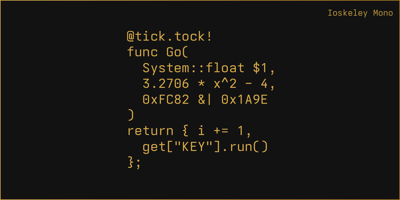
GitHub
Iosevka configuration to mimic the look and feel of Berkeley Mono as closely as possible. - ahatem/IoskeleyMono
oh that's weirddddd
I've spent a lot of time staring at berkeley mono so this gives me uncanny valley vibes
thanks for the suggestions! I'm taking a test fun of maple mono. and might give berkely mono a try
Oh this is so pretty
I need to try it out
it is, but it describes itself as a free version of berkeley mono. if the people who put hard work into berkeley mono want to charge for their work, I think we should honor their choice and shell out the $75. but I'm not making any money right now, so went with maple mono.
I accidentally erased my nvim config but before that I was using Dracula with Iosevka
Myna looks like a name, so it looks like you're declaring your love to someone, lol
THAT'S THE TSODING FONT!!!
yes :3
i am a regular viewer of mista azozin
I just watch the videos, I kinda don't like streams :d
and I hate when he just disrespects chat when they're helping them, so yea...
same actually
i <3 monocraft
iosevka is a great font as it has a bunch of ttf font features, so you can tweak it to look however you want
there are stylistic sets that approximate other fonts as well, it's super versatile
and a lot more fits on the screen than with other fonts because the glyphs are really tall
tweak it to however you want up to a point, I never managed to work out how to get it to look like Monaco, although I got close. It was still too tall/square
I am also unconvinced that it can be made to look like pragmatapro, the current efforts do not look like it at all
Berkeley Mono, I also love it. Thats money I dont regret spending
Comic code is my fave still, and it's pretty cheap to boot
Lilex (https://github.com/mishamyrt/Lilex) is my fav
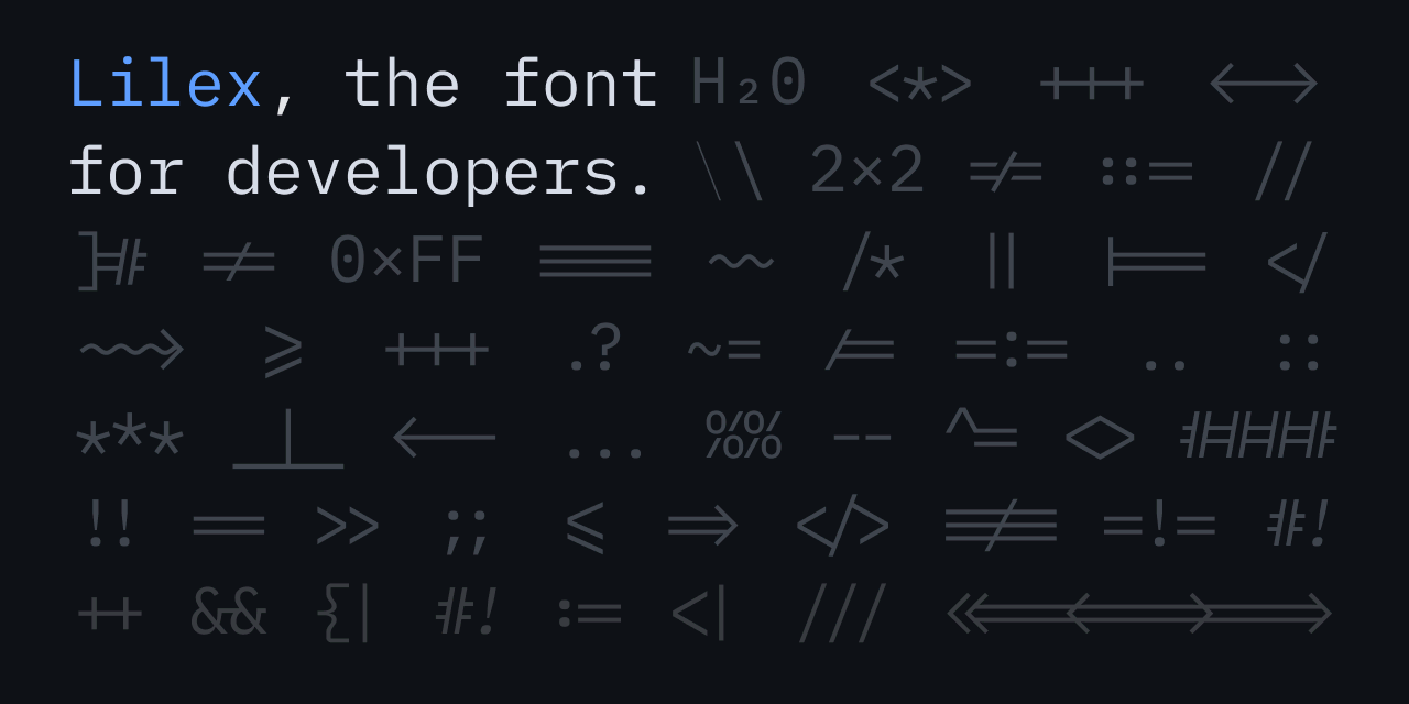
GitHub
🤘Open source programming font. Contribute to mishamyrt/Lilex development by creating an account on GitHub.
WAA
iosevka comfy motion fixed :) https://github.com/protesilaos/iosevka-comfy
Iosevka is great, I've used for some time. After switched to Maple Mono, and last year to https://github.com/0xType/0xPropo
helix + horizon-dark + iosevka (nvim users get helixmogged)

ooh, horizon dark looks really good
yeah it's nice
i was using dracula before but i think i like this better
This might be my new favourite dark theme, Kintsugi Dark Flared and the font is Lilex

woahhhh that looks nice
I know right?
Also I discovered zed has a crate to automatically convert a vscode theme into a zed one, that saved me sooo much time
if only such a thing existed for helix
rust??? not a tsoding viewer :d
I mean, helix's themes are kinda easy to add onto
okay but consider: c strings arent real
and also literally everything is unsafe in c
I always use nob.h when I use C bc of that :
tbf every time I write C, I make my own string struct that has lengths
it does mean you can't use the regular string library (although you still need string.h for memcmp) but I find it isn't usually too much of a bother to write what I need
you need Nob_String_View :d
that's pretty much what I write yeah
Does it have the advantages of fixed-size vectors (stack vs heap) compared to the original C strings (C noob here)
it sorta depends
the char *data field can be a pointer to anything, so you can allocate the characters themselves on the stack or the heap when you initialise them
it comes down to the way you write your string operations: if I had a string_append(String a, String b) function, I might choose to have it dynamically resize a, or I might choose to have it error
A proportional font for coding? Don't you have issues with some lines appearing longer/shorter than they are?
Not at all issue for me, is just bit more spreaded
There is also 0xProto which is more programmer "friendly". I tried both and can't decide 🙂

very nice font
Check out how Redis and Cello do strings. They use a cute trick so they’re compatible with c stdlib functions and still have a left field.
https://nick-gravgaard.com/elastic-tabstops/
i haven’t tried this but I like the idea. Separates the concept of alignment from the number of characters so proportional/fixed font doesn’t matter.
Elastic tabstops - a better way to indent and align code
My new theme, Fauxbespin, inspired by the Mozilla Bespin IDE from way back. Font: Inconsolata.

Neovim in ghostty terminal - ghostty supports custom shaders
lots of people using neovim here
go with proto; monospaced fonts are way better for coding
doom-emacs with doom-winter-is-coming-light theme, kinda reminds me of the light mode of the Gleam docs

doom-emacs, with doom-acario-dark

Emacs in 2026.... Respect :d
Another doom enjoyer!
Do y’all use some other key bindings for emacs? Or maybe just you don’t get emacs pinky?
If you have a regular ol keyboard I'd bind Ctrl to caps
I’ve always used evil-mode for vim keybinds in emacs. I was a vim user first and don’t want to give up that muscle memory
But I also bind caps to ctrl anyway, that makes the whole OS better
if there is a emacs + helix plugin, I'm going to emacs right now
I used to use caps as ctrl, which helps, but homerow mods are even better
I use one-shot mods on alternate layers (so, a thumb key plus either middle finger on the homerow activates a sticky ctrl) and that works nicely as well
Thanks for the tips. I have ctrl/caps switch but it wasn’t enough sadly. I will look into homerow mods
this is a fantastic place to start https://precondition.github.io/home-row-mods
I bound capslock to control in the OS and that's all i need
Whoa what a cool guide. Thank you!
"doom enjoyer", "evil-mode", should i be worried?
evil stands for Extensible VI Layer, don't worry about the acronym it's totally a coincidence
That sounds like what someone who doesn't want their lair discovered would say
no it doesn't
i just use the edge of my palm the press the Ctrl key. i don't know if that's an ergonomic typing positioning (someone told it isn't) but it works for me, as long as i'm using a keyboard with raised keys
Interesting. You mean like the regular little Crtl key in the bottom left of the keyboard?
yeah i was about to say, even if i make a fist, my palm is way below the ctrl key
that's a neat idea though to use your palm
i will check out meow thanks
it's a bit finicky to set up (i think the setup guide is outdated, irrc i had to change some stuff for it to work) but ultimately pretty good, and has good integration with other tools in emacs
that's neat
Ive been meaning to try out meow and objed for a while

GitHub
Navigate and edit text objects with Emacs. Development on pause. - clemera/objed
neovim with kanagawa (wave variant) colorscheme!

what's that neotree?
looks like it's custom, sry
it came with Astronvim, i didnt customize much from it
oooh, it's a distro
yup
I'll see it later than, thx!
zed - custom theme derived from an app i have

nvim + "everviolet/nvim" theme

Looks nice. What’s that font?
I think this?

I use it only for weekends because it has pink on top and now I'm in my Gleam love phase xD for the week boring "catppuccin/nvim"
is it evergarden?
I guess, I think i copied from the repo

I like it, I'll try in nvim. Daily I use kanagawa