#Forum design ideas
1 messages · Page 1 of 1 (latest)

idk why i cant reply to initial message, but yeah the yellow does indeed need to be different
and i personally cant tell the difference with yours until i really looked closely 😭
The thing is, I don't know how much we can make it visually similar to Vercel since technically both the server and forum are not endorsed by them. There's a risk of giving people the wrong idea 🤔
good point, but i still strongly beileve if we made it good, we can have vercel endorse the forum or something
endorsement by adoption (i just made this up)
Yeah, it's the official community server but it doesn't mean they necessarily support everything going on here
Yeah, it's a possibility
Man... I got tripped up by Figma's free plan limits 
Apparently you can't create different variable modes without having the project on a pro plan...
you are on crack mister
im fine with creating a design system but i fear that it wont be used. so im not sure if i like the idea of going further without any reassurance that it will be used (?)
unless you want to add it to your portfolio or something
Idk, I just do it every time I start a new project 
I like having a single source of truth at least for colours and typography. Components are useful to have there but I usually add very few to the set.
This genuinely made me chuckle 🤣
I mean
can't you still use "styles"?
also you start every project with pro plan??? 😭
man im broke
Yup. (thank you Figma for giving students stuff for free  )
)
are you still on uni?
Yeah for typography, but for colours it's easier with variables
imposter syndrome is real
And it's also more accurate to how you implement them in css
Nooo... Why?
coz i have graduated 😭
Isn't that a good thing? 👀

flex is my fav rn
where did u buy this?
At Counter-Print. It's a British publisher that specialises in design books.
I got the NASA Graphics Standards Manual too 
Well, that was fun 
feedback? 👀 nevermind, I'll change it completely now that Vercel's ds is out in full

ngl i think the "most helperful" is too clear here and distractine (esp with the green tick)

too clear and distracting?
might do with text-sm or something then
and make the ticks appear once (column header maybe)
yeah
i think maybe dont let the icons be so bright but i dont think they will look good then
why am i talking tailwind lingo in figma
i think the colors of the "helper" and the "moderator" is still confusing
yeah mod needs to be its own
also currently only mod and public are the roles stored in db
since vercel is blue ( i like it this way) maybe we can hue shift,
admin --> teal
mods -> green (friendly and green uwu, still the wisest)
helpers -> yellow (bright, enthusiastic, optimistic)
ngl i feel like mods is the one role that shouldnt change as we are used to it
(i also dont want to think im mod when im not... as yellow)
but i do like where your coming from
blue -> teal -> green -> yellow are in order, anddd its the system im used to haha
but yeah
I really don't like having blue as the success color. It's so backwards compared to everything else and it doesn't make sense.
But it does make sense having it be the mod color 👍🏻
then what would be the vercel staff icon?
The Vercel logo as is right now. Then admin blue, mod green, helper yellow, partner could be cyan, booster gets purple and gray for regular member and bot
They can still be green but instead of having one per row it can be placed together with the title.
Most helpful ... green-check
yeah thats what i meant too
Oh yeah, I missed this
vercel logo right now would be black, its not as readable imo in dark mode
oh wait, sure the vercel logo is ok to be their icon
but what about the role color?
We can change it with media queries for the website, but I don't know if Discord has support for setting different icons based on theme 
nope
the role icon for vercel staff is ok
but what about the role color?
u skipped that part
Good question... Maybe white (and assign a different default color for everyone else) or the same blue as admin
then light mode user wouldnt see the names...
@flint abyss i made my own fork based of off your latest design.
Here are the changes
- the search bar is justified in the middle as its only related to the threads, and not related to the most helpful and categories section
- i matched with design theme from Next.js blog and I like the way it has less visual distraction, thats why I removed the grey bg and border of each thread component.
- made larger fonts has tighter letter spacing (as it should be)
- added more vertical padding in the dropdown
- using secondary color or fader text for unselected/non-active category item
- using white/primary for selected category item
- aadded tags to each thread
- changed navigation button to use white instead of primary blue
https://www.figma.com/file/3FjrAE0dtGVZ6IaIDywcAd/Nextjs-Forum?type=design&node-id=285-1082&mode=design&t=hwRTrJJXlzkGkqtt-4

It'll get there eventually 
Yup, I saw it. You're right about the search bar, if it was like on GitHub where a search is performed across all issues/discussions it would make sense to have it above the three columns.
As for the Next.js blog theme I'm not sure whether to make it look like that or follow their design system and use bg-1 for slight differences in surface colors and gray-1 for default component colors...
Fonts are good, although I still have to add the entire type scale from the ds so there will likely be changes to that.
As for categories and tags, that's a good change too 👍🏻
Only thing, I don't know if I like more having the "Answered" pill or just a filled green checkmark 🤔
And at last, the bottom pagination is very much open to changes. We could also consider removing it and adding an infinite scroll or a "Load more" button.
mmm i fail to figure out why you send that here
can you resend the design system link again
to see the member count
it says 94k

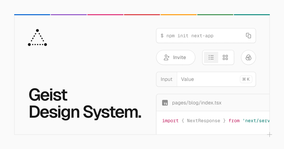
Vercel
Vercel's design system called Geist. Made for building consistent and delightful web experiences.
Cause I wrote 90k+ in the subtitle and it would be nice to have it be 100k+ maybe?
oh
just dynamically update it 😭
btw where did you get the inspiration to use bg-1 or gray-1?

In the colors page they give general guidelines on how and where to use them
true but the <Threads> arent layout components, those are list items imo

something like this
I think the bg or color 1-3 section are only valid if they act as a "card"
or card-like component
Ooh, ok
I have issues with teams having a design system and then not following it 
Those pills for example don't fall in with how they document them in the ds
This is what is closer to our usage, though they let the component has larger padding because they want Users to actually read the individual blogposts.
However ours is different because users wants to quickly finds threads therefore (I think) its more suitable to have a more cramped (more crowded) list
Here we can see, bg-less and border-less list items

As for categories and tags, that's a good change too 👍🏻
Only thing, I don't know if I like more having the "Answered" pill or just a filled green checkmark 🤔
Idk about this, thats why i put both of them lol.
GitHub seems to have both text and icon version, thats where I take inspiration from
Although one thing to consider is,
Some people wants to filter by "Answered", and since its a filter item, i think it fits well within the other tag pills (NextAuth.js, API Routes, etc) thats why i put them side by side.
And at last, the bottom pagination is very much open to changes. We could also consider removing it and adding an infinite scroll or a "Load more" button.
Who are we? are you working with a team
But overall the design is much better than the initial one
You are my team darling 
Jokes aside, I'm designing my version of it but you're free to add to it and suggest changes as you've been doing. For that matter, anyone can dump their ideas here ✌🏻
From what I've seen so far we're the design freaks of the server lol
I added the badge component and updated the button component. I haven't added all the sizes tho, and I changed the text color of the subtle gray badge cause I felt that having it be white was out of line compared with the other ones.
Also take a look at the embedded badge for solved threads and let me know what y'all think about that.
not me seeing different pfp and thinking someone is spaming a link in random channels
tho i do like it
interesting read