#Design Dojo
1 messages · Page 2 of 1
It's so annyoing that I can't tell what's AI generated or not anymore buit I'm willing to bet that that m4 is ai generated
Yeppp tahnk you so much
ye could be, or a video game screenshot 
idk how good AI is at specific car models
Either way I prefer actual photographs by a mile

Alright
I got something

Not too bad but I don't like it very much I feel like it's kinda in the same style as the other ones
What do you think?
looking good
the orange smoke i guess you kind a put there as a burnout
it looks off angle and does not fit too well
other then that
bit too tight with the logo around the edges
gotta give it some breathing room
i would shrink the logo down to equal the width of the "570S" text
other than that good deal
maybe add a black > transparent gradient on the bottom
fade some of that road out
That would have been good yeah
I agree with all you said lol but I already moved on to another design
Which I find pretty cool

This is getting addicting
Middle bottom image is a bit low contrast and sticks out weirdly from the other images
kinda blends into the background
Odd one
Are the photos all yours?
Yep
Alright yeah I see
ouu @cedar rapids

i like this new indesign cover
looks like 2025 versions are rolling out for CC
I think this has been rolling out for a week or so now…?
Had it happen for Media Encoder.
yeee
oh thats cool!
oh crap I need to read the developers posts for this update for my tools 😅
ok, does this look decent besides missing the "v"? be gentle

well, overall just heavy with text
one thing i can reccomend is design is to keep the text to a minimum if possible and give it some breathing room
bot the key things pop out well
weekend job
17 an hour
first come first server
honestly you could drop the rest other then the contact info
and put a call to action > like visit our website, or call to learn more
something along those lines
i just really want to know what was used to make it
theres a design principle called K.I.S.S
stands for Keep It Simple Stupid
most cases a poster like this benifits from being simple rather then layout all of the details. you can keep all the main points, but include additional info as fine print at the bottom
another thing is flow, this starts from the top and then goes to the right, but then theres text on the left which I feel should be at the very end
aswell as cutting off an image
well, hopefully adam is back to respond 
Yee
also another point is that a call to action should be highlighted, or pointed out a little more prominantly
which you also pointed out 😅
 , i'd replace the "first come first server" with the CTA
Should go:
Flexible Weekend Job
$17/Hour
<<Short Detail>>
First Come, First Serve
CTA
<<Fine Print Details>>
I wouldn't put "Easy Money" that attracts the wrong kind of people
oh and another small thing, keep it to 2 fonts
have a heading font, and a sub text font
that sub text font can use different weights whilst the heading font is your bold text
will adam respond? will adam read this? find out next on dragon ball Z
Will Tom ever shut up about design?
find that out on the next episode of "How I met your Graphic Designer"
I soo, need to fix my indesign script for ID 2025 😢
lmao nah i like your insights
we're on the same page tho
wish there was a graphic design server as active as this one
The titles look AI generated lol
By the way
mmm

prty cool
I had this type of idea
But I don't know how to execute it
I tried stuff
But nothing seems to match
that yellow is a lot
To add the text I mean
and i'd drop the graphic on the bottom
Yep agreed
straighten your pic as well, leaning to the right rn
The thing is I don't want to do the same design twice so I don't just want to add a text behind the car and call it a day
I tried putting it on like a donut shape on the graphic on the bottom it looked awful
Oh yeah mb
thats good tho
you get more practice that way
umm
well at this point it goes back to doing some research
one thing you can do, if you have exausted car advertising / design
is go look at shoes
and what they do
lot of running/basketball/nike/adidas will have cool ads
other brands as well
That's a good idea thanks

I agree that the yellow is a bit too much but Not a fan of the idea of removing it as a whole, although Ireally like the idea of removing the excess green on top
you could do similar with the yellow
just a strip
as thick as the red/green
or increasing in thickness to the logo
something like this, more of an arc

ehh
thin strip might just be better
fun to try stuff tho
do your thing

idk how i feel like aboutt the point your making with the red/white/green
i'd say follow the curve of the logo
I like the way it's increasing

It's not what I was talking about
i do like your edges
but i was reffering to this point here
Oh
I don't quite get it then 😅
I should probably remove the white line though
between the two greens
yes that
and

the top of the logo is curved
but your line art is pointed
so i'm saying to curve your lines
instead of have them come to a point
ohh

i think i'm mkaing it more confusing with that graphic 

i'm not cracy about how that sits there
really fights with the edge of the green up arrow
also goes against the oposite curve that the lines create
2 things you can try
- one is bring the logo down to sit above the black and mask out the logo so we see the sky behind id - kinda like a cutout basically. this might be too tight
- option two is curve the letters the oposite way to follow the contour of the green line
idk if any of these will look better but wroth a try perhaps
Online local high school job board. Students look at it for work.
Chatgpt. Then I heavily edited the text in ms paint
I just don't have certain workers come back.
ahh interesting
if you have photoshop that will be a better tool to use
if not GIMP will do the job as well
a YT tutorial or two
Canva actually
will be the best free tool
I kinda wanted to submit this yesterday though
I was debating just screenshoting the text only directly off ms word
will this be printed?
well, if you take our advice and lighten it up that will be good
and you can do it for free on canva
otherwise it sounds like you're ready to hand this in

I agree, but I had spent like 30 minutes with the guy I was paying already
I mentioned the text was small in various parts
This is better but text like the “no experience required” being tilted is just not a good design decision
Should be under the flexible weekend job
general advice to working with a designer
its best to give them the copy of what you want your design to say
the resolution
and any key elements you'd like present
and leave them up to it
this should take no more then 5 minutes
micromanaging a designer does not end with good results

this is how it is 
Ahh I see yeah
Curving the other way would make it look weird though imo
For the text I really had no original ideas so I just stuck with what usually works 

Hmm now there is a big empty space under the logo til the text but I can't add anything there

Looks ai generated
alternatlively you can make it a 1 : 1 AR
also dont like the feathered brush on the bottom
looks very amaturish
so i'd go for clean bold lines
ye for sure
Understandable
Yeah I could actually

Alright yeah will do thanks
Heyy
I don't know if this is the correct channel for this question
But how would you go about replacing the sky/ground on a car image?
On photoshop ofc
Photosho has “sky replacement”
Otherwise, good ol generative fill for the ground
And how would I go about replacing the whole background 
I tried that and...

Yeahhhhhhh 😅
really?

I've got no idea how to do that

mmmm ye
but does it have to?
it is a real sky
perspective is just off

you're gonna click on that mask
Yep
make sure its selected
And erase?
then using your brush tool, make sure the colors are set to black and white
Alright
like 85 ish hardness
and just brush over the window
that should fix it
if it does not!
make a mask layer on the folder "sky replacement group"
and use the same method on that mask


what r ur thoughts
I'm struggling mostly with like everything idk what the hell im doing I like making lil posters sometimes
it's the rain
and everything idk
do you have something youre like trying to make/inspo things?
this would be a bitch to print
the water looks crazy shutter speed was too low
it's tragic for sure the water just looks like hell of a lot of grain
and there is grain as well but not the cool grain
i need some layout inspo
testing out a two column layout rn
perhaps that title for the section is too big 
but idk. testing out best way to lay out this text heavy doc
yea i think so tbh
the margin between boxes seems small
i'll try extending them
What software you using?
indesign
Good stuff! That it all 🤣
If you have any questions feel free to ask me, I am literally qualified to teach this software 😂
What kind of a question is this? 😭
Do you not see the guides?
They’re InDesign colors.
Who else uses colors like that?
🤨
Affinity
Oh. Eww.
IKR
nah Affinity is great, but I once tried to teach someone indesign, just to find out they were using Affinity Publisher
which is great and all, and the knowledge is kinda transferable, but its the small things that matter
i am happy with these pages in particular
why you viewing this in view seperations mode?
cuz you can tell where the bleed starts ||i did not know that was a feature ||
this looks awesome, though my main concern is what kinda book is this?
its is a research report for an university
how is it getting bound? how many pages?
not sur wym
when the book is open what side is this page on
big data will be on the right
Oh you got facing pages on
previous one
ok awesome
I would highly recommend adding more gutter inbetween the pages for the text
if that makes sense
it does
you think its too tight?
this is about 85% of the pages
give or take the graphic
will also be adding numbers on the button for each page
sorry, I am being too vocal in the way I am explaining this as It makes sense to a printer but not much to a designer in the way I said it
so you have an inside margin and an outside margin right?
inside should be more than the outside
yes, my printing knowledge stops right after hitting the print button
the white here is all inside, and gray is all outside/bleed
the top is a bit tight perhaps
i can move it all down
if thats what you mean
so when you do CMD + Option + P a window will pop up showing your page size, and margins


oh you're using different shortcut keys
i'm on windows
go to edit > page settings
either way i dont need to worry about printing this
i will be sending it to a shop and they will take care of it
no this is not about printing it
its about the ability to read it without it being sucked into the spine
mm ok
sorry, if you do CTRL + Alt + P

you should get document setup
Unlink the margins and add more to the inside margin
I dont know dumb units, I only know proper units
so if the outside was like 10mm, I would make the inside 13-15mm
rememeber a book bends
and when it does, it can make it harder to read
does not look like its affecting my document
because it wont
you have preview unchecked
and it only moves the guide
which is a purple outline around your page border
*and it would only move shape the text boxes to match if you have liquid layout rules applied to it. but thats a clusterfuck to deal with sometimes

yea. i'm 60 pages in prty much. and i dont work in indesign enough to do it in any kind of efficient way unfortunatly
yeah fair. also I would refrain from changing document settings within the properties panel, ever since they added that for some stupid reason it does not let everything else in the file know a setting has changed
good to know
so always change page size, bleed and all that from the document settings window
i understand the issue youre describing with how the inside of the page will bend
i'm using a similar ammount of a gutter sice as the picture i sent of the last one
and it was not an issue in that one
so no problem here
yee
i will leave that setting as is for now
its more of a problem for perfect bounds really
if the printer thells me thers a problem and things are obscures i'll do something about it
I just make it a practice as I work with many books
I've had people go from saddle stitch to perfect bound in an instant
like 120+ pages in
yee, i have to use InDesign once every two years, otherwise i avoid it like the plague
hence the meme i made
been using PS for about 15+ years so i can fly though anything in that
yeee
i dont think i'll ever go deeper into print tho, if i do, i'll make sure i have a proper mentor
so i'm not stumbling through the dark with YT tutorials lighting the way
apreciate your help tho


would you like a .c4d or a .stl perhaps?
I was mainly kidding, but if you’re willing to offer. Perchance.

JESUS THE TOPOWORK ON THAT IS INSANE
fucking reduce that. there is no need for that many quads
Yoo
@pastel rain
I'm back for more feedback
I'm pretty sure on the idea but need some feedback on the dimensions of the logos/texts

i will be honest
this looks like bad screenshots taken from a video and logos put over it
Oh
Well it's gonna be in a carousel with lots of other pictures so

with stuff like this
it was supposed to be like for the "speed"
Any idea how I can make it better?
That Porsche is having a drink, cute Porsche
Who’s a good little Porsche!
You are!!
<pats porche>
reviving chat
no
<takes a gun out and shoots it>


@chrome socket Is there a way to tell Fiery to put a blank separation sheet in the middle of a book somehow?
Not fiery on its own, you can hit preview on a file, then select a couple of pages, go edit > open in acrobat and add a page
This can be weird if you haven’t already imposed, so if you impose it, flatten it, then add pages, it can be easier
Let me check when I get in today
I just did it manually.
I ended up separating the files and just insert the blank separator sheet manually.
We're coil binding anyways,
Thought there'd be an easier way to do it.
I mean, you can use mixed media, and apply it to chapter intro pages, or yeah, add a blank page, then mixed media tag those pages, and the printer should do it for you
I actually have hot folders setup for a certian client we get exactly for that, we just tell them to add a blank page before each chapter
I mean, like I said, we're coil binding them anyways.
There's like 310 pages and 9 chapters.
The separation sheets are blank.
oh you dont have an inline punch?
Nah. Wasn't added.
Wait, coil bind -- not hole punch.
We have an in-line hole puncher.
Two and Three hole puncher.
yeah, we have an inline puncher that allows you to switch out the dyes
Not sure if Canon features that exactly, but I can ask my dealer and see what they can offer me.

Ahh, of course GBC made it.
but yeah, check with canon, surely they have an option
yee
We just upgraded our booklet maker from 20 sheets to 45 sheets.
but yeah, 2 up a3
punch twice
cut in the middle, saves a stupid amount of time
ours by default can do up to 50
and you can kinda trick it to throw more in there aswell 😅
I just tell mine the plain paper option when I want it to staple something a little thicker than plain, but not thick cardstock.
I prefer the Canon version of Fiery than Xerox

Xerox did not give me the g/m2 values. Canon does.
I've done some sketchy shit with the machine.
I can run the machine with the door open, once I get the last sheet in there, I quickly turn the RCT unit off (unit infront of the plockmatic), and the plockmatic pauses. I print the rest of the sheets off on another printer, cut the Lay edges off, then feed them in whilst its in its error state, turn the gbc back on, and then it just forces the book though, staples it and gets really angry when the book exits the end
I've managed to force a 75 sheet book though it 😂
with like all the distance settings set to like -40 at the end
fuck that
Xerox Fiery is stupid.
yes
woosh
thoughts? how can i make this look better

this is prty good already
one thing is your left edge
honestly its not too noticible
but line up the left side of all your text
i get why youre doing it the way youre doing it
but i think i'd move in the bottom text & logos a bit to the right
bacckground image is nice
ah so its even
yes
i didnt notice that
second thing, the background image
just move it down a bit
so that his head is not so close to the edge of the photo
/graphic
otherwise youre cookin
whats on the top right corner?
that your logo or something?
ye
hmmmmm
it is good
but its not something i've really seen before
if you did this design just for fun
totally fine, keep it there
but if its for a peyed client, i would def remove it
nah its for my schools account and i just always credit my account with it
i know exactly what you mean
but here's the thing
empty space is good
it gives the viewer somewhere to rest their eye
if all of it is crazy buisy large typeface and crowded, they wont wanna look at it
this is balanced right now
i'd say you can simplify it more, but get in the habbit of getting comfortable with empty space
ok, thank you so much

whats your goal
interesting
is 602 the district or the number?
to call emergency
also the 3rd and the largest pic seems the coolest
question two
why blue?
the callsign
Melbourne 602 is her callsign
only other poster ive done lol

mmmmmmmmmmmmm
allrite
ok. #1 thing both about photography and graphic design is composition
there's not much out there about cop posters, but there is a top of referance material if you look into army marketing, ads and promo stuff

there we are obviously missing a bike/vehicle
but take inspiration from the composition
where is the text placed? does it need to take up a huge part of the screen/poster? does the msg come across? does she look cool?
you could go with this kind of a style. use her sitting on a bike as a silhoettee, and then double expose the city she patrols

that could be cool
and keep the text small
602 is not that important, and we can see it, it does not need to take up 1/3 or the entire thing
even if it is important, still does not need to take up the space its taking up
composition option 3

text on the bottom, maybe the street her bike is on
in the image you have up front
or like i said, the 3rd image you have in the back, she looks the best in that
i'd lead with that as the hero image
and then place copies of her doing other stuff left and right
are you able to visualise what i'm saying? or does it not make sense - and its ok if it does not
i just want to know where you stand

yes, but also stop making everything giant
having empty space is ok
empty space gives the viewer somewhere to rest their eyes
if its all busy, you'll instinctivly want to look away
nothing for your eyes to go to

i'm glad
That looks way better, thank you so much bro
personally i'd also drop the blue/white gradient youre using as your background, and use a background that was part of the city. you can still put a blue gradient hue mask over it
or whatever youre using
I think I will do that tomorrow, it's a quarter to 1 in the morning lol
Thanks for your help tho
I may potentially pester you again at some point


good progress
@pastel rain Does it work?

good mornin
i'm still not a fan of the gradient
and her in the bacground being different sizes/elevations
send the psd through if you feelin like it
there's a particular look im going for lol


lmao
if its a look you want thats fine
alr i'm kinda busy now but i'll give you a version at some point
but yes, just want you to be aware of when where and why gradients were popular
its also just a easy thing to do as a beginer that seems to look good with little effort
often times it kinda comes of.... mmmmmmm
idk if tacky is the right word
but something like that
i love gradients too, but now a days you wanna go subtle
I only use gradients if it serves a purpose
like here

2 reasons, for contrast for the text. and the fact that this is printing huge and the background image is at this point low effective dpi
also, my god what an annoying thing to design to, windmill needs to be that low because of things in the way looking from a distance
these guys had awesome muffins tho, that office was nice
I use gradients everywhere

Is that gonna be a problem?

its just old if you just slap a good ol gradient left to right
and the two colors you use are like yellow and orange
thats fine 😂

somthing like this
if you wanna keep the blue
not happy about the text on the bottom
Holy moly

Looks dope for like a recruiting poster
for the background i literally googled malbourne https://www.tahneejadephotography.com/wp-content/uploads/2014/07/facebook-4-copy.jpg
got this pic, and blurred it to fuck

🤣
this is why i was telling you use a background tho
will look better then a normal bg
cba
layers are a mess and unnameed

i put your stuff under the "og" folder
mine is the other folder
good, feel free to ask questions
one thing that was odd to me was that i thought you had use the liquid tool here

it was just a bad mask, you cut off part of the bike windshield
i call this one:
Lasha and the Georgian Mountains

i just might do that


so you do photography, videography and graphic?
oh whats the design for?
Open Hire For?

the layering is cool tho, I do like how the background is done
everything else, makes me think I dont know how to read
so your saying just the text needs to be reworked?
the basketball kid is also underexposed
idk about that foresty background
personally i'd go for this style, collage all the sports people in this kind of way

slap some text one there to do your ads
up to you
Just sharing this -- featured this on my new packaging for my prints a few weeks ago:

School now wants to be printed as a poster and hang a few around the campus.
hell yah
😮
Me and my fancy ass templates
the safe first warning auto removes when unembedding links, which then reveals the green warning underneath


Black or white background?

white would print better
@chrome socket finally printing the envelopes in time for next school year.
What a coincidence, did some envelopes today
Is that a Canon?
No…
It sounds like the early versions of the imagePRESS.
My apologies.

oh fuck me sideways
this is great
credit thing is annoying
but bleed extensions
@cedar rapids
took them more than a decade 😂

That was in illustrator
got a big ol 12 page thing to put together
working for a company that only wants 1 style sucks
my boss asked me to do it in a different style anyway
but
gonna do a A B test anyway
one replicating what the main marketing office does
one unique
and waste my time

the upside is, its easy as shit
i'm basically drag and dropping assets
but once again
theres too much fucking copy 
thank you for coming to my rant ted talk
@pastel rain @chrome socket Is it just me or does Gmail deliberately remove all password protection for a PDF file that has password encryption on it so that they can't print it?
I just found this out when I was testing it out.
yup, so if you print from google drive > print > print to pdf
it removes the password
This is stipid. There’s gotta be a way to work around this.
there is a tool, an ancient tool for windows that just removes passwords
I forget the name
Serious?
Yeah, I just don’t remember the name
I'm sure the average Joe doesn't know how to remove the password
@chrome socket @pastel rain any of you guys experience any weird slowdowns with InDesign lately? Not even with the latest update.
It's slow on Windows, but not terribly slow on either MacBook or Mac.
MacOS usually launches instantly.
I don't use the latest update. they borked the access for network volumes via scripts
No, not even the latest.
I downgraded, remember?
are you using my scripts?
No, I'm just speaking in general.
Like starting up the program.
Yah it was being buggy for me this week
ugh, I just spent like an hour and a half trying to troubleshoot a fiery spot color problem, just to restart the machine and fiery, for it all to work normally again..
thx fiery
It’s just weird lately and I’m not even running the latest version.
thoughts?

@chrome socket am fucked, it actually is iOS 26

yee.... I actually like it
Kinda prefer iOS 18. Not sure why it didn’t stay with the 18 Dev Beta.
¯_(ツ)_/¯
I know I wont like the Finder's design in MacOS 26
but apple are pretty good at refining their designs over time
so I have no sweat
Ehh.
Buggy OS, innit?
not really
Cap
I mean, theres a reason why I refuse to use Windows as a productivity OS
Windows actually has so many things to offer in the live entertainment industry that MacOS can’t do.
Which is why native lighting consoles and audio consoles are solely Windows and not Mac, for the sake of stability and reliability.
MA Lighting has been real buggy on MacOS.
ShowKontrol and Resolume are the only two MacOS compatible programs that are stable.
Other than that, most of it is buggy or just not worth the headache.
You know?
¯_(ツ)_/¯
Although Premiere is kinda buggy on MacOS.
But other programs run like butter.
Could it be an optimization issue?
So as After Effects and Audition.
Never really had a problem with AE on MacOS
All the graphic, publishing and photography related apps run so well on Mac — but video and audio production.
Which is so strange.
Cause PR, AE, and AU run like nothing’s taking a toll on my Windows machine?
its nice that InDesign has gotten GPU support for windows now.. only took them like 20 years
Which doesn’t make sense?
But you see what I’m saying with the issues I’m having though, right?
all of my scripts run stupidly fast on Windows
yup
Nah fuck your scripts — they run well when they want to, we have a different topic on hand
It’s pretty annoying, not gonna lie.
It’s annoying when I actually want to mainstream all my workflow within Mac, yet I’m dealing with such issues.
most of my workflows work perfectly with MacOS, but thats because I build with MacOS. applescript and so on
Elaborate.
Too slow to understand this detailed statement.
MacOS comes built in with automation software and its own scripting language.
yes you can do this with windows, but MacOS has it on a deeper level

Apple thingy make work go brrrr
me use tool, me make thing
and thing works
then it make me happy
@chrome socket looking for an inexpensive desktop color laser printer, what would you recommend?
I just need it for the sake of printing packing slips with previews of the photos printed out.
i am unsure what to recommend, I use the machines, I dont sell the machines
I mean I was eyeing the Brother HL-L3280CDW, if you're interesting in what I came across.
Brothers aint bad
Yeah, I have two of their HL-L2420DW printers and they've been great.
Just looking for a color option without having to get into inkjet due to the costly expenses.
Literally would only use inkjet solely for photos.
lol, me just adding menus in context menus now 😂

Also!
on todays episode of Tom finds a silly indesign scripting quirk

hey @chrome socket

for digitally displaying it, does this give you a feel of a ||trifold||
what type of print does it feel like to you
this is how I do it

dont worry about the numbers, those are internal reference
ye i get ya
isometric feels a bit clinical
but does portray the folds more acuratly

thats the point
alternatively I mark the folds with a blue spot color called fold for the people who know what their doing
this is for printing and showing client purpouse i assume?
yup, its. a quick dirty way. just marking folds with lines
whereas what I showed before it just for showing the client the idea
for that sorta stuff, or when I am presenting a full design set to someone I use this site:
https://mockups-design.com/?s=trifold
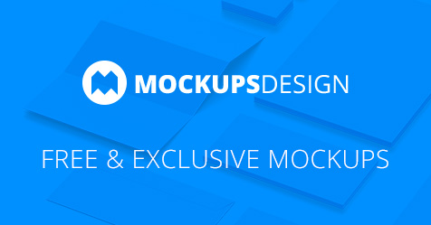
Mockups Design
these are also non attribute, so you don't have to credit them

Designs for the prototype of a board game. Includes a poster, instructions manual, promotional trifold, various game cards and also the game tiles


ouuuuu
Products for a (fake) fashion brand (so no worries about doxxing or sum) (this was a finals project)


(Fake) magazine


And here just a random little magazine about art (the cover was lame so not showing that)

fun layout
I had to squeeze in 2 art pieces for each genre, so kinda chaotic but fun
it works
When it comes to this one I wish I would have done the overall design like the poster. It looks so much cooler than the dark blue and offwhite
I also made a t-shirt for this project 
ya unified visual language is always a plus
posted and the stationary do look a bit seperate, althought the font unites them
The poster was one of the last things I did and just putting a model in front of a dark blue background didn't feel right
I should have just made everything like the poster. That would have looked much cooler, and kinda went with the "eco friendly" thematic
well
*the background of the poster does remind me of a oil spill *
or paint mixing
either or
The background consists of like multiple images which were like overlayed for texture effects
nice
If I had the chance I would have used fancier paper as well, but we didn't have much variety at our school
can always reprint in the future if needed
Yeah
these are fucking awesome, though if it were me, I would have more margin to those text boxes, text feels like its struggling for air
apart from that, its awesome
Thx.
And yeah ig, it was like my first ever magazine style thing


Merriweather do be a good font

Logo design is such pain 😭
Really hate the process..
Worst part is when the client doesn't like any of your ideas
Throw in a "bitch fee"
I find that in most cases, a client wont like any of them because they cannot see it being used
so show them examples of it being used
Mmm interesting
I mean yeah.. Generally one would include mockups for projects..
But some clients are still tricky

whats your goal?
valid
i feel like i had the vision then just threw up ts
lol
so imo i think you got 2 different ideas clashing here
i think the logo on its own with the players in it is its own thing
sticking it in here
it gets verrrrrry lost
i think that should be a standalone poster on its own
with a simple background
yeah true, i was just trying to fill in the space yk
a subtle gradient or faded pattern - like their jersy stripes
yee thing about design, its kind of a natural instinct to want to fill every empty spot, but you dont have to - empty space is good, gives viewer a place to rest their eye
but the important thing, just like in photography, is composition
random empty space isnt always great, but when compose well, it adds quite a lot
so i'd reccomend settup up a grid to work with
you could look up "graphic design poster grid template"
or something along those lines
this is that slide without the logo

better already i think
that line in the middle is distracting a bit but its not too bad
the safty net is a bit unfortunate
ik 😭
watch your edges and masking too


looks a little fucked up
make sure the logo is sharp
ye ill fix that up
ty bro 🙏
always giving the best advice
 you got this
@pastel rain this better?

mmm mmhm mhm
i think the background is still distracting
but can be use d
move the seats down a bit/the logo up
so its resting on the *simpler background
and slap a gausian blur onto that field
so it defuses more

nice
looking good
only other thing you can try to straighten out the chairs
its curving a bit / skewed one way
you can add some words if you'd like

perfect

Vectorize you mean?
I hate it when I deal with logos not vectored
I like it vectorized.
Is that gonna be an issue?
@chrome socket vectorized his borb.
I mean, if done in photoshop it will export as raster anyways
I was debating of throwing my 5 cents in here about working in Illustrator and linking assets.
I swear, Illustrator is on a fritz lately:

lol, how big is your document?
nah
does not matter most of the time
either its a tiny ad or a tiny print
unless youre zooming you wont see it
Individual work, yup
Professional work, nope
It's going to matter if you're making stickers and other marketing things, like what I'm doing right now.
dye lines for stickers
I always snap at my co-workers at school (the other teachers) when it comes to vector files.
"ContourCut" you mean
I'm getting lazy with Flexi and using their Contour Cut feature.
Fuck off Tom.
Anyways, yeah. 
Flexi, and all those other softwares love the spot color, or line attribution "ContourCut" or "CutContour"
most cases it seems to be "CutContour"
Yeah, it is.
interchangable really
I've been having too much fun with the Mutoh
yeah those machiens are fucking fun
I got to use Epsons option a while ago
and their system is really great
I try to avoid Epson printers
But their SureColor large formats are too good to pass up on.
I parted ways with the Xante flatbed in favor of a Mutoh flatbed.
yee, these machines used their surecolor format
But yeah, in terms of using Vectors. if you can use them, just use them. Its better than being told that the customer cannot print their artwork because it is too small. And believe me, I've been on the receiving end of the "what the fuck, I thought I could use this for print aswell as web, what do I pay you for"
Individual work, where you know your target destination is Web or a small ass print, sure
But in a professional area, where Spot Colors like pantones, or CutContour work. or even if the artwork needs to work on multiple scales, just rasters is not good enough
Shut the fuck up cunt, I will ditch a brick at your big ass head

How do you know I have a big head?
super cool machines

I originally wanted to go the LogoJet route because consumables are cheaper than the Xante and Mutoh combined.
LogoJet and Mutoh use the same software and drivers for much of their machines.
I debated on this for a while and decided to just go with the Mutoh for the sake of it.
Mutoh has a bigger R&D dep aswell iirc. could be wrong on that
basically this
i wish photogshop could magically do vectors
just work in pixels the whole time
and at the end exoprt vectors
some kind of smart object shinanigans
and it sucks that working with strokes, paths, curves. fucking sucks in photoshop
at the end of the day, if you are working with vectors within photoshop, things scale easier
but yeah, individual. its fine
small jobs, perfectly fine
pen tool does a prty good job
but full design complements with different destinations, yeaaaa just use Illustrator or InDesign
it does, however managing stroke/path is fucking annoying.
Affinty Photo does it way better. (even though I use photoshop still)

¯_(ツ)_/¯
me loves this context page. lets see them add more pages, leading me to bash my head on a desk

What the fuck is this yearbook?
Leavers Book
No, you’re right on this.
My previously flatbed has been nothing but a disaster.
so its supposed to be playful
Oh the yearbooks are very formal. but the other things like this is rather playful.
this year they wanted it to be like this
Mutoh printers are expensive, but their support team is exceptional. Especially when ordering consumables too.
last year it was pretty boring and kinda had no character
I’m reviving this idea:
This Is Exactly You! (this was my idea) — we had an acrylic cutout on the front cover, a slot sized for a 4x6 portrait of whoever owns the yearbook.
The inside pages will then flow through with the same idea.
You’ll get the general idea when I start putting everything together.
Hey I'm wondering how to make the space between just the bullets less not the other text. any help wit this thanks.

nevermind i figured it out
@chrome socket @pastel rain throwing together my sponsor banner for the school's football team... last minute thing, as always.
Is this doing too much for the background of a banner?

this is some grid layout?
depends what youre filling it with
this has been my day

Just photos from past season. Decrease the opacity to maybe 15-20%. Add my logo on top with my website as the main subject.
mmmm ok
i'm a fan of isometric
lil bit of space between them all
nice drop shadow
and youre cookin
leave a gap for your logo
Got an example?
My deadline is in 15 minutes. Lol.
I’m filling in as we speak.
lol just submit this for now