#art-help
1 messages · Page 9 of 1
 livid egret
 royal fern
looks good, if you're leaving it in just lineart i'd add some line weight.
with manga and lineart you'd probably go with cell-shading
livid egret
I want to add shading/coloring
It's not a manga, just cause wife and I are pretty tall, wanted to draw something for her to show how silly it is to compare herself to the 50kg asian ladies.I wanted to make it into small animation that alters between 3 sketches, once I dye it. When i add flat colors it just looks extremely childish and bad.
Not to mention that sometimes colors leak out and no idea how to fix it
royal fern
you keep adding onto the flat colors, either with gradient tools or soft airbrushes and such, i'll link you some stuff
livid egret
Great, link me in DM idk if I have locked the dm for non-friends, so sent you friend request, so we don't overflood this channel.
Thanks in advance!
 whole cedar
thanksss :> I really liked the concept so tried implementing it, though i think its a little hard to see.
 boreal anvil
 whole cedar
boreal anvil
whole cedar
boreal anvil
uauuu! thats pretty nicee, great use of a monochromatic scheme


 astral kernel
really pretty omg
 haughty tiger
omg thank you ❤️ you made me so happy
 brisk crater
@haughty tiger I love how that looks! Did you do that digitally or traditionally?
 molten frigate
Looks so goooddd wowww
haughty tiger
@brisk crater I did it traditionally.I used watercolor and black pen for outlines.And also for the background I used ''ebru'' which is a turkish art style.thank you so much ❤️
 sonic rampart
haughty tiger
sonic rampart
haughty tiger
this is super cool omg
 charred panther
boreal anvil
charred panther
boreal anvil
wow
 quartz isle
haughty tiger
quartz isle
haughty tiger
this is so gorgeous!! wow u are inspiring me to explore more mediums
brisk crater
That's so cool, I thought the background was digital because of how clean it looks.
haughty tiger
omg thank u guys you all made me so happy ❤️
 torn thicket
this doodle was inspired by @pigmypouter
on twitter idk man i just wanted to doodle

its just online class
 spiral arch
beautiful!!!! i love this style so much
 plain ivy
haughty tiger
I'm trying a new colorin technique.how does it lookkk
plain ivy
haughty tiger
I'm trying a new colorin technique.how does it lookkk
amazing
 dark shard
torn thicket
this doodle was inspired by @pigmypouter
on twitter idk man i just wanted to doo...
dark shard
torn thicket
this doodle was inspired by @pigmypouter
on twitter idk man i just wanted to doo...
i like the proportions
haughty tiger
plain ivy
amazing
❤️
I want to learn about animation.How can I start? 😦 I know nothing about digital art for some reason...
Do you have any suggestions,youtube channels maybe

 burnt escarp
boreal anvil
burnt escarp
boreal anvil
that's such a cool art style!!
boreal anvil
basil pfp
haughty tiger
boreal anvil
so cute
haughty tiger
burnt escarp
THIS IS SO COOL WHAT THE HELL??
thank you so muchh ❤️
 spring ore
looks great
 spark nacelle
do yall want to see a selfportrait i mad ehehe
torn thicket
ye
spring ore
Yessirrr

 spring ore
spark nacelle
here it is ehe
spring ore
spark nacelle
here it is ehe
Looks dope
burnt escarp
haughty tiger
bro you really did good with the background the swirls are so intentional to the piece if that makes sense
 covert topaz
This is Kim Jung Ji in my style. What do you think guys ?
 molten frigate
Sickkkk
spring ore
covert topaz
This is Kim Jung Ji in my style. What do you think guys ?
what does he say
royal fern
haughty tiger
I want to learn about animation.How can I start? 😦 I know nothing about digital...
you need to have the basics down well to animate well. and honestly it depends on what program you use to animate. Harmony? Animate? Flip-a-clip? They all have layers and keyframing though. you can do a simple youtube search on how to animate or animation for beginners and lots of good videos will pop up.
spring ore
I tried to animate a bit on an open source software called opentoonz too
Upside : no watermark
Downside : i can't fucking animate so i don't actually know any downside for it-
spring ore
As for YouTube channel or suggestions, try to search for some beginners tutorials, to animate simples objects and things like that, since it might be a bit like 3D
We all start somewhere i guess
royal fern
yea, I would start with ball bounce (tennis ball and bowling ball) and a flour sack animation. helps you with exaggeration, and clarity of emotions (through exaggeration and movement).
haughty tiger
thank u so much ❤️
 frozen viper
spring ore
what does he say
frozen viper
spring ore
what does he say
its basically saying don't ask this question again
covert topaz
molten frigate
Sickkkk
thankksss
covert topaz
spring ore
what does he say
Don't ask this question again !!!
 proud moth
how to genga
spring ore
What do you guys think about this ?
 royal fern
spring ore
What do you guys think about this ?
royal fern
spring ore
What do you guys think about this ?
it looks really nice! I'd change the tone of the bed (or whatever she's sitting on) to a darker grey so the shoes pop off - kinda blends in
spring ore
I believe the art world needs more phallic representation. Be it shown in the forefront of the canvas or a more "freudian" iceberg approach where the individual forms come together to form a phallic idol from the entire pictoral diagram.
spring ore
royal fern
it looks really nice! I'd change the tone of the bed (or whatever she's sitting ...
Aah yeah I get it now ! I'll keep that in mind Thanks !!
spring ore
spring ore
What do you guys think about this ?
ohh ive always loved lil fit illustrations
 brave spade
whaddaya think?

 rugged dirge
amazing
royal fern
brave spade
whaddaya think?
Very good start, but if you want to get into anime style drawings you need to know some basics of anatomy (the slope of the shoulders due to the trapezius muscle, hairline/skull/scalp, and face spacing). Not sure if the cross in the center of the face are supposed to be the guidelines or not, but if so, i don't think you used them too well. I'd also focus on line weight and economy of line for your drawing to look more clean and more dimensional.
royal fern
since it's anime the eyes and some expressions are more exaggerated, but they still stem from basic fundamental knowledge of where things belong and the sizing. in order to break the rules you need to know them typa stuff.
 radiant cedar
haughty tiger
radiant cedar
haughty tiger
this is fantastic!
brave spade
 royal fern
spring ore
royal fern
spring ore
FROG!!
burnt escarp
spring ore
i am in love with the frog statue. May i even say its the best part of the piece 😳
but genuinely i love everything about it ITS SO CALMING TO LOOK AT
royal fern
portrait of Rocky, my dog

 tight cradle
royal fern
portrait of Rocky, my dog
tight cradle
royal fern
portrait of Rocky, my dog
AHAHAHA CUTE
burnt escarp
royal fern
portrait of Rocky, my dog
i am in love with your dog
this drawing says so many things without words needed
spring ore
burnt escarp
i am in love with the frog statue. May i even say its the best part of the piece...
thanks! yeah i love him too
you shoulda seen his blockout form
hes a handsome man now but when i started sculpting him it was hilariously bad
sec


lmao
always makes me laugh
no clue where i thought i was going
royal fern
very reminiscent of my first frog drawing 😂
 eager pilot
He went from.the boy next door to the daddy long leg
spring ore
FROG !
burnt escarp
BLOB FROG
 sullen quiver
I love that frog lolol
 tidal wagon
hey everyone, can someone help me out
what do they mean by "use the horizontal middle line to find the intersection" ? like the intersection of what
 placid bronze
tidal wagon
hey everyone, can someone help me out
what do they mean by "use the horizontal m...
placid bronze
tidal wagon
hey everyone, can someone help me out
what do they mean by "use the horizontal m...
I think I need some more context to help out cause I'm just as confused 🤔
tidal wagon
placid bronze
I think I need some more context to help out cause I'm just as confused 🤔
oh fuck sorry i deleted my post 😭
because i got it
and felt dumb
it was that

 tropic mantle
Hello ! Could i get some feedback on this? im not sure how to continue : (

 late garnet
tropic mantle
Hello ! Could i get some feedback on this? im not sure how to continue : (
late garnet
tropic mantle
Hello ! Could i get some feedback on this? im not sure how to continue : (
man i can't help you to continue because i'm not an artist but you for sure and friend this drawing was really amazing
i'm not talking lip service just to please i really liked it
 weak tangle
tropic mantle
Hello ! Could i get some feedback on this? im not sure how to continue : (
weak tangle
tropic mantle
Hello ! Could i get some feedback on this? im not sure how to continue : (
A few tips!
- Let the piece rest, take a few days off or a week and get to it, sometimes we need some distance from the work to fully see it.
- I think it you may do some work with the background, since its all a kinda monochromatic color scheme you need something the stick off the character from the bg, maybe more contraste, maybe less lightning detail or just modify the tint and/or saturation. Or make the light from the lightning over the char more dramatic>
Theres a lot of things you can do with it, tho, if you feel stuck, I sincerely recommend leave it a side for a while.
Also, i think you naild the lighting tbh! ❤️
royal fern
tropic mantle
Hello ! Could i get some feedback on this? im not sure how to continue : (
really nice progress but the shading is really soft and doesnt make it look like there's really bright lights around her - needs more contrast like the other person said. try looking up the avatar lightning bending images or scenes since that's the best I can think of
weak tangle
Theres this thing that we all need to really work on that the "perfectionist" and a piece should be perfectly finished.. and that's not true, nothing will be perfect, ever (or au contraire, everything is perfect as it is). Some pieces are for us to experience or grow not just as and end it self. So, its okey to leave pieces that feel "unfinished", on the next one you'll know more and apply new things 🥰
 teal ibex

I drew this for my biology assignment and although I traced most of the octopus, I'm still proud of it
(It has a beak because we're doing binomial nomenclature)
 runic viper
can i get some feedback on this? it looks a lil wonky to me but im not quite sure. also how can i add in more texture?
 teal ibex
runic viper
can i get some feedback on this? it looks a lil wonky to me but im not quite sur...
teal ibex
runic viper
can i get some feedback on this? it looks a lil wonky to me but im not quite sur...
I personally don't see any flaws in this, it looks really good! Maybe the white shading in the background just looks out of place.
runic viper
teal ibex
I personally don't see any flaws in this, it looks really good! Maybe the white ...
yeh its supposed to be like a mesh material but idk how to draw mesh
teal ibex
I don't know how to draw to begin with :P
royal fern
runic viper
can i get some feedback on this? it looks a lil wonky to me but im not quite sur...
honestly probably with a texture brush since it's already so rendered and smoothed out at this point. I'd add more shading to the eyelid though - that's the part that weird me out the most? like it doesn't seem dark enough in value. also it's very odd the white cloth behind the face abruptly stops below the nose, I'd expect to see it above the nose too, at least a tiny bit of it.
runic viper
royal fern
honestly probably with a texture brush since it's already so rendered and smooth...
ahhhhh yessss thanks!
 next violet
what do you think guys?
 royal fern
next violet
what do you think guys?
royal fern
next violet
what do you think guys?
dude's so swoll he defies biology 💀 really really nice job on the coloring and shading. unless you meant for your character to look ridiculously jacked, then I'd look up some reference photos of bodybuilders for anatomy help.
next violet
royal fern
dude's so swoll he defies biology 💀 really really nice job on the coloring and ...
Nah just kidding dude That’s not mine
next violet
next violet
https://vm.tiktok.com/ZMegoGp3m/
Now, that’s mine, what do you think?
royal fern
good stuff, I'd add more colors and values in the skintone drawings more - there's pinks, reds, greens and blues in the skin due to the blood vessels and shadows and such.
spring ore
Working on a big ass rifle because who doesn't like big ass rifles ?

 nocturne tendon
next violet
what do you think guys?
nocturne tendon
next violet
what do you think guys?
a m a z i n g
next violet
Thx
 echo parcel
.

 sand moon
runic viper
can i get some feedback on this? it looks a lil wonky to me but im not quite sur...
sand moon
runic viper
can i get some feedback on this? it looks a lil wonky to me but im not quite sur...
what's the software?
quartz isle
my mom and i made zongzi (sticky rice dumplings) so i drew it unwrapping 🙂 any advice? idk if the drawing at the bottom reads as rice haha
 royal fern
quartz isle
my mom and i made zongzi (sticky rice dumplings) so i drew it unwrapping 🙂 any ...
royal fern
quartz isle
my mom and i made zongzi (sticky rice dumplings) so i drew it unwrapping 🙂 any ...
looks great! love the hatching lines. I call them chinese tamales haha
quartz isle
hahaha that’s so true we were joking abt that, also ty!!
spring ore
ohh, tasty
runic viper
sand moon
what's the software?
autodesk sketchbook
spring ore
are you going off a ref?
quartz isle
spring ore
are you going off a ref?
idk if ur asking me, but yes, i j took some photos with my phone as i ate it lol
burnt escarp
quartz isle
my mom and i made zongzi (sticky rice dumplings) so i drew it unwrapping 🙂 any ...
oh my gosh that shading is so good
runic viper
spring ore
are you going off a ref?
yesss i was
spring ore
if youre posting some art you want critique on always post the ref, helps people distinguish whats proportionally wrong, sometimes its hard to judge if forms are right since humans are squishy deformed meat bags.
tidal wagon
echo parcel
.
so cute 🥺
spring ore

 queen sparrow
Hello everyone!
 ocean patio

 keen compass
ocean patio
keen compass
ocean patio
damn thats too clean
ocean patio
keen compass
damn thats too clean
just a quick photo study
keen compass
the light is too nice👀
queen sparrow
ocean patio
thats so beautiful!
queen sparrow
yeah me too... too much school work
ocean patio
 queen sparrow
 placid bronze
ocean patio
placid bronze
ocean patio
I love the design! Very interesting
 normal robin
 ocean patio
queen sparrow
ocean patio
queen sparrow
i like the chill feeling
weak tangle
runic viper
can i get some feedback on this? it looks a lil wonky to me but im not quite sur...
You have almost non contrast between the bg and the face, the only focus are the lips and eyes. Try working with more shadows, add a color lightning so theres more volume. Texture and that its more a personal preference, I like more textured work than soft shaded , but its up to you !
weak tangle
normal robin
long live curry 🍛
normal robin
weak tangle
long live curry 🍛
hahaahahaha
boreal anvil
sweet days and her last kiss
 weak tangle
ocean patio
weak tangle
ocean patio
Neat study! where you thinking of adding any tint?
ocean patio
weak tangle
Neat study! where you thinking of adding any tint?
that was a greyscale study i didn't plan to color it
ocean patio
boreal anvil
sweet days and her last kiss
CUTE
queen sparrow
boreal anvil
sweet days and her last kiss
thats so cuute
 mighty walrus
ocean patio
mighty walrus
ocean patio
This looks pretty dope.
ocean patio
mighty walrus
This looks pretty dope.
thx mate
burnt escarp
ocean patio
i am so in love with the shading and esp the lighting <33
spring ore
burnt escarp
i am so in love with your art style!!
Tysm it means a lottt💜💜💜🥺
ocean patio
burnt escarp
i am so in love with the shading and esp the lighting <33
there is nothing rly good there ^^ but thx^^
ocean patio
spring ore
mate this is marvelous
spring ore
ocean patio
mate this is marvelous
Ahhhh tysmm 💜ur’re so good at backgrounds tho I love ur work😩💜
ocean patio
i will have to finish this someday
 runic viper
weak tangle
You have almost non contrast between the bg and the face, the only focus are the...
runic viper
weak tangle
You have almost non contrast between the bg and the face, the only focus are the...
Ohhhhhh got it thxxx :D
 tall violet
Iv'e been trying to finish this large piece for a while, so I'm mainly posting it for accountability purposes (goal is to finish it by morning), but critique would be greatly appreciated as well 🙂

 slender violet
quartz isle
my mom and i made zongzi (sticky rice dumplings) so i drew it unwrapping 🙂 any ...
slender violet
quartz isle
my mom and i made zongzi (sticky rice dumplings) so i drew it unwrapping 🙂 any ...
that looks great
i have no clue what it is
but it looks beauty
tropic mantle
weak tangle
A few tips!
1. Let the piece rest, take a few days off or a week and get to it,...
thank you so much!!!!! ill do just that !
tropic mantle
royal fern
really nice progress but the shading is really soft and doesnt make it look like...
O YO THATS GREAT REFERENCE THANK U !

 sacred dust
normal robin
help meßß.....
sacred dust
normal robin
help meßß.....
My advice is to try and focus on doing more confident lines that emphasize force and momentum . https://www.youtube.com/watch?v=IyuCq6VWVeA This tutorial was really helpful for me


Thank you to Squarespace for sponsoring this video. Head to https://squarespace.com/proko to save 10% off your first purchase of a website or domain using code PROKO.
This is part 1 of 3 of figure artist Mike Mattesi’s FORCE series. Mike teaches you the basics of FORCE and how to create more rhythm and fluidity in your drawings with beautiful ...
normal robin
sacred dust
My advice is to try and focus on doing more confident lines that emphasize force...
THANK YOU
sacred dust
normal robin
THANK YOU
Ofc :D
tropic mantle
normal robin
cute!!!! AAAAAAAAAAAA I used to have this same issue, I resolved it by focusing on making arced lines instead of super straight ones
normal robin
tropic mantle
cute!!!! AAAAAAAAAAAA I used to have this same issue, I resolved it by focusing ...
i mean i used to do it very wavy
but i wanna recreate the furudate sketch feels
since this is an oc of mind that im shipping with a canon character
Ushijima from haikyuu
royal fern
normal robin
I think it looks good, but the shoulder of the girl and her angle of standing make it seems stiff (inserted bad mouse drawing edit of line of action and stuff). even though you use straight lines, I'd try to add some curvalinear lines as well
 normal robin
royal fern
I think it looks good, but the shoulder of the girl and her angle of standing ma...
normal robin
royal fern
I think it looks good, but the shoulder of the girl and her angle of standing ma...
oh yeah im seeing it now
lmao thx
 delicate bridge
Hi folks. This is just a screen cap of what I'm working on. I would love some input on color choice, whether to add, keep, or tone down something. Thank u

 weary finch
delicate bridge
Hi folks. This is just a screen cap of what I'm working on. I would love some in...
weary finch
delicate bridge
Hi folks. This is just a screen cap of what I'm working on. I would love some in...
wooaaahhh idk anything about art but this looks hella cool
royal fern
delicate bridge
Hi folks. This is just a screen cap of what I'm working on. I would love some in...
it looks really really good! it might just be me/my monitor, but seems like the light orange background on the top right could be lighter in shade cuz it's still blending in with the scarf and arm just a tad bit (again might just be my monitor). The loss of gradientation on the scalp after the forehead also throws me off a bit - like since it goes flat, my mind also think the scalp stops turning/curving. Loving the complimentary palette and the lineless painting style tho, really crisp and clean👌
delicate bridge
yeah monitor RGBs vary across lol but that still helps so I know what to look out for for other platforms but sheesh both y'all are kind thank u. @royal fern could u emphasize more on the scalp 😂 I think I get what ure saying but I wanna be 100% sure cuz Im also struggling with it
should I add more of the warm orange and lessen the yellow gradient on the scalp? o-o
royal fern
delicate bridge
yeah monitor RGBs vary across lol but that still helps so I know what to look ou...
ok so halfway through this drawing I just realized I could've just told you to refer to a shading of a sphere but I was already too far in 👁️ 👄 👁️ but since the head/scalp is like a sphere and it turns, i would expect to see some darker orange around the rim and like a light yellow/orange radiating from the highlight

done with a mouse on mspaint so pls dont roast me
delicate bridge
OOooOOh
royal fern
it might just be that your gradient on the scalp is too light and delicate to see the shading
delicate bridge
Okay okay I gotchu fam
no it's wonderful even with a mouse LOL I can't roast u at all
thankfully I can change the gradient style easily so yeyeeee thank u for the input, b!
 royal fern
spring ore
royal fern
spring ore
nice style! kinda gouache/watercolror-esque
spring ore
Yesss tried something new
weak tangle
delicate bridge
Hi folks. This is just a screen cap of what I'm working on. I would love some in...
lovely work! ❤️ I think you have a really low contrast shades here, if that was intentional keep on going, if not, you bg is making really hard to read the drawing.
Now, color wise is really working, I would add more blue since its a nice complementary for the orange, maybe a bit of violet to add either light or shade. I don't think the darkest magenta on the arm is really working tho, you can try a a more brownish orange or even blue for that.
Also, since you have many strong composition lines diagonal (arms, jaw, hair lines) on the same direction, I would suggest a bigger dramatic/contrast over the cyan side of the face to compensate the weight.
Hope it helps !
Also, since there's such a big jump to the darkest brown, is rather heavy so the eye is making this route: hair-jaw-hair-jaw etc. You can fix this by working with other tones or bg ❤️
delicate bridge
weak tangle
lovely work! ❤️ I think you have a really low contrast shades here, if that was ...
make it lighter or change the background swatch to something else maybe?
weak tangle
delicate bridge
make it lighter or change the background swatch to something else maybe?
the ligher Bg makes such a BIG difference
Totally works
delicate bridge
Aight gucci ahahah but yeah thank u for the other input! Keeping a list here to experiment through 😅
weak tangle
Also, now with the blue on the oposite corner the hair its a bit more balanced ❤️
weak tangle
delicate bridge
Aight gucci ahahah but yeah thank u for the other input! Keeping a list here to ...
Its really neat !
delicate bridge
weak tangle
Its really neat !
 Thank u kind stranger
weak tangle
this vector shading is a super attractive style
royal fern
delicate bridge
make it lighter or change the background swatch to something else maybe?
I like the 2nd lightest one (around 3 seconds), but the very pale yellow can work as well. both protray different moods. one's supper bright and happy and the one's a more mellow-chill happy (for me)
delicate bridge
royal fern
I like the 2nd lightest one (around 3 seconds), but the very pale yellow can wor...
oooh okie dokie ~ 💚
weak tangle
delicate bridge
<:PEWcatcry:724916841813770240> Thank u kind stranger
Do welcome ! also, a tiiiiny bit of violet over the blue cheek will make a HUGE difference
Also, I never sheared my usual line of work/fun/study/yay !

Hope ya like it ^^
royal fern
weak tangle
Also, I never sheared my usual line of work/fun/study/yay !
oooo sick work! really like the asiatic monster/demon theme (not sure how else to describe it)
weak tangle
royal fern
oooo sick work! really like the asiatic monster/demon theme (not sure how else t...
Exactly like that!
delicate bridge
weak tangle
Also, I never sheared my usual line of work/fun/study/yay !
Giving me a fun trip right here
weak tangle
my work is heavily based on folkloric monsters around the world ❤️
weak tangle
delicate bridge
Giving me a fun trip right here
I have more psychedelic pieces jaja
Monsters n psychedelic, I mean, It doesn't get any better than that right? 🤣
I draw silly things too
 delicate bridge
Sounds more like a bad trip or just DMT making u see biblically accurate angels
weak tangle
delicate bridge
Sounds more like a bad trip or just DMT making u see biblically accurate angels
YES jajaja
delicate bridge
weak tangle
I draw silly things too
OMG Absolutely adorable ❤️
Cerberus but Chicken?
B r u h
royal fern
weak tangle
I draw silly things too
CHICKEN! ❤️
weak tangle
delicate bridge
Cerberus but Chicken?
Yass, it was a joke over a thing people were discussing on the news, about transgenic chicken n that, saying something bout growing multiple heads and all jaja
delicate bridge
Wait... What news????
What is being broadcasted to you that I dont get to see
wth
weak tangle
delicate bridge
Wait... _What news_????
Oh some local channel here jajaja
delicate bridge
What in the WORLD--
weak tangle
people be craycray
And lastly, some sketchity sketch studies, classical marble sculptures have an amazing light to make volume studies

Here is a bit late now, but we can manage to make a silent drawing-streaming session or something something like it
royal fern
weak tangle
Here is a bit late now, but we can manage to make a silent drawing-streaming ses...
I'm down but most of my stuff is digital animation work for now.
weak tangle
royal fern
I'm down but most of my stuff is digital animation work for now.
super interesting tbh! i know n o t h i n g about animation
royal fern
I'm PDT so it's kinda hard to sync up with most people on this server haha
spring ore
weak tangle
I draw silly things too
it looks awesome well done
ocean patio


 ripe timber
hello! any musicians here? any tricks on identifying augmented 6ths quickly? also distinguishing between french, german and italian... i can't seem to fullt grasp the concept lol
spring ore
What do you think of my creation? https://youtu.be/BlsV4yKdS_0

Fluidscape de Kevin MacLeod fait l'objet d'une licence Creative Commons Attribution 4.0.
Light Awash de Kevin MacLeod fait l'objet d'une licence Creative Commons Attribution 4.0.
https://creativecommons.org/licenses/by/4.0/
Source : http://incompetech.com/music/royalty-free/index.html?isrc=USUAN1100393
Source : http://incompetech.com/music/roy...
weak tangle
 half monolith
Love pixel art ❤️ cant really do much critic, i know a little but, but this looks amazing !
half monolith
weak tangle
Love pixel art ❤️ cant really do much critic, i know a little but, but this look...
thank u !
placid bronze
ocean patio
Nicee I love the vaues! Do you have artstation/insta/etc where I could follow you maybe? 🤔
ocean patio
placid bronze
Nicee I love the vaues! Do you have artstation/insta/etc where I could follow yo...
hmm yeah ihave social media but i dont post a lot. idk if we can share them here
 grand cobalt
What do you guys think? It's a study I did on facial proportions, it's my first time drawing like this

 short kelp
Its really nice 👍
the right hand side isn't completely align with the left, but maybe thats what you were going for
 karmic jay
grand cobalt
What do you guys think? It's a study I did on facial proportions, it's my first ...
karmic jay
grand cobalt
What do you guys think? It's a study I did on facial proportions, it's my first ...
left eye and eyebrow looks bigger than the right one; the ear could be more in a more elevated position parallel to the top of the ear being on the line of the eyebrow and bottom on the nose
if you're trying to make "perfect" symmetrical proportion that is
grand cobalt
Thanks! I was trying to be at least kinda symmetrical, but wasnt being too hard on myself since its my first time
Will definitely keep those tips in mind
karmic jay
grand cobalt
Thanks! I was trying to be at least kinda symmetrical, but wasnt being too hard ...
for first time is a really good result
grand cobalt
karmic jay
for first time is a really good result
Thank you!!
half monolith
and now the first animation :ppp
i could definitely improve it but it was just a quick draft to learn the basics
 burnt escarp
ITS SO CUTE
ocean patio
half monolith
and now the first animation :ppp
i could definitely improve it but it was just a...
Woah....i have no word
 topaz wigeon
Y'ALL ARE AMAZING ARTISTS/CREATORS 😭
half monolith
thank y'all...
spring ore
grand cobalt
What do you guys think? It's a study I did on facial proportions, it's my first ...
Did your intentionally make the picture not symmetrical?
grand cobalt
spring ore
Did your intentionally make the picture not symmetrical?
It was really just trying to practice facial proportions but i think my sketchbook or posture wasnt straight soooo its a lil crooked lol
spring ore
Guess who's back with another work on progreeeess
 sacred dust
was doing a study but then i got bored so i made him a fairy conductor 😅
 spring ore
Conductor to the world of the fairies
Would be a fun concept for a movie
sacred dust
Oh yeah youre right maybe i should flesh out that idea more
spring ore
grand cobalt
It was really just trying to practice facial proportions but i think my sketchbo...
I understand, well, do you start drawing with the first sketch or do you draw directly?
grand cobalt
spring ore
I understand, well, do you start drawing with the first sketch or do you draw di...
Sketch! I have a few process photos
 lone reef
sacred dust
was doing a study but then i got bored so i made him a fairy conductor 😅
lone reef
sacred dust
was doing a study but then i got bored so i made him a fairy conductor 😅
in love with this particular conductor fairy :))

 ocean patio
u're all too good for me
grand cobalt
spring ore
Btw your draw really good:D
Thank you!!!! That means a lot
proud moth
gengus
 royal fern
proud moth
gengus
royal fern
proud moth
gengus
sus. 👀
 blazing plaza
Hi everyone 👋 my name is Rey, im a young artist from indonesia and im glad to join and be here with all of you amazing and talented artist, hopefully i can learn more with you guys in here. have a great day everyone


 blazing plaza
the head is good, try to thicken a little black line on the body
then also give a little shade for the hair, and after that you can give a dark color in certain parts, for example eye,hair etc.
oh yes there is something missing, you can learn about shading for gradations from dark to light, it might be difficult but later you can add a gradient in the characters to make it look more real
 icy spruce
normal robin
icy spruce
normal robin
The lady´s arm seem unproportional with the body and the skirt should be flatter. I mean proportionally works well. If you want my opinion about the whole drawing, it would work better if the guy was in 3/4 or more clues of social interaction between them, it may be a bit plane . I really like your drawing and how you fit in the wrinkles and the foreshortening.
About the lady´s arm the wrinkles don´t help that much, it wasn´t proportions srry
normal robin
icy spruce
About the lady´s arm the wrinkles don´t help that much, it wasn´t proportions sr...
i knew it
XD
smth was off
icy spruce
I´m glad I could help 🙂
normal robin
👍🏾
normal robin
icy spruce
I´m glad I could help 🙂
it would work better if the guy was in 3/4 ??? wdym bro
XD
3/4 like body?
icy spruce
yeah
normal robin
ah i see
icy spruce
the man
icy spruce
Ahh I see
normal robin
VERY Stoic and blunt
so drawing him like hugging her seems like a big deal
XDDD
u literally can imagine this dude ignore his wife for days
icy spruce
No haha, I mean a different thing
normal robin
icy spruce
No haha, I mean a different thing
XD
icy spruce
It seems plane, like with no depth, in order to make a better body language he should be facing in the other direction,.
For example the girl is in 3/4, why don´t make the same with the guy but in the opposite direction?. Her body is facing towards him, but he facing towards us, and if you exagerated the body language the message would be much clear.
normal robin
ah i see
 icy spruce
Nice👍
normal robin
😌
 green sierra

 obtuse sierra
👀


 warm siren
spring ore
https://cdn.discordapp.com/attachments/598085762407464982/843461962264477716/Hig...
warm siren
spring ore
https://cdn.discordapp.com/attachments/598085762407464982/843461962264477716/Hig...
that looks sick 👌
half monolith
spring ore
https://cdn.discordapp.com/attachments/598085762407464982/843461962264477716/Hig...
marvellous
second animation, i picked quite high resolution for a starter, which made me spend much more time on details and in the end i still have mixed feelings about it ;ppp
 spring ore
https://cdn.discordapp.com/attachments/598085762407464982/843461962264477716/Hig...
spring ore
spring ore
https://cdn.discordapp.com/attachments/598085762407464982/843461962264477716/Hig...
Wow! This is masterpiece
spring ore
 spring ore
warm siren
that looks sick 👌
spring ore
warm siren
that looks sick 👌
Thanks!, very fun to mess around with an environment for once
ocean patio
spring ore
Thanks!, very fun to mess around with an environment for once
i'm jealous
spring ore
anyone can do it, stylised environments are pretty simple for even beginners
they have a pretty streamlined process, of prop creation, if you want to get into it at any point i recommend the channels 3dex and stylised station.
warm siren
spring ore
Thanks!, very fun to mess around with an environment for once
i don't mess with environments a lot but i should definitely start ahah
spring ore
spring ore
https://cdn.discordapp.com/attachments/598085762407464982/843461962264477716/Hig...
Woah this is 3D? I love it !
Here we go

Ooh cool idea could be cool to add some fog to the scene
topaz wigeon
^^^ agreeee fog would really complete the scene. or some sort of dust storm (if that's sand)
what did you make this on?? @spring ore
spring ore
spring ore
Ooh cool idea could be cool to add some fog to the scene
That's...a good idea actually
spring ore
topaz wigeon
what did you make this on?? <@456226577798135808>
I used the god blessed blender
topaz wigeon
all hail
honestly when i first tried blender a couple years ago, i was just sooo confused bc i'd been using maya up until then
 median grove
can someone just help me draw a simple man exercising..
royal fern
median grove
can someone just help me draw a simple man exercising..
exercising what? usually finding a photo for reference helps
spring ore
median grove
can someone just help me draw a simple man exercising..
Check your DM’s. Can’t draw btw
median grove
royal fern
exercising what? usually finding a photo for reference helps
just a simple poster of exercising to avoid sickness or viruses like that
median grove
spring ore
Check your DM’s. Can’t draw btw
i appreciate it
spring ore
Np
 hollow onyx
old art

 rich glacier
spring ore
https://cdn.discordapp.com/attachments/598085762407464982/843461962264477716/Hig...
rich glacier
spring ore
https://cdn.discordapp.com/attachments/598085762407464982/843461962264477716/Hig...
owo...
spring ore
topaz wigeon
honestly when i first tried blender a couple years ago, i was just sooo confused...
Well i don't have the money for Maya and bender can do a lot of things too
But I understand, the software is confusing as hell when you start
i mean if youre a student you can get maya for free (among other ways to get it), but honestly from somebody that has used maya for years. Blender is better in most ways. Doesnt make maya bad just blender is way more artist friendly rather than maya which is pipeline friendly.
rich glacier
spring ore
i mean if youre a student you can get maya for free (among other ways to get it)...
but why did you kill me? :0
spring ore
oh?
rich glacier
/j nevermind.
spring ore
spring ore
i mean if youre a student you can get maya for free (among other ways to get it)...
I'm not an art student so i can't access it x')
However i agree that blender is good to learn a lot of things, you can sculpt, model, texture, shade and do a whole lot of crazy shit with it, it's cool-
i just lied about what course i was on and they still let me have it, maybe they changed it, but i dont think they thoroughly check it.
spring ore
Bahaha
I'm still good with blender for now tho-
But I'll try it with Maya later
warm siren
rich glacier
but why did you kill me? :0
you got in his way he was going to be a god XD
ocean patio
what about zbrush ? is it that bad ?
 rich glacier
warm siren
you got in his way he was going to be a god XD
rich glacier
warm siren
you got in his way he was going to be a god XD
ikr !!!
its cuz, I believe in justice and he just acts it when needed to
He's not god, he's a child with a kill list.
warm siren
Ahah I'm currently reading "the Los Angeles bb murder cases" idk if you've read it but I think you'd love the way mello talks about him 😂
 last inlet

Real-time meetings by Google. Using your browser, share your video, desktop, and presentations with teammates and customers.
i need help pls
karmic jay
hm?
karmic jay
last inlet
i need help pls
what do you need help with?
 mint garden
does blender need a lot of ram to run and work properly?
i know nothing about blender so asking if I can start working on it
royal fern
define "work properly"
mint garden
i meant to do It's job, you know
royal fern
if you'r trying to get it to run fully smooth then it honestly kinda depends on your entire computer system with at least 8gb ram
mint garden
wooo
royal fern
if you're a professional then probably 16+ RAM with good CPU and GPU
mint garden
noice
spring ore
Well i use a Lenovo yoga, blender has some difficulties and i can't ask too much, but it definitely work
mint garden
i have a dell laptop with 4 GB ram. Inspiron 15 core i3
think it can run it?
i Don't think so🤣🤣🤣 illustrator crushes when I open it. might buy a good pc someday then start working
royal fern
yea, I think the i3 core is killin ya
mint garden
☹️☹️☹️
spring ore
Yeah i have a I3 core too
And i can do these :

 quartz isle
this is a sketch for a dress i’m making but if anyone has figure advice that would be great 😄
 quartz isle
boreal anvil
my oc's
quartz isle
boreal anvil
my oc's
these r so good! i feel like they have a lot of personality and ur drawing style is super cute
ocean patio
boreal anvil
Teach me
 somber portal
boreal anvil
somber portal
boreal anvil
Reminded me of Riko and Reg from Made in Abyss haha
boreal anvil
somber portal
Reminded me of Riko and Reg from Made in Abyss haha
they are the main inspiration
spring ore
boreal anvil
I've got some made in abyss vibes from the girl on the left, i really like it tho-
spring ore
Oh well i just read the others messages XD
 spiral ermine
 keen cloak
spring ore
quartz isle
this is a sketch for a dress i’m making but if anyone has figure advice that wou...
keen cloak
spring ore
quartz isle
this is a sketch for a dress i’m making but if anyone has figure advice that wou...
Wow i love ur style
 fading schooner
anybody here take IB visual arts?
 merry tendon
hello guys
i am an artist on instagram
if would be really great if you all will support my page paintdrop__
i am quite near 1K followers will be great if you follow my account
thank you<3
royal fern
fading schooner
anybody here take IB visual arts?
no but i can help
tropic mantle
Hello again! Ive done some updates on the piece i asked help for! Any feedback?

 shy tendon
thats pretty neat
 royal fern
 open birch
nice piece! only feedback is go heavier on the paint application so you don't see the white canvas underneath
karmic jay
tropic mantle
Hello again! Ive done some updates on the piece i asked help for! Any feedback?
I think you did what is called overblending
between the left arm and the side of her torso, it's clear that there is light and shadow. Your shadows and lights are not defined, the transition between them is too big and it causes this effect that looks unnatural
spring ore
tropic mantle
Hello again! Ive done some updates on the piece i asked help for! Any feedback?
I just don't think long hair has the same quality as short hair maybe you can straighten it on it
karmic jay
her balance is kind of strange too, she's tilting but her head is still, in real life, she would lose a little bit of balance, and would be difficult for her to stand that way
karmic jay
spring ore
I just don't think long hair has the same quality as short hair maybe you can st...
I agree, the long hair parts are too simple/no texture
spring ore
yep
spring ore
tropic mantle
Hello again! Ive done some updates on the piece i asked help for! Any feedback?
and the lights makes on long hair don't look very nice
karmic jay
@tropic mantle if you want direct help, I can try and draw the same pose more realistically and you can translate to your style
ours don't match but I want to just try the pose itself
no pressure though, I am just offering practical help
 sharp kraken
hi!! just wanted to grab outside opinions before continuing-

is the shoulder i’m pointing at
too short??? i’m not sure 😞
also hand tips? : o
the double bump thingy i’m fixing now, but any other anatomy that is wonky?? ive been looking at it for so long its kinda hard to tell 😅
karmic jay
@sharp kraken can you take another picture, but the whole drawing instead of cropped?
sharp kraken
yep!

sorry it’s kinda hard to tell in some areas : ( the clothing is too intricate ><
karmic jay
I think there is nothing wrong with it
sharp kraken
alright ty!!! i’m likely just overthinking 😅
karmic jay
you're doing everything with a consistent style
so I think it's good for what you want
karmic jay
sharp kraken
alright ty!!! i’m likely just overthinking 😅
artist moment
karmic jay
the hands are good, but this index finger (pointing finger) is too big
 sharp kraken
oo ok ty : o
karmic jay
@sharp kraken I am wrong, sorry
sharp kraken
o
karmic jay
the index finger is good, I can see the intention of it being on the side
sharp kraken
ahh yeah that is a little what i was going for, i’ll try to make that more obvious ythough : )
karmic jay
yes, try to make it obvious
either with lines or with shading

because without those indications it just looks like a blob
karmic jay
karmic jay
either with lines or with shading
I hope you get my point with that
 dapper pier
here's my latest unfinished portrait , i need your opinion

 eternal geyser
dapper pier
here's my latest unfinished portrait , i need your opinion
eternal geyser
dapper pier
here's my latest unfinished portrait , i need your opinion
Wow it looks so realistic, so far so good👍
karmic jay
dapper pier
here's my latest unfinished portrait , i need your opinion
it looks awesome, though the highlights can be more brighter
I don't know if the face is finished so that's what I think it's the best
tropic mantle
spring ore
and the lights makes on long hair don't look very nice
Thank you for the feedback! ill work on fixing it
tropic mantle
karmic jay
<@530033141776252929> if you want direct help, I can try and draw the same pose ...
hi ! Thank you for the tips !!! Ill make good use of them !! And sure that would be super helpful to me!!!!
karmic jay
tropic mantle
hi ! Thank you for the tips !!! Ill make good use of them !! And sure that would...
cool, glad I helped
when do you have some free time? we can join on the chill out VC and try to do some sketches about it
tropic mantle
im free at the moment : )
karmic jay
I can't do it right now, sorry
tropic mantle
dont worry about it!!
 steady sphinx
dapper pier
here's my latest unfinished portrait , i need your opinion
steady sphinx
dapper pier
here's my latest unfinished portrait , i need your opinion
Omg wowwwww
Iejdjsbsksvsnxkwseo
Twat
TWT
U make me cry
Y r ppl so talented?
spring ore
Be aware, this is not the final product
But i still like the first result-

and i like compliments too
royal fern
the one cloud going in a different direction is throwing me off wack - usually they go in the same direction due to wind pushing the clouds. really nice vibe and atmosphere it's giving off though.
spring ore
I noticed it too, and the overall look of the clouds is not as good as i wanted it to be, the sky is not blue enough, and it's overall a bit empty
I'll add a few smaller floating rocks around as well as some rocks on the ground, maybe an ambient occlusion (or whatever the name is, my dumbass forgot) to add some volume
ocean patio
spring ore
Be aware, this is not the final product
But i still like the first result-
@spring ore have you done some thumbnails before diving into this composition ? I agree with Bean about the cloud issue. I like the idea of rocks kinda merging into clouds. Floating rocks are really well done imo but if their are the true subject i think they must pop off more. Don't forget the story behind scenes. (IM SO SORRY IM RLY BAD AT DRAWING AND FAR FROM SOMEONE WHO CAN JUDGE OTHER PEOPLE WORK TT__TT)
spring ore
Okay, not gonna lie i just do it like that without a lot of reflexion, it's inspired by the work of a friend (who drew a similar view) x)
As i said, i noticed the cloud and I'll try to fix it, but i was too far in the render and i wasn't ready to sacrifice half an hour of rendering right now-
Making them pop off more is a good idea tho, maybe adding a few more ''big'' rocks, or making them bigger would be a good idea
As for the story behind the scene
There is no story behind the scene i think, it's just big floating rocks
But !
I'll try to make some visual storytelling in my next piece as it sound like a great idea
royal fern
the lack of gradientation in the sky also makes it seem a bit 2 dimensional. it need to have a light to dark gradient in some direction
ocean patio
royal fern
the lack of gradientation in the sky also makes it seem a bit 2 dimensional. it ...
true
here's a tiny scribble xD
 karmic jay
spring ore
Be aware, this is not the final product
But i still like the first result-
karmic jay
spring ore
Be aware, this is not the final product
But i still like the first result-
it looks like a liminal space of some sort
spring ore
royal fern
the lack of gradientation in the sky also makes it seem a bit 2 dimensional. it ...
Indeed, i tried to find some sky material but i couldn't make it work, I'll fix that
spring ore
karmic jay
it looks like a liminal space of some sort
God you're right-
 tribal tartan
Hello ! I looking for some who work/learn video editing/ VFX like me :)
When i come back from vacation i want to start twinmotion or unreal engine course
steady sphinx
spring ore
Be aware, this is not the final product
But i still like the first result-
This is so good TwT bye.
spring ore
steady sphinx
This is so good TwT bye.
Thanks !
 stoic sluice
tribal tartan
Hello ! I looking for some who work/learn video editing/ VFX like me :)
When i c...
stoic sluice
tribal tartan
Hello ! I looking for some who work/learn video editing/ VFX like me :)
When i c...
whoaaa unreal engine, what course is this?
ocean patio
 spring ore
Very nice
 vivid trench
cute
spring ore
there we go
 karmic jay
it is kind of weird looking how the mountains have close to no shade
spring ore
maybe i should add some sort of fog?
ocean patio
spring ore
maybe i should add some sort of fog?
where is the the light source ? Is that dusk ?^^ it seems to be dusk with sun falling left but lights on floating rocks are right side and on the ground its the opposite ^^ I like this one more than the previous one
spring ore
it's supposed to be on the right and yes it's dusk ^^, i noticed the light problem on the right too but i didn't managed to change it
and oh god i noticed the rock on the ground, i'll fix it
 lost skiff
spring ore
there we go
lost skiff
spring ore
there we go
Great stuff. One think I would like to see is some gradient in the ywello
open birch
Some sketches I did while in class lol
 ocean patio
first version

 torn quail
😀
 proper zenith
not as beautiful as your pictures but
 tidal wagon
how do you guys focus while drawing, like for solids hours whitout music or podcasts
because, i'm trying to achieve that, but it's too hard, my brain keep going here and there
should i talk to myself in my head more ? like "this line goes there, if I do that it will result to that" etc ?
because focusing on books, maths etc, is more do-able, you try to understand whats written down, but when it comes to drawing it feels different at some point
spring ore
tidal wagon
how do you guys focus while drawing, like for solids hours whitout music or podc...
I really love 3D, it's probably the same for 2D drawing, but i have an idea and i focus on it, i need to see a result, weither it be a sketch of the final result or just a small piece.
Basically how i do it is focusing on the idea i have and the result i want.
Dunno if it helped tho-
tidal wagon
spring ore
I really love 3D, it's probably the same for 2D drawing, but i have an idea and ...
It actually was pretty helpful, I guess I'm not able to see beyond what's in front of me properly and I'm doing random things hoping it works
thank you Alias !
royal fern
tidal wagon
how do you guys focus while drawing, like for solids hours whitout music or podc...
I either have music just to block out distracting noises. For me I just blank out and draw and try to improve my motor skills during it, because that's what drawing is.
tidal wagon
royal fern
I either have music just to block out distracting noises. For me I just blank ou...
Yeah I agree, that's a part of what drawing is, but if you want to actually learn, you have to focus and understand what you're practicing so you can be better and faster at it
royal fern
usually there's lecture then lab/studio courses so I don't worry about that too much, plus there's rough sketches into final iterations
tidal wagon
I'm using "fun with a pencil" of Loomis right now to focus on some basics, and I'm doing some turn around heads of his facial expression "folks" that's kind of tough so I tend to get frustrated and my brain fly away when it happens, like I will think about random things about my life I really don't want to spend time on xD I rather eat my piece of paper instead on focusing on those things
spring ore
tidal wagon
It actually was pretty helpful, I guess I'm not able to see beyond what's in fro...
No problems
Music help a lot for the imagination, i listen to a lot of movie/trailer music (y'know these YouTube channel who put music with over the top titles like ''epic battle trailer movie rock music''), it help me imagine a lot of things, and then it's mostly training, you start with small things like drawing a lil' dude and you end up making some cool things-
I started by drawing random things too but eventually you'll find something you like ^^
tidal wagon
spring ore
No problems
Music help a lot for the imagination, i listen to a lot of movie/tra...
Yeah I love those, Ivan Torrent, Two Step from Hell ... piano compilation, they're all great to imerge into your own world ! They're great for personal project, but I feel like I'm not putting too much "brain" into my work ... Idk maybe I'm just being weird
Anyway thank you again Alias !
@royal fern Thanks to you too ColoBeans !
spring ore
tidal wagon
Yeah I love those, Ivan Torrent, Two Step from Hell ... piano compilation, they'...
Excellent choice of music 👀
No problems again, i believe in you x)
tidal wagon
spring ore
Excellent choice of music 👀
No problems again, i believe in you x)
!!! Thank you !! I believe in you too !!!
spring ore
Danke x)
tidal wagon
De rien 😄
 lost mist
check this out

 haughty kestrel
I finished this

 magic wyvern
thats not a bugatti
delicate bridge
lost mist
check this out
I like that you kept in the stroke-styles. Did u use sometihng like copic markers to color in the car?
lost mist
delicate bridge
I like that you kept in the stroke-styles. Did u use sometihng like copic marker...
winsor and newton promarkers
this was my first attempt with them
delicate bridge
aaay. I dont use that brand often but they are one of the quality ones
that's a great first attempt!
 swift pendant
 lost mist
swift pendant
lost mist
swift pendant
woah nice
lost mist
delicate bridge
that's a great first attempt!
thanks
delicate bridge
swift pendant
U tryna do interiors for cars? 👀
swift pendant
delicate bridge
U tryna do interiors for cars? 👀
focusing on interior and exterior design, yeah
spring ore
swift pendant
oh damn
lost mist
swift pendant
focusing on interior and exterior design, yeah
lambo sian
swift pendant
lost mist
lambo sian
yeah, beautiful car
lost mist
swift pendant
yeah, beautiful car
eh, its ok, but that drawing is so good
swift pendant
lost mist
eh, its ok, but that drawing is so good
thanks man
lost mist
ur interiour is so nice
swift pendant
im currently drawing the audi e-tron
lost mist
the exteriour the wheels can be bigger, but it looks nice overall
lost mist
swift pendant
im currently drawing the audi e-tron
nice
 knotty lance
I’m planning to transfer from digi art to paper, does anyone have tips on how to avoid messing stuff up-
karmic jay
tidal wagon
how do you guys focus while drawing, like for solids hours whitout music or podc...
I just go with the flow, it is something I like so much I don't even need to try to focus. BUT my attention to other things is very bad and I am trying to better that. I advise you to be more aware about trying to do other any type of distraction
for me, distraction is almost automatic, I don't really choose when I start to drift
so being aware when I'm doing that is my way to combat that
other thing I did is to write something whenever I drifted, it's shocking how much I did it, I recommend you do that too
normal robin
tidal wagon
how do you guys focus while drawing, like for solids hours whitout music or podc...
i always set my self yes or no question
the line okay?
no
dont ask why
just 1 question one answer
 spring ore
oh yeah for that i just kinda had to train myself to focus, started off with a timer of about 10 minutes drew 100% concentrated for that then stopped when the timer went off had a break then went back on
takes a bit but now i can do it for 10-12 hrs
best way to do it if youre easily distracted imo
 flint nimbus
hey if u were drawing characters that were generally small so u cant really add much detail to the face how would u do it cause mine just keeps looking droopy
^ asking anyone btw 
normal robin
flint nimbus
hey if u were drawing characters that were generally small so u cant really add ...
simplify it
 cursive ginkgo
flint nimbus
hey if u were drawing characters that were generally small so u cant really add ...
cursive ginkgo
flint nimbus
hey if u were drawing characters that were generally small so u cant really add ...
i hope this reply isn't too late! I think yes simplify, but its a bit broad of an answer. You should prioritize the most important features, like what features are most important in expressing the character you're drawing. Or if it's a bit more environmental, you should prioritize the largest shadows/highlights. Think about how cartoons seem to prioritize eyes for expression and makes it easy to identify a character
flint nimbus
cursive ginkgo
i hope this reply isn't too late! I think yes simplify, but its a bit broad of a...
omg it isnt too late thank youuuuu


 lost mist
eager pilot
lost mist
eager pilot
amazing
lost mist
magic wyvern
thats not a bugatti
this was my first attempt, i wanted somethhing easy
Im trying new things out, first attempt on eye. Plz give feedback!
 karmic jay
flint nimbus
hey if u were drawing characters that were generally small so u cant really add ...
karmic jay
flint nimbus
hey if u were drawing characters that were generally small so u cant really add ...
blur your vision and try to look at anything. You will see colors and some forms, but no detail nor texture.
 true hornet
heyo does anyone have some tips or critique for me on this sketch so far (anatomy , proportion wise would be helpful) tyvm 
 stone blade
true hornet
heyo does anyone have some tips or critique for me on this sketch so far (anatom...
stone blade
true hornet
heyo does anyone have some tips or critique for me on this sketch so far (anatom...
your arms are smaller in proportion to the face same with the legs.
i would suggest going to figure reference one more time
true hornet
I didnt reference the pose
Would u suggest making the head smaller or Arms/legs bigger ?@stone blade
 tacit plover
swift pendant
tacit plover
swift pendant
OMG
swift pendant
tacit plover
OMG
haha, thanks
royal fern
lost mist
Im trying new things out, first attempt on eye. Plz give feedback!
watch out for how you approach the eyelashes - they curve up and out versus straight sticks, and they follow the waterline. you do a good job on some parts, but for a majority of the eyelashes that's the problem. great job on the whites of the eye; not many people understand that although they are called the whites of the eye, they are still shaded.
royal fern
true hornet
heyo does anyone have some tips or critique for me on this sketch so far (anatom...
good pose but like you said, anatomy and proportion could use a bit of work. since it's art you can take some liberties with proportion and anatomy but it seems like you're going for the more realistic type. i made the mistake of using aqua and red and now it looks like a 3d glasses drawing, myb

the biggest thing i found was to check the length of one arm and leg to the other, and as for the hands - use your's for reference! using a basic "mitten" hand helps a lot too before you move onto blocking in the fingers themselves
true hornet
@royal fern ty so much 
i started drawing 2 weeks ago so i have still enormous problems grasping proportions / perspective (especially foreshortening) , anatomy (especially hands) and many other things
royal fern
I can go into detail of what I did- but for the super basics there's the ribcage and pelvis which you can simplify to an egg and a rectangle.
 normal robin

please help me on the anatomy
her hips is supposed to be that sall
small
im just insecure about the dude position
it doesnt look like it fit in my opinion
royal fern
true hornet
those were the forms i used
boobs are honestly really flexible and various but usually people go for super perky ones just so it looks more....anatomically correct? I guess? I would take out the round sphere for the waist and use either an egg shape or thicker rectangle for the ribcage
normal robin
pls go light on me
true hornet
im no expert on drawing boobs sadly
normal robin
imagine a water ballon
true hornet
i learned that they behave like waterballons to some extent pressing on the chest being bit perky on the other side
normal robin
AHAHHAHA same mindset and brain cells
true hornet
normal robin
i mean if they are super tight like in a sport bra then you can draw them higher up
if not then they end around half the ribcage
true hornet
now i have to draw clothing which is still super hard for me
royal fern
normal robin
i think it might be the placement of the guy's neck and head - it should be a bit more forward? in the current state it looks like he's relaxing in a chair instead of doin a sit up type of thing
true hornet
idk how boobs behave in clothing
normal robin
if they are saggy (like into old age) then they can literally end at the last ribcage bone
royal fern
true hornet
i learned that they behave like waterballons to some extent pressing on the ches...
mnnn not really. boobs are literally sacks of fat. if anything imagine thick jello
normal robin
royal fern
i think it might be the placement of the guy's neck and head - it should be a bi...
ye ye hes supposed to be on a bundle of pillow
sry XD
royal fern
normal robin
ye ye hes supposed to be on a bundle of pillow
it looks fine then, i think it just looks weird cuz there's literally no support underneath him. it's like if you drew someone dead lifting without the weights.
normal robin
for sude
sure

i mean im worry about this part
thigh arent pillows
so they dont get smush
but only a lil
but since this dude is a atlethe does it appy as well ?
or is it like
sitting on a chair?
royal fern
they get smushed but if you have a considerable amount of muscle it doesn't "spill" as much since it's more taught.
true hornet
@royal fern tyvm for the help again , really helped me a lot
lost mist
royal fern
watch out for how you approach the eyelashes - they curve up and out versus stra...
wow thanks for the feedback, will improve in the future!
guys new drawing, took inspiration from chanel Artville, let me know what you think!!

close ups
 karmic jay
normal robin
karmic jay
normal robin
I think his back is too strait
karmic jay
lost mist
close ups
those reflections, nice job
weak tangle
normal robin
but since this dude is a atlethe does it appy as well ?
Mhhh.... the dudes position is super stiff, it requieres A LOT of core muscle tension if he's not having any back support. That said, if he's tightening the core to maintain that position, the rectus femoris will be super tight with the tensor fasciae latae and vastus lateralis, so no, no squishy. If not, no, it need to have a bit of a curvature for the pressure
normal robin
weak tangle
Mhhh.... the dudes position is super stiff, it requieres A LOT of core muscle te...
oh no no im sorry
hahaha

hahaha
any tip for back ground
im open to it
im fairly bad at bg

this was my ref
people say i should practice more back ground but idk where to begin..
XD
weak tangle
true hornet
i learned that they behave like waterballons to some extent pressing on the ches...
The easiest way is waterballon, yes, or like a drop of water. BUT breasts comes in so many shapes . The waterballoon alegory helps you understand the weight of the breast and have a more "natural" looking fall
weak tangle
normal robin
people say i should practice more back ground but idk where to begin..
perspective
weak tangle
normal robin
it works
normal robin
my back ground lack texture and details
weak tangle
normal robin
my back ground lack texture and details
Its not needeed for this
Think of this: whats the focus on the scene?
normal robin
the couple
weak tangle
Exactly. If you add to much work of detail to the bg it would withdraw atention from the couple
normal robin
yeah but like the bg in this many say the blur destroy the entire piece
wich kind amakes me worry
and if i undo the blur
weak tangle
Having a simple bg, blured, difuminated makes layers of visual density, so, if the characters are working together with the bg maybe you'll have some parts more worked out and some more sketched
weak tangle
normal robin
yeah but like the bg in this many say the blur destroy the entire piece
Nah, it gives focus. You can also makje the bg clearer if you're gonna make it less blured
normal robin
clearer?
weak tangle
lighter
 weak tangle
Think of this: the lowest values of a picture is where the eye will focus naturally
So, if you want to focus on this figure, that has the lowest values as black, you can make the bg ligther to make the eye stay of the couple and not wander to the back
normal robin
ah i see
weak tangle

Watch my previous color theory tutorials:
-
https://www.youtube.com/watch?v=6fb6V3uOVZg&list=PLgp2JRuyDVnCHOfxpxfbHszSMUXhPFG40&index=14
-
https://www.youtube.com/watch?v=utKZGtuQExo&index=13&list=PLgp2JRuyDVnCHOfxpxfbHszSMUXhPFG40
This is by far the most outlandish thumbnail I have ever created in my entire 4 (5?) year career on Youtube. Je...
She explains it super easy
normal robin
👌 ui thank you
weak tangle
this is an easy example
 normal robin
oh yeah
weak tangle
You have 3 layers of information:
- the character in full detail
- the soldiers, other characters that help to the narrative of the picture but are not that important
- and the hundred people meshed in the bg, because that density of information is not necessary
jaja sorry for the super long explanation ! hope it helps ❤️
weak tangle
Also, if you think you need to improve you bg, the best way is start doing perspective studies AND work the picture backwards, start with the bg and then add the characters
weak tangle
normal robin
pls help with this another one
sure
 weak tangle
Okay, the shoulders are doing something weird here jaja
weak tangle
I think the main issue is that you're making the arm shorter
give me a bit and ill try to make some lines over if your fine with that
weak tangle
normal robin
go ahead
Here's whats happening

you're making mostly one direction and its looking a bit unbalanced
weak tangle
 normal robin
oh yeah

 true hornet
@weak tangle Ty for the help
weak tangle
✨
normal robin
👌👌
normal robin
weak tangle
so i keep the right arm? (her right
weak tangle
The shoulder should be a bit higher and that should fix the lenght of the arm, if not, loweer the elbow to match the waist
as a reference, almost always the elbow ends up in the waist
 worldly trench
Nice observation ibeodd
true hornet
i think
i finally fixed my anatomy
bot wont let me post the picture cause its explicit 
 lost mist
karmic jay
those reflections, nice job
lost mist
karmic jay
those reflections, nice job
thanks
 prime briar
normal robin
prime briar
normal robin
I think looks good but the hand 🤚 itself is in a bit weird position, maybe it’s me tho ...
normal robin
prob
royal fern
normal robin
the other arm is fine, but the arm far away is showing too much. the female is being viewed at an angle so you shouldn't be able to see all of her other arm unless it's kinda hunched like the character is disgusted or cold or w/e. I thought the arm was where the shirt was, and I think it would belong there and the shirt would kinda connect near the neck due to the viewing angle
this for reference

also boob-torso and other arm observations

 royal fern
@normal robin as for the single green line in my edit - the boob/pectoral muscle is connected to the shoulder/arm (peepo for censorship to prevent uncomfortableness). it's not always visible unless ur more muscular but its a good guideline
 royal fern
ocean patio
doing some thumbnails to make a city background
royal fern
ocean patio
doing some thumbnails to make a city background
I could never, I hate perspective LOL.
ocean patio
royal fern
I could never, I hate perspective LOL.
i have more struggle drawing a human than making perspective xD and to me the most difficult is sculpting details in the cubes u make, making everything coherent is not easy
and storytelling in background ooooffff
@royal fern
xD
royal fern
I guess, haha. perspective is too accurate and mathamatical for me. humans are organic so mistakes are easy to bypass
ocean patio
Furthermore perspective don't have to be 100% accurate even more in this kind of background since eveything is living
royal fern
hmnn
ocean patio
I think u have a great opinion on persp while u are using it constantly on humans xD
xD
maybe we could draw together so i can learn from you !
one day
royal fern
ocean patio
maybe we could draw together so i can learn from you !
maybe haha
normal robin
👍👍thx


 analog dew
 lethal nebula
I understand Im not good but what do y'all think?
lethal nebula
I understand Im not good but what do y'all think?
looks real cool
spring ore
very surreal
spring ore
lethal nebula
I understand Im not good but what do y'all think?
Picasso is shaking
Welp! All of you barely need help lol. Here I am, in love with drawing but can barely draw a stick figure
karmic jay
spring ore
Welp! All of you barely need help lol. Here I am, in love with drawing but can b...
need any help?
spring ore
lethal nebula
Somebody call an ambulance.... But not for me! 🔫
Why must thou hurt me this way, oh cruel stranger
spring ore
karmic jay
need any help?
Wait really?!?!!??
I should warn you, good human. I'm at level zero
spring ore
karmic jay
we all start somewhere
Point mad!
*made
Wait... so there was a time when all you hyper artistic folk couldn't draw an eye???
Hard to believe tbh
normal robin
eh?
karmic jay
spring ore
Wait... so there was a time when all you hyper artistic folk couldn't draw an ey...
what?
spring ore
karmic jay
what?
As in, all these amazing artists also went through a phase where drawing something as simple as a stick figure intimidated them?
spring ore
Sometimes I think there's something wrong with me. Like, everyone can draw an eye. EXCEPT ME!
spring ore
karmic jay
everyone is this way, we are all born on 'default mode'
wow. Ngl, this actually calmed my nerves for some reason. "Default mode" is way better than "talentless potato"
karmic jay
spring ore
Sometimes I think there's something wrong with me. Like, everyone can draw an ey...
practice
study
observation
perception
influence
coordination
memory
all of those things play out when you draw
if you don't have any of those, it might be harder to draw anything
good thing is that all of those are "trainable"
spring ore
karmic jay
practice
study
observation
perception
influence
coordination
memory
all of those...
Study?... Study as in reading about color theory etc?
karmic jay
study in the most broad way
seeing other peoples techniques
studying anatomy
studying form
studying tone/color/hue
etc
spring ore
I think I see the problem. I try too hard to draw. But I never have a vision for it. And I never look for reference. In short; I'm trying to draw from memory, even though I'm at super beginner mode.
spring ore
karmic jay
study in the most broad way
seeing other peoples techniques
studying anatomy
stu...
Ah! That makes sense
karmic jay
spring ore
I think I see the problem. I try too hard to draw. But I never have a vision for...
doing that is good and bad
the bad is that you are probably studying "wrong" and doing too much work for little improvement
the good is that starting drawing from memory in the beginning is great
because you are definitely going to need it in the future
spring ore
For example, I try to draw eyes. But I don't look at eyes before deciding to draw them. So I always get awkward lash placements etc
Should I continue this and wait for it to develop overtime? Or should I get into a proper routine with reference?
karmic jay
proper routine
spring ore
karmic jay
proper routine
As in search for a reference image. Stare at it. Try to mimick its placements. so on
karmic jay
memory is to be trained whenever you have the patience and enough control of the subject and the pencil/pen control
normal robin
spring ore
Sometimes I think there's something wrong with me. Like, everyone can draw an ey...
theres no wrong way to draw an eye honestly
you can put 2 dots down
and call that eyes
karmic jay
normal robin
theres no wrong way to draw an eye honestly
agree, it could be symbolic drawing
karmic jay
@spring ore what is your goal? like, name a few artists you would like to have their styles or something like that
 spring ore
karmic jay
<@456226577798135808> what is your goal? like, name a few artists you would like...
spring ore
karmic jay
<@456226577798135808> what is your goal? like, name a few artists you would like...
I have no idea. I'm going to be honest with you, I start a drawing by trying to recreate the eyes from cough cough painter of the night and often end up with a weird looking "realism" in them
spring ore
I literally have no direction. Maybe I should pick a style and research into how it's made and everything.
karmic jay
don't pick a style, but search what you like and aim at the direction you want
normal robin
cuz i didnt know where to start
spring ore
normal robin
realism was never easy
I swear. I will try to create a cartoonish eye and end up with a drawing that looked like a failed attempt at realism
karmic jay
though it's good to focus on one at a time
karmic jay
tracing is great, but don't just copy the thing you are seeing, understand it
spring ore
karmic jay
picking a definite style will set boundaries on you
oh alright. So just keep experimenting until I get it, huh?
karmic jay
spring ore
oh alright. So just keep experimenting until I get it, huh?
pretty much, choose what you like and work on it
like, I love 93273892 artists, and I normally try to copy them but copying just one would be kinda bad because it would be his drawing but downgraded
spring ore
Which one is better to start with? Living things or materials?
normal robin
 karmic jay
copying is understanding how the artist thought and how he made into the illustration, just copying the lines without understanding is very bad
normal robin
i mean for starter
later on
i did drawwith understandinf
mixing art styles
furudate with hyann natsu

not from me
natsu on yt rlly played a role on how i color
karmic jay
spring ore
Which one is better to start with? Living things or materials?
what do you want to draw? like, would you like to draw only cars? buildings? portraits? surrealism?
spring ore
karmic jay
what do you want to draw? like, would you like to draw only cars? buildings? por...

This
This is what rekindled my love for art
This art style
spring ore
karmic jay
what do you want to draw? like, would you like to draw only cars? buildings? por...
I have no idea. I see a painting of a landscape, I want to paint it. I see a sketch of the Karakoram highway, I want to sketch it. I see a manga cutie, I want to draw him
I am lost between wanting to do everything and not knowing how to do anything
spring ore
normal robin
webtoon
Most have harsh lines. This sort of soft style is what fascinates me
karmic jay
if you want to draw everything, start trying to make something 3d from something 2d
I mean simple things, obviously
square -> cube
circle -> sphere
triangle -> pyramid
learn how to bend them too, not just a perfect circle, but a strange blob too
spring ore
karmic jay
square -> cube
circle -> sphere
triangle -> pyramid
Now that you mention it... The only 3d shape I can draw is a cube
That would be a great start
karmic jay
don't worry about perspective YET
focus on form and volume
try to indicate with lines or faces the direction of the object
spring ore
karmic jay
try to indicate with lines or faces the direction of the object
Got it
To see how and where a sphere is lying
Not just an abstract sphere
karmic jay
you can use crosshatching, or drawing a grid on the form, you can use tones too
karmic jay
spring ore
Not just an abstract sphere
you can do both for now, I think
just a sphere in the middle of nowhere is fine
spring ore
karmic jay
you can use crosshatching, or drawing a grid on the form, you can use tones too
Huh?
 spring ore
karmic jay
crosshatching
spring ore
karmic jay
crosshatching
Woah
A youtube tutorial on this seems like it would help
Hehe
karmic jay
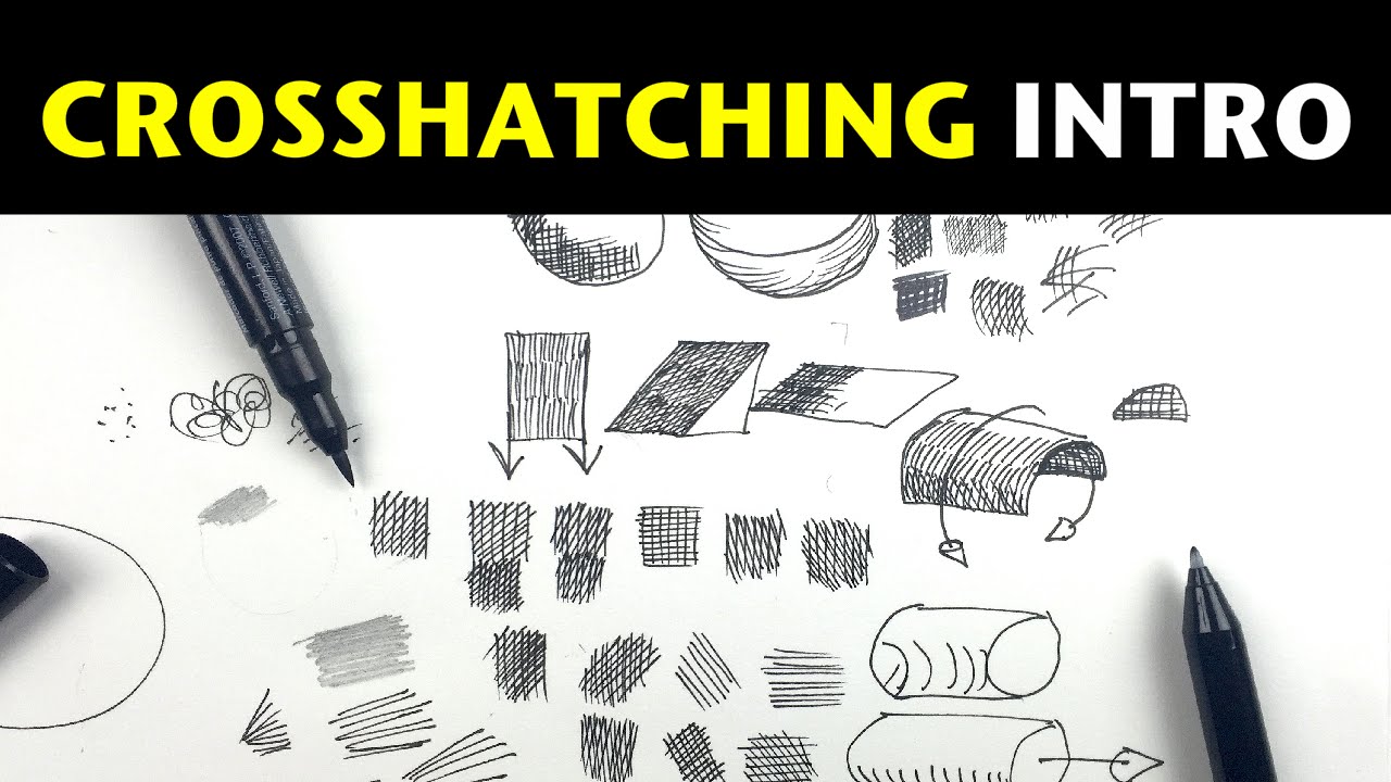
MY DRAWING BOOK
https://goo.gl/0bCLZA
---------------------------------------------------------------------------------
SOCIAL MEDIA
https://www.facebook.com/AlphonsoDunnDrawing/
Instagram: http://www.instagram.com/alphonsodunn
Twitter: http://www.twitter.com/alphonsodunnart
-------------------------------------------------------------------...
again, just worry about getting the form right

Antonio Stappaerts is a professional concept artist and teacher. In this video, he’ll detail his six steps on how you can learn to draw anything and provide you with a better understanding of form, design, and structure. You’ll learn how to break down complex subjects into simple shapes, the importance of shape design, and get some valuable tips...
this guy is perfect
I have lots of reference and videos, so if you want any help just @ me
spring ore
karmic jay
I have lots of reference and videos, so if you want any help just @ me
OMG!!! I was actually out on YT looking for tutorials and confused with what to pick. Tysm for sending these
You're an angel
karmic jay
be careful though, a lot of youtube/pinterest/instagram content is useless
like, bad, generic and bland tutorials
you will learn how to spot them once you have seen enough
the best tip I can give you is to never stop, no matter how bad it's looking, you can always fix it
you control the pencil, you control the paper
also about that, try to work with pencil/pen manipulation, don't jump into drawing forms without knowing how to draw lines
spring ore
karmic jay
like, bad, generic and bland tutorials
Wow really?😲
i'll remember to give you a ping once I practice with this beginner stuff you taught me
Thank you so much!
💙
normal robin
spring ore
Most have harsh lines. This sort of soft style is what fascinates me
literally the style i have honestly

they use more of a g pen
i use a softer version
spring ore
normal robin
YESSS! I didn't know how to describe the "softness" but even though your drawing and the one I screenshotted are a totally different vibe, there's this... Coziness about this style that I love
It doesn't intimidate me like most webtoon art
normal robin
👀☺️☺️
normal robin
spring ore
It doesn't intimidate me like most webtoon art
they are racing against time
wich i fully get
their backgrounds are models
wich skip u the hassle of drawing them
wich save you lots of time if u r doing comics
spring ore
normal robin
Don't be shy. Drop the release date of this webtoon of yours. I swear to God these two are genuinely interesting characters even though it's just one picture
normal robin
but i do illustraition
normal robin
spring ore
Don't be shy. Drop the release date of this webtoon of yours. I swear to God the...
😂😂😂😂😂
dude
ill be an one man army
spring ore
normal robin
their backgrounds are models
Isn't that cheating!!!
normal robin
spring ore
Isn't that cheating!!!
honestly its not
sure it save you time
since most of the webtoon artist are one man arm
spring ore
normal robin
honestly its not
Oh i don't know the moral code of the art underworld
normal robin
you dont look at webtoon panels the same way as a illustraition
normal robin
spring ore
Oh i don't know the moral code of the art underworld
dont trace and call it ur own
trace but keep it as study
spring ore
normal robin
since most of the webtoon artist are one man arm
Truee.... So much work
spring ore
normal robin
trace but keep it as study
That makes sense
normal robin
spring ore
Truee.... So much work
and to keep up they update once a week
imagine.
being one man
completing 30 panels
that takes alot of time not to mention story design
spring ore
Yeah. I've seen docus of how mistreated webtoon artists are
By the sites they work for
normal robin
if you look at my illustration it takes 4 hours
spring ore
normal robin
if you look at my illustration it takes 4 hours
WHAT?
normal robin
spring ore
By the sites they work for
its honestly thrilling
you get to show off your skills
spring ore
I thought once you became a pro, it took like 10 minutes
So it's ALWAYS gonna take long
normal robin
you cant exactly rush art
spring ore
normal robin
you cant exactly rush art
That's a turn off. Ngl
normal robin
by that i mean learning
it takes months for me to get my anatomy skill to a decent level
but i still makes mistakes

forgetting the basic
but my best advice is
to use references
spring ore
normal robin
Is there supposed to be something off with this? It looks perfect to me
normal robin
if you look at background

you can see the head broad
the mirror
and the thingy idk wtf it is honestly
silver plate lining that run on the wall
 spring ore
normal robin
and the thingy idk wtf it is honestly
spring ore
normal robin
and the thingy idk wtf it is honestly
It's a silver plate lining that runs on the wall
Lmao


 spring ore
normal robin
spring ore
normal robin
I SEE IT. So that's what using a reference means. Not copying it. Studying it
normal robin
the first pic is for the pant texture
normal robin
spring ore
I SEE IT. So that's what using a reference means. Not copying it. Studying it
well 1 on 1 copy is helpful to train ur eye
studying it happens when you are consious of whats actrually going on

these could help
spring ore
Ohhhhh
spring ore
normal robin
Wow... Things look different when you try to mimick them in your head
Do you use a tablet?
normal robin
spring ore
Wow... Things look different when you try to mimick them in your head
yeah!
normal robin
spring ore
Do you use a tablet?
ofc O.O
i had my first tablet after saving up 40 euro
brought myself a used wacom tablet
it get the job done
karmic jay
spring ore
Thank you so much!
np, we're all going to make it
spring ore
normal robin
i had my first tablet after saving up 40 euro
That's 8000 rupees...😳
normal robin
its fairly cheap here
im in school and paying for my own stuff
to i barely have enough
😂
spring ore
normal robin
im in school and paying for my own stuff
Do you work?
normal robin
i do
just small things
before i start commissioning
aka drawing for money
😩
balancing school , work and hobbies is pretty intense
but i enjoyed it
i meet now people at work
hobbies help me stay motivated
spring ore
normal robin
balancing school , work and hobbies is pretty intense
Man I wish we had a job-culture here in South Asia. That would really put some of the burden off of my father
normal robin
😂👍all worked out... wonder woman in a nutshell
normal robin
spring ore
Man I wish we had a job-culture here in South Asia. That would really put some o...
i was in vietnam before i came here
to germany
i got a schoolarship and i just take flights
😂
spring ore
normal robin
i got a schoolarship and i just take flights
Wow
Good for you my guy.
Plane tickets are as expensive as someone's yearly wage here lol
Even within the country
Flying to the west with no sense of direction is gonna cost a fortune. Not to mention how hard getting a visa is for Muslims.
 verbal badger
can someone show me some tips about shädbase drawing?