#Review design process please
1 messages · Page 1 of 1 (latest)
Bump
Hey Nano, this is super interesting — when you’re mapping out your design process, do you find tools like Figma slow you down when you just want to sketch ideas quickly? I’m exploring ways to keep diagrams cleaner without losing flow****
Oh that’s a smart workflow — using Clip for quick ideas then Figma once things get clearer makes sense
Do you ever wish there was an easier handoff between the two, or are you happy keeping them separate?
One thing you can definitely do is provide a high level user flow with your design concepts. Maybe I missed it or it was too hard to navigate the figma link on my mobile device, but it is always good to start with something simpler and lower cognitive load before jumping into all the details.
I did have some sketches there , I did some sketches before jumping to mid fidelity design, or did you know that?
Thanks for reviewing btw, did you think the competive analysis was too basic or? I only analyzed what was important for the design goal
This is what I am referring to when it comes to user flows: https://www.interaction-design.org/literature/topics/user-flows?srsltid=AfmBOoocfdHIQUHYEbzVXbmMTrLIhmZfjv8NgbKjccy9RjvtWdkMtMk0
I didn’t see anything like that in the figma file, but I also think you need to break up the board into smaller sections so that it is easier to navigate and see how each sections of design is related to the initial set of problems you want to solve.
A high level user flow will help you organize things better.

The Interaction Design Foundation
Discover the importance of user flows in UX design. Learn how to create compelling user flow diagrams, upgrade your designs, and explore real-life examples.
The competitive analysis is good (screen shots also nice to include when there are existing solutions), and it would also help to collect some users thoughts on the problem you are trying to solve (this can be direct or indirect information), and anything else that Discord might be able to answer for you.
I did collect user thoughts though? I made a survey and did affinity mapping on the figma file
I didn't think it was necessary since I already had sketches of what I was gonna do and highlighted how it solved the problem
I don't think you saw it
Why is it good to include screenshots of their solutions?
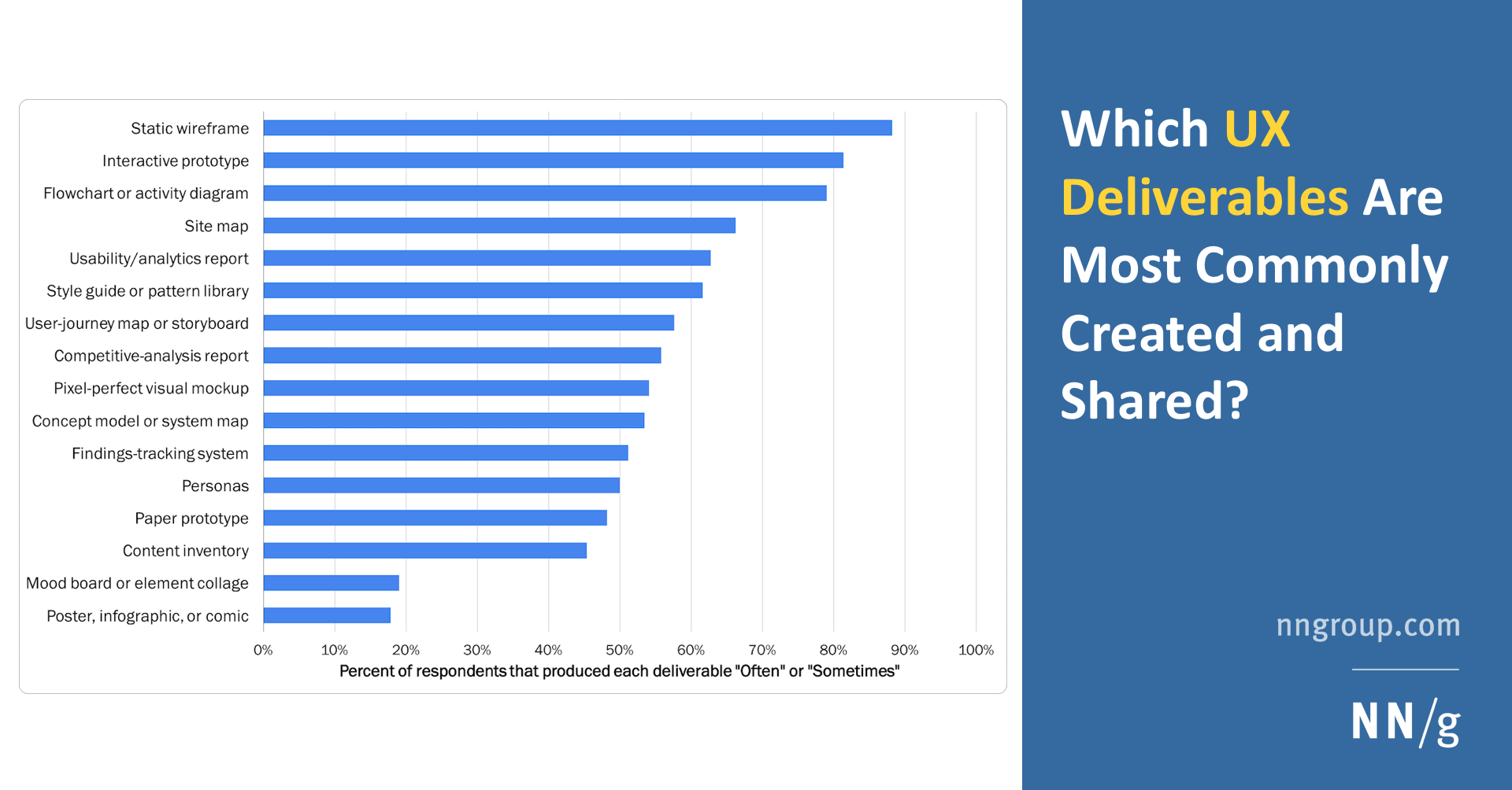
The user flow give you a high level view of the solution. Not a bunch of high fidelity screen designs, not rough sketches of the solution, something that a developer can understand the logic of the solution and implement in code. That’s the difference. As a designer you are communicating your solution to different people in the team: https://www.nngroup.com/articles/common-ux-deliverables/
Nielsen Norman Group
Static wireframes are the most popular UX deliverable, but 11 different deliverable formats were used by at least half the professionals we surveyed.
It comes back to communication to people in different ways/styles that are effective in different ways - some people respond better to text, and others to visuals/images.
I could not see anything that can easily be defined as affinity mapping on the figma file. It’s to do with how you have put everything on a big canvas that someone has to scroll and pan to navigate. There are better ways to present this type of research output.
Of course I see why that will be relevant, but I'm working solo so I don't see doing this necessary for my situation
If I was actually working on a team yeah I would have those type of priorities. This thread was about me asking if my design process was good in terms of my user research, not how it is presented
And when I make the case study that's when I'll focus on presentation
If you can’t present the user research in a way that is clear to the audience, it is hard to provide feedback on it. Being able to communicate well is one of the most important aspects of user research!