
#We greatly appreciate your feedback to help us improve.
1 messages · Page 1 of 1 (latest)
My humble opinion, hope this helps.

Thank you so much for your feedback i will fix it
Was about to suggest the same. Other wise its nicely done
I would suggest you the same as the first guy you should focus a bit on spacing let your design breath were it needs to, make your headline small or you could make the insect part bigger and other just smaller idk you can try out different things and play with it a little more, and also the line at the bottom right i would suggest you to align it with the text on the bottom left and make your social icons a bit small too so it should look like equally aligned in all the angles, hope that helps other than that everything looks nice keep up the good work
agree with everyone. also small thing but consider changing the color of the logo for visual consistency
Ok thank you so much for your honest feedback
Thanks 🙂

Also is the yellow color of the text and button, the same yellow on the insect? I would match those.
And the line were the color switches from black and white to color, seems a bit "brutal" because it cuts the head of the insect off. Maybe it would look more interesting if you offset it, maybe to the golden ratio?
Thanks for your opinion
@young spire @slow cave @vague nymph @oak remnant @ruby locust Sorry for being so late I had exams so that's why I got late.
So how is it now?

Better, keep going 💪
Thankyou 🙂
Looks great but again make the icons smaller about the size of the left bottom text and align the line equally from both sides

I think the color to black and white line is in a slightly weird spot but it looks very cool! Maybe move that line in between home and species instead of having it go through the s?
i think your getting confused here...what im trying to say is make the social icons smaller about 24 to 28px and align it with text in the left bottom and remove the line or you can keep it but put it in between of icons the the text
hope you understand now mate 🙂

And the color will be right white?
yeah keep the color white and make the icon smaller and you either fill the line all the way or don't put the line or you can keep it in between icon to left texts
like i told you
Ok thanks wait

it looks good now 👍
🥲
Thanks bruh
just make the left text a little bit bigger and your done
about 1 or 2 px should do the job
You can see it your self it looks alot more cleaner than before its perfectly aligned in all the angles now the one you made before...the line was un even and wasn't properly aligned so next time always check the alignment mate 🙂 and btw no problem always mate 👍🏻 keep grinding
Thankyou so much 🙂
Can you again help me in this project
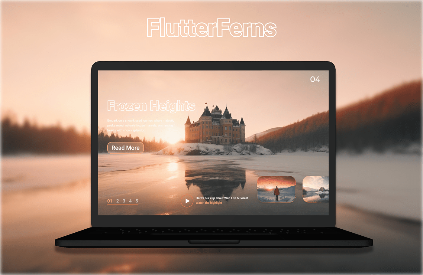
https://www.behance.net/gallery/176719351/FlutterFerns-Web-Design
?
Ahh I tried but didn't look so cool with the top bar
Change the colouring it's blending with sun the orange color i can't proper see it tbh so some people may have eye sight issues so you should always think about the peoples problems first before start making something in this case the colors are not properly selected and the stroke font with white color is also not clearly visible so yeah maybe make a squre about the size of the desktop and put a black color and lower the opacity so the pic should be darker than lighter and than use white color
Bcuz of that the contrast diff will be alot more clearer than before
ok i will start working on this
Thankyou so much for your efforts and valuable time 🙂🖤
No problem mate always 👍🏻 just remember what you want people to see first than make that alot more visible than the rest so people's focus should go on that part of the design that you want them to see first in your previous one the bug was catching all the attention so in this one you should decide what you want them to see first and make it like that 👍🏻 have a good day mate keep going and keep getting better
Thank you for the valuable feedback! I appreciate your advice about making the important part of the design more visible. I'll definitely keep that in mind and work on improving it. Have a fantastic day! 👍🏻
Maybe make it a gradient instead of the straight black to white?