
#Daily Environmental Art Study for 2 Weeks Journal
19 messages · Page 1 of 1 (latest)
 inner ermine
 ionic rose
It is good to real life studies but at this point its better focus on how to manage ur colour
I recommend to color study professionals/master painting
Here my quick sketch base on ur painting

Dont forget color not everything . Composition, value , edge control etc is equallly important
Hope its help
inner ermine
ionic rose
Dont forget color not everything . Composition, value , edge control etc is equa...
Thanks, I'll take that into consideration!
inner ermine
Tried studying works from Salomon van Ruysdael, and it ended up a complete mess. I think I was too focused on getting the colors right, and not understanding the why behind them. I need some help with color harmony and values.
 ionic rose
Its already looks good
Yeah u should put those knowledge into ur practice
Keep it up 👍🏻
ionic rose
Values its quite easy u just need to remember, foreground is darker than background
For color harmony
Idk 😂
 tropic veldt
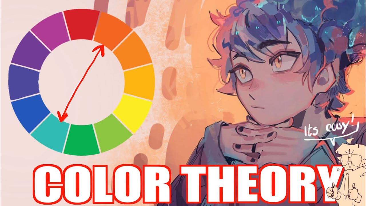
The first 1,000 people to use the link will get a 1 month free trial of Skillshare https://skl.sh/bluebiscuits06231
I’m happy to announce I’ll remaking my first tutorials in more detail (how I pick Color’s and how I paint) I feel have become alor better at explaining things so I’m excited to work on them, here is the first part, Color ...
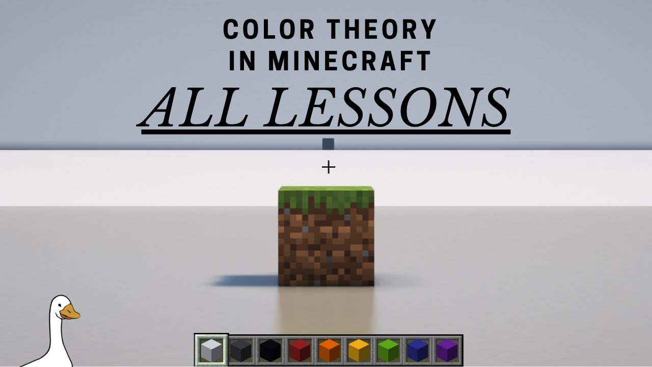
CORRECTION: Adding white makes a TINT, and adding black makes a SHADE. I have this backwards in the video.
A supercut of all the basics of Color Theory in Minecraft!
Thank you all so much for checking these out, you all are amazing.
More Color Theory videos coming soon
JOIN THE DISCORD
https://discord.gg/FBhw5H9yMa
00:00 intro
00:28 Value
02:...
Two videos that explains color theory in different ways. If one way doesnt make sense, the other almost certainly will
inner ermine
ionic rose
Values its quite easy u just need to remember, foreground is darker than backgro...
Yeah, that's it. I'm thinking too complex when doing these sometimes, especially with master studies.
inner ermine
tropic veldt
https://youtu.be/y0ufQpeD0Yk?si=JxF_eMKiZYvlnSg4
I absolutely love Blue so much! Thanks for the tip, it brought back up different color concepts that I totally forgot 😋
inner ermine
Day 3. I wanted to focus more on color harmony and values. To do that, I learned more about temperature, greys, and differnet color relationships. The top right is an attempt to create a foggy overcast blue environment.
 tropic veldt
inner ermine
Day 3. I wanted to focus more on color harmony and values. To do that, I learned...
Hey if youre wanting to be documenting your general progress please move this over to #1275265244435845220 art help should be more for helping with something specific. Youre kinda turning this into a catch all which is more what art diary is for