
#Lighting/colouring help !
39 messages · Page 1 of 1 (latest)
 frozen copper
 teal frost
I’ve been working on the lighting/colouring for 2 hours but I still can’t figure...
The main problem right now is that it looks very muddy
First of all, the colours themselves are kinda ugly
I recommend sticking to one colour (Depending on the character's surroundings or the vibe you wanna give off) and use a multiply layer
Since there's a lot of blue in your piece and that your character's outfit is mainly warm colours, a shade of blue would work nicely as shading
The other thing that makes it look muddy is the fact that all your shadows are soft
teal frost
frozen copper
I recommend sticking to one colour (Depending on the character's surroundings or...
Like one tone of shading colour?
frozen copper
Yeah
You can add gradients and such to make it more interesting but I recommend sticking to one tone
frozen copper
frozen copper
The other thing that makes it look muddy is the fact that all your shadows are s...
When shading, the first things you should focus on is identifying your cast shadows and your soft shadows. Cast shadows are created when something blocks the light's path and ends up creating a shadow on the surface the light was supposed to hit (Ex.: When under a light, he nose would leave a shadow on the other side of the face). Cast shadows are sharp, kinda like cell shading. Soft shadows show the transition between dark and light on a curved surface (Ex.: If a lightsource hits the side of a ball, that ball would have a soft transition between light and dark)
Basically, when adding a shadow, ask yourself: Is something leaving a shadow there? If the answer is yes, then that shadow will be sharp.
A mix of those two would make your piece a lot more readable.
frozen copper
teal frost
OH MY GOODNESS thank you so so much for the help 🙏🙏🙏🙏
Once you're comfortable with that try playing with halftones, environmental lights and bounce light
If you wanna learn more about lighting try watching Angel Ganev's youtube shorts
teal frost
I will check out rn 🙂
teal frost
I tried to start redoing the shadows w ur tips! 🙂

 copper swan
Try saturating either the light side or the shadow side and see how you feel.

 teal frost
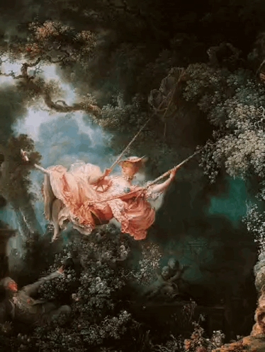
HAHA i was thinking abt this painting while drawing lol

It doesn’t look idk how to say but like good to me but idk why
Any critique appreciated
copper swan
The light sources are a little out of the place, like she had off angle lighting on her face and her dress is a bit more front ligt even if there's direction
copper swan
if you treat the torso as a cube (for simplification's sake), it's not likely to catch as much light from this angle, esp. if the chest casting additional shadows. Her chest is also a slightly different angle as well lighting wise
I think the bloom effect is also confusing you because the blurriness is bleeding into the bluryness of the shadows so for the sake of solving one problem at a time, just turn it off for now
frozen copper
teal frost
Omg it looks so good 😭
That's a lot of improvement
Also sorry for late reply I didn't get a notif 🥀
Though I'd recommend using a bigger brush when making that shine on her so it doesn't look like she's the one glowing