
#Need some critique
11 messages · Page 1 of 1 (latest)
 wild kiln
 hearty sigil
if u feel like the lines r shakey u should try stabilization
it looks good right now
maybe add shadows inside the mouth
 wild kiln
hearty sigil
if u feel like the lines r shakey u should try stabilization
Is it possible my lines may be too thick and it could end up being a product of why i feel the lines look off? At certain points i do enjoy the thicker lines but at others i feel as if they look shaky. I use krita so i did end up doing the inking/lining process with the stabilizer on but it seems to no avail unfortunately
hearty sigil
wild kiln
Is it possible my lines may be too thick and it could end up being a product of ...
the line thickness is up to artistic stylization
there are styles that use bold and thick lineart
these are some pieces i like myself
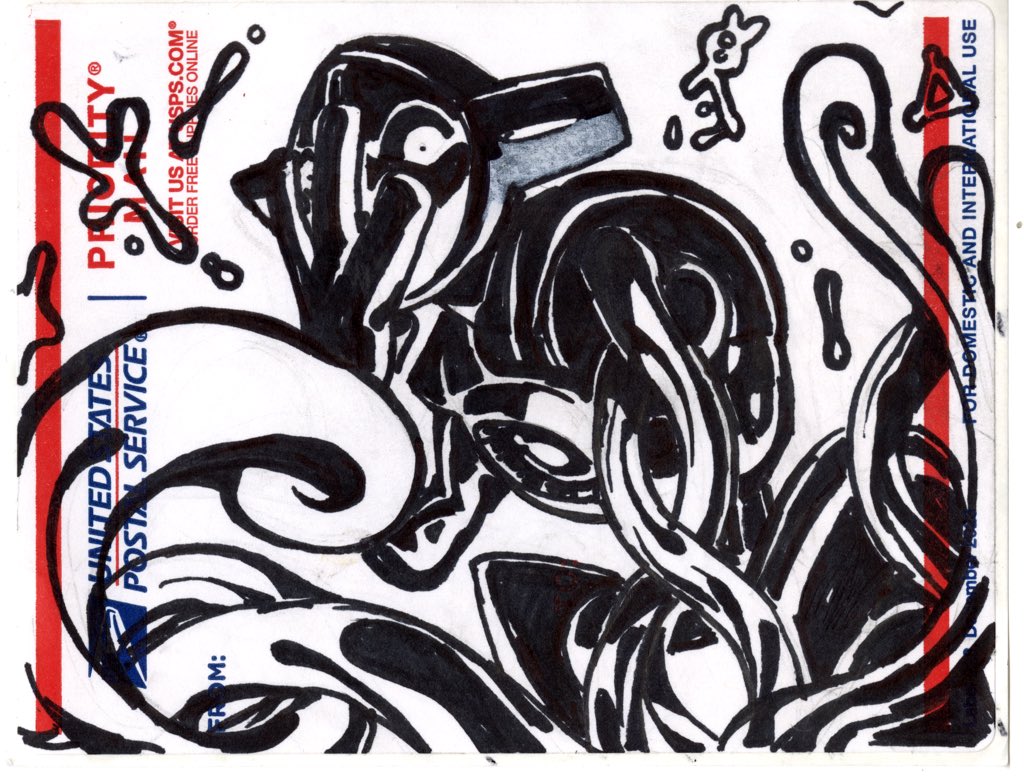
 hearty sigil
wild kiln
Is it possible my lines may be too thick and it could end up being a product of ...
if it looks off it might because the lines you drew may be like inaccurate to an actual reference
just search up a reference of a dragon