#Artist General
1 messages · Page 10 of 1
Ipad deosnt need an M3 chip
its just, if youre an experienced digital artist, you could likely do with something higher performance that can handle a more diverse workload, or is more optimised for your pace
if youre a beginner, dont just toss 1.5k USD at hardware for a discipline youre just starting, get a $20 osu tablet you use with your laptop and explore your options
if you need the portability, to use it literally anywhere, just remember, the sun beats down on its screen, and its not waterproof
An ipad is arguably worth the prise material wise
But practicalty wise defininitly not
its marked up out the arse
The latest gen ipad is marked up but not to that crazy of a level from what ive seen
This is mostly because they decided to give it realy high prossecing
they typically cost 700ish to manufacture
Yeah but this is also where there premiering a new flagship chipset
Mb ive been saying M3 i meant M4
I dont think your ipad needs a 9C cpu at all
Its an ipad what are you doing with it? CG?
700+ 350 for R&D + 100 for overhead = 200 profit
thats very generous for R&D
like very generous
Thats pretty good
im being very liberal with R&D and Overhead
(For the record i dont like apple)
(I think there products are all vastly subpar)
(But you also have to understand that merely hating something deosnt mean i cant/shouldnt view them objectively)
i think the ipads are apples only good product cuz the competitors are also around the same level
IOS sucks tho
Just get an android tablet
Ipads have procreate
i had a drawing laptop
Thats like the biggest arguement for it
lenovo
Are those any good?
wacom made display tablet for a screen
theyre alright
had the ability to run the softwares i needed
stylus it came with was shit but you can get a diff stylus
I need a stylus or smtn like that for half decent digital art lol (im not the best artist)
i ended up just not vibing with it that hard cuz keyboard shortcuts
i need the
m
elsewise im a lot slower
plus ive gotten used to screenless tablets
if youre used to screenless tablets, you go SO MUCH FASTER than your screened brethren
Ive seen those they look realy cool i just think my hand eye co ordination would take like a week to adjust
it takes longer than a week
it took me a while to get used to it
but its about the fastest input method to digital drawing if pace is important for you
i did work on a per project basis so i didnt get paid more for spending more time on a project
so working at my typical fast pace is important to me
i actually used osu to help me get used to it believe it or not @drowsy hinge

i think my submission is done, can i post it or do i have to wait after voting?
no fecking clue, i should take part bu lazy
you guys were talking about food so much I was surprised thinking it was about the fruit but I like your stance
Not shocked that sounds like it would work haha
I mean regular apples are meh
it helps a lot
but also it means that whenever im doing work and a song i know from osu comes on i go into overdrive and draw super fast
Green apples and specific cooled apples that have this crisp are top tier. I forget what the 2nd ones called
wait it genuinely makes you faster lol
fuck at this point I can't be 100% sure which one you're talking about
i think its a neurological thing, like osu PTSD
the moment i hear like any song from kano
*NYOOM
Yes
Ptsd is crazy
i do get faster tho
its pretty funny to me
im not gonna pretend to know why my brain does that but i draw fast
when osu song

google thinks im dutch
or sm
fellow artists how to get motivation
This might help #mod-announcements message
Just go to the original post I think
Yes there's a doc to send it to
yea i sibmitted it to the google doc

what i ment is to post it in general
Good luck and may the fumo comes into ur hands
Maybe after


pipe a european
Draw scribbles
Some have different way to get motivated. But for me is to manage my time and find out what to do outside of your usual habit, like going for a walk, socialize with others in irl, stop and take your time to seeing the outside.
But the one I suggest to do is minimize the screen time.
Sounds ironic, but it somewhat helps.


Its officially a month now since I started digital drawing and what would be better than remaking an old art I did

Trying a realistic skin render
Without the brown thing i added i swear this is just gonna go straight to zeppelin
I drew neuro

Cute lineart
can I post my work somewhere else which I gonna use for the contest?
You are certainly allowed to, but we are going to be revealing all the art pieces at the same time so that the community can vote on them once the deadline comes. If you want your art to be fresh and new when the whole server sees it, you might want to wait.
I apologize for the late response
@viscid gust wanna see one of my favorite Artfight attacks I made?
Sure
We ballin
I heard money is the greatest motivation
can't confirm don't have any ||money||
but see person above


Cute neur dress 

money shit motivation
commissions sucked the passion for art out of me
i love it so far
doing something artistic you're passionate about for money just makes it suck
you can be passionate about something and work it
and it be fun
but overall my experience, it was pretty draining
and i had EXCELLENT clients and worked for amazing studios
i didnt have any nightmare clients or nightmare bosses
it still was exhausting tho
yeah, you have to worry much more about the quality and its very draining
nah its not that either
if anything, commissioned art wasnt as good as my own art because my clients had way lower standards than i do for myself
im a very experienced artist, i see the dozens of small flaws they dont
whenever i do a commission i worry about not doing good enough and its just draining
eh, i dont
honestly ive had clients stop me from finishing the art cuz they were already so happy with it
i sent the WIP
they were like "DUDE THATS AWESOME"
i hate when i do this, especially on my own older works
paid the full price which they were supposed to send after i was done
and i was like, sweet
and they were really happy with it so i touched up the WIP and off it went
nah the main thing is that i stopped drawing because i wanted to draw and it just became a job
drawing was reserved for when i needed cash, i did other hobbies as hobbies
thats kinda what it had become for me to make 3d models (what i was doing for commissions) and ive kinda since stopped doing them
it just started to feel like a job and wasnt fun
but hey
if bills need paying
id rather draw than sort amazon packages
i just happen to be privileged enough to have other opportunities and the capital to pursue them
Huge headache rn but almost done 

nice
Don’t forget you can take your time if you need to! We did increase the deadline by one week

Looks wonderful ❤️
Quick doodle number 5 of 7
Wasnt that great but I wanted to try a different angle than im used to. Maybe would have looked better if I detaled lips at all, idk. Forgot to crop it too, whoops lmao
First Post: #1191208584441237536 message
Yesterday's Post #1202464797921247272 message
Tomorrow's Post: (Not Made Yet!)

Quick doodle number 6 of 7
wanted to be RELALY speedy with this one. I'm starting to realize im getting WORSE at drawing eyes. Might need to finally buckle down and look up guides instead of feeling this one out.
First Post: #1191208584441237536 message
Yesterday's Post #1202464797921247272 message
Tomorrow's Post: (Not Made Yet!)

and there we go
caught up
I got it, thank you!
Good luck, by the way!
Guys just sharing my eye tutorial i hope it helps

draw with friends— and by friends i mean, join us here
no competition, no stress, just draw
you're probably better than me anyways 
drawing with a crowd is a great idea
i was thinking of a fun activity for us to do, but I wanted to get feedback from yall
We get the names of a bunch of us, put it on a wheel, and have that person do a neuro project.
We have them post it, and then we all spend three days attempting to remake the same picture but in our own respective styles.
It was just something I was brainstorming
What yall think 
Cool idea
if we get enough people interested lets give it a go after the art comp
Trying that one artists filter effect i forgot their name but they make stuff like this
Noise + chromatic abberation

Should have asked this way earlier,
whats the size limit on the contest drawings
I'm on A3 right now

mods are crying right now
lol why
they already extended the deadline once
damn i will start from today hopefully i can make it in time even tho i suck at it

(peek, guess which is evil and neuro

i really am
 got some serious thigh squish on that one
Also evil on the left
100%
I'm having a hard time on shoulders now lul, wow before I can't even draw heads (not that I'm good at hair yet)
do you know about the canvas size of the contest?
Right neur left wevil
canvas size?
you can draw as big as you want, but I would suggest having it a size where it can be enjoyed via discord browser, at least, since once the drawing phase is over, the server will be voting on artwork
If I misunderstood, let me know!
im very happy to see so many more people discovering the event now!
I think the turnout is gonna be great for this event!
Pretty.
@dull phoenix
Ull get accustomed to krita if u use it once a day or once a week
no, i tried it 4 times
never
?>:(
Art related topics
Not on #neurotic-neurons cuz it's Neuro topic only
Im gonna die from coloring this

If i dont chat anymore i want you guys to know its been a good run
(cause im gona play roblox)
That's great
Also for mods out there im sorry this is revealing but i just wanna make an art about rio samba festival in brazil and i wanna stay accurate to the costumes
Oh, I thought she was lying on the bed
Sounds like fun!
 borzoi
Is there an ai tool that automatically sets a gray layer for your art to color in
Its not ai but you can use gradient map if there is such function in your program
Wait reallly?
Does it only generate inside the lineart?
Like it doesnt spray all over the place
if you made, for example, a skin in grayscale, then in gradient map you choose which color will be the darkest/ lightest and it paints layer in colors, I recommend choosing 4 colors, but 2 also works
I usually use this method when I draw clothes
Yeah it does, so you have to make different layers for skin, clothes, hair etc
why not just use the paintbucket thing
oh cuz its a sktch.
i dont think theres anything specifically wrong with the eyes
Shape feels really weird when I’m drawing them recently
It keeps feeling like I’m doing something wrong
eh, its nothing standout to me
if you feel youre struggling with eyes its still probably better to focus on like the basics of construction and anatomy as opposed to details because a very simple eye in the right place looks much better than a perfect eye in the wrong one
HAND JUMPSCARE!!! 

You won't believe what I did to my hand art I. My next piece, it's hidious I tell you that much lule, btw good hands manuh I'm jelly
Ibispaint's bucket is rly bad
Unlike ps
And the lasso tool
Quick doodle number 7 of 7
Ran out of time to do the full body with this one if I wanted to be a quick sketch. Tried applying all I tried learning this week into this. I'm happy with it.
First Post: #1191208584441237536 message
Yesterday's Post: #1202464797921247272 message
Tomorrow's Post: #1202464797921247272 message

Artist General (& Daily Neuro Day: 7/7)
Lul
breh everyone so good
I feel you
Same

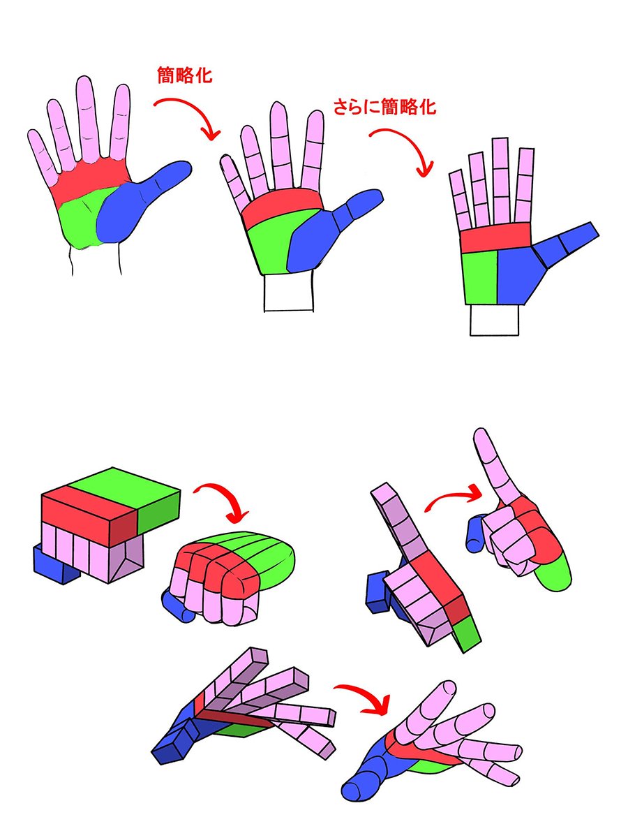
동물의 주둥이를 도형화하여 캐릭터 코와 입 부분을 감싸면 반인반수(수인족)의 느낌을 낼 수 있다


One brick at a time they say...
Literally me
Just a silly illustration


Cute neuro
furry tutorial?
She is a cartel boss and someone is late on their payment
I feel like this are realy encapsulates a vibe i realy like
Idk how to explain it but it looks great
Thabks iy looks kinda goofy rn but
Is is supposed to be a dark
Themed art
Yknow with the cinematic lighting n sumn
Godfather typa stuff
Who the heck design all those frills in????
oh, it's me.


I can't do shadows
Whos the butler meant to be?
Now im not good at art, and this already looks realy nice but i feel like if you add some extra bright lighlights, not too many maybe like some on evils face, the lighter and the back of the woman bowing it would probably add to the dark asthetic
Yeah im still doing some math
Take all my advice with like a mountain of salt tho hah
Trying to figure what bright light would fit cause this red thing is just the midtone
Her eyes popping looks realy nice
Oh really? I thought ill just put it there so i can tell where her eyes are lol
I feel like it adds to her importance
Ohhh shii
Now i remember
I intentionally didnt add eyes to the other characters lolol
When analysing this scene her face is the only one that is realy visible
Yeah i thought that was what you were going for
I usually just forget what my plan is sometimes
You have a good eye (no pun intended)
Thank you i just like analysing scenes lol
Im atill trying to find a cool mafia scene
Do you know one
Cause i have no idea what color the highligh should be
So i left it last
Im sory i gave u a headache lol
Despite bieng the smallest it highlights her importance, a face and posture are both the imediate ways to show off a persons position, the man despite bieng quite big and menacing has a passive and neutral posture and is actively suporting evil, the woman on the left is quite tall but is in a submissive posture, her face is coverd in shadows and looks apologetic, the girl on the floor has a face that isnt shown as well as bieng on the floor slouched, the posture makes her look defeated, the centerpiece evil is looking down on the girl on the floor, hed eyes are highlighted but they dont have much emotion behind them, she has a cigerette in her mouth and her posture is very provocative and active, its a "fight me" posture but in an assertive way. It makes it feel like everyone else in the scene is beneath her
Thats just what i got imediately from the scene atleast
cool mafia scene? there was a scene from a game I thought was pretty cool, but I'm not really sure if it fits the type of mood you're going for
Yeah im trying the umm
I think it was that one movie from 2022
Oh yeah people never think that far into a scene
Woth black actor and the plot is about mafia
When you over analyse its because those are things people do passively or subcontiously your putting into words
Thats very intersting
Scene reminds me of a lot of the scenes of thomas shelby from peeky blinders (mostly for evil and her henchmen)

Ig like some type of siegmeund freud typa stuff
DIO making a mother eat her own baby is definitely the most EVIL scene in anime

Gives me the same vibes as this scene from dio tho
For the person on the floor, and partly evils vibes
Idk a direct compareson for the girl on the left though
Omg i need this
Thanks ill try to use this as a ref
Np
I am cooking something great


i played with color a bit, maybe this looks better?

(just thought I'd try to help)
Ohh it looks nice
Hmm
So what you did here is remove the green right
It actually need to stay for some reason because later its gonna be the ambient light
Yknow color theory stuff
I messed up cause i actually painted highlight and shadow in the same layer which is bad cause the shadow needs to be linear burn
And the highlight is add
that looks so painful
mostly i added hue in curves for midtone and reduced for highlight and in hue/saturation i added saturation in red and reduced in yellow, and yeah lowered a green


I think its looking great
this is highlight/midtone/shades that i get

in your work its looks like this

midtones/highlight is close to each other, and then shadow is very far
hope thats help!
Wait ehy does your stuff look like that lolol
Thats pretty odd
I just use the color circle usually
i like square more xd
Ok now im done
Its time i add the base colors

Orange green blue triad kinda fire
yeah, looks good
Thabk u

Thank you i actually for once tried controlling myself to not add a ton of details
Just storytelling and sum silly ahh lighting
And you guys helped me figure out stuff so u have my thanks
peak
Omg this genuinely looks incredible
It looks insane and after looking at your media ive just realised that your the guy who made all that art omg
Ive always loved your style
Keep it up
Tysm watt yeah i kinda have the one old account i had named laroche and i think it had much more art i posted there than here
I think that was full of traditional art from the seaech history lolol
I didnt notice the time actually i drew this for 7 straight hours
This one is very addictive to draw
Np
You think its the mafia vibes or art style?
I think its the mafia vibes yeah
Something about it tickles my brainstem
Also im really looking forward to everyones arts here for heirs contest
square goes hard man
you have the brightness and saturation both there
hue slider on the right

lmfao
Well i guess a tilted square
Cause i remember krita had a tilted square i think
- hue doesnt mean anything btw
and that isnt particularly much contrast
fwiw, you should hit max sat in the midtones unless you have extreme lighting conditions
its a shame drawing softwares typically dont have histographs
This is what interests me it just looks like straight from nasa's control panel
those are curves
you can change the colours across the entire painting
its part of what i do when i say i do postprod
its not super important fwiw
if you can get within the general area you want
you should be fine
that doesnt have particularly much to do with curves
curves hit value
That makes sense
Sinxe i dont have physical curves in ibis
Usually luminosity, saturation and hues are adjusted through painting layers in ibis
I guess thats the charm of it
you probably do have curves btw
most softwares have it, but its very hidden in drawing softwares cuz usuaully illustrators dont know how to use em
We actually dont have it surpisingly
why is my lightroom lagging.

curve on the right
i didnt do much to it because i prefer adjusting the values with lightroom's sliders as opposed to going straight to curves
I kinda miss that on krita
It was easy to be lazy on my color palette that and let the sliders fix stuff
I always hit my highlight slider to max then add a little bloom filter
meh, i dont do it for every painting, only some
i use it a lot for photography
plus i dont do postprod in my drawing software
only in lightroom
actually
colour curves do
im most used to value curve mb
I always find the need to postprod my arts since ibis is so lacking in features so i just go to befunky since it has curves
How about hip curves 
Imagine if there was a phone ps
best to not do postprod for most pieces, its way easier to get an understanding of light and colour and hit it while painting
I usually just do it since i kinda find the colors of realism boring
yeah that doesnt require postprod
No i mean when i draw
Im very used to realistic lighting so
I just play around with the sliders to see potentiality
ah fair
btw
this isnt particularly accurate either
Oh yeah im born with tritanopia and im using color vision lenses
But its just fixes like half of it so some people might see my art with lots of blues and yellow
I cant see yellow/blue if i dont tone the saturation very highly
well yeah, I am not an accomplished artist, I was just sharing how I do things, if that helps
Meows*
WHY DO MY SOFTWARES KEEP CRASHING

actual dipshit software
@turbid karma @proud birch

saturation maxes out in the middle values overall
where saturation lies within the highlights depends on whether its a diffusive surface or a specular one
metallic surfaces are specular, so they blow out
and go pure white
grass is diffusive, so it doesnt
i usually just do layer overlays for texturing but yeah thats good info

metallic

specular
highlights blow out (hit pure white)
diffusive

highlights are saturated but not blown out
Ohh i see
you can also see the yellow paint on the wing in teh first example
bright, saturated, not blown out
texture of paint more diffused
texture of metal more specular

for red its the vert stab
uhhhhhhhhhhhhhhhhhhhhhhhhhhh
tail.
you see the tail fin with the mitsubishi logo
thats full on in the light
but isnt blown out
when things are brightly lit they tend to drop in saturation

you can see the paint lose saturation as it gets brighter
in both cases
but more so for gloss than for matte
because it blows out
Yeah matte looks like a little muted
i like matte personally
Well you can probably guess why i like gloss
Sometimes armor is so confusing
I see some references do matte and glossy
Probably just artstyle
thats to do with the finish
actually
metal can be "finished" to a high degree of polish, or you can leave it reasonably dull

The light is like creeping through the midtones making an eye candy
Why i love matte the most
just your luck meeting a manufacturing engineering student who can explain the reason metals are depicted the way they are
anyway
Those metals are interesting
but yeah theres metallic
glossy
matte
semi gloss
various words
but the general concept is that its a spectrum between diffusive and specular
how light interacts with it at the highlights depends on where its at here
and less obviously, at the lowlights and mediums
cuz it also affects how light interacts with it there
Very useful info
O7
you can, but youll also get a feel for it through practice
i just happen to have taught a lot of people about art, and I need to know the theory so that i can explain stuff to people
if you dont intend to do that you can just practice and look at references instead
Im in a state where im still trying to convert my years of realism experience into anime-style
Since i mostly did traditional paintings
Anime is so weird
i do mostly semi realism
i could do realism
but fuck texturing/rendering
tedium
Thats true its so time consuming to detail a cube inch
I can see that you love realism do you have an art where you would have to let go of everything youve learnt to make something completely different
Ohh interesting
i have a lot of hobbies outside of art, and i love seeing their accurate depiction
i will leave the abstract and experimental to others
so most of my art is extremely grounded
I'm consuming and saving all this art advice like I'm ever gonna actually learn how to draw
plus, its a challenge in its own right making something mundane look gorgeous
wdym
Light leaks always seemed so gorgeous


I never know the reason why
I just do it since it makes it look better
left is nice
i take it left is light leaks
anyway,
- the right one is crushed highlights, the light leaks inadvertantly fixes it slightly, and softens
- its added texture without drawing attention
- the temperature of the right side is slightly too cold
thats probably why you like it
Ohh interesting
I figured this out cause i was looking at some photography pictures and i saw when couples take a picture and the sun is behind them
It looks so nice
a few things have to go right for a backlit photo to look nice
note
Blown out : Highlights hit pure white, or are generally too bright
Crushed : Shadows hit pure black, or are generally too dark
backlit photos tend to crush your subjects
this isnt backlit its top right just above ~ give or take
so if this was photography you'd lose the lens hood
if you want the leaks
i recommend btw
@proud birch try drawing eliv/nwero inside a real picture and try to match the original lighting
paccha art


paccha is particularly good at this
Now that i thoight of it i never actually had, i use irl refs but my lighting always strays towards this style
For example

Ohh this is the lighting that i always seaech when finding refs
back is lit, side is lit, sleeve is not (?)
Yeah its just a manhwa art
They patched that thing in probably not more than an hour
Fastfood manga
Thats understandable
I just read manhwas to learn impact frame arts
Like how the body warps when moving
wdym byt hat
eh, when drawing movements i typically encourage people to draw from videos


dont rant dont rant dont rant dont rant
Its not very realistic but its just a umm
A style picked up from a collection of manhwas
im just
They like to do stuff like this
not the right person to
discuss this with
i have a bone to pick with like 99.99% of art that depics fighting
No dw im just curious how you visialize things that move
Blur?
Most artists draw stationary art so im lucky to meet people experienced with object in motion
i used to be an animator
so im unfortunately too used to that
but
if youre lazy, blur
if youre teppu, arrows
if youre smart about it
compositional imbalance /positional imbalance
or impacts
or impossibility of stationary stances
here

this photo is 100% of a moving subject
because its impossible for the poses to be held
Thats true
not because theres blur
I could see a little blur on the guys foot
yeah but thats not why
its blurry cuz it took place at night in artificial light
and the camera isnt particularly good
but really, its obviously dynamic cuz the poses cant be held
even the guy on the left, hes pushing off his right foot

hes moving forward
into the path of this kick
the extremities also have more blur btw cuz they move faster

this is a more extreme example of where the poses cant be held
To umm portray where the feet left from in this example
Yeah i cant see anything
So much blur
its a screen cap from this clip
pose is impossible to be static, so by default its dynamic
oh i was in the black shirt so i was fine
Oh i see
but this move is from judo specifically
I only do muaythai
do muay thai justice in your art lol
i have bones to pick with art of fighting where the artists dont know shit about fighting
Haha lolol
Its so painful i usually used to grind my shin in a umm
Idk if theres an english word for it
I mean yeah its basically a stick lol
The gym closed down unfortunately
So i havent sparred for a year
But i have my bags at home
Just the usual morning hundred calf kicks
from a question mark kick
threw it too hard
tore my own meniscus
Rip
Thats a dangerous kick fr
I try those but i have never applied in spar, since i have bad flexibility to begin with
i land it offten
but dude its like 4 am here now
im gonna go make breakfast
take a shit
start gaming
that stuff
later
Okay have a nice day
 bit tmi there
about the bowel movement i mean

With this and my last art maybe I'm entering my "bad girls" arc . Trying to get the feel for slightly more spiky hair. I wanna move out of the smooth cartoony style slowly for the hair. Pose was a random one i picked out of my ref folder.
First Post: #1191208584441237536 message
Yesterday's Post: #1202464797921247272 message
Tomorrow's Post: #1202464797921247272 message

Artist General (& Daily Neuro Day: 7/8)

Who? Ngl my intrusive thoughts says "ah she kinda looks like Nico"
Oh lol you can tell without the colors dsmn
Havent seen nico this oiled up

Thanos ahh
who's nico?
the sun god
im an atheist
monkey d luffy moment
oh wait im stupid
i thought it said nika
???
"He looks like zeus"
"Whos zues"
"The head god of the greek pantheon"
"Im christian"
But no nico is a membernof the server
also known for their "Cute Neuro" comments on everyones art
and despising evil for some reason
Shes also known for bieng a tsundere
Idk if there is a connection tho
 Definitely does
I'm drawing them dead
for legal reasons
im not drawing other members of this community dead.
infinity gauntlet edit when?
LMAOOOOOOOOO
i kinda want to fix my submission, if i edit my respond on the form, does it count?
Hannah and Neuro Wip


 mods
modswoahhh that looks soo good
Yo can you revoke your submission so that i have less competition? 
If you respond again to the forum, we will be able to tell that you were using the newest submission

Ain’t nothing wrong with thighs
While I agree with this sentiment, it’s almost verbatim what I got when I asked another mod to make sure
LMAO
Stopped drawing for a bit, the sniff is back goddammit
sniff?
Runny nose
Maybe fever but I haven't feel the heat in my neck
Have a little headache tho
@viscid gust I have cooked on this mass attack on Artfight

if you are wondering, this attack is worth 931.75 points
Like no joke
neuron activation
just checked the full art and
men of wisdom thinks alike
Get out of my room.
Wanted to keep trying new poses. Hopefully its not too  .
.
First Post: #1191208584441237536 message
Yesterday's Post: #1202464797921247272 message
Tomorrow's Post: #1202464797921247272 message

Artist General (& Daily Neuro Day: 7/9)
6 minutes to spare
Nice perspectice study heir


Beautiful
thamk
im surprised it turned out well
i havent painted a sunset in forever
 on color theory man
plus you have so little control with the VR controllers
Do you have any baby tutorial for it?
Even a basic tutorial is so confusing
Sadly not, still have work
It's nice but my i3 PC can't handle vrchat or have a stable connection
a lot of people jump straight to what colours are complementary and work well together or whatever and shit (in tutorials)
people need to jump into composition first frankly
cuz theres no point in knowing how to create contrast with colours if you dont know where to use contrast well
or if you cant do values for shit
I remember making art in black and white first before learning color theory
And then i was suprised when i tried overlaying a singular color in my black and white painting
idm people learning colour early but its hard to show people a good tutorial cuz a good lesson adapts to what the person already knows
Yeah lol
and colour theory is one of those topics which highly depends on you already having other basics
cuz if i say orange and cyan contrast, that means fuck all to most people
doesnt help that half the artists on youtube spout the same bullshit about the colour wheel
Making anatomy is
I think it takes me the longest if you have a very dynamic pose in mind so i just heavily rely on refs
What do you think about someordinaryartist? (A ytuber)
its been so long since ive watched tutorials
ill have to revisit them if you want my opinions
Oh
but i also think artists arent the best people to learn colour theory from anyway
honestly ive yet to see anyone with a particularly great tutorial on colour theory
There are some artists thats really good on teaching it
very few people tie it into everything else
but anyway
@tidal cosmos the basics of composition is directing attention
you draw stuff in a way that draws attention to the parts of the piece you want people to admire
human brains tend to read contrast as interesting
so most people draw things according to contrast lines
we have a few ways of making contrast
- value contrast
- colour contrast
- texture contrast
colour theory is the study of how each colour interacts with each other to produce or not produce contrast
its more comprehensive than that but the MAIN thing people study colour theory for, is for that
Might question all of those, what's a value contrast in layman's term

when you have a line in a painting where a dark area meets a light area, thats value contrast
cuz theres contrast due to one area being bright, and the other being dark

where the sky meets the trees
And about color contrast?
colour contrast is where the contrast is produced by the colours being different to each other, even tho their brightness arent that far off
in the top of my painting, yellow meets blue
the colours contrast hard
one's a warm colour (yellow)
the other is a cold colour (blue)
same with below on the ground cuz the flowers are red/pink and the grass is green
pink contrasts well with green
And the last one texture contrast?

texture contrast is where the 2 regions of the piece may be similar in colour and shade but their textures arent
textures can be like patterns
Remember that this is for the sky, applying this to characters for example neuro,would mean the bounce light/ambient in the shadow could be leaning towards blue and the highlight yellow
not inherently, but god i dont feel like getting into the complexities of lighting colour
fuck that
That's what I'm confused and hard for me, how to make a correct bounce light, searching for the right color of it, and how the other colors interact with said lighting
depends on what its bouncing off of
if you bounce white light off a blue surface the ambient light from that surface will be cold
its not really something you need to always think about either fwiw
Like a wooden table for exame and the lighting is in front of them (candle) and a light up top that slightly behind said character sitting at the table looking at the camera (Infront of said person)
Hmm
its also a matter of angles and intensity
whether the light is directed or diffused
anyway i tend to not draw shit with weird lighting because
- its particularly hard to get right
- doesnt often look good on its own, and is much better if youre using it for visual storytelling
Let's say the candle is giving off, a slight orange tinge and the light up top is giving off a bluish white light
I lazily arranged the bounce light here but its basically just a nerfed light source

if youre doing solo pieces and you dont care about the visual storytelling
Yeah its just an eye candy
its more hassle than its worth (to me)
I know you need to make a base layer of the color but sometimes my brain just think (it doesn't look right) but with shadows (mainly multiplied skin color layer) in the whole canvas with a specific opacity that I use it looks fine
you dont really need to either
The hard part is what color is perfect for base layer, what I mean is the saturation of it
i dont make base layers of colours
That's what I've been doing now
That's why bounce lights sounds alien to me atm
Usually
The perfect color is light gray since it overlays well if ur planning yo have fun around it
That's the best part, idk how to make shadows first work, and then what even is mid and highlights
were you around when i made saturation curves through the value range?
i know borzoi was
you should reference tho
se
Ok i think i found one

Nope
Just something to look at
I think
@tidal cosmos post most recent art
Thanks, I think this will help a little
I'll try to see what's wrong
shadows are hard its like something you just know how it would work over time as you look through a ton of references
Will ping u, it's on my pc and I'm in the washroom atm
Sure
Nah theres a LOT of theory behind it too
You can learn it from theory if you want
It's something I can describe to a pretty strong degree
Not particularly helpful unless ur drawing
Ye
References are always nice you can flat out
Just inherit the lighting
And then add your own spin to it
Just eye training
Thigh tips

That's the confusing part, for a beginner artist like me my interpretation of that is, "so should I eyetool that?" But that's wrong
This i somewhat using now, that I know there's a slight washed color on the skirt near the skin
Well usually u can first split the light and the dark on both side just like yin and yang
You have a reference you use?
And lineart color aswell, I'm somewhat know how to use it but can't put it okay-ishly


I'm a scatterbrain when drawing 
Well for me
I furst start off layering a dark color on the gray base layer and then cut away chips off it using eraser


That soft light down there is just an airbrush
Hard and soft eraser is it?
Yeah
Ah airbrush
But dony make your soft eraser small
Make it like 900 million pixels wide and then stroke 1-2 times
So first is gray layer, and then some shadows on specific parts, after that is putting another layer that is blacker than the rest of them and chip away stuff on that layer?
Thats what my interpretation is anyway


No I want you to continue about this before color
Lule
That's why I deleted it so it don't deviate if there's still more to this
Okay
Now i make new layer
Should be under the
Shadow layer

Make it slightly lighter than the shadow
Should be color burn too layer type
Some artists usually just paint straight up the midtone but then we would have to talk about color theory here
This is gonna be the midtone where the light and dark meet
Now ur all set
Oh!
Now about" After all of those how do you color it?, just a low opacity colors?"
So the mid tones are those
No dont do low opacity, instead make it low saturation
If we talk about saturation and the starting point is the highest, how much do I saturate it?
Not super low but somewhere around it

Saturated is right here in my box
If you want numbers you can try experimenting around 40-60% or branch out
Usually i assign layer types
.
Hard shadow - linear burn
(Its desaturates and darkens all colors)
Midtone - color burn
(It saturates colors and shifts its hue to darker side
Yellow -> orange)
And then the base layer remains the highlight
Youre welcome
If u applied everythint, the color itself will do stuff for you
I just added a plain desaturated yellow color here


The color burn burnt the color in the areas where u assigned gray
The darker the gray the harsher the burn is
Oh man it looks so natural when it comes together
My brain ass just thinks "it's shit" whenever I start coloring
Do you color the base layer with the shadows on or you turn it off?
Maybe I'm doing it wrong cuz that's what I do
Did you color on a different layer
Oh and also is this the order of the layers
Linear burn
Color burn
Your color here
Just checking
The things I do on my art till now? I don't use linear and color burn atm
I see can i see the art with all the layers
Just multiply 
I'll just send my latest last heir theme then, with the layers and stuff
Or do you want me to use the evil art I did when it's her birthday
Cuz I used multiply there


shit. lemme find one with a good enough example

there it is , im slighty proud on this one

onlyy referenced i used  this is 76 mb

I forgot this art piece is so hungry it takes up 3 and a half gb fucking ram usage lmao
It's the barbeque art I did lule
Ohhh
So thats how evil is drawn
I forgot what her jacker looks like
I think this is good
For now how you can improve is i dont think throguh colors
But the perspective and the complexity of the lineart and how you shape the shadow
Your coloring is good
You've seen the beach art I did right? I think that was the latest