
#📝project-feedback
1 messages · Page 42 of 1


Tried this album cover on photoshop....feel free to leave some feedback

@golden crane
I love the design... Minimalistic and engaging
@golden crane this look so cool 😎😎😎
thanks guys
Excellent work with the cover, @golden crane! I like the way you kept the minimalism look at the same time as you managed the contrast of the dark and light red against the background. Great typeface choice as well, they combine very nicely to the overall style of the cover 💯


Thank you very much @sleek tiger
Gave +1 Creative Carma to @sleek tiger

An impromptu photoshoot at home on a rainy Sunday afternoon with the kiddos turns into an epic tale of humanity's last home. Two kids go back in time and befriend a couple of dinosaurs to save Earth from the forces of evil.


posted my first project made with adobe suite to behance today! would love any feedback/ commentary anyone has to share 🙂 (especially related to any tips and tricks you all have for avoiding blurry gradient art with noise texture!)
https://www.behance.net/gallery/121034105/PRIDE-2021

Beautiful project, @narrow lance! Loved the colors and textures. The type on a path is looking awesome. If you want, you might add some mockups like postcards, social media posts, just for the viewers to see some applications. 🙂

Amazing Shadow and lighting .Good job
So fantastic also so realistic.Nice work
thanks mate
Gave +1 Creative Carma to @small finch


DAY 1172 — Brief of the Day: Advertise Go-Karting. https://www.instagram.com/_twc_daily


Godzilla vs Kong

This is the image i get from client and client i asked me to remove extra numbers from it.

And this is the after version of image above i have remove the extra numbers from it


I preferThis!!!
thank you for the feedback!
Gave +1 Creative Carma to @pallid barn
Thanks so much for the feedback Valdair! 🙂 Any go-to mockup sites you use?
Gave +1 Creative Carma to @sleek tiger
made this a few weeks ago. Would appreciate any feedback and tips

Love the colours and the mood 🙂 I wonder if the floor lamp would cast more yellow light in the direction it seems to be facing?
tried this alien invasion theme illustration

Really nice effect! I like the sparks/particles and warm hilights added on the fur. Great job!

nice


no tips from me.... overall 100% PERFECTION... keep it going mate!!!
its really good!! i really love the color grading!! my feedback would be to add depth of field
overall i really liked it!!
Well one sword will be red whereas the others would be blue.. Why can't u try that??
Is this a war??
no this is post apocalypse

On today's stream, answering Ps questions and chat's suggestions. Using the Timeline.

Cool animation and great stream session!
Thanks, Franck! It was a fun one.
Gave +1 Creative Carma to @bleak echo
As always!😉
This is my sketch for my next piece before the shooting process,I planned the color and so on,but I still need some feedback for the shattered glass part especially the thing behind it.Can you give me some feedback for it?

Feedback please? anything... trying to find my style and learn.

I love the concept and can't wait to see the final piece. One thing to think about, how was the hole made? What's the story? First thing I did was look for a hammer laying on the ground next to the ladder. Like someone broke the glass, dropped the hammer (or whatever they used), and ran off.
Yes that is the idea,I want it looks like someone broke the sky like glass with a hammer @waxen gazelle
I'm looking for the DCC with broken glass for you. I'll post it here.
Thank you @waxen gazelle
Gave +1 Creative Carma to @waxen gazelle
https://www.behance.net/live/videos/3565/Photoshop-Daily-Creative-Challenge-02 It's with @fair lance

Challenge: Create a broken glass effect using Blend Modes and Layer Masks. Try applying your effect to a photo series using Smart Objects!Get the starter file here: http://bit.ly/psdcc10-28-2Join your host each morning at 9:00am PT to learn how to approach each challenge using Photoshop. Complete 5 challenges by Friday, November 1st and you’ll b...
So you know it's good!

That's really great!!! I loved it
Well done! Shattered glass looks great! I agree with Shawn the main point is what do you want to say. The ladder tells me an other story... I see an astronaut on the top of the ladder starring at the hole with a slingshot in his hand... More complicated than a simple hammer on the ground but I'm really a complicated man 🤣... Anyway it's a great start!
Thank you @bleak echo
Gave +1 Creative Carma to @bleak echo
Awesome! I love the warm tones and how you played with lights and shadows to get this nice picture! Impressive work!👍
I tried something different and here is the result.
Please follow me on Instagram@david.difie


one photo,three ideas

Thank you @narrow pasture
Gave +1 Creative Carma to @narrow pasture
hi guys, i wanna share my work 😬✌️

https://www.behance.net/gallery/121964385/SOCIAL-POSTER how about this
Hey everyone this my first digital painting can you guys rate it out of 10

👍 👍 Excelent
10
Here is the daily project @compact flume. They have definitely gotten better over time.

opinions?

perhaps you could give one half of the pill a red or blue overlay
and maybe a different color stroke could make the text stand out more
Thanks, I’ll give that a try:D
Hello, I can't choose witch one to upload to my social's, can you help me out?

Either the 1st or 3rd one
3rd one will look good
Perspective Illusions,inspired by Erik Johansson


I like the one in the very right @smoky mortar


Nice!
thank you @wintry mica
Gave +1 Creative Carma to @wintry mica
Woah nice!
Thank you
Gave +1 Creative Carma to @alpine narwhal

This is beautiful.
How do I keep the moon fairly large while making it look far away?

Smaller and lower opacity might work
Paint Me a Picture


aliens * :)
sick hella sick tho


12 years later and he is still missed.

This is amazing I want to learn how to do this


Very nice but it needs more highlights
Inspired from 7 deadly sins of Human
Instagram: @nimble coyote

I'll take any feedback just throw it on me!
What are your thoughts?

Very nice i like it a lot

in the middle of a project.....
drawing all these girls.
im in the middle and this is what ive done so far (still need to do eyebrows, more shading, hair and stuff)


(the closup of the lips lol i just love how they came out haha XD)


hello, everyone and happy weekend


#Doggo on duty
nice concept
Just a small tip -
warp the helmet and give more space to his cheeks.
:)
Stay Hydrated Friends


I am new and I am not sure how this works. Please feel free to comment.


@cold rivet very well executed. It looks familiar.
@narrow pasture I really like your work. Simply Scary. Bravo
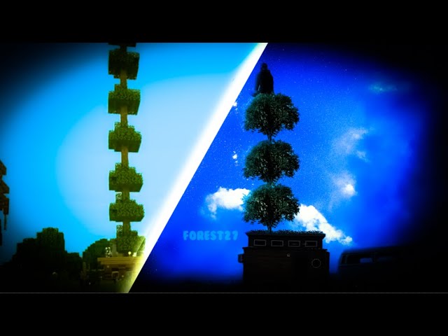
Tree Wars photoshop time-lapse
Insta: @itsforest27
Music used:
Mumbo Jumbo - Tiny Timelapse (elybeatmaker Remix) https://bit.ly/3jgHILj
Tobu - Seven https://bit.ly/3jgoNQJ
#hermitcraft #photoshop #fanart #minecraft #mumbojumbo #grian
Thanks! || are you sure its not a wrong ping right? xD ||
Gave +1 Creative Carma to @spring badger


Guys where can I post my photoshop arts? I am new

My Vaporwave art!

My channel banner!

Tried compositing the car, I have never composited before
The background is not mine
Inspo : Nemanja Project

Lit!
Thanks Brother!
Gave +1 Creative Carma to @woven panther
What kinda memes do ya make? lol I like to make fake Smash Brothers introduction characters because they wont announce Waluigi as a new character


Thanks mate!
Gave +1 Creative Carma to @sage cloak


My work for the Adobe Create Waves project.


Just a lil quick edit of a meme image in India.

the perspective is good.but I think you should make the shadow of the darth vader a bit darker and to the left side @toxic dome
A poster I made for Adobe's Create Waves project.

you shouldn't be sending this kind of stuff.....You know that right?
im not very good at drawing.

Lol another spam message I take it
My latest Behance Project. It includes a link to a custom brush pack I used on the various pieces.
https://www.behance.net/gallery/122658843/Ever-and-After-a-Custom-Vol-1-Customized-Expressions

Behance
The following contains a collection of pieces each one using a different custom brush. If you, like me, love trying out a new brushes and finding unique ways to create new material you can find a link to the brush back below too. I have labeled each piec…
@tawdry falcon awesome! TY!
i tried this illustration on photoshop....can I get some feedback on this

Thoughts??

really clean ||and sus||
this composite is pretty nice! the lighting is spot on,the only critiques for this is the shadow,the shadow looks off,because the front part of the shadow,you should mask that front off to make it a bit better
H


Monday_zzzz


you can check breakdown of this amazing artwork
click here and enjoy..

o
If anyone knows how to animate birds more organically please let me know!
Why don't you let them flap?
A Skill I lack in animation as of right now unfortunately
Made this on photoshop...hoping some feedback

a few pieces ive worked on


First ever attempt ....would love some feedback and fixes


hi, can you transfer my cat to an egg or a squirrel?

Todays Design

Having some fun this evening.


Hey Guys.. what you think about, this two Font Styles I did? I'm open to listen the best of.. for a new project I'll share here, on my instagram and behance too
of course, uh
finally after all my designing and drawing.....
check out my store on Redbubble! my original art and designs ❤️

Redbubble
Nixxii is an independent artist creating amazing designs for great products such as t-shirts, stickers, posters, and phone cases.

I present my newest artwork "Mister Time". I saw this fellow in one of my dreams and saw it as a sign to turn him into a painting. He turned Out a bit more Nice looking than i intended but im quite pleased with the result.
Made using Adobe
ng__

that's really cool
love the glow around him
Made a new profile picture of myself using a mix of online images and some astro-images I took myself.
It's only like my 3rd ever composite image so I'm surprised that it turned out even remotely decently.

made this yesterday and am so proud of it. any things i should change?

I find it truly cool 😍 😍 😍
How have you made this? 🤯 Is it drawn or is this a combination of pictures?
The only thing I miss on this picture are the details on the right lower side of the picture.
What I mean is even though that side becomes gradually black, it feels for me like a clean cut meaning that it doesn't respect the form of the skull
it was just 2 pictures used.
- was the skull
- the brain.
the brain wasnt facing the right direction so perspective warp
for the smokes i used a custom brush
and i used a lot of blend if.
i agree that the bottom right was cut of with the shadow but that was because there was nothing there and i would have to make my own environment and i was just too lazy

I think you misunderstood what I was trying to say 😅
With "detail" didn't mean an additional object or background.
What I meant was the form of the skull.
Right now it feels like for me as if you have drawn the shadow like this (yellow line)
A skull isn't a flat surface, therefore I would have drawn the shadow like the green line because on the one hand it would take the lighting in consideration and on the other hand one would somehow see the form which makes a skull recognizable
Ye but it just didn’t look nice it looked so unnatural. I might blend another skull with it to see if it looks good
Heya, just finished making these branded icons today, any feedback welcome:

wowwwww,,i wonder how you made it with the lasso?//
those look really nice. Only feedback I can give is maybe the readability won't be amazing for the images with multiple items like the middle left one when / if the icon is presented smaller. But i'm no expert so take my feedback with a grain of salt. 🙃
can i get some opinion this thumbnail
i added dust particles on the 1st one so which one looks better


divided

Thanks Ellie 👍🙏
Gave +1 Creative Carma to @keen pasture
Abstract Head Poster

Personally i prefer the version without the dust particles as it really only appears on the mans face more than the woman’s. Instead of the particles try adding some noise to add the texture and see if that works
Im new to photoshop , this is the first thing i made , idk what most of the stuff do yet , so feedback would be great 😅

Hey man, it is looking pretty good so far! I still think that the space in the sky still has a lot of potential, it's looking kind of empty at the moment. Perhaps you can play around more with highlights to give more definition to the mountains here and there? And lastly, though I think this is just personal preference, try giving the river more reflection :DD
Thanks :D
Started a surrealist art project in school, had this idea - then i went home and made an improved one. This is my first proper photoshop project i've done, still needs improvement imo but i think its a pretty good start!

You think that is a "pretty good start"?
I call that an amazing start. I love it and the message! Awesome!
thanks!
Something fresh
The duck's name is Garry.


DAY 1206 — Portfolio Day: be.net/_khs


Duck edits

Album artwork ^^

logo i designed recently, would love any feedback to make it more suitable for a shirt/bucket hat/sticker/etc

how did you make that background effect?
AD design for the best Character ever created

trying to figure out where to draw the blue on the deer is difficult for me because i dumb

Tried this on photoshop...........
https://www.instagram.com/kaushil.exe/


Screenshot of my photo (because of max file size download in disc without nitro), rate it and point out my mistakes pls 😁
P.s There is about 5 photos, some particles, smokes and shadow-light editing

Mountain View Concepts


My work for the Adobe Create Waves project.

drew a bunch of scribbles with two different colors then used liquify

which one do you guys prefer?
which one lol @toxic dome
also the message at the top was intended for another pic not the two i just posted
okay bet
gotchu haha
ended up rolling with this

Simple Concepts


👍


Third rendition is unreal!! Live the flowers coming out of the helmet! The coloring and shading is top notch
thanks😁


A little something I'm working on for an upcoming book by Kevin C. Noel.

my design https://www.behance.net/aevb/

Behance
this looks really nice! Have you done this to do with Benny Productions? I recognise the logo in the bottom right
Thanks and yes I have done this for Benny productions contest
Gave +1 Creative Carma to @dusk igloo
cool, i really like the castle on the left as it looks like the ground has grown around it almost
How is it


DAY 1216 — Brief of the Day: Advertise Ice Cream🍦 #photoshop #pexels #indesign https://www.instagram.com/_twc_daily


Done this in.. idk like 30minutes? what y'all think>

DAY 1217 — Play More. https://www.instagram.com/_twc_daily

New food fighter!! LOL


can u guys rate those photos
im new to photoshop and just trying to edit
from 0/10
ping me if u guys want to rate
like this
@crimson jewel 0/10
🙂
sks
DOOMER —————————————— #hatdosay #ngmcuongx #JuiceWrld #aev #melodicrap Source…
Hi thats really cool how did you make it? Im new to photoshop. 🙂
guys what do you think on this Design?

@simple herald very simplistic and modern. I like this design!

wow
yes simplicity
@sleek tiger thank you so much
Gave +1 Creative Carma to @sleek tiger
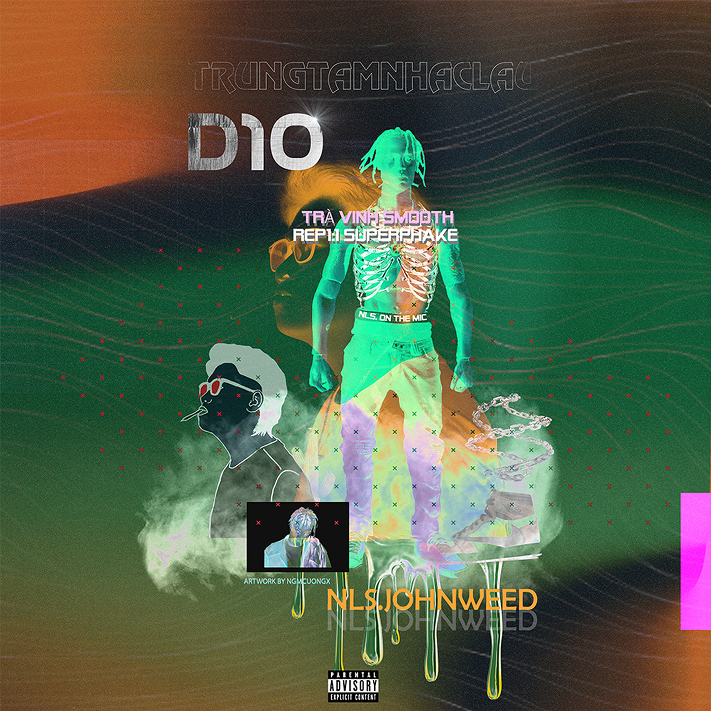
artwork by me https://soundcloud.com/nguy-n-minh-t-n-65106342/realdrug

Original track by TRUNG TÂM NHẠC LẬU D10
Composed by hatdosay(aka NLS.johnweed)
Mix & master by hatdosay (aka NLS.Johnweed)
Artwork by coconcxc
📲 Email: tankuda69@gmail.con


@bright relic love this
Thank you @marble glen
Gave +1 Creative Carma to @marble glen
My first post in a while https://www.behance.net/gallery/124183071/Rewards-App

DAY 1219 — Brief of the Day: Advertise Swimming Pools. #photoshop #unsplash #indesign https://www.instagram.com/_twc_daily


can someone help me mask this deagle and dm me 🙂

can someone remove the background? 🙂

Hello everyone I have a design exercise for uni. The first poster has loads of information for the viewer.
and the other ones have less. For the ones that have less information can I have feed back on which one works the best. And also any other feed back to improve them. Many thanks


Eeeek! I'm really happy with this so wanted to share... but i'm not sure if it's the right chat so apologies if not! https://www.behance.net/gallery/124258233/Createwaves

Hi Cristian, great job! I would agree that the ones with less text are better. Personally I would say that you need to have a look at your fonts and their positioning / hierarchy / possibly introduce a secondary font with a different weight. As a viewer it's a little bit difficult to know which text to look at first. If you have a look at other posters it might give you an idea of what i'm referring to. I hope this helps, but great effort 😄
This looks great, @pulsar nebula! Are you planning to submit it to for the #createwaves challenge?
Thank you 🙏 I’ve uploaded it to Insta etc with the right tags… but then realised I hate the text 🤣 or do you mean the daily challenge? If the daily challenge I’m not sure if I’m doing that yet as I have some pretty hefty work commitments next week… tbc! Are you doing something for #createwaves?
Gave +1 Creative Carma to @frozen jungle
Yup, I meant the insta challenge! Funny that you mention the text because I think that was the one thing I would've changed myself. I feels like it's lacking something, but I'm not sure what.


Hi @pulsar nebula thank you so much for taken the time to critique my work I definitely agree with you and would apply them . one question though if you had to pick one poster which one would it be ?? Thanks again 😊
Gave +1 Creative Carma to @pulsar nebula
Not a problem 🙂 Personally i'd say the last one... but art is subjective of course so what I prefer may differ to other people 🙂
😁

Hi friends! Wanted to get some feedback on this. What do you like? What do you think I could do better? Thank you so much for your help. I am always looking to learn 🙂 Also, any Atlant-iens here?

Also, please excuse the weird sign in the bottom right, I don't know what happened when I uploaded it to the channel.
Beautiful work! Is this all just illustration, our is it part illustration, part photo manipulation?
Hi. I think overall this looks good. The moon I think is a little too crisp around the edges, so it doesn't look natural you can tell it was just placed there. That purple haze in the background seems a little heavy in my opinion. But overall nicely done. I am guessing you are going for a futuristic Atlanta?
Manipulation work.
https://www.behance.net/gallery/121400723/Manipulation


@void elm love ur design


Please suggest for color scheme
Which 1 is lookinh good
Or I change a whole color scheme
Photo composite I completed a little while ago. Made up of, I think, 18 images and a lot of puppet warping

@next edge hey Stu! Thanks so much for this feedback this is mainly photo manipulation. I just grabbed a stock photo of Atlanta and went from there as well as stuck some other elements together. 😊
I definitely had some trouble with the moon and couldn't figure out how to soften the edges in the right way while also giving it some good texture. Any suggestions as to how best to tackle this? And thanks for the feedback about the haze! I can definitely play around with that.
And yes! Futuristic Atlanta. Noticed afterwards that the signs got a bit wonky (weird rectangle overlaps) because of Photoshop export glitch.
Thanks for taking the time to help me out!
- Shelby
Gave +1 Creative Carma to @next edge
The first colour scheme for sure
@next edge All of it is Photo manipulation
@astral sage Make the moon white instead of red. If you intentionally made it red then its okay , its all about artistic freedom. Convert the moon layer into an smart object, then apply Gaussian blurr effect on it. Make the university bill board outter glow color sort of orange-ish , right now it is distracting into the eyes. You can add some haze effect here and there ,it will give the photo more dynamic view. Finally edit the outcome in camera raw filter or in adobe lightroom and see whats come out.
Hey! I was hoping to get this reviewed by a 2nd pair of eyes. It's a webinar post I made for a client....

Sweet! Thank you so much for your help! I will definitely try this out.
Gave +1 Creative Carma to @void elm
Looking good. Perhaps you could try a different font for the tag line (Serif) and give it a light cyan colour. Good luck!
@young raft adds a little bit more character to it.

aahh yes, that is a good idea, thank you :)
Gave +1 Creative Carma to @icy zodiac

Geometrical

WAR-HOG

A Day in the Garden - down for some feedback if you've got it 🙂


How is it?

Looks great! I love the shadows on the grass, however I feel everything is a little to vibrant
@alpine narwhal thanks so much for this feedback! 😃I started thinking this too about the vibrancy. I'll play around a bit more 😊 thank you again!
Gave +1 Creative Carma to @alpine narwhal
@steep quail very simplistic I like the elegance
Feel free to leave some feedback

Looks simple and neat...really good illustrations
The idea which you put into this is really unique and interesting and coming to the artwork, you can add bit more depth and shadows everywhere
@golden crane This is my thought, if you make all these changes I thing it will give the art more authentic and realistic look. Add some haze here and there. Then edit the final outcome on camera raw filter or light room

Surreal, "Upside down"

so this took over 72 hours to render so i hope you enjoy https://youtu.be/F8SDqwnewmo

This Satisfying render 2 was made with blender 2.92.2 and took serval days to render (72+ hours to give you an estimation) as there were alot of grahical errors like clipping and an obvious just obvious seam and also this render was made with 500 samples ran into a denoiser (not optix) and rendered in 60 frames per second with a medium high con...
try to geuss what i modifeied


first time using photoshop for anything other than removing background, how do i improve?
That is very nice, add some drop shadow on the text too @cosmic shard
will do thanks :)
nice design. But it seems very color less probably you can edit in camera raw or may be add some saturation.Camera raw will be good choice I think.
Another problem is text on the lower part are getting very hard to read. Fix that too. May be add some layer style effects or you can change the font color to white. Just the opposite contrast to make it more visible and readable. @cold pollen
New stile for me, I usually work with darker themes, any tips on how to improve?

Awesome! Thank you so much! I will try this out.
Gave +1 Creative Carma to @golden crane
thanks for that constructive feedback...I will make changes for sure
Gave +1 Creative Carma to @void elm
@void elm looks great but the water should be a little bit darker to match the forest above it... It looks a little not so surreal.
Thank you very much 🙏
Gave +1 Creative Carma to @void elm
thanks I appreciate it. But according to my perspective I think the water should be bright cause of the amount of light source. May be I should have made the forest brighter lil bit.
Gave +1 Creative Carma to @marble glen
@golden crane @cold pollen
You are most welcome
@void elm yes the contrast between the trees and water isnt enough god eye my boy 👌
Thanks man 🤠
Gave +1 Creative Carma to @marble glen

I think this is ok to post here...I minted and posted my first NTF the other day...

@ember pine I would maybe bring in the drop shadow a little on the words and maybe add some kind of texture to the words
A quick 15 min edit. How does it looks?? Any suggestions??

It's ok but its obvious u took transparent text or a cut out on the right
I agree maybe take the rest of the white out but leave the transparency
“Freedom (n.): To ask nothing. To expect nothing. To depend on nothing.” - Ayn Rand


Hard to see the text . It looks nice maybe at some outline or shadows to the freedom text? Other than that wow


Please give me your reviews on this design


Thanks man
Gave +1 Creative Carma to @marble glen
@magic basin captian Levi ! I love this design
Nice

cool


Looks like XCOM I like it
Thx bro
Gave +1 Creative Carma to @marble glen


this is amazing...nice work on the blending of the face and its really cool; You can also give a nice glow for the moon part where the blue light would be coming from behind
This looks simple and balanced and also try to change the color of the volcano to something interesting so that it would look good with the pink circle in the back. Try to change the font color and the glow but the style of the font looks promising and proceed with that.
any suggestions?


im dont know how to give a good feedback but THIS IS COOL... but the skate board photo the board and the mountain look like you just put it there...
A couple shirt mockups.


Hi

🌀 بیش از 7 مورد تمرین جهت افزایش تمرکز و احساس آرامش همیشگی 🌀
🌀 داشتن تسلط بر روی افکار و رفتار خود 🌀
🌀 دور شدن از هرج و مرج ذهنی 🌀
🌀 مدیریت و نظم دادن روتین شخصی 🌀
--------------------- با سابسکرایب از ما حمایت کنید ---------------------
--------------------- با سابسکرایب از ما حمایت کنید ---------------------
--------------------- با سابسکرای...
Subscribe please
not here
https://youtu.be/wJWksPWDKOc?t=9399 original image
EVERYWHERE AT THE END OF TIME - Stages 1-6 (COMPLETE)
https://thecaretaker.bandcamp.com/album/everywhere-at-the-end-of-time
Everywhere at the end of time' was a series exploring dementia,
its advancement and its totality.
Audio remembered, disfigured and forgotten by The Caretaker.
Artwork on all stages by Ivan Seal.
Mastering on all stages b...


If you jump into my stream tomorrow and remind me, I'll give you feedback live.
k

Made this earlier, took me around about 25-30 mins to make in total
What’s everyone’s thoughts? 💬
Personally I really like the composition and colour scheme best imo


I am new to design and this is my first edit in photoshop. Comment how it looks and what are the flaws in this?

They look squeezed horizontally 😅
Thanks mate for review but I did this for only this image( the original edited is not squeezed ). Do you see other problems than this?
Gave +1 Creative Carma to @flat cypress
@ashen dirge You could match the general colour if you reduce the saturation of the portraits. Hope this helps.
Thanks for sharing 😊
Gave +1 Creative Carma to @icy zodiac


is this the place i can like submit stuff for people to look at?
Yes if you want feedback on it

Hello, this is one of my first composites, can I get some feedback? Thanks!

I could have fixed the car reflections I suppose

You should be adding some essentials&elements and you need to crate a focal dimension. Which is to create some reality and and better story telling. Some color grading and color scheme would be good. For those kinda works you can follow bennyproductions on YT
@dim ocean ok I do follow him and he helped a LOt, but yea I will try color grading next time and thanks!
Gave +1 Creative Carma to @dim ocean
Just made this, what do you guys think? (had to make it a jpg to fit)

@toxic dome The truck itself has too much of a contrast compared to the background image, you can really tell that it was photoshoped and it looks unnatural.
@marble glen how about this

oof when I put it in discord it looks trash
Yes I agree that looks better
@toxic dome thats more like it 😛


Umm does spiderman have a Harry Potter wig on? 😂😂
Great picture btw


Blue for sure
Last version, what do you think?


What u guys think?

https://www.instagram.com/p/CSYrc_BnVca/ Feedbacks?
No, this is ushanka
I MADE A WEBSITE WITH MY ARTWORKS ON IT, if u guys could visit it IT WOULD BE AMAZING!!!
link bellow

I took a picture of an f-15 and then edited it in lightroom and photoshop

how do we feel about this ?

Timeless

Im pretty proud of this, what did I do good and what could I improve (especially the shadow) ? (Had to turn into jpg to fit)


@toxic dome Good Job! You could try to match colour a bit more. The scene is quite warm and the car has a cooler tone. Hope this helps.
@icy zodiac Ok thx how exactly would I go about doing that?
Gave +1 Creative Carma to @icy zodiac
Im not very good at matching the color
On the layers panel in the bottom, click on the "new adjustment layer" button. This will create an adjustable layer of your choice. I suggest "colour balance" for this. Place the new layer on top of the car layer, right click, create clipping mask. This will limit the changes to the car only. Then, you can double click on the little icon of the adjustment layer and turn up the yellows and red while slightly decreasing the blues.
It's alright. Practice makes perfect.
Good luck! I look forward to your final result.
@icy zodiac Ok thanks I mostly used curves tool for color matching and haven't tried the colour balance so thanks!
Gave +1 Creative Carma to @icy zodiac
@icy zodiac I agree, this does look better

Great! I'm glad I could help. You can keep tweaking things here and there, and it'll get better as you go.
yes thank you very much
It's always good to not over do it. You'll start having a feel for it the more you train.
Yea I can't wait to start learning more about photoshop
Especially with nice people like you
Notice the sides of the car. You could create a new empty layer. Change blend mode to colour. And paint over the sides with a soft round brush in a warm colour. Then adjust the opacity as you see fit. This would blend it even more.
hmm ok
I'm glad you're excited about photomanipulations. Once you start getting the general feel, you'll have no limits on your creativity.
what u guys think? Any improvements needed?


Practicing hair masking. I have bought a graphics tablet recently, so trying to get used to of it. I know the hair strands are not looking accurate as the original image but I tired to draw as accurate as possible


@vivid latch your concepts are good but lighting effects are not really glowing. You can use blend options to make the effect glow. Lighten, color douge, lenear douge,soft light, hard light,pin light, lenear light- these are bledning mode to make glow effects. These effects works differently in different images. Try these out and see which one works better . Another issue I have notice in your images on instagram is your images are missing highlights. You can use hue/saturation layer to create highlights. And to make the highlights smooth you can use blend if.
Thanks for advices! I tried to add glow but it atrracts to much attention and it seems to me that it destroy the composition
Gave +1 Creative Carma to @void elm
Hi can some one please give me feedback on these display sings for vegetables. Which one works best. Many thanks


In that case you can play with the opacity
I guess the sec one
Fresh veg always best
I made it in Ps


Speedpaint of one of the seven races for our upcoming game!
Check us out elsewhere as well!
https://twitter.com/SpiritLordGames
https://www.twitch.tv/spiritlordgames
https://www.instagram.com/spiritlordgames/
https://www.tiktok.com/@spiritlordgames
music: https://www.youtube.com/watch?v=GlxqzYUCad8
#Drawing #timelapse #speedpaint #digital #art...
Would love some feedback on the editing as well if you can spare a minute :)
how does this look?

Thanks @void elm I really appreciate that that
Gave +1 Creative Carma to @void elm


If I can have some ones preference over which display sing they would prefer to have if they owned a shop that sells fruits ?

@sonic laurel i find the blues as a distracting element. The tone used is really great. As blues and reds are kind of complementary colors they attract the attention and hence take away the focus point from the subject.you can go with a more analogous pallette
Hope i could helpyou with this.
@fossil bear Little kitty photo session I figured you'd appreciate.


Practice

was just having some fun.

Paris D’accord rendition

Aww! This is Eminem, right?
@fossil bear that is who I would say it is lol
@fossil bear to be honest I think more of Queen (F.M.)
@fossil bear Hah yeah, I took one with the other two as well though.
@vivid dragon is the Kitty's name Eminem?
And if you have more than 1 cat it is not fair to give 1 screen time and not the others

my first photoshop is good ?


I really like custom making people. This is Ziyva, m half-orc D&D character.

Alright friends. This is how I am feeling about the Coronavirus today. Yes, the eye of Sauron is the virus. I hope everyone is staying safe and healthy. I know we're all very much done with this. I am sending you all good vibes in this time. 🙂
Also, totally open to feedback, let me know what you think!


Thank you 🙂
Gave +1 Creative Carma to @empty goblet

Even if it is dark inside the car, I would not let it be truly black inside. Instead I would brighten it a little bit, so that one can also see something inside the car
Thank you, i will try it out
Gave +1 Creative Carma to @flat cypress
@onyx elm I love those colors. The glow in the clouds is really well done, it looks like water colors?
can someone recommend me a good background for my custom mask for my school?

Thank you very much, yes kind of
Gave +1 Creative Carma to @west scroll
A plain one woulld better imo
Please give your comments.

Awsome, amazing work
Thanks sir.
Gave +1 Creative Carma to @topaz karma

I used part of the last PhotoShop DCC to make a birthday card for my dad. I think it turned out pretty good


Yup, thanks for letting me know
Gave +1 Creative Carma to @weary knoll
looks cool, iv been wanting to do something similar
first time photo editing :))

No way this is your first time, good job dude
ty :))
Gave +1 Creative Carma to @snow kindle
i watched a few videos about editing so i learnt a bit


está muy bien pero te falta la tilde xdd
cierto jaja
buenardo
@indigo night thanks man and yeah it was funs
Gave +1 Creative Carma to @indigo night

@empty goblet The foreground looks a little too green to me. I think if you matched its color to the rest of the image a little more it would blend better. That aside, if the focus is the foreground then the clouds should be out of focus, so a bit of blur will help it seem more like one picture. (Sorry I can't give more specifics, I'm still pretty new to using photoshop for manipulations myself.)
it looks good tbh, i dont know how to fix up the blending and all that but i looks nice already
art

ok, ill call my dealer
ok
Any thoughts? I'm at a point where I know there's plenty of room for improvement but I'm having a hard time recognizing where my problem spots are.

Any specific areas for those highlights? And by resolution do you mean the actual resolution of the image or something else? @onyx elm thank you for the feedback
Gave +1 Creative Carma to @onyx elm
Resolution of the images used. Always work in high res for better results. Highlights are all over the place and don't necessarily match the lightning. The blending mode for them is wrong also, you should change that.
got it! Thank you so much!
graciass
10/10
:))
looks AMAZING bro
Hey everyone! I know I haven't been that active in the challenges lately, but those of you who are interested here is a link to thirty-one Photoshop brushes and seventy-eight Illustrator brushes I've created. The second link takes you to my Behance project that showcases all the brushes!
https://www.dropbox.com/t/W0CNsoH5jVR6sXPW
https://www.behance.net/gallery/125476789/Ever-and-After-a-Custom-Vol-2-Shaping-the-Future

Behance
This project most certainly took a lot of effort. A labor of love. Every day of July I made a new pixel brush to use in Photoshop and Fresco. Originally I planned to only release those thirty-one brushes. However, about a week before the end of the month …
Hello, this is my first photoshop. Its good or bad?

I use some tutorials on youtube
@sharp mantle for ur first photoshop it looks pretty clean man!
how does this look

Looks too good
looks amazing man
How does this one look?

cool as heck man
rate maybe or what should I do lemme know

hehe, thank u
Gave +1 Creative Carma to @runic agate
bro, cool
thanks man


pretty good man
i like thatt
Thanks
@toxic dome
👀
Guys, what do you think 😬

Not bad
That's nice
thank you 🙂
Gave +1 Creative Carma to @ashen dirge

open to any comment

boshporus btw 😄

i made it for my friend

another version

and this is the one that i think best


i just realized that green could be less
this was the first edit i did in adobe photoshop


People still watch that? Either way good job my friend
thank you ,we used to watch together with friends at nights 😄
Gave +1 Creative Carma to @marble glen


i started learning how to make gif in photoshop


i know they are very amateurish but just started
bro.. looks amazing
Really?
this is ugly

Yh man
i added beard to my friend

Hello guys, this My Design for robert lewandowski 


maybe the writing should place at middle
middle of circle maybe but its really good simple and beautiful

Hi everyone
fire🤩


that's good @marble yacht
thanks
the top of the gun could be brighter
but thats an old edit
i just wanted to share
oml that's creative


impressive
amazing


That's great @marble yacht

NOICEEE


so this took approx 72+ hours and i would like your feeback thank you in adavance https://youtu.be/J7HcFHrwnAY

This video (Satisfying render 3) was made in blender 2.9.2 and was rendered on a mac book pro 2018 model and took approxmitaly 68+ hours to render the scene
Thank you for watching this video and to all the people who are currently reading this I would encourage you to subscribe to the channel if you haven't already and maybe just maybe give th...
any suggestions? im planning to turn this into a gif with falling sakura petals

as a side note this is just my second thing i have made in photoshop, feedback is appreciated
HI ...... This is my Photo . Do you like it ?😅

so this took approx 72+ hours and i would like your feeback thank you in adavance https://youtu.be/J7HcFHrwnAY

This video (Satisfying render 3) was made in blender 2.9.2 and was rendered on a mac book pro 2018 model and took approxmitaly 68+ hours to render the scene along with this this render was made with 500 samples ran into a denoiser (not optix) and rendered in 60 frames per second with a medium high contrast using the flimic lense and also a 4k HD...

any improvments needed?

or this?

nice
wow

Thanks
Gave +1 Creative Carma to @balmy basin
i just noticed that when i scroll down or up he shakes his hands thats kinda creepy
elephant
did you like it?😊

Movie Poster i created. Obviously fictional


Arabs being stereotyped 🙄 but it is executed amazingly, actually looks alr 👀
lmao

this is dope man
maybe the left side should be little bit darker
ok, thank you
Gave +1 Creative Carma to @somber hamlet
no problem mate
Woah that’s epic
sauron
thanks dude
Gave +1 Creative Carma to @alpine narwhal
yes I take the eye lmao
that's cool !!


Thx🙏❣

lmao nice

prolly the lighting and blending
you cut the trees very harshly
so it makes it look unrealistic
other than that good job buddy
lil bit unreal
use a light hard brush
Hello, I'm making poster about Akira. Mind if you check it and if you have any feedback let me know:)
https://www.instagram.com/p/CTCiXaxFilp/

it'd look better if it was less grain in whites i think
Hey, I made two funny photoshop edits and I'd like some feedback, here they are:


The pugs shaders aren't really good, but I think it still cool anyways
Okay thank you for the feedback feel the same after I design it
Gave +1 Creative Carma to @marble yacht
Thank you so much
i made it in 2 hours

great edit put shadow on monke and flag
Thank you! I kind of impressed my self with the flag, didn't expect it was going to be that realistic with the floor shadow :)
I wanted to add more jets and helicopters but I couldn't lmao

Pretty cool, would be better if you add a kaiju for that robot to fight
thanks for the advice man
please give me some advice. I work soo hard on my recent art, but i feel like something is missing, but idk what it is. Any kind of suggestion or advice would really mean a lot to me, thank you :)


for the first one you can make the castle shadow a bit smoother but art is amazing
Okey, thx

What do you guys think
https://www.instagram.com/p/CTFmZXplBzf/?utm_medium=share_sheet


Second one is my favorite, nice highlights, nice shadows, nice bro, good job
How can i fix this up guys?

You are a developer, freelancer, designer or photographer and you don't have time to build your own portfolio website?
Take a look at this Portfolio Wordpress Theme:
https://www.templatemonster.com/wordpress-themes/velo-portfolio-wordpress-theme-195630.html?_gl=1*1detbhb*_ga*NDAxNTc3ODMuMTYwNzk0NDYzMA.._ga_FTPYEGT5LYMTYyOTkwODMzMy41MjIuMS4xNjI5OTA4MzU0LjM5&_ga=2.174043811.1058706856.1629297710-40157783.1607944630

TemplateMonster
Velo is a Wordpress portfolio theme suitable for designers, developers, freelancers and anyone else. Can be easily and quickly customized according to

Tra Vinh Smooth
——————————————
#nlsjohnweed #TravisScott #hatdosay #ngmcuongx #melodicrap
Source Video : Mr. Nobody(2009), Baby Driver(2017),
City Of God(2002), Her(2013)
Composed : hatdosay
Mix & master : NLS.Johnweed
Soudcloud : https://soundcloud.com/nhaclaud10
Source Music: https://soundcloud.com/nhaclaud10/sang-da-choi-autotune-audio
...


Hello, everyone! So, I made two nice works and I would like some feedback from you guys
The first one is a random monster draw that made a realistic version of:
Original draw

My version

The second one is another random monster that I made realistic, but now it's a purple creature:
Original draw

My version

That's all, again, I would love some feedback, and thank you for reading :)
"ᴅᴇᴀᴛʜ ɪꜱ ᴀɴ ᴇᴛᴇʀɴᴀʟ ꜱʟᴇᴇᴘ?"
Swipe for color🎨
.
.
3d blender art
.
.
.
.
Likes
156


The big tree should have white outlines because of the sun but do not paint the parts that is in front of the sky i hope i made it clear
I said it because generally the outline doesn't easily appears because of sky but you should paint part that has sun right behind
This is kinda complicated but you do it as you like
hi, any suggestions? im new and the tutorial was my inspiration but made all by myself

can u send it as .png file? then discord will not reduce the quality of the file
png was to big:(
oof
wait i will try
this manipulation is good.. i liked it.. but the perspective of the horse is kinda
wrong..so its kinda looking fake
thank you, the perspective of the horse was the hardest to me, like its really hard to create a rally nice perspective, it needs a lot practice
i mean, you can try finding different horse image

yepp
Coool
also add depth of field
But the leg
Grass brush could make it better
thanks i have one grass brush luckily
i made a horse on the desert, barely can see it but im proud of it:D
you can download brushes from brusheezy.com
thats helpful thanks
https://youtu.be/Ilw9cl6a0A8 you did it well btw

welcome to my channel
please subscribe like and share...Thanks for watching
Follow Me ▽
YouTube: https://bit.ly/2NUxQVN
Facebook:https://goo.gl/6vEYND
Instagram: https://bit.ly/3dB6XCR
Stock Images: http://bit.ly/3vkDCp9
Brushes Link : https://bit.ly/2Ekhoxx
photoshop tutorial
photoshop manipulation tutorial
khmer photoshop
------------------...
The mountain was unnecessary 😁
It looks way more realistic without that
thanks! my strategy in learning is to watch the tutorial just once and then playing in photoshop totally by myself
yeah that montain i was like,, why
Yeah thats how you improve yourself
i used that mountain but in kinda different way
But i don't do that actually i watch as many video as i can
They stay in my mind
that's more better if its stay in your mind, not only on one tutorial project and then poof
What you think? Trying out new font styles

@marble yacht okay ill try
3D text made in latest version of Photoshop with help of Dimension DN. Observer the 3 D shadow of the text made in Photoshop
https://helpx.adobe.com/photoshop/kb/3d-faq.html


Blender+Photoshop=unstoppable

@toxic dome Your image looks amazing! The lighting and colors are beautiful! A few small things I noticed are that the mountain in the background and the horse running on it should probably be a little more blurred. Also, I noticed that the grain you added to bring the whole image together isn’t on the knight’s right hand, or since he is facing us, it would be the hand on the left side. Same thing also on the left side of his clothes, there doesn’t seem to be any of the grain. Last thing I would suggest is to maybe add some more grass to cover the knight’s right foot because if you zoom in it does’n’t fit in with the image. But those are extremely small things. This image is incredible!
thank you i will change everything you suggested!!
I listened to your suggestions and made some changes, im not good at adding depth blur etc but im sure its better than previous one

I would add some long gras top of the legs, so the blend more with the ground. Without checking, I think either the saturation of the knight doesn't match 100%
should be more saturated yes?
Looks awesome!
The knight and the horses look kinda fake
I had a quick check. One reason is the saturation of the knight not matching to the rest. I made a quick and dirty adj layer

Not sure if this is where this question should go, so please let me know if its not:
Any ideas for a design for my profile picture? I don't want to use a picture of myself but I want to create something, and I'm stuck on ideas of what.


outstanding work! how did you get on this level?
Thank you! I took graphic design in school, and honestly just by watching lots of YouTube tutorials and practicing using different tools.
Gave +1 Creative Carma to @whole night
could you link your socials so I can follow you?
Sure! Thanks! @WhaleBabyArt on Instagram.
My first time making a character of my own design. I deliberately tried to make her look somewhat painted.


Here the version before the filters were added to make her look all painterly. I think her tail is my favorite part 🥰

reminds me of priscilla from Dark Souls, very pretty
Very cool! You should make a cool composite with your character now!
A work in progress... haven't titled it yet. Hoping to release a few images fo prints at the beginning of October for a Halloween-themed series.

@frigid lodge should i tone down the colors?
I don’t think so. Personally, I really like those color tones together. You might want to use some sort of foliage brush and paint some of the trees around the bear’s feet to make it look more realistic. Right now I can see the transparency where you used a soft brush to kinda fade away the mask. You could also add a little fog by the bear’s feet to help hide the transition. Also the leg on the right (the bear’s left leg) looks a little more desaturated and has less contrast than the other leg. Maybe try to match that a little more.
Hi I created a cover design using photoshop, and its for a friend of mine who needed it, so I wanna make it absolutely perfect. Can anyone give me a little feedback on this?

The title is too hard to read, especially the “on skid row” part
Okay
I would darken the top or bottom and put all of the text (white) in over the darkened area.
I just launched my website, https://www.voodooartstudio.com - check it out if you find some time!

voodoo art studio
Today/Tomorrow is confirmation and i forgot to buy greeting cards. Lucky I have Photoshop an a decent Printer...

Alright
rip
Well , first movie poster i create


damn dude thats sick
Very Nice
Some changes can be made to the edges
and the face needs a little adjustment.

My latest downloadable brush pack of 31 Photoshop/Fresco brushes and 31 Illustrator brushes
https://www.behance.net/gallery/126824721/Ever-and-After-a-Custom-Vol-3-City-of-Bricks
Photoshop - https://www.dropbox.com/t/BJwC7AQfm3Aqn5wz
Illustrator - https://www.dropbox.com/t/jD73m9Rsi4CvUM95

Behance
Another set of 31 Fresco/Photoshop brushes and 31 Illustrator brushes

She has a place to live now!

i created this a week ago with blender 3d and i would approved it using photoshop any video suggestion for compositing and make it look better and for you want to use it you are free

Blurring birds is the only thing I would suggest. It's an amazing piece of art
thank you ❤️
Gave +1 Creative Carma to @whole night
my soudcloud, my design / PS CS6
https://soundcloud.app.goo.gl/pwrSZ
Listen to AEVB | SoundCloud is an audio platform that lets you listen to what you love and share the sounds you create.
Mmmm


You drew this??
no, but it's the collage
Nice


Something I'm working on for my wedding anniversary

https://www.behance.net/gallery/126934005/Moon-404-Error-Page
how's this, my first time uploading on behance
Something I made for a friend

done

Lmaoo that's funny af👍 😂
Hey Guys..
I made this art last week, shortly before a holiday here in Brazil.
I wanted your opinion, https://www.behance.net/gallery/126656961/Garotinha-na-Natureza
