
#📝project-feedback
1 messages · Page 37 of 1
Made this i appreciate any tips if something missing 😃
i just finished making this
and im proud of it once again but the fire part seems off to me
how can i fix thatfor the future
I'm still new to photo manipulation but this is my latest and most proud work😶
Hello Everyone.
I have designed these business cards for an app making startup that is kind of fun and interactive app. Please share your feedback and suggestions. Can you please share some ideas to make the front side more engaging and creative? Much thanks
@azure brook @vivid dragon @stark saddle
Gave +1 Creative Carma to SamPetersonArt
@tall patio nice work, if you choose background colors little lighter will help
@stone jetty these are the brand colors of the company.
Thanks:)
Gave +1 Creative Carma to shahid kazmi
@tall patio nice work
@tall patio is a company of bitcoins? Neat presentation cards
@uncut pelican this is some app making company, not bitcoins
@toxic dome I really like that photo manipulation!
playing with photos
@tall patio What do you mean by "more engaging and creative"? Have you picked the words or the client? Why have the client picked them?
@tall patio have you created moodboards to get clarity on the visual direction that fits the brand?
@sweet marlin is that painted or a effect?
@sweet marlin You could rotate the images just a little bit more cause "diagonal" is to subtle but would add movement/dynamic. I like the colors but I wish there were something else yellow at the top area to balance the big strip.
@light thorn it is a Photograph that I painted over :P. ohh and thx for your comment 😃 I agree on the colors balance thing and I will see if I can add some movement to it later on
Gave +1 Creative Carma to Kevin be.net/_ke
@sweet marlin Hope you learned something doing this process and not just painted over it 😁
https://www.behance.net/gallery/84009529/Synthesis this is not ph but maybe you like it

@light thorn sure I did, thx again for the comment 😃
Gave +1 Creative Carma to Kevin be.net/_ke
@copper hare Avengers looks Fabulous!
@stone jetty Looks like the splash page for an old movie. Nice.
Nice work @tall patio .
@hazy rock Came across this and thought of your admonishment.

Behance
@hushed cairn thx
Gave +1 Creative Carma to ValentinePierce

First time using the timeline option. Any tips to help improve is greatly appreciated.
@toxic dome aaaah, a classic 😄 I think you could make the loop a bit longer so you can take more time with the fades 😃 Everything else is spot on!
Ok. Thanks for the tip.
@mystic wedge try to use a different color for the font. Black on green/purple could be a bit tough to read. Instead of reducing the opacity too much, you could also go for a more opaque look
of course you can take this further and add a texture to the bar. As long as you don't overdo it
@azure brook how do i make the loop longer?
@toxic dome how long is the video file?
2 seconds
i did this in after affects after watching video on how to do it but i did bad job.
its supposed to make a 2d image 3d
but i did a bad job.
@tall patio This is so cool 😃 Love the colours..
Respect Valery Legasov for his dedication to science & helping the #Chernobyl disaster
Impressive work @last stump. My only suggestion is that you could remove this traffic light, it is catching too much attention. Great job ❤
Curious how some of you with more experience would edit an image such as this one where the lighting just wasnt right making the image grainy. How would you edit?
@vague meteor maybe try something like this? Punch the highlights up, crop in a little so there's not so much floor, correct the horizon so you're all straight and then paint some light into the natural highlights of the photo.
Thanks @main kraken .. been messing with reducing noise and some edits in Camera raw which helps but i know it wont get to perfect.
Gave +1 Creative Carma to Gaz
@vague meteor Yeah just make sure you're ISO is a low as possible it should help with the noise. Always worth shooting a little underexposed and fixing in post so you dont gain an unwanted distortion. Cute pic though of the fam!
@main kraken Yes, kicking myself in the butt for not noticing! argh.
did this photo manipulation and made this lense flare
first time doing GIFs on photoshop
@tropic halo thank you 😃 and yes
wow that's amazing, you planning on doing concept art for film? @sweet marlin
@tropic halo I hope I can do that one day 😛 I love concept art
Yeah he does artist interviews,its inspiring and you know more about the industry. Career advice for free @sweet marlin
@tropic halo wow that's actually amazing ! 😃 thanks again for the support
Gave +1 Creative Carma to Bastino Mhika
your welcome
@tropic halo looks so cool
thanks @coarse tundra
Gave +1 Creative Carma to LocaDesquiciada
New project up! https://www.behance.net/gallery/84101055/Blue-Ball-Machine

@dapper radish that is amazing!
@last stump I would brighten up the trees a bit. some of them look almost black
@main kraken quick question- how do you straighten out the horizon/image on PS?
@unkempt bay I usually just go into the crop tool, set the grid, then rotate the photo as best I can so it doesn't skew the other elements.
There's a tool:
what would u change? would like any feedback 😃
ignore the blue bars, these are just for youtube
@azure brook thanks will try to fix that
Gave +1 Creative Carma to evil
I did a challenge for Adobe once but didn’t win a prize. Still, I loved what I did.
I loved the colors @safe oriole! Great job 😃
Thank you! @sleek tiger
Gave +1 Creative Carma to Valdair Leonardo
@safe oriole I love it too! ♥
Thanks @gritty shuttle !
Gave +1 Creative Carma to artety
@main kraken and @dapper radish thank you both!
Gave +1 Creative Carma to paulvansommeren

Realistic Retro Radio ... Armed in illustrator and retouched in Photoshop.
You've done an amazing job @copper hare. The textures are so realistic! 😲
@copper hare I agree with @sleek tiger. Grand!
@sleek tiger thx
Gave +1 Creative Carma to Valdair Leonardo
@hushed cairn thanks to take you out of a tutorial to practice.
This started as a sketch on paper. Took it to photoshop for colouring. Any advices?
A little Shadow work and background for PsDCC7 Puppet Warp.
oops. posted in the wrong section.
@placid geyser the sunglasses are groovy :)
I'm working on merging photos. Why does this still look fake?
I think it's the lighting
I think you're right, but I can't pinpoint what it is. William's face and my face have the same colors. I even added that blue hue to my forehead! 😂
@manic trellis I think it’s the lighting (different source/angle) but also scale (and angle)... 🤔 Looks like you’re too small in reference to the other people in the photo
@crisp blaze Thanks! I had made myself shorter than Will and Taylor but yes, now that you mention it, I could go larger. Is there anything I can do in Photoshop to fix that lighting issue, or is bad source material forever bad source material? I'm still learning how to use things like highlights.
Gave +1 Creative Carma to Chocolita
@manic trellis yes, the lighting is different. there is a distinct cyan light in the original photo, which isn't present on your face 🙂 I think you can also refine the selection of your hair using the select and mask workspace 🤔
@coarse verge The pink elements are a great idea! The eyes are just great -they look slightly annoyed but in a fun way 😄 I think you should do something against the gray untextured areas. How about a subtle blue or a shade of red? Well done with the texture!
if you can, try to blend it a bit here:
@manic trellis I think this is fun... I am not an expert at all. But I think the photo of you is too crisp in comparison. Maybe if you softened your photo they would match. 🙂
Image position problem
Hi Everyone
I have merged two photos and need your valuable feedback friends. Thank you in Advance.
I have merged two photos and need your valuable feedback friends. Thank you in Advance.
Its dark.
@umbral jasper yeah! you're nearly there 😄 I would add a tiny touch of green to the outside -like the foreground. maybe you can bring some of the glass texture back? It is super clearn right now and those windows never are that clean 😉
Thanks @azure brook for your valuable feedback.
Gave +1 Creative Carma to evil
I would make the blues in the horizon a bit darker. great shot @umbral jasper
@analog ermine The composition looks good and the T-😃 rex being lit the same as the road scene makes it fit really well, My eye keeps getting drawn to the guy in the foreground though, I think he needs a bit more shadow (compared to the car shadow next to him it isn't as strong)
@lavish siren hmm you're right. I'll work on that
@lavish siren hmm you're right. I'll work on that
So I watched the Alex Kiesling videos this weekend and have practiced using the techniques. I think this is a finished illustration now, but any advice is welcome as I have been staring at it too long now 🙂
Thanks @lapis silo I will do that
Gave +1 Creative Carma to RoseVisuals
what do you think guys ? I am still new to graphic design and branding but i really want to keep going .
I hope you give me your opinion and maybe some feedback if you can 😄 😄
https://www.behance.net/gallery/83786615/Personal-Identity-Mohamed-Nasr-Branding

Behance
Personal Identity | Mohamed Nasr | BrandingI worked on this project for about 1 week and it was a really fun project to work on in this project, I show my design for my personal visual identity
Damn that looks amazing
Well done
@manic trellis I don't know if you still are working on this but take a look at your forehead and William's forehead. His forehead has shadows while your's is a bit too bright. Another thing that is weird is the glass. The reflections is a bit off. But overall you did a good job. Some lighting changes would make it better.
cool
I really really like the colors in the day in the country art
Hey! Just finished my new collage 🙌❤️🖤
I hope you like it! If you want to see more visit my instagram page:
@ AndriiGrey 🙏
My hubby and I did a project together two years ago. He took photos and I designed the calendar with watercolor brushes in Photoshop. It was fun.
https://www.behance.net/gallery/65407979/PERSONAL-Calendar-2018

@safe oriole Great job! The presentation also looks awesome - are you planning on printing it? If so, you should totally add a photo of the finished calendar 🙂 I like the short lines of text you've added to the Behance project. It always adds so much when the artist explains some of the background and motivation behind the project
Thanks! Yes, I work at a printing company so I printed my calendar for free lol Thats a good idea; I will take a photo of it @azure brook
Gave +1 Creative Carma to evil
@astral stump ?
New at illustrations! I picked up a random image from google and tried creating it in illustrator. Would love to here your comments/feed backs to keep improving! @azure brook
An illustration i've been working on... can`t make it look like a finished look, please feedback
@stark igloo If it were me, I would remove the coral colored shadows on the blue "waves". To make it look finished, maybe create some sort of shape to the overall image or reduce the image itself so there is more white space around it. Looks great. Very creative. Nice work! @worthy canopy Wow. Well done!
Behance
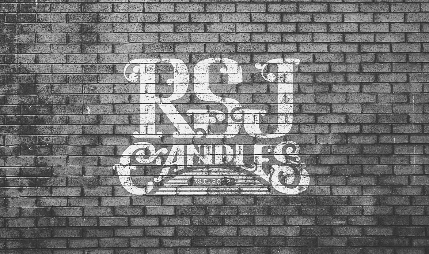
A personal project, case study on rebranding a non-fictional company called "RSJ Candles"
@toxic dome great filter! just make sure to mask out the frame correctly .:)
@stark igloo that is so cool! I love the colors!😍🙌
Can’t wait to share my new work with you guys!
Here is my new work! It is to big to upload the original file here, so I’ll upload a screenshot from instagram
@rose wing thank you 🙂
Gave +1 Creative Carma to Michele
Wow @wise silo this is awesome!
Hi! I'm new in this community.
PHOTO MANIPULATION: Turtle Island 😁
This is Freddy Krueger + Freddie Mercury for the sticker mule™ coupon today. Thanks. I hope it's ok I put illustrator art in a photoshop discord. oh gosh.
Love the look of this font.
I’m working on a poster design for my school’s Model UN club to recruit new members. The blank space on the bottom right will have contact info (which I haven’t added yet for privacy reasons). I have a few tweaks I still want to make but any feedback on the design?
The QR code at bottom left seems to be competing with the headline "MODEL UN" ... I suggest to make the code smaller. The QR code has a minimum size of 1" x 1" to be readable by the phone if that helps. It doesn't seem to have a solid grid system and I'm not sure which text to look at first, second, and third, so on.
Thanks @safe oriole! I’ll work on the points you’ve mentioned. Maybe I’ll make the title one line and add a bit more spacing around everything in addition to doing the things you said. That might give the margins a better shape. I’m thinking about shrinking the title and bullet text a bit and then maybe enlarging the top most text. Maybe I’ll remove the top line all together for a easier visual flow and less conflict. Another person in the club wanted it added but I think it’ll be hard to make work. Thanks again!
Gave +1 Creative Carma to Voxann
I’ll also play around with the font weights to get a easy reading order of the page elements.
Looks really good @analog ermine
C4D ❤️
@Noah Feller#0714 thanks
@analog ermine I think the face mask could be a little less opaque. Nice image.
Space Illustration
🙌
Any suggestions for this one???
@hushed cairn thanks! Something like this ?
Gave +1 Creative Carma to ValentinePierce
@analog ermine That is much better, don't you think?
@hushed cairn yaa!
Made some logos from my own daily challenge https://www.behance.net/gallery/84563603/LOGOFOLIO-pt-1

Sometimes game screenshots are fun to play around with to make it look better. I did this screenshot 2 years ago and made it look lively.
https://www.instagram.com/p/BQ5Wpz5BqFb/?igshid=19jf6ckwhcbmd

Instagram
29 Likes, 6 Comments - Voxann (@voxann) on Instagram: “Before and after! 😍✨💖 Http://voxann.wordpress.com #guildwars2 #gw2asura #gw2style #gw2elementalist…”
@safe oriole
That’s a huge emote lol @analog ermine
hey people, what do you think of this design ?
Very nice @safe oriole warming up the space with candies.
@safe oriole hehe
@hushed cairn Thanks!
Gave +1 Creative Carma to ValentinePierce
Beautiful images @zealous axle 😍
@sleek tiger thankxxxx !
saw some of these little creatures from one of you, so I decided to try drawing one myself. Any name suggestions? 🙂
@inner sorrel myb Globex ? 😁
@pale siren oh I like that 😄
A more red Head, some sweat , country contures and it`s a picture for climate change 🙈
What do you thik ?
Nice, looks mystic..... perhaps you could bring some more texture to the dark areas.
This is the first time I use only one texture.
Any suggestions?
Sample off a poster I am designing, I need input on areas for improvement. Thank you. This group is awesome by the way.
@pale siren this is really good. My only suggestion would be that you can see a dark line right in the centre of the sky. Maybe fix it with healing brush tool
@toxic dome nice image I love the idea and great work on the eye there though I would suggest doing some cleaning up on the chin there so the colours dont overlap the face and look like they are in mid air. I think that would make them blend well with her face and look realistic more realistic hope this was useful
@toxic dome depends on the look you're trying to achieve. I think you should also add some shadows to anchor the effect to the face
and I would expect to see some glow if the energy (?) is this bright 🙂
maybe you can also darken the image in general to make it look more moody 👍
Old porcelain sign
@copper hare Love the texture with the bevel&emboss 😄
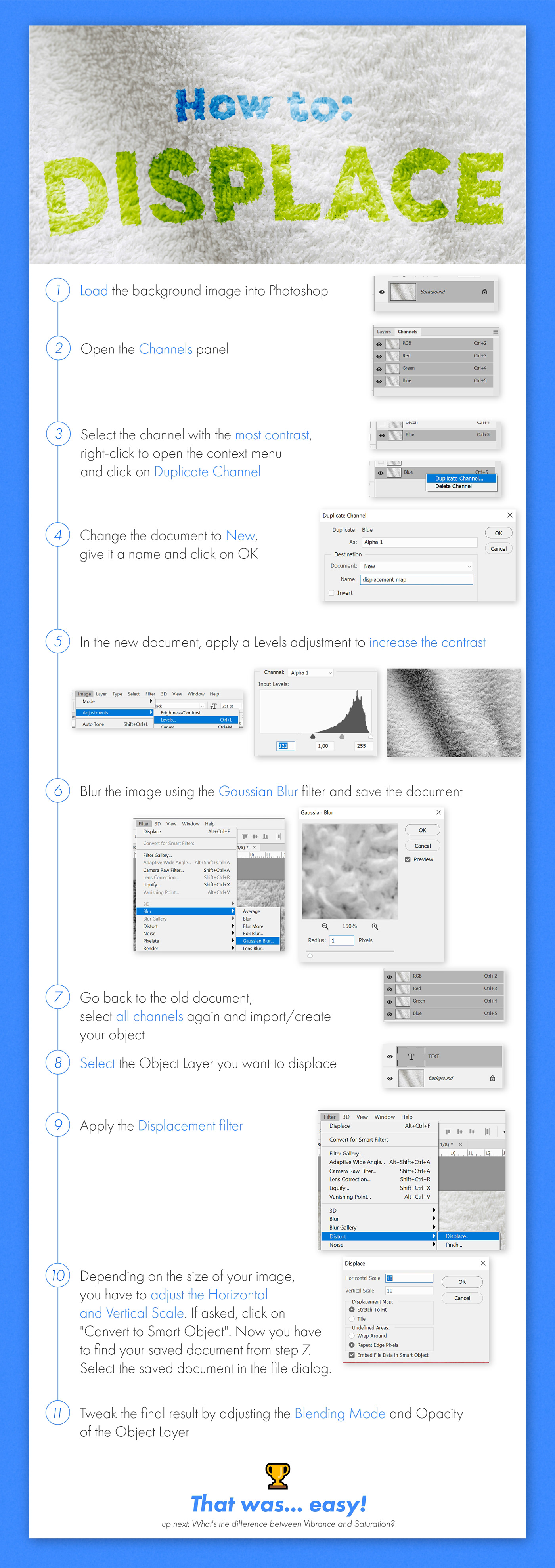
have you tried using a Displacement map?
if not, you should try it out 😄 https://www.behance.net/gallery/81965679/Photoshop-Protip-Displacement-Map
Behance
How to fuse an object to a material using the Displacement Map filter.
@azure brook Thx.... good idea I didn't think of, I'll prove it if it turns out.
@azure brook This is the effect with Displace. I don't know if it's going to look good.
@copper hare yes! looks great - the displacement effect distorts the layer based on the layer you've selected. This is very useful if you want to add some imperfection to an otherwise clean layer. The sign was super dented and scuffed. You wouldn't expect a clean lettering
but now the white layer "hugs" the texture.
maybe you can dial back the effect a bit but I think it makes the whole design more believable
@little trout you have to use one of these backgrounds at least once 😄
I believe Val once did a Daily Creative Challenge based on this concept
Hi people! I give u my behance (i'm new in this, and i have just this challenge on it) if someone want to see it :)
https://www.behance.net/gallery/84718643/Daily-Creative-Challenge-(PS)

can i share my latest project that doesn't have todo with the photoshop challenges here?
XD
Yes @marble hinge

Behance
I designed a poster everyday for 30 days for personal practice and was experimenting with different visual elements, and these are the ones I picked that were my favorite out of the 30.
Beautiful posters @marble hinge! Number 006 and 029 are my favorites ❤
Thanks!! 😄
007 and 027 are great too!!
I agree @pulsar bloom those lines in 027 are amazing
@pulsar bloom thank you !! 😄 i like that one too XD
Gave +1 Creative Carma to SZ8925

Behance
I try to create something that it's me but in B&W (i'm full colors). The hardest part was to keep the essence of myself.
my initials haha
omg, really?
omg I am really excited, I finally managed to make some sketches on my Wacom tablet that don't look terrible! I would love any feedback.
I just realized you can’t see the right border of the top image. I’ll fix that later.
@coarse tundra great logo and great presentation! Having all the mockups is key if you ask me. As someone, who is seeing this project for the first time, I would love to know more about the idea behind the logo. Is this your new logo? Why the distorted stripes and how did you create them? Is this a font and if so, why did you pick this one? Are there any variations of the logo? Questions like these could have fascinating answers and if you have some time to spare, you could put some of this context on your project 🙂 Again, great job!
@unkempt bay the perspective looks good and the proportions are very realistic. Your next step should be to really hone down the lines to the essential contours. They don't have to be super perfect and you don't have to use a ruler, but just cleaning up could improve your sketch a lot 🙂
then you can think about blocking out the lighting. Just use a big brush and see which part of the scene should be lit and which should remain covered in darkness
@azure brook omg I didn't expect that feedback! Thanks you so much I'll try to improve the post and I'll use that questions like a guide because I really don't know what to put in the post so I filled with the mockups. Once again thanks for your time!
Gave +1 Creative Carma to evil
@coarse tundra check out https://www.behance.net/gallery/74545957/Newman-Regent - I think they did a great job

Behance
Bespoke logotype and crest for Newman & Regent, a shoe and bookmaker from Northamptonshire, UK.
to be fair, you don't have a client with requests and reviews... but hey
My professor leave all to us. I really don't like do logos, and one that identifies me, using the letters I struggle a little bit. When I finished all was love and I decided to put the work in behance... without knowing how to present kind of post...
I'm looking forward to improve and your feedback was exactly what I need
@coarse tundra that's what we're all here for! Glad to have you as a part of the community 🙌
yeah, 007 looks wild! @marble hinge
@marble hinge I love how you're using all the vibrant colors together with the noisy dark-gray shapes
I think #029 is my favorite!
yay I got my samples
My new work for instagram page :
@AnotherChicago ⬅️
@azure brook Thanks man !!! 😄
Gave +1 Creative Carma to evil
I won't be able to catch up with the challenges now that I'm in class. I'll share my past work time to time, though. I saw that one of the challenges was to add text to images so thought I'd share what I've done a few years ago. It's one of my favorite work.
https://www.behance.net/gallery/36893185/AUTOMAIL-America-the-Beautiful-series

Behance
America the Beautiful series for Automail offered by QuantumDigital
@toxic dome they look killer! Use them wisely 😛
@azure brook Thank you so much for the feedback, and I really appreciate the tips for moving forward. Do you have an example of blocking out the lighting? I am so new to this. If not, that's totally cool. I'll keep updating here as I move on!
Gave +1 Creative Carma to evil
@unkempt bay this looks promising: https://www.youtube.com/watch?v=CT0RFAmRWvs - and here are some textures you could use https://www.youtube.com/watch?v=CUizoNOqsLM
This week our topic will be applying material textures to a drawing using technical ink pens. NON ARCHITECTURE 10%off coupon: themodmin website: http://www.n...
Architectural Sketching by lt khang Playlist: https://www.youtube.com/watch?v=BrNQ0XixAw0&list=PL3E3rOjsb0TEnQdYVud9F4deHUTIRUtCm Subcribe: https://www.youtu...
Thanks, @azure brook ! That was quick! You're the best.
@azure brook I should have seen that one coming lol
@wise silo I love that picture! The front transitions well into the back, except there seems to be a vignette in the front layer that isn't in the whole picture- I think if it carried throughout the whole image it would blend better, but that's just my opinion.
I fixed the border issue. It was bothering me lol
I was watching a movie after seeing @midnight glen present a Master lighting class so I did a screen capture and tried my hand at creating a lamp shade and glowing light. Let me know what you think.

Behance
Name to incorporate in the logoSUSHI TODAYSlogan to incorporate in the logoJapanese & Asian DiningDescription of the organization and its target audienceWe are an All-You-Can-Eat Sushi & Fingerfood restaurant in the Netherlands. For a fixed pric…
Amazing @tough quiver!
What do you'll think about this composite?
could i get some honest thoughts on this? its not done obviously, but i wanna make sure the idea/composition im working with is moving in the right direction.
@obtuse cypress I would just be careful with the paint spatter brushes. Don't cover too much of the logo
@last stump I like all the glowing embers and the turbulent water 🙂 I think you could improve the black border around some of the embers
try to use the Screen blending mode
And this reflection looks a bit off - you probably wouldn't see a reflection on the lower part of the water. Maybe you can reduce the brightness of the reflection
I like the blue color wash you've added but The hue doesn't quite match the green-ish glow of the butterflies. You could probably bring those two colors more together 🙂
@tough quiver you should totally post this somewhere between in the presentation of your work. Just tell the viewer about the project. Was it for a client or is it a passion project? Why did you pick these colors, where there any first iterations of the logo?
@hushed cairn well done! The edges around here could be a bit more pronounced but the rest looks great!
@bold cobalt the poster is pretty abstract, maybe you can reveal more of the shape in the foreground?
@latent zealot I like the clean black & white look but I wouldn't mix those sharp shapes of the wolf with the droplets below the B.
@latent zealot also I hope you have paid to use the stock asset 😉
@azure brook thank you! though, the logo itself is made out of the paint splatter
Gave +1 Creative Carma to evil
@latent zealot maybe you're better off designing your own wolf icon instead of using the first one that appears when you type "wolf icon" into google 😉
sad but treu
@bold cobalt I think you'll have to rework this area here. You could add some water splashes to hide the transition
whenever possible, try to look at reference photos. You can actually barely see below the waterline. You can just the reflection of the boat.
playing around with photoshop 😛
Thanks @azure brook I agree and will work the edges a little more.
Gave +1 Creative Carma to evil
What you think about it, i think looks strange
@undone crow I don't think it looks strange at all! The image is just very noisy due to the low light in the scene. That's probably why it looks slightly off
MM ok i'll try to fix a little that ,thx
Hello everyone I am really enjoying these challenges
Hello @unique orchid, that's awesome! Feel free to use the feedback channels to ask and also give feedbacks 😄
Hello guys 🙂 I’m taking part in Daily UI - 100 days-100 challenges and here is my first work - Day 001, create a sign up page 🙂 comment appreciated 😉 https://www.behance.net/gallery/85022291/Daily-UI

A friend asked me to work on this cyborg-ish portrait for him. He only sent me photos from his phone, so the res isn't the best. Any suggestions or critiques? I have one version with yellow eyes and one without.
@lusty wadi try to even out the brightness of the individual elements a bit. right now, the Parental Advisory logo is the brightest - try to brigten up the sphere and the title! I would also probably use a different font for the Song Title - pick something epic!
@visual lintel you should probably post it to the XD Server 🙂 http://bit.ly/XDdiscord

My favorite disney princess is Rapunzel so I did a composite inspired by her. I'm mixing digital paint techniques with composite photography. Please let me know anything I need to fix. @fair lance @azure brook
@last goblet I really liked the way you used the machine within the face. If I were you I would try to use more blue, white and a few light effects, in order to look more like tech. If you look on any place for tech you’ll se a lot of blue, whites and cool lighting effects you can reproduce. 😛 Maybe you should consider background.
@wet sand thank you. That's a great idea. I will check it out. Thanks.
Gave +1 Creative Carma to Maiane
@azure brook Thanks, I will 🙂
Gave +1 Creative Carma to evil
Old Porcelain Posters
My first post in here 🙂
@radiant peak Wow! this is epic! I wonder what the story behind this is 😮
great use of lighting and shadows. Maybe you can bring back some of the detail where her dress touches the rock
if possible, apply the same amount of light to her body as the head of the creature
@copper hare yes! I love your logo series! Do you also post them to Behance?
@olive relic any reason for the watermark next to the astronaut? love the colors and the geometric design. you could probably reduce the grain slightly 🙂
@azure brook Thank ..If do too, I leave my profile. https://www.behance.net/Ghostylolero7f 😜

Gave +1 Creative Carma to evil
@olive relic I see 🙂 - just keep in mind, watermarks like this can be removed without much trouble. And if somebody wants to freeboot your work, they will do it anyway - with or without watermark. Your watermark isn't too big or noticeable, so I think it is just ok
What do you think about it? What could be the next steps to get a better composition? I dont know how to go on now. Maybe u have some advice?
Its not my Idea I got the inspiration for this from a MusicVideo: Jim James - State Of The Art (A.E.I.O.U.)
☮
great image by the way @toxic dome
I wanted something to play with the lights & shadow and this is what i came with ...it's not grate but i'm still a beginner
@molten hollow thx i will try my best
@quasi light thank you
Gave +1 Creative Carma to Kars
Hey,
I added shadows and light now but i dont like the shadows at the feets do you have any advice or idea to get a better result for the shadows there?
☮

Behance
Small dog in a cup. Photo manipulation with oil paint filter applied.~I'm going to start making all my photo manipulations using the oil paint filter applied at the end to make them look more interesting.
your welcome @toxic dome
Beautiful font @magic hamlet
Added some highlights to it as advised using curves & blend if to my last composite .... hope it's better now
Spare time
First design draft for the album cover contest of inkie (beatboxer/loopstation artist) he do digitazl kind of music. Only on photoshop, what are your thought? thanks
I made this fortnite header for my friend, I've been working on using photo manipulation and what not to create 3d enviroments how do you think it turned out? Anything that looks off?
@jagged mauve nice! Love the vibrant colors! But the whole header looks a bit soft. I think you shouldn't blur the image too much 🙂 At least the text should be nice and crisp
@wild plank I think you should make the artist bigger and put the text behind him, so his head covers parts of the title. And I would tone down the greens in the highlights - especially on his face 🙂 I like the cool background and the font looks killer!
@opal thorn I love the idea with the circular glow! You should probably add more light to the person in the middle. If possible, only add it as a rim light. Before you can do that, you will have to tighten the mask though. You can add an outer glow later 🙂
@unique orchid Awesome job 😄 I would just add a highlight to the tip of the nose to make it look less flat. Maybe you can slightly desaturate the tie; the color contrast is pretty strong 🙂
Whats great about working for myself is I get to stretch all my different art muscles Getting fancy with packaging tri fold pocket frame from cards and pockets with stickers from sticker mule and stand out stickers and hand inked linocut with bonus star dude hand pressed print (not avalible in stores)
Hi Everyone. Check this and say something? How u like it or anything you can suggest?
What you can comment on this! guys
@toxic dome that looks awesome! I love the packaging 😄
just make sure you take the photo with more light - it is quite noisy ^^
mockup design by designbridge follow @frozen canyon
Other Old Porcelain Posters
Nike Ad (just for fun)

Behance
Dreaming of glowing fish that swim around your head. Definitely the best so far I've done with highlights.
My first mock up. Pretty happy with how it turned out
@toxic dome why not using artboards in photoshop instead of making a new psd for each design? — What is the key messages you want to convey? > Whats the target you want to reach and what messages is relevant to them and why? This also influences the way you need to design this "Poster" (colors, typography, photo etc.) I would also work on the visual hierarchy. The Design on the right is to busy, on the Left visual hierarchy issues + typography problems and contrast. The option in the Middle ist the strongest but to bright and also needs more contrast and visual hierarchy. 👍
@bleak wraith Liked it. Nice touching.
@light thorn Thanks alot. This means alot. I have to learn alot. Jus started with Desiging stuff few months ago. Will looking to sharpen those skills. Thanks for the feedback. Love you. Man.
Gave +1 Creative Carma to Kevin be.net/_ke
@light thorn About artboard thing. I don't know. Ps does have an option for Artboard! ????
If you create a new document, below the "Pixel" there is a checkbox to make artboards (my screenshot is German sorry) 😁
Just finished making this one so what do y'all think?
@bold cobalt Fantastic idea! I think you should add some color to the person with the hoodie - it looks awfully grey 🙂 You could add some blues and reds to the mix
@bold cobalt and probably darken the hand a bit
@bold cobalt and maybe even trim the mask slightly here
@bold cobalt the lightning bold looks epic! Make sure not to oversharpen the image though or you will end up with weird artifacts
and there are some weird reflections in the water
but that's pretty easy to fix 🙂
I think the rock formation is a nice centerpiece
Hey it's been a while since i was here but https://www.behance.net/gallery/85419695/Dixel-Multimedia-Identity?

Behance
Identidad de marca para una empresa ficticia. / Brand identity for a fictional bussines.
@azure brook sorry to bother you, but i try to make a better logo presentation, it's in spanish because it's a work for my collage (i'm from argentina) so... thanks for the last time and check it out!
Gave +1 Creative Carma to evil
Hi guys. Any comment. Which do you u think i should finalize? JR Logo designed by me. 🙂
double exspose image that looks amazing
So I have this new idea I wanna make for a series of pictures for fun that are black with some sort of liquid gold highlighting somewhere in the image. (Another idea I have would be the gold coming from the eyes) I need some feedback on this one tho bc I felt like it was missing something so I added a glitter effect on her cheeks and eyelids. Is it too much or should I add more? Does the gold effect look realistic enough? Is the black TOO dark or does it show the details enough???
Wow
does anyone have any advice for how i can make the gold cracks look better? idk if it looks natural enough
photoshop cc
Try using something like that photo above yours. Blend it in with the photo
@magic hamlet they look amazing but maybe you should make the people a bit brighter
And it doesn't look natural because it has those visible edges
So yes, try blending modes
And try to erase the edges of the crack
You could also have it on a separate layer and use image>adjustments to develop the hue, vibrance, contrast, brightness etc. You could even try a colour lookup layer as well. But not a bad job so far. Keep it up. @magic hamlet
Double Exposure - Photoshop Masterclass w/Paul Trani
First attempt of double exposure ever!
Another attempt
Another exposure/fun piece, just experimenting on these pictures really.
I'm really enjoying the double exposure, I can't stop doing it, XD
My latest composit 🙂
The first banner i do with 3D effects
One of my latest pieces around climate change called polar opposites. ❄️

Hi! I've been following the DCC's for a few months now and I really enjoy them! But I'd like to push myself a bit more and decided to start a "poster-a-day" project (I came up with the idea after the DCC with @stark saddle) in which I will make poster designs with a quote or a song/lyrics as guide/inspiration.
This is my first one, if all goes right there's 29 to follow 🙃 Would love to hear what you think!
@crisp blaze Hey congrats on your poster a day project! I'm looking forward to seeing the remaning 29!
I did the same thing buy did a poster a day for a whole year. You can view some of it here. https://www.temicoker.co/a-poster-a-day
Coker
I was challenged by my friend Magdiel to design a poster a day to enhance my graphic design skills. I took to the challenge and have been designing a poster a day. I'm learning a lot from him and myself during this project. Find a poster you like? Order it here
Thank you @tulip dune ! I admire your work so much! So inspiring!
I’m still a beginner at graphic design and thought a month for my poster project would be just fine to start with 😊 Designing posters every day for a whole year seems very intense but could be my next goal 😉 If you have any advise or suggestions I’d love to hear and learn from you!
Gave +1 Creative Carma to Temi Coker
😄
I'm a member of my school's robotics team and I'm redesigning the website. This is a design I'm thinking about using for the website homepage. Any feedback? (The photo is a mid render screenshot FYI because it's taking a while to render 🙃. So ignore the rendering lines...)
fixed the edges on the cracks and added a better glow around it, how does this look?
people here are really creative. I loved these creative art work. And i wonder when i will reach at these level.
@flat stratus you'll reach that level man. JUst keep working!
@magic hamlet It looks amazing!!!
@crisp blaze Thanks so much for the kind words. Yeah my advice is make time for creating every day. Sometimes I would make 2 posters in 1 day if I knew the next day would be busy
Gave +1 Creative Carma to Chocolita
@crisp blaze all in all, don't give up and if you miss a few days, just make it back up.
@tulip dune thank you!!!
Gave +1 Creative Carma to Temi Coker
01-Replace-an-Object-Starter
@tulip dune thanks for the advise!
Gave +1 Creative Carma to Temi Coker
Of courrse @crisp blaze
Here’s my design for day 2. Don’t think I will post all of them here but if you like you can follow me on Instagram (@signoritachocolita). Will also make a project page on Behance later
Looks great! And ok I'll try and keep up.
Beautiful! Followed you on Instagram @crisp blaze 😉
@sleek tiger cool! Thanks! 👍
Gave +1 Creative Carma to Valdair Leonardo
My result from the last master class. I found this very inspiring and I will certainly look at it a few more times to get through the intricacies
I have posted here this before, but i'll reshare incase new members are interested , more on (clrfluid) = Instagram.
Behance
I designed a poster everyday for 30 days for personal practice and was experimenting with different visual elements, and these are the ones I picked that were my favorite out of the 30.
@marble hinge very inspiring!
that is a great image @bold cobalt
Very nice effect!
Adobe Creative Cloud Recent Youtube Video - How to paint a texture attempt
@bold cobalt This slooks so good!
@magic hamlet looking at this on my phone I can't even see the model. I love your idea. Just gotta figure out how to bring some details through 😊
Thx
People please give me feedback on this poster made by me, do i need to improve it or it's just okay?
i think it's okay :o but maybe you can call more attention to the word time management and the date maybe :D
just a quick sketch
kind of gives it hierarchy and contrast/interest
not sure how i feel about the cut out effect though, doesn't seem to be adding anything to the poster
Advertising. 😀

Behance
I wanted to make a series of images edited to be dark but have gold liquid somewhere to highlight the image. So far I had these three ideas but eventually I might create more.
Hi @midnight glen (or @vivid dragon ) I saw your Masterclass😀 Could you tell me if I should improve something? KLM's birthday coming up, made it just for fun.
Just a test poster I came up with, inspired by a youtube video
If I spent more time on it I would have blended the splash with the strawberry more and also remove the white fringe a bit more.
Gave +1 Creative Carma to urboisteve
@bold cobalt I have written a long "Feedback" to your design but discord bot told me I should not spam with the same message over and over again 😂 Sorry I can't rewrite my thoughts. The message to you was unique and I haven't posted any thing "similar" obiously here in the chat. 🤦♀️ thanks discord bot thanks
Just give me some bullet points, XD
They weren't finished products anyways, just some tests.
"just some tests" — for what? 😀(Remove the white fringe, splash bigger, YFYW makes no sense to me #readability, strawberry compete with typography (visual hierarchy) and the overall concept/idea of the poster is not clear. — But like you said, just some tests, so I'm curious what the final piece will look like 😀
Yea, thanks for the suggestions, really just inspired from some Youtube videos and wanted to put something small together, not for anything inpeticular, I will add some more to it.
Yes! Back in the game! Tried to start my macbook (after I spilled a drink over it and left it to dry for 5 days) and it seems to work fine! 😅 I'm behind on my Poster-a-day project now but will catch up asap! Here's my day 3 poster that I had sort of finished when I spilled my wine. Would love to get feedback 🙂

Behance
I have been testing out different kinds of layer styles for typography and this is the best I came up with so I had to post it. Colors I got from a color scheme I made in Adobe Capture.
@magic hamlet love it! 😍
@crisp blaze thank you!
Gave +1 Creative Carma to Chocolita
A little photo manipulation advertisement, OPS?
could someone please make this companies logo. I want to have it as background
@crisp blaze Glad you are back in the game. I know you back up regularly, right?
@hushed cairn Oh yes glad to be back and busy catching up on my poster project! And yes, I back up every day 😇
Hi please, I need someone who wants to help me, I made a logo but when I downloaded it I had low quality and the colors look a bit bad. I wanted to ask if someone could edit my logo so that the colors look better. My team does not sport Photosho is for I ask for help. Thank you very much. @everyone
Since we are on the Mock up topic, I want to share with you all a T-shirt design celebrating the upcoming Inktober 🙂 I used one of my Inktober drawings from 2 years ago
My poster designs of yesterday and today. Decided to enlarge the text of the quote and added a drop shadow to make it more legible. I think it’s better than the small size I used for the quotes on day 1-4, but would love to hear what you think of it. Also, I’m struggling to find a style... 🤔
@olive relic very good idea! so please pay attention to put the skull a bit lower, it doesn´t fit yet with the real face (postion of the eyehole). Rest: well done 🙂
Hiiii... Im trying to do something new... So, i'm sure that I'm having problems to put everything together, but so far this is what i got. (i'm not good with labels, i will try to fix it later).
wow great image @gilded harness
Have taken 2 hours making that. It's not the final edit. Shadows might be a little bit off, focus as well, but if added more blur the concept will be totally ruined... So idk
@gilded harness Wow, looking awesome! 😄
Just one thing: could you make the bottle blend with the background a bit better? I noticed the top part was very white. Here's a tutorial I found on it: https://youtu.be/n3NniavNOIM

In this Photoshop tutorial, you will learn how to extract glass from a white background using blending modes. This video will teach you the best way to selec...
That's what I need!!! Thank u @pulsar bloom
Gave +1 Creative Carma to SZ8925
Any suggestions on how to make the eviction sign more cohesive to the photo?
im testing out making an enamel pin effect from scratch since i cant find any tutorials and just packs to pay for. just need some advice for if this is looking realistic enough? or any changes i could make???
@tulip dune Thought I'd give your poster tute a try.
@hoary citrus My idea: I'd select the sign, go to the background layer, copy the selected piece (of the tree), paste it as a layer over the sign and then play around with an opacity level low enough to just give a hint of the wood structure on the sign.. Just try?
u gave me one of the best tips ever! Thank u soo much, my bottle looks much better now 😍 @pulsar bloom
Gave +1 Creative Carma to SZ8925
@gilded harness I gotta try that, looks awesome. So you know, there's a white cork that you've also made transparent.
Yes I saw it hahaha... But I didn't have time to fix it 🤦 I'll try to do it tomorrow and I fix few more things that I think could be better and I'll show u all again 🥰🤗 @red ginkgo
Ah true. I know myself I sometimes completely miss certain things like that so I figured I'd mention it
Looks really good, I want to try mockups like that too I've never done those
Thank u, I appreciate it 🤗 @red ginkgo
Gave +1 Creative Carma to CLAYTONGP
Anyways... It was kind of hard .. cuz I made everything (except for the fruit and the bottle)... I mean the background, the reflection, shadows... Etc.
Isn't easy at all when u do it for the first time haha
Well you are learning fast!
Experimenting with a Cyberpunk/Blade runner look. How's this?
@steep topaz Looking good! Try changing the background to black and add an inside glow to the font
How's that? @magic hamlet
What do u guys think of my personal logo? Any suggestions are more than welcome 🤗✌
soo... i fix the top of the bottle, the light in general... and i don't know what more do on it. Im not sure about the label still... Someone have a tip for it? anyways, i accept all comments 😄
i love it @spring current , minimal, colorful, modern... 😍
@gilded harness thank you 🤗
Gave +1 Creative Carma to Meer
@spring current Loved the colors and how you played with the fonts!
@magic hamlet think your mockup for the enamel pin looks great! 😍 Maybe you could make the metal edges a bit thinner and add a gold foil clipping mask (?) to make it a bit more realistic, if that’s what you want to achieve (personally I love it like it is already)
@sleek tiger ~Thank u Valdair! Good to see you here 😄
You're welcome! Good to see you here too 🙂
Just a twitter banner I made some time ago
@dull path Hi! i think that in first one, the letters need to be more visible, maybe put the opacity a little higher, idk. The second one seems great. Great job 👍😎
@grand hawk I love it, it's colorful and i really like that glitch effect! Great job 👌👏
any comments on this one .....
do u guys like this font more then the other
@dull path I actually really like the first couple fonts you used!
I think it makes it look more powerful, while this font is very playful
@toxic dome the orange that is the actual teapot the poars ig we could call them are a different size then the top piece of the orange and makes it kinda wonky when you really look at it i dont know if that make sense and the two piece of chocolate look kinda out of place
@lime magnet the font i used for the top two are the overwatch font if you wanted to know
its such a quality font that work with just about anything
I have a spooky October project to share called THE SPOOKS! I'll be updating the project with new illustrations everyday 🙂

Behance
An experimental series of spooky horror illustrations for the month of October 2019
@steep topaz i like it!
@crisp blaze thank you! i might have to change the gradient instead i was just using photoshop's default gold gradient but i think i need one more metallic looking.
Gave +1 Creative Carma to Chocolita
@magic hamlet you could also use more than one gradient and use blending modes
@dull path Thank you
Gave +1 Creative Carma to HOSS
@crisp blaze true! i currently only have two layers
This is awesome! I love it!
@fast haven Thanks. — Just a quick idea. 😬
Gave +1 Creative Carma to Shawna
Doing Inktober for the first time! Made a little twist, instead of making traditional drawings i decided to do digitally. This is the first one, the prompt was "Ring". I would be happy to hear your feedback. 🤗
@spring current Like the composition and colors, great 👍
The style and texture is nice
@light thorn Thanks 👍
Gave +1 Creative Carma to Kevin be.net/_ke
@spring current i really like your style
@red ginkgo Thanks, i've been tying some new things and textures 🙃👍
Gave +1 Creative Carma to CLAYTONGP
Hi everyone! A while ago I started a Poster-a-day project, after a delay because of hardware problems I'm back on track and made a project page on Behance! You can check it out here:
https://www.behance.net/gallery/86306013/Poster-a-Day

So i was going to print out some stickers of a Design My significant other drew as a surprise for her, I was wondering if anyone fan give me any feedback on my design?
Heres the original Sketch!
Anyone would love to share feedback or advice. This is the assignment of making poster on music, i crated this? Help me.
@gritty coyote Beautiful. But Bit confused about the character. What it is?
Something I tried after watching @signal jetty Water and grass is a bit tough.

Instagram
20 Likes, 2 Comments - Imagine Studios (@imaginestudioofficial) on Instagram: “I'm Drowning in my own thoughts. 💭 Edited with @photoshop & @lightroom . . . #photography…”
do share your thoughts on my edit!
@toxic dome its a combination of the Raddish Spirit and No face spirit from Spirited away.

wow @olive relic This is amazing! Love the colors and the concept! Great job!
@toxic dome That teapot is SO CUTE 😍
Old porcelain posters. Armed base with Adobe illustrator and retouched effect in Adobe Photoshop.
i need some opinions on this book cover i made for a friend (its for a digital book btw) bc i offered to update it since i got better at color grading. this is the new cover
compared to the old cover
@magic hamlet I like the update, especially the brilliant text. I don't know a lot about color grading so I'm no help there. I do think the dragon could be a little darker.
@hushed cairn thank you! i'll play around with the coloring of the dragon bc i know he wants it red but i'm scared of messing it up so badly it won't look red lol
Gave +1 Creative Carma to ValentinePierce
@magic hamlet Make it a smart object. That way, the changes can be reversed.
@hushed cairn i keep forgetting to do that 😂 i always have layers and layers of clipping masks omg
@magic hamlet Until Smart Objects I had multiple duplicates of my layers in case I messed up. Here is a quick look at your dragon as a smart object with a slight levels adjustment.
@hushed cairn i do have a fog over it so i'll just remove that
@magic hamlet Oh, ok. See how you like it without fog.
Image with watercolor-looking filter. Photo taken from gallery Iphone 11.
Guys, i'm a beginner at photoshop. I would really appreciate it if you guys can give me some critiques and suggestions
@hearty wind the concept and style is really great, well done! But the masked images of the tiger and the kid is a bit too sharp. Also don't add this much sky, u can crop it a bit so the kid and the tiger is focused more. Just need a little more detailing and fixing But all in all really good job. Keep it up.
Here's days 2, 3, 4 and 5 of the inktober challenge! What do you guys think? Should i keep doing this style of illustration? I'm not really receiving much feedback on the other plataforms (behance, twitter, etc...), and that it's making me a little unmotivated, but i'm gonna keep doing it anyway, because i'm really enjoying doing these! If u want to show some love, click on this link (https://www.behance.net/filipagomess) to visit this project and others. 🤗🙃
@hearty wind Hi there! I really like the concept! Here's some tips: from what i see the little "house" have a really small shadow which means that the desert photo was taken maybe around midday, so because of that i would try to make the shadows of the child and the tiger a little bit more dark, to match the house shadow! Apart from that, is a really good composition (and cute). Keep it up! 👏
I'm in love with you number 3 @spring current 😍
@spring current Keep doing what you love. You can only get better and you are already doing nice work.
@abstract plover @spring current Thank You so much for the suggestions and encouragements
Gave +1 Creative Carma to Viper_Yash
@sleek tiger Thanks, it's one of my favourites until now too 🤗
Gave +1 Creative Carma to Valdair Leonardo
@hushed cairn Thanks for your kind words! I really aprecciate that ❤
#onlinecreativejam #contest @momodousalieu
I look forward to jam @ Churchill's Town https://t.co/lCp2VVInDT
Guys, I need suggestions on improving this poster
@copper depot Visual Hierarchy. — At the moment, the button design (which I don't like and think using a different design for this, feels like an element from a website) competes with the headline and both compete with the images below. — The copy is all uppercase and not that much readable and having the "with" in a different color gets all the attention, cause its white and in the center. — Rethink what your one message is, what the reader should see/read first, second etc. — keep in mind where this poster will be seen how big it is how much time a person has to read it (depends on where it is - location - and the situation the person is - walking, driving etc.) — I like the headline font, a bit to saturated, maybe adjust the color of the image more. —
@copper depot jus a personal opinion. 'm not a pro. But work on font, tagline. Also the paraline is overlapping. What i feel, y not keep it within the boundary(of 150/- tagbutton). Rest is great. i feel like.
Hey everyone! Just updated my behance portfolio to include September's PSDCC with Kladi! E N J O Y! 🙂 https://www.behance.net/gallery/86487797/PSDCC-SEPTEMBER

👌
Hey @everyone som eof you were asking questions on inktober to practice your sketches. I will be using Adobe Fresco to take part on Inktober. here the general rules! https://inktober.com/rules have fun!
Inktober
@spring current this is a beautiful style and I love the textures of them aside from the fact that your characters are so cute 🙂 Your concepts are very creative as well. Keep up with this style for the rest of Inktober and don't give up on it. I'd like to experiment with this style myself so I might need some tips on the technique 😉
Behance
I designed a poster everyday for 30 days for personal practice and was experimenting with different visual elements, and these are the ones I picked that were my favorite out of the 30.
@stable bay Thanks for your kind words! Glad you like it! 🤗
Gave +1 Creative Carma to Dorina Boneva
I hope you like
ok so my friend needs another book cover and i made this, before i send it to him i just need to know if everything looks realistic enough?
or just makes sense design wise, here's the original with no coloring for reference
Guys, asking for any feedbacks that can help me improve this picture.😀
@hearty wind I really love this one! The only thing i would do is make the shadows a little bit less sharp! Apart from that is awesome! Color grading is on point, i really like it! Really great job!
@hearty wind keep all the shadows with the same direction as that big one from the fox
@light thorn Is this one better?
@hearty wind great work! As filipa already pointed out, the shadows look a bit too perfect. try using a softer brush or adding a displacement map. (there are tutorials on youtube where you can learn how to apply a displacement map 🙂 )
@neat sparrow so, this is for a presentation?
@spring current @brave mesa @azure brook Thankyou 😁
@copper depot Now it looks bit cleaner good improvement. 👍
Behance
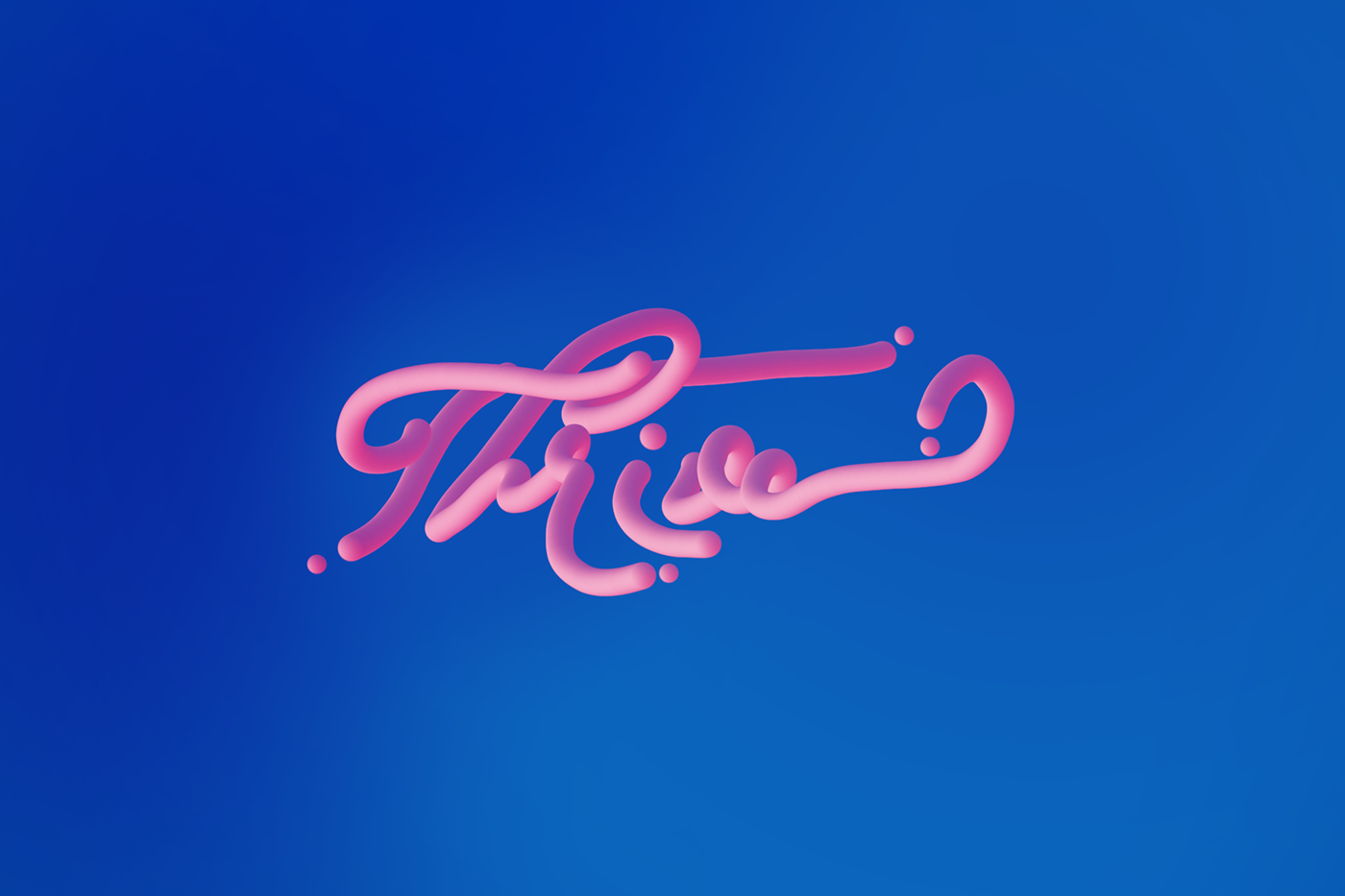
Thrive - typography with mixer brush. Font - Trendencia. Color scheme from adobe color.
Any thoughts?
photo from none league day in England
photo from none league day in England
photo from none league day in England any comments welcome on the photos
back before i sucked at photoshop
Hello guys this is my creation.. any feedback to improve it? thanks😀
@noble anchori think the trees next to the man are a little bit brighter than the other trees and make them a little bit cyan like the background
@noble anchorother than that it is a good photoshop
any comments?I lowered the saturation a bit
I just finished uploading the challenges of last week... If someone want to check it out (and if there its something that i can change i accept it too) 🙂
https://www.behance.net/gallery/86428107/Daily-Creative-Challenge-(PS)-Oct-1-to-Oct-11

Feedback
@distant nimbus The image is pretty, but it lacks contrast in my opinion. You should add some highlights, and brighten up the flower so it stands out. 😀
Thank u! And thank u for your feedback. I will use it to improve the photo.
@distant nimbus have you added the blur in post?
@gilded harness I think all of your submissions have at least one unique aspect to them! Challenge #4 is probably my favorite one! The composition is very believable but also totally out of this world! I also appreciate the level of work you put into the challenge 🙂 . Your edits are clean and you observe all the important aspects of good design. I only have two things you could look into: The text on the fifth challenge should probably be more visible. I would go for a smaller all-caps white font with increased tracking - movie poster style. (or you could get rid of it entirely)
And the second thing: the shadow and hair on your (?) face look a bit jarring. I think you could go with a less drastic color or with the halftone pattern instead of the pure black shadow
Thanks @azure brook yes I think a lot about the text... The problem is if I make it more visible it will take all the attention... So I wasn't sure what to do with it 😅
And about the other one... I didn't think about it . But I think the black part it's already on it when I change the picture in caption. I should check that!
Thank so much for ur feedback 😁🥰
Gave +1 Creative Carma to evil
something like this maybe @gilded harness
although this makes it less legible now that I see it
🤔
@azure brook I didn’t add the blur I used my 200mm lense to get my blur..
hello there, feel free critic or feedback this poster thanks 🙂 😬 #📝project-feedback
@bitter fog I love this poster
Not sure if this is a proper channel to ask for but i'm kinda looking for someone who has a bit of spare time to edit my picture i want some things gone from the background
Who could help me? D:
@native river we can help you if you're stuck somewhere during the process but I hope you'll understand that most people wouldn't work for free 🙂
@bitter fog Well done! This almost looks like the prompt for todays challenge 😄 I would change the shadow of the flowers here. try using the Color Burn or Linear Burn effect. they will usually result in a more realistic shadow
you could also use a curves adjustment layer and mask in a shadow
image of the painter Sassoferrato a portrait turned into a stained glass window.
Original
@azure brook alright, thank so much for advice , yeah i'll fix it
Gave +1 Creative Carma to evil
@distant nimbus thank you 🙂
can i have suggestions please.
second one
@azure brook Thanks for explaining, I just want a good insta picture with a small edit its not that hard for someone good :x
Gave +1 Creative Carma to evil
hello - here are some fresco 3d sketches ... it's work in progress but would love some feedback, regarding colours, etc ...! thanks in advance
@tidal bolt These are awesome, keep it up 😲😍
thanks so much @spring current - i've seen your sketches and they are great!
Gave +1 Creative Carma to filipagomes
@tidal bolt Awh thanks 🤗;)
Gave +1 Creative Carma to Tan_2019
@spring current are you working in fresco yet?
@tidal bolt nope, i'm working on photoshop 🙂
@tidal bolt There are Awesome☺☺
@dense locust hi julia, if you do read this (it's not a busy channel) - i've posted some 3d sketches further up. what i meant in the live stream was that with 3d product drawings you need to be a bit 'arty' but also quite precise. i can do this on paper, but doing it in fresco can be quite challenging ... needs practise. any feedback welcome, thanks! 😃
Gave +1 Creative Carma to Julia Masalska
Playing with blending things into photos
@hard helm thank you so much - very encouraging!
Gave +1 Creative Carma to Pixels DesignVilla
@tidal bolt good job, it feels like it's with real airbrush.
@copper hare aaahw, thanks for your support - that means a lot! it's a great program for drawing and painting!
Gave +1 Creative Carma to Ghosty!
@tidal bolt and what program is it?
@tidal bolt I Love your approach! It’s nice to see product designs made in Fresco! I would play a little with the background colors. And maybe you can also add a hand of somebody holding it.
@tidal bolt kinda like here:
@copper hare it’s adobe fresco, for drawing on an ipad! but you can get the same airbrushing effect by masking & painting in photoshop!
@limpid bronze thank you for your comments, julia - yes you are right, usually those concepts drawings are a bit plain on white ... i’ll play with the background! and there will be more pages to explain the concept, with hands! 😃
Gave +1 Creative Carma to JuliaMasalska
Thoughts please?
What do you think? Any improvements I can do?
My son trying out his Halloween Costume. The costume and mask are genuine but i placed the background in and tried to adjust lighting and color on my son with PS to blend him in with the background. I'm not happy with it, as i think my son still sticks out, not really belonging with background. Suggestions?
i made this i am new here pls coment on my design

Behance
This is modern cover of a book , my aim was to bring a taste look in the book cover.
My other son trying on his Halloween costume. D7100 with Tamaron 70-200 G2 @ 70mm. Exp 1/60 f/3.2. With flash. Obviously photoshopped except the costume and the moon is actually taken by me during a lunur Eclipse. The rest, tree and grave background are stock pictures. Suggestions?
originals
well I just have wifi again, so i tried this cuz i was boring without it and how halloween is close i decided to do this! 🙂
I am new to photoshop and Compositing. Any Feedback for this composition? Please give your professional advice to improve myself.
I am new to photoshop and Compositing. Any Feedback for this composition? Please give your professional advice to improve myself.
hello hello, just wanted to share the final behance project of my 3d sketches ... would be great if you could have a look! https://www.behance.net/gallery/87159553/3D-Product-Design-Sketches-in-Adobe-FRESCO @spring current @limpid bronze

@toxic dome I think you're almost there with the first one. Just tweak the colors and lighting a bit (especially the green of the leaves) and you're done 🙂
@toxic dome good job on the displacement map here!
I think you should reduce the planets in the sky a bit. try to go for only one or two
@toxic dome this one here just needs a crop to center the ring 🙂
it looks like you have used screen as a blending mode. try the other blend modes of the same category. Color Dodge and Linear Dodge often result in vibrant colors 🙂
@azure brook thank you for the suggestions. I will make those changes for sure. It's good to learn from new things. I will keep improving my skill.
Gave +1 Creative Carma to evil
same layer, different blending mode:
Can you tell me how to keep the image quality high when Compositing?
@toxic dome if you're just talking about the raw quality, never save as jpg until the final export. always try to work with smart objects and use layer masks instead of erasing pixels using the eraser tool
also, use adjustment layers instead of the Image -> Adjustments menu
one more thing about the shot with the deer, you could warp the perspectives of the tracks slightly, so they match up with the center of the image
the original (left) is slightly off
@azure brook thank you
Gave +1 Creative Carma to evil

Instagram
3 Likes, 0 Comments - Mahmoud Sameh (@illogical_blur) on Instagram: “How lovely is the moon tonight? - - Original photo taken by @nevenkrcmarek - - #photoshop…”
The Context Within (series)
Comment & Review ..
cool effect @hard helm
thank You.. @tidal bolt
Gave +1 Creative Carma to Tan_2019


Behance
Feedback? On the first two images,i did some typography design. A little not much. Third one I did masking on brush strokes.
@toxic dome I like the blue middle one a lot. The Banana is a bit hard to read (I know that's the point but...) Maybe drop the opacity on the letters so they can be seen within eachother as grey points?
@timber oar No problem! I did the same thing to my last painting when it just didn't feel right (warming up the background) and I felt like it really helped.
Guys can u give me some feeds for my portfolio..

Behance
@toxic dome hey man.. ı like to tell something about you creator banana :)
Maybe types can have more space. Cause u have more space on your area and its look empty. İf there is message about “be empty” its okey but with this design Im not sure. And inside of banana mayve u can choose only one typ of geometrical shape and do everything with same shape. Also this banana and style dont need shade under.. 🙂
@toxic dome I really like it! Really cool idea. I think it would be cool if you added shadows of the pieces of skin that are lifted on top of the flowers. Also under the right (her left) eye its a pretty harsh cut. maybe soften that out a bit 🙂
I do like Fuchsia, Kathleen.
On this Café in some sky vessel called Resurrection, stories are told - between the living and dead. {editor}
hey guys any one have beer set mockup?
Feedback?
What should I do! I feel stuck, 4 different type of beer they have.. And I want the show everything is soo clear 🙂
Feedback? From photo to Oil Painting-ish!
guys I need some advise and feedback 🙂 shot me go on🤔
@azure brook 🙂 shot me man.. I need your hard advise.. 🙂
https://www.behance.net/gallery/87317821/LilaMisa-brewery-craft-beer-beer-branding
I finished 🙂 go on check guys


Instagram
24 Likes, 0 Comments - Sarfraz Alam (@sarf_alam) on Instagram: “I like this style :P . . . . . . . . . . . . . . . . .…”
Feedback?
@limber relic Looks very real... great job 👌
I Made this a while ago using a mix of Photoshop, Illustrator, Audition and After Effects. I didn't have my USB mixer at the time and recorded the audio using my voice recorder on my phone. Im gearing up for my next animation, but they take so long with life and everything. Is it too corny? https://youtu.be/YKJa7S1Wgg8

@simple halo that's amazing!!!
@kind island thank you
Gave +1 Creative Carma to Dani Jane
Hiya everyone i'm new in this discord (really awesome you guys have one its soo cool!) and i was wondering, is there any way to improve something like this? im really proud of this dreamscape yet i think it could be better.
@thick relic Great work! The sky seems a bit too busy though - I would probably reduce the stars a bit, you could also pick a slightly calmer sky for the background. 🙂 Perhaps you can also tweak the colors of the ground plane: darken the tones and remove some of the green and red channel
a bit like this
Done in Photoshop
detailed artwork https://www.behance.net/gallery/87358601/Zombie-Hand
Old porcelain posters - Armed base with Adobe illustrator and retouched effect
in Adobe Photoshop...... https://www.behance.net/gallery/87511185/Old-porcelain-posters

Displate
See amazing artworks of Displate artists printed on metal. Easy mounting, no power tools needed.
Hand-crafted metal posters designed by talented artists. Easy magnet mounting. We plant 1 tree for each purchased Displate.
If sound, textures, colors, atoms, our stars - cannot dance? Then, neither can we, this forest missed - curiosity disposed. {editor} #CaféConversations
@olive relic Love this!
Draw in Photoshop 🍦💀
https://www.instagram.com/p/B4VomNDnPFq/
Finally got around to really giving the Oil Paint feature in Adobe Fresco a shot by doing a Sargent study. Really enjoyed it after getting used to it. Feels a lot like real oils, very impressed.
Just wanted some advice please. Do you guys think that the text is legible enough? Particularly the 'Lifestyle Choice' part at the bottom of the poster.
Really good painting @vivid dragon. Very excited about giving Fresco.
hey i was thinking what do you guys think of these? this was a task we had to make at school, it was about faking a vacation.
Just posted a timelapse of that previous John Singer Sargent study I did in Adobe Fresco with the oil paint live brushes. In case anyone wanted to see the process. https://www.instagram.com/p/B4dHO4-DnbI/

Instagram
9 Likes, 0 Comments - Sam Peterson | Fantasy Artist (@sampetersonart) on Instagram: “This is a study I did in Adobe Fresco of John Singer Sargent using the oil paint live brushes. I’ve…”
Feedback please....
What's up @everyone . I am Fabian and I am a 16 year old Photoshop Artist! If you wanna watch my stuff you can checkout my youtube: Fabi Productions and my Instagram: fabidoesphotoshop. Thank you 
@brave scarab thanks
Gave +1 Creative Carma to PSP
just starting
@brave scarab wow... Your's look good too... May be you can change the highlight colors of the plam to match the glowing lightning strikes
i did but idk how to make purple lighting by lightroom
only white lightroom annoyed me xD
If you are doing this in lightroom then use the local adjustment brush with some split toning, though I am not sure if split toning works with local adjustment brushes, but you can also play with temperature and tint to get a purplish effect, but don't overdo it, make it subtle
Gave +1 Creative Carma to sauvik
I am glad that I could help you
hey guys i've created a fun art work, and was think what do you all think of this?
@thick relic I like how you merge the vinyl with the stone (plus adding stone texture on the vinyl), that works well 🙂
I also made something, i'm not sure if it works, maybe i added too much effect 🤔
So I am working on this event..and can't find a good mockup for medal 🏅. Can anyone help?
Before & After images after using content aware fill tool in Photoshop.
I did this collage type of thing after watching @iamkladi DCC photoshop.
@toxic dome that's cool riyaz. Keep it up.
{Doc Da} This could happen to you. {Jersey} Forget about it. {Draco} To hide one's light is our crime. {bouncer} There are those who comprehend. {pirate} The end.
#stonePhoto #CaféConversations
I would give the path a darken or a doge and burn @thick relic
Context Within {series}

Hello, how are you? My name is Willian, could you view my projects and give me feedback? I appreciate it!
hello hello - so sorry i missed the last couple of challenges @azure brook @vivid dragon - hope all is well! just to show a quick project i did for fun using fresco illustrations on 3d models rendered in dimension! thanks for looking 😃 https://www.behance.net/gallery/88093903/Wooden-Creatures-in-Fresco-Dimension

Behance
Fresco illustrations on 3D shapes, rendered with Adobe Dimension.
Gave +1 Creative Carma to SamPetersonArt
hello @sleek tiger haven't seen you for ages! hope all is good with you! thanks for project appreciations ... 😃
Gave +1 Creative Carma to Valdair Leonardo
Hello @tidal bolt, the end of the year is consuming me lol, luckly Friday is a holiday here. Your works are incredible, thanks for sharing with us 💙
Gave +1 Creative Carma to Tan_2019
@sleek tiger thanks, you are too kind! aahw same here - from now 'til christmas it's just one stressful blur ... hope it goes well for you and have a great long weekend! 😄
Gave +1 Creative Carma to Valdair Leonardo
Have a great week and weekend too @tidal bolt 😃
what do guys think?
The framing is perfect, along with the different colors! If you wanted to change the color scheme of the ferris wheel and purple to match a yellow-red like the sun the subject is holding, and make the subject a little bit darker to blend in. Very cool concept though!
hello! just to share another behance project about autumn photos if you’re interested ... thanks for looking! https://www.behance.net/gallery/88147697/Autumn-Colours

@tidal bolt those photos look great and the patterns are beautiful 🙂 - you could spruce up the project by also focusing on the presentation. For example you could present the Adobe Capture colors in a more pleasing way
I'm sure you can come up with a much better version than mine ^^
@ionic silo Alright, that's an epic composition right there! I think you have created a great atmosphere and I think you can improve it even more by calming down the colors of the corn field and possibly even crop it since the main focus of the image is the sky with the planets.
Also make sure to check for any coloring artifacts like this
I like the beam of light here, but notice how the center is white. It looks white because the camera was overexposed. If you reduce the opacity though, you introduce detail, where there shouldn't be any and you will end up with a rather gray and dull color. Instead, try the color dodge or linear dodge mode. then you can reduce the fill slider instead of the opacity.
And last but not least, I think you have picked fantastic images for the planets but if you ask me, there are too many objects in the sky (plus the busy stars). I would reduce it down to one or two bigger planets.
oh, and I know this isn't really important, but the planets are solid objects so you shouldn't see the stars behind them 😉
Having said all that, I'm still impressed with your work. The perspective is right, the lighting is good and the source images are beautiful 🙂
@wispy raft Yes, the framing is lovely and the glow effect looks great 😄 - I would just make sure to adjust the lighting. The subject is very well-lit, even though the background is super dark. I would perhaps tone down the saturation of the face and also the brightness. And for an extra touch, you can draw in some pinks, blues and greens to simulate the lights in the background
okay the face in my version is a bit too desaturated. you could find a good compromise
@raw sky thank you, I know what you mean
Gave +1 Creative Carma to adiffor
@azure brook your does look better 🤔
So this is what I meant by color-grading the picture- so the sun matches everything else in the picture; only a suggestion!
@azure brook thanks so much tim - totally right, i might revisit this at some point, it was a bit of an after-thought! those capture colour pics were just screenshots of the new desktop version ... ha ha! 😃
Gave +1 Creative Carma to evil
My work

Hello @strange summit you can post on the Xd server to get feedback 😉 , you can enter using this link https://discord.gg/bE6xQ3
@azure brook hiya tim - how about this?
@thick relic II love how you merged the images together. What sparked this idea? Looks like theres a VINYL in there as well! So nice
i wanted to create some art, combine the things we as human create which are straight and symmetrical and combine them with natures unsymmetrical looks, it came out really cool!
@winged osprey i used the alpha masking technique, and custom brushes that look like splashes, sorry for late reply 😅
@tidal bolt beautiful 😄
Been working on this composite of my sons art project and a fire. But i just can't seem to get the light right. It just doesn't look right to me in general.
Any suggestions?
@scarlet spade I think you could just darken the environment a bit and add a glow layer using the blending mode color dodge
this is the glow layer
and this is how it could be used
not perfect because I don't have the psd with the layers
if possible, try to look at a reference file
A reference file?
basically google campfire
because then you notice how dark the logs actually are
unlike in my example
so technically it should be more like this
The fire is an adobe stock image and i tried to adjust brightness, saturation and color to match the background without much success.
I also used the color dodge blend mode too, but obviously need to work on it more
again, I would recommend looking at real images
unless it is pretty dark, you don't actually see the glow around the fire
That's a good point. I'm adding fire glow when there shouldn't be any
or you could make the scene darker if you really like the glow
What about the wooden house? would you say it blends in or stands out? My problem is, because i know it's a composite, my brain can't see it as anything else.
thanks so much for your advice @azure brook & have a lovely weekend!
Gave +1 Creative Carma to evil

@brave scarab great work! Thank you for sharing the file 😄
Gave +1 Creative Carma to PSP
Correct font : BlackOpsOne just 1 click and edit text
war font
Art font Neon
i'll stop now not want spam next time
png
for video edit animation etc..
Awesome @brave scarab !
Thanks ❤️
@lone quiver looks awesome! I would go with a slightly more orange lens flare though since the sun is setting 🙂
yeah you're right @azure brook, by the way i'm not using a lens flare, but a technic i've seen in this video
https://www.youtube.com/watch?v=VZ1YAWDXWFI
if you're intersted ^^

Discover the Techniques to Create a Fake Sun with Photoshop! Simulate a realistic Sun by using Gradients and Blend Modes. Besides, we will learn to create a ...
but what he is doing is much better than what i ve done
Hey guys hope you're well 🙂 Finished my latest behance porject. what do you think?
https://www.behance.net/gallery/88271149/Poster-Collection-2
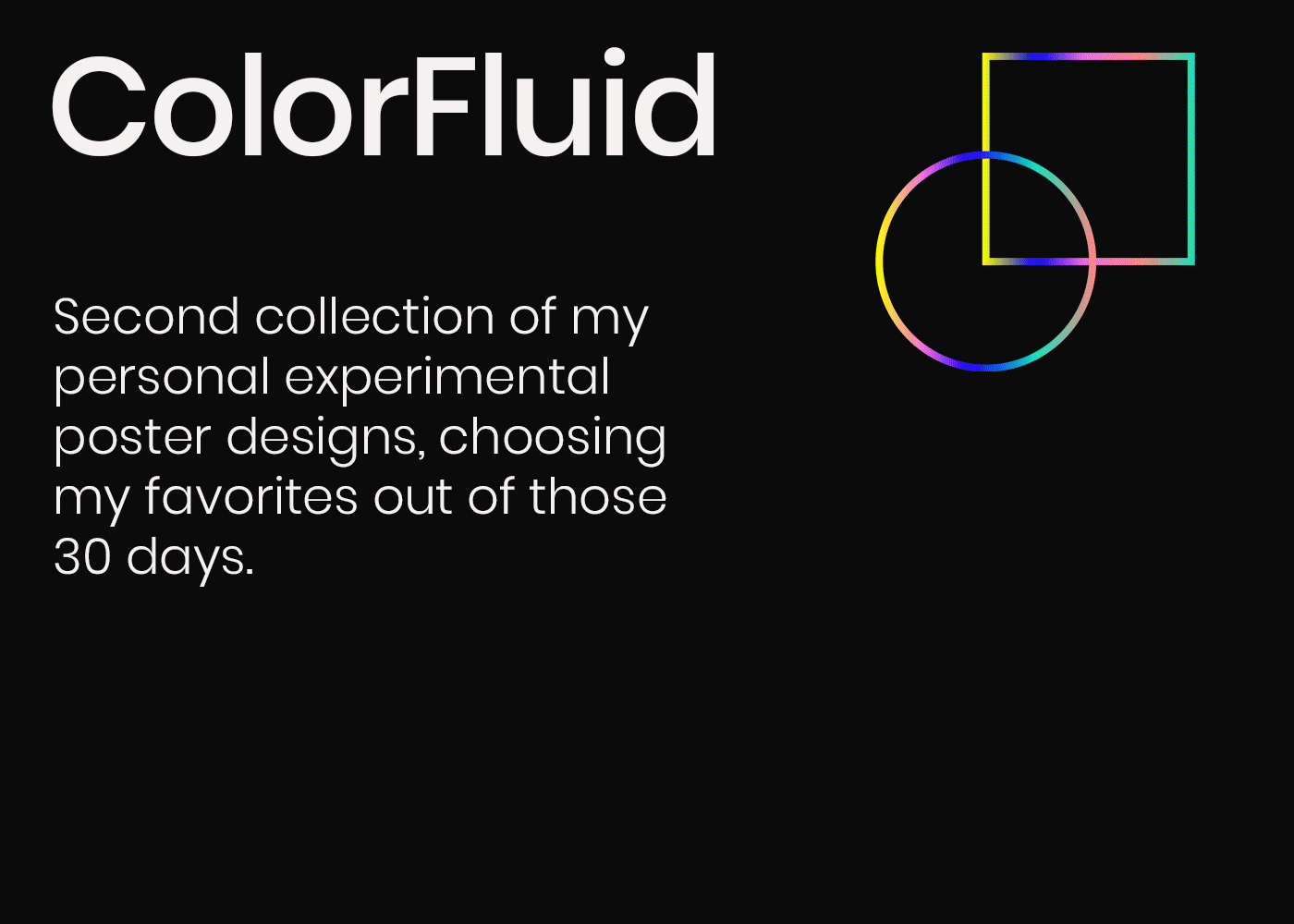
Behance
After Part 1 was done, I worked on experimenting for another 30 days and these were some of my favorite results, out of the 30 designs that I created.
Hi everyone. Hope you all doing great work with your creativity. Please take your little time to check and appreciate my work. 😦 i will be happy. and will love to follow you all in Behance. Thank you for the love. Love you too.
https://www.behance.net/gallery/87469051/BannersPostersFlyersCovers-etc

Behance
This Board/Project includes all of the Banners/Poster/Cover I Created. This is Folder sums up my all of it.
@lone quiver
nice job
They are so awewesome @brave scarab !!!
@torpid comet thx
Gave +1 Creative Carma to Truckerboaz
can edit for fake lighting ( COLOR easy change )
you want great background but maybe change color
Thanks 🙂
@torpid comet i can send this by psd you free to edit
That would be awesome! Will try to make something great for someone I know
Thanks you
Oh.. I already saw you sended it.. But couldn't edit the text. What do you think I could do about it?
you can take effect or background
copy / paste
also you can select neon layer and enter double click you can see how i did the effect
Hey @brave scarab you know what would be cool? Since you share so many assets (are you creating them yourself?) What if you could share them all in one place - you could post them to your Behance portfolio with links to the files
this would make browsing the work much easier 🙂
@brave scarab If you're however just posting the work by others (stock websites like pngtree) and removing the watermark, that would be not the best idea
I`m pngtree team 🙂
so you are allowed to remove the watermark using the content aware tools instead of sharing the orignal files without the pngtree watermark, right?
well someone has removed the watermark in that image. I can see the traces of the edit. This channel is more for your personal work so everyone can provide feedback 🙂
I see - still, if you like to share the files, I would suggest using one central place and linking to it 🙂 . You can't really browse through the work here with all the other messages in between. I would suggest Behance or Adobe Portfolio 🙂