#📝project-feedback
1 messages · Page 36 of 1

weren't
true that might help
make the top left text bigger
yeah
??

pen tool and the little bézier curves are my worst enemy
i'm good with the pen tool
looks better . but the text on the bottom is pretty small and hard to read. the hard to read part might be because of discord compression
Here's a demo I made

It's the smudge tool lol

what i’ve been trying to focus on when i design is not rely on words to always translate your message.
maybe play with the size and placement of “boats weren’t made for land” and find your purpose as i am assuming the “find your purpose” is the message you’re trying to send with this.
i like the “not everything belongs everywhere” text too
yeah ok thanks
Gave +1 Creative Carma to @unique lance (current: #1041 - 1)
or one more opinion then im done
ur photo already has the boat on land, so maybe completely omit the “boats don’t belong on water” since your photo is already saying that and replace it with “not everything belongs everywhere.” followed by “find ur purpose.”
also how are your guys demoing so fasttt
Another stupid thing I made

how>>
I know my way around the tools
put outer glow effect, and then smudge it
then gradient map
yeah
lol fair im going to get serious about photoshop i think
Good! I can help out!
just one click, lol
I just took the text and stretched it
yay!! do you mind if i add you as a friend and we can talk design stuff? i think having someone i feel comfortable to share my stuff with will help me use it more
actually nevermind i see you already requested let me accept lol
I did
sure
how do you use smudge tool??
Should look like this
Turn the intensity down
i put it to 1% and i just makes it smoky
i think i made it better but have some blank space now

and does anyone know where i can find good high quality overlays
Adobe has some
It was better the other way
Maybe make the boat a little bigger


In which color space are you working ? Which mode? 8, 16 or 32bit?...what the exported file format... Difficult to answer with so few info...
Trying something new with a collage style

Love the overall style and vibe...Tape cassette and Vinyl scales look a bit off (unless you intended to use them as background patterns)
I'd try placing the cassette above the Polaroids and enlarging both it and the record to show them at their actual size.
The object doesn't have to be fully visible, but the scale is important.
Got it 👍, any type of help, tips and advice would help me alot because i love the collage style and i would like to improve at it. I can do the changes tomorrow.
I will also do alot more collage to other topics and not only the game that im doing the most art in, so i can see what is going to help me on my journey
Honestly, I think it looks nice.
I think I'd probably switch the fonts a bit. - Even if it's just to change that last line
Because the beackground and foreground are the same colour, I'm not sure what I should be focusing my attention on?
how about my design ?


You're doing a great job! - I know plenty of people who can ONLY speak english and they would never have spotted that.
My trick, if I'm having a dumb moment is to pretend I don't know the english word for something, even though I can only speak one language.
"Oh and also.... [forgets what I'm about to say]..... "Ah I don't remember the english term for this"
🤣
made logo design for food delivery
thank u
Gave +1 Creative Carma to @slate ermine (current: #245 - 7)
npp
I see
Thank you for your feedback
Gave +1 Creative Carma to @glacial grove (current: #55 - 39)
You’re welcome!
Solid work both of you ❤️
🔥
Okay .. so these are all of my headers from before 2019

I took like a 3 year break
then came back quietly ... to make art in the dark
AI Adapted from photoshop artworks I made in the last 5 years


Then, these are also recents, which ones are AI and which ones are done by hand .. ? At a certain point it begins to blur ... but .. I think that's the statement
agreed, changing it now 🙂
how do you want feedback on ai works?
If you take the time to look, or even ask a question, you would know that my work is often 500-800 photoshop layers . Care to share your port ?
Didn't think so
I've been doing this for ~14 years, aint no way some skidmark is going to come in here and insult me, put your money where your mouth is, where's your work ?
Pasificm is not a virtue, make no peace with evil, destroy it.


To be fair he did say the ai is adapted from his original work so he didn’t create slop he put his work as a ref and the AI just took the original work and changed it
so then he should ask for feedback on the original work..?
i’m just not really sure what he expects
If the work looks good or no generally not necessarily the AI part
that’s not feedback. i believe jack corrected me on this. i believe i got warned for telling someone their stuff looked really bad.
I think saying really bad isn’t THAT bad but some ppl just started so it’s better to tell them what to fix in their work
thats what im saying. its not really their work. i have no idea where it stopped being theirs and where it started being ai's. feedback on "ai" work is thus worthless. plus - they can't even action the feedback. they either have to first recreate the ai changes in photoshop or carry on prompting the chatbot.
Perhaps if you don't have any constructive criticism to provide, maybe just do something else.
that is indeed what i did 🙂
I’d like some feedback on this
No. Like... go do something else. Instead of antagonizing the situation by continuing with statements that obviously are not going to land.
im not really antagonising anything. i think you just do not like any conversations at all that are not submitting to kissing the poster's ass. which is a shame because that does make it hard to improve - when people are restricted from telling you your work is in fact not very good
And while we're at it... "footjobenjoyer" ? - Change your display name or you can leave the server.
So now you want to antagonize me as well? Not a great strategy.
Keep running your mouth.
I saw your comment and I think we're done here.
I love the gradient mapping you used here, both colors speak well for themselves. the one thing i did notice, which is not a huge deal, but will help with consistency is on the red one you have a textured background, but I noticed on the blue one its is just a gradient, I think if you added that texture on the blue it will add a little more depth that the blue one sort feels like it's missing. Otherwise this is a very cool set! I love the owls and I love the edgier aesthetic it takes on. it feels way more grungy, and gives the owl an allusive feel!
thank you ill work on the textures later! and im glad you like the conept behind it
Gave +1 Creative Carma to @warped pond (current: #1041 - 1)
ofc! make sure you send the final version I wanna see it when it is completed!!!
A concept cover and fan art for All Tomorrow

I turned Qu's and New machine's artworks to line art and made a mash


That's a good start.
could you add a soft inner glow to the bugs?
otherwise nice job
Bugs?
I just edited this.


the artworks
Okk
@wooden oak I made a project that doesnt incolve any political messages but its heavily inspired bu early soviet propaganda posters. Can i post it?
As long as its SFW and follows the guidelines of the server, i.e. no excessive profanity, nudity, drug use, violence, etc
There it goes

it's pretty good
Idk if any1 here has seen the show but I made this poster for Call of the night lmk what u think

That one was peak
I've heard of it.
That's pretty decent
Maybe make the background darker?
A glow around the text?
Nice job tho
Thanks appreciate it ❤️
To make the characters stand out more I’m guessing?
I love you pfp btw DOOM is a great rapper
Yeah
I really like it! Make sure to watch out for the margins tho, you are getting pretty close to the edges there with the text, also maybe make the girls face a little smaller? her chin is sitting off the page creating a odd composition, and it's a little disproportionate to the guys face. sorry i havent watched this one yet so idk the names, but I really like the style! Cool way to set the vibe with the split colors!
Ah i see yeah so just generally more central and work on the perspective
Great start! Try making the text the same hue of red as the image, and make sure to watch your margins, the text is too close to the edge especially on the top right side. For readability you want to make sure that you have enough space for all of your text to breathe.  You could also try playing around with expanding the red to the top and making some of the text black to create more of that strong contrast that those old propaganda posters used to have. Definitely something to play around with, but try it out and see how you feel about that! Also I know it's kinda hard to deal with but the image is really low resolution. I think you could rebuild that image as a vector really easily with image trace or the pen tool in Illustrator!
Yea I think that is the right direction, you clearly have a good eye for design, sometimes those nit picky details can slip past ya ahah happens to me all the time lol
i feel like somethings missing but idk

Yeah ig even the professionals miss stuff like that lol
How's it now?

That's 3 times upscaled btw 💀
More brightness/contrast on the rose
Maybe a glow/gradient fill on the text
all the text?
oh yea for sure, good design is invisible, bad design screams for attention! but its harder then it looks, I guarantee if you look around at all of the different pieces of graphic design you see in the world on a daily basis, you'll realize there is a lot more bad design then most realize ahahaha ive been cursed since one of my professors pointed that out to me lol
the biggest focus is on the 3 pictures in the middle, ive also added some text, same font though. and the other assets are for aesthetic vibes etc

Is the dog meant to be blurry?
Try making 'leash' the same width as the words above:

yes, that its much more readable then it was before! One thing I am curious about is how you could work with the empty space around the text up top to create a pathway for your eyes to lead down your design. Maybe you could play around with layering the text with " Put Him" on a line above "On A"?
mmmmm now that I think of it, that might feel unbalanced. (worth a try to see how you feel about it tho)
You could use that space to create Repetition, and have "Put Him On A" stacked on top of itself 2-3 times. if you go that route play with the sizing.
Also, try filling more of the space on the bottom with "Leash" and see how that feels, you could make it larger to fill a little more of the black space on the sides + top and bottom, but remember to keep your margins in, alignment is key for a strong composition.
Inevitably whichever direction you go, there are lots of cool options to play around with! have fun with it!
Hi James!
Hello 👋
Where you place that 'curve' determines how much goes red vs black... - too far on one side and the black overtakes the image! - Like a child who over enthusiastically 'coloured over the lines'.... - too far the other, and the dog turns smaller and skeletal!

Damn @novel comet , breaking out the videos too! That's awesome!!!
@rain sluice try those out fs
Ima go draw a bunch of sea animals for my final lmaooooo
What's the goal? - I mean I really dislike almost everything. (Sorry! - please read on though!) - The font is hard to read, I don't know what which is the most important heading. The bevelled text looks out of place. - The combination of black and white, plus colour is offputting, the text is the same colour as the background, and the paragraph column spacing is pretty wild too...
But I suspect that I'm not your 'target audience' for this particular piece of art.

This looks good
i added some textures to this one

I don’t really have a clear goal with it I’m trying to make an old looking modern poster the only thing I want to keep is the text in the middle

I like it I just think you should add a bit of motion blur to the text
here's the og

ok
both sides?
Yes just slightly to blend it in
<@&548221840750018590> spam
A very new kind of spam
I got used to them telling us Mr beast is giving out money I actually thought this one was real😭😭

Looks great I like how the text looks like it’s blending with the background more than before

an alt version

I like this version better
Thank you
Yessssss that last one is my favorite
Hey guys
This looks cool
Thank you
Great alternative! Love the circle halftone effect... You might try to move the center of the circle pattern to a daker place
(in between the wrists or forearms)... I find its placement too obvious and distracting. Other than that, it's a great job!
Thank you
Gave +1 Creative Carma to @bleak echo (current: #6 - 1179)
The blue/green gradient map did a lot of heavy lifting 😅
You are Right!...It really is a very powerful and incredibly useful tool!💪
It is!
Very useful for coloring


long story short it's a homework assignment that i got a little distracted with lmaooo 


Really cool design.
Are the pink elements supposed to be hit by light or glowing? If so, perhaps a little glow around them in places where they are illuminating the blue parts.
The work is so cool 👏👏
It is indeed dramatic. The right one
Thank you
Gave +1 Creative Carma to @warm crater (current: #199 - 9)
any suggestions?


It looks good
I think originally I was going for lighting effects but making it look like it’s glowing could be really cool! I might try that!
Did you draw this from scratch?
For the most part, I drew it in fire alpaca, and then moved it into illustrator and photoshop for lighting, color, and texture


Used lightroom and photoshop for these, would love to hear some thoughts on it and would appreciate any constructive feedback on how can i improve 🙏


A project i did called
“Between Bloom and Blood”
And here is a little description
Between bloom and blood, destiny doesn’t hesitate.
It grows in silence, then speaks in red.
A field can look peaceful—
until you remember what it has witnessed.
This is not just fate.
This is the cost of it.
کپشن (فارسی):
میان شکوفه و خون، سرنوشت تردید نمیکند.
در سکوت رشد میکند، اما به رنگ سرخ سخن میگوید.
یک دشت میتواند آرام به نظر برسد—
تا وقتی به یاد بیاوری چه چیزهایی دیده است.
این فقط سرنوشت نیست،
بهای آن است.


Let me know your thoughts
And questions 🙏
Cool. Looking forward to seeing it.
Very professional. Any chance you would be willing to share the originals? I understand if you'd prefer not to.
yo mandem. Any suggestions? and rate out of 10

5/10
It’s a good start
I like the torn paper effect you did
But I have a lot of criticism
Maybe crop them both more so you can see the player more
And put the crying logo up
please feel free to say
I was also half confusde making it
Just did
too long....
Figures 😂
lmaoooooo
Who is the guy on the right? IShowSpeed? Is it really necessary for it to be so big and take up so much space?
Messi is in the middle but very tiny, Ronaldo image is cut on all sides...
I'd try to highlight the two players more (maybe we should choose different images)...
The torn-paper effect is a good idea, but I'm not sure it's easy to apply effectively to these images in a vertical format... Any reason for this format? Instagram post/story?
With faces it’s generally good practice to crop so that there is space in front of the face. For the person on the right you've cropped their nose but included "unnecessary" features such as the side of the head.
When cropping this image I would not crop like image 2 but perhaps crop like image 3


I like your design. I'm not saying my alteration is an improvement. I thought it could be interesting to add some variety to the lighting.

That does actually look a lot better
WIP but its supposed to be ralph lauren, with the different styles i need ideas to bring this all together

You can try the Harmonize feature for every single element.
Maybe put a grain and make it brown or something
Great job
This is what it looks like harmonized and with a brownish grain (added text and might add a paper cut affect)

Hmm.
It’s a good start.
Can you give me the full image? I’d like to help out!
hows this yall

Fxntain should be larger
Otherwise I like it
It’s really good!


I am working through the designs for a new artisanal page I am designing focused on invoking more understanding and empathy in the viewers every day life through pieces of literature, poems, scenes from movies & music, that show the brightest colours humanity offers. If you see any errors in these or ways to improve please let me know


Thank you
Gave +1 Creative Carma to @mossy heath (current: #1041 - 1)
Nah just made it as a joke 🤣
Yes that makes sense. That will look better. Thanks man
Gave +1 Creative Carma to @abstract oxide (current: #14 - 292)
I did try to make something decent but I didn't have a clear vision/path so it ended up like this
Like Messi or you mean ronaldo? And I did try to put the title up but it looked kinda weird. Maybe the colors dindt matc
The one in the middle
Cheers mate
Thoughts on this?? Purely new to photoshop and this is the 2nd thumbnail I've ever made. any changes or additions??!

Blur the background a little
Great job btw
OHH! Thats exactly what i needed to seperate the face from the BG!!
Thank you SM
Gave +1 Creative Carma to @glacial grove (current: #48 - 45)
:)
The red used for "Marathon" blends into the background and doesn't stand out enough...IMO
I've added a bit of blur to the entire background. Anything else that you might suggest?


Hey yall what do you think

Great Job on the definition and lighting overall thats a 10/10 and one of the most important features. As far as the background, make it more Michael possibly pop it out with flare. Go look through his art style, theres so much gold and dramatic black and clean edges
Thanks dude I appreciate it and for sure I will do 👌🏻
Gave +1 Creative Carma to @oak bloom (current: #1041 - 1)


Thank you
Gave +1 Creative Carma to @slate ermine (current: #199 - 9)

Sweet!
Any feedback?
The background is very 'busy' and the characters are getting lost in it. If the characters are the point of the design, they don't really stand out at all. Also, it screams AI generated. It looks like a GPT Image 2 generation. Then you put the YouTube logo and text on it.
OK. Well, the wallpaper looks like a GPT 2 image. It has that "look" to it.
And as I said, the characters are getting lost in all of that background detail.
Also, if the point of it is promoting this person, their name is tiny in the middle compared to the rest of it.
And its just plain white text. I would perhaps spend a bit more time on that.
no no I didn't mean that I can delete it
I love the colour contrast between the vibrant red strawberry and the green background.
The subtle shadow beneath the strawberry adds a nice sense of depth, preventing the design from looking too flat.
I love the font choice, and the overlapping leaves add a nice touch.
To match the subtle texture of the background, I would try giving the text a "stamped" or subtle distressed look.
Overall, it’s a very clean, professional-looking piece. 💯
I would attempt to brighten the characters and darken the background so they stand out more. Also, make the person's name, larger and more prominent in the image. Again, so that it stands out against the background. I'm not saying this is end solution; these are just suggestions.

This looks decent. I would get rid of this "Authentic M&M's logo inside every bag" because that has no meaning and the company wouldn't include that.
Alrighty
How y'all think of this
I like how the hair looks
Cool

This is a cool design. It has a somewhat interesting layout. However, I think it lacks tension and drama. I would perhaps consider making the dragon attacking the castle. Maybe breathing fire / raining down fire on it.
imma add a spotlight on the castle and maybe ill add the fire for the dragon as u said
Might even be cool as a movie poster. Just an idea I had and wanted to play around with that concept.

Gave +1 Creative Carma to @wooden oak (current: #2 - 3338)
If you've downloaded it already, I'll delete it. You good?
Some of it. I generated the dragon and a new castle (on fire).

It doesn’t look like something they’d use so not really
I believe I finally have finished my graphics for a media company I am starting focused on expressing humanities heart at a G and PG 13 rated level.


Honestly could use more natural placements. I like the style all together though, maybe try shaping up the font a little tighter in clarity of subject too, but all in all it’s pretty original I like how expressive and intentional everything feels
which one is better?


international nurses week graphic i made for the non profit i work for :)) simple work but always fun

How's the poster? I'm making it for my client

This is looking good.
The lighting is obviously very different across the various people. For example, the white balance on the person at the front is particularly warm. I recommend unifying this a little more across all the people.

For me this is a pretty solid design. Nice work.
It does feel a little busy. Both the image and the graphics are quite colourful and competing for attention. Personally I would simplify the colour scheme within the graphics by possibly...
- Have solid lines of colour as opposed to blocks of two or three colours
- Have the icons as a single colour.
- etc...
thank you!! that looks so much better i just had no idea how to fix it
im assuming i would do this with adjustment layers for each photo instead of one adjustment layer to adjust them all at the same time ? workflow has been hard for me to get a grasp of
Gave +1 Creative Carma to @abstract oxide (current: #14 - 293)
hmmm alr ty
Gave +1 Creative Carma to @abstract oxide (current: #14 - 294)
Cheers. You are very welcome.
You could certainly use adjustment layers if you wish.
Personally I like to use the White Balance option or the Temperature and Tint sliders within the Camera Raw Filter.

No worries.
Don't read too much into my comments. I generally prefer simpler designs.
Your design is solid.
thanks so much for your feedback and how much do u suggest I sell it for like I never sold posters for shops tbh
Gave +1 Creative Carma to @abstract oxide (current: #14 - 295)
That's the eternally hard question every designer has had to deal with. I've had clients who would happily pay many hundreds of dollars and others who freak out if I suggested $30. Of course it's extra difficult these days with many expecting AI to produce something free and instantaneously. Sorry but basically I don't have an answer for you.
Alr
Good luck

also you seem very talented would u mind sending me ur link if I wanted any design or smth?
That’s very kind of you to say. Thank you. While I am not taking on new work at the moment, I am happy to provide feedback here on Discord.
Gave +1 Creative Carma to @rose monolith (current: #1041 - 1)
alright it's good
Strong starting point for a premium automotive advertisement
The car is quite dark and blends into the background. Dark cars often pop more against brighter backgrounds or during the "golden hour"...
And it looks so small, even though it should be the star of the show.
@ashen mica : Example of @rose monolith shows you some improvements (Car size and positionning (Rule of third), Background brightness (Contrasting with the Black car), Use of Caps letters and hierarchy for Headline and tag line, Call toaction button not using the past tense (should be Explore Now), Negative space between elements offering Breathing room on the left...
Your design is a great starting point, but it could really stand out with a few tweaks. Good luck
thanks for your kind feedback
Gave +1 Creative Carma to @bleak echo (current: #6 - 1191)
@rose monolith I MADE THIS FROM THE GAME FROM ROBLOX AND TURN IT INTO THE REALISTIC USED BY GOOGLE GEMINI AI.
-_-
@rose monolith BEFORE AND AFTER


I had a bit more 'fun' with this concept:
https://youtube.com/shorts/sQ6lObEJ5Zw?si=KL86Yx4l5tN3h_Og

Dragonfire: the Song of Destruction is a short animated sequence created for experimental purposes.
Design & Keyframes: Photoshop;
Video Generation: Grok Imagine;
Sound Effects: Adobe Firefly;
Post & Assembly: Clipchamp.
#AIVideo #Photoshop #GrokImagine
Ahaha love it
I ended up keeping the old concept cuz I didn’t find a way to add the fire but I’ll use the dragon for another concept I have in mind

~250 layers
Just going to start attaching layer count now .. so people don't misinterpret my AI workflows
This looks nice
Second one
Great job!
thanks 🙂
Gave +1 Creative Carma to @glacial grove (current: #47 - 46)
You’re welcome
The Art itself looks very nice. maybe look that some parts are consistent. e.g. the rose has a sharp bloom, but blurred leaves and stem.
Also you have the Text "Commissions now: open" but for what? THEN there is the little line that says Custom Photoshop art. When people look for Custom Photoshop Art that they want to pay for often they look for a Name that sticks out or the Art itself. maybe try some other Headline.
There is some rectangular "Play" Button on the Top left, some skull-art and then Text. What exxactly is the Log, beause right now the "Play Button" is the dominant piece ... a bit confusing
The Art itself is very nice, but also it looks after a while like its always the same. Always skull, allways in the middle, always lots of color, etc. so yes, its your Art, but when looking for commission people are also looking for more variations what you can do. E.g. if I would like your style, but I want my dog in that style I would not know how THAT would look like. Also would you ONLY do that kind of style or is there also other styles? The Line "Pricing Guidelines" looks a bit lost. The "Buttons" under the Artworks suggest something with Games, not very consistant. Maybe try if your Name with the addition of "Rareghost-Artwork" or so would work.
Hope that helps.
This is my first creation with Photoshop. Yes, I love MMA, LOL.
Anyways. I would appreciate all criticism on how I can improve.

genuinely helpful, thank you @normal spoke
Gave +1 Creative Carma to @normal spoke (current: #20 - 120)
trying something new with the typography because I genuinely didn't like the text before ...

In Essence you made nothing better IMHO 😉

Now you have on top 5 blocks with no main-info and no guidance. Logo, Name of the Company and/or User Name, Slogan. NOTHING MORE.
Also never cover text with anything. Doing so renders it unreadable and worthless. (e.g. green marked area)
All the light-greenish area is empty space —senseless and worthless.
Better: On Top = Who are you (Logo, Name, Slogan), Then = WHAT do you make (Portfolio 3-5 Images, not more), Then Contact = Social Media Handles, Website, QR-Code. Nothing more. Enjoy.
ohhhh, I see what you mean now. This gives me much clearer direction.
Hey everyone, I'm doing a Youtube thumbnail for a vblog that I had previously made during a course in motion design but something seems off, particularly in the vlog's title. Can you take a look and give me some feedback and ideas on how can I improve it?

You've got some good elements. For me the issue is that there is a lot of dead space that could be filled by making the main elements larger. The textures are also very noisy which distract from the small main elements.
Thank you for the feedback @abstract oxide, I made some further editing to it and at least to me it looks much better now 🙂 I thought it would be good to add what's the focus of this video as well, so here is the new version

Gave +1 Creative Carma to @abstract oxide (current: #14 - 296)
Nice update mate. Personally I would make the equipment and title larger but that's your call. Good luck with the project.
I agree, it's always a matter of tweaking with the thought at the back of my mind to not make it too big or too small 🙂 I appreciate your feedback


Hey @stable bay! Long time no see...
Love what you did with text... I think you should expand on the main topics a little more.
I'm not sure the highly artefacted background and powder explosion are suitable for your thumbnail.
If you are using your thumbnail for YouTube, be aware that 'Arms Exercises' is in the wrong position. You should usually avoid placing important information in the bottom right area. This is where the time stamp appears, and the text will certainly be partially covered.
A little gif to show you what I meant...

That's pretty cool! Love the composition... You might try to add a bit of grain to enhance the gritty style and make "Protect" tag looks more like a real painted word...
For now It's looking a bit flat=> try to make the red more like WilliamChurchill at the top and/or play with opacity and/ortexture...
But I'm really nitpicking... That's a solid work!👍
This is very good for a first project!
Imma say make their names bigger
Oh, gotcha. Thanks
Gave +1 Creative Carma to @glacial grove (current: #47 - 47)
Heyyy, I'm excited to share my latest project! I created three mechanical keyboard designs in collaboration with KOWA, one for each type of gamer (casual gaming, ranked, and sports). It was so much fun designing real objects. I'd love to hear your thoughts and find out which one you prefer! Thanks!
https://www.behance.net/gallery/247283379/MelcGraphic-x-KOWA-Keyboard-Illustration

A fusion of MelcGraphic's colorful universe and KOWA Gaming Studio's superb custom keyboards and keycaps.This project explores the integration of a cartoon graphic style into mechanical keyboards and custom keycaps. This cartoon approach allows for the ...
Thanks mate. Happy to help.
Gave +1 Creative Carma to @stable bay (current: #92 - 22)
Little background: In 2006 was I at Clingman Dome in Smoky Mountain National Park USA, I shot 3 photos of a sign Image 2 to 4, my project is to combine this 3 image to one hole sign and in the same time show that the sign is stand at Clingman Dome.
I have try to do that for 20 year and now have I succeeded. I will chare the 3 original image image 2 to 4 and the result image 1 and the psd file with all layers. I used Photoshop 27.6.0 and Gemni 3.1.
I removed the background on the 3 original the merged the 3 image to one, then I prompted Gemni 3,1 to fill in the missing parts of the sign after I had combine the layers after that I prompted Gemni 3.1 to change the background to Clingman Dome.
Now we all know that Gemni or I not can Cherokee so I had to copy the text and color match the background.
As you how had been at Clingman Dome this sign does not stand in the dome it self but on the path up to the dome, but I like how the result that Gemni made and yes the background is Clingman Dome.


Graphic designers try to follow rules, but the best artists, designers, geniuses, creatives of all stripes, they all burn the rule book.
Rules are for beginners, not masters
To an extent
Still need balance even as an expert
disagree, those who make it the furthest are always the risk takers, entrepreneurs, philosophers, artists .. everyone notable eventually realizes that their own way is the only way .
Risk is always important but risk without balance usually leads to chaos
You can risk everything and lose
Or risk everything and win
But non calculated risk leads to a wall
some of us are aiming to hit that wall

Midjourney?
uhh, photoshop .. currently on layer 314
That’s impressive
thank you ! 🙂
I remember a few weeks ago you mentioned something about using your art as a reference for ai and I thought it’s the same ones
ahh, here I'll show you what I mean .. I usually build the base on photoshop and then I adapt it using krea realtime, it only really works for the more simplistic artworks for now tho .. uhh here


That’s actually impressive even the ai ones don’t look like ai
Actually your hand work looks more like AI than the actual ai work you’re putting the software out of business bro😭😭😭
hahaha here's hoping !! 🤞 thanks friend 🙂
I finally got my first proper client
any feedback on the design?

Title: Eternal Maestro

how? Please teach me how
Nice natural flow for the eye to move from the name of the dish to the image and then down to the price/Call to action.
Positioning Rolls image off-center creates a modern and less static feel.
There is a clear Typography visual hierarchy ( even if the descriptive text underneath KATTI ROLL is a bit small and "clunky" to read due to line breaks.)
I would make ORDER NOW bigger and try to place the delivery mascott elsewhere (It looks a little lonely and out of place in the upper right corner)...
Why not try linking it to the Phone Numbers/CTA section?
Great design! Love the "out of bounds" effect...
I would try to:
1- left align "LUKA" with the blue box,
2- right align "MODRIC" with the background and connect the bottom to the box,
3- Center align the bottom part ... The coat of arms and text block seem offset to the right.

Here is a quick Draft to illustrate what I meant...

@loud lynx - Note: I didn't recreate the light effect on Modric name but it's a good idea to keep it.
This Spot Light effect adds a nice touch!
Good job. I like the light effect.
this was mostly js fixing the distances and spacing but overall i rlly like this design especially the light
explain did a great job
The point of my message wasn't to take credit, but simply to highlight the areas I felt needed to be corrected to make the design even better.
So Yes I 100% agree with you! @loud lynx did a great job!
for fun

i like it :))
thanks gigi
gots to teach me ur gradient method
so funny we’re on here at the same time i was just about to send my work lol

Yo thanks teach, really appreciate you taking the time to draft that
Gave +1 Creative Carma to @bleak echo (current: #6 - 1196)
Realy appreciate it once again
@wooden oak is it good or any improvements before I send it to my client
@bleak echo Teach, do you think starting a social media right now is okay? I really want my first payment as soon as possible.
If you’re creating an account to advance your career by using it as a portfolio, I recommend having some solid work to share or post before you set up your account... After that, you’ll need to share high-quality content on a regular basis... Keep in mind that this can be time-consuming and may take a while before it starts bringing you clients and generating income...Not sure that social media is the best way to get payment "as soon as possible"...
Have you figured out which specific design niche you want to work in?
You should also consider using Behance (it 's free) to create a portfolio featuring some of your very best work in your design niche (the things you want to work on).
I would recommend that you identify the type of work you’d like to use to generate income and create a few case studies that demonstrate:
1- Process Breakdown (Show your sketches, mood boards, and final concepts)
2- Before & Afters (Showcase client transformations to prove your impact)
3- Design Tips (each non-designers how visuals improve business revenue)
If you're starting that's OK you can simply use fictive client/product to create your project.
The purpose of the portfolio is to convince your potential clients that you are the right person for the job!
Good Luck!
Not very specific, by I want to work in line with football (or soccer). I am already on behance and shared few there.
I think Before & AFters and Design tips are great because they are topics that have great impact while being time efficient.
About niche again, I am trying to be fluid within the constraint of football. I've made matchday posters (example below), editorial designs (like the Luka Modric I showed you and the Camp Nou below) and vintage poster (like the Neymar, Zidane and R9 below).


I think these images summarized all I've done till now
To me, this looks like a GPT Image 2 generation. What did you "create" in here? How was Photoshop used? What was the creative brief given by the client? Also, is there more to this comic? Because the story doesn't make a lot of sense.
yeah stfu
Yeah. Great answer.
Wow! A great way to build long-term relationships
I'm all for using AI but I mean, have some skin in the game. It's difficult to know what to critique when the image is so obviously generated.
I don't want to discourage you, but it will be really hard to break into this field and generate income...
Clubs and online sites willing to pay for this kind of visual content usually already have many seasoned professionals on staff...
In addition, you'll need to deal with issues related to image rights if you plan to make money using someone else's image... (Even more whith professional athletes)...
If you're just starting out, it might be a better idea to work with clubs closer to home... These days, with social media, even amateur clubs use this kind of imagery to promote themselves... You’d have a better chance of generating revenue ethically than by trying to break into an already saturated market (even if the amounts will certainly be lower than if you were working with FC Barcelona)
So what type of niche do you recommned?
Sorry but I can't choose for you and/or recommand any particular area...
This choice is yours; you must therefore select a field in which you are willing to work and accept the terms and conditions associated with it...
You seem really motivated to work in the sports industry. That's great! I just wanted to let you know about some of the challenges you might face.
No no. I do have passion for football, that is why I started with it but I really need the money first.
I don't need you to choose for me but can you please name some profitable or in-demand niche?

Rather please answer my question. After research I decided with print marketing(ad creative making) and packaging design. Do you think this is profitable in demand niche?
Yes... I think it could be good... But you know graphic design is highly competitive so be prepare to compete!
I don't know if you have a background or a degree in graphic design, but if you're self-taught and want to get started, the Behance link below could be very helpful... It's full of interesting content/guides to help you launch your career...Good Luck!
https://www.behance.net/resources/guides?tracking_source=nav20
bought a new computer monitor bc i was tired of designing on a crusty 13 inch macbook air screen so naturally i had to make something random.
made the imessage UI from scratch bewcuse i wanted to play around. the text is eh but


Thank you so much for your time teach. I will still be posting for more feedbacks
Gave +1 Creative Carma to @bleak echo (current: #6 - 1197)
Turned it into an album cover

how is the page of the menu?"

i feel like the page in the menu is looking quite weird.The orange text is feeling out of place.How can i make it work?
Make it pop
😭
What do u guys think?


Pretty good I like it
thank u so much 
Gave +1 Creative Carma to @mossy heath (current: #665 - 2)

Ofc!
Poster was fun to make had to turn it to an album cover
Okay
Nice


@bleak echo Teach, do you know how to do or have any idea book formatting?
I do have some questions
any CC0 fonts anyone would recommend to use here? also any critiques are welcome, I'm still experimenting with the text and maybe colour scheme

Love that! Shadows turned out really well... I find weird the brighter grid lines doesn't match the lighter grid like on a real blue print paper... Otherwise it looks great...
1st section has no title (vs burgers,pizzas, soups...).
You could try to change orange of titles for the same than "Menu" or turn it black. Prices alignements are weird and unconsistent (sometime align on the text line, sometimes above sometimes below...).
Also you might add some subtle shadows under the visual elements.
Hello I started learning photoshop. Its been 15 days. Since past 3 days I started making posters. I just want someone to guide me.. please help me. I need to know a kot about color combinations. And different type of posters. Please do help me. Please do share a little bit of your valuable knowledge with me. Just guide me.. I have done this now like 10 mins ago.. is this how we do posters? Please help me

Nice. It's a good start. A few suggestions. I would be careful to not put elements like text too close to the edges of the layout. There needs to equal margins around the edges. Especially if this is being printed and trimmed. Also, I would not use multiple different fonts and style for the brand name. Use the actual logo. Place it once and make sure its legible. Next, you shouldn't ever cover the product or product packaging with things like Sale prices or 50% off. Marketing managers won't like that. Products should not be obscured by marketing elements like that. Give it some breathing room.

If it were me, I would probably simplify this a lot. Just my opinion but something like this...

If its an elegant lifestyle brand, you're probably going to want more simple, less cluttered.
If I want to place shop now or offer text. Where should I place it??
Yes sir, understood. Thanks for the feedback. Thank you very much🙏
Gave +1 Creative Carma to @wooden oak (current: #2 - 3343)
"Shop Now" and "Save 30%" do not seem to fit well with the other elements. I would combine the "Shop now" and the domain name as I have done in the sample layout. Again... just a suggestion and in my opinion. Obviously, do what you feel is right for you.
Yeah. I agree with your suggestion. You are experienced. So you will know a lot of things. Anyways. Thank you sir
Gave +1 Creative Carma to @wooden oak (current: #2 - 3344)
You're welcome. Keep going!
First logo. I know it's goofy but we can always improve.

I did copy off a youtube tutorial
Looking good. If you provide some context we could give you some appropriate feedback.
You don't have to, but it's often good practice with creating logos to see if it works when it is a simple silhouette. There are some situations where colours and gradients can't be used. Again, I wouldn't worry about this too much, especially if you are just getting started.

The context is that I want to get to a decent level of logo design. I see it has a lot of demand in the market and this was my first try trying understand the process
You've made an awesome start. Best of luck getting into it.
For books/Magazines layout/formatting, Adobe InDesign is the app to use... Photoshop is not really made for multipage editing....
That’s really good
Appreciate it. Still got a long way to go but im tryna learn the process properly.
Thanks you so much also for the postive feedback
Gave +1 Creative Carma to @glacial grove (current: #44 - 51)
You think the black to red gradient didnt fit?
Yes I am aware. I want to learn it
I don't think that's what he meant... Usually, it's a good idea to check that the logo works well without visual effects like gradients and reflections...
We should recognize the logo even when it's flat and black on white...That's why I think he shared a silhouette of your logo...
@deft bane 👆 👆
Thanks
Gave +1 Creative Carma to @glacial grove (current: #43 - 52)
i feel like there something wrong with the skin contrast

Couldn't have said it better myself
Could you elaborate? What style are you going for?
Not a specific style, but the contrast of colors in general
Does it look fine?
Personally I’m good with the contrast but feel that the shadows are a little too red. Again, personal preference.
What is lacking?

Hmmmmm.
You have lots of great elements but to me they all feel like background. Personally I would choose one or two elements and make them larger or more obvious through lighting.
yeah, a little color balance should fix it

I have a feeling that’s not what would happen if someone contacts you on tg
Perhaps a little drop shadow under elements like the wings and swords to make the overlap feel more 3D.
This is a rough example.

That actually makes it better thank you
Gave +1 Creative Carma to @abstract oxide (current: #14 - 297)
I didn’t think of adding anything since it was just something I thought of while playing cs2 😭
Thank you. Happy to help.
Gave +1 Creative Carma to @mossy heath (current: #503 - 3)
I dont have any ideas for this 2 but for the void its feel very empty


I don't know mate. I think you might have nailed THE VOID. A void is after all a whole lot of nothing.
There's just enough there with THE VOID to show it's a person without really revealing anything. I also like the strong contrast.
Thank you so much for the feedback bro I just restart to use photoshop so i still bad with the program and with My creation
Gave +1 Creative Carma to @abstract oxide (current: #14 - 298)
You are very welcome. You've got some skills mate. Keep up the great work.

Whats missing :3

i made an mj poster for spotify cause i was bored a few days ago, can i get feedback??

the quality of mj is bad
yea i didnt care about the quality cause it was gonna become small either way
this was on a 2000 x 2000 canvas
try generative upscale
if you want realistic shadows
oh yea good idea
which are you talking about
the reflection or the shadows on the clothign
the reflection
try upscaling the main image to obtain the best quality of reflection
sure i can try
and the text is not really aligned properly
on a grid?

ohh
becuase of the blur
yea i alligned it correctly but after the gaussian blur it made it a bit spaced
try bluring the space of the text it self so the blur doesnt go out of the text frame that will be better for more realistic relfection
wdym
the idea is great
if you selected the whole text the blur will space out of the text frame ( the text it self will have a blurred glow ) you dont need the blurred glow thing
oh yea true
i did want the glow tho it gives it more of a reflection and feels more natural
its good i can't lie
Guys how does this look, I want to put it in my portfolio


I like the effect you did
Very cool! I like the lighting.


Long time no see
Greetings to all the mandem
How does one make logos like these?

I tried all I can with my beginner knowledge and nothing worked. And Claude and ChatGPT just straight bullshitting me,
Are you asking about technical skills or inspiration?
Hi guys, any tips? meant to be a YouTube promo video thumbnail

The Design overall works for me. Solid. Maybe edit minor Details like the Textblock "Sounds by Dj Shone" could be much smaller and way more to the bottom. Also the Head obscures much of the text behind it. Make it maybe a little smaller and shift it a bit more down. Have fun.
What should the Thumbnail tell the viewer? What Trick? Often it helps to show some before and after Image and some arrow or transition between the two. I only can see that it could have something to do with PS. Also there is much unnecessary space with that gray background. Have fun.
Yeah, actually, that makes sense. I did mean it to be Incomplete info for the thumbnail. I added more to the title, it's about a plugin for Photoshop, which makes lens light dispersion and lens distortion.
I thought it was good for a hook.
I'm not sure about this one !

honestly its not much better, because now some can see that it is some kind of Plugin but what the effect is is not obvious enough I think. For a Thumbnail it should REALY tell what is shown and not what to expect. I can not see a difference in the before and after image in the Thumbnail. If thats REALLY clear the Thumbnail could work better.
Thank you, I really appreciate it!
I will work on that 👍🏼
Gave +1 Creative Carma to @normal spoke (current: #20 - 122)
Technical skill to make that specific logo
^
Photoshop has some great vector tools but Illustrator has more. For logo creation using solid shapes I would personally be using Illustrator.
I would start by writing something using a good font and then expanding that into shapes. You can then manipulate those shapes and add/subtract to them.
If you have specific technical questions I suggest you ask them in the ask-a-question channel
I would suggest that this is the critical part - no need for all the layers etc. in shot, that might imply its complicated 🙂

Yeah, I totally agree with u 👍
I’ve just been brainstorming about these as well.


Good job.
Airbrushing Techniques (Mole/Acne Removal, and oily skin removal) does it look unnatural?

Photo shot in studio w/ Nikon Z50
There seem to be artifacts on the chin - or is it just the resolution of the original image? Perhaps post the original for comparison?
Can I share some photos I took with Olympus extra zoom ? Using Kodak Tri-X 400 ? So I can get some feedback am not a photographer I only have fin camera point shoot
Sure


The cats eyes are too white they look empty 😭
But good pics I see the vibe
Yeah it’s the flash lol
I have a point shoot camera can’t edit anything

I actually don't have the original image because I shot it on a SD card that isn't mine, so I had to give back the SD card to the person I borrowed it from.
However could you circle or highlight these suspected artifacts
What is it for?
Any suggestions on how to improve? I'm a bit stuck because something is definitely wrong with this, but I can't identify the issue. :/

yo guys i want some help, im building a Portuguese party poster but i need some help with the logo and other elements to combine
the party schedule im going to due in the final


For me, Benny looks a little off for a couple of reasons…
- His contrast is very low. He doesn’t have any deep shadows or strong highlights despite those being present in other parts of the poster.
- Why are the legs fading away when the LEGO at the bottom is solid?
Look at the chin - its quite clear 🙂
My advice depends on the final poster size.
I tend to make sure text elements are in three sizes to allow reading at far, nearer and close distances to the poster.
the post is in the size A3 (29.7cm x 42 cm)
but idk what logo can combines or if this logo combines
Not sure about logo combines, however now that I know its A3, I'd make the text at the top much bigger.
I had just made this youtube thumbnail but I don't know if I should leave the background color as is do one of these


@nova dome - Please don't repost the same things multiple times. That includes forwarding. You'll just have to wait until someone has time to give you feedback.
But I already sent the DM hours ago😭
There are volunteers here. No one is on call to provide feedback.
In all of the images you posted, I'm not noticing a lot of difference. Since the elements on top are very brightly colored, I would probably make the background darker so that the text/graphics stand out more
So as is or...?
No. I would probably make it darker so that that character and the text stand out more. Just my opinion...

Ah okay
- The title says "Sarah & Zach". Should there be two people in the thumbnail?
- There is a lot of dead space around the title text. Personally I would arrange it with "Sarah" on the first line and "& Zach" on the second line.
It's just a logo
A concept cover for our new garage rock band (Name translates to Desolition Syndrome)

Hi! What do u guys think about my latest piece? Which one should I go with?


The second one that shows the comparison image feels like the winner. IMHO
Second one prob
hello am re doing my portfolio i have only done desktop and not all contents i would love a mini feedback before doing the mobile onehttps://readymag.website/u260326309/6312276/ also low quality staff are cuase i have 6mb limit

I like the noise effect
You did an amazing job
I like how you can see more art when you click on them
Good design choice
oh thx you very much!!!!!!!!
Gave +1 Creative Carma to @glacial grove (current: #42 - 53)
You’re welcome!
I like elements of both of your designs. Perhaps you could combine in something like this...

I'd make the lighting on the B&W image more dramatic and contrasty to fit "film noir"
https://www.youtube.com/watch?v=jsmVL7SDp5Y
Please consider supporting us on Patreon: https://www.patreon.com/FilmmakerIQ
Take the full Filmmaker IQ course on Lighitng for Film Noir with sauce and bonus material at: https://filmmakeriq.com/courses/basics-lighting-film-noir/
Learn the basics of three point lighting and some of the tools for shooting Film Noir so you can start to analyse ...

Good job
I think we saw those a while back. Same crowded poster, similar images.
I'm still not very good at ps I made these a while ago looking for feedback


Good use of masking
These are my recently works I did for Portfolio, and I am still in conflict w Swiss Design Poster, and feedback would be great, cheers!


Good job with both
Maybe try making the names bigger
what about background colors, i was trying to go w something not too tacky but yet it got darker
cause it it is some variant of grey
Try grey then
Hey Photoshop people what do you think about this one I made it’s a little doodle of Gerard way the lead singer of my chemical romance

For the typo art - if you have the clean background paper image, you could use a displacement map to make it look more like the type is printed on the paper 🙂
Oh yeah, actually that's great idea, gonna add that next time while working, thanks!
Gave +1 Creative Carma to @raw wadi (current: #26 - 98)
Modular grid and hieracrchy in text.Feedback is appreciated.

Good job
Maybe increase the spacing in “Plastic World”
Sure.
Very subjective - I'd lift "Plastic world" just above the image. I'd make "In a town . ." the same width as the image 🙂
Hi, I have recreated the new Spotify disco logo inside Photoshop with no extra software or plugins
It was just for fun

Great job
Another Disco ball 😅

that actually looks pretty good, only thing i'd do is maybe add some glow to the text and some blur to the background elements to make it stand out a bit and it took me a while to recgonize the glock in the first image, maybe its visibility can be improved as well
also, if u add some feather to the mask of the knife, it will look more natural
also, the extra text at the top and the bottom right is too packed together, maybe spacing it a little more, especially between words, is gonna make it look better
I’m a graphic designer specializing in clean promo designs for brands and businesses.
I’d love to help improve your social media visuals. dm me if you need help the price will be low + fast delivery
Hey! Just a heads up, #project-feedback is really meant for sharing your own work and getting critique on it, not for finding clients.
If you have actual projects you want feedback on, drop them here and the community will take a look. That's honestly a better way to build credibility 👀

Hey guys! I’ve done photoshop for a while, but on this project Im stepping into a side of compositing, lighting, and styling that feels pretty new to me 😨
I figured I’d see if anything stands out as glaringly wrong and/or a quick adjustment to a more experienced eye, like maybe my shadows are too high or something and it’s throwing off the whole styling, idk lol 😭 I’m relatively happy with where it’s at and could be happy with calling it finished, but just thought I’d gauge people’s thoughts too. If nothing else, hopefully I just learn a little extra from that 😼

Here’s some of my references too!


Would be more than happy to give my thoughts to anyone’s work in return too to help pay it back haha, just let me know!
Hey dude so 2 things maybe 3 actually first is this image right here I would try to make it even on everything so it looks like real encapsulated in the bag either by removing via eraser or marquee second with the hands at the bottom I get the idea but for me personally I would make them as normal hands rather then a green tint especially on the left and last I would say to burn or increase the contrast of the leafs a little bit because it kind of blends in with the background and it’s hard to tell the difference but other than that solid dude


Sweet, thanks a ton!! I think the second two tips should be pretty easy to implement! And then, for the first one- do you mean the soil would be more realistic if there was a bit less and if it sloped down towards the back edges of the bag?
Gave +1 Creative Carma to @terse bluff (current: #1043 - 1)
Looks great, I think all the tips from earlier seem well-implemented! Only thing I’d say is I liked the yellow more than the blue but that’s kinda subjective lol
i am open to feedbacks and suggestions.
I do think the yellow wasnt readable
You mean the soil in the bag right
I will have to work on the background if i was to go with the yellow one.
I think it’s readable for the top two texts but yeah the bottom one is probably too small to be yellow
thats right
Like do you mean remove the soil circled in this picture?

Ok so as in terms of that I mean that in that part specifically I would get rid of the little bit of a overflow so it looks like the perfect amount in there rather than too much cause say for example you were to draw a line before the point I drew over in the outline/structure of the bag content would still be out of that line so it’s a matter of alignment
@carmine fox
You’re good it’s not a huge deal I’m just nit picky it’s a bad habit that I have when designing anything
An ok now that I look at that part of the pic with fresh eyes it does look overflowy
I think I’m kinda stuck with the color of the hands and the overall color matching / grading of the photo tbh ☹️ I feel like I want the grass much more green and the subject much less green (more “magenta”). But if I adjust either of them I have to adjust the other one equally too or else they don’t match, and the coloring looks fake
If my options were everything green vs everything magenta here’s what it’d look like though, just done in the photo app bc I’m in bed lol 😭 and iirc it looked super weird if I only made the hands / entire subject less green, unless I also adjusted the grass equally


I don’t hate the less green one, skin looks much more correct in tone, but it’s kinda a completely different vibe unfortunately
Maybe there’s a better way of making the subject match the environment’s color + lighting without turning everything + everyone green 😂
I can help out!
Yeah in Photoshop
@sly jasper
Please don't keep spamming the same post all over the server!
Personally, I'd make the grass darker - something like this rough

This is good

Yea do you have photoshop?
@glacial grove @raw wadi @terse bluff thank you all for responding!! Sorry, I slept in and only just woke up 😂 I appreciate all the thoughts and support a ton though, thanks!!
-I do have photoshop haha, I was just being lazy before sleeping and used the Photos app lol
-Euan: I agree for the most part! I think some way of adding contrast between subject and background would be needed. I think I’m just new to this approach to photoshop and trying to make things look photorealistic; usually I’d just make the subject brighter and warmer and more contrast and sharpness, and then the opposite on the background, and call it a day 😂 now, I’m hesitating on all of those things as I just can’t tell what makes something look “photoshopped” if that makes sense. But yours looks promising, I could experiment with it some!
-I can also send the different source components and adjustments I’ve done in photoshop if that’d make things easier to understand. Don’t want to overshare or spam or anything though, just whatever’s easiest!
Gave +1 Creative Carma to @raw wadi (current: #26 - 99)
Gave +1 Creative Carma to @terse bluff (current: #667 - 2)
Gave +1 Creative Carma to @glacial grove (current: #37 - 59)
Before I went to bed, I found this video and was thinking it could be a good solution to the green cast issue? https://youtu.be/OBDZvkUtig8?si=WPGXp5inpJyaLbTp
Ok, so I turned off any adjustments I had that were attempts at “stylizing”, I think this is my foundational color corrected image. Does this look like a color-correct starting point?

And the different components are the grass 3d render, a photo containing the hands + bag + some of the plant, and a 3d render of some of the flowers
Cool and yea I would say this is good starting point so now that you’re here what would be the next step for you so I know what to resolve it with
I went in and redid the color matching, and then added some bloom. Then did global color + light adjustments, and am here!

Which I think has resolved a lot of the issues from the green color cast!
Now I might just put a texture + slight blur over everything and call it a day tbh
finalized branding of a garry's Mod scp-rp server that my friends and i are working on.

I think I’m done!!


Was able to overcome a lot of the issues i was having, was just a matter of being patient and watching enough youtube videos lol
First time doing image manipulation

I think the clouds are horrendous. Anybody spot any other errors?

maybe turn down the glow a little
otherwise good job
i love the colors
Very nice. Nie Background and good omposition overall. Maybe try to make the album title and the band-name a bit more pop in the way that it now is a bit flat. Maybe add some shadow, outline or a bit motion blur or something like that. But overall I like it.
added a slight path blur to the text. somwthing like this?


For me i looks more natural now. All in all good design.
a fast first thought was: Wow. If you see it for a short moment it looks very mysterious.. But when I want to make the picture a bit bigger, it's quite dark what is logic because of the theme. But I like it! 👍
@copper forge thanks 😊
Gave +1 Creative Carma to AK
Is this channel is for past challenge purpose?
Cyberpunk 2077 - Adobe Photoshop CC 2019 www.behance.net/gallery/82540627/Cyberpunk-2077
@sudden cliff for the past challenge you can use #💎past-challenge channel 😀
Made my first brush. 🔥

your work looks very good
thanks @torpid thicket
Gave +1 Creative Carma to ofir_bre
@slate badger I really like the graphic in the steam of the coffee.

Dribbble
Here's a little redesign of the Arsenal Direct online shop
Press L to show some love ❤️
Play with the prototype here https://www.uplabs.com/posts/arsenal-direct-shop
whelp... that was my first half attempt of recreating the sketch effect challenge.... not very successful... any idea how to change pattern density based on brightness?
oh shoot was that the wrong chat?
@wraith yew thank u so much for comments.
Gave +1 Creative Carma to pfordie
Paint Brush Effect Portrait
@sonic gate
The very 1st Youtube video of yours I watched and I was able to make it rain! I'm so looking forward to the daily challenges!
That's Anton the ant, by the way... from Antwerp. 😀
Image mortgage on photoshop ( Brush effect )
hi all. I haven't been using this thread for any personal work just the challenges. So here I am. I have been working on this and i feel like it's missing something. Some last finishing touch and I feel like it's a color thing but i'm a little stuck. Any suggestions or critiques? I'm totally open.
Hi there, I'm working on a task to make a poster for an event. The company concept is about buying online from local shops around the world. I'm suppose to prepare something fast and not put too much time on it. I created this one. What do you think? Would be great , if you can give me some feedback.
@analog ermine That is really cool. I like that all the skeletons in the seats give you a sense of direction or orientation. And how you have the glowing effects are perfect. Really dig this
@last goblet thanks a lot 😊😛
Gave +1 Creative Carma to SamZilla
@toxic dome I really like the cities within the words - very nice effect and overall the poster is pleasing. I am not as much of a fan of the zig-zag effect as I feel it takes away from the cities and I find the white a bit strong against the dark of the poster body. Maybe an off white or another light color picked from one of the cityscapes would help. But really a good job! 😁
@toxic dome I think this design is really strong overall! The only thing I'd change is that the dark values in the cityscapes start to make the letters kind of difficult to read. Perhaps you could lighten up those darks and you should be good to go
@toxic dome @stark saddle thank you so much for your feedback. I will try to change it based on your feedbacks 😊❤️
Gave +1 Creative Carma to Kathleen
@toxic dome I like the posteer a lot, but until I read the concept, I had no idea that it was online. Maybe add some text explaining, or change the title to "Online Local Market Event, or eMarket Event?" Just a suggestion. 😃
@unkempt bay thank you for feedback. Event name is actually just a placeholder now. They will decide it later. 😊👍
Gave +1 Creative Carma to UrsaMajora
I used to be really big into photoshop back in high school
here's a few of the things I made
@fair lance well i got sucked into watching your tutorial on making Captain America's shield... struggled on the red paint effect, I couldn't find the same brush but I didn't look too hard 😂
Much needed channel thanks!
Do you guys think this might be over edited? Or too warm?
doing something for my friends brand 😃
I've been playing around with photoshop for now
making funny meme images
Probably going to branch out to more serious stuff once I get more comfortable with using the program
@sleek haven you can make the greens a tad bit darker. It isn't too warm
@sleek haven I'd say definitely too warm. Push the greens a bit greener and the rock a bit more to the red to get some better separation. Some of the moss seems a bit overexposed, and the leaves could benefit from a bit of sharpening/clarity. Good luck!
A screen capture from a movie. It was just a flash but I noticed that the "coffee" line and "Wesley's" was not quite right. Anyone see what I mean? @weak tree Here it is.
Hello everyone, I would like to know your feedback on my latest project "Farmer Revenge"
did you actually make that?
it looks pretty good!
I think its beyond my skill level to give any meaningful feedback on, though
Hi Guys,
I designed this logo for a pet shop selling pet food, clothing and accessories...as part of an online challenge to improve my skills...do let me know your thoughts about it...
@unborn oak loved the logo, thats only what I would do
@unborn oak I like the black/red scheme better. The font might be a bit too heavy and could be kerned a bit tighter. Love the idea of incorporating the heart in the paw. Might be nice to make that one continuous stroke? Because you have your paw outlined, it might be nice for consistency to do the same for the 'toes'?
@rustic plank Thank you for the feedback 😃 will try out the version you suggested.
Gave +1 Creative Carma to afonsofidjones
@dapper radish Thank you :)
I used this font to give a friendly and happy vibe...when you say it needs to be kerned a bit tighter...is it for the space between letters O,V and E? because optically there seems to be a wider gap around V. Still learning about Kerning...
And I shall try to outline the heart and see how it goes with the overall design.
Gave +1 Creative Carma to paulvansommeren
Hmm maybe I just like tighter tracking, but I think it could be slightly improved around the OVE as you said. It's a bit of a tricky V shape because it's quite wide which generates a kind of large space at the bottom. It's a good choice for a font though, very friendly!
@dapper radish Agreed. Quite tricky to handle some alphabets...Il make changes and repost.
@lunar heath Wow that looks awesome! Did you composite it from ind images or adjust lighting and blur etc on an image already made? I think the chicken in bottom left is cool but a bit distracting maybe. But it could be just the combo of@the chicken and the large wheat piece being so sharply in focus together. Something about the immediate foreground isn’t working for me. Maybe the chicken needs to be vertical and not coming in from the side. Not sure. But point is I think it distracts a bit too much from the main elements. I get the idea the chicken helps lead our eyes into the composition but I dunnno. Very awesome looking though. Great job. Love the goggles on the cow and everything.
@hushed cairn I'll admit I'm at a loss... imo i think the "Welsey" part needs more angle LOL
@unborn oak its not half bad
its minimalist
so its not my personal cup of tea
but I can see a pet store using that design
can I have your opinion on something?
I made this mock up for a friend's fictional setting a while ago, and it's the one time I tried to make a logo for something
essentially my friend wanted a airline logo if the company existed during the HRE
and this is what I came up with
<@&548221569533476888> could I have any feedback on this, please?
Any suggestions?
@sleek haven not too warm for certain times of the year. I have actual pictures with this coloring from hikes I've been on. Where is this?
@slate badger I like the the way you have scratched the image. For my taste there is a little too much off on the left side of the face. I son't mind some but not as much as you did. I like the ink or paint splotches also.
personally, I would try making the polaroid bigger to fill more of the background, and perspective warp the image inside it to match the bend.
@lyric bolt wow I just had to make a logo i designed 1 color for printing job vs the full color one i originally did they look similar crests and leaves
@worthy cobalt I will work on that. I am trying my hand at Out of Bounds and any suggestions are helpful.
@weak tree yeah, I can see the laurel wreath and shields kind of give it a similar look
yours looks much more put together, though
@lyric bolt thank you... mine was done in illustrator using vectors...
Gave +1 Creative Carma to Some Fucking Leaf
@lyric bolt if you have an adobe stock subscription they have the crest and laurel leaves all done... its really just different vectors composited because I am not drawer
drawerer?
drawist
I just spliced a bunch of different images to get my finished project
@lyric bolt basically all I did as well just used illustrator and vectors vs photoshop
@worthy cobalt thank you
Gave +1 Creative Carma to MildMisanthropy
@weak tree hey could I ask for your opinion on something I'm trying to create?
@lyric bolt sure but i'll warn you i'm probably not all that skilled but i'll give you honest opinion
Its still very not fininshed, but composition wise, how would you put this together
Like where would you put the name, what colour would you make the text, is there anything I could add to make the card more interesting? etc
@weak tree
@worthy cobalt Thank you. I like it better warping the image. I also changed the color.
Gave +1 Creative Carma to MildMisanthropy
@weak tree "Hometown Diner" is flat and "Wesley" has a shadow which makes it look like it was just plopped on top. It should be flat as well. The real name, apparently is "Hometown Diner" but it was a movie with a boy named "Wesley" whose mom owned the restaurant so the goal was to connect them. Maybe it had another name before "Hometown" since there is a lot of space between "coffee" and "hometown" but they deleted that and added "Wesley," but they didn't keep the same look.
@wraith yew I like the color swap as well, good idea!
@hushed cairn I see it now LOL Hometown Diner's got a drop shadow but its going the opposite direction and white.... i saw the distance between coffee and wesley and at the other end but thought it was just the angle of the sign.... and i thought it might be cleared up if you angled wesley more
@lyric bolt obviously do a better job than this... I liked the border in the left upper corner with that pink dot, I would duplicate that dot may be thin it out though (the border not dot).... I am more of a traditionalist when it comes to cards so I like the split image... The image i found of the character had butterflies around her may be add them to break up where the two meet and that will help give you a spot to add the text... also may be try to play with a reflection on the bottom half to change it up some.... sorry this is all mumbled... may be others will have better insight and direction than me
and by this I mean my quick mock up not the original
@weak tree huh, well I appreciate your honesty, lol
I just got back into photoshop so my skills arent as good as they could be
I like your idea, but theres one issue, I am planning on having all 52 cards have a different character and it'd take some skill to make a divider like that consistently with different thematic elements specific to each character
@lyric bolt i'm sorry I didn't mean to offend you at all i was just letting you know the direction i would go... i meant do a better job with the cutting out then I did with my sample layout... i fumble thru....
gawd i could never do 52 cards LOL I would get 10 done and redo my entire theme every 10 cards starting over and over and over
lol no worries, you'd have to try way harder than that to offend me 😛
I'll try to make a divider and see how that looks!
@lyric bolt that's what my 3 card deck looked like
@lyric bolt The background and divider were all the same for each one, I just played with the blend modes and coloring and saturation for each one... but since it was based on a specific series not characters it make it a little easier to use the same divider
I think I'm going to take the logo from each series the character is from and use that as a divider
@weak tree this much better?
@lyric bolt yes! perhaps tone down the background, so Lain Iwakura stands out better
@lyric bolt just the corners LOL you have pink in 1 and the others don't have any
@last talon Thank you for your comment, Really i appreciate your feedback. i wanted to show a shock in chicken eyes. it wants to say something to us, i don't know why its here. if course it helps me in composition but why chicken, really i don't know :D. This Visual was manipulated from many images and hundreds of layers, you can watch making from here https://www.youtube.com/watch?v=jhNeXcYhEHo
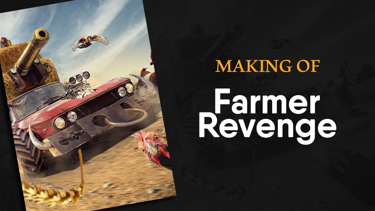
Farmer RevengeA new personal project Inspired by Disney's Home of the Range, a Farmer's revenge is all about action in July's sun. Lively animals and a roa...
Gave +1 Creative Carma to Jon Leo
@lunar heath Ya, I really like the shocked chicken. I think it does look like it wants to say somthing to us. I'm just not sold on the location or something about how the bottom of the image looks seems unresolved. I do like the chicken. And super impressive that you put it together. Very creative!
your Feedback helps me.😊
thanks @lunar heath Dude! that's awesome too! lol. Also keep in mind, it' just my take on it. The rest of the world could disagree... You gotta do what you think makes sense to you at the end of the day or else you'll be making things for other people, which isn't horrible I guess 😃
Gave +1 Creative Carma to Tarek
@lyric bolt Thank you for the feedback, appreciate it.
As far as your logo design is concerned...I am no expert but the font definitely needs to be bigger. Also what do the three figures behind the globe signify? Is it a dragon?If yes, does it really fit in well with the airline ?
Gave +1 Creative Carma to Some Fucking Leaf
@dapper radish very interesting donut man! Awesome lol. You said this wasn’t photoshop , what did you use? Or is it real life sculpture!
@last talon That thumbnail's actually from my site, click the link for the actual piece 😃 But since you ask, both the linked project and the donut man (which uses a 3d scan of my face) are made in Cinema 4D. More on the head can be found here: https://paulvansommeren.design/ego

@azure brook hi tim, i have found your guide for displacement on here somewhere and finally tried it out, thanks so much for this! what do you think, i tried to get a printed look onto felt ...
Gave +1 Creative Carma to evil
Hi @dapper radish , I've kerned the logo type and outlined the heart...do let me know your thoughts on it...tried my best to make kerning adjustments...
another variant of the above with just outlining the paw shape....
@dapper radish Wow! That stuff is killer. I’ve always been interested in 3d stuff but that makes me want to do it lol. How do you get a scan of your head? Is that pretty serious hardware or is it just like stitching photos together ? They all look awesome. I love the mats just conform perfectly to the surface. Awesome.
@unborn oak I like the outline variations better. What's the difference between the two outlined variations in the second presentation?
@last talon I was at a business fair where a company showed off their tech, that's how I got it... If you wanna get into 3D, Cinema4D is suuuper user friendly and easy to learn. Blender's free tho and I've heard they've really increase usability too.
@last talon @dapper radish Cinema 4D lite ships with After Effects 😃
But it's very limited. However, EJ Hassenfratz has some good tutorials for learning just C4D Lite.
@toxic dome The second one has smaller toes. Just wanted to see if it looks better.
@unborn oak
Loving the one on the right (the one with the smaller toes). Very nice work!
All I would suggest is to bring the words a teeny weeny bit closer.
hello 😃
if anybody is free, i need some advice on this logo :
it's the second version
the first one being :
thanks
@noble plinth Thank you :)
Do you think the kerning needs to be tighter?
Gave +1 Creative Carma to Ess
@rugged lantern I really like the first one ✌🏽
thanks @unborn oak 😃
Gave +1 Creative Carma to Malini
i made a 3rd version
and i think it will be my finals
anyone, don't hesitate to give any feedback. i stay open to all 😉
Is that grey the background or did you upload a png?
Either way, the top red one is my favorite
the logo can be used independently of the text when needed, and the size difference between FIRE and DESIGN STUDIO is more balanced
but the color seems a bit too stiff
is it supposed to symbolize this?
yes 😃
and also yes, it's a png. it should be on a white background
thanks a lot @dapper radish
Gave +1 Creative Carma to paulvansommeren
Thanks @azure brook for the cinema 4d idea! Now I just need to find some time to do more stuff lol.
Gave +1 Creative Carma to evil
Evil got Carma. that's funny 😃
@rugged lantern that looks so much better now. Looks great!
thanks @last talon
Gave +1 Creative Carma to Jon Leo
yes, it took me some time but i worked on it based on the feedbacks
now when i look at the first version, i can't even imagine i was seeing it "great" ^^
@rugged lantern be careful with the lighter font weight of "Design Studio" it may be not legible when used in tiny spaces.
ok thanks @uncut pelican i'm starting the whole design system shortly. will make adjustments then. mostly, it will be used on the website, some branding elements like letterheads and business cards
Gave +1 Creative Carma to Tropical Delirio
@unborn oak
No, I think the kerning is fine... and I really meant a teeeeeeny weeeeeeeny bit when I suggested bringing the words closer together. At least, that's what I see.

sci fi hand design https://www.artstation.com/adeebalmadeebalm
nice one. makes me think of the terminator ^^
haha thanks man happy to hear from you
hi @solar yacht welcome!
@rugged lantern hi!!
later today there will be live shows on behance 😉
or maybe later "tomorrow" for you, depending on your location lol. i'm in the indian ocean
nevertheless, enjoy!
@noble plinth What do you think now?

@unborn oak
Noice! Very noice!
I wish you the best of everything with your project, Malini.
@noble plinth Thank you so much for all the help and feedback 😃
Gave +1 Creative Carma to Ess
@unborn oak
You're more than welcome!
Not sure where to post this, but I am currently rebuilding the classic map "Sub" from the "Worms" game to look and play well in the newer worms.
Posting this for feedback, I am now done with the Island 😃
well not completely done (the leaves need a comic style adaptation... but yeah I think these are 6 or 7 different stock images 😄
Wanted to make a kinda sci-fi image, so what do y'all think.
@last stump Niiice! I think you could add some grain to the glowing elements https://www.behance.net/gallery/78746469/Photoshop-Protip-Realistic-Grain-in-Camera-Raw

Behance
original Photoshop Protips, shared on the official Photoshop Discord Server
also try adding a glow around the shapes 😃
you could also go the extra mile and add a displacement effect https://www.behance.net/gallery/81965679/Photoshop-Protip-Displacement-Map
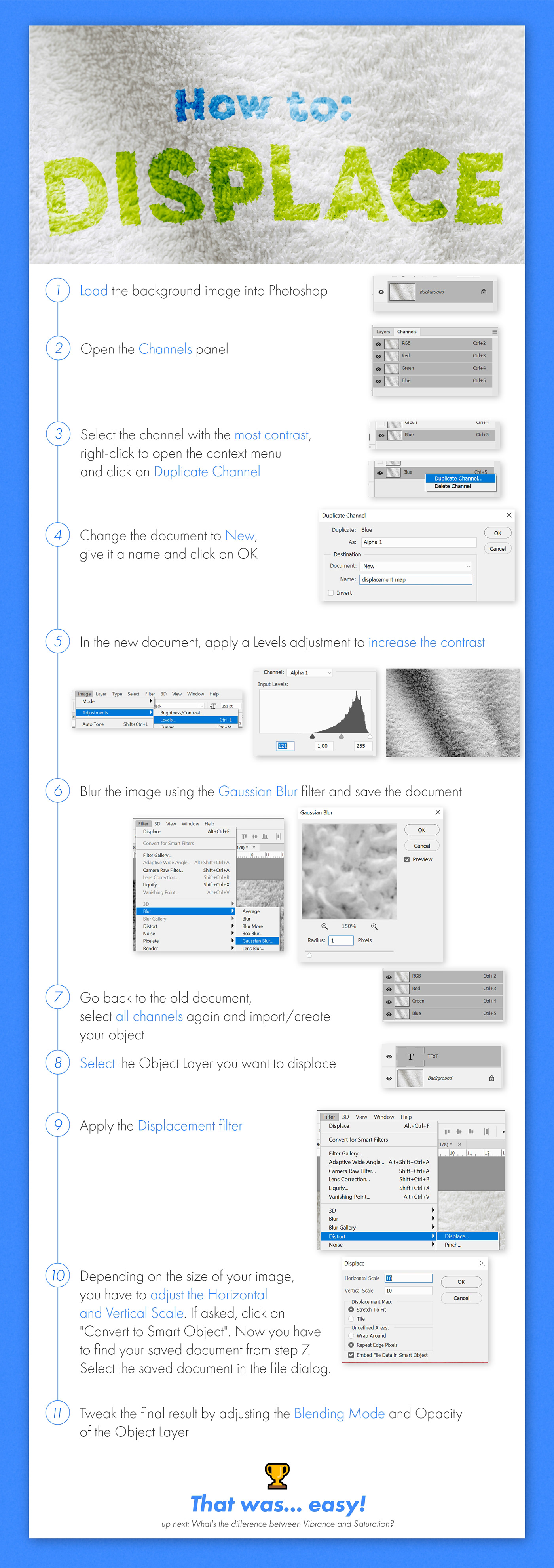
Behance
How to fuse an object to a material using the Displacement Map filter.
Thank you so much @azure brook this really helps 😀
Gave +1 Creative Carma to evil
https://www.behance.net/gallery/83717831/Event-photos any feedback?

This was taken while a storm was starting to form and it was already raining somewhat heavily to the left of the frame.
My ultimate masterpiece
Bruh
Moment
If you're sharing work, try asking for guided feedback or providing context. 😃
I just want a place to share my cursed creations lol
something i did once with photoshop and a stylus
this was a quick one i spent about 30 mins on
im addicted to photoshop lol cant stop making stuff.
I make simple images like so.
It's always free so feel free to dm me and ask me for one.
Metallic text (final retouching) from @fair lance tutorial, in case anyone is interested https://www.youtube.com/watch?v=rBUwVrjlyPk
In this Photoshop tutorial, you will learn how to recreate the Black Panther movie poster text effect. To recreate this text effect we will use stacks of Lay...
Hello everyone, I'm giving away this beauty original file for printing:
https://www.behance.net/gallery/54103349/Octozombie
you just need to ask me for the file on my instagram: https://www.instagram.com/j.f.florencio/
This don't grant comercial rigths is just for personal use like decor your mancave or office, bedroom etc...But if you really want to use it on your project I can sell you the rights fot it.
In case you print it, send me a photo ;)
I hope you enjoy this work that took me around 60 hours our more witth 7000pc size at 300 dpi

444 Followers, 303 Following, 58 Posts - See Instagram photos and videos from João Florêncio- Illustrator (@j.f.florencio)
Insta@_twc_daily Never give Up. 🙌🏻 #doNotBreakTheChain⛓ 😎
yes 😄
okay lol
i made this today and im proud of it i would like to get tips of how i can improve my gfx I DONT WATCH NARUTO SO IF AURA IS WRONG DONT JUDGE ME
Looks awesome @light thorn. Great job in these 500 days ❤️
@sleek tiger Thanks 🙌
Gave +1 Creative Carma to Valdair Leonardo
Applying textures and metallic.