#📝project-feedback
1 messages · Page 30 of 1
Besides pretty good
i feel like im not satisfied lol
Should i tag mods for this or is it something different like?...
theres still this hunger in me
that i can make it a little better
but oh well. Thank you brooo!
Omg they are so fast

I actually used tı dı this kinda work
well...
really?
İ still do but a lot less
For an example this is Angell (Yeah with 2 L)

This is my first ever project actually
ooooo, you painted all that?
Nope, maden on Photoshop
like inserted things and designed it?
Just has ton of filters and adjustments
Background moon and angel are seperated
its a great one yes
Background isfrom Eclipse arc xd
ooooo I knew it HAHSHHSH
GFGDFGFS
Hello
İnspected it again, the lava (ig?) under kills it
Too long
İ made same mistake here for an example

What are our thoughts on this? I can't think of anything else I need to edit on it but if you have any suggestions then please let me know!!

Cool shot. Personally I would get tighter with the crop. Although, of course, it depends how important the environment is. I also got a little creative with the rotation.

Black and white often looks awesome

for a sec i thought it was the eclipse scene
Ikr lol
Oooo any suggestions
Like maybe lower it?
Or maybe put it behind
wow thank you for the recommendation! I love what you have done with it
Gave +1 Creative Carma to @abstract oxide (current: #13 - 238)
The black and white is also such a good shout
Thank you and good luck with all your Photoshopping
Gave +1 Creative Carma to @heavy elk (current: #1011 - 1)
Cheers mate
you too!
Projects like this usally revolves around 2-3 main objects
Every extra thing makes focusing harder
Think of it like frosting on cake
Everytime you add some it becomes harder to get the taste of cake (I am pretty hungry rn sorry if this was a poor example)
So if you already have strong visuals, dont bıther with much more
İ get the contrast but the heaven part is much smaller and more faded
Hell part is longer and stands out so badly
Gaming thumbnail hows this?

Looks goofy
But the armor on the man seems... A littledifferent from vibes of Hollow Knigth
Cool concept.
The clothing has great contrast with lots of highlights and shadows. However, the lighting across the face is very even and flat.
Rate?

Sorry, what do you mean like it stands out badlyy
Im here
And?
Just seems out of place
This looks fantastic. The black and white looks great and all of the elements are really interesting.
I hope you don’t mind me experimenting with your design. I made the person larger and raised their highlights which I feel gives them a stronger presence in the design. The problem here of course is that covers up more of the background which may be important.

My Latest Design Concept (Mockup created from scratch)
Design process is in my profile
Thoughts?


I like what you’re done, is this curve adjustment?
I do appreciate this. Ive started taking photoshop more seriously
Thank you. Here are my adjustments. I had to half the dimensions to get below the Discord file upload limit.

Gave +1 Creative Carma to @meager cliff (current: #1011 - 1)
It shows. Again, a great piece.
What is this?
It's a Discord bot that allocates "points" to people that are thanked by others
Plz let me know, is that design is bad?

This is looking pretty good. Nice work. A few thoughts...
- I would be aligning the text and button to a single line
- The honey in the lower right dripping up looks odd
- The logo is a little small and hard to read
- The white text against the light background is hard to read

Thanks 🙏
You're welcome
I'd agree with @abstract oxide about the logo and add that the strap line "from hive to home" should be much more prominent 🙂
thoughts?

yo! how can i make the small text more visible w/o changing much
i mean uhh
idk, i like it how it is but its not that visible
I think the text on the bottom and side is a tough element to design for because you have a mid-tone text crossing over areas that vary widely in contrast.
yeah, that's why im strugling
Also, "GRAND DUELIST" is challenging to read at a glance, especially with the way it overlaps the figure and the texture.
Let me make sure I understand, this would be cut into triangles? Is that correct?
yup, the grey fragment will be cut off
Are you having this printed?
not yet
Is that the goal? To print this?
yup
So, first off, I would design this so [2] of these layouts would fit one page. Then you can get double the prints out of a single page. So split the page corner to corner. And put a copy of design on the other side.
That's just a practical thing. Design-wise, as I said, you have some legiblilty issues here because the text is overlapping these various elements.
I'm not a big fan of the font choice for Fiora, League of Legends. That is a tough font to read without the overlapping.
im doing just one print of this, its poster for me, but thx for advice, we usualy just use imposition programm to do this for us
Gave +1 Creative Carma to @wooden oak (current: #2 - 3123)
hmm
i would love to stay on font that looks like this one
lms
Its your design. You can do whatever you like. I'm just giving my opinion.
Maybe you can put a white stroke around some of the text. That might help to separate it from the background some more. Not sure that would work for the smaller text though.

I tried to generate the result quickly. It didn't get the text right but you get the idea.
Maybe you could do the same with the smaller text as well.

This is a bit 'busy' for my tastes but if you like it, that's what matters. Its going on your wall. :)

Japan has Godzilla and Norway has... Gåszilla? 😄
every poster i've made is busy XD
imagine jax on the left half

;o

im open to criticizm, but i just need an opinion so lmk what you guys think-what i should change/improve

shot on iphone 12 pro
i know its oversatured but ill fix that later
what should i do to improve the overall thumbnail

You should not use cheats, it would drastically improve it
No because the whole video is a cheat showcase
So the 2 texts are crucial
✨ Meet Owleaf – where wisdom meets nature.
Smart choices, sustainable living, and eco-friendly vibes.
Let’s create a greener tomorrow, together. 🌍💚
Logo and Brand Identity Design pack!

Very creative. Nice work.
The head and body contain smooth, flowing elements. However, the legs are very angular and for me don't quite match.
Ok, noted. Thanks!
No worries. Good luck with the project.
the image inside the person could be more bright. Maybe adding a bit glow make it feel even better.
For the image of the person, I would actually prefer a bright summer's day with a beautiful blue sky and lush green flower meadows. Unfortunately, this grey veil has the opposite effect. It seems oppressive and does not support the message of the title ‘Peace’.
How can I improve this photo?

Love it ! 
Thanks
Gave +1 Creative Carma to @terse jetty (current: #36 - 57)
You’ve got some great stuff going on here. I particularly like your colour choices.
For me where the water meets the land could use a little work. It feels like you've got deep water meeting the shore.
I'm liking this.
Given that the person is in partial silhouette, is there too much light on the birds? (I appreciate that this is very much artistic interpretation)
Yes, I added a circular light frame around the person and on the text
Nice. I'm liking the series you are creating.
Thank you! I'm glad you liked it. I just love inspiration and spreading positive energy 💖
Awesome. Keep up the great work.

Gym logo concept and branding kits design

Very creative logo and nice demo pack
Thanks @abstract oxide
Gave +1 Creative Carma to @abstract oxide (current: #13 - 239)
Is this for something in particular or are you just creating for fun?
Making portfolio
Nice. Good luck.
Again thank you 🤝
Gave +1 Creative Carma to @abstract oxide (current: #13 - 240)
Can I get feedback on this?
Visually I think it’s great. Very stylised.
Can you give some context so we can offer some constructive feedback?
Thanks.The text says زندگی مثل علف است، سبز می روید ولی همیشه پایمال میشود ’ and underneath in English ‘Even in open fields, the weight of survival follows’. Basically I wanted to show how life can look open and free but still feel heavy like the cow represents survival, routine, and the struggle we all carry. That’s why I added those surreal, Persianised touches. Just experimenting with vibe + metaphor.
Gave +1 Creative Carma to @abstract oxide (current: #13 - 241)
Awesome. I think your vibe is great. I hope you turn this into a series.
Hello
hi! could i get some feedback on this?

Showcasing literally no photoshop skills, but i liked this design :p

I like it 😍
I need Feedback I'm still learning ☺️

You said you were printing these out as stickers, right?
What is this being made for?
Today's logo and branding design project

Another great mash up of ideas. Nicely executed.
While I like your logo, I'm wondering if feels more "right" with the front of the camera in a more elevated position.


would like some feedback before i finalize

Personally I would like to see some detail in the snow and clothing. I don't mind a bright scene but without that bit of detail you just have a sea of white. You've done a good job with the skin.
That's a great candid photo mate. Nicely done.
The image feels a little flat to me which is easily addressed with a highlight adjustment and a contrast boost.

Thx bro ill change it soon
Gave +1 Creative Carma to @abstract oxide (current: #13 - 242)
No worries. Did you take the photo?
Yes I did
You've got a good eye
Ty I used my moms old Nikon d200
I’m going to try to save for my own camera soon
I’ve been using hers for around 2 years now
Got this two days ago

Another great shot mate. If you add a little sharpening to that the details will really pop
Alr sounds good ty
Good luck getting that camera
Thx man
🔥
Are you familiar with the Camera Raw filter? You can transform an image like yours dramatically and quickly using the Texture, Clarity and Dehaze sliders. I've probably overcooked this but image compression will likely chew up much of the changes.

I think I’ve used it once before, I did that image In Lightroom
Excellent. In case you don't know this Photoshop filter and the Develop module in Lightroom are effectively identical.
Ah Alr
Should I just open the photo in raw and edit it like that now
Or js use the Lightroom sliders
Use which ever you prefer. Personally I use Photoshop for a quick edit of one or two things. I'll use Lightroom when I'm working on a group of images.
I totally get it
It's fantastic for cataloging
Yea makes everything very simple
And easy to learn, I’m teaching my friends little brother who is applying to the art school I’m at how to use it
Nice
I learned most of the adobe stuff a few years back by treading the forums and watching YouTube
Best way to do it imo
Lots of amazing free tutorials online for sure.
What are you studying?
I’m in communications and doing film and debate
But I do some photography on the side for fun
Awesome. I'm signing off mate. Good luck with the studies and the teaching.
Thanks have a good night
Poster
Hello everyone! I’m excited to share with you my latest project Metropolis a seek & find illustration inspired by “Where’s Waldo,” set in a fictionalized version of New York. The idea was to build a playful ecosystem that feels both recognizable and imaginary the kind of place you’d love to get lost in.
I’d love to hear your thoughts, whether it’s on the illustration itself, the design choices, or any other feedback you find useful.
Thanks a lot to those who’ll take the time! ❤️🙌
https://www.behance.net/gallery/229003131/Metropolis-Isometric-illustration
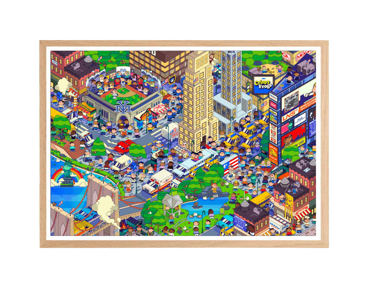
Metropolis is an isometric illustration inspired by New York City. The project depicts a fictional, detailed urban map designed as a dense playground of architecture, traffic, parks, advertising, and everyday life scenes. Built entirely in Illustrator, th...
I like it very much! However now I'm wondering what I need to seek and find?
Thank you ! Click in the Behance mini, you can find the missions 🔍
Gave +1 Creative Carma to @raw wadi (current: #25 - 93)
Yes, thank you 🙂
Gave +1 Creative Carma to @vital rose (current: #1013 - 1)
Looks good
Hehe thansk
You’re welcome
This is fantastic. You should be really proud mate.
I particularly enjoyed seeing the elements come together to create the final piece.
Did I just find a certain president leaving a particular tower?
like this??


Thoughts?


is this like a album cover?
nah, just art for the gram 😭
oh ok lol but my feedback would be like erasing the shoulder part & bottom lightly (brush flow 15%) to make a fade look
Nice detail recovery. Personally I would brighten those areas up a bit while making sure not to obliterate the details.
ok thankyou
**Hello photoshop Community 👋🏻 **
I hope everyone doing great ,
I just published my latest project Lessgerit® — a complete branding journey where we transformed a running club into a cultural identity through strategy, design, apparel, and community. I’d really value your feedback or a quick review on the case study, as it would help me improve both the design and presentation.
Here’s the link: https://www.behance.net/gallery/233886237/LESSGERIT-Brand-Identity

Lessgerit® is a running club and sportswear brand built on four values: endurance, community, authenticity, and progress. This case study presents the full branding process—from brand strategy and visual identity to apparel design, photography direction, ...
Thank you so much Michael 🙌
Gave +1 Creative Carma to @abstract oxide (current: #13 - 243)
No one knows who it is, but...
You are very welcome. Again, great work.
Hello, what is your opinion about this? Where could I improve? Trying to get back into sports graphics after a bit. Is this portfolio worthy or I still have a way to go before I can be happy about my works?

its for a competition, the theme is Planet B: a virtual warning.
also i updated it a little

Make the Earth bigger
When is the poster due?
13th
Multiply blending mode on those red letters
Make the gold text yellower
i am very new to this, could u explain that a little
okay
Select the red letters
Ctrl + J if you’re on Windows
Go to the layers panel. See where it says “Normal”? Click on it and change it to “Multiply”
alr thankss
its going completely black
Take a screenshot and show me
Also do this first

My Latest Design Concept About Bob Marley (Mockup created from scratch)
Design process is in my profile
Thoughts?


Nicely done!
Thanks bro free free to check my page
Gave +1 Creative Carma to @bleak echo (current: #8 - 907)
Nice
Made a logo and branding kits for an agency


Nice work!

Looks very nice, but what is it for?
Love the grid layout and how Purple is "bleeding" inside the eyes. Great job!


hi, finished my business card

anything that should be changed? anything hurts?
110 x 50 mm
i dont like the instagram logo tbh
QR code
idk how i can change it
plain white? red?
eh idk

that's the front of the card
its still in process
strugling with kerning
gon just take one font there, the right one
its cool
uhh, forgor to tell em what i do XDDD it looks more like a fishman business card

the fact that "your personal" and QR are the blocks of white objects is irritating

i think you dont need the catch me here part
I dont like the blank space when i delete it
guys i need feedback on how to make this better

Just a beginner. Please suggest improvements


damn that's impressive
Thank you 🙏
Gave +1 Creative Carma to @austere hazel (current: #1014 - 1)
how did you even achieve this look? Sorry for a broad question but I'd love to know
That's okay, I'll do my best aha !
Well, to start, I do a lot of color matching by creating a hue map:
Create a solid color layer in the new adjustment layer icon, set it to '0% saturation' and '50% lightness', set the blending style to 'luminosity'. Then create a new 'hue/saturation' adjustment layer and set the 'saturation' to '100%'. Group both and name it 'Hue Map', Toggle visibility to see the base hues of your entire project.
Just make sure it's at the top of the layers.
From there, you can add selective colors to all of the layers within your composition and adjust them to achieve hyper realism of color blending.
The next step is using the HSB sliders on camera raw to achieve much greater color cohesion. 🔥🙏❤️
That's how I do the colors, not a lot of lighting needs to be done to preserve the collage feel of the artwork.
It's ~800 layers now, and I still need to fill the top with another few conspiracies I know of..
It's a political piece, critiquing the old radical left prime minister.. I've been working on it for more than a year.. believe it or not, this is how it started haha. First draft.

holy, thank you so much for the info! Really appreciate the response ❤️
Gave +1 Creative Carma to @gaunt ruin (current: #384 - 4)
and to be fair, it's surprising how similar the first draft looks to the one you sent.
Well, maybe not similar but the structure didn't change much. I change my stuff all the time lol
Yeah, I was pretty happy with the initial composition, so I just built and built. 🔥🙏 Id let myself have much longer iteration sets, then sometimes deleting things, but so much trial and error. This is just the polished ideas so far, still much more to add to this.. just need to find / create some better assets. Like flying glass, etc. although I could generate particles and stuff too, still a long ways to go with it.. I want it to be something quite unique.
Falcon Gear – Fix Fast, Fly Far
🚗 Falcon Gear is your trusted automobile partner, combining precision, speed, and strength. From quick fixes to performance upgrades, we keep your ride ready to soar.


It's a pretty cool design but I'm not sure about the "foggy" look. From what I've seen, esports tournaments generally have strong colours with bold contrast. Not that you have to follow that look necessarily.
From a graphic design perspective, I find the first piece you shared a little too busy and cluttered...I hardly recognized Justin Trudeau, Parliament, or the Liberal Party logo...
Too many elements can detract from the message you're trying to convey... Try to make the key elements of your message easily recognizable.
IMO the best version could be somewhere in between.

hi i am making an album cover and I just wanted to get some tips on what to improve

I hear you, the busyness of the piece is a nod to my Schizoaffective mind ❤️🙏🔥 all of my pieces are anchored in this.
Looking really good, however, I think the title text could be a lot more than it is currently.. I think gold 3D text would pop real nice in your greeny blue scene
Looking great glitch!
cool stop spamming

This is looking really good. Nice artwork.
While I like the bench and particularly the lighting on it, it does take up a lot of room and draws the eye. I would consider making the bench shorter or replacing it with a chair. This would have the added bonus of letting us see the dog which would have an interesting silhouette.


The lighting on the various elements is very different. If you adjust it you will create a much more cohesive composition. My example is rushed but hopefully shows my point.

It was a trouble for me because when i already selected the colors, it made the whole thumbnail way too bright which caused eye distraction so i hovered to the exposure bar and drop it down a little so that the text pops out more. The top and bottom of the thumbnail i use gradient so it could cover the 2 models' leg and blend them in with the image more.
I don't know what to do when the color of two things are alike. If i were to change color of the unrelated elements to the text it would look really bad🥹
Im not completely sure direction i should take with this,should i use background a or b? Give it a blue filter? Use less visual elements?


I like both looks. While I prefer the pop of the more colourful version, I think it’s background is too busy and distracts from the central character.
I sympathise with your situation. But if I understand correctly, are you asking us, in a public forum, to help you commit what must be some kind of fraud?


I like your composition.
Perhaps get rid of the few elements between the trees like the car.
any way to improve this like typography or photo placement to make it look better

I like your colour choices. For me, less is generally more. You have so many images that none of them can be really seen. Personally I would remove all but a couple of images and make them significantly larger. Unless having many images is important for some reason.
yea , the images were imp that's why I had to add them , thanks for the feedback
Gave +1 Creative Carma to @abstract oxide (current: #13 - 244)
No worries. Good luck with the project.
LionBuild – Crafting Landmarks, Building Trust | Construction company logo and branding design

Hi @kind raptor Youve posted quite a few of these designs without actually asking for specific feedback. What is it youd like?
Another cool mashup.
For me the hammer within the logo is not obvious.
Does this make sense? Razoragle – Sharp Looks, Bold Vision | Salon Logo and Branding Design
✨Razoragle is where precision meets power. Inspired by the sharpness of a razor and the bold vision of an eagle, Razoragle redefines grooming with cuts that are clean, confident, and commanding

Another well executed combo.
However, this, like your last one, just don't sit quite right for me. A hammer to a lion and now a blade to an eagle.
Any tips on creating better line work with cleaner outlines?

How are you creating the line work?
Wacom tablet on ps.
Not a screen tablet
I use some smoothing
What tools are you using?
How do you mean, like in photoshop?
Just the brush tool
At least for the outlines
Hi everyone! 👋
This is one of my latest photo manipulation projects 🐬✨
Would love to get your feedback on composition, lighting, and overall storytelling.
Any suggestions to make this portfolio-ready are super welcome! 🙏

Interesting concept. I'm keen to see how this evolves.
Your background, with the silhouetted clouds, suggests the sun is low on the horizon. This would mean that everything with a surface facing us should be in silhouette as well.
hello
any more scope for improvement in colors?
although i do see that the borders are more black
I like what you’ve created. Perhaps a leaf or two overlapping the text would make it feel that extra 3D.
You have a minor issue with the "E" in BIRDSMP.NET. The text is perfectly flat yet the chunky vine under the "E" should be displacing it.
Yeah that's an issue actually. It defies all laws and just floats there.
Aside from that one minor issue the rest is looking great.
Thanks
Gave +1 Creative Carma to @abstract oxide (current: #13 - 245)
Yeah I need to make better library of leaves
After about a year and a half, or maybe even a year, I haven't gotten back to photo manipulation. I remember the one with the lines not being very good at it.
WITHOUT AI


out of 10


It doesn't have to be overly complex. Even something as simple and subtle as this.

Yup, for sure
Nestique — A Nest of Timeless Style | Fashion Boutique brand logo and Branding design

ok

Any thoughts on this?


The text could be thicker and more glowing
Also is the focus supposed to be on the bird?
The bird and her
Clouds could be slightly brighter
If I was on my PC I could do some edits for you both
I think you should desaturate the background a little and blur it a little
Yeah the slight desaturation seems like an obvious thing to do now that I'm reading it. To make the other things show up more. Thanks.
Gave +1 Creative Carma to @knotty ether (current: #1014 - 1)
Uhh, thank you?
I have no idea what this means.
In this server, 1013 people have been thanked more than you. It keeps track of people receiving thank you's.
Gave +1 Creative Carma to @knotty ether (current: #652 - 2)
Oh, nice!
Thanks
Ping me when you finish those edits, I’d like to see it!
im making this out of frame thing any help on it?

What's your goal here?
Nestique logo in the middle should be igger
I also think you could slightly increase some highlights on the girl
Could you give me the .PSD file, if you want? I'd like to help you.
im not sure i just want to have a nice out of frame look to it
I'll give you my advice soon
Put half of the ball on the frame
Make them overlap
Thoughts on this documentary thumbnail?


Arda Guler Match Statistics


What is the point of this poster?
its for a nigerian artist
What’s his name?
zaylevelten (tenski)
This is looking really good. Nice work.
The central guy is made up of 5 photos rotated relative to each other. However, the pieces that make up the guy are not rotated. For me, this breaks the look you are going for as the photos are acting like a window and not photos. Does that make sense?
Oh i got it thanks for suggestion will look into it
Gave +1 Creative Carma to @abstract oxide (current: #13 - 247)
No worries. Good luck.
hello i would like to make this more realistic and less cartoon any advice thanks in advance 🙌

You should make the text more readable. I feel like this poster is too messy and there's too much going on in the background.
Turn the climber's colors down a bit.
better ?

Mostly
I think you should desaturate the whole image by 10
And remove that white fog on the climber’s legs
The boulder should have more color
Ping me when you fix it


Which color do you want it to be
Use the eyedropper to get it
Then do one of these ^


Looks good. But for back part it could be better.
how do you think I can improve it?
I'm not really good at that so don't have any advice. wait for other people to respond
I was going for a more minimalistic style. I see it with a lot of these types of tee's just the car's description at the back for the curious folks
Make the tezt bigger
in the back
thats the most I can fit bruh for the print in the website 😭
I will try tho thanks
Which website are you using?
tap stitch
I used photopea
there's absolutely no way you can do the front of the shirt with that site only
But you can improve the back :)
I will try to hold on
@toxic dome

matter of fact does look a lot better thanks for the suggestion
You're very welcome!
i need help, idk what artistic direction to go after with this image/typo, any suggestion to make this more fancy is appreciated thank u

The photograph is very “noisy” with lots of detail. Setting everything to a single colour could be one tactic to "calm" down the graphic a little.

One fancy trick is to pull a few things/people in front of the text. The word "TO" has a few people just behind it. Perhaps you could mask the word to bring them in front.
thats very smart, thanks appreciated
Gave +1 Creative Carma to @abstract oxide (current: #13 - 248)
color fill then lower the opacity of that layer?
Thank you. Please post any updates as I'm keen to see where you take it.
Gave +1 Creative Carma to @wraith pulsar (current: #1015 - 1)
I changed the blending mode of the layer to Color
You can certainly lower the Opacity but that will let through some of the original color... which might be exactly what you want
not bad

oops wrong reply
but ye
i accidentally blur the background so i cant really do the mask people thingy u told me but thats fine too
how would this fit with citys behind it, im looking for a destroyed city type vibe

but not sure + can't find really good destroyed city images
Looking good.
Your small text is a little hard to read. Perhaps a more solid background color could help.

Do you know about Smart Objects? They allow you to apply things like blurs without harming the original pixels. You can also alter things like filters at any future date.
My latest practice


I need help retouching dark image like these, do you know how to make this look better? its for a bar post

What do you want to do, exactly?
What do you mean by “look better”?
After about a year and a half, or maybe a 2 years, I haven't gotten back to photo manipulation. I made the one with the lines but i dont like it
WITHOUT AI


Maybe turn the black part more like a shadow?
Lower the opacity and add sligth gauss blur
For me the most distracting element is the noisy background. Although your image is low res and hard to diagnose. Within the Camera Raw filter are some really good noise reduction options. Don't forget to sharpen it a little if you need to offset any smoothing the noise reduction causes.

Those are cool. Based on those if you don't already know about this effect you might enjoy it: empty stroke effect
Not at all implying that your work needs it, just can see someone that does that stuff utilizing this effect in the future. And learning how to do it is as quick as reading my reply lol.
just fix a little bit is it more realistic now thx for the advice 🫡

Gave +1 Creative Carma to @knotty ether (current: #489 - 3)
Thank you!

I had to take a screen shot of this because the file size was too big
but what you all think?
Hello, I'm from Indonesia and I want to learn Photoshop.
mate you should go to general
okay


this was the final product
Looks good mate. Thanks for sharing.
Gave +1 Creative Carma to @wraith pulsar (current: #653 - 2)
thank you for your help too appreciate
Gave +1 Creative Carma to @abstract oxide (current: #13 - 249)
You're welcome
Just a thought, it looks like Mt. Everest in the background, so what is he climbing thats higher? 🙂
It’s cervin in Switzerland in the background and he is climbing mont Everest
How do I make the shading on Beyonce's face look more realistic?

I wanna soften up the orange parts, make a more gradual transistion to those highlights.
My apologies 🙂 I stand corrected. We wish him luck 😉
Turn the background brightness down like ~30 percent.
For the Switzerland mountains
looks better to me thanks a lot

Gave +1 Creative Carma to @knotty ether (current: #384 - 4)
Alright. Are you done editing, or do you want more suggestions from me?
yes of course i'm learning a lot from you
i want this montage to be perfect
for me the only things that is disturbing me rn is the face it looks off
and the shoulder too
Oh, thanks a lot!
Do you mind giving me the .PSD file for this so I can edit it?
I can have a hard time explaining my words and thought process sometimes so I'll show you what I did.
You picked the right person!

no worrie i got a lot of time
Alright! Cool!
🔥 sorry if my file is a little messy ha ha
It's okay!
when i rasterize a text layer with white text and then scale it down it turns gray, how do i fix this?
Your critique.

Nice, however due to the angle of the person peeking out of the phone, I'd be tempted to mask in a bit of her right hand so it protrudes outside the phone frame.
I think it will sell the composition better 🙂
Don't rasterise text at all.
The interpolation settings are making it blurry and mixing up the colour slightly.

how would I be able to erase portions of a text without making it a smart layer or rasterizing it? i cant any other way thatI know of
Pretty cool but are u really sure 'bout font?
Nah, do you prefer fonts ?
Dont really think thats it
You could use a simple layer mask instead of erasing.
sorry im relearning photoshop how do you use a simple layer mask?
are you referring to just the basic mask tool?

Create a layer mask by clicking here in the Layers panel. Paint on the mask in black to hide what you don't want to show. Paint in white to reveal.

Sorry, just got home. - Yes. that's correct
hey everyone i have a question
how can i do this kind of diamonds not manually but by making a path and make the diamonds follow it ?


One possible way....
However, I suspect that Adobe Illustrator might have to be used to get you a better result:
https://www.youtube.com/watch?v=d-0aSsuFGCY
An easy way to repeat any shape along any path using the "Replace Spine" option.
TUTORIALS
Adobe Illustrator: https://goo.gl/DeaKFe
Adobe Illustrator Christmas Edition https://www.youtube.com/playlist?list=PLSQcxS0ygkS6h1NA9imACy5MJjZ05chsl
Adobe Photoshop: https://goo.gl/rYq4mX
BECOME A PATRON
As a patron...
thumbnail for Instagram reel from the event recording
Thank you very much
Gave +1 Creative Carma to @novel comet (current: #5 - 1181)
how do people feel about this design i did earlier


still having pronlems
problems*
could it be because im doing it on a stroke text?
when I do it it trys to recreate the lines of the text

which is annoying
Yes. Its probably the Stroke Layer Style. I would create the logo with compound Shapes instead.
What are you trying to recreate exactly? Because I think the auto-maker has a much different logo.
im trying to place a smaller text inside the text @wooden oak , i managed to make it work somewhat so ill send you what i mean


As D.Human said you can just place e.g. the layer with the small text in front of the other layer with the big Text. then you can put a layer with a shapte to blend between the small and the big Text or play around with the outline of the small Text itself.
Additionally. - After you've added your stroke, make it into a NEW smart object... - THEN mask it. - The stroke won't mess up like your example then,.
Thank you!!
Gave +1 Creative Carma to @novel comet (current: #5 - 1182)
guys i have a major problem and need help really badly
ive made all my designs in 800x800 with 70ppi. I just remembered that I need all my designs to be in 1500x1500 with 300ppi minimum, all my designs are finished, is there any possible way to change all of this? with 70ppi, the print on the shirts will come out horrible looking. need advice asap
Oui il y'en a, mais le sur-échantillonnage est fortement déconseillé. Surtout que tu as travaillé en 70ppi, une modification en 300ppi entrainera fortement une perte de qualité à l'impression.
anything I should change?

First simple Poster remake exercise
Main focus (Layers, Layer mask, adjustment layers, smart objects)
How did I do
Hopefully after 2 more exercises
I advance to the next stage God willing next week 😎
Reference image

final work

@timid cloak - Sorry, just to check.... which is the old one?
I'm guessing this was the 'original' with the dodgy fonts?

Oh jeeez - No - I see it's the other way around.
To be honest - since you posted this into project feedback I'll be honest/critical.
===
I don't like your choice of font. Is that Comic Sans?
The guitars don't have any shadow, so it almost looks like one wierd guitar with two necks
The line spacing is a little random
you're using 4-5 different fonts on the same poster
I asked OpenAI for feedback too, all of which I agree with:
Typography
The font choices feel clunky and outdated. "MUSIC FEST" dominates, but not in a clean, modern way.
Inconsistent font sizing and spacing makes it look unbalanced.
Layout
The guitars overlap awkwardly, pushing into the "FREE ENTRY" text.
The text alignment feels random: some is centred, some left-aligned, and spacing is uneven.
Too much empty space at the bottom while the top looks crowded.
Colour palette
The dull beige background with brown doesn’t give “festive” or “exciting” energy — it looks flat and muted.
Graphics
Clip-art-style guitars and music notes feel generic.
The treble clef watermark in the background is distracting rather than supportive.
--
Some suggestions:
Modern fonts → Use a bold sans-serif or a playful display font for the headline, and pair it with a clean sans-serif for details.
Better hierarchy → Clear headline → date & venue → performers → “Free Entry” as a punchy callout.
Fresh colours → Bright, energetic palette (e.g., purple + yellow, teal + coral, or dark navy + neon).
Stronger visuals → Replace clip art with either a stylised illustration (flat vector) or real photography of instruments/crowd.
Balanced layout → Centralised headline, evenly spaced details, and a strong focal point instead of scattered elements.
Yes that's the original Image
I'm a beginner
I'm focusing on layers, layers mask, adjustment layers, smart objects these styles
I don't want to mess things up for now
This week
That's what I'm focusing on
I have completed sessions on them
Time for some exercises
To advance to the next stage
That's why
Try picking some bold colours, putting FREE ENTRY in it's own box, stick with a max of two fonts and try and keep all the text aligned more consistently

Of course. - You do it at your own pace. - Good for you!
I hope it's a good start? For now
Thanks for elaborating on how I go about them
I will take then into consideration as I scale through
My learning plan
Gave +1 Creative Carma to @novel comet (current: #5 - 1183)
Aesthetically, I'm not a fan of the brown version and the choice of fonts - but it sounds like you're learning the technical aspects right now, so that's completely understandable.
Yes that's why I didn't focus more on the typography
(I'd also question why 'DJ's' would be using a guitar. - I'd have thought a photographic crowd shot would have been more suitable) - However, I'm just being pedantic at this point 🙂
I did this without any examples to follow so it might look bad haha

Straight to your portfolio folder
Who knows as you get better in time
You can ho through your portfolio and remake them the best way the should be when you finally get the skill?


ft.noxy

Make the person smaller so we can see everything. I'd also recommend upping the contrast and brightness in some areas.
I'll make a mockup for you.

Looks rather messy.
So im trying to include 3 posters but want them to be big enough without covering the text any advice?

U could try and change the dont tho
Any Sans Serif would work
I will after i get the poster composition right
Try to resize the project?
any feedback? im not that good with photoshop and im trying to do a youtube banner

Huh?
Could use more stuff on the banner, and increase the opacity of that Pokemon a little more.
<@&548221840750018590>
Image spam
Like you could put a halftone layer/effect on "Battle Academy" and the joy-cons.

yo can I send you my shirt?
design?
it's a car one
Move "pokemon news" and the rest of that text to the left
of the youtube logo
Also, I meant you could add more Pokemon you're a fan of!
what do you want me to do rate it?
idk but I just wanna show it
sure dm me
I did
I am starting now!
ho nice thanks a lot again
Gave +1 Creative Carma to @knotty ether (current: #316 - 5)
Does this look more realistic to you? @atomic ivy

I'll upload the .PSD file soon
It's in the folder.
Wooow, this is incredible Thank you so much for your help I really appreciate it Do you think you could explain a bit of what you did so I can learn and try to apply it in my future creations? Thanks again
Gave +1 Creative Carma to @knotty ether (current: #277 - 6)
That’s such a great technique I had never thought of doing that — really brilliant haha!

I had no other choice! I found your layer organization a bit messy
Sure, I’ll explain
Let me open the file back up.
- That's why I made a duplicate of your smart object so I could do my stuff.
I renamed my layers to explain it to you better.

And this video shows you how I did my layer selections! https://www.youtube.com/watch?v=UpLAEoMZVPc

Custom Luminosity Masks with Color Range in Photoshop
Luminosity Masks are all the rage these days it seems and rightfully so, they are extremely powerful. A Luminosity Mask is nothing more than a selection of the luminance range in your image. Think of it like separating lights, darks, and colors, kinda like doing the laundry. Sure you co...
If you are confused about anything, feel free to hit me up!
Came up with it myself. I just stack the image on itself.
And change the blending mode.
Wow thank you so much for taking the time to explain everything and even renaming the layers, that’s super helpful
The video link is also perfect, I’ll make sure to study it carefully
Gave +1 Creative Carma to @knotty ether (current: #237 - 7)
You're very welcome. I can't wait to see your next projects!
Also thanks a lot.
havent opened photoshop for years, good enough ?


Very dramatic - Nice. - I tried it with the new harmonise tool....

I'd rather do it by hand ...
Very good. How'd you make it?
increase dark areas a little bit.
thats how i wanted it like the area dark but him shining you feel me
I think you should make his clothes shine too
bet
Can I get feedback on this? (This special work literally doesn't have any deep thoughts or ideas behind it but I think it looks interesting)


You can't - or you don't want to remove the header?
can't. Even if i want to, Its a necessary thing for college. But it looks fine with it i think.
If it is necessary, why is it so blurred that you can no longer recognise anything?
So that i don't doxx myself 😭

?
I don't know what ‘doxx’ means. Slang is not my language. But removing it is easy in this case.
Dox means it would reveal their identity. Which they don't want. Hence the blur.
Doxx meaning revealing myself and being exploited (location, name, etc.)
The human hand is what I find to be the most problematic in this layout. It's in an odd position and the thumb seems too long when compared with the rest of the fingers.
Hmm i see. Well this is the image originally

This was changed by nanobanana
from this

Well, regardless, the thumb is way too large. On a normal human hand, the thumb only extends to about the first joint on the index finger. This thumb extends the entire length. Look at your own hand for context.
Hmm yeah its a problem then.
I would do something like this. Better proportions and there is more depth in how the fingers are placed.

woah thats way better
Feel free to use that instead, if you like
Thank you so much!
Gave +1 Creative Carma to @wooden oak (current: #2 - 3149)
This is what it looks like finally

I would probably use a different text treatment for the bottom... But that's just my preference. (That font is: Bebas Neue Light)

What do yall think abt this one ??

Looks good
I like this one, but is it supposed to be like a movie/book poster?
I can give you more advice based on that.
(Also is it okay if I edit my own version of this? I like it a lot!)
It was actually for my art class, the project was about disfiguring the subject as part of the assignment.
I chose to represent flowers on the face to emphasize the idea of renewal
Then I named the poster design "Rebirth"
Yeah for sure! As long as u don't publish it since the girl I photographed did not give consent for anyone else to use their image.
Thank you!
I have a cool idea: Blue overlay everywhere!
A little more contrast between the girl(s) and the background.
Fun fact: i tried it and honestly it looked pretty good but i prefered without it
Fair enough!
I'm setting up a bunch of these for someone for their website/cataloguing etc. and really would like an unbiased opinion. They are all pretty much setup like this. Same style brackets, same light grey background. And if there is something I could change to make it better I'd like someone to point it out.


You might want to invert the pink background gradient so that the darker part is at the top behind the product in the cup so it stands out better 🙂
sure i'll do

hi guys
i made this design for my app dark mode but i cant make light mode im not a designer what can i do

Some do it the lazy way, by inverting the colors of the image, but I would maybe try to keep the colors by fading the inversion to luminosity. (The best method is to add an invert adjustment layer, and set it to luminosity mode)
Which is better, 1, 2 or 3? and any other advice/thoughts would be much appreciated as well


ideally you dont want a product to be obstructed by a glow or motion
especially if its an ad
yeah fair enough. so how could i improve it?
remove the glow & motion blur
The product should be predominantly clearly recognisable. Blurring and exaggerated gloss on the product are counterproductive. Contrast enhancement can also be helpful (e.g. quick and dirty in my screenshot).


thanks for the feedback, i definitely agree having some contrast helps the product stand out more
Gave +1 Creative Carma to @gentle horizon (current: #14 - 230)
Those all look good!
https://www.behance.net/gallery/235646245/Comic-Draw-Art Need feedback
"KEEP YOUR BREATH FOR TALKING, WE DONT HAVE MUCH TIME" ft.silence


They both look very nice.
Looks nice!
Turn down the red a good bit, it can hurt some people's eyes.
I edited it for you.

I really would want to be able to do something like that
Nası koduk ama Liverpoola
Cool design.
The shadows suggest that both feet are on the ground but it looks like his left heel is elevated.


@median wing - You can't advertise in this server. If this is a legit opportunity, search or post on a legit service. Like Behance. https://behance.net/hire/ | https://behance.net/jobs/

Hire the world’s best design talent on Behance. Discover, connect with, and hire the perfect creative freelancer to bring your ideas to life.

Discover your next career move, freelance gig, or internship
I like your design.
It looks like you are suggesting the headphones are hanging over something that is semi transparent. Perhaps some surface reflections would help sell this idea (rough example attached).

Personally I would be making the bottom box the same width as the elements above it.
thank you for the feedback 👍
Gave +1 Creative Carma to @abstract oxide (current: #13 - 251)
No worries. Good luck with the project.
revamped someones youtube thumbnail as practice, do yall think is decent for being made in roughly an hour?


Yoooo new creation any advice remake of this gif 👍


Would you mind rate my poster. I need some suggestion and comment ;))

what do yall think?

Have a look there: #❓ask-a-question message
That's great! The subtle shadows sale the depth effect of the pentagons...
What if you add an "out of bounds" touch (with the saber or the head) ?

This is a really good addition. I especially like the line drawing itself. (This combination probably works far better than the original elements.)
👍
Looks good.
Personally I would make the person bigger.
Looks fine
<@&548221840750018590>
Image spam across the channels
Thanks
Gave +1 Creative Carma to @gentle horizon (current: #14 - 233)
That was quick. Thanks.
Gave +1 Creative Carma to @sleek tiger (current: #3 - 2673)

That's "Quickdraw Valdair"
thoughts?

Looks cool. Can we see what you started with?


i worked mostly on the lightning on it

wow looks really good 2me
Fantastic work. I really like your style.
I'm not sure about the shadow in the middle of the road.
You think it looks off ?
My first time trying anything fancy, I usually just slap in one or two adjustment layers for giving the colours more pop
Anything you think could be improved on it?
Im new to photoshop tbf so i just give my opinion you shall ask someone w more knowledge!
Haha that's the same reason I didn't say anything on your piece 😂
If you work a little more carefully, it will be perfect.

Did a better clean around those spots and some smaller ones I spotted going through them again

Thank you
Compare it to the shadow of the vehicle on the left in terms of direction and harshness
Cool!
wow i cant unsee it now ty!
Gave +1 Creative Carma to @abstract oxide (current: #13 - 252)
No worries
how can i make this better / sleeker

I like what you've created.
If you are looking for a different look, what about something like this...

thanks! helps a ton
Gave +1 Creative Carma to @abstract oxide (current: #13 - 253)
No worries. Cheers.
The face and hands look like those of a Playmobil figure. Was that intentional? If so, it's very well done.
any thoughts on how i could make this better? i feel like the triangle is really empty too.

made a background for prowler miles but when hes on it he just doesnt fit on there, is there anything i can do to make it look better? Im on the mobile version of photoshop

I think that looks solid. Only flaw I see is to spend a little more time on the girls mask (very top of head and inbetween strands of hair)
Latest piece design i made
Design process is in my profile


anyone?
Your character/figure is getting lost. There needs to be more separation and contrast between foreground and background. I would use a complimentary color for the background, i.e. opposite on the color wheel.

Nice design. A quick tip... when people use "All rights reserved" (in the United States) it denotes that "rights", specifically copyright assignment is attributed to an entity (e.g. person or organization). The proper way to write the attribution statement is: [Copyright symbol] [Year] [Copyright Holder] [Rights statement]
© 2025 ZNation. All rights reserved.
"All rights reserved" means very little by itself.
I appreciate it
Please provide more explanations about what your goal is what you are trying to express, etc. what is the design/logo about?
okey 😄Express magnets, named c init, logo brand peripheral🧲
The design looks great but it’s lost against the background. If the objective is to promote the product I would recommend a simple, bland background.
Thanks for the feedback
Gave +1 Creative Carma to @abstract oxide (current: #13 - 254)
Thanks for lmk G
Gave +1 Creative Carma to @wooden oak (current: #2 - 3154)
asking for feedback. hard to get that bottom area to look right, and text being more immersive I think just needs some playing around with. billboard poster still wip my computer is about to blow up

No worries
I like the elements and the concept. I think your lighting needs a little work. The light is strongest on the right side of his face while his left side is in shadow. This implies the strongest light source should be on the left of the image shining across to the right. With this in mind, his shadow directly behind him looks wrong.
i need some advice thank you

Any feedback? Yes i did add a watermark

Remove the gradient on “The Illest Villain”. Keep it the top color.
I'm trying to make like a minimalistic poster but just curious what do you guys think, maybe add something etc

Hi, looking at different ideas for movie posters and felt like this one was close but things were “just off” making it feel bad

Have you tried fading the blue line with a long gradient on a layer mask?
Or continuing the blue line to the ground and then enlarging its bottom to simulate perspective ?
I feel it’s missing a point of interest. The eye does not know where to look.
Thank you! Thats definitely whats making it feel off to me
Gave +1 Creative Carma to @jade inlet (current: #12 - 294)

Nice! I love how the blurred background and graphic elements add depth to your design.
For me the text is too close to the edge
It's looking good.
Unless it's important I would get rid of the quote marks and the period.
A couple of ideas regarding the placement of text...


Perhaps add some lightning clipped to the blue, you can try it in diff blending modes, blurriness, opacity etc.

That’s clever


Guys i have been posting my posters on Pinterest and youtube but still havent gotten clients, what should i do?
I think you are posting in the wrong place with the intentions for clients. Behance, Freelancer, Upwork and Fiverr are what you want. I listed them in the order of importance as I see them. I think of pinterest as where people show off mason jars they painted "live laugh love" on lol.


Hi, we might need more info, what is your goal? Is the icon a sort of watermark? I’d it photoshop only? I like the texture in your flares
Extreme solarizations! Do I recognize the hard mix blend mode with a tad of difference?
you do :3

You "need this"? Do you mean you made it? If so, could we see the original pieces? It looks great by the way.
Looks really good.
Some people I talked to also said the that the top looks kinda empty so maybe something like this


is there some things i need to improve

lol frutiger aero
I'm not afraid of empty space in design... as long as it's well balanced. I'm a fan of your original design. As already mentioned, I would personally place the title text differently. I like the new text. However, I'm not a fan of this new outline.
To bring everything together, I would be trying to match the lighting. Different elements have light sources illuminating them from different angles.
what do yall think of this brutalism poster?

VERY loud noise, otherwise cool
thx for the feedback
Gave +1 Creative Carma to @vale flume (current: #84 - 23)


Hello! I’m a photographer who uses Lightroom and Photoshop for my photography.
Id love to hear your thoughts on this photo and how I can improve it. Also any advice on finding photography clients (in Brisbane, Australia) would be fabulous

I'm curious if you are adding blur after the fact or are you shooting with a shallow depth of field? Photographing running animals with a wide open aperture sounds pretty stressful.😉
Bit of both. It is stressful 😂
My camera auto focuses on the animal’s eyes though so it’s super handy. It does miss sometimes but it’s slayful when it gets it right
You're a braver person than me 🙂
I trust you are shooting RAW?
Perhaps bring down the exposure of the sky a little?
Yeah I am. I struggled to get the sky right with the trees there but I’ll give it another shot.
This shoot was a while ago and I’ve since started underexposing a bit so I get the sky right and then bringing out the details later
Nice. I do the same. I try not to blow anything out if possible and brighten up anything that's underexposed.
Yeah, turn the noise down a little
Thanks to everybody for the input on the first poster so here's what I'm trying to do next, same style and minimalist idea

What do u guys think?

i am very beginner and i’m playing around with some of the basics. constructive criticism welcome. how can one improve this?


My question is if the shadow matches the realistic light?
we could argue there is a street lamp directly in front of the subject
Hello, good morning, afternoon, or evening. Could someone please tell me how to make the camera (those three rectangles) better (black and white)?

You mean you want to make the camera gray?
no, i mean like make the camera less out of place. becouse is just 3 rectangles
Ok, so you want to make it more detailed/realistic.
Like, model something after this.

Do you want the whole image to be black and white?
01
Remove the white edges from the hair. Also, if everything else in the photo has an orange-ish tint, why not add it to the jacket as well?
the AI cut out the subject and the hair didn’t go so well
so manual cut out it is
or i’ll get a very soft brush and gently erase it
Turn down the blue in the eyes a little.
rings a bell. can you enlighten me anyway?
Sure thing.
Custom Luminosity Masks with Color Range in Photoshop
Luminosity Masks are all the rage these days it seems and rightfully so, they are extremely powerful. A Luminosity Mask is nothing more than a selection of the luminance range in your image. Think of it like separating lights, darks, and colors, kinda like doing the laundry. Sure you co...
Latest Piece design i made


Any feedback to improve the work I made this totally in Photoshop, no plugins, no extra software

Guys is this design good or nah?

More pink and purple around the image
A little less vignette
Otherwise it's fine.

Got it ty 👍
Gave +1 Creative Carma to @glacial grove (current: #1021 - 1)
I like it. Really good design.
The lighting across the face is very even. If you wanted to make it even more dramatic, perhaps darken down some parts of the face/body.
Thanks for the feedback, appreciate it. 👍
Gave +1 Creative Carma to @abstract oxide (current: #13 - 255)
Cheers mate
took this photo but i have no idea of what to make of it

might need some suggestions from you guys
this is my first ever “project “ on ps, any criticism or suggestions? 🥺

Looks pretty good for a first project.

Nice?
could make it look better?
fixed the floor a bit because i didn't know i could rotate the thing

Is this supposed to look like a PS2 game?
idk i just saw a funny image

Nice!

can someone assist me with a site to download quality picture for graphic design
unsplash.com has great free photos.
Make you sure you filter your search unless you want to see paid images.
Cool photo.
Perhaps a couple of large words where the bottom word is partially overlapped by the building.


Pretty nice concept.
I think you should add a light blue outer glow to the the blue text and blue clock
Screen Blend Mode, 60% opacity on the cursor and the white clock
And make “catch it…” bigger.
Looks nice, I like the atmosphere
Neat, I’d rotate and duplicate the seconds ticker, with some spin blur. I’d rework the text color, maybe?
my homework is to make a game’s sequel poster
how does this look?

I’m not quite satisfied with it
i might try doing “chess 2”
made a cute lil project featuring myself 🤥🤥 wasn’t going for anything in particular just playing around … i forget i pay for photoshop so might as well use it lol

Looks nice
I think you could add more stuff to it
That matches with the game's theme.

You could increase the contrast on the chess pieces, but otherwise I like this!
What do you think of my edit?

Looks cool. Nice work.
The thin lines look really jagged in parts and are drawing my eye.
No worries and good luck with your designs
ohh nice
Thank you! Is there anything you would like me to change?
Gave +1 Creative Carma to @manic spoke (current: #1021 - 1)
Well, how do I fix those thin lines?
Made a second edit because why not

The stronger contrast on the pieces looks great


Hey guys, this was an experimental project with an obvious experimental design, so the reason it might look kinda basic or give rookie vibes is, I guess, because of the design style. I call it project noc (no one cares). I guess there is nothing deep behind it; it's just self-explanatory.
++It also gives early internet vibes, in my opinion, or the vibe that I edited it in Microsoft Paint.
what should be the goal of those images? as you said its experimentel, but in what direction should it go? I can't see any internet vibes. Also the Text is not so readable as it could be. Maybe try not so blurry lines. For the Theme "no one cares" would be more common and not as personal (hands, etc.) be ... because if someone e.g. takes a phonecall there is someone who cares, if someone gambles with money that person cares, if someone poures a glas of wine there is someone who cares that there is wine in the glas (regardless that the wine not landing in the glass 😉 ) so maybe some images like a abandoned flower in the desert, an old broken doll in a scrapyard, a dog abandoned in a parking lot and tied to a pole, a beggar in a busy street, etc.
updated

Thank you!
Nice

I like the colour and definition on the jar and beans. I'm not so keen on the cling film effect.
thank you so much sir
Gave +1 Creative Carma to @raw wadi (current: #24 - 94)
What do you guys think of my pixelated Morbius?

Cling film could be a little more subtle, yeah.
I'll do it.
Got rather lazy with this one.

I don't know how to remove it entirely, so I just selected that white color with Color Range and applied some darker blending modes.
Reduce the gold behind the bean a little bit, since it takes away the attention from the bean and jar.
And increase the contrast between the bean and the jar, if the jar is intended to be the focus of the image.
sure
and thankyou

How can I get the background effect

just finished a thumbnail. dunno if it's missing anything to make the txt/character pop a bit more 🛌

She’s popping a bit too much! /j
i think you should turn the highlights down like 40%
Do you know how I can do this?
Some sort of blur effect.
I don’t really know, sorry 🤷♀️
ty
radial blur the 1st layer, dupe layer & resize it down
^
Duplicate the text&character, and multiply by 50%

In today's Photoshop effect tutorial, we will learn how to do this simple spin or radial blur photo effect in Adobe Photoshop.
Thank you for Watching!
Support our channel and download some of our free templates here:
https://www.buymeacoffee.com/ThePhotoshopLab
► CH...
Thank you
ye gonna touch now 🙏
Thanks, excited to see it
Gave +1 Creative Carma to @urban mortar (current: #1021 - 1)
no nitro xd just brought down the opacity & gave it a 2nd shadow to blend the bg a pinch https://youtu.be/NjVSsvCC1Do?si=Qx0P0vAsZNs6swET
Turn the background’s purple down a little bit
Since you want to make the text and girl stand out more.
There are sites to compress PNGs!
i dont like the word compress xd
maybe its the purple backdrop ya
gradient prob a lil heavy
It just makes the file size smaller.
Like 10 mb, so you can upload to Discord.
Understand.
Yeah
Wanna see it