#📝project-feedback
1 messages · Page 25 of 1
thats where I am right now, im on my 6th real year in photoshop, technically my 8th but ive only been working at it a TON for 3 years so i usually just say 6 years and settle for that.
thank you man!!
i just finished another lemme send
Let's see it!!


ahh i did post before i forgot
that is insane dude wtf
hahaha! I did a different one of my Prime Minister that was ~900 layers deep. It's too vulgar to post here though!
also!
Have you used a hue map before? Very good for building up warmth / coolness in work. Check this out.
You create a filled color layer with grey at 50% lightness, set to luminosity, and then you add hue / saturation set to 100%.. this will map the colors of your piece/work. Allowing you to come in with selective color adjustment layers clipped to your images, and you can adjust the colors manually.


yep!! Makes a huge difference in understanding how much the colors are interacting with each other, especially for greenery, you want to make sure that it's of the same shade of green. Makes a huge difference.
yep one sec!
@gaunt ruin I messaged you
Is it for an animation?
Also, I'm a lil different. I went through a lot in my life, and ended up being diagnosed as schizophrenic much later.. This one is a commentary on what it's like living with paranoia of people reading my thoughts. I'm hoping one day, not to "make it", but to help others with advanced mental health concerns express themselves so that they can heal themselves too. That's the point of art imo. It's a tool to catalyze growth.


Tshirt design by me Thoughts?


Thoughts? For a youtube thumbnail

working on this design for a hoodie...I feel i can change the harmony o things but not sure where to start and cant find much online to go off of. The basic idea is a college grad hoodie but for my local career tech highschool.

alt ver

saw this its lowkey crazy
Can somebody give some feedback on this youtube thumbnail? For a video game called dark souls 2

thanks
Gave +1 Creative Carma to @spice quest (current: #371 - 4)
This one is good, but the problem will be that printing this in a t-shirt will not look that well, so try to change the design and also add something to the back too.
but how you make this type of images?
I made this poster but I didnt know what to write for the text


The design can be printed by using screen printing
I find them in envato elements and i generate some characters in midjourney
Hello guys!

I've just finished this new banner for a friend,
it's something I would call a typography study (That's what I focused on the most), so I would love to get some critiques to improve.
The contrast here is amazing lmao!!
Hey everyone, may I please get some feedback/ideas on how I could improve this typography poster? Thank you so much! (Sorry for the edits, I accidentally copied the wrong versions.

second version

Sorry sorry but I’ve got it thank you
It's nice! I'd reccomend looking into font combos if you haven't already, often a display font, like a big serif as you've used, pairs nice with a clean sans serif for the smaller stuff. Helps legibility too
I see, I hadn't thought about that. Thanks ^^
Gave +1 Creative Carma to @restive spoke (current: #309 - 5)

Looking fire!!!
I feel i lacked something. It's ugly ass hell. Any feedback, criticism and suggestion?

Visual to Neural
Cat


shadow?


thats hard im gonna add that


Right on. What do you do to get the background like that?


for this type of arts, you should write anything related to saitanism/ evil things. NO PROMOTION TO SAITANISM.
I tried to replicate a thumbnail I saw on youtube, could someone guide me on what I can fix here?

Thanks for them deets.
Gave +1 Creative Carma to @eager mantle (current: #970 - 1)
quick lil logo for a gmod project
the aurebesh text above says imperial city roleplay aswell
Turning someone appropriately named Lee into Link: Leenk lol

Pretty sure head and face swaps (for trolling purposes) was the original idea behind Photoshop. :D
I'd maybe work on the text a bit more. Maybe try some different fonts.
I'm thinking back and that is 100% what eventually got me into photo editing starting with the "gateway drug" MS paint super crudely
Looks sooo cool!

Quick mini poster I made for a friend -- Wondering how I can improve the footer, as well as the overall composition
hey guys ink&imprint here again. I have came up with a poster design on theme exorcist do tell me what you feel about this and do tell me your suggestions and improvements too. All kind of feedbacks are accepted, it would be really helpful for me.


Any feedback? This took about an hour and a half.😂

Which side do you like more?

firs time work PS

@frank crane The photo is great! I know square format is popular, for me I'd love to see how it looks portrait like a4 ratio. Maybe with a dark blue colour overall but use the red as the highlights? With a well crafted 'exorcist' as the title at the top. Great pic, think you may have hours of more fun exploring the post processing of it!


Well, since I made this, I guess I like the washed-out side more, not the higher-contrast version, but that looks good, too.


fixed up the logo a little, wasn't exactly "centered" before - now it is. 
Not bad but I believe there is a lot of text which is a bit overwhelming to the viewer


I would maybe add a texture or mess with the drop shadows or something, lowk the sketched one from earlier looked more like the real thing
yeah the ones above dont look that sketched i was messing around with gradients and layer settings

I think they might have gone for a faded effect on purpose. With that and other retro-ish effect, it is called Brutalist, even if there is no concrete involved 😉 https://en.m.wikipedia.org/wiki/Brutalist_architecture
Brutalist architecture is an architectural style that emerged during the 1950s in the United Kingdom, among the reconstruction projects of the post-war era. Brutalist buildings are characterised by minimalist constructions that showcase the bare building materials and structural elements over decorative design. The style commonly makes use of ex...
Neww

any feedbacks?

texte a revoir reste good
Hi guys i want to share some of my work for feedback
How can i improve ?
Thank you


That looks really cool. If it was mine I would want to see what it looked like with the circle at the top right and the lightning that looks associated with it also in that teal blue to contrast with the white face of the guy near it
I'm having a hard time staying away from timeline and making animations

Copied my first thumbnail tutorial the other day! Don’t mind the pop-up 😅 obviously didn’t create from scratch, but it was still fun, let me know what you think!


Hi, export a png or a jpeg of your image and post it here!
what do you think? designed in photoshop class

I like it, especially the displace effect!
Amazing Good Work
can anyone tell me how to make this better

It's a bit messy with a very busy background
The items are all different scales and don't align very well
the text isn't centred
The screen looks like it's been 'clipped out' and you can see the edging
what to fix ?
Most of it to be honest. - What's it for? Coursework?
What's the 'post template' thing at the top about?
I'd probably pick ONE or TWO main items and show those instead of FIVE, all badly comped together.

Maybe include the date that the sale is due to last until, so they know how long they have to order...


You could use a hue adjustment on a background to make it similar to the original too?

Good luck...


Everything I said before still stands.
Font colour makes it almost unreadable, background too busy, the market stall of items beneath the text looks a wonky, no idea why it's underlined and that font is an awful choice too.
This is for a canvas company, I need to make it with modern colours and make it look simple yet posh.
What colours do you think would work well?
I tried to use a landscape and portrait canvas but it didnt look right


can there will any change


any thoughts?

Goood
🔥
Waaa incredible
thank you!
Gave +1 Creative Carma to @royal ocean (current: #970 - 1)
Looks good !
Hello everyone, recently worked on one regional system design project. Do let me know what you guys think
https://www.behance.net/gallery/217016401/Ujjain-Heritage-and-Monument-System-Design

The project focuses on restoring and enhancing the heritage and antiquity of Ujjain City by revamping its heritage monument system. Ujjain, with its rich history dating back to the Vikramaditya era, has lost some of its original charm. The goal is to unif…
Are you able to use an icon to better represent a canvas?


It depends on what you're selling of course, but I like the informal style you're going for, but I'd add an artists easel try to balance the icon with the font size..
I just tried drawing this alternative option by hand as to what font and style I'd go for, but I'm not very good at drawing shapes and stuff freehand!
If I was to actually be doing this business, I'd pay someone on fiverr etc, maybe £50-100 to just draw out a decent vector based on my dodgy attempt.


I damn well love it!
The background is a nice contrast, good blur, the split logo , I like the font and gibberish text in the white-out block too. 10/10.
Really appreciate your time on this
im wondering how i could make this more visually interesting


wow looks amazing
Is there anything that could enhance it or make it better in some way ?
Gyad dang!!!
That is real good!
This is awesome as the composition so far and as the concept itself!! Nice work
WIPperinos


Hi what do you think about my project i hope you like it
Full project: https://www.behance.net/gallery/220076963/GAME-OVER


It was my first try; with practice, I will improve further.


neww

This is a lot more incorporated and well mixed than your last one!! I love it
I like how the movement in here draws attention to the main focus, also the bright highlights in that
another one i made just for discord chats


Hi, I created the following B & W treatments based on the first 4 images (League splash arts) Any tips on how to improve them? I want to improve my background treatments.
These backgrounds will be used as a base to make posters with w/ typography and elements over them so if y'all can give me any tips concerning that I'd be really grateful ^^
Hello, i would love some feedback on these posters!!


really love the illustrations! the text for the Ariana Grande one doesnt really match the beige colours in my opinion. The text is also really high up. The middle is usually where the viewer looks at first but theres a lot of space between her head and the text. The second one visually looks very pleasing. The dominant white catches the attention very well. Dont have any feedback for this one except the text spacing on the top is a bit wider than the sides
Looks amazing!
Thank you!
Gave +1 Creative Carma to @fallow lava (current: #970 - 1)

Lights on the greyscale really pop out with this one
i seriously have to not go on photoshop without surveillance for a long time/in one sitting. Feel free to critique, still got stuff here to retouch.
i am considering redoing it

i havent color graded anything and/or blended it out

deexistin gtime


no clue how this is done but i love it
Evened out the colors I see!
Yes, and added fog, light rays to justify front glow and shadows.
Still, magenta is too strong.
What look are you going for in particular?
Something I've noticed looking up similar images is that in sand dunes/mountains in general perhaps have this gradient cascade from further away and becomes brighter/has higher rim highlights in the foreground


Nothing, I am just not fan of magenta color, cyan is best color to represent fantasy in my opinnion.

Then don't do magenta unless you're only experimenting outside your comfort zone
There are soooooo many hues to blend and enhance it is not even phunny 🙏
Cyan really has a fantasy give-off vibe, immediately
You could do green, high cyan, and red and bright orange
Was this made by you?? 🤔🤔
i made these campain for my college assignmaent


also make illustration
does this look fine ?/
Its fine do you mind if i ask how did you do that or what website did you use?
website for ??
do what ?
Thats Adobe illustrator right?
YESS
you made it out from scratch?
NAH I TOOK AN INSRPITAION FROM AI
and did it?

so u just have reference
YESS
I MADE IT SIMPLIFIED
FOR THE BRAND BECOUSE THAT DESNT MATCH THE THEME
I CAN ALSO DRAW IF I WANT TO BUT IT TAKES MORE TIME SO I PREFER THAT
so like 5$ per image did u charge on ur client


IN THIS ILLUSTRATION I MMADE IT FROM SCRATCH
THE GOATTTT

2nd
nah bro kobe isnt even top 5
Dunno, I liked Jordan and Mcgrady

Meme-ish poster
I'm looking to improve my use of typography in particular, but any feedback is welcome :3

few joke ones i made for the meme assignment in class


Feedback on Instagram https://www.instagram.com/p/DGogL_kyBLZ/?igsh=MWJ5bW15a3FpanUwaQ==
Y qué tal un @nescafe ? 😁 Aquí otro proyecto de estudio en Retoque digital para publicidad.
-
Este es un trabajo realizado en @photoshop
-
La imagen del producto la he procesado en @pixelcut para aumentar su calidad.
-
Recursos fotográficos de paisajes en @pexels
-
Recursos para VFX en @freepik
-
Referencias de @ojackverso @jonathanre...
🚨 The Adobe team would love to see examples of what you're creating with the mobile app. Link for you to easy download if you missed public announcement 🙂 https://apps.apple.com/us/app/adobe-photoshop/id1457771281
Please share your creations!

App Store
Unleash your creative potential with Adobe Photoshop. Whether you're new, curious, or already familiar with Photoshop, we’ve made it easier than ever to learn and grow your creative skills. This advanced mobile image editing application gives you more power and precision to transform any image into…

Made this for my original shoe company I'm calling Hike (hi-kee)

i 😭😂
This is definitely something I would see in my surrealistic dreams
how can i improve this

if you are going for a CD, make the hole in the middle transparent

hello am a new designer
Hello, I would like you to tell me what you think about this project. Thank you! Greetings from Argentina
Daaaammn like you make something new everyday or something?
I saw your Behance page, your stuff is great!!
Critique because I have NO CLUE

i like it but u can change 2/3 things
the text isnt very lisible but its aldready good
i think let text basic without effect
but its good


Hello! Beautiful model and a great outfit! I really like the second session with her even more because the background doesn’t distract from the subject. The lighting also seems better—it shapes the model nicely, even though it’s also a sunny day. I would suggest trying a session during the Golden Hour, either in the morning or evening, for an even more stunning effect. 😊✨
Additionally, you could choose a background that complements the model’s outfit—either by matching similar tones or creating contrast to make the clothing stand out even more. This can enhance the overall composition and make the outfit pop beautifully!
any way to improve this

How to improve it


I think you loose the outer glow around bottle (which makes it looks fake and photoshopped) and drop the weird background pattern.
make the branding on the bottle a bit smaller.
You don't need the title 'reviews'. Just run the quote along the bottom instead.
I also think you can come up with a better title than "cherish every moment'
I don't like that you have literally 6-7 different fonts going on in all sorts of mismatched colours
The black area bit in the top left corner looks proper weird too.
Maybe a title like "Elevate your senses".
Sorry if I was a bit blunt. I actually work on commercial products/ads so was probably a bit too critical,

'nother League scene
any feedback? (Mainly focusing on typography / composition / fundamentals)
any feedback on it or rate it out of 10


@limpid trench pick one mr man
About the text, I had another critique about that too! To make it bold and more visible
Noticed zooming out all the way, it looks WAY more readable as well, and as a piece overall
tried anime designs for the first time, any feedback

My attempt at CRT filter


any ideas on how to improve the foreground (sandy stone with path) and the background greenish deserty background but with late afternoon sun shadows)?

I dont have access to firefly at school so generative fill isn't possible for me

Cool
Okay I’m not sure if I’m picky, but I took this pic (as part of a project) and even after a whole bunch of post processing (first in Lightroom and then Photoshop), I’m not super happy with the result. It feels off to me (a little bit), and I was thinking about whether I should darken the sky and then darken the hair but that would blend the two elements together too much. At the same time, if I leave the sky lighter, it ruins the whole mood. But, if the sky is slightly darker and the hair is purposely a little lighter in order to highlight the highlights (sorry😂), it feels off and I have no idea what to do. Also the motorcycle wheels feel too harsh. Thoughts?

I would like better brushes than this, but I liked the result 😅

Heyyy everyone, I posted a new project, anyone who can give me some support I really appreciate it!
https://www.behance.net/gallery/220511137/Social-Media-Pagina-de-Vendas-Advogado

PT-BREsse projeto foi desenvolvido para o lançamento da Assinatura Jurídica Vitalícia do Curso CEI, abrangendo a criação da Landing Page, Página de Captura, Página de Agradecimento e os criativos para tráfego pago e orgânico.Os gestores buscavam uma a…
thank you very much for your opinion. I will keep it in mind for the next one. That model is my wife and believe it or not, she is a children's school teacher. Regards
Gave +1 Creative Carma to @pallid zealot (current: #65 - 30)
thoughts on this poster?

getting back into photoshop after a bit, need some feedback on making it feel not so empty? anythings appreciated

thought about replacing the smoke effect for steps to a smaller text in illustrator instead
perfect
can somone make this white and black with no effects

Hello
Can you make that crown
White
With a bit of black accents at the bottom of the crown


is the background is AI generated
ohh, no i seen the text in the back ground, so i asked it but the first one eye catching just need some detailing and lightning effects
no, the first one is cool
can i give a try, it will benefit both of us, contact me personally
yes
I create this quickly idrk how to feel about it any feedback?


I need help figuring out this background and how to really organize the information in a nice way and still make it tie into the overall flyer 😩😩


Someone please help 😩
They said they rather a darker background that the white and then I just kinda slapped in the info at the bottom
Any other suggestions are welcomed as well
First 1
Ok thanks , Any suggestions on how I can make the background and lower information work ?
Gave +1 Creative Carma to @weary briar (current: #971 - 1)
Idk
Two older versions with different backgrounds


Hello Everyone
would anyone know a good way to put a shadow so itl oks like lebron is stepping out of the star?

Looks really sick! I would only use a statue more well preserved, you can hardly identify it is a person
Hello! I’ve just shared the Mello Brew brand identity project on Behance. Feel free to check it out, and if you like it, hitting the appreciation button would mean so much! 😊
https://www.behance.net/gallery/220667785/Brand-Identity-Mello-Brew

Brand Identity - Mello Brew
been trying to get into pixel art this is what I ended up making. if anyone has any tips about pixel art or other stuff like that it would be greatly appreciated 🙏🏻
Any feedback guys?


How did I do ? And his can I improve

looks good, maybe just add some texture so the white doesnt look as bland
i think the full black textured is better
agree
Ok I’ll try it
need some help with adding details to this prototype, honestly ive just burnt out on it and cant think of anything smart lmfao

its supposed to be for a humanitarian biker group patch

i made this movie poster for a school project, does anybody have anything that i should add or improve

The blending of the elements, lighting, atmosphere ( not overlays ) , shadows, cracks of fire on the mountains, etc
yeah the lighting is really lacking
you need it to go over your elements
dragon, people etc
idk how to do that rlly bcs im only 16 and we started with photoshop this semester

In this video, I’ll show you How to Create an excellent sun flare in photoshop. Enjoy!
Instagram:- https://www.instagram.com/grapexels/
Facebook:- https://www.facebook.com/grapexel
Tiktok:- https://www.tiktok.com/@grapexels
my Personal Facebook account: https://www.facebook.com/nishantchhetre/
Image used in this video: https://unsplash.com/ph...
try something like this
pretty simple
have it somewhere here as your global light

If it didnt say Apollo in the back, id have no idea what the subject is; I'd recommend either finding a different angle of the statue or maybe make it less stylized in the face/stylized in a way thats still legible
Also for sake of composition and the rule of two thirds, I would move the statue up by 20-30% of the entire length of the canvas
Other than that, I think it looks great! I especially like the choice of colors (complimentary, but a pale yellow as to not be an eye burner), and the text effect was done well
Hey i have a task at school can i get any feedback on this movie poster. Any tips would be helpful.

make the person pics make more real and 3d and they needs blend, add some shadoe.
Don't use too many fonts, and the text below is not visible so kindly change the color.
the person in back is looking cool but its borders are not matching though.
in terms of composition, id recommend to move everything down and give the upper part some space to breath
Give everything a slight blue hue other than the orange fire and some bounce light, a vignette for drama, and better blend the fire in with the hands
also ideally, The Frozen Knight would have each word capitalized
Edit: oh, and maybe extend the tiger out a bit. Rn it looks like hes bursting out that guys chest

I Need Feedback i make the blue ring

I'm nearing the end of working on a long mock perfume brand project for my brand designer portfolio. I used a few AI-generated images because I didn’t have the materials to shoot everything myself. (Outside of extensive edits using PS)
I’m also looking for tips on using AI images for mockup designs in the future. I know it can be a tool, but I want to utilize it in an appropriate manner. It seems like everyone is trending towards all AI is bad when it can have its uses in graphic design. A
Any thoughts or advice would be super helpful!
Hello I am pretty new to this community but I am hoping for connections and some constructive feedback to my work. I am currently reworking my college projects for my portfolio. And I would be just grateful to hear from some of you guys , what you really feel about the project down below .
Thank you fast forward 🫶🏻
https://www.behance.net/gallery/219264833/Sphere-Packaging-Branding

very unique showcase
love it
also we used the same mockup lul

nevermind, might not be the same

Hello everyone. Here I share with you this project with a touch of surrealism. I hope you like it.
https://www.instagram.com/p/DG4JfWwphXe/?igsh=MW4wZzdjazVxeGl4

https://www.tiktok.com/@mr.minz58?_t=ZN-8uTJEr5AC6I&_r=1
any advice for any of my work on tt, quality keeps getting weird only new to this. Motorsport page ⬇️

TikTok
@mr.minz58 4 Followers, 54 Following, 868 Likes - Watch awesome short videos created by Mr.Minz
Wow
@vast rapids Thanks 👍
Gave +1 Creative Carma to @vast rapids (current: #971 - 1)
if it's legit you're amazing at this
I created it with just 5 images. Thanks for your words friends, they motivate me to continue with more projects.
and thank you for sharing it!!
Gave +1 Creative Carma to @frank geode (current: #971 - 1)
Thank you for your feedback
Gave +1 Creative Carma to @vast rapids (current: #630 - 2)
Haha yeah mrmockup freebies are the best 🙌🏻 thank your very much , your packaging looks also really cute , love how all the elements are coming together
Gave +1 Creative Carma to @glossy furnace (current: #630 - 2)
thank you to you too :)
Gave +1 Creative Carma to @mellow wadi (current: #973 - 1)
multiple iterations of an outdoor gorpcore type of brand based on the triglav mountain in Slovenia

need some help on picking which one to go ahead with
New Tshirt Design ..... Thoughts on this ?

My new post.
If anyone wants to have a look!
https://www.instagram.com/p/DG3VlyWuQP3/?igsh=MTZsbTRhbXgzd29iZA==
The McLaren 570GT is a proper supercar powered by a 3.8L twin-turbo V8, producing 562 hp and 443 lb-ft of torque. It sprints from 0-60 mph in 3.3 seconds and reaches a top speed of 204 mph, built on a lightweight carbon-fiber chassis weighing less than 1500kg
🏎️ @goingplaces110
📸 @edinburghautomotive
📸 Canon 60D
@sigmauk 18-35mm F1.8 DC | ...
Likes
183

the second is so firee


some of my fave car pics i took


『3:3 Energetic Portal of March 3, 2025: A Gateway to Creativity & Manifestation:
3:3 Portal on March 3rd is a profound energetic gateway that amplifies the essence of number 3 in numerology. This portal is all about creativity, self-expression, and divine alignment. With its array of significant benefits, let's dive into the 3:3 portal and harn...
hahaiiaahaiiahaaiiaahaiaiahaaia
#9thdimension #lightworkers #starseeds #y2k #futurism #frutigermetro #art
Yaaa i changed the text placement as well!! I have heard that the previous one was too on-the-edge, so I displayed options to shift it lower
you got a new subscriber! ❤️
Thank you soooo much!!
Gave +1 Creative Carma to @median parcel (current: #630 - 2)
clean
not finished

i aight do this

@thorny obsidian
Sick af
Reminds me of this dubstep remix I've been listening to

hmm
some things to rework but good
Oh i didn't make this, this is the thumbnail of the video xDD


sup everyone, i start with a new design account in insta, but i feel my first post is "empty". Is a impression or is really bad?
@nike Air Max 1 "Blueprint"
.
.
.
.
#graphicdesgin #designergrafico #design #designer #poster #graphic #postergraphic #art #adobephotoshop #photoshop #posterart #graphicposter #posterdesgin #nike #nikeairmax #blueprint #airmax #air #maxair
what can i add next? (this is for a dc server)


Tuff as hell 🙏🙏🙏
i think i will add more renders

I'd love some feedback
Also if anyone were to take a guess on what my profiency level, does it look like beginner, intermediate or advanced (im not advanced at all LOL)
I wanna try more 3D creations
more background manipulation
more psychadelic
I like the white photograph spec layers 🙂

the last one


@thorny obsidian
After recieving some advice, I decided to start anew. It is a draft but I wanted to create a logo detailing retouching. It is for myself. The 'Md' refers to my initials. The bandaid to detail the fix, the dotted (marching ants) marque refers to the area needing to be touched and the hand being the work being put in to it. Any suggestions?


basic but good
good stuff


with our without rectangles
the logo feels too big to be in the same size as the text rectangles


max is missing fr
dw im making one for each team and their drivers so he will be soon
goated
thoughts? starting an outdoor brand identity project based on a mountain in slovenia

the displacement map might be to intense for the text imo
New tshirt design I made

doffy goat
Looks awesome! Really strong outdoor vibe with the rugged texture and bold type. The mountain icon is clean, but maybe it could reflect Triglav’s shape a bit more? The distressed look is great, just gotta make sure it stays readable across different uses.
One thing to watch out for—if the logo isn’t in vector format, it could be a pain for scaling, printing, or embroidery. Might be worth converting to curves to keep it sharp everywhere.
Also distance between mark and brand name - I am not sure if proportions are right.
Curious to see where you take this! Are you thinking apparel, gear, or something else? 🔥🏔️
Hey, I've recently uploaded a new brand identity project, Nova Stream, to Behance. I believe you'll find it insightful, and I welcome your appreciation and feedback.
https://www.behance.net/gallery/221055509/Brand-Identity-Nova-Stream

Brand Identity - Nova Stream
yeah i have separate versions without the rugged text effect, thinking of going the apparel route but mockups are expensive haha so rn i just have some brand identity designs


I like the look.
Personally I would increase the contrast a little between the company name and the background.
It’s a good look.
Perhaps try removing the red glow from around the guys?
4:5 banner that will be around half a meter wide on wall and height is auto

I recommend bringing the text in a little more from the edges. This could be very important if your banner ever gets put inside some kind of frame.
this is before and after can someone give me feed back if the color grading looks good or no


Honestly, that would go per taste.
We can just give our opinnions.
Someone like more vibrant, someone less vibrant, someone more contrasty, someone less contrasty, someone hazed, someone can't stand haze...
this is what the client wanted
• Skin Tones: Pay close attention to skin tones, ensuring they look natural and consistent.
• Posing: If needed, make minor adjustments to poses to improve posture or composition.
• Color Grading: Adjust hues, saturation, and luminance to create a specific mood or style.
• Sharpness: Enhance sharpness for clarity, but avoid over-sharpening.
• Noise Reduction: Minimize grain or noise, especially in low-light photos.
• Exposure: Adjust brightness and contrast to achieve optimal lighting.
• Resolution & File Format: Export images in the appropriate resolution for intended use
can u tell me if it looks better than the before?
there is a lot of quality drop off too
- Skin tones: Less red, too saturated
- Posing: Skip
- Color Grading: I think it is oversaturated
- Sharpness: Impossible to know on discord
- Noise: Good
- Brightness/Contrast: Needs to be more bright, less contrasty
- Exposure: Just a bit more
- R/FF: -
You painted sofa in some very light pinkish color.
It can be really hard to get that all together using camera raw only, try spliting man from background and edit separatelly.
man and books and how you call that where books are, i would adjust that, and background is just good as it is.
make floor more white to lose the dirty like shape
you would need to separate floor too
Fix these too

alright thanks for the feedback
Gave +1 Creative Carma to @wheat sigil (current: #154 - 11)
hello everyone, what do you think?

I saw this style on pintrest and decided to recreate it


good stuff kolega
This is a really cool piece. Congrats.
The one thing that feels a little odd to me is the fade on the forearm for the hand pressed against her hair. Everything else in your composition has a hard, cutout edge.
Excellent piece. Any chance we could see the pieces you used to create it?
I will send u the links it was just some textures i found online and than i merged a picture of a suit and a light bulb together and than just added the title

honestly good stuff but maybe just a lighter blue, current one is a bit heavy on the eyes
Nice work mate
I really like this look.
You’ve created a high contrast image while the blackest part of your graphic is more like a really dark grey. You can increase that contrast, if you want, by adjusting that black point.

ah yes
im a big fan of the grays i must say

for my room 🎉
I like your style mate
Best of luck with all the designs
appreciate it 🙏
im tryna think of an idea of what to make next
i have nothing unfortunately
This looks a lot more put together now!! Love how you blend in multiple forms of media onto one image
This is the my very first project i made on photoshop need your opinions on what to improve in it

For your first ever its really great
For your car cutout, you can use the blur tool on the black areas where the car and text intersect to make that transition smoother. Just by a bit

yeah i used to edit on mobile but got laptop recently and i am learning photoshop now so its a very big change coz i don't even know any tools and neither saw any other video on photoshop so yeah i have a lot to improve
how can i do that
in mobile i used to to it with polygon selection tool
but idk about photoshop

i will try it next time thanks for the tip
Gave +1 Creative Carma to @spice quest (current: #309 - 5)

final version of the logo used for my upcoming garry's mod project


You have a faint white line around the light blue box but not the logo. Personally I would choose one style or the other and be consistent.
Are "Premiere" and "Pro" intentionally not aligned vertically?
The dark logo is almost lost against the dark portion of the background. Something like an outline or glow would offer some separation that could help.
@glossy furnace here is max for you


the goat
dw i wont 🙏
#1 music video
be nice 2 me epilepsy speedrun
I'm going to mess with this more tomorrow and was wondering if anyone has some pointers for improving it. As of now I'm probably just going to mess around with the text to get some sort of glitch or distortion effect going on.

Hello Guys, i'm a beginner graphics designer and i need to work on a project, but i can't decide which thing will i create, here is my portfolio for help: https://pavitrapatilgfx.github.io/portfolio/my-works.html

Hello guys. I want to get this logo on my shirt but IDK if I did this correctly. Its going to be on a black shirt, any advice about making it look better?

makes the gold part look more like a gold bar
There are tutorials on YouTube on how to do this
Friends, I'm learning about light and highlights

This is my second ''art''
Does anyone have any tips on how I can improve?
could you expand a bit?
I thought about putting shadows on the crystals
which part should look like a gold bar?
sure
the big yellow part
you can put a gold texture on it
Hmm, If its not too much of an issue could you show an example? I dont know what to search exactly on yt 😅
no problem friend
1s
I've never done this, but I know it's possible
sry
lol

Things to Gold Effect - Photoshop Tutorial - About Photoshop
Hello everyone,
In this video tutorial, I'll show you How to create a Gold Effect in Photoshop easily
its a very simple tutorial yet very exciting
You can do this trick with almost everything such as products, things even the living things
if you found this video helpful then make su...

Color Code | 2d1203 | c07e00 | f7e4a3
Today in This Tutorial, You Will Learn How to Create Gold Effect Photoshop | Turn Anything into Gold In Photoshop | Gold Effect | Adobe Photoshop Tutorial. in a Very Easy and Quickly Simple Way. its Perfect For Beginner or New Graphic Designers. if You Have Any Question, Ask Me On The Comment Section if You...
HERE
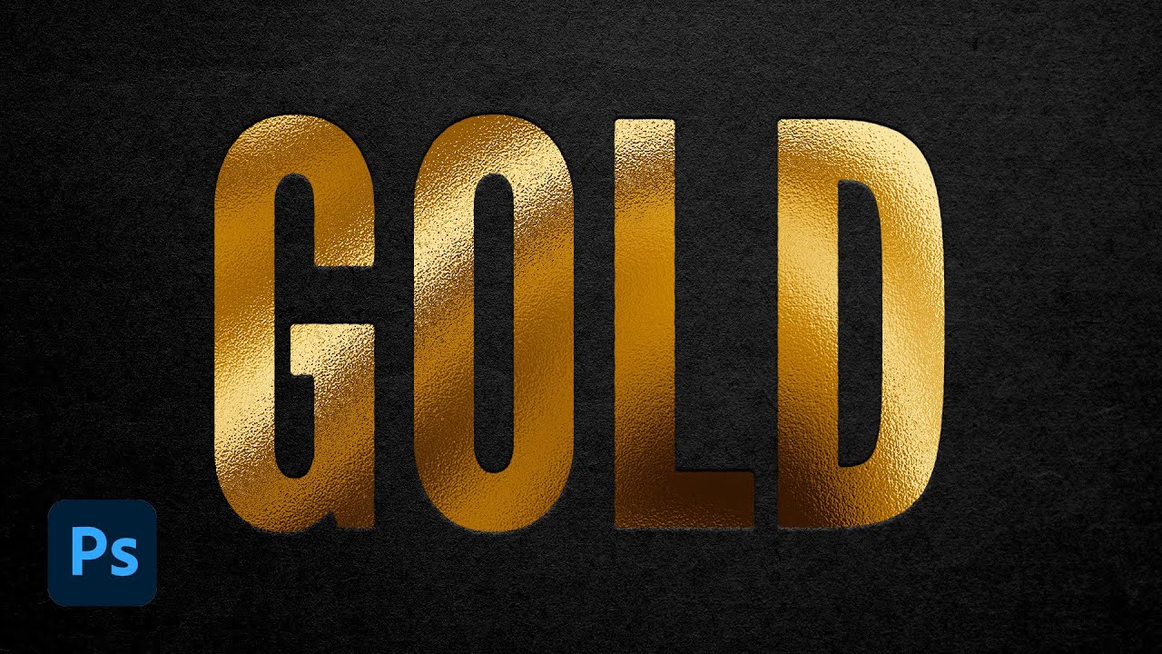
⭐ Get 20% off ANYTHING in my Spoon Graphics Shop - https://spoon.graphics/20off
In today's Adobe Photoshop tutorial I'm going to show you a handy technique for creating a gold foil effect that looks just like the hot foil stamping printing finish that adds luxurious embellishments to printed products. We'll first create a shiny gold texture, the...
I think the last one will help you more
any feedback


Great work
thank you
Gave +1 Creative Carma to @abstract oxide (current: #13 - 182)

currently editing some ghost recon breakpoint screenshots i took

any tips for beginners?
Learn about color theory, lighting, and composition. Focus on those and not gimmicks and effects.
thanks
Gave +1 Creative Carma to @wooden oak (current: #2 - 2775)
i will be bugging you again😅
dont look at other designers for exactly what to do. look at them for what you like and just experiment
express instead of follow
feedack plz


🙂 hank your feedback sir , its honor a lot to me, about the hand means like carees me feel warm hehehe
Not sure why one side of the image is so emtpy. The text could be a litte better placed if you draw some lines you see that they not match as good as they could be. Also some of the light reflections on the flask and the sword is a little off. Rest of the composition looks good imho.


Thank you 🙂
Gave +1 Creative Carma to @bitter fog (current: #210 - 8)


This looks cool.
I'm wondering if the caption text is a little too small, given how small thumbnails can be displayed.
The alignment of your text is a little random. Some suggestions to try…
- Center align
- Left align
- Follow the edge of the strawberry


This is pretty basic but does anyone have any advice on how to blend the area in after removing an object.
I feel like there always seems to be an area that looks a little out of place. I know I can spot heal to smooth out but I don't want it to over compensate and would like it to be textured/keep the same boundaries i.e. for a path the path and kerb


Seems to me the issue tends to be it makes it darker, I just do a quick and dirty fix of just making a new layer with the median colour, in this case the grey, and just slap it on, gaussian blur, paint it in manually.. there may be better ways to finesse the content aware fill but I find the manual method to serve me well! Not just blur btw , maybe cut and paste, stretch over, looking to reduce any obvious repetitions etc etc, sadly never found an easy fix myself
You could add an adjustment layer that brightens the area and then paint on the mask with a soft brush.

Michael is on the money here, would also suggest, if you have a clean cut of your item, can be easier to take your own picture of a scene, or stock pic, and drop it into that, making sure to pay attention to lighting
Hi there, what do u think about this design?

Hey guys I just finished up my case “Wirrkopf” a fictive brand which works towards better mental health.
Would feel blessed reading some comments on that project 🫶🏻
https://www.behance.net/gallery/221265031/Wirrkopf-Editorial-Branding
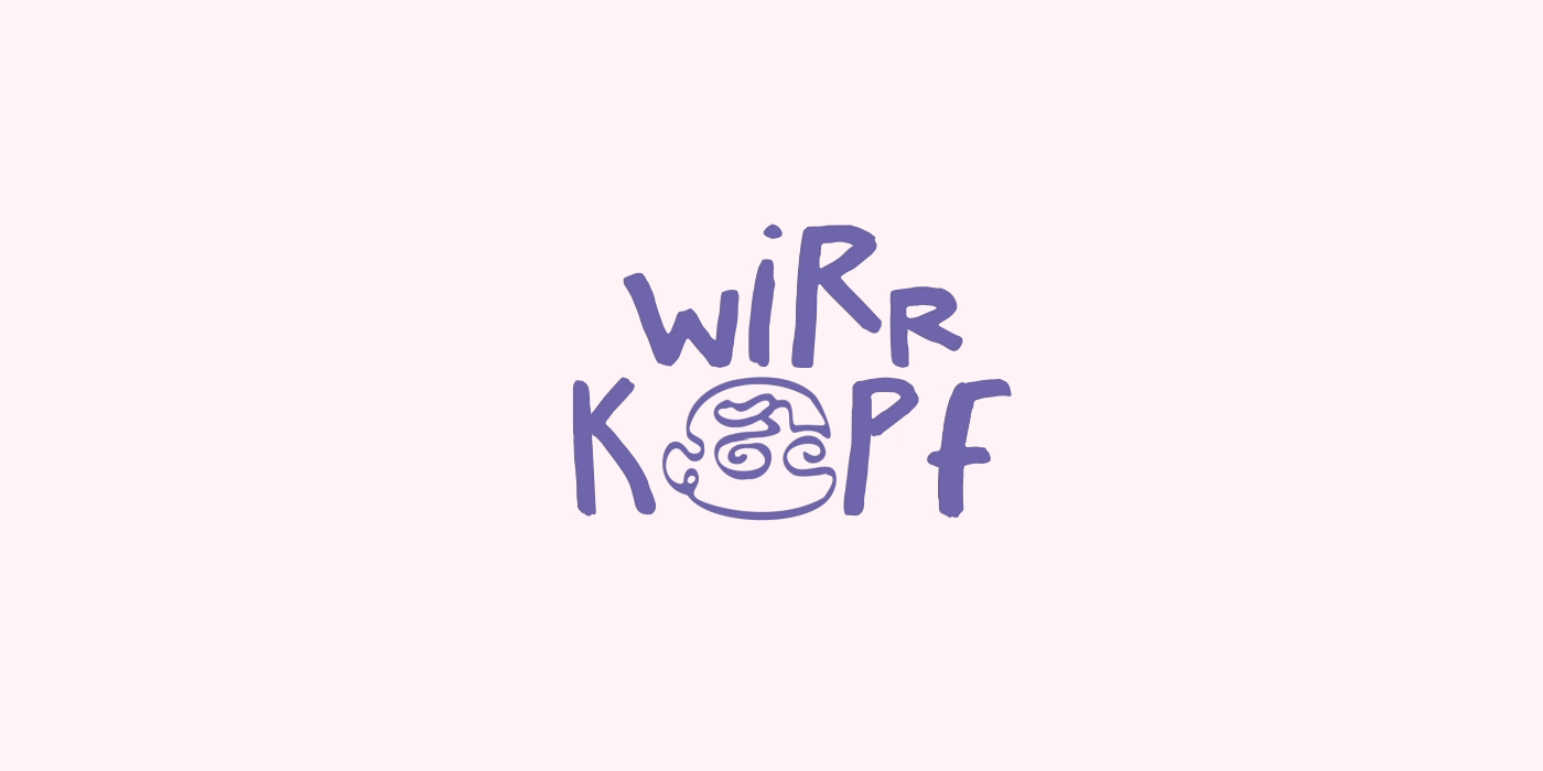
Wirrkopf | Editorial | Branding
Cool design.
Perhaps you could distort the thumb or the text a little through the glass ball?
any feedbacks?thanks in advance


@lethal carbon - Sorry. You can't advertise this service here.
texr is a bit sharp it doesnt fit
could try adding a drop shadow or a distortion map
Is there any way I could share it in a more appropriate way? Maybe in a different channel, or by reaching out to someone at Adobe who might find it relevant? I’d love to connect with the right audience without breaking any rules.
You're not going to be allowed to advertise services in this server. Try a different venue. X, Threads, etc.

or more something like this

the colors and type are really fun and vintage feeling. I do have a question about the icon though. Is a tag the only thing you explored as a logo?
you could try writing down a list of items or gather pictures, or whatever is commonly associated with this specific trift store so your idea is more unique to this specific store
It's hard when you have creative block, but when that happens its important to do more research so you have more of a base to be creative with
Cause unless they're an online only place, a brick and mortar store can rely more on vibes and unique imagery
awesome. hopefully their real life objects inspire you‼️ ‼️
the goat ‼️
Aw thanks , I may be more creative with it. I kind hate that the link shows the first slide of the case instead of the cover . Cause I focused more on the editorial and illustration part of the project 🥲
Gave +1 Creative Carma to @abstract oxide (current: #13 - 183)

You've got some great elements there. I feel like your main subject is the least eye catching element. Perhaps a little more light and/or contrast?
Hi I'm new to photoshop and am interested in creating such designs I love the overlay and the pops of color, It looks like another layer which is lighten or opaque but moreover it is like the white is replaced with another color. How could I create this? Any advice?


These could just be simple Color Fill or Gradient Layers with Layer Masks and or Blending effects. Either Layer Blend Modes or Advanced Blending. Not that difficult to achieve.
Give me feedback please 😁


Tyyyy
Can you please tell us what is what?
simplest way you could go about it is probably just putting a rectangle with that color in a different blending mode
probably soft light?
though you could try and see what works best for your design
It's a Pokémon called Stakataka, I'm trying to improve my skills on realstifying drawings, arts and such
Cool. What I meant was I don't know what is your work and what is reference material.
I only used this one picture to create the character.

Can you guys provide me with some feedback for this thumbnail I've just done?
I have a small 13k subs channel that I recently purchased from a friend, and I plan on posting content relating to anime, japanese culture and events, and many other relating subjects!
This thumbnail I've made for a small 30 min. documentary about the Kyoto Animation Arson Attack from 2019.
(#FF0050 is the main color of my brand, which is why I chose this style). Also the noise and such are artistic choices, but obivously the quality of the perpertrator's image is not great, since it was captured on CCTV.
Looking forward to your feedback, thank you!!

Grain is not usual in youtube thumbnails
If you're looking for feedback on your artistic choices, you're the only one you can get the feedback from
I would try to find a different photo of him of scrap the photo entirely
The rest looks decent, i like how you let the bottom empty for the time cap
That's awesome mate. Great work.
definetly, picture is low res compared to the rest of the thumbnail
everything else is fine
poster i made using my own mock brand, looks a bit odd to me rn but it might be the damned impostor syndrome

was kinda trying to get some gorpcore aesthetic?
wip


Cool comp. A couple of thoughts…
- The perspective of the car and the road don’t quite match
- The shadow of the car is far darker than the shadows on the cliffs
Perhaps you could obscure the cut along the neck by making it look like the neck is popping out between some of the swirls?
Thanks mate. Good luck with the project.
Gave +1 Creative Carma to @unborn sparrow (current: #976 - 1)
My file got corrupt the first time and I had to everything all over from scratch
It was much better before
Nothing worse than losing a file. I hope you've got a backup this time 😉
Anything for this one because it feels like the onions aren't enough
Like maybe the lighting should be better
More pink idk
I definitely like your concept. However, from an advertising point of view, I feel like the text and the BBQ far outweigh the product in terms of presence. Personally I would increase the size of the product and adjust the lighting. Right now my eye is drawn to the upper left corner.
And yes I think your BBQ needs more than onions 😉


I want the white to be beige, how can I do that in ps?

How that's look guy's 😉

Are you familiar with Gradient Maps?

Really good work.
Large parts of the suits are nearly solid black. Perhaps you could slightly brighten some of the shadows to reveal a little detail.
just started photoshop today, this is my first little project after watching a 25 mmin tutorial! is there anything you'd recommend to learn or do differntly?

Ok,i will improve in my next project
Keep up the great work mate
Okk boss
Wow I didn't think of that at all! Thank you for showing me
Gave +1 Creative Carma to @abstract oxide (current: #13 - 184)
Thank you. Happy to have helped.
Gave +1 Creative Carma to @prime rune (current: #976 - 1)
interesting idea, you could remake the cargo crates into the colors of the flags, as a nod to them
otherwise its good but like michael mentioned you could mess with the lighting a bit too
Ok bro i will try
And,thanks a lot for this information ☺️
youre doing good man i like it
Can't believe it's already been 5 years...

Im creating this and i just dont know what to add too it if im honest any ideas?

I want to bring back some of the details of the picture while it is in threshold, there is a way to do this by clicking rasterize layer and burn tool but it isn't working for me and i don't want to change the threshold lvl

Perhaps use a different method. Try stacking Adjustments, e.g. Black & White, Posterize and Levels Adjustments. That should provide a great deal of control...
I tried this out and its going great! I have another question tho, how can I create this effect or vibe that I'm going for on the design? Its like a grainy, dull, washed but also vibrant design. I tried adding noise, it looks good but I want to see if there are any other adjustments or filters I can use. I tried exploring a few, but was able to achieve the look I want. I think it may be the colors used idk


You could try adding a medium grey Solid Color Fill (convert to a Smart Object). Apply a Noise Filter to it. Then you can play with the Blend Mode and Opacity Level for it. See how that works.
You could also stack a Blur Filter on top as well if you want to knock some of the crunchiness down. :)
The E93 BMW M3 features a 4.0-liter naturally aspirated V8, producing over 414 hp and 295 lb-ft of torque. It does 0-60 mph in under 4.1 seconds with the DCT, with a top speed of over 155 mph. As the last M3 with a naturally aspirated V8, it’s highly regarded for its sharp handling and is becoming a sought-after collector’s item.
🏎 @_jpt8
📸 @e...

Hello guys 🤠,how that's thumbnail looks,give me feedback 🤘

I'm no professional but, I think you should remove the yellow light from the players and add a white or a bright colored outline on both of them.
thanks for the feedback
Gave +1 Creative Carma to @inner solar (current: #977 - 1)
Just finished this, one of the first photos ive taken so far with my new camera setup, what we thinking?

This helped tremendously! Thank you so much
Gave +1 Creative Carma to @wooden oak (current: #2 - 2787)
I like the shot and the look. Nice work.
For me the red car and red shop front are very red. Perhaps try backing off the saturation of the red in these areas just a little. Again, just personal preference.
hello this is my first thumbnail how can i improve it


Hi, did you try another color than white? Is the capital Y needed in the second “your”?
Hi, I would adjust the spacing of r and y in 1 and 2


Hi guys i have some questions... what is the best lut for you? And what should i add?
Your images aren't loading. Please try reducing the size and repost.


any sugestions?

maybe some grain on the text also
or a distortion map is what id usually go for
it stands out a lot
struggling with a book cover, it's supposed to be a class project for a poetry anthology but I'm kind of stumped as to how I can improve it. 😞
Additionally, is there a way that I can overlay the falling leaves on the text without being too distracting? thank you so much in advance!

w/ dimensions overlay

honestly in my opinion i dont see anything wrong with it
its really good for a book cover
maybe you could incorporate something to nod to the seasons changing like leaves changing colors
now im not an a painter so dont take my opinion too seriously lol
Overall I think the image looks great. However, when only looking at the front cover it feels a little bland to me. Perhaps you could add some more trees, even if only off in the distance? Again, really nice image.
need some help deciding on which one to go ahead with for a personal studio

feedback is appreciated

We don't have any context. - so it's hard to judge
Like @novel comet has already said. What are you doing? Clients? Industry? etc...
whoops my bad was in a rush, im doing brand designs mostly , for now aimed at small businesses
i just want to see which one is most aesthetically pleasing for someone whos not me
impostor syndrome is not fun
the 1st one in 2nd row

Maybe number them, and give more details about the style you are aiming for.
One of my latest work

The phone number stands out by a lot. It is good in a way, but I’d like to see a version where it is less intrusive
I like it. However I find the blurry basil leaves? a distraction.
ive figured it out myself after some time which ones i liked the most
turned out as a big ass file at the end


@ocean river - Please don't do that.
Oh I will work on that
Any feedback? I'm by no means a graphic designer, just want to do the artworks for my own songs. This is just a still from a video I took at a rave and made some edits to. Idk about the text though, finding it hard to get the right spacing and all, anyone got tips for that?

Now that I look at it again I should probably move the text up a bit lol
Or like this, idk I find it hard to get a good font and good spacing etc

I actually like the first version. I would only make that text a little larger (but still considerably smaller than "SPEAKERS")
Thanks, I aligned it with "EAKE" from "SPEAKERS" now. Something like that?

Gave +1 Creative Carma to @wooden oak (current: #2 - 2791)
This looks great.
A good thing about your design is that you could easily tint it any colour and the whole composition would still work.
Thanks! I think the glow is a bit extreme on SPEAKERS rn but when I decrease the size of opacity it looks lame for some reason. Looking for some ways to burn it into the composition a bit more. Maybe a slight motion blur look or something
The idea is to make it a bit of a template so I can use stills from different videos for each track but keep the same style
KNALWERK in all white really draws the eye. This isn’t necessarily a bad thing if that’s what you want. Perhaps you could make it grey so as not to detract from SPEAKERS?
So I kind of want to nail it once
This could definitely work as a great template. Nice.
Yeah, I was already thinking about that, tried reducing the opacity a little bit. It's my artist name so I guess it's not a bad thing if it draws the eye though. But I'll try grey, thanks 😁
Gave +1 Creative Carma to @abstract oxide (current: #13 - 185)
Cheers


I like it. It has to my eye a nice retro vibe.
I used one of my drawings
i think a distortion map would help, to make it something like i did here

it would kind of gradient it out and make it less hard on the eyes
but make it less intense to fit your project
Very dumb design🙃

Hey, thanks! That's a good idea. I actually ended up just overlaying some more textures just on the "SPEAKERS" text and I think it kind of worked but I will definitely try your method

Gave +1 Creative Carma to @glossy furnace (current: #472 - 3)

good choice, definetly helps too

I like it. However my eye is drawn to where the left edges of the N and K are out of line.

Hello! I’ve just shared the Synapse brand identity project on Behance. Feel free to check it out, and if you like it, hitting the appreciation button would mean so much!
https://www.behance.net/gallery/222199193/Synapse-brand-identity

Looks cool.
Personally I would increase the contrast a little and darken those shadows. Make the lighting a little more aggressive to match the subject matter.
@wooden oak should i make the yellow lights white?

I would make them white. I'm not fond of the yellow tbh.


fire
carti fan, i lovr it

fire

this one is the (before)
after:
too blurry
fixed that

yea this is calm
also , there is an another version , which one is better by the way?

How it looks guys 🙃


What y’all think?


That's cool
thank you bro
Gave +1 Creative Carma to @hollow marsh (current: #67 - 29)
i'm tryna grow my art account @khush.wonder
on instagram check it out
Maybe try only to fire-up the car, but not the person. Also if the car would be on fire it would lighten up the background also a bit.
oooooooooo good attention to detail, i see what you mean
gotta blend the guy in more
this is the one bro
working on a basic youtube banner and im thinking about adding some yellow or orange to this but dont konw where to go from here tbh

Cool project. Can you tell us more about you or the channel?

right now its just random bs its something on the side so i have no real plans which is part of why im struggling so much
looks good tho
ty i like your project too i have very basic photoshop skills id like to understand it as much as you do at some point
Gave +1 Creative Carma to @last moss (current: #309 - 5)
adding more things is not always going to make something better sometimes less is better
true i wasnt planning on putting to much but i guess if im struggling maybe i should just let it be
i don't know feel free to try different things and see if that makes an impact
gotcha ty
Rate my set-up and how did you find out that I'm working for minimum wage? 💀


I would focus on your colors and composition
i want to add yellow and orange since they’re complimentary but idrk how to go about it
I think it's a bit of a strange one to be honest...
It all looks... wierd.
The O is barely readable, you're covering the only face on there, the composition seems all over the place. - I'm not sure what sort of content this youtube creator makes...

i just put stuff that i liked together i had nothing in mind tbh

ai
honesty : ugly asf try harder need improvement
💀💀💀😭
send me ur png pic ill make it better
bleach based channel or what
gimme all the png's
or ill js make em maself
go for it honestly im busy rn so i cant hop on my pc this second but if u want to id appreciate it
oke
its not based on anything rn its just random stuff until o figure out what i want to do
ok
I like it. I don’t know the show particularly but your poster is sufficiently intriguing and so it would encourage me to find out more. Thats surely the aim.
Thanks 🙏🙏
It's a song!
https://youtu.be/aYS0TEYcT2A?si=D4dz3b10zyrQyuqp
Sum 41's "Dopamine" comes from their new record 'Heaven :x: Hell' — out now via Rise Records. Buy/stream the record at https://sum41.lnk.to/HeavenHell
Follow Sum 41:
Instagram: https://www.instagram.com/sum41/
X: https://twitter.com/Sum41/
Facebook: https://www.facebook.com/Sum41/
TikTok: https://www.tiktok.com/@sum41
Lyrics:
I’m born of b...
Gave +1 Creative Carma to @raw wadi (current: #26 - 91)
That's quite frenetic compared to your low key poster 🙂
That's definitely right! But i tried to catch the sense of it because some certian riffs in the song makes me imagine it that way and some certain words
I wanted it to be simple because my brain only function sweiss design lately
But also i did added effects to the image + gradiant map to make it sigma as we say and you know the image of the man standing i see it Fit
But i do agree for a rock song that's sounds nicely weird?
I wanted to blend the simplicity with the dark vibes a bit..

I would say it's that. I'd probably drive to the track 😉
I get that, But:
1 - i couldn't think of an image would Fit or find like what would i use ?
2- you could say the poster catches some parts of the song cinematicly
This is my very first image I created, but it's on Photopea, not Photoshop, and I'm curious if it's good. Any feedback you can give me would be appreciated.

i also made this earlier but it was from a tutorial

i made some others aswell


just remove the dear on the right
and add just a little bit of the yellow light on the left dear (just a really slight amount)
first tutorial i ever watched i know what you are reffering to
I do not like making posters of this type but tried and i do not know if this is good or terribly bad

First ever design
What should I improve and work on 🙂

The Porsche 911 Carrera GTS strikes the perfect balance between daily drivability and track-ready performance. Its 3.0L twin-turbo flat-six delivers 450 hp, launching it from 0-60 mph in 3.4 seconds. With a 193 mph top speed, enhanced suspension, and a sportier exhaust, the GTS offers an exhilarating yet refined driving experience.
🏎 @chris_...


The sky looks dull and boring you can some kind light the pointing towards the subject, the gradient is not really visually appealing, the text should definitely be bigger, and if you want you can add some tiny pieces of text and marks ( will make it more like a poster)
But as your first design this is not bad just improve one thing at a time
I’m trying to give feedback recently to improve myself as well
Thank you for the respone


Hi, please tell us more, did it start as a full color image?
yup
originally started as this

for my first poster i think ive done great
?
Second edit in my career

I know that the body is a bit to big
But otherwise what should I improve?


just messing around but i wondered if anyone has any tips

I would consider doing some visual research on what other designs of this type include. Also, consider your visual hierarchy and the type.
Great work.
Personally I would manipulate the lines of shadows to make them look like they are following the contours of the head and body.
thanks
Gave +1 Creative Carma to @abstract oxide (current: #13 - 186)
Thanks
Gave +1 Creative Carma to @open robin (current: #978 - 1)
No worries
Looks like a professional poster I don’t know maybe only experts will be able to point out the mistakes here or things to improve
I see, thank you!
Can someone critic my poster design

personally I would swap the positions of the hiring box with the joining box so that wonderful is not hyphenated:-)
You have a lot of overlapping boxes which disturb the flow of the ring below them. Perhaps you could bring things like the logo and contact info within the ring.

I need some feedback if anyone is willing to give. I'm working on my new 2d pixl art platformer game in unity and I'm creating my tile map is PS. On the right is the induvedual bocks and left is those to blocks put together a bunch of times creating a scene. Thanks!


I think this generally looks great. Really nice work.
You have some sharp horizontal lines that extend a long way across your image. My suggestion would be to break these up a little.
Every fourth horizontal gap is noticeably larger than the others. Perhaps tighten that up a little.
Best of luck with the Unity game


this is just a advert for a gaming laptop (for my school coursework), need some feedback on it
could also use some feedback on this too

Fire, make the headline bigger i suppoosr
Way too close to the bottom use margins bring em up

Try not to let elements get too close to the edges. The text at the bottom needs wider margin. Its falling off the layout. Also, brand managers don't like logos to be crowded. There needs to be more negative space around logos.
You could make your compostion like this ( the text info)

The "30% Off" kind of cheapens the design. I would drop that element.
Is the image ai or yourself from made these effects
Nope? I think many companies does that to attarct clients, his font choice is good like y2k tech style
Yeah, well, I'm not a fan of that. They asked for feedback and that's my opinion.
the images like the mouse are original (the effects, e.g,. lightning are not)
What is not good that your image size is 21 mp
So you made em with overlays and so on? I adore that
thats fair, it was an intentional decision i had to make, still dont know how i feel about it but i can go a different route with it
yeah but that's not the case because when you work many people be like:
Include a discount
Did you made a selection around the mouse wheel with pen or whatever, then color overlay and inner and outter glow?

Yeah? What's your experience level? You work in advertising or marketing?
yeah, i made a selection and masked the lightning so it goes into the mouse. used a solid color layer with linear dodge to add a glow to it
I did work with event management company, they gave me specific stuff and so on to include, and many clients do ask for that they tell you what to include
Well i really like these designs thats a well done but with some text management you will be fine
If you're a student thats dope.
thanks for the feedback, really appreciate it @gusty cape @wooden oak
Gave +1 Creative Carma to @gusty cape (current: #979 - 1)
Lastly is the 1st image ai generated? * the stock image *
yeah, this was the original image i used. looking back on it, i probably shouldve taken the little extra effort to come up with something on my own (i initially used it as a foundation to build on but i kinda just stuck with it)

I meant the laptops
oh, the laptop on the right is a photo that i took of my own laptop. the one on the right is a keyboard i took from the internet and the screen was made using the pen tool
Next time use y export for screens i guess this way your image size will be less than 21mp which is heavy
oh got it, thanks
Gave +1 Creative Carma to @gusty cape (current: #634 - 2)
I think one of the main issues with a design like this is: product managers are going to want the whole product displayed clearly. This split-image might seem like a fun notion but in the real world, the company would probably never go for that. A couple thousand dollar computer is going to need clean crisp photography of the product. And they generally won't put "30% Off". They will put the price or the MSRP. Just some things to think about.

The ad for the mouse is better because you showcase the product in a much more favorable way.
You can see it clearly which is great from a marketing standpoint.
i see exactly what you mean, and i agree. my coursework has a brief with some requirements/guidelines to achieve a higher grade - one of which being to incorporate some sort of binary oppositional theme to it (here, being vintage vs modern). if it was in any other context, i likely wouldnt have gone for something like this, but i completely agree with you here and i appreciate the feedback for it.
That's fine. Put the old computer in the background. The new product up front. :)
now thats definitely an idea. thank you
Gave +1 Creative Carma to @wooden oak (current: #2 - 2810)
The mouse ad is solid. Just watch the margins and try to give the text some breathing room at the edges. Same for company logos. Don't crowd them. Brand guidelines usually indicate a certain amount of space around a logo. Good work. Keep at it!
That’s super good woah
Top feels a bit barren but I’d just fix that by moving the mouse png (if that’s what it is/if you can) up a bit more to center it in relation to the text—but maybe just adding something to the top would suffice. I’m too indecisive myself to give effective advice sometimes lol
i definitely hear what ur saying. i can look for a way to fill some of that negative space, thanks
Gave +1 Creative Carma to @abstract forum (current: #980 - 1)

Ahaaa I'll make sure to tidy that up, thanks!
Gave +1 Creative Carma to @abstract oxide (current: #13 - 187)
Apperciate it, hopefully everything will go good
@spice quest - If you'd like feedback on a specific image, please just post that. Don't post all your social media links here.

So export a smaller version of it from Photoshop. File > Export > Export As...
This space is for feedback on specific projects. We can't have everyone posting all of their social media links here. Otherwise, it will turn into a SPAMfest.
If you want to post multiple images in one post, please use the #1110544577850511401 . Share a link to your gallery post here and ask for feedback on the work included there.
Thanks!
No worries. Thank you.
Gave +1 Creative Carma to @frigid flicker (current: #980 - 1)
Sorry they aren’t edited at all i dont have photoshop access as i only have my phone


I designed this logo a while ago for a client but looking back at it I don't like because of what I know now the circle is good but too complex for a logo can I make this more minimalistic

It's a small business focused on computer servicing and building called VONTEC
Got a deep itch to go snowboard after seeing this post
Have you considered connecting the V and T in such a way that it looks like a single continuous path?
Somewhat have some shirt designs that haven't been printed yet
Front

Back

Cartoony trading ui, what do you guys think?
Be as harsh as you want, I'm trying to improve!
