#📝project-feedback
1 messages · Page 24 of 1
its semi organised
this font thing is so annoying
ill setup a google drive link
in a moment
yea ikr
I always get these weird square bugs

and im using a second laptop
different one
there must be some layer above it
do u have the psd I'll look
yes but it says 9 minutes remaining

wait but i made a few polishes
so it isnt the fully updated version
if you can fix that square problem
ill be so happy
still waitinfg
Aight I'll help you 🤔 I'll do my best
yo sorry im back
Google Docs
This is the fully updated file
its 3gb
sorry it took so long
This is the final picture.. although

this part is anoying me

ok i fixed it
@cinder grove its finished @eager stream

Damn
Ii actually didn't fix it
I just covered it up
What did you do
Like experiment with it

I just layer masked it again
U see the balance font, IDK if it is nice
I'm just experementing
I don't really like the batman effect here
ngl bro the amount of work you've done here has just caught me off guard, but i think the layer management could be better

I have huge respect for you to be so good at this.... 
Also i just selected the subject and copied the layer mask u had, and that resolved this issue

And i did change opacity for a few too
Yeah I know 😅 i never delete layers just in case as a backup
Thank you so much bro I appreciate it :)
Gave +1 Creative Carma to @eager stream (current: #231 - 7)
Alr imma try that
also i think u should give a outer glow to the text
I will try that
I have to go now unfortunately, but I'm deeply grateful for all your help
I'll be back tomorrow and try those things

Hi I'm new here and a beginner in graphics designing, would love some feedback on my work.

This looks amazing but I feel like the big title colour should be changed
I thought that but can you expand on that
It doesn't really make sense to have a dusty dirty paper background with antique TVs and everything but having a red font with a glitchy text effect
Any fonts that might work
Look for an earthy dusty font, something that fits the background, I don't know font names on the top of my head unfortunately 😂
Real, i just go to foont book and take hours
np i just wanted feedback from a design perspective and what color would u suggest
this looks much better


I want to share this collage I created, a mix of textures, colors, and creativity. Every element was chosen to convey a unique idea. I hope you like it as much as I enjoyed making it. Feedback is always welcome!

888 Followers, 695 Following, 289 Posts - See Instagram photos and videos from reacto (@reacto____)
Hi all. I've been learning Graphic Design on and off for the last year or so. I've been taking one of Lindsay Marsh's Udemy course and I came up with these designs that I was thinking on using in my portfolio. Let me know what you all think


Hi everyone, this is one of my first works of this genre, I had a lot of fun doing it, how could I improve?

hey guys i wanted to ask what do you think of this expression of my character getting hit by a basketball?

It’s giving basketball on baseball violence
Perhaps a few teeth and/or a tongue
Hey guys im updating this for my portfolio what do you guys think? the first one is the updated one.
i have to add a few more details, but after that, I'll be mocking it up in different mockups


Is this figma?
It looks quite minimalistic and in this menu screen the White box which comes from the right side should cover all the way up

Also add a Black or gray line in the centre middle bottom as on apple devices exit is to drag from that line
How can I make this more realistic?

Looking good?

Make the number plate more realistic?
like minimalistic in a good way or a bad way? 🙂
Well it depends on the user right? Nowadays they make it look too modern ifyk what i mean
from my prespective i usually don't prefer it so simple
im stuck on what i could do with it.....
you added the black car, right?
Hmmh?
What is the difference to your old topic? The transparency?

I wanted to ask about the expression which I'm going to adjust it a bit
yeee
Can we see the original elements you used?


it looks pretty good, but the only thing that looks off is the car's shadow
try making it smaller or less diffused
the car is 3d

Oh ok, tmr i’ll try this too
That's asset (Plugin : Blenderkit)
What's the render setting, as i can see u haven't put up any light source on the project file
How'd u get the Sun effect on the hood
hdri
I'd suggest u try cargo kitbash 3D for assests
aight makes sense
ofc lol I didn't think u could render on world material output too
Also it's day time exr so yeaa makes a lot more sense u really don't need a light source
nice work

good job very expert like
hmm ty
Gave +1 Creative Carma to @vivid spoke (current: #963 - 1)


For a moment, I read that as 'SpankFest'
However, I think that's more a reflection on me... than your design.
Perhaps make the darker parts a little lighter, so the logo can be read better.
Also the block under about us isn't well aligned or designed.
bigger and better font. especially bigger that left upper corner.

In my quick 'fix', I've scrapped the words 'About Us', it's not required.
The box at the bottom covers most of the texture behind it anyway, may as well go the whole hog and make it bigger/opaque
It was too wordy, so removed the textbook definitions of what Digital / Social marketing is.
I question what on earth the fashion images are about, but I think that this level of feedback is beyond the scope of the feedback at this point
Do you have any ideas on fonts?
i like bold fonts, I dont know what suits you, but that one looks kidna old.
hmmm will look in to it
Like clean designs
but the logo in the left needs to be bigger correct.

Ty james
Gave +1 Creative Carma to @novel comet (current: #5 - 1089)
Ohh
Hmm I'll work on that

Maybe its better to erase some of the red texture in his face/neck so his going to look way cleaner and better. Also make your name llampis smaller ,remove the backdrop shadow from the letters and you could make the fonts more artistic(like a signature sign). Also you could remove completly the name SALAH(or at list put it in a better position in the canvas to make it stand out). Last i noticed that you didnt quite make a good mask of SALAH(watch a youtube video on that). Thats my opinion ,hope i helped❤️👍
Thank
album cover i made!


Nice, only thing I'd change is centralising the song list

Nice work. I like it.
Have you tried having the base of the text fade into the clouds rather than get cut off by the horizon line?

Did this after watching the tutorial in the gallery and happening to seeing this pic shortly after

Nicely done… in a grotesque kind of way 😉
Perhaps a little cloning or distorting on the teeth/nose so it’s not such an obvious cut/paste.

What are ppl thinking abt this one i made?? still a made in progress😅

Design itself seems solid. I would try to give a bit more gras and maybe a little flower or so on the ground. Also the Yoyo Thingy on the string cold maybe a bit more or bigger or better.
ok thx for that
Gave +1 Creative Carma to @normal spoke (current: #21 - 105)
Really nice piece.
For me the contrast of the text and the image don't quite match. I like both, but I would personally adjust one to match the other.
Perhaps the black border around the text is throwing me off.
any changes or additions to this poster im working on??

I'd be careful not to be put text to close to the edges of a page. There should be a decent margin and whatever margin size you choose should probably be equal on all sides.
I like the image. That seems pretty strong. I'm not fond of the text treatment. I'd probably work on that a bit more. Use all that empty space a bit better.
What are your thoughts on this? No colour just black and white?

I really like the design. Nice work.
I’m not sure about just flipping the image and using it a second time? Do you have a second image you could use? Perhaps one where the shadow also falls in the same direction as the other image?
Finding pictures that i can work with from the Truman Show was hard. Unless i screenshot the movie but the quality is terrible. i am working on another one though...
Thank you
Gave +1 Creative Carma to @last moss (current: #963 - 1)
My pleasure
Took Bullo's advice and changed up the top images...How is it now...

Yeah this looks cool.
But you couldn't find a better image of Laura Linney? 😉
Hey hey! Can anyone dm me so they can check out my artwork I made? I would really appreciate it!
i have 2 of them to show off
made a new poster! what do yall think?


From the web...and its all Truman actually

My worst experiences with sports, what you think is the best one?


I like the upgrade you made that includes the teeth. For me the bloodshot eyes could use a little work. Perhaps some heavier lines with variation like you did with the mouth.
You don't want to post it for us all to see?
fr that's sus
1st time trying hair color change following a tutorial


@eager stream @royal latch
listen, so i'm making this collage-style promotional image for my youtube channel with a bunch of artists, my approach for this is an old newspaper or magazine, any tips or tricks or ideas on the web on how to make this more eye catching for youtube so people can click on my video based off of the image as well? any suggestions on what else i can add or whats missing


dope. What's your insta?
designedbyjinsi...why?
Jennie from blackpink has released a mv as a teaser for her upcoming album...what are your thoughts on this poster?

you post your designs, right? this is exactly the style im trying to learn so I'd like to check more of your stuff out
any comments or critques?
If its so, i can give you more accounts where you can learn more...i am also currently learning this style
I kinda think everything is too dark
And gloomy
hello this my latest project I hope it is good
yes, please do!
Just go through my following list...then their following list😂


Working on this thing, anything I should add/ remove? I also need to think on what to put on the bottom

Lol I love it. It is really cool, I would maybe try and add some different survives. it is 5 of the same font and spacing. Maybe mix it up a little bit, but either than that it is super cool
Oh yeah definitely, do you know how to have each font rotated in different ways in one line?
hmm im not sure, what I would do is try finding the font online and that will give you room to move it around a little, but you can also just find the word survive in different fonts and orientations, may help a bit
Alrighty, thanks for the feedback 👍
Hello, new here.
Today I made an artwork inspired by a Gorillaz song, Feel Good Inc.


Please give me feedback
Really good combo. Nice work.
The lighting looks a little off to me. It doesn’t seem consistent.
Have you tried one large SURVIVE rather than lots of small ones?
Really nice work. Did you model this yourself?
my feedback would me to decrease the brightness on the right side and increase the transparency of the Text below Good INC it's not exactly readable
though it's blending in so nice the text
also can we have more small butterflies, it's blurred in the front and that's understandable but for it to make more sense i think there sould be a few on the island tooo


Thank you 😊
Yes I did
Gave +1 Creative Carma to @abstract oxide (current: #12 - 179)
Awesome. I'm a big fan of Blender myself.
love the pink
Yea blender is good, But it has some problems with modelling (extrusion and inset are broken).
😵💫
😒
Broken? I use them regularly and they seem good to me. Any specific problems?
I could show some examples but they'll clutter the channel, may I dm you

Maybe but I'm not sure where to put it
Sorry but I don't do DMs. I prefer to keep all activity public.
Alrighty
just small problems, not a big deal

check THIS out

fixed lighting with camera raw filter
This is my work, isn’t what I wanted to do , but it look good!


this is actually really clean, nice work
Thank you, planning to make 12 minimum for portfolio
Gave +1 Creative Carma to @lunar cedar (current: #627 - 2)
hm, if i were you i'd try to divide them into 6 and 6 to post 2
post the first one, then post the second one with the same name but with a "pt II"
or something
You mean post them in batches
🫡
Alright
After finishing 12 Will switch to display shelves/exhibitors
yessir
Btw if you ever need a custom mock-up for a brand... I could do that 🙃.
I Feel it too
❤️❤️❤️
I was thinkhing about it when i was in the process, but i didnt find the type of butterfly image that i wanted so I only put those
Actually
that isnt my only music project
have a look


Could you explain to me why did you feel it?
i don't know how do i make the ground he is standing on look better. any tips? 🙏

Helllooooo, I made this on photoshop and i'm making this collage-style promotional image for my youtube channel with a bunch of artists, my approach for this is an old newspaper or magazine, any tips or tricks or ideas on the web on how to make this more eye catching for youtube so people can click on my video based off of the image as well? any suggestions on what else i can add or whats missing


The shadows on the rocks suggest they are lit from above while the person is very evenly lit. Perhaps add some shading on the person along with a shadow of them on the ground.
One example… The rock is very dark and almost in silhouette. However, the person and windmill are quite bright.
Probably best to post your Blender questions on the Blender Discord server.
This looks great. Good colour and contrast.
Oh, I see, thanks
Gave +1 Creative Carma to @abstract oxide (current: #12 - 180)
No worries. Thank you.
Gave +1 Creative Carma to @shy crypt (current: #964 - 1)
Thanks
Gave +1 Creative Carma to @abstract oxide (current: #12 - 181)
Alright
İ haven't added any shading yet. I now that the lighting of the objects are off, but I don't know how do I fix the lighting of the rock's to make it look like it's coming from elsewhere.
Attempt at changing hair color. Any ways this can be improved?


Second image is the reference
U left one strand on the shoulder

why is there a white line behind the hairs

It's because of the brush size I assume
The parts where there are individual strands were a bit sloppy
what do we think ? any feedback appreciated

Try making the text stand out but if this is the look you are going for then it looks good
I can’t understand what this is exactly
And poster designs are about telling visually
appreciate the feedback , i’ll
improve on this
Keep improving


ISAGI ⚽

new tee design any thoughts?

looks cool
Nice cracked MC plugin

I’m very new to photoshop but I’m in charge of making theatre poster for our theatre play. My ideas is to make a rose roots vein strangle the neck. Is there any idea that can help me improve or any suggestions on how i can execute my idea better ??

i'm thinking of something like this but instead of the sword there's the neck. is that what you're saying?

yes actually
that's actually a great idea for me to do, but i'm not really sure how can i put a rose root vein on the neck and look realistic
i'm so sorry for asking too much but is there a guide or maybe a youtube video that can help me ??
i've been finding it since morning and i cant find any
Its about servers. Not for plugins 🧏♂️
Its cool
this is my progress so far. I want to put a rose but i dont know where i should put it


which is better

I like both for different reasons
I love it
maybe I would add some text boxes


Hey guys! Look at this Frank Ocean poster I made. What do you think?

thanks for the feedback
Gave +1 Creative Carma to @wheat sigil (current: #188 - 9)
Any feedback?


It looks really neat! Is that a podcast cover? I like the one with the Golden Gate Bridge better because the red provides more contrast and looks more patriotic. Great work!
Thanks! And It's a thumbnail design
Gave +1 Creative Carma to @naive palm (current: #308 - 5)
Any feedback

Looks cool.
i really need help on how can i make the women behind blends in or even any ideas on how to improve the picture

the blood stain on the lady is not looking real just play with its blends and colour adjustment
i think the hardest part will actually be finding the assets. blending two images together is quite easy
https://www.youtube.com/watch?v=uSUpLsZTrdM this tutorial helped me a lot and is easy to follow through

13 must-know photo manipulation tips for beginners in Adobe Photoshop.
👉 Want to master the Adobe software and design like a pro? If so, click here https://go.dansky.com/courses
Download the project files here https://www.dropbox.com/s/szim8kc25j6d6od/Dansky_Projects_Fidget Spinner Desert Photo Manipulation.zip?dl=0
----------------...
but try to search for free stock image websites and maybe you'll find something
this is another one https://www.youtube.com/watch?v=4uqcF7d0hLM

Welcome to the master class of advanced photo manipulation! Get ready to embark on an incredible journey where you'll learn how to transform ordinary photos into extraordinary visual masterpieces.
- My premium course (Photo Manipulation Ultimate guide!) :
https://nourdesign.teachable.com/p/photomanipulation-guide
- WhatsApp for any Questions...

[Free] Random paper type - ^^Studio 6996
Any feedback?

Nice job.
Try to add warm light to the headlamps and a bit more texture to the white background and see how it looks
Thanks, I'll try too. By the way, does anyone know a place where I can post my posters to get commissions and sell them?
Gave +1 Creative Carma to @last moss (current: #627 - 2)

Cool & colourfull
Plz rate it


the things on the top like "home, about gallery" and the date should be smaller. they're not that important and are cluttering the space
also why is the time with a semicolon?
Looks great.
Cool design.
For me you place your text too close to boundaries like the edge of the canvas and buttons.

Hi I need some help... this is a formal and is supposed to be the first to market "pre-sale"
How could I segregate "City Hall" and the date under yet it still being relevant, like in other words what do I do with it....
Is everything else okay looking lol.
Blank space at bottom will be for logo but for privacy its not there
I did post this on #❓ask-a-question but this is due to be put up in like a few hours so im hoping someone kind can quickly give some feedback
You might want to remove the white glow around the building
fiar point, changed it to this now

Hey that looks way better. Nicely done.
Any feedback on how I can improve this

The information isn't complete that's why it looks so sparse
Any way in which I can build on this direction

Anyone has any tips on how to improve this poster?

@snow trail
https://discordapp.com/channels/547473772727238676/548246314383835146/1334822088757743616
I think the issue is that the Background and the bike look too similar, you need some stonger contrast between the two
You could also use generative fill to generate the missing part of the wheel.
Good job with the clipping btw
Yeah I was trying to figure out how to get that missing part but that’s a good shout, thanks.
Gave +1 Creative Carma to @novel comet (current: #5 - 1093)
Yeah thank you, it took a decent amount of time
That’s the problem I’m having, I don’t really know what background to use .
Sparse is good. You don’t want it to be too cluttered. Only suggestion I have is make the main text a few pixels bigger. Nice work!
Maybe it is meant to be like this? I mean it’s cool to go against what everyone else creates and create something unique
Ahh okay got it , thanks much
Gave +1 Creative Carma to @naive palm (current: #273 - 6)
i'm not criticizing their choice of whatever they decided to put in the design.
also not sure how making it bigger makes it more unique... i actually like the design so i think making those adjustments would make it look better
I'm making a lyric video for someone and got asked to "replace the sun vector overlay with something a little less busy." But, I'm not sure what I should replace it with. Any ideas? Thanks

I like the look of it, but maybe try a different color. I think a light pastel orange would look nice.
Hello Everyone I need some help. I want to add the texture in thie eye for one of my designs. is there any textures that will match it?
Image


@proper knot - Hello. Please post files that Discord can display natively. (Not files that people have to download.) If its too large, you'll have to reduce the size/dimensions before posting.
Now I know that making them smaller is better and considered the best but I have also seen websites that make things huge on purpose and I believe that someone who created this design knows that and went for that style on purpose
It is anime so you can expect this kind of stuff
fair enough. but in design i think it's crucial to make things look intentional. and i believe that's the difference between those websites and this piece. if that was the intention of the designer, then that's it, no questions asked.
however it's important to understand why it might work better in some contexts than others. i've seen a lot of minimalist websites where type is the main focus, so they can do whatever they want with it: scale it, distort it, etc. in that anime design the main thing seems to be the girl and her character description.
and the bigger the scale the more importance and protagonism it has
Yh
I agree here
Any thoughts about this combination?


yep, I agree with you
Plz rate it, just a design, no promotion to saitanism

hi i'm durgesh and i here to show my work and you all rate my work also tell me i charge right amount for my designs or not.
my banner design charge around 15 dollar
and insta post design around 10 dollar so is that right or less ?


You should charge more
@last moss thanks for your feedback
Gave +1 Creative Carma to @last moss (current: #466 - 3)
Very crisp work! You could easily charge more than $10-$15.

hows this for my first edited photo? any advice for next time?


I think the this part should be a bit more dark

Hi @toxic dome
Unfortunately, the image has many places where there is no colour information. Such images are ‘difficult’ to edit.
However, colours, sharpness and contrast are in the ‘eye of the beholder’. Ultimately, however, it depends on what the finished image is to be used for.
Here is a third variant


any honest feedback? feel free to point out any mistakes or things that can be improved
just do not say a mere good or great
It’s looks pretty good, but a little cluttered. Maybe add some more contrast as well to help each character stand out more.
Thanks anything else you can think of besides the contrast?
Gave +1 Creative Carma to @naive palm (current: #232 - 7)
Try that first and go from there.
ok
Thoughts?

how?


The differences in style, one being a 3d model of Arthur Morgan while the other being a drawing on the far left, seems a bit jarring to me
I see I see great you pointed that out but should I make some changes on the one on the right that is black as well? Far in the background
You mean the silhouettes? In my opinion they blend nicely with the background
Hey people here is a recent design that I did for my t - shirt . Do tell me your view and thoughts on this it would be really helpful for me . All kind of feedbacks are acceptable.


A okay
ratings plz

Cool image but the text is difficult to read. It either needs more contrast with the background or something around the edges, e.g. outline, glow or something to push it away from the background.
I'm not really sure what this is or is supposed to depict. Thus, providing helpful feedback is difficult atm.


Try dots just on the background, not on the guy. I like the colors!
This is for my first printmaking project. Supposed to be a surreal graphic illustration combining 2 subjects from a list we made in class. I picked Crows and Coral


Would greatly appreciate any feedback on this "sporty and rich" inspired design for a sorority!

Wow this is so cool
Thanks
Gave +1 Creative Carma to @lavish flame (current: #967 - 1)
thoughts?

Hey i made a logo for my clothing brand and think it would fit into the surrealism design trend. What do you think?


I wouldn't take my advice too literally, but for some reason I feel like the oriental caligraphy under "VOGUE SINGAPORE" could use a black stroke. Or maybe a stroke the same darkness as her hair to match.
like that?

or more bold

i also thought of this
B1 to B2


its supposed to be a back of t shirt design
BLue version Or Dark version ?


Blue. Both look very nice, however.
While the parts of it blurred effect is cool, my vote definitely goes to the stroke. I would probably set it to the inside though so the symbol on the right has more white in the centers.
I’m a beginner can anyone give me some tips

Honestly, just watch some beginner videos.
Unless that's what you where going for, looks like you didn't take the time you could have on the masks. I assume you don't know about using the quick selection tool (W) to make masks which would have isolated things better, and efficiently. For example quick select the red symbol and the ghost and then press the mask button it would have masked it quicker/better than that without any of the exterior black. To go even further into better masks the select mask feature can dial it in even better.
I like the silly idea though, I ain't ahfraid of no troll.
Check out youtube etx
I still like Monstadst's character designs as someone who quit the game 2.5 years ago.
Both looks really good
Images and Shadows etc need cleaning up , but any feedback on the concept and overall design ?

first project

I made this and thought it was hilarious, but kinda really want feedback from others

You would probably benefit from making masks like that of the man from the quick selection tool, object selection tool (both W I think) or even just the remove background button. Or more time manually brushing which I assume your doing. But if you made that for someone outside the editing world, I'm sure they where stoked for it
Looking at that (as an amateur myself) it looks like a legit ad
I don't drink soda but I kinda want a Coke now for some reason. heh
But to your dissapointment, you drive to the store to get a Coke, and it's actually Pepsi in a Coke bottle
Thanks
Gave +1 Creative Carma to @hollow marsh (current: #80 - 23)
True. Sometimes, you must look... deeper. (Muwahahaha!)
That's really cool. I just saw something on the science channel about the potential of human skeleton abnormalties from humans born in space that provoked a flood of editing ideas. And it's funny that you sent that, specifically because of the skeleton involved.
Also if you find yourself an enemy you could edit them in this fashion with a tiny brain lol
Be honest: Did you get the vibe that I feel like I'm some hardcore magician because I can edit but what I did with my abilities was simply make a Pepsi Coke? Because that's what I was going for. And because I made it it's all I can see from it.
I saw it as a magic act but actually, the headshake reminded me more of "Bewitched" where she wiggles her nose and the witchcraft happens. That's honestly what I was thinking about. heh
Thanks for the honest feedback. Bewitched always fell under my radar and I never watched it so I don't know about that. My intention with the headshake was kinda look at me I'm a "crazy magician" in a sarcastic way because of how simple it actually was.
Gave +1 Creative Carma to @wooden oak (current: #3 - 2659)

The lips at the end of that
Samantha is mostly known for the nose wiggle but she did the lip thing too I guess. heh

Jeanie (I Dream of Jeanie) did a full nod when she worked her magic. :D
I wonder how much pink smoke Barbara Eden inhaled on the set. But I digress... Yes. Magic.
How the hell did you do this????
What a refreshing reminder how pretty she was. At the same time it reminds me how limited "pretty time" can be. for better or worse...
Logomark & Typemark Variations

I'll try to do a video that explains the technique. The basics of it are not that tough.
Waiting for it


B2
blue
same thing i was wondering🤣
thats sick, really gave me a jumpscare there
Just finished the first Poster for my brand, what do yall think?

The background is decent, but the picture of the person you chose is incredibly blurry. When finding a good photo to add make sure it is in good quality or it won't look great. Still for your first project not horrible, just try finding a better quality photo for the person.
Damn i fw it heavy
Love the text style and texture
Thanks man
Ofc

Alright so I have been working for a while now in a project in my free time so I have created a vector. and today I loaded it up in photoshop and I am kinda in an impasse, so I gave the chess pieces here a texture, but dunno looks kinda amateurish, been a while since I used PS for sth like this.
Also I don't know what colour scheme to use, how to improve what I made there.
Hoping for some useful feedback, tipps, inspiration and whatever comes to your mind. Ty in advance.


I agree that it's not working. What is it for? - it doesn't work as a logo.
The font with the thin stroke gives me Microsoft office 2006 vibes.
I don't understand the giant O either?


I'd have gone for something insanely different...

but again! - To be fair, I don't know the context! 🙂
basically I am playing with this idea, inspired by an english channel, to produce a chess teaching youtube starting the series at the very beginning, so the giant O is really a 0. I'd say the stroke thickness is definetly an adjustable variable. hmm, I do not really hate my design. Yours is definetly more serious and less playful.
Agreed! 🙂 - I wasn't sure what the purpose/goal was. - Yours is more suitable for a friendly youtube channel
Ok then. - Just use less colours. - Maybe white and a nice blue
@still crystal what can I change?


Wow, this looks unique.

Hey everyone! 👋 I’m designing Helping Hands: Cal Fire, a resource app for wildfire responders, volunteers, and fire-prone communities. I’m gathering insights to make it truly useful—if you or someone you know fits this group, I’d love your input!
Help shape a tool that gets critical resources into the right hands faster. Click the link below! Thanks in advance if you are able to take the 5 mins to help me develop this application.
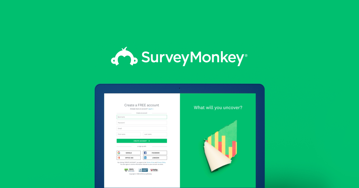
Take this survey powered by surveymonkey.com. Create your own surveys for free.
Good morning, sorry for the late reply it was late here in germany.
So I really love your idea, at first I thought about just the 0 with a knight for the pfp on media. But I think it has a more, not sure if this is the correct word for it, "elitist" touch to it.
And then I just drew up this idea, which seemed a bit more playful. idk... I might go back to the drawing board.
The idea is to also attrackt maybe younger people with a curiosity for chess, so translated it means "Chess from 0", that's why I went for a comic-like design.
Can’t tell if that’s good

Actually id really like feedback on this

😂😂😂
any feedback ?

Any thumbnail designers here? Which of these is more attractive, and can they be improved ?


imagine, an html language learning brand logo, what can i add to this

or is it enough ?
good place to collaborate on a project?
Id say find someone at ur level and discuss
Id say remove the 1010101010 and dashes and dots, the simple brackets and 0 look great and simple
I'm trying really hard to find a "mecha art" channel, but having difficulty. suggestions?
Hmmm… maybe search google/instagram? that’s very niche. You could try asking chatgpt for mecha artists online and find people who follow them/they follow. Connections are huge
Does anyone feel like they could give me some ideas on how to make it better? Supposed to be a phone wallpaper for a WWE Wrestler called ' Penta '

This is the first time I did something specifically like this but know It won't be the last of how cool/fun it is. If anyone sees anything to improve for next time I'm all ears.


I really like the color scheme on that
i am facing this issue while opening after effect.. try so many things but still didn't resolve

It is nice. Complimentary colors.
This is the Photoshop Discord. You should ask in the Adobe Video Server: https://discord.gg/adobepremiere
There were some broken parts in your picture ...
😇

I'd probably loose the blue, since the 3 colours don't sit well together, tighten the kerning, use a chunkier font, change the gradient to apply to the whole thing instead of individually, remove the random 10101010101 and smily face, and instead add an icon to represent 'learning' like a mortar board over the 0.
As well as adding an actual name of the product/service/organisation, since the "Brand Mark" alone won't mean squat to anyone if it's a new brand/logo...


another recent school assessment,

could have gone better but it's pretty good i think.
First impression: It looks too good for a beginner.


Yeah. Yellow against white doesn't work. Also not a fan of all the noise on the car.
alrighty! thanks for the feed back!
Gave +1 Creative Carma to @wooden oak (current: #2 - 2669)
Does this one look good?

Is “computed generated” a compliment 😇
It's not AI is it? Is that art from an anime? You've composited the elements together, correct?
Yea i made it out of scratch and i designed it based on a character in a game
I was just trying to test out the visual hierarchy or something like that

But for sure - if you have created it yourself.


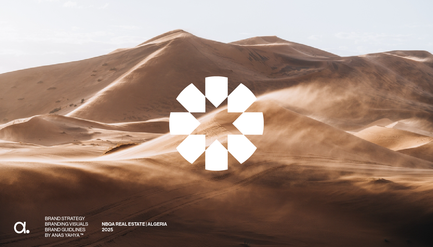
NBQA - Branding & Visual Identity
Don't forget Appreciate it if u like it. Thank you ❤️
Looks nice tbh, but I'm amateur as well


That is my best work
which one looks the best out of the 3? i tried a few tiny chnages to see what would look better.


What's it for?


I'm not really a fan of the italic title, and the black frame makes it feel like a motivational poster from the early 90's. I'd suggest you bring in a different colour instead of the black, which would make it look 'cleaner'... perhaps something like....

I wouldn't pick either.

The contrast between the dark background and the letters isn't great.


oh, that's more readable 🙂
To be honest, if it were me, I'd drop the chrome and keep it a solid colour perhaps?

@weary briar
I'll def give it a shot i really like the look of this, I'm pretty new to PS and keep things basic lol
He so quick with it lmao
Init
Tbh bro that looks good but the logo is for a reselling group and theres lots of other competition with the same logos like that so I want to stand out
Do u have any other tips?
or ideas
I mean
What's a reselling group?
it’s a reselling brand
I resell designer clothes and shoes
You seem to have good ideas
This is my current logo

But
Im not liking the crown
and I’m wanting a change
You buy unbranded simple items, whack a logo on and sell it on again?
(Not knocking you. Many major brands do this)
I'm just clarifying
oh, sorry do you mean you literally buy them, and sell them on?
No like
My friends son does the same thing with trainers
ok cool. So the brand itself isn't printed on the items.
Nope
I regularly buy business cards tho
so logo needs to look the part
Is there any way u can help?
yeah I reckon you could try a sleek, premium serif or minimalist sans-serif font, or try out some Luxury-style fonts like those used by Chanel, Balmain, or Prada.
Do you know the hex code of that color you used?
Maybe try some minimalist emblem, such as a diamond, shopping bag, or a subtle reference to high fashion, like a stylised hanger or stitch lines.
Black & Gold, Black & White, or Monochrome might give it a more sophisticated feel
orange: #ffb900
grey: 1c1c1c
Im going to be 100% i dont understand that
Is there anyway you can make this better?


I was thinking of using the room bold font
can someone help me and what to do with the top text please? (also ik I gotta clean everything up)

The current crown doesn't give off a 'luxury' feel.
To be blunt.... It's givin me a .... *"6 year old who's made their own hat for their school play" *vibe at the moment 🙂

Did u use AI
See if you can perhaps find a stock image of something a bit more fancy
Part AI, part me 🙂 - For the sake of speed 🙂
Yep
I'm only being this critical since you posted in 'project feedback' 🙂 - and I'm intentionally being nitpicky
Your earlier logo made me feel like it was the logo for band or something...

"TOUR DATES COMING SOON!"
I'm going to stop before I potentially hurt anyones feelings. - Good luck with the rebrand 🙂
Here's what I managed to do, I basically just kept what you had but used a different font on it, added drop shadows, and made the centipede crawling over the word "The".


What kind of business is it?
he works at a tattoo shop
and specializes in american traditional
the art in the card is his art
Id say the 2nd one should be good

If you print that on anodized aluminum it would be cool but more expensive than standard cards

Identify fonts with our font finder tool using an image or photo. Upload an image, and we’ll search our collection of over 133,000 fonts for the best match.

Looks cool.
keep it silhouetted or not?

Hey James

How’s that
forget the background
is that perfect?
Something my younger sister made with photoshp. (She making a updated one soon)

I also use Cinema 4D for my texts... https://www.behance.net/gallery/218814789/Anime-Headers-2025 All are in my behance. You can check if you want !

just magic bullet looks, its easy, but its looks good
This is not constructive feedback. If you leave a comment, please write actual feedback
Its good in the ensemble but the text look bad and its too much extruded
okay heres a weird question. I'm trying to create a frutiger aero style computer, however its a computer made somewhere between the 1960's-1980's. Although I think the design works well, I need it to feel more like theres a flashlight in front with no other light point, as opposed to a studio light setting. How would i keep the look of translucent shiny plastic while only using a single point light? Would this entire thing be easier to move to a 3d program and learn a 3d program? I have no clue. Thank you for coming to my ted talk.

Testing out a new (windows 2000, frutiger-ish inspired style) what do y'all think?
Also credit to SailorTrekkie92 for the icons!

I have no idea how to go about helping you friend, but this looks really cool :D
Any feedback on it

remove the bevel on the "M5" and "C5", and lower your drop shadow, or at least the choke of it. The bottom part looks pretty good, but the middle has too much dark spots. Your eyes tend to gravitate towards the middle, especially when the middle is a little brighter, like a vignette.
pretty solid work though man, good job
Thanks a lot
Gave +1 Creative Carma to @mystic plover (current: #207 - 8)

Thanks for this kind help, but i didnt understand that how did you adjusted the bmw
Gave +1 Creative Carma to @mystic plover (current: #189 - 9)
for that, i just used photoshops ai, but you could do similar by manually selecting the excess with the lasso tool


how does this look so far?

Asking what I can do to improve this poster

I feel the balance is good but something is off, hoping someone could point it out for me lol
That looks incredible in the eye of a beginner like me bro
Creative
thanks!
Gave +1 Creative Carma to @urban star (current: #968 - 1)
hey guys ink&imprint again. Here is my recently done graphic based on concept supernatural. Do tell me your views and suggestions on this . All kind of feedbacks are accepted.

i feel like the body texture is a little "flatter" compared to the face. The face has fine detail, defining the lips and chin, and i think its worth trying to make the body the same way. other than that I LOVE IT. it reminds m4 of old point and click adventure games
I'm not really a big fan of the font, I don't like the GLOW of the heading either and whilst I like the grunge type texture, I don't think it's quite working as it is...
Additionally, whilst I appreciate why the fully justified text causes different word spacing, I think the words just feel messy.
I like the copy at the bottom. It'd make it bigger
I'd loose the glow
I think the heading is too squashed up at the top
I'd lower the amount of 'white' in the grunge texture
Thank you! i appreciate the feedback!

The quotes LMAO 🔥
I'd ease on the drop shadows, also the green background doesn't help generate contrast w/ the black font
I think the car facing the viewer is a good idea, but maybe I'd try to simplify the overall design if that makes sense
Damn this looks insane, how do you achieve the "atmospheric" image treatments? (Like the lighting, integrating the elements into the background, etc)
I tried to recreate the second picture with me and my friends characters


any feedback on it

not bad, but I think you have too many different colours.
okay, but i have used only 4 colours in it
i really like the shadow of the car. its dodging into the sides, i like that. 😄 i think the formation could be harmonically better. make the ford much smaller, cause its not the whats that poster about. its about the car. so maybe make ford smaller. but mustang should loose some width/height too. also, look of the proportion of 'mustang' the left side has more space than the right. it is maybe what you wanted, but it should be in the middle, like the car 🙂 and from shelby, the letters, maybe a little bit more kerning. the dragon is a bit too much. it has nothing to do with the car right ? let thie design breathe a little bit. dont put to much on it. the gt 500 looks like 2 different fonts? also the pace between gt 500 could be smaller. this white stripe doesnt need the space. ahh and the dragon, just saw it now. theres too much going on, you dont need dragon there. use the space, dont fill it. dont use too many different fonts. 2-3 fonts is okay, but otherwise its stressing cause we can only see one thing at a time.
🙂 hope this helps otherwise hola at me 🙂
Hmm, i use smokes and i also do blur at the borders. I use Looks plugin for make glow sand final color correction. Add me if u need :)
Wait wait you mean the plugin looks provided by Maxon? I thought that was primarily for after effect
Not photoshop
yesss
Thanks ^^ I searched on YT and found some effects called "finals"
Gave +1 Creative Carma to @limpid trench (current: #968 - 1)
is this anygood


please do not eat gout stuffed oreos
Too many Oreos might give you gout? Is that what it says? heh

I made changes to the text at the bottom
- made it more visible/readable than before
2.Repositioned the main text to where it now works with his real name
3.removed the background text all together

Hey guys. I'm doing this pic just to training and portfolio... Any feedbacks?

Did this for a school assignment how is it

I would add another layer of mist over the subject, perhaps avoiding his face. Just to help it look like he's IN it and not layered over the top.
Also, bring the title down a bit so it's not butting up so close to the top of the image
color composition is nice, perfectly symbolized but try more to add some depths and realistic adjustment to the figure in it and to the yellow tin cans, they are not looking real, and the heading(PLUTO) is too above, slightly adjust it, and needed a little bit more games in it. use that electron ring between and enlarged for a more powerful look and filling the bg.


Any feedback, guys?

newww

thats cool!

it's done! might be redone in the future since I found some small problems but I'm super proud of it!

as you should, looks cold

I like the general idea, but there are a few things, technically, that bug me. There is a strong discrepency between what should be in focus and what is not. The crabs are more or less in the same plane as the bottles and yet they are very blurry (as they probably should be). The level of blurriness is inconsistent with what you would obtain if you were to photograph this scene.
The skills with PS are there, it's just that it lacks the understanding of photography.
The bottles on the foreground are sharper than the woman. The focus should be on her and the whale.
This is a very small whale 🙂
I quite like the background and how it blends with the water (I still think the water is too green/cold toned, as the sunset/dawn should impat the colour or water, bi=ut I undertsand the stylistic choice here)
I think you could have done better with blending the whale in the water, it's very noticeable that you used a soft mask or similar. There should be splashes at least.

Now this is real feedback not just good or bad you give the necessary details I should focus on
I also find that whale too desaturated. Even if I understand that you want to align the tones to the rest. It really looks like a magazine cutting there.
What I like to do when I do composite is tackle the colour toning at the end.
And always remember that an overall colour toning (either in ACR on a merged layer or thorugh a "color lookup" or even a "photo filter", does wonder to unifying the look once you adjusted all the individual elements.

I had to desaturate it because it was just too purplish
You need to always keep in mind that the the easiest thing you can do to make a scene remotely realistic (if that's your aim) is to take the deph of field into account.
I would say for starters, arrange your elements with them being sharp, if you haven't already, turn your different elements isolated on separate layers and turn them into smart objects, to which you will apply your blur. That way you are using a non-destructive approach and you can change the level of blur if you change your mind
Then maybe it's preferable to change the colour through other means (Like painting, levels/curves, changing the hue) than just desaturate, which will look weird if the rest isn't desaturated. If your reference doesn't work with all that, then you need to change your reference
I will leave it at that, I think you have enough on your plate already 🙂
Yh I need some time to take all this information and apply it 😅
Thx for your efforts
Good luck!
Practice makes perfect 🙂
Very good analysis.
Art is difficult, criticism is easy…
Likewise the birds are blurred, they should’ve in focus or they are huge and behind the mountains. The top of the canyon on the left is on focus. There is no footsteps, and I wonder how the heels do not sink, but it is also a dreamscape. Check also where the light is supposed to be coming from. You did right in adjusting noise on everything. Think also where you want the eyes of the viewer to be guided towards, and check if there is no parasitic element /tone/ object in your design that keeps you off that direction.

I think that's cool, as a PS user I am distracted because it looks like the whale has been brushed with the selection brush tool 😃 . But some sort of anything to make the water looked agitated around the base of the whale would help it out.
Unless maybe similar to a professional olympian diver, the whales goal is to make as little of a splash as possible coming out of the water lol

Hi Guys. This is my first design on photoshop any thoughts?


Yh Creating footsteps and adding some splashes to the whale plus adjusting the sharpness and blurriness would make it look much more realistic


I like this composition but its obvious by the jersey that this is flipped horizontally...

hey love the pic
It's not my project. I'm commenting on the project above.
I think it would benefit from some contrast but the drawing itself looks cute :3
maybe a light yellow background to complement the eyes / glases?
really creative!!
I like how you arranged the background pattern, although I think a sans-serif font would work better here (No idea why, just intuition)
having the goal to communicate something in mind will yield better results when designing, rather than creating good looking stuff for its own sake I think
(Don't get me wrong--I love aesthetics and am obsessed with them, but the more I learn the more I understand that design isn't just that)
hope I could be helpful as a fellow beginner ^^
Damn this is really good, but it's a bit hard for me to read the text & find out what the poster is about
Now onto posting some of my stuff to hopefully get some constructive feedback!!

This is a small, quick banner I made for a friend, it highlights Fusou (the anime girl on the right) as well as the ship she represents
I don't know if red is the best color for the handwritten font below, and I'm not sure how I could improve the background (Maybe add some more blur to the ship?)

this card I made for a friend (I barely know anything about HP I just did whatever she asked me to do) I'd like to better understand how to integrate the "grungy" frame around the subject as well as the plant figures in the bottom & improve the lighting specifically

And then there's this poster which I made as a "mock" of a poster from an artist I really like (Also a graphic designer) and gave it my own twist
I tried to integrate the lunar clock into the frame w/ the character and not add too much texture but I think I didn't do a great job honestly, it also looks too busy, I'd like some feedback on how to simplify the composition whilst conveying the same feelings of "Power" if that makes sense
again, I'm a beginner but go hard on me, feedback is really really appreciated if you are kind enough, I wanna improve!!
It could be a new character in a gorillaz videoclip!
This looks good; I like the sharpness of the image.
Hello, for the remus lupin, I’d try to vertically flip the frame so that it does not cover the head of the subject. The rest is very coherent, the flowers bring interesting details.
reworded some things to be clearer
vertically flip the frame
That's clever, I hadn't thought about doing that, let me give it a try

it does give him some more breathing room!! thanks @jade inlet
Gave +1 Creative Carma to @jade inlet (current: #15 - 149)
The only thing I’d tweak would be to move the ship so that the O does not look strangely filled. You could try a more orange color for the lower text, a complementary color to the blue. https://en.m.wikipedia.org/wiki/Complementary_colors

Complementary colors are pairs of colors which, when combined or mixed, cancel each other out (lose chroma) by producing a grayscale color like white or black. When placed next to each other, they create the strongest contrast for those two colors. Complementary colors may also be called "opposite colors".
Which pairs of colors are considered c...
Could you try also to bring down the gold element a notch. ?

Is this more logical? I took the golden color from the thing she's holding (I think it's a fruit or something) And moved the ship tower away from the O
I still think it lacks a bit of contrast though, no?
Yes, let me try

Something like this??
I meant out from his face and hand
Sorry I should have phrased better, the color was spot on

Yes! Now squint and look at the image. Is there a way to tone down the luminosity of the writing on the left of the character’s head, or is that important in the story?
I don't think it's essential no, it's just a fanart I found haha
the sparkles are intentional though
perhaps I should tone them down?
The point is to guide the viewer, give the image a point of interest.
the subject, and the name, and maybe the flowers?
those are my goals in terms of attention
or ""focus"" (new to this, sorry haha)

I thought about lassoing the letters to make them stand out less but that would also affect the surrounding area, and the magic wand doesn't seem to do the trick, do you know of a better technique for this??
I’ll let you experiment, it is your design and I don’t want to interfere too much, just what I feel
I see
thank you for the feedback !!
and yes I think I should think more about where I'm bringing the attention of the viewer
Do not hesitate to flip the image, stop working and come back on the image. Write down your goal if you do a sketch beforehand, or draw lines where you want to put emphasis, etc. but your sense of composition is already on a very good path!
I see, I'm also doing some research on fundamentals such as the law of thirds and other principles and this seems to marry well with that, I will keep in mind, thanks again 💙
Gave +1 Creative Carma to @jade inlet (current: #15 - 150)
I was going to say the exact same thing 🙂 - swap the red for a yellow/orange! 🙂
I am trying to do a logo with the name SILVØ, and I need to do some modifications for example the letter V. And I don't know who to do the Ø


I like what you're going for, but that doesn't look ANYTHING like the letter SIL...
To be honest, the easiest way to do the Ø is to either use a font that has it, or just draw it in by hand anyway... This is what I'd do....
Y'all think this is a decent thumbnail? For a dark souls 2 video

New tshirt design any thoughts guys ?

first thing I made, just for practice

Remove the black keyline/stroke and you're sorted!
I'll give it a go thanks bro
Add a slight SUBTLE darker outer glow behind the subject if you want to help it stand out from the background

@brazen wadi
That is actually sick
How do you add that effect in photoshop? I'm really knew
New*

Hello everyone. I have these three designs for a gospel festival. I had given the client 4 concepst before moving forward to this but at the end, they said that they were too "meh" or plain...They want more red green and brown. I did tell them I dont undertsand their concept and that they can look for another designer...


And this what they are posting on their socials and I have been hit with the largest self doubt abot my skills in my two years of designing

I will be sticking to logo and branding for a while

love needs to be simple 💕
DM?
No, I think the Design is Ok. But try not to use more then one Font. Its a bit distracting
Thanks for the idea but I'm trying to do a logo in DJ style. It was not completed and i need more to be completed. But i think I will do the Ø like you did

Gave +1 Creative Carma to @novel comet (current: #5 - 1107)

Hello! I'm working on a logo for an air travel app, could use your feedback on my design. Also, I'm in a bit of a dilemma. I've been experimenting with AI tools like Midjourney and DALL·E for idea generation, but often found the results too generic and not reflective of my personal style. Recently, I've been using a personalized AI model trained on my past works, which has been great for generating moodboards and concepts that align closely with my aesthetic.
For this project, while creating a moodboard, the AI produced a design that I really like, and I'm considering presenting it to the client. However, I'm conflicted because, although the AI generated the design, it was trained on my previous works, and without my past efforts, it couldn't have produced such a result.
Do you think it's appropriate to use this AI-generated design in my client pitch?
(I’ve attached Pictures of my original designs and the one of the plane)


I work directly in the industry you're talking about and I personally think that is absolutely 100% fine. I wouldn't shout about the fact that you used a custom trained AI to help with inspiration at moodboard stage but there's nothing inherently wrong with it. It's barely any different to taking and tweaking assets and icons from shutterstock to use on a moodboard. - Based on your other designs, it's clear that you can recreate that 'properly' if that sort of brand style is chosen. I'm sure you'd do things like fix the length of the wing and use some slightly more contrasting colours etc.
@tropic shell
Humanity’s Last Stand | Latest photo manipulation


Good, for my taste haze is too much.
Simple is always better.
These two are my first designs in photoshop, any tips to make it look better?


This was supposed to be a satirical photoshop of my friend. I am looking for reviews on the degree of funnyness.


Thank you james!
Gave +1 Creative Carma to @novel comet (current: #5 - 1108)

Hey guys, I did this design experiment out of boredom. Any feedback?

Looks incredible have you tried adding glow to the red
Charles Leclerc 🔥🏎️ .
Formula 1 Debut with Sauber (2018)
@mohamed.ali_nour @scuderiaferrari @charles_leclerc @graphixbyamir
.
.
.
.
Leclerc made his Formula 1 debut in 2018 with Sauber (now Alfa Romeo), a team that had close ties to Ferrari. Despite driving for a backmarker team, he put in stunning performances, consistently outpacing his more ...
latest I hope it likes you alll
Hi everyone, I just published my very first project on Behance. I’d be incredibly grateful if you could take a look and give it a like. Thank you so much!
https://www.behance.net/gallery/219188611/Lets-Feast-Branding-for-Netflix-Reality-Show

Let’s Feast – Branding for Netflix Reality Show
Hello, how are you? Oh, not really.
Hey, can anyone give me some feedback to improve my flyer?
Hello everyone! I'm working on improving my thumbnails and would love to get some tips and tricks. If anyone has advice on making eye-catching thumbnails, please share! Thank you!"
hi can ayone give me feedback to improve my flyer please ?

Dont send files ,delete this and send a screenshot or upload the image
you too ^^^
Share your thumbnails so far so we could give pointers


I start using PS yesterday


Onion flavour? delicious 🙂
Wash it down with a cheeseburger.
lol what the what?!?

Todays posters. Dont mind the black top and bottom, files were too big so these are screenshots


Keep it goin man! Love the birds. Curious to try something like that, just use stock images for that one?
The others could all be vaporwave album artwork!
Good work for a first day! Check spelling, it’s “à portée”
Not sure what is 1.1 maybe explain
One thing, try to find semicondensed fonts rather than stretching them. Unless you are David Carson. The birds is top notch!
Nahh its a lil more complex
Still tryna think ab this bc i love the stretch
I understand it’s unprofessional it just makes it feel more raw imo
It would be so surreal to see a flock of birds flying in a grid like this irl
The fact is fonts are carefully and painfully crafted to be coherent, and this messes all that work in one go. But for a distressed look, you could search in the thousands of free fonts you have on https://fonts.adobe.com
Adobe Fonts
Adobe Fonts partners with the world’s leading type foundries to bring thousands of beautiful fonts to designers every day. No need to worry about licensing, and you can use fonts from Adobe Fonts on the web or in desktop applications.

My dream
Ahh yea. I dont really know how to explain what im going for but i kinda like the stretched look because it makes the image uncomfortable. These are for the self expression part of my portfolio so it isn’t something for school or whatever, it’s all stuff i make for myself. I know stretching fonts is traditionally bad, i just almost like the way it’s bad. Tighter makes it feel tense, wider far too relaxed but still somethings off, its like one more emotion you can convey with something simple.
Really really cool
Made another poster

Hey, no problem, I listen to music with lots of distortion 😉
love music
anotha one

Hi guys! Here's a lil bit of my work from the past few years. 🙂 Let me know what you think!


first one lowk crazy
Thank you!! That's my most recent!! I specifically love in it the use of the scan lines as pattern, and the money different photoshop generated effects that were created.. like the rainbow color / tv screen overlay on the cloud was all done using adjustment layers and brushes. The water on the right was created using clouds then difference clouds, etc. That last one took a very long time, but I think it's the color contrast as well that really pushes it over the top for me.. ChatGPT rated it a 9.7/10 for me.. which was shocking.
Gave +1 Creative Carma to @spice quest (current: #469 - 3)
thats pretty insane
damn gpt gotchu right
gpt hates my work it says its "too expressive at times"
or i just get "that's dope! what does it mean?"
How it started vs how it "finished" any ideas for extra touches would be great


Float Brewery Christmas Table Standee Designs: https://www.behance.net/gallery/219358953/Float-Christmas-Standee-Designs
I know this has been already played. But I would still love if anyone has a feedback how I could make the picture more interesting/appealing.


Congratulations to you - or to the AI - as the case may be ...
ai ?
1m

how ?


iam pro designer
Congratulations to you
for your brain
As I wrote, but in other words, if it wasn't AI generated - then congratulations to you and your skills.
I am kidding with you my friend thank you very much my field in fivem or is expanding ❤️
Gave +1 Creative Carma to @gentle horizon (current: #17 - 137)
Yeah nice, I love this kind of work
Yeah. This is a cool animation.
On a side note: using AI in the creation process doesn't invalidate a project. It's another tool in the toolbox. It's how people use it that is the compelling factor.


White on mint is hard to read. I like the green, but make the text on it black
A footballer poster designhttps://www.behance.net/gallery/219401407/Yusuf-en-Nesyri

Definitely not the final version, it's more of a placeholder that I want to make better.

thx
Gave +1 Creative Carma to @terse jetty (current: #36 - 55)
thx
I like this idea actually
I prefer to stray away from it but maybe ill try to make a poster only using ai
Not sure how bc my posters are kinda freaky but ill figure it out
Freaky isnt the right word i guess but theyre just a lot
I wouldn't really think of it that way, i.e. using it or not using it. If it makes sense: use it. If not, don't use it. We don't often start projects thinking, 'I'm going to use the Clone Stamp Tool.' If it comes up, we use it. :)

That’s true, but maybe the poster’s central idea bases around the idea of ai usage, thats more of what I’m considering
Yep. The ideas and the design should always come first. Then you strategize how to accomplish it using the tools, technology and techniques you have at your disposal.
I just like poster art as a form of expression now
For a while id make posters for albums or whatever but honestly 2 days ago i feel like i really found my style all of a sudden
Nice. Start cookin! :D
I mean idk what i think of it, its definitely a mess but i feel like its expressive and i like that
9 posters in 3 days 😼
Well i havent made any today but today would make that 4 days

love it but its a little hard to read "fashion." could maybe be stretched all the way to the top, and have the figures on the ground with your other one? shadows and all?
Never thought of doing so. I am gonna try it. It might turn out good.
be sure to send it
I love photoshop man. Saved my life! Thank you for building such an incredible software Adobe!!


love photoshop
I use AI and stock photos btw, but I started ~13 years ago.. X) been doing this a long time!
13 years is bonkers bro how old are you
27, I got a cracked version when I was ~14 then finally upgraded to a real membership when I could afford to!!
yessir!! AI is only going to get better, try to be as creative as you can and incorporate many tools into your workflow, you'll thank yourself for it tomorrow.
Do you dabble with other programs too?
These are cool.Would love to know your process
Thank you!! Most of the art is like a screenshot of my life through the lens of my subconscious, it's all rich with symbolism about life, dreams, nightmares. Like a time capsule, a visual journal. I usually start with generating my stock photos on MidJourney. And crafting a scene. I use MidJourney to generate stock photography, I then use said photos and photo manipulate them into the scene with Photoshop. If you'd like, I can link you my Behance in DMs? I also have done twitter headers for many years before I started doing hyperphantasiac spiritual artworks.
I've also been incoporating ChatGPT into my learning pipeline to help me discover things quicker on AE.. lot's of stuff in process
considering using it, i just dont know how yet. i like storytelling and ai never understands the expression i try to convey.
im certified in illustrator and soon to be certified in indesign but i dont really like either cus you can do the same stuff in photoshop. illustrator sometimes i'll use because the outline tool etc but when it just comes to basic fill and guides i know how to do allat in photoshop and im most comfy w it so i like to stick to it.
That's fair! They all serve their purpose, I don't know anything about indesign but I know that illustrator is the only adobe program to make logos on.. the reason is that it's a vector based software while photoshop is a raster based software. What a vector based software is, is it's all of the lines and angles (shapes) that are generated using mathematics. While in a raster based software like photoshop, it's all designed in pixels. But I do hear you, I spent the first ~8 years on photoshop alone... it gave me a very firm foundation to stand on, and photoshop is only going to become beefier and more powerful over time as well! Very cool! I really like your posters btw! Keep it up, how many years have you been doing this for?