#📝project-feedback
1 messages · Page 15 of 1

Rate 1-10
Give me Your Honest Feedback Or Any Suggestions

Left is original pic, I tried to make it as a night.
still work in progress....
Guys need your feedback about this


I think this looks fantastic. Great work.
The following depends on your branding strategy. If it is very much centered around the person pictured, perhaps make them a little larger and reduce the size of the background character on the left.
I suggest losing the white edge around everything. Or add a white glow to disguise it.

Not sure why you have the salt cellar? Most brands would be downplaying their salt content for health purposes.
I like it. Your after image with it's hard shadows implies a full moon top right. So, there would be some small amount of lighting of the clouds in the sky in that region. Alternatively, dial down the brightness and reduce the contrast slightly to implie just a dark night.
hello all! these are some unit cards for my total war esque game. Curious what yall think?


why mix old pringles logo and new one

Some glow and it will be perfect

its good
I Totally Agreed With your Suggestions But Client Told me That Other Characters Must be Larger in Size So That Will Grab Peoples Attention


Ah yes. The good old client getting in the way of perfection 😉
Correct
Wanna see An Example


Hello guys can you help me and give some critical feedback for these 3 wireframes that I have created? For the Feedback btw, you can tell me which wireframe you like e.g 1,23 the most or like maybe i should combine some features of this wireframe to another one. You can also talk about things i should implement/change with design principles, layouts, and etc.

Editied this pic, left is Original pic and right is one I Photoshoped
Need your feedback guys


I think the shadows could be a bit improved. Also if there are lights in that small windows in the wall on the left the person should have more light.
Someone actually wrote an article about this piece
Recently made a video showing how i made this if anyonre intrested ❤️

nice work. i bet you will like the new video i dropped ❤️
the hair must show some reflection of the light

Not Mine 😁
sorry mann saw it latee
Np and yeah you're right about the highlights
what do you guys think? my intention was to create a pretty simple movie-like poster

I will see that, thanks for feedback
Gave +1 Creative Carma to @still field (current: #885 - 1)

Made this, anything I should improve on?

made this for a logo design commission but i never got paid 
any feedback?
Are these colors too strong or should I tone them down? (Asking more for Light room)


i would personally try to seperate the Background from the text just a wee bit more, assumeing this is a thumbnail for a YT video, i would try to make the signature in the middle of the O slightly larger and easier to read on a smaller image medium
oh definitely yeah, they originally wanted the logo just transparent with no background so i never really thought about that. (its for a game) + also i only put the signature so others won't claim its theirs if i post it, would you recommend generally having a bigger watermark?
yeah I would put a larger watermark, AI these days can remove less detailed ones like that, biger Watermarks across at elast 2/3 of it usualy deter people from stealing it in my expereience
i dont use adobe lightroom so i wont be trying to give too professional of an advice regarding that but, imo the cool tint on the first image kinda feels out of place, the grass & mountains makes it feel like its supposed to be a warm colour scheme yet its not
ah alr, thanks for the advice 👍
Gave +1 Creative Carma to @flint vault (current: #885 - 1)
Personally, I think 1 should match 3.
But tbh to each their own, unless you have a client that suggests otherwise.
which one is batter ?


Can someone help me, my transform control isn't showing
First
caps lock on ?/
turn it off then it will show
Doesn't work
I don't know how to fix it expect reseting my presets, is there any other way? I can't find it on youtube for some reason
.

No, the problem is that it isn't showing at all

ctrl + t
What version do you have installed? Help > About Photoshop... You can try restarting Photoshop or updating Photoshop
Also, please post these sorts of questions in #❓ask-a-question
it isn't showing. ahhh.
Oh, sorry
Right right, i'm new here
Update Photoshop if you don't know what version it is.
Open the Creative Cloud app and see if there are updates for your installed version.
air
"The martini. Shaken, not stirred." Neither is your heart after a night with the DB12.
Aston Martin cars have held a special place in my heart ever since I saw them grace the screen in James Bond movies. Their sleek lines, the powerful purr of the engine, and the aura of sophistication they exude on film completely captivated me.
.
Fonts: Neot...

feedback on this

This looks great.
The texture on the sides does not run parallel with the edges.
This is probably one of the best projects I’ve ever seen.
I don’t think any feedback is needed 💀
Is that a half-tone effect?
feedback?

Yes
Thankyou 😊
Mind giving it a follow and like😊🥺
this part is bit more slant that the other side

we both have same followers lol
Sorry what?
i was just comparing your page with mine
feedback on this?
I'm too lazy to adjust this rn cuz I've already edited the yt video for it 😂

It's good

soo me 🤣
i think if you had put a grainy effect + the flowers being a bit less colourful it would have been great
@odd flame that's a good tip indeed .
and try to put some other colour other than white
grainy effect would also give a poster vibes
so a brownish yelloowish white
Thank you for your suggestion
Gave +1 Creative Carma to @odd flame (current: #103 - 15)

critique please

I gotchu
Can i have feed back on this?.

also this is the original photo that im trying to remake ⬇️

The photo is off center by a little bit, you might wanna move it to the left some.

Like a tiny bit too
E-Sport Betting Web Design


Sending in like the next 5 min, need your feedback dear internet people
This is a billboard design
This looks pretty good! Are you sure about the format/aspect ratio of the layout?
what about the watermark?
@lethal ether what do u think now?

For facebook Ads, any good?


Sample version; don't want to spend money on a license the team won't use
There is too much happening
I know, I have to give all that info.
Its company i work in XD
Could the red be the "ceresit" pink?
Standard (and best) practice is to merge the design colours with brand colours
Lemme send an example

Ah
might have misunderstood
Your business is a stockhouse/"market" for supplies?
white bottom is place for sponsor logos
yea
hmm
Be careful about the spacing on "Za vrijeme Shopping Dana"
ct 174 is fixed meanwhile 😄
Only other thing, really, is the spacing.

tv specs will take it all hehe
we have many stuff
I'm wondernig whether a slightly more modern approach might help. It's a little "teleshopping". You have a great design, and even better might be something like this:

so i cnt really control that space
it actually looks better let me see
can you rate this please and i would love to know my mistakes, thanks in advance

Is that thing next to his right leg a football or what is that?
Had no idea where I was going with this, just following where intuition led me to, thoughts?


i would have did something like this(personal)

use this it would be better
would you mind letting me know which font the david is?
my friend made this, if you want inspration , looks like you are going that style


WIP. Critititique?

Akin/Reference photos. (Did not utilize reference images)
Please ping if you choose to respond


Thank you so much!! 💗💞
Gave +1 Creative Carma to @odd flame (current: #95 - 16)
My first speed art on youtube ❤️ :
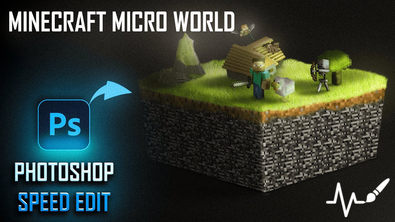
Welcome to my channel! In this video, I'll be showcasing a professional speed edit of creating a Minecraft Micro World in Adobe Photoshop. Watch as I transform a simple idea into a stunning piece of art, step by step.
I hope you find this video inspiring and enjoyable. If you do, please give it a thumbs up and consider subscribing for more crea...

i believe the voice is ai, which tool did you use?
Yeah i've problems with my mic so I can't use my voice over
PlayHT
thankss!
ugh okay wait
made the white part more sandy type texture idk to make feel like there is something

u made it with filters?
hm? its all you have to do it put that black image on top of your image and change the blending option
thank u
Gave +1 Creative Carma to @odd flame (current: #90 - 19)
could you let me know the name of the font you used on thst edit?
Thoughts on these ui designs, the difference is a drop shadow
https://cdn.discordapp.com/attachments/573224472589500440/1247977763902586900/Screenshot_2024-06-05_at_2.17.17_PM.png?ex=6661fd5d&is=6660abdd&hm=89f16d951ad6dddb9b2059c0871e332803fd013437dbe99abd4bf6f751c3fb7b&
https://cdn.discordapp.com/attachments/573224472589500440/1247978075044577404/Screenshot_2024-06-05_at_2.19.12_PM.png?ex=6661fda7&is=6660ac27&hm=c861776b781222b350c0192dcfccc2ebe5bd55f996b189b2bf8205d30420a320&


and if you had to guess what type of game it is thematically, what would you guess?
yea it looks like a farming game
WIP Alternative


solid, itd be nice to see it w/o grain
hi, which cropping is best for my video? here is are identical stills but with different crops:

this one has the blue floor aligned horizontally
this one has the roof aligned horizontally⬇️

this one is the original⬇️

So Basically I am creating a Website for a company/community called Pupuke Kahui Ako. I was tasked to create a sattellite website to their main Website. The vision statement of this company is to create a collaborative culture between schools, teachers, and the wider community. The purpose of this project is to help inform students from different schools about their location on the North Shore, as well as the history of their unique location in the world. Keep in mind that the pages that I have to work on are 3
So basically I have created a few concepts for the mock ups for my home page, and a small bit for the 2nd and 3rd page. So basically, right now I want your honest opinions and some critical feedback in how i can improve the design of my mockups or like tell me which mockups of the home page do you want me to use, or combine some features of 2 or more mockups of the home page together. As well as maybe adding that similarity of the home page to the other 2 pages to help show consistency. These are the mock up concepts for the home page, and the other 3 images are the 2nd page, and 3rd page, as well as some footer/navbar options in which I can implement to all the pages (Note - there is some navbar/ footers options not included as they are in the home page image.
Overall I Just want to ask feedback on which things I can improve, and what style in the home page is the best for you, or some features i can combine, replace, implement e.g the footers, navbars and more. This will help me decide on how the other 2 pages will look like as well. Feel free to ask any questions, as I am open to it :D


my man cool edit
i would love to get second opinions on my fan made design (movie poster), thanks in advance

everything except the text i find is cool , there is something you could do with this text
love it with the drop shadow, and definitely a cute adventure game
I love the collaged bus. The O and the T as a negative white is a bit confusing though

feel like the grain added a nice touch in the original
preciate you
ya i agree, first time i viewed it was on my computer but on my phone grain looks great
i have no experience in web design, but i’ll try to tell you what i like! so in the first image, each of the 7 bars are different layouts of the webpage?
somethin for a FIVEM server, thoughts? anything else to add?

@odd flame i really appreciate it man
I think they look like horrifyingly large walls of text. - Which is usually the opposite for what I'd recommend a website to include.
The font sizes look wildly different too. Some headings look absolutely insanely large, compared to the body copy.
Instead of using photoshop to mock-up a website, I'd suggest you try Adobe XD or Figma. - It will help you get a better sense of scale.
Maybe check out a few sample sites, just to help you get a sense of font sizes/scales:
https://demo.web3canvas.com/themeforest/unisco/index.html
tbh that looks like some standard wordpress basic Theme and some CI color (blue, black). But I do not see anything "special" or "Original". maybe try to design some really own design and incorporate that into prebuild Templates. For some ideas you can look at Behance and other art related sites. Enjoy.


how can I improve this?

Better font?
Better Blending, Better CC. Composition. Needs to be fixed badly.
Use a Rule Of Thirds Grid
Let me know what yall think...im not sure im really digging it but we see what yall have to say

where can i find Adobe Photoshop Elements 2024 pulgins
at adobe....prolly creative cloud
i dont see it
i got my first pulgin
from the pulgin site
the guy is too overexposed and toasted make sure the person is in right exposure
dont make the guy overexposed to show emphasis
but rather put glow effects behind him to show it
love the style how did u create this? Is there a youtube tutorial for it?
Nyoo, not exactly. I draw what's strongly visualized within the hivemind. Ensuring every reveal of design resonates deeply to my fullest potential, encompassing dreams from my inner child. Always testing out!
Have seen enough of these art pieces growing up however. So the reminiscing enhances the final I suppose
Could show one of the main ways to achieve the look though in DM
Very vague though
yea thats what i was thinking just wanted another opinion...thank you though....its prolly the overlay noise i got over it
Noticed something while searching for critique! Just clicked in that if an art piece feels off, about 3 or less of these principle support beams may need to be considered to increase or reduce! Sitting on work to fine-tune does tremendous help as well for an optimally harmonious design.


Thats a great find. Thanks for posting 🙂
Gave +1 Creative Carma to @thorny obsidian (current: #275 - 5)
You're welcome Euan!
What do you mean better CC? How does the composition and blending need to be fixed? What needs to be fixed badly?
Perhaps they were suggesting better Captions. Thinking it needs more of an equal alignment in the center of the text; "Use a Rule Of Thirds Grid" to line everything up
Everything with the composition seems to be images layed on top of each other. Merging that into an immersive ad/experience can be achieved with Blending Modes, simple Soft Brushes, Color Scale Adjustments, and (optionally) Grain

Purple lazers (High saturation Magenta)
Blending mode: Linear Dodge (Add)|Opacity 75%
Red suit enhancement (High saturation Red)
Blending mode: Overlay|Opacity 75%
Sky (High saturation Cyan)
Blending mode: Overlay|Opacity 100%
Shadows (Black)
Blending mode: Soft light|Opacity 100%
↓
Filter: Camera Raw Filter
⟶ Optics
Vignette +60
⟶ Effects
Grain 35
Vignetting -15
Visual movement (an art principle) on those aircrafts may help the space of immersion as well. Took me some times to notice they were coming to the center and not out
Of course these are all customizable, just a guideline on what to tweak to your tastes
The concept is cool and interesting!

Crititique?? Please ping if you choose to respond. Thank you!

never seen this type of sports edits loving it
sweet, thank you so much for the suggestion, and also the video explaining how you got that! that looks so cool and I am deff gonna try that out! thanks for the suggestions!
Gave +1 Creative Carma to @thorny obsidian (current: #244 - 6)
I guess he could mean vertically align it? on the horizontal access, it should all be aligned. I'll experiment with it some
This deff looks really cool with the extra blue and pink, and adds that fantasy/epic vibe that the poster was lacking. I am not sure if I did the magenta layer quite right, or if that is just a case of looking at something for too long lol. I am not sure if I like the text more behind the pink lines, or if I want it on top. it is harder to read as is, but makes the picture look more 3D-ish, wheras if its on top, the drop shadow makes the photo look less epic, but idk

heres with the text on top (this is the picture I just showed, but copy pasted the text on top of all the layers and lowered its opacity to 52)

Is that a 3d model or completely done in photoshop cause if you did that in photoshop completely that's actually insane!
Completely in photoshop
I'll post the speed art soon 😁
cccoooll
how can i upload a wide image on instagram?
do you mean convert a wide image into two slides?
its sick just the person being darkened and everything around him being lighter is making it lose the idea of him being the main focus. id lighten him up and darken it around him personally
any suggestion? I can't image something good lol

Its a solid start. However, I might simplify it a bit. Also, scale it down really small and see if it still makes sense. Just some suggestions.

When its scaled down and small, you'll see if the spaces between your shapes actually work and the pictogram still makes sense.
Well, I think the background would be changed based on the use-case. I think the sepia color palette is nice for general use. I suggest thinking about a few different use-cases and then try out various color palettes to see how they look.
I would try several variations. Experimentation will be a good exercise. It might open up some new ideas!
Yes

This tutorial will show you a great way to show off landscape photos, or even stills from your video productions on Instagram! By utilizing the multi-post carousel in Instagram, you will be able to not only share multiple photos in one post, but you can split your individual wide or panorama photos so they can be displayed as a seamless photo ac...
a quick google search would help💀
Thank you
Gave +1 Creative Carma to @odd flame (current: #82 - 21)
My first Poster design, any feedbacks

3 font is not needed
there are a lot more creative fonts out there you can download
these look basic and common too
love evrything else, GREAT project for someone who just started
i dont think that black thing is req

Thank's for your reply, I'll take care of the fonts next time

Oh Hell the Heck Yeah
Highly resonative artwork. Love the blending of detail in this arrangement. The flux of focal points and within this composition is truly mesmerizing. Thank you for sharing! 💗💕
Thank you
Gave +1 Creative Carma to @thorny obsidian (current: #204 - 7)
Amazing!! Atmosphere, shadow, and depth is improved. Not sure about the text placement, although I do like the darker rim of the second one. Pops out more.
Honestly, I would experiment with 3D aspects and the captions, have familiarity with how they commingle at times
This looks great. Fantastic work for a first design.
I agree with others that you have too many fonts.
Again, great work.
Thanks! 3D aspects? And what part of the captions seems off?
Gave +1 Creative Carma to @thorny obsidian (current: #185 - 8)
Please review my new project, Solar Eyeglasses, I have led the overall design process for this project. Share your valuable suggestions and feedback and critiques are more than welcome :
https://www.behance.net/gallery/195502813/Solar-Eyeglasses-a-case-study-on-brand-identity

Solar Eyeglasses | a case study on brand identity
How this shadow looks?

Thank you .. here I've downloaded new fonts and added them to the project

Gave +1 Creative Carma to @abstract oxide (current: #17 - 115)
The problem wasn't with the fonts
there are variety of fonts and that's not good
i prefer you stick with one font ( two maximum )
You've got a point, thank you brother
Gave +1 Creative Carma to @terse jetty (current: #60 - 31)
This also looks great. But like @terse jetty has already said, one or two fonts is probably the better choice.


the 4 mockups i like the top right one.
But the one with TX Studio is also clean as hell
@wooden oak
These two are cool...


Then go with that. However, I would spend the time tracing that out so its pristine vector art.
Perhaps not tracing it exactly because its a bit slanted.
Yes i will def remake that one
Use it as a template and make a perfect one
how can i send the others without spamming too much lmao
Just do a few at a time. Like you did with the previous post.
Try to pick the best ones. Weed out the weak ones. :)
DALL*E ghost banned me 2 days ago bc i did too many 
1 minute, i will send the others over
I think they have a limit and then you get put in the Cool Down Room. heh
ye
i made like 60 gens or smth
half of them where pretty nice!
It also learned to write my full name correctly, which was pretty weird :D
All of these systems are getting better at text.
But still. I would only use them for inspiration. If you're trying to make something to be printed, you'd create real, quality vector art of the things.
Yeah true!
im currently getting into Illustrator to make these, but its so different than photoshop x.x
Both are awesome. Different tools for different jobs.
i wish chatgpt had a feature where it would display all the images you generated. :D
But i have to search for all of them.
All of the OpenAI GUIs need a lot of help.
The user experience is pretty bad. I think they're looking toward the future, when you just talk to it and things happen on the screen.
i totally agree on that!
Me: "ChatGPT: Show me a Photo Gallery of all the images of cars that we've generated."
[ working image gallery is displayed ]
it would be so simple
But eh "it just works" how Todd Howard once said :P
so these are the designs i sorted out of the 70 designs

i like the 2nd one in first row. its really clean tho!
im at a motorsports/drifting festival this weekend so having a business card on me would be dope :D
There are some cool ideas in there. Maybe these for Front and Back

like those thicker ones?
nah is fine
i have a card from a media agencys thats like 2 mm thick, has a purple layer between the other 2
Anything that is more interesting, people are likely to hang onto.

I have to dial in to a meeting. Start digging in to Illustrator. Its going to take some time. Good luck!
Haha thanks a lot, as always!
I'm still confused on what about the text placement seems off or how it can be improved
Let me see

i would make the text centered and a bit thicker and tighter :D
Don't know if it's made to be intentional. Although I know sometimes when certain fonts are centered, they'll snap into this off-centered default

If that last part is the case, you can always use the:
Tool bar:
⟶ Select Tool (Rectangular Marquee Tool)
View:
⟶ Snap (To equally snap objects to evenly distributed measurements)
Edit:
⟶ Free Transform
Then drag the top text to the center
Also left click on the Text Layer and select "Rasterize Type" to make it a regular layer
(So now you can alter the text however you want. Even draw on it!)
Like your banner. :33c

OMG Yeah. That's what was slightly off!
Think you may need that 3 Ruler to lower it since it's obstructing the focal point (Character in the middle)

how do I get the 3 ruler to show?
Not sure. Forgot lol
Let me see if I can find it
I eyeballed it and used the pink line thingys when moving to rough guess where the third line was


Here's a best practice to improve on your Graphic Design skills. This can be used in Adobe Photoshop, Illustrator, Premiere Pro, and even After Effects!
⬇️ Download links for you ⬇️
👉 Get Photoshop on Adobe’s website: https://bit.ly/LSPV-Photoshop
👉 Get Photoshop on Amazon: https://amzn.to/3Tozpw9
👉 Try Photoshop FREE for 7 days: https://bit.ly...
This I guess? I know how to do it on another illustration software, but not here yet
Ohhh yeah! Think it's easier to read now as well
Can tweak some of the Hue/Saturation colors. Depends on what other critiques pitch in
here's the before picture as a reference, which is better than the original before lol

Wow 👏
this is what that image was when I turned it in for an assignment at college. I added the lasers after, and am improving it for my portfolio

lol, yea the original photo was for my advanced graphic design class I was taking for my masters program. I have since finished the class and gotten my masters degree. I am now applying for an MFA in graphic design, and in doing so, am going back and touching up/improving my work to make it portfolio ready. my portfolio consists of photoshop stuff, 3d art, and photography
typography is something that always seems to trip me up for some reason
its such a "simple" thing that just messes up the stuff Im making lol
this is another piece I have been improving. its from the same assignment as the spiderman poster. it looks better than it did previously, but still has some things about it that I just cant quite figure out how to improve. for example, the foreground, and how much of a cut off the planets seem to have from the background

not to mention the typography lol
This is an awesome concept. Do the symbols represent the planets or is it the bottom on as well?
the symbols on the planets are the buttons of a playstation controller
Immediately I would mention about the Foreground and Background. Having all colors darker than the layers in front, the eyes will see everything in the in the same area
what do you mean?
Usually things farther are blurrier (which you got) and faded in color
Things closer are vibrant and in detail
Imma tweak hold on
Little bright, but putting a white soft brush in the background and altering the blending mode can bring an environment to life

The lighting on the buttons is definitely something on my behalf lol, but I noticed there wasn't only one color/light source in the atmosphere
Reflective light is important as well. Things in nature are rarely ever shaded as only black, grey, and white

Then added vibrance to the underlying planet. Buttons may need some light rim below because of that
Pulling up a foreground/background ref


Unsure why it says "wrong" or "correct", but lowering saturation, shrinking further away, and subtly elevating the blur replicates how our eyes naturally register views
If everything on the same saturation, sharpened detail, and precise color level it would be overwhelming
I can see that though Really. Swear to god when I was learning these things for the first time, the most seemingly minimal things would be head-crackingly subjects to work on
and is it annoying
Feel like we may all have our personal obstacle curves, but in the end it is worth the effort!
Yea. Its weird how the smallest things are these huge struggles
you could add some pop with a particle explision behind the lower player with a soft transparency 👀 i think this would give it a nice "pow" look.
Wdym?
gimme 1 sec
like small smoke/particle swoosh, to seperate it from the fornt but not fully

idk if i should keep the fields im doing below Photograph & digital artist


I would choose a different Font for his name.
Give it some pop (use the dark sky for firework for example).

thoughts?
the font of the player is still a bit hard to read
anyone got feedback ? i feel its empty, but hmmm

or this one ?

This one is better i think


Maybe a little bit spacing between letters in the socials ?
but i think it's good now
like this ?

Yeah i find it better
me too!
Now onto the front xD
Post-production and composition study.
Tool: Adobe Photoshop


Amazing work may ik how you got rid of the font on will smiths jacket?
Can I guys have feedback on these 3 mockup pages I have improved them


Feedback pls. (The players nickname is frozone hence the visor and ice)

I like it. Is the name an actual written signature? If not perhaps choose a more easily read font?
Yeah agree with that
And i think you need to decrease the exposure
cuz i find it too much
How can I improve upon this logo

Is this referring to Thames the river in the UK?
Diamond Head speed art :
https://youtu.be/OUu_1MAJu3E?feature=shared

Don't forget to leave a like if you liked the content !
insta : ArtisticPulse
Youtube : ArtisticPulseOfficial
Feedbacks ?
yes, since then i've made some revisions

Ok, River Thames UK. I'm in Scotland but had relatives in Henley upon Thames.
The font suits the area - old English town vibes. However, I'd make the blue look more like a river than ocean or pond.
Lastly I had a google search for Events upon Thames. Your company may get lost in the results - the word "events" pulls up hundreds of search results.
Thanks for your feedback! the initial river color was just an exaggeration for the final color i'll end up choosing.
Also in regards to the company name, I understand that might be a problem, its a company my mum is starting so idk how she's gonna get the word around. i'm just making the logo though 😄
Gave +1 Creative Carma to @raw wadi (current: #29 - 66)
Ah, I didn't mean the colour, I meant how it looked!
sorry im confused, what do you mean how it looked?
Well, to my eye, it doesn't look like a river. Perhaps some foreground in green. Depends how literal you want it to be 🙂
oh i see. i can definitely do that, i want to keep it as simple as possible though idk if i should add too many colors. im trying to go for a sophisticated vibe. im also kind of new to logos and brand marks 😅

Could just be me but perspective wise makes him look like he’s got little hands compared to rest of body
Wassup guys. I wanted to know what you guys think about these pictures I took and edited. I wanted to give them more of an art vibe to it.


which color combo looks the best here?

all black one works black always works its a safe spot
"It's always been about love and hate, now let me say I'm the biggest hater."
DAMN. blew my mind, but "Euphoria" hit different. Kendrick went in with pure fire - the lyrics, the flow, the whole damn song. This ain't just a diss track, it's a masterpiece. Proud to be a K Dot fan and witness history with that record-breaking stream!
.
Fonts: Dirt...


Can you explain what these two images are?
Personally I like them very much. They suit my asthetic. I might have kept the original colours of the traffic light lenses but that's just me 🙂
Okay!! Thank you! 😁
Hey, I'm trying to make this grid pattern (found on Google Search), but I want the number of squares on each side of the cube to be 9 instead of 10. Messing with the perspective tool is frustrating. Surely there must be a better way, right?

hi wondering what i could add, or move around on this !


It need some blending
cuz i feel like you've just put some elements without blending them together
do you remember what blend modes you used to get the pink and blues? I am working on adding more reflective lighting to the scene
heres an update on my poster

Color Dodge Lower Opacity to 90%. Still have the file lol
I just scroll to see what's most suitable

The products is low quality

s
If it's for fun, perhaps a small mushroom cloud coming from the jug she's pouring into 😉
can anyone help me to improve this? and I'm very new to the photoshop.


before retouching and after
Nice work. Very professional.
thank you firefly...it's AI but modified. im making a game and she's the villain (moth queen) in unreal. if anyone wants to join and has experience in unreal 5 my DMs are open!


Tried to make a MrBeast thumbnail

The font makes it look like it was made using ms word
🤣 true
Solid for a beginner
What font should I use, then?
job

Great work
thank you very much
Gave +1 Creative Carma to @wooden oak (current: #3 - 2073)
hey i would like a feedback for a simple logo i tried to make for my web app
Hey guys, i would really appreciate some feedback on this poster and how can i make it better ... seems very empty for me in the background but i cant think of anything , thank youu!!

lightning study (not finished)

Thanks, man!
Gave +1 Creative Carma to @odd flame (current: #79 - 22)
I cant recommend one but see posters in general and find one that looks close to that font
Tbh i think you need more than that to make it seem as a logo
You could try brightening the highlights more to make it look more shiny, doncic on the right is a bit dark which we dont want thats it, btw the doncic part one of the “c” has a line above like “ć” look if you cN change that

Perhaps make the front character the full height of the poster. Perhaps even cut him off at the waist.
Looks good. Be sure to post the final work.


@wooden oak Turned out pretty good, thx for all the help 🙏

Gave +1 Creative Carma to @wooden oak (current: #3 - 2074)
hi guys
check out my latest project. Please tell me your feedback https://www.behance.net/gallery/201215639/Lumos-Bar-and-Restaurant

Hey everyone, I'm new around here and I really like to do some edits about the adventures I take inside a game, I would like some feedback since I'm not the best with lights and shadows


Amazon main image design

looks amazing

DAYUM
yall messing with it?


Kill Bill (2003) Poster
One of my favorite movies I’ve watched
Inspired from some of the work of @sebsmakesart
.
.
.
.
.
.
.
.
.
#graphicdesign #icographica #graphics
#selectedwork #graphic #posterdesign #posterwall
#graphicartist #certainmagazine #eyeondesign
#dailyposter #archivesarea #postereveryday #print
#digitalarchive #posterreposter #ty...

well done
Just did a F1 work, never did one before (had always done football prior)
How is it? Any correction/suggestions and how I can improve on them?

If you are free, do let me know my best work on my portfolio. Thank You ❤️
behance.net/anonymouslyanonymous
Hi, I looked over your Portfolio. Here are some thought. Overall its technicaly good work. I would sort them into albums based on themes, groups, etc. Also maybe try some consistency on your work. On some Images there is some kind of watermark (wich i do not like at all, but that maybe only me) on others not. Some have text in it some not. You have two Images "Team of the year" and "Who would you pick?" wich you could maybe put into ONE Image and use that as the album Cover Image for the Teams to choose from. Then there could be an album for single players with different kind of styles. Some have Text in it, some not. Try to have some kind of signature look maybe or Theme to put different Teams in different albums or so. Hope it helps.
Yeah I dont know myself why I put watermarks on those 😭
Thanks for your opinion
I'll try to make it nicer in the future In Sha Allah 🫡
What about this?
Well, that one seems not as good as the other work tbh. the arm with the trophy is blurred and seem not attached to some body, propotion of arm and head does not fit well, the right of the two drivers in the front does not go well with the other one, because of the different eye-line and the left one have the fists forward, the right one have some kind of awkward position of the arms. The yellow "glow" rom the trophy des not look natural. Maybe look atsome glow Tutorials on youtube. If the picture should show "victory on home soil" maybe you can place some reference on what "home" should mean?! e.g. when the driver is from italy take a shot from some famous italian race track, italian flag, etc. within the composition. Have fun.
- the arm I couldnt find a better quality picture, is there a way we can fix that? Because AI doesnt seem to work for me
- The arm is actually a part of the picture, I just added the hand holding the trophy
- Yeah that fist position I also felt weird about, but without those two images, the entire thing looked pretty bleak and empty + I couldnt find ahy other better pictures
- The yellow glow I did on purpose, to give off a fantasy kinda thing
- I wanted to add the monaco circuit, but didnt find enough space 💀, but I still made sure the flag was there (it's on his face)
- As I write this, I just realised the layers got misaligned and Leclerc has an extra ear 😭
The eyes also look very fake, perhaps because I reduced the noise way too much
Hand probably looks misaligned due to the helmet
I can see that now lmao


(yes the treebranch is a hammerhead shark)

Are the shadows of the man and helicopter falling at different angles?
Looks cool. Can you explain what we are looking at?
no
idts
a picture of Henry M. edited to be a picture of a smoking caterpillar
ive done a lot of work like this as well


Can you explain what we are looking for?
does the helicopter look really there?
Did you manually create the green caterpillar image from the other one?
no, actually the caterpillar was my reference image for my work of art
Have you added the helicopter and shadow to this image? That's why I was discussing the shadows.
Yes i have
i am attempting to make it the most realistic
'


blender export:"
he was trying to critique you by telling you that the shadow from the helicopter and the person are two different directions
For me the biggest issue is the shadow under the tail section of the helicopter.
The tail section is extremely thin in comparison to the body of the helicopter. However, the shadow is pretty much the same width the entire length.
It's hard to judge given the perspective. However, looking at the man, helicopter and car and their respective distances, I think it's pretty close. I would probably make it a little bigger.
Should i make another shadown coming to the right side like the man in the photo
You definitely want the shadow from everything to be falling to the ground at the same angle from the sun. Getting this wrong is one of the biggest giveaways that something has been added to a composition.

Hey that's looking great. The size and angle changes make subtle but incredibly important differences. Nicely done.
For some reason it seriously doesnt look real still


Perhaps darken the shadow more directly under the helicopter. Keep using the shadow of the man as a reference.
heres a closer look
I'm signing off mate. Best of luck with the project.
thanks man
Opinions?

Made a quick mockup of what a book about iconography would look like

why the copter so small bro 😭
Looks cool. Where are you thinking of using it?
The helicopter is still too small. If we use the white car as a reference, its not much further back than the helicopter. Perhaps try half as large again.


Should I make this brighter?


Nowhere, just got bored and made it lol
how is it ?

yes, maybe. Not sure what the flower has to do with a fridge. Maybe place something "cold" or "fresh" as eyecacthers there.
summer sale
Give your feedback about this manipulation please guys

The Compositing overall looks good so far. Me personaly would bother the consistent Flags from different Countrys (also the tag on the jeep). The Jeep also is blurry, but the dog and person is sharp. Also the light and shadows does not seem as consistant as I would imagine so that also could be worked on. If that should be some kind of military theme I would miss also some dog harness. Contrast on the black flag is to harsh, the orange tones to bright.
Rate my work and please let me know about my mistakes.


This one got me hard 😂
😂 💕

any opinion on this photo? do keep in mind discord compression crunches it up pretty bad,would appreicate a ping if you have any feedback | taken with nikon d5200 and 18-105mm lenses

I made this picture in blender, but am moving it over to photoshop to continue working on it. I rendered it with 2 different f-stops (both intentionally and unintentionally lol), and am experimenting with it. I feel like one f-stop is too drastic, and the other is not drastic enough. Here are the original renders. the third image is me currently working on blending the 2. I wanted to get some thoughts


heres the combined one

idk, I am not sure I like it combined or not. I really like the shorter f-stop one (the more blurry of the two), but I also feel like it is way too drastic. I guess I could try rendering with smaller increments of f-stop. it just takes so long lol
Im experimenting with combining my 3 renders of this image in photoshop

these are the three images. I cant decide on which blur level I like more, and am experimenting in photoshop to figure this out


Not sure if mistake would be the right word, but for this image for me its hard to understand what the main object would be. What should be sold? There are 3 main objects, but non of them are standing out. It could be a soda commercial, a "Peace for earth" or so commercial or to sell fresh oranges. Maybe mace the can bigger and the rest a bit smaller.
here are three skulls, but they are not consistent. why not shoose one. Also the shadows are not matching. The background looks a bit boring.
using a not-licenced Stock photo (and not even from Adobe Stock 😉 ) and placing a much to dark boxer and a soda can in it ... not sure what the message here should be.


if theres any logo designer here let me knoe how can i improve this

Hi. I'm working on a Jurassic Park poster. It's far from finished, but wanted to share it :)

Looks great , the mold and Crack texture on stone looks great, how you manage to do that??
So far Looks beautiful

I was playing around with some photo editing and was trying to make the crumples more visible. Can anyone help me with that? (this was already edited too to try and make them more visible)


Not sure why you want it MORE visible, because normally, such effects are only slightly visible in the background. But if you wish you could e.g. crank up the contrast of those layers so that the grey would go more into black.
Guys please give your opinion regarding this manipulation.

very nize! Maybe make the street lamp also glow in the same greenish light, because the person has linght on his left side that only would be that visible if there was a lightsource. Maybe the street light "glows" or glims in the same greenish light as the store behind. Also the light on the wet street and the car is a bit to white. If the car would be a little to the side so that its not overlapping with his leg that would be perfect 😉 Hope it helps.
added some rain and sidewalk puddles. tried to make the car look wet, but not sure if it panned out. thoughts?

Thanks! I used two layers of a dirt texture, one of them was set on overlay, and the other was set on hard light. I used layer mask to add and remove parts of the texture I wanted.
Gave +1 Creative Carma to @boreal condor (current: #186 - 8)
I would have used the same technique if I had to add the cracks myself, but I was lucky to find a stone texture that already had cracks.
A thing I been working on but I ain't sure if I should add more things to it, or whether it's better to be more simple.

This is my first editing

What are people’s thoughts on this? I added rain and wetness to it last night
How is this?

Woah, cool perspective 😮
What you guys think of the eyes fine or bad?
love any feed back ❤️

Kinda like it
Voyage of Victory: Sailing with UEFA Euro 2024 Dreams , Photo manipulation
Feedbacks ?

awe thanks
Gave +1 Creative Carma to @terse jetty (current: #55 - 33)
I added some more rain drops to the for/midground for extra realism. I think I am about ready to call er done

thoughts?

tips?

The lighting and colors are good. I think that an object that large would be kicking up much larger wakes and splashing as it disturbs the water. The wake along the the sides and the waves that it creates would probably also be more pronounced. It seems like you would want to exaggerate that to really give the image a sense of scale and impact.
Good job on the lighting and the fur. Particularly the edge light on the body. Those are nice touches. I'd like to see him in an environment with world lighting that matches. That would be cool.
I like that split image with the view below the water line. The sunlight underwater might be too bright here. You might consider dialing it back a bit.
yea, i have so much left to work on the whole piece before i get to the backgrounds, i usually take one in a real environment and one just with a black and white background
The lighting creates some tension in the image. I might reconsider the composition a bit. Perhaps use a "Rule of Thirds" approach. If the character is the main focal point, he may need to be moved to the right a bit more so that he lands at one of the main intersections. This can help to create more tension and visual appeal. Read up on using the Rule of Thirds in design. It might help you with when planning layout and composition.

I think you're right . I'll edit that
You asked about the text... I would probably try to keep equal margins on all sides. That might mean scaling down the headline and moving the logo up so that fits within the margins.

Your compositions are always very strong. Great color balance and visual interest. The empty space on the bottom is larger than on the top which isn't a big deal. Perhaps some other element(s) could be put there. I'm not sure if that would make it a stronger composition. Its probably fine as is. That space could be used for additional text if you needed to include more objects... should the need arise. Nice work.
First comp? Awesome! Cool "eye light" on the tiger. That is a great technique that was used extensively in old Golden Age films. It works well here. The highlights on the leaves might be a bit distracting. Be careful not to draw attention away from the star of the show and the main focal point of the image, i.e. the tiger. Good job. Keep going!
Thanks man, the “empty” areas were left that way as a safe area for resting coils.
The pink against the blue-green debris field is a nice color juxtaposition. That is sometimes referred to as "simultaneous contrast." The hues are also complimentary colors which work well together. As I mentioned to VeryTori above... Your composition might be made stronger by using a Rule of Thirds approach where the key focal point, i.e. the person, is located at or near one of the main intersections in the RoT composition. Currently he is very far to the right which leaves too much empty space to the left of him. Just my opinion but I think it might be improved by examining the composition a bit more.

are u brazilian
where’s the pink lighting coming from, and why isn’t it on anything else, just a random question, wel done.
It doesn't matter. Its a stylization; not realism.
aa my bad
Also, its not my project. I was giving feedback on someone's work.
sim
yeah i know i was just a bit lazy to respond to him lol myb
never met another brazilian on dc 😭
Are we the first then? hahahaha
talvez kkkkk
anyone got feedback for this?


Sorry i don't know


Summer is here! It’s my FAVORITE season! ☀️🎉👏
•
What season is your favorite and what do you like to do?
#tinteddesign #graphicdesigner #graphicdesign #churchmedia #churchcreative #creative #makeyousmilestyle #makersgunnamake #livethelittlethings #flashesofdelight #creativityfound #designer #artist #artistsoninstagram #artistsofinstagram #artfo...
old job, when I had time

Hey, what’s it for
fashion brand
jesus christ 😭

By becoming a sigma looksmaxxer
cute hihi
feedback??

I had combined these two images..


hii ❤️

"Menina dos Olhos" ... eu e minhas viagens!
Resultado Final: http://severianofilho.deviantart.com/art/Girl-Eye-450268867
Créditos:
http://nastiaosipovastock.deviantart.com/art/76-338730939
http://3dtomas.deviantart.com/art/Eye-detail-192901533
vlw
i want to apply this effect on the picture on right :?
can anyone guide me a bit.
i know i need to make multiple copies to produce the 3d effect.
but nothign else.


guys is getintopc safe,
Feedback? this is just a test thing I threw together in 15 minutes, so I know its not the greatest.

Hi. Looking for some feedback and tips on this image. I paid someone on Fiverr to enhance the original. They did an ok job and it was a good base but I had to do more work on it. Does anyone have any tips on how I could improve it, make it feel more real like it was shot on a modern camera? Cheer

what yall think...just a fun poster idea

Nice. I like the guys smile. - maybe make the head on the left a bit bigger so they're more mirrored.
It's always a challenge getting images the same looking resolution. - can you find a sharper image of sheldon?
Help me to Choose It Guys , What do you think which one will be the best for youtube


2nd one. - Also +10 points for not giving the guy a stupid shocked face.
First option is to use some gradient overlays, bevelled edges and drop shadows..
You could also use Adobe Firefly?


First time using photoshop, could the perspective on Mr. Krabs in the tv screen be improved?

I found perspective to be a bit confusing, I’m thinking I’ll probably find a stylus before messing with it again
(Done with iPad)
Also I’m not super happy with the way Mr. Krabs was recolored, I used an external tool to make him green and am wondering if that could be done in photoshop next time
I want it to look more similar to this (also perspective feedback here would be appreciated as well)


very well made
thank you
Gave +1 Creative Carma to @fleet grove (current: #890 - 1)
any things i could fix
nothing to fix imo
its just creativity splattered onto a canvas, looks amazing
is it a poster ?
yeahh i make them for my room sometimes
or just for practice
like youre gonna print it out?
just been testing new textures, fonts, styles, ways of doing things
idrk
i havent printed any yet but i rly want to
if you do that would be awesome 😭
i dont have access to a printer that can print this stuff 😭
i know people who would pay for me to make stuff like this yk
fair 😭
not yet
im 15 💀
new to design
new-ish
thats the full res version

i hope you friend is old enough to not get scared by these things 😩
can anyone suggest an element I can add to this, like something in the background or another detail to make it look less basic? or it fine the way it is? any other ways I can improve this are appreciated too

Basically I need to fit a long image and the text you see on the screen with the description and price
However every layout I tried looks weird OR can't fit a long image, it's related to PC parts so some stuff will be longer in height, some in width
I don't know if it's possible to create a universal layout, the one I currently use is quite outdated so I want to change it
The bear in the bottom right is a joke and the wave/background behind it as well, not sure how to fill that blank space or whether I should change the entire layout + the price is in a odd spot
Also the stars under the text used to have a rating above them so like 4.8 but I removed it cause someone said it would look better.

i must say this is an incredible layout
the one with a phone

that’s
better than the last
by a longshot
literally looks like a cloth or flag bro u did an amazing job
i agree
the last one felt like it had better color
1s
this was what i started with

😭
did u cut him out?
ye
u NEED to find a way to print this into a poster 😭😭
i’d buy one
this was the original

deadass?
thanks bro
ive been thinking of opening a server for commissions
or something idrk
wtf i thought the fit was orange ☠️
gradient mapping 😼
not a bad idea
yo
i could help
wanna see all the layers
sounds good
go to community voice chat rq
u can mute i gotta mute too
is there a way to rename layers
to make the blueprint text like that was hell
ye
i feel slow asking that 😭
i be getting confused and shi 😭
ye 😭
the depth?
its all one texture
oh 😭😭
😭
i got like 3200 textures
spent 8 hrs yesterday dopwnloading free ones from behance
worth it 100%
anyway ima go to bed its 2am
cya tmr though ima be back to work 🖖
bro i wanna start making posters i’m just idealess
wtf is that emoji
yea me too like
heres my start
i go to golfwang 💀
all i’ve made up until now is manipulation
tyler the creator's fashion website
steal an image that looks cool
or a pic of a model
and just play around with colors, textures
until i find something cool
and i follow that path

hmm
the stuff i’ve made
u may have the wrong base image
and i wanna make posters
i started with car posters
they sucked
this was like 6mo ago
maybe more idk
definitely more pause
10 months ago
anyway
il help u out tmr 🙏
i got u
everyone starts somewhere
aiii
started in 7th grade ☠️
its never too late
😭 thats crazy early
i been photoshopping since 3rd grade but never got good till this year
yeah
im going into 11th
u 15?
yepp
😭
for the record
im in 2 graphics clubs, an academy, 3 classes, going into my 4th & 5th next year
and if i can give you one word of advice its this:
classes do not help you
deadass
teaching yourself or learning frm others is the best way
i had this exact convo from your perspective about 8 months ago
some dude sent me like 12 textures
i watched a yt vid how to use them
i’ve learned more watching mods send snippets to help randoms then my classes 😭😭
then made my first design
😭
i’m so fr bro 😭😭
this was my first ever design with a texture
i be stalking #❓ask-a-question

damnnn
black backdrop, text, 1 picture
clean tho
true
but not as clean as my new stuff
youll be there soon
ill hit u up tmr lmk when u free
we can get to work 🫡


aiii
gn bro
night
that aint bad bro
ill find sum old stuff tmr
believe me it was absolutely awful like
i cant even describe how bad it was
it didnt make any sense either
scaring me rn ☠️
😭
one of them was a picture of a fish
with a gradient in the back
and it was a salmon
LMAO
with a salmonella warning
💀
but in stretched comic sans
idfk what i was on
actual acid trip
anyway ima gts
gn
night
I think the perspectives aren't right. You should go with another road image.
Best way to carry those Circles around the corner at a similar spacing? Currently 50px apart.

#❓ask-a-question (answered)
Yup, Ty
wsg
yeo

i kind of like and dislike the black lines but i wanna hear other's opinions

maybe put it behind the all 3 eminems
could look good
anime T-shirt
rate??

Testing by ASAP Rocky Poster

alrr
btw i wont be able to be on for a while
ill lyk when im back
Here’s where I’m at with this project if anyones got more feedback composition/details or anything, thinking of adding text that says “how original” in like school poster letters across slide 2
Specifically feedback on if I should keep the towel there, ways to make the second slide flow better, or other things to add to the theme of “emptiness from boredom”


this is ai right
fye bra
No
There probably needs to be bit more "harmonization" between the two images. Probably making the first image a bit darker to align better with the dramatic lighting of the second image. Also, there is a shower curtain visible in the second image but not in the first which seems like a continuity issue to me. I would probably add one to the first image but have it pulled to the side. Just an idea.
I was kinda hoping to sort of tell a story with it getting darker as you go from left to right, but I agree visually it’s not really doing that yet. I could also just increase the brightness of the second half maybe
And yea for the shower curtain I was kinda 50/50 on what to do there with the whole continuity problem, thanks for the insight
Gave +1 Creative Carma to @wooden oak (current: #3 - 2089)
I also can’t decide if the towel adds to the void type vibe or takes away from it
I do think something about the pic looks kinda ai generated tho so I might tweak some things until it feels less like that
Maybe put some kind of soap dish as tile on the other side of the towel so that its not that "clean" looking. I also wound try to lighten the other image so that it looks more coherent. Also on the first image there are mostly straight lines. I would put slanted lines on the second image as kind of contrast. If the shower curtain adds something to the story I would place it there.
yo human
could i get sum feedback too
on this

I really like this. The colors are complimentary. Like primary colors but lighter almost pastel. I like that its centered but then heavier on the right due to bold text. That makes the design feel better to me. The scribbling and "hand-drawn" stars a nice design elements too. The overall design style reminds me of the "wheatpasting" style of poster. Old-school guerilla marketing techniques from my NYC days. They would plaster the walls of construction sites with bill posters like this. Really brings me back to that time and place. Nice job!
thank you man!
Gave +1 Creative Carma to @wooden oak (current: #3 - 2091)
do you have any examples of wheatpasting, or old guerilla marketing techniques? I really love this style but can't find any like it for the life of me.
also have you heard of quim marin? I was wondering if you knew anything about that style and how to get into it, i find it pretty fascinating
The styles will probably vary drastically. Do a Google Image search for "wheatpasting nyc" and it should give you some examples. You could probably also substitute the City or Country to see what styles come back for various places. You could even add a year range.
sounds good, ill do some searching!
I seem to have heard the name. I just searched it and the style is familiar.
I like that. Contemporary design styling.
yeah, it feels more minimalistic and whitespace-reliant though. I really like it, but can never replicate it. I'm going into yearbook, and that's one of our inspirations for design, I'm just not sure how i'm going to emulate it.
I hate to use the term "urban contemporary" because it sounds like some soft jazz station on the radio. heh
'Guerilla Graphics' - *We hit and sink back into the night. *
is pinterest the right place to look 😭
Probably a good idea. That place has every image ever made now.
exactly
i really need to find specific designers with styles similar to mine
id die for pure inspiration
but sometimes its fun to go from nothing yk
taking random models from random websites
pasting what feels right
Bit o' both?
exactly
This is how we develop styles. Copying, emulating, mixing in our own ideas.
i absolutely agree
i started off my first posters by just copying what i saw on instagram reels
and they were WAY worse
but then they developed really really slowly
and eventually i got my own style
Yep. Great approach. This is how we learn as children. We copy what we see every day. Copy, approPRIATE, mix it in, distill it down.
yeppp
Appreciate the ideas!!
For slanted lines on the second image, do you mean kinda like warping the tile wall so that it starts degenerating kinda? Cause yea I agree I think that could add to the effect of the spread getting more uncanny/eerie as you go from left to right. If I did lighten the second half I feel like something like that would be needed to convey the story
And if possible could you explain a little more what you think the soap dish would add? From how I read it, do you mean it looks kinda unrealistic having only one item on the wall and the soap dish would add to the realism?
Love this!!
thank u brother 🙏
Gave +1 Creative Carma to @carmine fox (current: #340 - 4)
I'm kinda new to making sports graphics I'm trying to make power rankings and I think I got a good start but it just feels a bit off idk if there are any basic tips i could use

on another note since i already put it here everytime i put curve on this triangle it reverts back

after a few seconds
it keeps revertubg everything to a specific point in time
and i have to press undo
my state 😋
idk i think it stopped now but it was like a loading wheel and it undid all my changes
hm
but i got it back and i think it was just a bug
but yea do you think this looks alright
cuz im gonna do this for all 32 teams
ah my storage was low mustve been that
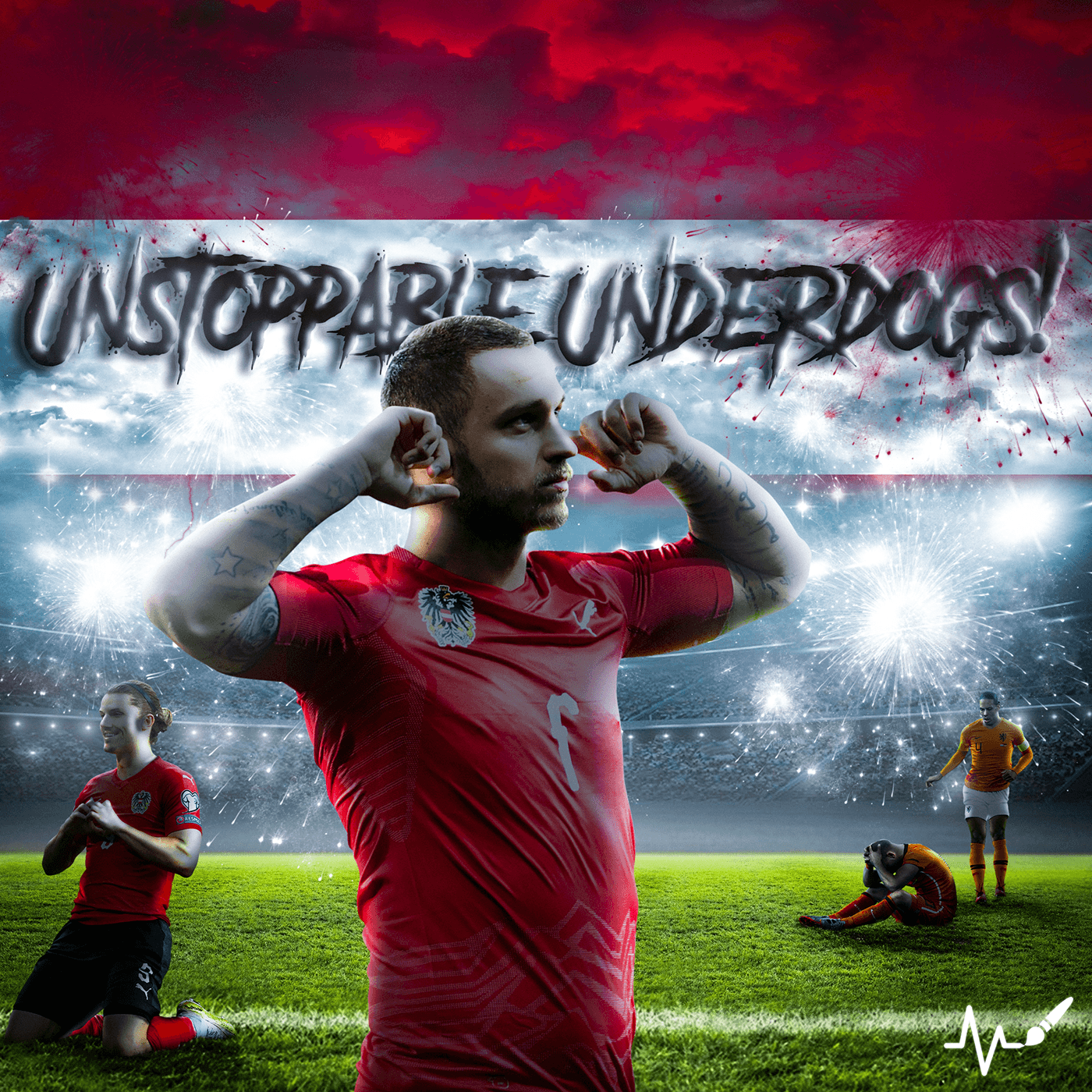
Austria fc Photo Manipulation

full project link : https://www.behance.net/gallery/201910915/Austria-Fc-photo-manipulation
"Even though we're goin' through it, this 'Die For You' remix hits different.
The Weeknd's magic touch with Ariana's voice... pure euphoria. This song wasn't just a favorite on After Hours, it was a masterpiece. But Ariana elevated it to a whole new level.
#DieForYouRemix @theweeknd @arianagrande Hands down one of my most cherished songs by t...
feedback appreciated

its great like that detail great job
thankyou! which detail are you talking about tho
the font , the way each letters have a diff angle
You might consider adding some imagery to support and reinforce the message. Also, to make the layout more interesting. Just a thought.
ohh
i see
im trying to make quick designs since im having issues establishing visual style/brandings that correlate to the brief . Do you thinkt the colors and font work here(my reasoning to chose them was a bold sans serif and warm colours to give a welcoming feel and a bit playful) or they are giving too much of a burger king vibe
I don't think the design looks bad. Your color and font choices in and of themselves are fine. If you want to approach this from a technical design standpoint... I wonder how these choices are actually related to the message itself: "Just wing it." Are the design elements cohesive? This message implies something that is done impromptu and without much planning. Improvisational. I would agree that "winging it and improvising" would be better than just giving up. However, I'm not sure that I feel that message in these fonts or the colors choices. You've rotated the letters a bit to imply that its loose and improvised but I don't think its a strong connection between those design choices and the message. Those are some of my thoughts.
i see. Any idea how I could practice to make my design choices (in general not just this poster) more in alignment with the message ? i feel that the elements being in alignment with message is essential and everything needs to be somewhat justified - but are there times when its okay to just leave them like in this poster where it looks good and works even tho its not completely justified
coz that is one thing ive seen as a difference in my work and my peers , they go for smth that looks good and i try to aim ffor justification and my designs turn out a bit more plain dull and safe compared to theirs (kind of holds me back from experimentation you could say)