#📝project-feedback
1 messages · Page 13 of 1
I could make the lines a little thinner and add more detail to the waves like you said too possibly
I like 3 the best but it’s not quite there
The first one is somewhat cool because its encapsulated in the circle. However, its not giving me the same vibe as the original one you showed. I actually like the original one better. Also, the first one somewhat reminds me of the Obama logo... (with the wave inside the circle).
I like the middle one. Makes the house element much clearer. Its wavy better 😉
You should be able to post here now.
tysm
Im a beginner photographer,took these pics yesterday and edited them a bit for clarity tonight. would appreciate some feedback/thoughts from either the photography or the editing side  ping would be nice aswell just so its easier to keep track of
Taken with nikon d5200 and kit lenses


design for shop

Hi @knotty tulip
I like the bottom right. Good color contrast and depth of field.
Top right with buildings in BG could do with more depth of field unless they are important
Two left images of blossum are difficult to see due to similar colors / focus / subject.
Fix?
Example - bottom left - use Camera Raw lens blur beta, then Select focus area, mask, invert and then reduce saturation and lightness in the BG

thank you! ill try to add them later today
Gave +1 Creative Carma to @raw wadi (current: #39 - 46)
Hi, im making a delivery box for a (fake, its for uni) company that uses really bold fonts and white borders on their work. I like the front and think its works but have no idea of waht to add to the side. Its directed towards older people, and its a sporting brand.

Hi community! What do you think about this Youtube thumbnail?

Can you guess what's the video about just by looking at it?
This will be city banner.
Also same elements will be presented in diffetent sized banners.
I think Header text should be smaller, and 25000+ and boxed under to be bigger with bigger letters and smaller distance between the same.
If anyone has any other idea or sees something bad in this, I would appreciate critique.

Surface of water is not visible and deeper you go water becomes crystal clear.
It's okay if you don't go for realism.
Face needs saturation.
Car needs blues to be removed.
Magenta removed.
You have blueish and cyan shadow over car which makes no sense.
Water does not reflect shadow.
Second needs contrast and color. Actually, all of them.
thank you
The new submersible Tesla?
Thanks for the feedback guys
5 stupidly expensive things elon musk owns
Vector Mask a cool mask, or what do you folks think!

I made this backdrop in Illustrator, I've been working on foreground and details of different genres to put in it on different artboards. Does anybody have any ideas?

I like the contrast between the mask and original but I'm not liking the square/triangle part on the left. With the circle and the flowers, the rest of the mask has a more organic look, and the rough edged shaping throws off the balance of that
I't was my first try with Vector mask
I like the mask effect
really good, i think you should echo the photo going to the right basically duplicates like the echo effect in afte reffects like it fading to the right or just a masked gradient colour
This is a poster i made and i want to check if the blending looks fine
And if i should add or remove something
(Yellow stuff on the top of the poster and on my face are not in the poster it’s just for privacy)
Hello guys. I would like to share some of my work. I started learning Photoshop two months ago so I would appreciate your feedback on my work. Best regards


If you have feedback please don't just say "You should try ...." Please elaborate and explain how to do it. Ty <3

tried to take some of the feedback from here,what do you think about this so far? its still WIP,manually fixing up badly blurred spots and touching up smaller details but i think the general picture's so far coming along somewhat fine

getting a lil closer to the final version

This looks great. Compliments on the colour and contrast.
While I like the crop, have you tried rotating the content so that the foreground branches are more angled?
i havent even though of that tbh,thanks for the suggestion
only stuff i messed with perspective wise was adding a bit of lens distortion cuz i wanted central petal bunch to stand out a bit more/take up more of the frame
No worries. Again, you've got some great shots.
hello everyone 🥳
how rate my work
thanks

I like it.
The contrast and highlights on the skin seem a little low in comparison to the other elements.
Looking good @knotty tulip Don't forget as in my original reply, a lot of this can be done with automation and not manually.
I like the subtle graininess in the background. I might be tempted to smooth out the complexion to increase that textural contrast.

Hello, can someone tell me what they think off this or rate it? ty 🙂 (the zafarex text is just watermark, not a part off the image)

i did try,unfortunately i kept messing up cuz its my first time using camera raw,and then also made edits in lightroom after i noticed some mistakes so couldnt reverse it and i just kinda gave up  i will try to learn it with time for the future though,just not on this piece yet
did you paint the shirt on him?
you shuld try making it like this
https://www.youtube.com/watch?v=JGUwl7aWpNk
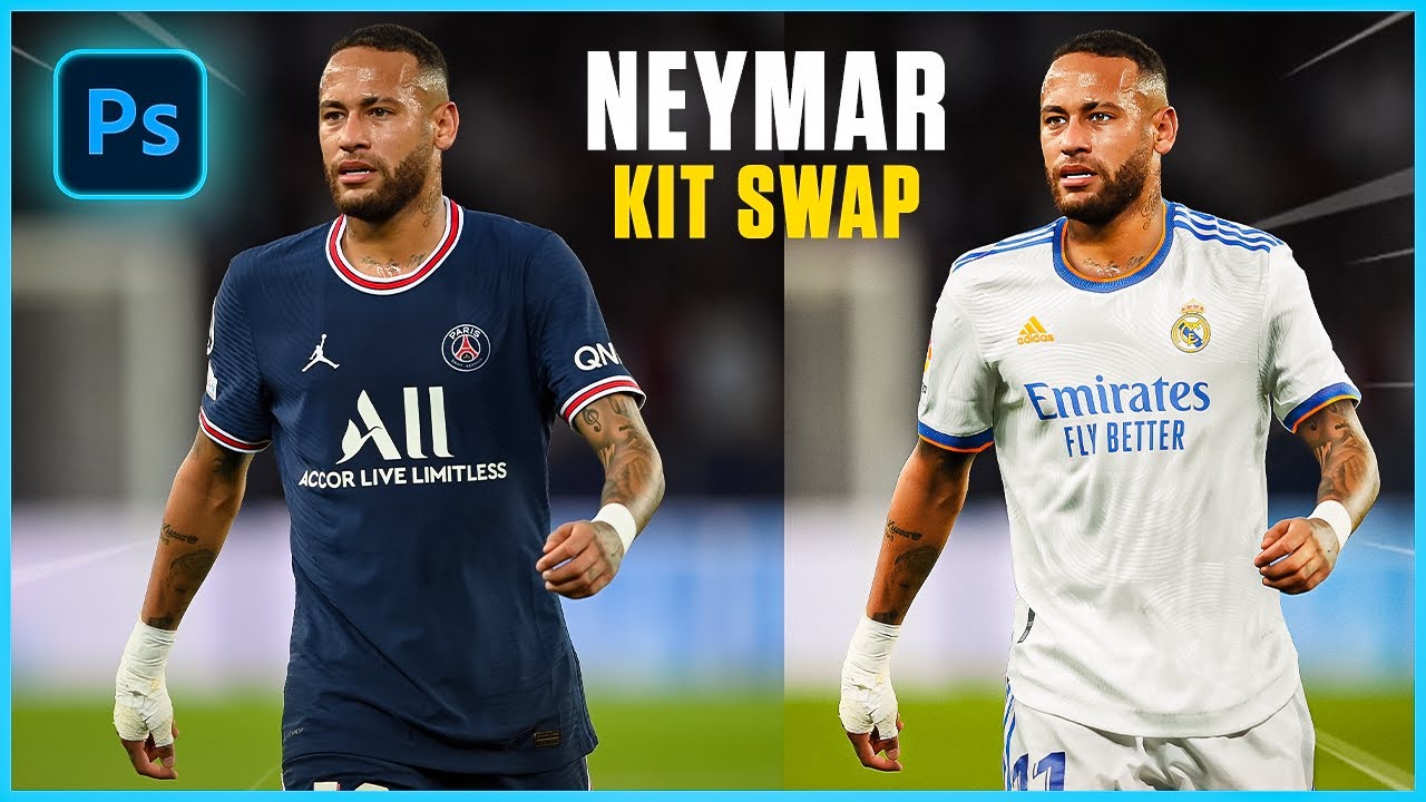
Subscribe for Free Photoshop Tutorials - https://www.youtube.com/c/ODDesign46
In this video we are going to be learning how to create a simple kit swap within photoshop 2022! The player we will be using is Neymar who plays for PSG and I will be changing his kit to Real Madrid!
Image Link:
https://drive.google.com/file/d/1__dys3lVh4SiRFEKUbBHP...
I did try that video. I found it very unnatural looking and just really low quality
idk up to you
@lean kayak This is what I got. it is ok so ty

how is it ??

i guess i need to do some rim lighting on the tress for more detailing right?
But i also wanted to seperate the subject from the bg
Im trying to keep it clean and minimal but what do you guys think?


I have a design ngl its gonna get me banned
cause its racist but its cool
If you wanna see it dm me

bro thats fire
tysm
Generally I think this is really well done. Nice work.
While I like the secondary black and white image behind the main colour image, I find the repetition odd. Perhaps a blur, or even a different image, would solve that issue.
This looks great. Really solid design. How did you make it? Any chance we could see the original pieces if there are any?
I like this.
I have a very minor issue with your corners. Some are slightly rounded while others are a harsh 90 degrees.
i guess i have no issues...would love to share it..
Recently started off a photography career (and thus started learning Ps for editing the photos-) and wanted to see yalls opinions on how this lighting edit looks:
The first is the RAW file, the second is the edited lighting


(Character is Lucifer from Hazbin hotel and the model is @ melondew.cos on insta)
That’s a great start. Whites and skin tones always the best way to check if your colour correction is working.
Congrats on getting into photography.
Are you editing using the Camera Raw filter?
If you are going to be editing many photos I strongly recommend you consider using Lightroom.
Full disclosure, I was simply opening the RAW files in Ps and running with however it opened 🫣 (I was entirely new to Ps and editing, all I’d ever done was overlays on an app called Polarr) and denoising , then adjusting the exposure, contrasts, and shadows, then editing the blacks, whites, and highlights, and finally color adjusting it to see what I could salvage from an impossibly terrible lighting location 😭 After that it was minor edits and spot healing what I needed to
But thank you! I’ve always had an eye for photography, just never considered that I could make a career out of it 💀 now here I am 🤣
Gave +1 Creative Carma to @abstract oxide (current: #19 - 102)
Thank you! I’m trying to improve more and have been trying my best to use skin tones as my gauge so thanks 😊
Upon getting back to the computer I looked and yeah it’s technically Lightroom 🤣🤣🤣
Congrats again. Best of luck with the new career 🙂
Thanks!
In case you didn't know, Lightroom is great because along with editing tools it also has a cataloging system built in.
I actually didn’t know that- there’s a cataloguing system?!
Photoshop files can get absolutely massive.
Lightroom is great because it only saves the editing steps and does not alter the original file.
That’s super sweet and cool, and explains why I’ve got the OG RAW, an “enhanced image” file, AND the saved final edit file actually-
Okay, ty. I will take this into consideration
Thanks mate. Best of luck with the design.
Again, what you've already created looks cool.
Gave +1 Creative Carma to @cinder rain (current: #862 - 1)
This better?

i don't like the way grass, background and player blends with each other
also there's no reason to put those here


And this

The 2 pictures I have posted recently are not my work btw I just used them as examples
also make these icons (team logos) more eye-catching because those were the last things i looked at while overviewing

thats fine, this looks way better, but now that corner looks a little empty, maybe add "Matchday" text here?
hi what is this group about
It is all about bullying @peak cobalt (For legal purposes this is a joke, we are a support server and community server for people inquiring about Photoshop 😄 )

This look good @peak cobalt ?
okay @peak cobalt be prepared ( Got it thanks for replying)
Gave +1 Creative Carma to @peak cobalt (current: #409 - 3)
and what does this creative carma mean
So whenever someone says thanks and a ping it gives them a point for helping
so if i write thanks @cinder rain it will give one creative carma to you
Thanks
Gave +1 Creative Carma to @quaint pewter (current: #862 - 1)
Thanks @cinder rain
yes
no comments

sorry was lil busy, this better, maybe change the font to some wide Sans Sherif type of font with and make it a little bigger? maybe as big as that red shape

merge the grass with the guy on the back better, also these icons are here again

erase rought borders of the grass field
Do you have any images of the seats within the stadium? Something like that could be good as your black and white background image because it has relevant content but it's suitably generic that it doesn't grab your attention.
Like this?

Sure. Or something like this but with more people...

This?

could also work
Good?

i think rise crowd background to a point the field of the crowd image mathes the height of your graphic's field
@cinder rain
you have a grass on the crowd image right?
yeh
i thought you could rise the crowd images to the point when it's grass will match the height of the grass of your colorful image with the player standing on it


higher, to the point it matches the height of your grass on the front
Like this? @peak cobalt

yup
change the matchday text font cuz to some kind of sans sherif wide one
and put it closer to the center

okay well, try to merge the this guy with the field better cuz now it looks very rough

A little something like this could work for the background…
- Lower the contrast
- Darken the image
- Use an image that basically functions as texture

and add outter shadow to the guy infront to make him pop a little

this.
This is a good idea
select it - blending options - outter shadow
reworl logo for helldivers 2

Any Edits ?

which one do we like more

weirdly enough they give me 50/50 vibe
yes, first of all - text hierarchy, second of all, too much colors, use vector images for football teams

this logo is unneccesary, maybe find a vector png of this team and put it on the background instead of "next match" text background?
what happened to his face?
Retouching but i think i have increased the shadows too much 😂

proly not

where's the full res of that i'm so curious
i found it
looks like AI upscale was used or something
show


yeah it was upscaled but i didn't notice the logo 😂
yeah that's why I've upscaled it
it's very obvious, go easy with it haha
Followed a tutorial and I got what I deserved.

i don't feel any positive emotions coming out of this photo ngl
I cooked 🔥

Trying to combine both 3d and Photoshop


Nice work. I wonder if the splash of milk would look better if it was moved up so that it wraps around the bottle and not the stand.
I like both. To me the first looks more like a face and the second more like a house.
After Edits


why did my post get removed 😂
If you are looking for feedback, post it right here.
working on something...

I recommend losing the hand on the large character in the back. It would simplify the composition and allow you to make that character a little larger, if you wanted.

alright!
which one looks better?


kinda left one
thanks, I'll keep the hand out then
Gave +1 Creative Carma to @peak cobalt (current: #263 - 5)
Cool. I vote no hand.


light fs
I like the light but it definitely draws attention from the car.
I would be adding lights and reflections to the car itself.
This is ridiculously rough but kind of what I would do.

which one looks better?


pretty sure this is the kind of poster which would look good no matter the color
equal for me

Any feedback is welcome, constructive etc

what is it supposed to be, a portfolio project or something?
sort of like a poster design
i see, it's great as it is, maybe just a little adjustment to the windows to match the reflecting color of the sky?
Oh, i didnt notice that - thanks ill go fix that up rq
Tried to make a cool effect for my logo im not sure if it achieves the vintage aspect that i am going for?
I think it looks pretty sick, definitely has a vintage feel to it
Ok thx I appreciate the feedback 👍
Gave +1 Creative Carma to @past jay (current: #196 - 7)
This looks fantastic.
There is quite a bit of fine detail in the logo. While it looks great, I wonder if you should back it off a touch, or perhaps add a hint of blur, if you are going for a vintage look.
don't really know how i ended up getting this idea but yeah, jude bellingham and erling haaland


holy discord compression is real 💀
if u wanna actually view it open it in a tab ^^


how can I improve these images? also, how can I make them synergize with each other more, while also keeping their independence of each other?


which lips would i choose? kind of a weird question
any thoughts on this?

fire
I’m about to start squeezing yo

Do you guys have any suggestions or is it finished?
I tried to go for a retro video game style just like the old tron game
what is it supposed to be?
Soundtrack for an upcoming movie
For a school assignment
I have most of the actual songs done but this is just the cover
I just turned it into a mini animation
how can I improve these images? also, how can I make them synergize with each other more, while also keeping their independence of each other?


i don't think you can in the way you did there, if it is meant to show that "ps5 is one level above", well it doesn't really look good comparing to the xbox series, maybe it will work better if you shift towards minimalism?
what do you mean?
they are both supposed to be like "dont choose our competitor, choose us" and work independently of each other, while also having some form of synergy when together
What should be added or subtracted to make this poster look even better?

fixed the typography in accordance with my professor's feedback for the assignment


I guess the thing I want help with the most is finding a way to bring synergy with the two to each other, while maintaining their unique identities
how do these look now? tried to mess with the typography and some of the elements to create more synergy between the two


i made this

Ngl I like the old typography more
That save 70% might look better if it was glowing and a bit darker imo
can you tag the photos you are referring to? if it is the very first set of posters, I liked that more too, but my professor docked me points for not having my posters portray a "choose this not that" message for each of the consoles in the rough draft phase of the assignment
messed with the typography on xbox again. I like this more because now there is more synergy between the posters with clear calls to action


Any critics for this? I started drawing digital from the start of feburary any advice is good

The very first one
Wait isn’t the point choose this not that??
yea, thats why I had to change the text, even though it looks not as good
its perfect other than the hands. looks kinda ... broken
But how did the font change that message, the message was clear in both
I didn't mean font, I meant the message. The message previously was just "X console Available Now" and that brand's slogan. I added a call to action by saying "Choose X" and made my own copy

too big of a gap between your "phone showcase area" and a gray text box area
You say it is a template. For a web page / site I'm thinking?
If so, perhaps think about how that text size will look on mobile
( unless you are going to have a mobile design or responsive page)
If it's for print, then yes tighten up the white space.
any thoughts?

I like it. Couple of comments:
Spelling: "Artwrok"
If it's on a conservation / Gaia theme, perhaps the lettering in a similar style in graduated green would look good?
i don't like that "Planet 2.0" and 'artwork created by Daniel' is the same size, drags attention away and confusses viewer cuz you don't know which one is supposed to be the name of the poster
Liked the look of how simple and clean album posters can be. Figured I'd give it a go myself.
Opinions/feedback appreciated 

looks pretty good, definitely would recommend for you to change the font for the songs :)
would you be able to recommend any good fonts that would suit these kind of things?
can someone help me with the typography part real quick
like what color and all.../

i am just scratching my head
But i am not able to come up
with something crispy...
try making this logo brighter and then match text color to the logo, ngl that logo was the last thing i saw there

made a couple more 


not sure if the songs on starboy look crammed 
not sure about this saw poster i designed any feedback?

umm somthing like this ?

went for a basic design, feedback appreciated


where do you get your details from?

hello guys, i feel pretty stuck at this project. Feedback would helps a lot!!

Rap song cover art

Need some help, which is better VALUE adobe photoshop for IPAD or canva for IPAD?


Feedbacks ?

no, i meant the gamma and the hue of the logo itself, not the outter shadow/glow, i think pastel blue would fit into the composition, wdyt?
idk, i love it
feels empty, maybe add some background, a little shadow around these 2 images with usa flag and engine?
his face is scary with this lightning, maybe find another image to replace it?
if it's supposed to be the album cover, it would be hard to read the text cuz it blends with the image

blur these shadows?

also add fabric texture to it
Feeling a little stuck at the moment. In my eye's it is finished but with some constant examining, I am seeing that most of the bee's dont really "fit" into the image. What do you guys think?

I don't know if you'd want to, but maybe add some field of depth into the photo? Also, since slow usually affects the surrounding surface too, you may want to put a glow on the skin depending on if you like it or not.
Hope that helps
glow reflections on the skin, bees has to be brighter and warmer since a warm light inside of the bee should cover them in the yellow/orange lights
awesome, thanks for the feedback. Regarding the glow, I did add some soft glow on the skin but it seems to be not very visible. I think the most visible glow is from the bee on her left cheek and the bee abover her right eye brow. I am considering of removing the bee's
ah yes, that is a good pick up on the bee being brighter since there is light inside of them. I like that, thank you.
Gave +1 Creative Carma to @peak cobalt (current: #196 - 7)
a tip when it comes to adding glow and things like that, start by adding too much, instead of adding a little. pull back as needed. you will find that sometimes the subtle approach ends up not even noticeable. for example, if you have something at 60% opacity, it may look good to you, but would have looked better at 80%. because you started at 0, you settle for 60. if you had started at 100%, youd find 80% to be the most optimal. take that approach with other areas, like the bee glow reflected on skin
very interesting, I will play around with it. Thank you greatly!
To me something feels off idk what it exactly is
OK thx
Gave +1 Creative Carma to @peak cobalt (current: #165 - 9)
Photo Manipulation Feedback?

Thank you ^_^
Gave +1 Creative Carma to @peak cobalt (current: #151 - 10)
these 2 guys have green faces while the ones on the right have red faces that matches red splashes


now we are talking, looks great, the only thing i'd mention is that player and teams are hard to see
I Think I Have Fixed It

add some highlights there


Alr! thanks for the advice
Gave +1 Creative Carma to @peak cobalt (current: #131 - 11)
finally finished, after a file being corrupted and had to do the whole design from scratch again

Any tips on how to improve this?


Is there a way I can make this look nice for my clothing brand I’ll send 5$ if anyone can make it nice it looks too photoshopped
just play around with color correction, make it fitting into the image
my friend said to blend the face some more but im not sure how to lol im very new to photoshop im making a cover art for my bf's song and am making it a meme lol
If You Couldn't Do It Dm Me With The Official Image
Any feedback?
Its a bonus card for a kebab house. (and in german lmao)

Perfect 
much love 

While I really like the strong contrast, you have a lot of effectively black areas. Perhaps you could lighten the shadows a little in some of those areas?
Looks fantastic. Great design.
Thanks so much Michael, im so proud of myself 
Gave +1 Creative Carma to @abstract oxide (current: #19 - 103)
I love photoshop. Its like a constant evolving of your creative brain (more or less lmao).
Im using PS since 2009, when i got my first PC at 10 yrs. did movies in win movie maker. I love that i grew up in professionalism. Really gives myself confidence im not a complete idiot 
Thank you. You should be proud.
Gave +1 Creative Carma to @low lagoon (current: #867 - 1)
ofc, behance being a big support for my inner references and different thoughts on design
its for a kebab restaurant and they usually have design back from the mid 90s ... and they usually look like all the same ugly stuff lmao
That's the great thing about design... it keeps evolving... and then repeating 😉
true that!
can i get some feedback on which one of these look the best? disregard the layout i just threw it together lmao

can we get more context on the company you made it for?

or maybe it's supposed to look like that idk
seemed like an unwanted cut to me
also use something to fix the perspective, i think they're called horizontal and vertical geometry something, basically this https://www.youtube.com/watch?v=d1yb_dRs3jY&embeds_referring_euri=https%3A%2F%2Fwww.google.com%2F&source_ve_path=Mjg2NjY&feature=emb_logo

Straighten a crooked horizon quickly using Photoshop. This is a trick that takes less than a minute!
You can use this same tool to straighten photos using other "lines" too, like bridges, sides of buildings, and more.
Check out our video on other quick Photoshop/Lightroom tricks: https://youtu.be/cOIwvaGidYc
And our videos on Editing and Grap...
supposed like that, but def looks weird on the mockup tbh yes :D
Hi all, looking for some feedback and advice on my Lightroom edit thank you
Photo on the left is the original, the one on the right is edited
I played around with lightroom for the first time yesterday and was quite happy with the difference but looking at it today I feel it might be a bit too artificial/saturated? all feedback welcome


it's not oversaturated, in fact i'd make the rocks with sand even more saturated for that "instagramish" feeling
a really short clip for reels that i made
Thank you appreciate the feedback mate
Gave +1 Creative Carma to @peak cobalt (current: #113 - 13)

that looks way better than before, it is almost blinding before u edited it but now the colours look nice
If there was one thing, perhaps keep the trees on the right a bit brighter 🙂
it’s an imaginary brand, but the concept behind it was a software development company. the audience is focused towards startup tech companies, entrepreneurs and business owners.
Ratings ?

ancelotti is stretched af


ok I 'll try to fix that
alright!
Is This Good ?


Thank you I appreciate it!
Gave +1 Creative Carma to @sacred horizon (current: #868 - 1)
Appreciate the feedback I’ll work on it I did have it brighter earlier but decided to tone it down to try and balance the rest of the picture

💀
i might add some stroke to it
it looks nice on the blue but the whole picture is so dark it kinda doesnt fit
that red and blue background looks nice, and the robot
those fighting robots r fun to watch, is that for advertising the fight?
nah this one doesnt fight
you have to score points by moving objects
thats the easiest way to describe it
https://youtu.be/fy1G5objoHY
this is a video of one of our matches

Qualification 75 - 2024 Orlando Regional
Red (Teams 2797, 3164, 9627) - 20
Blue (Teams 2152, 386, 6948) - 75
https://frc-events.firstinspires.org/2024/FLOR/Qualification/75
Uploaded by MatchLIVE from JK Productions
(c) 2024 FIRST Robotics Competition
oh my bad, still looks cool either way, i think it looks better now that u added the origonal background again because in the photo u sent before u could see it was cloned ground but now it looks smooth again and looks good
to take the picture i was working with a table cloth and 2 lights 😭
theres a local college with a bunch of film equiptment that we can go to and take pictures with though
do people control them or do they automatically go around to grab the objects?
both
the first 15 seconds are fully autonomous and you're not allowed to use your controllers to move the robot
this is one of the more well off teams with a super professional picture

i think if u wanted to get a photo similar to that one u could take a photo on a completely flat ground and photoshop the shadows if u didn't have a white floor and background
i just didnt trust my skills for that lol
we also dont really have any solid color spots to take the picture
im not too sure though, i mainly do surrealism photography and not advertising
maybe even just setting the machine up on blocks of wood so the wheels are flat could be easier than a solid floor, u would just need to do a lot of masking and watch some tutorials on how to do shadows if u r not sure how, the one with the police colours stands out more anyways, it looks intimidating and their one looks like they r trying to sell something
how would the clear parts work though?
btw the robots and teams are all managed by high schoolers with adult mentors
we design and build the robots in like 6 weeks
i didn't think about the clear parts, that would be hard, im not sure if i could do that either unless u put some white paper behind it when u take your photos, normally when i do my photos for surrealism i do stuff like that and the photos before i finish looks very odd
might retry on this picture

i wont have to deal with the weirdness of the backdrop on the red side
u could maybe use photoshop ai to fix that one corner up, normally i use it for small things like that, i removed graffiti off a building for an instagram post and u couldnt even tell it was there
i tried something and i like it way more

i blurred the background but it wasnt really working for some reason
that looks good, cant even tell it was dark there if u dont know there was a problem there

that looks cool, i would prefer that photo over the professional because of the red and blue it looks cool
it would probaly just get posted to socials and we will have a more professional picture later
we are trying to get more sponsors, i also made this

were trying to make more stuff for marketing
the only brand i know from that is harbor freight because they dont have any of those places where i live
that is a lot of sponsors though, is the robots competing big where u live?
There’s around like 6000-7500 active teams around the world
the 2 competitions we went to they had 40+ teams at each
and that was just in our state
World championships is happening this week
we majorly need more since we went into our like emergency funds this season
we’re trying to raise $70,000 for next year
damn thats a lot, how expensive are those robots to make? having 3 on a team at a time would make it pretty expensive as well, i think robot fighting would be around 4k for a decent built robot since they are a lot smaller
Our robot this year is like $6000
for my school i am kind of fundraising because im doing a course where we build a house and sell it for 400k+ 😂
they care so much about the money we are the only trade that doesn't get drug tested
we also have to pay registration costs for the team and for hotels and stuff, with 70k each student can go without having to pay anything
thats actually a really good price for what it looks like, it looks at least 12k, maybe its just a fancy design
the electronics are the expensive part
what do u need to do for fundraising? is it using the sponsors?
wdym
for fundraising the sponsors are where most of the money comes from, we also do a bunch of outreach events
i think if u want to make some smaller amounts of money u could take photos for other teams and do that red and blue background for them and some people would pay for that
The closest team is like an hour away lol
oh yeah that probably wouldn't be too good of a side hustle then 😂
lol
do u do any other photoshop stuff like surrealism or mainly just advertising and robot photos?
Mostly just small stuff for our team
Rating ?
Yeah
Did you build this in Photoshop?
looks like cuz of the pixilization
I don't follow you. I'm curious if this was animated in Photoshop.
what i see on my screen

The animation appears to preview far cleaner on my computer than yours.

low res vs 4k :d
I Have Just Traced The Logo Shapes In Photoshop
And Animated It In After Effects

Good to hear. Definitely the better place to animate.
Yeah It Would've Taken A Lot Of Time Doing That In Photoshop Frame By Frame
Awesome
how'd u made the wave thing?
wave warp in after effect
thx bro
Gave +1 Creative Carma to @terse jetty (current: #411 - 3)
You are welcome
Hello! Know this is a video, however is there any critique? Please ping if you wish to reply.
https://streamable.com/nr4izu

Nice work on the animation! It looks great. One thing I would note is that the start with the circles flowing outwards is a bit long, I think it could go faster
Appreciate that , Yeah maybe i will make it faster


those look sick
What are you wanting to do?
Ty!
Nicely done. A couple of suggestions...
First image: Increase the contrast (darken the blacks)
Second image: Don't have the last line of text span the whole column
Looks cool. Which parts did you do?
Thank you so much! Oddly enough, I am for some reason always worried when it comes to near-final critiques... Did all of it!
Gave +1 Creative Carma to @abstract oxide (current: #18 - 104)
Respect. What programs are you using? Premiere Pro? After Effects?
Ty! The contrast in the first one is fine, I just raised the blacks for a matte look, probably a bit too much though, the look with both of them is a magazine style. As for the second one, idk why but I kinda like when it spans the column because it's like an emphasis on the last word (this is also bc I'm lazy)
Capcut. 💀
Fair enough regarding the contrast on the first image. If you were ever presenting the images together I think it becomes more obvious.
Of course the design is your choice but I think you might trigger a few type/font fans with those last lines 😉
I have both PR & AE, I save those for intricate tweaks and specific effects. Trying to not learn those programs entirely for now, since I more want to focus on simple executions
I'm just reviewing the capcut.com website now. Looks really powerful. Is it mainly templates? Do they give you much manual control?
Yee they were for separate clients so nobody has seen them side by side 👀
Nice
Ohhh, wow hold on. Never heard of it? There are many AE-like preset FX. Templates are more of a recent feature, but most including myself just use the selections there to create our own outcome
Very cool. Keep up the great work.
Preeettyy powerful program with abundant textures, overlays, now stock images, light effects, etc. I still have to go through a lot of crap hoops to achieve this look however, lol.
It's extremely user-friendly and still manages to perform smoothly, even with timeline cuts that begin to resemble grass blades. Very useful for final/rough drafts, that free program.
Thanks! Definitely check it out if your interest is piqued. I appreciate your critique. 😊🥰
Gave +1 Creative Carma to @abstract oxide (current: #18 - 105)
Thank you and have a great day
Gave +1 Creative Carma to @thorny obsidian (current: #328 - 4)
Does this look ok?

Behance
I think you need to add more details
replace the character with another horror character from the game
maybe replace the stroke with outer glow
I love it 🙂
How is this, i am new

looks sick!
Did you try making the text in the same perspective as the car is? for some depth?
Ty! I have not tried that, I think I'll definitely try that though

Rate this out of 10


10/10
10/10


I like this one better
help

I messed up with ocapacity
looks fine to me
wich ones


peter griffin :(
That's Really Nice
ty
Gave +1 Creative Carma to @terse jetty (current: #266 - 5)
any suggestions?

i think you need to add the www.sitename.com and also contact numbers
and maybe parthners that can deliver your products
like "glovo, bolt" etc
I think this is pretty solid. I like your elements and colour choices.
Without knowing the full context, I think the food should be significantly larger. I also added a stronger drop shadow and increased the contrast to make it pop a little more.

Great work on the stag.
Personally I would reduce the brightness on the person and make it look more like they are in silhouette.
which way is more good looking, the 1st or the 2nd?


The first on the left looks more balanced 🙂
I dont think this thing works, adding website name. Even one of my favorite designer youtube says that adding website or "order now" CTA button plays no role. Just add the brand name and logo of the brand. Even big brand like domino's and burger kings (in india) does the same thing. They dont usually add website or number or any CTA button.


Can you please tell the distance, spread and size of the shadow
Thanks for you feedback 🙂
Gave +1 Creative Carma to @raw wadi (current: #35 - 52)
Not sure if @abstract oxide is about, but a quick play with layer effects: something like this perhaps 🙂

Oh okayy thank you
Gave +1 Creative Carma to @raw wadi (current: #33 - 53)
Yo could u check dms?

Yo what yall think i should add, this feels empty
Ill later animate so the text comes from different sides and the gun changes to few other ones
Looks cool but u could add like gas effect or aura behind the gun
oh yeh
ill add rays on the motion software


Bruh you are comparing big name companies with a no name company, of course if I see a macdonald's or kfs banner I will know where to look, if you have a small brand like a cafe that you wanna advertise it's a nice thing to make it easier for a customer to find your website, store, phone number or w/e, i wouldn't want to take an extra step to go and search for it...
@wooden oak made this poster kinda

added a cool overlay
and played around with layer styles wdy think?
i also added some vibrance exposure to the image
This looks cool! Nice work.
idk if i did too much vibrance causethey look kinda baked 😭
i appreciate that tho
Yeah. You have to be careful using too much saturation and vibrance. Over-doing it can result in something that looks cartoony and unrealistic.
yeah this is a realistic take but i usually do anime related stuff
trying my hand at new things
so that probably explains why it looks that
With illustrations, I think you can get away with deeper, more saturated colors. With photography, you have to be careful with skin tones.
yeah fr
Cheers mate
The logo is generally looking really good. Personally I would smooth out these corners.
Im trying to add the reflection of the moon in my dogs eyes, but it just looks weird


If I shrink the moon to small then you can’t really tell it’s the moon and that defeats the purpose
i don't think you can add a moon refrection there...
that will probably look super weird and some people might even guess that the dog is just blind

Honestly looks a lot better
any way to make the moons not look so lop sided in her eyes?
I'm just eyeballing it rn so it looks really bad
i mean you can create a circle around one of the eyes, then use white strokes to see the border, then just move it to the left eye and try to match the moon position there
This was supposed to be an artistic photo of the restaurant

But it looked not too artistic
So I used the painting as a frame for an ad
It says
"What shall we order from (restaurant name)
Feel like it’s missing something

I need suggestions. I'm kind of stuck xD. What would you do to make this comp look better?

For example, what color should the helmet and gun be to blend in?

whats ur goal for this project?
just to practice kit swaps
whats a kit swaps
ohh
i think ur doing pretty good
i even thought its just a regular ronaldo photo
thanks
what is the main subject of the picture?
Can you give more detail about what you are trying to make? I can’t tell if this is supposed to be a beam shooting up into space or if this is a world on the inside of a ring.
great kit swap, just add some little shadows over there

Some textures
Alright ty
Gave +1 Creative Carma to @jolly yew (current: #872 - 1)
No problem
not too proud of this one

i don't know what you did there, but you 100% should've used a Gradient Map to achieve that purpleness
maybe add a paper print effect or something
before i applied the camera raw filter the space background was purple & blue so i've added some highlights and glows with purple
you can adjust gradient map so it doesn't affect the space, but now it looks too "toxic" of a color

maybe wait for other's feedback cuz it's just my opinion
yeah ik thanks
Gave +1 Creative Carma to @peak cobalt (current: #106 - 14)
Yeah I think that's too much purple
https://www.instagram.com/p/C6G01UYy3Fs/
any suggestions?

Maybe make description text a little wider, it's too slim rn
And reduce it's opacity to like 70-90
I did mine like 2 weeks ago

the helmet and the gun
so this is based on Halo the game. So in the picture we’re inside the ring world

got bored


What texture?
How does it look. I changed a bit the composition. But I feel like its missing something.

I like the changes. Nice work.
Personally I would have just a hint of the ring reaching the mountains.
it looks really good, i just feel like the planet could be blended in more realistically which is a pretty easy fix, and the gun could use a better read on its shape
with saturn... it kinda feels off
It just looks too saturated
wdym?
yuh i was actually going towards that
Then it's fine, but less is more.
yeah thanks tho, since its just a personal project that i would not post ill just leave it like this
Gave +1 Creative Carma to @fair granite (current: #872 - 1)
Pokemon 2d into 3d


amazing
I like it. Perhaps round the feet to better fit to the rock? 🙂 They look very cut off. A rough idea

Oh Yeah You're Right I'll Fix That
Ratings ?


hi, what do yall thing about this thumbnail?

vote india
designed carousel for spotify. i still need to work on the last slide (call to action slide) but till now how is it?


sports design study / practice. thoughts?


I think matching the warm of the face could help, mask off the top and bottom so the dollar sign is under the eye lids and then add the same grainy texture that’s on the face.
Is the dollar sign on a layer above the image? If so, do you know how to change the blending mode of a layer?
I think it looks really good. Nice work.
The elbow on the left sits behind the green line. I would either…
- Move the person to the right to remove the overlap, or
- Hide that part of the green line so it looks like the arm is in front
I like your designs.
I wonder if using the same green on all of the slides would help unify the collection?


i understand what you want to say but. you know, if i use same colour on every slide, it wouldnt feel new. like boring boring
any ways i can improve this thumbnail?

I Don't Know If This Will Work But Try To Add vignette and maybe glow on the blue parts that makes every thumbnail more eye-catching
do you think the saturation looks okay as is?
yeah
This is what i mean

holy crud howd you do that
amazing
do you make tuts?
im fairly new to photoshop so yeah
just some effects that i add to every thumbnail that turns it 180 degrees
not yet
okay
you should you would make BANK 💵
Here's the psd you can go and check

😂
this is what i came up with

i used a different map
but i really liked how you added that depth and i was trying to get that effect
i dont think i did a very good job...
it's good but i think you didn't know how to make the same glow
just make a new layer mask it and invert the mask (ctrl + i)
make the layer blending mode to linear dodge(add)
okay ill try one sec
using the brush with a white color paint the areas you want to make glow on it
i think you didn't notice but i've used camera raw filter to increase the contrast and add vignette
i tried but i dont want to flatten all my objs into an image bc i usually reuse some things
you can delete it later if you have edits
i got into photography just recently, am taking pictures and i edit them, any feedback is welcome


i am done now. cant really think anything futher more than this. can you please tell where i can improve?

I’d maybe add a texture to the poster, so it looks less “fake”, but overall, I think it looks good. @toxic dome
Maybe drop a shadow under the poster

Hey guys. Kindly let me know your feedbacks on this brand identity design. The error you can find.
These look great mate.
Where are you pulling in the other content from? Stock, AI, etc…
Your composition looks great. If you want it to really look like a photo of a poster against a background, I recommend adding a little noise. I’ve attached a crude example.

@somber lark @fair granite @abstract oxide got is all, thank you for your recommendation. Really means alot.
Gave +1 Creative Carma to @somber lark (current: #872 - 1)
Thanks mate. Happy to help. You could also try adding some random light and dark areas to the poster to make it look unevenly lit.
Gave +1 Creative Carma to @median wigeon (current: #872 - 1)
Okay okay got it. Thank you.
Gave +1 Creative Carma to @abstract oxide (current: #18 - 108)
@abstract oxide did some changes


Added some noise. Brightened the wood. A little gradient on the curl.
These are all nice additions. Great work.
Perhaps a little vignette?

okay sure
Only a suggestion. It's already looking great. I'm signing off. Best of luck with the project.
Fruits in a Bowl - A Material and Shader Study
The concept for this project emerged as I was exploring real-life photography through static scenes. My aim was to gain a deeper understanding of how to achieve hyper-realistic rendering, while retaining the flexibility to art direct the scene entirely.
It also provided an opportunity to print the rendered image on aluminum and bring it truely to life.
https://www.behance.net/gallery/196826409/Fruits-in-a-Bowl-A-Material-and-Shader-Study
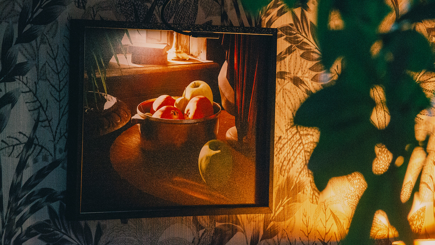
Fruits in a Bowl - A Material and Shader Study
this one is very clickable
Thank u, some are from behance and free fronts next to hand writing and some logos from pontrest
Gave +1 Creative Carma to @abstract oxide (current: #18 - 109)
Although am not sure yet what it need to be adjusted or improve on cuz am just starting
Made this for a school project, kinda struggling on how I would make some images and text fit into this background.. I’m not sure how to approach this without butchering it lol

It’s supposed to be a flyer for some College ESports club, it’s not actually, just a brief. I went for this type grundge theme cause the game I’m using for the club is rainbow 6 Siege
How can I make the + sign in between the two words look more like a plus, because to me it looks like a divide symbol. I tried connecting it so there's no gaps in the sign but it doesn't look good, just simplistic.

If you're talking about out blending images with the background, try messing around with the blending option sliders (dark and white). You could also try different blending modes on the images. I would try a mix of both, but make sure the colour grading is consistent - apply CC if you need to.
don't use rounded corners on parts of the vertical line that touch the horizontal line. this is what makes the vertical line look like two separate dots
I love you
@desert stratus Perhaps make the + sign much more angled and a slight stroke around. I've slashed the right edge to match the end S

Use blending modes to include the background in the foreground images
yeah i think you're right, the rounded corners make it look like dots. only thing is, I wanted to have a more modernized logo that also matches the rounded edges of some of the letters.
i like the idea, thanks
Gave +1 Creative Carma to @raw wadi (current: #33 - 54)
Hey, I am making a "Stop Vaping" Campaign for a school project. How can I improve this?
The text is in swedish and is talking about how it can lead to cancer and so on.

Anything I can edit in?
I notice there is a lot of empty space but I don't know what to fill it in with really
sorry to say but everything seems off there, the red header that probably must be white and not italic, the "var tredje etc" text that is hard to read and would probably be okay in helvetica, the site that has these letters like "o" with ' above it, sites don't contain these letters, at last, empty background, for a dude you might want to use gradient map effect with a paper effect...
maybe i could show you how i see it if you send me .psd file
What does it say? Why Stop Vaping? - simply against the rules "Because we said so", or does it mention health issues?
I'm asking because you could modify the visual accordingly.
I think you should change the background to some kind of smokey, hazy background... instead of the boring grey.

That background was generated using AI.
In fact, this background was too:

mehhh, nah that seems attractive as hell
maybe black&white?
it just feels as you're inviting me to a party with that graphic
Yeah - I'm not saying it's the right choice. - I was generating a smokey background for the the OP and generated that too whilst I was at it.:)
That looks good, maybe I should take insipration and not even use the model
Top red says stop Vaping. The rest of the text says "Every third vape you smoke, causes a mutation that could lead to cancer"
Buttom says "Smokehelp.com"
Yea. I'll send it. to you.


Damn this looks cool!!
Could you share the PSD file
would love to see how you made this!!!
didn't really used it, but thats how i saw it... i'm not getting paid to pefrect it, it's just a sketch for you

fonts used: Threat, Adobe Clean
stock image from unsplash

That was mostly midjourney to be honest.
Ohhhh but yessss that was cool af

Since the only light source is the moon, there is too much light on the top of the hat brim. For incandescent lamps the main illumination comes from the filaments at the top of the lamp.
I don't know what else to add or subtract, what do you think?

How come it's only black and white?
how can I improve ?

idk it just doesn't feel alright
I am missing an ingredient 🤌🤌


revised versions lol
okie okie
i would like to get some feedbacks now...
The third one is beautiful, maybe add quite a bit of noise to it
Hello guys, I have a request from you. I'm not good at Photoshop, maybe you can do it for me. It's really simple but I can't do it myself because I'm a novice. Those who will do me this favor, please dm me. It's really easy, I just want you to put me next to a celebrity in a realistic way.

Learn it, mask a photo of yours, bring it beside the celebrity and adjust the lighting (need to mask the celebrity pic if you're behind the celebs)
Sure thing …..Thanks

Thank you Sir
Gave +1 Creative Carma to @raw wadi (current: #33 - 55)
let me know if you'll need anything
Is there anything specific I need to do to post images in this channel? For some reason I can’t add images.
made a phone wallpaper

hey guys I need your help 🙏 I have to add the finish line and inflatable thing, tried my best with tones of layers but it still looks off... do you have any advice please ?

I think you did a decent job. - Maybe a bit too much contrast though
oh thanks that already looks better, also I guess people won't know it's edited so they won't notice as much
Gave +1 Creative Carma to @novel comet (current: #6 - 877)
at least I hope lol
Last Photo Edited

I'm making this for my friends server pfp and I'm not really happy with it rn what can I do to make it look a bit nicer

Will this need to be recognisable at very small sizes? If so, perhaps simplify it and lose some of the detail.
i have to make a magazine cover design (very simple) for my school trip but i have to put a bunch of text on it (its a requirement) but im scared itll be very ugly since the text is bulky and just covers everything in the background, im thinking if i should put like a background bar for the text to sit in but that could also look bad so what should i do? p.s. also dont mind the star on the left i was just messing around with shapes


im talking about paragraphs tho, not simplistic text
like literal paragraphs
it may as well be the content page instead of the cover
It's not a magazine cover then is it?
yeah sure but its what its called so 😅
Um... How many words?
wait sorry let me see
Also, are you only allowed ONE page for it all?
I'm just looking at these here for guidance:
https://stock.adobe.com/uk/search?k=travel+magazine+template
yup ,,,
ok i just asked my teacher so pretty sure i can just omit all my content and shove it to the next page, then my problem is solved xD thanks

Wait thats awesome thanks
Gave +1 Creative Carma to @novel comet (current: #6 - 880)
or....

OR...

that looks nice tho, how do u the dark effectmabober
dark effect where? - the first suggestion?
I added a big black rectangle with perhaps a 50% opacity.
thanks!
it looks nice
Peaceful Design for a Peaceful place
how does this look?
My Breaking Bad poster is done :)

a friend asked me to make a logo so i came up with this how do i make it better

tips to improve this? Recently started out with photoshop so knowlegde is a bit rough

Yh 1 thing
Maybe get the logos left bottom of benfica and arouca on the same height and a bit of space in between the logos
Will do
what can I do to improve this design its too barebones rn I need it to pop out of the screen since its a logo for a discord server

gradient effect maybe?
where
what should I put in the middle?


I Love It ❤️
I asked midjourney to 're-imagine' your logo icon and it suggested these:
Maybe you could take inspriation from anything here....

hi sorry t obother u again, i need a big giant title at the top with a bold font (i used Mont bold), but idk what color to use, everything looks kinda eh
Still working on Fredo Santana
thanks alot
Gave +1 Creative Carma to @novel comet (current: #6 - 887)
Yeah, I'm not suprised. If you're following my design suggestion above, I'd strongly advise you keep the top clear and focus on the image only.
think he would mind if I intergrated this into my design?
Who? Midjouney? I'm sure he won't mind 🙂
kk
Tips to improve overall (especially highlights and shadows)

Highlights and shadows don’t look too bad. On composition I’d put the top guy more to the right and bottom guy to the left following rule of thirds.
Bro mid journey is image generating ai
@raw wadi I have so much to learn 🙂 3 weeks on PS and no experience in design so I'm winging it. What would be the most important fundamentals to learn ?
a movie poster I made, what do you think?

how to make or find this type of A letter?
All Criticism Welcome. Thank you in advanced.

Yeah you can join their discord and generate image
thats useful
I guess first 25 images are free after that you have to pay
any changes I should make?

can I just make another account when reaches 25
cause im broke
Just learn to use it from their tutorial
tbh i'll prolly end up paying
You can completely make new things by giving descriptive description or post the work that you have done and say to to improve it
but anyfeedback on this?
my fav u mean?
Umm
well ive only made 3 good ones cause all the other ones I made I didnt have adobe and I used some crappy free software and they were super pixelated
Can you send it?
ok its not the best since I had to scrap it but still my fav
lemme find the screenshot
this is one of my idea's for the one above the people I made it for liked that one better but this is my fav one

looks great. the only tip i would give is your letter spacing could be a little closer. i think it would make it look a little cleaner, but overal great job
I tried to learn to make lamp glow


Did I do good job at it?
Feedback and tips would be greatly appreciated


the only thing i would say is for a more realistic look...when there is a haze your light will radiate in more of a halo due to the water in the air
but honestly looks good man
Thanks I just started learning to edit yesterday
really good for just starting man
Photo was not taken by me I just edited
yea for sure as a designer we all use stuff thats not ours
I am not much of a photographer, right now I just want to learn to edit do you know where I can find unedited photos to practice editing for? Maybe there is a discord server for it or something?
i use unsplash and pixhere
Beautiful, free images and photos that you can download and use for any project. Better than any royalty free or stock photos.
Thanks
Gave +1 Creative Carma to @rustic patrol (current: #874 - 1)
no problem
i do alot of esports and sports posters
as well as stream layouts and logos
Nice
this was another recent one i did....im not happy with it but ehh lol

i realized some things i forgot to do after i was done
Eminem's Godzilla Song Cover Remake

I like the design. Nice work. Solid colour and contrast.
I’m not a fan of the text on the face, especially crossing the eyes.
yea that was something i was gonna change....i realized how it looked afterwards...thanks for the insight

heres another one i did today
Thanks mate. Keep the great working coming.
Gave +1 Creative Carma to @rustic patrol (current: #560 - 2)
just playing around with some ideas
Yeah this is cool. I’m OK with eye on the left getting messed up a little as the one on the right is clearly visible.
thanks appreciate it
Gave +1 Creative Carma to @abstract oxide (current: #18 - 110)
Any time
Hey all, I am new here, and it's nice to meet you guys.
Hey there!
https://assets.adobe.com/id/urn:aaid:sc:AP:cb5ce9ab-9911-4f65-ac72-48f6f885c912?view=published
This is my latest work, can you please give you suggestions on this?
hi guys do u like the orb? any tips to make it more orb-y?

I like this clean look at the top tho.
Did you try out giving the white background a papery touch?
like with this

There would probably be some distortion inside the bubble. You wouldn't see directly through it to the background.
like this @vestal flume

Will this papery touch look good when we print this??
depends if you can get a high dpi texture :D
but yeah it will def be, i use paper textures a lot and i think it sometimes gives it the last touch.
But really depends what paper you use as your print.
For glossy prints i dont recommend it
il try the gradient tip, as for the distortion i warped it a bit bit il try a bit more, @low lagoon ty for that image good reference
Gave +1 Creative Carma to @low lagoon (current: #330 - 4)
Will give a try on your suggestion, Will send both the samples to client. Thanks for the suggestion

for non-commercial you can look at freepik
sometimes they also offer free licensing, you just have to check
i think it looks a bit better

Apologies @rapid bison Ive been out of the loop for 24h.
Apart from learning the technical aspects of PS, I would suggest studying composition.
Did you check using https://www.whatfontis.com/ or https://www.myfonts.com/pages/whatthefont
Font finder that helps you to identify fonts from any image. 🔎 Upload the image and choose what the font you need. 990,000 fonts indexed free or commercial.
Identify any font with our font finder tool. Upload an image, and we’ll search our collection of over 133,000 fonts for the best match.
Any bird recommendation for the wings, i guess with the hat i will just add furr to a hat or something? lol

Maybe This For The Left Wing

oh thats good, idk how high res the picture is but, do you know the bird?
the wing fis pretty much perfectly though damn

You Are Welcome
How can I improve this picture

The banner or this photo?
the photo
Depends on what you want to do with the picture
just for social media
Are you just trying to make it look better or add to it or take out back ground?
just make it look better


we didnt win shi 💀
Well, whatever 🙂 - You get the idea of the proposed layout, colours etc.
yeah, i just think it looks a little weird with the banner cut out how it is imo
how did you select the background?


Any feedback ? I am fairly new to photography. Thanks

Nice shot. Perhaps a vignette (darken the edges) to draw attention to the middle of the image.
It could also make for an interesting black and white
A quick demo

could use like a lens blur effect


How about more mysterious?

so my school's briefing to create an alternative poster for the lord of the rings movie without showing the faces of the actors im thinking of doing something with door from Bilbo's house and the the map

any recomendations
How about the inside of the housewith the ring in the doorway and the map on the floor like a carpet 🙂

Was there a lake that close to the Shire? :D
how do i put the map on the floor tho perpective tool?
poetic licence and global warming 😉
think so
oh but i needs to be in vertical tho its a movie poster
I think the One Ring is gold. It looks like bronze or copper. I would think about that.
I'd also think about giving the map a slight beige/brownish hue.
yeah but since i wanted a frontal look on the ring i had to download a 3d asset cuz their arent any images with that perpective
oh yeah
Should look a nice composition in the door then 🙂

yeah i think it could work actualy but i dont have the level to be able to put the map as a carpet on the floor tho
i barealy know how to use the perpective tool
Just use cmd or ctrl T and drag the corners with cmd or ctrl to fit
Considering the layout you already have, I'd probably do something like this (see attached), Just suggestions.

oh wait hold can u send me the ring presetspsl
The what now? I had to select and mask it. You probably have the ring without the background so it should be easy to tweak.
@raw wadi's idea is an interesting take on the project. But if you're content with the layout/composition you have, I would suggest those things (above).
I would also provide more a margin between the ring and the edge of the layout. It's too close right now.
