#📝project-feedback
1 messages · Page 6 of 1
Probably not, but, I just wanted to start with something
I've just left it like that
i would put disnes pluy and search light to the bottom of the side
For the cover... put searchlight and disney right and the bottom, and make 'WHO' a bit bigger 🙂
Here is the whole thing, if that makes it easier

I'll try that
I think it will look better without search light and disney+ in front

I'd also perhaps shorten the paragraph and cute 3-4 lines if possible unless you have to provide that much copy. That's a lot to read for a DVD cover imo
I need to have that so no can do
But I agree
ahh assignments. gotta love em.
I wouldn't know what to cut, so I may just leave it
I don't what to complicate it too much
Nah enjoy them while you can tbh. Much more limiting on real world stuff
though constraints are helpful
More of an exam person lol
alright, then with the position you have right now it seems good
Gave +1 Creative Carma to @glossy mica
I like your use of the lime green, and I reckon you should bring that through more in the rest of the box/cover...

that looks cool yeah
OOOOOO
How do I do that?

It would work really well with this right???

Then I picked a green overlay colour, applied it over the top and added a multiply
That makes no sense to me but sure 🙂
i have the urge to do all by myself for your movie
Yeah. - Maybe add an outer glow on paint those neon masks to make it look like they're a bit glowy 🙂
Hahaha why lol
I did increase the exposure, I will try that
All I'll say is... don't make it too busy.

Yeahhhh agreed
it is that im pretty bored 
That's my film poster too
Loooool
I mean I could make a copy of each and send them to you?
Don't change them, but make edits of them?
Just little tweaks
sure thing, i am bad at explaining in the easiest way what i will change
i can even to the change James recommended
Yeah sure, I'll send them at 6PM UK time
I'm going back home soon so I can't really send it now
👍
Hey, I got the stuff, am I alright to DM you?
yes :)


those look amazing!! keep up the awesome work!!
Thank you so much
interesting quite i'd say haha, looks clean
did u get inspired by dbd ?
Surprisingly not however love DBD
haha gotchu !
What gave DBD vibes?
dn what to add to this to make it more full

The story(lord) of the DLC "Darkness Among Us"
Ooo I low-key get it
maybe noise
Maybe some burn textures
that also would make it look better
what layer should i add noise to?
To the whole project
You can make your noises as an overlays to avoid to affect ur layer
I's say the top one
okie
use this color


if u put 130 or 120, u wont keep the same color that you have, it gonna be more " brightness "
with noises

original

if i put 158 (for example)
it gonna be more "brightness"

if I put 94
What blending mode was applied for gray layer?
it looks like darker

like this?

yea


You can also use the shortcut alt+backspace to fill the whole layer
Now filter>noise>add noise

change it to overlay?
Oh so its overlay, nice


Much betta
tyty
well im out, gotta sleep now it's kinda late here, g'night y'all ! 😊
ty and gn
Gave +1 Creative Carma to @silent hedge
Night
help me improve ( i dont make them for vid just for fun and practice )


I would change the font of accept
thx

Cool stuff
Honest oponion it took me 5 minutes to make and im lost. Tell me what looks weird, what can be fixed. Coloring? pretend your a judge, be a dick about it

its for my product
constructive critisizm is the word you are looking for
and i'd say the colors
the cat looks very clearly photoshoped in
1 because of different lighting
and its the only orange thing there
good contrast
but still
and what makes this graphic not come together is the text
1 they are randomly thrown in with no real composition in mind
- you have 3 fonts, 2 colors 3 different sizes
wayyyyyyyyyyy too much variation just for 3 words
also this toy is a playmate
but the cat is sitting there bored
that says to me its a bad toy
and does not persuade me to buy this for my pet
have some action in the cat, not just the toy
also here with the y, you could not decide ot go behind the letter or to stay infront of it

dont just make the oppacity 20% and stop there
either fully in the front
or fully in the back
(unless the object is see through witch i dont think your object is)
this green is also not a fun color for a toy

more dull green and army


not the same product
well if you must work on this one, you have space here for text

wont be hard to fit 3 words there

for what thats bad

you have generetive fill?
neither do i
but if you did you could expend the image
the base image is not the best
If i had generative fill I can do so much
to try and add text to
what was your goal?
is this for a class? for work?
ok well, send me a cut when you'r done

thats still weirddd
You are getting paid for stealing a photo that literally says it can be bought
they said to edit it
well okay then, if you know what you are doing good
can u tell me what u would do for something like this
So this image should be edited to get more views?
its for the front of a website


make one
then why did you accept a graphic design job? 😂
idk cause y not
cuz now you're stressed
yea
so, heres what you can do.
go on fiver, find a graphic design that will do it for less then you are getting payed for it, hire them, get it, send to your client & keep the change.
good way to middle man a project
ok : )
make this look good
well, themed will explain it better then i perhaps
thats what i been telling you
im gonna go in debt
start with purchasing photoshop
thats too much
photoraphy bundle is $10
there is also a free trial
I cant buy subscriptions
i said free trial
I dont have a credit card
@little tartan sorry I know that's something most people have issues with. Explore Adobe Express as it's free and can do some basic design and layout https://www.adobe.com/express/
some image editting, too. and pretty easy.
But i need to edit my thingy and that wont help
its a 500 thing if i get it, he hires me forever
500$$
should be then reasonable to get a subscribtion, with getting a job i think you should have a bank card
that works too
@little tartan i done this as of rn

thats bad ngl
👍
can i pay u like 30 cents to do it for me?
I have no other ideas than what i sent above
Please keep the conversation civil.
If you want to insult people, do it somewhere else.
plz
Nah dude. They can't do that. It's disrespectful
XD
in which world are you living ??
50 cents
Ill instant send it
And no taxing!
I know I know its a very good deal
@little tartan then leave the job if you are not able to do it. I think someone would have been happy to get this job, and they would have already finish it. You are not professional at all.
i am professional, Ill do it for them
its 50 to do it and I do the rest of there store for 450 more
Nah move and bear the consequences of your action. You will sleep less stupid ;)) (no offense tho)

I mean, your behavior is unprofessional, you take people for idiots, learn from your mistakes.
oh, im sorry
Really, what is it for ?
do you have to make a poster or smth else
just an image
what is the name of the site ?
yeah its like a long thing
idk
...
I only know product
You must give more information if u want us to help you.
Okay
What the product is about ?
its a ball
When you say first image of a site, you mean the logo before the url right ?

a ball of what ? Dude do sentences istg, what this ball is made of, is it connected to smth, or is it a simple ball ?
its a ball
No dude, you can't pur that image for a site like that
pur?
It's more IU/UX, you have do go deeper in your idea
what is IU/UX

They said they are making a site for this product but are around the pet niche, and its a automatic play ball for cats
and its due today at 9 pm
Okay, is an offical picture from the company ?
Dude, it's actually 2am and i am trying to help you so please, DO EFFORTS !
And "strangely" you have NO any informations, no any shooting, nothing, not even a 3D ball PNG ?
side note: just followed your twiter, i love your stuff
I'm trying to take this further. I was told the background looks weird, its meant to be less "in your face" as the rest of the stuff

I fear the inner glow on the text is getting lost with the texts insides on "RBX" as well
If you say anything, please tag me
Thank you ! Appreciate it ! 🩷✨️
Gave +1 Creative Carma to @raven crow
When you say "less in your face" you mean that you don't want our eyes keep focusing on it right ?
(Just to be sure)
@silent hedge - I just read the car crash of conversation you had above. - Just wanted to say thanks for your efforts in trying.
There just wasn't enough of a brief given to be able to provide anything helpful. - It sounded like "I need to put a heading on this page", but I still have no idea if they wanted this to use as a poster, a social media post, a product image or something else.
Gave +1 Creative Carma to @silent hedge
what can i do for the background here? im out of ideas

You can maybe do the same "Flatten Effect" that you put on the Persons in the Forground. You also could try to lay some kind of Background maybe some Explosion or so between the People and the Logos. maybe look at others of those "Gamer Banners" and look how ts done. Hope it helps.
I tried but they are not talknative at all so well 😭 can't do more specially if they don't do any effort and I guess it's too late to help them so I'd say another bite the dust- 🤷♀️


You can download and install it from their site.
like this, text and pictures interspersed

I... think the letter spacing is a bit too wide, and I'm not sure I'm a fan of the melting guns? - but I'm not sure of the focus/goal of the image 🙂
Yeah, I think it’s pretty but it’s still pretty aggressive there


These are just screenshots for my mobile device so they’re not full quality but I think I fixed it
Does the bomb look out of place? I’m trying to make a portfolio for a program I want to apply to that involves like getting rid of nuclear weapons so I was thinking a before (this image) than doing an after image afterwards

I would darken the mountains
Should I try and harmonize it or would there be an easier method?
i would try to select it with magic wand tool
or that you go select>color range>select the color of the mountains and you play with adjustments

great, it looks better
Currently working on a project where I'm turning this image into a nighttime version of itself


One of my largest issues is with the bright light that the sun in the original is casting. Does anyone have any advice on how I could soften it or darken it?
whats better and wat could i add


It honestly looks fine for me on my phone. If you want to darken the highlights, mess with the curves with a mask. Also that moon is out of place since the light is coming from the left. It would be better if you just removed it.


idk what im going for just expirementing on other design types if that makes any sense
idk tbh I just was messing around on pixlr x so
how u do dat
in pixlr
im too poor to keep using adoble photoshop
Use Add Layer Mask in Photoshop, https://www.youtube.com/watch?v=aNpO6G72O3w'

Discover what Layer Masks are and jump straight into real-world examples to learn the best ways to use them in Photoshop! Starting from basic concepts to fundamental techniques and best practices, this lesson covers every aspect of Layer Masking for beginners. I hope you enjoy this tutorial. Thank you so much for watching :)
► TIMESTAMPS:
00:00...
The explosion should be faded since it's far away. Also there should be some glow from the explosion.
i think you should make the mountains in the front less faded than they are. the way it is currently set up the explosion should be blue because it’s so far away.
bet thx
Gave +1 Creative Carma to @shadow agate
made a car into a poster is there an easier way then spending 2 hours on the paint

I used poster effect and then spent ages editing it
also is there an thing you can use that makes the inside transparent
os like a font or smth
but leaves an outline
Idk what method you used, but I would make my design first, then use a displacement map to put the design on the car.
Something like this https://www.youtube.com/watch?v=GbJziXVkqrw

In this tutorial, you'll learn how to use displacement map filter in Photoshop using Crop tool, Layer Masks, Quick Selection Tool, Select Subject, Displacement Map Filter, Curves Adjustment, Brush Tool and Blend Modes.
—
Image 1 Used: https://forums.babypips.com/t/tesla-nasdaq-tsla-earnings-preview/533329
Image 2 Used: https://unsplash.com/phot...
thx that helps alot imma try to see if you can do that in pixlr bc I can't afford adoble photoshop
Gave +1 Creative Carma to @snow condor
if you could help with that than that be legendery
I don't use pixlr
alr
Appreciate it! I'll take that into account 👌
Do you think if I adjust the moon to be peaking out behind these leaves it should be fine, or should I get a new background image? @snow condor


The lighting is still wrong. Id suggest to remove the moon.
Do you think the second image with the sky looks better?
The first one has the better style, but the second one has better composition
But I generally like the second one
Here's another angle of the first image background I used

The clouds are a too saturated and bright
But that might be just me. I don't work with this type of style so idk.
I may end up compositing a night sky and then doing my own stylized clouds then for the best effect I think
👌
Last go here with another background for your opinions

I like the clouds, but the sky is too gray
You could mask out the clouds and add another BG and some stars
What? - I think your image looks awesome! Clouds look good/fine.
Is there a way to match the style to the bomb at the end? I want to get that effect but can’t

Set a black stroke, brush some black spots, and use the smudge tool to move the lines a bit
thanks guys


Went a different route on this Photoshop but not sure which is the better version. City versus simplistic?


what is this for? whats the goal here?
UN program, wanted to make a portfolio around a bomb because the main idea is to have a world without nukes
that sounded terrible but I’m hoping you get what I mean
i think by adding in a bomb in your graphic for that kinda goes against your goal
and what does the AD stand for?
This was on their website so I went with it 😭

oh interesting
so they are turning the bombs into art

in that case
no city bacground
and also bringten up the pink tree more
ok alright thx so much
Can someone give me some pointers for my banner? {gaming channel}

@random pulsar that banner is bad
??
why?
its terribly made
let me see one of ur images in ps
no
see
ur banner is trash, accept the criticism
let me see any one of ur images
i could make a better one in 5 mins
k do it
pay me

bro its bad accept the criticism

@random pulsar
10000000000000000x better than whatever ur banner was
@random pulsar thoughts?
Can someone plz dm me and help me improve?

@random pulsar ur banner needs to improve by a lot
im just saying, maybe change the text, the shapes, the pasted in images
i mean your youtube banner doesn't even need to be that special, make it simple
Please provide "constructive" criticism. Saying something is "bad" doesn't help. If you don't have anything constructive or helpful to say, perhaps don't say anything at all.
it would be a disservice to him if i lied and said it was good
You provide constructive criticism. That's how. If you can't do that then just be silent.
First of all, try to look at your project and find out for yourself what bothers you. Where do you think the mistakes are? What would YOU want to improve? It doesn't have to be detailed, but try to look at your picture objectively.
Then you may notice that you have a blue man on the left with a background and a man on the right without a background. That means you should either place the male on the left without a background, i.e. remove the bluish background.
Then the style of the two males should be similar if necessary. On the left is a digitally created body with lots of polygons, a smooth surface, etc., and on the right is a rough graphic block. You should choose a style. Then you chose a background gradient from dark violet to grey. Then an oval field "i epik gamer" which unfortunately I think should be some kind of placeholder at the moment, because that's not good English, but you know that for sure. Then underneath a thick box with a completely different color gradient, etc. You used so many colors that you can't see through them either. Here try to stick to a kind of color palette with 3-5 colors. The people in the picture are more 3 dimensional, but the text is one dimensional. There are various techniques for displaying text in 3D. It's best to just watch a few youtube videos on the subject of image design and image composing. Then build it all up piece by piece.
There is a website called vecteezy and you can find a lot of background for your gaming banner. Perhaps, try memphis, dynamic, geometric or just simply type "gaming background" once you enter the website. You can apply the gradient map on the background as well
You can find those backgrounds on the other websites too
Im making this logo for my friend in illustrator. He wants it to start off a clothing brand and id like some feedback. He says it feels like something is missing, since im kinda minimalist, im not really sure what I should add there so any feedback is appreciated.

I’m not crazy, the two images didn’t blend well together right?

I think the background ended up missing a blending step or two I forgot
How to being so negative, they need construtive criticism, you are not helping them by saying "how bad it is". Instead of that sentence, please, help them. Kindly.
Oh well, seems that D. Human said everything 😂
Next time, think about what you are going to say ;))
Both image fit really well ! I mean the little girl w that background is really cool !
Now what you need to do is going more deep in your work
Think about shadows, ligths, contrast, and colors curves !
I was thinking of maybe changing the color curve on the dress actually
I think the bright green is too contrasting
Shadows under the girl
She looks kinda floating
alright, I’ll add more.
I did add them under the feet but obviously it’s not noticeable
Yeah.
Should the whole girl get shadows?
alright I gotcha 👍 thanks
Np have fun
Hello. I just made this in photoshop and I think somethings of. Could someone please help? thanks

the tree casts a shadow to the right while the terrain casts it to the left
I dont get it
The darker area is on the right
Oh
I see now

Also... It would be better if the top right edge had a bit of a 'grassy' edge to it...

..instead of just STRAIGHT
(Google "grass cube render" to see what I mean)
Ok Ill do that.
How should i? With a brush?
Because brushes will just do a straight line
he left the server
You can use a grass brush at the ends of the edge to make it more realistic
Search for 'photoshop grass brush' and download them
ok
Tree looks flat. I understand you probably tried to "face" the tree towards the light source to make it look 3d, but it actually had the opposite effect. Since trees are radially symmetrical (like a cylinder) you don't need to have it "face" anywhere and it can just stay flat on the canvas and look fine.
Hey, this is my first Graphic Design ever! I used a PSD for the idea but if I'm honest I did 70% of the work. I want good feebacks pls!!


Yes?
Is it yours?
No, just to provide a case reference
Oh ty
It looks nice! Editing is clean and the colors are nice.
Composition wise - it's a little "empty" in the lower right quadrant. Also it's generally good practice to avoid placing text on top of text so things don't get hard to read.
appreciate it!
May i have feedback

i am making a motion comic where i mask out parts of a character and keyframe those parts to create an animation. i just finished coloring it too.
I haven't masked anything out yet, but only colored. so do you guys have any ideas on how I can mask these parts while being sure not to leave any white gaps.
i used gradient maps and gradients to color this by the way
Also, if you guys have any ideas on how i can improve the coloring I would greatly appreciate it

too lazy to update tbh
is ther anything else i could add

Yes

All 3 directions or just down
At the Blue Lines you can make the faces a bit wider and under that there is some space where you can ad somthing more.
Make the three Face-Lines bigger/wider so that they can be seen a bit better.
Oh alright

much better in my opinion!
ty
Gave +1 Creative Carma to @normal spoke
any feedback on this? looks a little boring to me at the moment.

What do you want to create exactly? When it would be a CD Cover there would be only the band-name, Title on the Front and the Songs on the back. The Footer should be much smaller and the "i Don't know what..." text is unnecessary . Also the hand, the mouth and those have no purpose. Try the Womans Cutout with the Title and Interpret/Band on the Front and the Rest on the back. Have fun.
this is for merch, back of a t-shirt for a music project
Well then you can place the CD-Front anc CD-Back Cover side-by-side. Look at other CD Covers and you will see what te Eyecatchers are. Rule of Thumbs: Less is more. Have fun.
Really new to photoshop just wondering what else to add? Any suggestions will help


I still don’t feel like the girl is blended in after adding shadows, is it just me? If not, what else can I do?

That is sick !!!
Well, your design makes me really think about y2k grain ! I would say to adding a bit gradient like from grey to low white/beige as the backgroud. Maybe duplicate several time the woman to make a movement effect (with an "invert" one), papers & scan line overlays would fit so well on it ! And then adding a noises overlays to make it fluide !
https://www.instagram.com/reel/Cpxo8oUAS3E/?igshid=YmMyMTA2M2Y%3D
https://www.pinterest.fr/pin/53832158040513702/
https://www.pinterest.fr/pin/543176405072992989/
https://www.pinterest.fr/pin/16184879900937501/

Mar 7, 2023 - 217 Likes, TikTok video from maria.tokar (@maria.tokar): "5 features of punk graphic design. #graphicdesign #posterdesign #typography". 1. No grid | 2. Variety of fonts | 3. High contrast images | ... God Save The Queen - Sex Pistols.

Pinterest
Nov 20, 2022 - Art / Design resources and inspiration shared a post on Instagram: "For the free graphic design assets go to my store, and scroll to the bottom or sort by price. 🥷 if you like please share my gs ⛓links to asset store in Bio. . #designsyndrome #albumartarchive #graphicplanet #graphicdirectory #albumartattack #amnestymagazine #city...

17-sep-2020 - Download this Premium Vector about Grunge texture overlay, and discover more than 56 Million Professional Graphic Resources on Freepik


when i see ur poster, this is what it makes me think about
hey guys this is my first design ..definitely its not complete, but also i just dont know what changes should i make into it ,what to add,or should i just leave this project?

It is recommended that you use a mind map, set a theme, and write out everything related to the theme (style, weather, light and shadow, elements, etc.). You can go to Behance or Pinterest to find references, or draw sketches, and then look for materials.
Ohk...thanku so much
Besides what Rannngooo wrote also try to imagine what the Story behind the picture should be. Right now there is only an astronaut laying on a ground and some wrotten ship. that CAN be an dead astronaut, because a O2 gas tank (<- hint) ist laying also down and there are steps coming from the ship wreck (<- hint) meant to represent the astronaut's disembarking from a spacecraft. you also can put some distant small light in th sky that can represent some Space station from where that astronaut could be.
this is the finale one i have gone with

have you tried putting the letters in the same perspective as the MC blocks?


yes !!
that's cool ! Maybe I would invert the M (flip horizontal)
touched it abit


sized it down
and changed stroke to 1 (made the spacing better (not on ss))
Nice ! This is better 😊
ty
Gave +1 Creative Carma to @silent hedge
Music cover art!

I don’t realy know how to do that
Yea gonna try that
Legends! please give me your feedback regarding to my art. I'm new to photobashing so now I'm applying things from what I've learned.

this is all photobashing? great mix of images i wouldnt be able to tell, looks like a digital painting
hi im a begginer graphic designer for my clothing brand and i need some tips because i have no idea how to do a good fade at the bottom of a design so it doesnt have such a harsh cut off to the tshirt


Hey bud! Thanks for your feedback and yeah, I mix some images I found from google then modify it.
Gave +1 Creative Carma to @shy raptor


It's a birthday poster design. What do you think of the design?

Thanks so much for the help! When you mean to fix perspective, how can I do that? Perspective wrap? If not wont the cars look distorted?
Gave +1 Creative Carma to @shy raptor
the sole balloon looks a little out of place, maybe you could add more or just not have balloons
i'd also bring its colour closer to the blue reflections on the jacket so that the whole poster looks more coherent
Try to draw some perspective lines. Cars further away are smaller as cars in the Front. you also can lok up "perspective Composings" on youtube, etc.
Looks nice. Maybe you can put some more ballons in it. Those can also represent the number "five" if you want or you can put other things in there. Also look at the shadows. I think the ballon has a good one, but the shoes can have some small shadows, too. Hope that helps.
Yeah, the thing is that the car is so close to the car behind that the difference should be unnoticable. Would you think the perspective issue is with the cars or the track/background?
Here is my updated version so you can take a look:

Can someone help me out with improving a pics quality on ps
Second ever logo! (day 2 of illustrator and photoshop) I'll link my first logo that i made yesterday above. For this logo i made the eye on illustrator and then copy-pasted it to photoshop and added the text and stroke around the logo, please rate it 😃
logo yesterday is the lemon one and logo today is the eye
tryna make the tyler one almost like the carti one any ideas


hey
The perspective issue definitely is with the cars, it doenst look like the front wheels on the ground compared to the back wheels: they make the cars look like they're titled or rotated wierdly in a way they shouldn't be
Nice composition. I would personally leave a little space between the front car and the right edge of the image. If you wanted to keep the cars at the same size then push them to the left and slightly crop the rear car.
Yeah, to clarify, I don't think they're talking about a vanishing point specifically. - Like you say, both cars are so close, they would be about the same size. - problem is that the angles generally are wrong. - I mean - what's the angle of the original picture that you took the cars from?
Ah yeah, I see what you mean. Do you have any suggestions to fix that without having to find a different image, or is it better to just find another image where the wheels line up better? 🤔
Can you share the original image that the cars came from?
Thanks, this is my second day learning photoshop and I've learned a lot. Anyways, thanks for the feedback, I will definitely center them a bit more 👍🏼
Gave +1 Creative Carma to @abstract oxide
Cars look like their front wheels are 6 ft higher in the air than the back ones...

Yeah I see what you mean. Yes, they were from some images I found, any suggestions on how I can fix it? 🤔
Yeah
True 😂


I tried to use the same angle
This is more how photoshop estimated the perspective:

Interesting, so would you reccomend I 'tilt' the background a bit more?

My version is literally the opposite 'angle' to yours.
High on the RIGHT instead of the left
Ah yeah, I see that
So would you recommend I do a horizontal flip? (of the background)

probably also want the line the left side of the track (TOP) to be much thinner than the right side (BOTTOM)
Ok, I'm doing that right now 👍🏼
I think you probably need to re-draw it - tracing mine perhaps for a better idea of the angle.
that said, mine is just a guess.
#❓ask-a-question any1 know how to do what i am asking?
Ok, I will do that 👍🏼
@novel comet Alright, I tried tracing yours but it feels off for some reason

Yeah that texture is flat/wrong
also, the grass not be straight either
What do you mean? 🤔
perspective
Sorry I just started 2 days ago, I hope im not frustrating you, but I dont understand
Ohhh, you mean Perspective wrap?
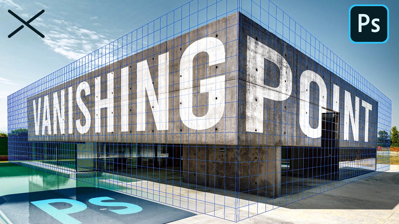
The Vanishing Point Filter and Perspective | Photoshop CC Tutorial | EASY
This Photoshop CC Tutorial discusses how to use the Vanishing Point Filter to add images, text and graphics to a photograph while maintaining proper perspective. This Photoshop tool allows us to create a simple grid and panels based on the perspective of your current image...
Ah okay, thanks, I'll take a look 👍🏼
Gave +1 Creative Carma to @shadow agate
I usually advise against using the vanishing point as it's not that intuitive and doesn't offer non-destructive workflow. In the discussed case perspective transforming will be enough as only one plane is visible
Ah okay 👍🏼

The Formula 1 Champions NO ONE Expected!
👆🏼 Made this one, not related to the other one, so tell me what you guys think 🙏🏼
I got rid of the people and edited a little bit. I don’t think I did a good job getting rid of them though. Thoughts?


The ones in the red frame may need a more natural transition

Wow. You've learned a lot in 2 days. Best of luck with the studies.
Appreciate it! 👊🏼
trying to make the gradient work maybe i just leave it out


Yeah, I don't like vanishing point either. - Seems insane that you can't place a smart object into a 'vanishing point' properly either. - meaning you can't later 'swap out' a wall/image.
I like the Version with the Gradient more. It has more depth.

wanna know your thought about this design
i just expressed my self and my problems with it

gonna touch it up (fix colours etc)
https://www.behance.net/gallery/174908831/Concert-Merchandise-Mobile-App-UI-UX-design
what do u guys think of this? any feedback?

Hi Adobe Community 🙌 ,
I'm excited to share with you one of my academic projects, SIMLESS Event identity branding
If possible, could you spare a moment to provide feedback on the project? I would greatly appreciate your thoughts on the design choices I made and any areas where I could improve.
Thank you for your time and continued support
Project Link : https://www.behance.net/gallery/161160037/Brand-Identity-SIMLESS-Event


Behance
The SIMLESS Event project is an academic mission that encompasses branding and mobile application design. My objective was to revolutionize professionals' engagement with eSIM through events. This small-scale implementation is dedicated to providing a use…
I love it. - Nice set of colours, the logo is clear with nice use of weights, - The abstract backgrounds work well.
This is...
GodtheDJ said everything !
I think you've created a fantastic brand. Congratulations.
I'm struggling to nitpick but there's a few minor issues with the flags...
- The content doesn't follow the distortions of the flags. This is only really noticeable in the left flag.
- The content sits at different vertical positions on the different flags. Is this intentional?
- Aliasing of the logo outer circle. Perhaps create larger and then downsize.
Again, fantastic work.
What’s the problem? As i guess this poster is lack of red colour, am i right?

Well received; thanks a lot for this feedback ❤️
Gave +1 Creative Carma to @abstract oxide
Are you looking for general feedback? Can you elaborate on the "lack of red colour" comment?
Yeah, I just don’t know: why doesn’t it look exiting… I guess I should add more red colours
And maybe there’s bad composition
A simple Curves adjustment layer that increases the contrast adds a lot of punch

i think the red colour is not so much the problem. Its more that there is much going on that is a bit to much. The boy is looking down very calm, has 3 Arms. That Flash on Top looks unrealistic. The one right Hand is blurry, but it would be better if it had a Motion blurr in the up-down direction. The Blending in Front with the Text looks a bit flat. Maybe there would a 3D Effect on the Text help.
Okay, i see, but wb calm face and the 3rd hand it’s don’t touch me bc it’s just a photo and i like multiply some photos in one… i agree with u I’ll try change it, delete the hand and make 3d effect. What about flash light: should I add lightings on the weapon? Or is it too small? I’m 4 beauty)
I would say just try different Lights and differnet positions. Try also to find reference Images in Films, etc. make screenshots, look how they look, etc.
Okay, i heard u 👌
do you guys feel the girl really blend with the background. please share your feedback

yeah ! It really does ! But maybe try to fix the color of the girl, like more warm
Ok
The Composition looks really nice. The thing is that the Light in the street come from the left and on the girl they come from the right. That looks a bit of. But all in all it looks very good.
I feel like something is off but I don't know what

The layout of the red lasers feels almost grid like. Perhaps make them a little more random.
Yeah after I made full edit I noticed that mistake thanks for pointing out
Gave +1 Creative Carma to @normal spoke
my first ever custom pfp, i have no experience and i kinda wanted to blend the green logo on top of the engine, but i didnt know how.

these were my base pictures:


Looks a little dark.
I assume you used the hue slider to change the colour. - and then made it darker with the slider beneath.
instead of making ALL of it darker, use the colour picker to pick out JUST the red shades... - that means you can darken the purple but leave the eyes, lights and teeth nice and bright.
Thank you
How do you record your photoshop like this?
I use some free software called ShareX
any suggestions to improve want some feedbacks about this edited pic


astrounaut a bit too orange. pro a shade between the all white and the orange you currently have would be best
play around
today i also learned about shadows too check this out too


yeah need to play some more to figure out to blend
oh nice job on the shadows here, looks great
thanks
Gave +1 Creative Carma to @shy raptor
Nice composition. Looking at the shadows on the sand and grass suggests that the sun is quite high in the sky. I would change the length and shape of the shadow under the astronaut.
so great !
what can i add

Great design. I like the elements and the hue and saturation choices are cool. I appreciate that the photo placement may be very deliberate but have you explored raising the image vertically? That way the text would not be covering her face.
Vertically how?
?

thanks for your feedback i will sort it out
Gave +1 Creative Carma to @abstract oxide
thanks
Yeah that looks cool. Nice adjustment with the text.
Another thing you could experiment with is taking the lower text, making it black and sticking it on the right over the sheet.
Thanks mate. Keen to see your update.
Gave +1 Creative Carma to @boreal condor
corrected shadow and changed some colorlookup.


Looking good.
Why? It does the job as it is 🙂 - It looks like a horrifically corny, brightly coloured youtube thumbnail. - Just as 'realistic' as any other clickbait looking thumbnail. - I assume that was the intention anyway?
(I'm not knocking the skill/project!) 🙂
nice work 🙂
wow jesus christ - came here for legitamate advice, not to be labelled as "horriffic". what a welcoming community
hey, I'm really sorry for that comment.
I didn't mean to offend.
and yes, it's to be used as a thumbnail so a level of exaggeration is expected
you literally gave no input on the things I was looking for feedback on. not sure how I could've taken it any other way
Yeah, of course. - I personally dislike the exaggeration on thumbnails, just a pet peeve of mine. - I was just in the process of giving some more constructive feedback, I promise!
I can't see the image any more, but from memory, I was going to say that you might be able to use photoshops neural filters to make it look like the man is looking at the monkey instead of off screen. - same goes for the monkey looking at the screen.
haven’t used that before. will look into it
Also, the table that the monkey looked a little bright, maybe add a bit of shadow on it? - but then again, it's a thumbnail, and they're infamous for being bright, over the top, over-saturated images anyway
sure, I’ll see if that helps it
I have to find the line between fake looking and believable while still being easily recognizable from a distance
hence the contrasting colors
Colours are good.
right now I agree that it’s too fake that’s why im here 😭
I noticed how the outfit worn by the bloke was so bright. - He looks like he should be working on a childrens TV show. - which again, was the entire point 🙂
One thing a lot of people get wrong is by having the different components added into an image all at different qualities and resolutions - I didn't get chance to look at yours very closely, but they looked ok from memory.
i’m just trying to avoid it looking like it was all stitched together (which it was) and non-cohesive looking
yeah fs. not sure what to do when I can’t really enhance quality though — should I add compression to higher quality parts?
i’m not at my computer rn but I’ll resend it
I think it was ok anyway, but if in doubt, I'd make the higher res things lower to match the lower res ones.
any tips on how to lower quality?
There is also another neural filter called colour harmonisation you could try out
I have 2022, are the neural filters available in that version
Um, quickest way is to probably rasterise the object, shrink it a bit, finish transforming it, and then enlarge it again.
ok yeah that’s what I usually do
Yeah I think so.
where do I find those?
hmm doesnt seem to be here for me

Harmonization. The first one in the beta section
ahh
I tried to blend this guy. Any suggestions to improve guys??


its hard to make his foot to blend any ideas
??
perspective is off
it'll be near impossible to properly blend that specific astrounaut in that specific bacground
also
astronaut in subway is odd to see, so makes it less believable but funny & interesting
Yes, for the perspective, you could try puppet warp, but…
And the lighting and shadows need to bf tweaked as well.

Very nice work. The piece definitely feels more cohesive now.
thanks
Gave +1 Creative Carma to @abstract oxide
that was in that part of astronut shoe which was in that photo
umm gonna ask anime questions again XD hope people don’t mind me
umm it’s not finished, I was thinking maybe I should put the light source behind rather than in front

I was thinking to make it more hmm like this with the light source on the back and tbh the background is probably too 2D I don’t even know how to edit it anymore


I have more reference but idk, maybe I’m just very confused with backgrounds
Tbh the shirt doesn’t even make sense and many things but I kinda gave up on those >_< i thought I might change the light source so I didn’t continue the uh line art and the color (cuz sometimes I shade it to help me with the line art better)
Scraped the old layout i had for this, what you thinkin?


i tried to blend this gar with this background. What you guys are thinking is this car really blends with this background??


Its a good start. The shadow colors on the car need to be adjusted. They are too bright compared to the shadows in the background plate. Also, the shadow under the front of the car also needs some work.
thanks for your feedback i will work on this this is my 5th attempt to blend something with something
Gave +1 Creative Carma to @wooden oak

i think this is for youtube video looks great honestly i love it
love it your draw style tho ! Well, actually idk if the background you want will fit with the charater, or maybe not in blue
But do you mean that you want that style for the sea or.. ?
Yeah its for YouTube, and thanks, I also liked how it turned out 🙏🏼
Gave +1 Creative Carma to @boreal condor

Lol, they are pretty similar 😂
ohh maybe not in blue yeah XD that blue i got no clue how to do it. I was thinking of something easier with like light coming from behind the character instead of from the top front. Maybe like this reference, the blue ones were the sea themed that has light from behind that I find very pretty
These don’t have umm sea I like the vibe, i think the blue is harder to do than regular I don’t think I’ll be able to do that


With some help I wanted to try for something like this as well as the uh shadow overlay, the thing that makes the character merge into the background idk if it’s okay or not

that Lumine tho 😍
Maybe try to find tutorials about sea landscape ?
That lumine is by void_0 on pixiv, oh yeah I’ve never thought of that :0 I’ll do that
Haha
Genshin need to do more skins tho
Idk if you know drawross, but they do pretty great tutorials, you should check his channel out !
what you guys think?
its for a signing i made for Coritiba in football manager, tried to make kind of like a signing post for social media

hey! anyone that would love to discuss and give advice to my color selection of fonts i used in my cover art?
im talking about the text on the phone, im not sure what colors to use for the text and glow

i think a green-ish yellow could go well
I think there can be two ways you can go the route and stick with the purple Lighting or you can ad something as bolovo said and use green-ish light as an accent. In both cases you should try to make the front of the phone brighter so that the buttons and Text gets more recognized. Have fun!

magzine design any feedback

feedback?

Hi all. I'm a beginner and I would like to get feedback on this. I feel it's lacking something but can't figure it out. What do you guys think?

watermark/10
this is good for starting out, i'd recommend using less variety of fonts
?
leave the "first" font and make the other two the same
watermarks are too distracting, noone will steal your work
well, anyways
The Font is not so good for this kind of work. You would use something with a bit more surface. The red scratches are Ok, but also not as dominant as they could be. The "Teenage" and "Heritage" Font should be the same. That "enzo"-Watermark thingy is Otdated, boring and Useless, because You always would have the Original Images to proof your work 😉 But as a Startingpoint not bad.
I like the Background, the "First" Part. But after that I do not get why there would be different Fonts and whatfor the notes should be. Maybe try little less, all the Same Fonts and some more faded Objects in the Background. Have fun.
Yes but I do not want it to get stolen-
I got asked to do that font
But thanks for ur feedback
🫶
Sorry, to say that but nobody would "steel" those Text and IF somebody REALLY would want that they could. Delete that grey areas and fill it wth black is a matter of seconds. As I said: You have the Original Files and always can proof that the Original is yours. Have fun.


You've created a really strong look. Great work.
I suspect a real world client would want the JOIN NOW button to be bigger and more obvious.
You have a few spelling and grammar issues.
Again, great design and a solid series of graphics.
Thanks for giving me valuable feedback. Next project I will fix the problem.
Gave +1 Creative Carma to @abstract oxide


Thanks mate. Keep up the great work.
Gave +1 Creative Carma to @delicate kite
I am a beginner designer and this Is my design

What's it for?
Is that "AC" thing part of the design or are you worried someone will steal your design and it's a watermark?
Yes it is just a watermark of my logo, sorry for now I will remove for the future posts.
hey im a up and coming star and im looking for a pro editor who can make me a quick gif
Oh lord, you don't need to apologise 🙂 - I just wanted to check it wasn't part of the design.
Maybe just knock the opacity back a bit more next time since it's quite distracting
Okay, thanks I accept it. 🙂
Gave +1 Creative Carma to @novel comet
Ok, the Watermark thing is settled 😉 For the Design itself I would change the second Image from the right (the coffee beans) into something with color as the rest or making all in that white/green-ish outline. The "AC"-Logo in the stlized fork in the middle would be for me way to prominent, but the design without the distracting AC-Pattern seem to look pretty solid. Nice.
This is for my trumpet section's hoodie. Thoughts?

This is a great design. Really nice work.
I checked the numbers in your image and noticed that...
- Your colours aren't solid and have some very slight variation.
- The white is more a very bright grey. Is this intentional?
Thanks, and yeah it's jpegged and i didn't really mean to make it darker
Gave +1 Creative Carma to @abstract oxide
Thank you. In case you don't know a solid black and white can be important for numerous reasons including having those colours drop away when using blending modes like Multiply and Screen.
Gave +1 Creative Carma to @wooden bluff


Hello again. Another excellent set of designs. A few thoughts... I think your text that's written in cursive is too thin and hard to read. As I mentioned on one of your other recent projects I think your "call to action", which includes the BOOK NOW button, needs to be larger. While I'm a big fan of negative space in design, I think some of elements could be enlarged. Keep those great designs coming.
In Case that should be printed on Hoodies i would try to simplify the Design overall a little bit, because those little details are not so good for printing on canvas and pretty hard to do. The Design itself I like!
Hi guys
New sketch, trying out new subject matters:
https://www.artstation.com/artwork/5vZNez

ArtStation
I had to do something for myself between all the client work and other projects; also had to be something that's not cyberpunk or sci-fi, so it's always nice but tough to engage in the usual introspection of "What else do I like to draw besides robots...? hmmm..."
That along with the challenge of carrying the same signature from subject matter ...
i need help with colour of the buildings at the front

it is not complete i have to complete the background and smoke from the factory animate that and the lantern and mist like particle effect
theme:polution (protest art)
Tried to blend the car. Feedback needed about does this car really blends??


The Race That Made Senna a LEGEND
I am struggling with this one, something is missing but I dont know what... please help a brotha out 🙏🏼
No the top right( hood) is too dark, pay attention to the lighting in the background
U blurred the outline of the car
Did U paste the image into the background
Reduce exposure, and use curves to make lighting better
If U want U can add noise for some texture
Yeah
Ah okay 👍🏼
U blurred the outline of the car with the background too much
I'll definitely check that out 👍🏼
Consider using camera raw to fix lighting and add highlights to the car
I dont know what you mean by "blurred the outline of the car with the background too much", like is the border too rough or too soft? I never adjusted the border for that image


Nope
Thats spray, since it was raining, the car brought up water too look like that
Ok, so just fix the lighting and add highlights
this is the original image
Are you sure? I dont want to make it to look to dark since this is a YouTube thumbnail and its supposed to be attractive. The bright white adds a bit of contrast and I like how that turned out
This is pretty cool but proportion are not that good, try to make the car a bit little
(If it's a youtube thumbnail, it's going to generally be tiny on the screen anyway. - I wouldn't panic about how blurry the edge is. - It's going to be compressed down to a single pixel anyway)
Also, not particularly relevant for a youtube thumbnail, but if you've got edges that feel a bit too bright, a neat trick is just to add a a darker inner glow effect.
Yeah, I agree, but at the same time I want to become better at photoshop in the process so any feedback is appreciated
That looks great, I'll try it out right now 👍🏼
@novel comet I tested it and it does look better with the inner glow, just that the top part also has the inner glow and it makes it look very dark

With 👆🏼

Without 👆🏼
love the colour tone here
The inner glow, you can kind of see it like a border on the edge
Yeah it definitely does have a better tone, but for a YouTube thumbnail it needs to be attractive
yea barely
To me it is very noticeable, does it work?
no
Am I supposed to make it bigger?
That will make the top part look even darker
OK
trying to manipulate this dog , teach me if im doing anything wrong im new for this please


Can anyone using Firefly message me please?
For Firefly questions you can take a look at the Firefly Discord Chanel. Because here are no Links allowed you go to the Firefly website and on the top right corner is the Link to the Discord. Have fun.
I think it looks good so far.
Hi! I need feedback and help on graphic design I'm doing. Can anyone help out a bit?
I am a novice/intermediate graphic design student and I make playing mats for a card game.
Currently I have lower competition but fear if I don't improve my stuff will get overshadowed quickly.
This is one of my designs, it's very simple and my only concern is that it doesn't feel like it has enough DEPTH and could feel a bit flat. The colors also might not work well with each other and it might feel a bit UN-COHERENT.
If anybody has just some general rules of thumb or advice please let me know

This is one of my competitors designs, it feels a lot more COHERENT and DEEP.
-
they used a technique where they overlayed color over the images to make them fit better and I'd love to learn how to do that .
-
They include a lot of outlines but my issue with them is that when I try to incorporate them they sometimes come out jagged. Is this something I can fix by upscaling images or something I need to do by not using the quick select tool when selecting my subject

discord.gg/adobefirefly is the link. That should be allowed. :)
You can try using Color Overlay, either by using Layer Styles or using a Color Layer set to various Blending Modes. Regarding the outlines, upscaling probably isn't the issue. Its about creating "cleaner" lines. Generally, vector shapes produce nice, sharp, clean lines. And they respond better to Layer Style > Strokes than "pixelated" shapes.
Could you link a tutorial on how to do these?
So if I wanted to outline an object, I'd go to Layer style and strokes ?
Not really sure about "tutorials" specifically for a Color Overlay. You basically just add a Color Layer (or Gradient Layer) and change the Blending Mode. (Tip: try "Overlay" or "Color" modes).
If you want to put an editable stroke on a raster object, you could dbl-click on the Layer. View the Layer Styles, choose "Stroke" and modify the settings.
Did this ! Thanks
Gave +1 Creative Carma to @wooden oak
So if you see in the background of my competitor, the images are in color, while mine are in black and white. For me I just put them all in a folder and used multiply to make a gradient be there instead of white
Is there any way I could make it so the images aren't black without having to stop using multiply?
Try a "Gradient Map" adjustment layer which maps colors in the gradient ramp to the luminance values in the image. That might be what the other guy is doing.
Thank you very much
Having a bit of trouble with it
But I'm gonna try to get a hang of it
Hi Adobe community 👋 ,
I'm excited to share with you my latest visual identity project **elFounder brand identity **
If possible, could you spare a moment to provide feedback on the project? I would greatly appreciate your thoughts on the design choices I made and any areas where I could improve.
Thank you for your time and continued support
Project Link : https://www.behance.net/gallery/176346605/Brand-Identity-elFounder

Behance
ElFounder's visual identity is clean and modern, with a focus on bold typography and a solid color palette. Overall, ElFounder is a brand that positions itself as a supportive partner for aspiring entrepreneurs, offering them the guidance and resources th…

OR

The Worst Formula 1 Crashes Explained...
Also if anyone has feedback on the BOTTOM one, I would really appreciate it 🙏🏼
Can you please type in the standard font size? Stop trying to make these posts larger than they need to be.
Tbh I like the bottom one more just because the colors just pop out a lot more as well as having a lot more contrast.
I'm guessing this a YouTube thumbnail and I'd consider this great :)
One thing I'd change about the bottom one is the shadows on the driver might look a bit too dark for me
Okay will do, sorry about that
Ah okay, Yeah this is a YouTube thumbnail 👍🏼
Will definitely look into that, thanks!
Gave +1 Creative Carma to @glacial verge
Hi so I'm looking for feedback for my design but Discord is not letting me send the image because it's deeming it as explicit content. I would love to get some feedback on it but can't post it in the server.
(It's not explicit it's just anime women in bikinis)
Basically these are gaming mats and I think I've significantly improved the design
What I'm looking to achieve is an effect so my design does not come out as flat
So this was the first iteration, recieved well but I wanted to make it even better
And this is the second iteration
Basically wanted to make the panels in the front POP out more from the background
And wanted everything to have a better flow
Basically wanted everything to feel more coherent
Still thinking about color overlays and stuff to make it fit all together better
Any ideas?
IMHO it looks Ok.
thoughts?

i feel its kinda boring idk whats wrong with it
except some oversaturated red at the top i forgot to fix
My Work 😋

🅰️ Old Thumbnail

Or
🅱️ New Thumbnail

The Genius That Revolutionized Formula 1 but at a HUGE Cost...
Good?

Can you provide some information about what is the original artwork and what you have changed?
Nice work. Did you build this entirely in Photoshop?
Is the strap supposed to be leather? If so, I think it needs a little texture to break up the solid color.
What are your thoughts on my design? 


what y'all think of it ?

Where’s bro’s head
still working on the project
Interesting design. A few ideas to help unify things…
- Tint the person and trophies blue (better match the blue environment)
- Lower the contrast on the trophies (diffuse light source)
- Resize the person to better match the couch
trying to get back into covers and its been a while as u can see


tell guys is this car really blend with the background


Everybody, Please give me feedback.


Nice attempt, the shadows/highlights are a bit extreme. shadow on front feels too dark
is the perspective is alright??
I don't know. - I feel like like, the back is maybe raised up too high...? - But I am being picky
(but you can't really change that anyway)
the car is not on that background before, i cut that car from another image and place it here thats why im asking that
yeah of course.
also i m trying that all horizon and vanishing point technique
to place that well but always being off
need more training on that
 thanks
Gave +1 Creative Carma to @outer cosmos
tried another photo manipulation, please tell whether this composite is good or not


Having a hard time with this shot. Raw file is pretty flat, but the blue in the sky gets pretty grain'ey / noisy when try to dehaze to bring out the mountains. Any recommendations overall on what to do with it?

Use Masks (if LR has that functionality) and isolate the various parts. Or use Photoshop. Separate the foreground and background. Then do the Adjustments on each. Use Adjustment Layers and Camera Raw filters.
Thanks @wooden oak. Will go that route and see what I can do.
Gave +1 Creative Carma to @wooden oak
Have you tried using the Noise Reduction features within the Detail module?
You've got yourself a pretty good comp there. Nice work.
Some suggestions for improvement...
- Shadows on subject are too heavy compared to background shadows
- Cutout of front tyre looks jagged
- Clouds seem darker around front spokes
- Is that a bench or a chair? Scale of the subject seems a little off
hey :) was wondering if anyone could give me some feedback!

thankyou for this constructive critisim i really need one of those to find where i go wrong i will fix that real soon thanks man
Gave +1 Creative Carma to @abstract oxide
Thanks mate. Happy to help. Looking forward to seeing your changes.
Gave +1 Creative Carma to @boreal condor


Hi, I've made product advertisement and I think it needs to refine more.
I would appreciated a feedback. I'll take note and use that info to improve my work next time !

What I do not like right away are the shadows on the bottles. Much too hard gradient and especially if you look at the light reflections, not even possible, because left and right reflections of the light are. The sticker has an inverted effect - actually, the 'no sugar' should be advertised and to be seen, yes. But all you see is: added. In the worst case, one reads: sugar added. The Mask of the Bottles are not correct - see the cap, there are white lines. Also the Bokeh of the Orange Plants should be corrected. But I like the colors and the background. Has so a bit of a Sicily vibe
Thank you very much. I need to consider lighting more.
And for No sugar added label I think I would emphasize NO instead I guess 🫡
for example. Or maybe you change the background color, like to green, so the contrast to white is higher and everyone can read it.
that would be nice, thanks for the great feedback
Hope it helps 🙂
Is there a reference you've been inspired by?
Tried another Photo Manipulation, Please tell whether this composite is good or not


no just started adding and adding

