#❓ask-a-question
1 messages · Page 32 of 1
What are you trying to do exactly? Move the selection area or move the content of the selection?
Yes, you're right. You could use a brush made out of square but you wouldn't have any perspective following the shape. Although in addition to using the perspective warp, you could also use the vanishing point feature (available in "filters"). You could still use a "square" brush to draw the frame, but then the perspective will be achieved by perspective warp or vanishing point (I'm thinking that the rounded corner on the bottom left might be easier to acheive with a brush on a path than copying and pasting squares one after another)
https://helpx.adobe.com/uk/photoshop/using/creating-modifying-brushes.html
and
https://www.youtube.com/watch?v=pm3z6vk4qog

In this video, we're going to learn how to apply a brush stroke to a path in Adobe Photoshop.
⭐️ Master Adobe Illustrator and unleash your creativity!
View course: https://www.dansky.com/courses/the-adobe-illustrator-masterclass
Get 15% off: https://academy.dansky.com/opt-in
✅ Download unlimited photos, videos, fonts, brushes, music, mocku...
As a rule, Photoshop displays correctly at 100%, and displays relatively accurately at increments of 25 (125%, 150%, 200% etc). So, never judge anything at random magnifications levels. If something needs to be enlarged or reduced (like an .svg on a website) then you need to draw it with vector tools that will allow to be resolution independent.
look at it at 100% and if you don't like the anti-aliasing (that smooths out the rounded edges - pixels aren't round, so it's a trade-off you need to live with if you don't like the jagged edges) you need to untick the anti-alias as @wispy ore rightly said.
Note that since you're using a vector tool, what you see is a visualisation (again, dependent on what Photoshop is able to show, here, in a very large magnification), once exported as a .svg, .eps or any other vector format, it will behave like a vector shape, no jagging, no anti alias.
If you need a proper vector visualisation you need to use illustrator, Photoshop is still, at heart, a raster program.
lol maybe I’m being silly but I can’t seem to get the curves right. but thanks.

Gave +1 Creative Carma to @vapid flume (current: #8 - 520)
If you want to "reshape" I'd use the liquify filter (it uses a mesh you can distort with tools), but if you want to remove wrinkles or that sort of things you will have to use retouching tools, like the stamp tool, spot healing brush tool etc
Did you use the brush on a path like I suggested?
If so, maybe play with the spacing maybe?
ok i will try that thanks
give e a sec
me not e a
thank you so much i have done so much research that has told me nothing this really helped
see if it will help give you an overview of what people do
https://www.youtube.com/watch?v=aMDPNqu9pnA
Learn the five essential steps to retouching any portrait in Photoshop in this fast-paced tutorial!
We’ll cover a very fast outline of the process I like to use when retouching portrait photos in Photoshop. From Camera RAW, color temperature, and toning, all the way to frequency separation, getting rid of flyaway hairs, sharpening, and color tre...
also if you need something specific done, let me know and I'll try to find tutorials relating to that particular need
I seriously can't thank you enough
Thanks for your kindness!
Gave +1 Creative Carma to @thick hearth (current: #848 - 1)
Good morning friends, o pai ta ON !
Hello all, i am editing the asset of a games portrait but the problem im having is when i mask it, it creates this blurred white edges and idk how to get rid of it. Another person had helped me and it looked much more cleaner compared to mine and I couldnt get a hold of how they did it


Did this person helped you here? Maybe we can find their answer and do a step by step following their direction?
No its in another gaming discord server
Basically here you have a blurred mask (if masked) so either you reduce the feather on your mask, or you can "sharpen" it to remove the blur. Can you show the full screen? (with layer stack etc)

use options > selection > expand/collapse/smooth

contracting will help remove the white border, but the magic wand is not a good option, it will be jagged if it is in low resolution
see which parts of your mask are smoothed and parts are not, to correct this use levels inside the mask,
part of the top of the head is semi transparent, that means that when you look at your mask by clicking on it while holding ALT, you see parts of it that might look semi-transparent , showing as grey, instead of either black, or white

Sorry messages crossed!
one thing you can do is increase the contrast to eliminate the grey bits. To do that the easiest is to highlight the mask, and apply a level adjustment on it (CTRL+L as a shortcut, or go to image>adjustment>level) and push the black triangle on the right and the left traingle on the left.

exactly how you'd do if you wanted to increase the contrast on a photo, except that you do it on a mask, and it's a bit extreme
Then you can do as @mental kiln said, you can contract or expand your mask to make it more accurate
where do i find those options?
which options? Levels on the mask is in the image menu (steps are highlighted in my previous messages)


Blurred Versus Sharp mask


I wanted to try and make a pattern similar to this. Should I use photoshop or illustrator? Not sure which is better because it’s not heavily detailed, but it is stylized where it looks traditionally drawn/painted & It doesn’t have the “vector art” look that illustrator is known for.

A quick tutorial on how to make an advanced seamless repeated pattern swatch in adobe illustrator. This is a step by step tutorial so everyone can follow along.
💜 Become a member 💜
To get early access to videos and to support the channel.
https://www.youtube.com/channel/UC6jbYFgzx31j9xSfU0u_Z9A/join
Links for tutorials on the illustration in ...
as for the illustration, look for it on freepik
So im asking more about creating the subject of the pattern. Not how to make it seamless
I want to draw something like the surfer, but I don’t know which tool is better for it
I guess my question is more related to styling
when it is embroidered, you need fewer colors, in this case the effect is called Threshold, or posterize
Ohh I see so it’s drawn however, or it’s a photo, and then a filter is applied
I don’t think it’s embroidered since it doesn’t stick out. It’s printed on
So then photoshop would be best @mental kiln ?
Bro, I told you, it appears to be a printed drawing, but the effects are > posterize
test
If you're just trying to create the surfers, I think it could be done in either. Which app you'd use really depends on the goal, desired result, output format and of course, your experience using the apps. What's the pattern for? How would it be used?
is dpi same as Pixels/inch
?
and also
how can i save something from photoshop to be vector ...?
DPI stands for Dots Per Inch and refers to the number of dots in every inch of a printed image. PPI stands for Pixels Per Inch and refers to the number of pixels in every inch of a digital image.
okay thanks...
Gave +1 Creative Carma to @ripe quest (current: #3 - 1703)
Since Photoshop has some support for vector graphics, PSD files can contain both. If you mean that you want to convert a raster image to a vector image, the shapes would need to be "traced" using the Pen Tool and either filled or stroked (or both) with colors/gradients. This is often done by hand in Photoshop. It can also be done in Adobe Illustrator with the Trace Bitmap feature.
so if i want image 200dpi lets say how much ppi is it? should i use coventer?
like to save an image like vector .SVG file
Are you printing this image? Because DPI only matters when you're printing.
i think yea ... not sure tho cos it was a request from someone but yea i think yes
You can't just "save an image" as SVG and it gets converted to vector shapes. SVG can contain embedded bitmaps so if just "export" the file, you could end up with either a base64 encoded image contained within or a relative link to the file on disk. If you're really interested in this, you should learn about each type of graphic (raster vs. vector) what they are and how they created, edited and used.
Then you would create the file at a resolution good for printing, at least 300 DPI.
but where i can define that 300 dpi or where can i chcek how much it has...
Hi guys how can I make this screen effect I mad the effect of the inside after following a guide on youtube but I don't know how to make the screen of the monitor and the light effect etc ...


You're on multiple intersecting trains of thought here. What are you creating and what is it for? If your goal is to create vector graphics, there is no "resolution" per se. They are graphics designed with paths, shapes, text, etc. These vector objects are constructed with anchor points, fills, color information, etc. Thus, they can be scaled to any size without a concern for pixel resolution.
Also, if this is the goal, then you should be working in Adobe Illustrator; it's purpose is the creation and editing of vector graphics and saves SVG natively.
so... i made this guy a logo for his company as an PNG around 300ppi and i sent it to him ... he said thats great and he will send it to someone (to print it maybe idk) and today het send me a DM that the company he sent it to they want it as an vector file max. 200 dpi
Yes. Because "logos" (when designed professionally) should be created as vector shapes; they should generally work in one color first (i.e. black) and possibly contain colors in CMYK color space.
ok so what do i have to do now?
Recreate the logo as vector graphics...
in illustartor?
That's what I would use.
ok thank you
So you've made this graphic of the gun and now you want to put it on an old CRT screen?
is there direct sparkle effect in photoshop? btw, haay
were i can defined clients ?
Well I guess it would be a pattern that could be used on textile or wallpaper or websites. It doesn’t matter the use, I just wanted to set a little project for myself for something to draw/paint. I didn’t realize it was just a posterized pattern, but say I wanted to create those stylized surfers but drawn by hand, and not posterized. Which program would have less hassle lol
Im plannign to use PS 2023 to throw appropraite light from a background plate generated by DALL-EE2 to a blender CG character, one layer to another. I've been spoiled by true 360 HDRi in Blender/Unreal Engine/Davinci Resolve 3d applications that do this properly with minimal intervention. THis time, I only need to composite static 2D mages: a 3d character from Blender, and the background plate mentioned. What is the best workflow from Blender and a background plate to layers in PS that would be an equivalent, without a lot of fussing about with color matching. I see an AI neural network plugin called Harmonization. Is there any additional technique or workflow I might be missing? I've attached an attempt at this with the Blender character, a DALLEE-2 background. THoughts?

yes and also I want the screen to have a reflection effect
and the black boarders like the one I posted above
I'm not sure what your workflow should be, but to "paint" light into an image is relatively easy with a Brush. There maybe also some Plugins for Photoshop, etc. but the best and IMHO fastest way would be to look at photos with similiar lighting and do it by hand.
Thanks, thats more or less what I thought.
Photoshop.
I was actually lookign for a more implicitly accurate way to do that--the way an HDRi throws light on 3d characters. Hoping that generative AI brings us new options to play with light by analyzing 2d background plates.
Thank you 🙏
Gave +1 Creative Carma to @ripe quest (current: #3 - 1704)

Ctrl ; (toggle Guides) and Ctrl ' (toggle Grid)
or View > Show.... Guides, Grids (in the menu)
Thank you so much

I found that the best option was to simply place a black backgound layer behind the portrait. When converting to a tga file and bringing to unreal engine, it counts the black background as transparent and thus getting rid of the lines 
hi i recently had to reinstall everything and now my photoshop is taking forever to load. my pc specs are good and i noticed that it using %100 of my memory while doing this. all i did in this image was scale an image up to match the size of the psd

reducing transparency
your file must be huge in size, check DPI / PPI resolution
how would i do that
i know that but i want like opacity decreasing it s hard to explain in english

LetMeGoogleThat.com
For all those people that find it more convenient to bother you with their question than to google it for themselves.
are we not in a help channel?

like wtf\
If I was looking to make a shortcut key for Replace Content what would I find it under?

Bring a visual example of what you need, it helps
right there where you are
I was trying to find what submenu its under, layers > smart object.
Just took some digging.

For example: the reflection of a refrigerator is approximately transparent, but I want the beginning of the reflection to be 100% opaque and the end like 0 percent opaque,And from the beginning of the reflection to the end of the reflection, let the opacity decrease

gradient !
ok thank uuu
Gave +1 Creative Carma to @mental kiln (current: #174 - 8)


please can someone edit this photo so its looks real can pay if needed


Hi guys, i'm new in photoshop and i wanna make impasto style paintings like above pics, but i can't figure out the brushes for that in PS. Can someone show me how to get/make impasto brushes?
If you just want the effect, just go to the effects gallery, if you're drawing from the beginning, I think it's cool to learn on YouTube first
Is there another way to create the painting effect? In krita there are brushes with 3d textures that allows you paint like in traditional painting.
This person has such brushes but i can't find the tutorial anywhere
https://youtu.be/7blQIZmEArQ?si=swUnP_FKVv3RP4O4

Trying to simulated a impasto painting effect with Photoshop, adding a relief style to each layer where I've painted.
Using my Oil brushes for Photoshop.
Artwork here: https://www.behance.net/gallery/142887461/Impasto-Panting-Photoshop
Brano 1: Memory Card Full
Artista: Bir...
bro, I bet if I go to Google, I'll find dozens, thousands of brushes similar to these, what makes it realistic is the choice of colors, and the brush settings

Saiba como baixar e instalar o melhor Brush para Photoshop! Veja agora a lista de 30 Brushes para Photoshop gratuitos e premium.
Yes, i did download those brushes before but it seems like they only have the raw texture but not the settings
the settings are from photoshop itself, opacity, pressure, softness, if you have a pen it will be better to work with that
Yes, i have a pentab. Do you know the settings to recreate the 3d texture? That'd help
in the tutorial it doesn't seem to use anything other than the BEVEL effect
If you don't want to answer a question, then please just be silent. There is no need to behave that way.... particularly to people who are new to the server and Photoshop.
I see, it works. Thanks
Gave +1 Creative Carma to @mental kiln (current: #160 - 9)
Sorry, I forgot to redirect you to the newbies tab
Excuse me?
It says #unknown
It might appear that way on the browser. It will take you to a post that discusses requesting work.
You're going to direct me to the newbies tab?
Thank you
Gave +1 Creative Carma to @ripe quest (current: #3 - 1705)
no, I mean, I forgot to redirect the friend
You can either answer the question or be silent. You don't need to be rude or direct anyone to another channel. We appreciate your cooperation.
ok , sorry
I used a filter on this and now I want to make it golden how do I make that?

Try adding a Gradient Map (Adjustment Layer) and using a gold-brown gradient.
sorry can you elaborate more i'm a complete beginner at Photoshop so I don't know tool names and stuff?
Hi, at the bottom of the layers panel, you’ll see buttons, click on the half black and white circle, and select gradient map
Once you have the gradient map adjustment layer you can change its colors In the properties panel.
Thanks @hushed niche
Gave +1 Creative Carma to @hushed niche (current: #147 - 10)
Similar to this...
You can also add one via the menu: layers>new>adjustment layers, IIRC
But the gradient map is just one way, for instance you could try adding a yellow/orange fill layer (same menu) then, changing its blend mode from “normal” to “color” (play with the modes to learn them in a fun way)
There are many different ways to achieve the same effects. Its best to get the basics down first and then begin experimenting. This is more like the method@hushed niche suggested.
Yes, forgot to add the clipping: alt-click between the adjustment and the image to restrict the changes to the layer.
nne help
need
haay
how to change the color red of the napkin with other skin like floral or idk ?

image > hue and saturate
change hue value
or remove sature and overlay a color
okay, thanks
good for the future but i want skin change like csgo ak47 or other weapon, but now on a napkin
"skin change" ?
yep
I don't know what this means... unless you're making a texture map for something. (?)
In which case, the "skin" is rendered flat, i.e. an orthographic 2D drawing.

Like that
But on this bapkin
Napkin
I din t know english like a native and IT s very hard to wrote what i want to say
Write*
I have a quick question: how do you add those designs to the playstation? Do you use the pen tool to make a new layer then drop the lava effect on top of that layer?
Looks like my answer was wrong
I'm trying to figure out how to do this on a napkin
I mostly know how to do it, it's just that it doesn't turn out the way I want it to, especially when cornering
You can drop it above and use a Layer Mask or Clipping Mask to make it appear to follow the contours of the shape. Making the light/shadow match is a different issue.
How can I translate, mathematically, between the coordinates on a gamut diagram and the RGB values for the color profile represented, when used in Photoshop?
Here is an example gamut diagram

If I'm using Adobe RGB, for example, how can I find the RGB values that closely correspond to a point in the Adobe RGB triangle on this diagram?
Mathematics is fine in the answer.
ChatGPT for the win
Translating between the coordinates on a color gamut diagram and RGB values for a specific color profile in Photoshop involves a series of mathematical transformations. This process is essential because the color gamut diagram represents colors in a color space (like CIE 1931 XYZ, which is often used for such diagrams), while RGB values are used for digital displays and image files within a specific color space (e.g., sRGB, Adobe RGB).
The process generally involves these steps:
-
Identify the Color Spaces: Determine the color space of the gamut diagram (e.g., CIE XYZ) and the target RGB color space (e.g., sRGB, Adobe RGB).
-
Color Space Transformation: Convert the coordinates from the gamut diagram's color space to the target RGB color space. This often involves converting from CIE XYZ to RGB.
-
Apply the Color Profile Transformation: Different RGB color spaces have different primaries (the exact shades of red, green, and blue) and gamma corrections. Transforming from the generic XYZ to a specific RGB space requires applying these specific transformations.
-
Normalization and Clipping: RGB values for digital use are typically normalized to a range, such as 0 to 255 for 8-bit color depth. This step involves scaling the transformed values accordingly and clipping any values that fall outside this range to the nearest valid value.
Example Transformation from CIE XYZ to sRGB
- Linear Transformation: Use a matrix to transform XYZ coordinates to linear RGB values in the target space. For sRGB, this matrix and the reverse transformation are well-defined.
-
Gamma Correction: Apply gamma correction to the linear RGB values to get the final sRGB values. sRGB uses a specific gamma curve, defined as follows for each color component ( R, G, B ):
[ C_{sRGB} = \begin{cases}
12.92 \times C_{linear}, & \text{if } C_{linear} \leq 0.0031308 \
(1.055 \times C_{linear}^{1/2.4}) - 0.055, & \text{otherwise}
\end{cases} ]Where (C_{linear}) is the linear RGB value for each of R, G, B.
-
Normalization: The sRGB values obtained from gamma correction are in the range [0, 1]. Multiply each by 255 (for 8-bit color depth) and round to the nearest integer.
Practical Steps in Photoshop
In practical terms, Photoshop handles these transformations internally when you work with color profiles. When you select a color profile for your document, Photoshop automatically translates colors to the document's color space as you edit. If you're doing this programmatically or through another tool, you would need to follow the mathematical steps or use a color management library that can handle these transformations.
For precise transformations or to handle specific edge cases, using a color management engine or library, like LittleCMS or the color management tools built into Photoshop, is advisable.
the problem here is that CIE XYZ doesn't seem to correspond in any meaningful way to the diagram.
Nor does CIE RGB
I'm afraid that ChatGPT just makes stuff up.
I've used it a lot, and it's very often wrong.
In that answer, ChatGPT is sourcing from materials that I have already read, but can't really figure out how to apply.
So it's not any more helpful.
Well, can’t say I didn’t try 😆
thank you
i encountered a really strange issue with Photoshop and Illustrator today. the characters "𒀭", "𒀮", and "𒀯" literally don't show up in the Noto Cuneiform font which you can get right here: https://github.com/notofonts/cuneiform/releases
all the other glyphs work just fine and in fact those 3 glyphs show up in the glyphs panel
but typing/pasting them simply doesn't work. nothing shows up. not even an inviisble character. literally nothing
what are the code points for these, in plain Unicode?
one sec i can get you them
𒀭 U+1202D
𒀮 U+1202E
𒀯 U+1202F
let me try to make them work in AI here
i already reported it to the Noto guys and they said it's an Adobe issue
the first one appears correctly when I select the Noto Cuneform OTF font that I installed from yr link
are you on mac or windows?
i'm using the: full -> ttf one
try full -> otf
one sec
but be sure to delete the other font, the ttf

what veresion of AI are you using?
I'm on 28.2 here

it's free, so easy to test it
but obviously the data is there
i tried microsoft word and that worked just fine too
could someone help me remove the background from this image?? im pretty new to this and im having trouble, It would be of great help :)))

ah ok
idk what's going on
@fathom flare try installing PS/AI beta versions and see how they behave
i'll probably just wait for the next update and see what happens
it's really not a huge deal
just a strange quirk i found
hello. im new to photoshop and i cant access the filter library, can anyone tell me why pls?
You'd have to have a layer active. Otherwise, that menu might be disabled (greyed out).
(Click on it in the Layers Panel.)
You've tried the "Remove Background" Quick Action already?
Okay, thank you
Gave +1 Creative Carma to @ripe quest (current: #3 - 1708)
maybe someone can help me here point me in the right direction. I've made a bunch of 3d renders that are exactly how I want, but I just want AI to make them look like... not 3d renderings. I could spend countless hours doing this myself but I thought that's what's so great about AI now. I've tried a bunch of image2image stuff, but I have to type twenty prompts that describe what the image is for AI to even get close to not changing the elements of the image, and just applying the style I want. simple prompts like "change picture to watercolor" or "make image look real" or "apply style" make AI come up with something completely diferant. is that just how it is? or is there somethign I don't know about? I'm about to try the newest version of photoshop with AI support and I'm hoping there's some filters or simple AI tasks that will accomplish what i want.
Yeah, try googling 'turn picture into oil painting gen fill photoshop'
You don't actually need to make it an oil painting! But the process is the same for whatever you pick... e.g. watercolour, oil painting, bricks etc
thanks but I don't think that's actually what im looking for. not just basic filters. Those I'm aware of. I'm more interested in what AI does to a picture, making hair and other elements more realistic, or completely changing the media style.
Gave +1 Creative Carma to @sly hawk (current: #7 - 785)
yo what is this effect called? is it deepfried?

I can see you drawing vector lines with the Line Tool. However, I'm not sure I'm understanding what it is that you're trying to do.
Sure. Deep fried, blown out, over-exposed. I'm sure there are many terms you could use to describe this.
I could not find the original image of the larger picture and want to try replacing it by using the smaller pic as a replacement but using the same position of the larger one. Any idea how?

Oh i got it. I just copy and pasted the width and length

not sure what the question is? do you want to scale an image up and adjust its position? use transform mode then ctrl+T

you could try masked curves adjustment  first
first
hello guys
hey
i could, but its actually just 3 simple steps
can i guide you instead?
Yes absolutely! But I dont have photoshop i use photopea
I know its not as good but I dont have money rn
oh okay, nvm then i have never used photopea lol
ill just give you without the background
give me few seconds
Yea thanks a lot!!
Any idea why after i copy and paste, it gets pixelated?


Thanks a lot!! :)))
did you copy and paste it in a different image? or this is just another layer?

could you pass me the image so i can try and see if it shows for me blur too?
np

lol so its solved?
could you just pass it as an image, i dont trust these things viruses could be there
no, just the original picture
i will try the cutout myself to see if im getting blurry results


you just need the red guy or what?
Yep

Oh well that was quick. Ill try getting more out myself thx lol
but i think that flame type of sword is his too?
yes
but ye i am not getting anything blurry
perhaps check this
in the file you are editing in
what resolutions did you open it with

sometimes if its too big or too small, there wont be smooth results
hope that helps
Pretty much that size. Its supposed to be in that portrait size
hmm i see, well then just just try again
if something is up just ping me
woah, even i cannot understand, is this some glitch or what
maybe just re try 😭
@regal hazel Have you tried with a line (and not a shape)
because I can clearly see your shape is too flat tolet us see the dotted lines, but I know ALL of them are dashed strokes
So either if you want to make a line choose "line" in the vector list, or draw a -say-rectangle.
Explanation is that in some instances, depending on the lengh of your "flat" shape, the dashed strokes of the top segment "fill" the gaps left by the bottom segment, leaving the impression of a continuous line. But when you look closely, you can see they are all dashed.

That's what is happening. It's just that for you, on some instances, your top segment and your bottom segment are sometimes so well aligned that they have exactly the same gaps, and thus look like dashed lines...
Hey guys so I’m working with texturing and want to copy channels from one project into another. I’ve been told to use ctrl A into ctrl shift C on the reference project into ctrl V pasting onto the correct channel of the other project, but it doesn’t seem to copy correctly. How do I get myself to consistently copy all details onto channels? Do I have to copy the layer itself or the channel? Why wouldn’t it be copying with the shortcut? Is there a manual way to copy it then?
hey does anyone know what this effect is called? :) i just assumed it was some kind of glow but i'm not sure if there's a specific name for it or not

I would use the calculation command, meaning that you can copy and paste a combined channel version of the channel
Image>calculation
But maybe more to the point, you can use the save selection menu
select> save selection. to another file
if you open both files in PS at the same time, the second file will appear in the drop down menu. (make sure to choose channel)


Looks like a simple Gradient map, with the shades inverted...
@small edge you can also choose "load selection" on the second document when the first is still open

I realise I'm not in a clear mind to explain things today... Sorry! 😬
Better rely on the help files!
😂
https://helpx.adobe.com/ph_fil/photoshop/how-to/save-reuse-selection.html
it refer to the whole process as selections, but in the end, you're dealing with alpha channels. If you want to copy and paste colour channels, then you would go through the "calculations" workflow (you can try "apply image too", it can help)
https://helpx.adobe.com/uk/photoshop/using/channel-calculations.html
how do I start
What do you want to start?
can anyone give me a tutorial about How to make a simple house in photoshop using basic toolsl
How simple?
Also, please note that a simple 'please' in messages goes a long way.
e.g....
like this?

thats the reference image

Is this homework?/coursework - I assume it is?
Do they just want you recreate that? or make your own?
If you plan simply use the pen tool, it would be like this:
If you need to 'make your own', I wouldn't try and build from scratch and instead work from a photo....
hello guys i want to make in photoshop skin changer on this napkin with this image


like the 2nd image to replace red color
What as in warp around the whole image? So it looks like the flower napkin was folded into a pyramid?
I want the red color on the napkin to be replaced by the flower image
Kind of skin replace
This sort of thing @spare pier ?

sheesh.
what is the name of this option?
how did you made this?
yes
It's not technically correct, since to do that, you'd need to render the thing in 3D and apply a texture - But that falls WAAAAY outside the scope of photoshop.
So you can see here with me just fudging it.
Obviously if you spend more than 5 mins on it, and grab different parts of the napkin etc, you can do a better job.
One thing I didn't actually do, which would help would be to move the layers around behind the masks... like here:
No problem
Hello I’m trying to get started in photoshop
is there a way to copy selection whitout when pasting making a new layer?
to copy and paste in the same layer
It will always create a new layer you are pasting something. What you can do is select the old layer and the newly created one and right click and choose "merge layers". That way, you'll end up with just one layer
No worries!
Hi. When I made variations of a design? How can I quickly switch through them to show them. Often I end up having to disable one layer / group to enable another, but is there any sort of quick way to switch between the variations?
Using Layer Comps. (https://helpx.adobe.com/photoshop/using/layer-comps.html)
how do i give this a white edge like seen here?


You want to change the black stroke to white? Or you want to add a white stroke in addition to the black stroke that's already there?
add a white stroke inside the black
Inside? There isn't much room there on some of those small shapes. It would have to be pretty slim.
thank you!
Gave +1 Creative Carma to @ripe quest (current: #3 - 1709)
As you can see, anything more than a couple of pixels and it starts to almost fill in those small shapes...

But I'm working on a screen shot. Maybe your source document is larger/higher resolution than what you posted here. :)
yeah how do i do this?
Can I see the actual document? Actual size?
unfortunately i cant haha, its nsfw
OK. Is the cropped part you shared the actual size of the artwork?
idk, but what youve done here is what im looking to do
I'll show you using the provided sample. Just keep in mind that the sizes/settings might need to change if the actual pixel dimensions of your document are larger or smaller than the sample.
Assuming that this is all one flattened image (no disparate/discreet Layers), I would make a selection and put this effect on its own layer. Also, do it so you can keep it somewhat editable. Something like this...
thanks
Gave +1 Creative Carma to @ripe quest (current: #3 - 1710)
You're welcome. I added the blur at the end because the edges seemed a little too crispy. If that is desirable, you can skip that step.
yeah thanks itll come in useful at some point probably
am i crazy or has saving the new live gradients feature been broken for almost a year now? i have to save as legacy or the colors are not accurate. it seems to mostly happen with gradients with transparency
I haven't noticed. General Release or Beta? What version are you running?
general release since they've added the live gradients feature
top is save with legacy (accurate) bottom is export

i can just use legacy thankfully, but its just weird thats its been like this for so long. and the inaccuracy is so subtle its definitely caused problems for people id imagine
Honestly, I haven't noticed this. Is it with RGB or CYMK or both? Also, "gradients with transparency" sounds a little suspicious since the opacity can be adjusted using various methods, i.e. in the gradient itself, on the layer or perhaps the layer has some Blend Mode assigned (or combinations of these things).
i use a lot of gradients that fade from color to transparency, and i also change blend modes and transparency on the layer itself
and its rgb i havent tested cymk
Well, Blend Modes can cause the colors to "shift" as these are mathematical equations and this can affect how colors appear in the comp.
anyways, i apologize i realized im not crazy with the comparison i just posted, so im just venting at this point lol. but heres a thread about it https://community.adobe.com/t5/photoshop-ecosystem-discussions/improved-gradients-not-exporting-properly/td-p/13825423
https://community.adobe.com
I'm running into an issue with the Improved Gradients when exporting a jpg through the export panel when using multiple gradients and artboards. The preview and the exported image is not reflective of the gradient in the actual photoshop file.


thats fair
anyone in here uses AE?
In terms of this post on the Com Forum, "exporting" gradients is a lot different than how things appear in the comp. The export filter might be causing some other related issue. It might be related to your issue; maybe not.
Sorry. I'll have to experiment with this more and see if I notice what you're describing.
You should ask in the Adobe Video Server: https://discord.gg/adobepremiere
i noticed it mostly when using this type of gradient, on top of solid colors, on top of photos. blend modes or no blend modes. i've been using save as legacy since the first incident ive had with it so i dont know to what extent it occurs
banned
Sorry. We don't address a lot of AE issues here.
is it normal that if i take the magic wand, select something and press "suppr" this pop up is showing ?


Press "suppr"? What is suppr?
If the Layer is a Background (its locked) and you tap the "Backspace" or "Delete" key, the Fill dialog will be shown. You can solve that by unlocking the layer. Click the little "lock icon" on the right side of the Layer in the Layers Panel.
A better way to do this (in my opinion) would be to click the "Add Layer Mask" button in the Layers Panel. This unlocks the layer and converts the selection into a Layer Mask. Then you're not permanently deleting the pixels. That way, if you make a mistake and remove some pixels by accident you can always bring them back.
You use the Layer Mask to show or hide pixels. Working non-destructively is [generally] the suggested workflow.
any tutorials to get started on PS?
ok hanks !
On the Home Screen for Photoshop, click the "Learn" tab... or... in the main menu: Help > Hands-on Tutorials... Perhaps choose the "Beginner" level and start with those.
thanks!

does anyone know how i can do the red layer on my own file in photoshop?

If the person is on a Layer, you could make a copy of it and fill it with a color. Then set the Blend Mode to "Color" and position it. That might work but it will require the person being isolated from the background. Hopefully, this makes sense.
thanks!!
Gave +1 Creative Carma to @ripe quest (current: #3 - 1711)
hello, does anybody knows about a sport font in google fonts?
Hey guys. im new on photoshop and im trying to create something simple, but i am having trouble finding help, can somebody please hop on a call with me and help me
New to photography and photoshop. I have a ton of photos on a memory card that I would like to choose from and batch edit. What’s the easiest way to do this?
Hi

How can I select only the orange circle without the white symbol?
I tried the lasso and object selection without sucess
Is it possible to use generative AI features that will only use colours from a specific palette?
you could use selection by color
how can i fit the colors of this logo https://upload.wikimedia.org/wikipedia/commons/7/7e/Gmail_icon_(2020).svg to this https://static-00.iconduck.com/assets.00/at-sign-icon-512x512-c0kv0kbr.png evenly
That's a tough one... It can only work if you separate according to staight angles (and not even sure if that would be really effective)
Something around that
the shape is round, with very little angles, which the original has lots


you'll see that the google sets of icons are always based around angles somewhat
yh thats why i couldnt figure it out
any idea how i could even do this
like how to be somewhat precise
My persoanl take would be to work on that in vector, do you know if wikipedia has a .svg (or .eps) of that icon? (or I guess you can find it as the "at" sign in any proper font.
Type the sign, outline the font (convert to shape in the type menu) then separate the different slices by drawing a line where it belongs. Honestly it would be way simpler in Illustrator

idk my way on illustrator and i barely do in photoshop
not the right font, but I'm pretty sure you can find one that looks like the icon
It's not something you can really do accurately if you're a total beginner. It would take quite a long time to explain. Do you know your way around vector tools in Photoshop?
not quite

lmfao that smiling face is frightening

would something like this work? for the sharp changes
with clipping masks but you an also do with shapes
might be a good way if nothing i try works
Be sure to draw guides as I've done in my screenshot
all you have to do is clip those shapes to the original icon
Like I did with my solid colour layers
By using the guides, you will ensure that the angles are right

btw how do i remove border from a square
those little arrows mean clipping mask. That means that the layers above the original icon only affect that layer
yh ik thats what im doing

click on the red barred square at the top

how can i do this but split it to 5 different areas?
Some some time to read a bit aboit the vector tools ,
https://helpx.adobe.com/uk/photoshop/using/drawing-shapes.html
You need to draw 5 shapes. See if the help files help with that
but since you are applying a clipping mask, you can really go over the shape, you don't have to draw perfectly. See how I've drawn a competely random shape here

but since it's clipped it doesn't matter
how did you split the layer to 4 different areas in the first place
You just need to be precise where the junctions are
It's not split, they're just guides
https://helpx.adobe.com/uk/photoshop/using/grid-guides.html
it shows a 7 by 7 tho
There will be some benefits learning the basics. Like using guides etc... That's the kind of things that really simplifies your life!
What do you mean?
i fixed it without grids

hopefully it does not look bad in the place i want it for
do you know any good png to svg convertors?
That's cool! I don't know if the curved junction between red and blue was what you wanted. If it was, good job!
Photoshop? 🙂
oh nvm the order was wrong

You need a vectoriser, there is one in Photohop
how do i do that
then once it's vectoised, you need to activate the legacy "save as" in the file handling in the preferences

that allows you to save as an .svg
is it only black and white?
You'll need to vectorise if your original icon is a .png, but since you've done your slices with the vector tools, doing it like I suggested at the beginning (text, converted as a shape: ie all vector) then no need to vectorise
the vectorisation yes. it's in case you cannot have a vector version of the @ sign.
Otherwise if you need it in colour, you need illustrator
well i didnt do all this to have a black and white result lol
You don't need a converter, because if you convert a png to an svg, the svg will contain a raster image
You need to work from vector shapes for the .svg to be all vector
That's the kind of things you need to take into account before starting the project. For example I would have told you to vectorise first if you've told me you needed an .svg
i dont understand the logic :')
That's why I suggested learning the basics first. You can't really wing it like that
i thought it was as simple as parsing an image through an algorithm that translates pixels into math
every png to svg i tried distorts the image itself
That's called illustrator 🙂
Photoshop is at heart a raster program, it has some vector capabilities but they are limited
can i convert the .png into .svg w illustrator?
if you import a png in illustrator it will vectorise it automatically (that's called auto-trace) then you can apply your colours, it will be even simpler. However the way to do it will be completely different than in Photoshop. You will have to learn the basics of illustrator
what I shown you was a quick and dirty way to do it in Photoshop, but if you want the real deal, illsutrator is the right tool
I need to head off anyway
Good luck!
👋
Is this image manually outlined? How did they achieve it from the the next image..


This was my attempt using Oil Paint + Unsharpen Mask

IA, Stable Diffusion + ControlNet Canny
Gave +1 Creative Carma to @mental kiln (current: #147 - 10)
How can I replicate this stencil?

I tried color range + shadows + work mask and its not as smooth
and I tried thresholding
any tips?

Here are some of my takes on it.
This was done using color balance + shadows + color fill

this was done using threshhold + gaussian blur + curves
Trace it with the Pen Tool. Or take it to Adobe Illustrator and use Trace Bitmap.
while would I trace it with a pen when I can use a magic wand tool to easily get the mask
If you're making an actual stencil, then you're going to want sharp defined shapes. Not noisy blotches. (Probably)
yeah, true
but I already figured a way to get rid of noise
If you trace it yourself, then you get exactly what you want.
I want to recreate the element shown here
like this
I did already
OK. So you figured it out?
see, here's the thing. I highly doubt the traced it, because the stencil has edges that looked like it was auto traced using the color balance option
Then paint over it first to better define the shapes. Then use an operation like Threshold. It will probably give you nicer shapes.
threshold ironically creates too many noisy and jagged edges,
Need more smoother ones.
hello! i was wondering what the best way of masking these bikes is so i can draw stuff behind them. im struggling to lasso tool them since the image is a bit blurry so im just asking how someone more experienced would do it

depends
properties -> selection object -> remove background
but ur image is wayy too blurry
why is the image if i place it to like a different tab but when i place it to here it changes color i use rgb lighting


can you please screenshot the whole screen?

what if you drag and drop your image file directly on the canvas?
it just removes the image
well the other image
@serene coral so i just drag and drop the image
onto the canvas. Doesn't it add it as a new layer to your project?
oh it doesn't count as a layer
@serene coral cause when i add other images it doesn't turn gray

@serene coral

sorry but I am not sure what causes this problem. make sure you're on the lastest version of Ps and try again
ok
How can i add this effect to my render?

It could be done with the filter "motion blur" (filters>blur>motion blur)
I dsont get those only colors like the black and blue
You'll probably have to mask the effect to restrict it to the dark blue shape or use it on a layer that contains only a selection of the figure to make it work properly like in your example
I am pretty new so i dont think i fully understand this but i will try
The motion blue takes the colours from the original shapes. It you want those colours then you'll need to change the colours of the effects manually after (either with a clipped hue/saturation layer, or simply by painting over on a clipped blank layer so you got the colours where you want them)
see if it helps
https://www.youtube.com/watch?v=cL1BvOtd5zY

Create Motion and Speed with Complex Perspectives in Photoshop! In this tutorial, learn how to put an object into motion by adding motion blur along the perspective. Using the power of multiple paths, we will feed the perspective information into Photoshop, and apply blur along these lines.
In this lesson, we will extensively learn how to use t...
Access Adobe Creative Cloud apps, services, file management, and more. Sign in to start creating.
after I use a layer mask, how do I show the old image with what I have edited on the new layer mask?
Can you clarify a bit what you are trying to do? Maybe include a screenshot of your Photoshop window (the whole of it is better) so we can understand your issue
I am trying to make a certain part of an image glow that I have selected with the magic wand tool and when I make a new layer mask to edit the particular part of the image It does it for the entire image, which I do not want as I only want what I have selected with the magic wand tool
Not sure I undestand but did you make your glow using the layer styles? there might be a settings in the blend option that restricts the glow to the content of the masked area as opposite to the whole layer
A screenshot would help tho 🙂
How can I create these? I've attempted to do them myself, but they turned out a bit wonky, and I couldn't quite replicate the exact look of the screenshots.


The neatest way would be to use the line tool in Photoshop, meaning that would keep everything vector, therefore not wonky

I'm assuming you're talking about the lines here
I tried that, but I couldn't seem to make them fit well. Do you have any tips?

Also, would you happen to know how I would make this shape?

Well, you need to spend a bit more time honing the vector skills. I can see you didn't join the segments there, so it dowsn't look good in the side intersections. these should be an unique point, not 2 points that you are trying to align
You can also use the pen tool instead of the of the line tool
You click one place, you drag, you click somewhere elese, you drag. You'll need to train first
https://helpx.adobe.com/uk/photoshop/using/drawing-shapes.html
as for this shape you can do it with the pen tool too, but not as a stroke, it has to be a shape. There is no real stroke shape setting in Photoshop like there is in Illustrator
like that, as a shape, not a line

Thank you so much, but may I ask how you got the middle line to show up?
Gave +1 Creative Carma to @vapid flume (current: #8 - 521)
It's a guide, You can set them in the view menu (view>guides)
You got the explanation here: They are only for help with alignment, they do not show when saved, they do not print.
That sounds awesome. I really do appreciate your help!
Honestly, they are really a life saver. Do use them! 🙂
Is there a way to ensure both sides are exactly the same, so you're not just eyeballing it and hoping one isn't longer than the other?

I would place other guides one horizontally, and two on the sides, the end points will sit where both the guides intersect. (there are other ways, but this one is the easiest).
Also know that you can place guides accurately by going to the menu View>guides>new guide, and typing in the coordinates there (either in pixels or mm), you can even do calculations in there

For example if you want the guides to sit at 10 pixels from both edges of a - say - 2000 pixel canvas, you set up the first guide on the left at 10 pixels, and the second one at 1990 pixels vertically (0+10 for the left, and 2000-10 for the right if you want to type in the calculations)

You can even set up multiple guides by using a guide layout
check the help files I shared earlier for more info

what's up guys, i was wondering if there was any way to turn the all of the red in this picture in a sort of cyan blue? I've been playing around for about an hour but can't seem to do it. (ai image)
Thank you again; you've been a great help. I would have probably resorted to some wonky method to recreate it.
Gave +1 Creative Carma to @vapid flume (current: #8 - 522)
The easiest way would be try try to add a new Hue/Saturation adjustment layer, and only change the hue on the red channel. See the screenshot

i did but it ruins the gold for me :c
When you're done, make sure you mask the areas of text that shouldn't be touched (either by painting over with a black brush or by selecting them with - say - the object selection tool and fill the mask with black with that selection)
will try that, thanks
You'll need to mask the gold bits
thanks 🙂 i don't know why i didn't think of that
I started cleaning the text with a black brush, see how the mask looks

I feel it's easier/quicker for me to go about it by painting (also because it's easier to draw with a tablet) but feel free to explore automatic selections methods if that doesn't work for you

I made a blue rectangle in my image, but I wanna be able to lenthen one side without keeping the proportions of it
I need to fit more text inside of it, but I don't wanna extend the width, only the height
fixed, just had to hold shift while adjusting
Hey, did I see you're stretching it to make it longer? - That's going to ruin the propotions and make it look wierd. - Can you just length the bottom like this?
hey guys im already almost an hour and a half trying to figure out how to manage to batch multiple photos on the same mockup template with a smart object
I would love any form of help thank you!
Hey @onyx root I can possibly help.
I know it can be difficult to explain your struggle with batch editing and smart objects with a single screenshot and sentence. On this occasion do you want to have a quick voicechat/screenshare?
Would love that thank you James
hey could someone help me change the colour of the white hair to a dark blonde colour because i cant really mask the hair well im pretty bad? :)))

Can anyone suggest me how to make a background like this? Because my attempts look much worse

Jeez. - Well the same logic / workflow applies there too.
thank you so much
Gave +1 Creative Carma to @sly hawk (current: #7 - 787)
You could also do it like this...
I'm sorry but I didn't save it. I closed the PSD after recording the video.
Thanks for trying to help but I've already tried these ways, just can't get it look good smhw
Gave +1 Creative Carma to @sly hawk (current: #7 - 788)
Well I suppose your example also had a vinette effect?

Just go back and 'paint them in' on the mask then.

I will, thanks boss
Gave +1 Creative Carma to @sly hawk (current: #7 - 789)
as a thumbnail designer, which plan should I go for? Does the different cloud storage really matter?


how to make this pixalated

how to isolate the thumb in a diffrent layer so i can move the lightbulb and it looks like hes holding it

Duplicate the hand layer and mask out the thumb
yeah
or you could use the pen tool or lasso tool
any tool that selects works
It kinda depends how your image is setup, what layers you have etc.
You might be able to draw around the thumb, then make a copy and paste it back over the top
What do you mean? It IS pixelated?
You mean MORE pixelated?
I think the bigger question is "do you want to use adobe Fresco"? if not, it looks like you may as well pick the cheaper option.
ye
Hi ! i have no idea if this is the right place but hopefully !
I have 2 same photos, but one has different "colors" from the other. I'm so bad at figuring this stuff out so I figured i would simply ask someone for help because i know somebody in here will have it done in two seconds 😭 All i need is the preset for one pic then i can apply it to the rest. It would really save me days if anyone could help. I can show in DMs the pics if thats okay. Also please have patience with me I've tried doing it myself, but Im not good at this at all. Any volunteer hit me up here or just dm me ill try to respond ASAP
Gave +1 Creative Carma to @sly hawk (current: #7 - 790)
Yeah, possibly. Photoshop has a harmonisation filter that may help.
DM them over if you want
thanks
Gave +1 Creative Carma to @sly hawk (current: #7 - 791)
How can I rotate to the left in Luqify with Twirl brush
hello, does somebody kwon how to make shape like that ?

idk what that is, so I'll go for the cheap one
is there anyone good with making presets / editing lighting / colors on the pics, please hmu
I presume you mean anti-clockwise?
Yeah
Hold ALT and use the tool as normal
You can draw it pretty easily with the pen tool?

hey, i saved my project last time and i did "camera raw filter" and it copied all assets to one.. Now when i opened up my psd file, then it looks like this only one layer..
Is it possible to unpack somehow?

i mean someone ever had same issue?
nop, you rasterized your file, with no chance of recovering
how that even happened? I remember that i saved as and i saw groups and layers
crappier to you could be cool to me :p
OK. Wrong word choice to be fair. "Smaller = less recognisable"
even history folder empty
how that happened? can you explain
um guys... maybe its an off topic question for this server but i'll ask anyways ... i want to print my Illustartor work to PDF but the image is 36x36 cm and theres is no such canvas/media to get it on to... A3 is small and theres nothing bigger idk why... A2 would fit but theres no such option idk why... can someone help me thx
A4?
A4 is 21x29 cm ... i have 36x36 image
How will I know what you did wrong? huassuhas, this is easy to happen when you work with smart objects, and close a parent file before the child...
What else is the problem? Just drag it inside and it will be the size it should be....
I print several different sizes within a 48x33 which is the standard size here at the graphics
if the paper is 21x29cm how i can put 36x36 image on to it ... it will cut the edges cos it wont fit
So on larger paper, just call your printer and ask what size paper they have available
For example, here at the printing shop there is 48x33 paper, there is 60x90 paper, etc.
then just adjust your file to their paper size
i dont think we understand each other 😅
Maybe if you show it with prints it would help
okay so imagine that i want that circle to print with 36x36

if i wanna create a avatar project/file. What is the good resolution for it?
theres no bigger media to put it on and i need it as an pdf
media size, and change the size to a custom
Is this PS or AI?


....
ai
The defined sizes are just presets, you can change the value to the size you need...
i cant
just follow my prints

Exit the print option, just save the file with a different size
AFTER .. you go to the printing process
😐
huh?
okay one more time step by step
what exactly do i do?
File > Document Setup > change units to CM > Edit Artboard > change values W H
save, enjoy
my screen recorder hides the windows
Hello! Does anyone know how I can make a tileable pattern and then vectorize it correctly? Because when I do it, you can see a lot of defects when I tile it.
Because the Vector is slightly different than the original image
A quick tutorial on how to make an advanced seamless repeated pattern swatch in adobe illustrator. This is a step by step tutorial so everyone can follow along.
💜 Become a member 💜
To get early access to videos and to support the channel.
https://www.youtube.com/channel/UC6jbYFgzx31j9xSfU0u_Z9A/join
Links for tutorials on the illustration in ...
search for tutorials on "patterns"
That's not what I mean, I know how to do it. It's just that I can't change my source Material, I have pixel images and want to turn them into a vector, but the vector is not tileable unless I vectorize it differently, so that's what I'm asking for

This is what I am working with
I just don't find any good settings in AI
I know, but that does not work for my designs
but if you need it in vector, you will need to manually adjust
you can use the automatic vector converter, and then delete the corners, and use the pattern technique
Yeah but how about Illustrator vectorizes it and keeps things instead of changing them? I think it should be possible, since it's just black and white
I stitch the pattern in photoshop with ai, since it's almost impossible to do it by hand.

Does it tile correctly? 🤔
No, but now just adjust, deleting the corners and using the pattern process

or just go flipping...
What do you mean with deleting corners?
Forget this suggestion, as it won't work in this case.
idk if im dumb or something but i still cant print it the size i need in pdf 😂 😅
like i set it to 36x36 and i go to print and its literally the same as it was before
the print file size must be the paper size
which is different from the file size
They are different sizes, for your design and for the paper understand:?
example, I will print your 36x36 on 48x33 paper
You will then need to divide it on A4 paper
then what was this conversation all about? 😅 😄

in photoshop its not vector
that's what you think, I work daily with vectors only in Photoshop
shapes are vectors, if you export them to PDF or SVG they will continue to be vectors
But it was just a tip, do it in the software you prefer
i have it as an SVG link
i just need to fit it somehow in pdf
thats all
in that size


i need to know why i cant pick 'custom' media size
It's hard to say, it could be several things, printer driver, file format, etc.
I don't think so, but I can't help you anymore...
why is my custom greyed out 😭
Hello! This is my first ever post on here, so please be patient with me 🙂
So I’m working on my album cover, and I added some custom livery to the car (circled in 2nd picture). As you can see when you zoom in, the two custom ‘stickers’ don’t blend in and pixelate like the other non-custom stickers do. How can I fix this?


ambience...there are several processes that can be done
What processes?
also might want to add a blending mode thru the layers tab
working with clip mask
Is there also a way to sorted of pixelate the logo so it’s blurry like the other ones
yep, style gallery, and pixelate
rasterizing, decreasing and increasing will also pixelate

500x500
150 DPI
DPI x PPI


99designs
PPI and DPI are two important terms describing image resolution. But what's the difference between DPI and PPI? There is much confusion on the subject, but not to fear. Here's what you need to know.
the more PPI density, the more resolution you have, the more your file also becomes larger
for digital redheads we use 75 to 100 dpi, for printing we use 150 to 200 PPi

Your file is not jagged, you need to convert it to vector to have smooth straight edges
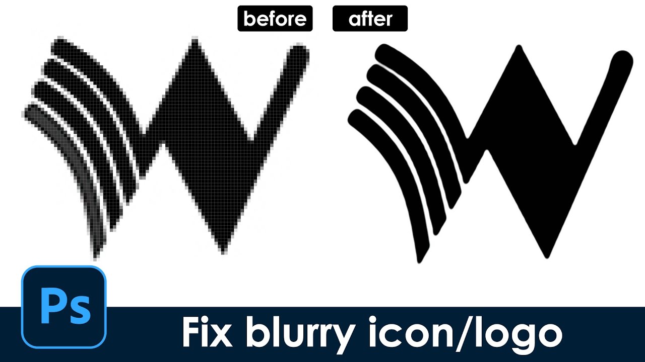
Fix blurry icon/logo make sharp edge-[Photoshop tutorial] quick and easy
only 15-20 seconds, Super fast way to turn a blurry icon or logo to one with sharp and clear edge
#hzdesign #Photoshop skills #quicktricks #MagicPS #fix blurry
icon is one I designed but in small low resolution mode
copyright-free music from
New Beginning – Del (No Co...
what a life saver, ty!

Thanks for helping!
Gave +1 Creative Carma to @mental kiln (current: #126 - 11)
By the way, what are Creative Carmas for? @ripe quest
Not much really. It just a simple way to keep track of people who are helpful in the server.
People say "thanks" and it gives you a point. But its nothing more than bragging rights really.
how can I create images with AI?
You can either use Generative Fill inside Photoshop or in the Firefly web interface. Sign in to your Adobe Account and visit: https://firefly.adobe.com/
can I use midjourney here?
No. This the Photoshop server. We don't have a Midjourney Bot here.
Ah, OK. Thanks
I use Comfy UI, if you have any questions I can help , However, there are other servers dedicated to AI
Comfy UI. Thanks, I'll look into it
You'll have to do that in DM or in another server. SD, Comfy, etc are beyond the scope of this server.
any way to stop LR from doin this?


how do i upload images to various channels?
<-- Use the PLUS icon to the left and select a file or drag and drop.
Hey Guys, So my photoshop did this glitch out of nowhere where all it is stuck at is mouse cursor. I made sure capslock wasnt on, i reset my preferences and tools and still no luck
Even on type tool or erase its on curser. When you hover over the edge of a selection in transform you see the icons for expand but i dont see that either
What version of Photoshop?
Main menu: Help > GPU Compatibility... any errors or issues reported there?
Latest
everything is green checkmark
i just reinstalled it too
how do i get the text to look like that?


So I just uninstalled it without keeping my preferences and now it says retry when installing
Not really sure I understand what it is that you're seeing. Also, I'm not experiencing anything like that. Perhaps you have some sort of hardware/hard disk issue.
Try setting the Blend Mode for the text layer to "Difference" Mode.
Ok so basically
I have this sprite sheet from a game however all of the frames for every single animation are all on one single image
Does anyone know an easy way to split it up? I'm trying to get the frames for the wings for something I'm working on but I need each wing to be in the perfect center because its for an animation

selection tool
I mean I need them to be split perfectly so that theyre all perfectly cenetered otherwise the animation will be messed up
https://youtu.be/BMALgd9cBD4?si=2tRuQnsK0N9JNa0Z&t=207
You can see how its supposed to look in this video

What do they call this kind of flyer

alguien que hable español y que pueda ayudarme con algo?
thank you
Gave +1 Creative Carma to @ripe quest (current: #3 - 1714)
@ripe quest So I ended up uninstalling creative cloud all together and it fixed the issue with the cursor
thanks again
I'm glad you got it sorted out!
use the crop slices function, adjust all, export > slices
How do I do that?

Divide one photo or image into several images to create a collage on your instagram grid using Adobe Photoshop CC 2020.
Rather read this instead of watching the video? Check out my blog, explaining the entire process: https://editwithkim.com/photoshop/slice-an-image/
Learn more about editing
Photoshop: https://www.youtube.com/playlist?list=PLd...
Thanks
here using guides, but you can simply select the rectangles
hello. i am trying to change of the color of the background and the colors of two lines on a screenshot. I need it to match the same black backround of my other screenshots, does anyone have any tips on how to do this?
Paint over the areas.
Let's see the image that you're working on.


thats actually pretty perferct haha. thank you. is there a way to make that yellow line a little more orange?

is it possible to get like an orange closer to the orange on this one? sorry for asking for so much

thats perfect.
thank you so much.
that saved me a few points on my lab report haha. appreciate it a lot
any ideas how to get rid / prevent the different contrast when using generative fill?

Hey all can someone who’s experienced in all adobe can help me I’m trying to do something with a piece that I made it would be extremely helpful please dm me
Can you post the piece, or part of it, so we can all offer suggestions?
how do i change this checkerboard pattern in the display of the wave filter

its making it hard to see what im messing with, itd be nice if i could change it to a certain color or other pattern for display
It looks like the text layer is set to a specific blend mode that "reacts" with the underlying layer (the girl). Something like "difference" Note that the colours are reverted. As the effects is highly dependent on the tone and colours of the layers involved, you need to test what works best.
The checkerboard indicates transparent areas, it won't show, it won't print, as far as I know, you can't change how the transparency is visualised
There is a way to change the colours of the checkerboard (in the preferences), but I am pretty sure it won't show in the preview box of the filter (only in the canvas)

it's in the edit>preference>transparency and gamut menu
I don't think you can go THAT granular when prompting but you can obviously retouching it later. It's difficult to see what's it's all about since this is a very close-up screenhot, but I guess either the clone stamp tool, or even a very loose, very feathered selection, and then a box blur (or a surface blur) on the area concerned will even out the cloudy aspect.
urgh, so I have now acquired Illustrator, and unfortunately I still got that same jagged edges issue... Could it be some settings problems maybe? an Adobe issue?

Did you use the transform command in Illustrator (with an X amount of copies)
This is the Photoshop server by the way 😉
Let me know if you need the link to the illustrator server?
I got the same issue with some Photoshop effects, that's why I asked, it's a common issue
You need more copies, or reduce the distance in the transform menu (just test it and let me know it works) I would at least double the number of copies
Sure
Not photoshop specific question but anyone have an idea what is the font family here?
The M is tall with sharp edges and the G is round

well, nevertheless, this still happens to me for some reason
Have you tried the usual? (what's the font, what font is, Adobe fonts font visualiser?)
here is an helpful post to identify fonts?
What do you do when you find a font you like, but then have no idea what it is: You use a font identifier!
Whether it's in an app like Photoshop or Adobe Capture, or using online resources online: I got you covered!
See the links below:
https://fonts.adobe.com/
https://www.whatfontis.com/
http://www.identifont.com/
https://new.myfonts.com/WhatT...

Yes I tried them, but the image has the letters cut off so the results are messed up
Geometric like that it could be Futura
https://fonts.adobe.com/fonts/futura-pt
A sans serif typeface with 14 styles, available from Adobe Fonts for sync and web use. Adobe Fonts is the easiest way to bring great type into your workflow, wherever you are.
Not entirely sure, but it's a good contender
High similarity, thanks, I might go with it
There is also the possibility that it's either a custom font OR a font that have been tweaked with tho
Another contender could be Century Gothic
On Adobe font, you can search with the typeface characterics
https://fonts.adobe.com/fonts/tags/geometric?browse_mode=default&filters=cl:ss,wd:r,ct:l&max_styles=26&min_styles=1&tag=geometric
Search for fonts by foundry, designer, properties, languages, classifications, and more.
Explore the latest additions to our font library at Adobe Fonts.

Hi guys I have a problem I want to make my person hold an object in his hands however I am a not advanced in photoshop to make it look realistic does anyone have tips
I want to put a box in his hands however when I do it it looks unrealistic

Specifically this Rolex box but the angle is pointing down and I need it to look realistic in his hands

You have a slight "white" pixels outline on your object, that contributes to making it look "photoshopped"
Select outside, expand selection 1-2 pixels, fade it 1 pixel and delete. Or manually apply a mask or use a selection--> border refinement tool (though I prefer the older 100% working way of doing it, the first)
Then match it's colors/warmth to that of the figure and make sure it's proportions are correct. I think you have to make it slightly reddier and less yellowish to make it correctly align with your image (better way is to use a curves layer or a tone/saturation layer
the above was for you, I forgot to include you in the answer 😄
Someone knows how to get back the "distribute layers" buttons on the toolbar? They have hidden them behind a submenu and it slows down my workflow.
They still show up for me. Can you show your screen when more than one layer is highlighetd and the move tool selected?

Those are the ALIGN layer, not the DISTRIBUTE. Those are hidden for you too, they are behind the 3 dots things like on mine
Otherwise you can have them directly in the properties

See, those greyed below in the properties are "distribute", and they don't show on the toolbar. I want them there like they were in older versions, because I often have to distribute objects and align ^_^
I perfectly know what "distribute is" 🙂
I don't wanted to sound obnoxious, I used caps just to explain my issue, sorry!
The standard distribute (horizontally and vertically) show when 3 layers are selected, it's the distibute left, right (and top and bottom) that aren't showing. As far as I know You can only get a direct access via the properties

ok thanks, since other tool areas are more customizable I asked to see if there was a way to customize those back like they were in older versions.
In Illustrator you get a separate panel for thses for (again AFAIK) not in Photoshop
Guess I will have to work with properties open when I need to align a lot of things
Is just that there is a TON of space on that move bar, so it seemed strange to me that those options are collapsed under the three dots, while they were available before
It's possible that someone made a plugin for that. That wouldn't surprise me.
Thanks for the help anyway 🙂
I knew it 🙂

Nice, that plugin is interesting, align to canvas is another thing that is useful to have handy for some works
That's the same guy who made a really great plugin that adds an illustrator-style pathfinder for Photoshop. Super Useful!
I bought an alpha for 3D program and I have a problem:
-
How can I get rid of those shreds and still keep the volume?
-
Edges seems to have low resolution. Is it possible to upscale the resolution of this greyscale alpha?


how do i do kinda blured glass effect

I didn't understand your question, apparently you can make these shaders directly with photoshop gradient
duplicate layer, blur + layer noise + overlays
I have a pack of these alphas, they look good overall and I want to keep the look of it BUT they have jagged lines in between them and edges are too sharp/low res.

this is what i get in 3D program
Well, you can try a few things, use levels to increase the brightness of the white, use blur to blur, this will soften your jaggies a little, use levels later to make a choke effect
https://bigjpg.com/
This site increases the resolution of your file a little, you can also test
Bigjpg - Image Super-Resolution for Anime-style artworks using the Deep Convolutional Neural Networks without quality loss. Photos are also supported.
thank you, will try it!
can someone help me with this

Its telling you right there what to do... You should update the GPU drivers.
You should download the GeForce Experience app. That makes GPU driver management simple.
Thank you
Gave +1 Creative Carma to @severe furnace (current: #849 - 1)
Hello, so this is a png image i found but I want the lines to be a different color.. can i do this ? if so how ? .. thanks

double click on the layer, color overlay
but apparently you have a gray background, use the magic wand to select the background and remove it
Thank you, I didnt send the actual PNG just a screenshot
Gave +1 Creative Carma to @mental kiln (current: #117 - 12)
what blur
and whats layer noise

In today's Photoshop Tutorial, we will know the other way of creating the awesome glass effect in adobe photoshop.
Thank you for Watching!
► My Simple Youtube Setup
Peripherals:
Logitech MX keys: https://amzn.to/3rz9DvT
Samung M5 (Smart Monitor): https://amzn.to/3PXOfec
Logitech M720 Wireless: https://amzn.to/...
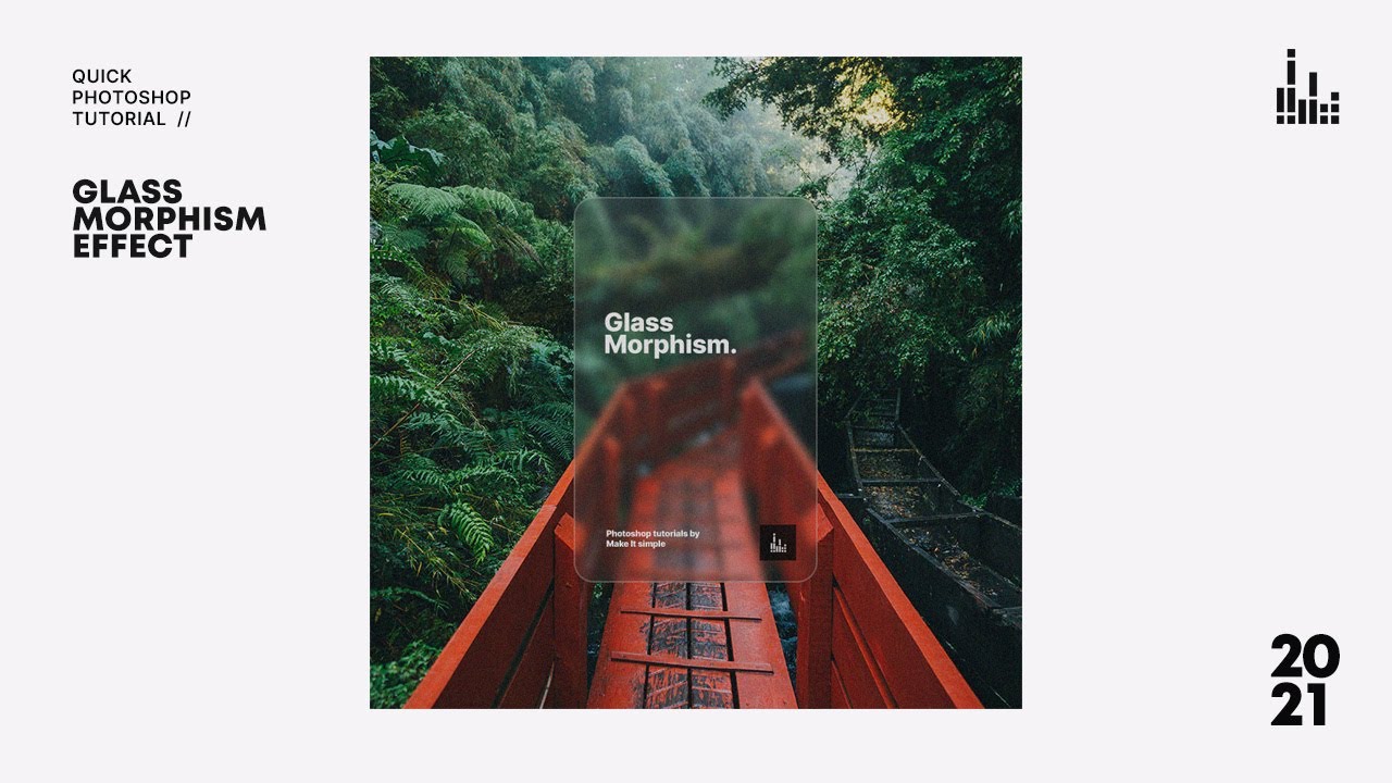
In today's quick Photoshop tutorial, we will know how to create the new design trend this 2021, the Glass morphism. Hope you enjoy this simple Photoshop tutorial.
Thank you for Watching!
► My Simple Youtube Setup
Peripherals:
Logitech MX keys: https://amzn.to/3rz9DvT
Samung M5 (Smart Monitor): https://amzn.to/3...
thx
Gave +1 Creative Carma to @mental kiln (current: #108 - 13)
is it possible to export all images in a group and groups would be exported as folders?

so I dont need to select each image, export them and organise into folders
unfortunately i cant get wanted result 😦
when blurring i lose my white sharp detail in the middle
Your Brush is set to "Screen" Blend Mode. I'm assuming that you want "Normal" (?)

yess thank you
Gave +1 Creative Carma to @ripe quest (current: #3 - 1715)
hi! i selected this word and i really like the effect its giving, how can i achieve it? there doesn’t seem to be any highlighting tool

I'm new to Photoshop, how do i fill the inside of the A completely white

magic wand and select that inside, or by quick selection tool.
Draw rectangle under letters.
liquify
convet to shape, or select tool and mask, and duble click layer , color overlay
Based on the fact you're new, I'd do it like this....
Actually, skip the last 80% of the video and just copy these settings when using the fll tool

tysm
I'm currently trying to recreate the texture in this, but I'm not exactly sure how or what to look up. Would someone mind helping me?

I'm basically trying to remake the whole thing, so I could learn from it.
Use Google lens to find the roots of this image
Can anybody put what they think is the best texture for this poster. I already tried one named "dirty-steel" in the project, remove it first before adding yours.

Also the texture is named "grain effect"
can someone photoshop a two pictures together for me?
thank u
Im currently creating a GTA themed video right now and for those who have played the game knows what this picture is. Its a mission complete that slides onto your screen once you complete a mission (obviously). I know its something I have to create on photoshop in order to apply it to my video and I was wondering: how do I create these sharp edged lines on the side of this photo? It looks like its on a dollar bill but I don’t know what its called or how to create it!

Also not sure what type of green this is. Either way I would have to change the opacity to the whole thing since the video would be in the “background” of this.
General Adobe question. Is Identit-e.com a site that adobe uses?
I was checking my validity for a substance painter membership through my school and the email sent me there
are there any graphic designers able to dm me for a job on making intstagram posts?
sure, i already do that on a daily basis.
Why do you ping people for no reason.
Ask and wait, questions are always answered.

Find out how to easily and effortlessly export transparent PNG files from Adobe Photoshop.
► Project Files, Templates, Animation Packs, Courses & More:
https://brookerfilms.gumroad.com/
► My Filmmaking Courses on Skillshare:
https://www.skillshare.com/brookerfilms
► FREE Adobe Premiere Pro Title Pack (50 Titles):
https://brookerfilms.gumroad....
I am not aware of it, but I will see if I can find something. Did you receive a code to redeem, or is it just a verification process?
Hey sandrine, is there no special role for server boosters in members section?
It could be a simple grid, distorted with something like the polar coordinate filter.
To make a grid I would use the line tool (in the vector tools), or even make your own repeat pattern, then convert the lot to a smart object and apply the filter. It will give a round design. You will then have to position it at the edge of your banner and duplicate to the 3 other egeshttps://www.youtube.com/watch?v=SOduRMgsVB4
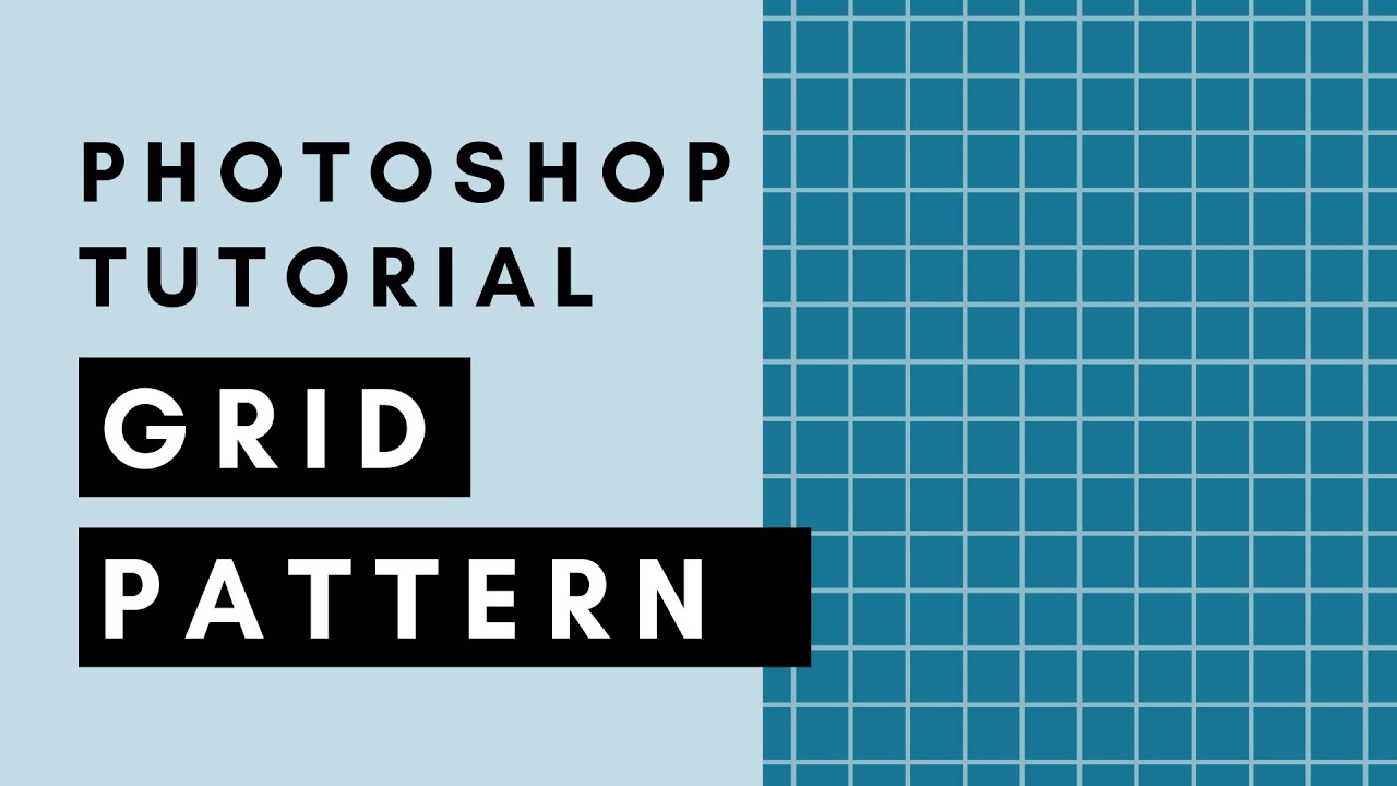
Learn how to create a seamless repeating grid pattern in Adobe Photoshop.
With this grid pattern you can make your own digital scrapbook paper or printable grid paper.
In this tutorial you will learn:
- how to use the line tool in Photoshop
- how to work with smart objects when using repeating elements so you can easily change the thickness of...
I don't think so, I am not even really sure what a server booster is (is that to do with Nitro?)